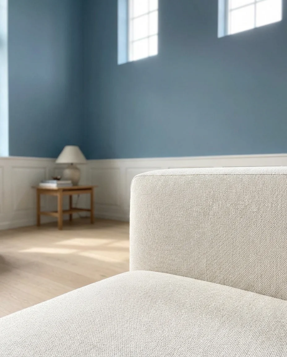
Blue living rooms are having a serious moment right now, and it’s easy to see why. From soft powdery hues to deep, dramatic navies, blue brings a sense of calm and confidence that few other colors can match—and Americans are pinning these spaces by the millions. Whether you’re doing a full renovation or just shopping for a new sofa, the right shade of blue can completely transform how a room feels. In this guide, you’ll find fresh and inspiring ideas to help you build a blue living room that actually feels like you.
1. Dark Navy Accent Wall with Warm Timber
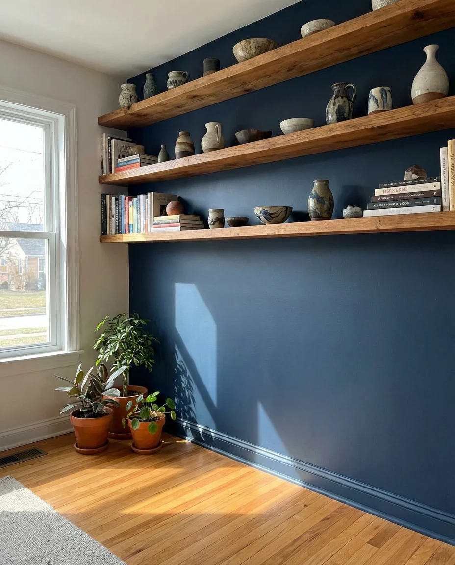
A single dark navy accent wall can anchor an entire room without demanding a full commitment to bold color. Paired with warm timber shelving and natural wood floors, this combination creates a grounded, layered look that feels equally at home in a mountain cabin or a city apartment. The contrast between the richness of navy and the honeyed warmth of brown and wood tones is one of those design pairings that simply never goes out of style. It’s deeply satisfying to the eye and surprisingly easy to pull off.
The smartest move here is choosing a matte finish for the navy wall—it absorbs light beautifully and avoids that flat, painted-gymnasium look. If you’re unsure where to start, interior designers often suggest testing your chosen navy in a 12-by-12-inch swatch and living with it for a full weekend before committing. Lighting changes dramatically between morning and evening, and a shade that looks rich at noon can turn almost black by lamplight. Taking that extra time before painting will save you from a costly redo.
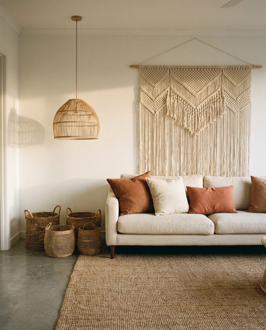
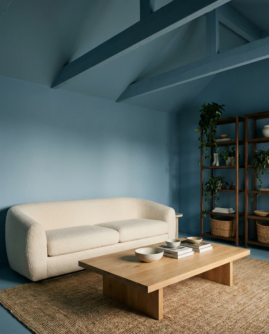
2. Neutral and Blue Layered Textures
When neutral and blue come together in a living room, the result is a space that feels collected rather than decorated. Think linen sofas in warm ivory, chunky woven throws in dusty chambray, and a jute rug underfoot tying it all together. This approach is especially popular among homeowners who want color without the drama—a kind of visual breathing room that still has personality. The trick is to vary textures within those neutrals so the room reads as layered and intentional, not washed out.
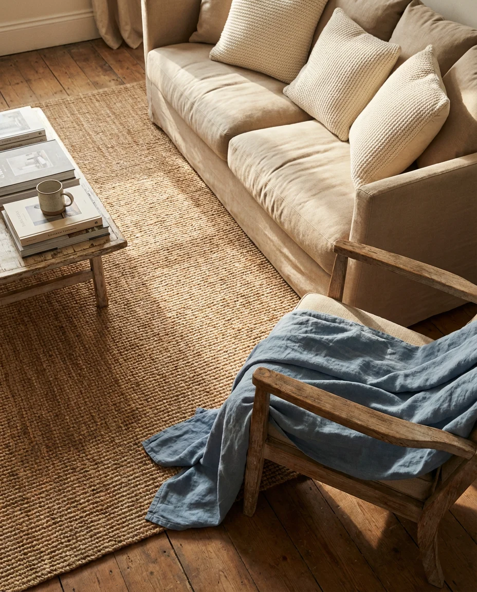
This palette works particularly well in open-plan spaces where you need a cohesive visual thread between the living and dining areas. Because there’s no single dominant color, the room feels flexible—you can refresh it with new throw pillows or a different area rug without a full redesign. For budget-conscious decorators, this is genuinely good news. Swapping a $40 set of pillows from Target can shift the mood entirely without touching your walls or furniture. It’s an approach that grows with your taste over time.
3. Green and Blue Botanical Living Room
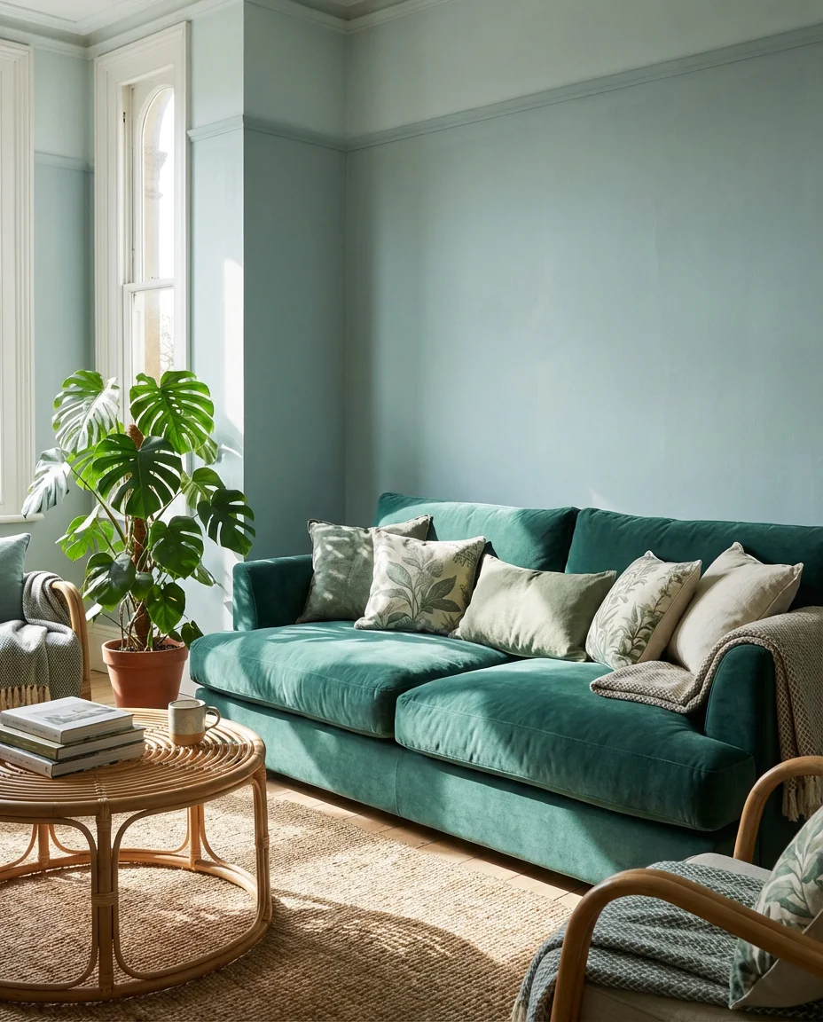
The green and blue combination is one of nature’s own color stories—think ocean meeting forest, or sky above a garden—and it translates beautifully into a living room setting. A teal or sage sofa against a soft blue-green wall creates an immersive, botanical atmosphere that feels genuinely restorative. Add in oversized potted plants, botanical print cushions, and rattan accents, and the room begins to feel like something out of a design editorial. This look is trending hard on Pinterest for good reason: it’s lush without being overwhelming.
This pairing works best in rooms with good natural light—east- or south-facing spaces where morning sun can warm up the cool tones. Without light, green and blue can veer into murky territory. If your living room doesn’t get much sun, counter it with warm-toned bulbs (2700K–3000K) and metallic accents in brass or aged gold. Real plants are almost non-negotiable here; even a single large fiddle-leaf fig or monstera gives the room the organic vitality that makes this whole look click.
4. Grey and Blue Classic Sophistication

Grey and blue is a combination that has graced the pages of design magazines for decades, and it’s still one of the most reliable ways to create a polished, timeless living room. Cool grays ground the space, while blue—whether it appears in a velvet sofa, patterned rug, or painted wall—adds depth and character. This palette is especially popular in Northeastern cities like Boston, New York, and Philadelphia, where the aesthetic leans toward quiet sophistication rather than flashy maximalism. It signals taste without shouting about it.
One common mistake in grey-and-blue rooms is choosing shades with conflicting undertones—a warm greige next to a cool blue-grey creates a subtle tension that reads as “off” without most people being able to name why. The fix is simple: decide whether you want a warm or cool base and commit to it throughout the space. Pull undertones from your flooring or architectural features as a guide. Once you nail the undertones, the whole room will feel effortlessly cohesive rather than like it’s fighting itself.
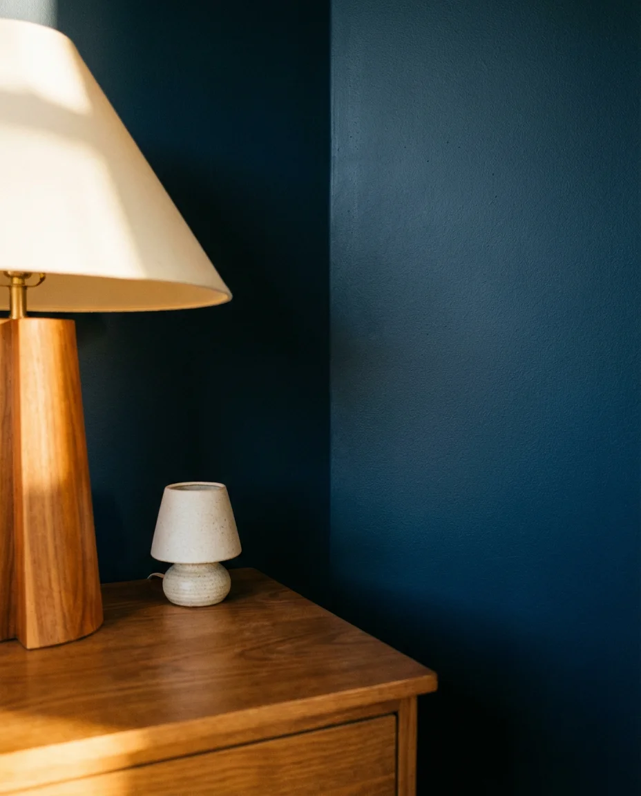
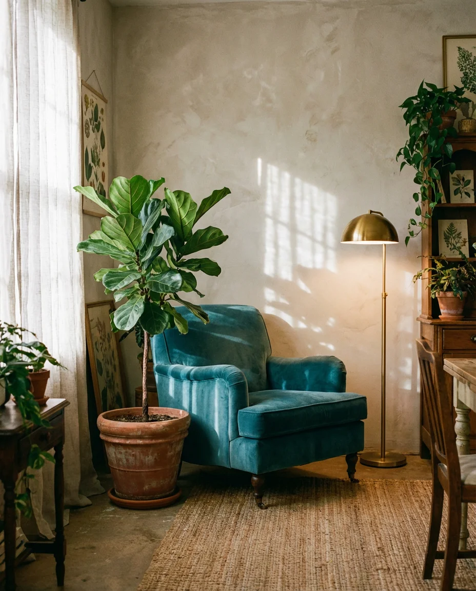
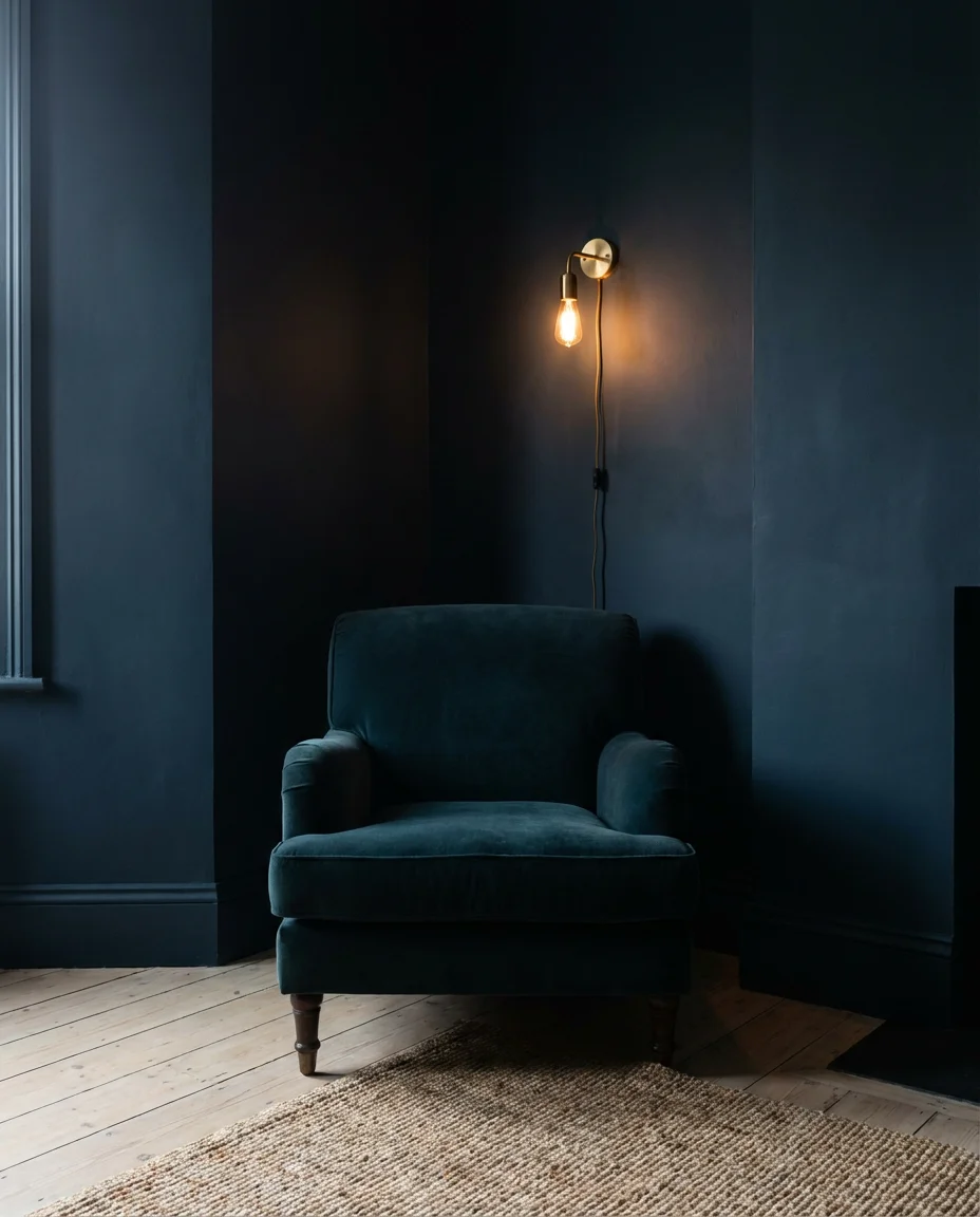
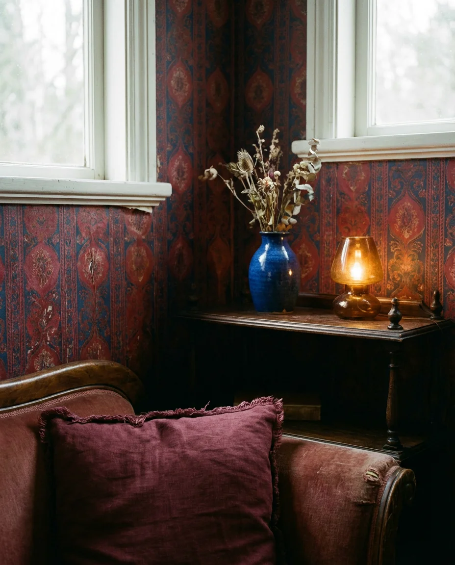
5. Cozy Midnight Blue Reading Nook
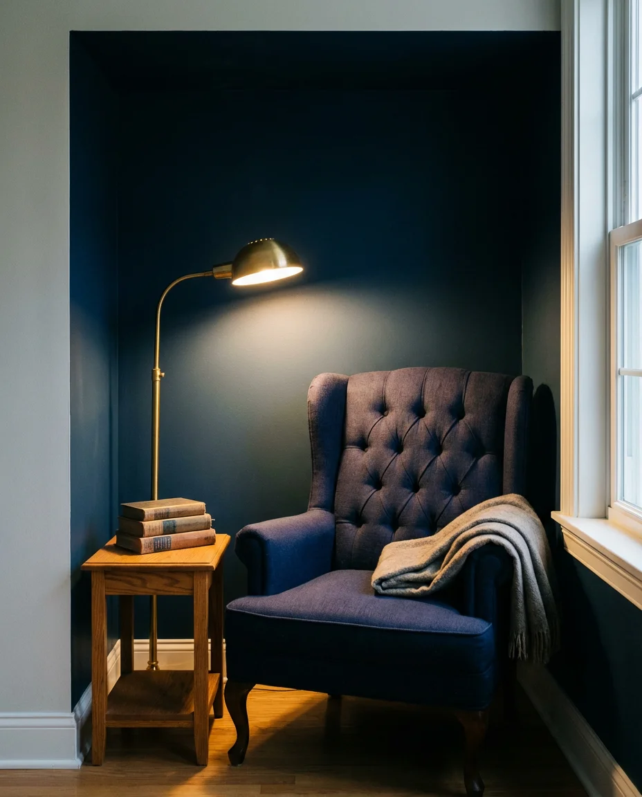
There’s something about cozy midnight blue that makes a corner of a room feel like the most desirable seat in the house. Picture a tufted armchair in deep indigo, a wall painted in a near-black navy, a brass floor lamp casting a warm pool of light, and a small stack of books on a side table. This kind of dedicated reading nook has become one of the most-saved living room features on Pinterest—it speaks to a real hunger for intentional, restorative spaces in American homes that are otherwise dominated by screens.
One homeowner in Austin shared that she carved out her midnight blue nook in an awkward alcove she previously used to store bags and coats. After painting the alcove walls in a deep navy and adding a secondhand wingback chair and a plug-in sconce, the space became her favorite part of the house. The transformation cost under $300, and it completely changed how she uses her living room. Small, dark corners are often overlooked, but with the right color and a single comfortable chair, they become the most character-filled spots in any home.
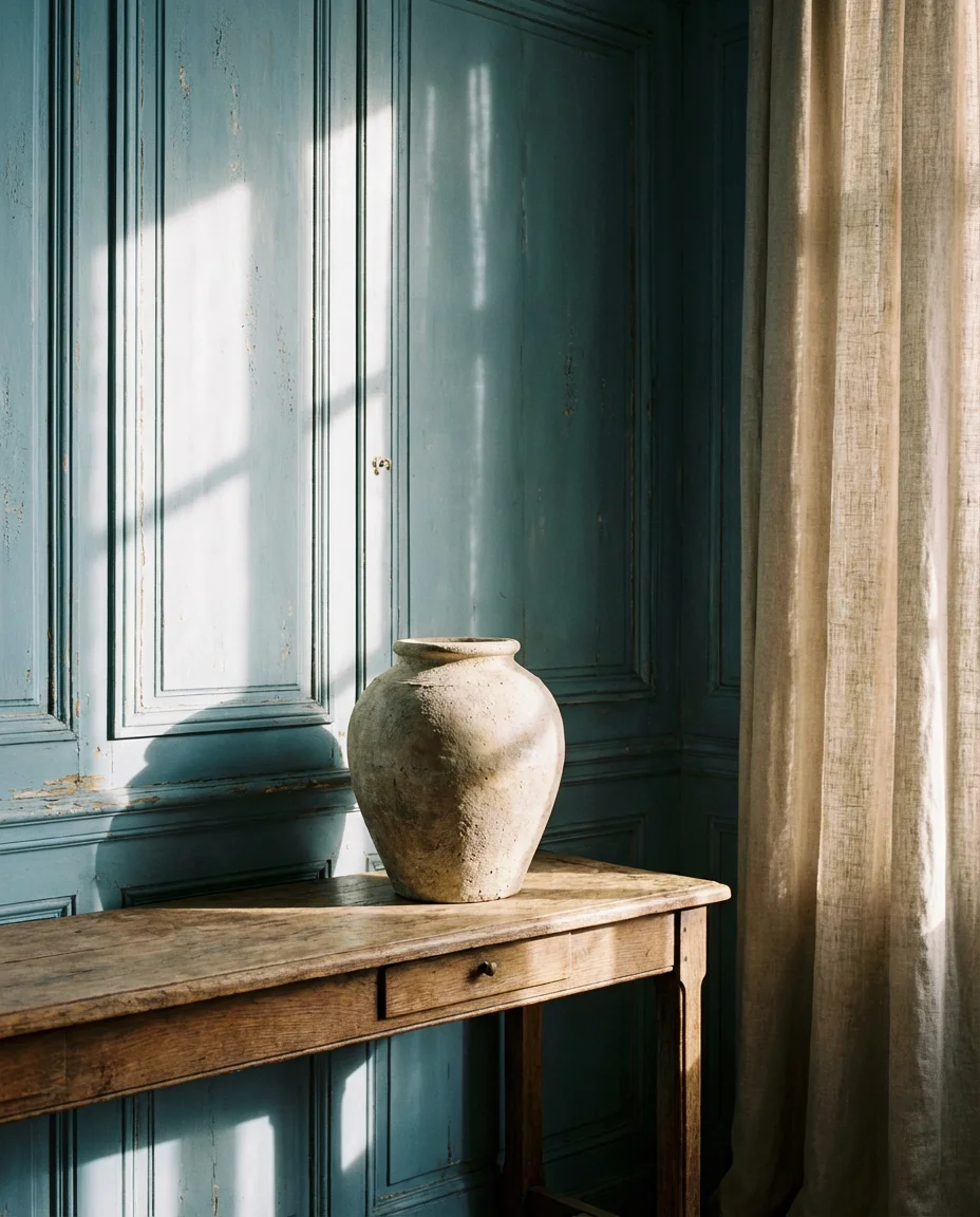
6. French Blue Living Room with Antique Touches
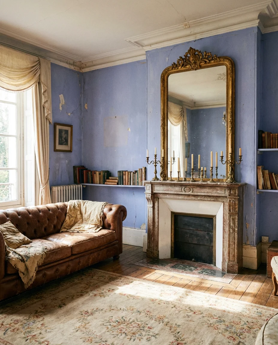
French blue—that particular dusty, faded periwinkle you see on Provençal shutters and vintage French linen—brings an effortlessly romantic quality to a living room. It’s warmer than a classic navy and softer than a true cobalt, sitting in a sweet spot that works with both contemporary and traditional furniture. Pair it with antique gilt mirrors, worn leather, aged brass hardware, and natural stone accents for a look that feels lived-in and genuinely beautiful. This is a palette for people who want their rooms to have a story.
French blue works best in rooms with high ceilings and architectural detail—crown molding, ceiling medallions, or paneled walls give it proper context. In a very plain box of a room, it can feel a little flat without those supporting elements. If your space lacks architecture, add visual structure with a picture rail, a large ornate mirror, or a boldly scaled piece of antique furniture. The key is contrast—French blue needs something aged or textured alongside it to reach its full romantic potential.
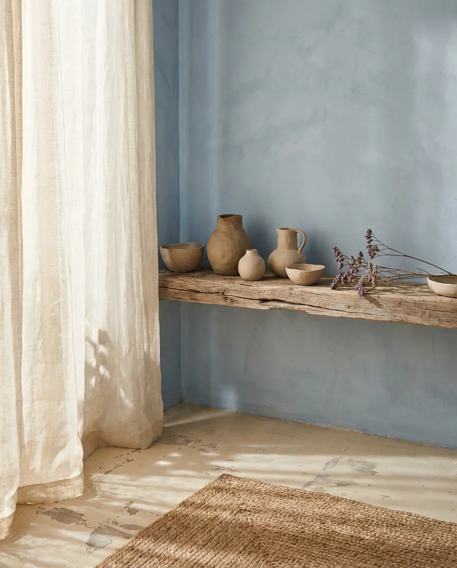
7. Duck Egg Blue Scandinavian Calm
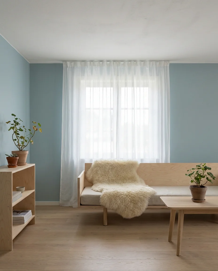
Duck egg blue has a quiet, almost medicinal quality—it genuinely makes rooms feel calmer and more spacious. In a Scandinavian-inspired living room, this soft blue-green sits alongside natural birch wood, sheepskin throws, matte white plaster walls, and minimal furniture with clean, functional lines. The result is a space that breathes. It’s the antithesis of clutter, and for Americans who are exhausted by maximalism and sensory overload, this kind of room has real emotional appeal. It is designed as self-care.
This approach works especially well in smaller living rooms where every design decision needs to work harder. Duck egg blue walls in a small room recede visually, making the space feel larger than its square footage suggests. Keep furniture low-profile and legs visible—this allows more floor to show, amplifying the sense of openness. Avoid heavy window treatments; sheer linen panels that filter rather than block daylight will preserve that luminous Scandi quality that makes the look so compelling on a gray winter morning.
8. Moody Blue Velvet Maximalism
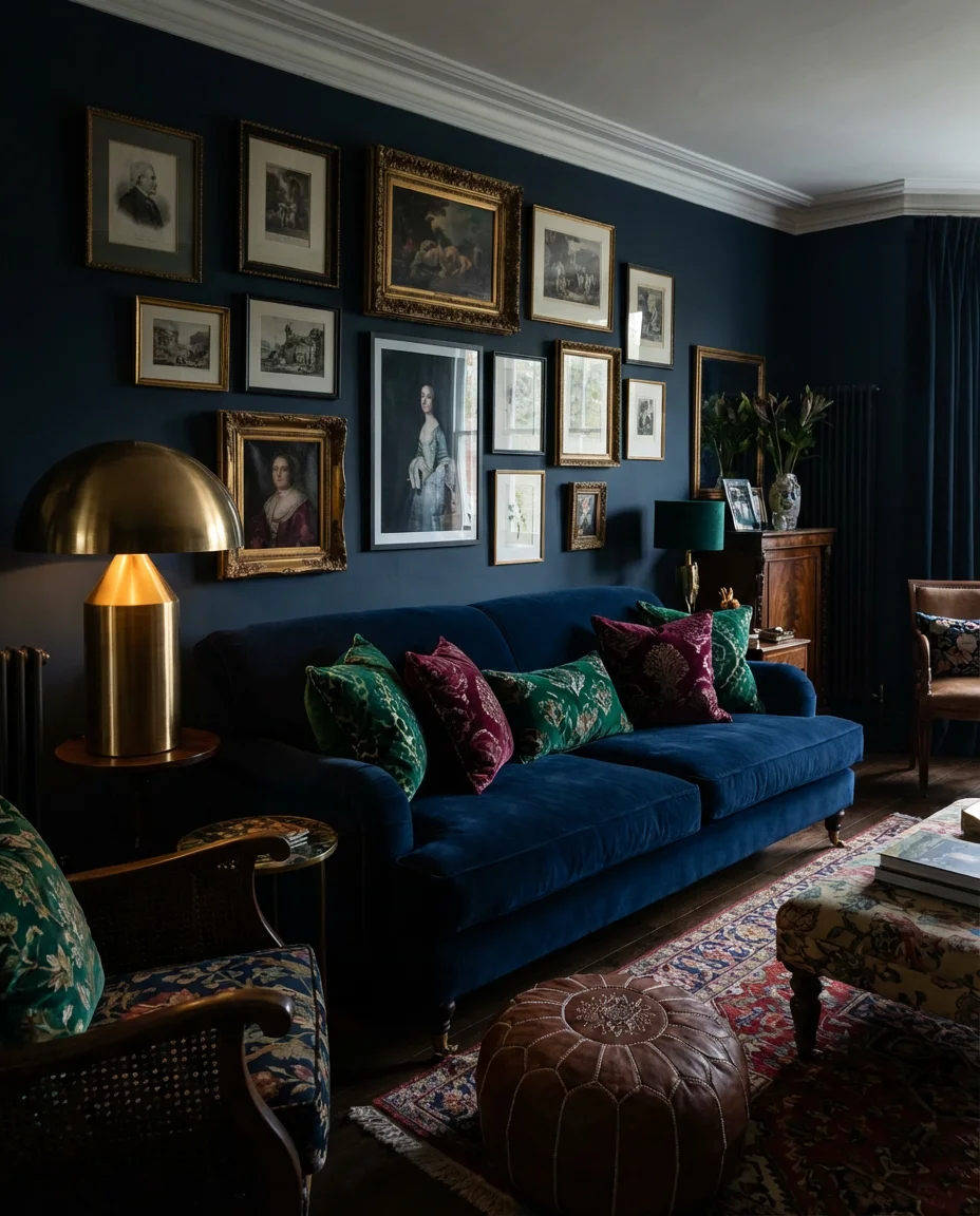
For those who believe more is more, a moody living room built around deep blue velvet is an unapologetically bold choice—and one that’s gaining serious traction in 2026. Think of a midnight blue velvet sofa layered with jewel-toned cushions in emerald, burgundy, and gold, against walls painted in an equally rich, saturated hue. Gallery walls packed with framed art, sculptural lamps, and stacked coffee table books complete the picture. It’s a lot—and that’s entirely the point. This is a room that refuses to be background.
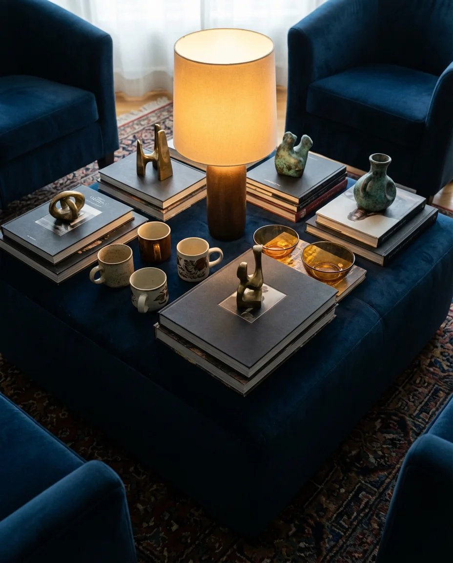
The biggest mistake people make with maximalist rooms is treating every object as equally important. Even in a room full of things, there needs to be a hierarchy—one dominant piece that anchors the space, a few supporting characters, and plenty of filler that adds texture without demanding attention. In a moody blue velvet room, let the sofa be the undisputed star. Everything else—the cushions, the art, the side tables—should be chosen to support it rather than compete. Restraint within abundance is the secret to maximalism that reads as curated rather than chaotic.
9. Beige and Blue Relaxed Coastal Vibe
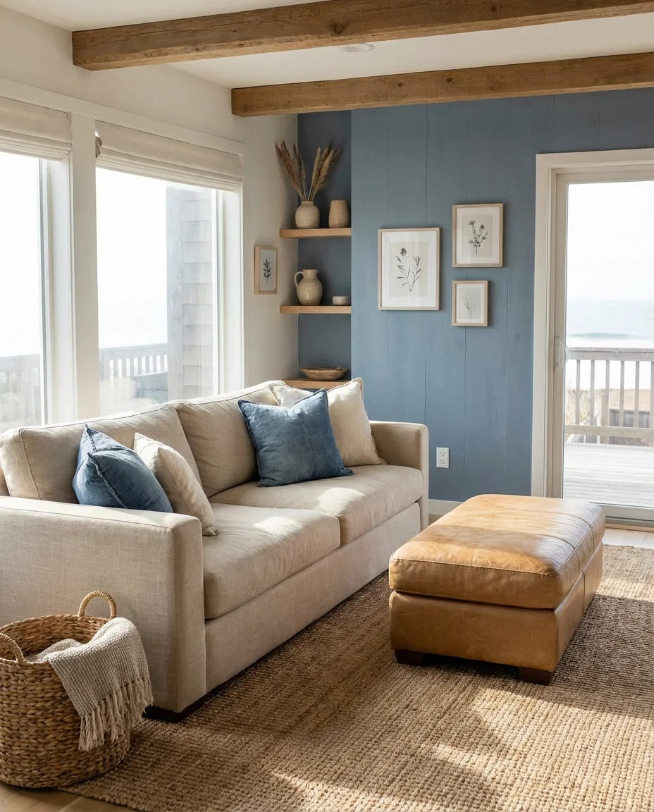
Beige and blue is the coastal palette reimagined for 2026 — less nautical kitsch, more relaxed seaside ease. Swap out the lighthouse motifs and rope accents for natural linen upholstery, soft camel leather, sea-glass-toned ceramics, and a large jute rug underfoot. The blue here is gentle and washed out—think faded denim or sea-washed slate rather than primary sailing blue. Together, beige and soft blue create a room that feels perpetually relaxed, as though you’ve just come in from a long walk on the beach and kicked off your shoes.
This palette performs especially well in homes along the Gulf Coast, the Pacific Northwest shoreline, and the Carolinas—places where indoor-outdoor living is a priority and the surrounding landscape already provides the color story. But it works inland too, particularly in homes with good natural light. The key is to lean into natural, imperfect materials: unglazed ceramics, linen with visible weave texture, and driftwood-finished frames. Perfection kills this look. Let things be a little worn, a little weathered, and it will feel genuinely authentic.
10. Sky Blue and White Airy Minimalism
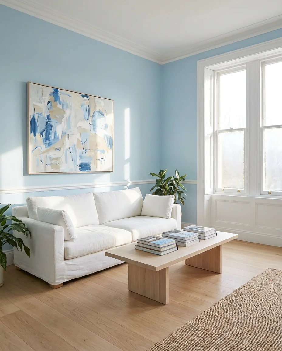
There are few things more uplifting than a living room painted in sky blue with crisp white trim and flooded with morning light. This combination is among the most-searched living room palettes on Pinterest year after year—and for good reason. It’s cheerful without being childish and bright without being stark. A white linen sofa, a few abstract prints with soft blue tones, and minimal furniture in pale natural wood round out a room that genuinely makes people feel better just by walking into it. It’s mood-boosting design in its purest form.
This approach is a particularly strong choice for apartments or homes where natural light is limited. Sky blue walls reflect daylight back into the room and create the perception of more space and airiness. Keep the floor plan as open as possible—resist the urge to fill every corner. Two or three well-chosen pieces of furniture will serve a minimal room far better than six mediocre ones. Think of the empty space as part of the design rather than something to fix. The breathing room is what gives this look its signature lift.
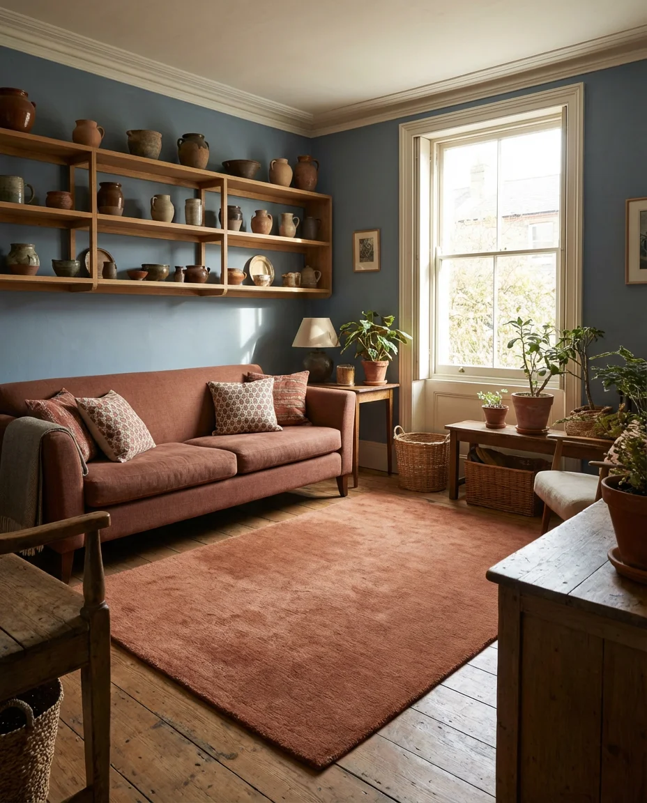
11. Inchyra Blue Moody Country Style
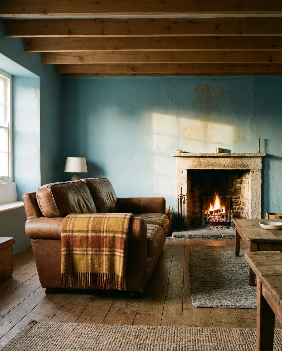
Inchyra Blue—the beloved Farrow & Ball shade that sits somewhere between a faded denim and a muted slate—has developed a devoted following among American homeowners who want color that feels serious and considered. It’s especially at home in country-style living rooms: imagine it paired with exposed ceiling beams, a stone fireplace, worn leather sofas, and plaid wool throws in earthy ochres and rusts. The overall effect is deeply atmospheric—a room that feels like it has always been there, slowly accruing warmth and memory over decades.
Where Inchyra blue really earns its reputation is in spaces with imperfect surfaces—slightly uneven plaster, aged woodwork, or stone or brick details. Its complexity allows it to look different in every type of light: steely and cool in overcast daylight, deeply warm and almost green by candlelight or firelight. If you’re planning to use it on all four walls, don’t underestimate how much the color will shift throughout the day. That changeability is precisely its magic—it’s a color that rewards living with, not just looking at in a paint chip.
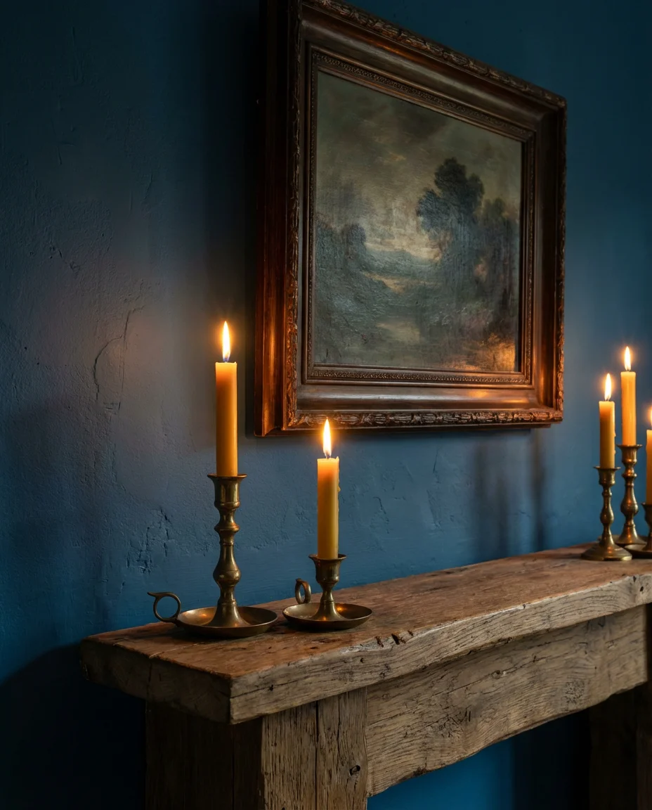
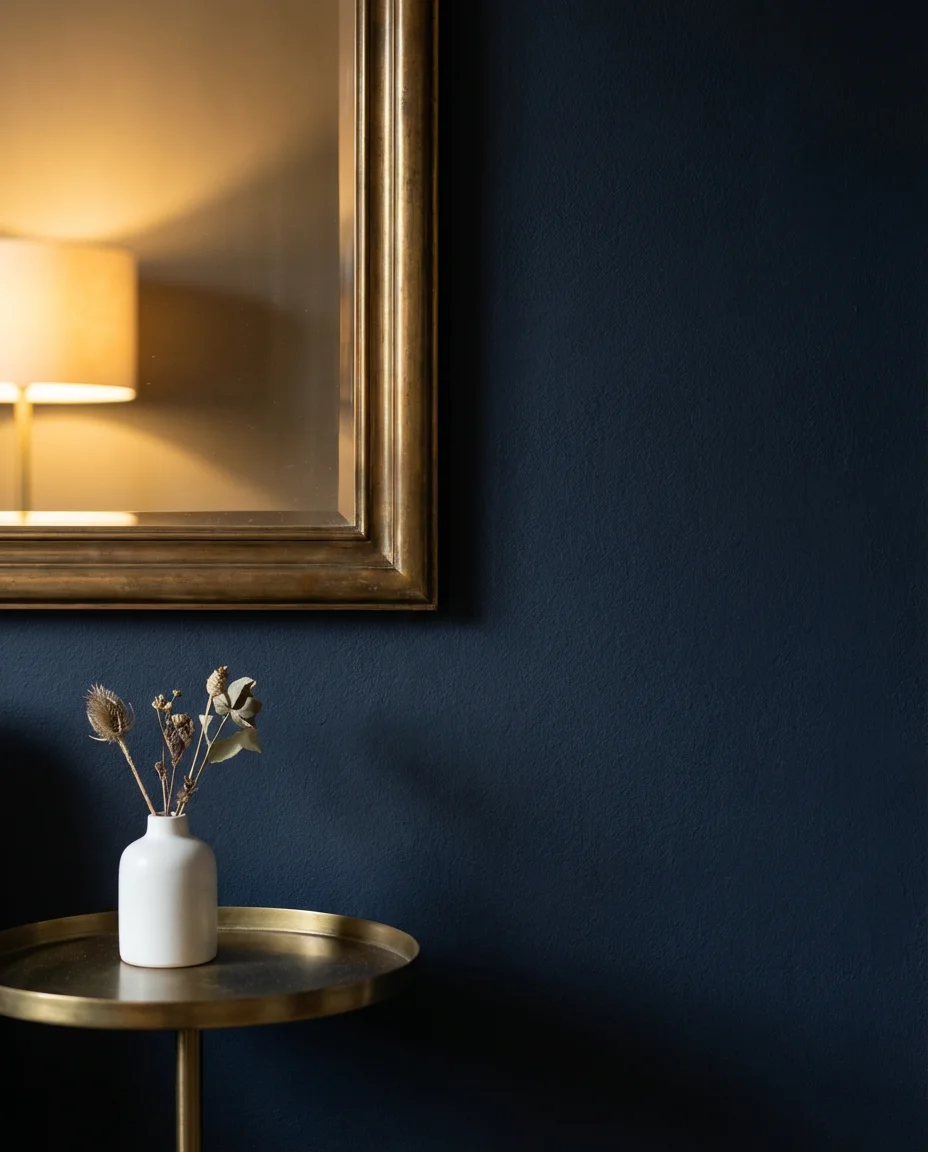
12. Hague Blue Drama with Gold Accents
Hague blue is one of those rare paint colors that photograph beautifully, look stunning in person, and somehow work in nearly every architectural style. Deep, inky, and slightly green-tinged, it creates an instant sense of drama when used on living room walls. Pair it with antique gold hardware, warm brass lighting fixtures, a Persian rug in jewel tones, and velvet upholstery in complementary navy or forest green, and the room becomes genuinely extraordinary. This is a choice for people who want their living room to feel like a destination, not just a stopover.
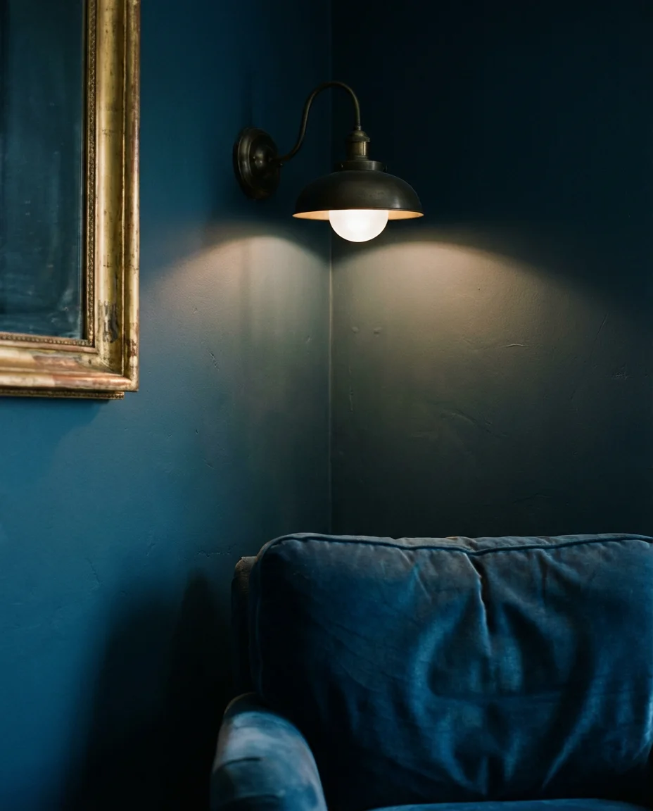
Expert decorators often note that Hague blue is one of the few very dark colors that actually works well in smaller rooms—its depth creates intimacy rather than claustrophobia, provided the lighting is well-considered. Use a mix of ambient, task, and accent lighting to make the room glow rather than lurk. A single ceiling fixture is never enough with this color. Layer a floor lamp, a table lamp, and a few candles for the kind of atmospheric warmth that turns an evening at home into something genuinely memorable.
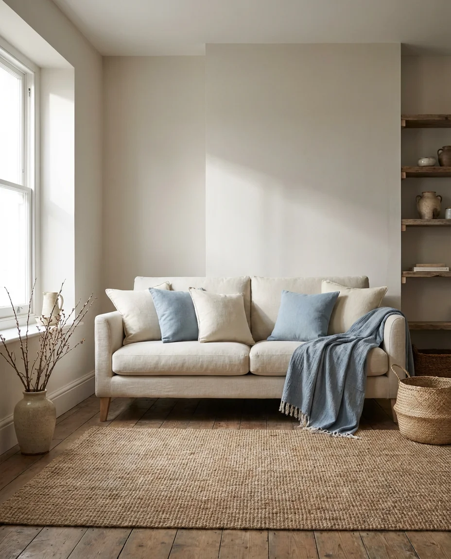
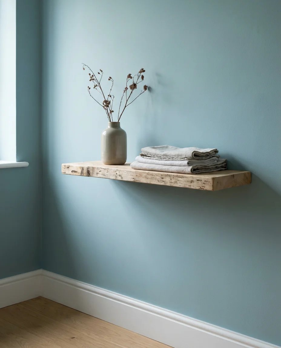
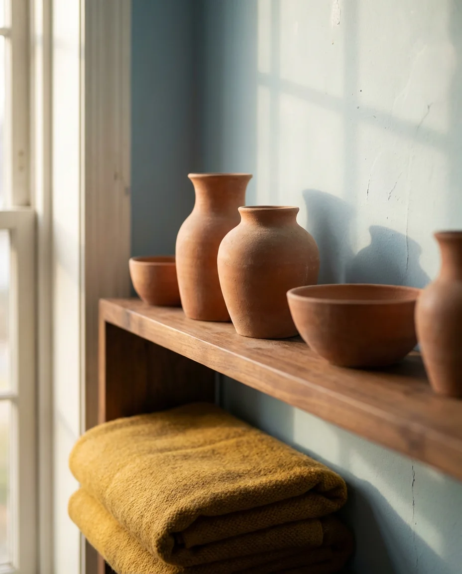
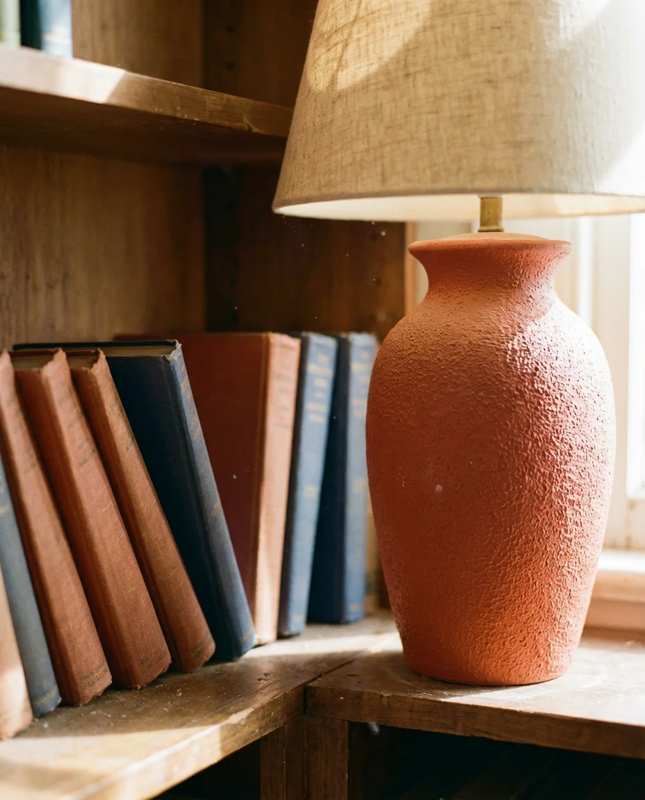
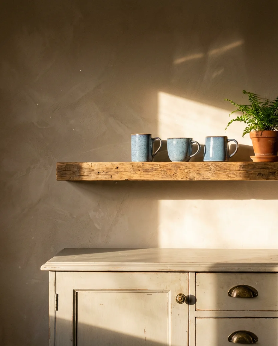
13. Pale Blue Walls with Warm Accents
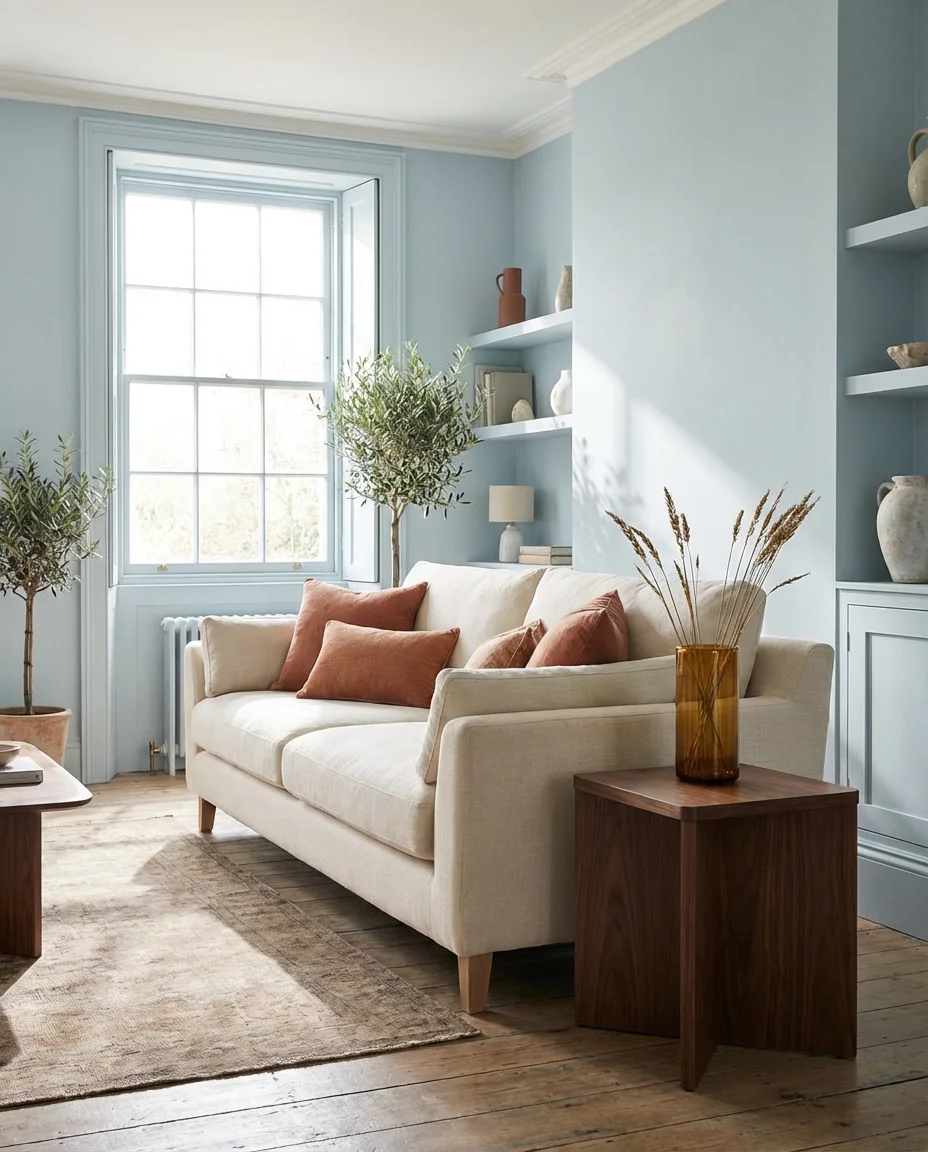
Pale blue walls are perhaps the most versatile entry point into a blue living room—they’re light enough to work with almost any existing furniture, and they provide a gentle, restful backdrop that makes warm accent colors sing. Terracotta cushions, amber glass vases, mustard yellow throw blankets, and warm walnut side tables all look extraordinary against a well-chosen pale blue. This combination has been appearing on design blogs and Pinterest boards throughout 2025 and into 2026, showing no signs of slowing down. It’s a palette that feels current but not trend-dependent.
This is one of the most budget-friendly ways to refresh a living room without replacing furniture. If you already have a neutral sofa in grey, white, or beige, painting the walls in pale blue and adding warm terracotta and amber accessories can feel like a complete transformation—for the cost of a few gallons of paint and some new throw pillows. It’s a strategy that real homeowners use all the time, and the results consistently look far more expensive than they are. The key is choosing a pale blue with a touch of grey in it rather than one that reads as baby blue.
14. Orange and Blue Bold Contrast Room
Orange and blue sit directly across from each other on the color wheel, making them natural complements—and in a living room, this pairing creates an energy that is vivid and undeniably exciting. The trick in 2026 is to work with muted, earthy versions of both: a warm burnt sienna or paprika rather than bright orange, paired with a dusty or slate blue rather than electric cobalt. This softened take on the contrast palette has the visual punch of complementary color theory without the sensory overwhelm. It’s bold, but it breathes.
This color combination has deep roots in American Southwestern design—think adobe walls, turquoise pottery, and faded terracotta tile. It also appears throughout mid-century modern design, where designers like Alexander Girard regularly paired these complementary tones in upholstery and textiles. Referencing those design traditions gives the pairing a historical grounding that makes it feel considered rather than accidental. A single paprika-toned ceramic lamp on a dusty blue bookshelf can carry the whole room’s color story with remarkable elegance.
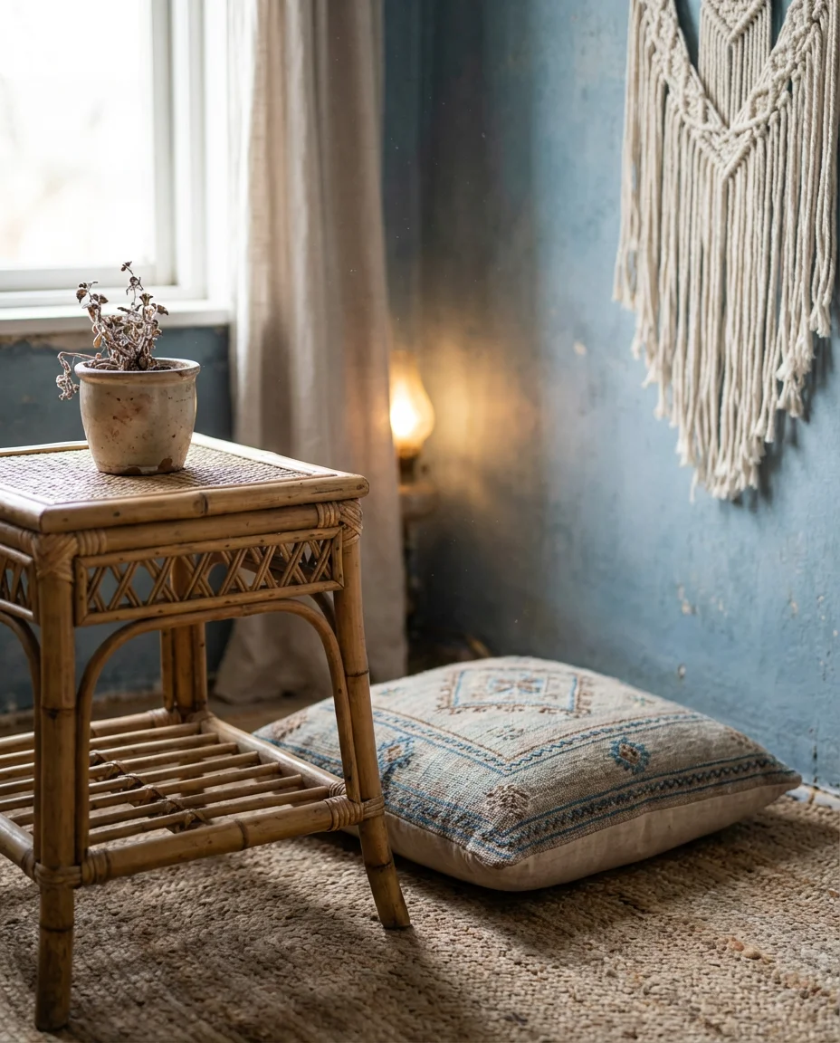
15. Dusty Blue Boho Eclectic Space
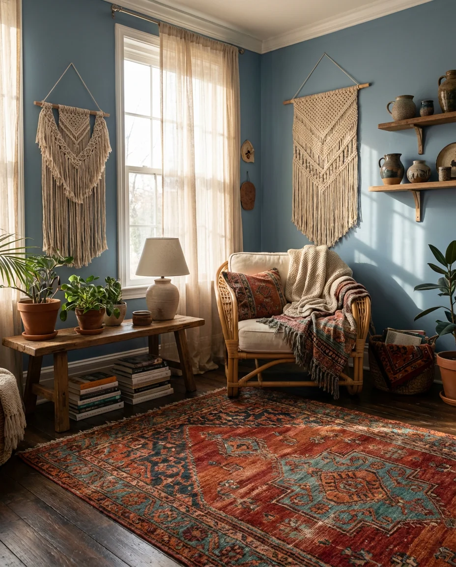
Dusty blue is the perfect base color for a bohemian living room—it’s soft enough to let pattern and texture take center stage without competing but present enough to give the space a cohesive mood. Layer it with Moroccan rugs in warm jewel tones, macramé wall hangings, eclectic vintage furniture, and a mix of ceramic and rattan accessories. The result should feel personal, collected, and slightly worldly—as though every piece has a story. This is a living room that rewards slow browsing, not a quick glance.
One of the real advantages of dusty blue in an eclectic or bohemian context is how well it ages. Unlike trend-chasing colors that can start to feel dated within a couple of years, dusty blue has a timeless, slightly faded quality that only improves as a room accumulates more layers and history. Real homeowners who committed to this palette five or six years ago are still happy with it today—in fact, many say it looks better now that they’ve added more pieces over time. That long-term staying power is worth factoring into any decorating decision.
16. Pink and Blue Playful Feminine Room
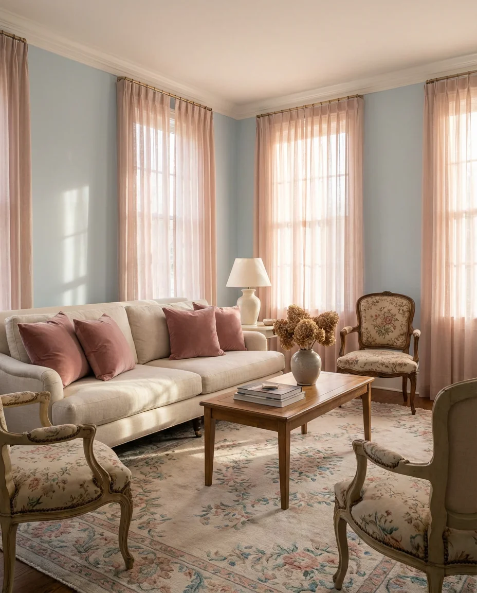
The pink and blue pairing has shed its nursery associations and grown into one of the most sophisticated color combinations in contemporary interiors. In a living room context, think dusty rose sofa cushions against a pale blue wall, blush linen curtains catching the afternoon light, and a delicate floral rug tying it together. This is a room that feels gently feminine without being saccharine—it has polish and restraint, and it photographs beautifully in the golden hour light that makes Instagram and Pinterest content shine. It’s the kind of room that makes visitors pause.
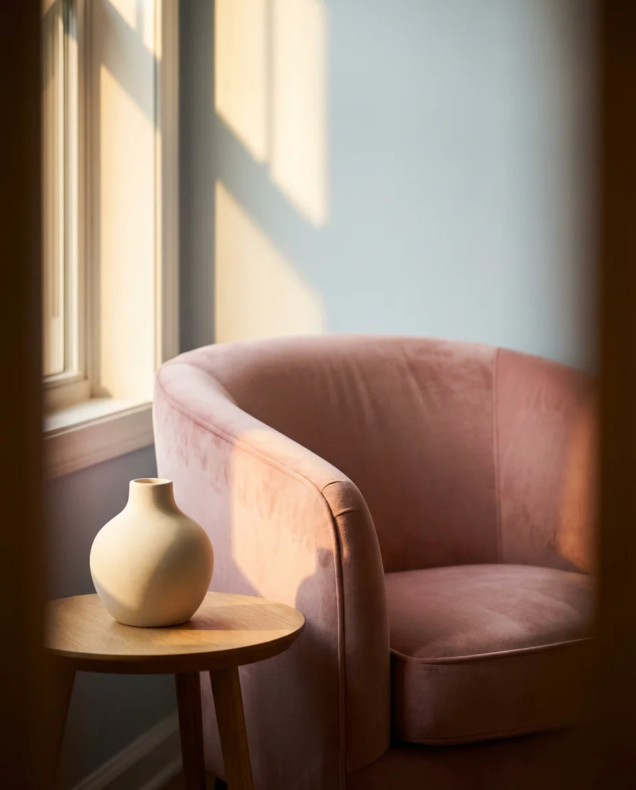
The key to keeping pink and blue from feeling juvenile is to use muted, complex versions of both colors—dusty rose rather than bubblegum and steel blue rather than baby blue. Mature, slightly greyed-down tones carry the combination into adult territory convincingly. Add sculptural elements like a smooth plaster vase, a reeded glass coffee table, or a curved velvet accent chair to reinforce the grown-up intention. Those three-dimensional forms give the room structure that keeps the soft color palette from floating away into sweet but insubstantial territory.
17. Color-Blocked Blue Walls and Ceiling
One of the most talked-about living room trends right now is painting not just the walls but extending color up onto the ceiling as well—creating an immersive, enveloping effect that feels genuinely architectural. In blue, this technique is especially effective: a mid-tone dusty blue that wraps walls and ceiling creates a sky-like canopy that makes any furniture placed below it feel significant and intentional. It’s a designer trick that completely changes the spatial experience of a room without touching a single piece of furniture.
This approach works in rooms of almost any size, but it is particularly transformative in spaces with lower ceilings that might otherwise feel slightly oppressive. Rather than fighting the height with bright white ceilings, embracing it with color—and making the ceiling intentionally part of the palette—turns the potential weakness into a strength. Use the same color on trim and molding to fully commit to the wraparound effect, or use the ceiling shade one tone lighter for a subtle delineation. Either approach reads as deliberate and confident.
18. Gray and Blue Sophisticated Modern Loft
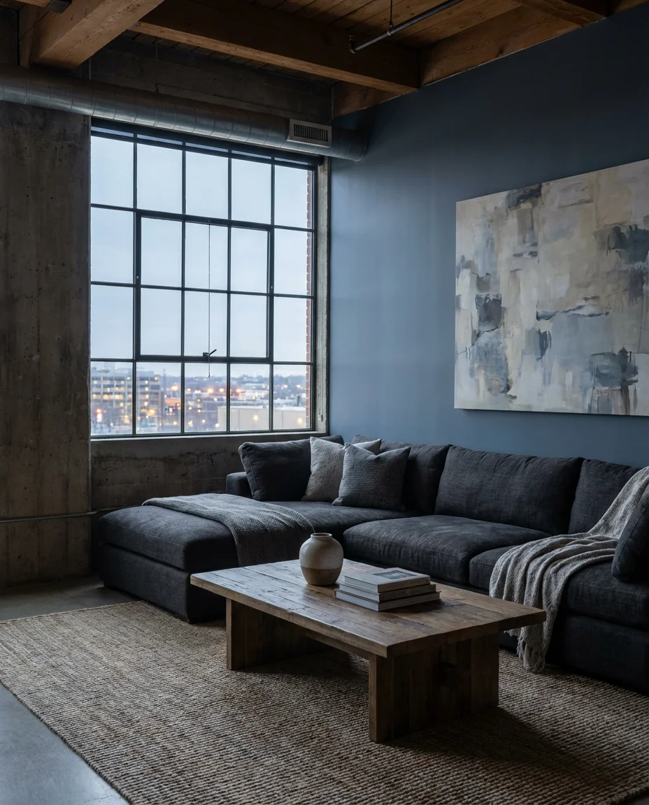
In a modern loft setting, gray and blue create a palette that feels genuinely urban and sophisticated. Exposed concrete, steel-frame windows, and high ceilings provide the architectural backdrop; within that, a deep charcoal sectional against a slate blue feature wall delivers the kind of composed restraint that loft living is known for. Add in industrial-style lighting fixtures, abstract wall art, and a single large organic element—a live-edge table or a sculptural tree branch—to soften the industrial edges. The result is a room that feels both raw and refined.
This palette is well-suited to cities with strong loft cultures—Chicago, Detroit, Brooklyn, and Portland—where converted warehouses and factories have become some of the most sought-after living spaces. The gray and blue combination complements the existing materials without trying to disguise the building’s industrial origins. Instead of fighting the concrete and steel, the palette leans into them, treating raw materials as a design feature rather than a liability. This is fundamentally honest design—and in 2026, that kind of authenticity is exactly what draws people to these spaces.
19. Taupe and Blue Warm Modern Farmhouse
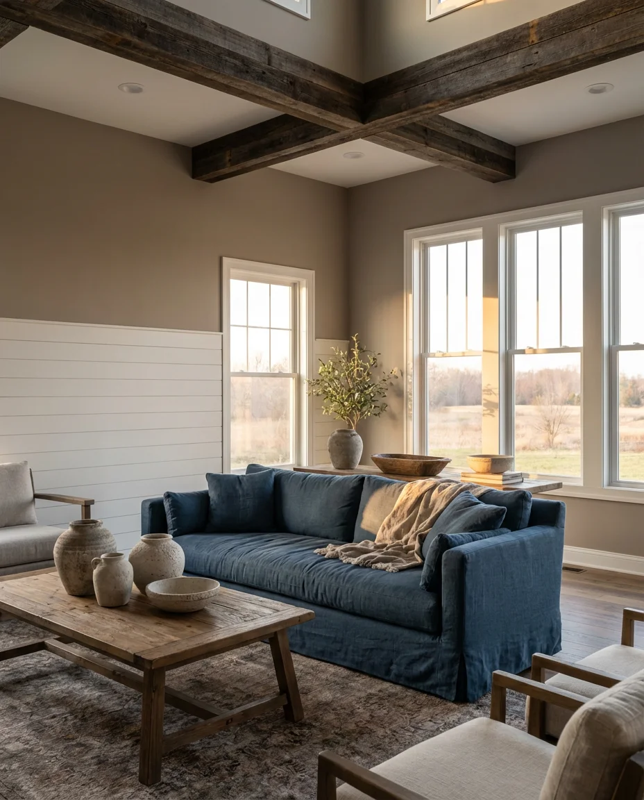
Taupe and blue are having a genuine revival in modern farmhouse interiors—offering a warmer, more grounded alternative to the all-white aesthetic that dominated the previous decade. Warm taupe walls and blue accents in the form of linen upholstery, ceramic accessories, or a painted piece of furniture strike the ideal balance between welcoming and current. Add reclaimed wood beams, shiplap detailing, and vintage-inspired hardware to reinforce the farmhouse feeling, and you have a living room that feels both rooted and fresh. It’s a deeply livable palette.
This look resonates particularly strongly in the American Midwest and South, where warm, hospitable interiors are part of a genuine cultural identity. Homeowners in these regions often gravitate toward palettes that feel comfortable and established rather than cutting-edge and transient. Taupe and blue delivers on both counts—it’s approachable and warm like a farmhouse should be, but it has the visual refinement to feel intentional rather than accidental. It’s a palette that invites people to sit down and stay a while, which is the ultimate compliment for any living room.
20. Yellow and Blue Cheerful Retro Energy
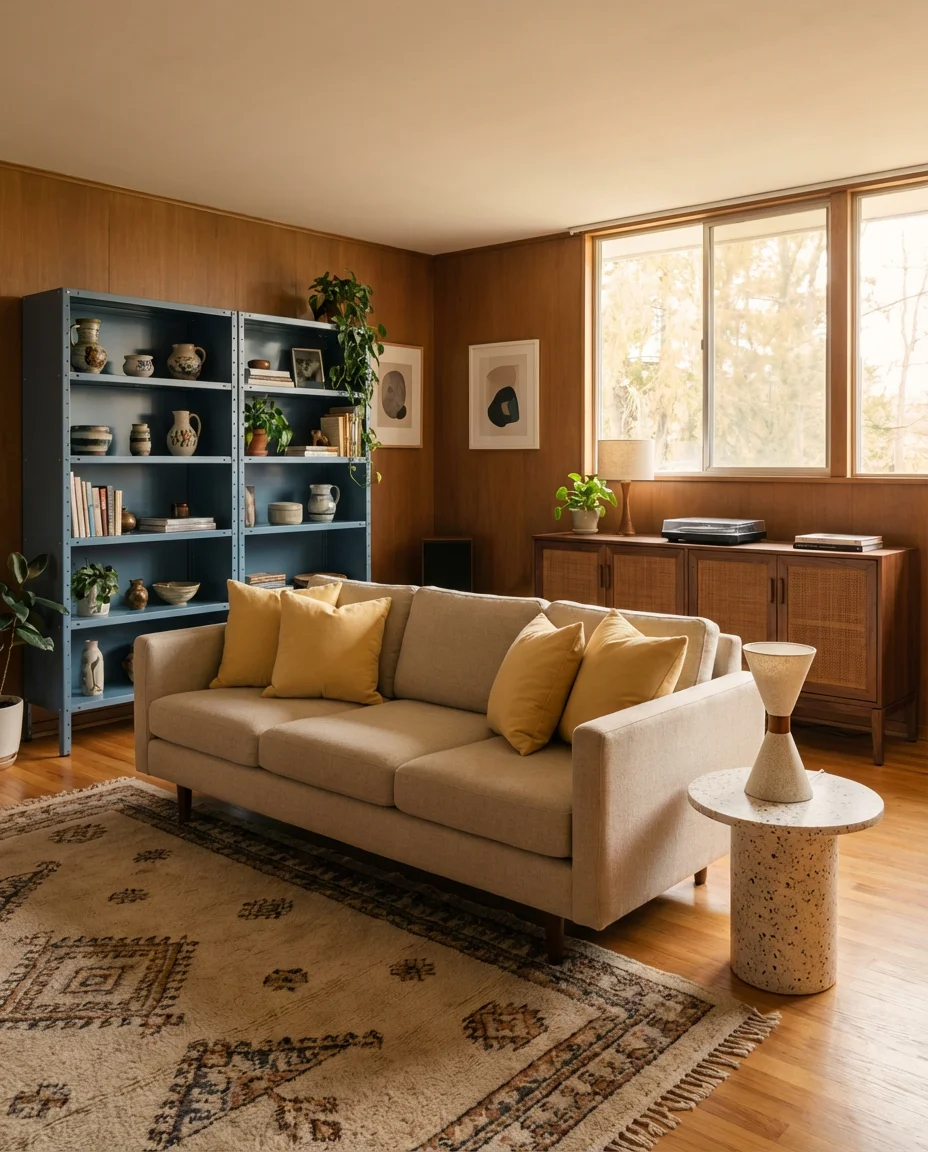
Yellow and blue together carry an irresistible retro optimism—they’re the colors of a summer afternoon, of vintage ceramics, of mid-century textiles that still look extraordinary today. In a living room, the combination can range from the vivid and playful (primary yellow sofa, cobalt blue wall) to the sophisticated and muted (pale butter yellow cushions, deep steel blue shelving). The retro energy is there regardless of which end of the spectrum you work from—it’s in the combination itself, which has a warmth and vitality that neutrals simply cannot replicate.
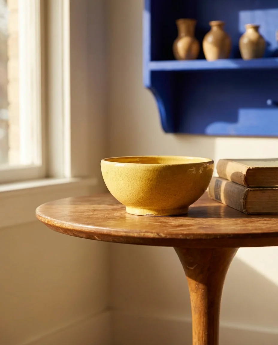
For a sophisticated take, ground the yellow and blue combination with dark walnut furniture and terrazzo accents—materials that carry mid-century associations and help the palette feel curated rather than casual. A single statement piece, like a vintage tulip table or an Eames-style lounge chair, can do enormous work in reinforcing the retro reference. You don’t need to go full period room to evoke an era; often one or two well-chosen vintage or vintage-inspired pieces are enough to set the tone, and everything else can be more contemporary.
21. Red and Blue Heritage Living Room
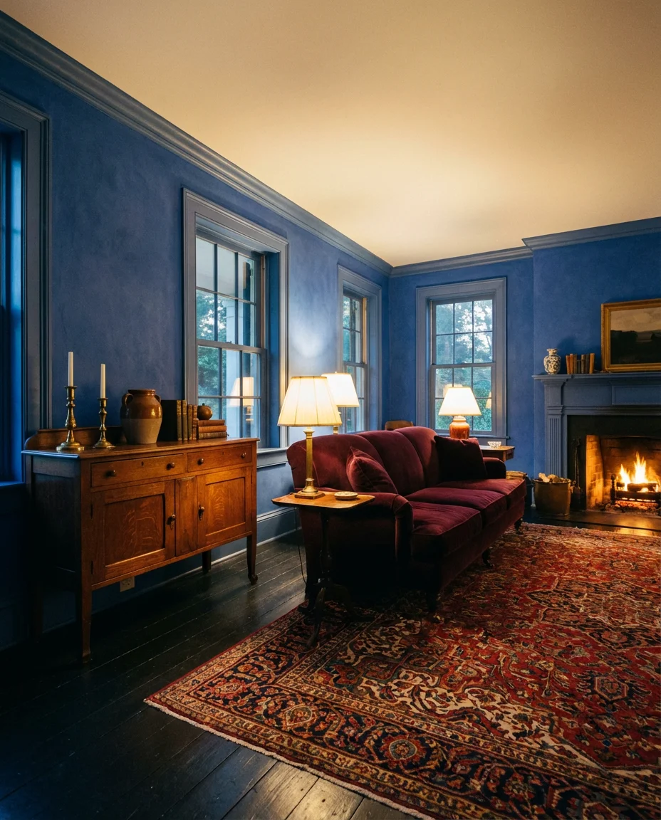
The red and blue combination has a long and distinguished history in American interiors—from the Federalist parlors of early New England to the bold, patriotic color statements of mid-century decorators. In a contemporary living room, this heritage palette finds new expression in deep burgundy velvets, cobalt blue ceramics, Americana antiques, and richly patterned rugs in both tones. It’s a combination that carries genuine historical weight, and in 2026, that sense of depth and provenance is precisely what makes it feel relevant rather than dated.
The key to working with red and blue in a modern context is restraint—not using them in equal measure, but letting one dominate and the other provide punctuation. A predominantly blue room with red accent cushions and a red-toned rug will feel richer and more intentional than a fifty-fifty split that can veer toward flag decoration. Let the blue do the heavy lifting on walls or large upholstery, and deploy the red in smaller, jewel-like moments. That hierarchy is what separates a heritage-inspired room from one that accidentally looks like a campaign headquarters.
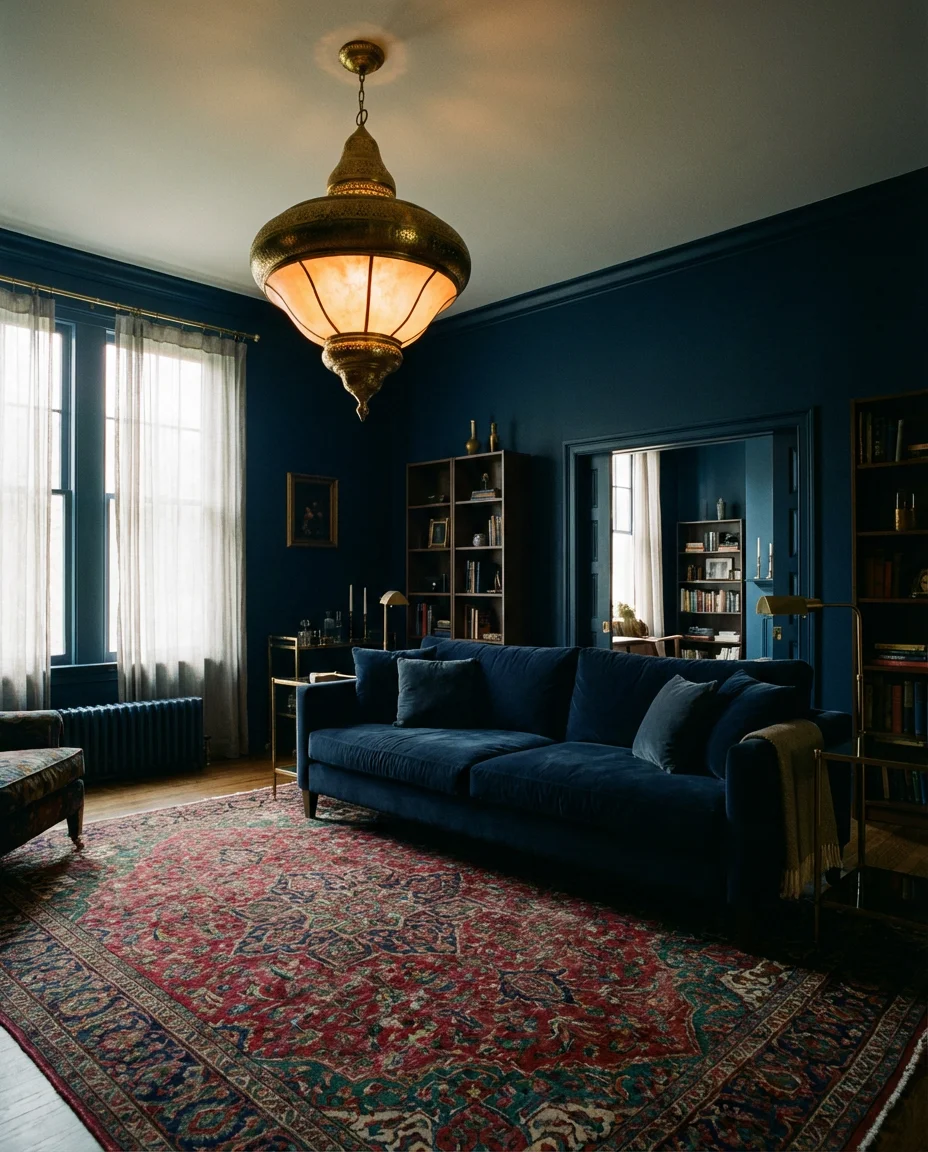
22. Navy and Brass Glamorous Living Room
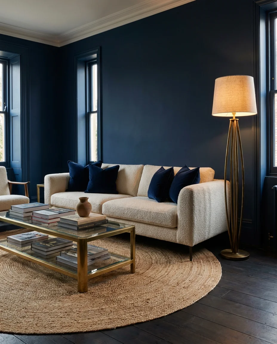
Few combinations in interior design feel more effortlessly glamorous than navy and brass. The contrast between the cool, inky depth of navy blue and the warm, lustrous glint of antique brass or satin gold is one that decorators return to again and again—because it simply always works. Picture deep navy walls, a brass and glass coffee table, a cream bouclé sofa with navy velvet cushions, and a sculptural brass floor lamp in the corner. The room glows. It has an evening-wear quality, an occasion-dressing energy that makes even an ordinary Tuesday feel slightly special.
What makes this combination so durable is how well it ages. Unlike silver or chrome, brass develops a patina that only makes it more beautiful over time—and navy is a color that never goes out of fashion, only cycles in and out of peak popularity. Investing in quality brass hardware, lighting, and accessories for a navy room is a genuinely sound long-term design decision. A brass pendant light, a set of solid brass cabinet handles, and a well-made brass-framed mirror—these are objects that will still be beautiful in twenty years. That kind of longevity is worth paying for.
Conclusion
Blue living rooms are endlessly adaptable—from barely-there sky tones to the deepest, most dramatic navies, there’s a shade and a style for every home and every personality. Whether one of these 22 ideas speaks to you exactly as shown or sparks something entirely your own, the most important thing is to choose a direction that genuinely excites you. Drop your questions, your own blue living room photos, or your favorite idea from this list in the comments—we’d love to see what you’re planning and where you take it.