As we move into 2026, bedroom color schemes are embracing a mix of grounded earthiness and quiet sophistication. Americans are searching for palettes that feel both restful and intentional—colors that help create a retreat from the noise of daily life. Pinterest boards are overflowing with searches for shades that range from deep forest hues to soft neutral layers, reflecting a desire for bedrooms that feel personal, layered, and undeniably cozy. Whether you’re refreshing a guest room or rethinking your own sleep sanctuary, this guide covers bedroom color ideas that balance trend-forward style with timeless comfort. You’ll find options for every mood, from bold and moody to calm and collected.
1. Mauve and Cream Elegance
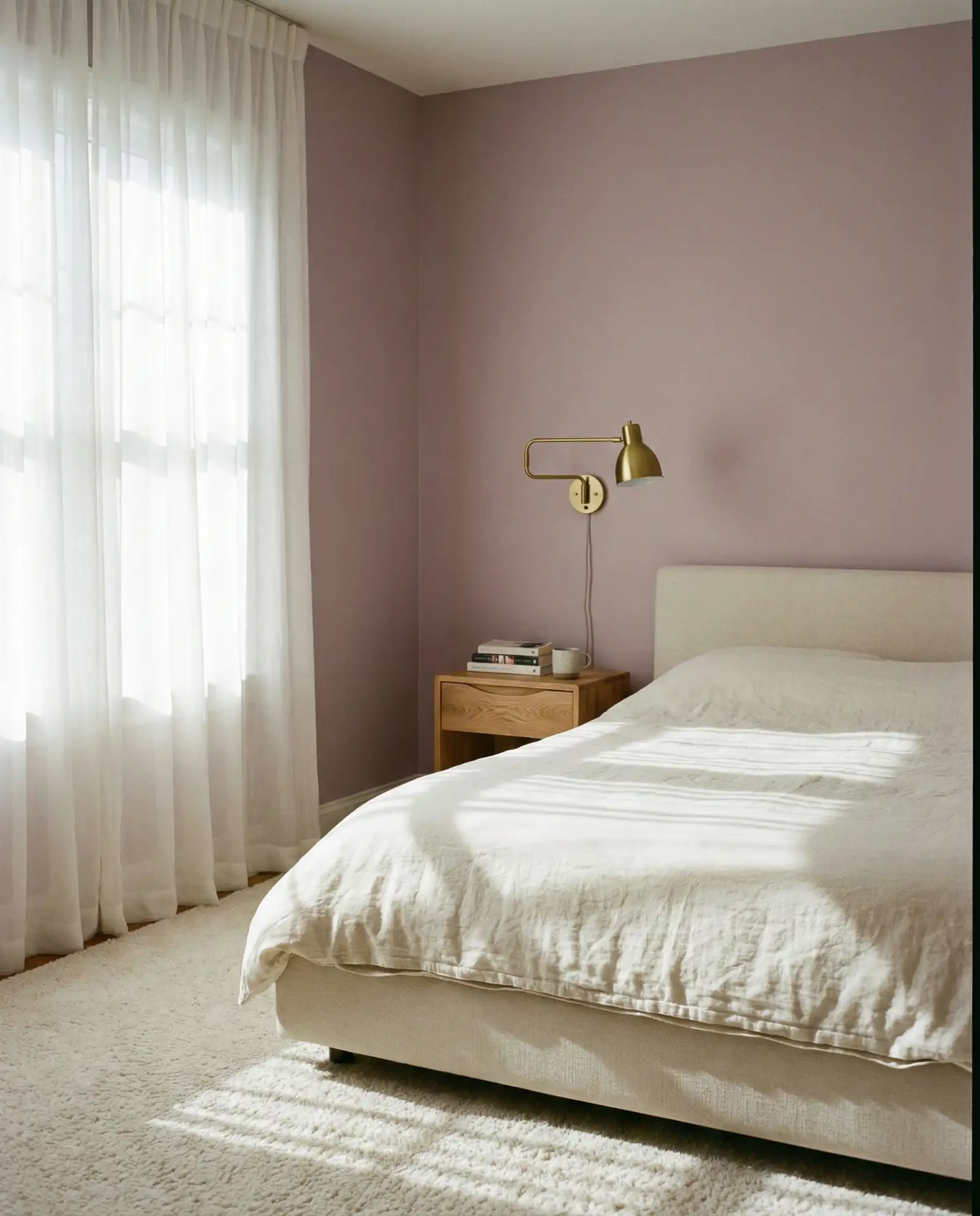
Soft mauve walls paired with cream bedding create a bedroom that feels both modern and quietly romantic. This palette works beautifully in spaces with ample natural light, where the mauve reads as warm rather than overly purple. It’s a versatile choice for couples who want something more interesting than beige but still deeply relaxing. Layer in linen textures and matte brass hardware to keep the look grounded and sophisticated.
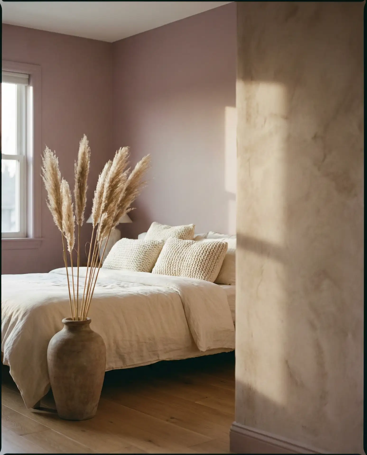
This scheme works best in suburban homes and condos where soft color is welcome, but overly bold choices feel risky. Mauve has staying power—it’s been quietly gaining traction for years and shows no sign of fading. Pair it with warm wood tones and avoid cooler grays, which can make the space feel disconnected. A common mistake is choosing a mauve that’s too pink or too gray; test samples in your room’s specific light before committing.
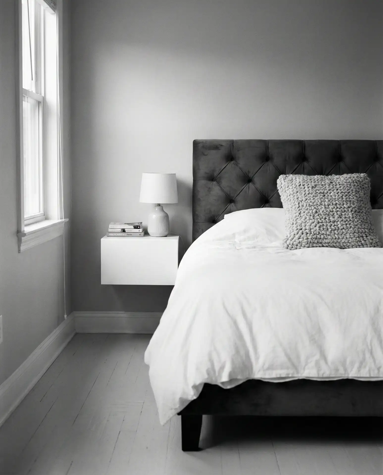
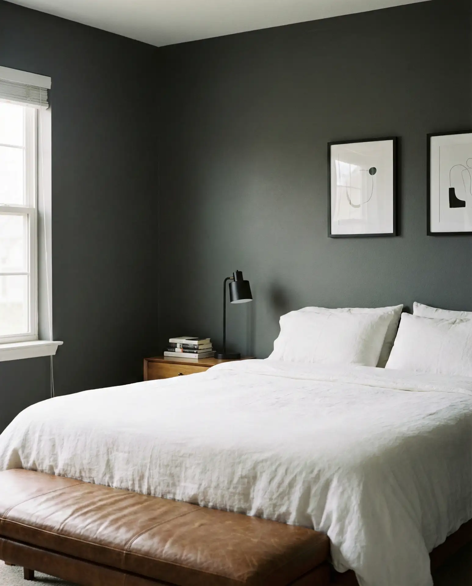
2. Charcoal Walls with a Grey Headboard
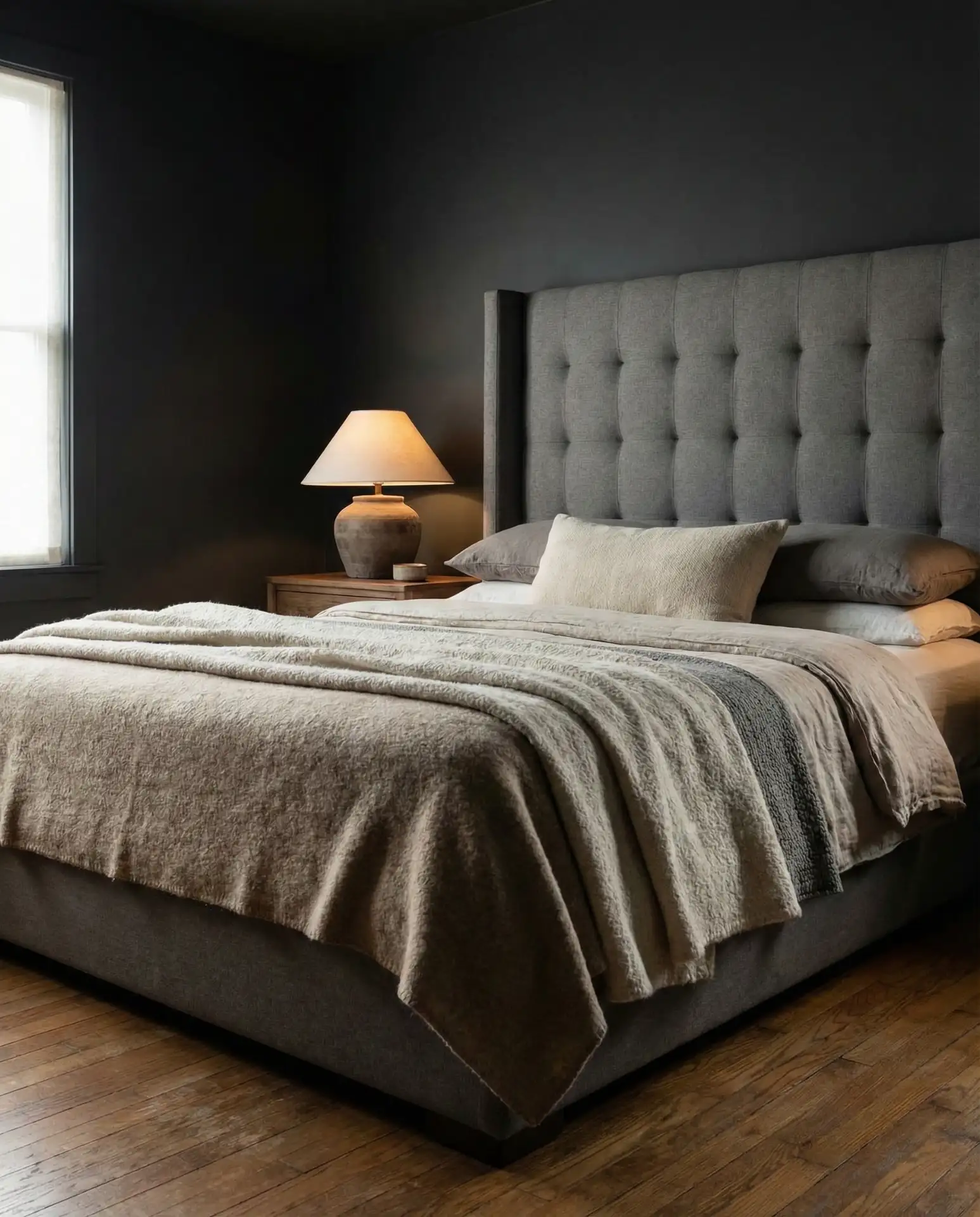
Deep charcoal walls bring instant drama, especially when anchored by a plush grey headboard in a lighter tone. This setup creates tonal depth without relying on contrast, making the room feel enveloping rather than stark. It’s a favorite among design-forward homeowners who want a classy, hotel-inspired bedroom. The key is balancing the dark walls with plenty of texture—velvet, bouclé, or linen all work beautifully here.
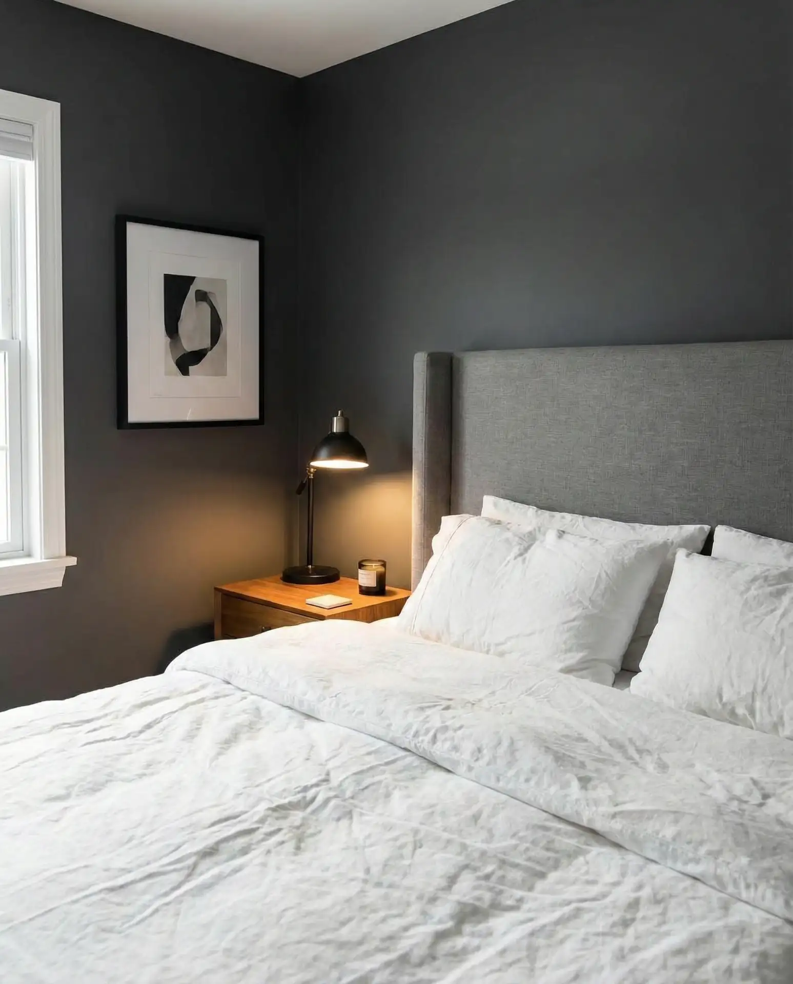
A designer once told me that dark bedrooms feel smaller only if you skimp on lighting. Layer in multiple light sources—bedside lamps, a pendant, even LED strips behind the headboard—to keep the space from feeling cave-like. Charcoal also hides imperfections better than lighter shades, a practical benefit in older homes. Skip the temptation to add too many accent colors; this palette thrives on restraint and tonal harmony.
3. Teal Accent Wall with Warm Oak
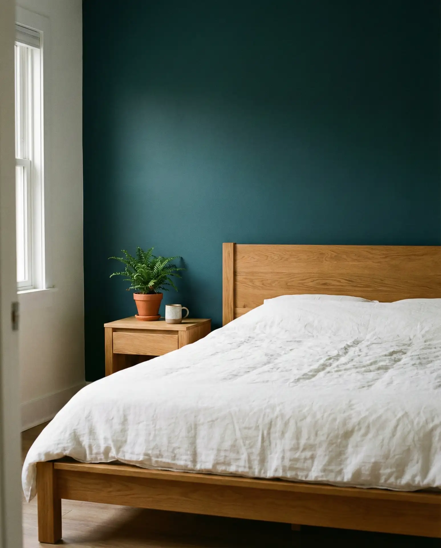
A single teal accent wall paired with warm oak furniture brings life to a neutral bedroom without overwhelming it. This approach is especially popular in the Pacific Northwest and New England, where homeowners gravitate toward colors that echo water and forest. Keep the remaining walls in soft white or warm gray to let the teal breathe. The oak adds a grounding, organic element that prevents the teal from feeling too cool or sterile.
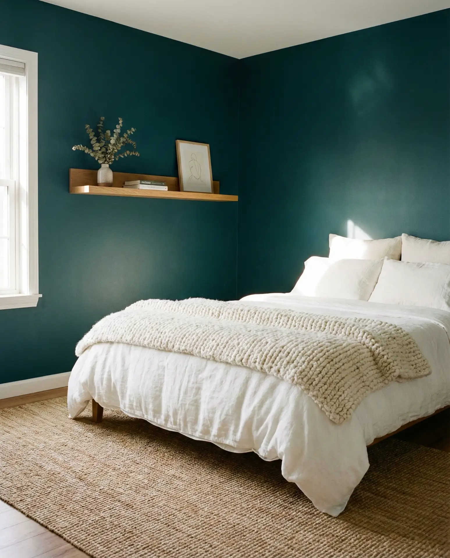
This palette works best in bedrooms with good natural light, where the teal can shift in tone throughout the day. In darker rooms, opt for a lighter teal or risk the space feeling too enclosed. Budget-conscious decorators love this approach because you only need to paint one wall, saving both time and money. Pair with brass or matte black hardware to give the scheme a polished, intentional finish.
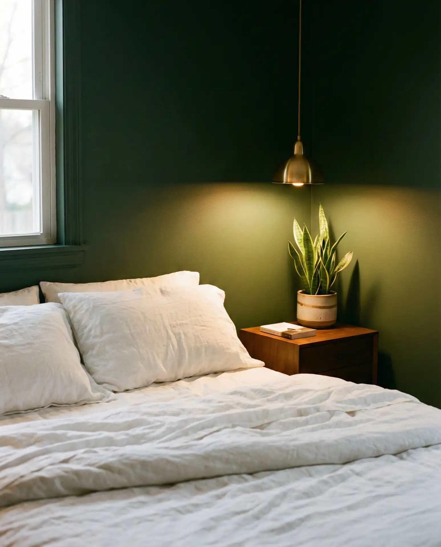
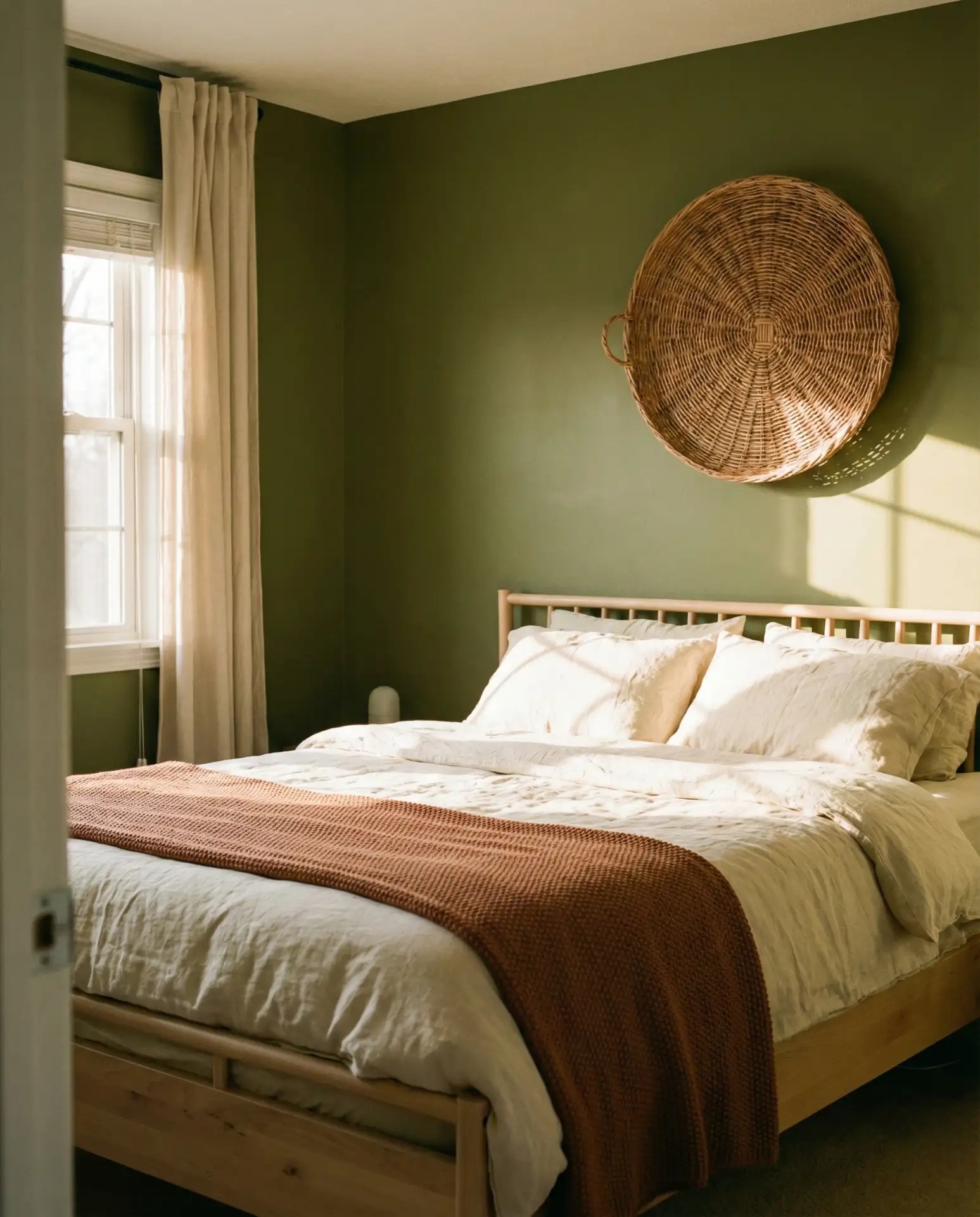
4. Olive Green Serenity
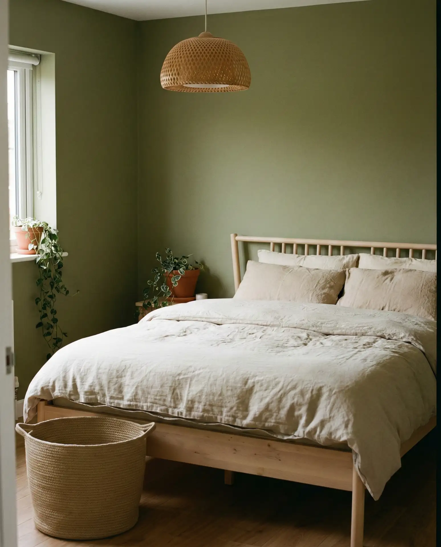
Olive green has become one of the most searched bedroom colors on Pinterest, and for good reason—it’s earthy, versatile, and surprisingly cozy. Unlike brighter greens, olive feels grounded and works across seasons. It pairs beautifully with natural materials like rattan, linen, and unfinished wood. This shade is particularly effective in bedrooms that lack strong architectural features, as it adds instant character and warmth.
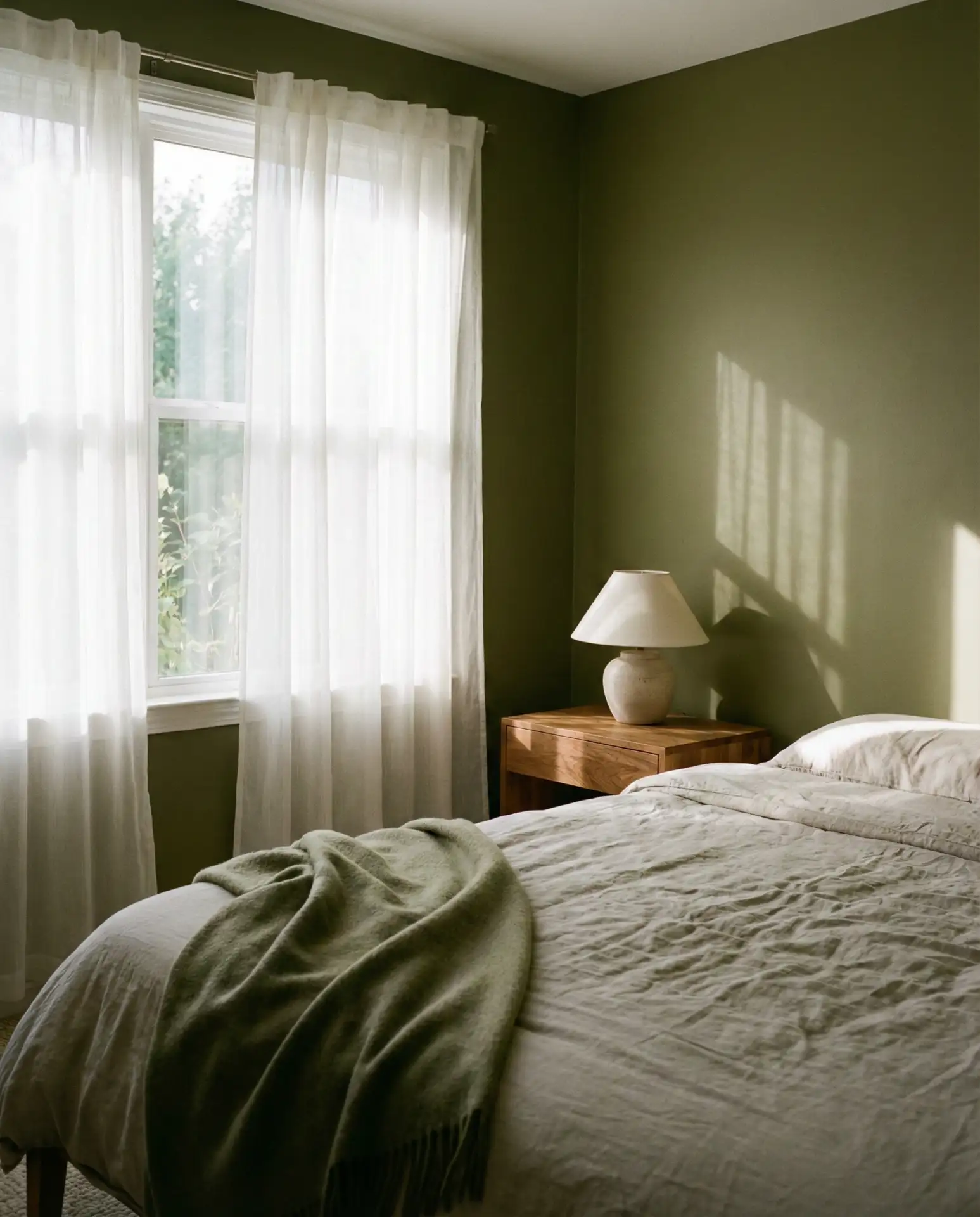
Olive green works beautifully in both urban apartments and rural farmhouses, making it one of the most adaptable colors of 2026. In the Midwest and South, homeowners are using it to bring a touch of the outdoors inside, especially in homes surrounded by greenery. A practical insight: Olive shows fewer scuffs and marks than lighter neutrals, making it ideal for high-use guest bedrooms. Avoid pairing it with cool grays, which can make the green look muddy.
5. Black Headboard Statement
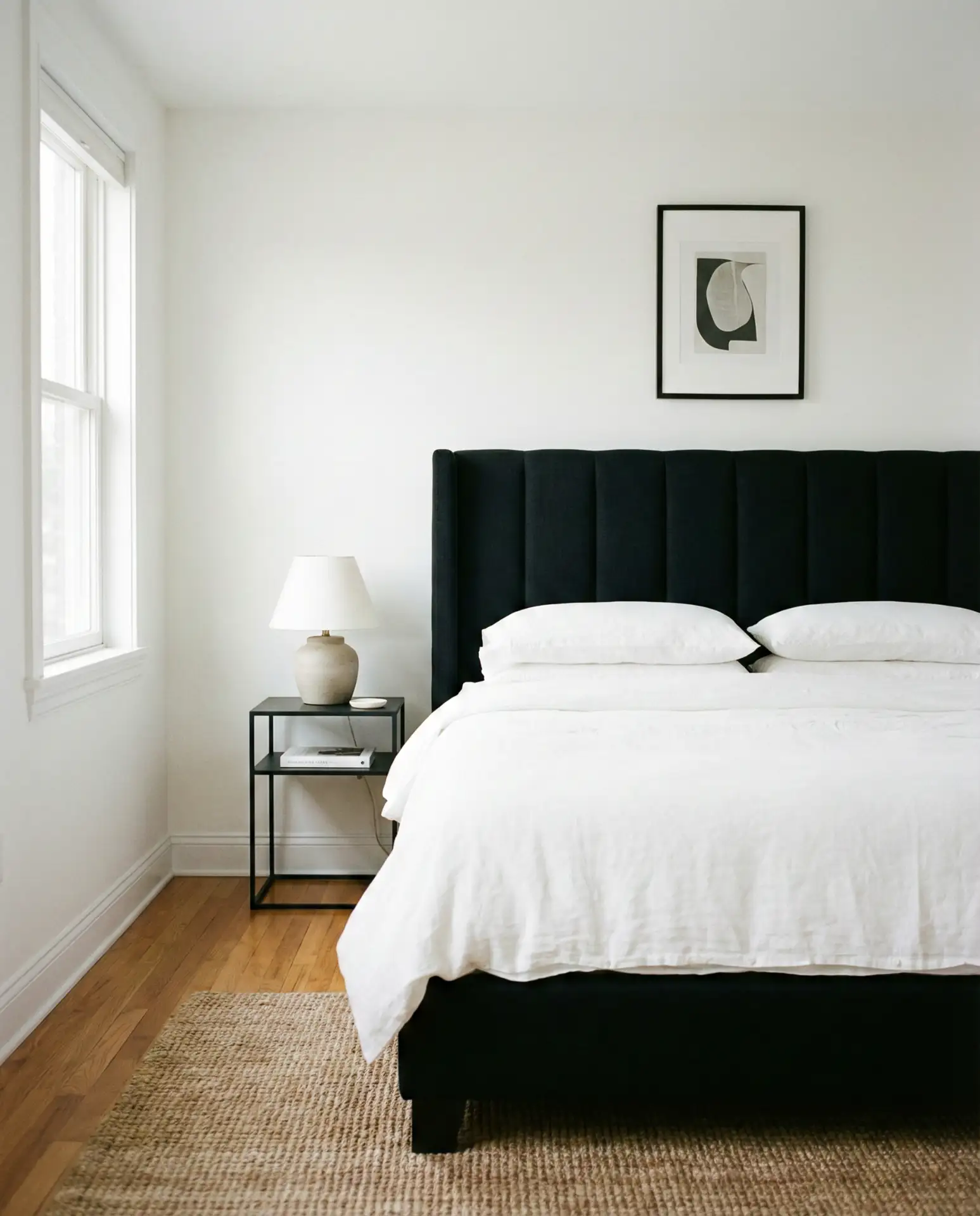
A bold black headboard—whether upholstered, painted wood, or metal—anchors a bedroom with confidence. This works especially well in spaces with white or light beige walls, where the contrast feels intentional rather than harsh. The black adds weight and definition, making even a simple bed feel like a design focal point. It’s a go-to choice for men who want a masculine yet refined aesthetic without feeling overly decorated.
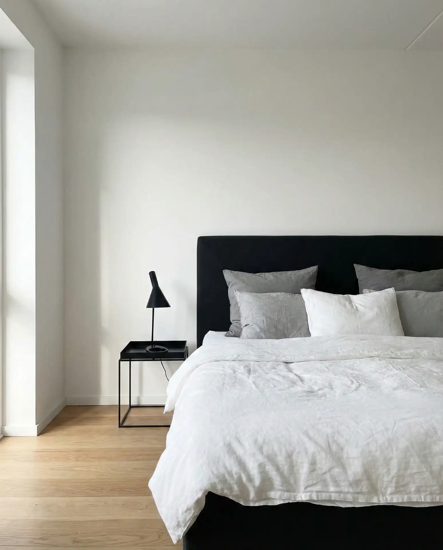
One homeowner I know swapped out a beige fabric headboard for a matte black one and said it completely changed the room’s energy—it suddenly felt more intentional and less generic. This approach is budget-friendly because the headboard does all the heavy lifting; you don’t need bold wall color or expensive art. A common mistake is making the rest of the room too dark; balance the black with plenty of whites, creams, and natural textures to keep the space from feeling heavy.
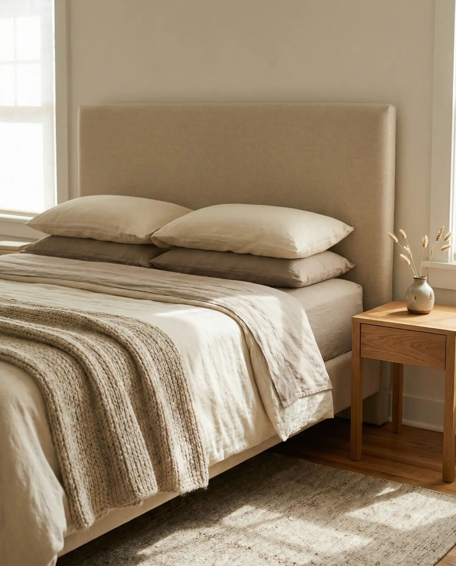
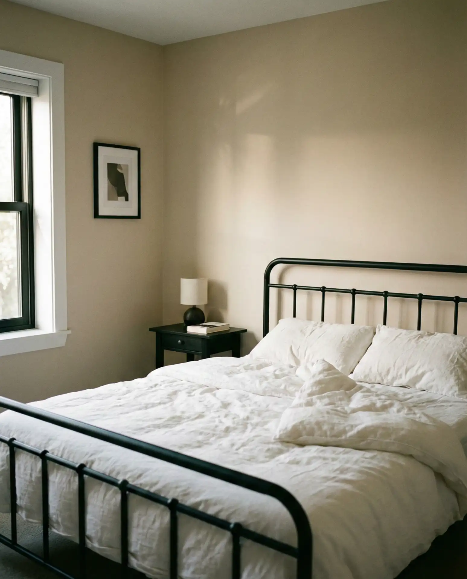
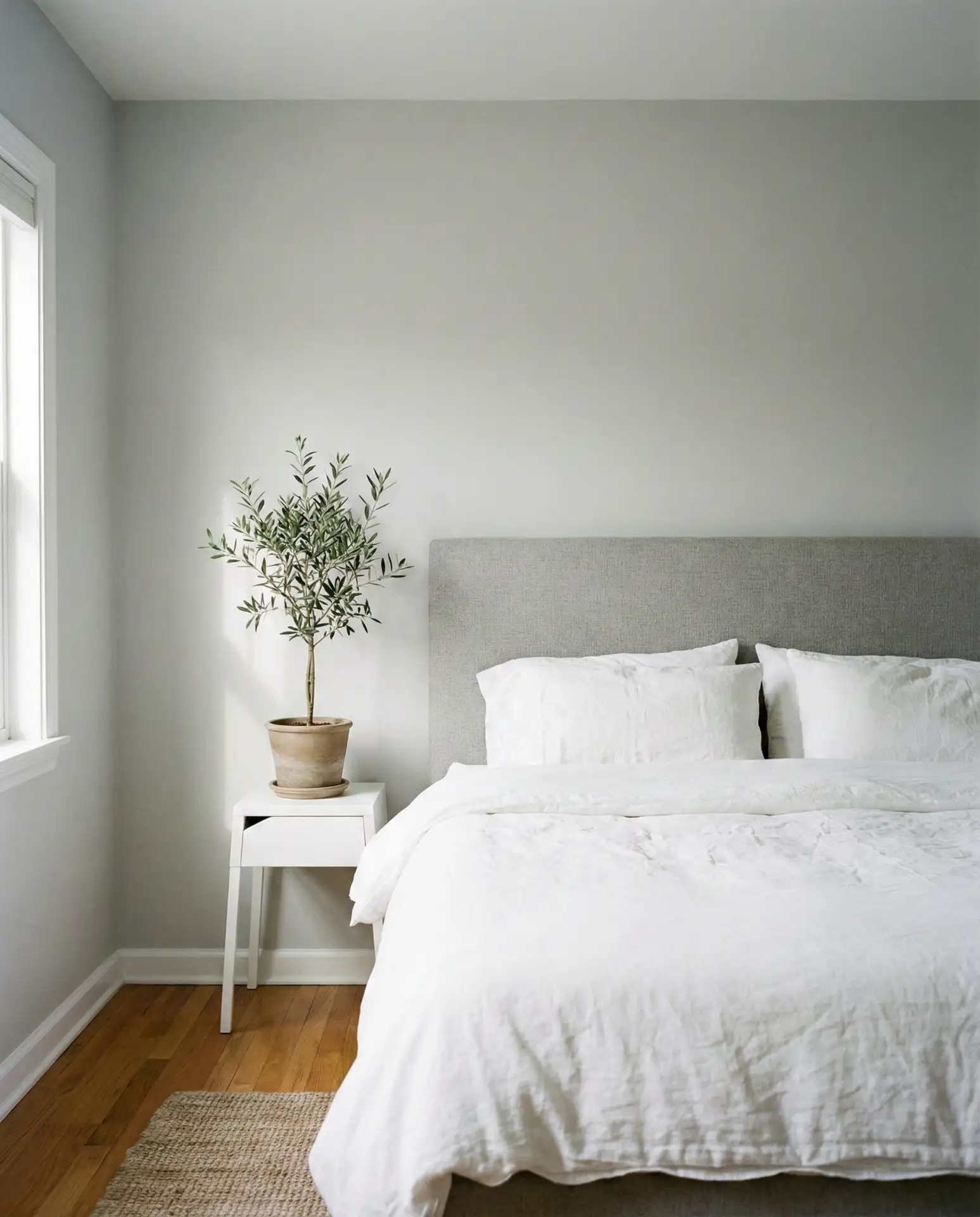
6. Beige Headboard with Layered Neutrals
A soft beige headboard creates the perfect foundation for a cozy neutral bedroom that never feels boring. The key is layering—mix linen, cotton, wool, and even faux fur to add depth and interest. This palette is endlessly flexible, working in everything from minimalist lofts to traditional Colonial homes. It’s also one of the most searched color schemes among couples looking for a space that feels calm and mutually agreeable.
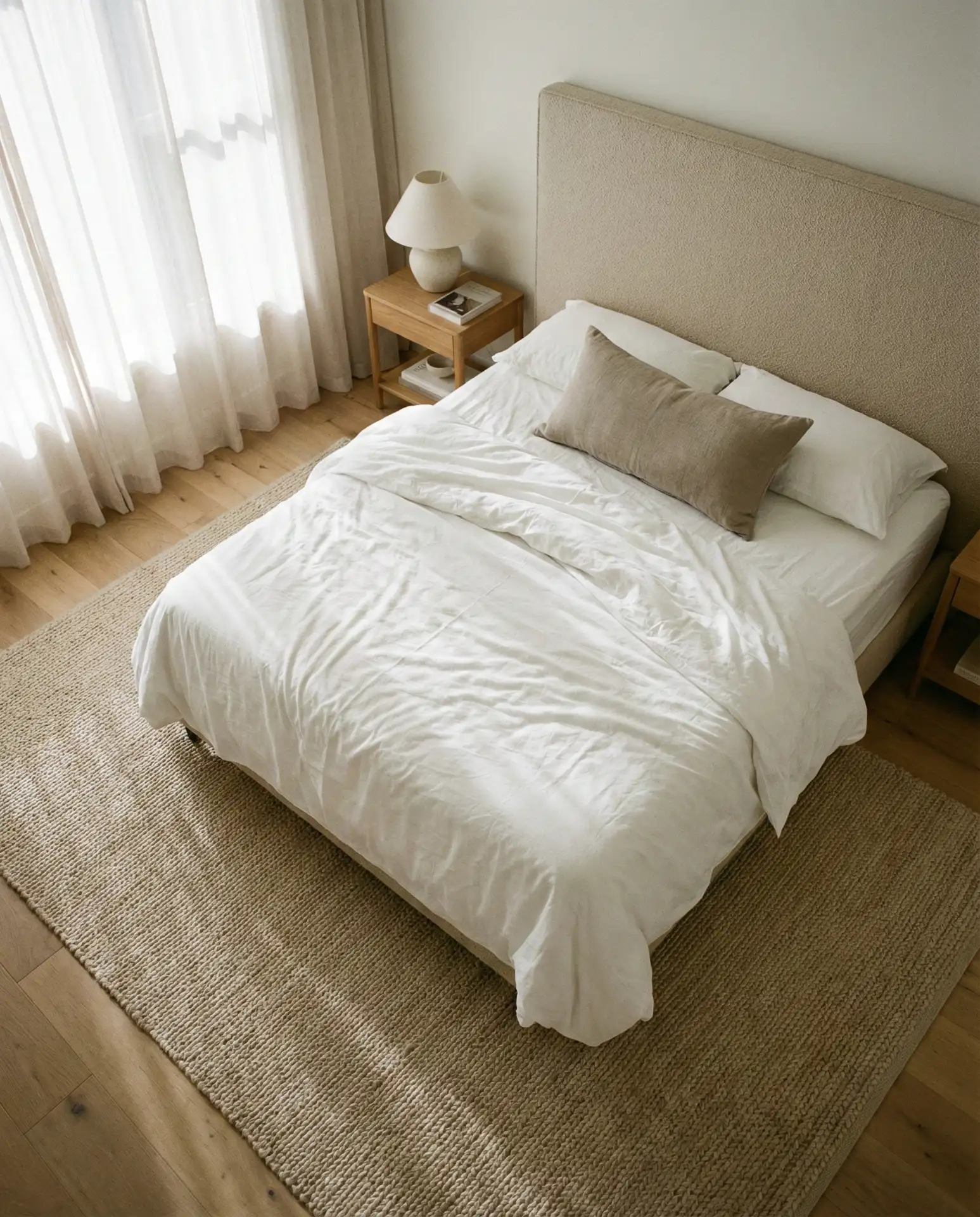
This scheme works best in bedrooms where natural light is abundant, as the layered neutrals can appear flat in dim spaces. In the Southwest, homeowners are pairing beige with warmer terracottas and sandy tones for a regional twist. The beauty of this palette is its longevity—it won’t feel dated in five years. To avoid a washed-out look, vary the tones and textures; a flat beige room reads as bland, but a layered one feels sophisticated and inviting.
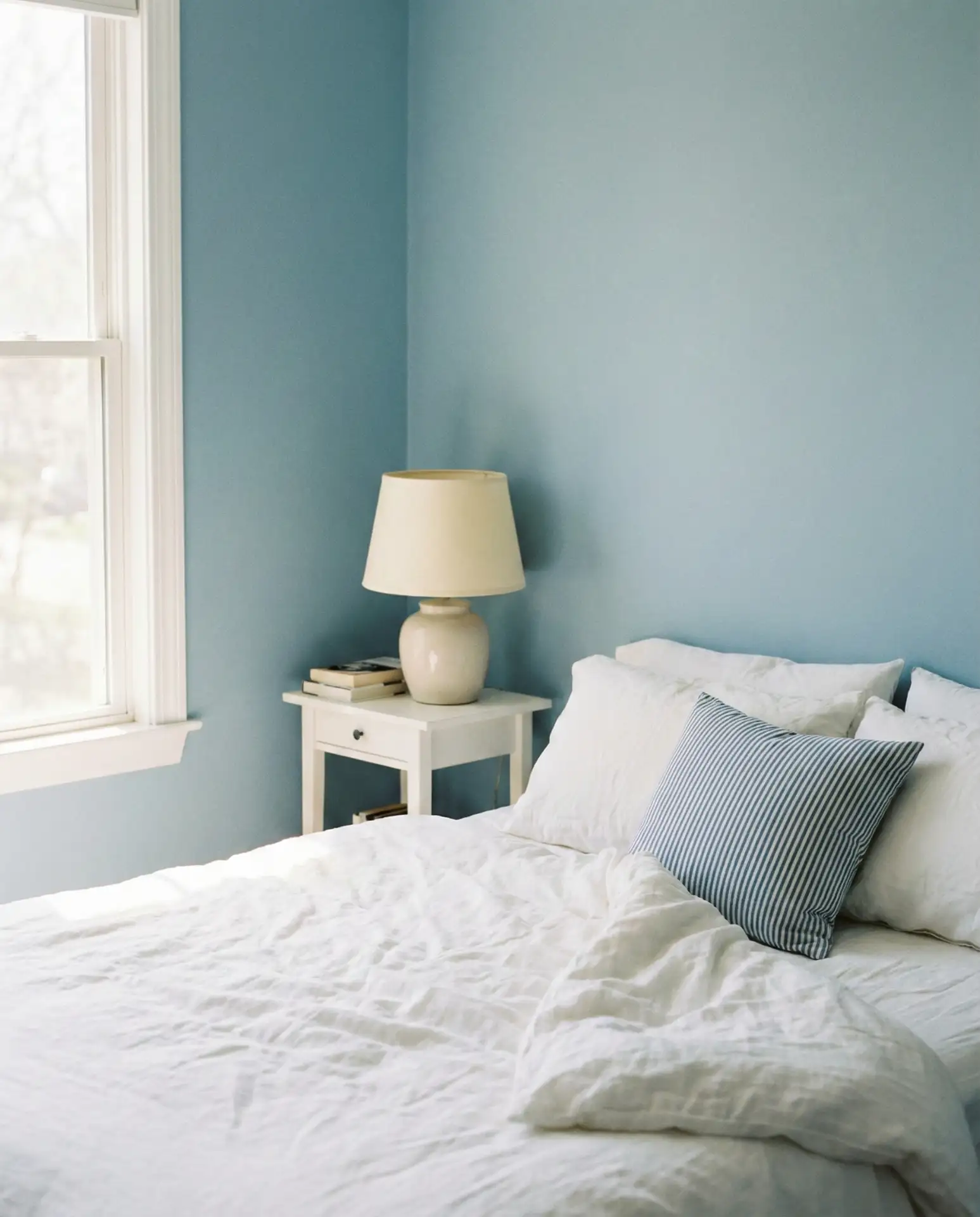
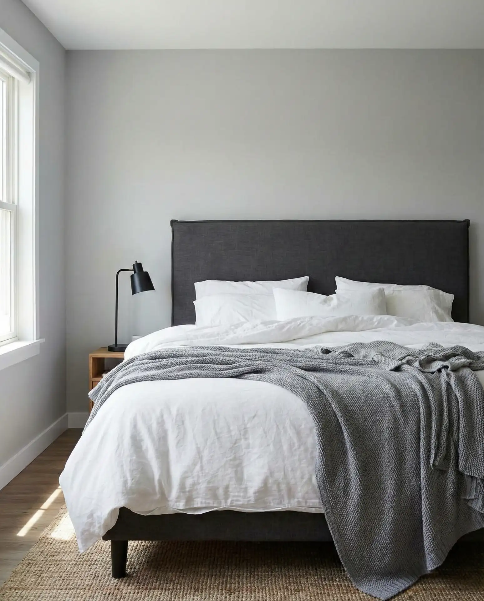
7. Gray Headboard with Soft Blue Accents
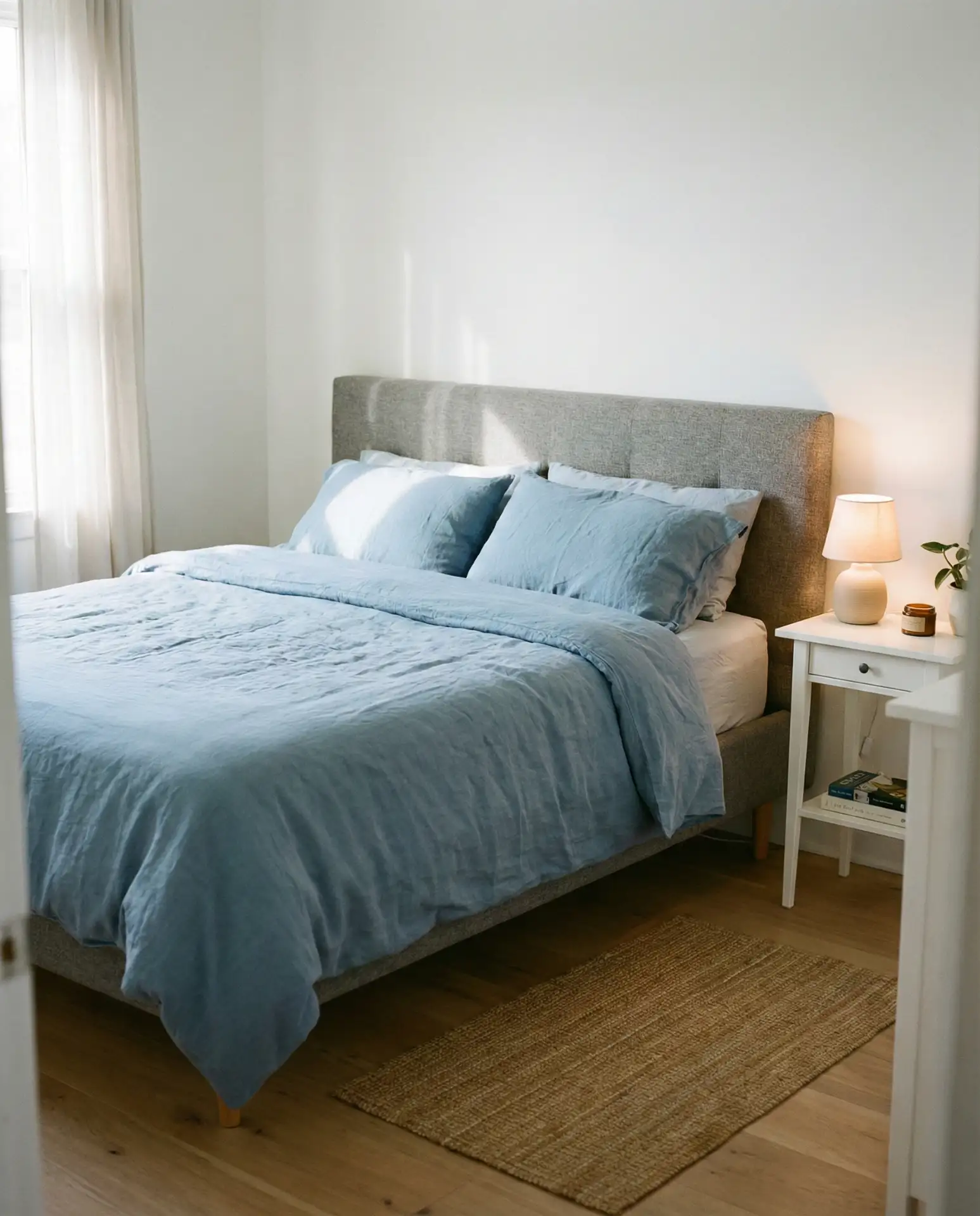
A mid-tone gray headboard paired with soft blue bedding creates a relaxing bedroom that feels cool without being cold. This combination is particularly popular in coastal regions and suburban homes where a serene, spa-like atmosphere is the goal. The gray acts as a neutral anchor, while the blue adds just enough color to keep things interesting. Keep the walls white or pale gray to let the headboard and bedding take center stage.
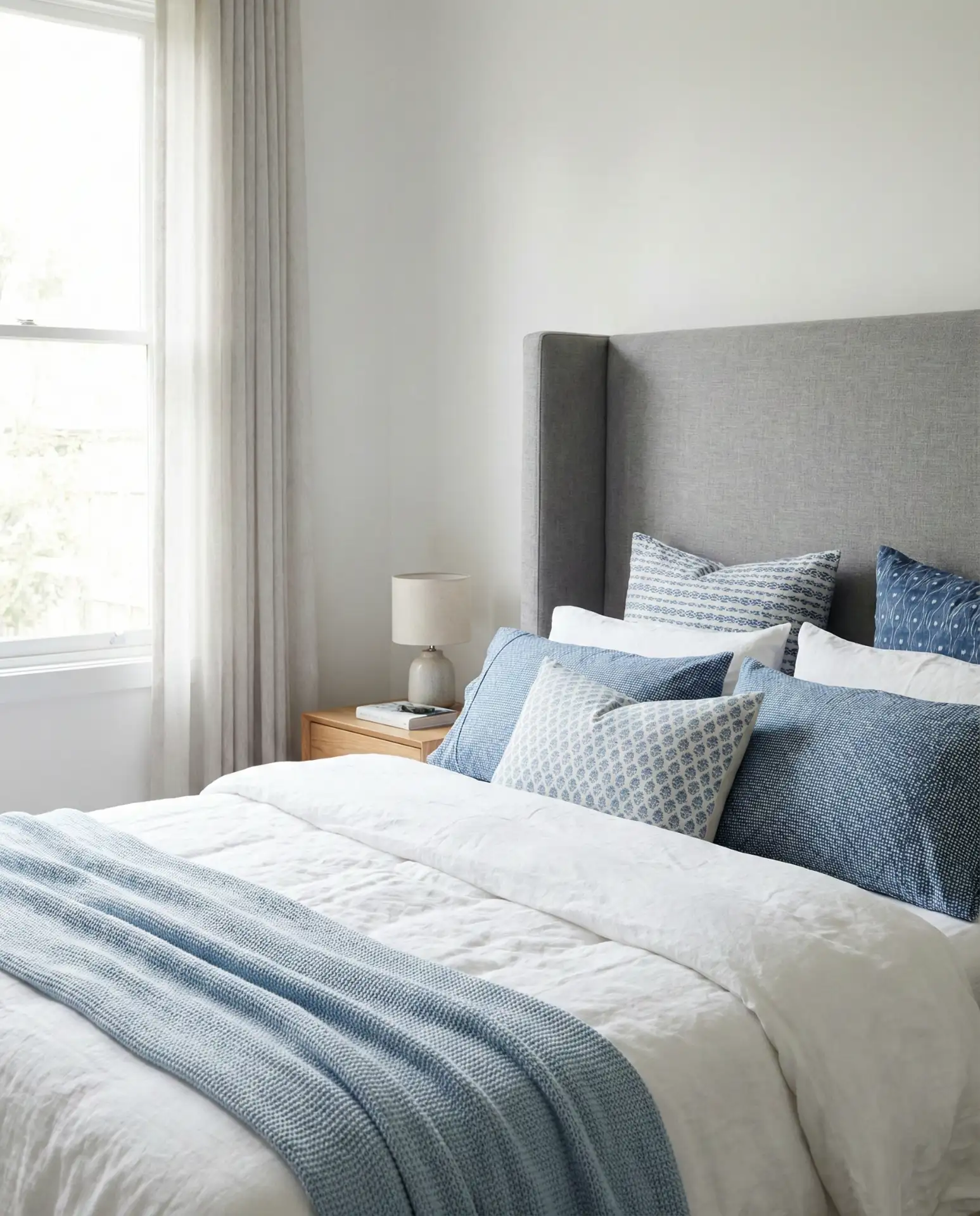
This palette is ideal for guest bedrooms, where the goal is to create a universally appealing, calming space. One common mistake is choosing a blue that’s too saturated—stick to dusty, muted blues rather than bright or primary tones. In homes with northern light, this combination can feel cooler than intended; balance it with warm wood tones and soft lighting. A designer trick: use blue only in textiles, not on walls, to keep the room from feeling too themed.
8. Farrow and Ball Inspired Depth
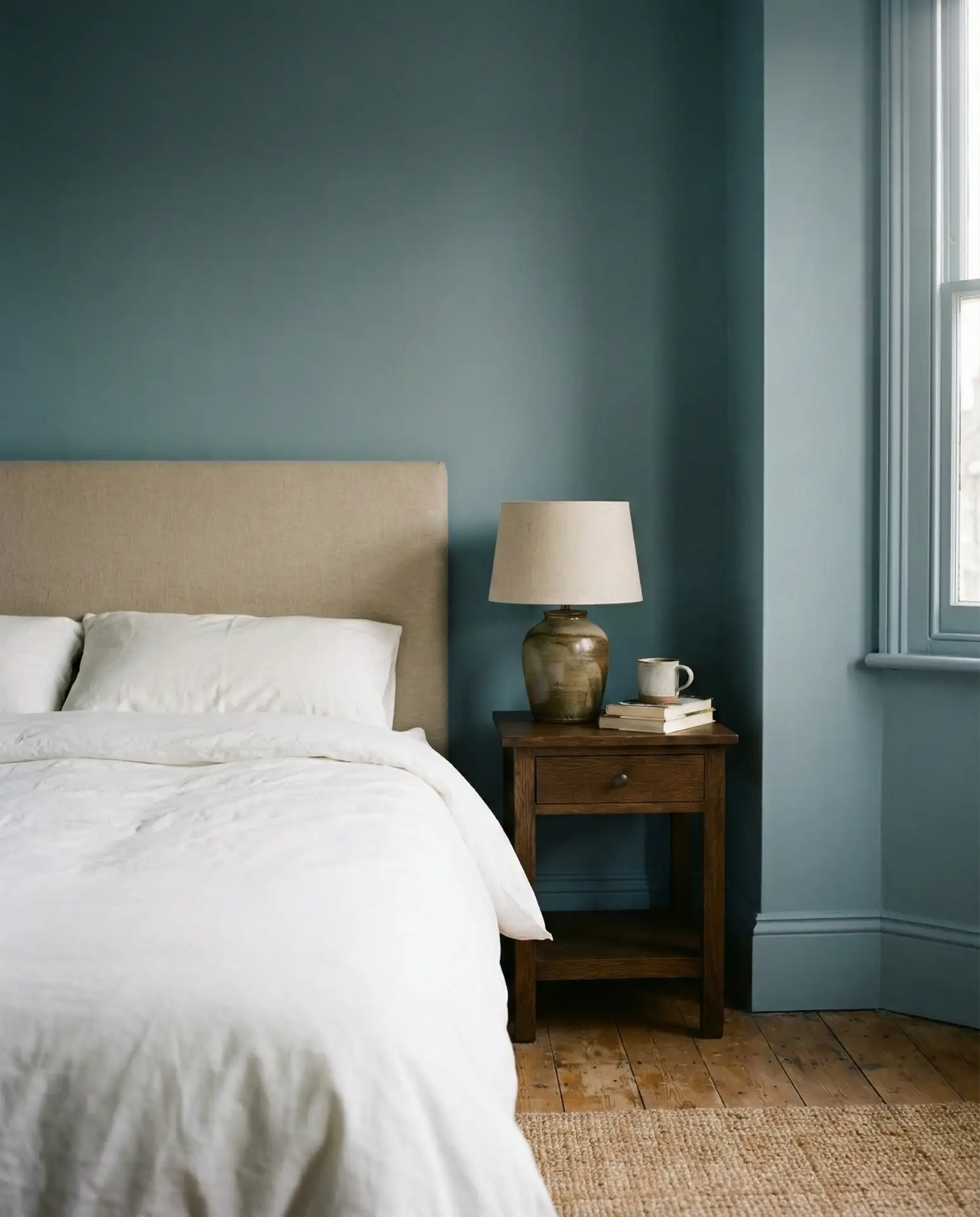
Rich, complex colors in the style of Farrow & Ball bring a level of sophistication that flat paints simply can’t match. Think deep grays with green undertones, dusty blues, or muted terracottas. These shades change throughout the day, revealing different depths and moods. This approach is favored by homeowners who want a classy, curated look that feels European in its restraint and elegance.
This color philosophy works best in homes with good bones—crown molding, tall ceilings, or large windows—where the paint color can truly shine. In older East Coast homes, these complex hues enhance architectural details rather than compete with them. While Farrow and Ball paints are premium-priced, many American brands now offer similar complex tones at lower price points. Avoid pairing these colors with stark white trim; opt for off-whites or creams to maintain tonal harmony.
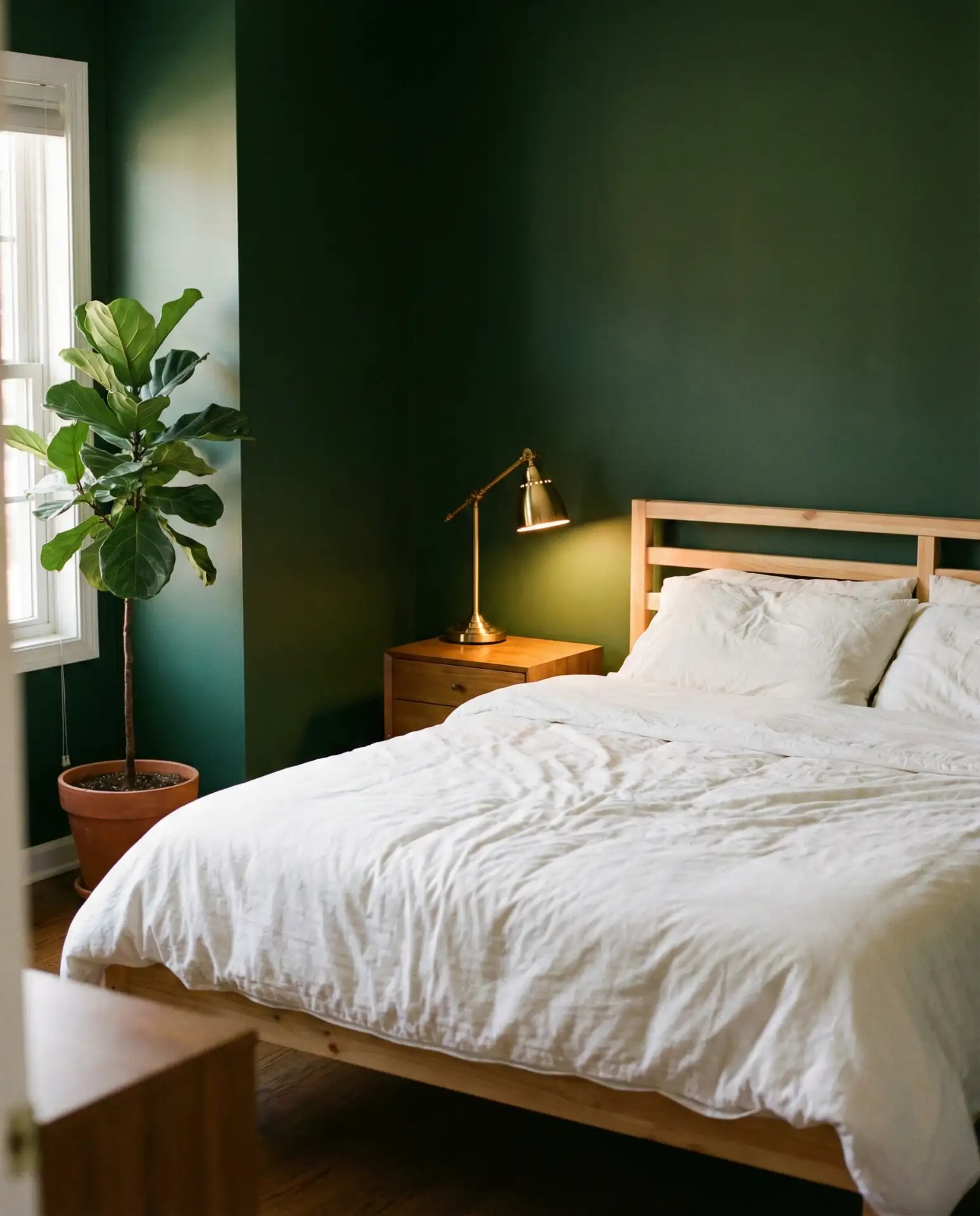
9. Forest Green Drama
Forest green walls create a bedroom that feels cocooning and luxurious, especially when paired with warm metallics and natural textures. This is a bold choice that works beautifully in both modern and traditional settings. It’s particularly effective in bedrooms with high ceilings or large windows, where the dark color enhances the scale rather than shrinking it. The shade is having a major moment as homeowners move away from safe neutrals and toward more daring, nature-inspired tones.
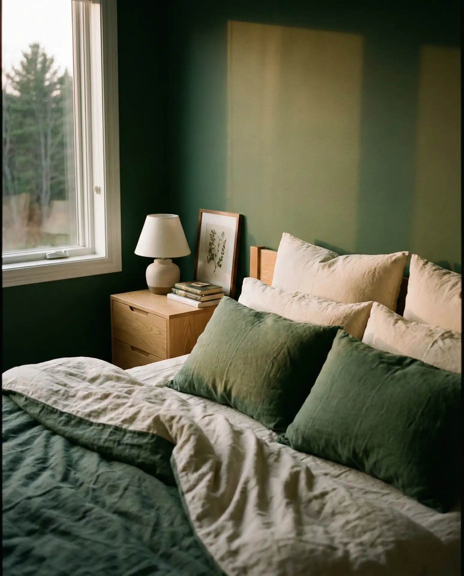
A friend painted her bedroom forest green and said it transformed her sleep quality—the room felt so much more restful and enclosed in the best way. The color pairs beautifully with warm woods, brass, and even black accents. In urban apartments, forest green brings a sense of nature indoors, which is especially valued in cities with limited green space. One mistake to avoid: using too many other dark colors alongside it, which can make the room feel oppressive rather than cozy.
10. Blue and White Classic
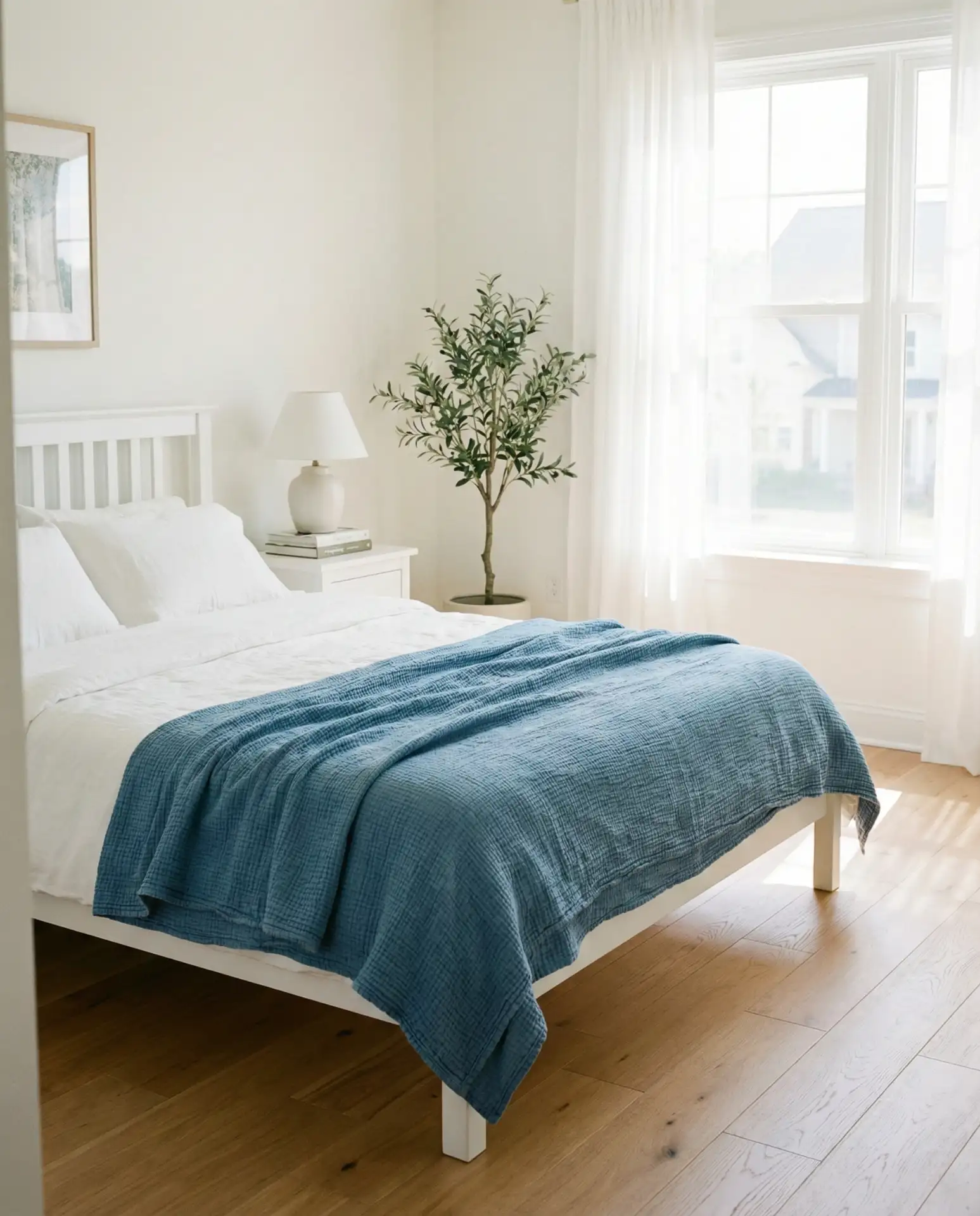
A timeless blue and white palette never goes out of style, especially in bedrooms where calm and clarity are priorities. This combination works across design styles, from coastal to traditional to modern farmhouse. The key is choosing the right shade of blue—dusty blues feel more contemporary, while navy adds drama. Keep patterns simple and let the color do the work. This is a particularly popular choice for guest bedrooms, where the goal is a universally appealing space.
This palette is incredibly forgiving and works in nearly every region of the US, from New England to California. It’s also one of the most budget-friendly schemes, as blue and white textiles are widely available at every price point. Homeowners often start with blue walls and white bedding, then add layers over time—a blue rug, patterned pillows, or artwork. Avoid making the blue too bright or primary; softer, grayed-out blues feel more sophisticated and less juvenile.
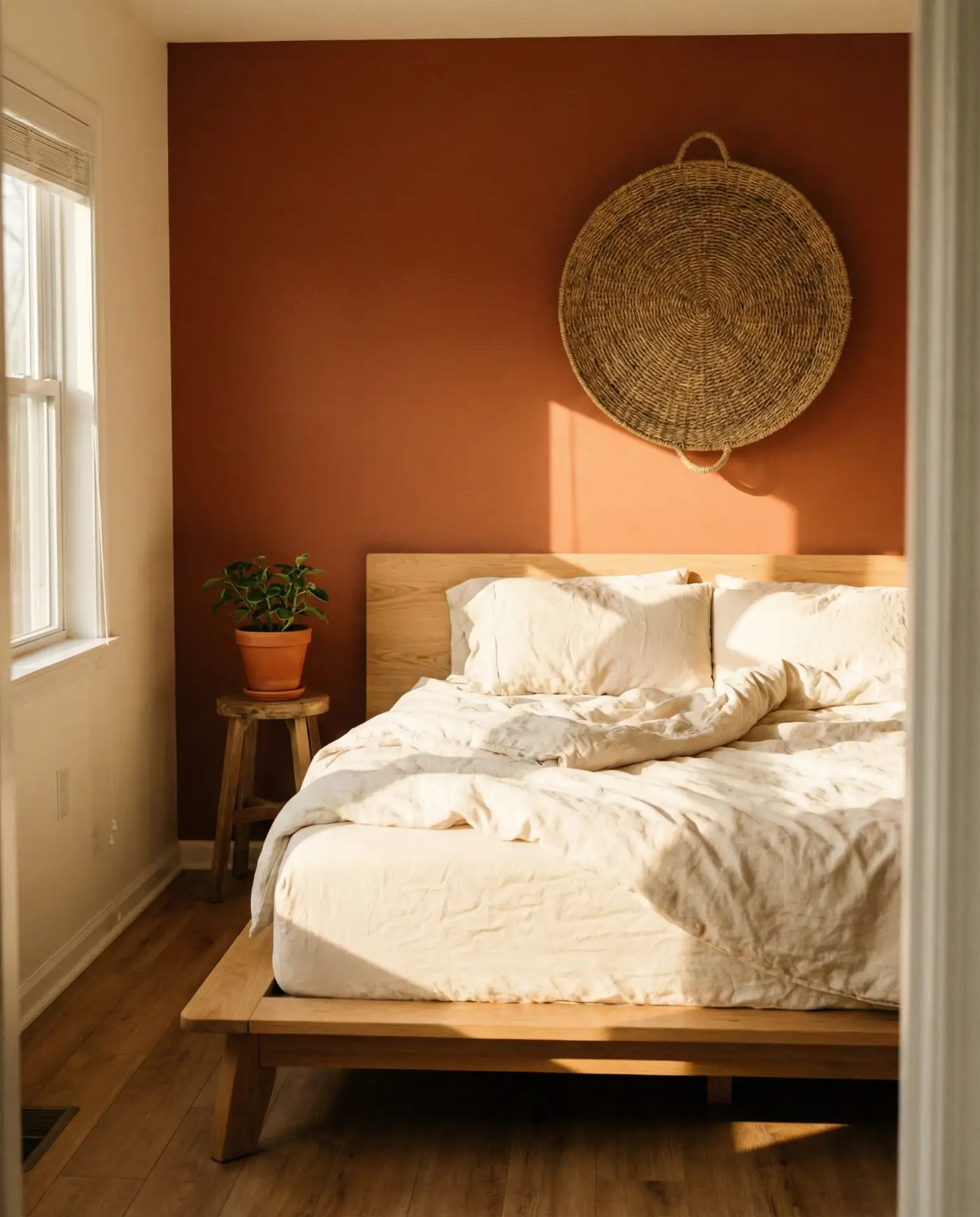
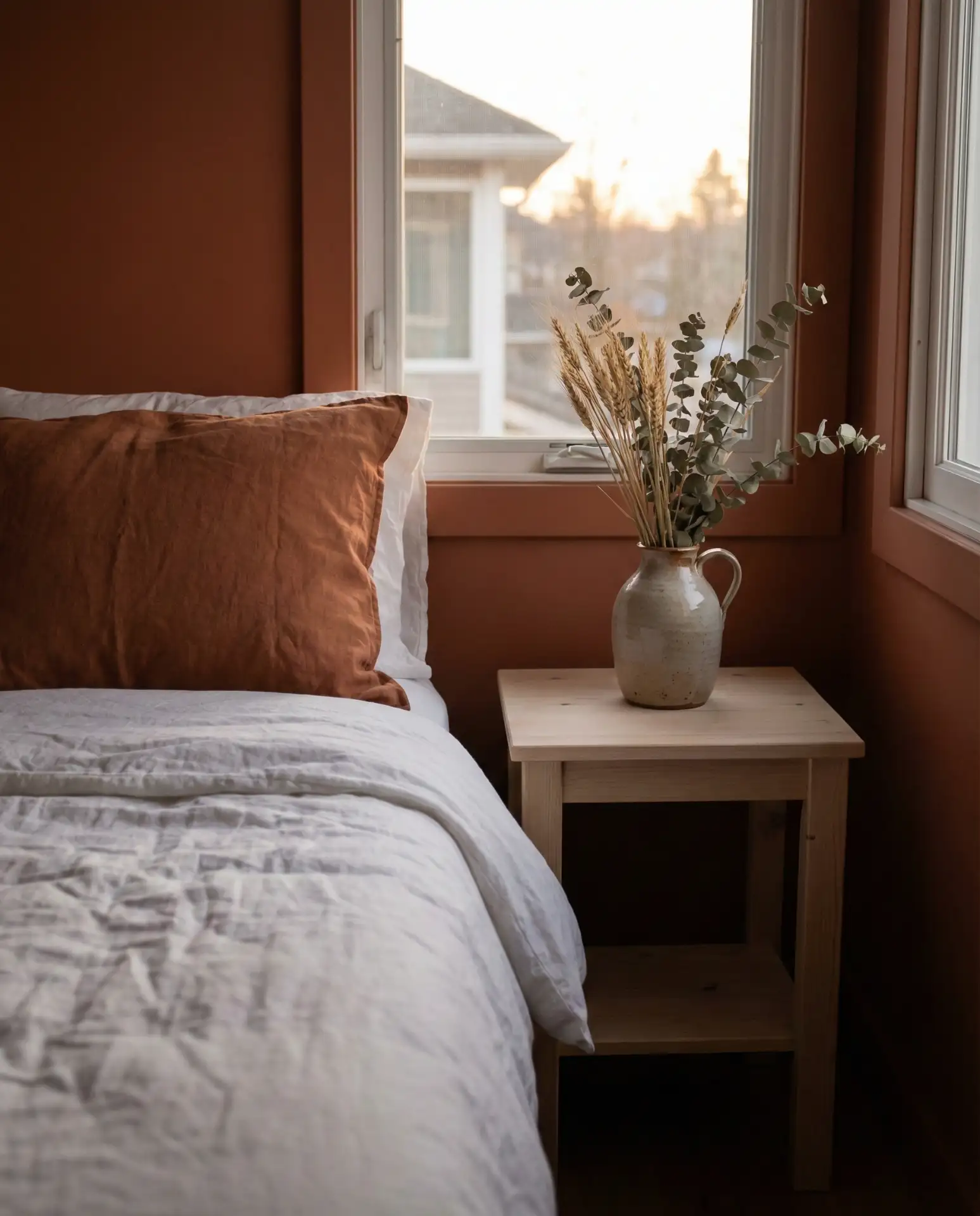
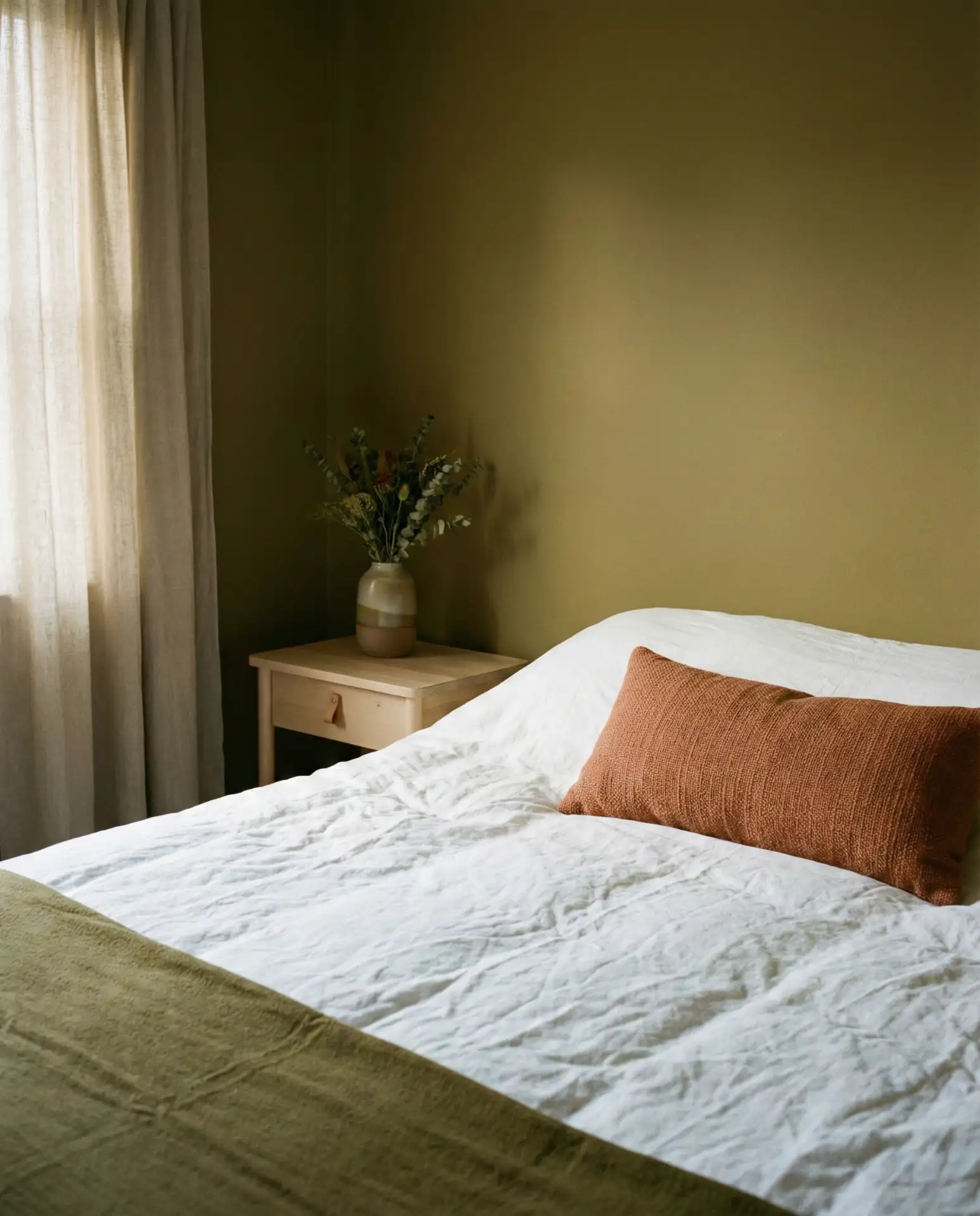
11. Warm and Cozy Terracotta
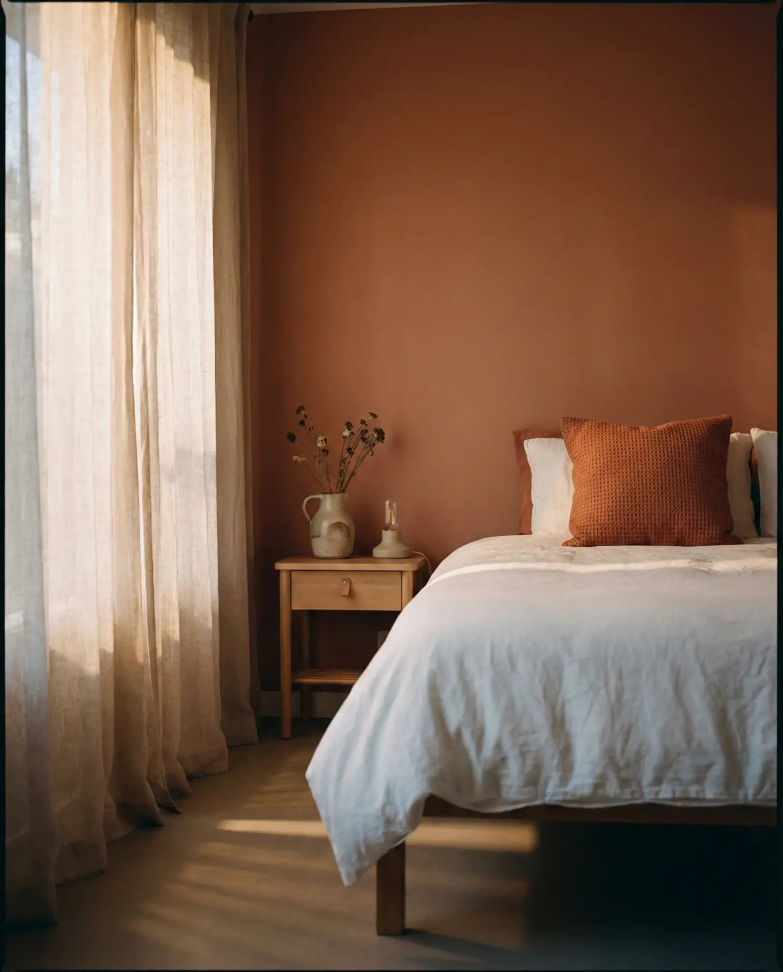
Terracotta brings an instant sense of warmth and earthiness to a bedroom, especially when used as an accent wall or in textiles. This shade is trending heavily in the Southwest and California, where it echoes the natural landscape. Pair it with cream, soft white, or warm gray to balance the intensity. It’s a color that works beautifully with natural materials—think raw wood, linen, and woven baskets. This palette feels both warm and cozy, perfect for bedrooms that prioritize comfort.
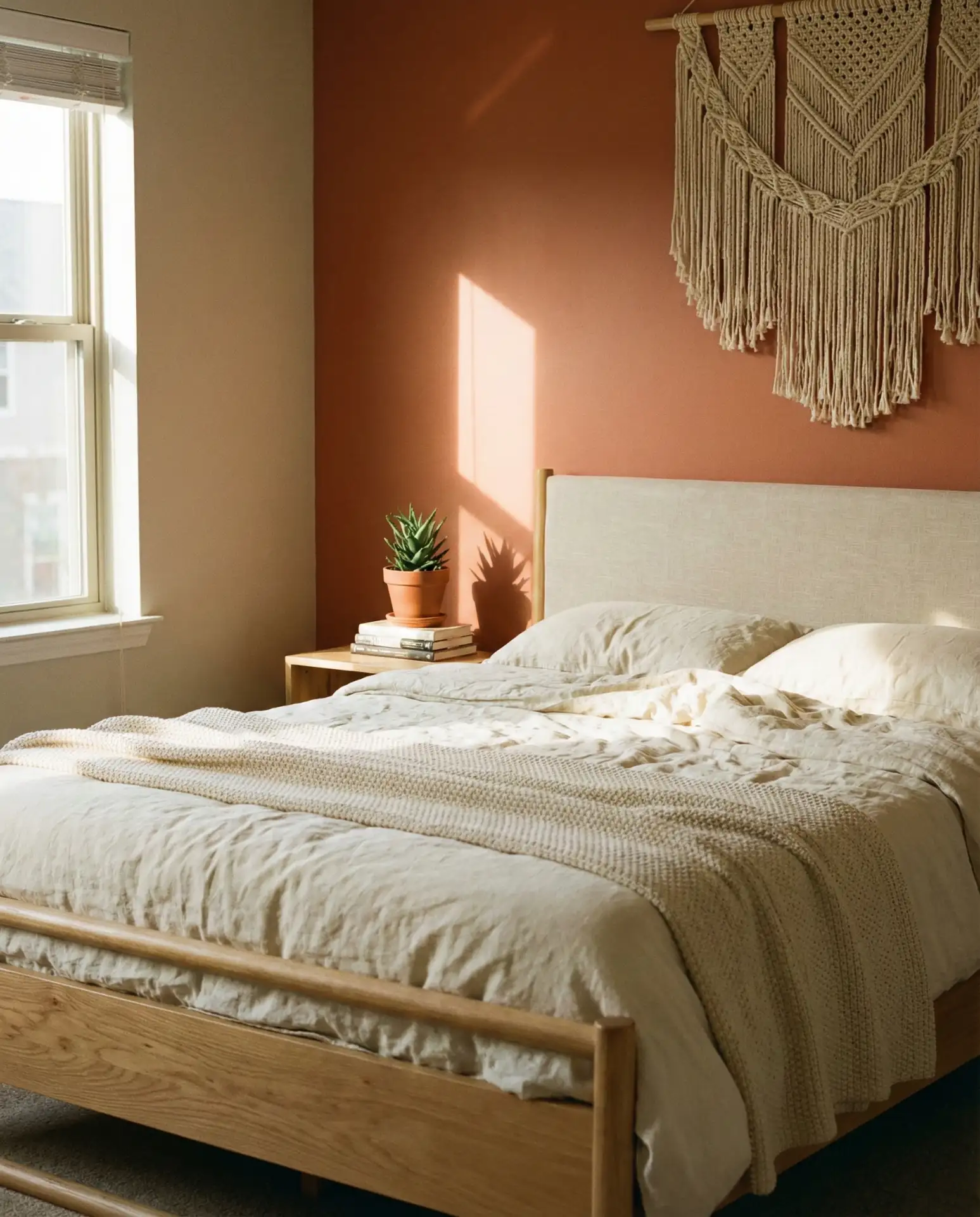
Terracotta is particularly effective in bedrooms with southern or western exposure, where the warm light enhances the color’s natural richness. In cooler climates, it can make a space feel more inviting during long winters. A common mistake is pairing terracotta with cool grays or blues, which creates visual tension rather than harmony. Stick to warm neutrals and earthy tones for a cohesive, grounded look. This color also works well in small doses—a terracotta duvet or rug can have just as much impact as a full wall.
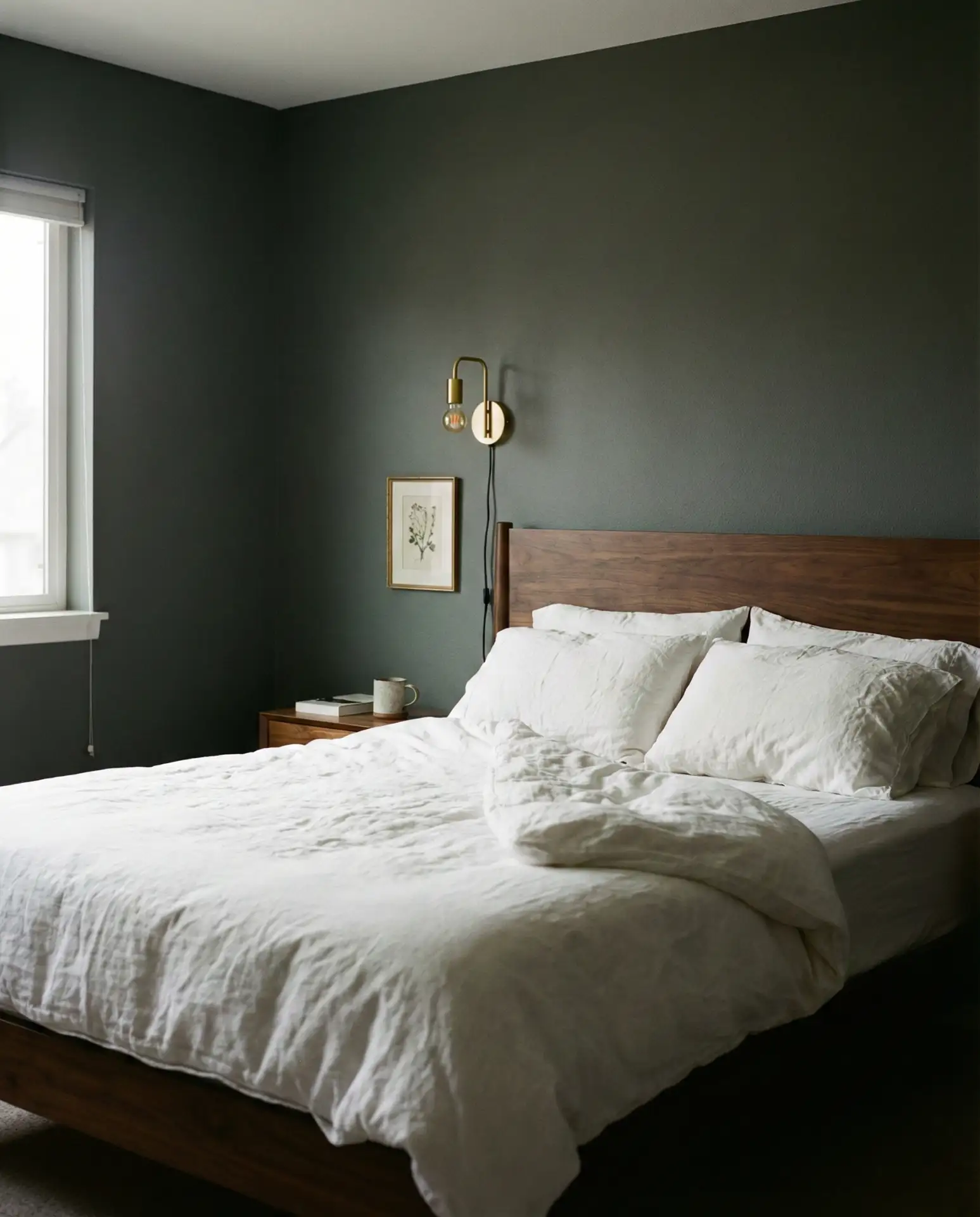
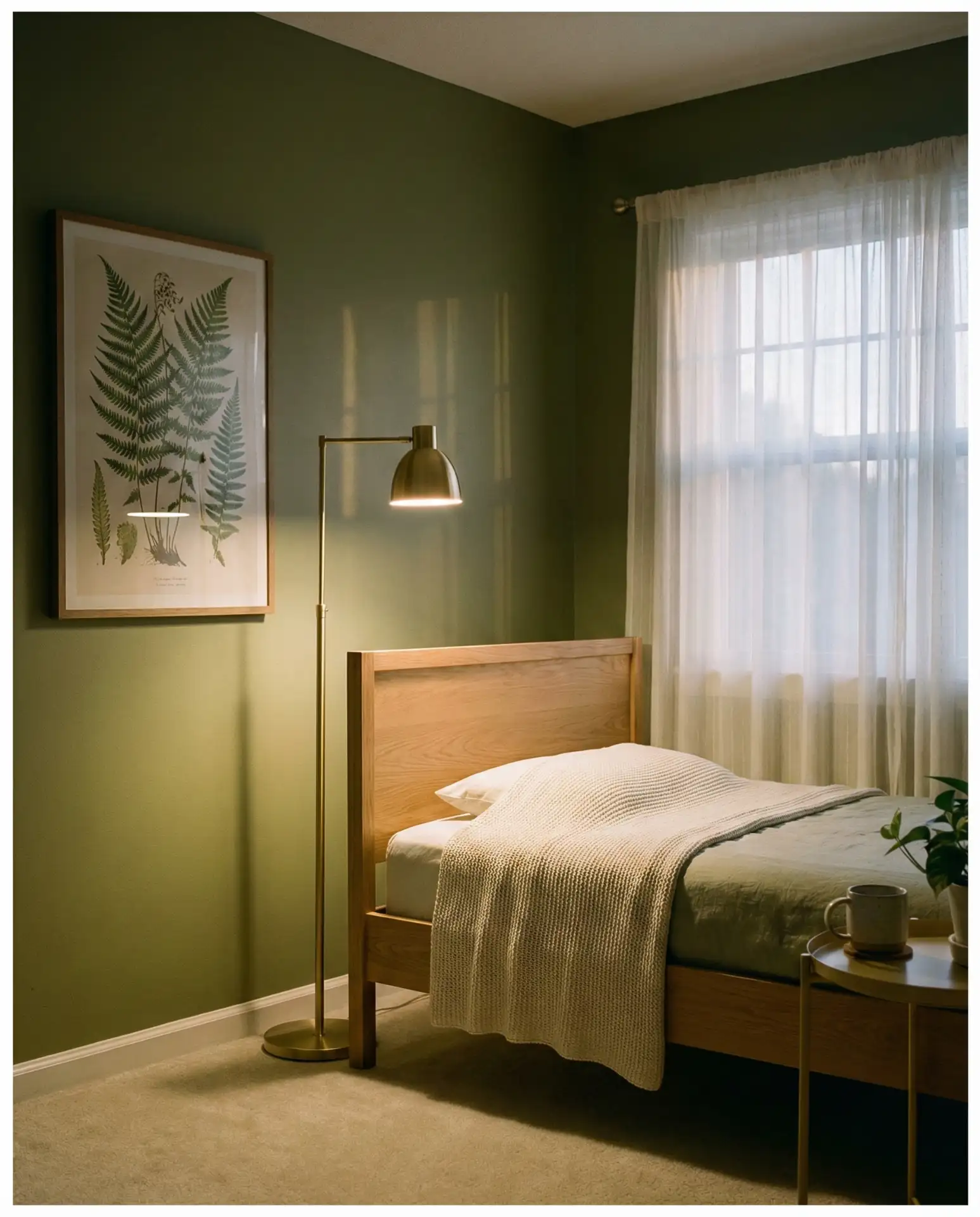
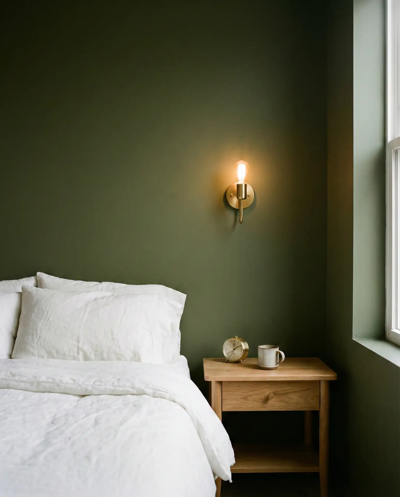
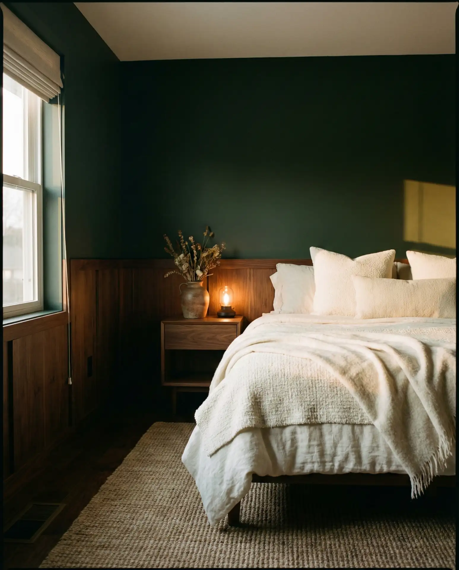
12. Dark Green Moody Retreat
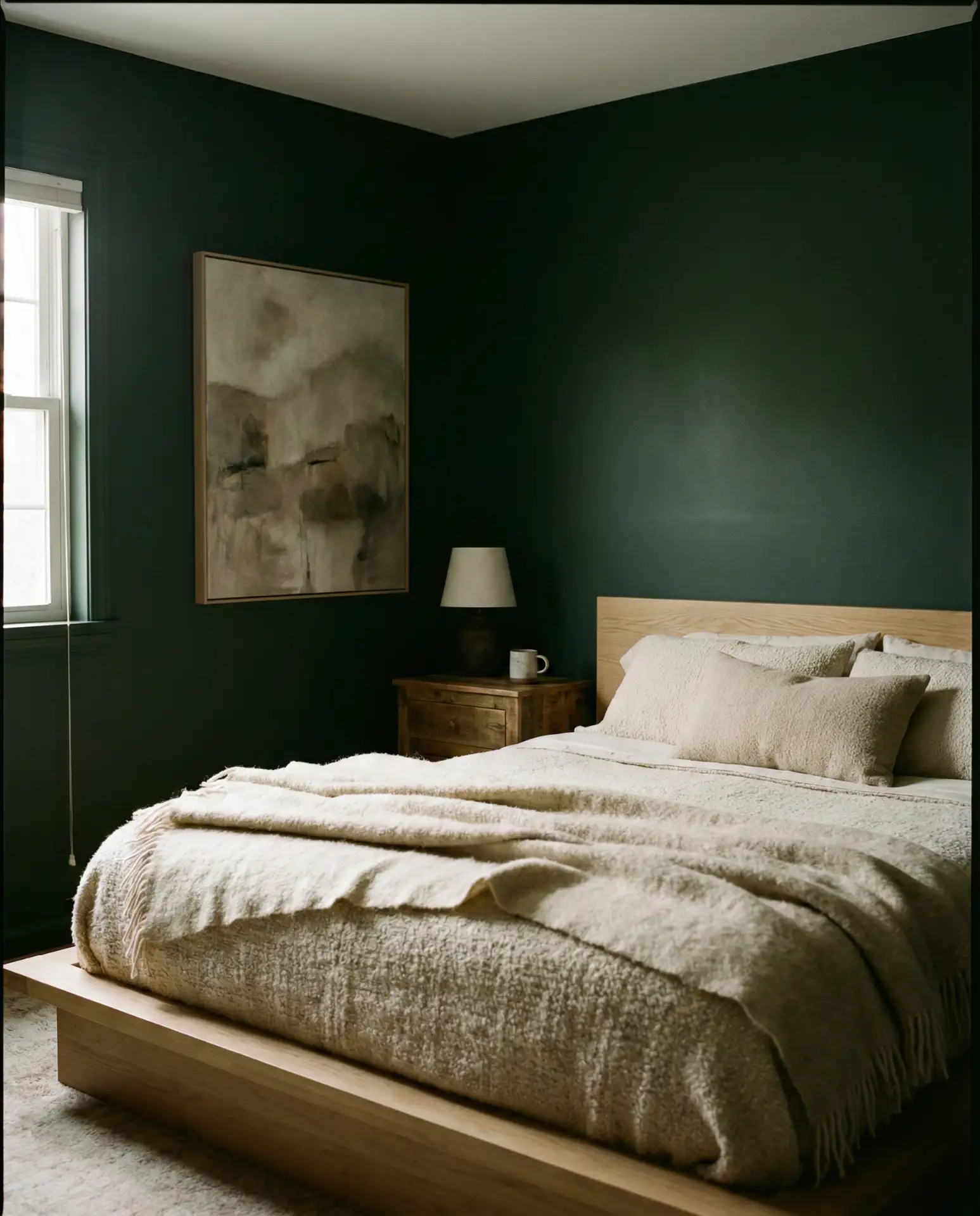
Dark green bedrooms are having a moment, especially among homeowners who want a space that feels intimate and enveloping. This shade works beautifully with brass fixtures, warm wood, and plenty of texture. It’s a sophisticated alternative to black or navy and feels deeply relaxing when done right. The color is particularly popular in master bedrooms, where the goal is to create a true retreat from the rest of the home.
This color scheme is a favorite among design editors and tastemakers for its ability to feel both modern and timeless. In the Pacific Northwest, dark green bedrooms are paired with large windows to balance the moodiness with natural light. One practical insight: dark green shows dust and scuffs less than lighter colors, making it a low-maintenance choice for busy households. Avoid adding too many other colors; keep the palette tight with greens, creams, and natural wood tones for maximum impact.
13. Classy Monochrome with Texture
A classy monochrome bedroom relies entirely on texture and subtle tonal shifts to create interest. Think shades of grey, charcoal, and soft white layered through linen, velvet, wool, and matte finishes. This approach is incredibly sophisticated and works beautifully in modern or minimalist homes. It’s also a favorite among couples who want a space that feels curated but not overly feminine or masculine. The lack of color forces you to focus on quality and craftsmanship.
A designer once explained that monochrome bedrooms work best when you invest in a few high-quality pieces rather than filling the room with cheaper decor. The restraint creates a sense of calm and intentionality. This palette is ideal for urban apartments and modern homes where clean lines and simplicity are valued. A common mistake is making everything too matchy—vary the textures and tones of gray to keep the space from feeling flat. Add warmth with wood or brass accents to prevent the room from feeling too cold.
14. Olive and Brass Sophistication
Olive walls paired with warm brass fixtures create a bedroom that feels both earthy and elevated. The combination is sophisticated without being stuffy, and it works across a range of design styles. Brass adds a touch of glamour that keeps the olive from feeling too casual. This palette is particularly popular in historic homes and urban lofts, where the warm tones complement original architectural details. Layer in natural textures like linen and rattan to complete the look.
This scheme works best in bedrooms with warm natural light, where the olive and brass tones can truly shine. In cooler northern light, the olive can read as muddy; test samples before committing. Brass fixtures are widely available at every price point, making this an accessible look. One real homeowner behavior: people often start with one brass piece—a lamp or picture frame—and gradually add more as they find the right pieces. Avoid mixing brass with chrome or nickel, which disrupts the cohesive warmth of the palette.
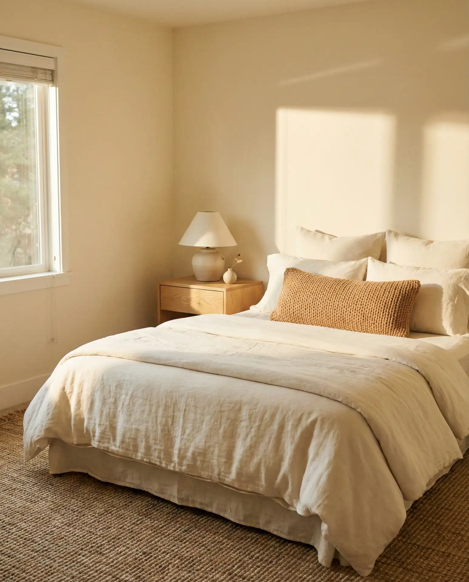
15. Cozy Neutral Layers
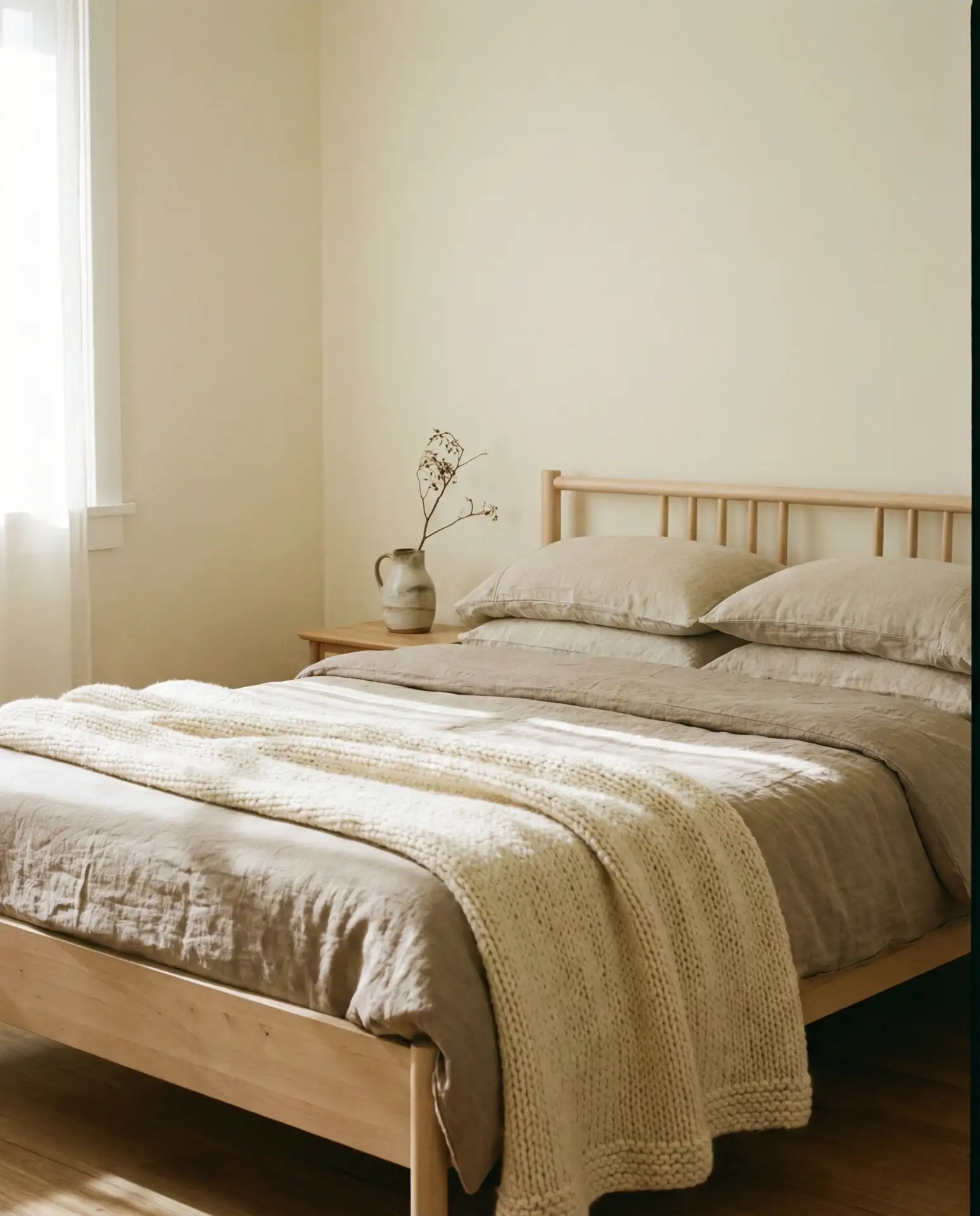
A cozy neutral bedroom is all about layering multiple shades of cream, beige, taupe, and soft gray to create depth without color. This approach is endlessly flexible and works in nearly every home style. The key is varying textures—mix smooth cotton with chunky knits and soft linen with nubby wool. It’s a palette that feels effortlessly put together and never goes out of style. This is one of the most searched color schemes on Pinterest, particularly among those seeking a relaxing, spa-like bedroom.
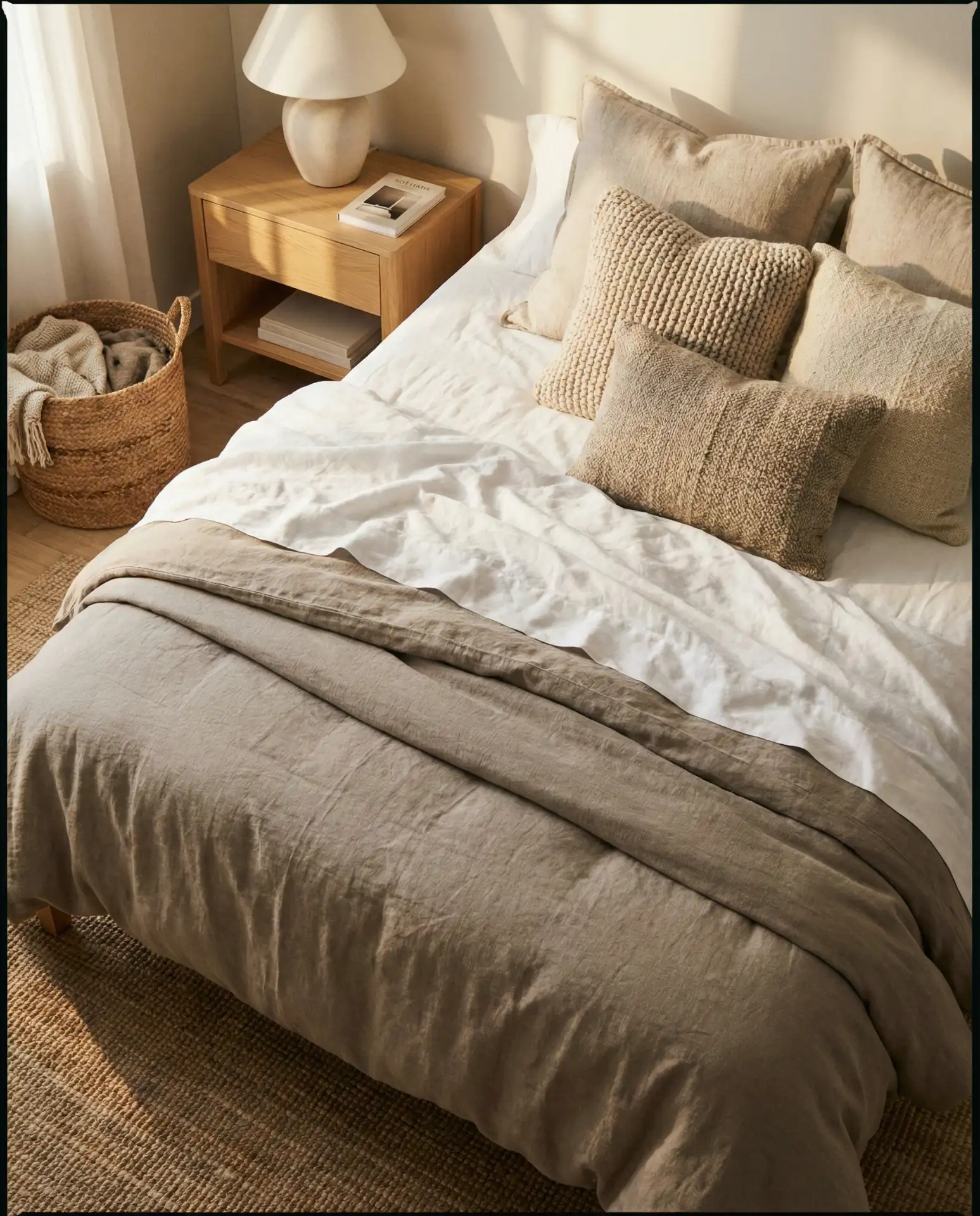
This palette works best in homes with abundant natural light, where the subtle tonal shifts are most visible. In the South and Southwest, homeowners often add warmer neutrals like sand and camel to suit the regional aesthetic. One common mistake is choosing neutrals that are too cool or too pink; stick to warm, earthy undertones for the coziest effect. A budget tip: thrift stores and vintage shops are goldmines for neutral textiles—linen sheets, wool blankets, and cotton throws can often be found for a fraction of retail prices.
16. Masculine Charcoal and Leather
Charcoal walls paired with leather accents create a bedroom that’s undeniably masculine yet refined. This palette works beautifully for men who want a space that feels intentional without being overly decorated. Think of a leather bench at the foot of the bed, a leather-wrapped lamp, or even a leather headboard. Keep the rest of the room simple with white or cream bedding and minimal decor. The leather adds warmth and texture that prevents the charcoal from feeling too cold or stark.
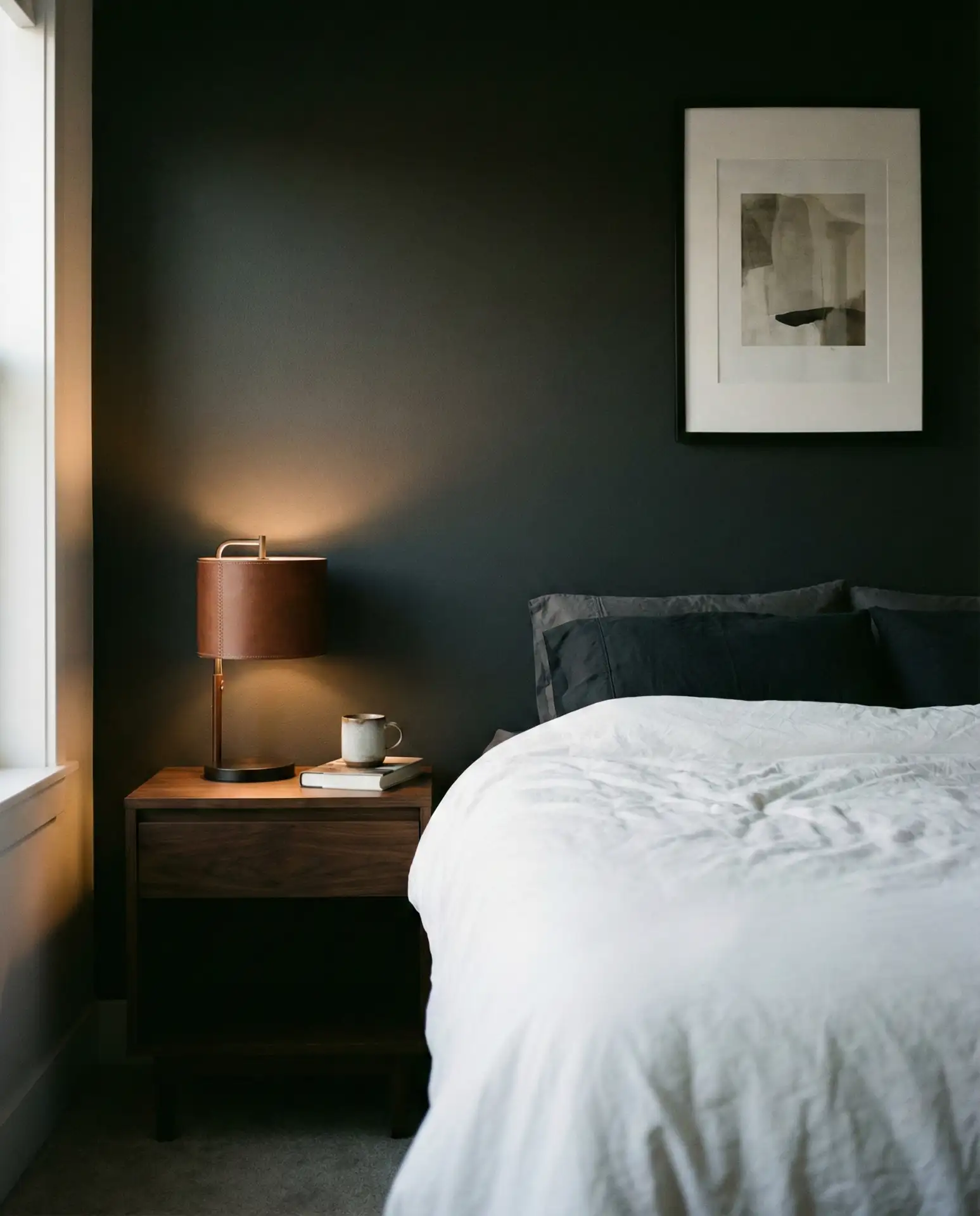
This approach is particularly popular in urban condos and lofts, where a more industrial, refined aesthetic is valued. Leather ages beautifully, developing a patina that adds character over time. A common mistake is adding too much leather, which can feel heavy; one or two pieces are enough to make an impact. Balance the dark walls with ample lighting—a floor lamp, bedside lamps, and even under-bed lighting can prevent the space from feeling cave-like. Avoid overly glossy finishes, which disrupt the matte, understated vibe.
17. Soft Neutral with Black Accents
Soft neutral walls paired with black accents—whether a black headboard, black window frames, or black hardware—create a bedroom that feels both timeless and modern. The contrast adds definition and prevents the neutrals from feeling washed out. This approach is incredibly popular in new construction homes, where black windows and doors are trending. The palette works for couples who want something sophisticated but not overly bold. Keep bedding and textiles in whites and creams to maintain the light, airy feel.
This palette is ideal for guest bedrooms, where the goal is to create a space that feels polished yet universally appealing. In California and the Southwest, this combination is everywhere—black accents ground the soft neutrals without overwhelming them. One homeowner mentioned that switching to black hardware throughout her bedroom made everything feel more cohesive and intentional. A common mistake is using too many shades of neutral, which can look muddy; stick to 2-3 tones maximum. Add natural wood for warmth if the space feels too stark.
18. Warm and Cozy Rust
Rust tones bring an earthy, warm, and cozy energy to a bedroom, especially when paired with soft creams and natural wood. This color is similar to terracotta but slightly more muted, making it easier to work with. It’s a favorite in the Southwest and California, where the color echoes the natural landscape. Use rust as an accent wall, in textiles, or in decor—it doesn’t take much to make an impact. The shade pairs beautifully with brass, black, and warm wood tones.
Rust works particularly well in bedrooms with western or southern exposure, where the warm light enhances the color’s richness. In darker rooms, use rust sparingly or risk the space feeling too heavy. An expert tip: pair rust with cooler neutrals like soft gray or cream to balance the warmth and prevent the room from feeling too intense. A common mistake is using rust in a room with cool lighting, which can make the color look muddy. Invest in warm-toned bulbs to keep the palette cohesive and inviting.
19. Grey and White Minimalism
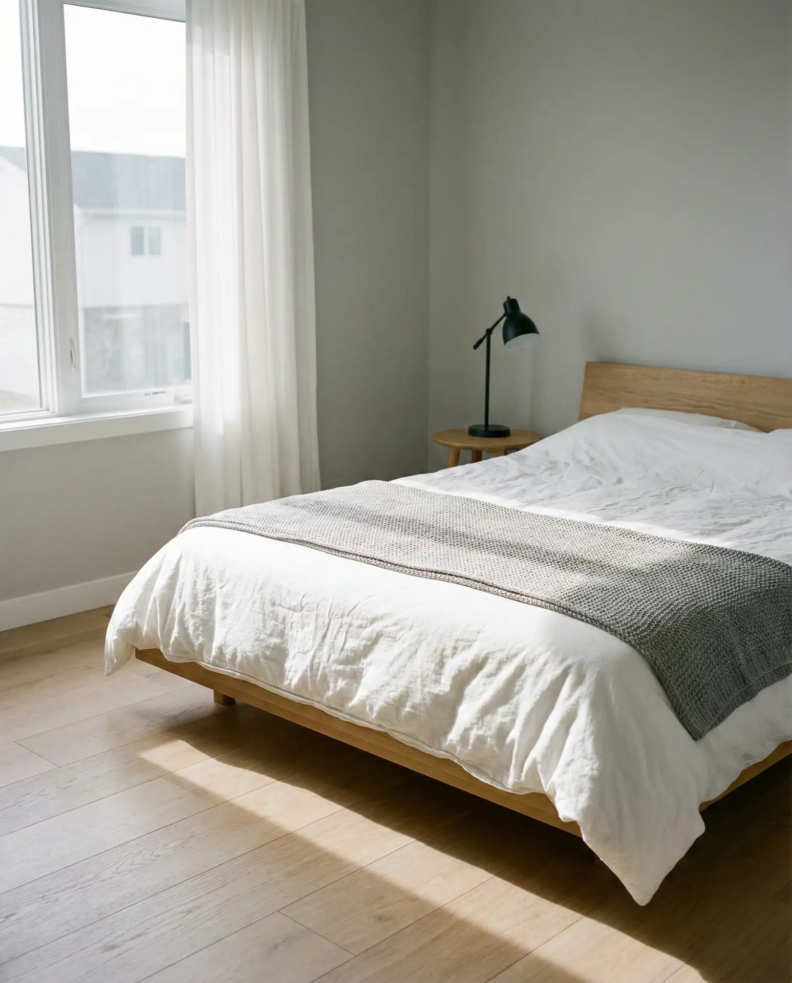
A grey and white palette is the foundation of minimalist bedroom design—it’s clean, calm, and endlessly flexible. This combination works beautifully in modern homes and apartments where simplicity and order are priorities. The key is choosing the right shade of gray; too cool and the room feels sterile, too warm and it reads as beige. Stick to mid-tone grays with neutral undertones. Keep decor minimal and let the architecture and light do the work. This palette is particularly popular among those seeking a relaxing, uncluttered sleep space.
This palette works best in small to medium-sized bedrooms, where the light colors help the space feel larger and more open. In larger bedrooms, add texture and layers to prevent the space from feeling too cold or empty. One real homeowner behavior: people often start with gray walls and white bedding, then add small pops of color through art or plants over time. A common mistake is choosing a gray with the wrong undertone—test samples in your room’s specific light to ensure the gray reads as intended. Warm wood accents can soften the starkness if needed.
20. Olive and Terracotta Warmth
Pairing olive with terracotta creates a bedroom palette that feels deeply earthy and grounded. This combination is particularly popular in the Southwest, where both colors echo the natural landscape. Use olive on the walls and terracotta in textiles—a throw blanket, pillows, or a rug. The two colors balance each other beautifully, with the olive providing coolness and the terracotta adding warmth. This palette works across seasons and never feels trendy or dated.
This scheme is ideal for bedrooms where you want to bring the outdoors in, especially in homes surrounded by natural landscapes. A practical insight: both olive and terracotta are forgiving colors that hide wear and imperfections better than lighter neutrals, making them ideal for high-use spaces. Avoid pairing this palette with cool grays or blues, which disrupt the warm, earthy harmony. Instead, layer in natural materials like rattan, linen, and unfinished wood to complete the look. This palette also works beautifully in open-plan homes where the bedroom connects visually to other spaces.
21. Cozy Cream and Camel
A bedroom in shades of cream and camel feels instantly cozy and inviting. This palette is warmer than traditional beige and feels more intentional than basic neutrals. It’s particularly popular in the Midwest and South, where warm, enveloping spaces are valued. Layer in plenty of texture—linen, wool, cotton, and even faux fur—to keep the palette from feeling flat. This scheme works beautifully for couples who want a bedroom that feels warm and mutually comfortable.
This palette works best in bedrooms with ample natural light, where the warm tones can truly shine. In darker rooms, the camel can read as muddy; opt for lighter shades or add more cream to brighten the space. One homeowner shared that switching from cool grays to warm creams and camels completely changed the feel of her bedroom—it suddenly felt more restful and welcoming. A common mistake is choosing neutrals that are too pink or too yellow; stick to true warm beiges and creams. Add black or brass accents if the space needs more definition.
22. Dark Green and Warm Wood
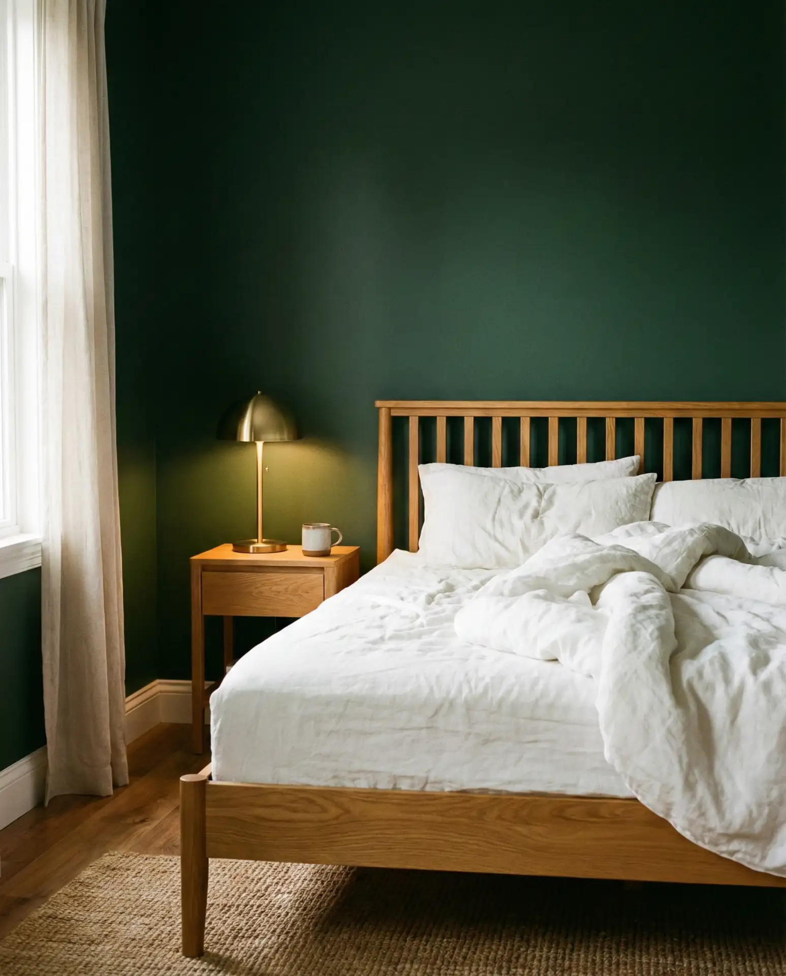
Dark green walls paired with warm wood furniture create a bedroom that feels both classy and deeply relaxing. This combination is particularly popular in historic homes and urban lofts, where the dark color enhances architectural details. The warm wood—whether oak, walnut, or teak—adds a natural element that keeps the dark green from feeling too heavy. This palette works beautifully across seasons and never feels dated. Layer in white or cream bedding to lighten the overall feel.
This palette is ideal for bedrooms where you want to create a sense of intimacy and enclosure. In the Pacific Northwest, this combination is everywhere—it brings the feeling of being surrounded by nature even in urban settings. An expert tip: use warm-toned bulbs and layer multiple light sources to prevent the dark walls from feeling too heavy. A common mistake is pairing dark green with cool-toned woods like ash or maple, which creates visual discord. Stick to warm woods with golden or reddish undertones for the most cohesive, inviting result.
Conclusion
Which of these bedroom color schemes resonates most with your style? Whether you’re drawn to soft neutrals or bold, moody tones, there’s a palette here that can transform your sleep space. Share your favorite in the comments below—we’d love to hear what you’re planning for your bedroom this year.