If your Pinterest feed has been flooded with gorgeous home exteriors lately, you’re not alone—exterior paint colors are having a serious moment heading into 2026. Whether you’re planning a full repaint or just dreaming about a refresh, the palette options this year are richer, bolder, and more personal than ever. From earthy terracottas to moody deep blues, American homeowners are moving away from safe neutrals and leaning into colors that actually make a statement. This guide walks you through of the most inspiring exterior color directions right now, with ideas that work across architectural styles, climates, and budgets.
1. Warm Taupe with Black Door Accents
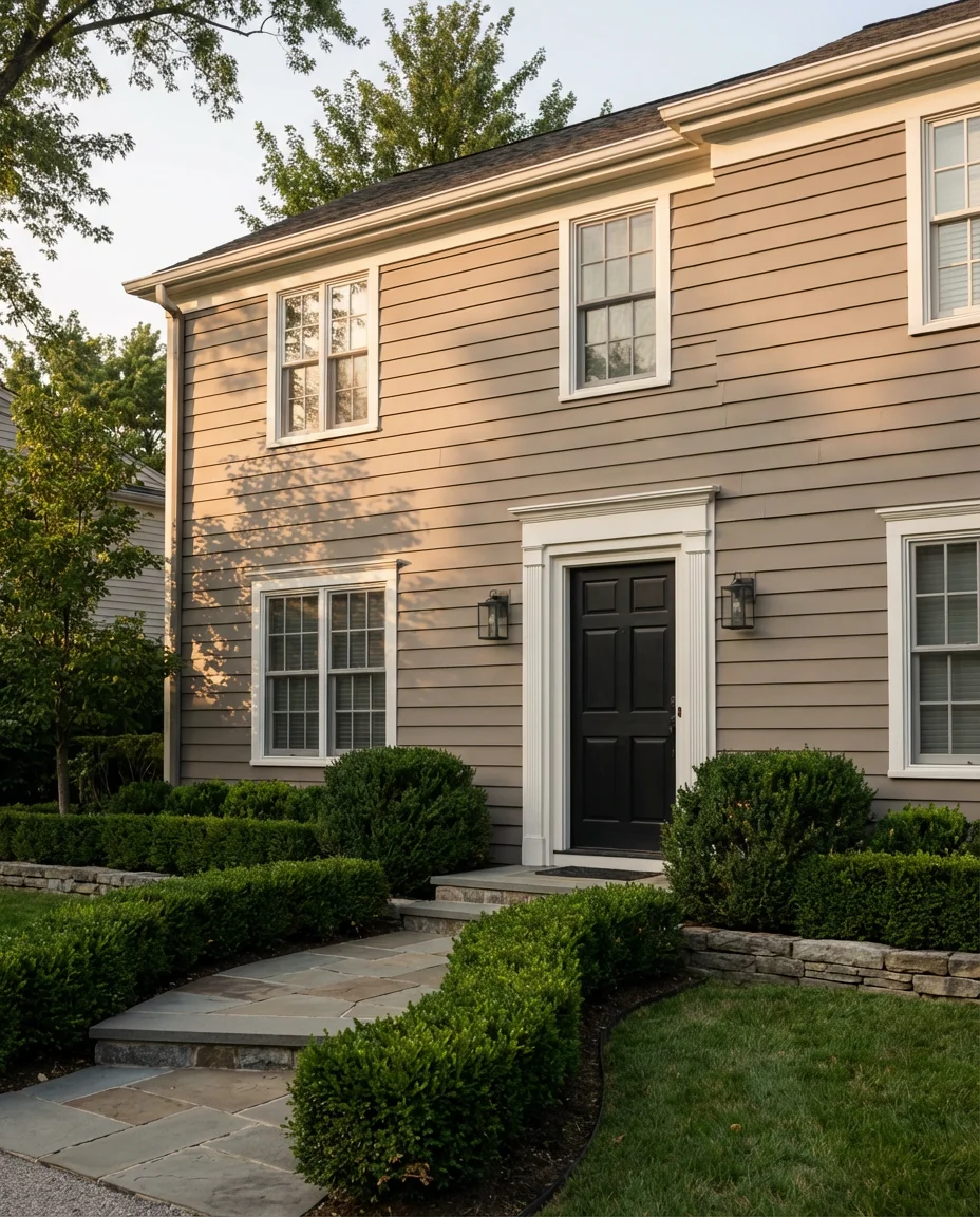
There’s a reason taupe keeps showing up on best-of lists year after year—it’s the rare neutral that reads warm without veering into beige territory. Paired with black doors and crisp white trim, a taupe exterior feels elevated and intentional. It photographs beautifully in natural light, which is a big reason it performs so well on Pinterest boards. This combination works across Colonial, Craftsman, and newer construction homes alike.
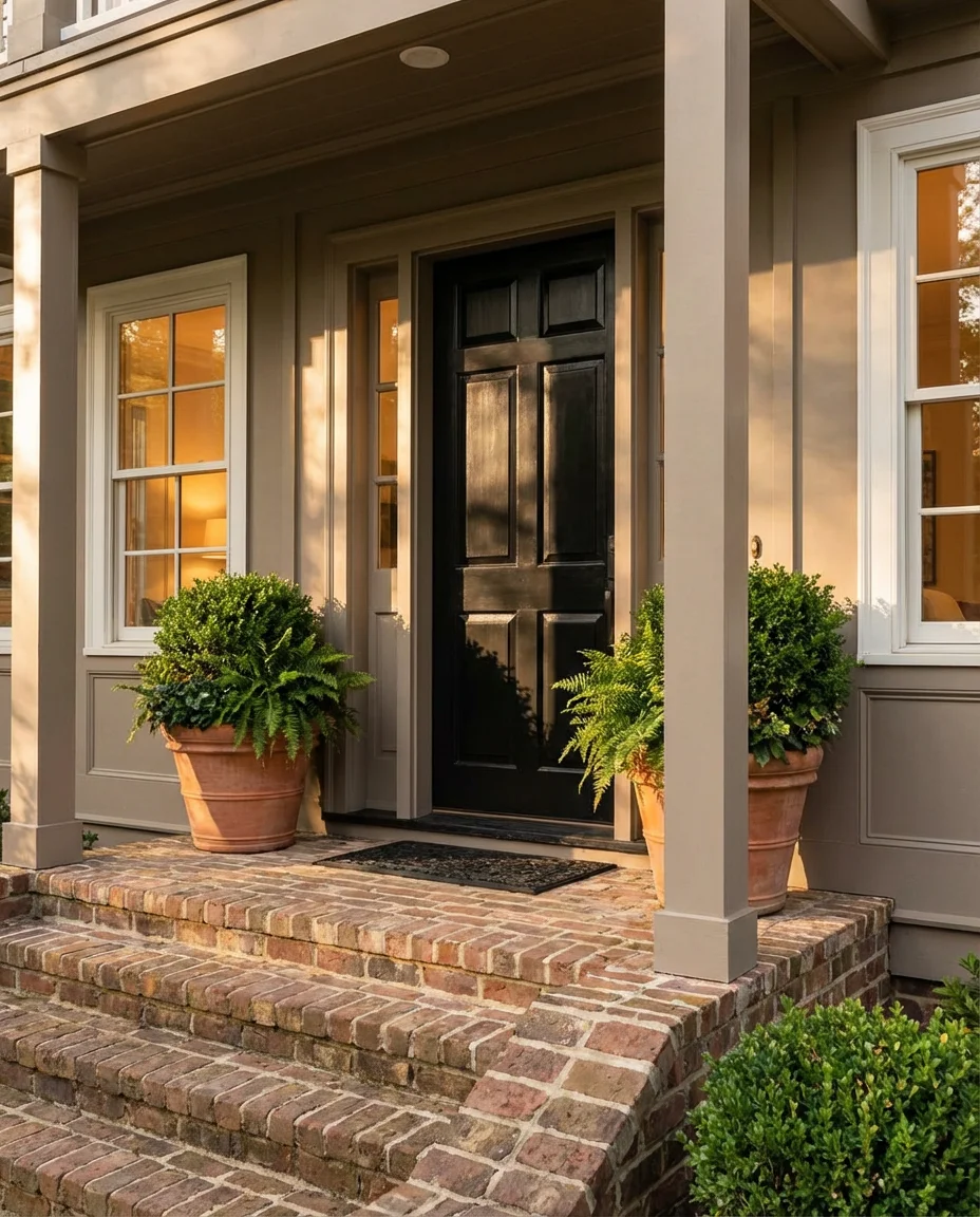
Taupe reads differently depending on the undertone—some lean pink, others go gray. If you want to keep things universally appealing, look for warm sand-toned taupe with a slight gray undertone. It pairs beautifully with aged bronze fixtures and wood-grain garage doors. Designers often note that this combo is one of the highest-performing palettes for resale, particularly in the Midwest and Southeast, where traditional architecture dominates.
2. Classic White with Light Gray Trim
A white house never really goes out of style, but the way designers are using it in 2026 feels distinctly fresh. The key shift is in the trim—instead of stark bright white, homeowners are now pairing body white with a light gray that adds dimension without contrast overload. The effect is soft, polished, and photographically irresistible, especially against a blue sky backdrop.
One common mistake homeowners make with white exteriors is choosing a formula that reads too blue or too yellow once it hits direct sunlight. Pull a few large samples and observe them at different times of day before committing. Pure whites tend to look stark on clapboard siding, while off-whites with a warm undertone feel more lived-in and inviting—which is exactly the aesthetic most people are chasing right now.
3. French Country Blue Farmhouse
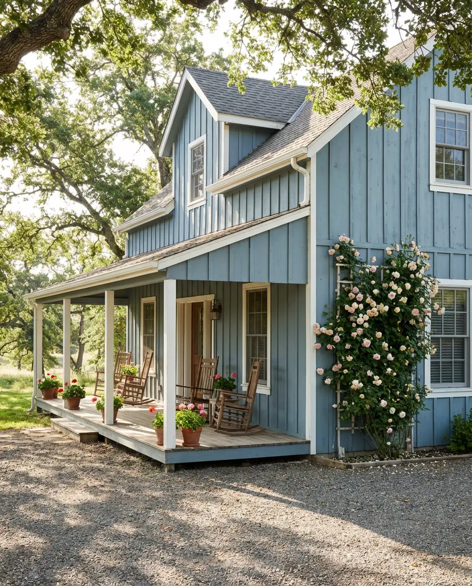
The French country blue trend has been quietly building momentum, and in 2026 it’s hitting full stride. This is a dusty, muted blue—think faded denim or aged shutter paint—rather than anything bright or nautical. On a farmhouse-style home with white trim and a covered porch, it creates an effortlessly romantic look that Pinterest users absolutely cannot scroll past. It’s cozy and sophisticated at the same time.
This palette works best on homes in the South and Pacific Northwest, where lush greenery creates a natural backdrop that makes the blue pop. In drier climates, pair it with drought-tolerant silver-leafed plants to maintain that soft contrast. One homeowner in Tennessee shared that after painting her farmhouse this color, neighbors started stopping to ask for the paint information—which is kind of the dream outcome.
4. Deep Green with Brown Roof
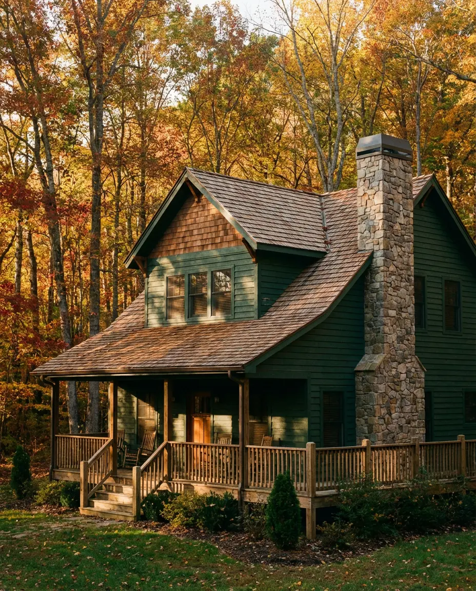
Green is arguably the color story of 2026, and the deep forest and hunter varieties are leading the charge for exteriors. When paired with a brown roof, the combination feels rooted and organic—like the house grew from the landscape itself. This look is especially compelling on homes with wood or stone accents, where the natural material palette reinforces the earthy, grounded feeling.
If you’re in the Northeast or Pacific Northwest, this palette practically sells itself—the surrounding trees and natural landscape do half the work. Budget-wise, deep greens typically require more coats than lighter colors because the pigment load is heavier, so factor that into your painting estimate. Most professional painters recommend a high-quality exterior primer specifically designed for deep-base paints to prevent fading over the first few seasons.
5. Behr Moody Blue-Gray Contemporary
Behr has been one of the most searched paint brands for exterior color inspiration in recent years, and their blue-gray range is particularly beloved right now. These shades sit right on the edge between blue and grey, shifting depending on the light—cooler and slate-toned in the morning, warmer and almost lavender at dusk. For contemporary homes with clean lines and minimal ornamentation, this is a near-perfect exterior choice.
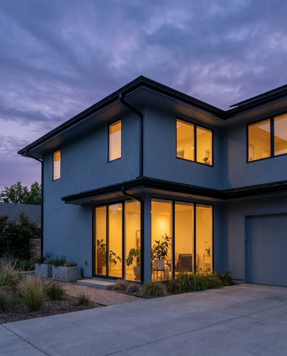
This color range is where contemporary design meets practicality. Blue-grays hide dust, pollen, and minor surface imperfections better than pure whites, which is a genuine advantage in high-pollen zones across the South and Midwest. Homeowners in suburban Texas have particularly embraced this palette as an alternative to the beige-on-beige monotony that defined their neighborhoods for decades—it reads fresh without being polarizing.
6. Terracotta Roof with White Stucco
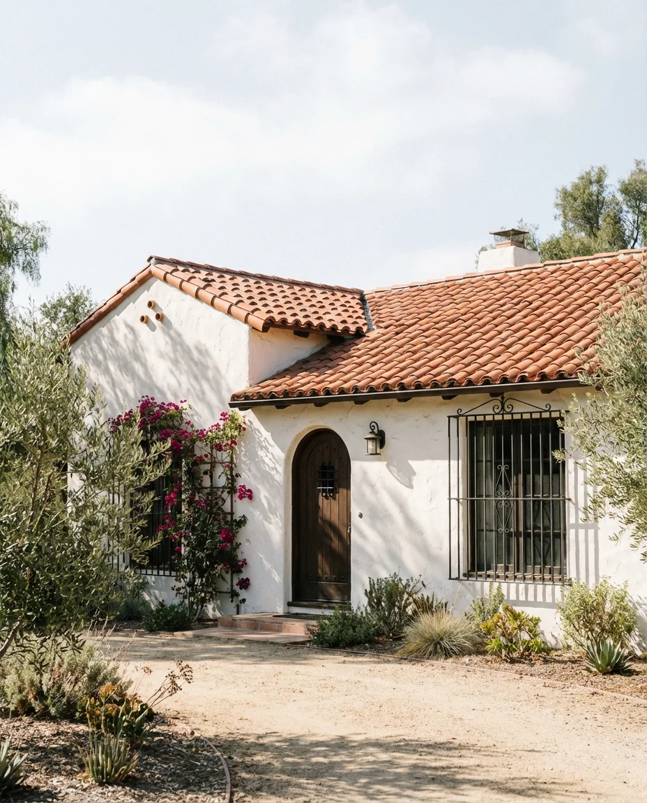
Mediterranean-inspired homes are surging in popularity, and the terracotta roof paired with white stucco walls is the defining look of that style. The warm rust-orange of clay tile against crisp white creates a contrast that’s timeless rather than trendy. This combination performs exceptionally well in the Southwest, Florida, and California, where the architectural tradition already supports the aesthetic.
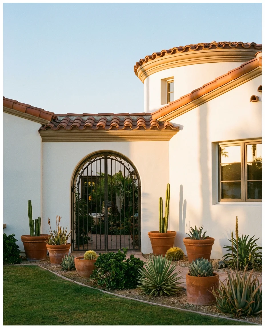
Where this works best: sun-drenched climates where the white stucco stays bright and the terracotta holds its warmth year-round. In cloudy northern climates, the same combination can look washed out. If you love this style but live north of the Mason-Dixon line, consider warming up the stucco slightly with a cream or sand base—it keeps the Mediterranean spirit alive while accounting for lower-light conditions.
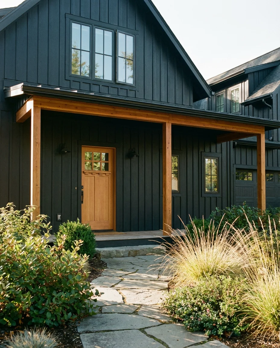
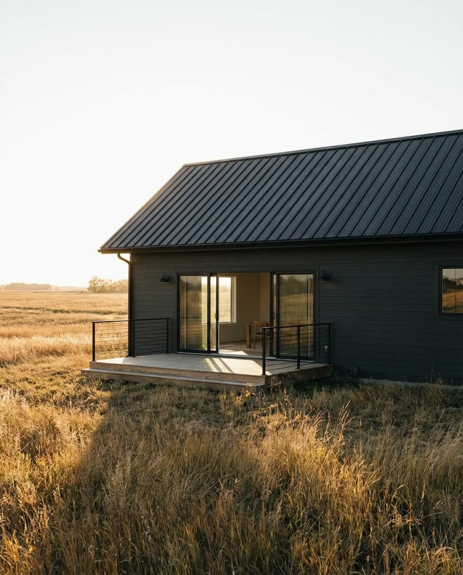
7. Dark Charcoal Modern Farmhouse
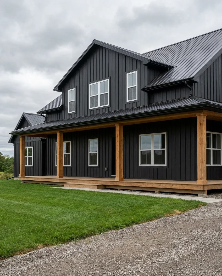
Dark exterior colors have shed their controversial reputation and are now one of the most requested looks in American home design. Charcoal and near-black shades on a modern farmhouse create a dramatic silhouette that feels both moody and confident. When paired with white windows and wood porch details, the darkness becomes an asset rather than a liability—framing the home like a photograph.
A real homeowner in rural Michigan painted her traditional white farmhouse charcoal after seeing it on Pinterest, nervous about the reaction. Within a week, she said three neighbors had asked for her paint chip information. The key lesson: dark colors on farmhouse architecture look intentional rather than somber when you keep trim crisp and landscaping well-maintained. Avoid dark shutters—let the body color do the work.
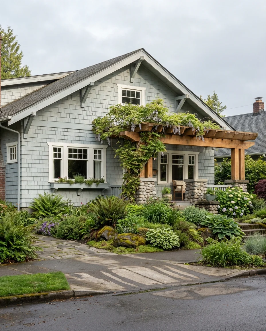
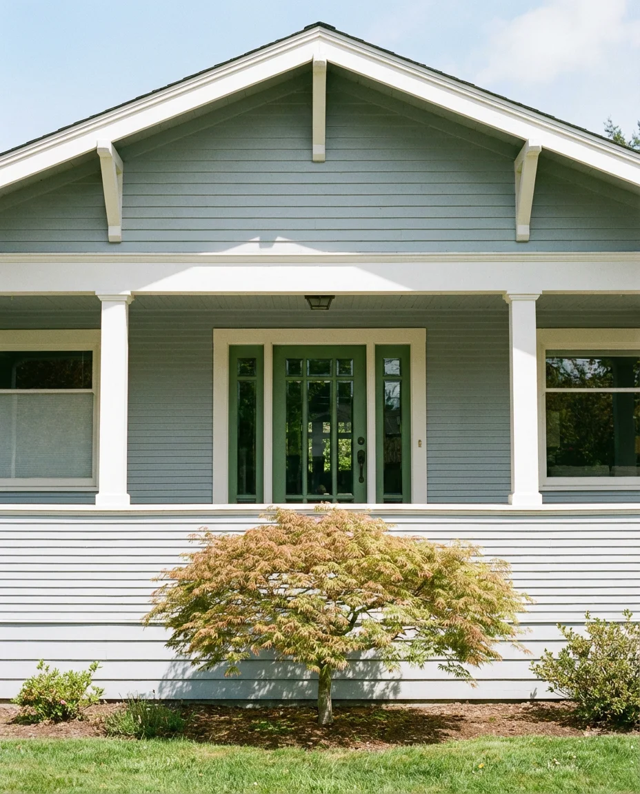
8. Soft Sage Green with White Windows
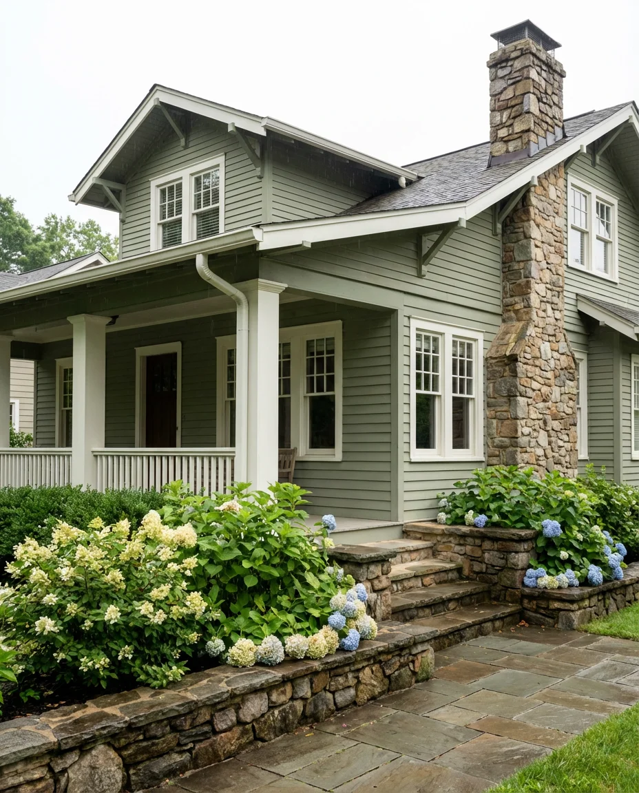
Sage green sits right at the intersection of nature-inspired and sophisticated, making it one of the most versatile exterior colors in the trending lineup for this year. The soft, muted quality of sage means it pairs beautifully with white windows without creating jarring contrast—instead, the two tones feel complementary, like they evolved together. It suits Craftsman bungalows and Cape Cod-style homes especially well.
Expert color consultants often recommend sage for first-time homeowners making their first big exterior color decision because it’s forgiving—it reads neutral enough to avoid neighborhood drama while still feeling like a real design choice. It’s also a great choice for homes surrounded by mature trees, where the green of the paint echoes the surrounding landscape and makes the property feel intentionally placed rather than dropped in.
9. Brown with Red Brick Wall Accents
Working with existing brown roofs and red brick wall details is one of the most common exterior painting challenges, and the solution is simpler than most people think. A warm, medium brown body color that pulls from the undertones already present in the brick creates cohesion rather than competition. The result is a home that looks like it was designed as a unified whole rather than assembled from mismatched parts.
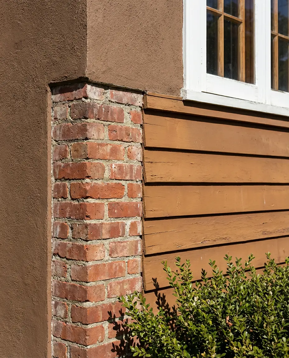
The most common mistake with brick homes is choosing a paint color in isolation—always pull from your brick’s undertone first. Red brick typically has orange or purple undertones depending on the firing process and age. Bring a small chip of your actual brick to the paint store rather than relying on a photo. Many paint brands offer in-store digital analysis that can identify your brick’s dominant undertones in seconds.
10. SW Accessible Beige—The New Neutral

SW (Sherwin-Williams) has long been a go-to for exterior color guidance, and their warm beige and greige families remain among the most searched colors for home exteriors. What’s changed in 2026 is how these neutrals are being used—not as default fallbacks but as intentional anchors for more bold accent colors. Paired with a deep green or navy door, a warm SW beige body reads luxurious rather than generic.

This is where budget reality meets design aspiration in the most practical way. Neutral exterior colors like SW greige are typically easier to touch up over time since matching the paint years later is more reliable than with custom-mixed deep colors. In higher-turnover housing markets—think Atlanta, Phoenix, or Dallas—sticking with a broadly appealing neutral can realistically add to resale value by keeping the broadest possible buyer pool interested.
11. Indian Red with Stone Details
Indian red—a deep, earthy crimson with strong rust and clay undertones—is making a confident entrance into the exterior color conversation this year. It’s bold without being aggressive, warm without being orange, and it photographs with stunning richness in natural light. When paired with natural stone foundation details and cream or sand trim, it creates an exterior palette that feels rooted in history and place.
This color works best on homes in the Mid-Atlantic and New England regions, where stone and brick architectural traditions feel native to the landscape. It’s a color with genuine visual weight, so it tends to look better on homes with architectural detail—crown molding, pilasters, bay windows—rather than flat, minimal facades. Think of it as a color that rewards complexity.
12. India-Inspired Saffron Yellow Exterior
Drawing from India-inspired architectural color traditions, warm saffron and turmeric yellows are appearing on American exteriors in a way that feels genuinely fresh. These aren’t the chalky butter yellows of the past—they’re saturated, confident, and unapologetically joyful. Against a white trim and with lush green landscaping, a saffron yellow exterior becomes a genuine neighborhood landmark in the best possible sense.
Yellow exteriors tend to perform best in warm, sunny climates where the saturation holds up visually. In overcast regions, the same yellow can look muddy or flat. If you’re committed to this palette in a gray-sky climate, consider going slightly deeper and warmer in tone—a turmeric or ochre—which holds its depth better under diffused light than a brighter, lighter yellow would.
13. Mid-Century Modern Olive and Wood
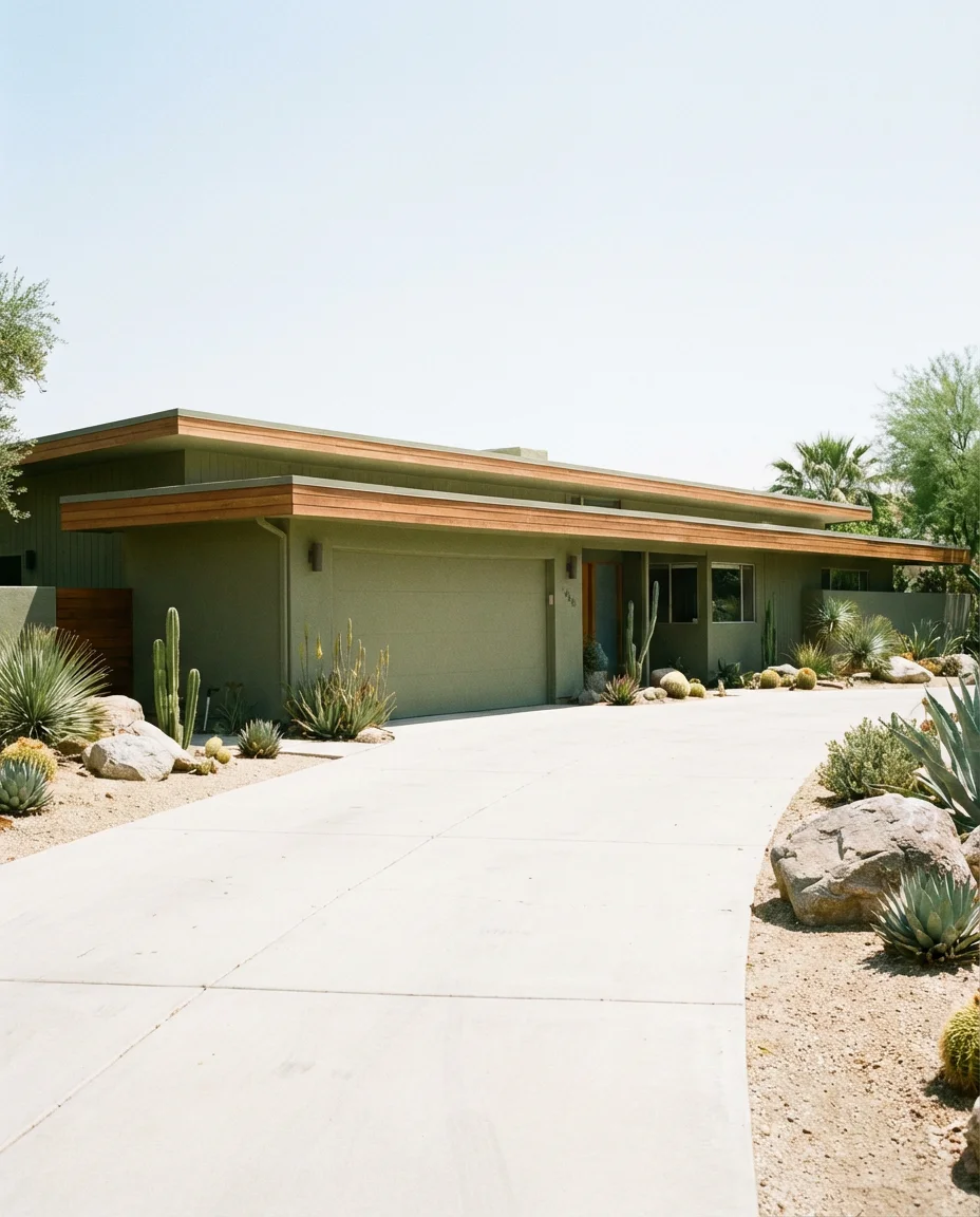
The contemporary mid-century modern exterior revival is in full swing, and the color palette driving it is all about muted, sophisticated organics. Olive green, warm khaki, and aged avocado tones paired with natural wood accents and flat rooflines create that quintessential post-war California cool that everyone seems to be chasing on Pinterest. The key is restraint—every element should feel like it belongs in the same decade.
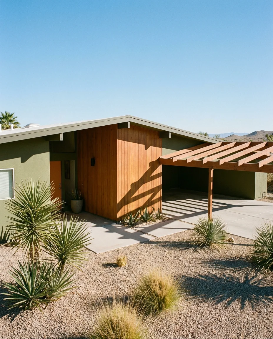
Mid-century homes often come with original details—clerestory windows, overhanging flat roofs, and breeze block walls—that reward period-appropriate color rather than contemporary neutrals. Choosing an olive or avocado that references the original palette of the 1950s and 60s doesn’t just look right aesthetically; it also tends to preserve the home’s architectural integrity in a way that matters to preservation-minded buyers and neighbors alike.
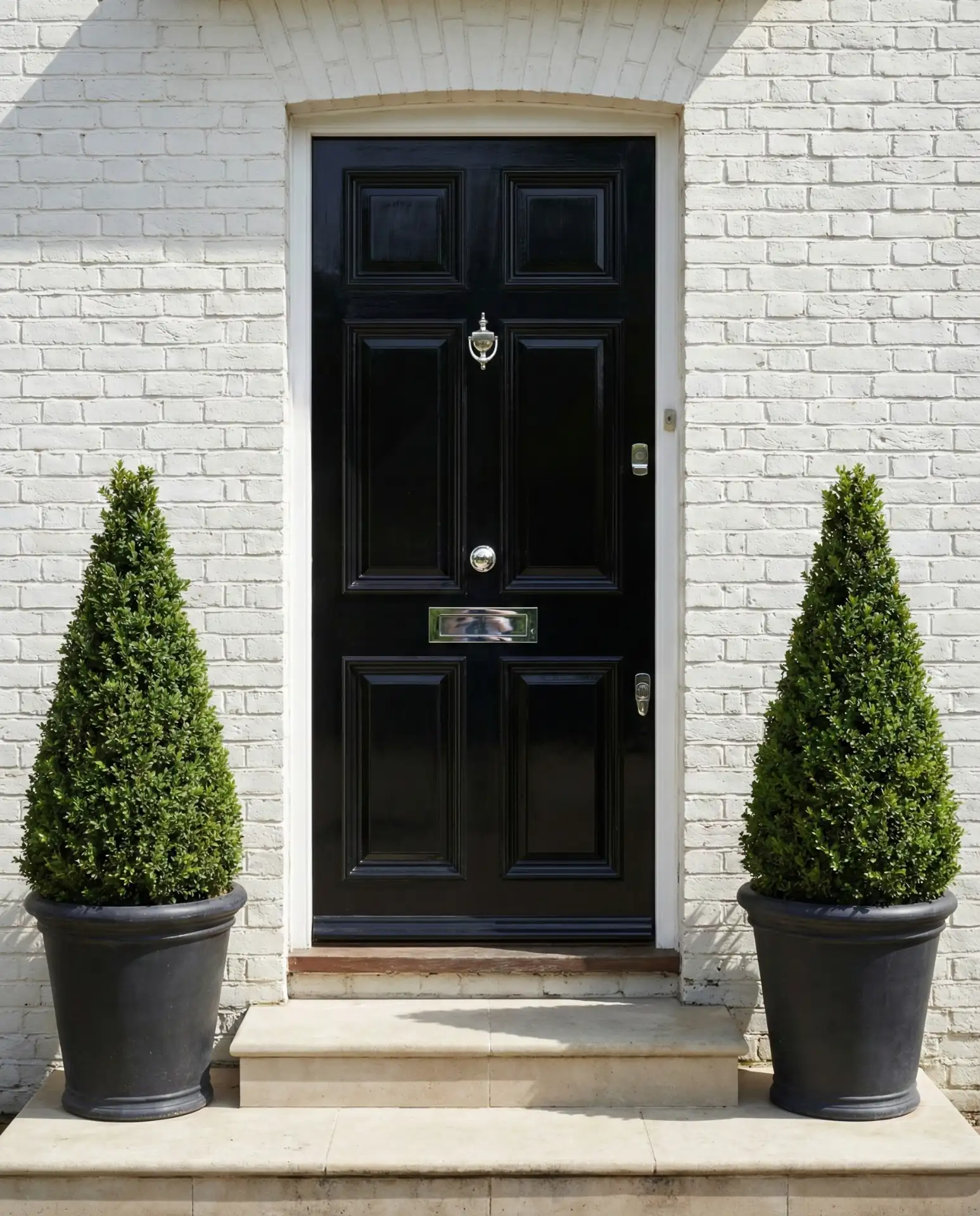
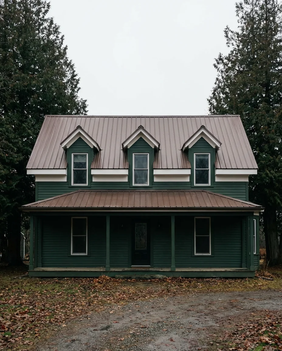
14. Gray Exterior with White Trim and Black Doors
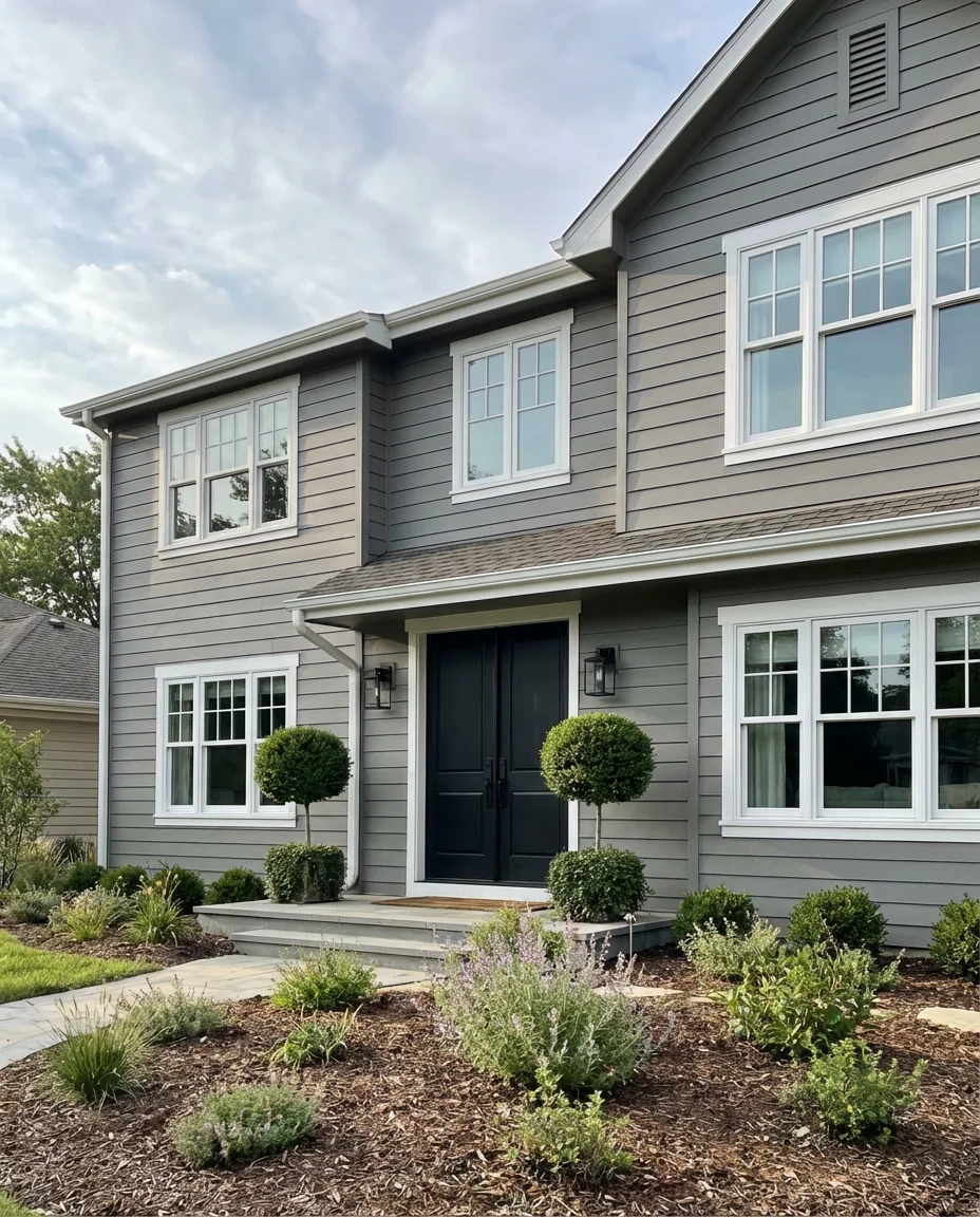
The light gray, white trim, and black doors combination remains one of the most searched and pinned exterior palettes in America, and it shows no signs of fading in 2026. The formula is essentially foolproof—gray as a body color bridges the gap between cool and warm, white trim sharpens every architectural edge, and a black door anchors the whole composition with a focal point that feels deliberate and strong.
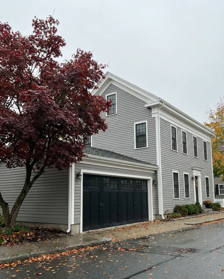
One subtlety worth noting: the specific gray matters enormously. A cool, blue-toned gray can look sterile and institutional without careful balancing, while a warmer greige-gray feels inherently more residential and welcoming. Test your gray sample next to both your trim white and your proposed door color before committing. A $10 sample pot and a weekend afternoon of testing can save you from an expensive painting mistake.
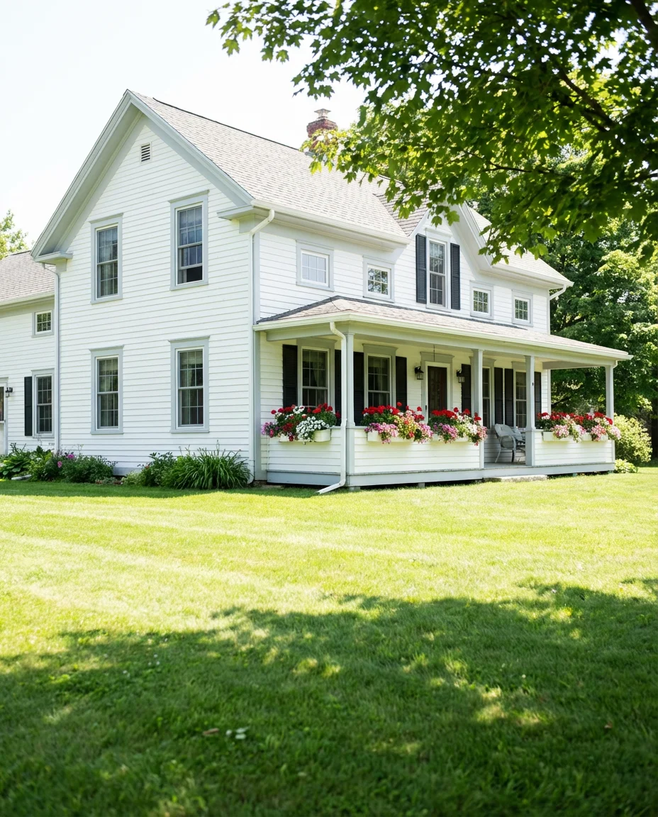
15. Creamy Off-White Farmhouse with Brown Roof
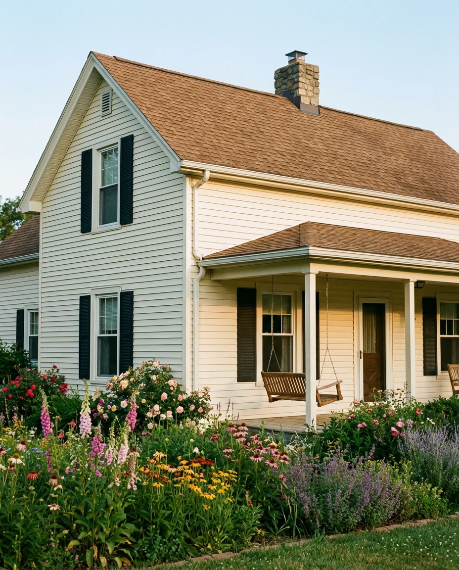
There’s a warmth to creamy off-white that pure white simply cannot deliver, and for farmhouse-style homes with a brown roof, it’s often the more flattering choice. The slight yellow or ivory undertone in an off-white body reads as lived-in and genuine rather than freshly scrubbed. Against a warm brown shingle or metal roof, the combination evokes heritage farmsteads in the best possible way.
This is a palette that real homeowners across the rural Midwest and Southeast return to again and again—not because it’s the most exciting option, but because it works reliably across seasons, ages gracefully, and complements virtually any landscape. For families in farm country, it also carries genuine cultural resonance that makes the choice feel personal rather than trend-driven, which is its own kind of value.
16. Latest Dusty Blue Coastal Home
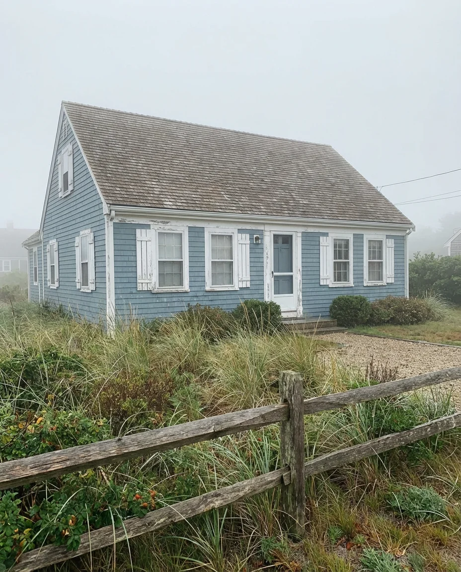
Among the latest coastal exterior trends, dusty blue—specifically the kind that leans gray and faded rather than bright and nautical—is having a serious breakout moment. It pairs beautifully with white trim, natural wood details, and sandy or pebble landscaping. On Cape Cod and Shingle-style homes especially, it creates that washed-by-the-sea quality that coastal living enthusiasts spend a lifetime pursuing.
The geographic context here matters as much as the color itself. A dusty blue reads beautifully against actual coastal light—the diffused brightness and high humidity of oceanside environments give it a luminous quality that inland settings can’t quite replicate. If you love this look but live inland, compensate by choosing a slightly lighter, slightly warmer version of the color to avoid the flat, washed-out effect that sometimes happens away from the water.
17. Warm Walnut Brown Modern Ranch
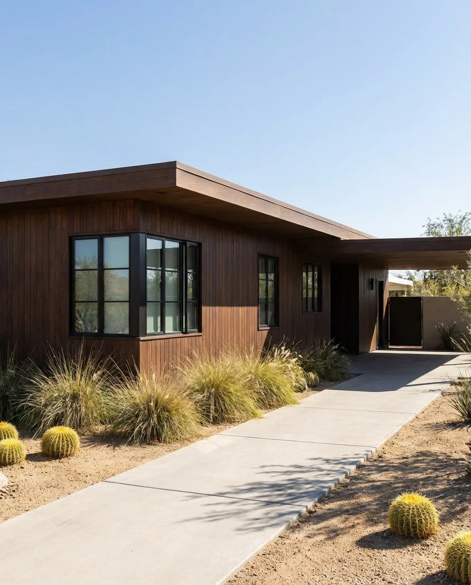
Rich walnut and chocolate brown tones are showing up on modern ranch homes with growing frequency, replacing the cooler grays that dominated the 2010s. There’s something grounding and masculine about a deep brown exterior—it connects the home to the earth in a way that no cool-toned color can replicate. Paired with black window frames and concrete hardscaping, it feels contemporary without feeling cold.
Brown exteriors are experiencing a design rehabilitation right now, partly because younger homeowners are reacting against the cold minimalism that characterized the previous decade. A well-chosen warm brown can read traditional or contemporary depending entirely on the trim treatment and landscaping—strip away the shutters, add slim black window frames, and the same brown body color transforms from country cottage to modernist statement.
18. Pale Lavender Gray—The Unexpected Choice

Not every trending color in 2026 announces itself loudly—some of the most interesting moves are subtle. Pale lavender-gray is one of those. In full sun it reads almost as a warm white; in cloudy light its purple undertone becomes perceptible. On Victorian-era homes or Queen Anne-style architecture, it creates a storybook quality that is deeply Instagrammable without feeling contrived or costume-y.

This color is experiencing its highest search interest in Pacific Coast cities—San Francisco, Portland, and Seattle—where overcast light conditions let the lavender undertone reveal itself consistently throughout the day. In sunbelt states, the same color can read almost completely neutral, which might appeal to homeowners who want a subtle nod to this palette without full commitment. Pair it with a sage green front door for an extraordinary combination that feels genuinely original.
19. Bold Teal with Natural Wood Accents
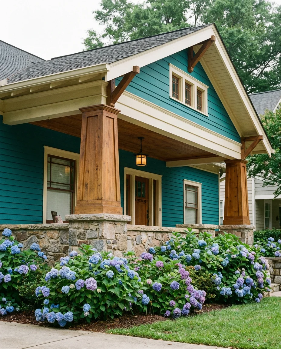
Teal occupies that remarkable sweet spot between blue and green—making it feel simultaneously fresh and grounded. On a bungalow or Craftsman-style home with natural wood porch details, a bold teal body color creates a look that references both Arts and Crafts tradition and contemporary design confidence. It’s a color that says something specific about the people who live there, which is exactly what a great exterior color should do.
Teal is a color that homeowners either commit to fully or talk themselves out of entirely—and the ones who commit almost universally report loving the outcome. The psychological barrier is real, but the visual payoff tends to exceed expectations. If you’re on the fence, consider painting a large 4×4 foot sample area and living with it for a week across multiple weather and lighting conditions before making the final decision.
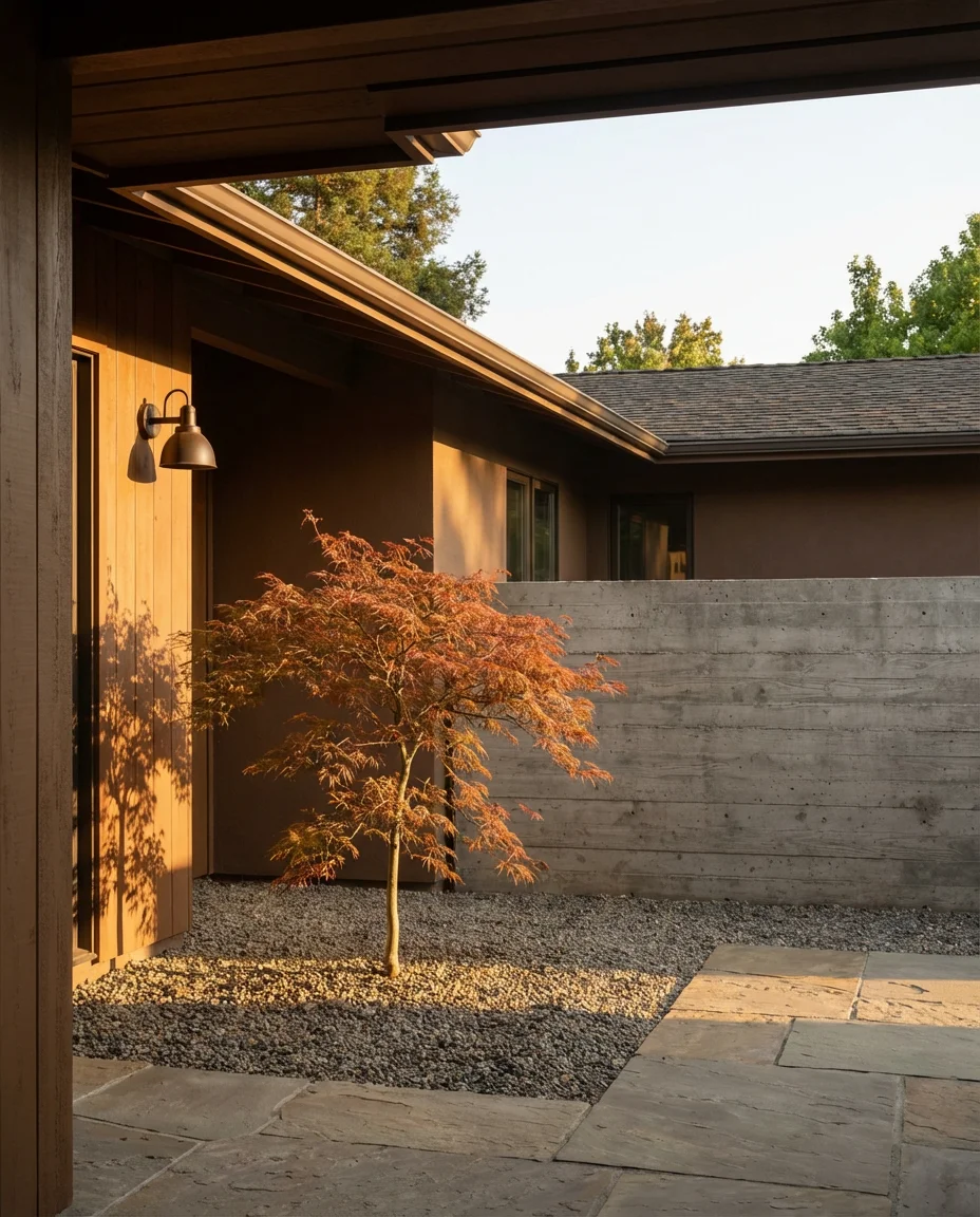
20. Earthy Terracotta Stucco Contemporary
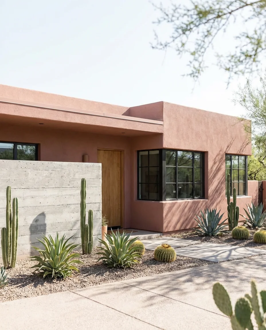
Terracotta as an exterior paint color—not just a roofing tile—is one of the more exciting developments in 2026 exterior design. Applied to stucco on a flat-roofed contemporary home in the Southwest or California, it creates an adobe-inspired warmth that connects the architecture to its landscape. The color bridges traditional Pueblo and Spanish Colonial traditions with a distinctly modern attitude when paired with minimalist landscaping and clean lines.
The American Southwest and high desert regions of California are natural homes for this palette, where the light is strong enough to handle the warmth of terracotta without overwhelming it. But this color is also appearing on renovated mid-century stucco homes in unexpected places—Phoenix, Tucson, and even Austin—where homeowners are embracing the regional architectural tradition in a more explicit and confident way than previous generations did.
21. Greige with Black Garage and Front Door
Greige—the hybrid of gray and beige—is the chameleon of exterior neutrals, and when anchored by dark black garage doors and a matching front door, it feels anything but generic. The formula is essentially a sophisticated update of the classic white-and-black combination, with more warmth and visual texture. It works exceptionally well on homes with brick driveways, stone edging, or any hardscaping that adds material depth to the exterior environment.
This combination is performing particularly well in new-construction subdivisions across the Sun Belt, where builders are offering it as an upgrade package over standard all-beige options. Homebuyers in these markets increasingly use Pinterest to identify what they want before walking into a model home showroom—which means the greige-and-black look is shaping purchasing decisions before buyers even realize they’ve been influenced by their social feeds.
22. Pale Blue-Gray with White Windows Craftsman
A pale blue-gray sits at the gentler end of the cool exterior spectrum—less dramatic than slate or charcoal, but more interesting than plain gray. On a Craftsman-style home with white windows and exposed rafter tails, this color creates a thoughtful, Arts-and-Crafts authenticity that architecture enthusiasts respond to immediately. It has the rare quality of feeling historically appropriate while remaining completely contemporary in sensibility.
Pale blue-gray is a color that ages beautifully rather than wearing out its welcome. Unlike deeper, more saturated colors that can feel tied to a specific moment, this tone reads timeless from almost any angle. For older homes in established neighborhoods—the kind where the houses have been through five or six different paint cycles over decades—this color has a way of making the home look like it was always this color, which is a sign of how naturally it wears.
23. Inky Navy Blue—The Statement Exterior
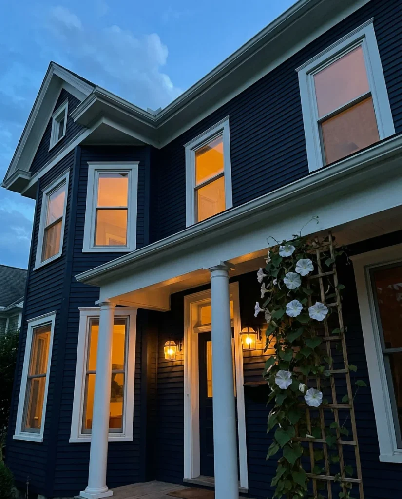
If dark exteriors are trending, navy blue is leading the charge as the most dramatic and design-forward option in the group. An inky, almost black navy on a two-story Colonial or traditional home creates a visual presence that is impossible to ignore—in the best possible way. Paired with brass or bronze hardware, white trim, and lush foundation plantings, it’s a combination that has appeared in architectural publications with increasing frequency heading into 2026.
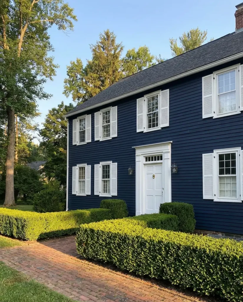
Navy exteriors require a confident commitment, but the payoff is a home that simply looks more expensive than it costs to paint. The color has an inherent formality and richness that elevates even modest architectural details. The one practical consideration worth noting: deep navy requires premium exterior paint with strong UV protection, as darker pigments are more vulnerable to sun degradation over time. Invest in a high-quality product, and the color will remain true for a decade or more.
Conclusion
Whether you’re drawn to the quiet sophistication of dusty sage or the bold drama of inky navy, the exterior color choices available in 2026 give every homeowner the tools to create a facade that feels genuinely personal rather than borrowed from a developer’s default palette. We’d love to know which direction you’re leaning—drop your color picks, questions, or photos of your own exterior project in the comments below, and let’s talk through it together.