Blue bedrooms continue to dominate American interior design in 2026, especially among homeowners aged 20–60 seeking calming, stylish retreats. Pinterest users are flooding the platform with searches for blue bedroom inspiration, drawn to the color’s versatility—from soft coastal vibes to dramatic moody statements. Whether you’re refreshing a primary suite or reimagining a guest room, blue offers endless possibilities that work across budgets and home styles. This guide presents carefully curated ideas that blend current trends with timeless appeal, helping you create a bedroom that feels both personal and on-point.
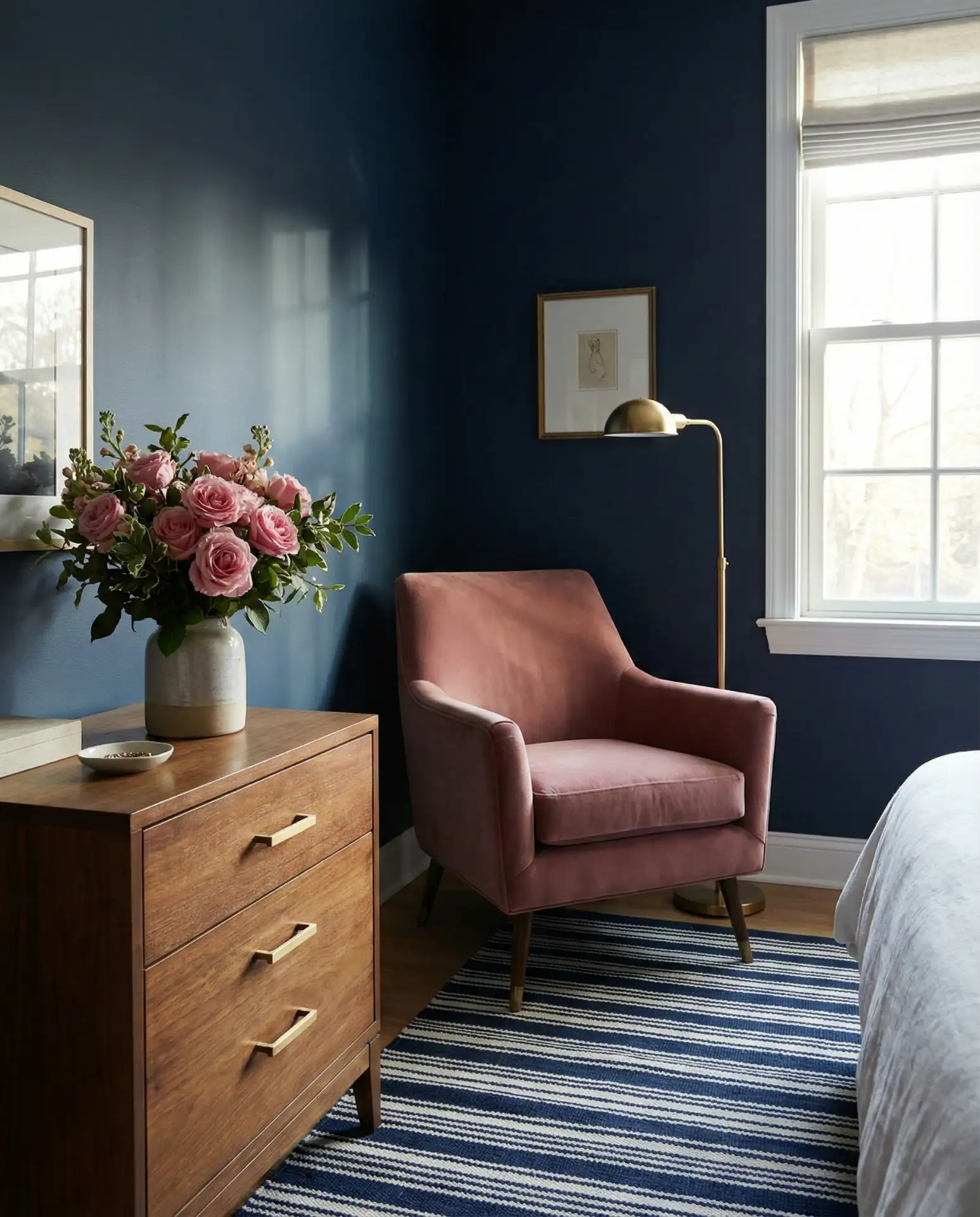
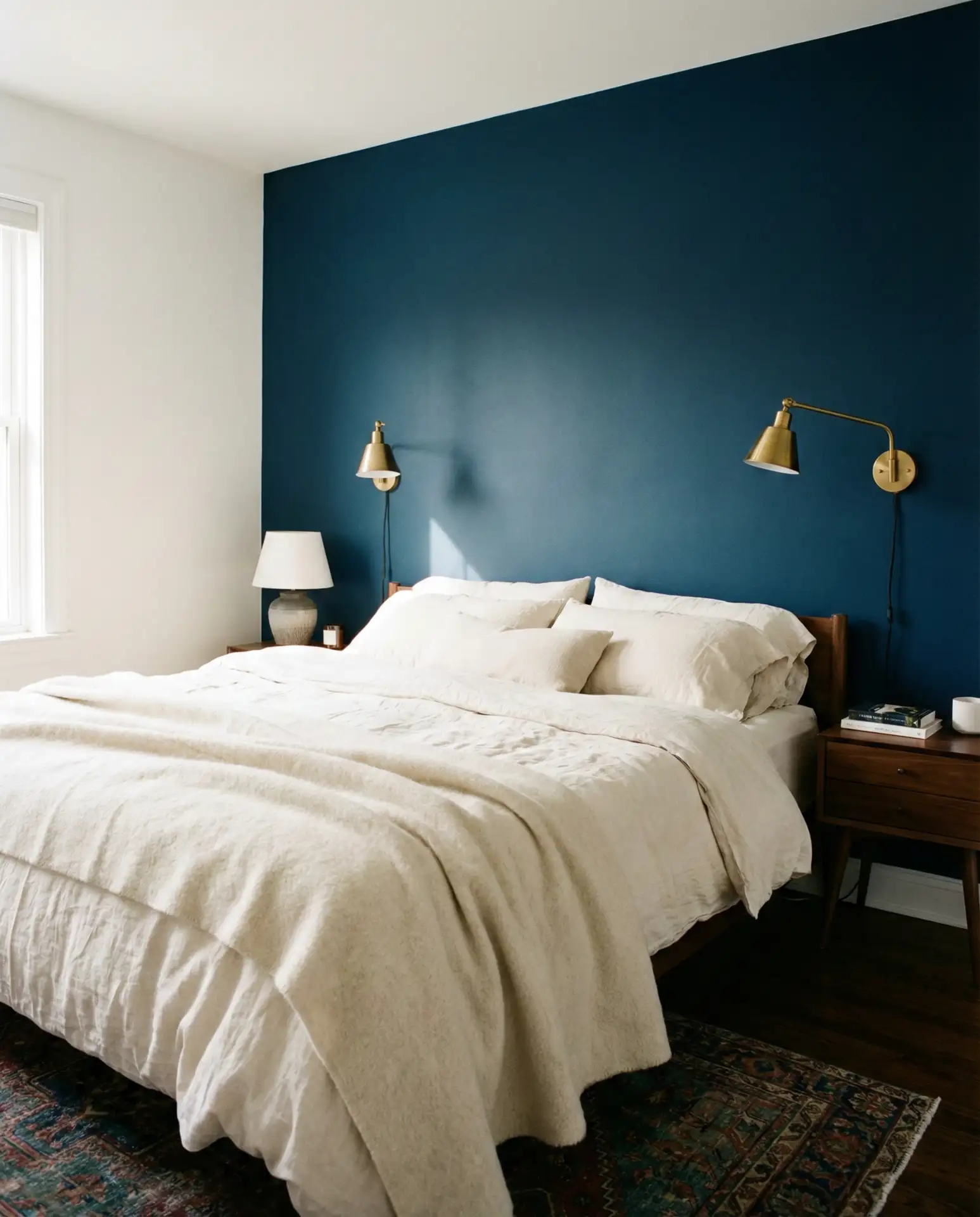
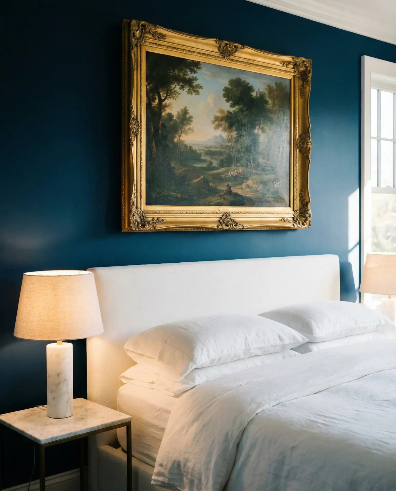
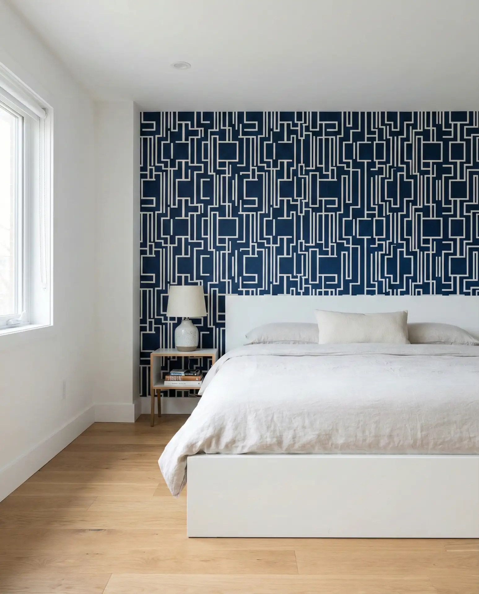
1. Navy Accent Wall with Brass Hardware
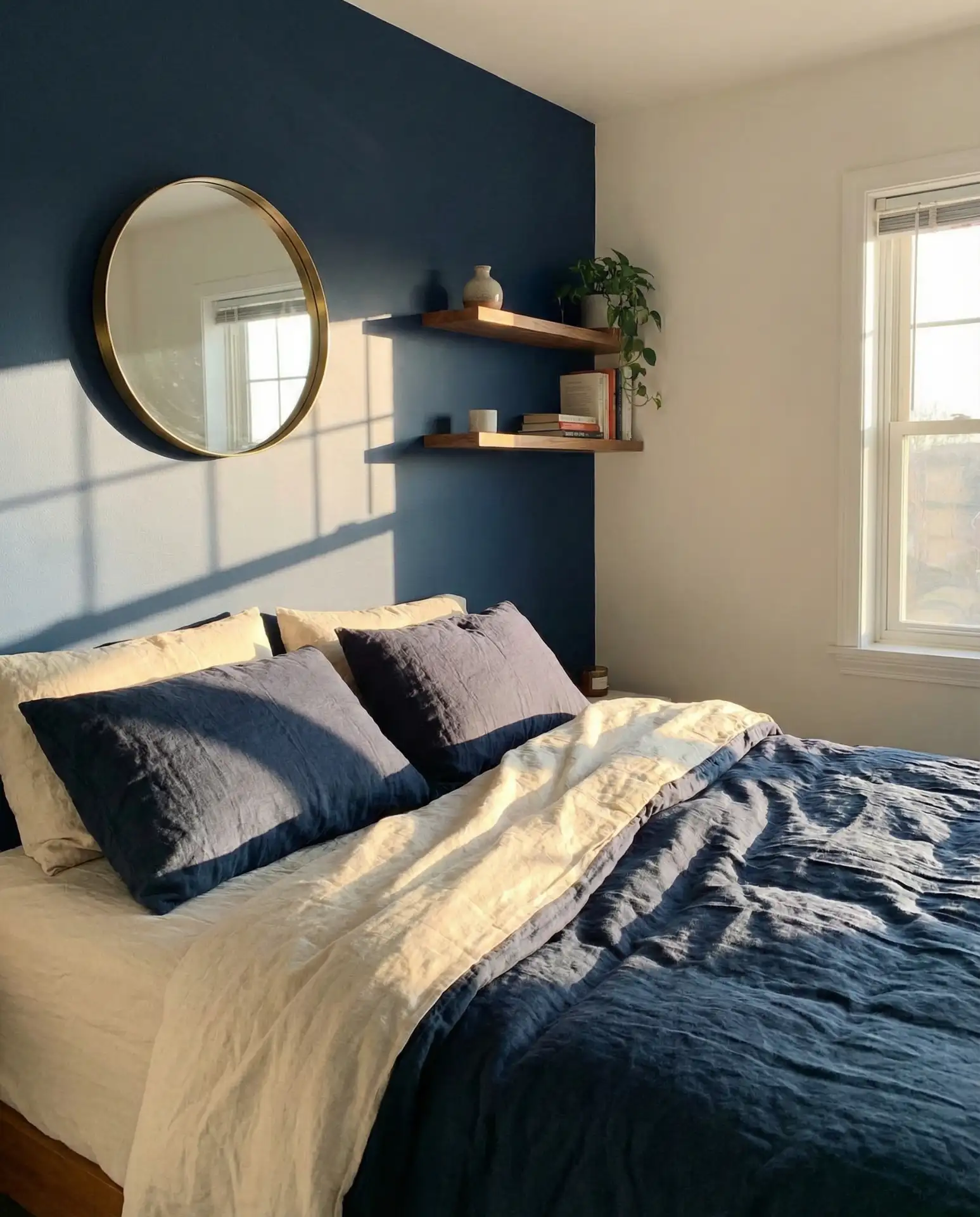
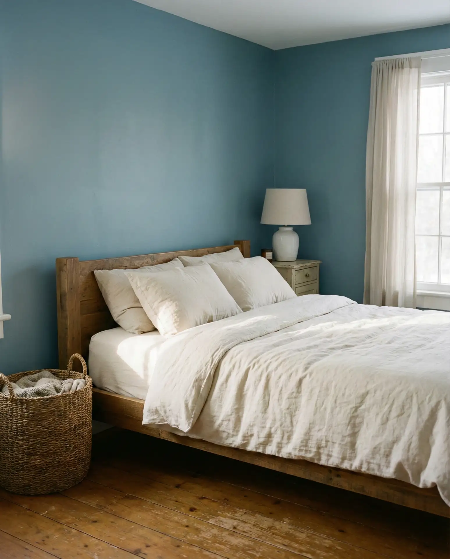
A navy accent wall anchors your bedroom with sophistication without overwhelming the space. This approach works beautifully in rooms with abundant natural light, where the dark hue reads as rich rather than heavy. Pair it with warm brass cabinet pulls, light fixtures, and picture frames to create contrast that feels both classic and current. The combination appeals to homeowners who want a moody atmosphere that still feels inviting rather than cave-like.
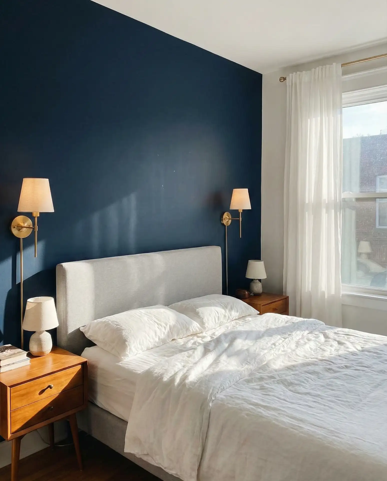
This look works best in suburban homes and city apartments where you’re balancing modern taste with livability. Keep the other three walls in a soft white or cream to maintain brightness and prevent the room from feeling closed-in. Layer in textiles—a chunky knit throw, linen pillows—to soften the formality that navy can sometimes bring. Budget-conscious homeowners appreciate that one gallon of quality navy paint typically costs $40–60 and transforms a space more dramatically than any furniture purchase at that price point.
2. Soft Powder Blue with White Wainscoting
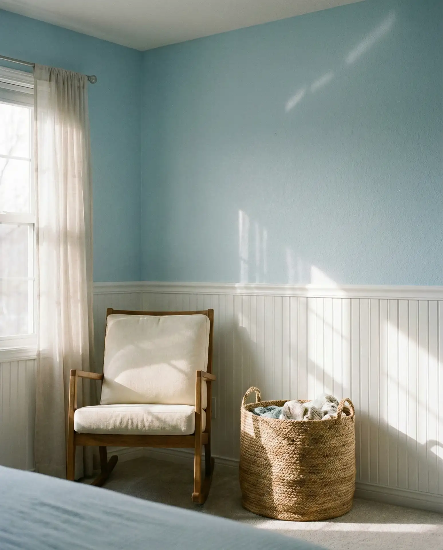
The combination of powder blue walls and crisp white wainscoting delivers a fresh, cottage-inspired aesthetic that Americans associate with coastal New England homes. This soft color scheme creates an airy feeling that works particularly well in smaller bedrooms where you need to maximize perceived space. The wainscoting adds architectural interest at a relatively low cost, especially if you opt for pre-primed MDF panels. This approach appeals to homeowners drawn to aesthetic bedroom designs that photograph beautifully but remain practical for everyday living.
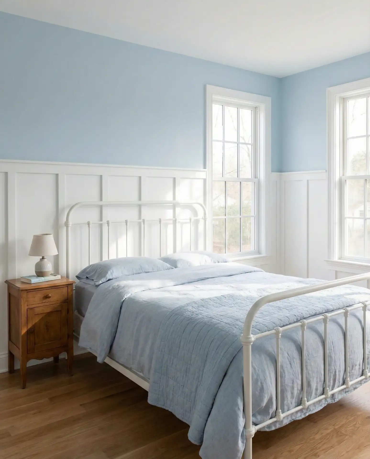
Many homeowners make the mistake of choosing powder blue that’s too bright or synthetic-looking—test samples in your actual bedroom lighting before committing. The most successful versions use blue with slight gray undertones, which reads as sophisticated rather than juvenile. Wainscoting installed to 36 inches creates ideal visual proportions in standard 8-foot ceiling rooms. This treatment works across home styles, from Cape Cods to Craftsman bungalows, making it a safe choice when resale value matters.
3. Midnight Blue Ceiling Treatment
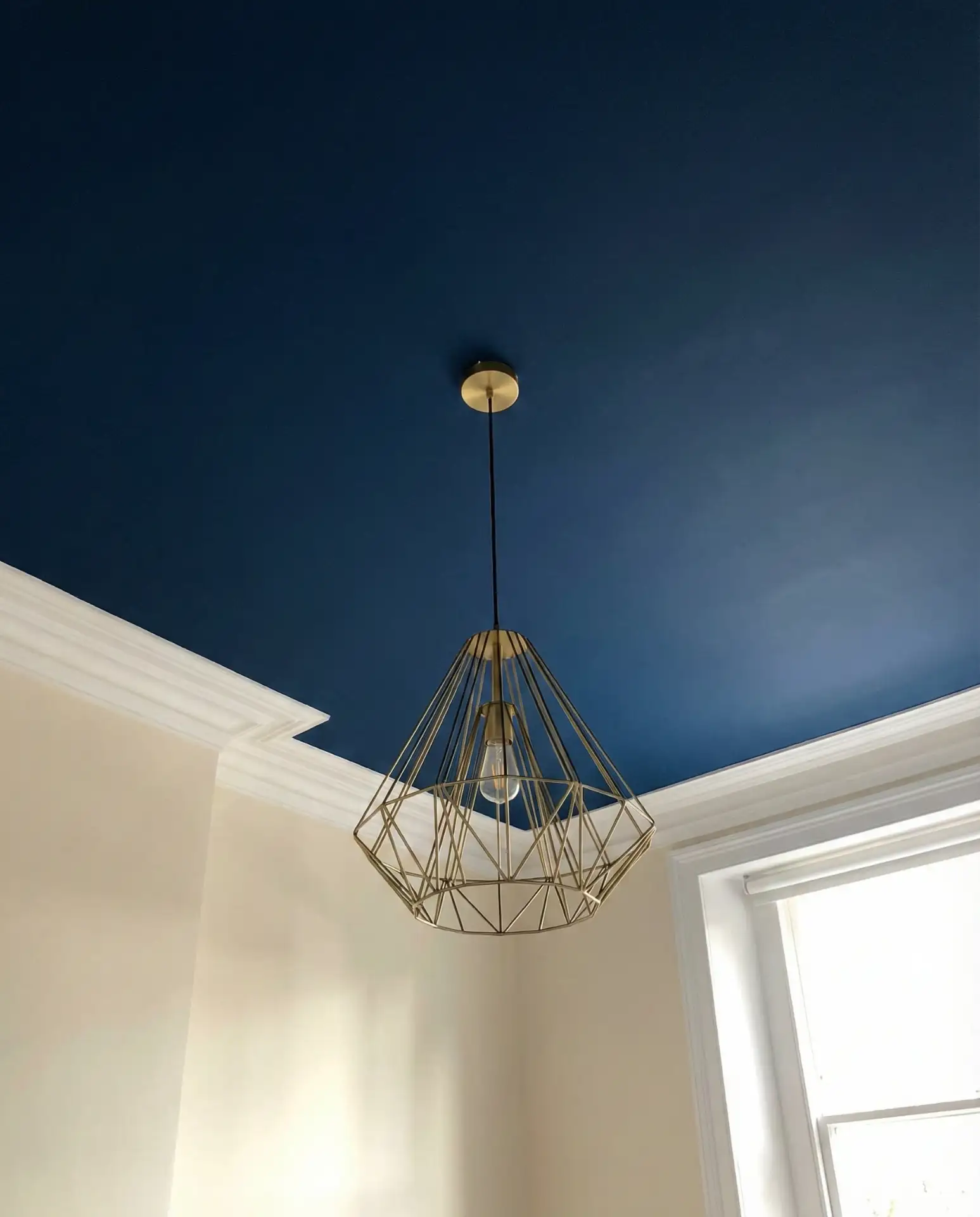
Painting your ceiling in midnight blue creates an unexpected focal point that mimics the night sky, perfect for bedrooms where relaxation is paramount. This dark overhead treatment actually makes rooms feel taller by drawing the eye upward and creating depth. Keep walls in a contrasting lighter shade—cream, pale gray, or even white—to prevent the space from feeling oppressive. The trend gained momentum in 2025 and continues strong in 2026 as homeowners seek ways to add drama without committing to dark walls.
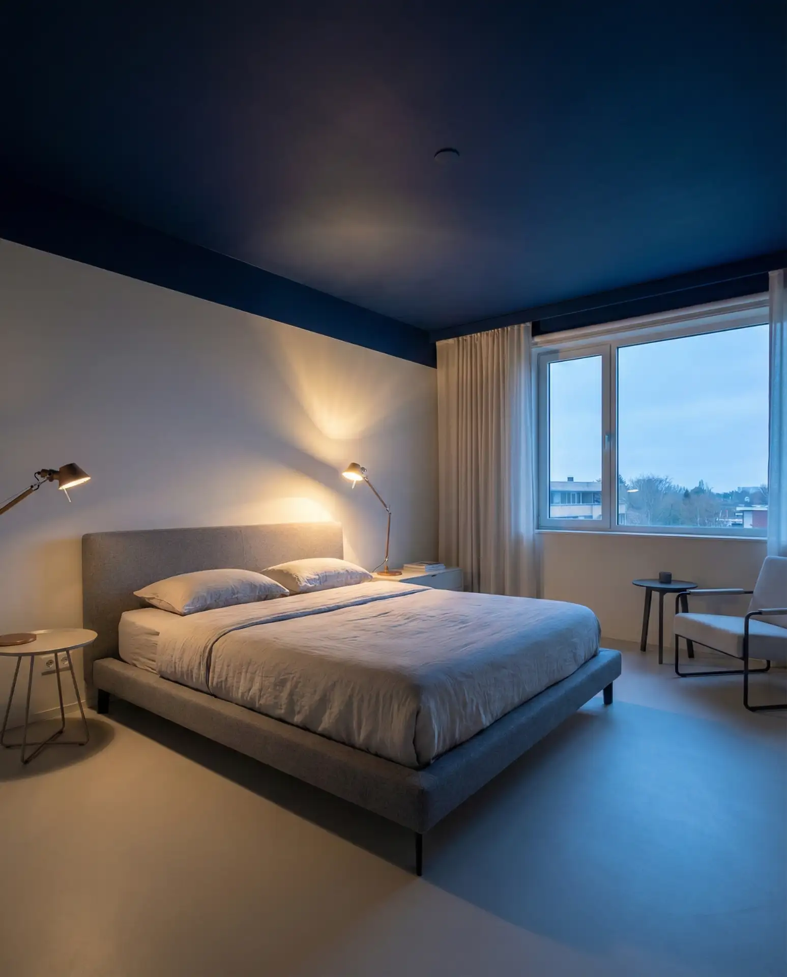
Interior designers note that this approach works exceptionally well in master bedrooms with tray ceilings or architectural details worth highlighting. The midnight blue ceiling pairs beautifully with warm metallics like aged brass or copper in light fixtures, which creates a subtle celestial reference without being literal. One designer from Texas mentioned that clients initially hesitate but universally love the result once completed—it’s become her signature move for boring builder-grade bedrooms that need instant personality. Standard ceiling paint costs the same as wall paint, making this a budget-neutral way to achieve high-impact results.
4. Duck Egg Blue with Natural Wood Furniture
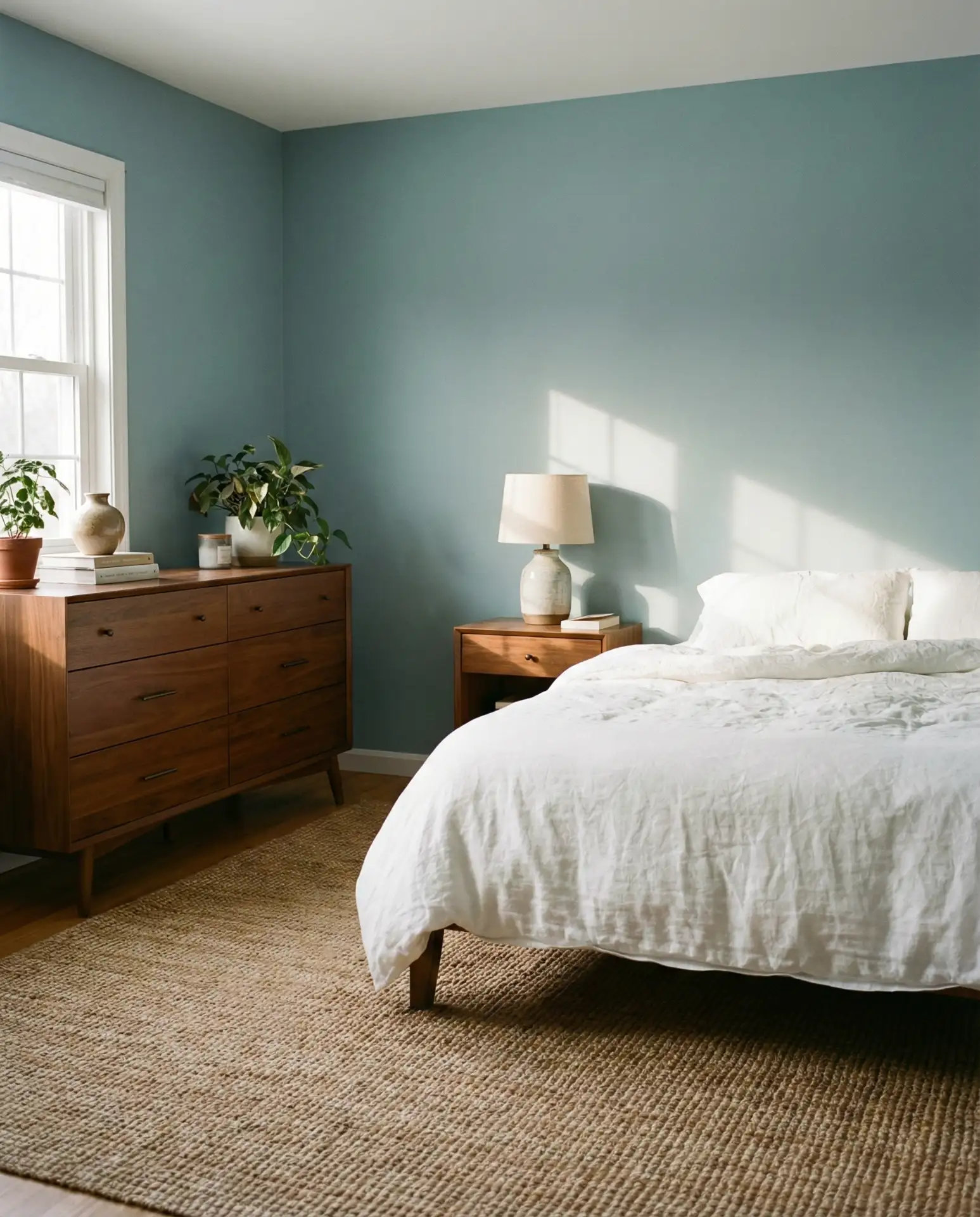
Duck egg blue offers a muted, sophisticated alternative to brighter blues, with its subtle green undertones creating warmth that pure blues lack. This shade gained popularity through British design magazines and translates beautifully to American homes, especially when paired with natural oak, walnut, or maple furniture. The color works particularly well in bedrooms with northern exposure, where it maintains its softness without looking cold. Homeowners seeking a cozy yet refined atmosphere gravitate toward this combination because it feels collected rather than overly coordinated.
This palette thrives in homes throughout the Pacific Northwest and New England, where the connection to nature feels authentic rather than forced. The key is choosing wood furniture with visible grain and character—too-perfect finishes can make the room feel sterile against the soft paint color. Many homeowners discover this shade after trying grays that felt too cold; duck egg offers similar neutrality with more personality. Paint typically requires two coats for even coverage, and the color shifts beautifully throughout the day as natural light changes, giving you multiple moods from one paint choice.
5. Royal Blue and White Striped Bedding
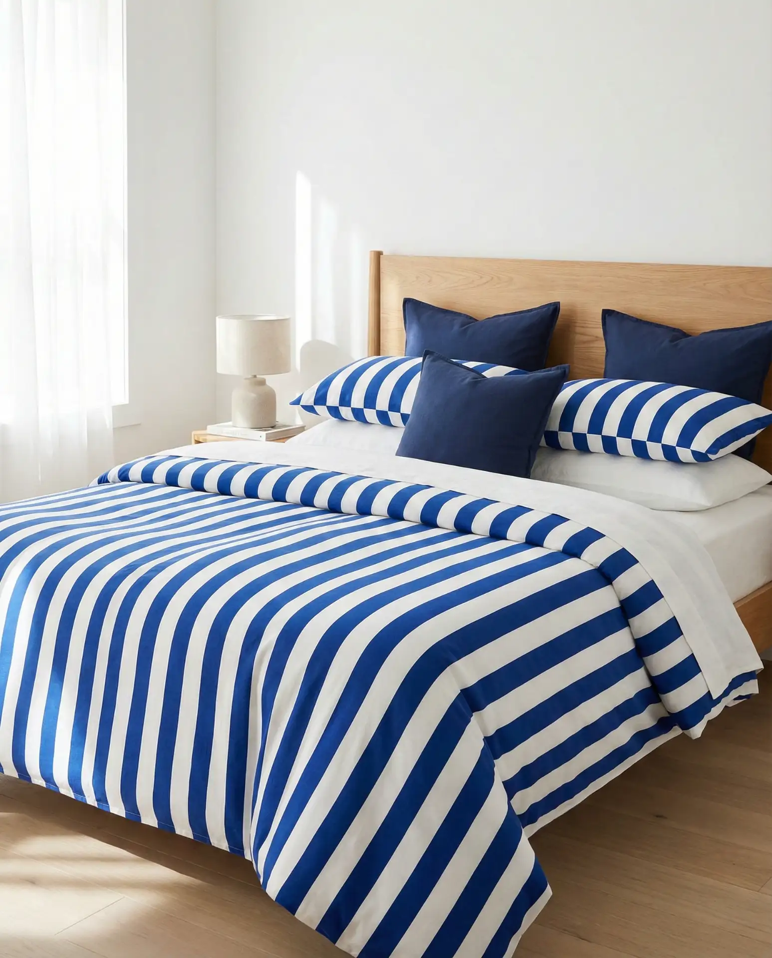
Bold royal blue and white striped bedding makes an instant statement without requiring paint or permanent changes to your space. This classic pattern evokes nautical themes but works equally well in urban lofts and suburban homes when styled with modern accessories. The high contrast ratio creates visual energy that suits active households, and the pattern disguises wrinkles better than solid colors—a practical consideration for busy families. This aesthetic bedroom approach appeals to renters and commitment-phobic decorators who want impact without long-term obligation.
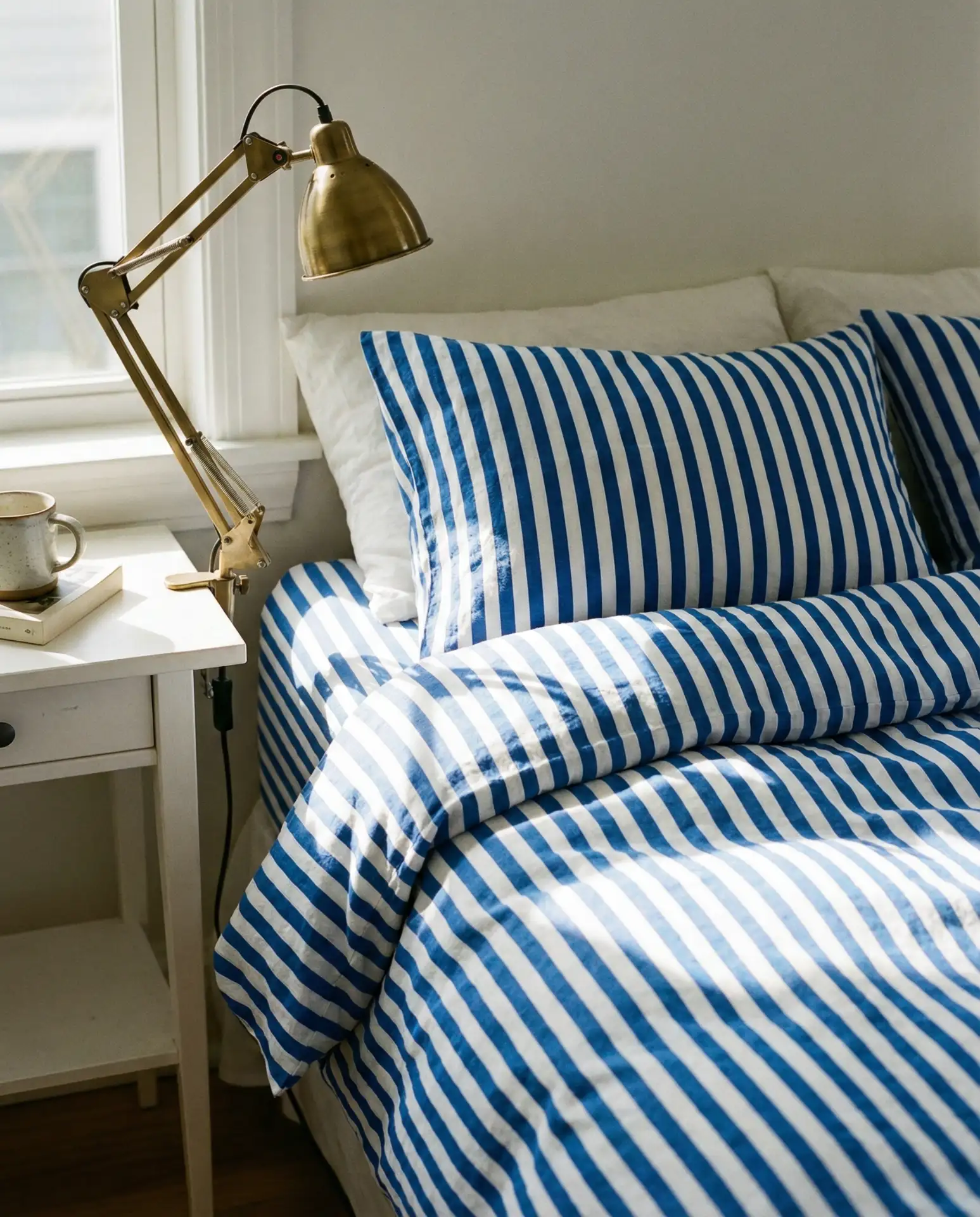
Real homeowners report that striped bedding works best when the rest of the room stays relatively neutral—too many patterns compete for attention and create visual chaos. Choose wide stripes (3 inches or more) for a contemporary feel, or narrower ticking stripes for vintage charm. Quality matters here: cheaper sets pill quickly, and the blue can fade to purple with repeated washing. Expect to spend $120–180 for a durable duvet cover set that maintains its crisp appearance. This approach particularly suits guest bedrooms where you want personality without personalization.
6. French Blue with Gilt Accents
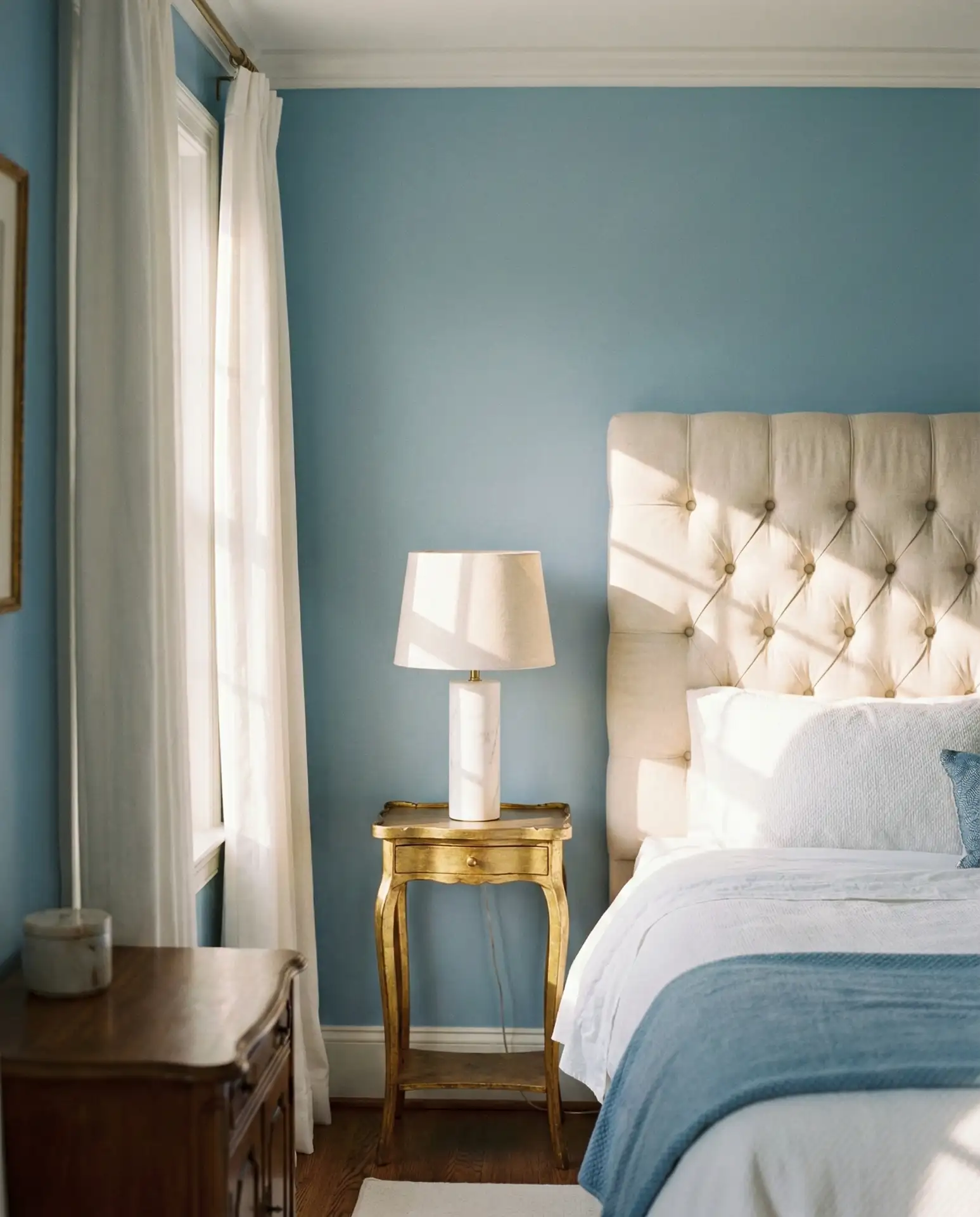
French blue brings European elegance to American bedrooms, with its grayish-blue tone creating sophistication that feels effortless rather than fussy. Layer in gilt-framed mirrors, gold-leafed picture frames, and antique brass candlesticks to reference Parisian apartments without full-on theme-park decoration. This color works beautifully in rooms with high ceilings and good natural light, where its subtle complexity can be appreciated. The combination appeals to homeowners who want a soft color palette that still feels special and intentional rather than safe.

Common mistakes include overdoing the gilt—it should appear as thoughtful highlights rather than coating every surface. Three to five gilt elements in varying sizes create balance without looking like a gold explosion. French blue works particularly well in historic homes throughout Charleston, Savannah, and New Orleans, where the color complements existing architectural details. Modern homeowners in newer construction can use this palette to add instant heritage and character to otherwise generic spaces. The paint color itself is forgiving and works across various lighting conditions, though it shows best in rooms with both natural and warm artificial light sources.
7. Pale Blue with Terracotta Accents
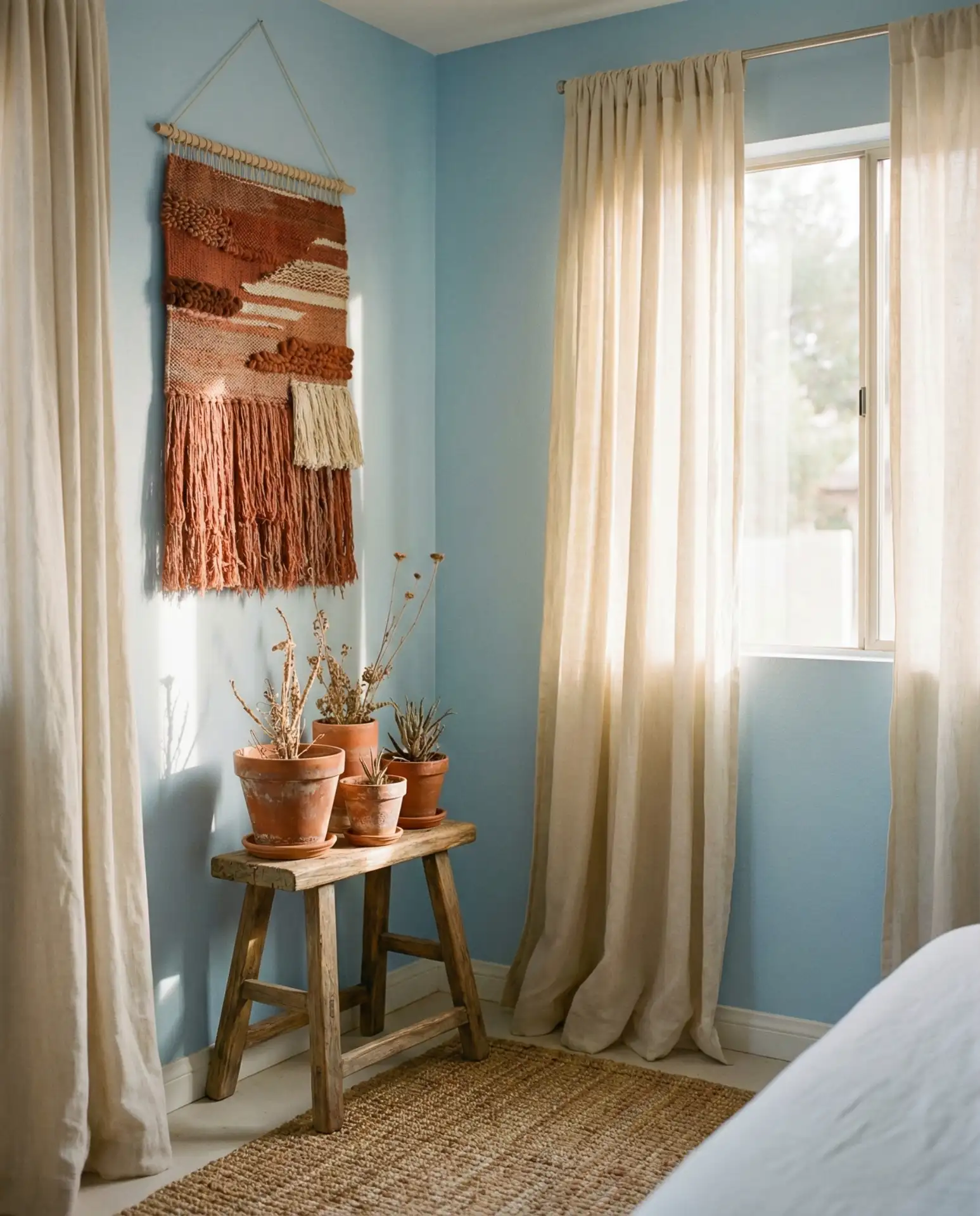
The combination of pale blue walls with terracotta and clay-toned accessories creates an unexpected warmth that feels both modern and timeless. This palette references Southwest design without literal cowboy clichés, making it accessible for homes nationwide. Bring in terracotta through textiles—throw pillows, ceramic lamps, woven baskets—rather than painting, which keeps the look flexible as trends shift. The juxtaposition of cool and warm tones creates visual interest that single-color schemes can’t achieve, perfect for inspo hunters seeking something beyond basic neutrals.
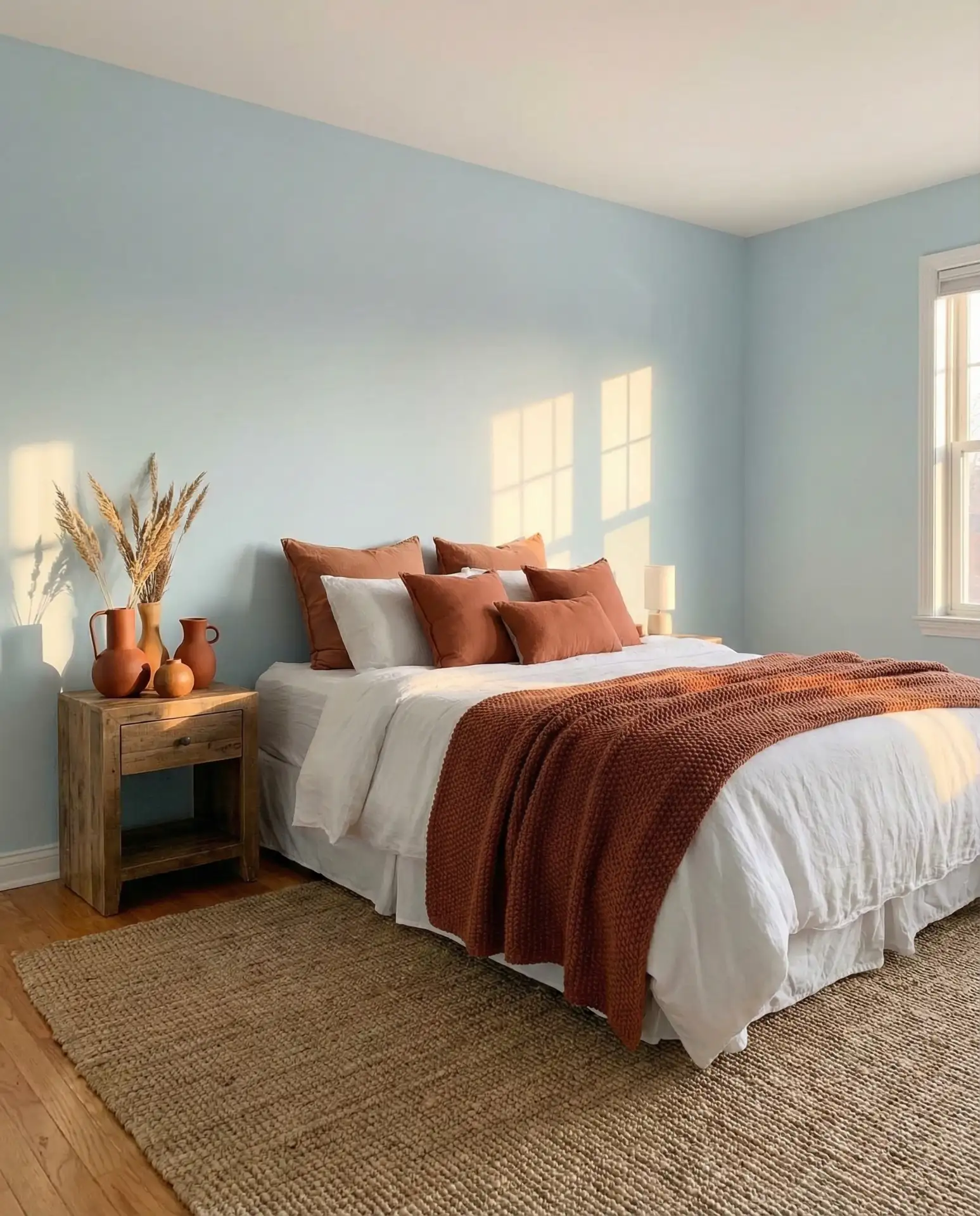
This color story works particularly well in homes throughout California, Arizona, and Texas, where the climate and landscape make the palette feel native. Northerners adopting this look should add more terracotta in winter months and dial it back in summer to keep the balance feeling natural year-round. Avoid the mistake of introducing terra cotta only through one element—distribute the warm tone across at least three different items or materials to create cohesion. The pale blue backdrop allows you to shift accent colors seasonally, making this one of the most versatile blue bedroom foundations for homeowners who like refreshing their decor regularly.
8. Moody Blue with Black Trim
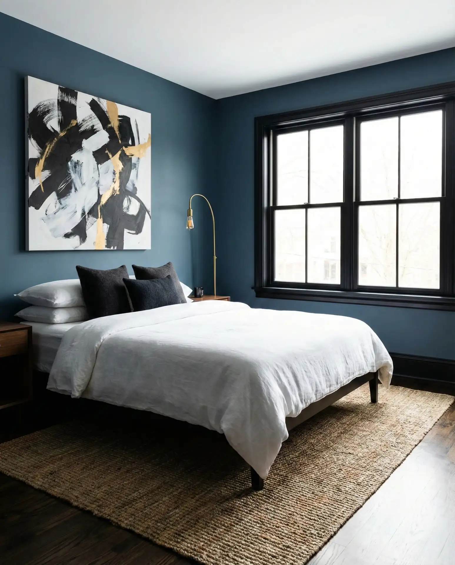
Deep moody blue walls paired with matte black window trim and baseboards create a dramatic, gallery-like atmosphere that younger homeowners particularly embrace. This bold combination requires confidence but delivers a sophisticated, cocooning effect perfect for primary bedrooms. The dark palette actually makes colorful artwork and textiles pop more dramatically than they would against white walls. This approach suits homes with ample natural light during the day and works especially well in urban settings where the drama feels contextually appropriate.
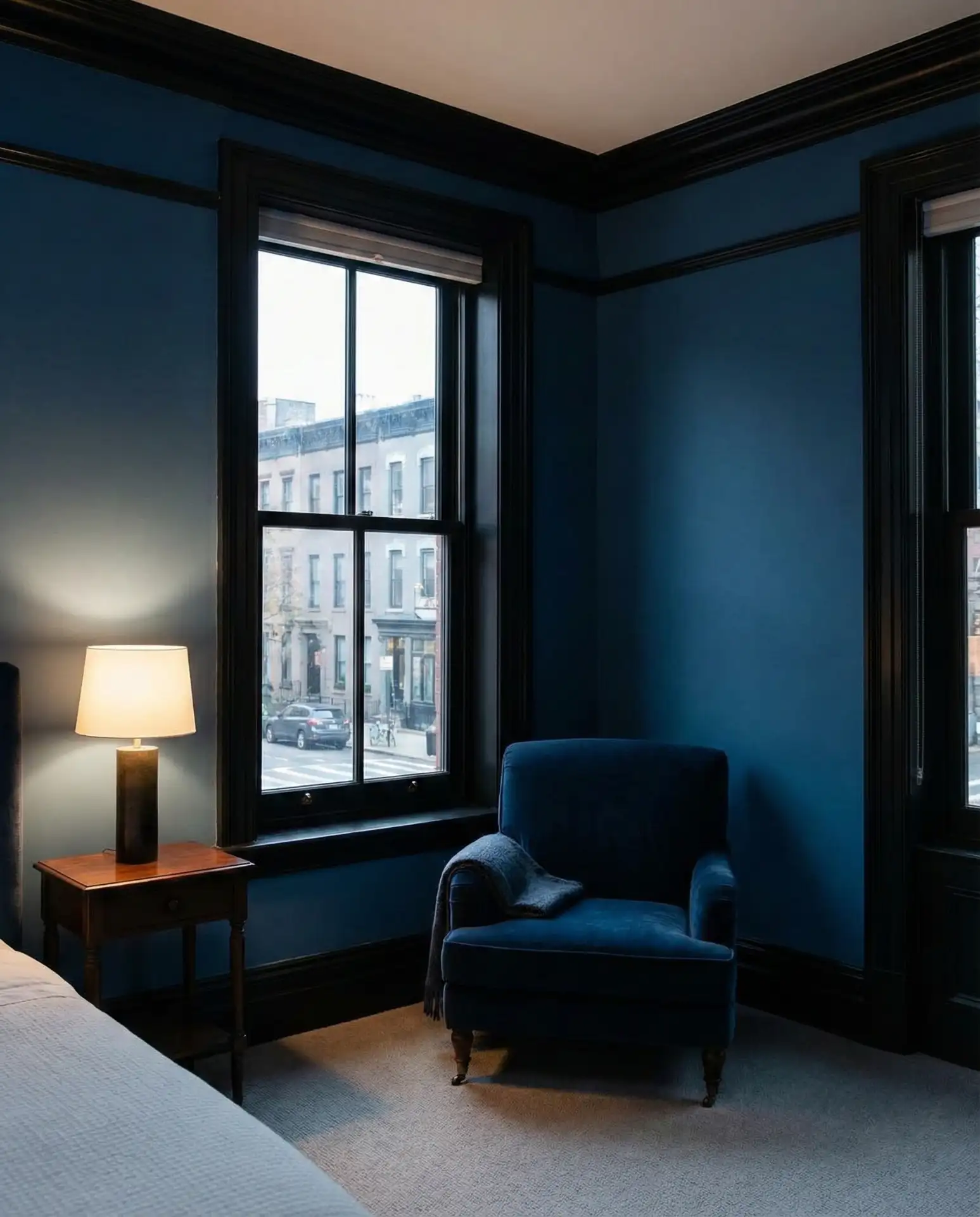
This look thrives in cities like Brooklyn, Portland, and Chicago, where homeowners lean into bold design choices and aren’t afraid of rooms that feel intimate rather than airy. The black trim costs no more than white trim to paint but transforms the entire character of the room—it’s a detail that separates confident decorators from tentative ones. Balance the darkness with plenty of warm-toned task lighting and at least one significant white or cream element to prevent the room from feeling oppressive. Many homeowners report sleeping better in these darker, more enveloping spaces, which block light more effectively than pale walls.
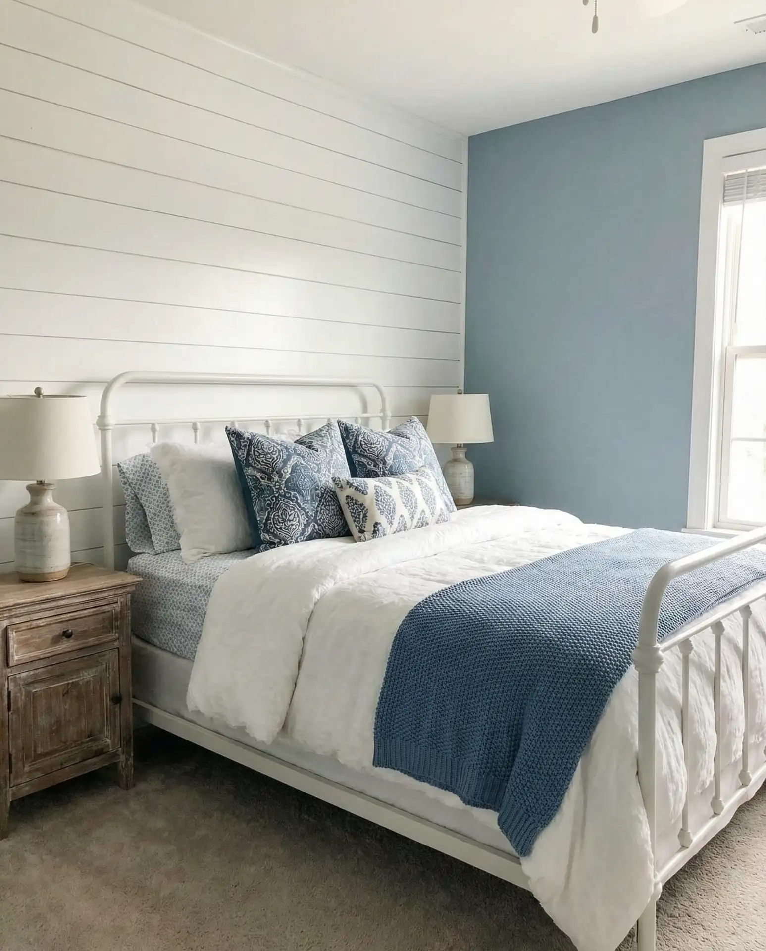
9. Dusty Blue with Cream Bedding
Dusty blue offers a middle ground between a bold statement and whisper-quiet neutral, with enough gray in the mix to feel current rather than dated. Pair it with cream or ivory bedding rather than stark white—the softer contrast creates a more relaxed, approachable feeling that suits bedrooms better than high-contrast schemes. This combination works across home styles from farmhouse to contemporary, making it a safe choice when household members have different aesthetic preferences. The cozy factor increases when you layer in varied textures: nubby linen, smooth cotton, and chunky knit throws.

A common mistake is choosing a dusty blue that’s too gray, which can read as muddy or depressing in rooms without ideal light. Test samples on all four walls and observe them for at least 48 hours through different lighting conditions before committing. The color should still read clearly as blue, not gray-with-a-hint-of-blue. This palette particularly suits suburban primary bedrooms where homeowners want sophistication without the maintenance anxiety that comes with stark white bedding. Cream hides stains and wrinkles better while still feeling fresh and intentional.
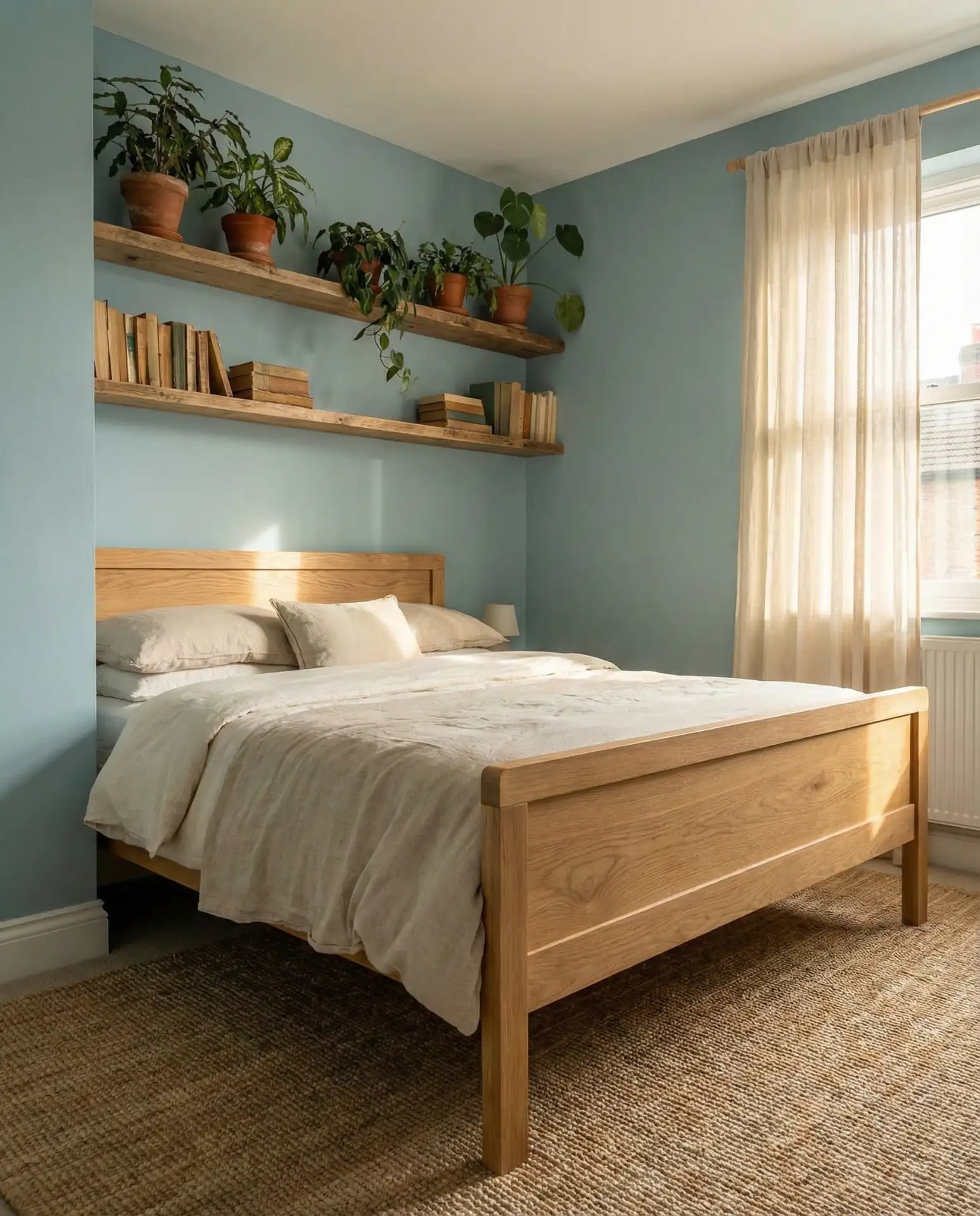
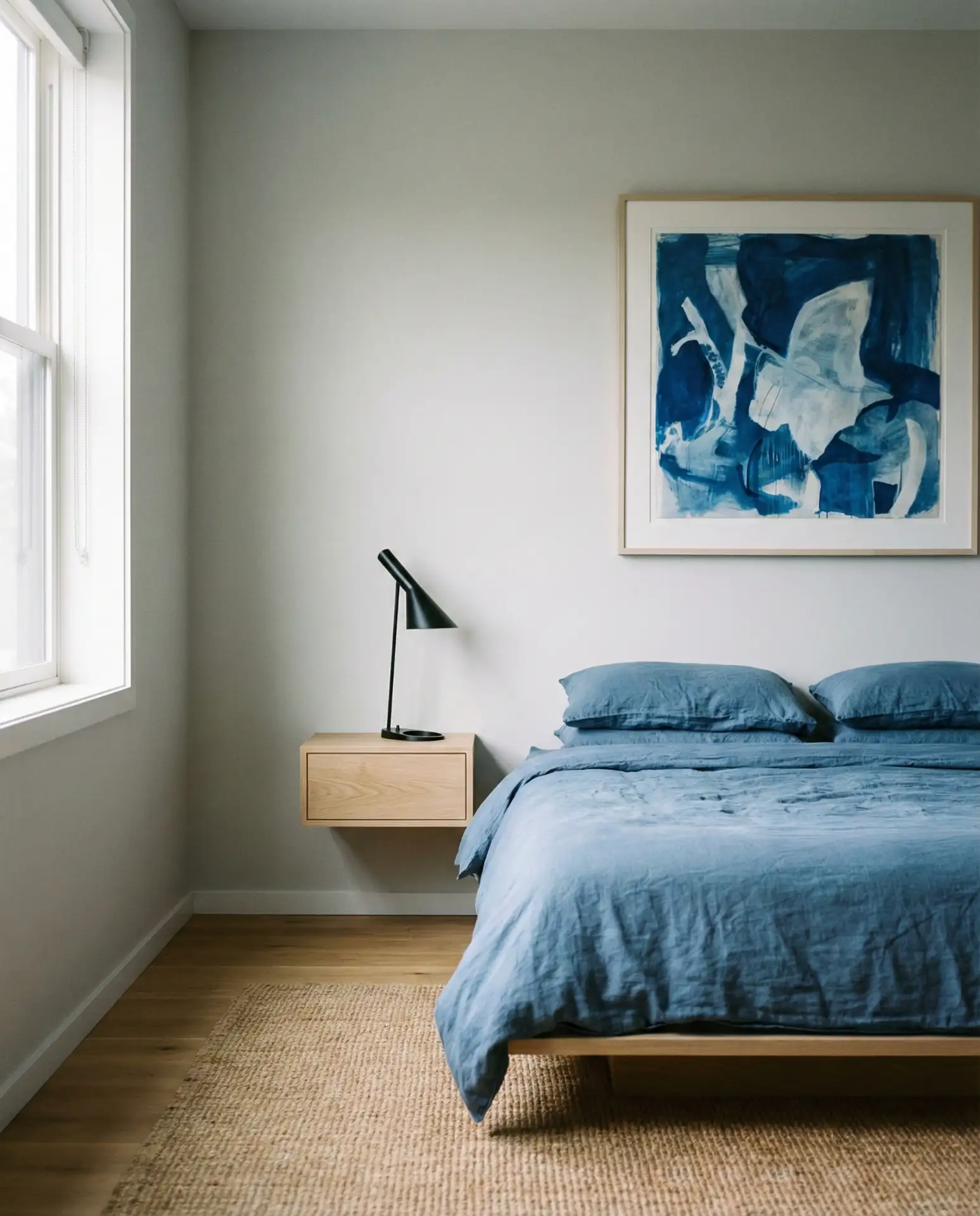
10. Coastal Blue with Jute and Linen Textures
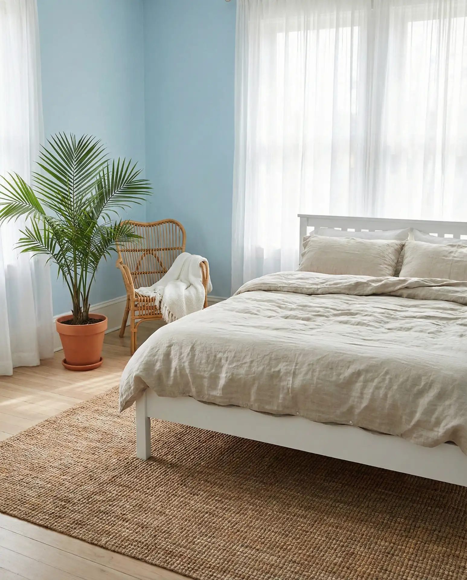
Light coastal blue paired with natural jute rugs and linen textiles creates an effortlessly breezy atmosphere that Americans associate with beach vacations and relaxation. This approach works in actual coastal homes but translates beautifully to landlocked properties where you want to evoke that same easy feeling. Keep the blue light enough to maintain airiness—think clear sky rather than deep ocean. Layer in natural materials like seagrass baskets, driftwood mirrors, and unfinished wood furniture to complete the aesthetic bedroom vision without resorting to literal shells and anchors.
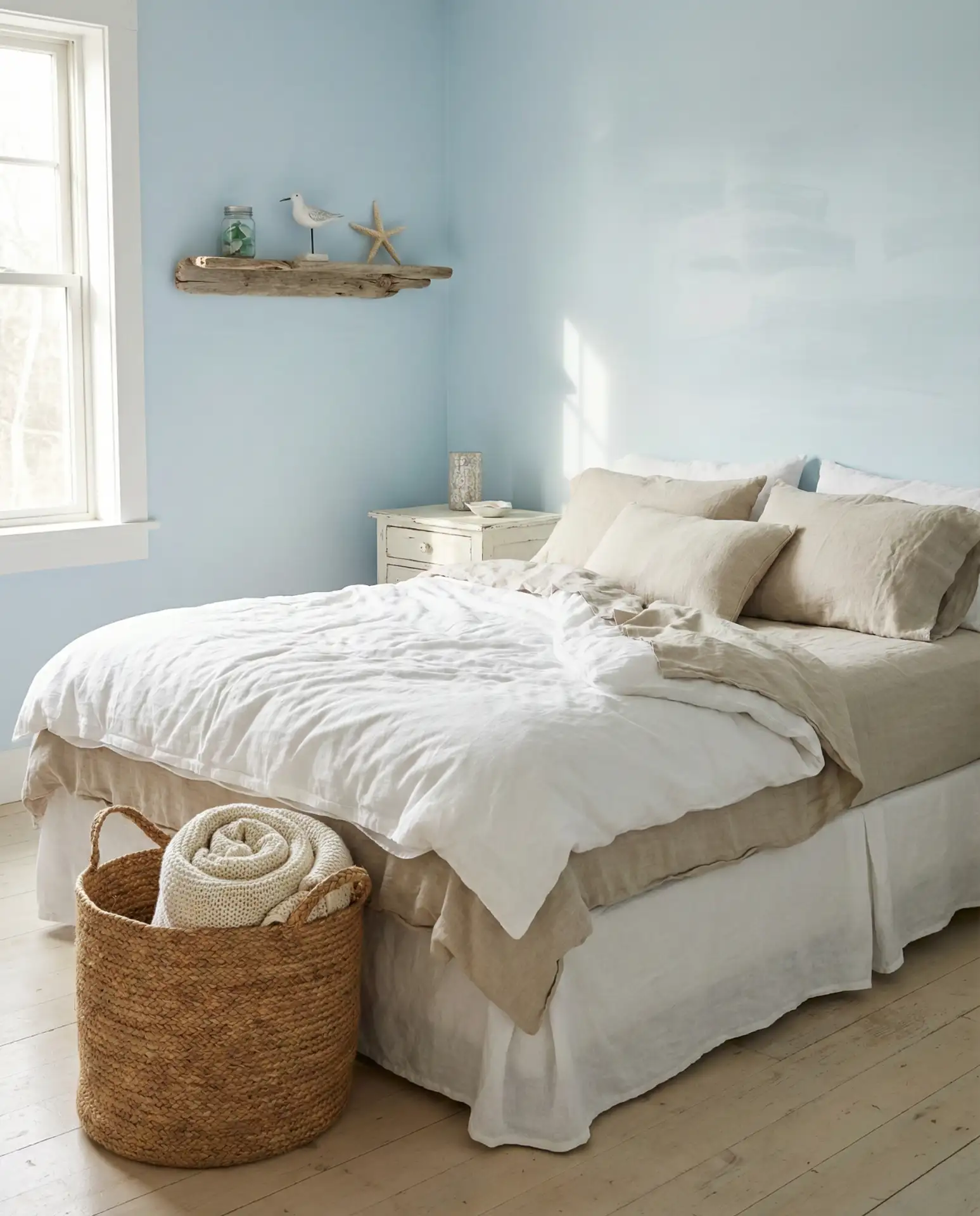
In the Midwest and mountain states, homeowners use this palette to create mental escape spaces—bedrooms that feel like vacation even when you’re landlocked and surrounded by snow. The key is keeping things unfussy and casual; coastal style fails when it becomes too precious or overly coordinated. Natural textures should show their origins: jute with visible weave, linen with slight irregularities, and wood with knots and grain. Budget considerations matter less here since natural materials often cost the same or less than synthetic alternatives—a good jute rug runs $100–200 for an 8×10, and linen bedding has become more affordable as demand has increased.
11. Navy and Pink Mixed Palette
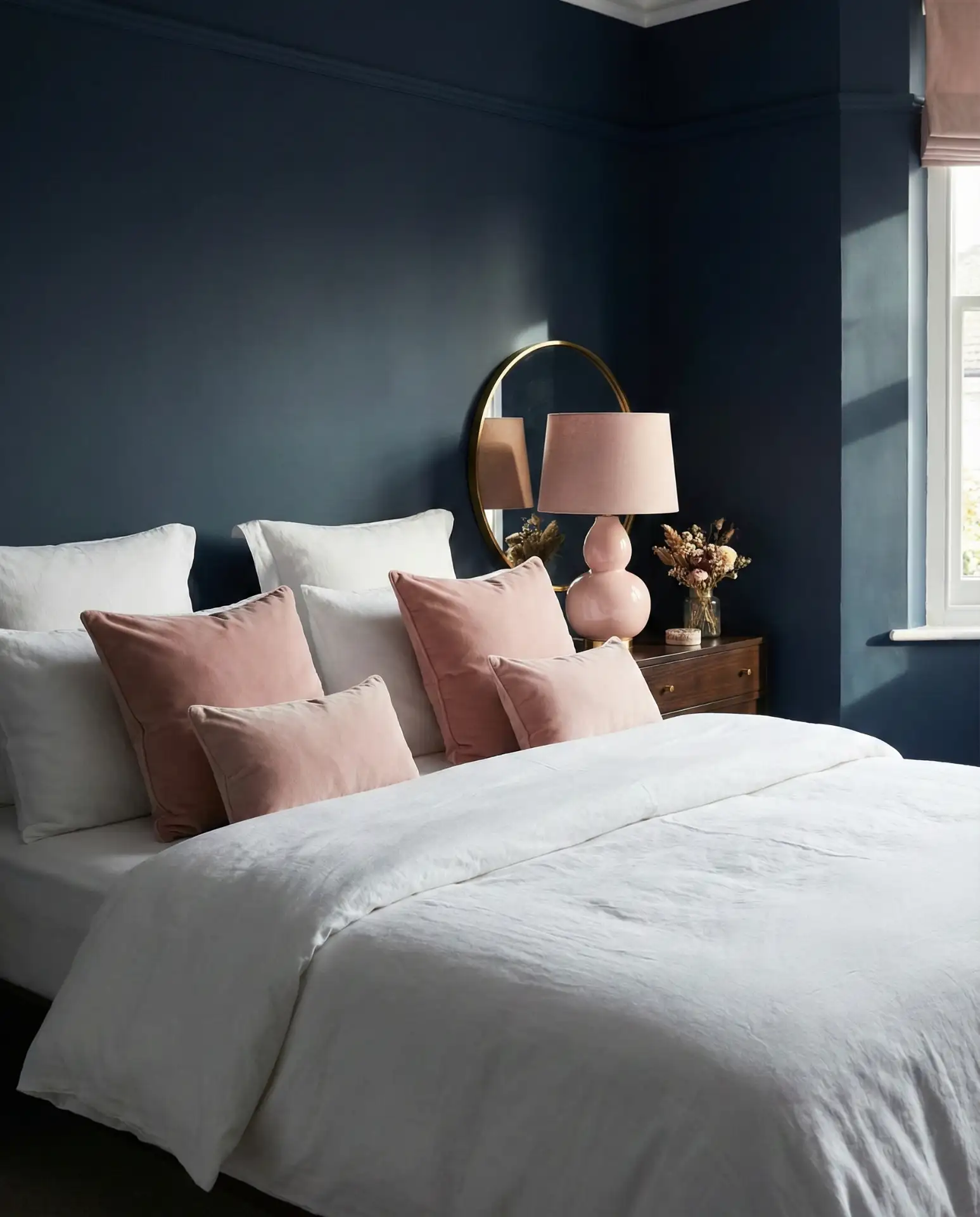
The combination of navy and pink and rose tones creates a surprisingly sophisticated palette that works for adults despite its initial juvenile associations. Use navy as the dominant color—through paint, bedding, or major furniture—and introduce pink through artwork, throw pillows, or a single accent chair. The contrast between cool and warm and dark and light creates visual interest that monochromatic rooms lack. This aesthetic bedroom approach appeals to homeowners who want personality without sacrificing grown-up credibility, particularly women decorating their first solo spaces.
Expert decorators recommend keeping pink to 20-30% of the overall palette to maintain sophistication—too much and the room tips into saccharine territory. Dusty rose and mauve work better than bubblegum pink for adult spaces. This color combination particularly resonates in Southern homes, where bold color isn’t feared, and in urban apartments, where renters use removable elements to personalize white-box spaces. The navy provides grounding weight that prevents the pink from feeling frivolous, while the pink softens the navy’s sometimes stern character. It’s a pairing that shouldn’t work but absolutely does when proportions are right.
12. Green and Blue Layered Tones
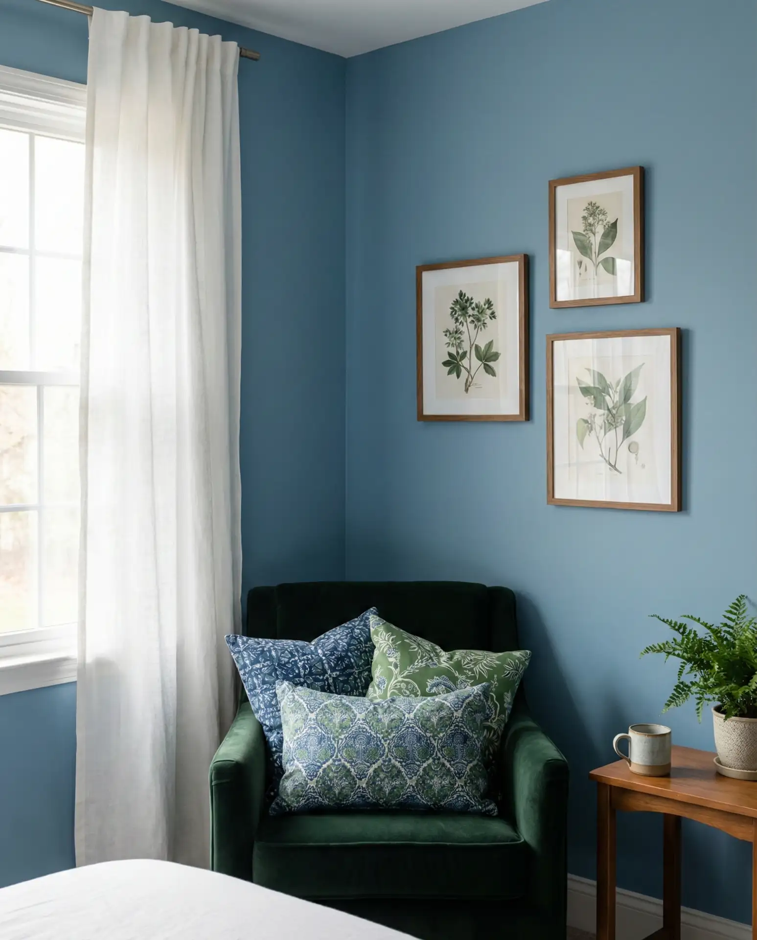
Combining green and blue creates a nature-inspired palette that feels inherently calming, referencing water and foliage without literal representation. Use a soft blue-green on walls—colors in the teal or sage family—then layer in textiles and accessories in both purer blues and greens. This analogous color scheme (neighbors on the color wheel) creates harmony that’s almost foolproof, making it ideal for tentative decorators. The cozy factor intensifies when you choose muted rather than bright versions of both colors, creating a restful cocoon perfect for sleep spaces.

This palette thrives in regions with lush landscapes—the Pacific Northwest, New England in summer, anywhere with substantial tree coverage—where it echoes the view outside your window. The colors work year-round but feel especially right in spring and summer. Many homeowners discover this combination accidentally when trying to choose between blue and green, then realize they don’t have to pick just one. The trick is keeping the intensity levels similar across both colors; pairing a bright kelly green with a dusty blue creates discord rather than harmony. When done right, guests often can’t identify exactly what color the walls are, which is part of the sophisticated appeal.
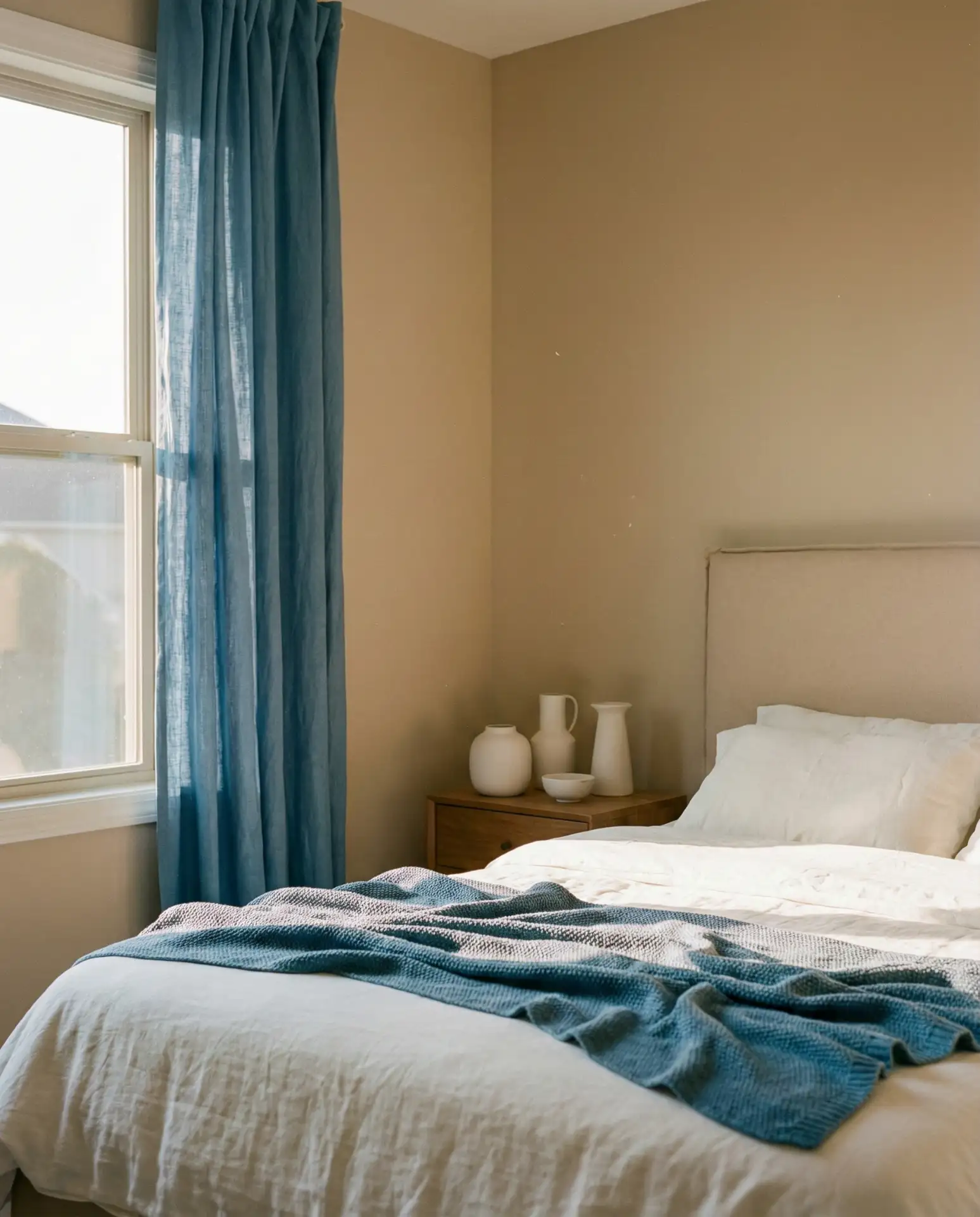
13. Beige and Blue Neutral Foundation
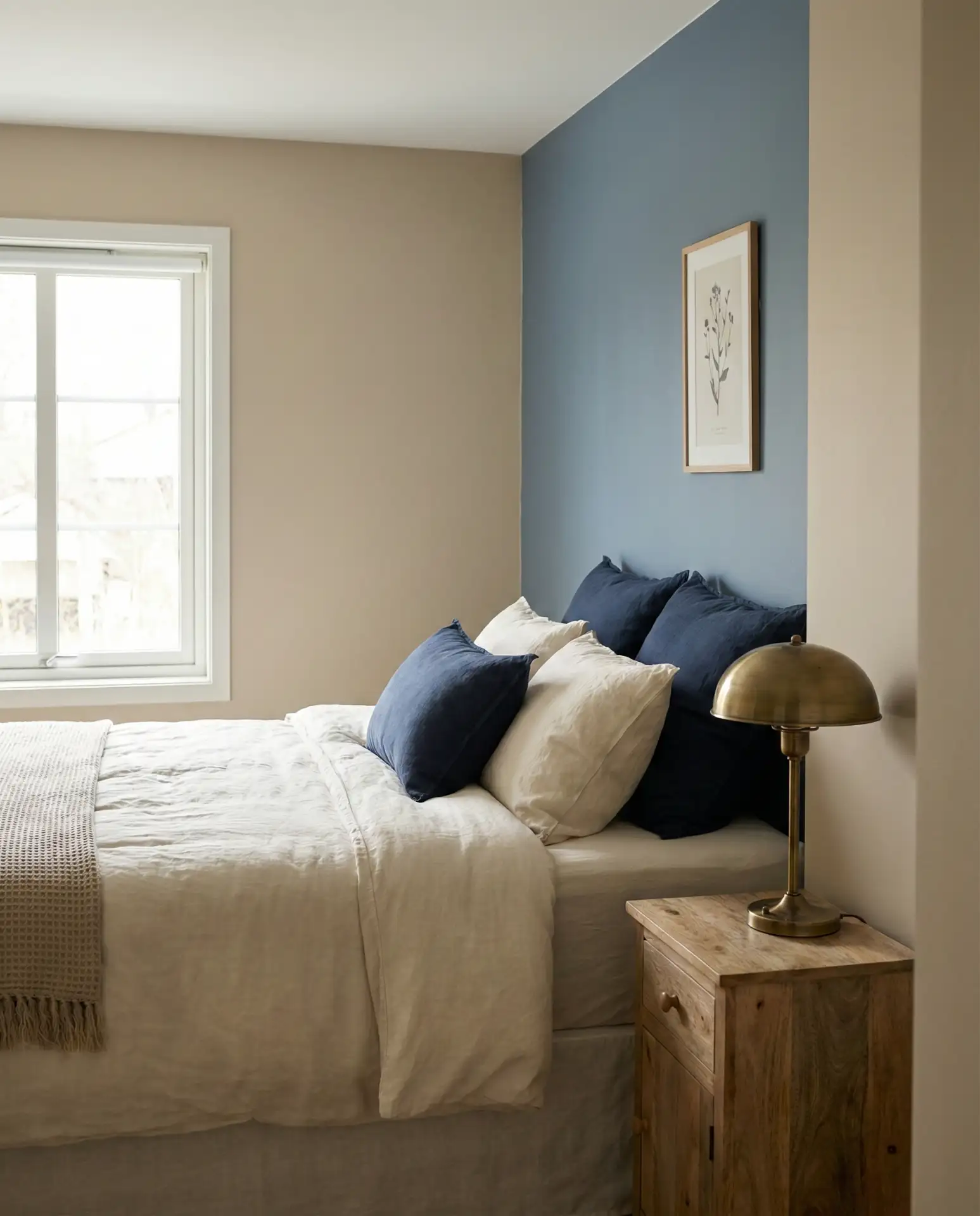
The beige and blue combination creates a warmer alternative to the stark blue-and-white schemes that dominated earlier years. Use a warm beige or greige on three walls and reserve blue for an accent wall or introduce it through textiles and accessories. This approach suits homeowners transitioning from all-neutral spaces who want to experiment with color without full commitment. The beige provides safe grounding, while the blue adds just enough personality to prevent blandness. This soft color story appeals to a broad audience, making it excellent for guest rooms or homes being prepared for sale.
Homeowners across the Sunbelt states particularly embrace this palette, where the warm beige base complements desert landscapes and bright sunshine. The combination also works well in homes with existing beige carpeting or tile that feels dated—adding blue updates the look without requiring expensive flooring replacement. A practical consideration: beige shows dirt less than white, making it more livable for households with pets or children. Choose a blue with warm undertones rather than icy shades to ensure the colors complement rather than fight each other. This isn’t the most exciting color story, but it’s one of the most successful for creating rooms that feel finished and considered without being trendy.
14. Grey and Blue Modern Minimalism
Pairing grey and blue creates a contemporary, streamlined aesthetic that appeals to minimalist-minded homeowners who want calm without coldness. Use a warm gray on walls—one with slight brown undertones—and introduce blue through fewer, more impactful pieces: an upholstered headboard, a single piece of art, and quality bedding. This restrained approach creates visual breathing room that busy minds need for sleep. The combination reads as intentionally curated rather than accidentally minimal, which makes all the difference in execution. This aesthetic bedroom style dominates Pinterest boards focused on Scandinavian and Japanese-inspired design.
This aesthetic works best in urban apartments and contemporary homes where architectural simplicity already exists, but it can also bring much-needed calm to cluttered suburban spaces. The key mistake people make is choosing a gray that’s too cool, which creates an unwelcoming, institutional feeling. Test gray samples next to your chosen blue before painting—they should feel like they belong together rather than merely coexisting. In northern climates, warm grays prevent seasonal depression that cold grays can exacerbate. The restraint required for this style doesn’t suit everyone, but for those it fits, it creates deeply restorative sleeping spaces that feel like five-star hotels.
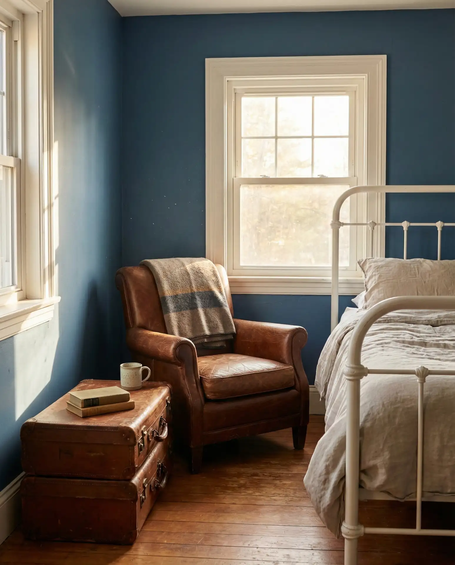
15. Rustic Blue with Reclaimed Wood
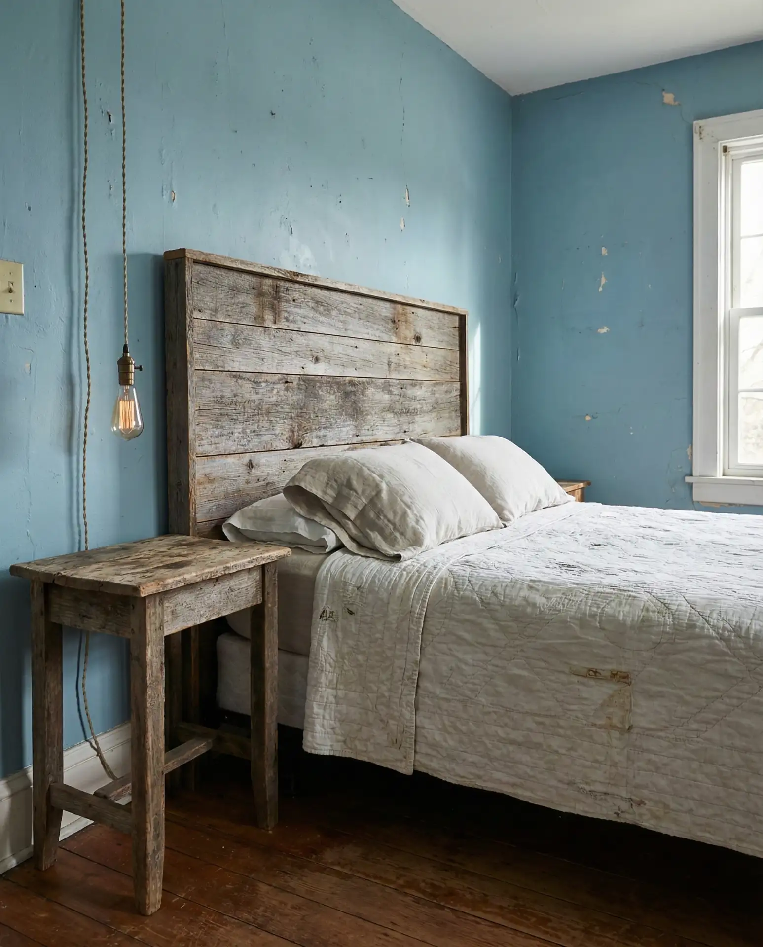
Weathered blues paired with reclaimed wood create a rustic aesthetic that feels authentically aged rather than artificially distressed. This approach works particularly well in renovated barns, farmhouses, and cabins where some original character exists to work with. Use a dusty, faded blue—something that looks like it’s been sun-bleached over decades—on walls or furniture. Layer in reclaimed wood through ceiling beams, wall treatments, or furniture pieces with visible history. The cozy factor runs high here, appealing to homeowners who value patina and story over pristine perfection.
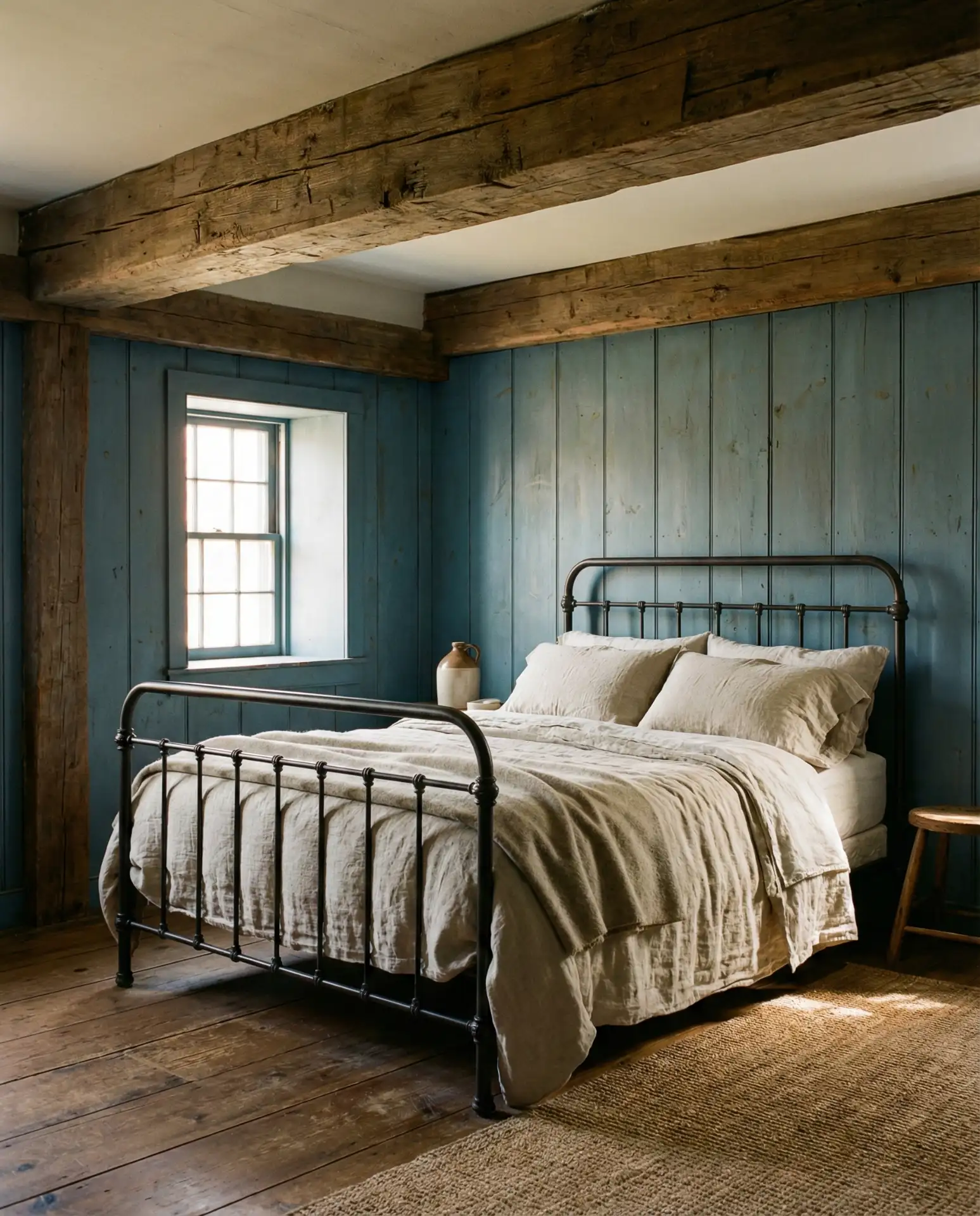
This style dominates in rural areas throughout Montana, Vermont, and the Midwest, but urban dwellers adopt it to create contrast with city surroundings. Real reclaimed wood adds cost—expect $8-15 per square foot for quality material—but the character it brings can’t be faked convincingly. Alternatively, newer wood can be given a reclaimed appearance through specialized finishing techniques that cost less. The blue should never look fresh or clean; if it does, sand it lightly or use glaze to add depth and age. This isn’t a trend-driven style but rather a timeless approach for homeowners who want spaces that feel collected and lived-in from day one.
16. Yellow and Blue Sunny Contrast
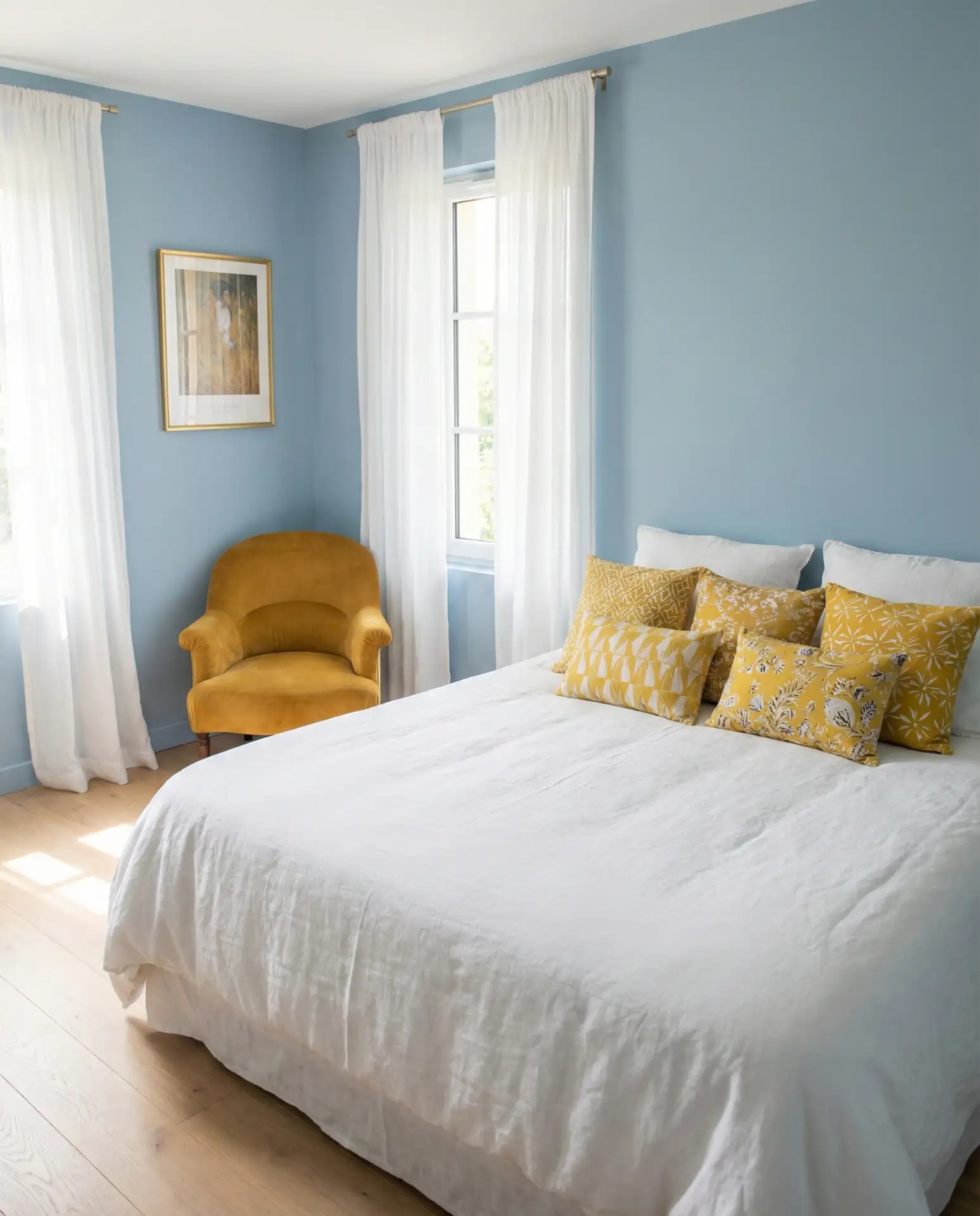
Combining blue walls with yellow and gold accents creates an energizing palette that works particularly well in darker bedrooms needing a brightness boost. Keep the blue as the dominant color and use yellow strategically—through throw pillows, artwork, a single accent chair, or lamp bases. This complementary color scheme (opposites on the color wheel) creates natural vibrancy that monochromatic rooms lack. The combination appeals to optimistic decorators who want their bedroom to feel uplifting, not just restful, and works across styles from modern to traditional.
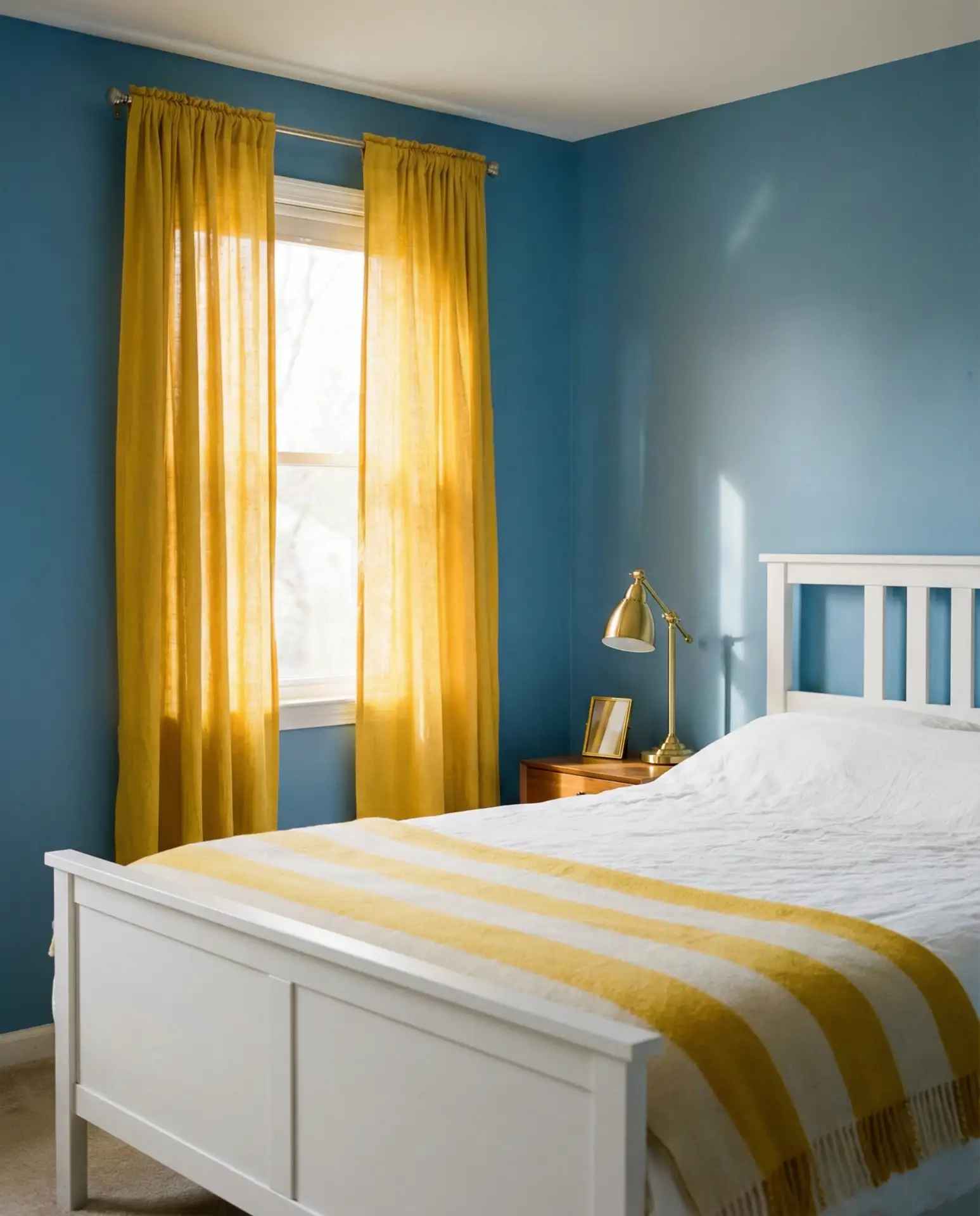
In California and Florida, where sunshine is abundant, this palette brings the outdoor brightness inside in a controlled way. In cloudier climates like Seattle or Boston, it compensates for what nature withholds. The trick is choosing the right yellow: too bright reads childish, too muted disappears against the blue. Aim for golden yellows with slight orange undertones, which feel rich rather than harsh. Homeowners nervous about commitment can test this palette through easily swapped elements before painting or buying major furniture. One Pennsylvania homeowner mentioned she painted her north-facing bedroom blue specifically so she could use yellow accents to warm it, and the combination transformed what had been a cold, unwelcoming space.
17. Red and Blue Bold Statement
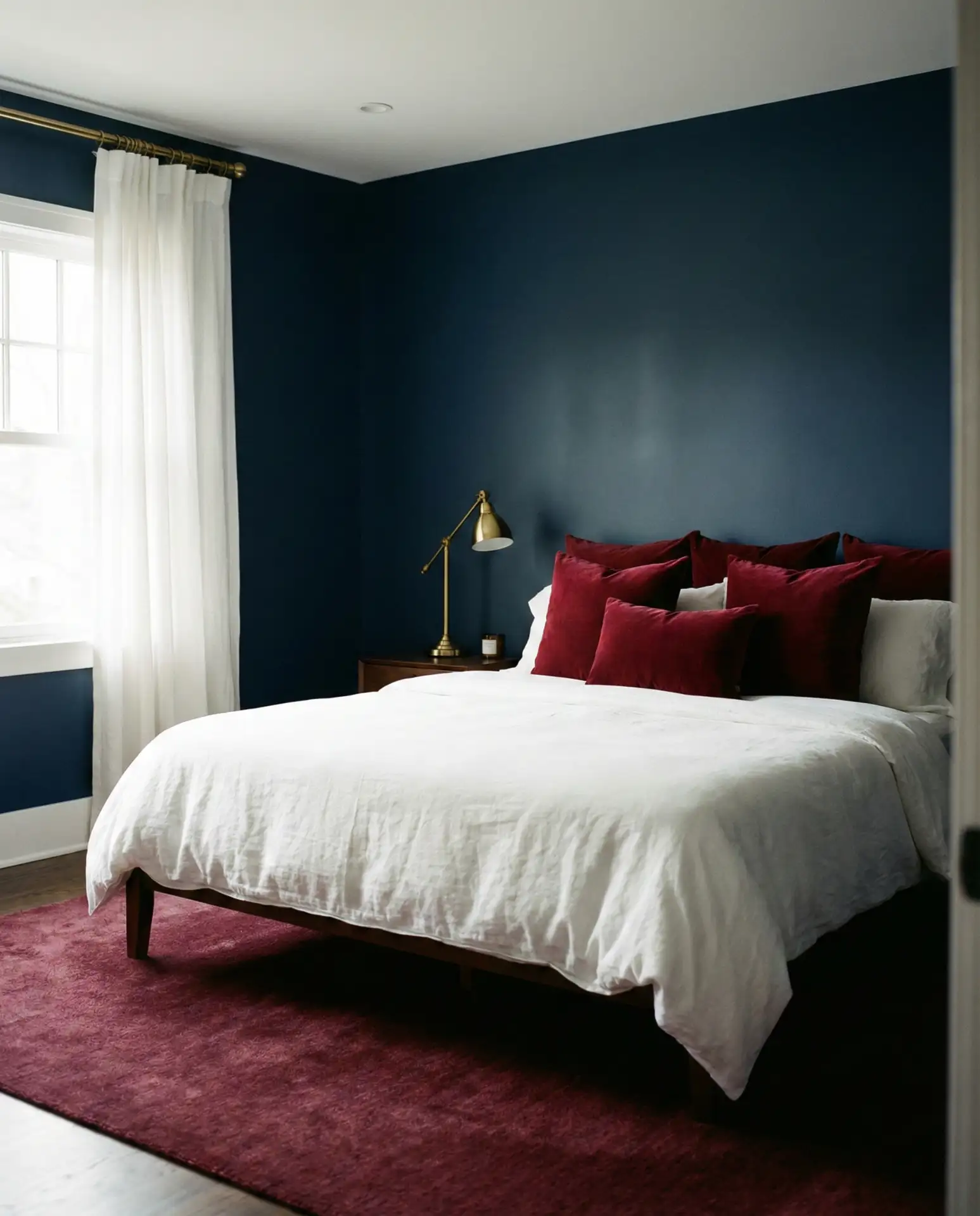
Pairing blue with red and burgundy accents creates a bold, confident statement that suits homeowners unafraid of strong color. This isn’t a common combination, which is precisely its appeal for those seeking unique inspo rather than following safe trends. Use blue as the base—through wall color or major furniture—and introduce red through smaller doses: throw pillows, artwork, or a single upholstered piece. The contrast creates energy that works for guest rooms or secondary bedrooms where you might spend less time but want maximum personality.
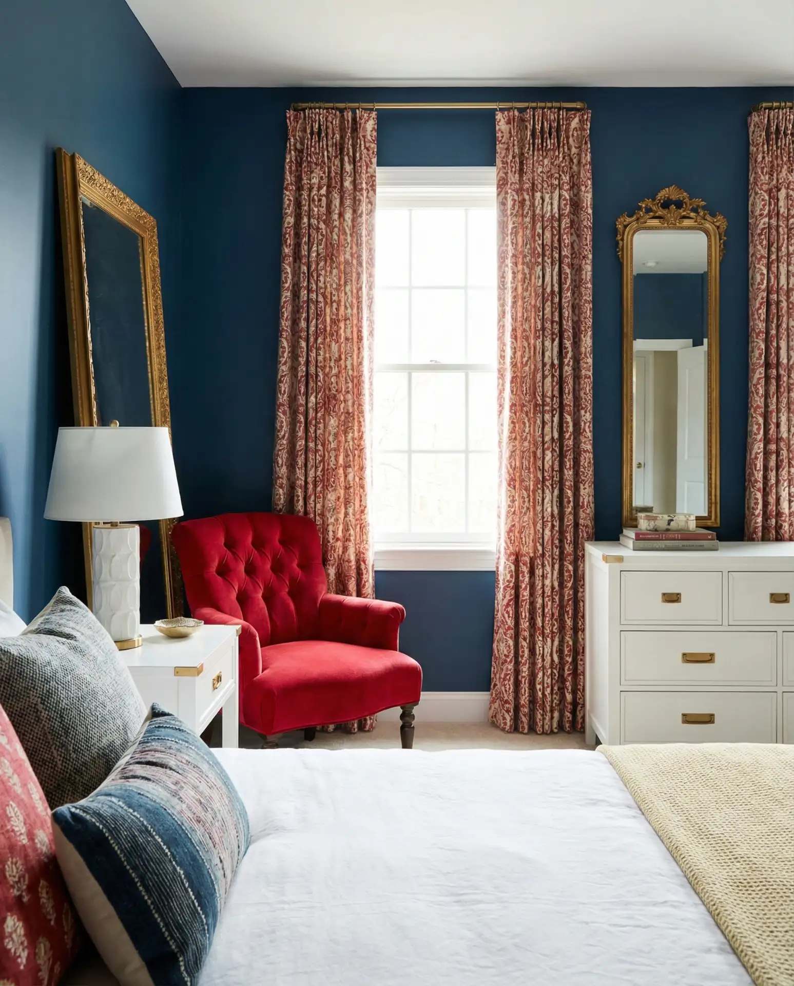
This palette works best when the red stays in the burgundy-to-crimson range rather than bright fire-engine shades, which can feel overwhelming in sleeping spaces. It’s a combination with historical precedent—think colonial American interiors and British manor houses—which lends it credibility beyond personal whim. The look particularly suits homes with traditional architecture where the formal color combination feels contextually appropriate. Budget-wise, starting with blue walls and adding red through textiles keeps the investment manageable and reversible if the boldness becomes too much over time. This isn’t a palette for everyone, but for the right person it creates rooms with undeniable character.
18. Soft Blue with White Shiplap

Installing white shiplap on one wall and painting the remaining walls soft blue creates a modern farmhouse aesthetic that remains popular despite years in the spotlight. The horizontal lines of shiplap add architectural interest to flat, featureless walls, while the blue provides color without overwhelming the space. This approach works in homes from actual farmhouses to suburban new builds, proving the style’s flexibility. The combination feels fresh and intentional, appealing to the Pinterest crowd seeking that perfect balance between trendy and livable.
The shiplap trend shows staying power because it solves real problems: it covers imperfect walls, adds texture, and creates a focal point without the commitment of wallpaper. Installation costs vary wildly depending on whether you DIY or hire professionals—expect $2-7 per square foot for materials alone. The most common mistake is installing shiplap on all four walls, which becomes visually exhausting; limit it to one wall for maximum impact. Choose a blue with enough saturation to read clearly as blue but soft enough to pair harmoniously with the crisp white shiplap. This combination particularly thrives in homes throughout Texas, the Carolinas, and Tennessee, where modern farmhouse style dominates new construction.
19. Blue Ombré Wall Treatment
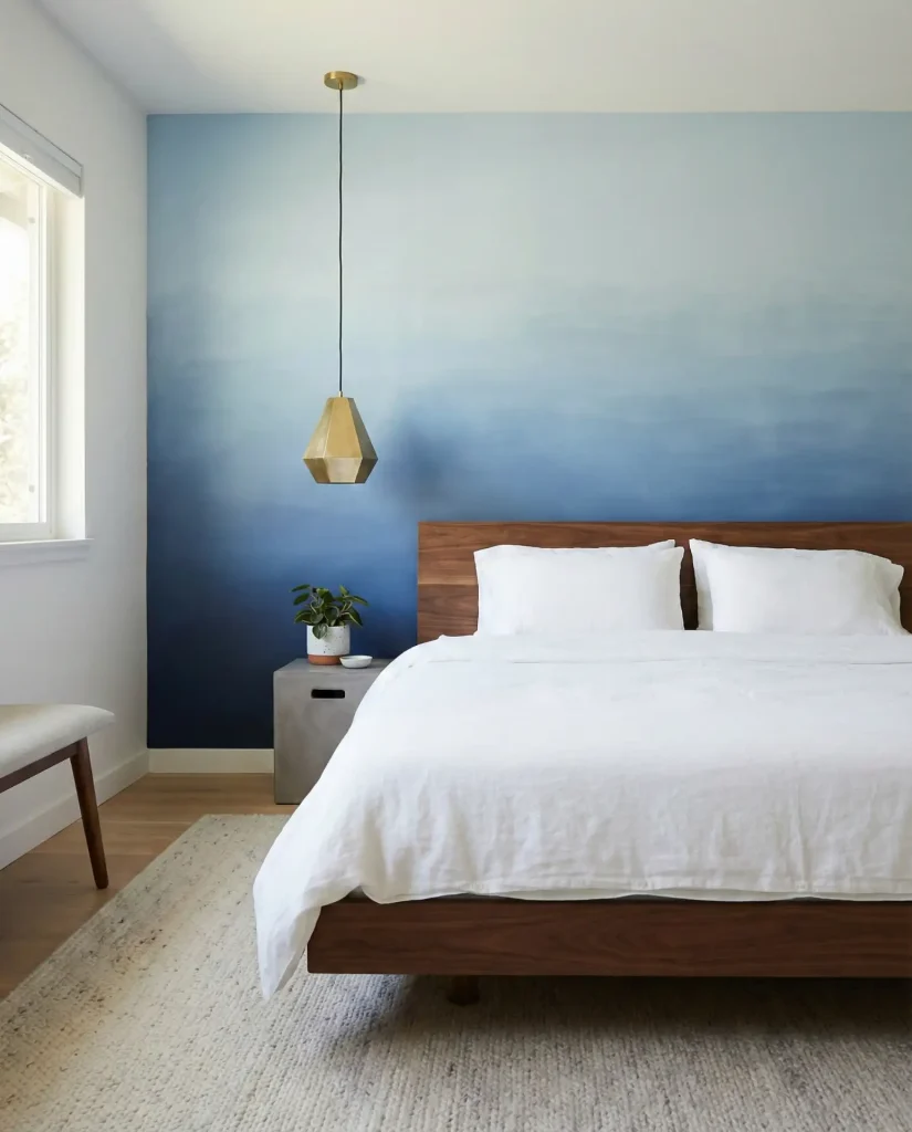
Creating an ombré effect that transitions from deep blue at the floor to pale blue or white at the ceiling adds artistic interest and creates the illusion of height. This technique works particularly well in bedrooms with lower ceilings or limited square footage. The gradient draws the eye upward, making the room feel more spacious. This aesthetic bedroom treatment requires more labor than standard painting but creates a truly custom look you won’t see in every other house. It appeals to creative homeowners willing to invest extra effort for standout results.
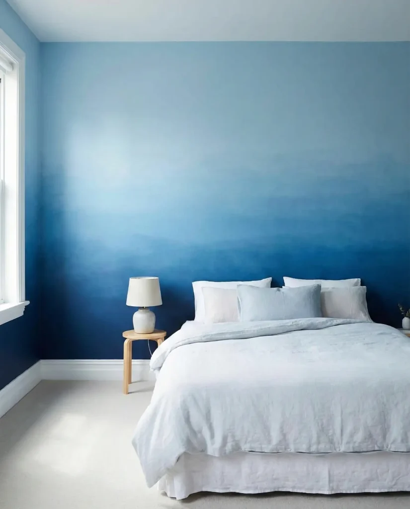
Real homeowners attempting this technique report that success requires patience and the right tools—a quality wide brush or roller specifically designed for blending is essential. Practice on poster board first to develop your technique before committing to the wall. The gradient should be subtle; too dramatic, and it looks like a teenager’s bedroom from 2005. Choose three to four shades of blue in the same color family, which makes blending easier than trying to work with just two very different tones. This treatment works best on the wall behind the bed, which becomes a natural focal point without competing for attention throughout the entire room.
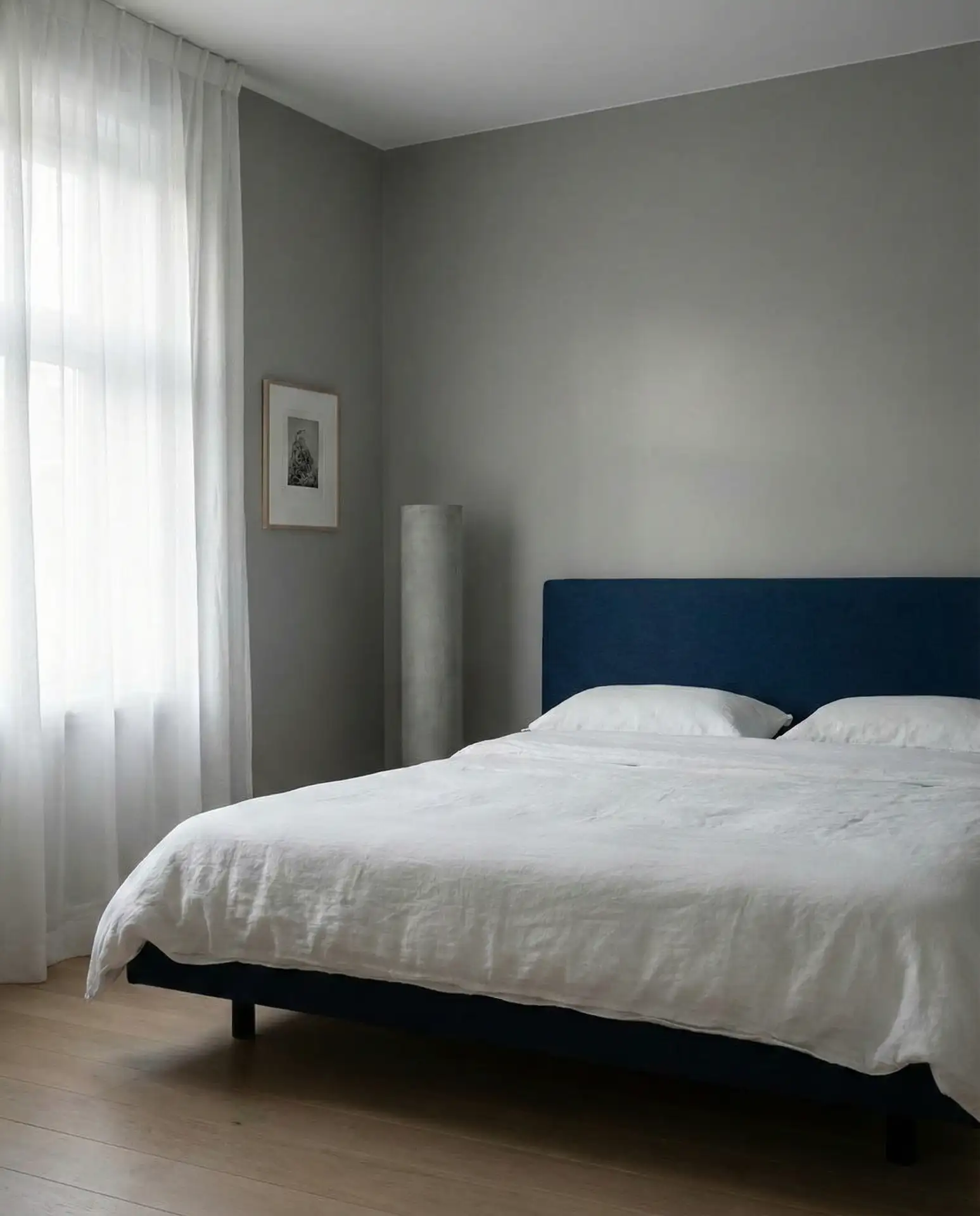
20. Prussian Blue Statement Wall
Prussian blue—a deep, slightly greenish blue—creates instant drama when used on a single accent wall while keeping other walls neutral. This historic pigment has depth and complexity that flat navy lacks, reading almost jewel-toned in certain lights. The dark richness works beautifully behind beds as an alternative to traditional headboards, creating a built-in architectural feature through color alone. This moody approach suits confident decorators who understand that dark doesn’t automatically mean oppressive when balanced with adequate lighting and lighter elements.
Interior designers in New York and San Francisco frequently specify Prussian blue for clients wanting sophistication without following obvious trends. The color has art-historical significance that gives it intellectual weight beyond mere decoration. Prussian blue works particularly well in rooms with warm wood tones or brass fixtures, which create beautiful contrast against the cool depth of the blue. One gallon typically covers 400 square feet, meaning a single accent wall costs $40-70 in paint—remarkable value for the transformation it delivers. The color shifts throughout the day, appearing almost black in dim light and revealing its blue-green complexity in bright sun, which keeps the room visually interesting.
21. Blue and White Graphic Wallpaper
Bold blue and white graphic wallpaper creates instant personality, perfect for renters or commitment-phobic homeowners who want impact without permanent changes. Peel-and-stick options now rival traditional wallpaper in quality while remaining removable, making experimentation accessible. Choose geometric patterns, large-scale florals, or abstract designs depending on your style. The aesthetic bedroom potential runs high here, as wallpaper photographs beautifully for Pinterest and Instagram while solving the problem of blank walls that feel unfinished.
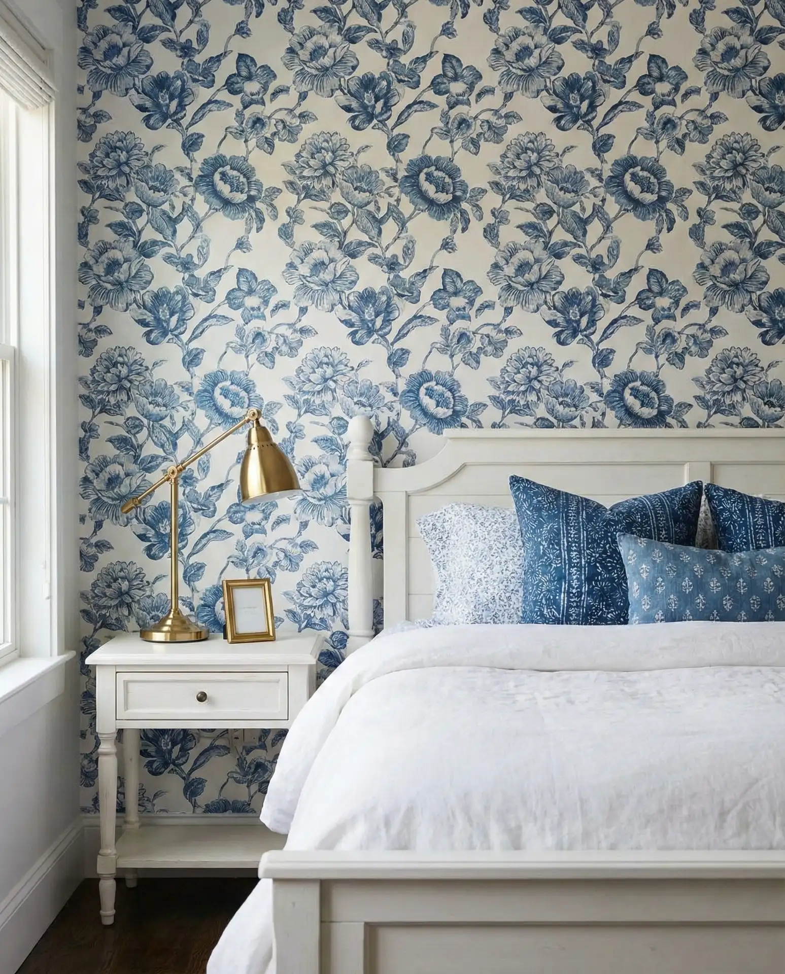
Where this works best: on the wall behind the bed, which naturally functions as a focal point. Covering all four walls with busy patterns overwhelms most bedrooms and can interfere with sleep. Quality peel-and-stick wallpaper costs $1-3 per square foot, with a typical accent wall requiring $100-250 worth of material. Installation is genuinely DIY-friendly, though perfectionist types may want professional help to achieve perfectly aligned seams. Choose patterns with at least 60% white space to prevent the room from feeling claustrophobic. The blue should coordinate with existing decor but doesn’t need to match exactly—slight variations in blue tones actually create more sophisticated layering than perfect matches.
22. Ice Blue with Warm Brass Finishes
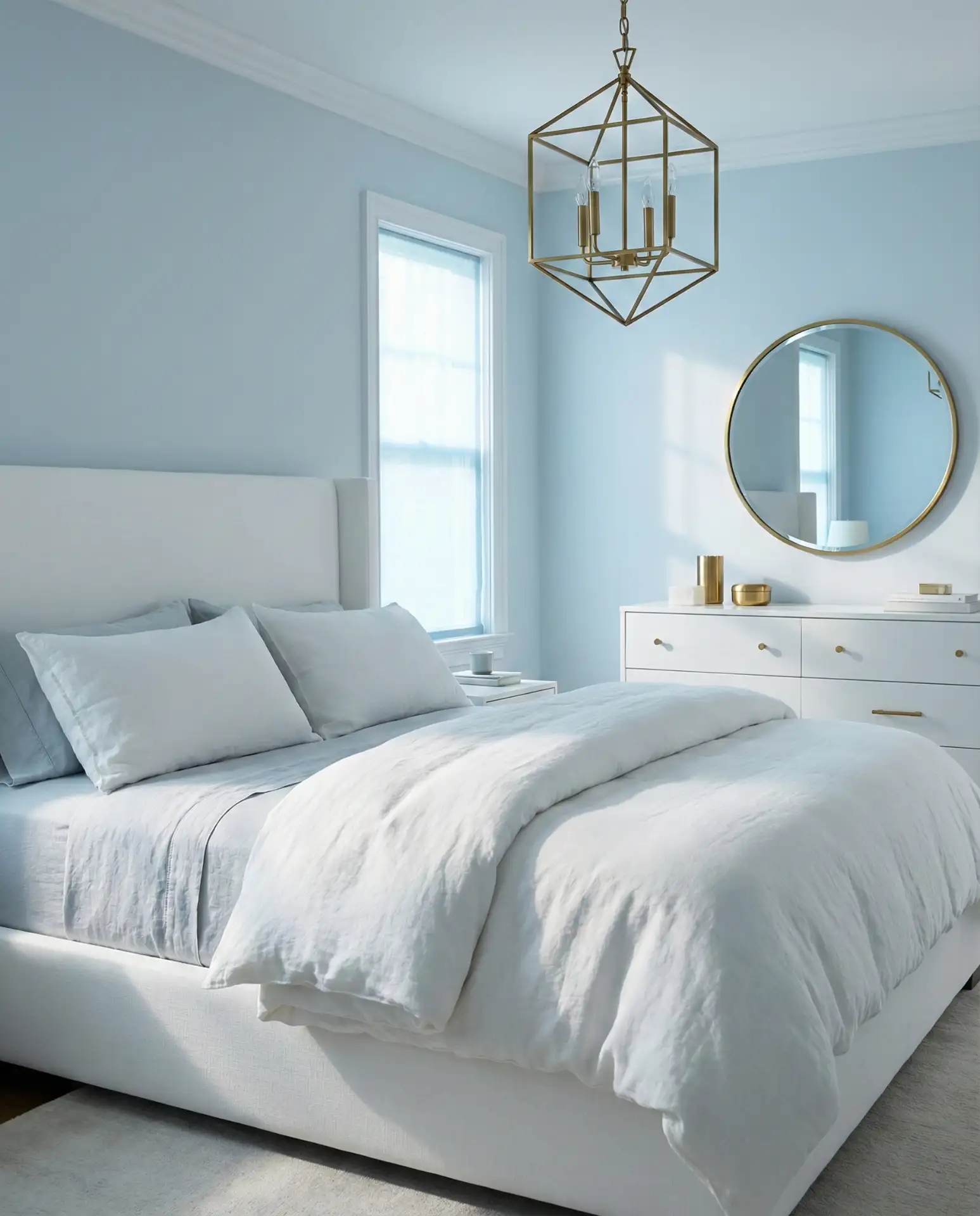
Very pale, icy blue walls paired with warm brass hardware and lighting fixtures create a sophisticated balance between cool and warm that feels both modern and timeless. The near-white quality of ice blue maintains brightness while adding subtle color that’s more interesting than pure white. Layer in brass through drawer pulls, light fixtures, curtain rods, and decorative objects. This combination works in homes from minimalist modern to traditional, proving its versatility. The soft color palette appeals to homeowners wanting calm sophistication without stark coldness.
Common mistakes include choosing an ice blue that’s too blue (which reads as baby blue rather than sophisticated) or too gray (which feels cold and unwelcoming). The ideal shade has just enough color to distinguish it from white in direct comparison but maintains a neutral quality in practice. Brass fixtures have become more affordable as popularity has increased; expect to spend 20-40% more than chrome equivalents, but the warmth they add justifies the cost difference. This palette particularly thrives in primary bedrooms where creating a hotel-like sanctuary matters. Test paint samples against your flooring and existing furniture to ensure the undertones work together—ice blue can read differently depending on surrounding materials.
23. Denim Blue with Leather Accents
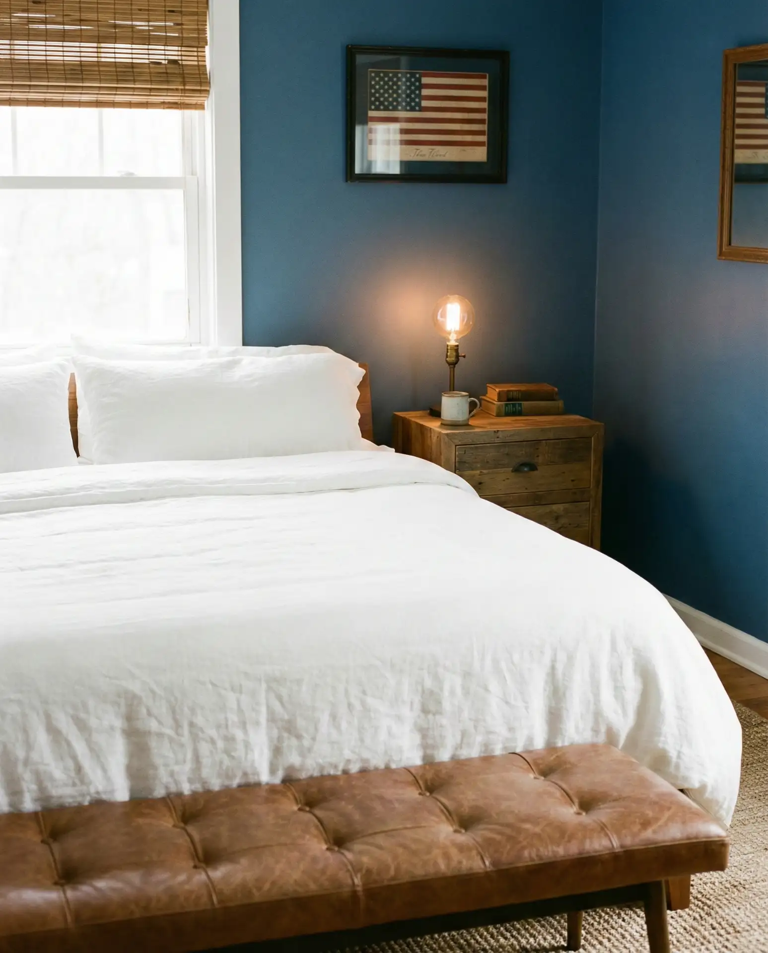
A mid-tone denim blue paired with leather furniture and accessories creates a masculine-leaning aesthetic that works beautifully in bedrooms across gender lines. The blue references workwear and casual Americana, while leather adds sophistication and ages beautifully over time. Use denim blue on walls and bring in leather through a bench at the foot of the bed, a reading chair, or smaller touches like drawer pulls. This combination suits homeowners wanting a rustic yet refined feeling that doesn’t skew feminine or overly precious.
Real homeowners report this palette feeling particularly appropriate in rooms with good natural light, where the leather patinas beautifully over time and the blue reads as intentional rather than drab. Quality leather furniture requires investment—a decent leather bench starts around $400-600—but lasts decades when properly maintained. Alternatively, incorporate leather through smaller items like magazine holders, lamp bases, or drawer handles to achieve the aesthetic at a lower cost. This color combination works across the country but feels especially right in Denver, Austin, and throughout the Southwest, where casual sophistication defines regional style. The denim blue should have enough gray to read as sophisticated rather than bright or childish.
Conclusion
Creating your perfect blue bedroom in 2026 means understanding that rules exist to be interpreted, not rigidly followed. Whether you lean toward moody drama or soft serenity, coastal ease or sophisticated glamour, there’s a blue palette that fits your life and space. Mix these ideas, adjust them to your circumstances, and don’t be afraid to trust your instincts. What blue bedroom ideas are you most excited to try? Share your thoughts in the comments below—we’d love to hear which direction you’re heading.