Blue living rooms are having a major moment in 2026, and it’s easy to see why. From serene coastal retreats to bold peacock-inspired statements, blue offers a versatility that few other colors can match. American homeowners are flocking to Pinterest for blue living room inspiration, seeking spaces that balance calm with personality. Whether you’re drawn to soft sky tones or dramatic navy depths, this year’s blue living room trends reflect a shift toward intentional, mood-driven design. In this article, you’ll discover fresh ideas that blend timeless appeal with contemporary style—each one designed to help you create a living room that feels both personal and on-trend.
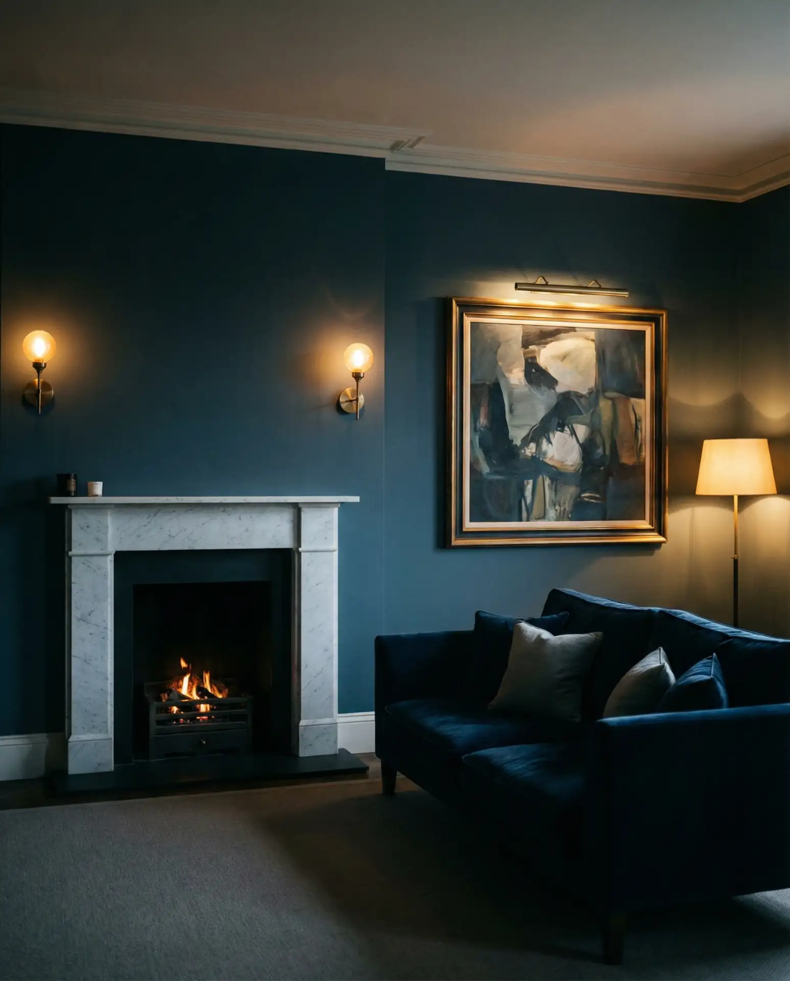
1. Dark Moody Walls with Warm Accents
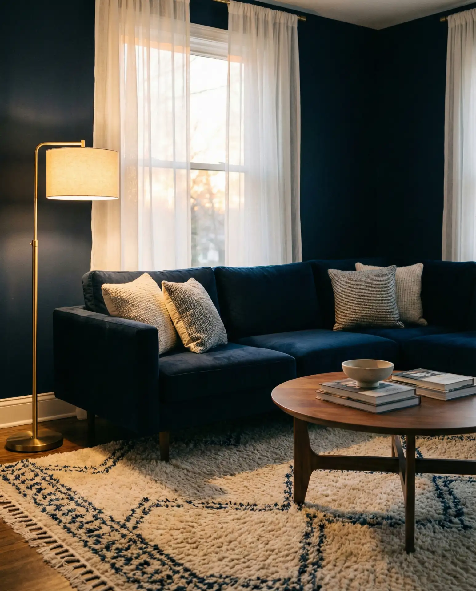
A dark blue living room creates instant drama and sophistication, especially when paired with warm metallic accents like brass or copper. This approach works beautifully in homes with abundant natural light, where the depth of color feels rich rather than oppressive. Consider a deep navy or charcoal blue on all four walls, then layer in honey-toned wood furniture and golden lighting fixtures. The contrast between cool walls and warm details creates a cozy, enveloping atmosphere that feels both modern and timeless.
Where it works best: This style thrives in urban apartments and older homes with high ceilings, where the darkness adds character without feeling cramped. Avoid pairing dark blue with heavy curtains or overly dark furniture—you’ll lose the balance. Instead, keep window treatments light and airy, and choose at least one major furniture piece in a lighter finish. Many homeowners make the mistake of going all-dark, which can make the room feel like a cave rather than a sanctuary.
2. Light Coastal Refresh
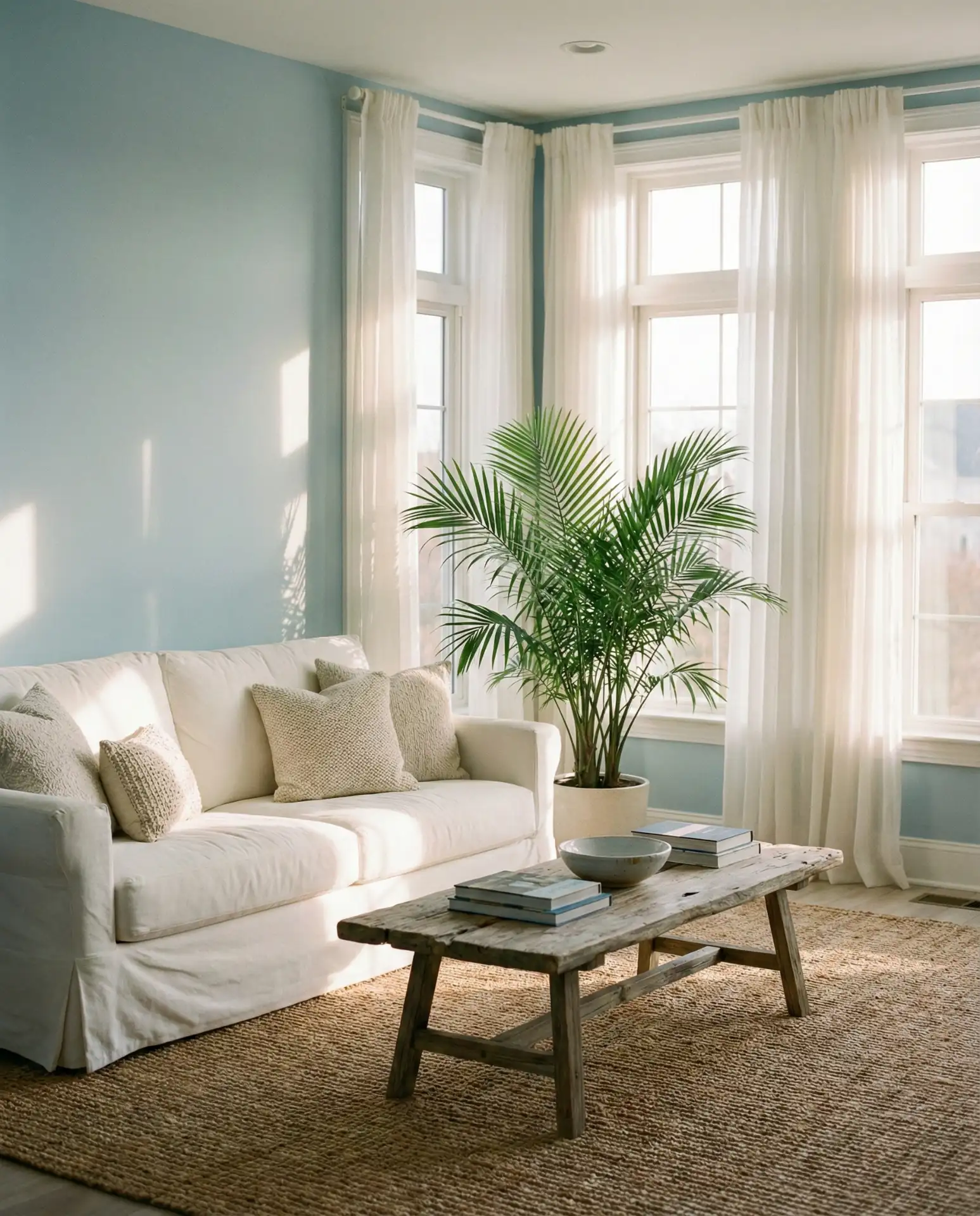
A light blue palette instantly transports you to a beachside retreat, making it a favorite for coastal homes and anyone craving a serene escape. Soft powder blues and pale aquas work particularly well with white trim, natural fiber rugs, and driftwood-inspired furniture. This isn’t about literal nautical decor—think more about capturing the feeling of ocean air and open skies. The result is a living room that feels breezy, uncluttered, and effortlessly elegant.
In Southern California and Florida, this look has become almost a regional signature—homeowners pair it with indoor-outdoor living spaces that blur the line between interior comfort and beachfront ease. The key is keeping everything tactile and organic: linen, cotton, rattan, and unfinished wood. One friend recently painted her living room in a barely-there blue and said it completely changed how she felt coming home—suddenly, every day felt like vacation.
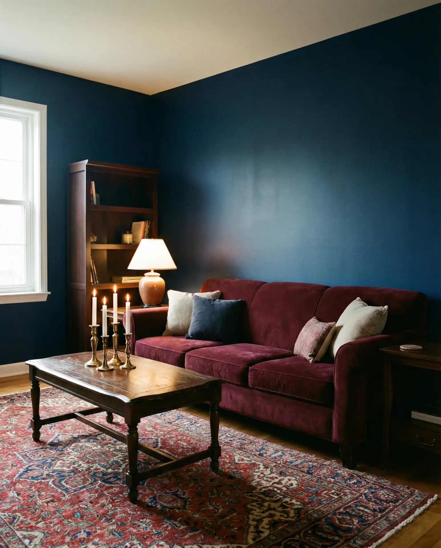
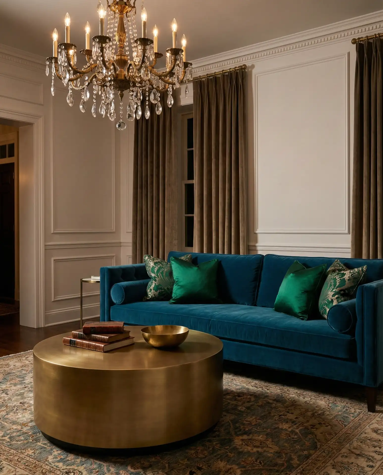
3. Brown and Blue Layered Sophistication
Combining brown and blue creates a grounded, sophisticated palette that feels both classic and contemporary. Rich chocolate browns or warm tans anchor the coolness of blue, whether you’re working with a slate accent wall or a collection of blue velvet pillows. This combination works especially well in traditional homes that need a refresh—it honors the past while feeling entirely current. Layer in leather, suede, and woven textures to deepen the warmth.
A practical insight: start with brown as your foundational neutral (furniture, flooring, or large textiles), then introduce blue through easily changeable elements like throw pillows, art, or an accent chair. This way, you can adjust the intensity of blue over time without committing to a full repaint. It’s a forgiving palette that grows with you, and it’s particularly effective in homes with existing wood paneling or built-ins that you’d rather enhance than cover up.
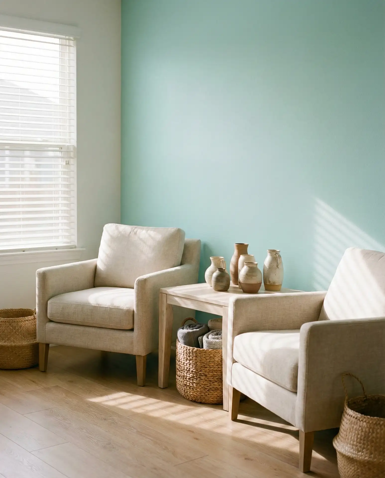
4. Neutral and Blue Minimalist Canvas
A neutral and blue scheme is the foundation of modern minimalism, offering calm without coldness. Think soft greys, warm whites, and creamy beiges alongside muted blues like powder, fog, or slate. This palette works beautifully in open-concept homes where the living room needs to flow seamlessly into dining and kitchen spaces. The restraint creates breathing room, letting architectural details and a few carefully chosen pieces take center stage.

Budget tip: this style is surprisingly affordable because it thrives on restraint. You don’t need a lot of furniture or accessories—just invest in a few high-quality pieces in blue and neutral tones, and let negative space do the rest. Many minimalist enthusiasts in cities like Portland and Seattle favor this approach, pairing it with sustainable materials and secondhand finds that add character without clutter.
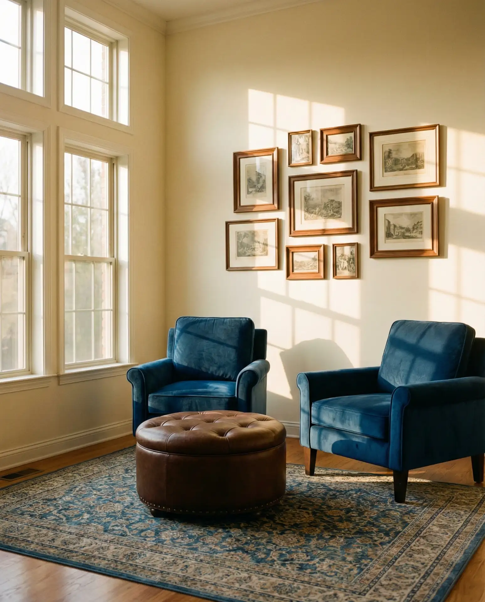
5. Grey and Blue Urban Elegance
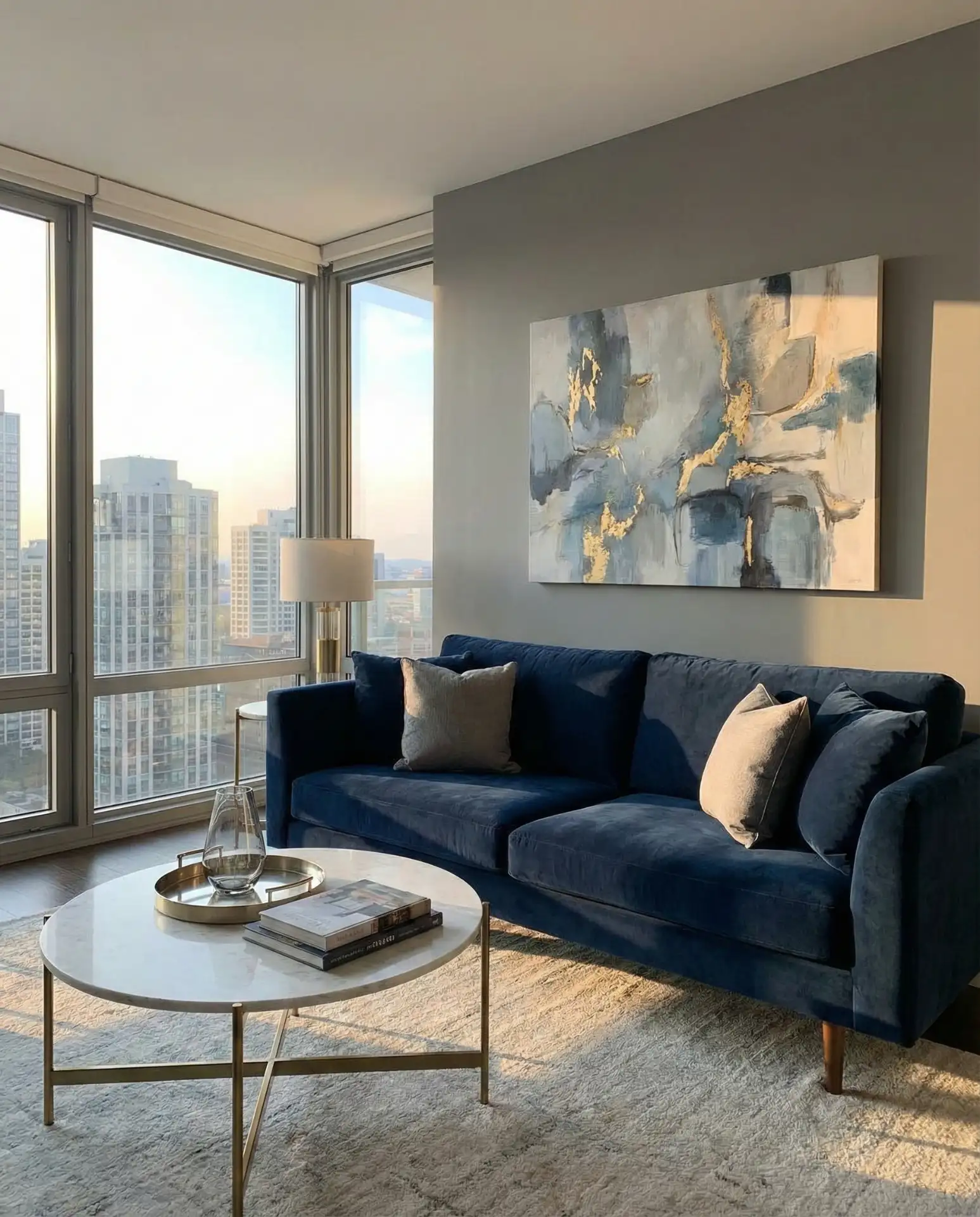
The grey and blue pairing has become a go-to for urban dwellers who want sophistication without stuffiness. Charcoal or dove grey walls provide a chic backdrop for everything from icy blues to deep indigos. This combination feels particularly suited to loft apartments and modern townhomes, where industrial elements like exposed brick or concrete can be softened with plush blue textiles. It’s a palette that feels grown-up and polished, yet still inviting.
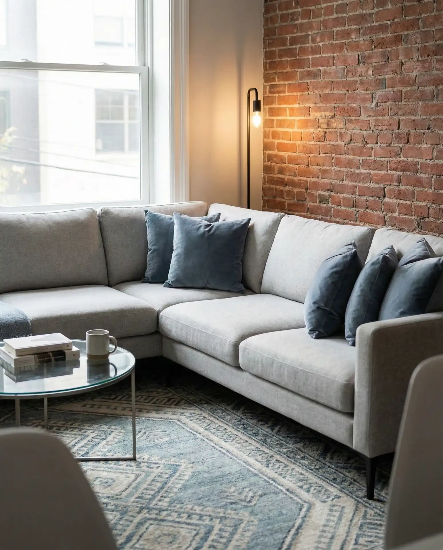
Expert designers often recommend layering different shades of grey and blue within the same space—warm greys with cool blues, or cool greys with warmer, more teal-leaning blues. This creates depth and prevents the room from feeling flat or one-dimensional. Avoid the trap of going too matchy—vary your textures (velvet, linen, leather) and finishes (matte, glossy, brushed metal) to keep the eye moving and engaged.
6. Green and Blue Botanical Harmony
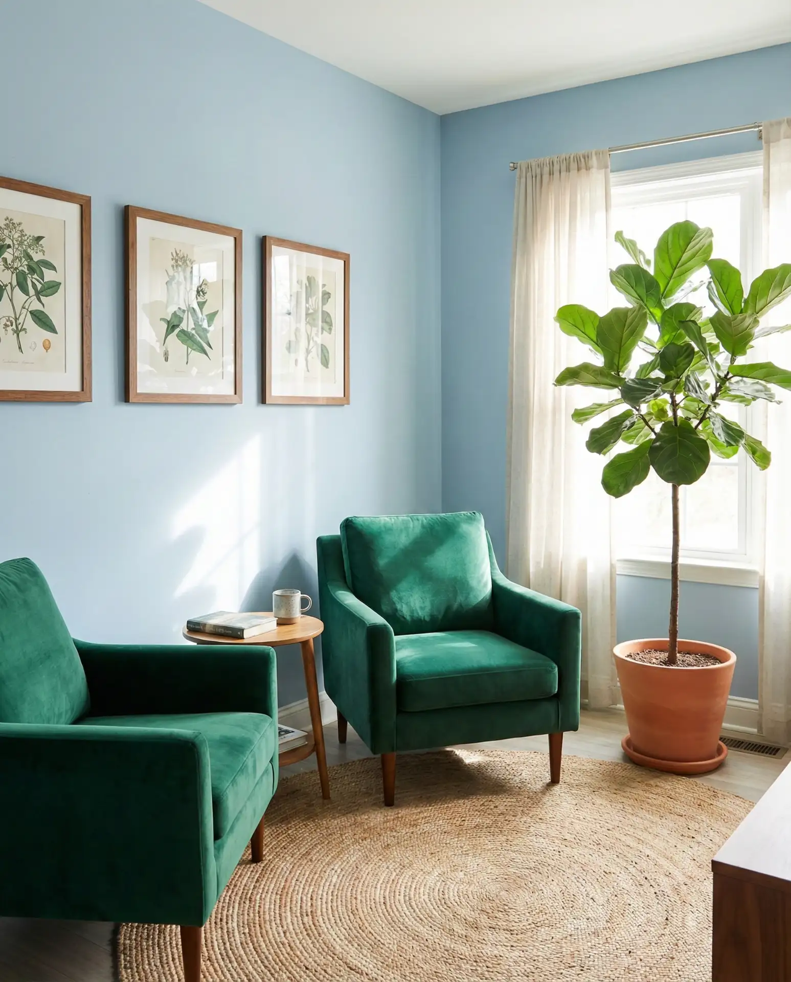
Blending green and blue creates a naturally harmonious space that feels like bringing the outdoors in. Think sage greens with soft aquas or forest tones with deeper teals. This palette is ideal for homes surrounded by nature—think Pacific Northwest cabins or Midwest bungalows with tree-lined yards. The key is balance: use one color as the dominant hue and the other as an accent, then tie them together with plenty of natural wood and live plants.
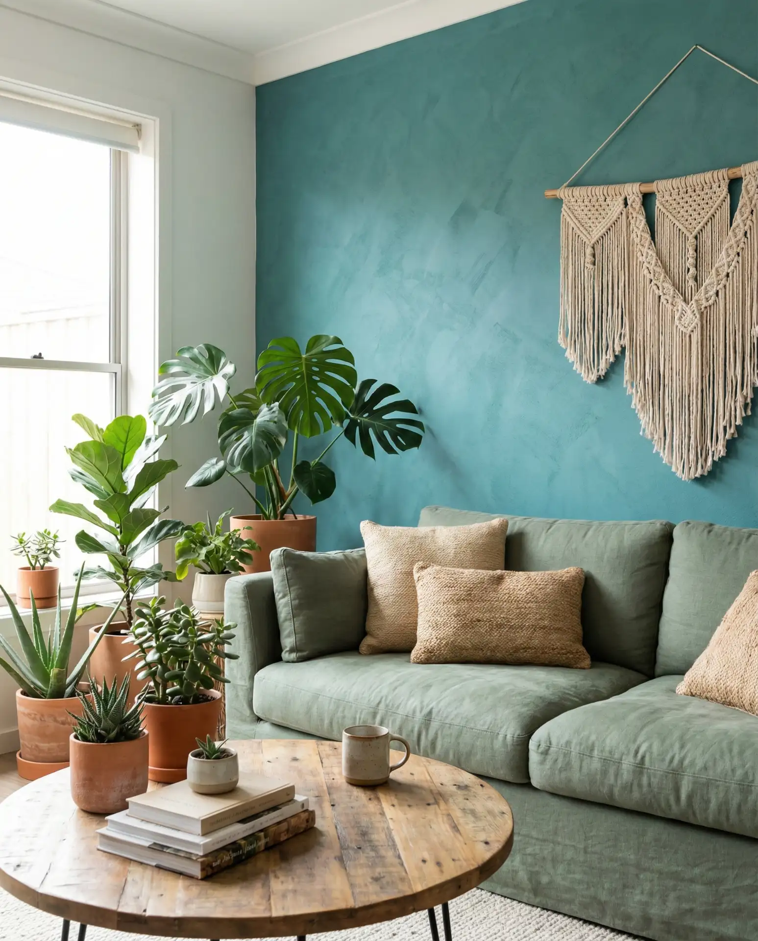
Real homeowner behavior shows that people who gravitate toward this palette often have a strong connection to nature—they’re the ones who fill their homes with houseplants and prefer hiking to city life. The living room becomes an extension of that lifestyle, a place where the line between inside and outside feels intentionally blurred. It’s a forgiving palette, too, since any shade of green or blue found in nature will naturally complement the others.
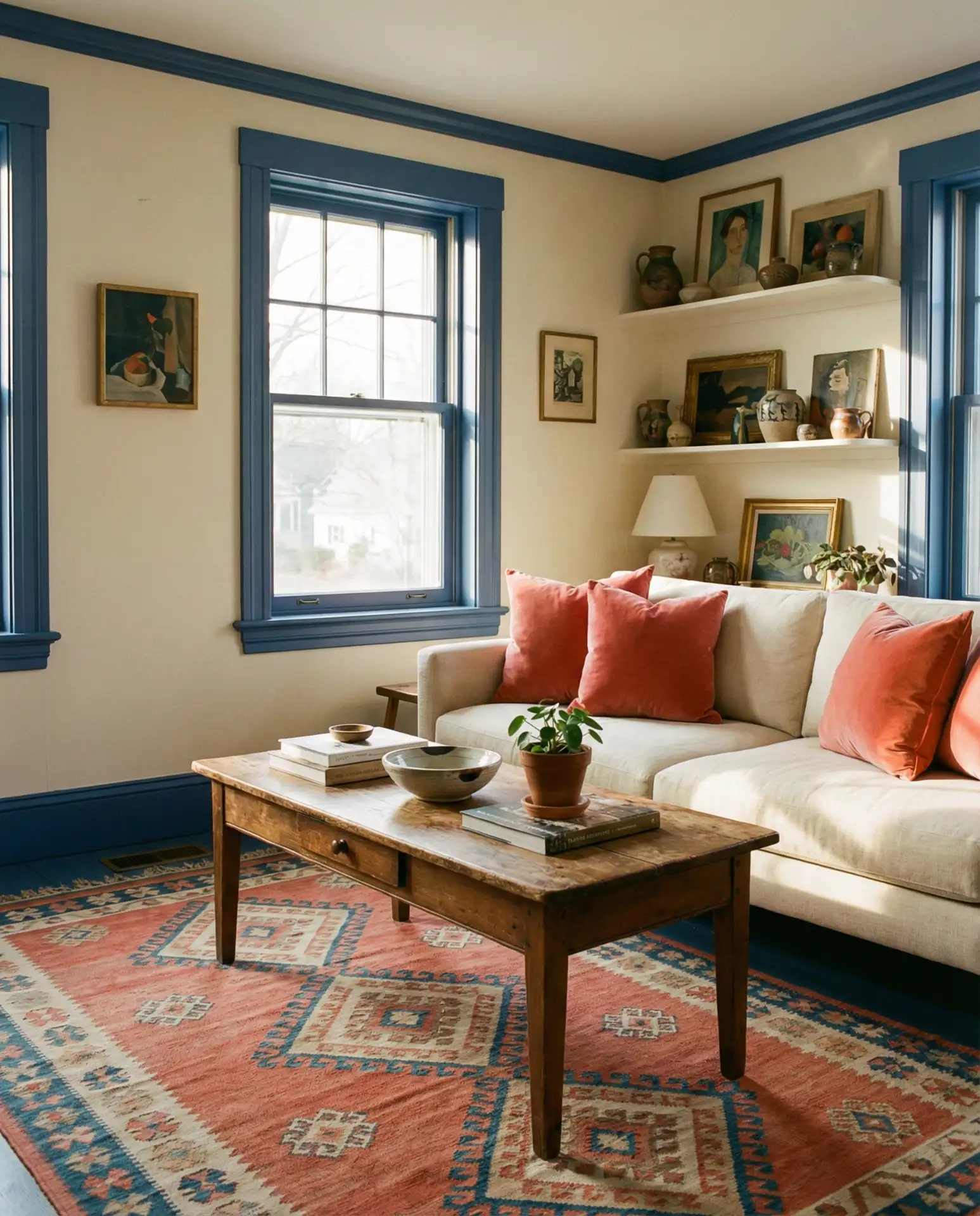
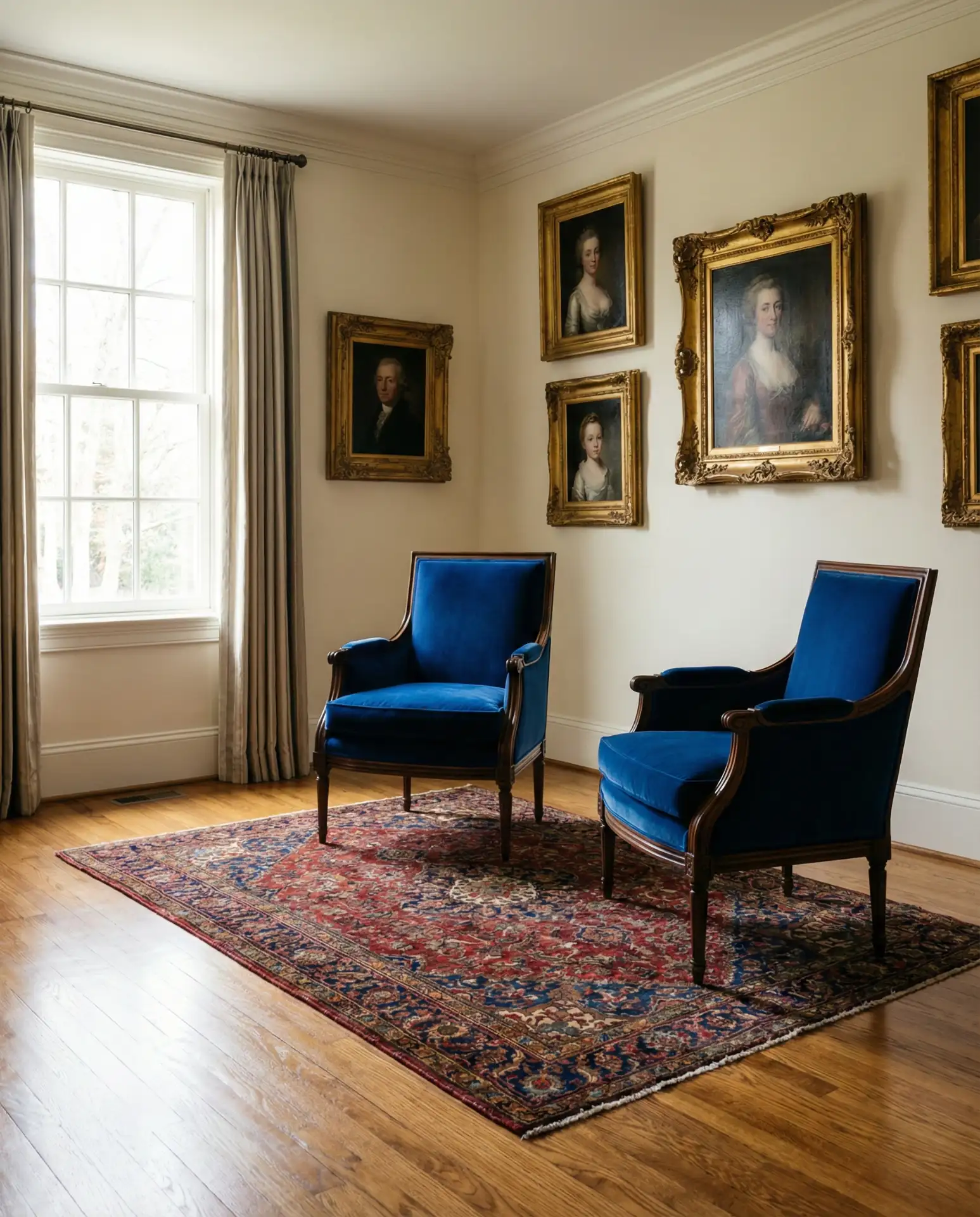
7. Duck Egg Blue Vintage Charm
The soft, greyish tone of duck egg blue brings vintage charm without feeling dated. It’s a color that works beautifully in period homes—Victorians, Craftsman bungalows, or Colonial revivals—where it enhances original details like crown molding or picture rails. Pair it with antique furniture, distressed wood finishes, and delicate floral textiles for a look that feels collected over time. This isn’t a color that shouts; it whispers elegance.
In New England and the Mid-Atlantic, duck egg blue has become a favorite for homeowners renovating historic properties. It honors the home’s heritage while feeling fresh and livable. A common mistake is pairing it with overly modern furniture, which can create visual tension. Instead, lean into the vintage vibe with secondhand finds, refurbished pieces, and textiles that have some age or patina to them.
8. Orange and Blue Bold Contrast

The unexpected pairing of orange and blue delivers bold, energetic contrast that feels fresh and daring. This is a complementary color scheme that naturally draws the eye, making it perfect for homeowners who want their living room to make a statement. Start with a blue base—whether it’s walls, a sofa, or a large rug—then introduce orange through artwork, throw pillows, or a statement chair. The key is balance: too much of either color can overwhelm, but together they create dynamic visual interest.
This color scheme appeals to younger homeowners and creative types who aren’t afraid to take risks with their interiors. In cities like Austin and Denver, where individualism is celebrated, orange and blue living rooms are popping up as a refreshing alternative to safer neutrals. One designer I spoke with called it “the new bohemian”—it has that same free-spirited energy without relying on tired boho clichés.
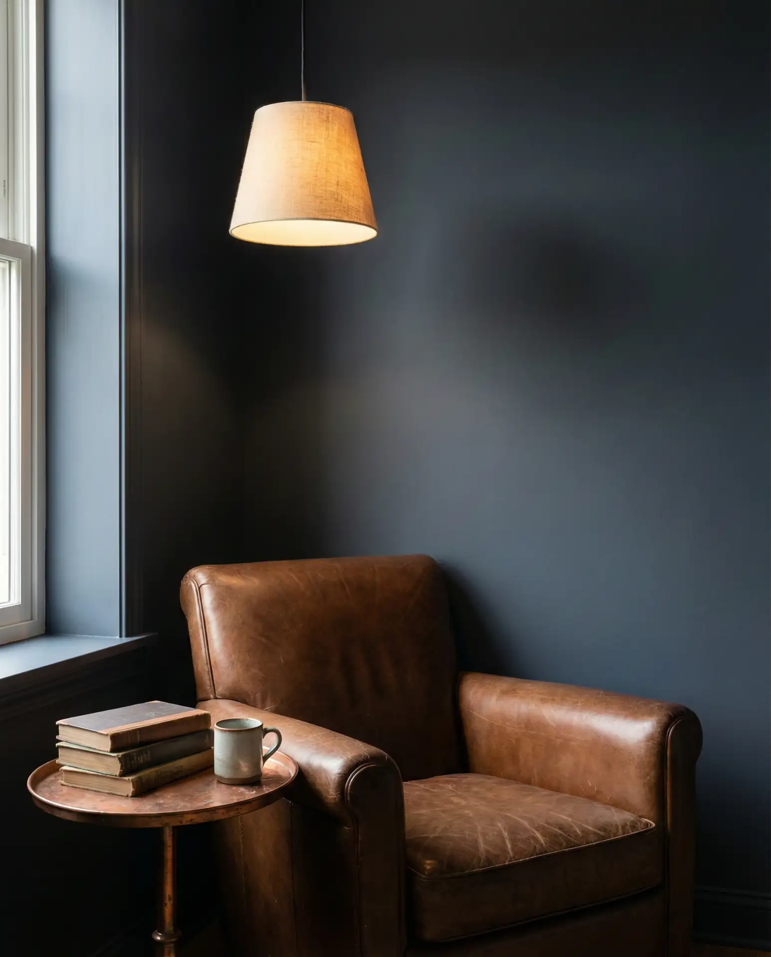
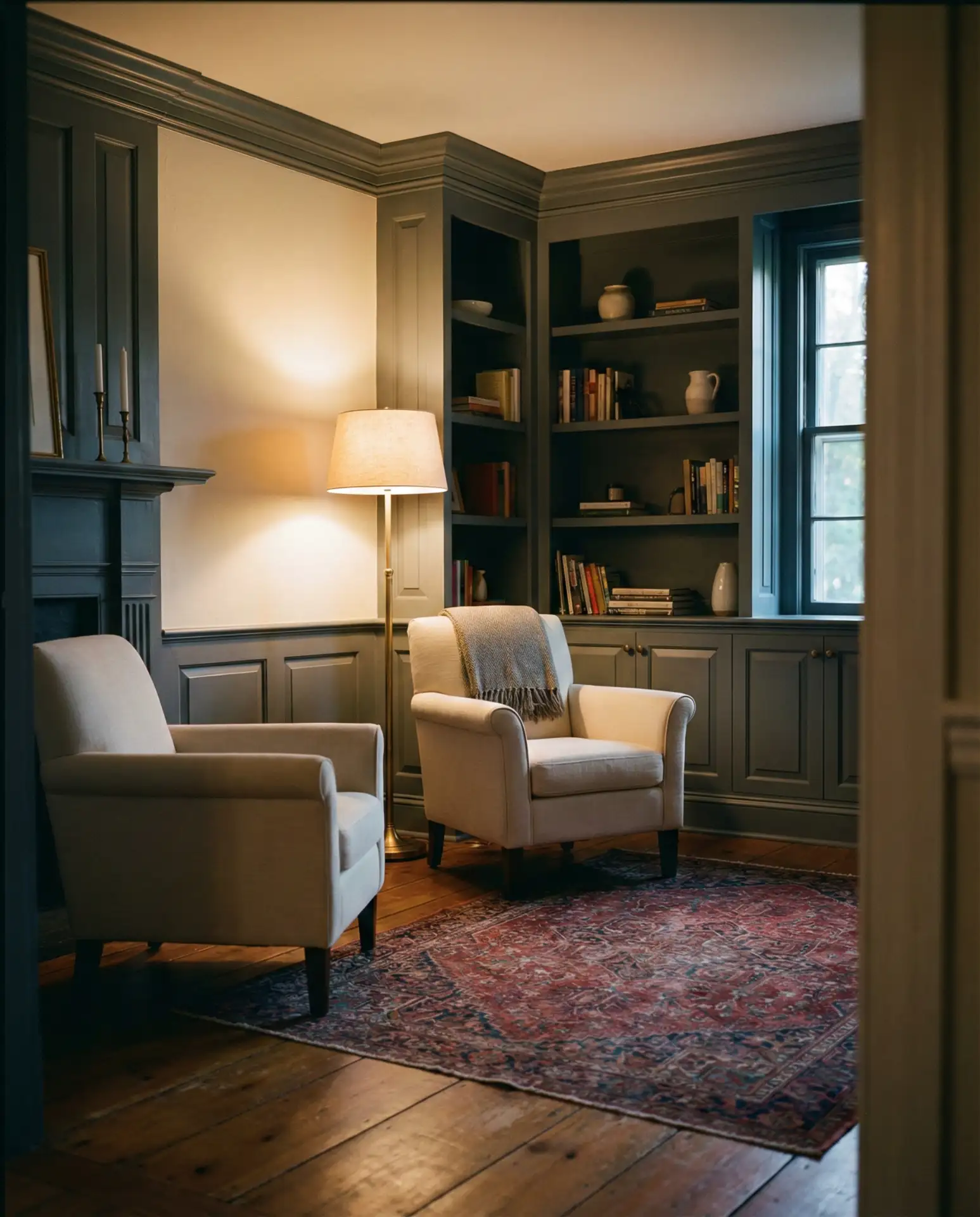
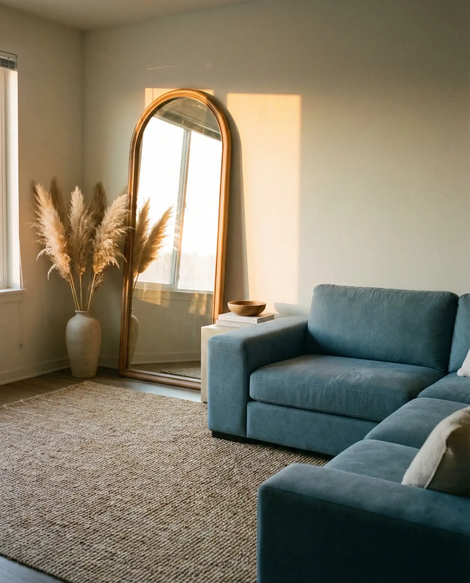
9. Hague Blue Sophisticated Drama
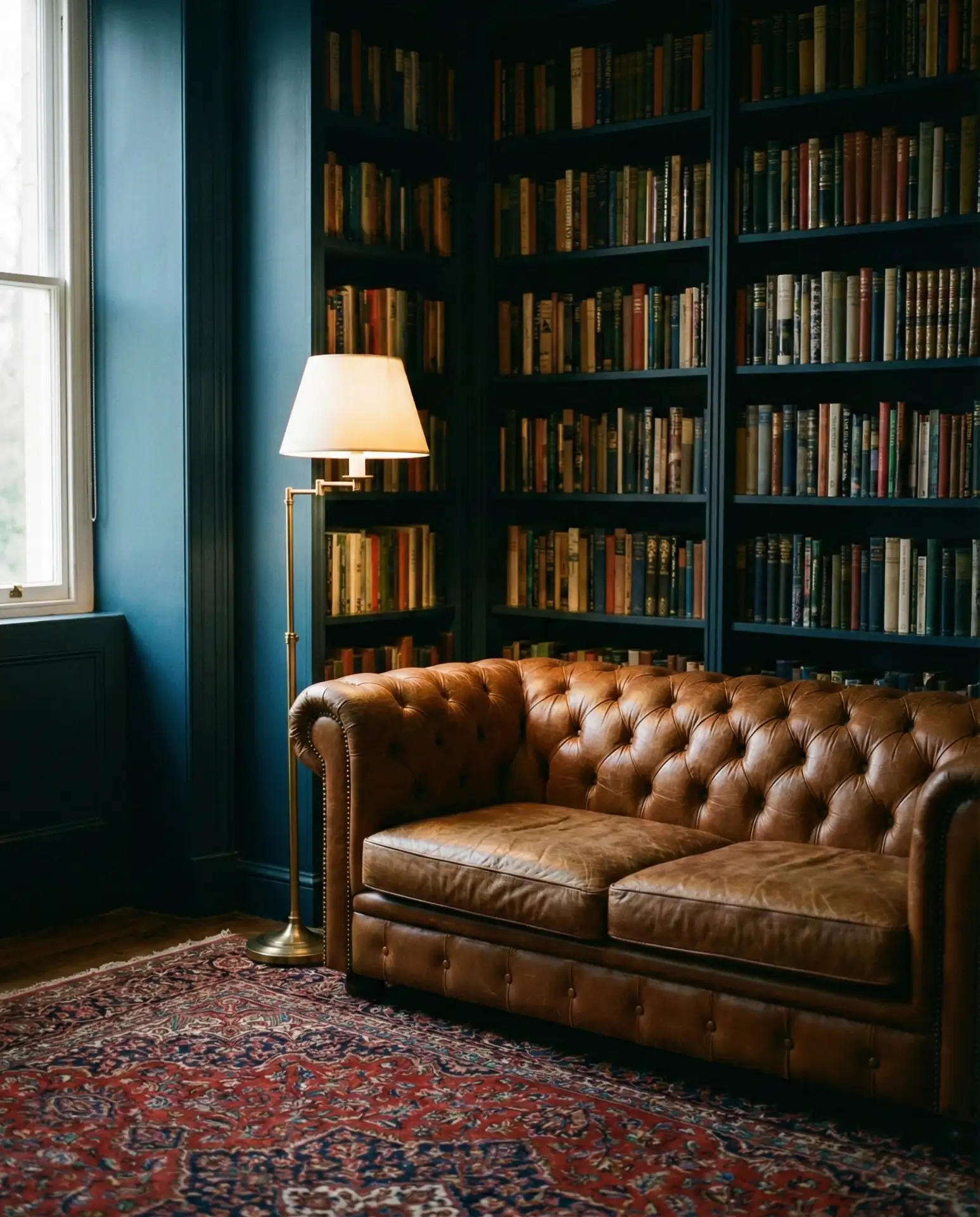
Made famous by Farrow & Ball, Hague blue is a deep, complex shade that reads almost black in low light but reveals rich blue undertones in brighter conditions. It’s a choice that signals confidence and taste, perfect for creating a library-like atmosphere or a jewel-box living room. This color demands commitment—it’s not for the faint of heart—but the payoff is a space that feels intensely sophisticated and utterly unique.
Where it works best: Hague blue thrives in rooms with strong natural light during the day and good layered lighting at night. Without proper illumination, it can feel oppressive. It’s particularly stunning in homes with high ceilings, large windows, or architectural details that benefit from dramatic color. Many homeowners use it in formal living rooms or home libraries rather than casual family spaces, where its intensity might feel too heavy for everyday living.
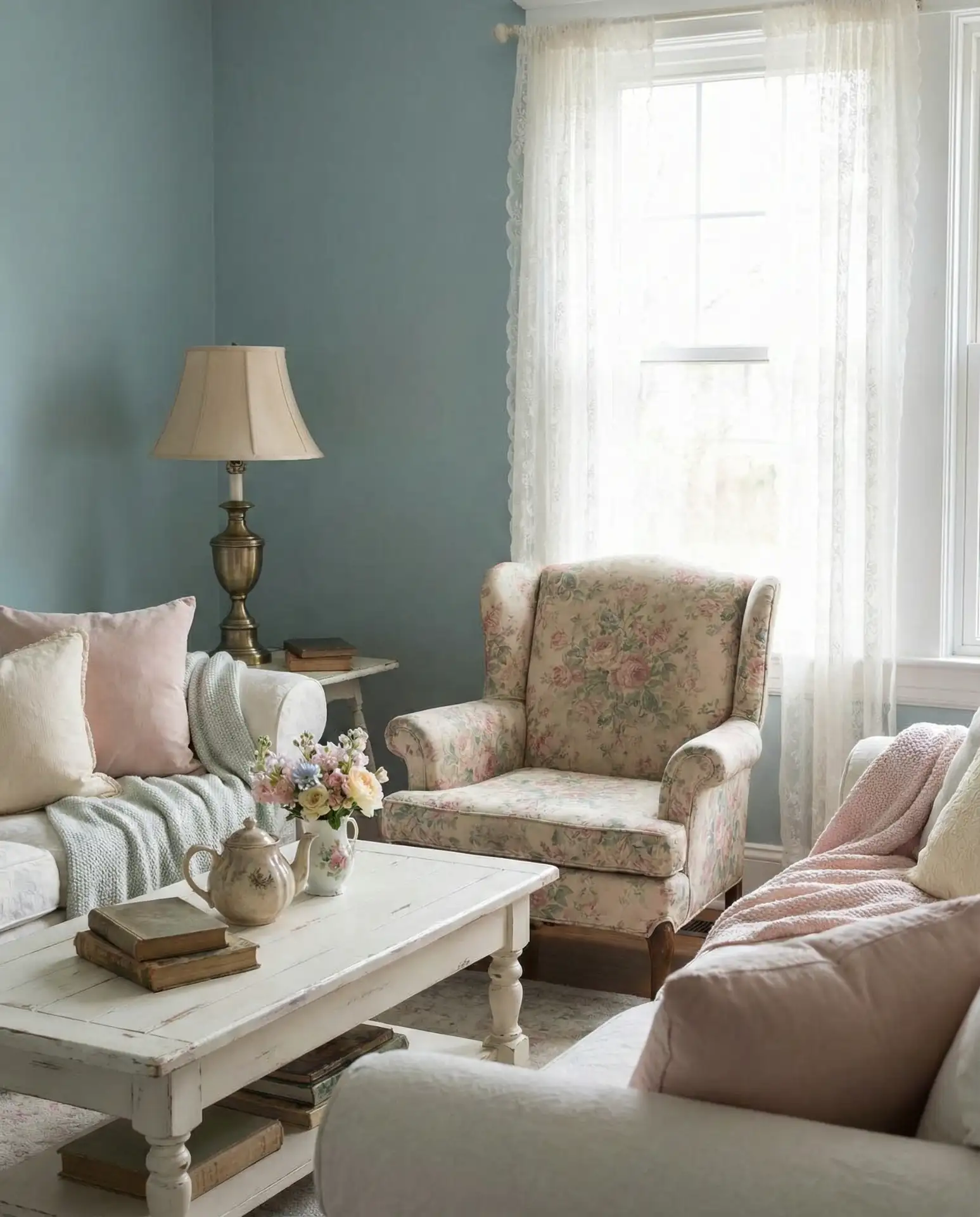
10. Pink and Blue Playful Elegance
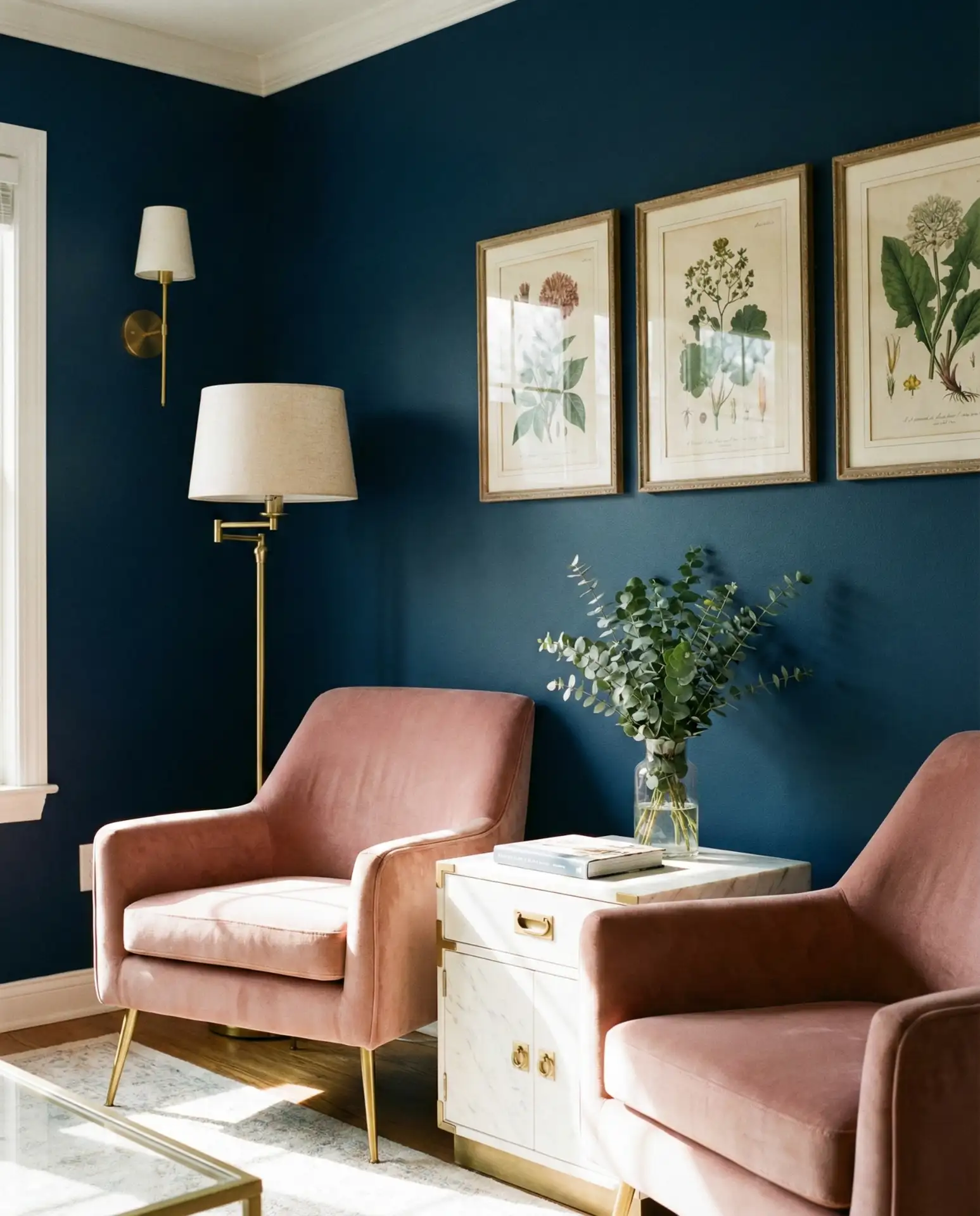
The combination of pink and blue has evolved far beyond nursery territory, emerging as a surprisingly sophisticated palette for grown-up living rooms. Think dusty rose with slate blue, or blush with navy—these pairings feel both playful and refined. This scheme works particularly well in eclectic or maximalist interiors where personality and whimsy are celebrated. The trick is avoiding anything too saccharine by choosing muted, complex shades rather than bubblegum brights.
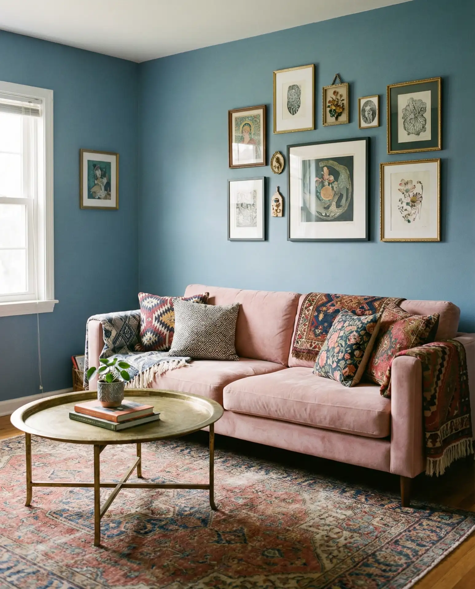
A neighbor recently redecorated her living room in these tones after years of beige, and she said it completely changed her relationship with the space—suddenly it felt like her, not like a catalog. The lesson: don’t be afraid to embrace color combinations that feel personal, even if they’re unconventional. Pink and blue together can feel joyful without being juvenile, especially when grounded with plenty of white, cream, or natural wood.
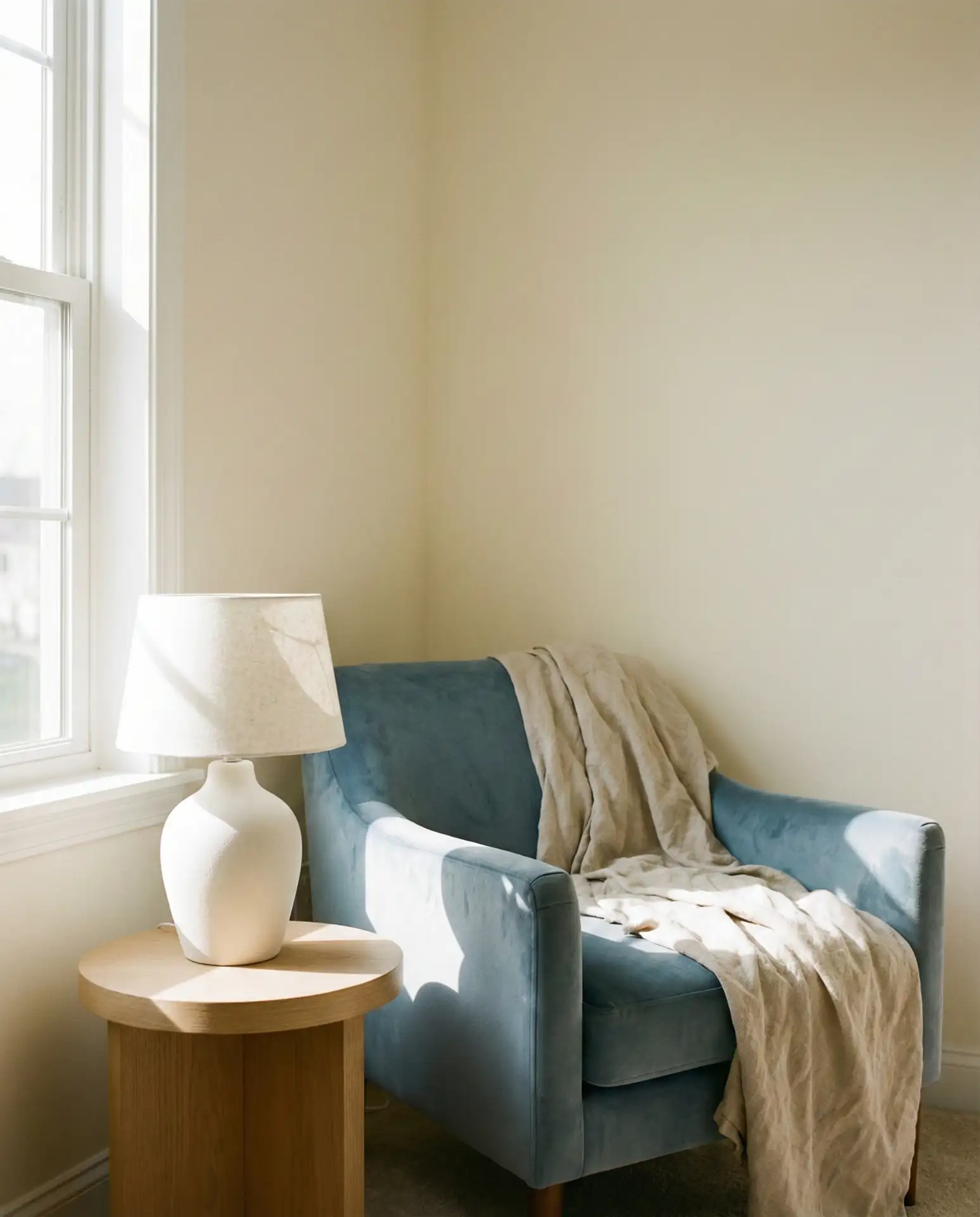
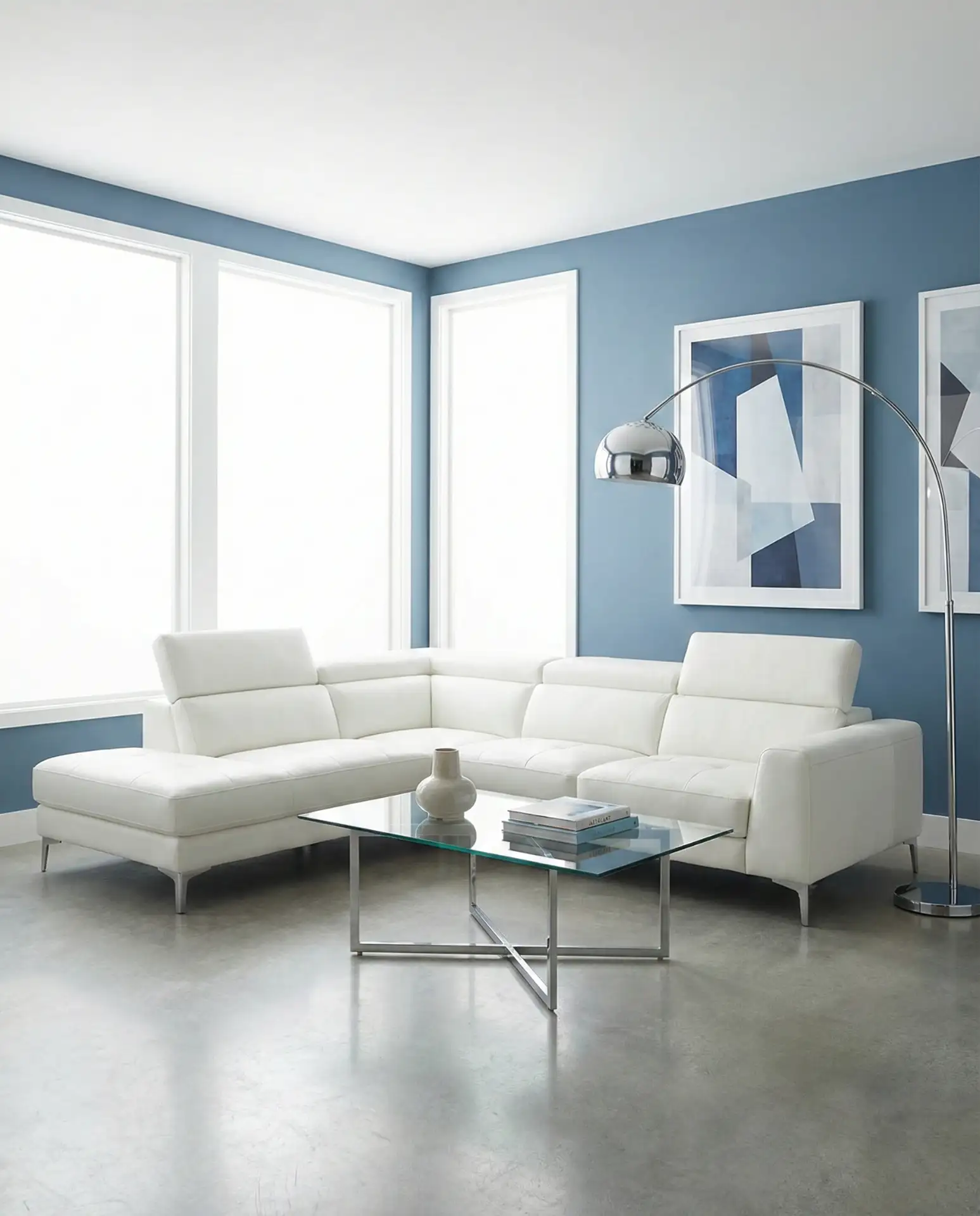
11. Sky Blue Airy Serenity
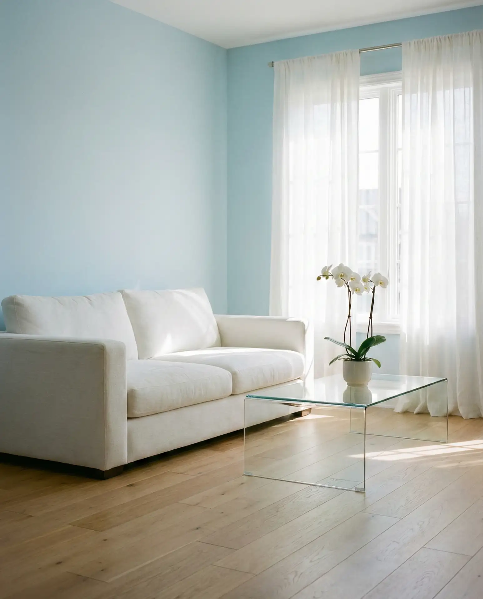
A sky blue living room captures the essence of a clear summer day, creating an atmosphere of openness and tranquility. This pale, bright blue works beautifully in small spaces where you want to enhance the sense of airiness or in sun-drenched rooms where the color will shift and glow throughout the day. Pair it with white trim, light wood floors, and minimal furnishings to maximize the feeling of space and light.
Sky blue is particularly popular in studio apartments and small homes across crowded cities like New York and San Francisco, where every design choice needs to work overtime to make spaces feel larger. The color reflects light beautifully, which is why designers often recommend it for north-facing rooms that might otherwise feel dim. Just be cautious of going too matchy—vary your blues slightly and introduce warm neutrals to prevent the room from feeling cold or sterile.
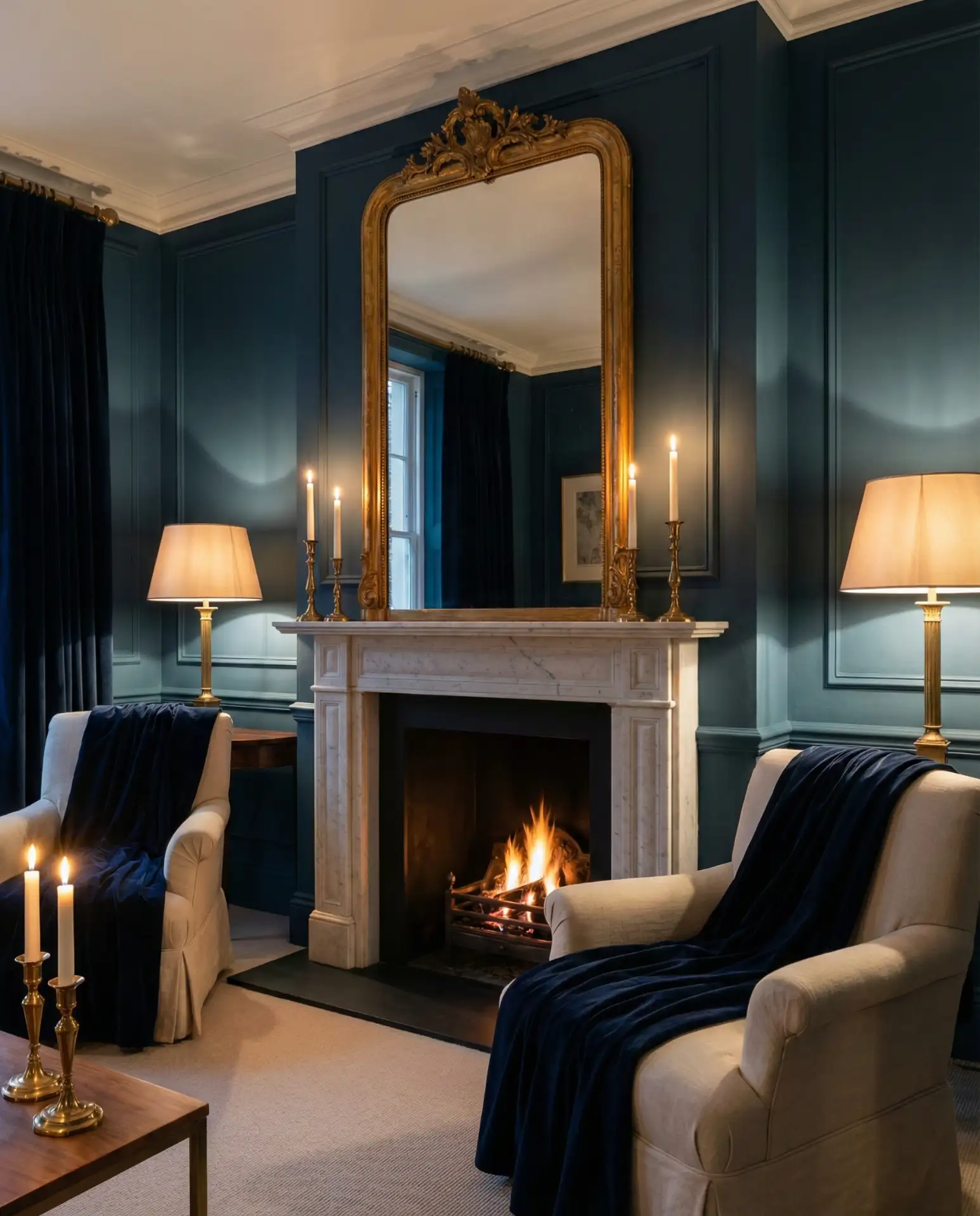
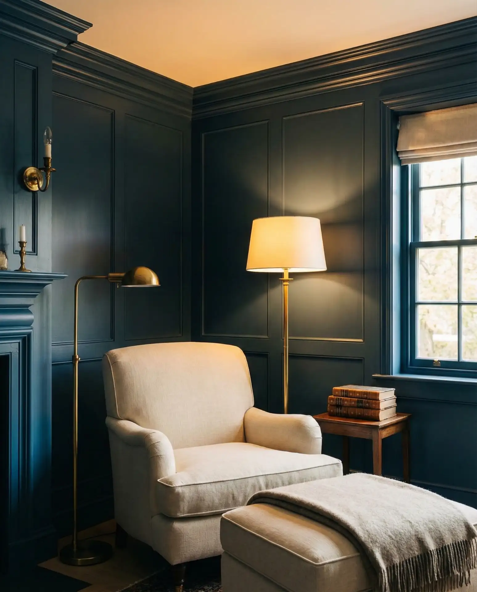
12. Inchyra Blue Moody Depth
Another Farrow & Ball favorite, Inchyra Blue is a dark, greyish-blue that feels both industrial and refined. It’s darker than traditional blue but softer than black, making it perfect for creating cozy, enveloping spaces without going full moody. This color works exceptionally well in rooms with architectural character—exposed beams, brick walls, or vintage molding—where the darkness enhances rather than hides the details.

Budget consideration: darker paint colors like Inchyra blue often require more coats than lighter shades, which can increase your paint costs. However, the dramatic impact is usually worth the investment. One practical tip—if you’re DIYing, invest in high-quality primer to ensure even coverage and true color depth. Many homeowners report that skimping on prep work with dark colors leads to patchy, disappointing results.
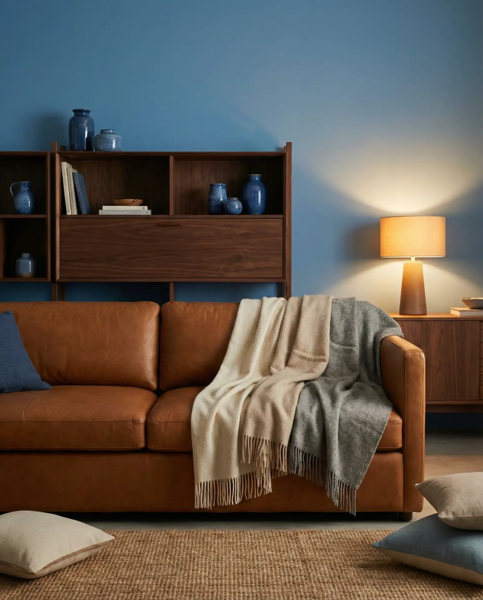
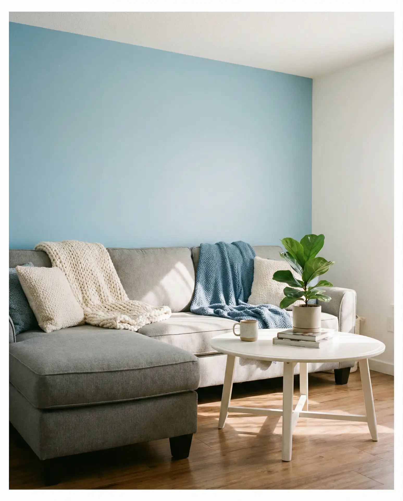
13. Taupe and Blue Warm Balance
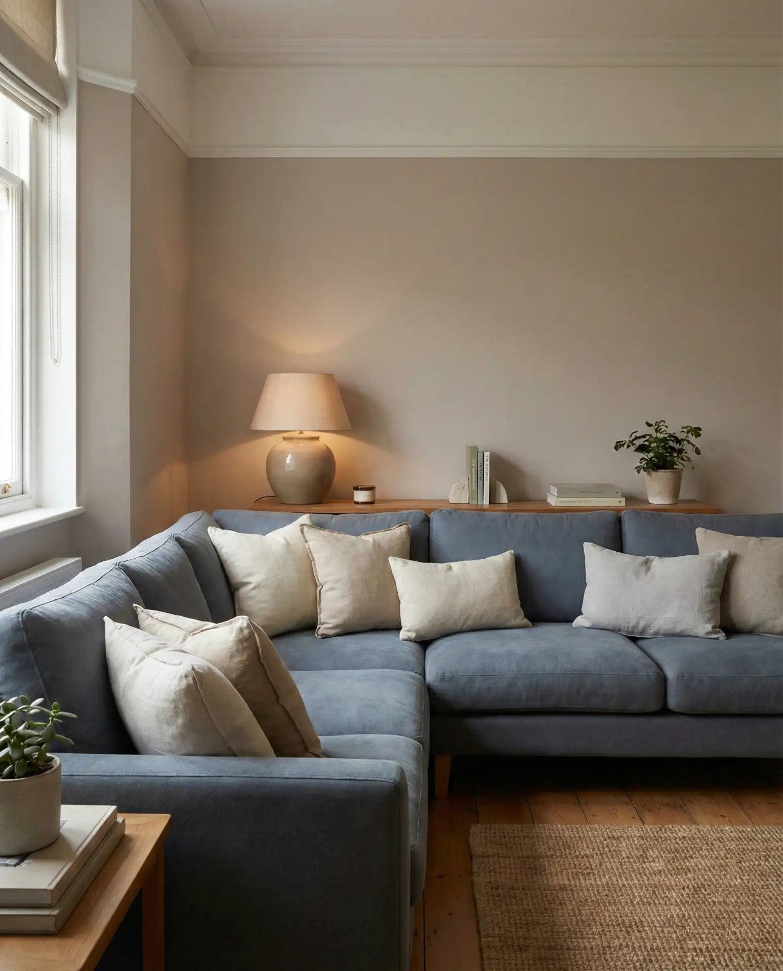
Combining taupe and blue creates a balanced palette that’s neither too warm nor too cool, making it incredibly livable for everyday life. Taupe grounds the coolness of blue, while blue prevents taupe from feeling dull or flat. This combination is ideal for transitional homes that bridge traditional and contemporary styles, or for anyone who wants a sophisticated space that doesn’t feel trendy or overly designed. It’s quietly elegant and deeply comfortable.
Expert commentary: Interior designers often describe this palette as “fail-safe” because it works across so many contexts—from suburban ranch homes to urban condos. The neutrality of taupe makes it easy to introduce seasonal accents or swap out decor without repainting. It’s also a palette that ages well, never looking dated the way more trendy color combinations might. If you’re unsure where to start with color, taupe and blue are a reliable foundation.
14. Red and Blue Bold Heritage
The classic pairing of red and blue draws on American heritage while feeling surprisingly fresh in 2026. Think beyond literal patriotic themes to more sophisticated interpretations—burgundy with navy, or coral with indigo. This combination works beautifully in traditional homes, especially when incorporated through upholstery, artwork, or vintage textiles like kilim rugs or antique quilts. It’s a palette that feels rooted in history but not stuck in the past.
In New England and the South, this color combination feels particularly at home, echoing regional design traditions while adapting to contemporary tastes. The key is using red as a punctuation mark rather than a dominant force—a single statement piece or a collection of smaller accents. Too much red can overwhelm blue’s calming qualities, creating a space that feels visually busy rather than balanced.
15. Yellow and Blue Sunny Optimism
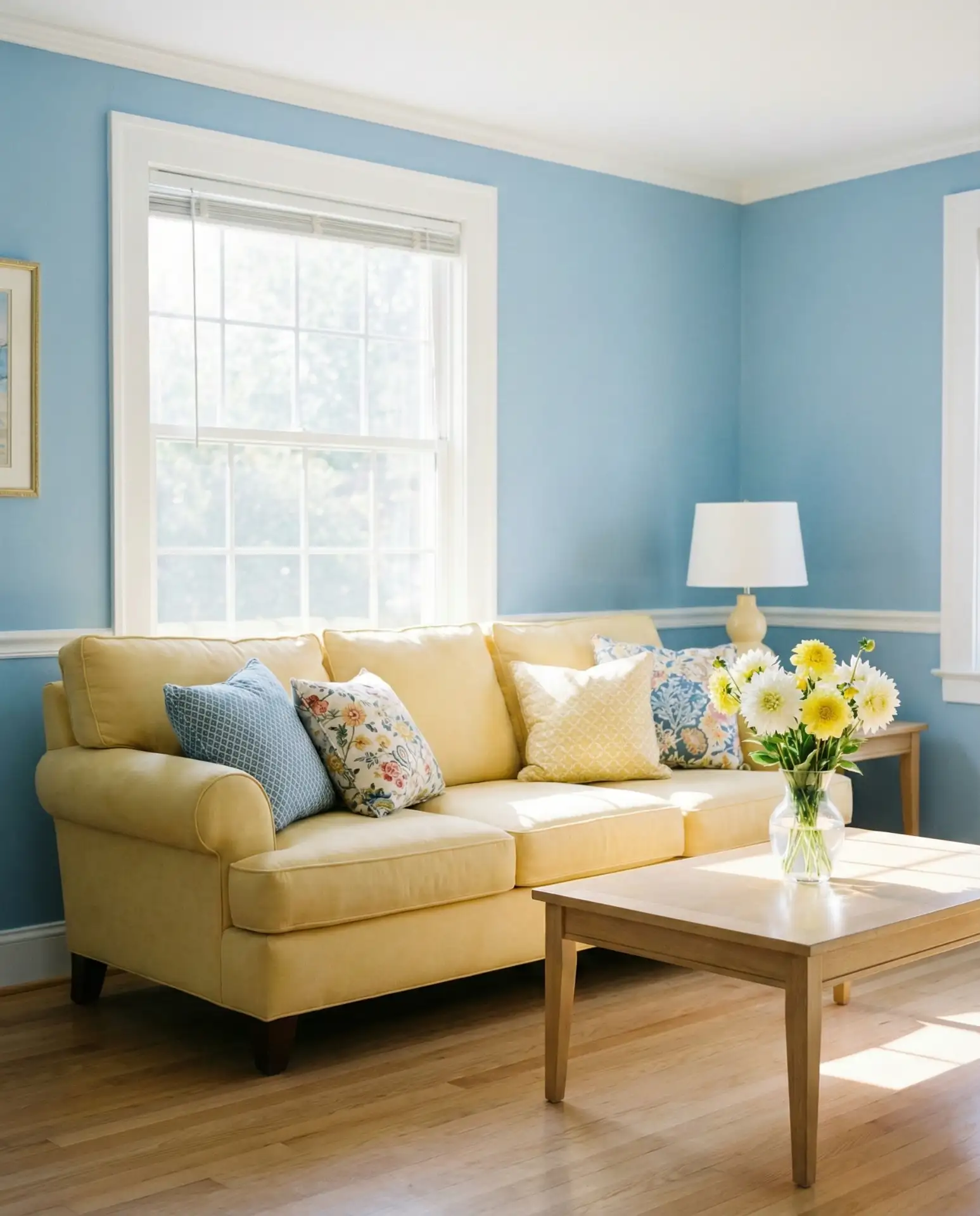
Nothing lifts the spirits quite like yellow and blue together, a combination that radiates warmth and optimism. This palette is particularly effective in climates with long, grey winters, where a dose of sunshine indoors makes all the difference. Think soft buttery yellows with powder blues or bold mustard with deep navy for more drama. The trick is calibrating the intensity of each color—too bright and it can feel overwhelming, too muted and the energy dissipates.

Common mistake: going too literal with the yellow and blue combination, which can accidentally skew toward a children’s room aesthetic. Avoid this by choosing sophisticated shades and incorporating plenty of white or neutral elements to give the eyes a place to rest. Many designers recommend the 60-30-10 rule—60% neutral, 30% blue, 10% yellow—to maintain visual balance.
16. Peacock Blue Jewel-Toned Luxury
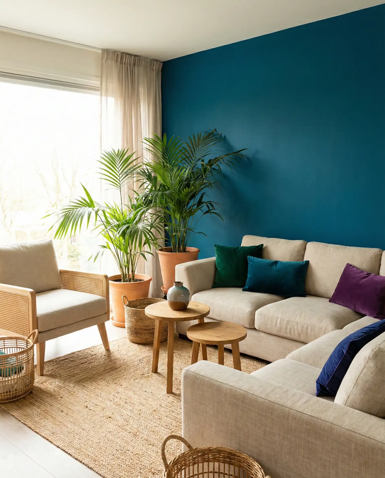
Rich and saturated, peacock blue brings jewel-toned luxury to any living room. This blue-green hybrid has depth and complexity that shifts in different lights, sometimes reading more blue, sometimes more teal. It pairs beautifully with gold accents, emerald greens, and deep purples for a maximalist look, or with crisp whites and natural woods for something more restrained. This is a color for homeowners who love color and aren’t afraid to embrace it fully.
Peacock blue has become especially popular among homeowners in warmer climates—think Southern California, Arizona, and Florida—where the color echoes tropical waters and lush landscapes. It’s also a favorite in urban apartments, where a single bold color can define the entire space. The intensity of peacock blue means a little goes a long way; even one accent wall or a single upholstered piece can completely transform the energy of a room.
17. Royal Blue Regal Statement
True royal blue is bold, confident, and unapologetically saturated—a choice that announces itself the moment you enter the room. This is a color for formal living rooms or spaces where you want to create impact, and it works particularly well with traditional or classical design elements like crown molding, crystal chandeliers, or ornate mirror frames. Balance the intensity with plenty of white, cream, or metallic accents to prevent the space from feeling too heavy.
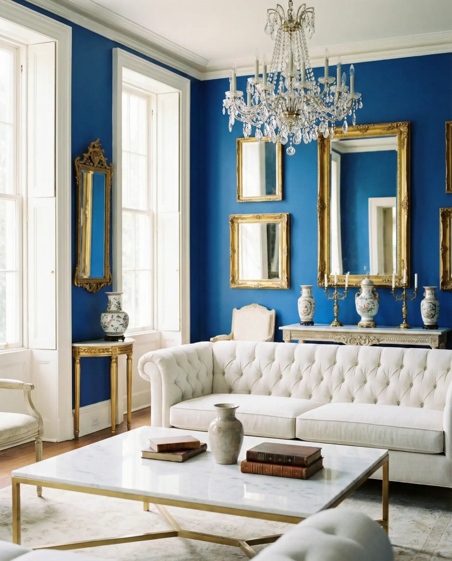
Real homeowner insight: those who choose royal blue tend to be confident decorators who view their living room as a showcase space rather than a casual hangout. It’s less common in homes with young children or pets simply because the formality demands a certain level of maintenance. But for empty nesters or design enthusiasts who love to entertain, royal blue creates an unforgettable backdrop that guests will remember long after they leave.
18. Aesthetic Blue Trend-Forward Design
When designers talk about aesthetic blue in 2026, they’re referring to carefully curated, Instagram-worthy spaces that feel both current and timeless. This isn’t about a specific shade but rather about the overall approach—mixing vintage and modern pieces, layering textures, and creating vignettes that photograph beautifully. The blue might be soft and muted or bold and saturated, but it’s always thoughtfully combined with complementary elements that tell a cohesive story.
Where it works best: this approach thrives in homes of design-conscious millennials and Gen Z homeowners who’ve grown up with Pinterest and Instagram as their primary sources of inspiration. The aesthetic blue living room is less about following a single rule and more about developing an eye for proportion, contrast, and detail. It requires patience—buying pieces slowly, editing ruthlessly, and being willing to rearrange until everything feels just right.
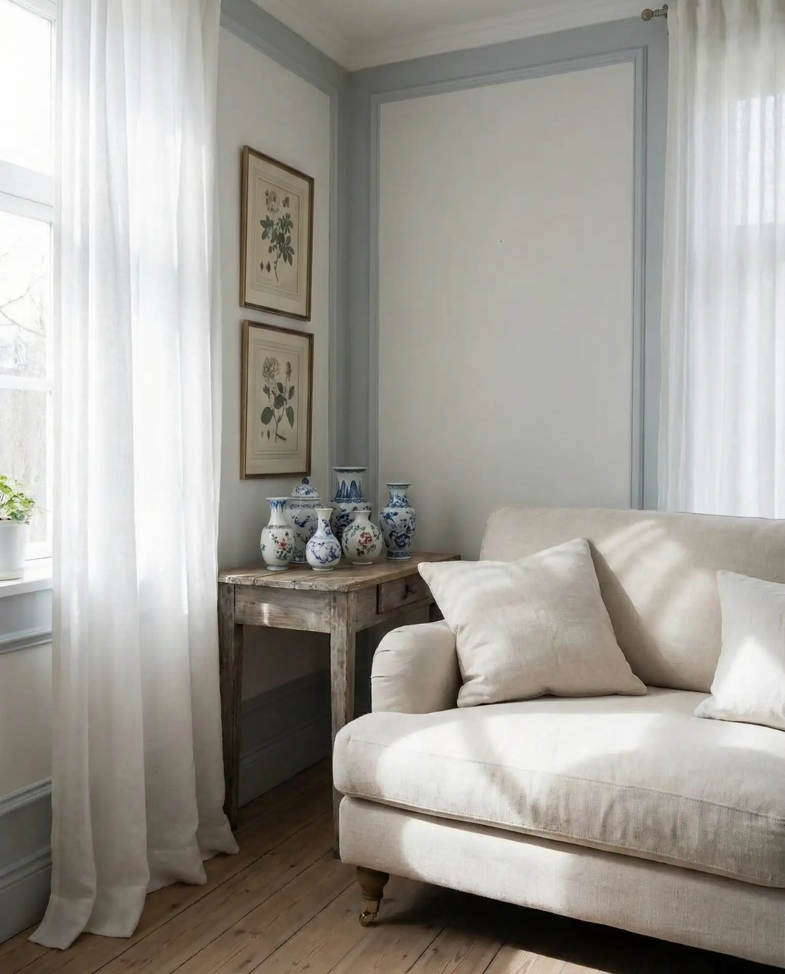
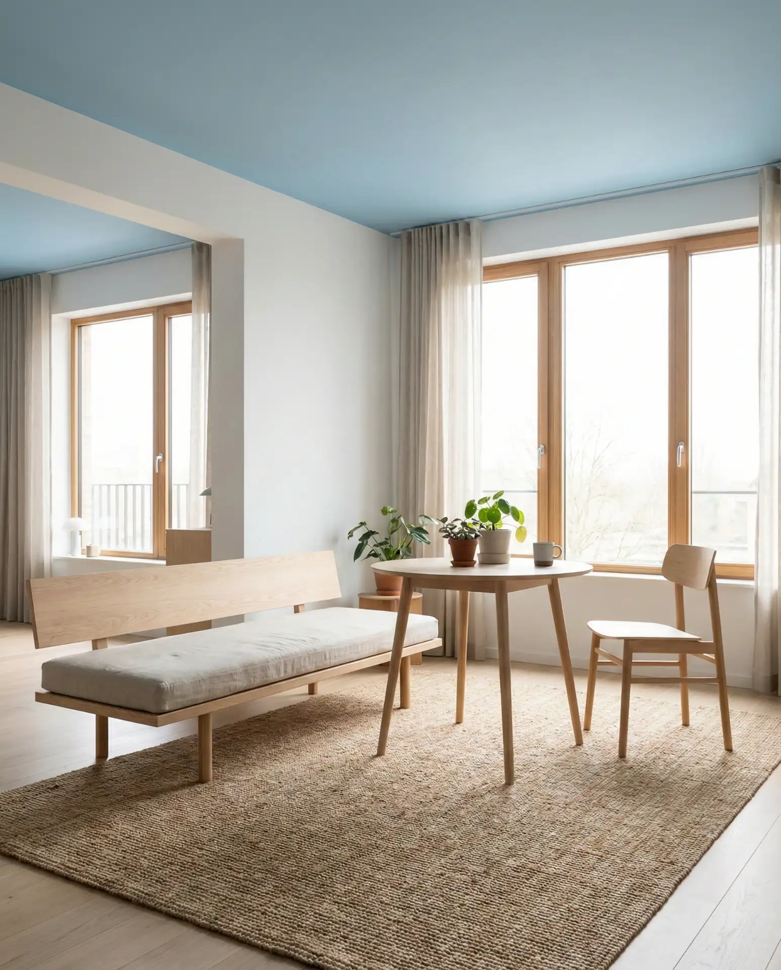
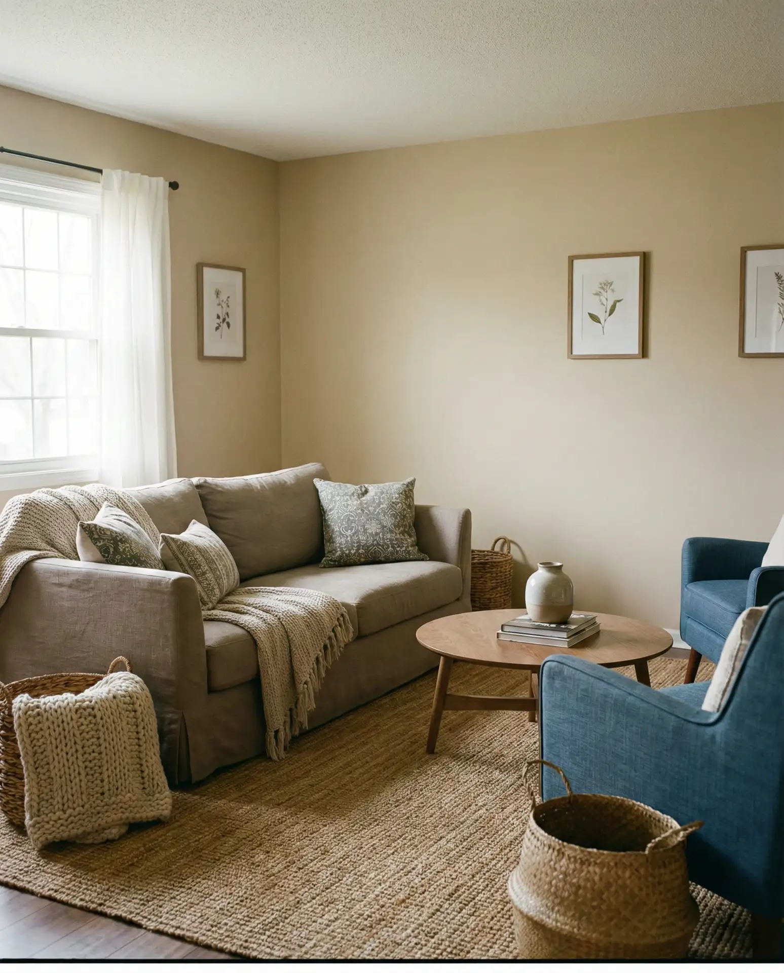
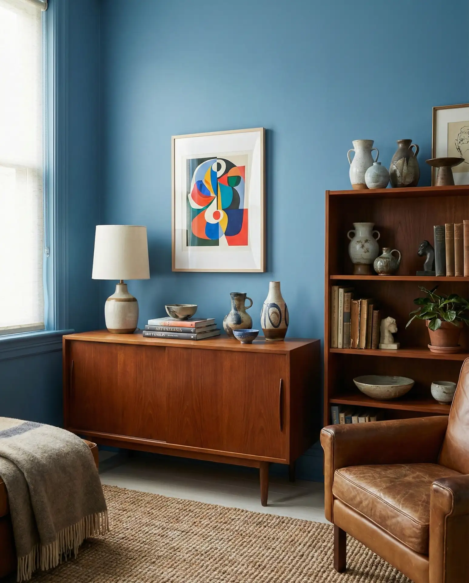
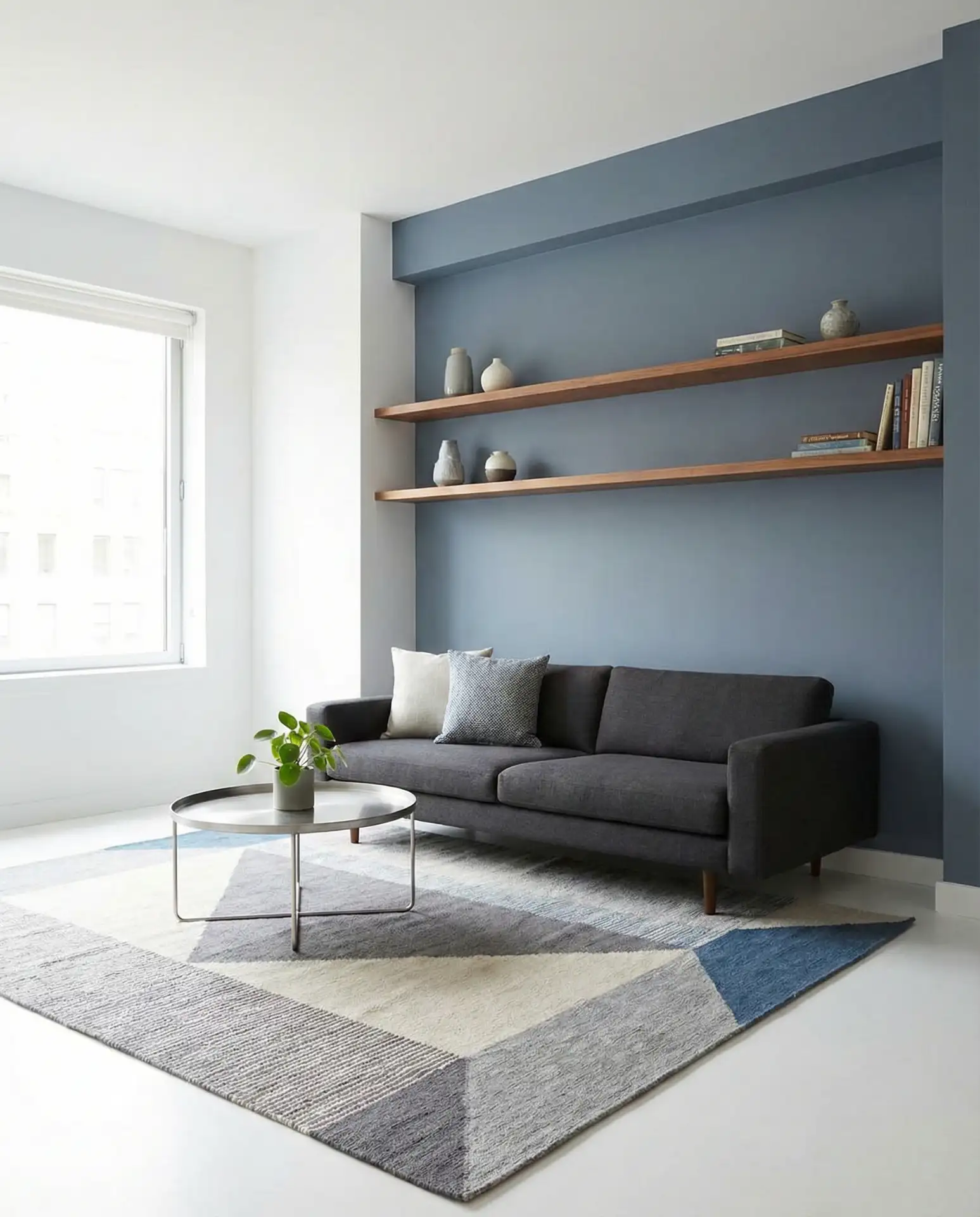
19. Grey and Light Blue Soft Transition
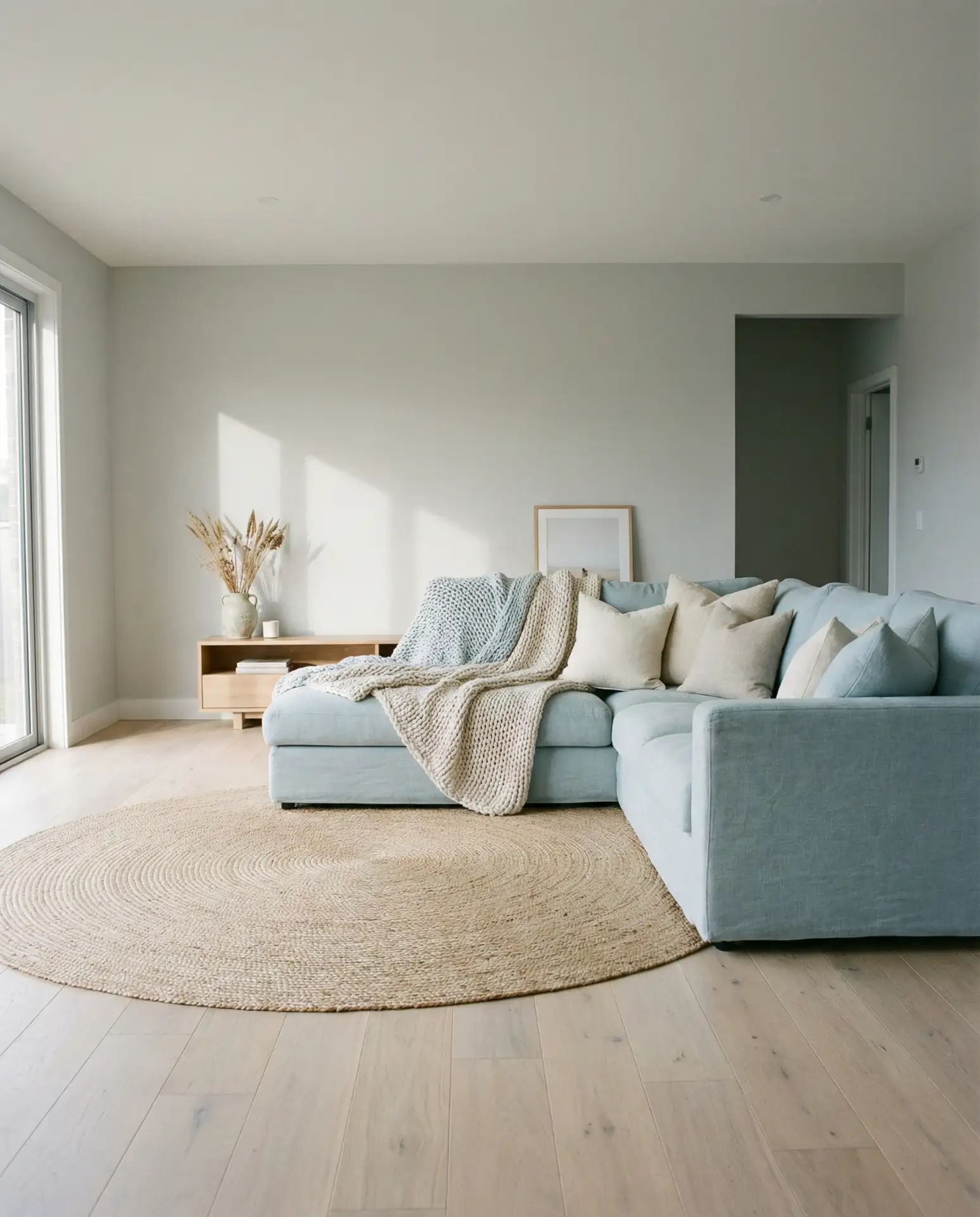
The pairing of grey and light blue creates one of the most versatile and forgiving palettes available, perfect for homeowners who want color without commitment. Soft, barely-there blues blend seamlessly with warm or cool greys, creating a soothing backdrop that works across all seasons and styles. This combination is particularly effective in open-plan spaces where you need a cohesive color story that flows from room to room.
A practical insight for this palette: sample your colors in multiple lights before committing. Grey and light blue can shift dramatically depending on natural light exposure, appearing cooler in north-facing rooms and warmer in south-facing ones. Purchase sample pots and paint large swatches on different walls, observing them throughout the day and into the evening under artificial light. This extra step prevents the disappointment of colors that look completely different once fully applied.
20. Stiffkey Blue Deep Immersion
The third Farrow & Ball shade on this list, Stiffkey Blue, is a deep, almost-black navy that creates instant drama and intimacy. It’s darker than Hague blue and more saturated than Inchyra blue, making it the boldest choice for homeowners ready to commit to serious color. This shade is particularly stunning in rooms with beautiful molding or architectural details that you want to highlight rather than hide. The darkness makes everything else in the room—art, furniture, metallic accents—pop with greater intensity.
Common mistake: underestimating how much light you’ll need once you paint a room this dark. Stiffkey Blue requires a thoughtful lighting plan with multiple sources—overhead, task, and ambient—to prevent the room from feeling like a cave. Budget for good lighting fixtures as part of your renovation; the paint color is an investment, but without proper lighting, you won’t be able to appreciate its full beauty and complexity.
21. Modern Blue Clean Lines
A modern blue living room prioritizes clean lines, uncluttered surfaces, and a carefully edited color palette. This is blue at its most restrained—think mid-tone shades that provide color without drama, paired with sleek furniture and minimal ornamentation. The modern aesthetic emphasizes function and form, where every piece serves a purpose and nothing feels extraneous. Glass, metal, and polished wood surfaces reflect light and enhance the sense of spaciousness.
Modern blue living rooms are popular in newly built homes and recently renovated spaces where the architecture itself is the star. In tech hubs like Seattle, San Francisco, and Austin, this aesthetic aligns with a lifestyle that values efficiency and simplicity. The challenge is keeping it from feeling too cold or impersonal—introduce warmth through textiles (wool throws, linen pillows) and natural elements (wood, stone, plants) to ensure the space feels lived-in rather than sterile.
22. Black and Blue Dramatic Contrast
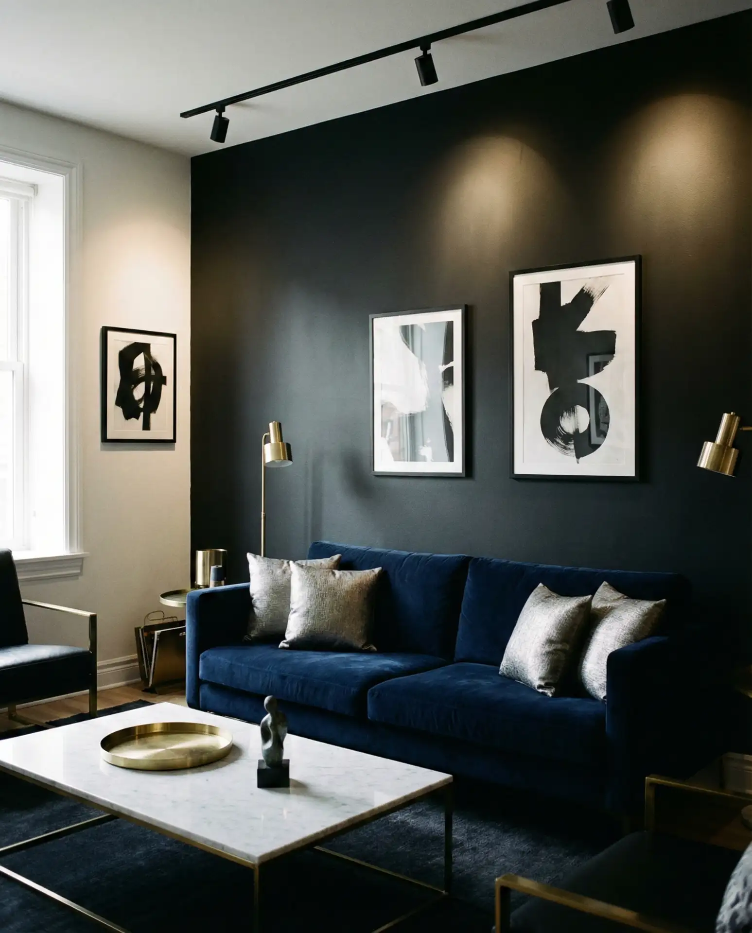
The pairing of black and blue is about as dramatic as you can get, creating high-contrast spaces that feel both edgy and sophisticated. This isn’t a palette for the timid—it requires confidence and a willingness to embrace darkness as a design choice rather than something to avoid. The blue provides just enough color to prevent the scheme from feeling too stark, while black adds gravity and grounding. It’s a combination that works particularly well in urban settings and modern interiors.
Expert advice: if you’re drawn to this palette but worried about it feeling too dark, start with black and blue in your furniture and textiles rather than on the walls. A black sofa with blue pillows, or blue walls with black-framed artwork, lets you test the combination without the commitment of paint. You can always intensify the look over time as you become more comfortable with the dramatic aesthetic. This approach also makes it easier to pivot if you decide the high contrast isn’t for you.
Conclusion
Blue living rooms in 2026 offer something for everyone—from the soft serenity of sky blue to the bold drama of Stiffkey blue. The key is finding the shade and combination that resonates with your personal style and the way you actually live. Whether you’re drawn to coastal calm, urban sophistication, or jewel-toned luxury, blue provides endless possibilities for creating a space that feels both current and timeless. What blue living room idea speaks to you? Share your thoughts in the comments below—we’d love to hear which direction you’re taking your space this year.