Cape Cod homes have held their place in American architecture for generations, and in 2026, homeowners are finding fresh ways to honor that classic charm while embracing contemporary updates. Whether you’re drawn to the coastal simplicity of white clapboard or considering bolder moves like dark green trim, this style continues to evolve without losing its roots. Pinterest boards are brimming with inspiration as more people seek that perfect balance between tradition and modern living. In this guide, you’ll explore twenty-two distinct exterior ideas that celebrate everything from colonial symmetry to unexpected paint colors, each one designed to help you reimagine your own home’s curb appeal.
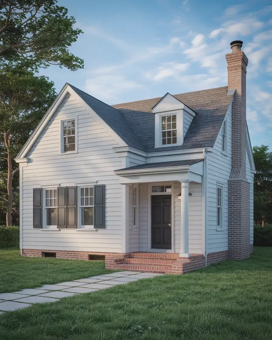
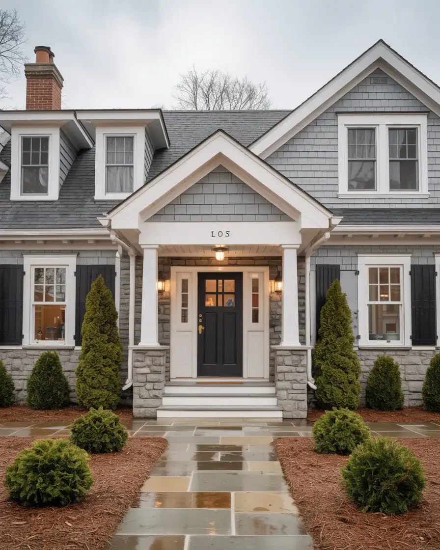
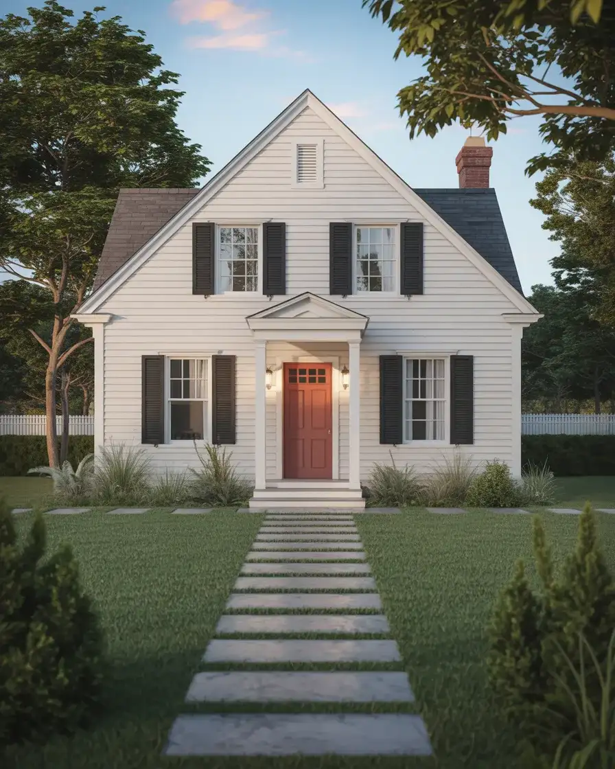
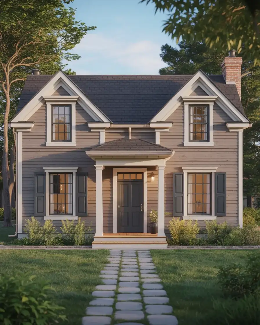
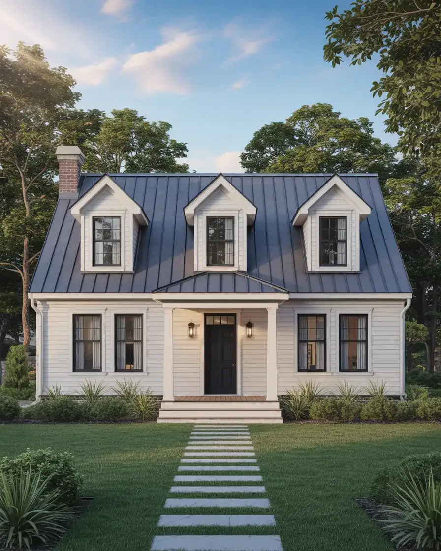
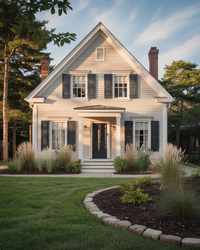
1. Crisp White Siding with Black Shutters
This pairing remains the gold standard for Cape Cod exteriors because it delivers timeless elegance without overthinking the details. White clapboard siding reflects sunlight beautifully, keeping interiors cooler during summer months, while black shutters frame each window with crisp definition. The contrast feels intentional yet effortless, a hallmark of New England design that translates seamlessly to neighborhoods across the country. Pair this with a simple front door in charcoal or navy to tie the palette together without adding visual clutter.
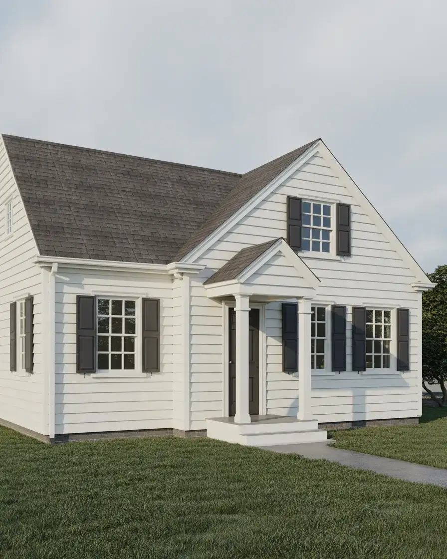
Where this works best is in suburban settings where neighboring homes lean traditional—your updated Cape Cod will stand out for all the right reasons. Maintenance is straightforward since both white and black finishes are widely available in durable exterior paints, and touch-ups remain nearly invisible. If you’re worried about the starkness, consider adding window boxes filled with seasonal blooms to soften the overall look. This combination also photographs exceptionally well, a bonus if you ever plan to list your home.
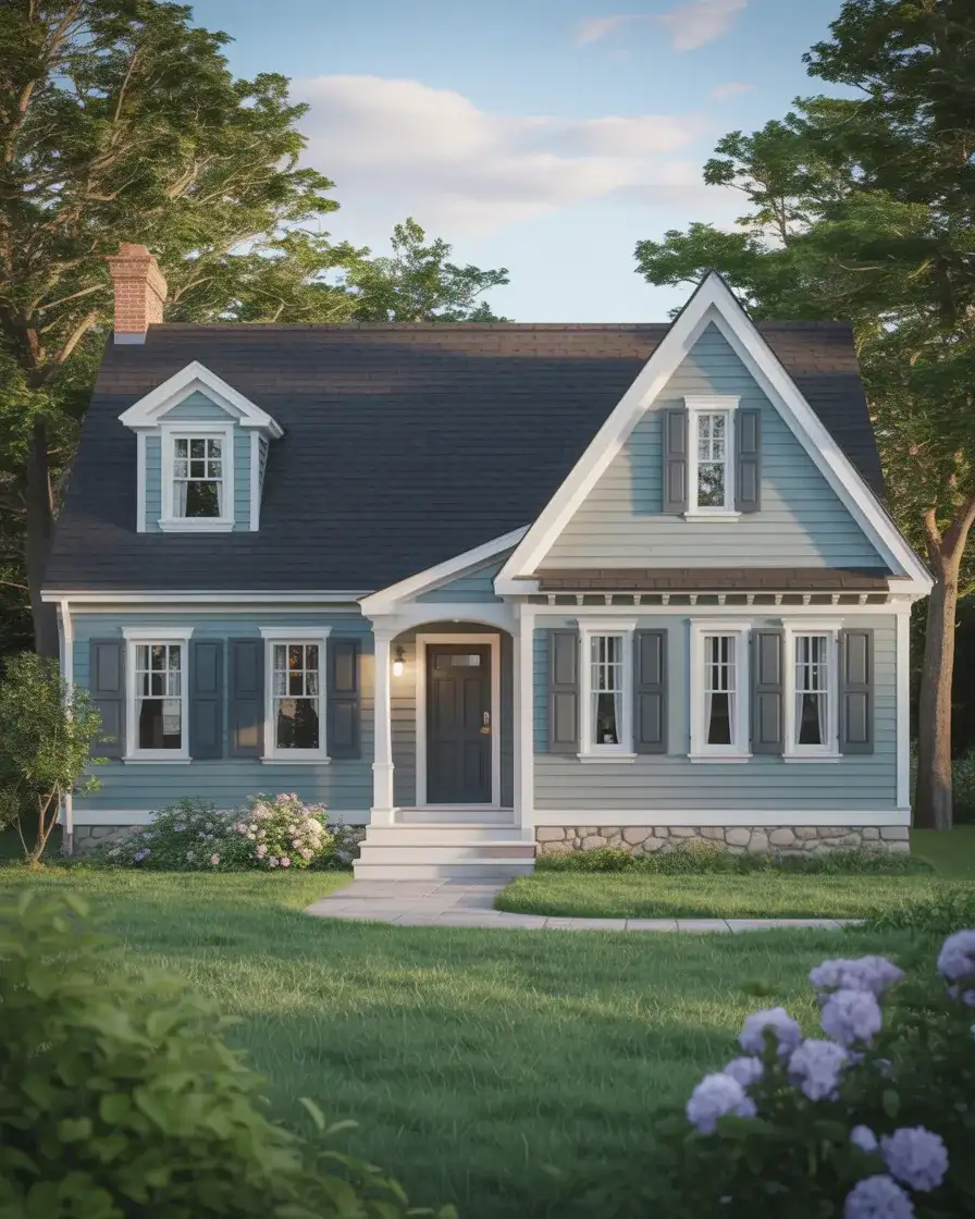
2. Soft Grey with Coastal Blue Accents
Switching to a muted grey body shifts the mood from stark to serene, especially when you introduce coastal blue on the front door and trim. This palette channels beachside calm without feeling overly thematic, making it perfect for homes located inland or in regions far from the coast. Coastal color palettes like this one work year-round because they’re grounded in neutrals but still carry personality. The grey anchors the structure, while the blue draws the eye to architectural details like dentil molding or a porch ceiling.
A practical insight here is that grey hides dirt and weathering far better than bright white, which means fewer pressure-washing sessions and a cleaner appearance between maintenance cycles. Homeowners in the Pacific Northwest and New England especially appreciate this, given the frequent rain and mist. Blue accents can be adjusted in intensity—go lighter for a whisper of color or deeper for a bolder statement. Just ensure your blue has enough grey undertone to harmonize rather than clash with the body color.
3. Classic Cedar Shingles Left Natural
Cedar shingles offer a textured, organic alternative to painted siding, and when left to weather naturally, they develop a silvered patina that feels deeply rooted in New England tradition. This approach celebrates the material itself rather than covering it up, allowing the wood’s character to evolve over decades. Classic Cape Cod homes in coastal towns have worn this look for centuries, and it continues to resonate with homeowners who value authenticity and low intervention. The natural grey tones pair beautifully with white trim and dark window frames.
Real homeowner behavior often involves a misconception: some assume natural cedar requires zero upkeep. In reality, you’ll want to clean the shingles every few years and apply a clear wood preservative if you want to slow the silvering process or prevent mildew in humid climates. If you prefer the warm honey tones of fresh cedar, a semi-transparent stain can preserve that look longer. Either way, this material choice adds depth and warmth that flat siding simply can’t match.
4. Deep Green Siding with Cream Trim

A dark green exterior makes a bold statement while still honoring the Cape Cod aesthetic, especially when balanced with cream or off-white trim that prevents the color from feeling too heavy. Green connects the home to its surrounding landscaping, creating a cohesive relationship between structure and site. This palette works particularly well on wooded lots or properties with mature trees, where the house nestles into the environment rather than standing apart from it. The cream trim brightens window openings and corner boards, adding contrast without harshness.
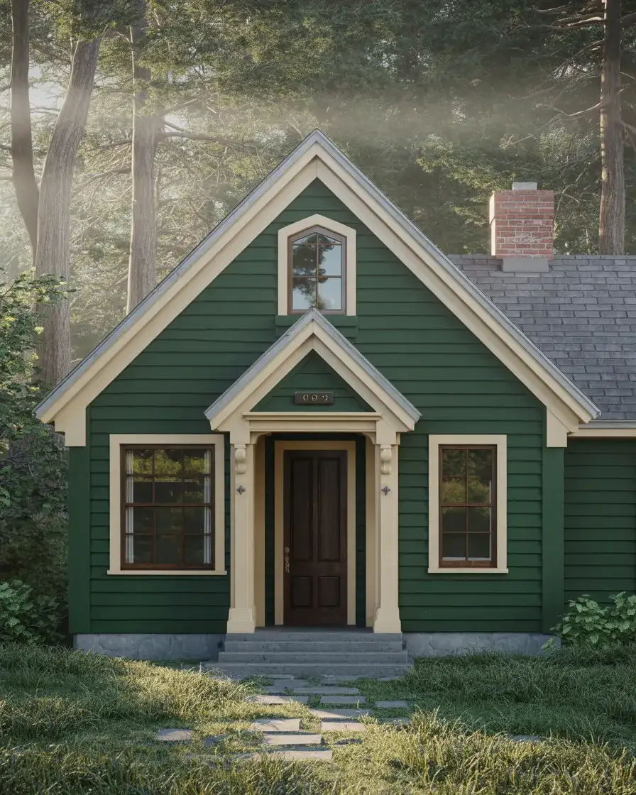
This color choice reflects a growing trend in American residential design where homeowners move away from the expected and embrace deeper, more saturated hues. Expert-style commentary suggests that dark exteriors can actually make a home feel larger by blurring the boundaries between building and backdrop. If you’re considering this route, test large samples on different sides of your house to see how the color shifts in morning versus afternoon light—green can read surprisingly warm or cool depending on exposure.
5. Whitewashed Brick Foundation
Many Cape Cod homes feature brick foundations or chimneys that have darkened over the years, and whitewashing those elements brings a fresh, cohesive look to the entire facade. This technique softens the heaviness of traditional red brick while preserving its texture and character, creating a more unified color story when paired with painted siding. Antique homes benefit especially from this update, as it lightens the overall composition without requiring full replacement. The result feels both historic and current, a balance that’s difficult to achieve with more drastic interventions.
A micro anecdote from a Massachusetts homeowner: she resisted whitewashing her chimney for years, fearing it would look too farmhouse-style, but once completed, the change tied her entire exterior together and actually made the roofline more prominent. The limewash or diluted paint allows some of the original brick color to peek through, which adds depth and prevents the flat, sterile appearance of solid paint. This approach also ages gracefully, developing a subtle patina that enhances rather than detracts from the overall aesthetic.
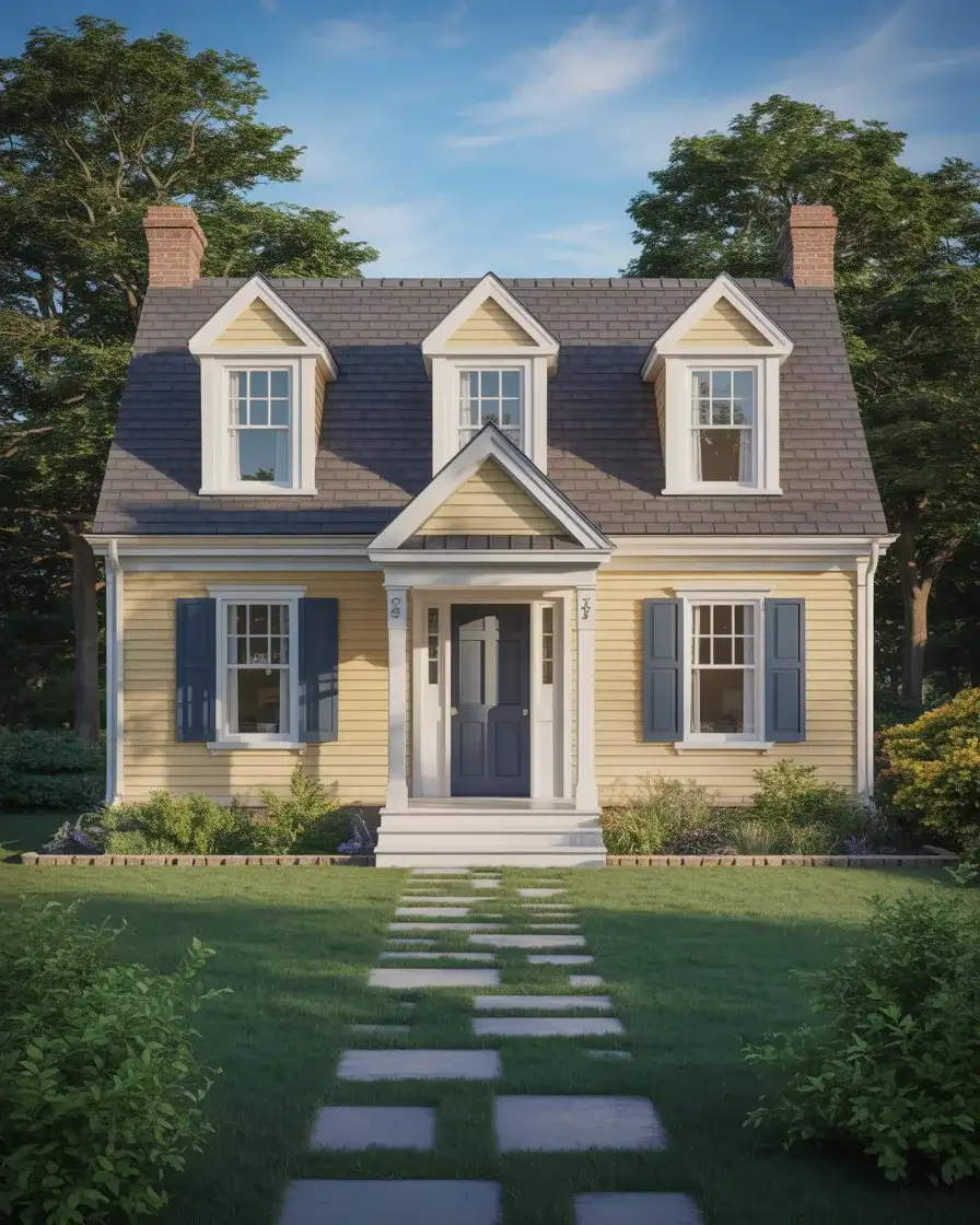
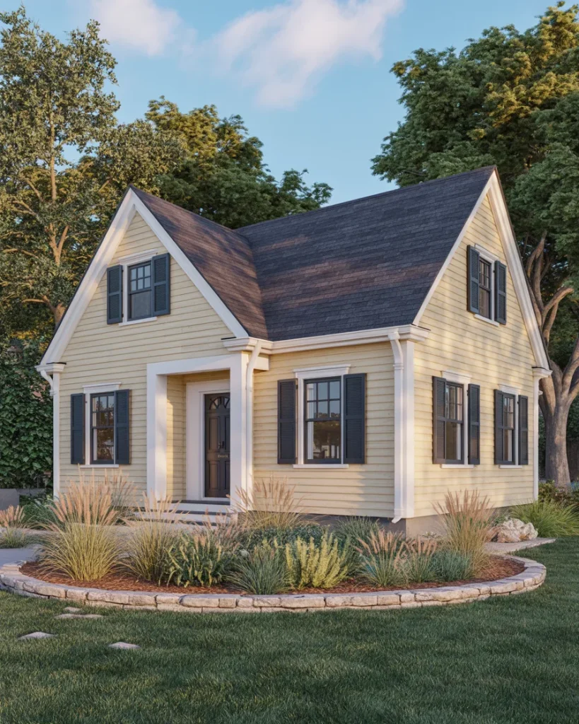
6. Bold Yellow with White Trim
A yellow Cape Cod exterior injects personality and warmth into a style that can sometimes feel too restrained, especially when paired with crisp white trim that keeps the look polished rather than playful. This combination works beautifully in sunny climates or neighborhoods where homes already showcase a range of colors, allowing your property to stand out without feeling out of place. Design ideas like this prove that Cape Cod architecture can accommodate bolder palettes while maintaining its essential proportions and symmetry. The yellow should lean toward buttery or ochre tones rather than bright lemon to avoid a cartoonish effect.
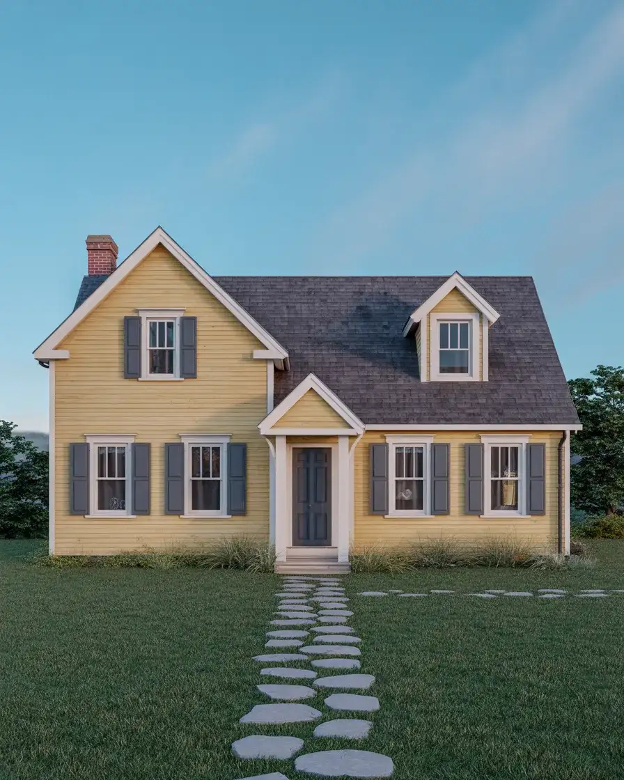
Budget-conscious homeowners should know that yellow paint often requires an extra coat or high-quality primer to achieve even coverage, especially over darker existing colors, which can add to labor costs. However, the payoff is significant—yellow homes photograph beautifully and tend to attract positive attention in real estate markets. If you’re nervous about committing, start with a yellow front door or porch ceiling to test your comfort level. Many people find that once they see the color in place, their hesitation disappears entirely.
7. Stone Veneer Accents
Introducing stone veneer to a Cape Cod exterior adds textural interest and a sense of permanence, particularly around the foundation, chimney, or entryway. This material bridges the gap between traditional and contemporary design, offering a natural counterpoint to smooth siding without overwhelming the home’s classic proportions. Landscaping choices become easier too, since stone pairs effortlessly with plantings, gravel paths, and wooden elements. The veneer can be installed in a variety of patterns—stacked, ledger, or fieldstone—each creating a slightly different mood.
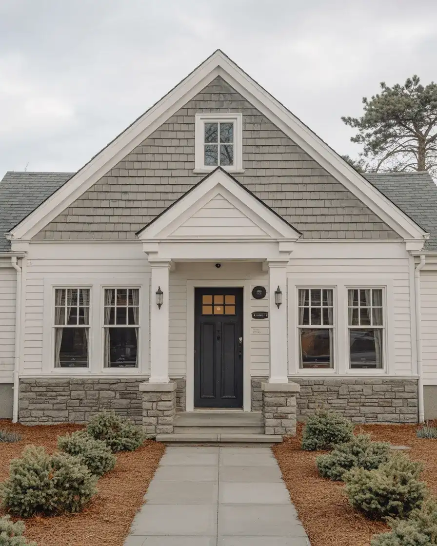
American lifestyle preferences increasingly favor low-maintenance exteriors, and stone veneer delivers on that front with minimal upkeep beyond occasional rinsing. It also provides excellent insulation benefits when installed correctly, helping regulate interior temperatures and potentially lowering energy costs. Where it works best is on homes with existing masonry elements, as the addition feels like a natural extension rather than an afterthought. Just avoid overdoing it—stone should accent, not dominate, the facade.
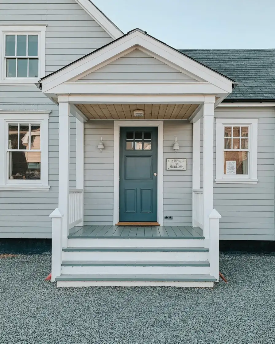
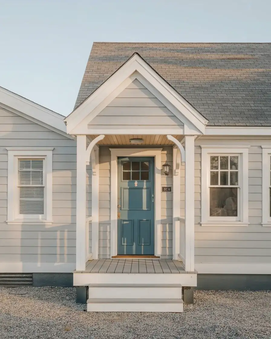
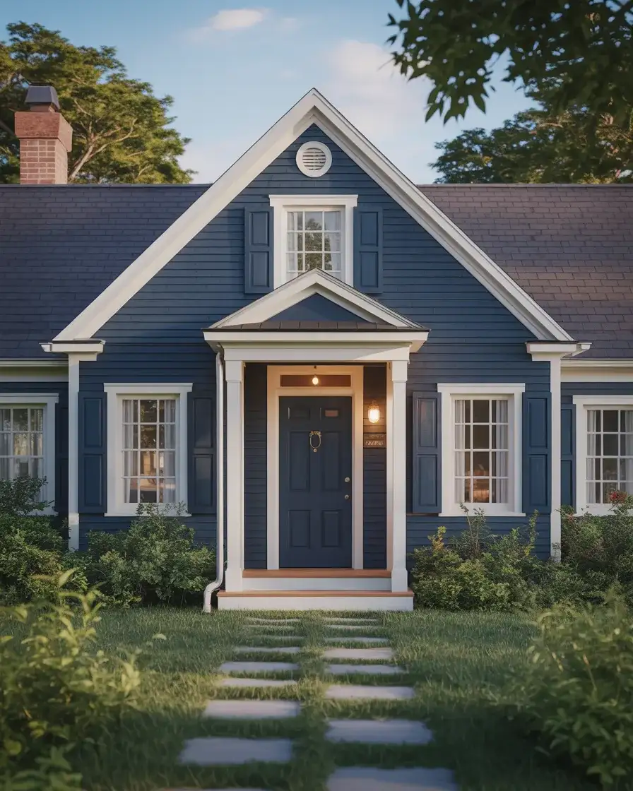
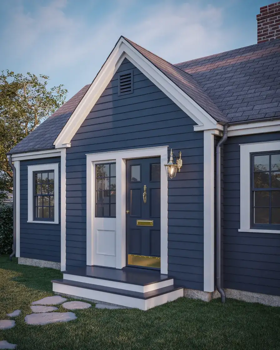
8. Charcoal Grey with Light Blue Door
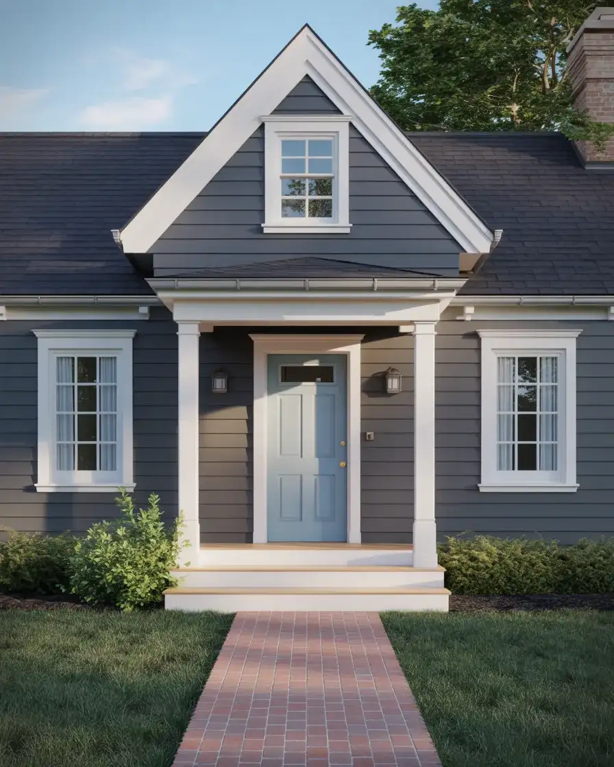
A dark charcoal body creates dramatic curb appeal, especially when you introduce a light blue front door that serves as a welcoming focal point. This pairing feels sophisticated and modern while respecting the Cape Cod silhouette, proving that you don’t need to stick with white or beige to honor tradition. The charcoal grounds the structure, making it feel substantial and permanent, while the pale blue adds a touch of optimism and coastal charm. It’s a combination that photographs exceptionally well and stands out in any neighborhood without feeling forced.
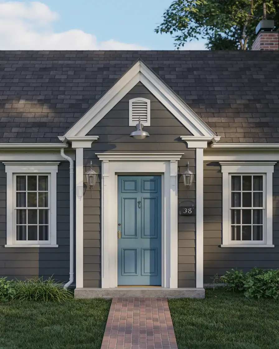
Common mistakes include choosing a blue that’s too bright or saturated, which can clash with the charcoal rather than complement it. Stick with blues that have grey or green undertones, often labeled as “spa blue” or “duck egg,” to ensure harmony. Another misstep is neglecting the hardware—brass or brushed nickel handles look far better on a light blue door than black or oil-rubbed bronze, which can disappear against the charcoal body. These small details make the difference between a cohesive design and one that feels disjointed.
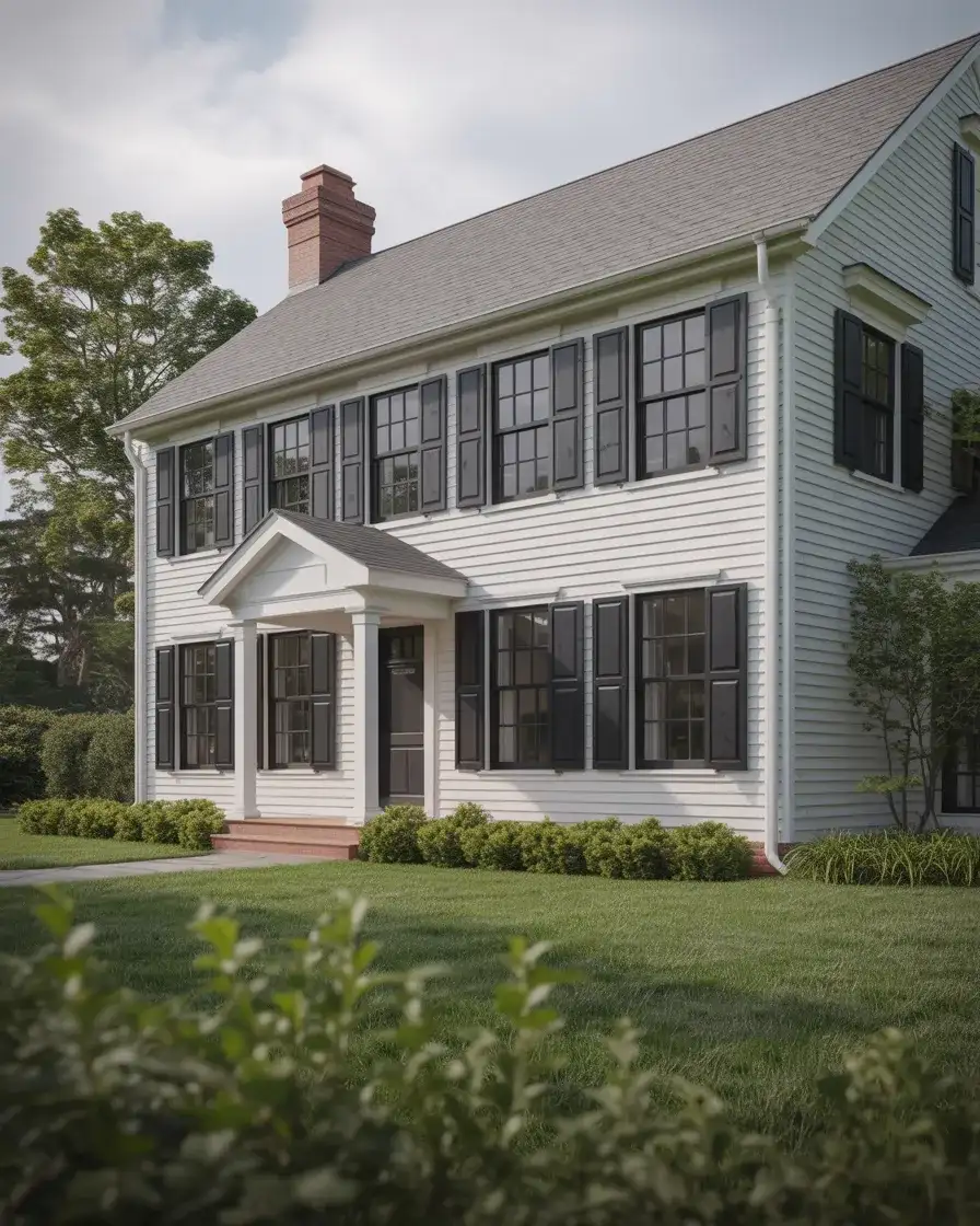
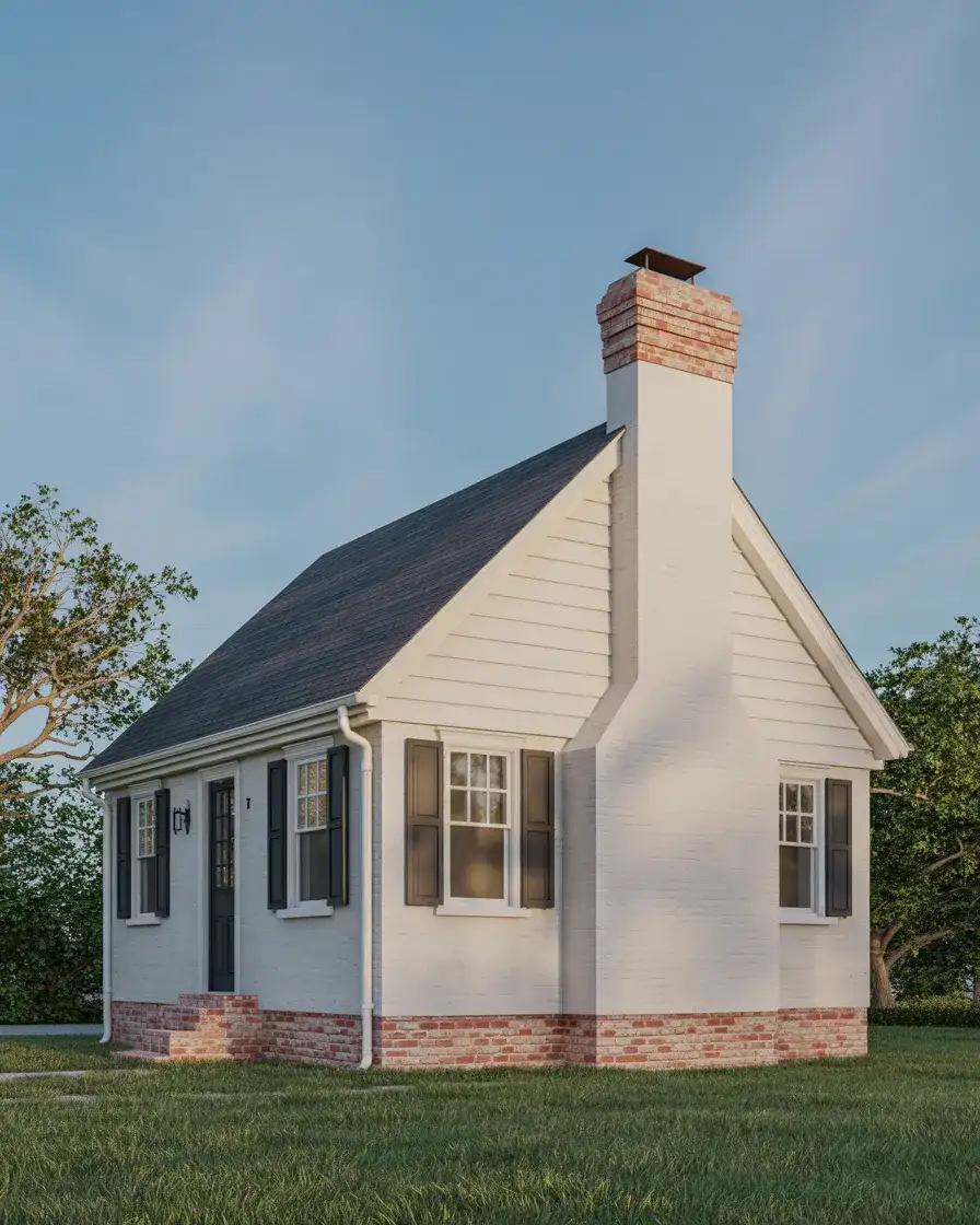
9. Traditional White with Red Door
The pairing of white siding with a red front door is a colonial staple that continues to resonate across America, offering a sense of heritage and hospitality. This combination feels instantly familiar yet never tired, especially when the red leans toward brick or barn tones rather than fire-engine brightness. The white body reflects light and keeps the home looking fresh, while the red door acts as a clear point of entry, both functionally and symbolically. It’s a choice that works equally well in urban rowhouse settings and sprawling suburban lots.
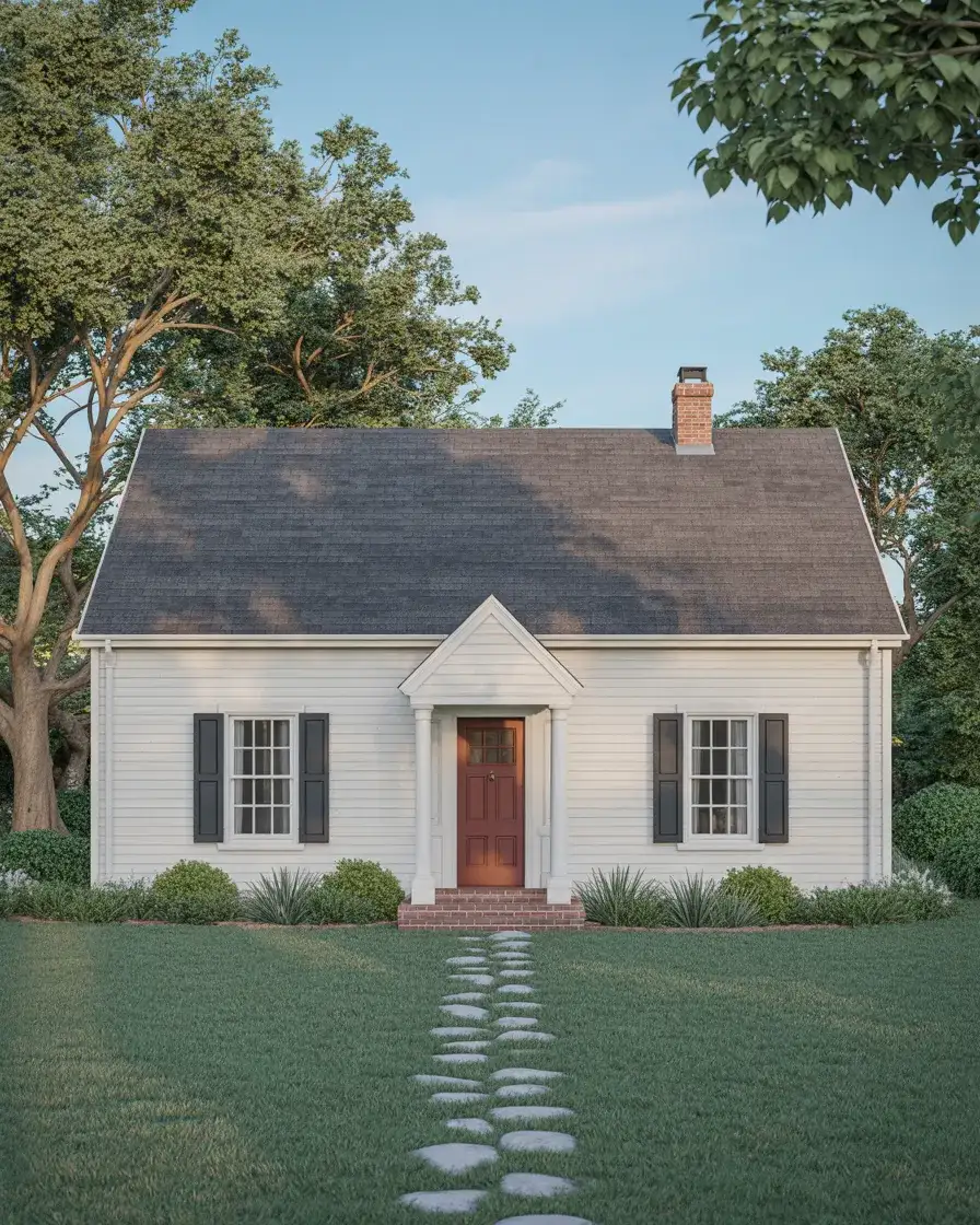
A practical insight is that red doors require periodic touch-ups more frequently than neutrals, as the pigment tends to fade faster in direct sunlight. Choosing a high-quality exterior paint with UV protection extends the lifespan of the finish and reduces maintenance cycles. Some homeowners also find that a red door feels too formal or traditional for their taste, in which case a softer coral or rust tone offers a more relaxed interpretation. Either way, this pairing remains a dependable choice for anyone seeking timeless appeal.
10. Sage Green with Natural Wood Accents
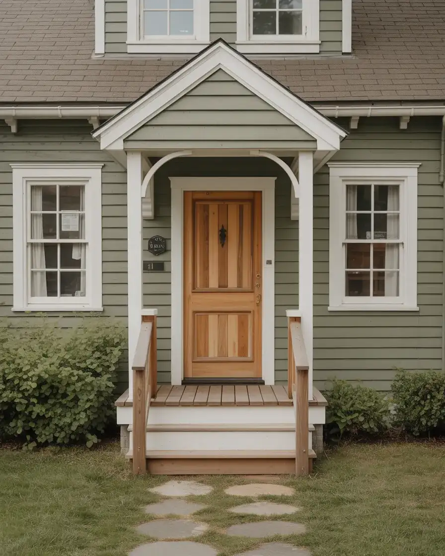
Sage green brings a softer, more organic quality to Cape Cod exteriors, especially when paired with natural wood elements like a stained front door, shutters, or porch posts. This combination evokes a garden-inspired aesthetic that feels grounded and calm, ideal for homes surrounded by mature landscaping or native plantings. The muted green acts as a neutral backdrop, allowing architectural details to shine without competing for attention. It’s a color that adapts beautifully across seasons, reading fresh in spring and cozy in fall.
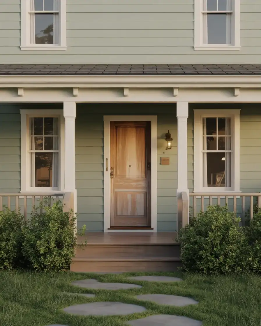
Where this works best is in rural or semi-rural settings where the home has space to breathe and connect with its surroundings. Urban environments can feel too dense for this palette, though it can succeed in tree-lined neighborhoods with generous setbacks. One homeowner in Vermont shared that switching to sage green made her home feel like it had always belonged on the property, rather than sitting on top of it. That sense of integration is what makes this color choice so appealing to those who value harmony between built and natural environments.
11. Navy Blue with Brass Hardware
A navy blue exterior makes a confident statement without venturing into overly bold territory, especially when you layer in brass hardware on the door, lighting, and house numbers. This palette channels both nautical and colonial influences, offering depth and richness that feels appropriate for a Cape Cod design. The navy reads almost neutral in certain light but reveals its true color in full sun, creating subtle visual interest throughout the day. Brass accents warm the overall composition and elevate the home’s sense of craftsmanship.
Real homeowner behavior shows that navy tends to appeal to those who want color but fear going too bold—it’s a safe step beyond grey or white that still feels respectable and refined. The brass hardware is key to pulling this look together; chrome or black fixtures would create a colder, less inviting aesthetic. If you’re considering navy, order large samples and observe them at different times of day, as the color can shift from almost black in shadow to true blue in direct light. This variability is part of its charm but worth understanding before committing.
12. White with Natural Cedar Shake Roof
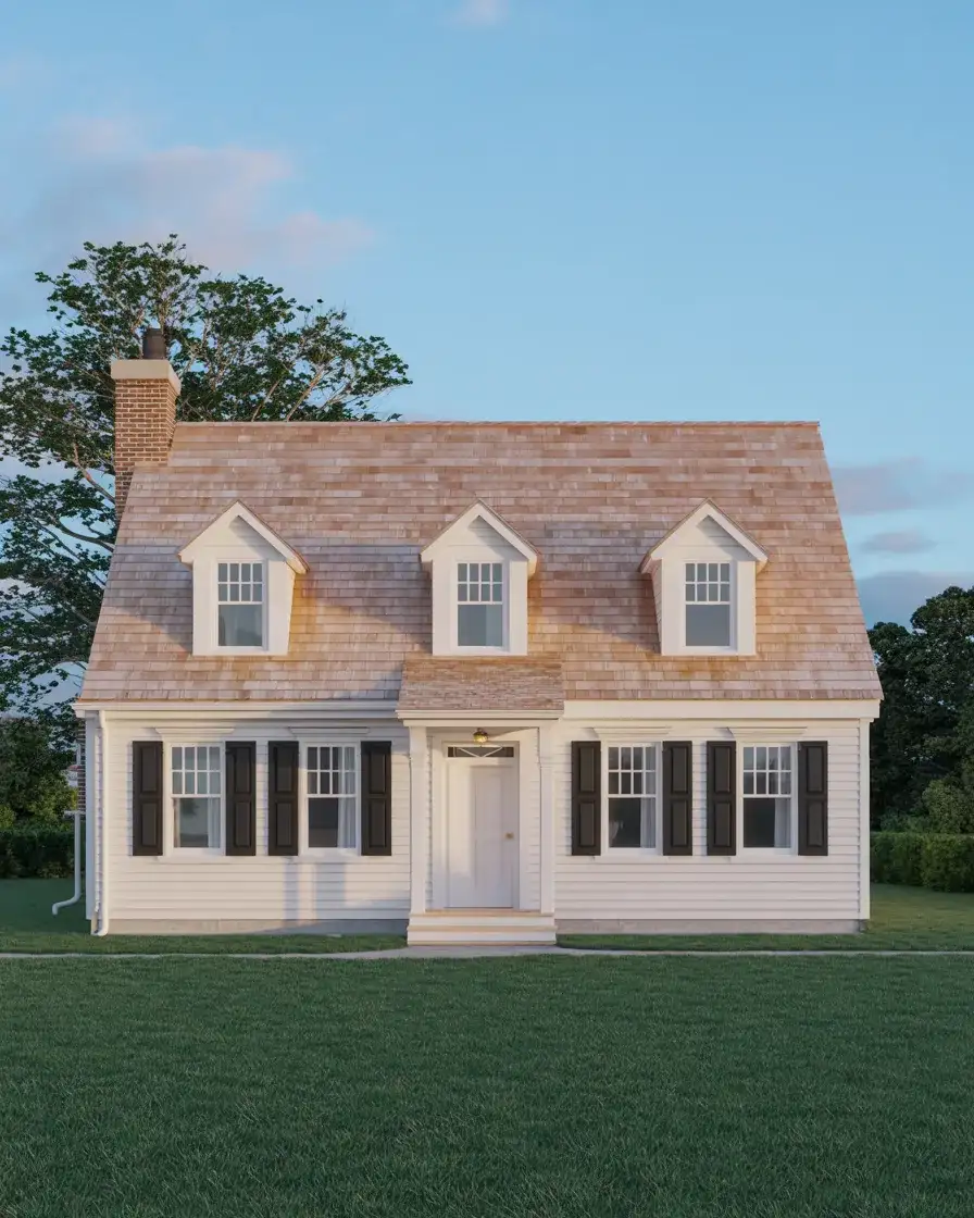
Pairing white painted siding with a natural cedar shake roof creates a visual hierarchy that honors both traditional materials and clean lines. The roof becomes a textured crown that adds warmth and character, while the white body keeps the overall look bright and approachable. This combination is particularly effective on large Cape Cod homes where the roofline is prominent and visible from the street. The cedar will weather to grey over time, creating a beautiful patina that complements the white siding without requiring maintenance beyond occasional cleaning.
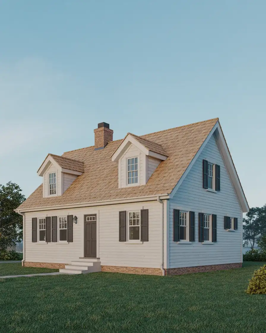
An expert-style commentary here is that cedar shake roofs offer superior insulation and ventilation compared to asphalt shingles, which can translate to energy savings over the roof’s lifespan. They also last longer when properly maintained, often exceeding thirty years in dry climates. However, they require more upfront investment and may be restricted in areas with strict fire codes, so check local regulations before committing. If cedar isn’t feasible, architectural shingles in a warm grey or brown can approximate the look at a fraction of the cost.
13. Pale Pink with White Trim
A pale blush or dusty rose exterior pushes the Cape Cod palette into unexpected territory, creating a soft, romantic aesthetic that still respects the home’s architectural bones. This color works beautifully when paired with white trim that keeps the look crisp rather than saccharine, and it’s especially effective in neighborhoods where most homes lean heavily neutral. Coastal areas seem to embrace this choice more readily, perhaps because the color echoes the soft tones of shells and sunrise skies. It’s a color that rewards natural light, glowing warmly in morning sun and appearing more muted by evening.
American lifestyle trends show growing acceptance of non-traditional exterior colors, especially among younger homeowners who view their homes as expressions of personality rather than strictly investments. Pink can feel risky, but when executed with restraint—meaning pale tones and minimal additional color—it reads as sophisticated rather than whimsical. One common mistake is choosing a pink that’s too saturated or cool-toned, which can veer into bubblegum territory. Warm, greyed-down pinks with names like “first light” or “shell” tend to work best.
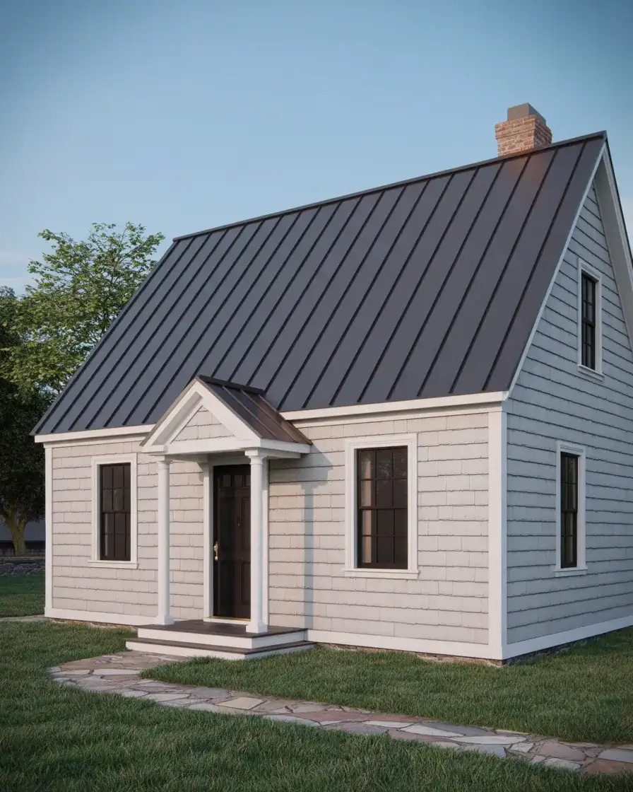
14. Weathered Grey Shingles with White Windows
Embracing weathered grey shingles creates an authentically aged appearance that feels rooted in New England history, particularly when you paint the window sashes and trim in bright white for contrast. This look requires patience—either by allowing natural cedar to weather over years or by using pre-finished shingles that mimic the effect—but the payoff is a home that looks like it’s been standing for generations. The grey tones shift subtly in changing light, revealing hints of silver, blue, and brown depending on moisture and sun exposure.
Where this works best is in coastal or rural settings where the weathered aesthetic feels appropriate rather than neglected. Urban environments may view unpainted shingles as unfinished, which can affect perceived property values. A micro anecdote from a Nantucket homeowner: she initially worried that her weathered shingles looked too rustic, but after a year of compliments from neighbors and visitors, she realized the texture and depth were impossible to achieve with paint. If you’re considering this route, commit fully—mixing weathered shingles with painted elements can look unintentional rather than deliberate.
15. Taupe with Black Windows
A warm taupe body color offers a sophisticated neutral that feels less stark than white and more refined than beige, especially when paired with black window frames that add graphic punch. This combination bridges traditional and contemporary sensibilities, working equally well on vintage homes and new construction. The taupe provides a grounding presence that complements both natural and man-made materials, from stone landscaping to metal roofing. Paint colors in this range have gained significant traction in recent years as homeowners seek alternatives to the ubiquitous grey.
Budget considerations come into play with black windows, as they typically cost more than white vinyl and may require custom orders depending on your location. However, the investment pays off in visual impact—black windows create a modern edge that white simply cannot match. The taupe body color is forgiving when it comes to landscaping choices, working well with everything from formal boxwood hedges to relaxed perennial gardens. Just ensure your taupe has enough warmth to avoid reading as dingy grey, which can happen with cooler-toned versions.
16. Classic White with Expanded Porch
Maintaining a classic white exterior while adding or expanding a front porch transforms the home’s functionality and visual appeal, creating outdoor living space that feels integral to the design. This approach respects traditional Cape Cod proportions while acknowledging modern American preferences for outdoor gathering areas. The porch can wrap around one side or extend across the full front elevation, with columns or posts that echo the home’s existing details. Painted ceiling boards in pale blue or white add a finishing touch that feels both historic and fresh.
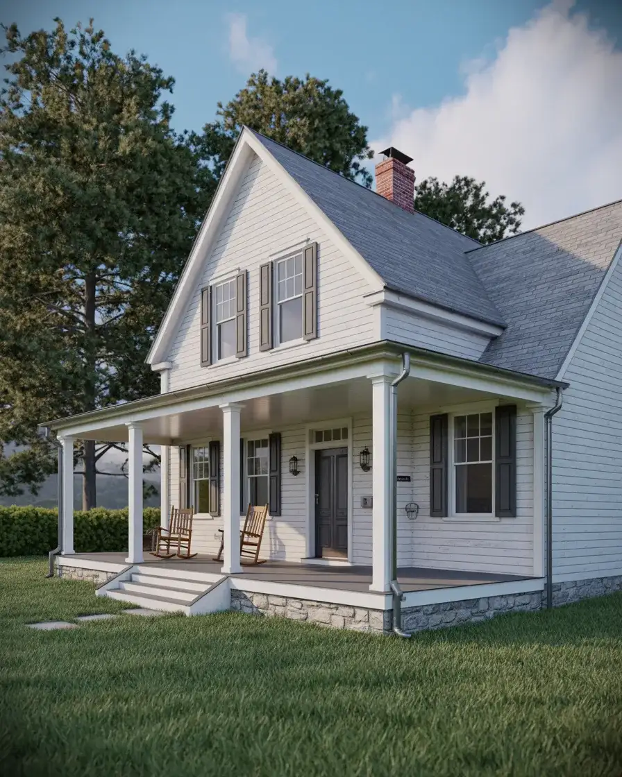
Real homeowner behavior shows that porches significantly increase how often people actually use their outdoor spaces, transforming them from decorative features into daily living areas. This is particularly true in regions with mild evenings or where sitting outside is part of the local culture. If you’re planning a porch addition, ensure it’s proportional to the home—too large and it overwhelms the structure, too small and it reads as an afterthought. Working with an architect or experienced contractor helps strike the right balance while ensuring the addition feels like it’s always been there.
17. Charcoal with Copper Accents
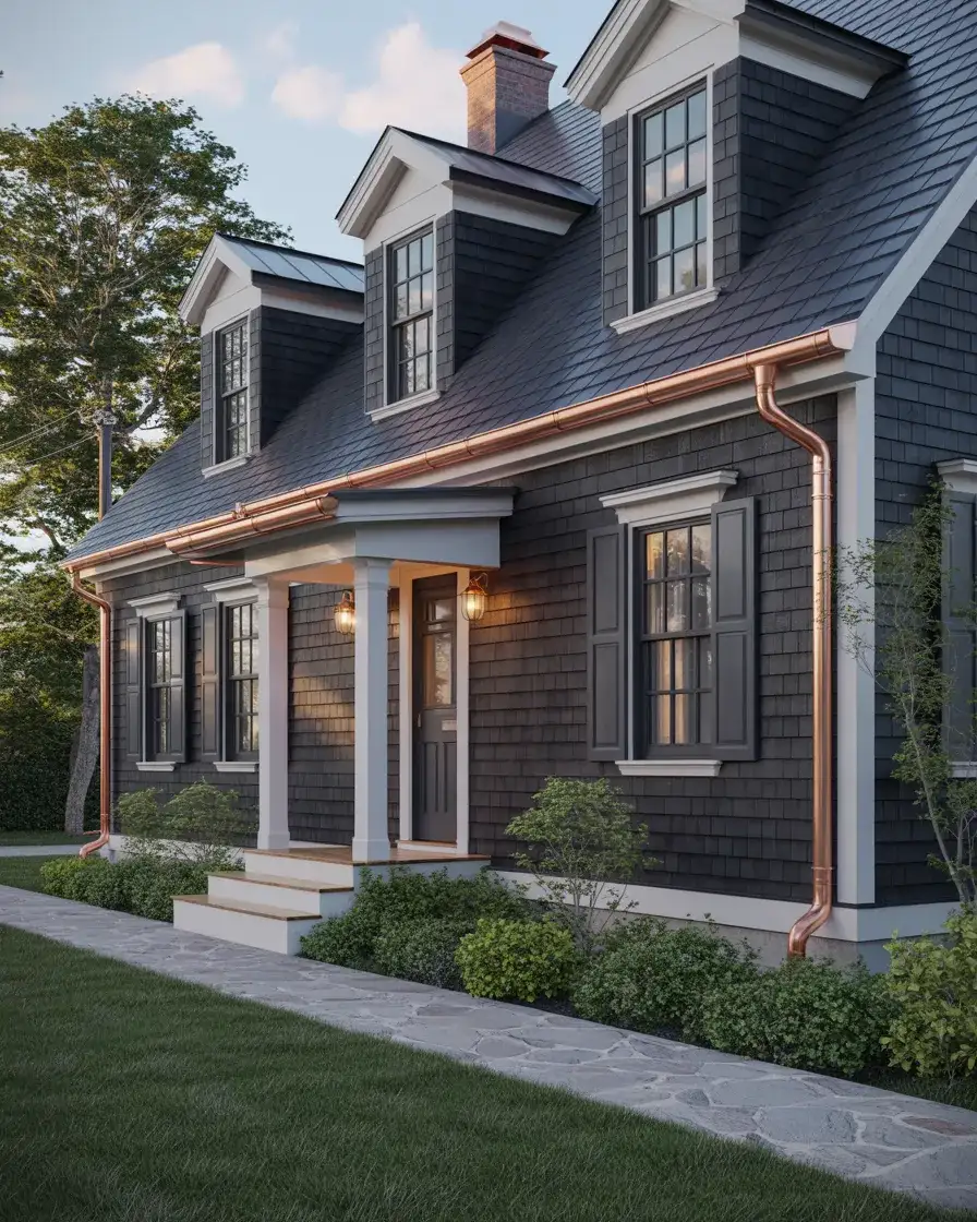
Choosing a dark charcoal exterior and layering in copper elements—gutters, downspouts, lighting, or house numbers—creates a sophisticated, high-contrast look that feels decidedly modern while respecting Cape Cod form. The charcoal provides a dramatic backdrop that makes the copper’s warm tones pop, and as the copper develops its natural patina over time, the relationship between the two materials becomes even richer. This approach works particularly well on homes with simple, uncluttered facades where the material pairing can take center stage without visual competition.
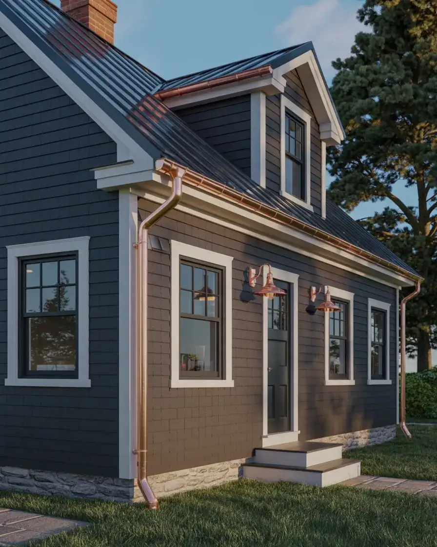
American lifestyle trends increasingly favor materials that age beautifully rather than deteriorate, and copper fits this philosophy perfectly. Unlike painted surfaces that require periodic refreshing, copper’s patina is desirable and protects the underlying metal. The primary consideration is cost—copper elements run significantly higher than aluminum or vinyl alternatives—but many homeowners view this as a worthwhile investment in both aesthetics and longevity. If full copper isn’t feasible, consider using it selectively on high-visibility elements like the front door surround or entryway lighting.
18. Soft Blue-Grey with Dark Roof
A blue-grey body color straddles the line between grey and blue, offering subtle color interest that never feels pushy or demanding. When paired with a dark charcoal or black roof, the overall composition gains definition and depth while maintaining a calm, collected presence. This palette works across diverse settings, from suburban neighborhoods to rural properties, and adapts beautifully to different architectural details. Coastal color palettes often include this range because it evokes both sky and sea without literal representation.
Where this works best is in regions where weather varies significantly throughout the year—the color reads differently in bright summer sun versus grey winter light, providing visual interest across seasons. A common mistake is choosing a blue-grey that’s too cool or has purple undertones, which can look dingy or uninviting in certain light. Test large samples on multiple elevations of your home before committing, and observe them in both direct and indirect light. The right blue-grey should feel balanced and neutral while still registering as a color rather than pure grey.
19. White with Black Standing Seam Roof
Pairing white siding with a black standing seam metal roof creates a crisp, contemporary interpretation of Cape Cod design that emphasizes clean lines and durability. The metal roof’s vertical seams add subtle texture and visual interest while offering superior longevity compared to traditional asphalt shingles. This combination works particularly well on homes with simple rooflines where the standing seam pattern can be fully appreciated. The high contrast between white and black ensures the architecture reads clearly from a distance.
Practical insight shows that metal roofs excel in regions with heavy snow, as their smooth surface allows snow to slide off rather than accumulate, reducing structural stress and ice dam formation. They’re also more fire-resistant than traditional shingles and can last fifty years or more with minimal maintenance. The primary drawback is cost—expect to pay two to three times more than asphalt shingles—and the distinct sound of rain on metal, which some homeowners love and others find distracting. If you’re considering this route, ask neighbors with metal roofs about their experiences before committing.
20. Olive Green with Brick Details
An olive-toned green body paired with natural brick elements creates an earthy, grounded aesthetic that connects the home to its site while maintaining classic Cape Cod proportions. The green provides a neutral backdrop that makes brick chimneys, foundations, or walkways feel intentional rather than disconnected. This palette works especially well on wooded or rural properties where the colors echo natural surroundings, and it ages gracefully as both materials develop patina over time. The combination feels substantial and permanent without appearing heavy or dated.
Expert-style commentary suggests that olive green works best when it has enough grey in the mix to prevent it from reading as army surplus or institutional—think Mediterranean olive rather than military fatigues. The brick should ideally be left natural rather than painted, as the texture and color variation add depth that flat paint cannot replicate. If your existing brick is in poor condition or painted a color you dislike, consider using brick veneer or stone as an alternative that achieves a similar effect without the commitment of full-scale masonry work.
21. Warm White with Natural Landscaping
Choosing a warm, creamy white rather than stark bright white creates a softer, more inviting facade that pairs beautifully with naturalistic landscaping featuring native plants and informal planting beds. This approach recognizes that the home doesn’t exist in isolation—the relationship between structure and site matters just as much as the building itself. Warm whites have subtle undertones of yellow or beige that prevent the harsh glare of pure white while maintaining brightness and reflecting light effectively. The natural landscaping softens the transition between lawn and foundation, creating visual flow.
American lifestyle preferences increasingly favor low-maintenance, ecologically responsible landscaping over formal lawns and exotic plantings. Native plants require less water, fertilizer, and pest control while providing habitat for pollinators and local wildlife. This approach also tends to look more natural and less contrived, which complements the unpretentious character of Cape Cod architecture. If you’re planning a landscape overhaul, consult with a native plant specialist or landscape architect who can recommend species appropriate to your region and site conditions.
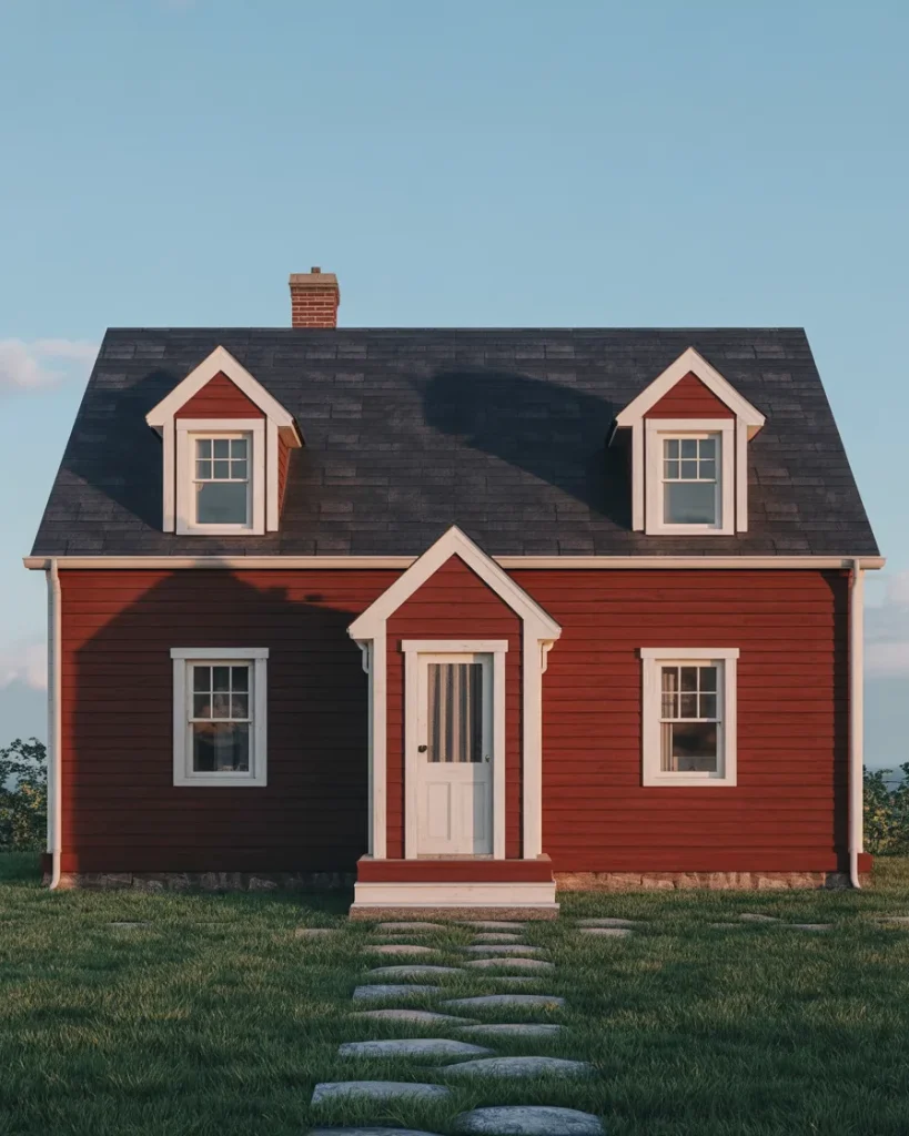
22. Barn Red with White Trim
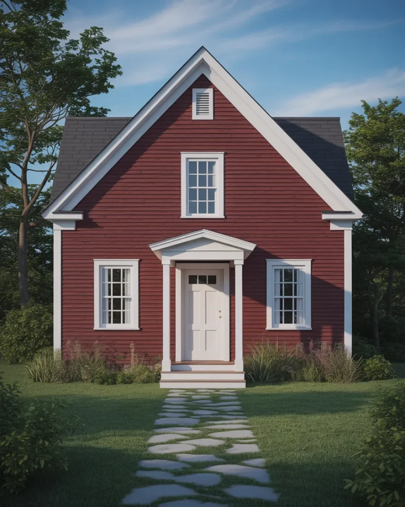
A barn-red exterior pushes Cape Cod color conventions while maintaining historical legitimacy—this shade appears frequently in colonial architecture and agricultural buildings throughout New England. When paired with bright white trim, the combination feels bold yet grounded, offering a distinctly American aesthetic that stands apart from more conservative choices. The red should lean toward earthy rust or brick tones rather than fire-engine brightness to maintain sophistication. This color choice works particularly well on homes with minimal applied ornamentation, where the color itself becomes the primary architectural statement.
Common mistakes include choosing a red that’s too bright or saturated, which can read as toy-like rather than sophisticated. Stick with reds that have brown or orange undertones, often labeled as “barn red,” “brick,” or “russet” in paint decks. Another consideration is neighborhood context—this color choice makes a statement and works best in areas where architectural diversity is welcomed rather than discouraged by HOA restrictions. If you’re uncertain, test large samples on different elevations and observe them for several days before committing to this bold yet historically appropriate choice.
Conclusion
Cape Cod exteriors offer remarkable flexibility within their traditional framework, proving that respect for architectural heritage doesn’t require visual monotony. Whether you gravitate toward time-tested combinations or feel ready to explore less conventional palettes, the key lies in balancing personal expression with the home’s essential character. Take inspiration from these ideas, adapt them to your specific site and climate, and don’t hesitate to share your own exterior transformation story in the comments below—we’d love to hear which direction you’re heading.