Dark exterior house colors have been quietly taking over neighborhood streets—and in 2026, they’re not slowing down. From deep forest greens to moody charcoals and rich navy blues, homeowners across the country are ditching the beige and embracing something bolder. Whether you’re scrolling Pinterest for your next renovation project or just curious about what’s trending this year, this guide covers stunning dark exterior color ideas that actually work in the real world. By the end, you’ll have a clear picture of what colors, styles, and combinations are making waves right now—and how to pull them off in your own home.
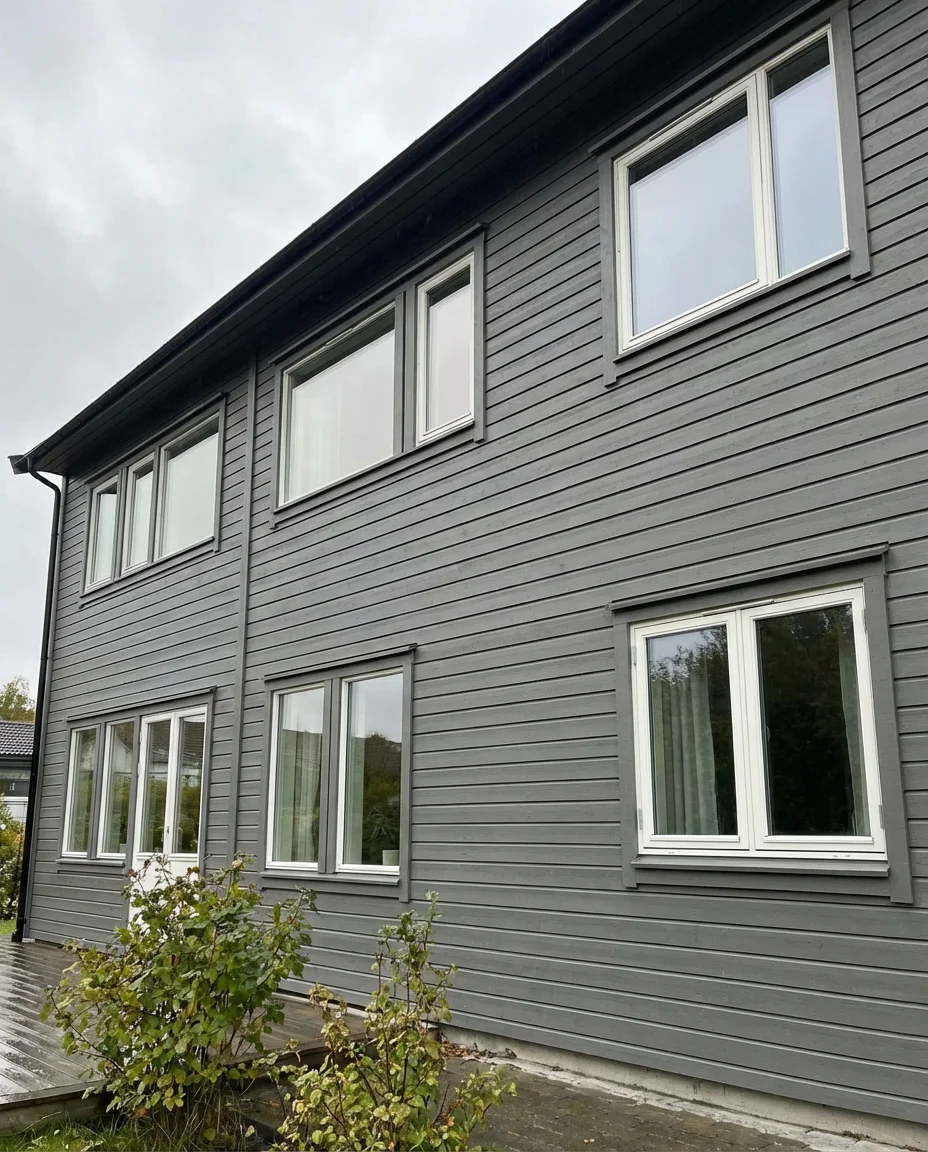
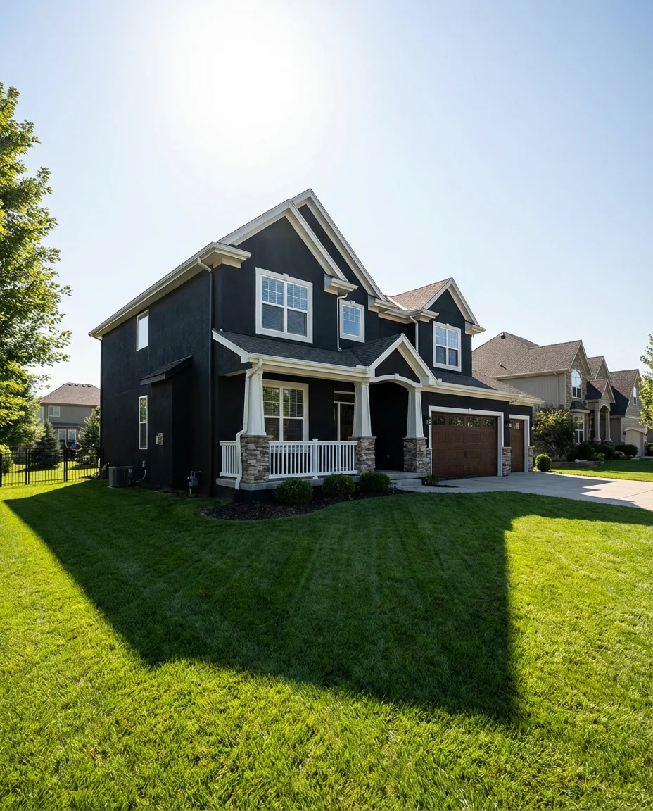
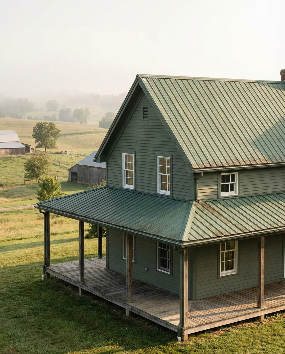
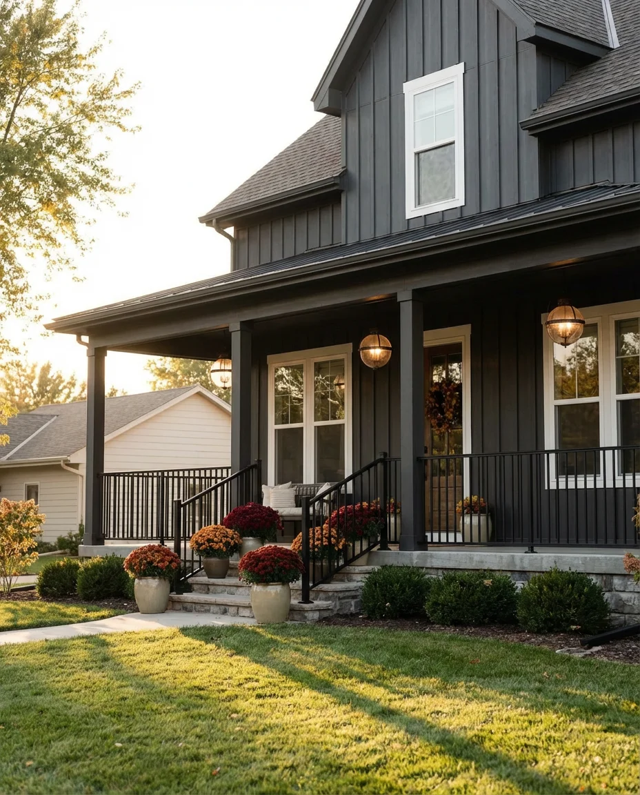
1. Charcoal Gray on a Modern Farmhouse
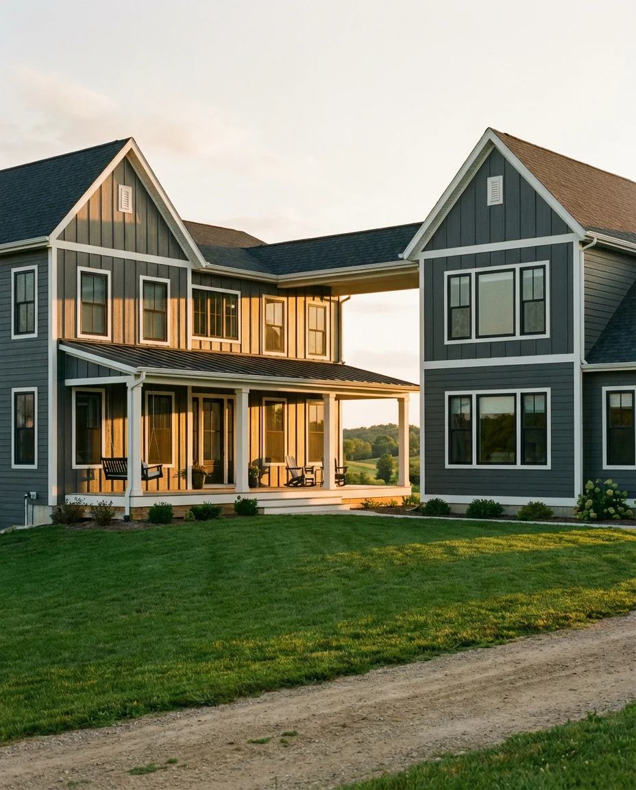
There’s something undeniably grounded about a deep charcoal gray wrapping a modern farmhouse. It reads as sophisticated without trying too hard—the kind of color that makes your neighbors slow down while driving past. This shade works especially well with white trim and black windows, creating that crisp, high-contrast look that’s been dominating Pinterest boards for the past two years and shows no signs of fading in 2026.
Charcoal gray is one of those colors that looks different depending on the light—cooler and slate-like on cloudy mornings, warmer and almost brown at golden hour. That versatility is exactly what makes it such a safe bet for a major exterior investment. If you’re nervous about going too dark, start with a color like Sherwin-Williams Iron Ore or Peppercorn—both are popular entry points that feel bold without feeling black.
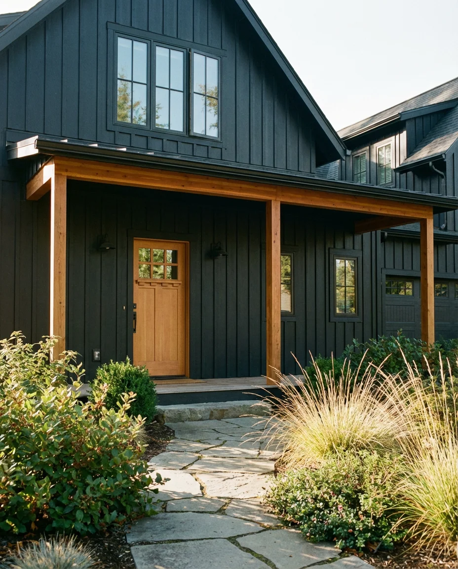
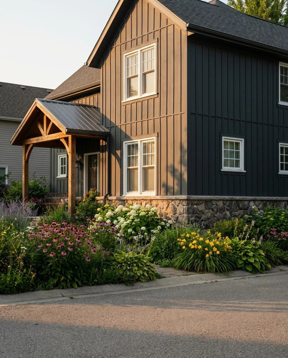
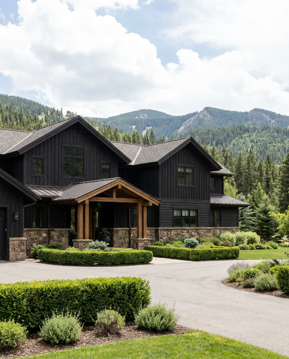
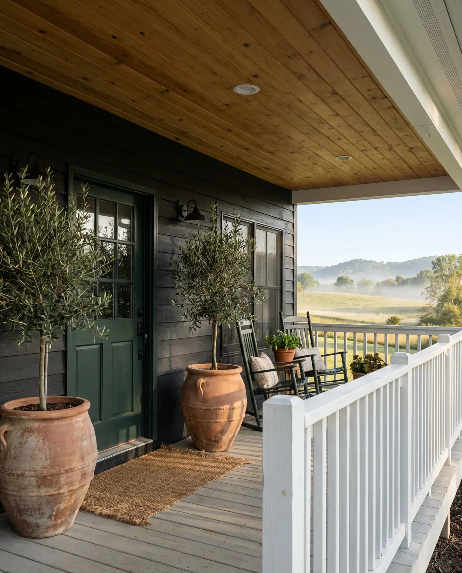
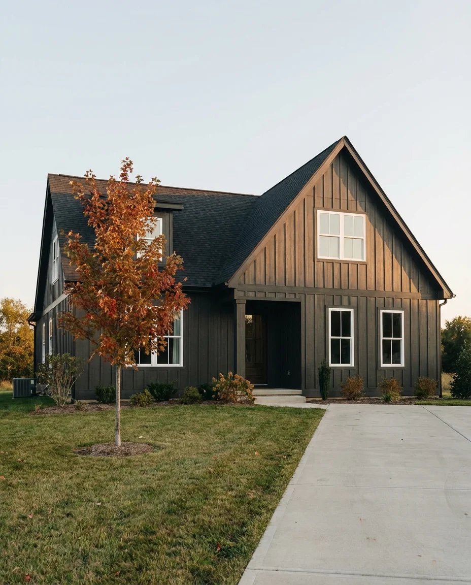
2. Black Board and Batten with Natural Wood Accents
Few combinations feel more current than black accents paired with warm natural wood accents on a board and batten exterior. The contrast between the inky siding and the honey tones of cedar or Douglas fir is striking in the best way—it’s organic and modern at the same time. This pairing has exploded on Pinterest because it photographs beautifully and translates well across climates, from the Pacific Northwest to the Texas Hill Country.
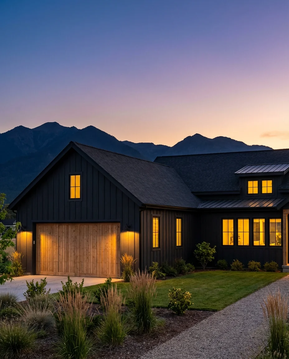
One practical thing to keep in mind: black siding on board and batten can absorb significant heat, which matters if you’re in a sun-heavy state like Arizona or Southern California. Opt for a paint with heat-reflective technology, or choose a dark charcoal rather than true black if your home gets direct afternoon sun. It’s a small detail that can make a big difference in both energy costs and paint longevity.
3. Deep Navy Blue on a Brick Exterior
Painting brick has become one of the most polarizing topics in home design—but when it’s done right, it’s genuinely stunning. Deep navy blue over a traditional red brick base (especially on older homes where the brick is already painted) creates a richness that feels almost European. Pair it with white trim and brass fixtures, and you’ve got something that looks like it belongs in a design magazine rather than a suburban cul-de-sac.
A common mistake homeowners make when painting brick navy is going too glossy—brick has a natural texture that gets lost under shiny paint, and a satin or flat finish will always look more intentional. It’s also worth knowing that once you paint brick, it’s very difficult to reverse, so testing a large swatch and living with it for a few days before committing is always worth the extra time.
4. Forest Green Stucco on a Ranch-Style Home
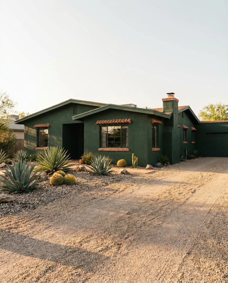
Dark forest green on stucco is having a serious moment, and it’s particularly magnetic on low-slung ranch-style houses that sit close to the ground. The color connects the home visually to its surroundings—especially when there’s mature landscaping nearby—and has a moody, almost Tuscan quality that feels both timeless and fresh. On a ranch with a wide footprint, this color makes the home feel intentional and anchored rather than sprawling.
Homeowners in the Southwest have been especially drawn to this combination because deep greens complement both the warm desert landscape and the cooler mountain terrain. One real homeowner in Scottsdale shared that after repainting her stucco ranch in deep sage-green, the home felt “completely different—like it finally belonged where it was sitting.” ” That sense of belonging is something a good dark exterior color can genuinely achieve.
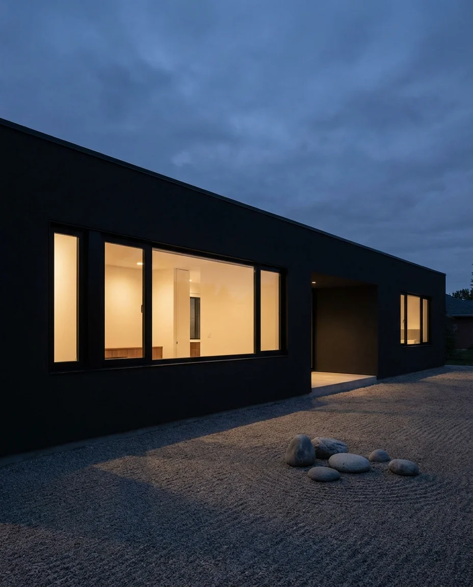
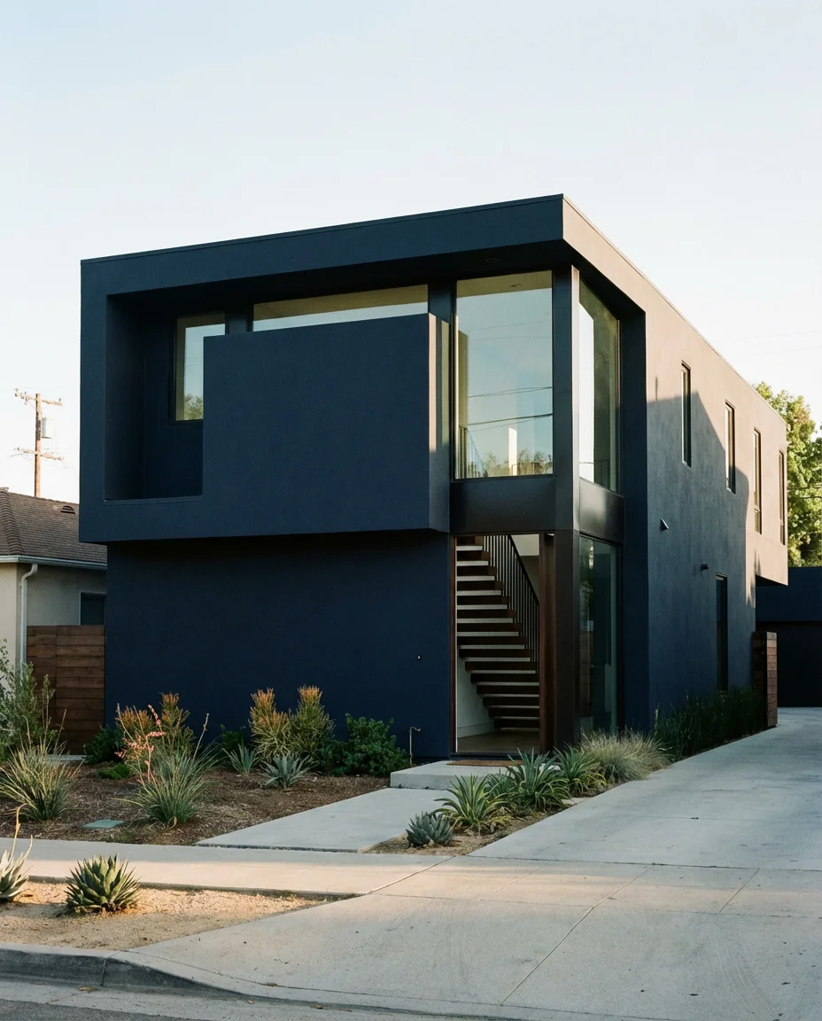
5. Matte Black Minimalist Exterior
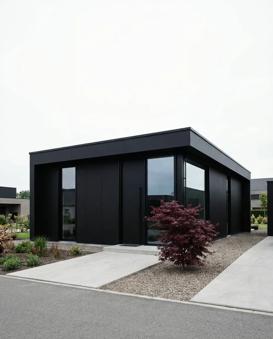
For the minimalist homeowner, nothing communicates intentionality quite like an all-matte-black exterior. It’s a bold commitment that pays off dramatically—especially on homes with clean geometry and minimal ornamentation. Black windows disappear into the facade, creating a seamless look that’s more sculpture than architecture. This approach works best on small houses and modern cubes where every surface is visible and the quality of the execution really shows.
Budget-wise, going all-black on an exterior isn’t necessarily more expensive than other dark colors—but the prep work matters more. Any imperfections in the siding or trim will be highly visible under a matte black finish, so skipping the surface prep is the fastest way to ruin the look. Expect to budget for thorough priming and potentially two coats of a high-quality exterior paint to get that smooth, even finish that makes the style work.
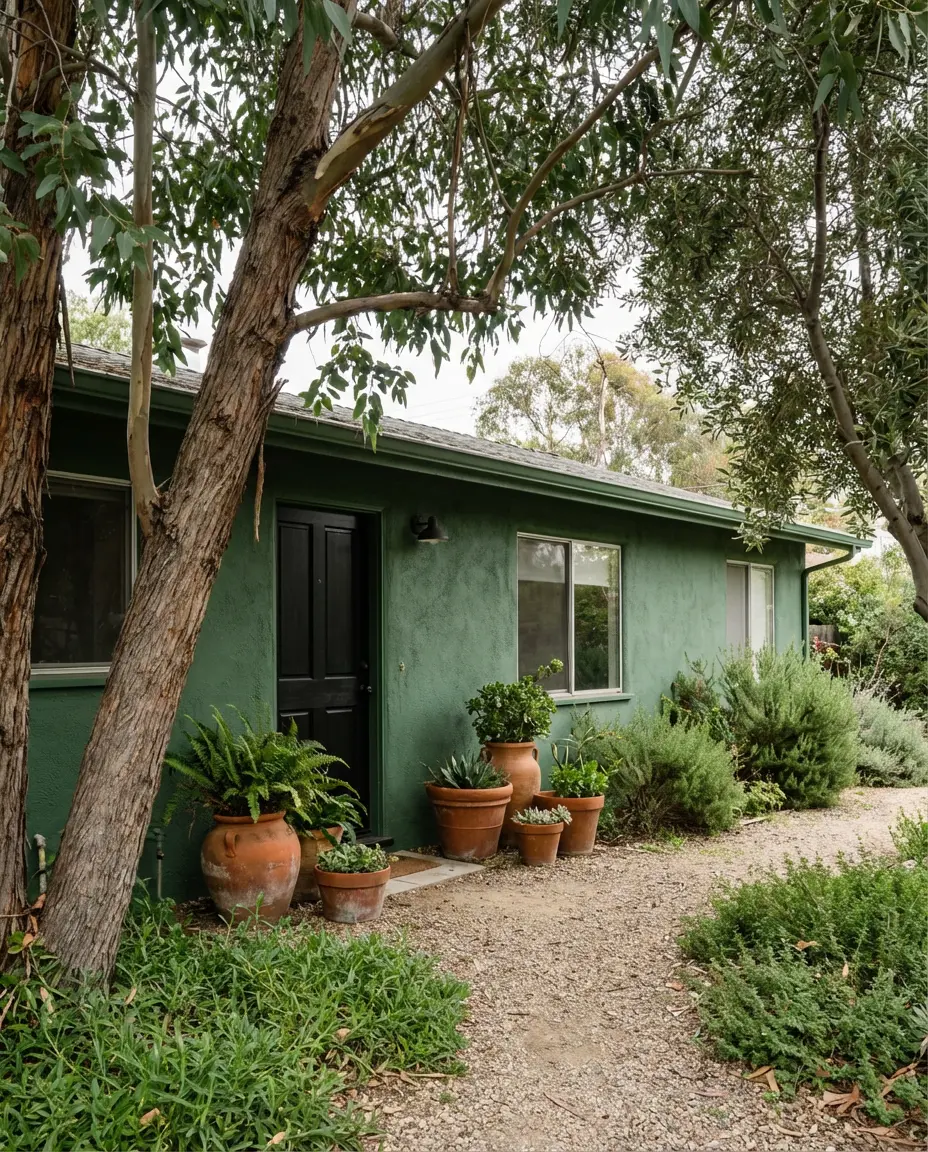
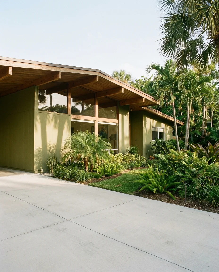
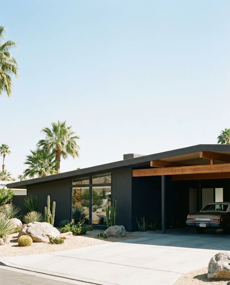
6. Dark Olive Green on a Modern Mid-Century Home
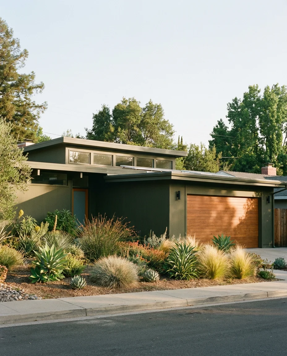
Dark olive green feels like it was practically invented for modern mid-century homes. The earthy, slightly military tone connects directly to the nature-forward philosophy of mid-century design, and it plays beautifully against the flat rooflines, clerestory windows, and warm wood details that define the style. This is a color that looks expensive—but it’s actually one of the more accessible dark shades to pull off because it’s forgiving across different light conditions and landscaping styles.
Mid-century revival neighborhoods in cities like Palm Springs, Austin, and Minneapolis have seen a notable uptick in dark exterior repaints over the last two years. Design commentators note that dark olive specifically tends to “read as original” on these homes—meaning it looks like a deliberate period choice rather than a trendy overlay, which is exactly what you want when you’re working with a historically significant style.
7. Sherwin-Williams Caviar on a Large Two-Story
Sherwin-Williams Caviar (SW 6990) has become one of the most pinned exterior colors of the decade, and it’s easy to see why on a large house with substantial square footage. The near-black depth of Caviar gives a grand home a sense of authority—like it knows exactly what it is. It pairs especially well with stone accents and white trim, which keep the facade from feeling oppressive and add architectural dimension at the same time.
Where it works best: large colonial or craftsman-style homes in the Northeast and Midwest, where the scale of the architecture can carry the weight of such a dark color. On a smaller ranch, Caviar can feel heavy, but in a home with soaring rooflines and multiple gables, it becomes genuinely dramatic in the best possible way. Always test it in both full sun and overcast conditions before committing.
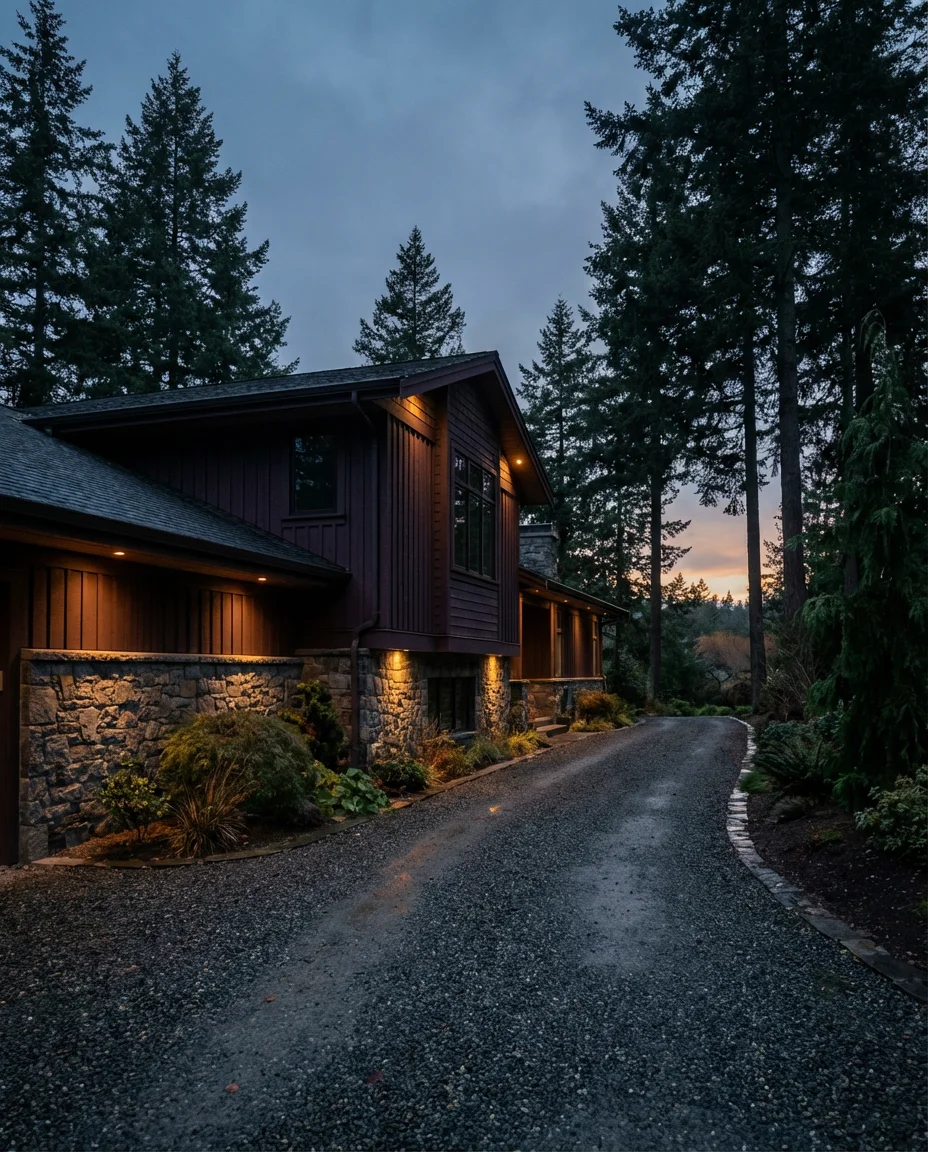
8. Dark Mocha Brown on a Craftsman with Stone
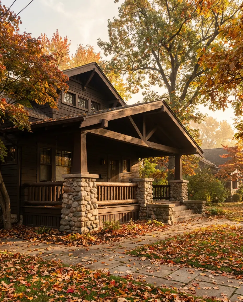
Deep mocha brown paired with natural stone is one of those combinations that feels rooted in the American landscape—literally. It echoes the palette of the national parks, of old river cabins and mountain lodges that have stood for a hundred years. On a craftsman bungalow with exposed rafter tails and tapered porch columns, this color tells a story of craftsmanship and intention. The tone is warm enough to feel inviting but dark enough to feel distinctive.
This palette is especially powerful in the Pacific Northwest and New England, where homes are surrounded by dense trees, and the dark exterior helps the house recede into the landscape in a peaceful, intentional way. Interior designers sometimes refer to this as “nature blending”—choosing a color that connects the built structure to its environment rather than competing with it. It’s an approach that always photographs beautifully in fall.
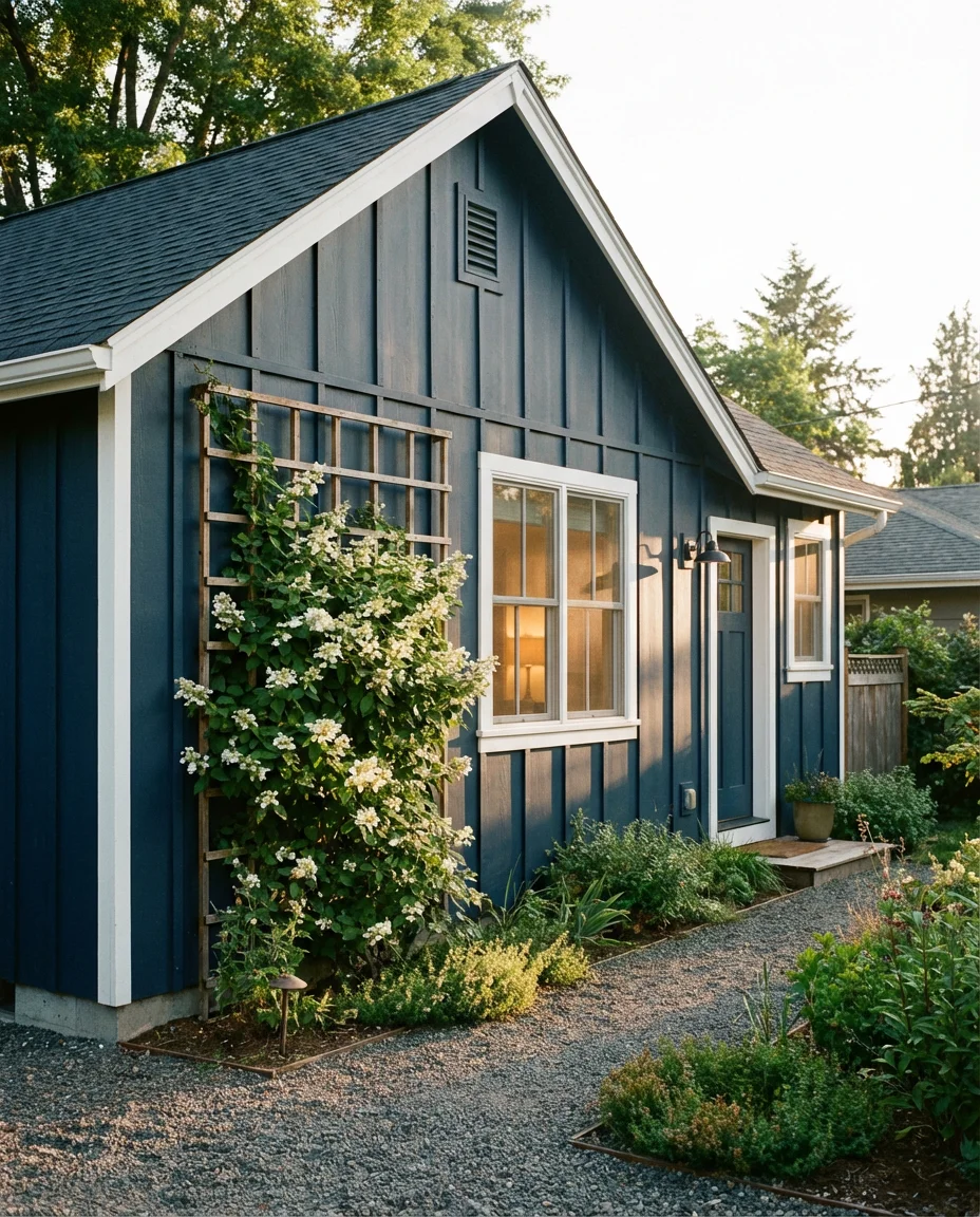
9. Ink Blue on a Modern Board and Batten Small House
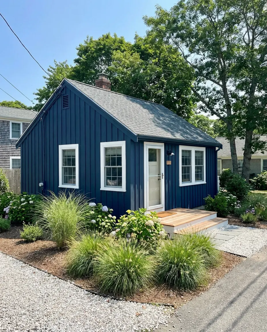
Ink blue—that deep, almost midnight shade that sits between navy and black—is one of the most versatile dark colors you can apply to a modern board and batten exterior. On small houses, it has a magical effect: the dark color compresses the perceived volume of the home and makes it look more intentional and cabin-like rather than just compact. Pair it with white windows and natural wood porch details for a look that’s collected and considered.
One thing real homeowners have noticed: dark blue exteriors tend to look dramatically different in photographs versus in person. In photos (especially on Pinterest), they often read as nearly black. In person, the blue comes through beautifully—especially on overcast days. If you’re choosing this color specifically because of how it looks on Pinterest, go slightly lighter than you think you need so the finished result matches your expectations.
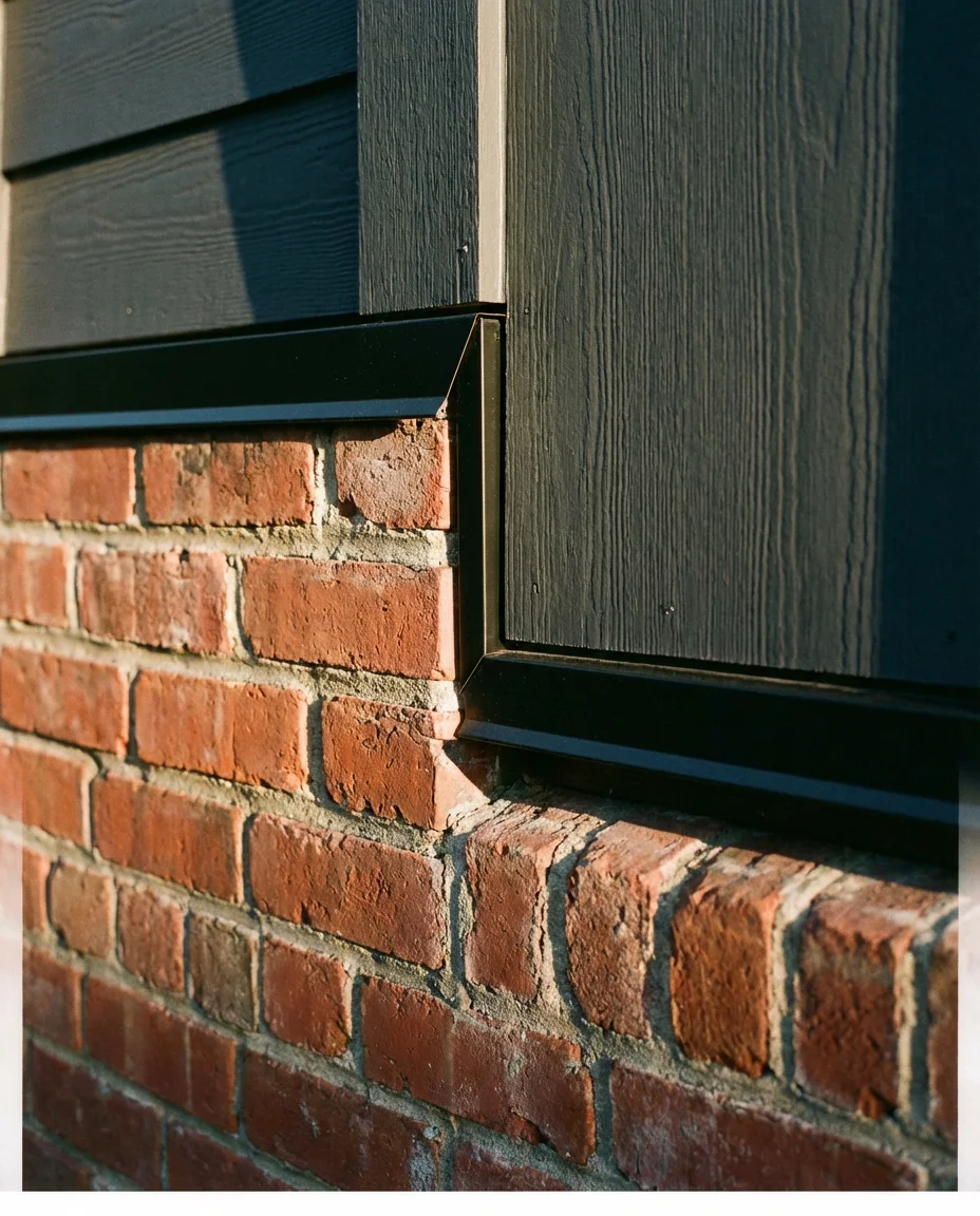
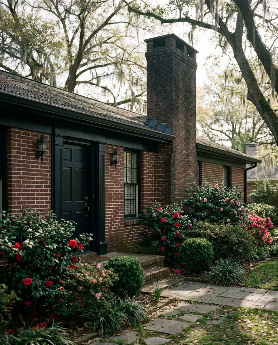
10. Charcoal and Red Brick Combination
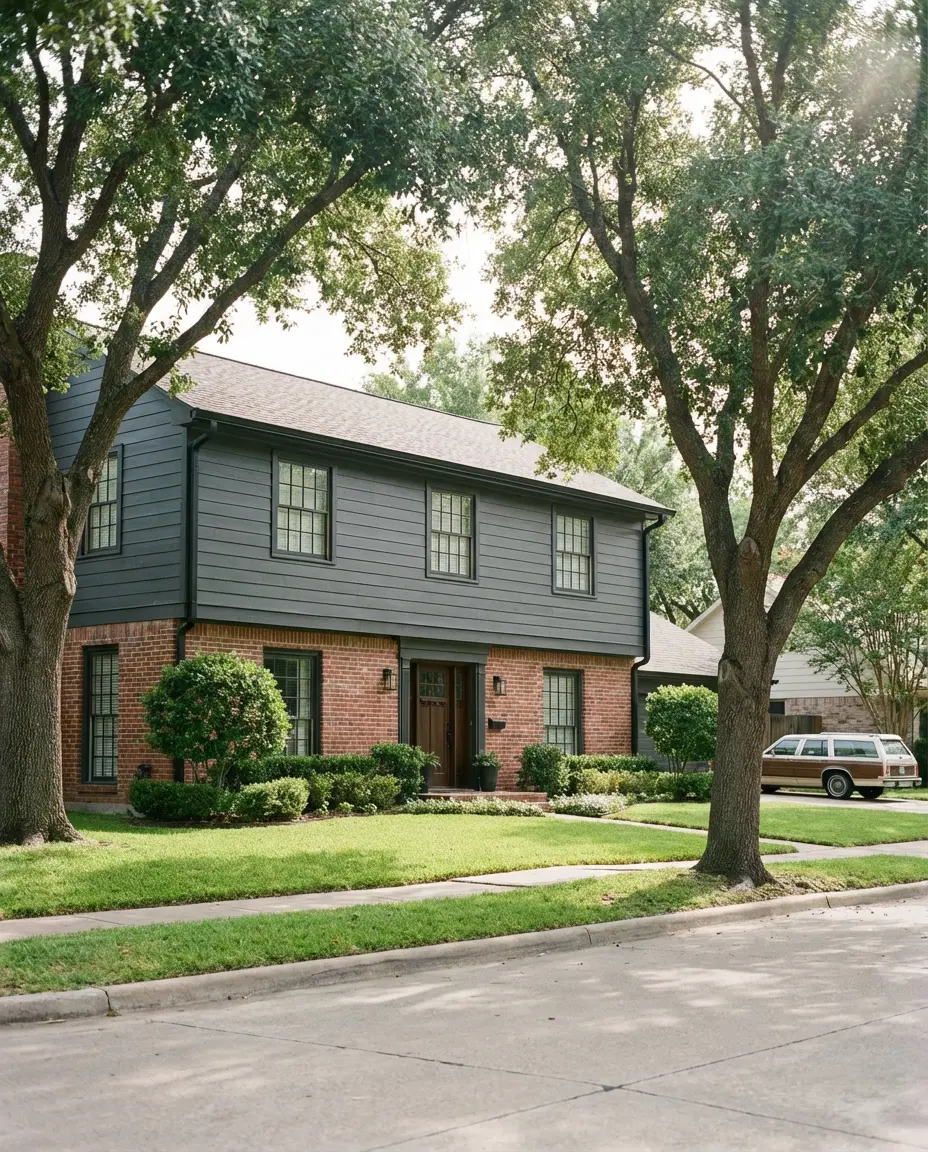
Leaving some original red brick exposed while painting the upper portion of your home in charcoal is one of the smartest partial-paint strategies trending in 2026. It honors the history of an older home while still making a bold visual statement. The warm rust tones of natural brick ground the darkness of the charcoal, creating a two-tone effect that feels far more sophisticated than either material would alone. Add black accents on the gutters and fixtures to tie it all together.
This approach is particularly well-suited to 1950s and 1960s ranch homes and split-levels in the Midwest and Southeast—homes that were built with brick as a primary material but have since accumulated multiple layers of painted trim and siding. Rather than painting the entire home, the partial-paint technique lets you modernize the look without erasing what makes the home architecturally interesting. It also tends to be more cost-effective since you’re covering less surface area.
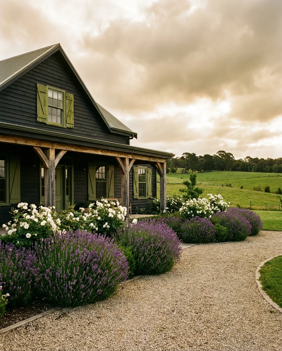
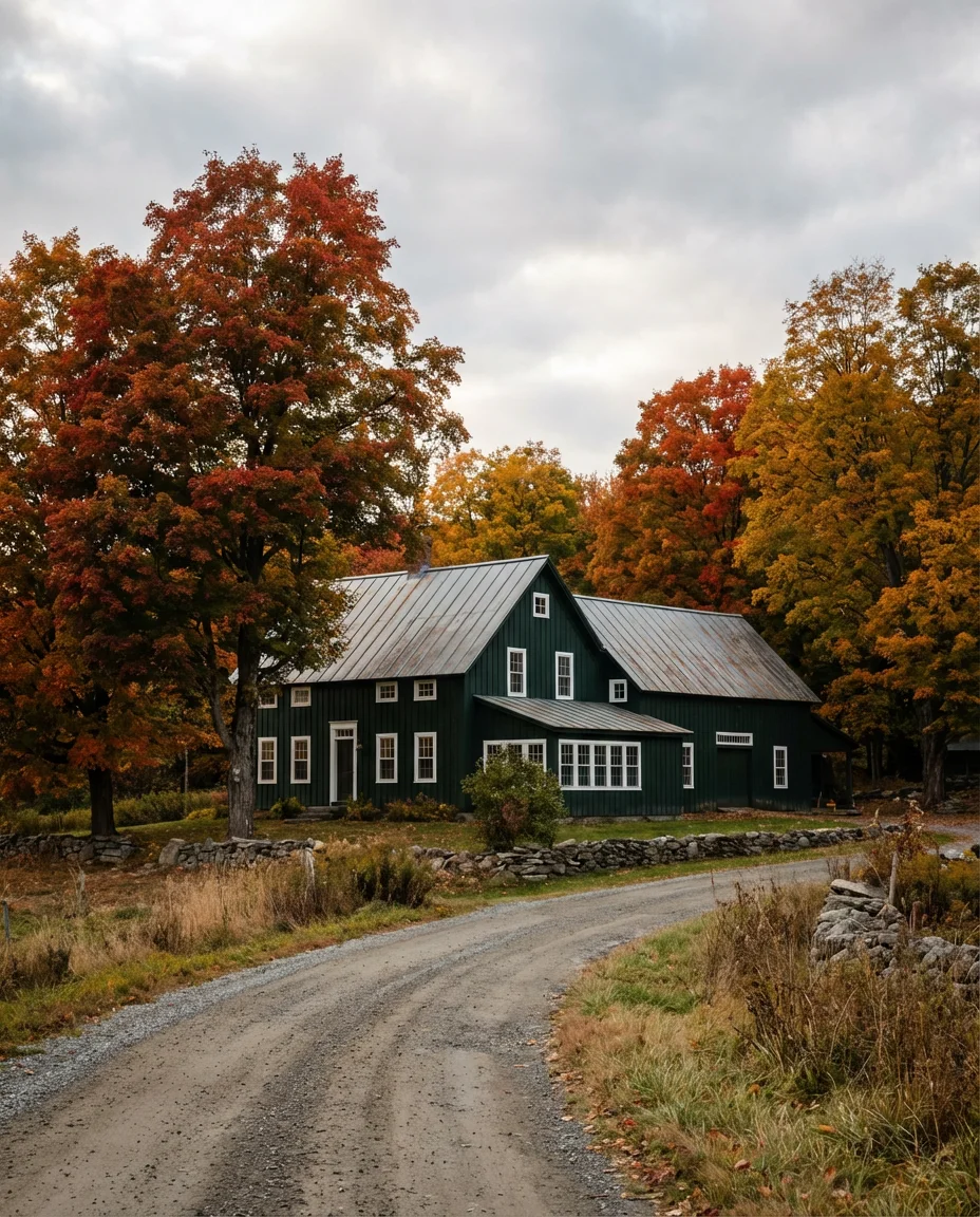
11. Dark Sage Green on a Farmhouse with a Green Roof
Pairing a dark sage green exterior with a green roof—whether that’s a weathered metal roof that’s turned a patina green or actual green roofing shingles—creates a tonal, layered look that feels deeply connected to the land. On a farmhouse, this palette reads as authentic rather than trendy, the kind of color scheme that looks like the home grew up there rather than was recently renovated. It’s earthy, calm, and quietly beautiful in the best way.
Where this works best is on properties with acreage—particularly in the rural South, the Midwest, or the Upper Mountain states, where the surrounding landscape is predominantly green. In dense suburban neighborhoods, the all-green palette can feel a bit camouflaged. But on an open lot with mature trees, it’s genuinely one of the most beautiful exterior color pairings you can choose. The effect in autumn, when the surrounding leaves turn, is particularly stunning.
12. Dark Plum on a Modern Minimalist Exterior
Dark plum is the brave choice on this list—and it’s starting to show up on minimalist homes in progressive design cities like Portland, Denver, and Brooklyn. At first glance it can read as near-black, but in direct sunlight the warm purple undertone emerges and makes the home look unlike anything else on the block. This works best when the rest of the palette is kept extremely simple: no decorative trim, clean lines, and black windows that let the siding do all the talking.
An expert-style tip worth knowing: plum and eggplant exteriors tend to fade faster than neutral darks because the red pigment in purple-based colors is less UV-stable. To combat this, look for exterior paints specifically formulated with fade-resistant technology—Duration or Emerald by Sherwin-Williams are good options. You may also need to repaint or touch up every 5–7 years rather than the typical 8–10, so factor that into your long-term budget.
13. Ebony on a Large Modern Home with Stone Base
On large houses with generous square footage, ebony—a near-black with warm brown undertones—creates a palace-like presence that’s completely different from flat black. The warmth in the color keeps it from feeling cold or industrial, and when paired with a stone base and natural wood accents at the entry, the overall effect is somewhere between a luxury mountain lodge and a contemporary estate. This is a color for homes that are meant to make an impression.
This palette shows up frequently in luxury new construction communities in Colorado, Utah, and the Carolinas—places where the surrounding landscape is dramatic enough to hold its own against such a powerful exterior color. Architects working in these markets have noted that dark exteriors on large homes also have a practical advantage: they tend to absorb solar heat efficiently during cold winters, which can marginally reduce heating costs in mountain climates. Style and function, combined.
14. Dark Teal on a Ranch Home with White Trim
Dark teal is the underrated gem of the 2026 dark exterior palette conversation. It’s not as obvious as navy or as expected as charcoal, which is exactly what makes it so appealing on a ranch home where you want personality without spectacle. The blue-green depth reads differently depending on the hour—more blue in morning light, greener in the afternoon—and the white trim gives the whole palette a coastal freshness even in landlocked states. The overall tone is confident and calm.
Teal is one of the safest “unconventional” choices because it’s universally liked—it rarely triggers the strong negative reactions that can come with more polarizing choices like all-black or plum. In HOA communities where exterior color choices require approval, dark teal has become a popular compromise: it’s distinctive enough to feel personal but neutral enough to get approved. If you’re dealing with restrictive community rules, this might be your best path to a genuinely interesting exterior.
15. Deep Burgundy on a Brick Ranch with Black Accents
Deep burgundy over a brick ranch is a moody, rich choice that feels rooted in Southern American design traditions—think New Orleans townhouses and Charleston single-family homes where rich, saturated colors have always been part of the street fabric. Paired with black accents on the shutters, railings, and light fixtures, the effect is theatrical in a contained, elegant way. This is a color that makes a ranch-style home feel far grander than its footprint.
A micro anecdote worth sharing: a homeowner in Baton Rouge repainted her 1960s brick ranch in deep burgundy after seeing it on Pinterest and described the neighborhood response as “immediate and enthusiastic.” Three neighbors asked for the paint color within a week. That kind of organic social proof is exactly how a color trend builds momentum in real American communities—one brave homeowner at a time.
16. Dark Gray Stucco on a Modern Minimalist Large Home
Dark gray stucco on a large house with a minimalist design philosophy is the contemporary California dream exterior—and it’s spreading rapidly to Florida, Texas, and the Southwest. The smooth texture of stucco amplifies the drama of a dark color in a way that clapboard or board and batten simply can’t replicate. There are no gaps or ridges to interrupt the surface, so the color lands as a single powerful statement. At scale, on a generous two- or three-story home, this is breathtaking.
One thing to know about dark stucco specifically: because stucco is a porous material, it can absorb moisture and show efflorescence (white salt deposits) over time if not properly sealed. Make sure any dark stucco application is preceded by a high-quality elastomeric primer and sealed with a breathable waterproof topcoat. In humid climates especially, skipping this step is the single most common—and most expensive—mistake dark stucco homeowners make.
17. Black Farmhouse with a Color Pallet of Green and Wood
The trio of black, deep green, and warm wood is one of the most searched exterior pallet combinations of 2026 — and it comes together most beautifully on a farmhouse where each element has a natural home. Black for the siding, dark hunter green for shutters or a front door, and warm cedar for the porch ceiling or beam details. The tone is rich without being heavy and natural without being rustic in a clichéd way. It’s a palette with real staying power.
This is one of the most accessible dark exterior palettes for first-time dark-color homeowners because the green and wood elements soften the impact of the black siding—there are natural transition points that keep it from feeling like too much. If you’re not ready to go all-black immediately, start with the siding in deep charcoal rather than true black, and use the full black only on trim and accents. You can always deepen the siding color on your next repaint cycle once you’ve lived with the palette.
18. Sherwin-Williams Iron Ore on a Modern Mid-Century Ranch
Sherwin-Williams Iron Ore (SW 7069) is arguably the most universally recommended dark exterior paint color among professional designers, and on a modern mid-century ranch, it’s close to perfect. The deep charcoal black is slightly warm rather than cool, which keeps it from looking harsh, and it holds up beautifully in both strong sun and overcast conditions—two things that can’t be said for all dark colors. It’s the kind of color that looks intentional rather than trendy even five years later.
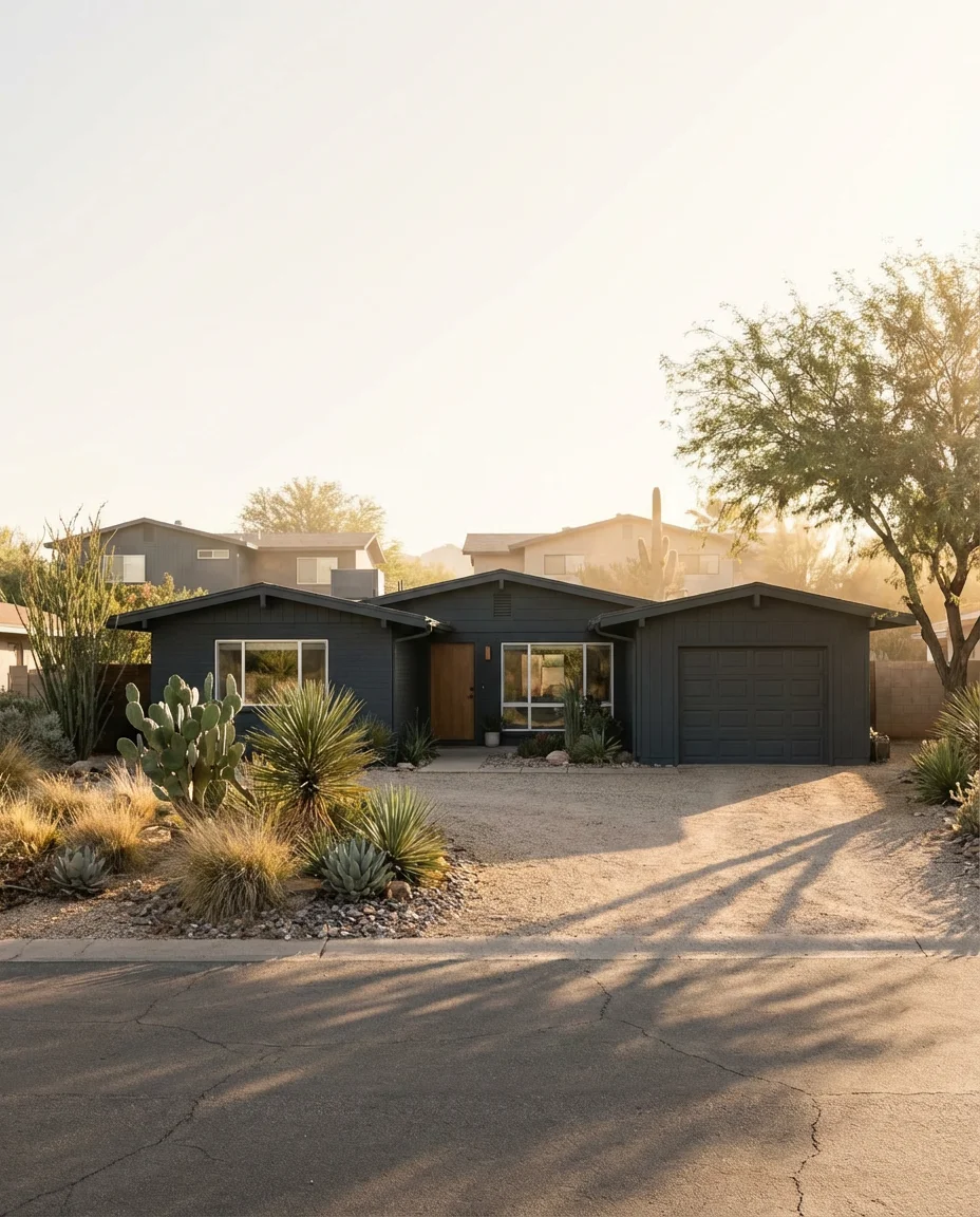
Real homeowners who’ve used Iron Ore consistently say the same thing: the color looks completely different on a paint chip than it does at full scale on a house. On a small chip it looks almost black. On a full facade, it reads as a sophisticated dark charcoal with visible warmth. This is why designers always recommend painting a 4×4-foot test swatch on your actual exterior wall and observing it at different times of day before committing to gallons.
19. Dark Exterior on a Bloxburg-Inspired Build
You might not expect to see Bloxburg on a serious design list, but the Roblox building game has become a genuinely fascinating mirror for real-world design trends—and dark exteriors have dominated Bloxburg aesthetics for the past two years. Young homeowners and renters in their twenties who grew up designing Bloxburg homes with deep charcoals, dark navies, and black windows are now bringing those same instincts to their first real homes and renovation projects. The pipeline from game to reality is real.
This is a genuinely interesting regional and generational context: millennial and Gen Z buyers entering the housing market for the first time are gravitating toward dark exteriors at a higher rate than any previous generation of first-time homeowners. Design researchers attribute this partly to the influence of gaming aesthetics and partly to a broader cultural shift toward rejecting the beige-and-gray neutrality that defined so much of the 2010s housing market. The dark exterior isn’t just a color choice—it’s a statement about taste and identity.
20. Dark Green Board and Batten with White Windows
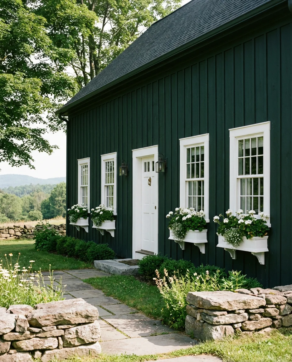
Dark hunter or bottle green on board and batten with white windows is the classic pairing that never gets old—and in 2026, it’s showing up everywhere from Vermont vacation cabins to North Carolina mountain retreats. The vertical lines of the board and batten siding elongate the look of the home, while the bright white window frames create punctuation points that prevent the facade from feeling monotonous. A stone pathway or foundation detail completes the look with organic grounding.
This combination photographs so well because of the contrast ratio—the deep green and bright white create a dynamic that digital cameras love, which is a big part of why it performs so strongly on Pinterest. If you’re specifically designing an exterior with social sharing in mind (and there’s no shame in that), this is one of the most reliably photogenic combinations available. Just make sure your landscaping is tidy when you take the listing or portfolio photos.
21. Charcoal Board and Batten on a Modern Farmhouse with Best Curb Appeal
When people search for the best dark exterior curb appeal on Pinterest, a charcoal board and batten modern farmhouse appears in nearly every results grid—and there’s a reason for that. This combination hits every note that the American home improvement audience responds to: it’s modern but not cold, bold but not alienating, and it photographs beautifully in every season. Tuck a covered front porch into the design and add a white trim detail, and you have the best possible version of this look.
If you’re planning to sell within the next few years, this specific combination—charcoal board and batten with white trim—has been shown by real estate agents in multiple markets to increase buyer interest at open houses. Homes with this exterior tend to generate more saves on Zillow and Realtor listings, which translates to more showing requests. It’s not just aesthetically popular; it’s financially smart, especially in competitive suburban markets where standing out in the listing photos can make a real difference in sale price.
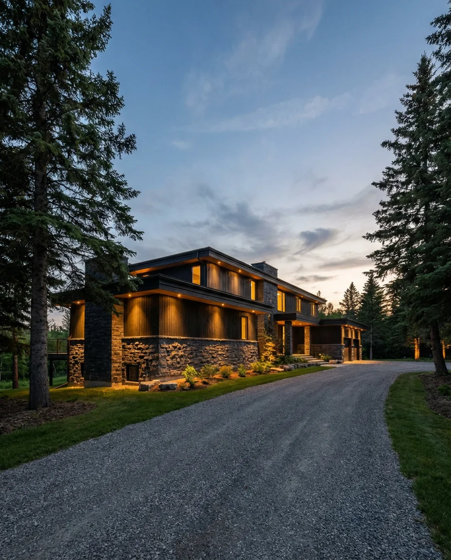
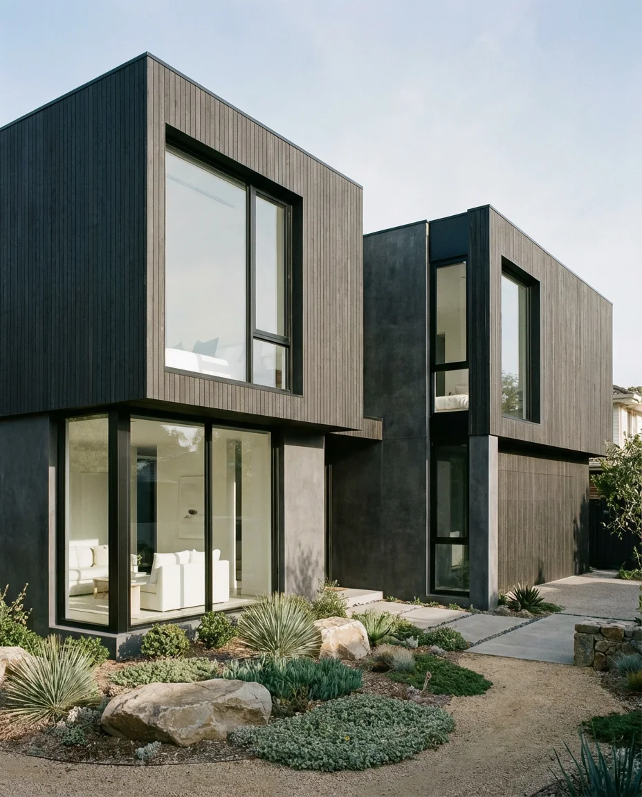
22. Near-Black with Natural Wood and Stone on a Modern Exterior
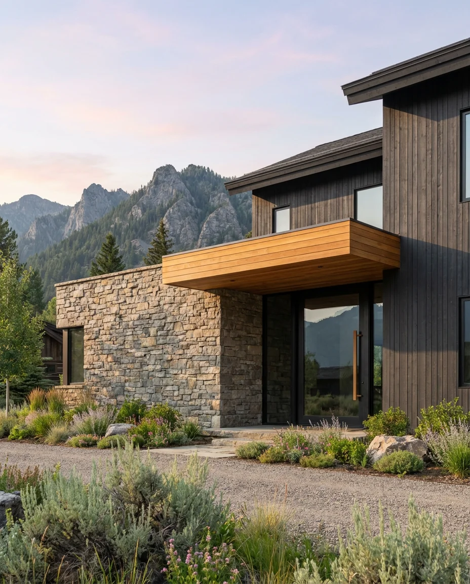
The trifecta of near-black siding, natural wood accents, and stone detailing is the pinnacle dark exterior combination of 2026 — and it works across styles from contemporary to craftsman to mountain modern. Each material plays a role: the dark siding provides drama and sophistication, the warm wood keeps it human and inviting, and the stone grounds it in something ancient and solid. Together, they create an exterior that feels complete in a way that single-material facades rarely achieve.
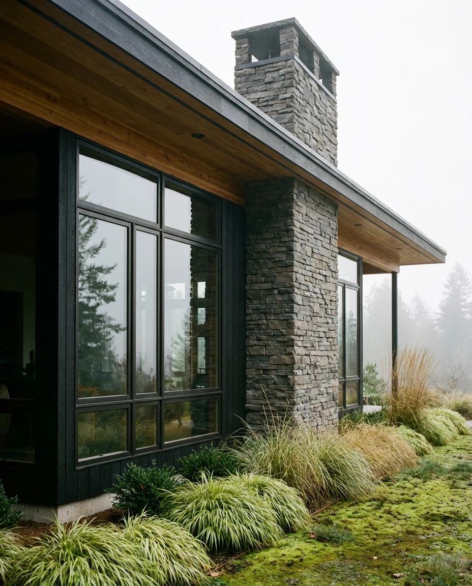
This combination is the dark exterior equivalent of a tailored suit—it requires quality materials and precise execution to work properly. Cheap wood accents will look mismatched rather than intentional. Stone veneer applied carelessly will look like an afterthought. But when all three materials are chosen thoughtfully and installed with care, the result is an exterior that genuinely improves with age rather than dating itself within a few years. It’s the investment approach to dark exterior design, and it’s absolutely worth it.
Conclusion
Dark exterior house colors are no longer a niche choice for design enthusiasts—they’re a mainstream movement that’s reshaping neighborhoods all across America. Whether you’re drawn to the graphic boldness of all-black board and batten or the quiet sophistication of a dark sage stucco ranch, there’s a version of this trend that works for your home, your climate, and your budget. We’d love to know what dark color you’re considering for your own home—drop it in the comments below, share your before-and-after photos, or let us know which of these ideas stopped your scroll.