Front door color choices are evolving in 2026, with homeowners across the U.S. seeking hues that balance curb appeal with personal expression. Pinterest searches for door colors have surged as people look for inspiration that fits their home’s exterior, from red brick colonials to coastal cottages. Whether you’re drawn to bold statements or neutral elegance, the right front door color can transform your home’s first impression. This guide explores twenty-three fresh ideas tailored to different architectural styles, regional preferences, and design personalities.
1. Classic Navy Blue for Red Brick Homes
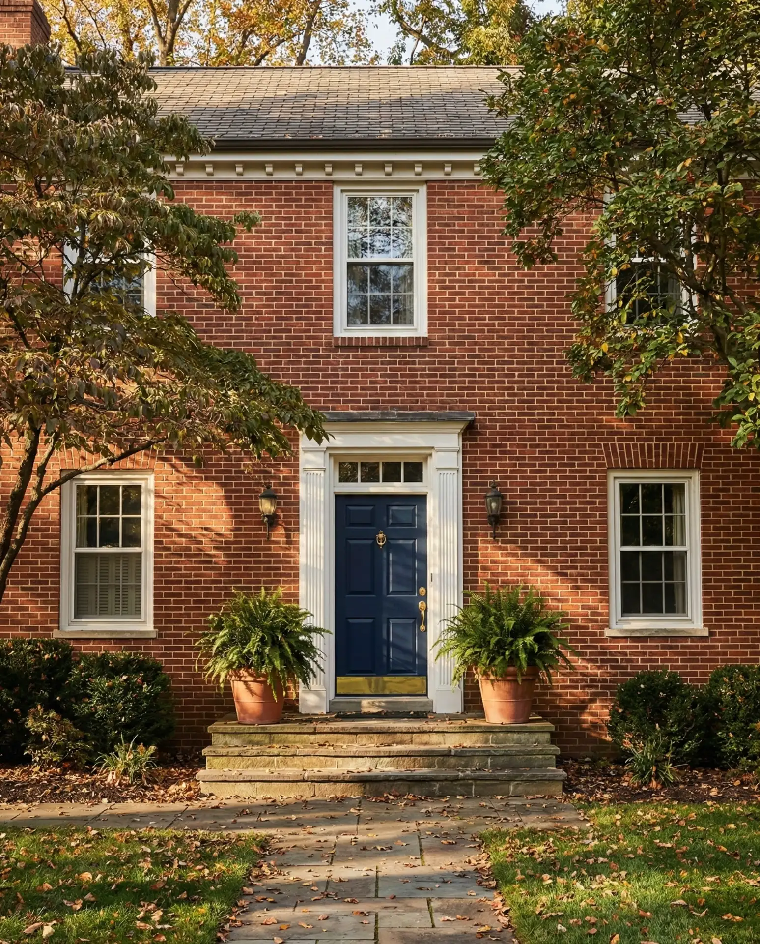
Navy blue remains a timeless choice for red brick homes, offering a sophisticated contrast that feels both traditional and current. This shade works beautifully in neighborhoods from New England to the Midwest, where brick exteriors dominate. The richness of navy complements the warm terracotta tones without competing, creating a welcoming entry that feels grounded. It’s particularly effective on homes with white or cream trim, where the three-color palette achieves architectural balance. 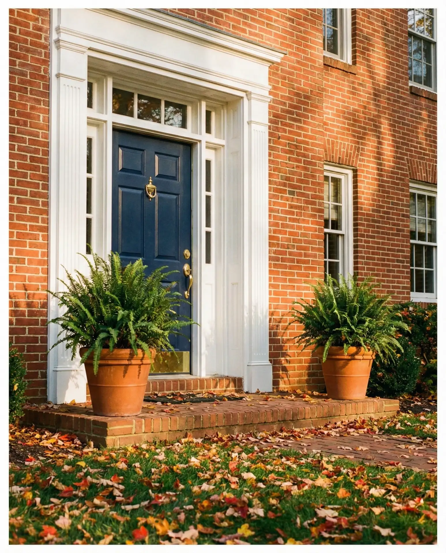
Navy blue doors require less frequent repainting than lighter colors, typically lasting five to seven years in moderate climates. Homeowners in coastal regions should opt for marine-grade paint to prevent salt air damage. The color hides minor scuffs and wear better than lighter alternatives, making it practical for families with children or pets. Pair it with brushed nickel or aged brass hardware to complete the refined look.
2. Sage Green with Natural Wood Accents
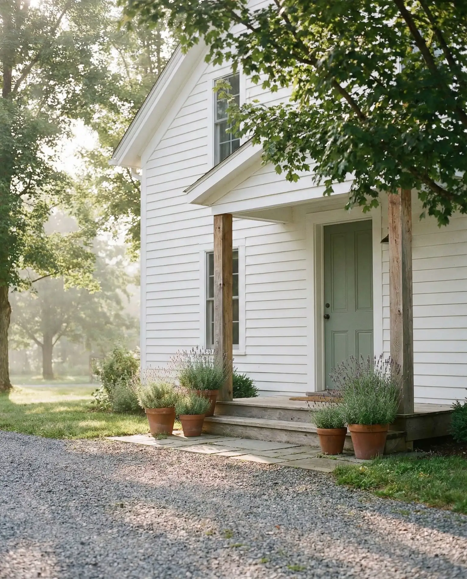
Sage green front doors have become Pinterest favorites for their calming, nature-inspired appeal. This muted tone works exceptionally well with white house exteriors and natural wood elements like cedar shakes or exposed beams. The color bridges indoor-outdoor living, a priority for many American homeowners redesigning their entryways. Sage green feels particularly at home in Pacific Northwest settings, Southern California bungalows, and renovated farmhouses across the heartland.
A designer in Portland mentioned that sage green doors pair beautifully with unlacquered brass hardware, which develops a natural patina over time. This combination creates an organic, lived-in aesthetic that appeals to younger homeowners seeking authentic character. The color also complements stone pathways and native plantings, extending the natural palette from door to landscape.
3. Bold Teal for Coastal Cottage Charm
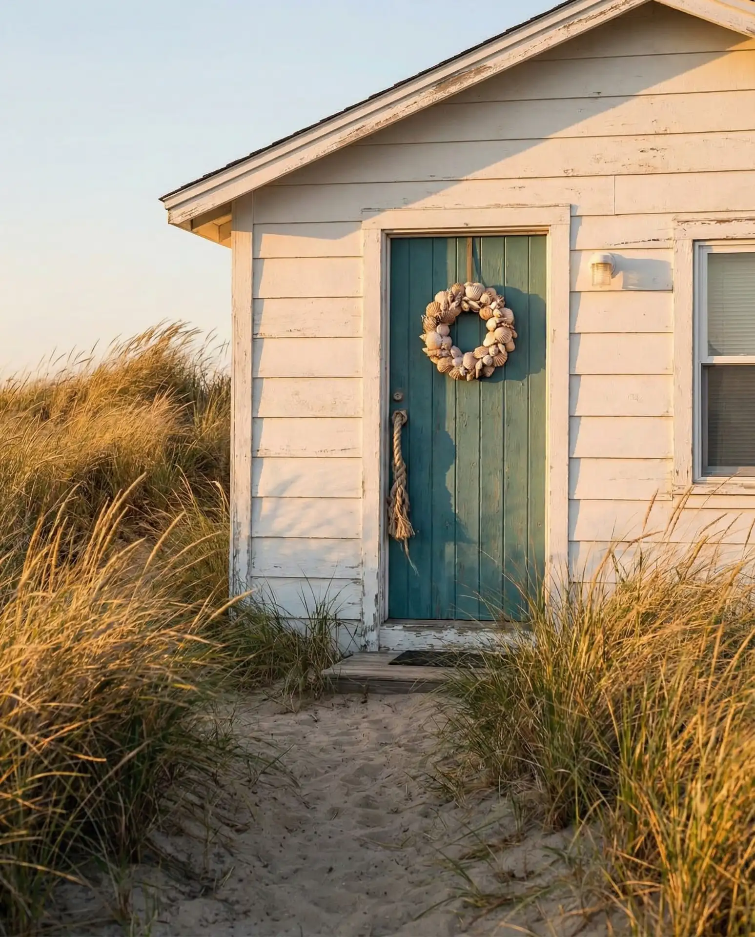
Vibrant teal front doors capture the essence of coastal living without feeling overly thematic. This shade works beautifully on cottage-style homes with white clapboard siding, evoking seaside towns from Cape Cod to the Outer Banks. The color reflects light differently throughout the day, appearing almost turquoise in bright sun and deepening to jewel-tone richness in evening shade. Teal creates an immediate mood of relaxation and escape, qualities that resonate with homeowners seeking vacation-home vibes year-round. 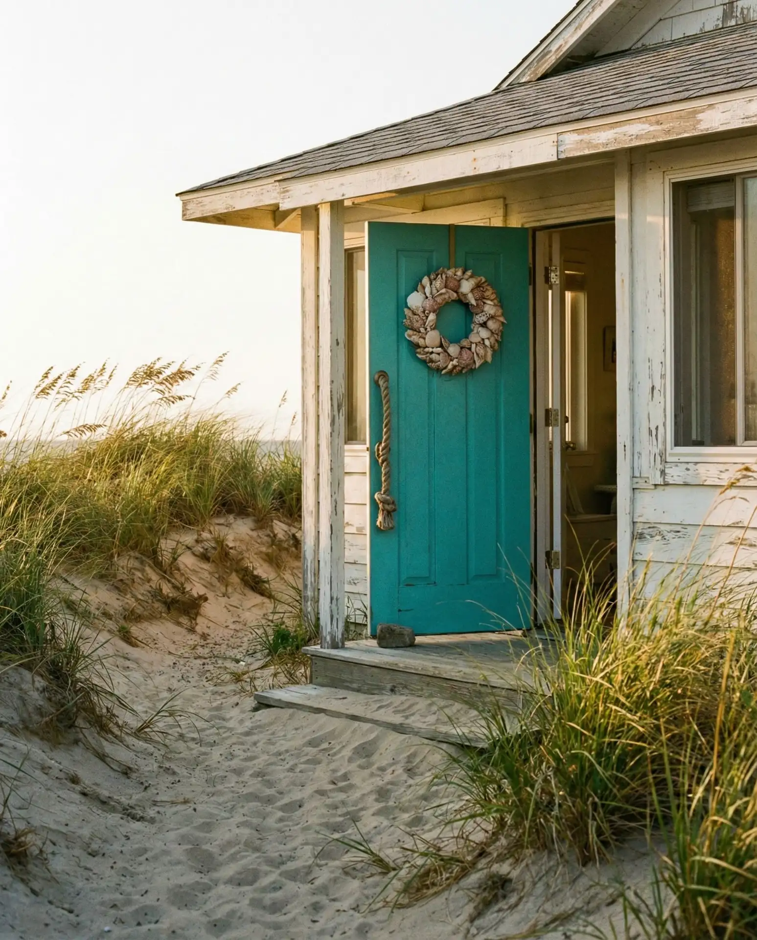
Teal works best when you commit fully to the color rather than second-guessing its boldness. Many homeowners make the mistake of choosing a watered-down version, which loses the statement-making impact. The saturated version creates the “wow” moment that Pinterest users seek. Budget around $150–$250 for quality exterior paint that resists fading in salt air and intense sun.
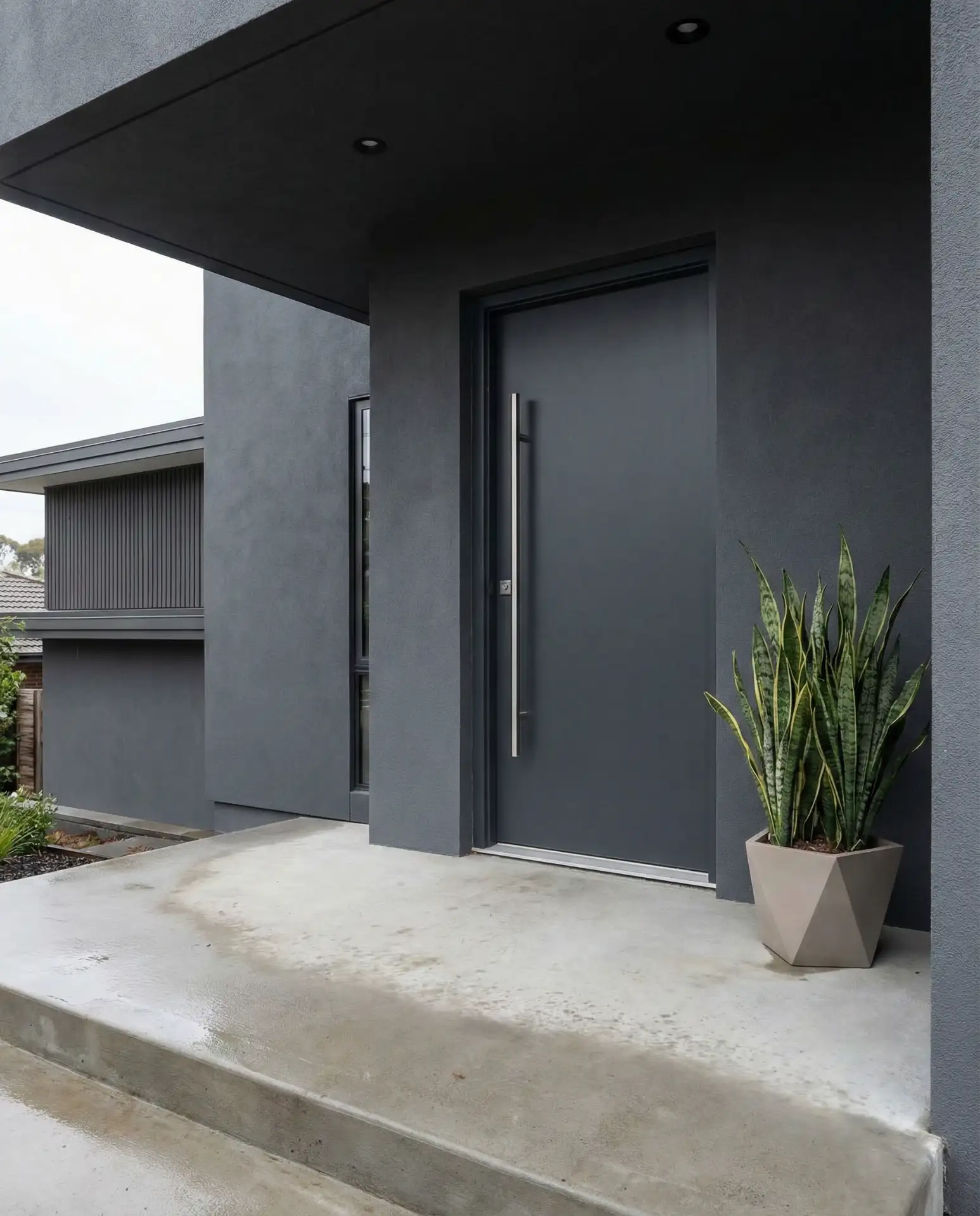
4. Charcoal Gray for Modern Gray Siding
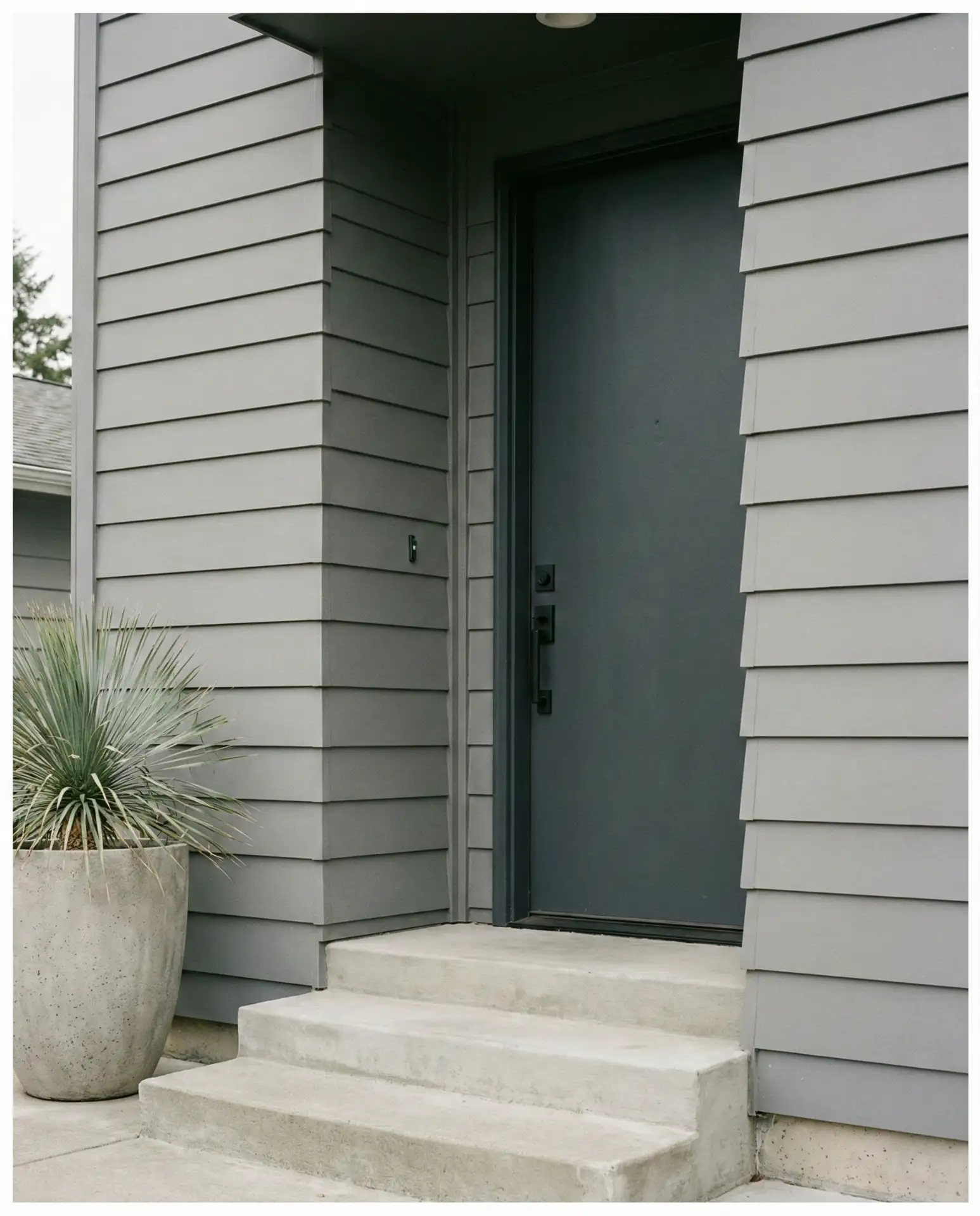
Monochromatic schemes are gaining traction in 2026, with charcoal doors on gray-sided homes creating sleek, contemporary curb appeal. This approach works particularly well on modern builds with clean lines and minimal ornamentation. The tonal variation provides subtle definition without introducing competing colors, allowing architectural features to take center stage. It’s a favorite among urban homeowners in Seattle, Denver, and Austin who prefer understated sophistication. 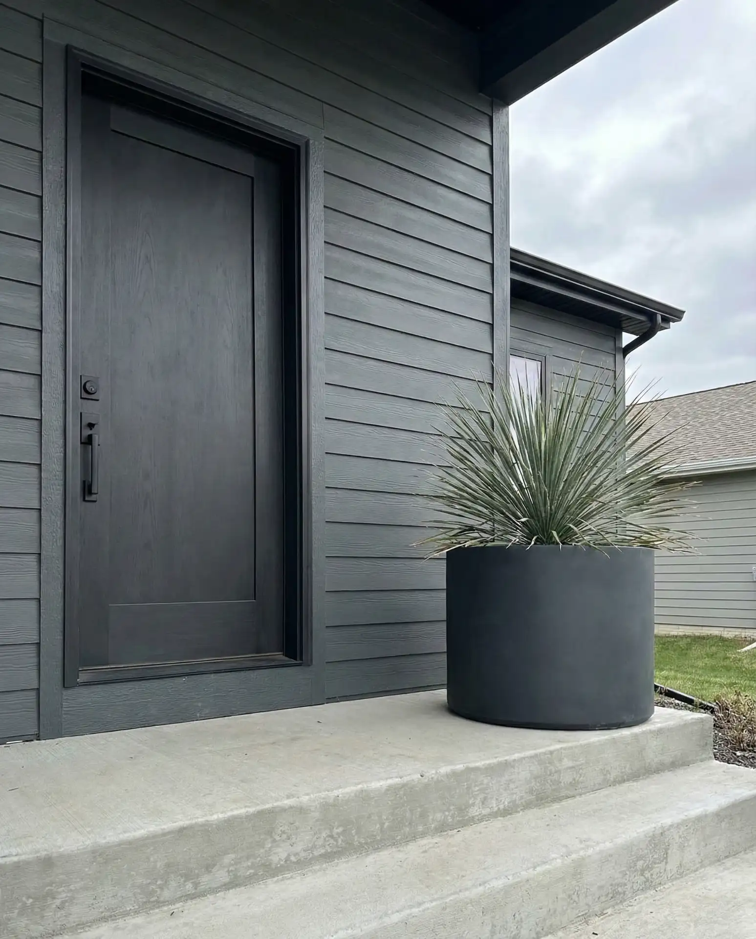
This color combination works best in regions with ample natural light, as it can appear flat in heavily shaded entryways. Adding landscape lighting or a statement overhead fixture helps create depth and visual interest. Matte black or stainless steel hardware completes the contemporary aesthetic without adding unnecessary embellishment.
5. Warm Terracotta for Tan House Exteriors
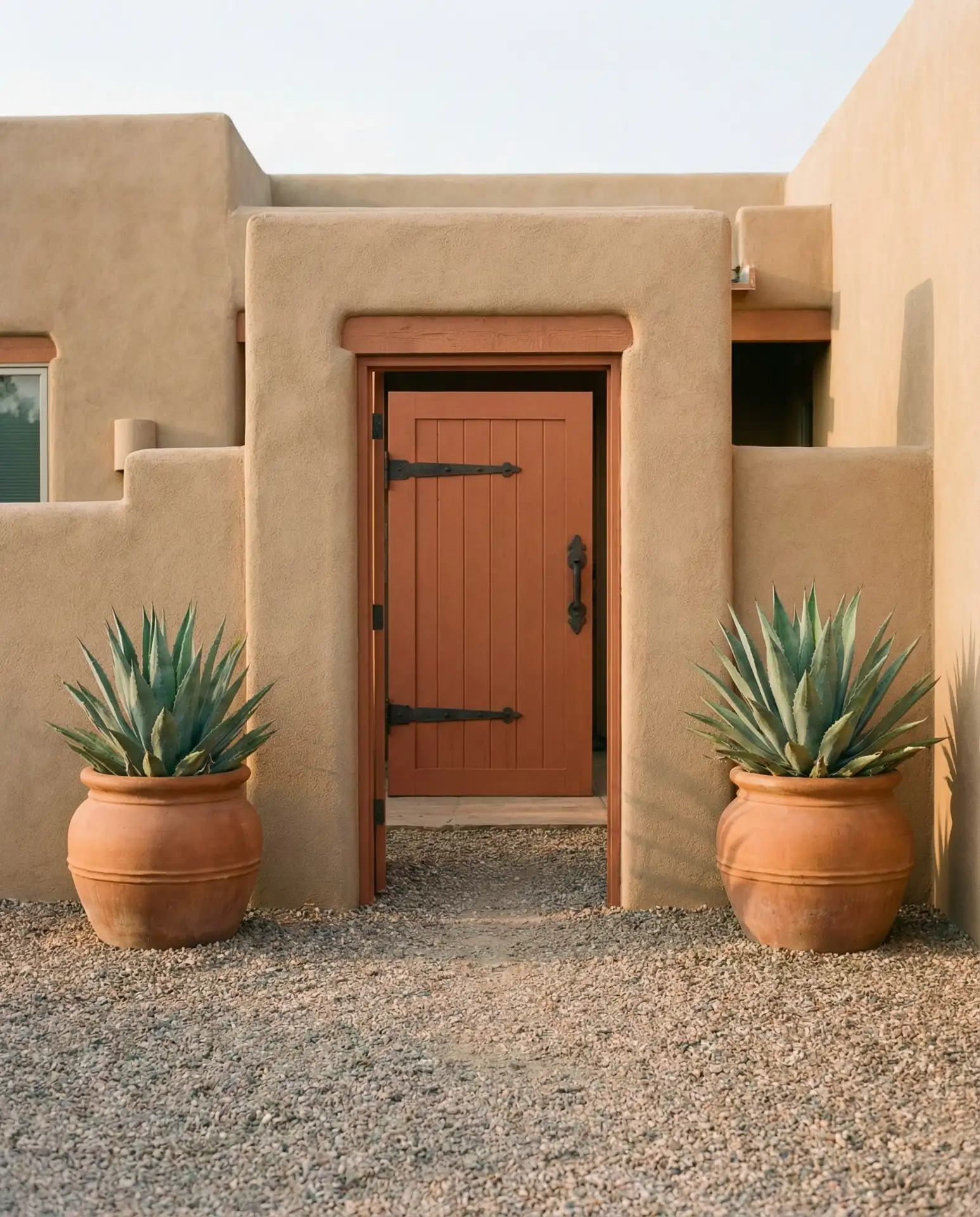
Terracotta and burnt orange tones bring unexpected warmth to tan house exteriors, creating a sun-baked, Mediterranean-inspired entry. This orange family hue complements stucco, adobe, and neutral siding found throughout the Southwest and Southern California. The color feels both earthy and energizing, offering a departure from predictable neutrals. Terracotta doors pair beautifully with clay roof tiles and desert landscaping featuring succulents and ornamental grasses. 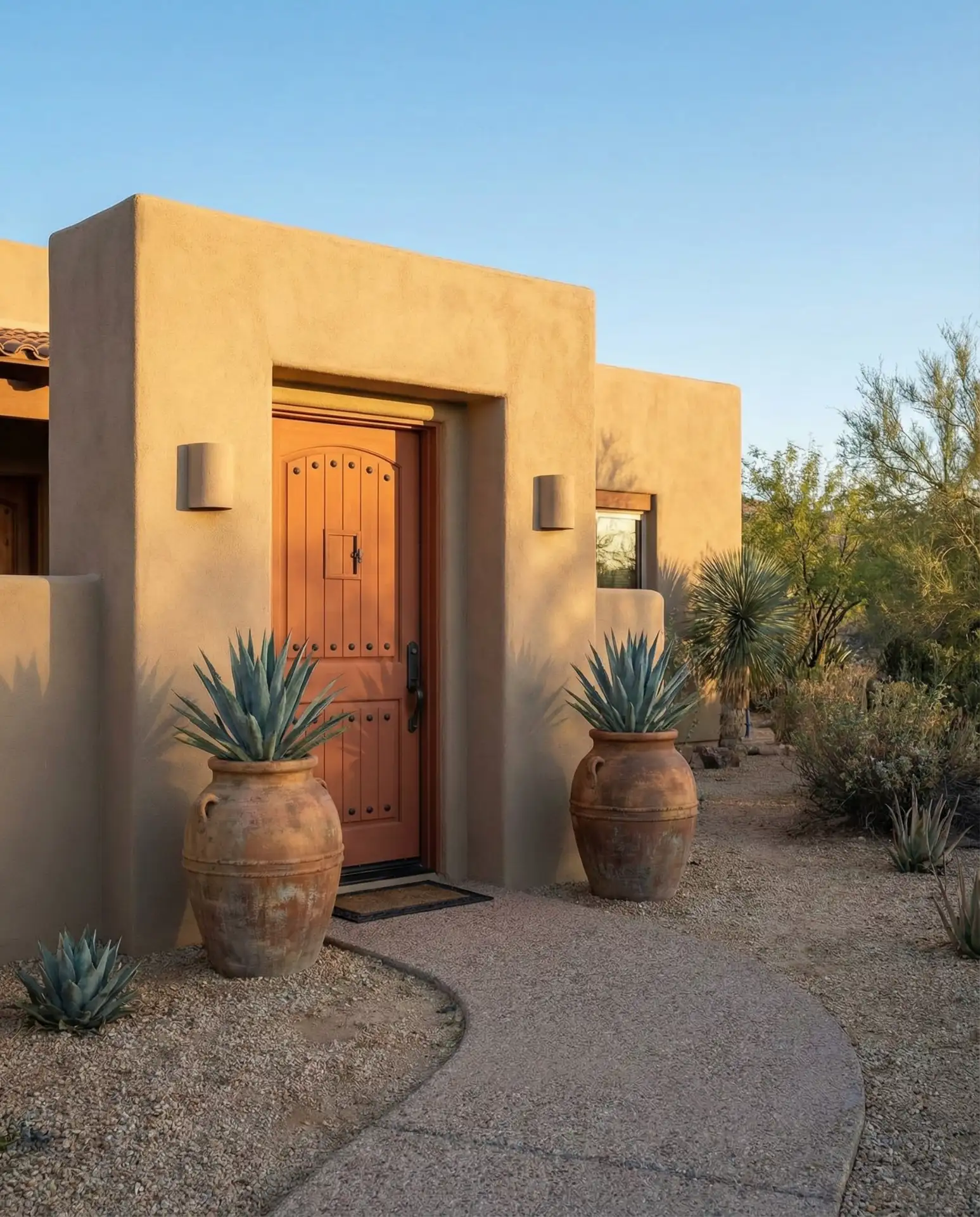
Where it works best: homes in Arizona, New Mexico, and inland California, where the color harmonizes with natural surroundings. The shade can feel out of place in cooler, heavily forested regions where jewel tones tend to dominate. Consider the regional context before committing to this warm, sun-loving hue.
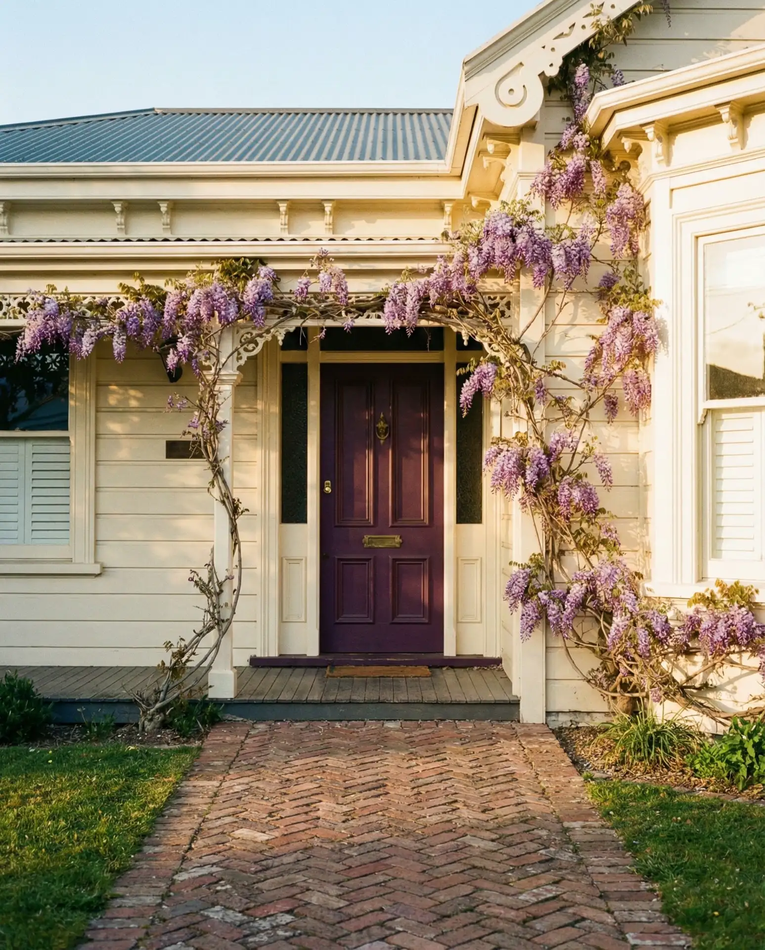
6. Deep Purple for Unique Character
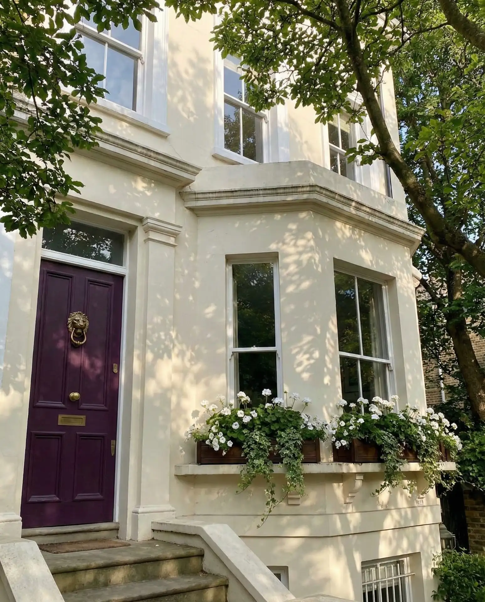
For homeowners seeking truly unique curb appeal, deep purple delivers personality without veering into novelty. This unexpected choice works on both historic homes and modern builds, depending on the specific shade and surrounding colors. Eggplant and plum tones feel sophisticated against cream or light gray exteriors, while brighter purples suit Victorian or eclectic architectural styles. The color makes a confident statement that stands out in suburban neighborhoods where neutrals dominate. 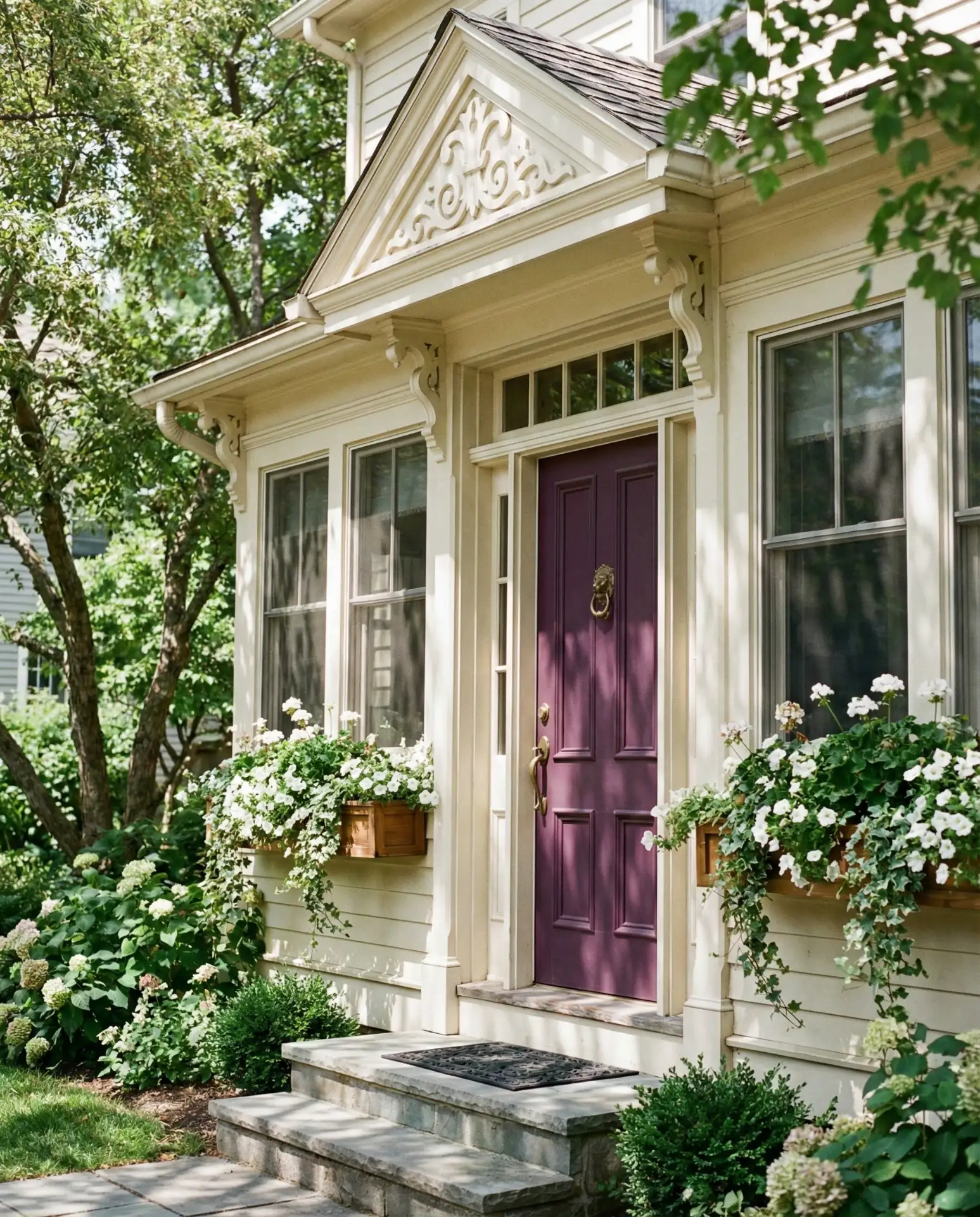
One homeowner in Charleston repainted her door from black to eggplant and noticed neighbors stopping to compliment the change within days. Purple reads as both regal and approachable, avoiding the severity of black or the expected nature of blue. It’s particularly effective when paired with antique brass or oil-rubbed bronze hardware that echoes the color’s richness.
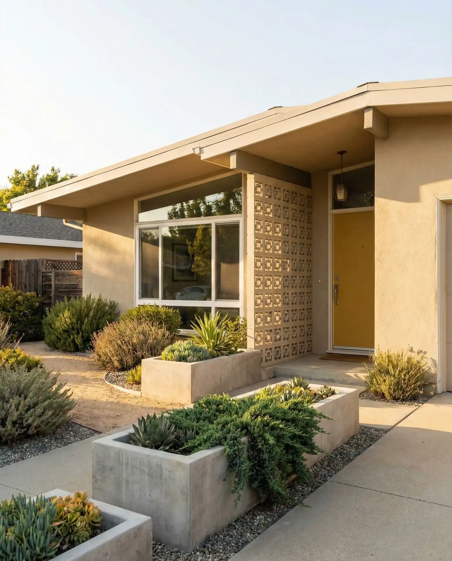
7. Soft Yellow for Cheerful Entries
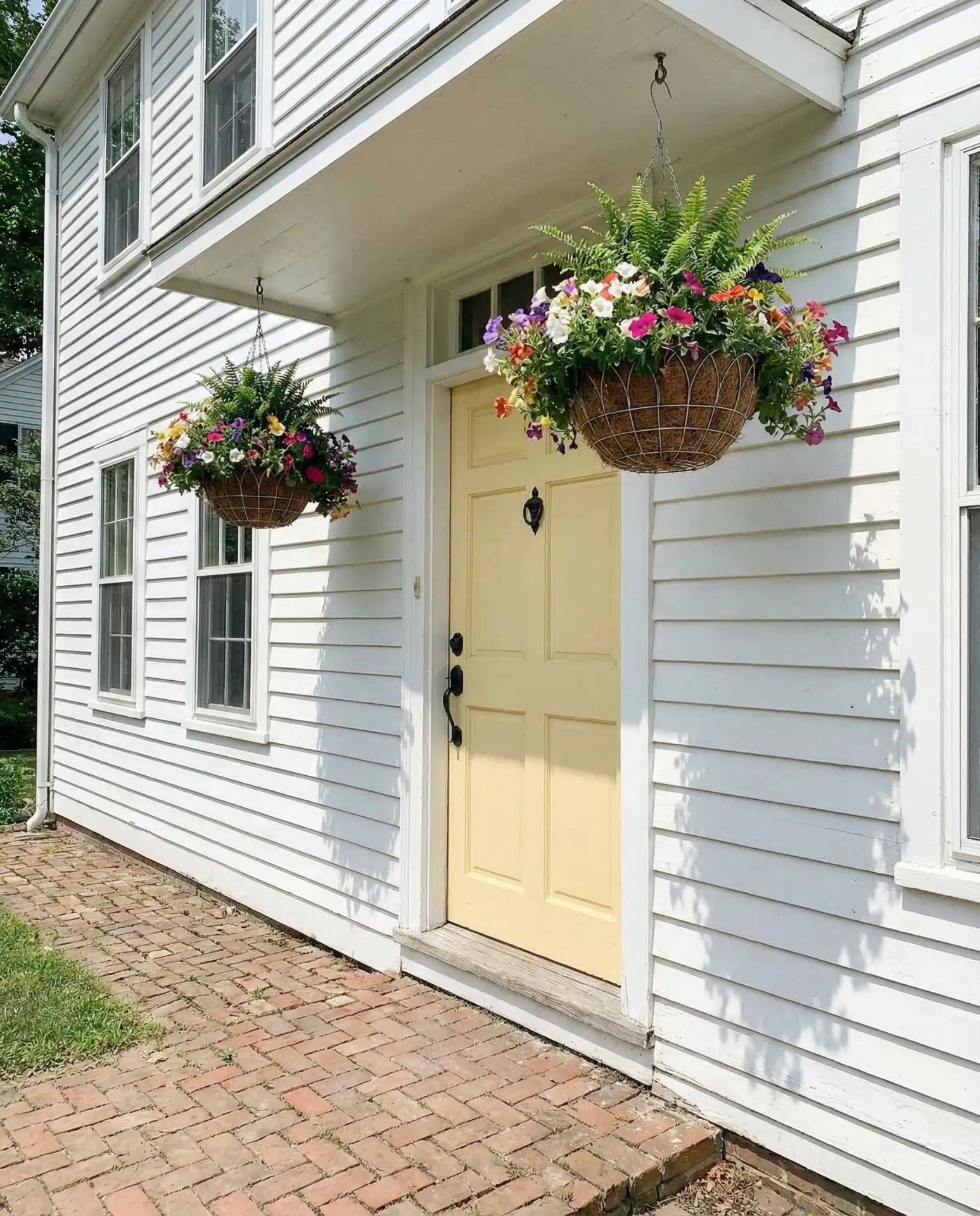
Buttery yellow front doors radiate optimism and warmth, particularly effective on white or gray homes seeking a cheerful accent. This shade evokes Southern hospitality and cottage garden aesthetics, popular in regions from the Carolinas to the Pacific Northwest. Yellow works year-round but feels especially welcoming during gray winter months when a pop of sunshine lifts spirits. The color pairs beautifully with black or dark green shutters for classic contrast. 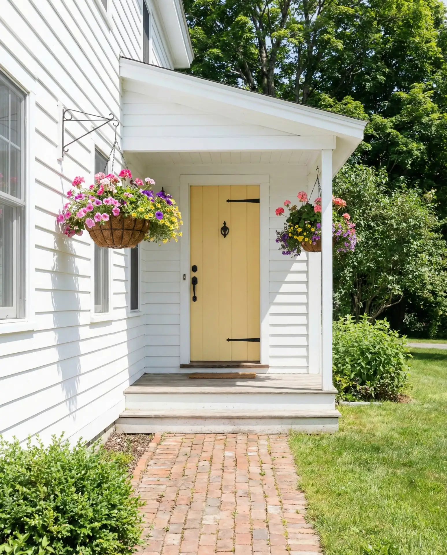
Quality exterior yellow paint typically costs $40–$60 per gallon, with most doors requiring one gallon for two coats. The color shows dirt and scuffs more readily than darker options, so plan for touch-ups every three to four years. Choose a satin or semi-gloss finish for easier cleaning and better durability against weather exposure.
8. Forest Green for Traditional Elegance
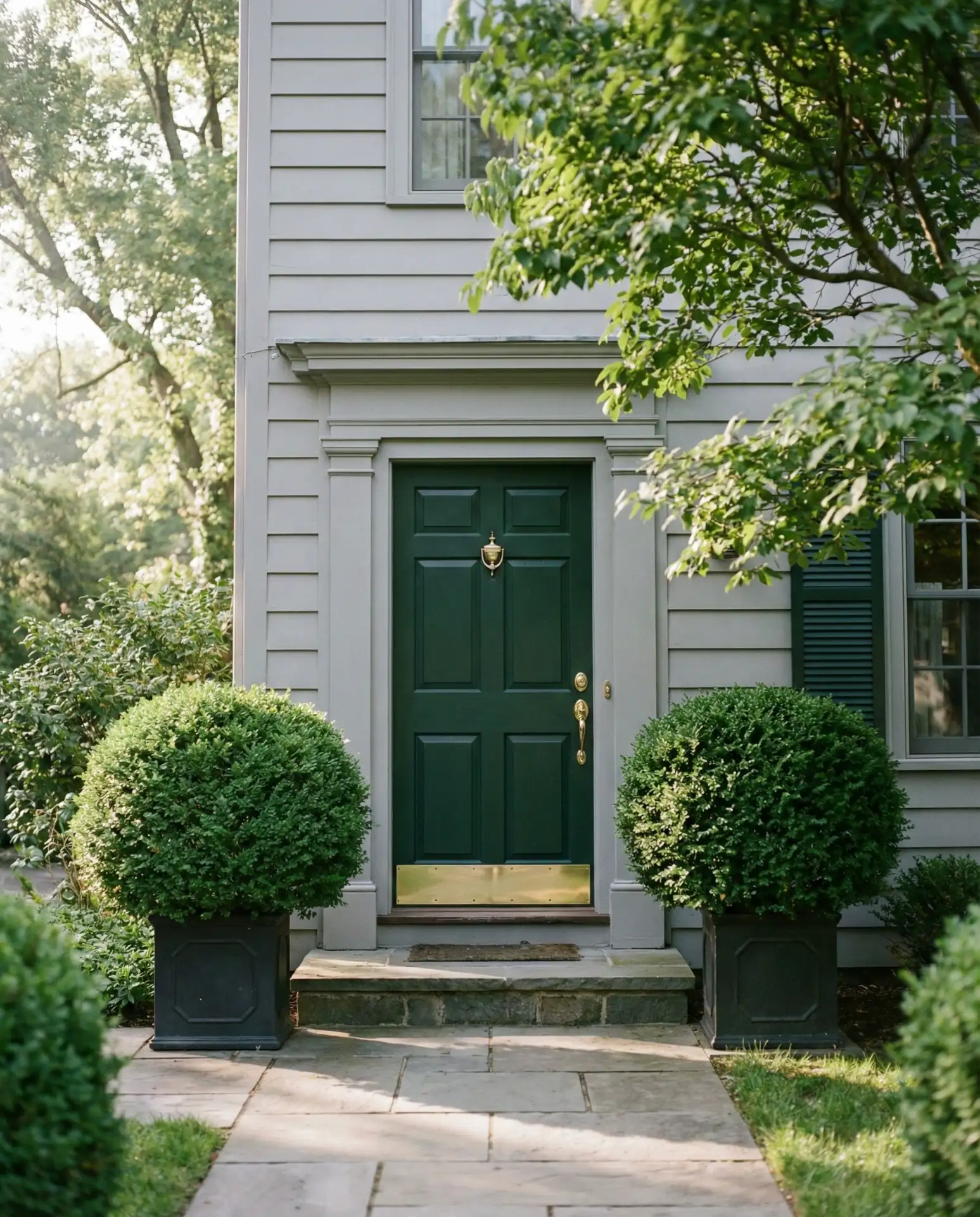
Deep forest green brings timeless elegance to traditional homes, particularly those with green siding or natural wood exteriors. This classic choice feels equally at home on Colonial revivals in Connecticut and Craftsman bungalows in Oregon. The color connects homes to their surrounding landscape while maintaining formality and polish. Forest green works beautifully with brass hardware and complements foundation plantings of boxwood or holly. 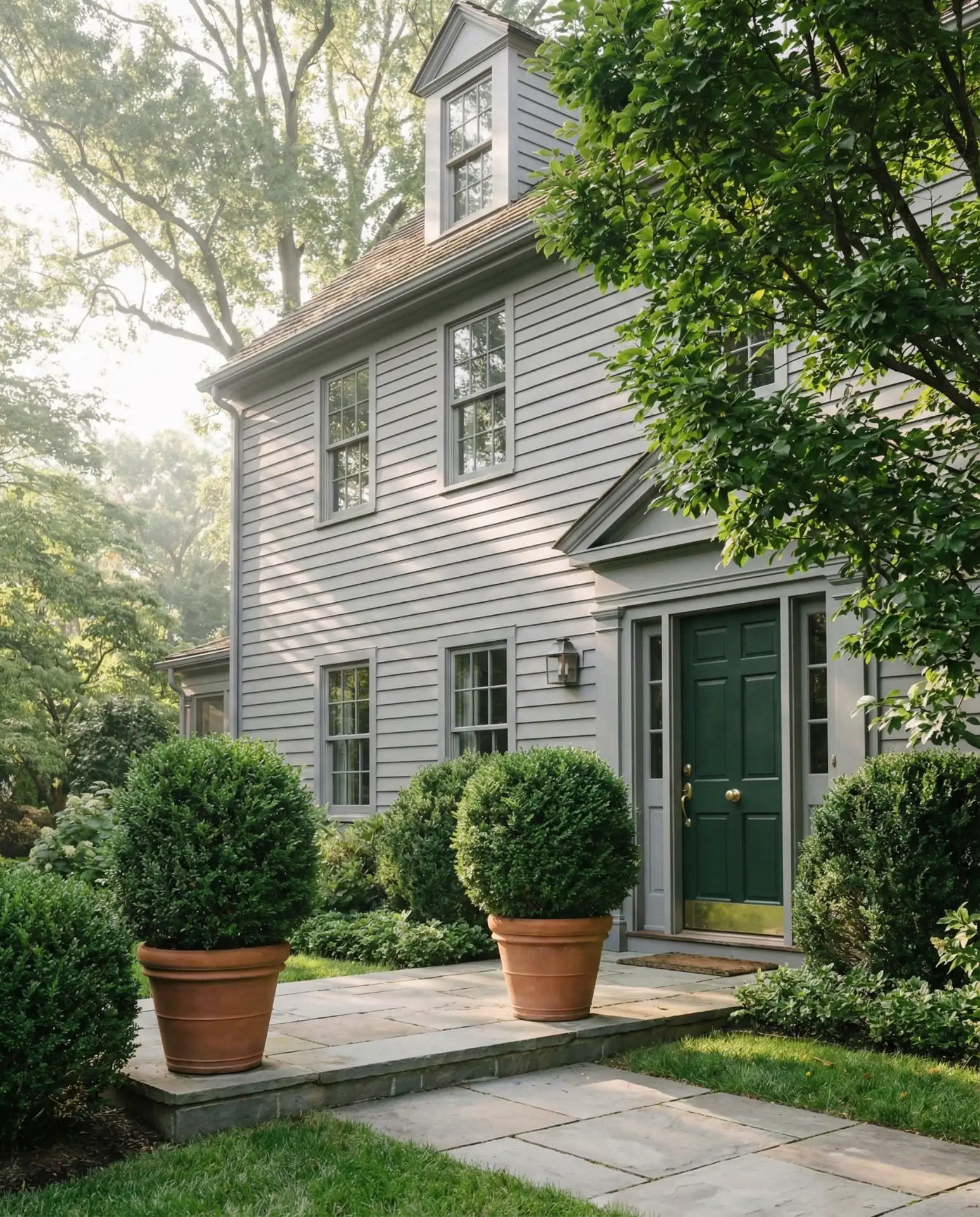
Forest green is one of those colors that rarely goes out of style, making it a safe choice for homeowners planning to stay long-term. It appeals to both traditional and modern sensibilities depending on the hardware and surrounding details. The shade works particularly well in heavily wooded areas where it echoes the natural environment.
9. Coral Pink for Playful Sophistication

Soft coral pink strikes a balance between playful and sophisticated, offering a fresh alternative to traditional neutrals. This shade works surprisingly well on white, gray, or even pale blue exteriors, adding warmth without overwhelming. Pink doors have gained traction on Pinterest among homeowners seeking approachable elegance with a touch of whimsy. The color feels particularly fitting for cottage-style homes, Mediterranean villas, and mid-century ranches undergoing modern updates. 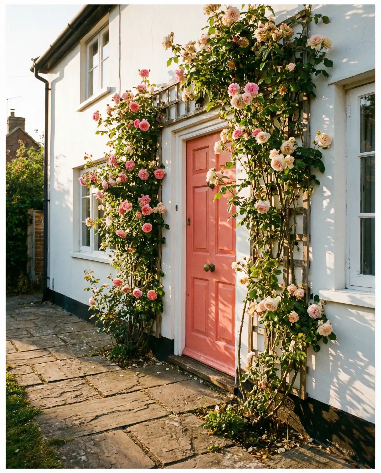
A common mistake with pink doors is choosing too pastel or too neon a shade. The sweet spot lies in coral and salmon tones with enough saturation to read as intentional rather than faded. These deeper pinks maintain their vibrancy longer and pair well with natural materials like terracotta, limestone, and weathered wood.
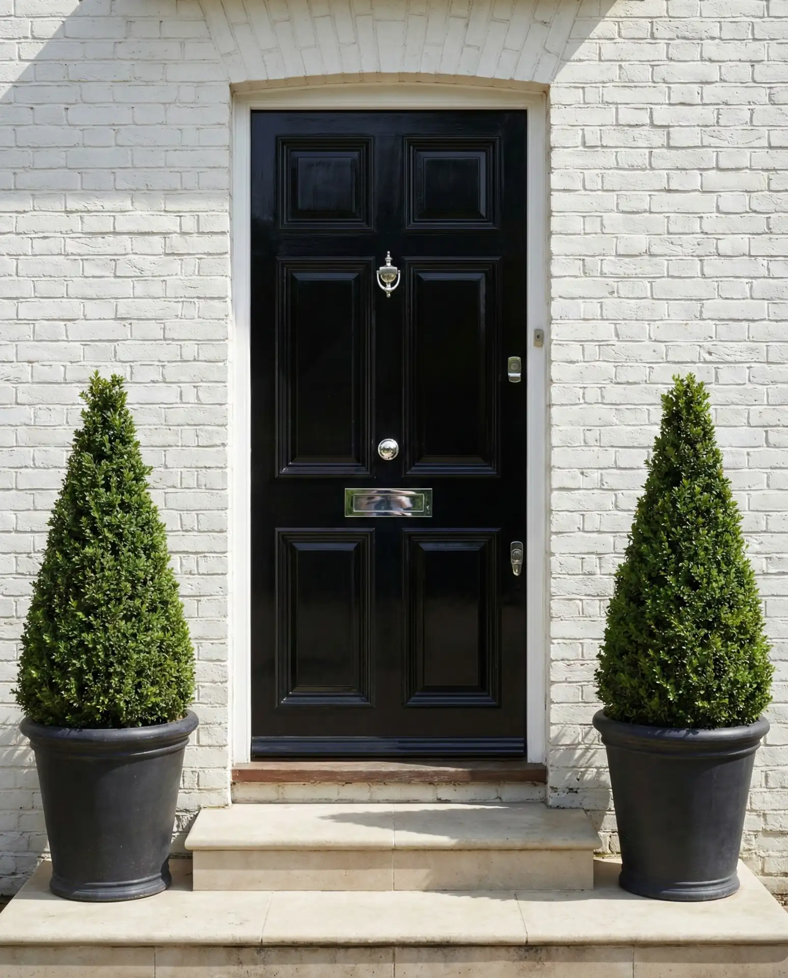
10. Glossy Black for Dramatic Impact
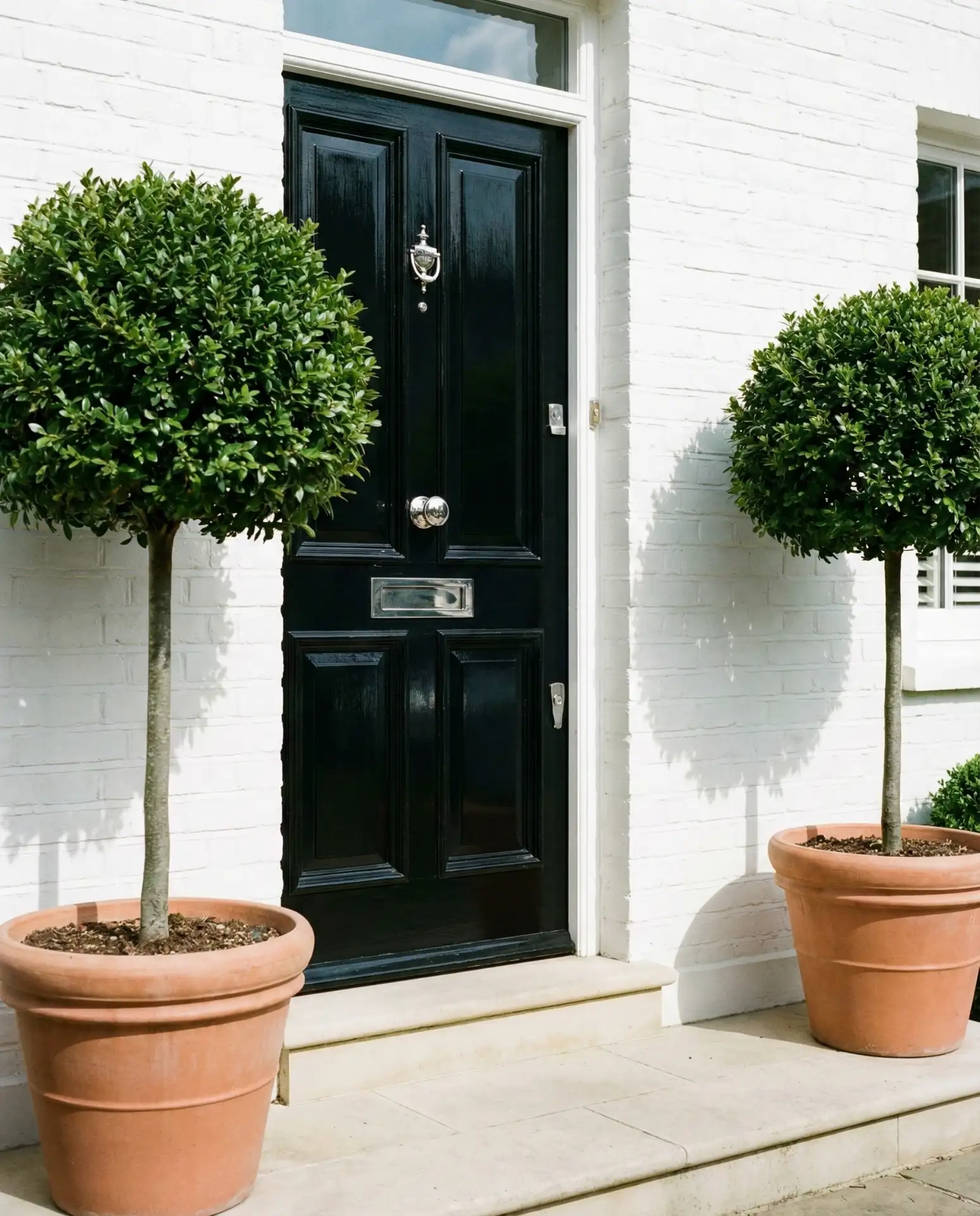
High-gloss black front doors deliver maximum drama and sophistication across virtually any exterior color. This bold choice works on everything from brick to siding, creating crisp contrast and architectural definition. Black doors photograph beautifully, which explains their Pinterest popularity among design-conscious homeowners. The color never feels dated and adapts to both traditional and contemporary settings with ease.
Black shows every fingerprint and requires regular cleaning to maintain its showroom appearance. Budget for monthly wipe-downs with appropriate cleaners, and expect to repaint every four to six years as the gloss finish degrades. Despite the maintenance, black remains a perennial favorite for its ability to make any home feel more polished and intentional.
11. Sherwin Williams Urbane Bronze for Warm Neutrals
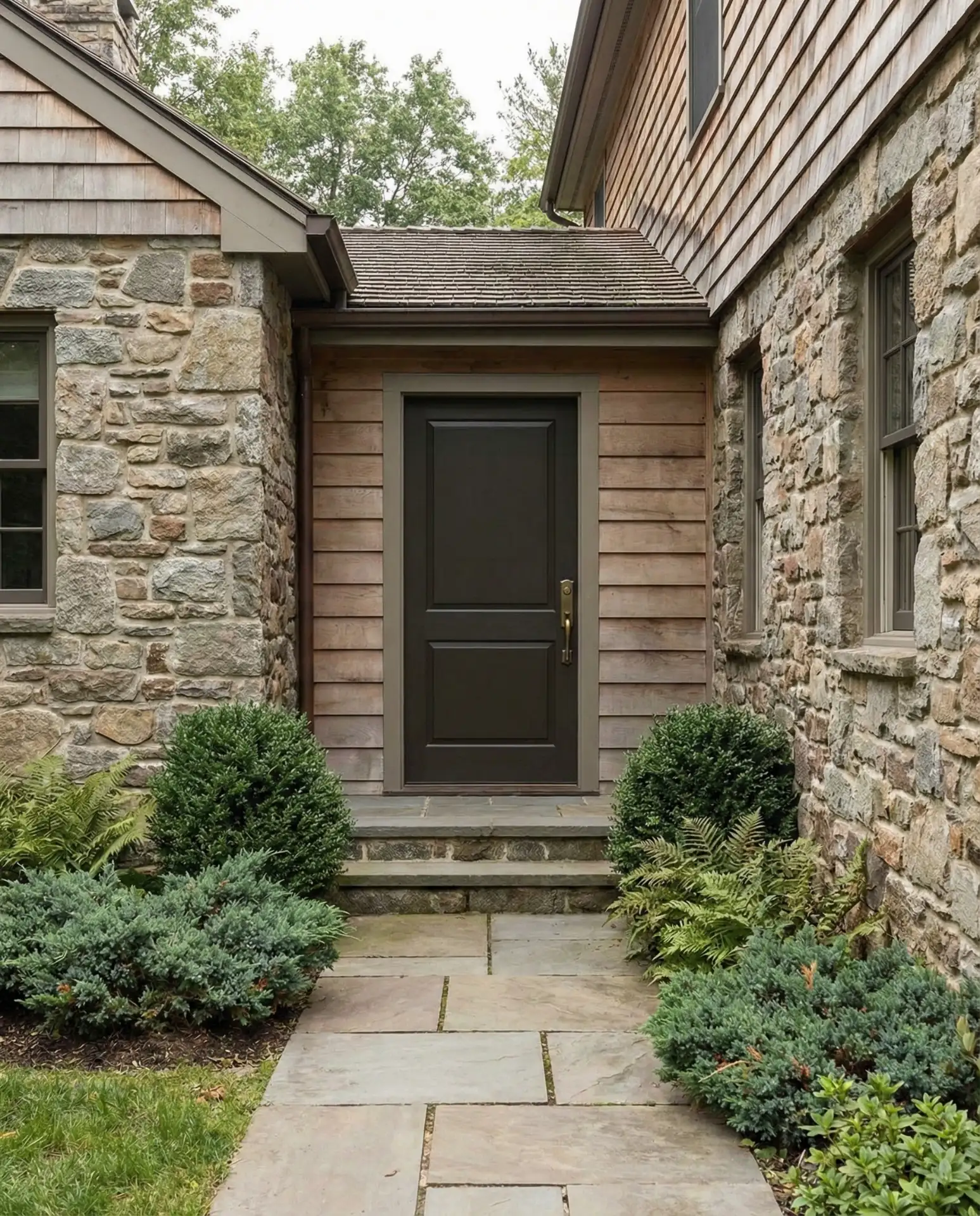
Sherwin-Williams Urbane Bronze has become a go-to for homeowners seeking neutral and earthy sophistication. This warm, chocolatey brown works beautifully on homes with stone, brick, or mixed materials, providing depth without feeling heavy. The color shifts between brown and charcoal depending on light conditions, offering visual interest throughout the day. It’s particularly effective on homes with warm undertones in the siding or masonry. 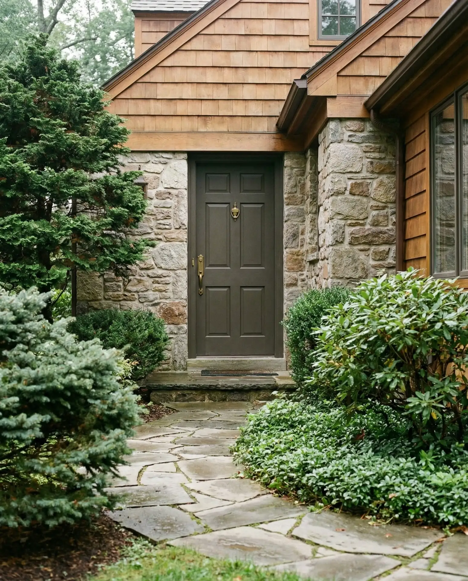
Interior designers often recommend Urbane Bronze for clients who want the impact of a dark door but find black too stark. The warmth in the brown prevents the harshness that pure black can create against certain exteriors. Pair it with warm metals like brass or bronze rather than chrome or nickel for a cohesive look.
12. Benjamin Moore Hale Navy for Classic Appeal
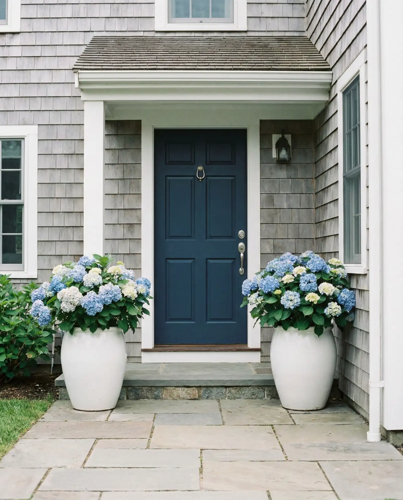
Benjamin Moore Hale Navy remains one of the most searched paint colors for front doors, offering true navy depth without appearing black. This shade works across architectural styles from traditional to farmhouse, providing versatility that explains its enduring popularity. Hale Navy pairs beautifully with white trim and works on homes with gray, beige, or brick exteriors. The color feels authoritative without being severe, welcoming without being casual. 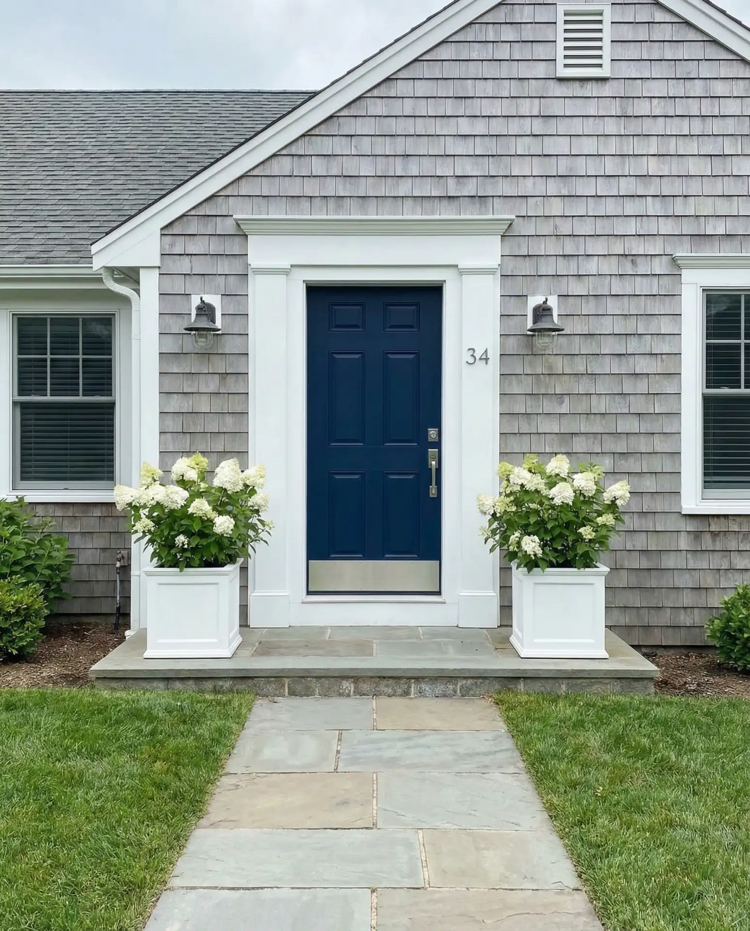
Where it works best: suburban neighborhoods where the color feels appropriate and timeless. Hale Navy appeals to homeowners who want a designer look without risk, which explains its presence in countless Pinterest boards. The shade is dark enough to hide wear but not so dark that it absorbs excessive heat in southern climates.
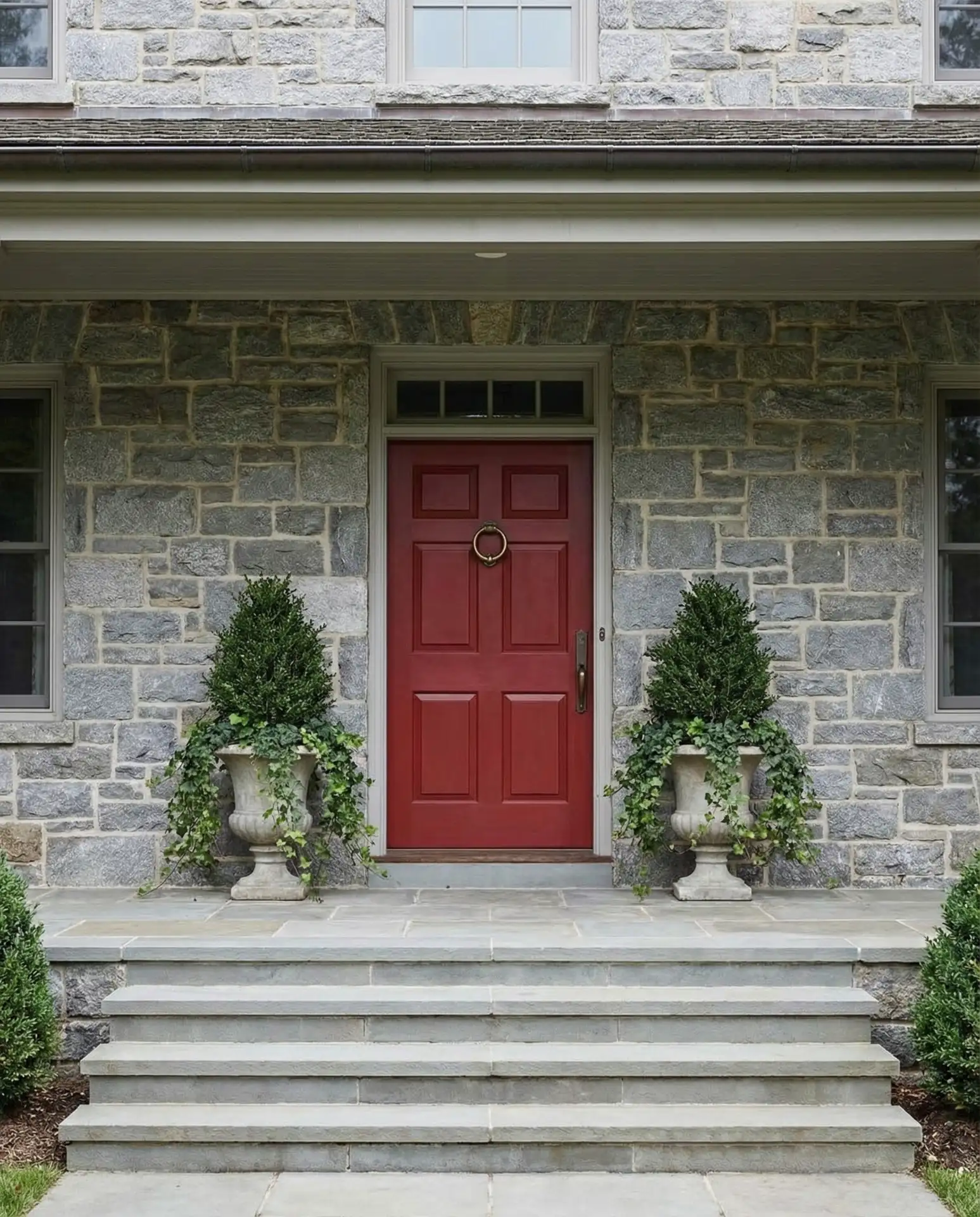
13. Bright Red for Traditional Statements
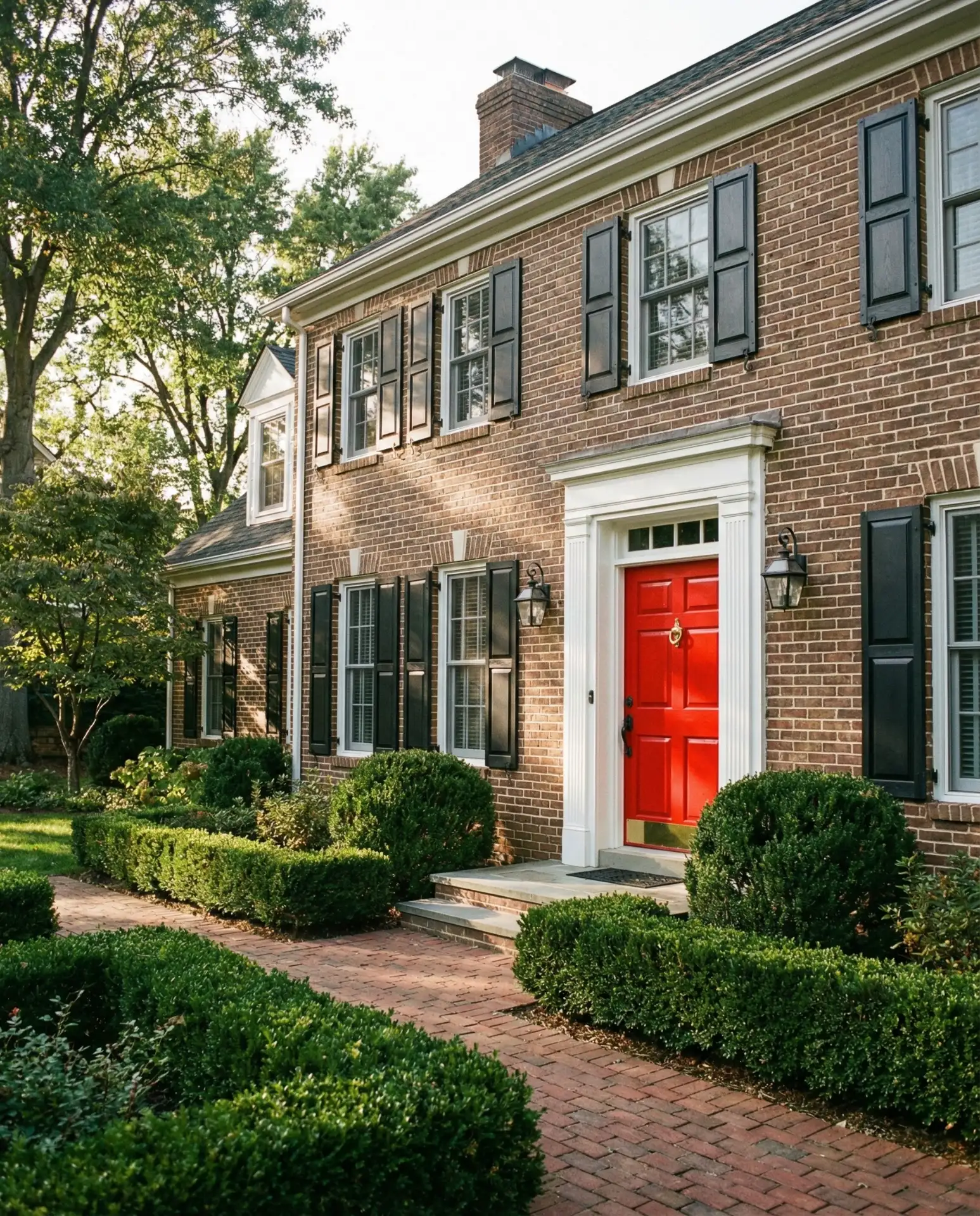
True red front doors carry symbolic weight across cultures and make powerful visual statements on ideas for brown brick house exteriors. This classic choice suggests confidence and hospitality, particularly effective on Colonial and Federal-style architecture. Red creates maximum contrast against neutral exteriors while feeling surprisingly traditional rather than trendy. The color works especially well with black shutters and brass hardware for a timeless American aesthetic. 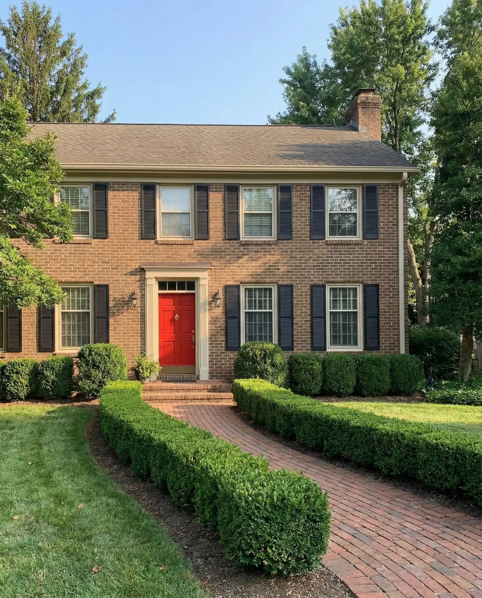
A neighbor in Virginia mentioned that her red door receives more compliments than any other exterior update she’s made. The color photographs beautifully and stand out in real estate listings, which matters for resale value. Red requires confidence to pull off but rewards homeowners with instant curb appeal that never goes unnoticed.
14. Dusty Blue for Serene Curb Appeal
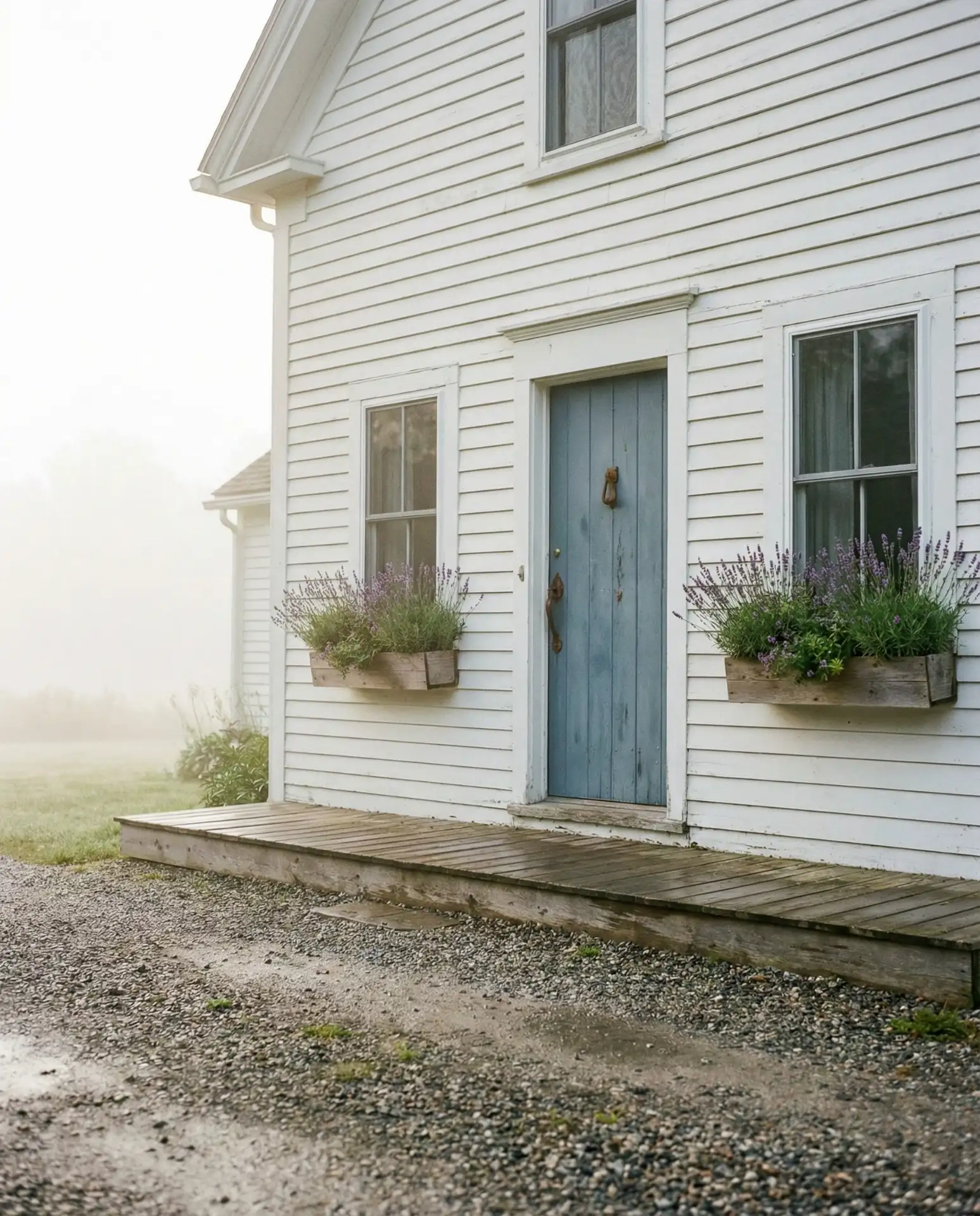
Muted dusty blue offers a softer alternative to navy, creating serene curb appeal on light blue house exteriors and white cottages alike. This shade works beautifully in coastal and farmhouse settings, evoking calm without reading as too pastel or sweet. The color pairs naturally with weathered wood, galvanized metal, and stone elements common in transitional architecture. Dusty blue feels current while avoiding trend-dependent boldness. 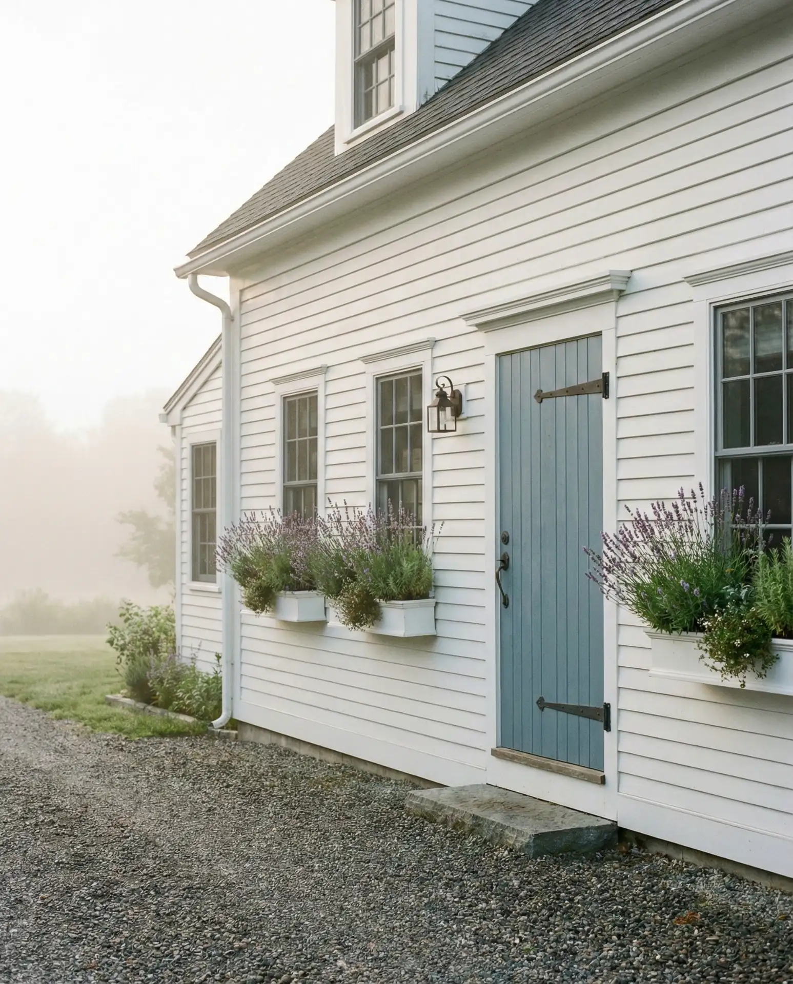
This shade costs roughly the same as bolder blues but requires more careful selection to avoid appearing washed out. Test samples on your actual door throughout the day, as dusty blue can shift dramatically from morning to evening light. The color works best when you commit to the softness rather than trying to deepen it, which often results in an awkward in-between tone.
15. Olive Green for Organic Appeal
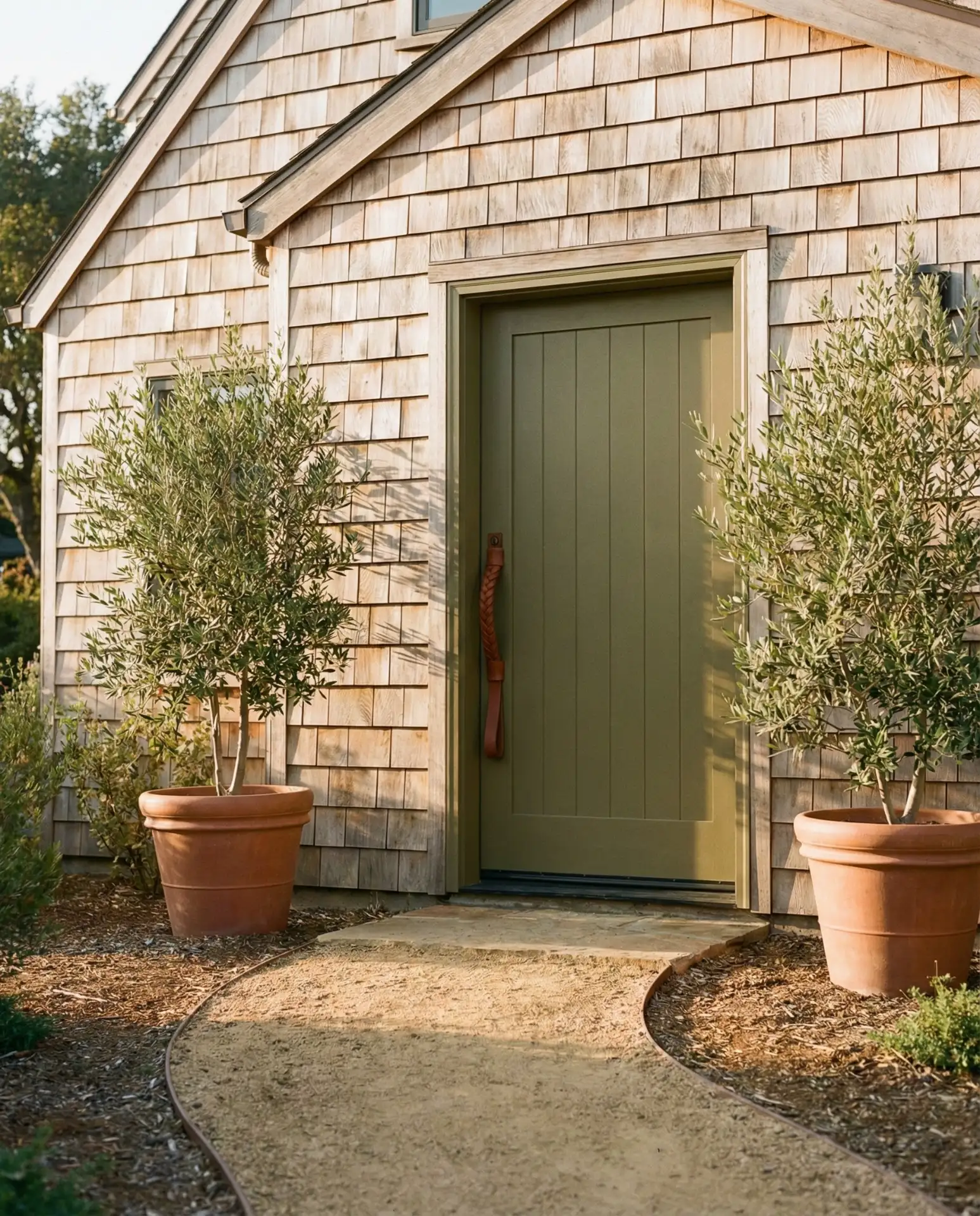
Olive green brings organic, earthy appeal to homes seeking connection with natural surroundings. This muted tone works exceptionally well on homes with wood siding, stone foundations, or neutral and earthy exterior palettes. Olive feels less formal than forest green while maintaining sophistication, making it ideal for casual contemporary homes and updated ranches. The color harmonizes beautifully with drought-tolerant landscaping and native plantings gaining popularity across the West. 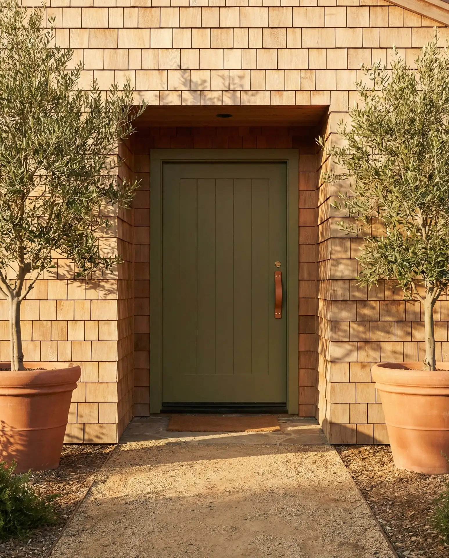
Many homeowners overlook olive in favor of brighter greens, but this subtle shade offers staying power. It doesn’t tire the eye or feel too statement-making, which appeals to those seeking long-term satisfaction. Olive pairs beautifully with terracotta accents, natural fiber rugs, and warm wood tones in the entryway interior.
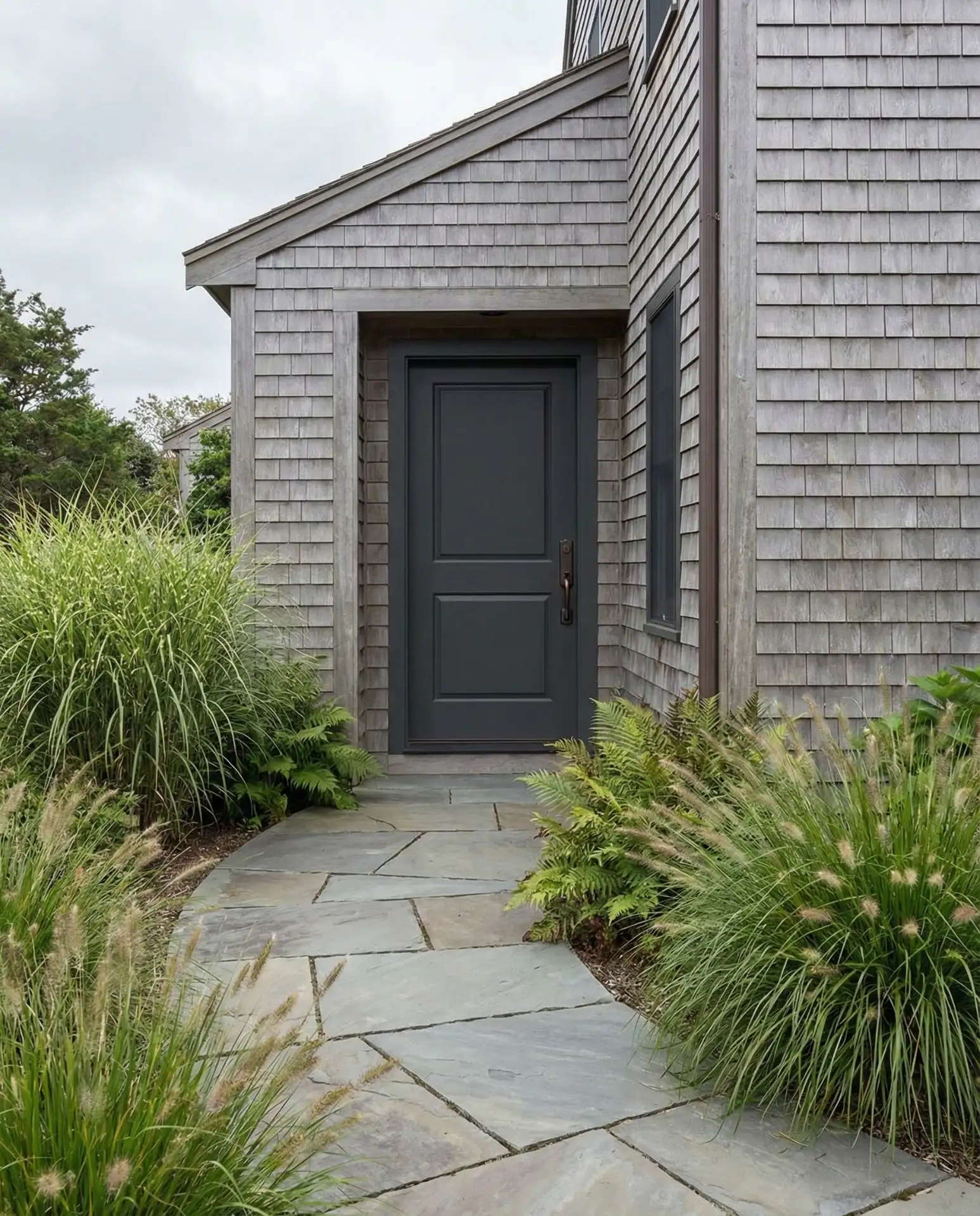
16. Charcoal with Matte Finish for Contemporary Homes
Matte charcoal front doors have emerged as a favorite for dark gray house exteriors seeking monochromatic sophistication. The flat finish creates a modern, industrial aesthetic that contrasts beautifully with natural materials like wood and stone. This approach works particularly well on minimalist architecture where glossy finishes would feel too traditional. Matte charcoal requires less maintenance than gloss, as it hides fingerprints and shows less weathering. 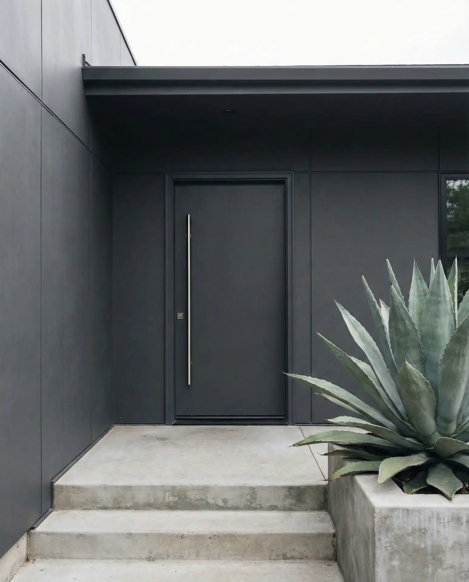
Design experts note that matte finishes work best in covered entryways where direct rain and sun exposure are limited. Full-exposure locations may require more frequent touch-ups, as matte paint weathers differently than gloss. The aesthetic payoff makes it worthwhile for homeowners committed to contemporary design principles.
17. Aubergine for Rich Drama
Deep aubergine brings sophisticated drama to homes seeking something beyond standard bold colors. This rich purple-brown hybrid works beautifully on cream, gray, and white exteriors, offering depth without harshness. The color shifts between purple and brown depending on light conditions, providing visual interest that flat colors cannot match. Aubergine feels particularly appropriate on historic homes and cottages where character matters more than perfect symmetry. 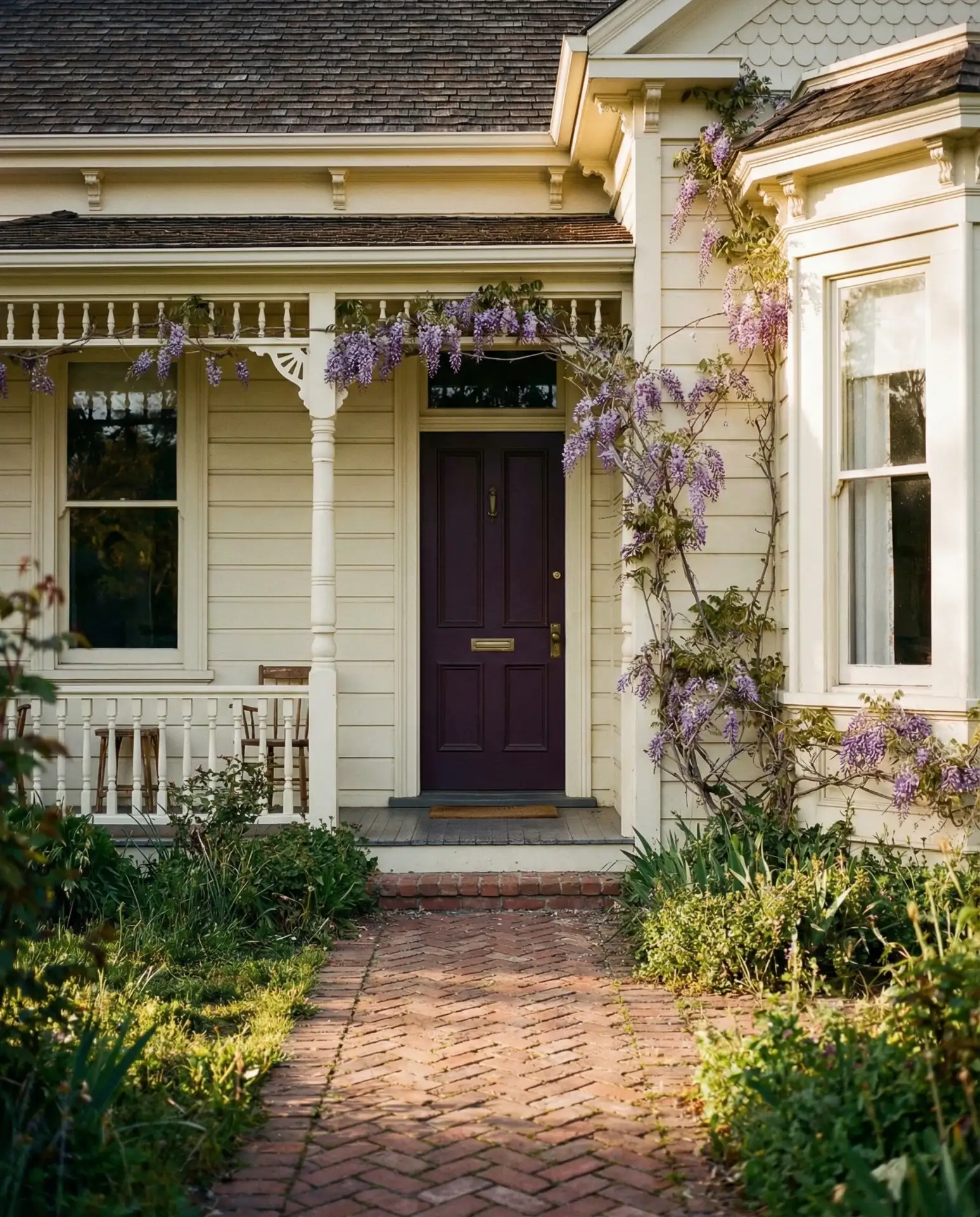
One homeowner in Savannah reported that her aubergine door became a neighborhood landmark, with visitors using it as a meeting point. The color provides unmistakable personality while maintaining elegance. Pair it with warm-toned metals and avoid cool chrome or silver, which clash with the warm purple undertones.
18. Soft Mint for Retro Charm
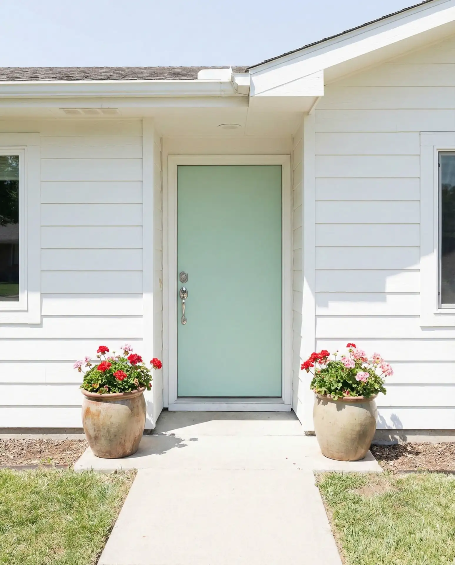
Pale mint green brings vintage charm to mid-century ranches and cottage-style homes seeking playful sophistication. This shade works beautifully on white or cream exteriors, evoking 1950s Americana with a fresh twist. Mint feels particularly fitting in neighborhoods with period architecture where authentic color choices enhance historical character. The color pairs naturally with black or dark green accents and complements established gardens with roses and perennials. 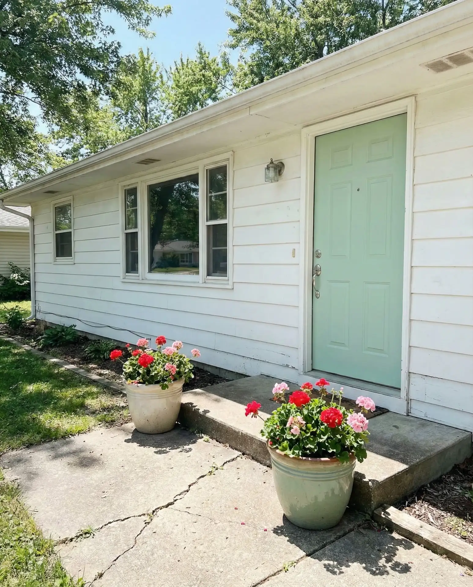
Where it works best: neighborhoods with 1950s and 1960s architecture where the color reinforces period authenticity. Mint can feel out of place on traditional colonials or modern builds, so consider your home’s original era before committing. The shade requires regular cleaning, as it shows dirt more readily than darker alternatives.
19. Burnt Orange for Southwest Style
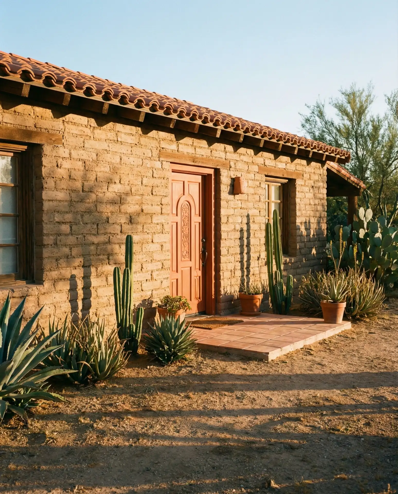
Burnt orange front doors capture Southwest character on adobe, stucco, and tan exteriors throughout desert regions. This warm, spicy hue complements the natural landscape while adding vibrant personality to neutral homes. The color works particularly well with rustic wood elements, wrought iron details, and desert-adapted landscaping featuring cacti and agave. Burnt orange feels authentic rather than trendy in regions where this palette dominates vernacular architecture. 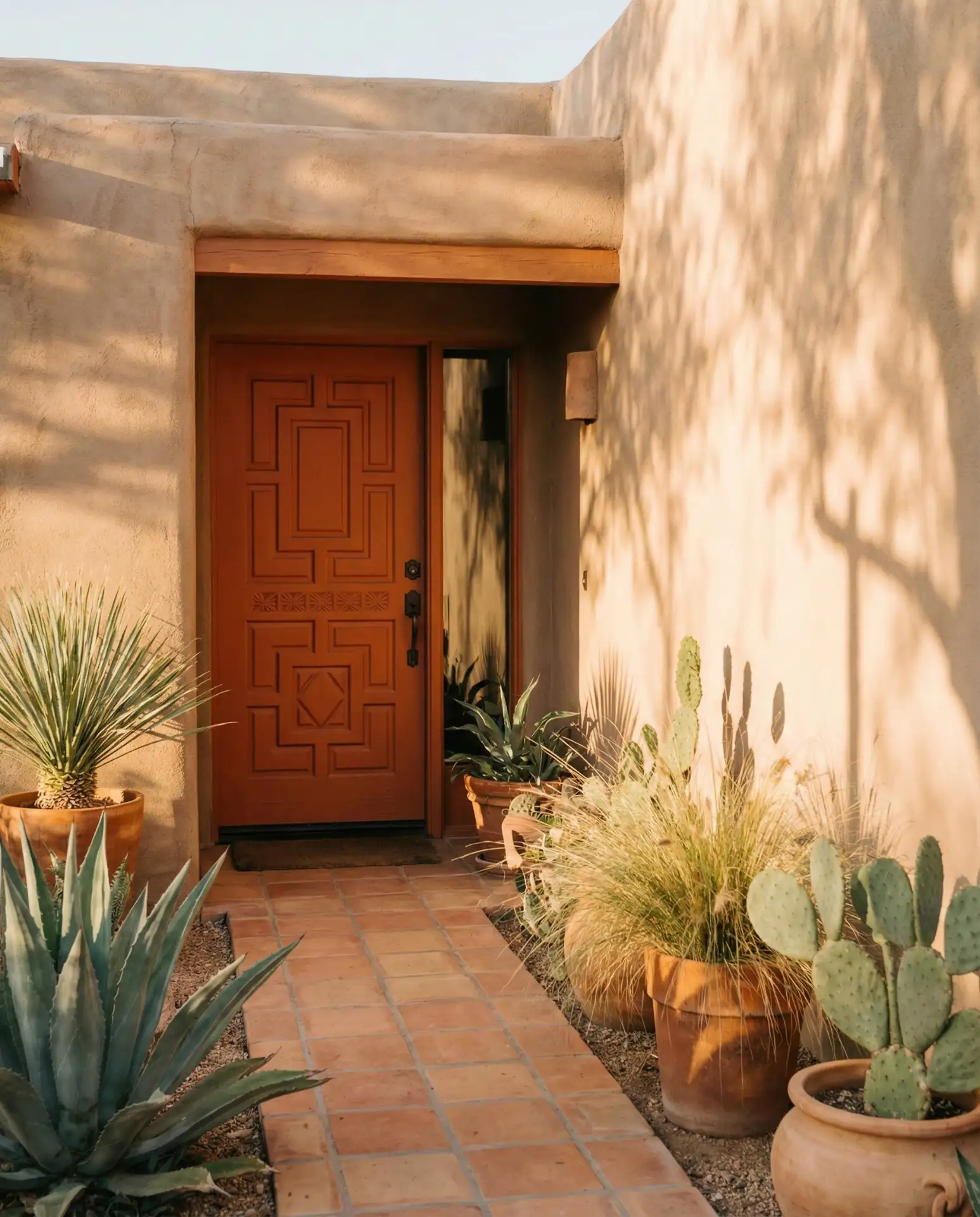
A common mistake is using burnt orange outside its natural habitat, where it can feel forced or thematic. The color belongs in regions with similar natural tones and warm, dry climates. In wetter, cooler regions, consider more regionally appropriate alternatives that work with local architecture and landscape.
20. Graphite with Bronze Hardware
Deep graphite paired with oil-rubbed bronze hardware creates sophisticated contrast on contemporary and transitional homes. This combination offers warmth that black with chrome cannot match, appealing to homeowners seeking modern elegance with organic undertones. Graphite works on virtually any exterior color, from white to gray to natural wood. The slightly warmer tone prevents the starkness of pure black while maintaining similar visual weight. 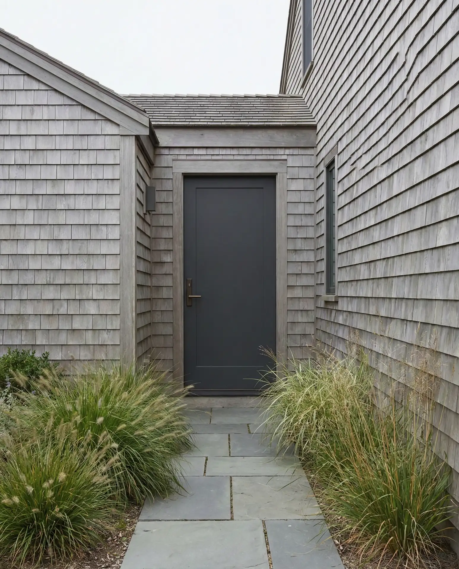
Quality bronze hardware typically costs $80–$200 depending on the piece, but the investment pays off in longevity and aesthetic impact. The warm metal tones prevent the cold, institutional feeling that chrome can create with dark doors. Expect to refinish or replace bronze hardware every seven to ten years as the finish wears.
21. Pale Gray-Blue for Scandinavian Simplicity
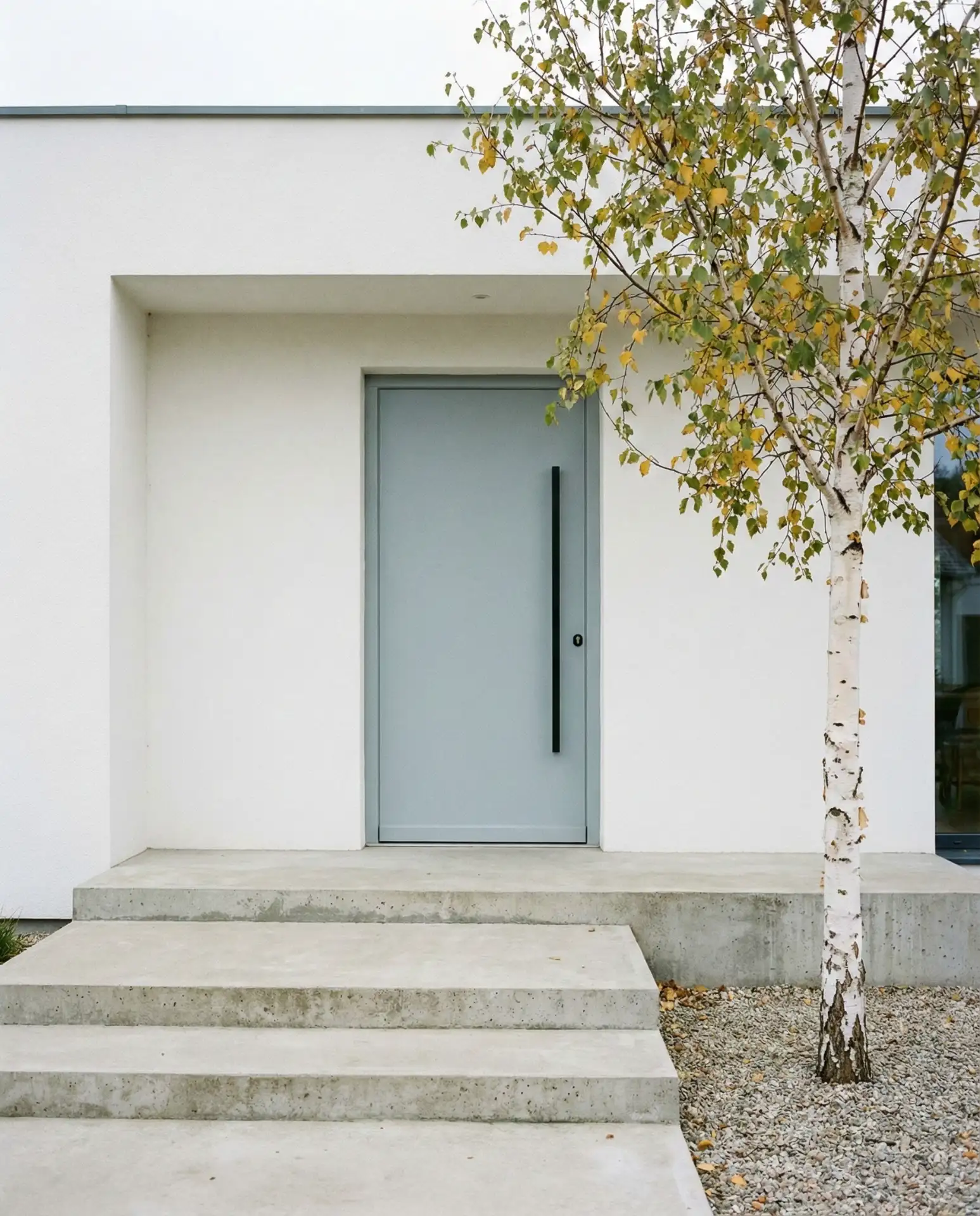
Soft gray-blue tones bring Scandinavian-inspired calm to contemporary homes seeking understated elegance. This barely-there color works on white, gray, or natural wood exteriors, creating subtle definition without bold contrast. The shade pairs beautifully with matte black hardware and minimalist landscaping featuring grasses and evergreens. Gray-blue feels particularly appropriate in Pacific Northwest and New England settings, where misty, overcast days dominate. 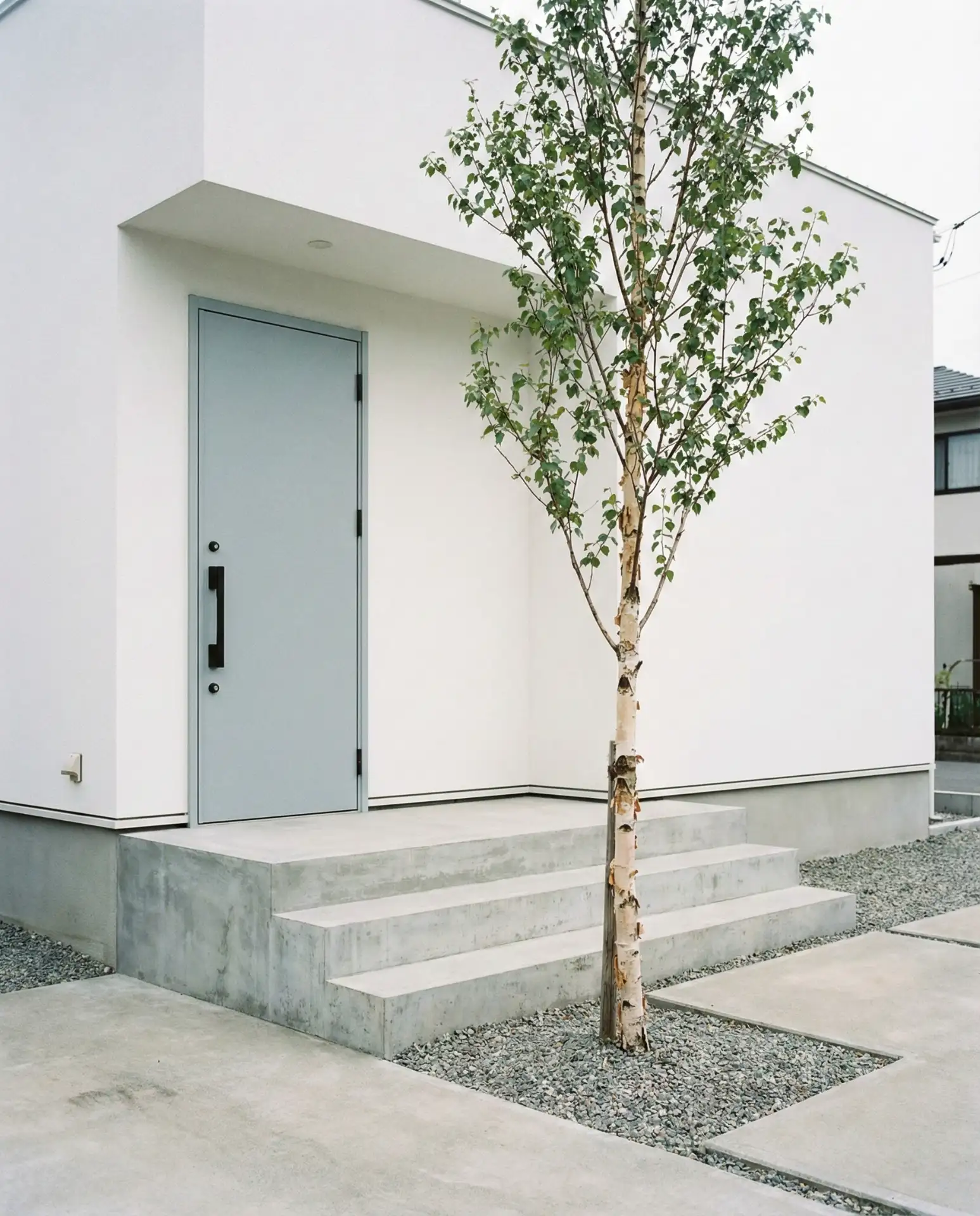
This subtle shade requires careful selection, as samples that look perfect indoors can disappear against certain exteriors outdoors. Test in actual placement and view from the street to ensure adequate definition. The color rewards homeowners who appreciate nuance over bold statements, creating quiet sophistication rather than immediate impact.
22. Crimson Red for Feng Shui Energy
Deep crimson honors feng shui principles while creating stunning curb appeal on traditional and contemporary homes alike. This shade represents prosperity and protection in feng shui practice, attracting homeowners interested in intentional design. Crimson works beautifully against white, gray, or natural stone exteriors, providing warmth and vitality to the entry. The color feels both traditional and current depending on the surrounding architectural context. 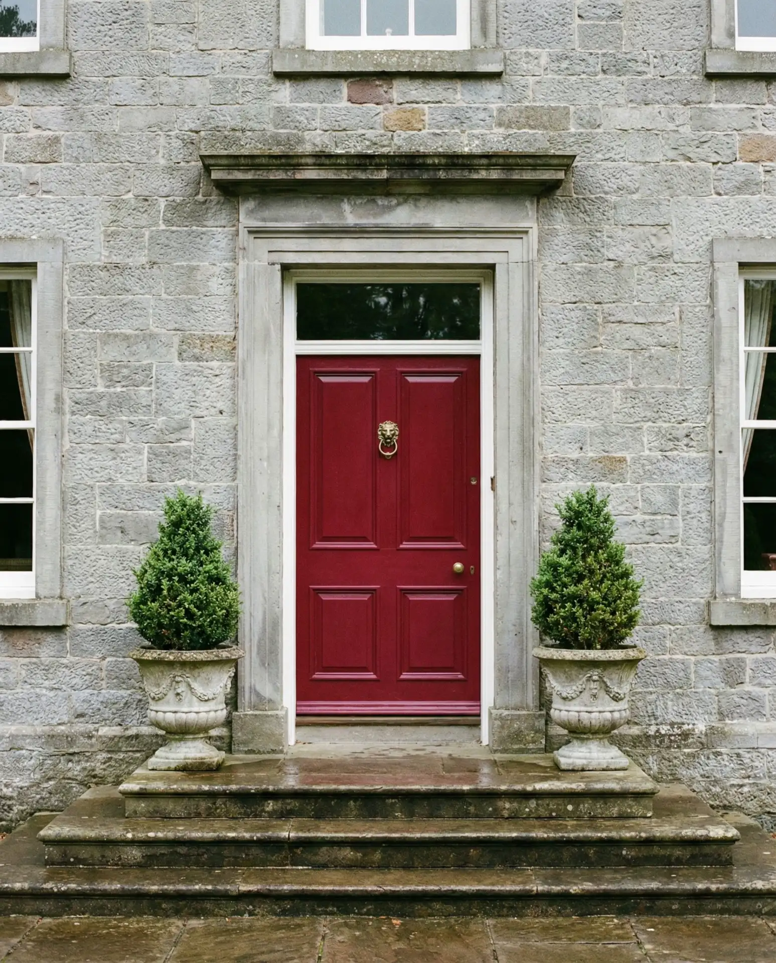
Interior designers note that crimson red doors often inspire clients to be more intentional with their entire exterior palette. The bold choice encourages thoughtful hardware selection, landscape design, and lighting decisions. Budget around the same as other reds, but expect the deeper pigmentation to provide better UV resistance and color retention.
23. Warm Taupe for Versatile Neutrality
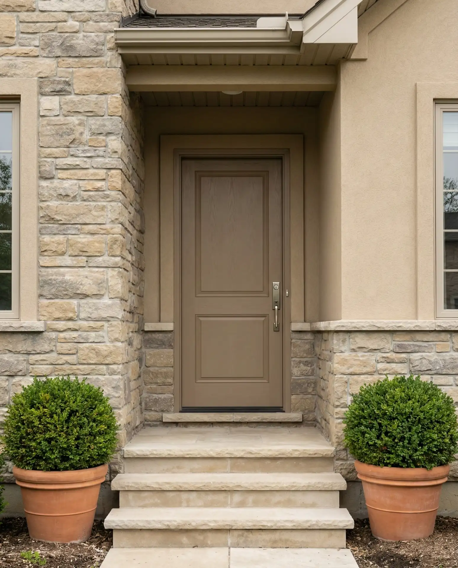
Warm taupe delivers sophisticated neutral and earthy appeal for homeowners seeking understated elegance over bold statements. This versatile shade works across virtually all exterior colors and architectural styles, from modern to traditional. Taupe provides definition without high contrast, creating a seamless, curated appearance. The color pairs beautifully with natural materials like stone, wood, and terracotta while complementing both warm- and cool-toned exteriors. 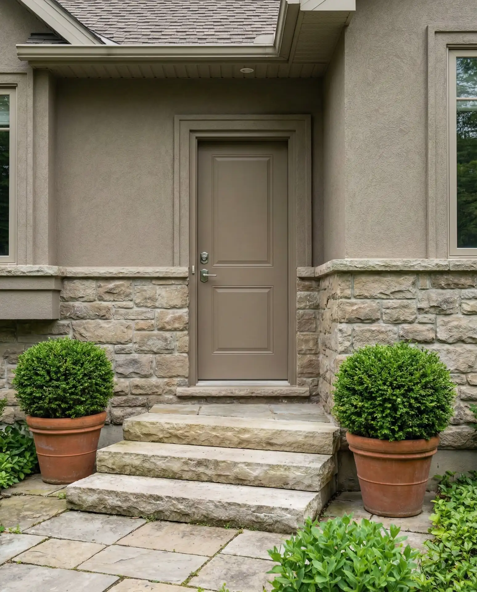
Taupe works best for homeowners who want the door to integrate seamlessly rather than stand out dramatically. It’s an excellent choice for those planning to sell within a few years, as it appeals to broad tastes without alienating potential buyers. The color hides minor wear and requires touch-ups less frequently than lighter neutrals while avoiding the maintenance demands of pure black.
Conclusion
Your front door color sets the tone for your entire home, influencing both curb appeal and daily mood. Whether you’re drawn to bold teals, sophisticated navies, or warm terracotta tones, the right choice reflects your personal style while enhancing architectural character. We’d love to hear which color resonates with you—share your favorites in the comments below and let us know what you’re planning for your 2026 refresh.