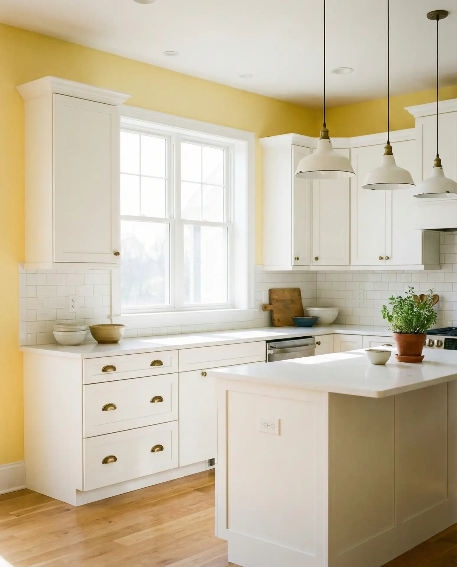
Kitchen color choices in 2026 are all about balance—warm neutrals meet bold accents, while trending palettes embrace everything from moody drama to sun-soaked brightness. Whether you’re planning a full remodel or simply refreshing painted cabinets, the right color scheme can transform your space into something that feels both current and timeless. Americans are turning to Pinterest in droves for inspiration, searching for combinations that work with their existing oak cabinets, white cabinets, or black countertops. This guide walks you through thoughtfully curated kitchen color ideas that reflect the year’s biggest trends, from cozy cottage vibes to sleek modern statements. You’ll find practical palettes, real-world advice, and fresh approaches to walls, cabinetry, and accents that actually work in everyday homes.
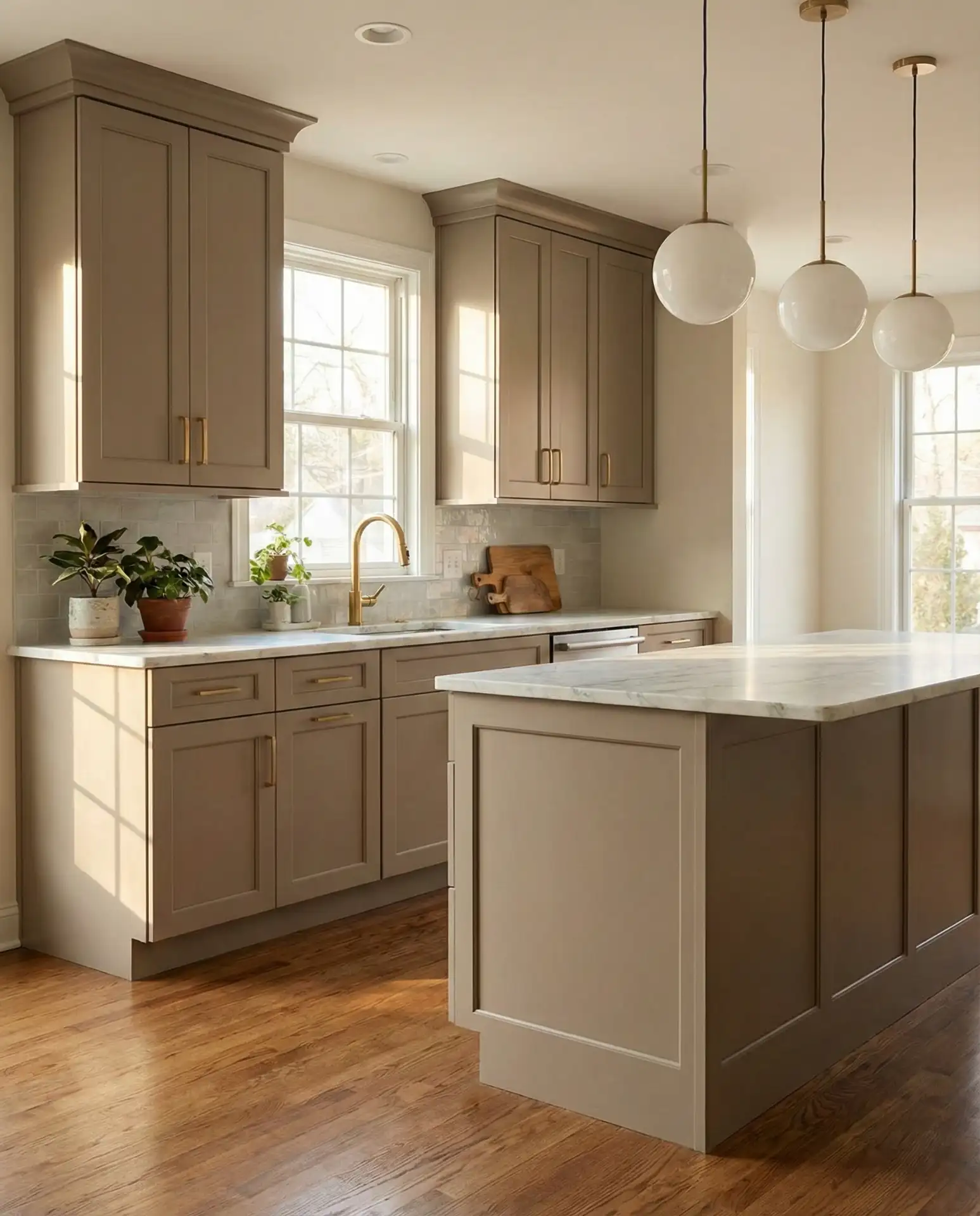
1. Warm Greige with Brass Accents
This neutral palette combines the softness of gray and beige into a single harmonious base that flatters nearly every kitchen layout. Warm greige walls or cabinets create a backdrop that feels inviting without overwhelming the senses, making it one of the best choices for open-concept homes where the kitchen flows into living areas. Pair this foundation with brass hardware, faucets, and light fixtures to introduce subtle warmth and a touch of sophistication. The result is a scheme that feels both modern and timeless, adaptable to farmhouse, transitional, or contemporary styles.
Greige works especially well in suburban and urban homes where natural light varies throughout the day—it stays warm in morning sun and never feels cold in the evening. Homeowners in the Pacific Northwest and Midwest have embraced this palette because it complements the gray skies and wooded landscapes outside their windows. If you’re working with existing oak cabinets, greige walls can bridge the gap between honey-toned wood and more contemporary finishes. This combination is forgiving with fingerprints and smudges, making it practical for families who actually cook and gather in their kitchens daily.
2. Deep Forest Green Cabinets
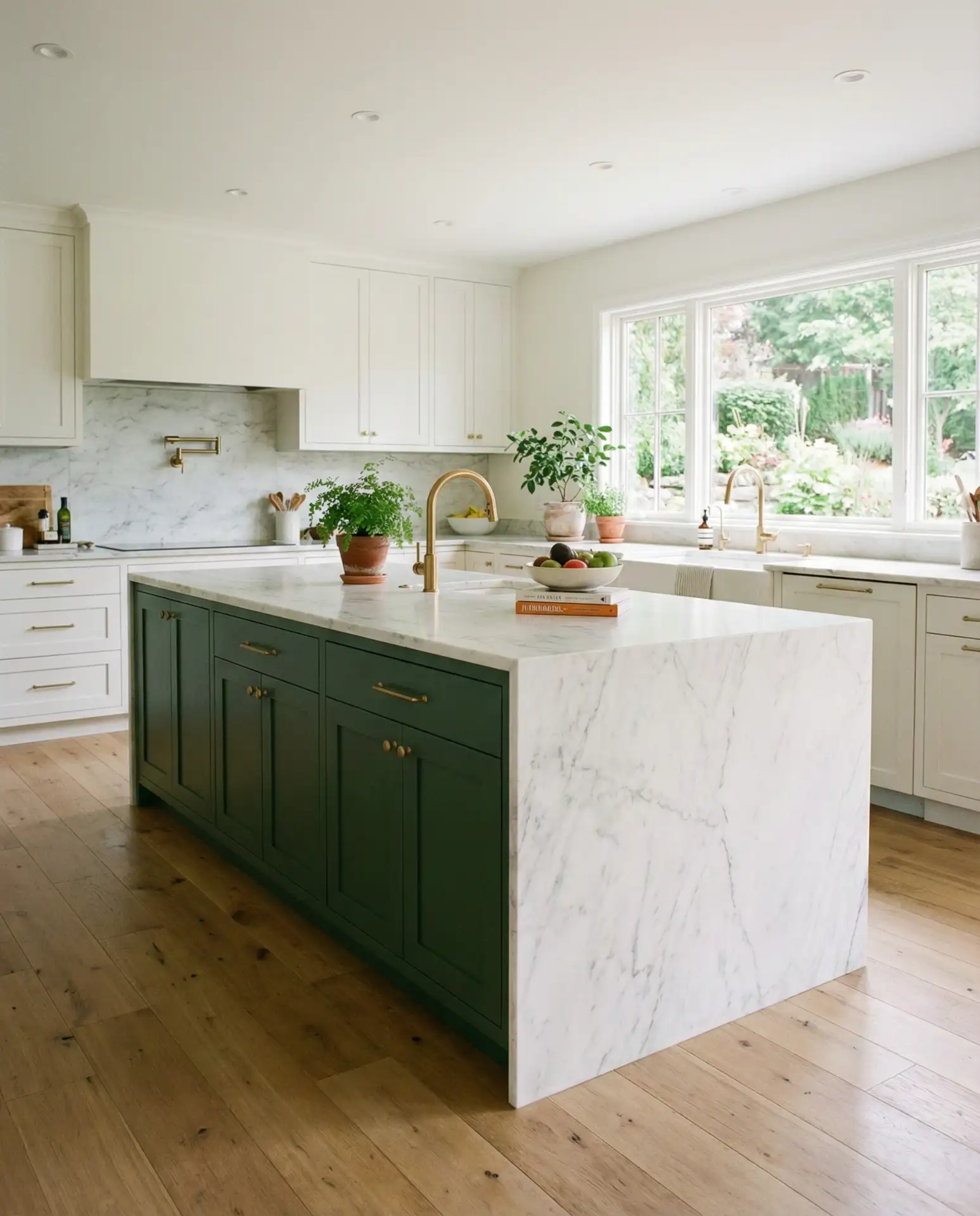
Forest green cabinetry has surged in popularity as homeowners seek bold alternatives to the all-white kitchen. This rich, saturated hue brings a sense of nature indoors while maintaining a grounded, sophisticated presence that doesn’t feel overly trendy. It’s a 2026 favorite because it pairs beautifully with natural materials like wood, stone, and brass, creating layered schemes that feel curated rather than formulaic. The color works in both traditional and modern contexts, offering flexibility for various home styles from colonial revivals to mid-century ranches.
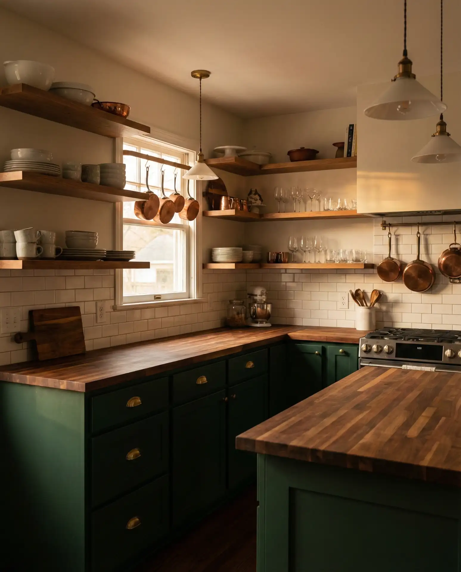
One practical insight: deep green hides wear better than lighter colors, meaning fewer touch-ups over the years. It’s particularly effective on lower cabinets where scuffs from shoes and pet activity are most likely. Many homeowners balance the intensity by keeping upper cabinets or walls in a lighter neutral, which prevents the space from feeling cave-like. This approach also makes smaller kitchens feel more intentional rather than cramped, especially when combined with ample task lighting and reflective surfaces like glass or polished stone.
3. Soft Sage and Cream Duo
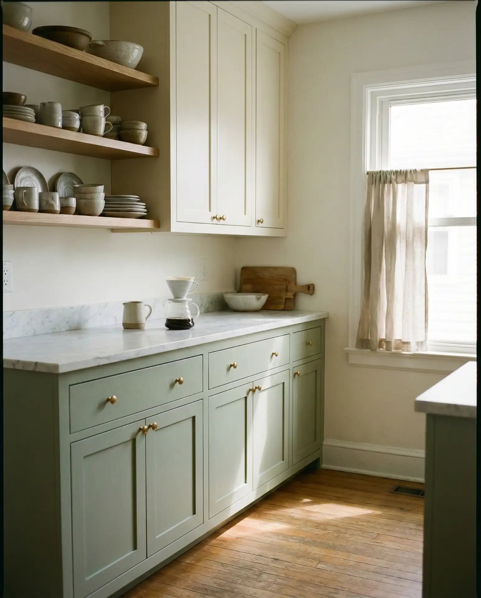
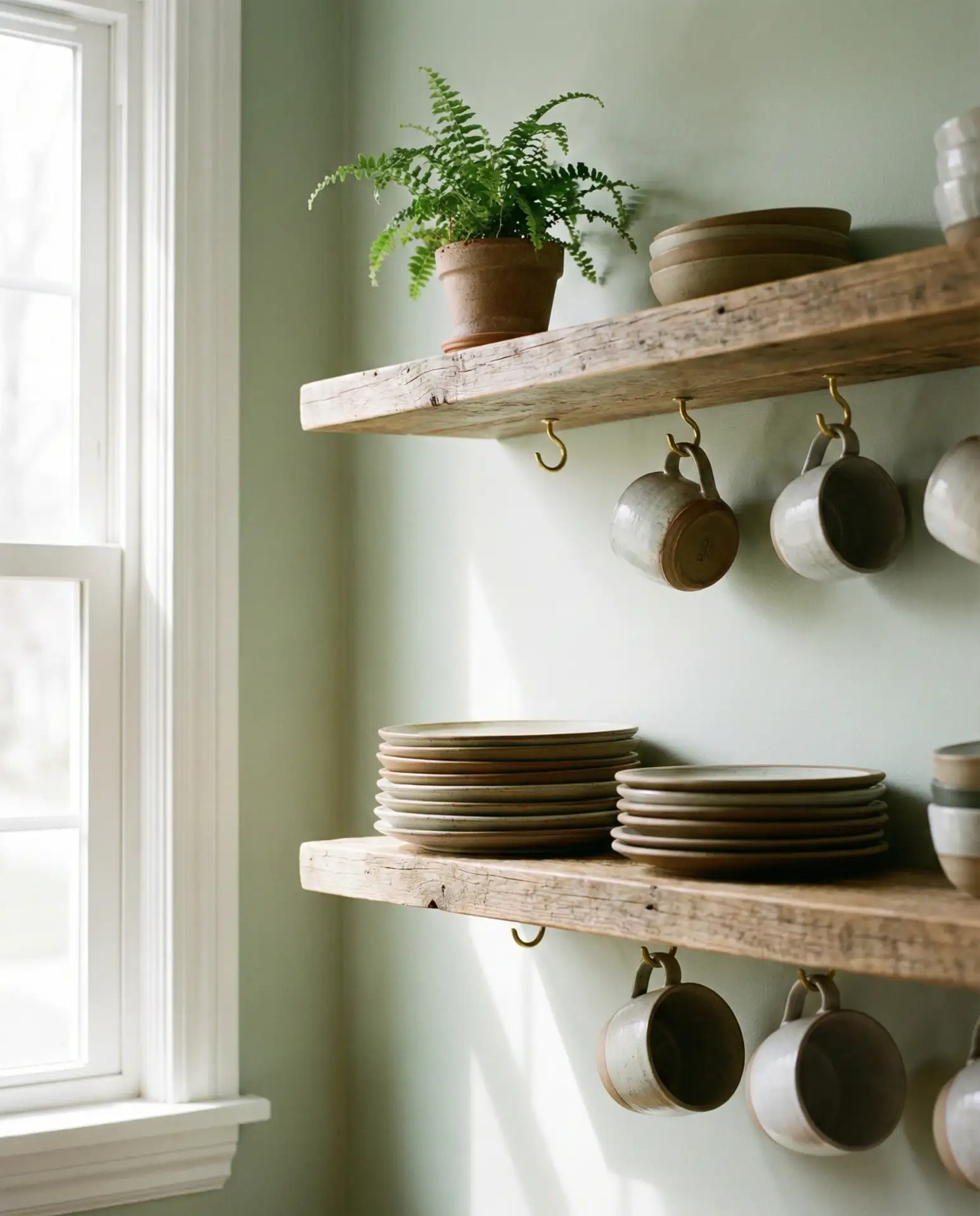
This gentle combination channels the quiet elegance of European country kitchens while feeling utterly at home in American spaces. Soft sage green—muted and slightly gray—serves as the primary cabinet color, while cream or off-white appears on walls, trim, and sometimes on upper cabinets for contrast. The palette evokes a sense of calm and simplicity, making it ideal for breakfast nooks, open shelving displays, and spaces where you want to encourage lingering over coffee. It’s one of the most requested schemes for homeowners renovating older homes with charm they want to preserve.
This palette works best in homes with good natural light, particularly those with east- or south-facing windows where morning and midday sun can bring out the green’s warmth. In the South and along the Eastern Seaboard, this combination complements traditional architecture without feeling dated. A common mistake is choosing a shade that’s too yellow or too blue; test samples in your actual lighting before committing. The cream should be warm enough to harmonize with the green but not so yellow that it looks dingy against white appliances or fixtures.
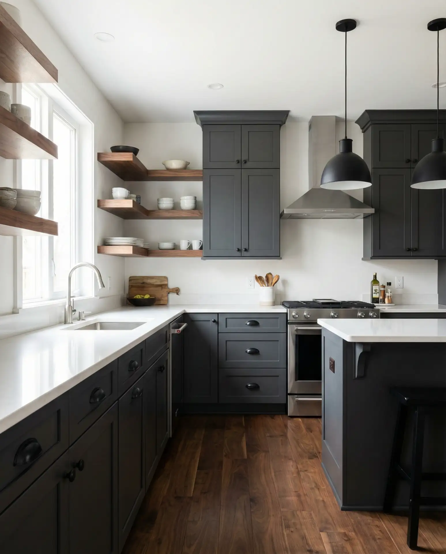
4. Charcoal Gray and White Contrast
Charcoal gray paired with crisp white delivers a high-contrast scheme that feels contemporary and urban. This combination works particularly well with white cabinets on the perimeter and a charcoal island, or vice versa, creating visual interest and defining zones within an open kitchen. The gray grounds the space and adds depth without the heaviness of black, while the white keeps everything feeling airy and expansive. It’s a trendy choice that still has staying power because the proportions can be adjusted to suit personal taste and the room’s natural light levels.
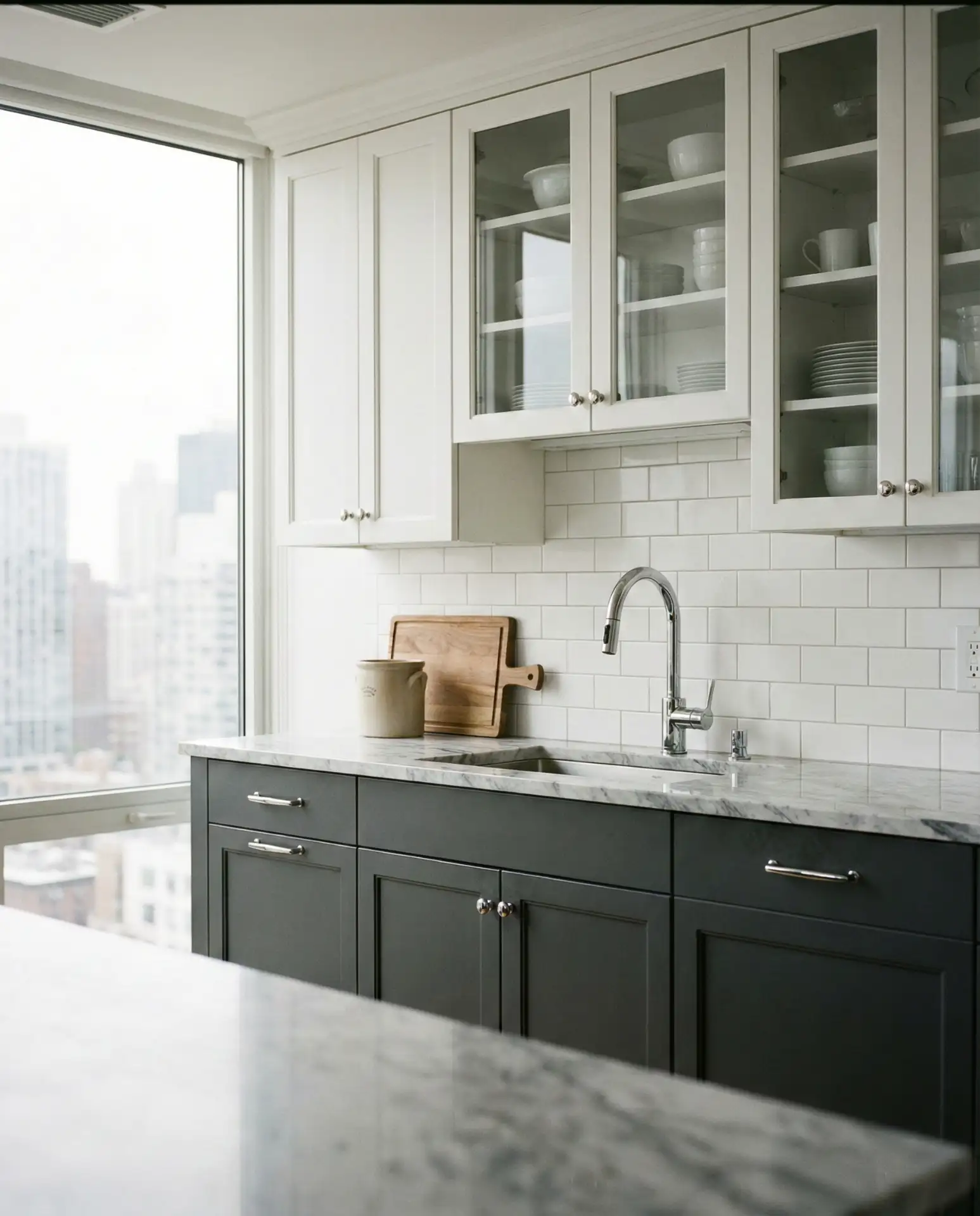
Loft apartments and renovated brownstones in cities like Chicago, Brooklyn, and San Francisco have made this palette a signature look. The contrast helps define the kitchen as its own zone in open layouts, which is especially useful in studio or one-bedroom spaces where boundaries are helpful. If you’re working with a black countertop, charcoal cabinets create a cohesive dark base that doesn’t compete, while white uppers prevent the space from feeling too enclosed. This scheme also photographs beautifully, which matters if you ever plan to list your home.
5. Terracotta and Ivory Warmth
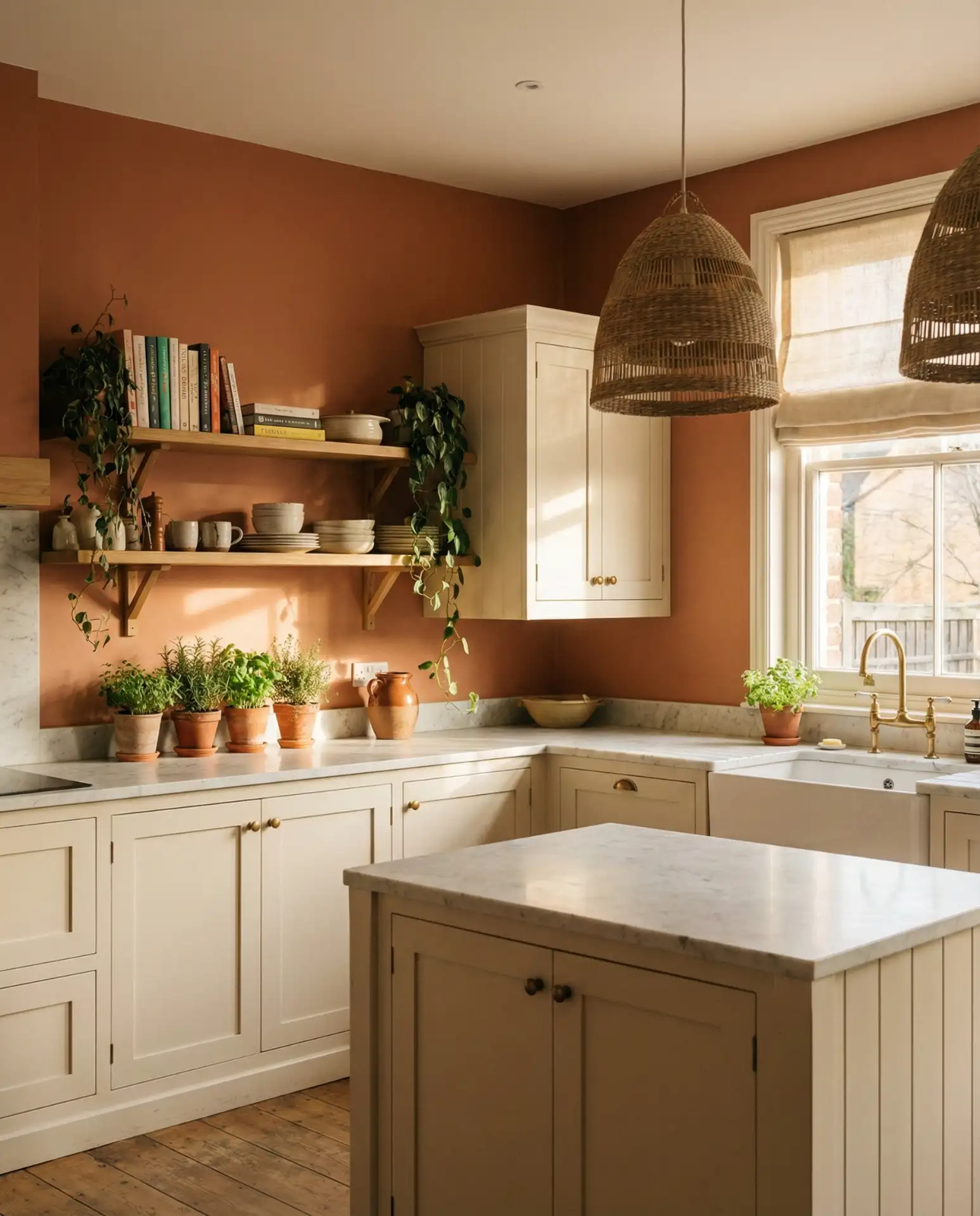
Terracotta has re-emerged as a kitchen accent color, particularly for walls and backsplashes, where it injects warmth without overwhelming the space. Pairing it with ivory or soft cream cabinets creates a cozy Mediterranean-inspired atmosphere that feels relaxed and lived-in. This palette draws from the earth and evokes sun-baked clay tiles, making it a natural fit for homes in the Southwest, California, and Florida, where indoor-outdoor living is a priority. The combination feels collected and layered rather than matchy-matchy, which aligns with current design sensibilities favoring character over perfection.
A designer I spoke with in Santa Fe noted that terracotta works best when applied selectively—one accent wall or a tiled backsplash—rather than covering every surface. Too much can feel heavy, but the right dose creates warmth that’s hard to achieve with neutrals alone. This palette also complements natural materials like rattan, linen, and unfinished wood, which are having a moment in American kitchens. If your space lacks natural light, use terracotta sparingly and lean more heavily on the ivory to keep things from feeling dim.
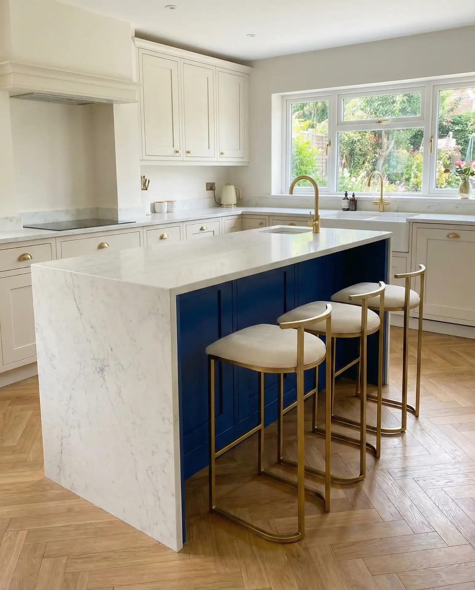
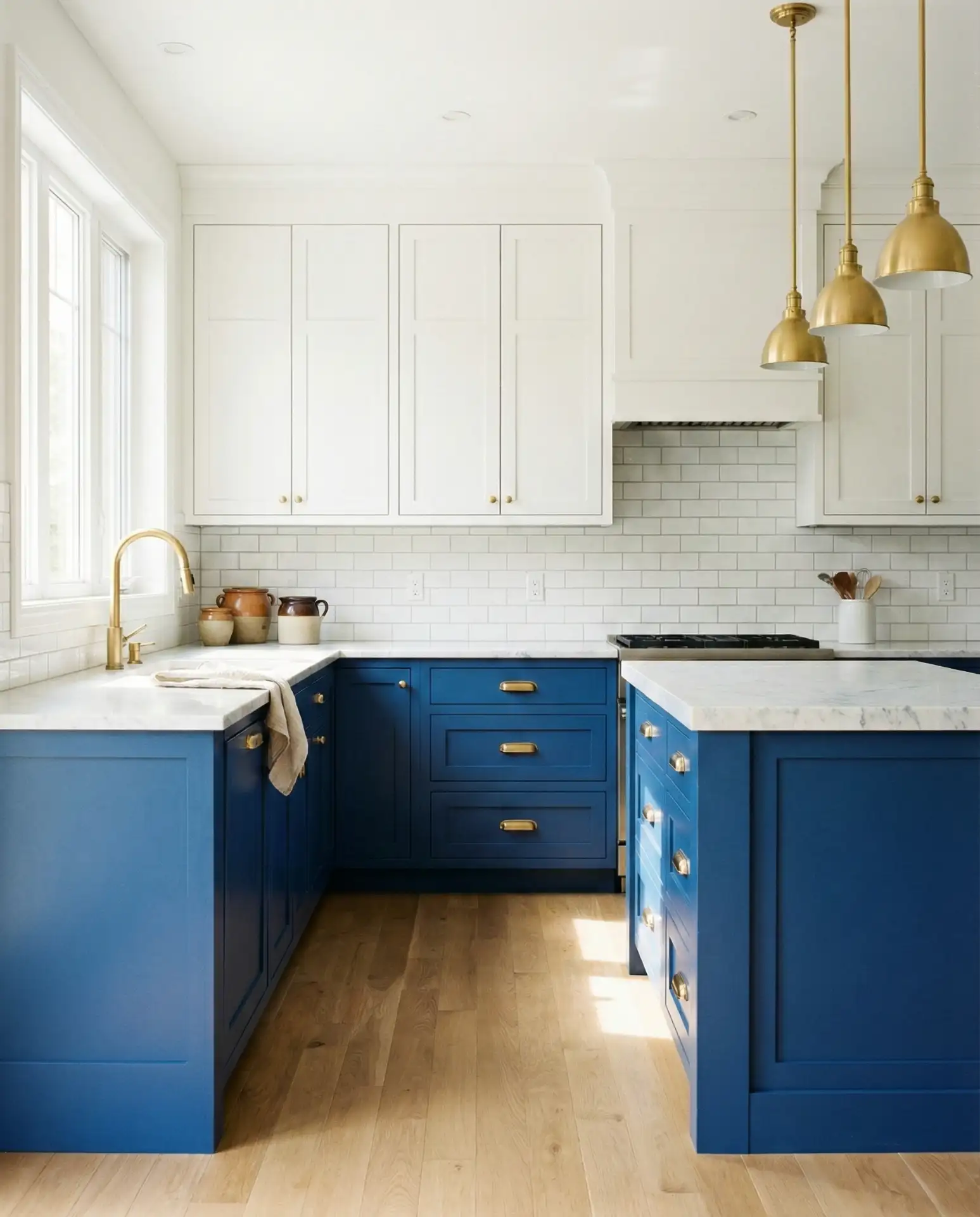
6. Navy Blue and Brass Elegance
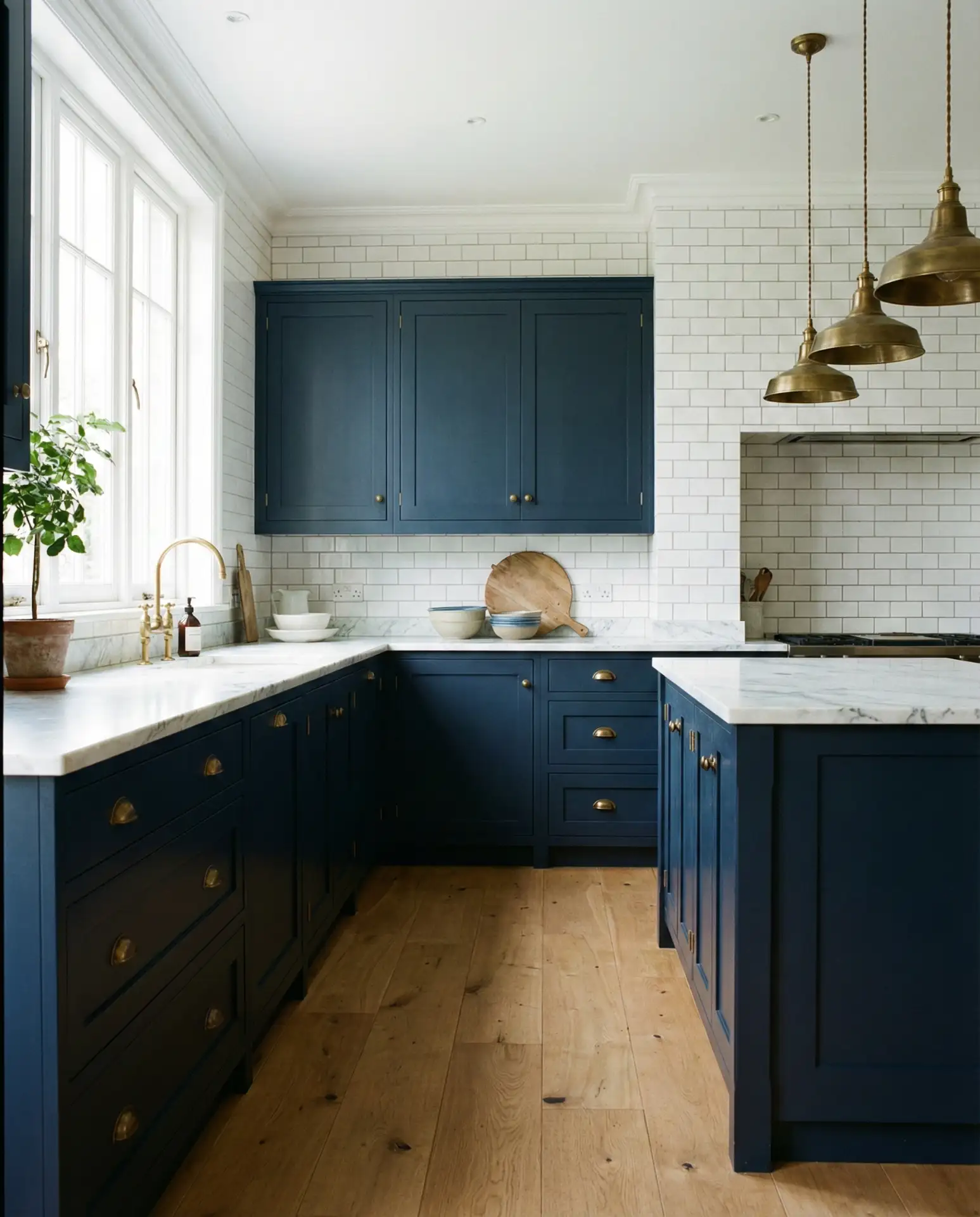
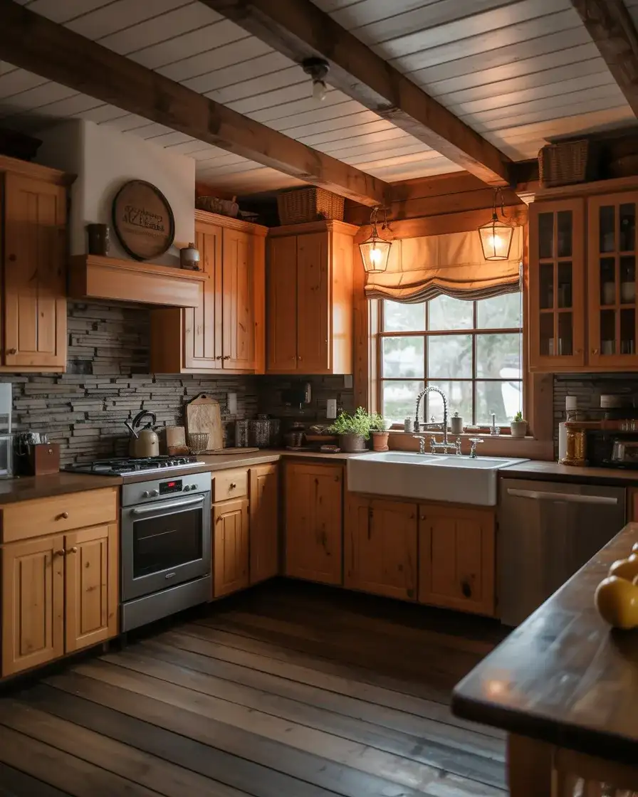
Navy blue remains a steadfast choice for those seeking a bold yet classic kitchen color. When combined with brass hardware and fixtures, it delivers a tailored, almost nautical sophistication that works in both coastal and landlocked homes. This scheme feels particularly at home in New England, the Mid-Atlantic, and lakeside properties where traditional architecture meets modern sensibilities. Navy serves as a grounding element that can handle busy patterns in rugs or backsplashes, making it a versatile anchor in schemes with oak cabinets or lighter wood tones that need a confident counterpoint.
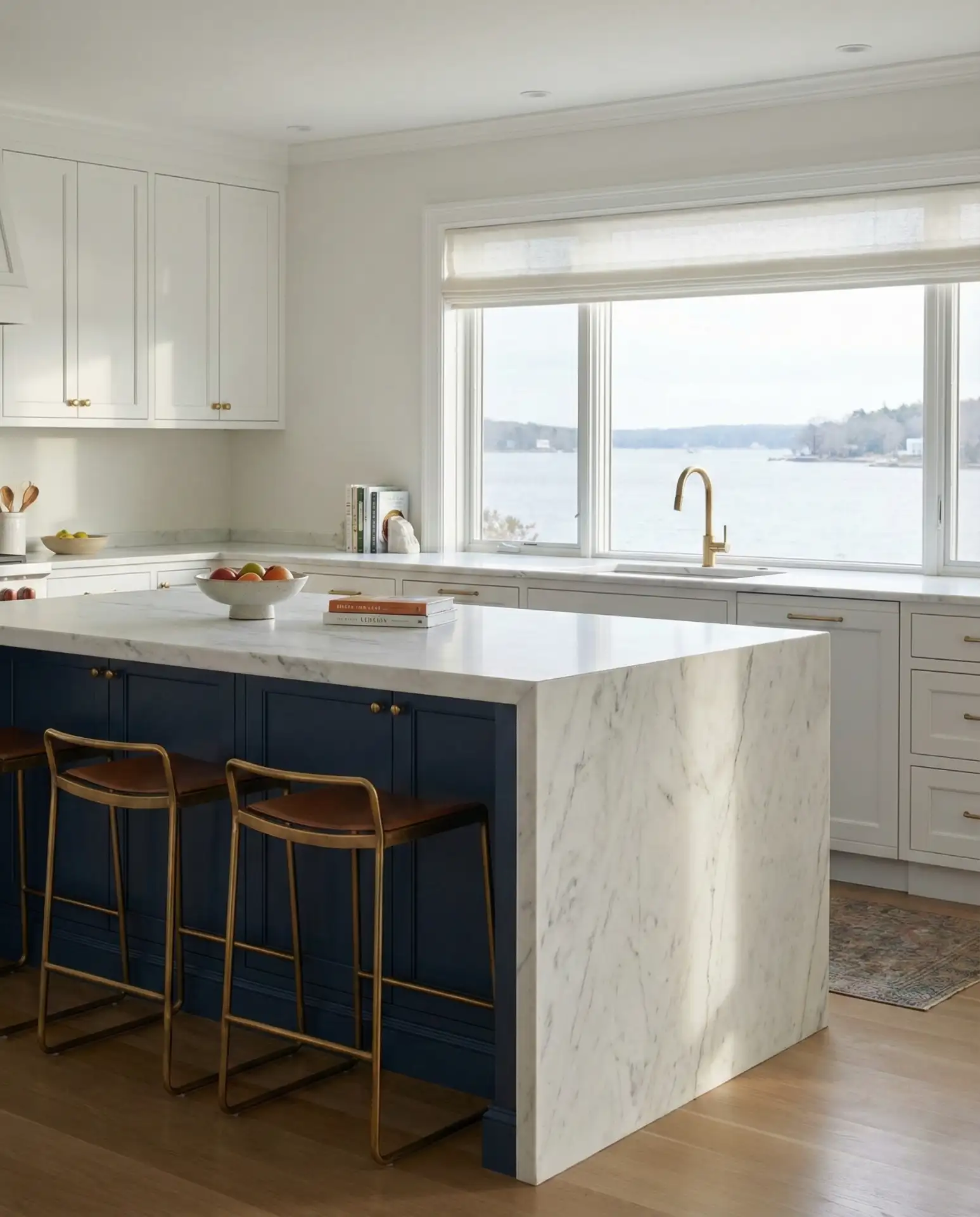
Budget-conscious renovators appreciate that navy paint is relatively affordable compared to custom stains, and it can completely transform builder-grade cabinets. The brass accents elevate the look without requiring a full hardware overhaul—even swapping out a few key pieces makes a noticeable difference. Navy also hides imperfections better than lighter colors, which is helpful in older homes where cabinets may have dings or uneven surfaces. Just ensure your lighting is adequate; navy absorbs light, so layer in under-cabinet LEDs and consider a lighter ceiling color to keep the space from feeling closed in.
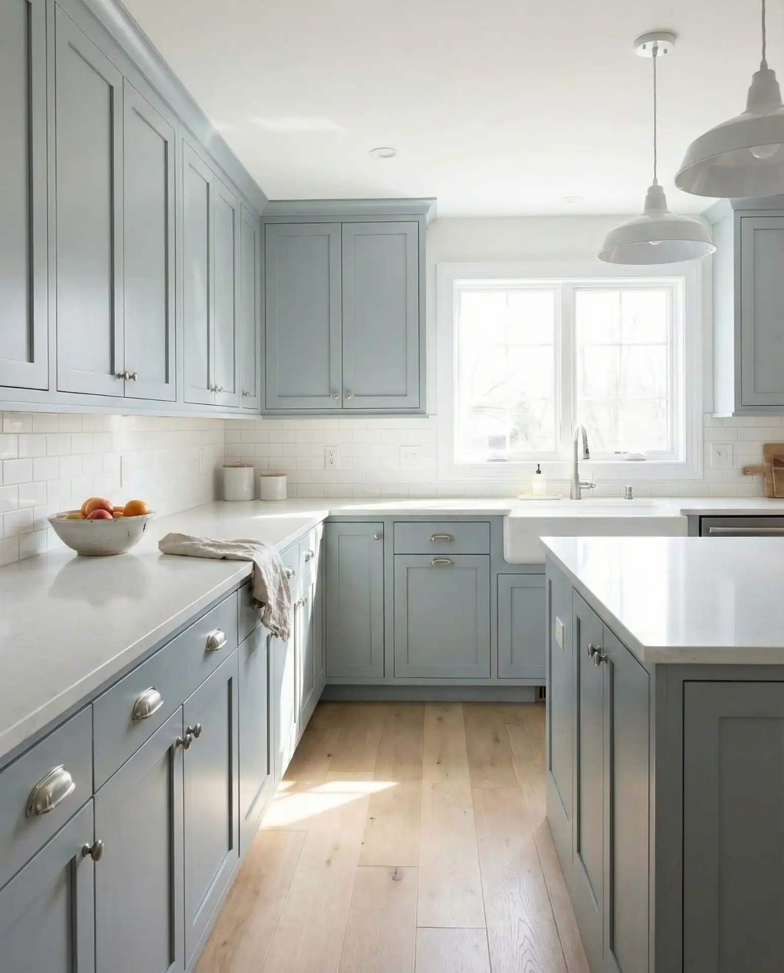
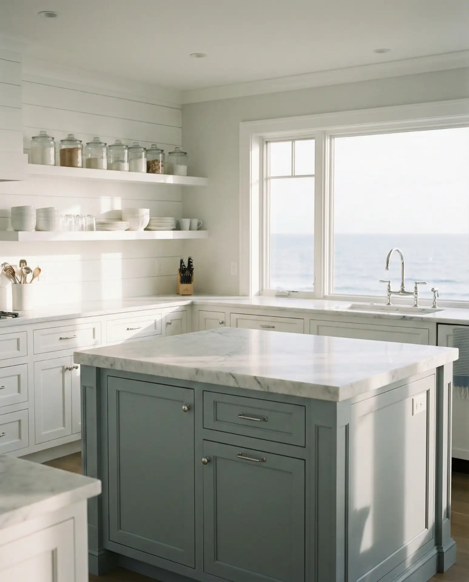
7. Pale Blue and Natural Wood
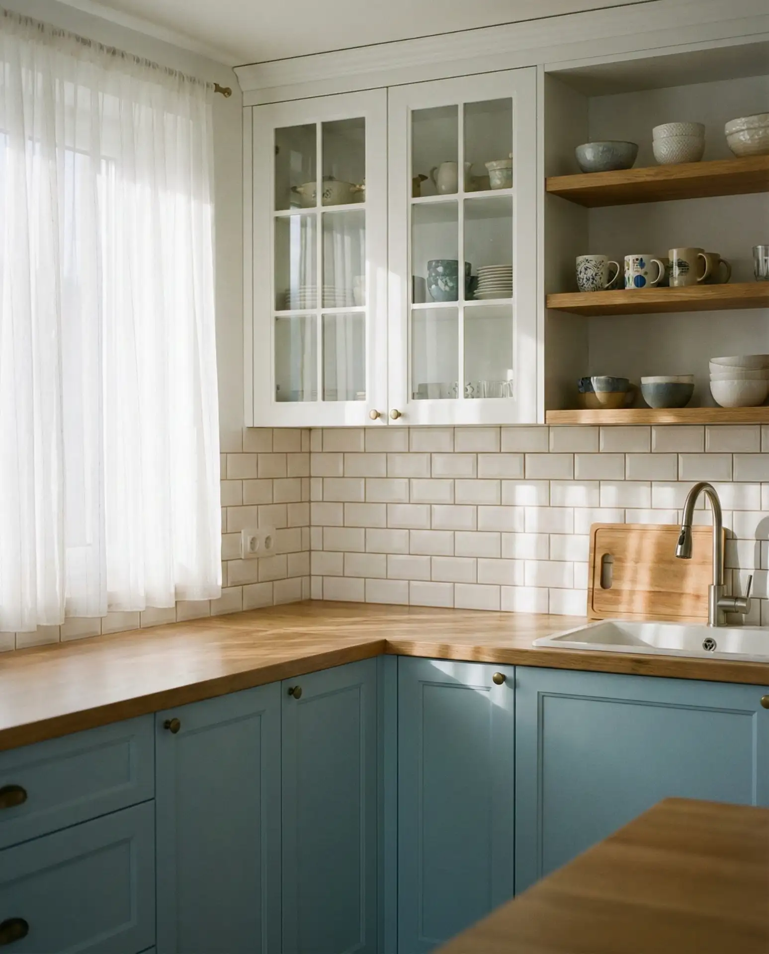
Pale blue cabinetry or walls bring a serene, almost Scandinavian quality to American kitchens, especially when paired with natural wood tones in flooring, countertops, or open shelving. This combination feels fresh and airy, making it one of the best choices for smaller kitchens or spaces with limited natural light. The blue reads as soft and approachable rather than cold, particularly when you choose a shade with gray or green undertones. It’s a palette that works beautifully in cottage settings, beach houses, and renovated bungalows where a light touch is more appropriate than dramatic contrast.
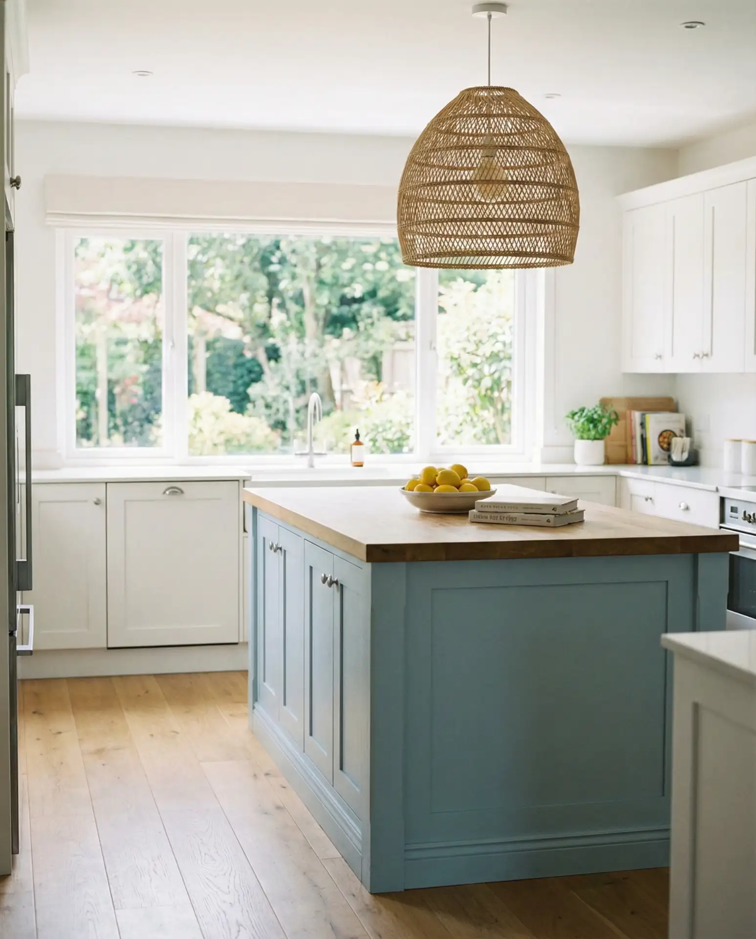
This palette is particularly popular in coastal towns from Maine to Southern California, where homeowners want a nod to the ocean without resorting to literal nautical themes. The natural wood keeps the blue grounded and prevents it from feeling too precious or formal. Real homeowner behavior shows that pale blue kitchens tend to stay cleaner-looking because smudges and fingerprints are less visible than on stark white. If you’re blending this scheme with existing oak cabinets, choose a blue with warm undertones to harmonize with the honey tones rather than clash.
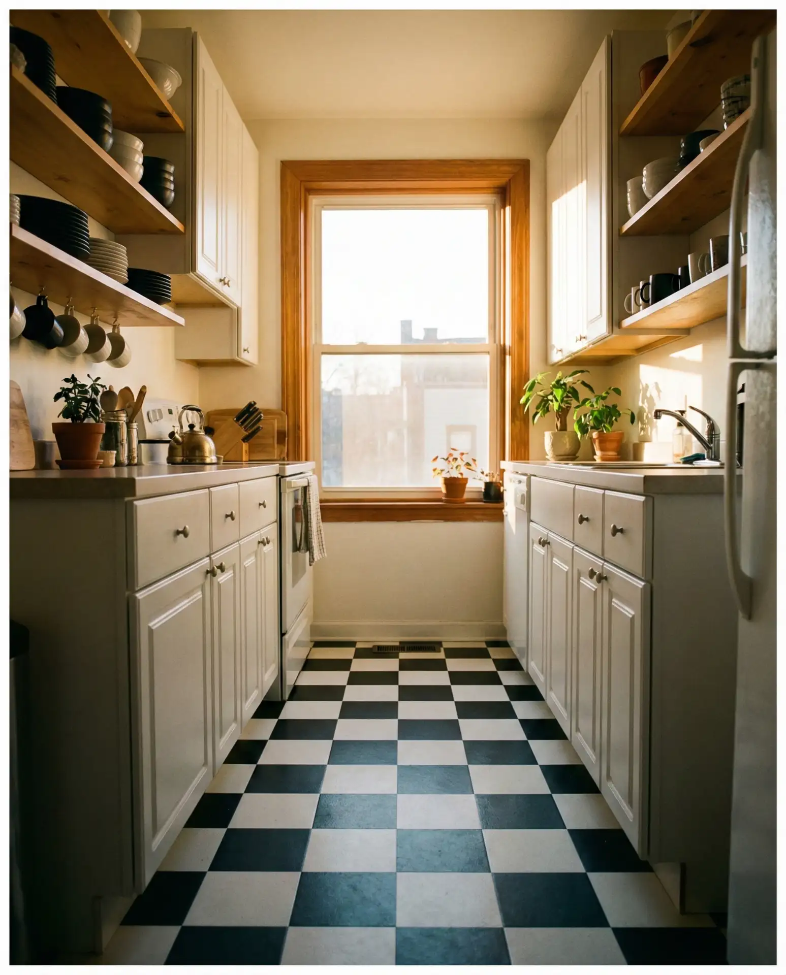
8. Black and White Checkerboard
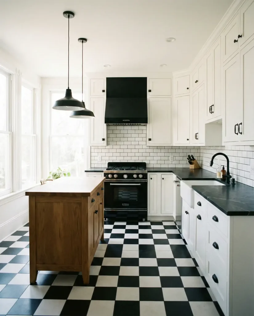
The classic black and white checkerboard floor has made a roaring comeback, often serving as the centerpiece of a bold kitchen design. When the floor carries this much pattern, the rest of the space typically stays simple—white cabinets, minimal hardware, and clean lines let the floor take center stage. This scheme feels retro and nostalgic, calling back to diners and mid-century homes, yet it reads as fresh when executed with modern proportions and materials. It’s particularly effective in galley kitchens or smaller spaces where the repeating pattern creates visual rhythm and makes the room feel larger.

Expert stylists recommend keeping the grout dark on checkerboard floors to minimize visible dirt and staining, especially in high-traffic households with kids and pets. The contrast is striking enough that light grout doesn’t add much visually but does add maintenance. This pattern works best in homes with vintage charm or those aiming for an eclectic, collected look. If your kitchen connects to other rooms, consider how the bold floor will transition—sometimes a subtle shift to solid tile or wood in adjacent spaces helps the checkerboard feel intentional rather than overwhelming.
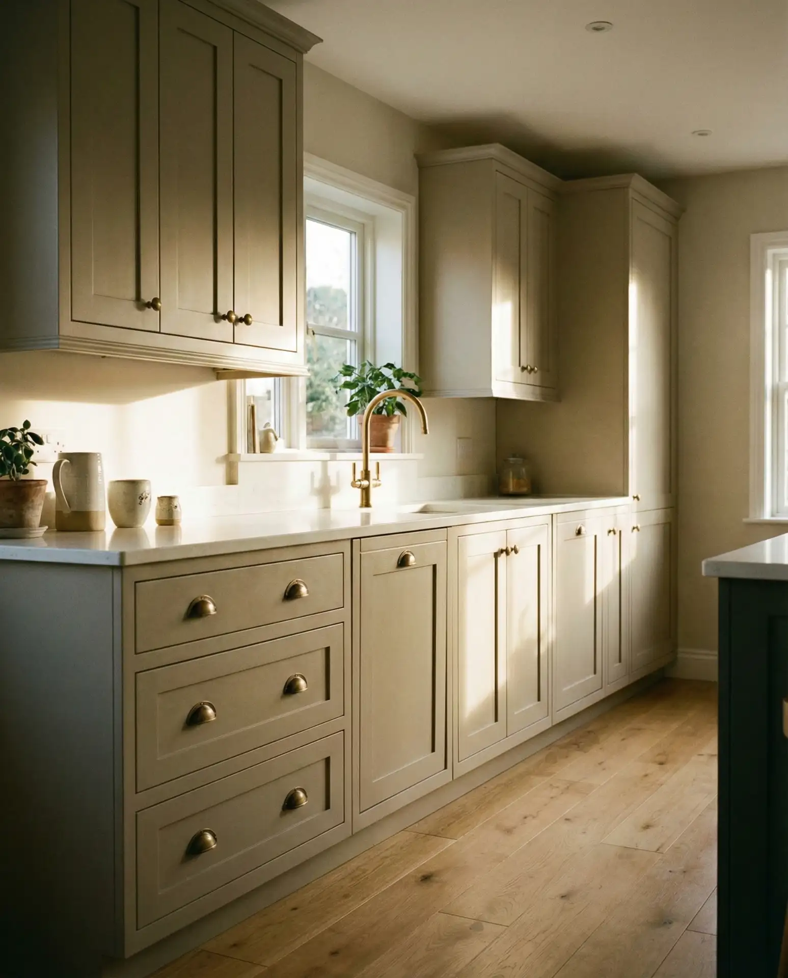
9. Warm Taupe with Gold Hardware
Warm taupe delivers a neutral sophistication that’s more complex than beige and softer than gray. It serves as an elegant middle ground that flatters virtually every other color in the kitchen, from dark wood floors to marble countertops. Adding gold hardware introduces a layer of luxury without the formality of polished brass or the coolness of nickel. This palette feels particularly at home in transitional kitchens where traditional and modern elements meet, and it’s become a go-to for designers working on timeless renovations where trends take a backseat to enduring style.
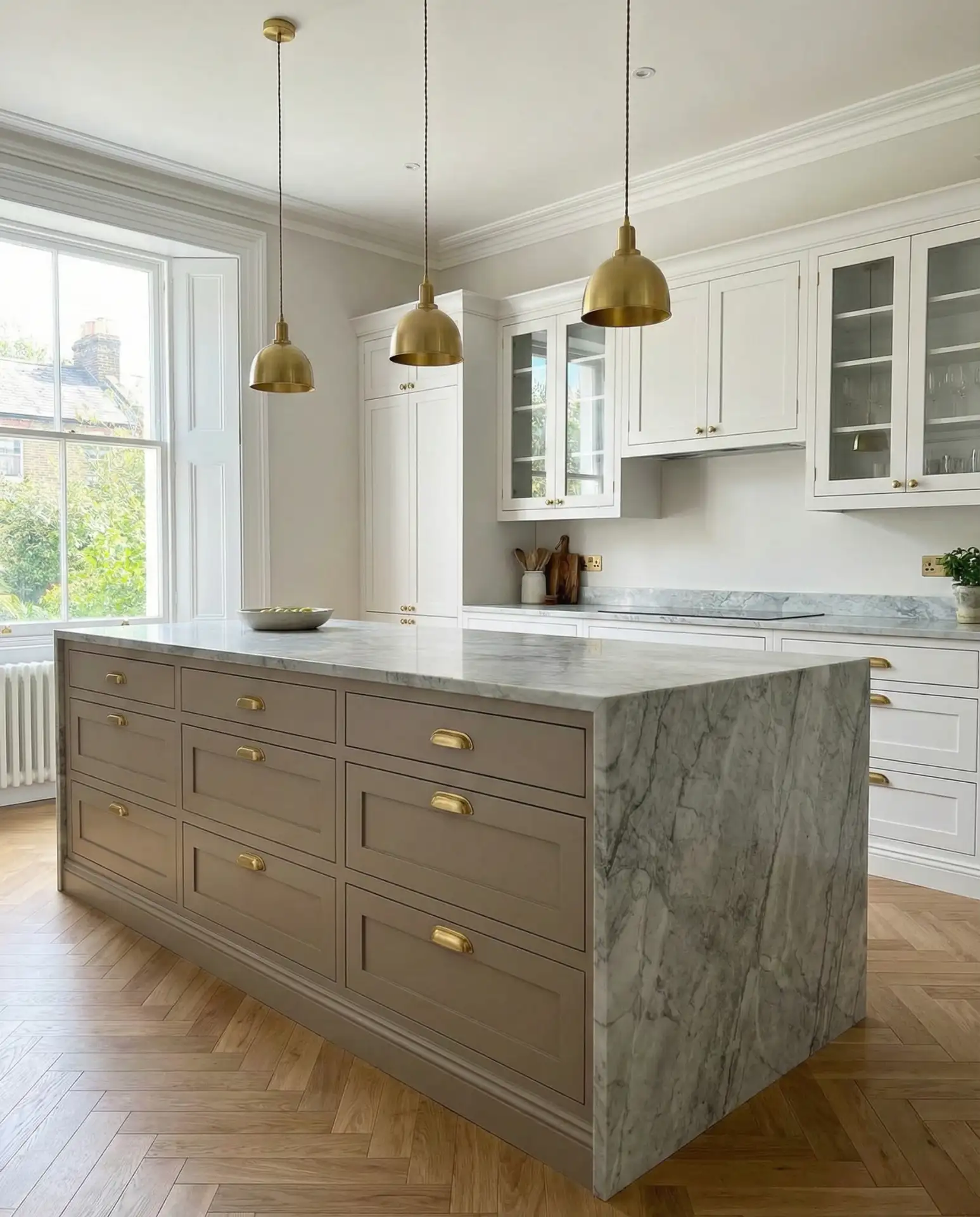
Where it works best: this combination shines in homes with ample natural light, especially those with west-facing windows where afternoon sun can bring out the warmth in both the taupe and the gold. It’s also forgiving with various lighting temperatures, maintaining its warmth under both daylight and incandescent bulbs. Many homeowners find taupe easier to live with than stark white because it’s less prone to showing every smudge and doesn’t create harsh glare in bright conditions. The gold adds just enough personality without committing to a specific style, making it adaptable as your tastes evolve.
10. Dusty Rose and Gray Balance
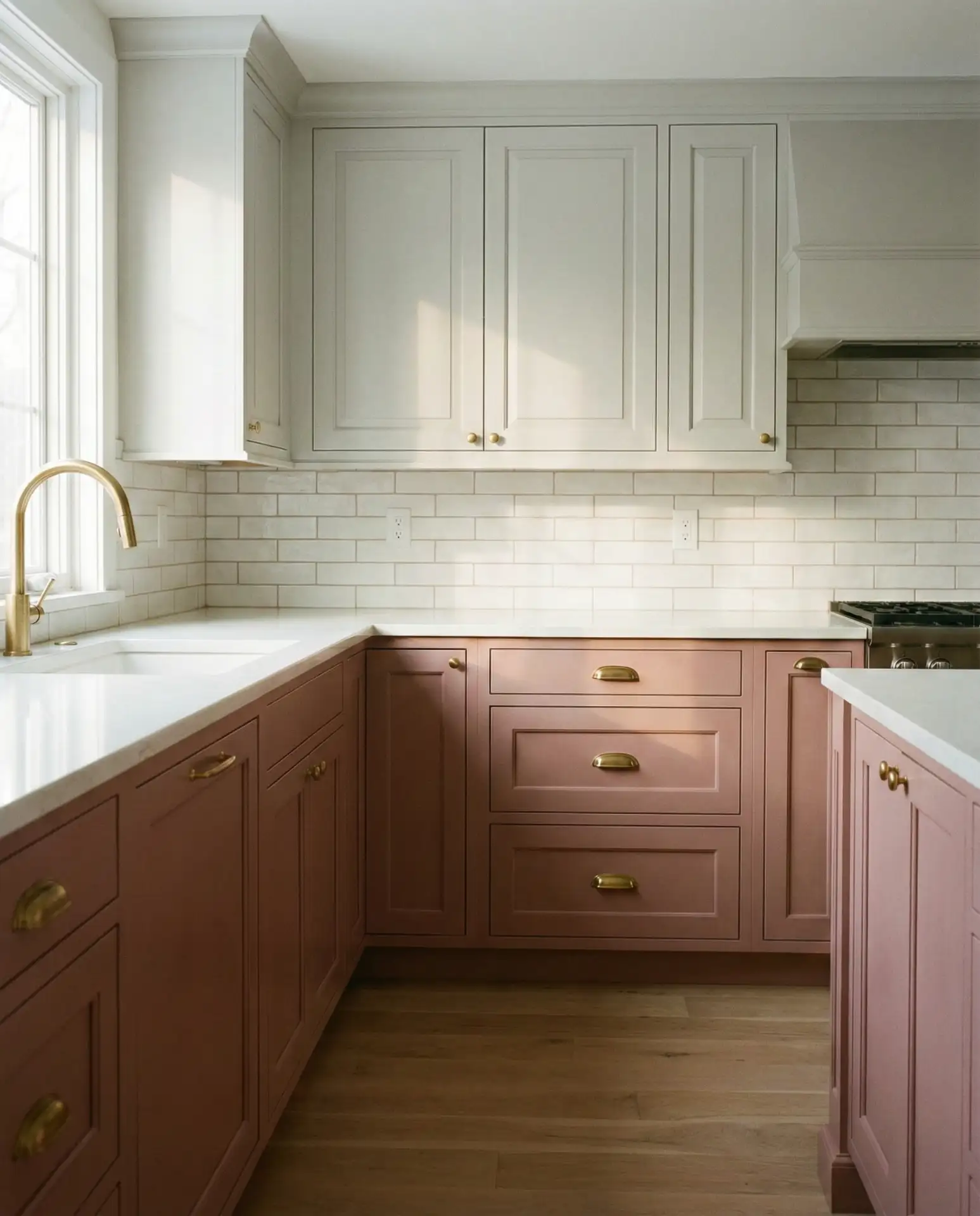
Dusty rose, a muted pink with gray undertones, offers a surprisingly sophisticated alternative to traditional kitchen colors. When balanced with cool gray cabinets or walls, it creates a scheme that’s both modern and unexpectedly livable. This combination works well in urban apartments and renovated older homes where a touch of color is welcome but bright, saturated hues would feel out of place. The rose typically appears as an accent—on an island, lower cabinets, or a single wall—while gray handles the heavier lifting. It’s a 2026 palette for those who want to step away from predictable neutrals without committing to anything too loud.
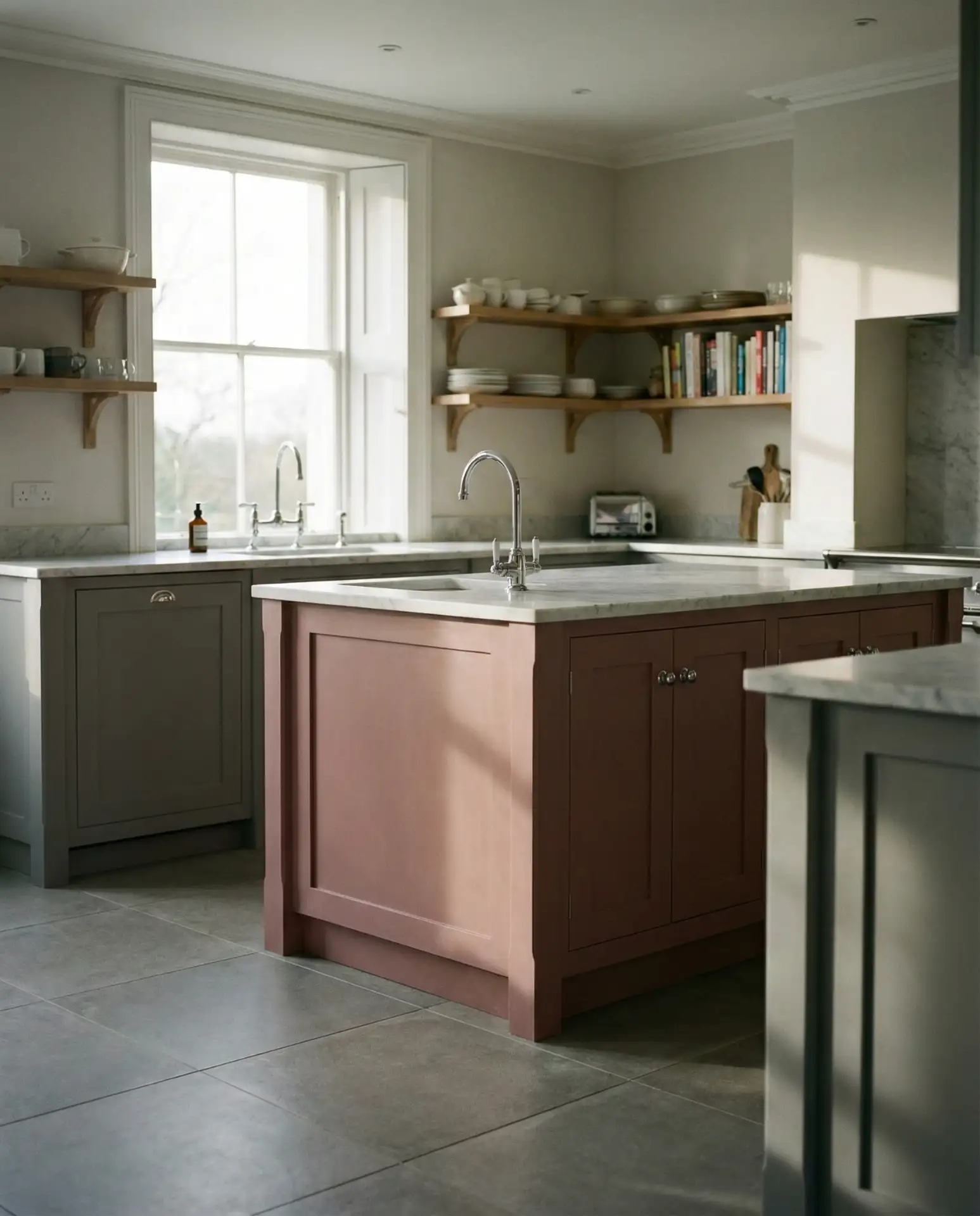
A homeowner in Portland told me she initially worried dusty rose would read as too feminine, but the gray balance keeps it grounded and surprisingly gender-neutral. The key is choosing a dusty rose that leans more mauve than bubblegum, ensuring it has enough gray mixed in to hold its own against other neutrals. This palette pairs beautifully with natural materials like marble, concrete, and light woods, which further anchor the softer hue. If you’re testing samples, view them in both morning and evening light—dusty rose can shift considerably depending on the time of day and surrounding tones.
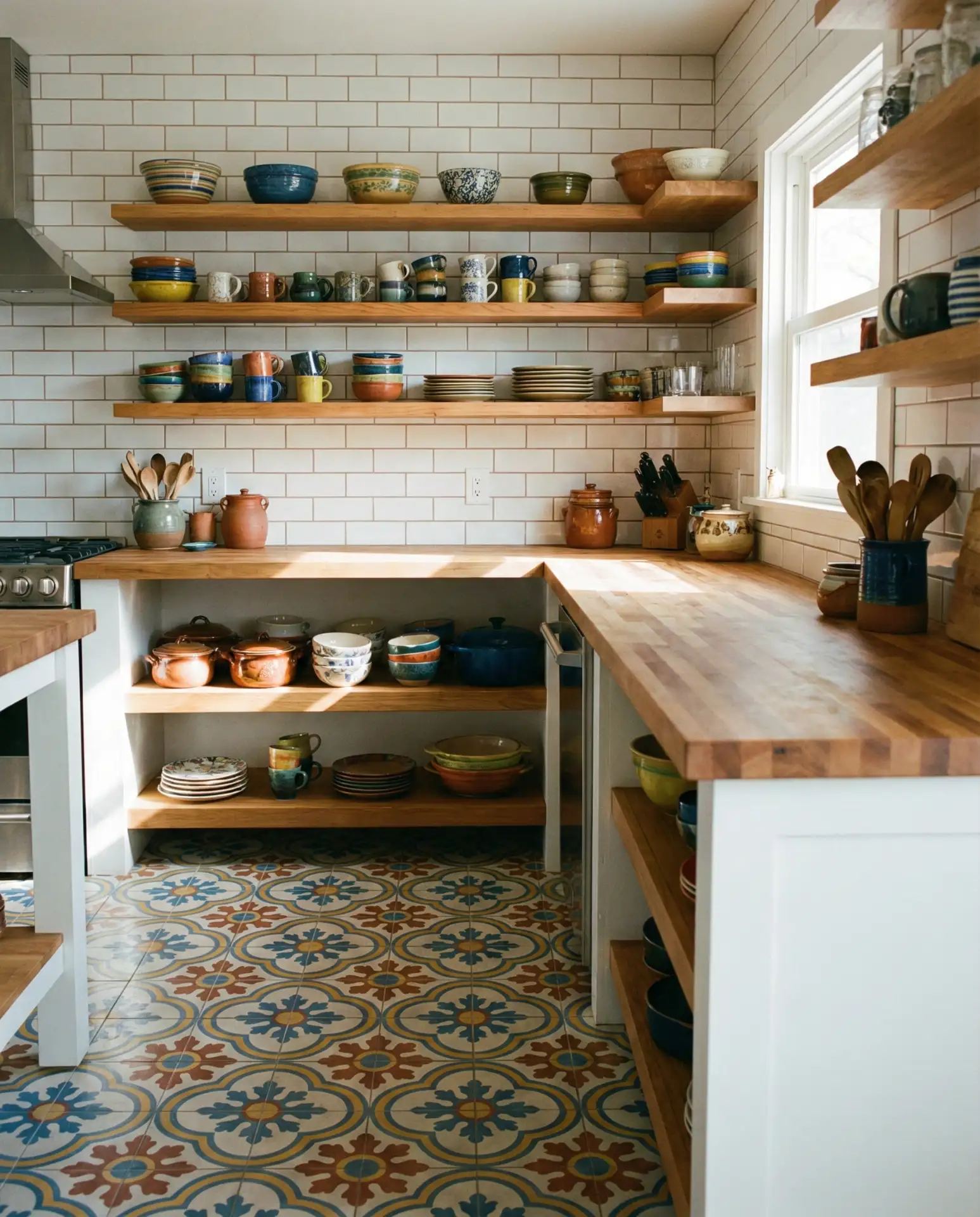
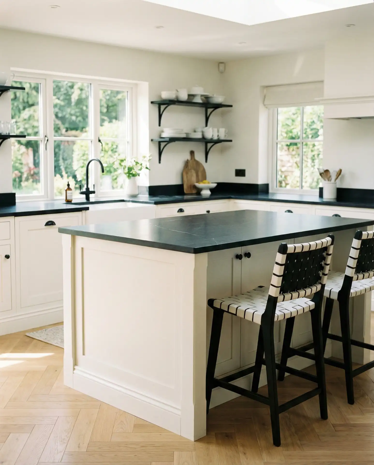
11. Crisp White and Natural Oak
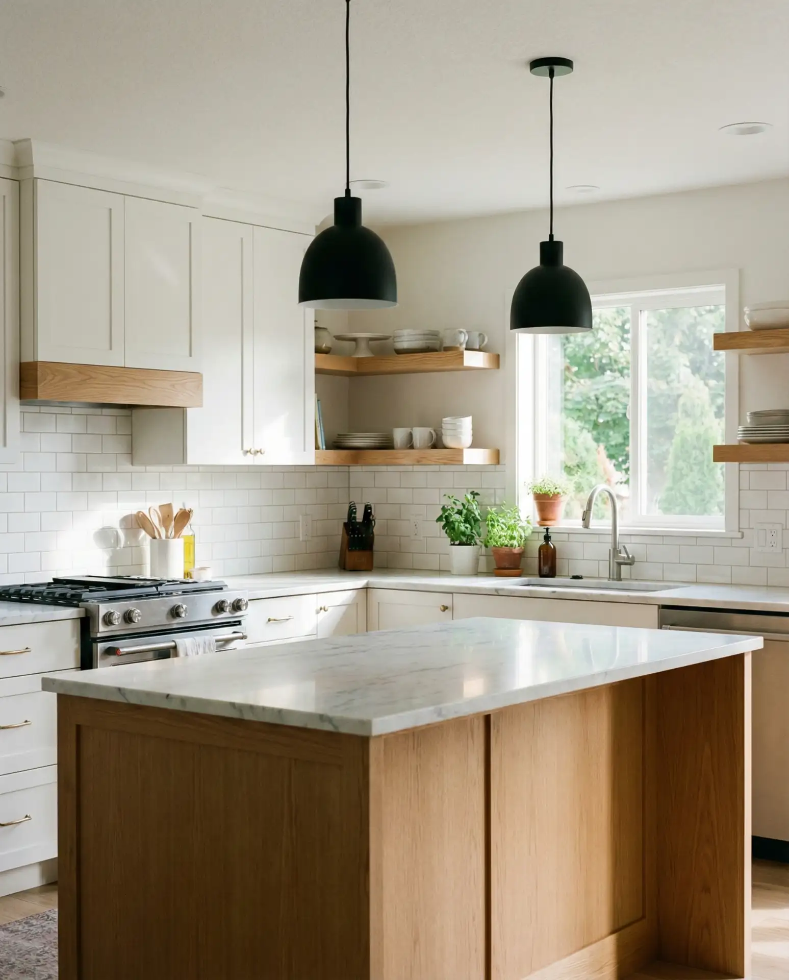
The pairing of crisp white cabinets with natural oak cabinets or flooring remains one of the most enduring schemes in American kitchens. It’s clean, it’s classic, and it never feels dated when executed with quality materials and good proportions. The white provides a bright, reflective surface that maximizes light, while the oak introduces warmth and texture that prevent the space from feeling sterile. This combination is especially effective in open-plan homes where the kitchen needs to feel cohesive with adjacent living areas, and it’s flexible enough to accommodate changing decor styles over the years.
This palette is popular nationwide but especially in the Midwest and suburbs, where practical, low-maintenance choices are prioritized. White cabinets with oak flooring create a foundation that allows for easy seasonal decor changes and works with virtually any backsplash or countertop material. The oak’s grain and honey tones add character that painted floors or tile can’t replicate. Many homeowners working with existing oak cabinets choose to keep them and simply repaint surrounding elements white, which is a budget-friendly way to refresh the space without a full tear-out.
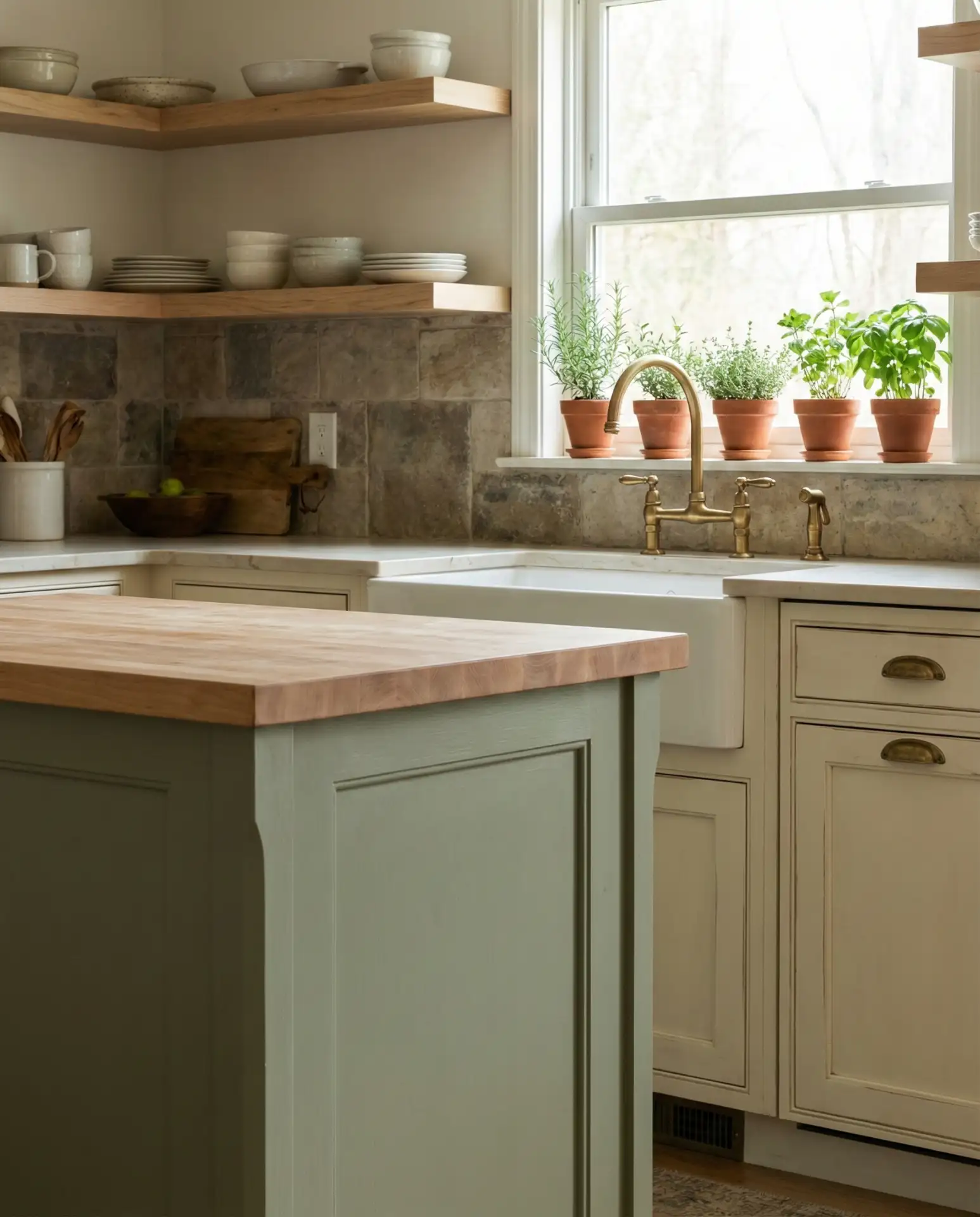
12. Olive Green and Cream Softness
Olive green, earthier and more muted than forest green, brings a grounded, organic feel to kitchens when paired with cream or warm white. This cozy combination has roots in European farmhouse design but translates beautifully to American homes, particularly those with rustic or casual aesthetics. The olive can appear on lower cabinets, an island, or accent walls, while cream keeps the space from feeling too heavy or dark. It’s one of the best palette ideas for homes surrounded by nature—think mountain cabins, rural properties, or wooded suburban lots—where bringing the outdoors in feels natural and intentional.
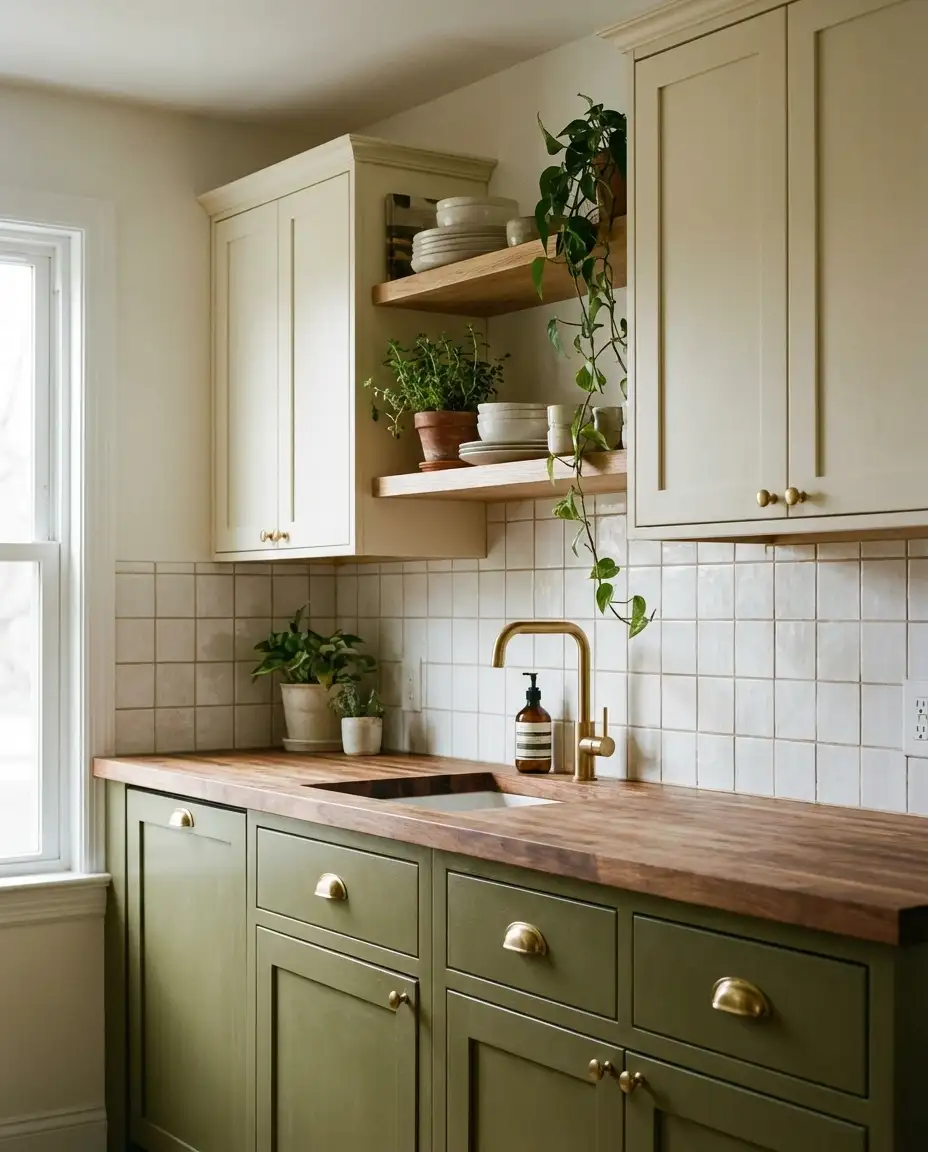
Common mistakes include choosing an olive that’s too yellow or too brown, which can make the space feel dated rather than fresh. Look for olives with gray undertones that read as sophisticated and contemporary. This palette works well with black countertops or dark wood, which ground the softer tones and add visual weight. Real homeowner behavior shows that olive green kitchens tend to feel calming and are often described as spaces where people want to spend time, not just pass through. The cream prevents the olive from overwhelming smaller spaces while maintaining the warmth that makes this combination so appealing.
13. Jet Black and Marble Drama
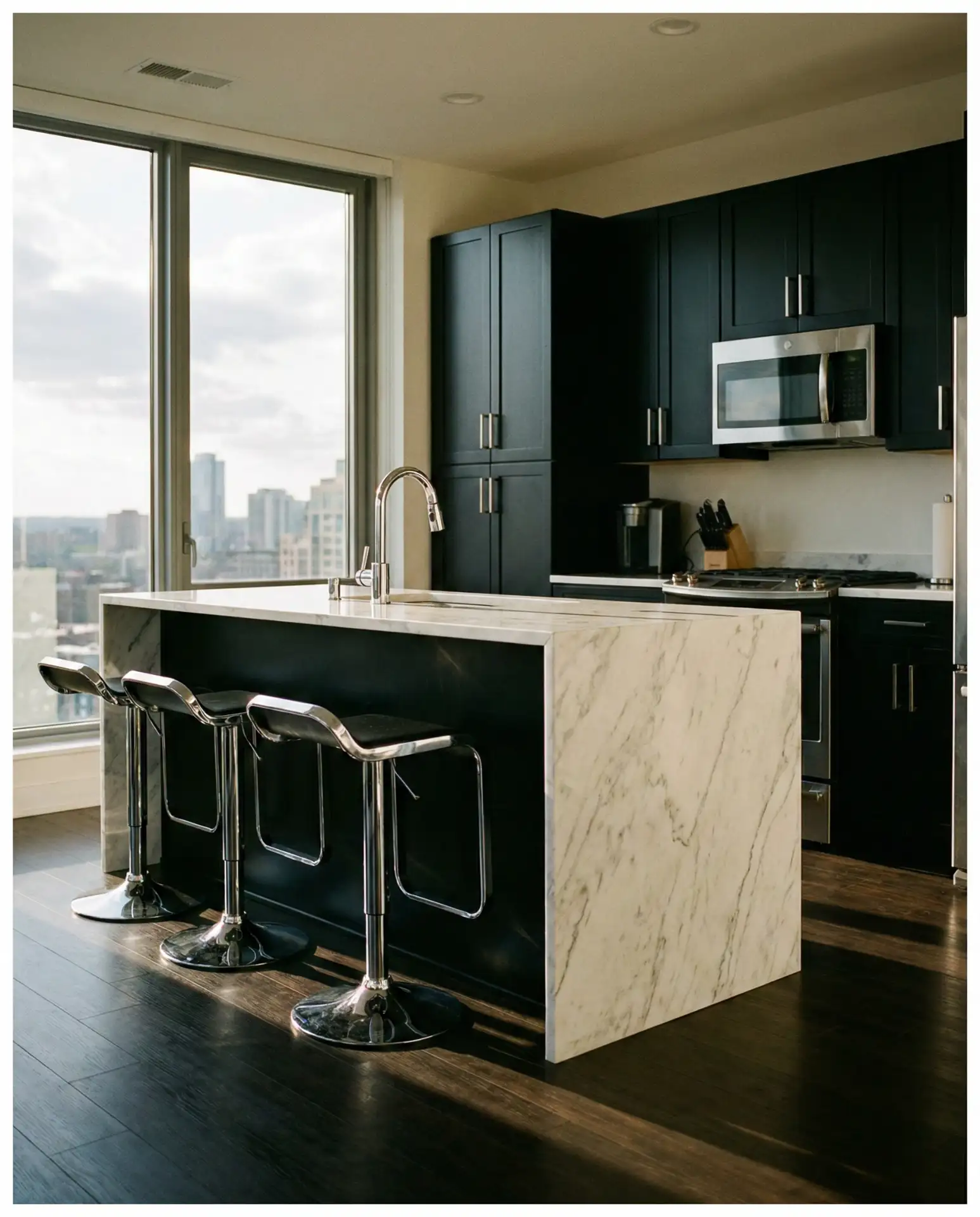
Jet black cabinets paired with white or light-veined marble countertops create a high-drama, bold kitchen that commands attention. This scheme works particularly well with a black countertop on the island to create cohesion or as a complete contrast where white marble takes center stage against the dark base. The combination feels modern and luxurious, often appearing in renovated brownstones, contemporary lofts, and high-end suburban homes where making a statement is part of the goal. Black absorbs light, so this palette requires excellent artificial lighting—think multiple pendants, under-cabinet LEDs, and recessed spots—to keep it from feeling oppressive.
Price-wise, this look can be achieved at various budgets: black paint is affordable, and marble-look quartz offers the aesthetic without the maintenance headaches of real marble. Black cabinets do show dust and fingerprints more readily than lighter colors, so many homeowners opt for a matte or satin finish rather than high-gloss to minimize visible marks. If you’re working with limited natural light, consider using black only on lower cabinets and keeping uppers light or open. This maintains the drama while preventing the space from feeling like a cave.
14. Soft Peach and White Freshness
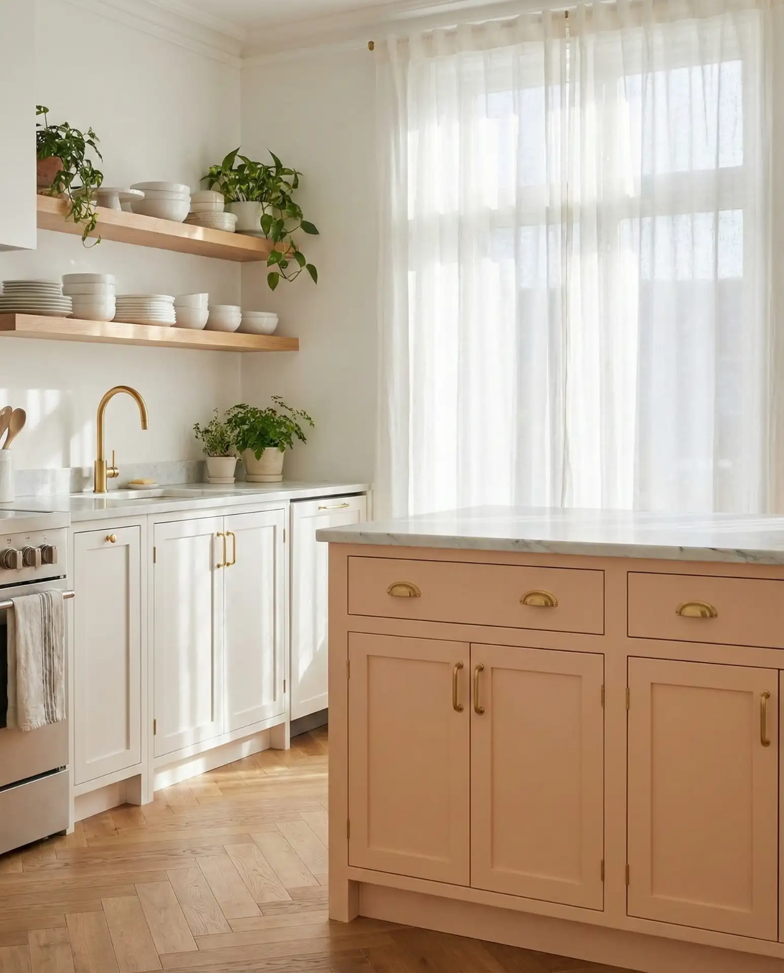
Soft peach, more sophisticated than coral and gentler than salmon, brings unexpected warmth to painted cabinets or accent walls when paired with white. This bright yet subtle palette feels particularly at home in sunny Southern kitchens or in homes where homeowners want a cheerful, welcoming vibe without resorting to primary colors. The peach reads as modern when executed in matte finishes and balanced with clean white surfaces, stainless or brass hardware, and natural materials. It’s a 2026 scheme that reflects a broader trend toward softer, more optimistic color choices after years of gray and navy dominance.
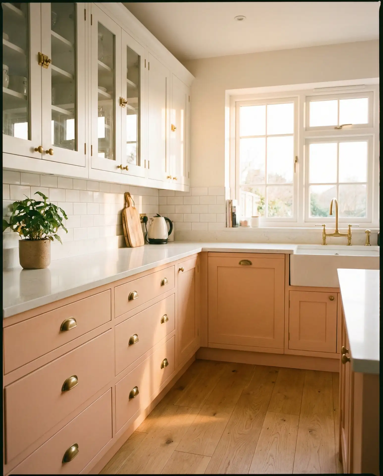
This palette works beautifully in breakfast nooks and kitchens that double as gathering spaces for morning coffee and casual meals. Regional context matters: peach feels more at home in warmer climates or in homes with Mediterranean, Spanish, or coastal influences. A mistake to avoid is choosing a peach that’s too orange or too pink—test samples on actual cabinet doors in your lighting before committing. The white should be crisp enough to provide contrast but warm enough to harmonize with the peach. This combination pairs well with natural wood, woven textures, and plenty of plants for a fresh, organic feel.
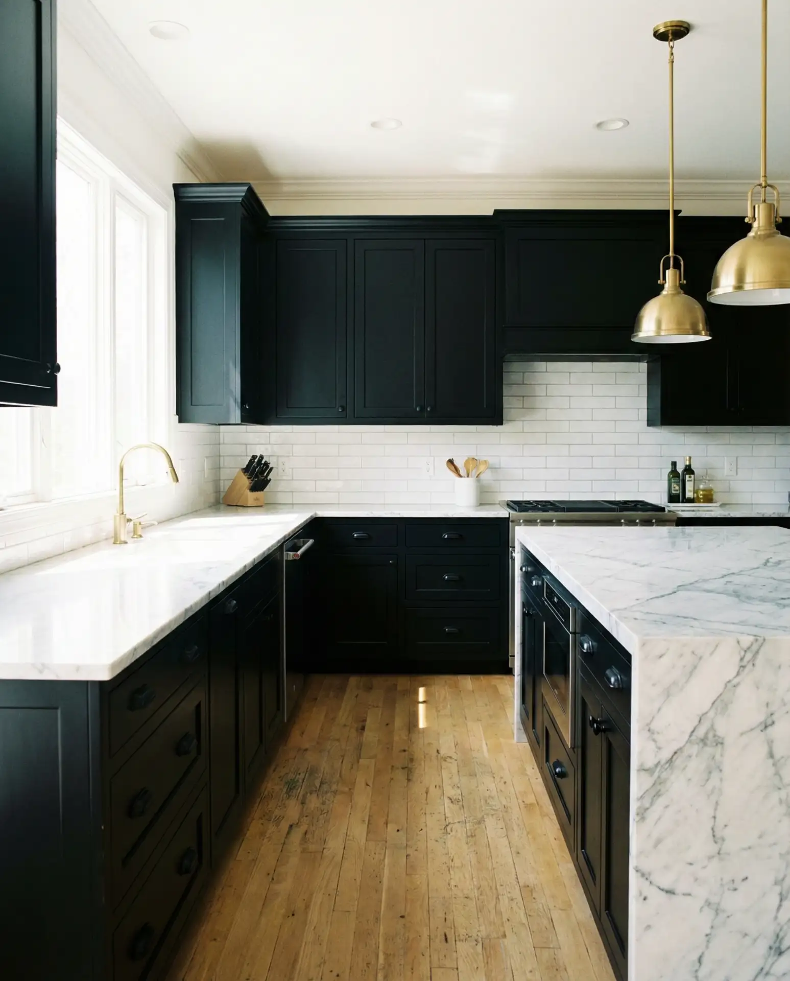
15. Charcoal and Walnut Richness
Charcoal gray cabinets combined with rich walnut wood tones create a sophisticated, masculine-leaning scheme that feels both modern and timeless. The walnut can appear in flooring, open shelving, or countertops, bringing warmth and natural grain that prevent the charcoal from feeling too industrial. This combination works well in urban lofts, renovated mid-century homes, and contemporary new builds where clean lines and quality materials take center stage. It’s one of those schemes with oak cabinets that can be adapted—by staining oak to a darker walnut tone—for homeowners who want to update without replacing existing woodwork.
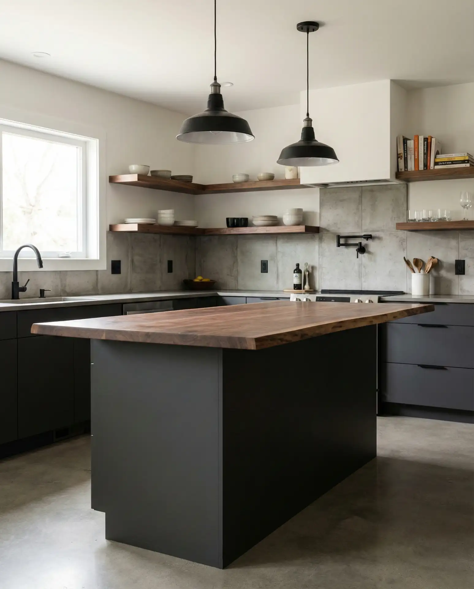
An interior designer in Seattle mentioned that this palette photographs beautifully and holds up well over time because both charcoal and walnut age gracefully. Unlike lighter woods that show every scratch, walnut develops character, and charcoal paint is forgiving with minor dings. This combination also hides everyday wear better than all-white or very light schemes, making it practical for busy households. If you’re working with limited natural light, keep wall colors light and use plenty of task lighting to prevent the darker tones from making the space feel enclosed.
16. Mint Green and White Airiness
Mint green cabinetry or walls bring a retro, ice-cream-parlor charm to kitchens, especially when paired with crisp white countertops and trim. This bright, refreshing palette calls back to 1950s diners and mid-century homes, yet it feels thoroughly modern when executed with clean lines and contemporary hardware. The mint works well on lower cabinets with white uppers or as an accent island in an otherwise white kitchen. It’s a cozy choice for smaller spaces because the light, cool tone doesn’t visually shrink the room. This scheme has found new life in beach houses, vintage-inspired renovations, and young homeowners’ first kitchens, where personality matters as much as function.
Where it works best: this palette shines in homes with plenty of natural light, particularly those with south or west exposures where the mint can glow throughout the day. It’s also popular in rental renovations and starter homes where the owner wants to make an impact without a huge investment—mint paint costs the same as any other color but delivers much more personality. The key is choosing a true mint with a blue-green balance rather than leaning too yellow, which can read as dated. White keeps everything feeling fresh and prevents the mint from overwhelming the space.
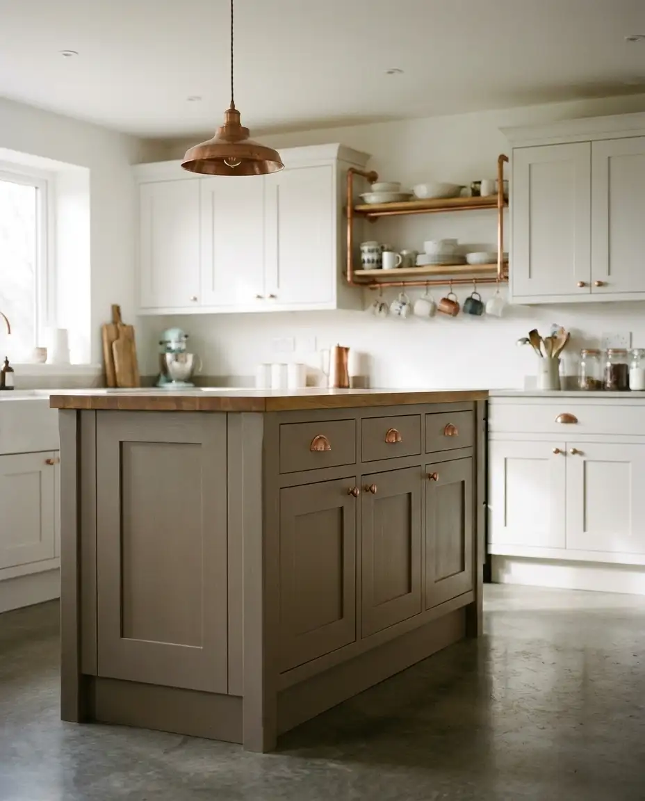
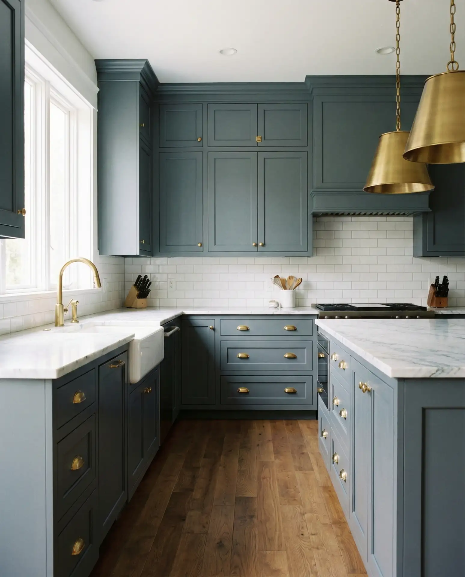
17. Warm Gray and Copper Accents
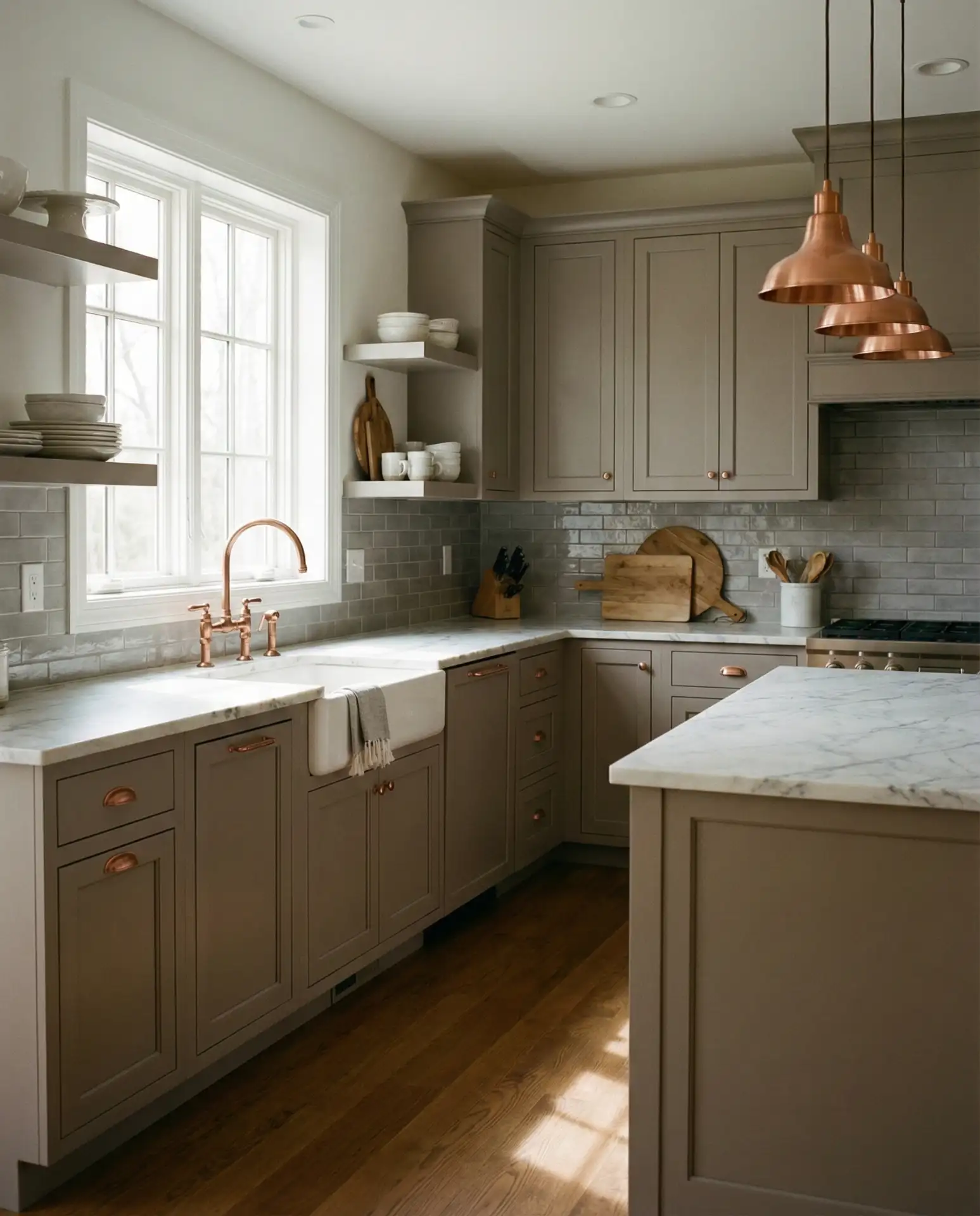
Warm gray cabinets paired with copper hardware, lighting, or accent pieces create a neutral foundation with just enough metallic warmth to feel current and interesting. This combination strikes a balance between cool and warm tones, making it adaptable to various design styles from farmhouse to industrial to modern transitional. The copper adds a handcrafted, artisanal quality that feels more approachable than polished brass or chrome. It’s one of the best palette ideas for homeowners who want a sophisticated look that doesn’t skew too formal or uptight, and it pairs beautifully with concrete countertops, reclaimed wood, and natural stone.
Real homeowners report that copper develops a patina over time, which some embrace for its lived-in character, while others prefer to polish regularly to maintain the shine. This is worth considering based on your maintenance preferences and aesthetic goals. The warm gray should have enough beige or taupe mixed in to harmonize with the copper’s warmth; a cool, blue-toned gray will clash. This palette works well in both traditional and modern contexts, which gives it longevity as styles evolve. It’s also forgiving with various wood tones, making it easier to incorporate existing furniture and flooring.
18. Cobalt Blue and Gold Glamour
Cobalt blue, brighter and more saturated than navy, brings drama and confidence to kitchens when paired with gold hardware and fixtures. This bold combination feels luxurious and statement-making, perfect for homeowners who aren’t afraid of color and want their kitchen to be a conversation starter. The cobalt typically appears on lower cabinets or an island, with white or cream balancing the intensity on uppers or walls. This scheme works in both traditional and contemporary homes, though it requires commitment—cobalt is not a background color. It’s a trendy choice that reflects confidence and a willingness to embrace 2026’s more adventurous color direction.
Expert commentary suggests that cobalt works best in kitchens with excellent natural light, as it can read quite dark in poorly lit spaces. Many designers recommend using it on lower cabinets only, allowing white or light-colored uppers to reflect light and keep the room from feeling too enclosed. The gold adds warmth that prevents the blue from feeling cold or unwelcoming. This is one of those palettes where less is more—cobalt on every surface would be overwhelming, but strategic use creates impact. If you’re hesitant, start with a cobalt island and keep the rest neutral, allowing you to dial up or down the intensity in future updates.
19. Creamy White and Black Contrast
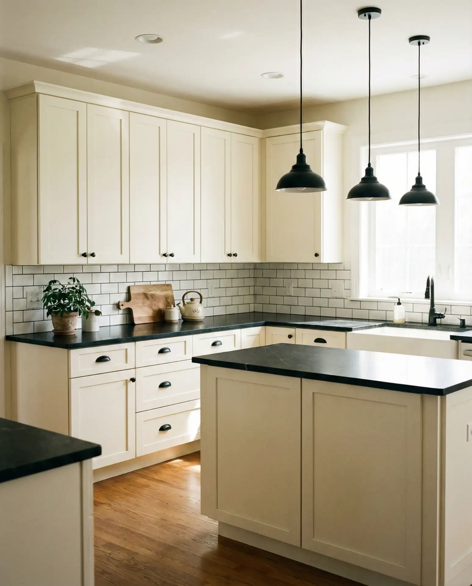
Creamy white cabinets with black hardware, lighting, and accents deliver a timeless scheme that feels both fresh and classic. Unlike stark white, the cream adds warmth that makes the space feel inviting rather than clinical, while the black provides definition and visual interest. This combination works across virtually all design styles and home types, from colonial to craftsman to contemporary. It’s particularly effective with a black countertop on the island or lower cabinets, which grounds the lighter tones and creates intentional contrast. The proportions are key: too much black can overwhelm, while too much cream risks feeling bland.
This palette is hugely popular in suburban America, where homeowners value timeless choices that won’t feel dated in five years. The creamy white softens the contrast compared to stark white with black, making it more forgiving and less sterile. It’s also practical: the cream shows fewer smudges than pure white, and the black accents add enough edge to keep it from feeling too safe or boring. This combination works beautifully with various countertop materials, from marble to butcher block to concrete, and accommodates both stainless and black appliances seamlessly.
20. Slate Gray and Brass Mix
Slate gray, a cooler, more blue-toned gray than charcoal, paired with warm brass creates a sophisticated tension between cool and warm elements. This palette feels distinctly urban and modern, often appearing in loft conversions and renovated townhomes where industrial architecture meets refined finishes. The slate provides a substantial, grounding base that can handle busy patterns in floors or backsplashes, while the brass adds warmth and prevents the space from feeling cold. This combination is particularly effective in schemes with oak cabinets when you’re mixing old and new—slate-painted lowers with original oak uppers, for example, create an intentional blend of eras.
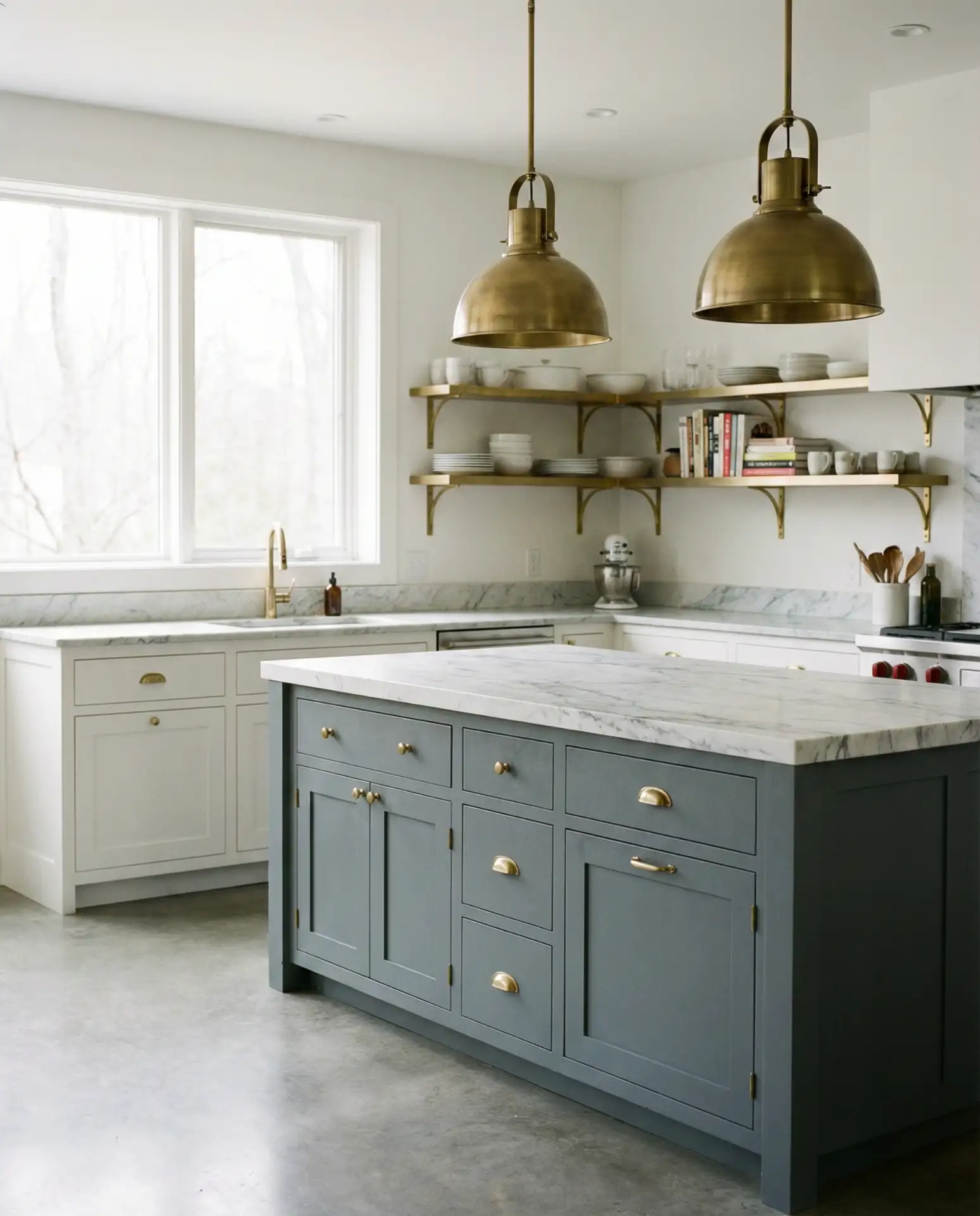
Budget considerations: Slate gray paint is an affordable update that dramatically changes the look of existing cabinets, and brass hardware has become more accessible with options at various price points. The key to making this palette work is ensuring adequate lighting—slate absorbs light like most dark colors, so layer in multiple light sources, including under-cabinet LEDs, pendants, and recessed fixtures. A common mistake is choosing a slate that’s too blue or too green; look for a neutral gray with just a whisper of blue undertone. The brass should be unlacquered or lightly aged for a more authentic, less shiny appearance.
21. Butter Yellow and White Cheerfulness
Butter yellow, soft and creamy rather than bright lemon, brings an optimistic, sun-drenched quality to kitchens when paired with white. This bright yet approachable palette works particularly well in country or cottage settings, where a cheerful color feels right at home. The yellow typically appears on walls or lower cabinets, with white providing balance on uppers, trim, and countertops. It’s a cozy choice that evokes farmhouse kitchens and vintage charm, yet it can feel fresh and modern when executed with clean lines and minimal clutter. This combination reflects a broader shift toward warmer, more joyful color choices in home design.
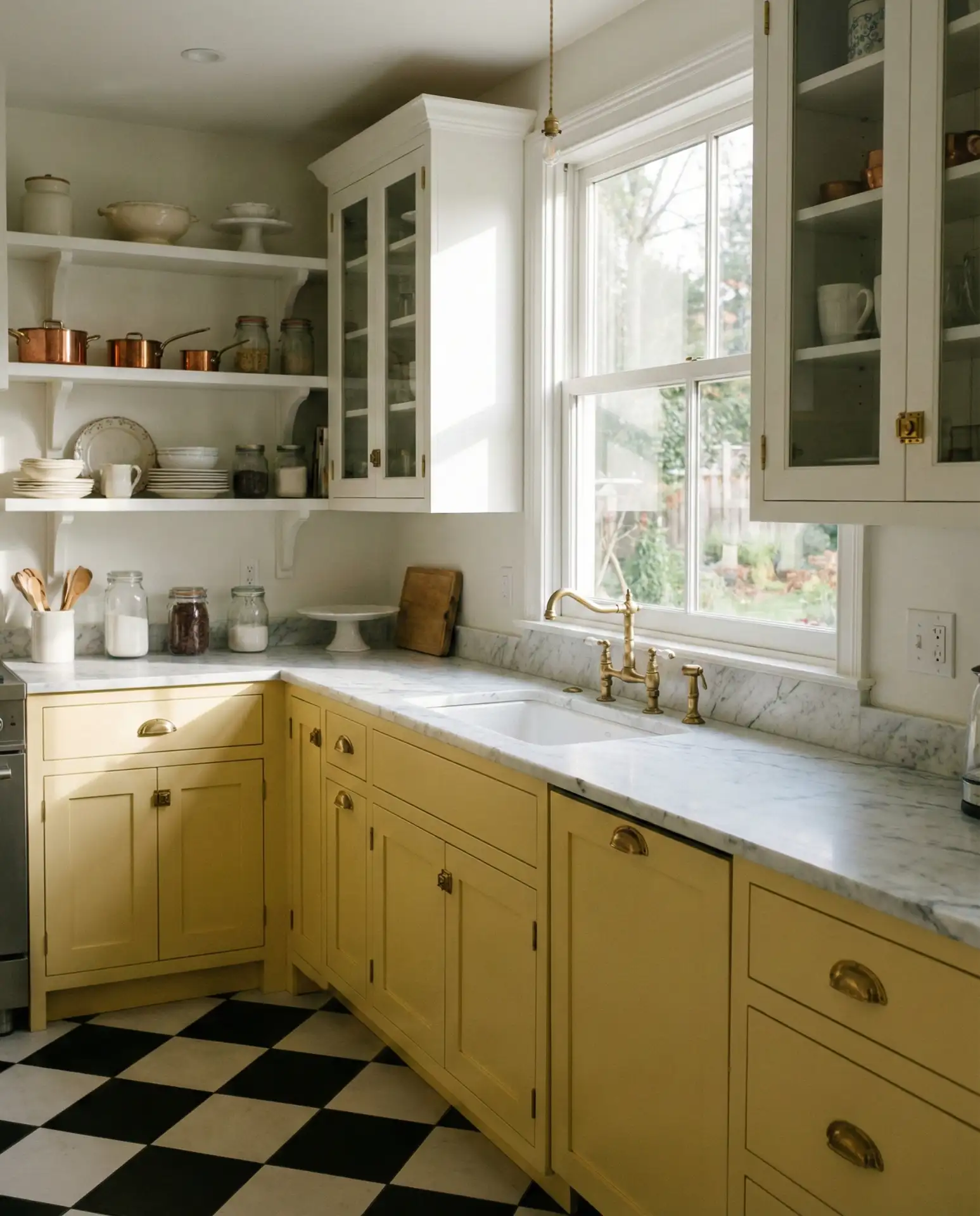
This palette works best in homes with good natural light, particularly east-facing kitchens where morning sun can make the yellow glow. It’s popular in rural areas and smaller towns where country aesthetics are embraced, but it also appears in urban settings where homeowners want to create a cozy retreat from city life. A homeowner in Vermont shared that her butter yellow kitchen lifts her mood during long, gray winters—the color provides warmth even when natural light is scarce. The key is choosing a butter yellow with cream undertones rather than stark yellow, which can feel too intense or institutional.
22. Burgundy Red and Cream Warmth
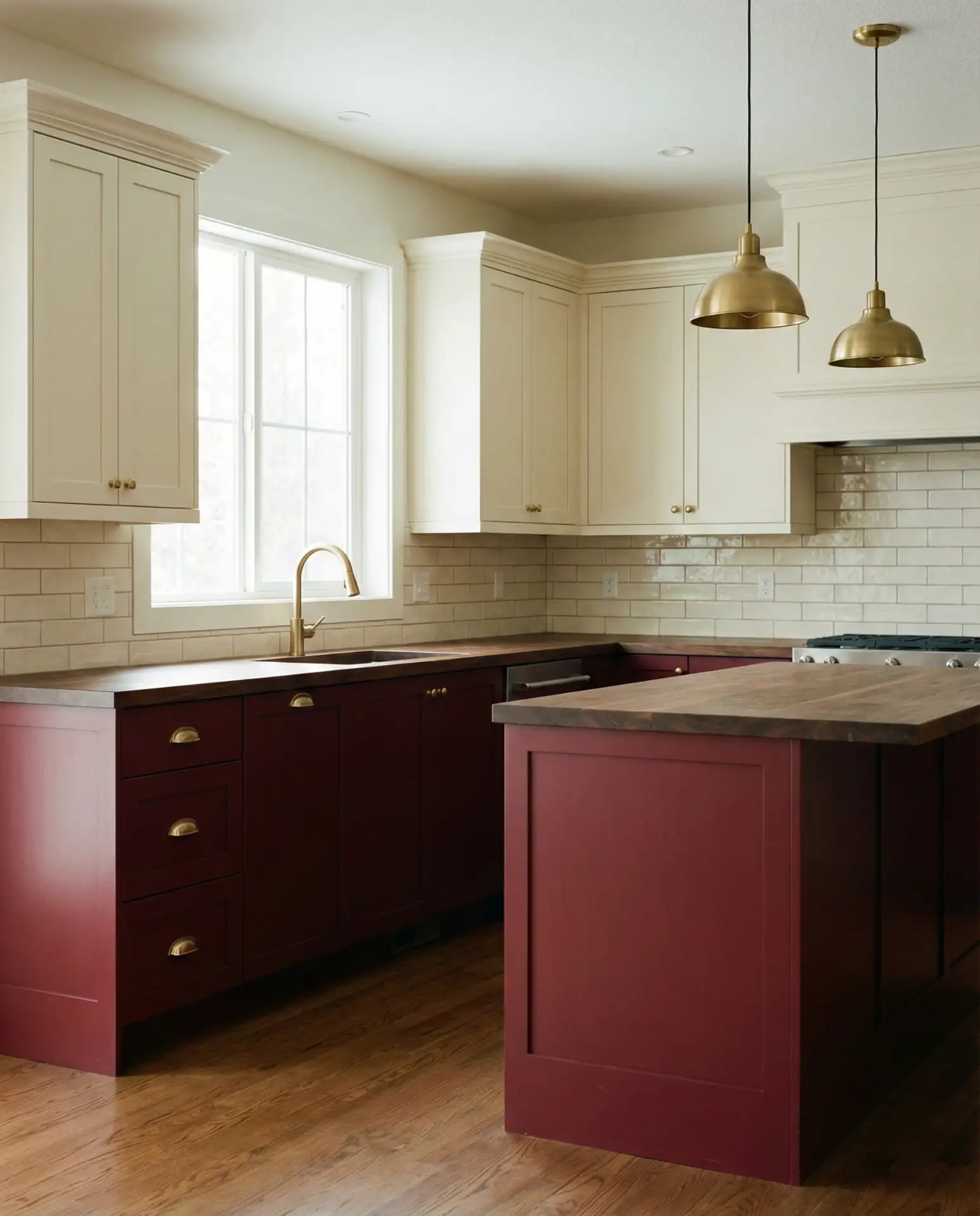
Burgundy red, a deep wine-toned shade, brings dramatic warmth to kitchens when balanced with cream cabinets or walls. This bold palette feels richly traditional and works beautifully in colonial, Victorian, and craftsman homes where historical color choices are being revived. The burgundy typically appears on lower cabinets or an island, with cream handling the upper cabinets and walls to prevent the space from feeling too dark. This combination pairs well with natural wood, brass or copper hardware, and stone countertops for a layered, collected look. It’s a scheme for homeowners who want to embrace color fully and aren’t afraid of making a statement.
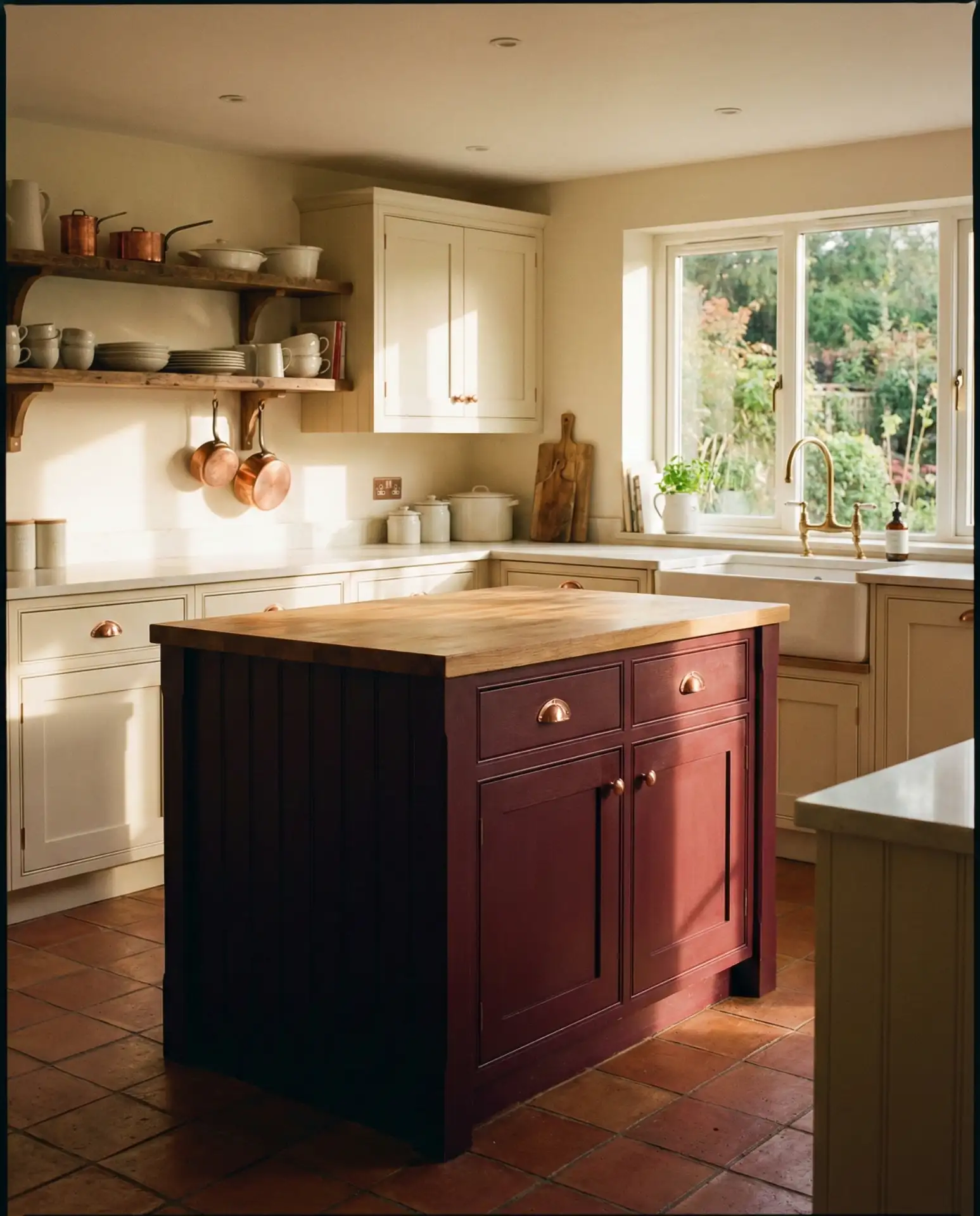
Where it works best: this palette shines in older homes with architectural character—crown molding, wainscoting, or original hardwood floors—where the color choices can honor the home’s history. It’s also popular in New England, the Mid-Atlantic, and the South, where traditional aesthetics remain strong. The burgundy should be a true wine tone rather than leaning orange or pink, which ensures it feels sophisticated rather than dated. Cream provides necessary breathing room and keeps the space from feeling too heavy. This combination requires excellent lighting to prevent the darker tone from making the kitchen feel oppressive.
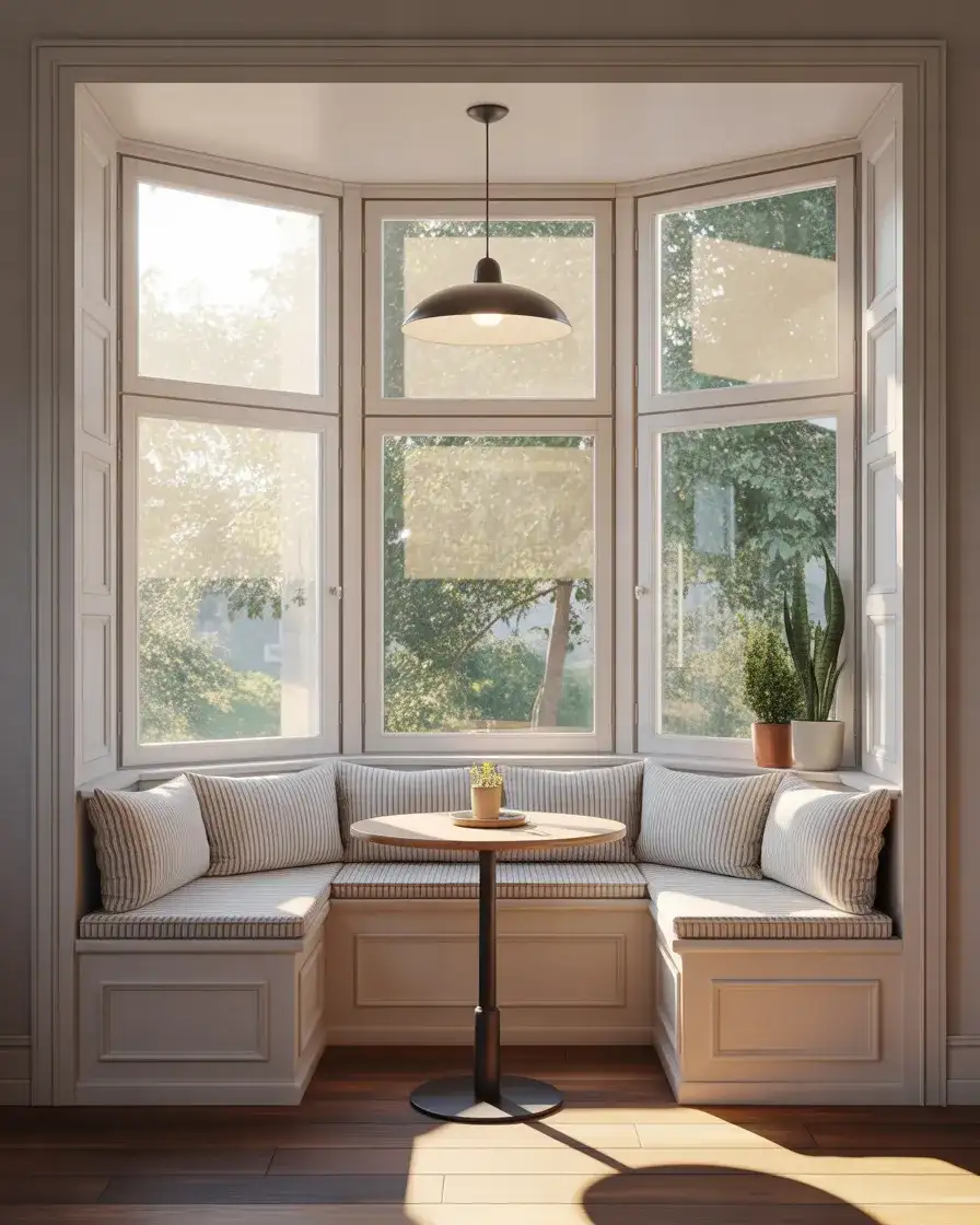
23. Soft Gray-Blue and White Serenity
Soft gray-blue, a muted shade that reads as both gray and blue depending on the light, creates a serene backdrop when paired with white. This neutral palette feels calming and sophisticated, making it ideal for kitchens where you want to encourage a peaceful, uncluttered atmosphere. The gray-blue works on cabinets or walls, while white appears on countertops, trim, and backsplashes to maintain brightness. It’s one of the best palette ideas for coastal homes, but it translates beautifully to landlocked spaces where homeowners want a touch of that airy, seaside sensibility. This combination has staying power because it’s subtle enough to live with long-term without feeling tired.
Common mistakes to avoid: choosing a gray-blue that’s too saturated or too cool, which can make the space feel cold rather than serene. Test samples in your actual lighting at different times of day—gray-blue is particularly sensitive to light changes and can shift significantly from morning to evening. This palette pairs beautifully with natural textures like linen, jute, and unfinished wood, which add warmth and prevent the space from feeling too sterile. Many homeowners working with existing white cabinets choose to add a gray-blue island or paint an accent wall, which introduces color without overwhelming the space or requiring a complete renovation.
Conclusion
Kitchen color choices in 2026 offer something for everyone—from bold, statement-making hues to soft, timeless neutrals that adapt to changing tastes. Whether you’re drawn to the drama of deep greens and navy blues, the warmth of terracotta and peach, or the classic elegance of black and white, there’s a palette here that can transform your space. Which combination speaks to you? Drop a comment below and share which scheme you’re considering for your own kitchen—I’d love to hear what’s inspiring your next project.