Kitchen paint colors have always been one of the most searched home design topics on Pinterest, and 2026 is no different. Whether you’re planning a full renovation or simply refreshing your space with a new coat of paint, choosing the right color can transform your kitchen from ordinary to extraordinary. This year’s trending palettes range from warm neutrals and moody darks to cheerful yellows and calming coastal blues. American homeowners are embracing both bold statements and timeless classics, often tailored to their cabinet styles—from oak and cherry to modern black or white. In this guide, you’ll discover inspiring kitchen paint color ideas that reflect what’s trending right now and how to make them work beautifully in your home.
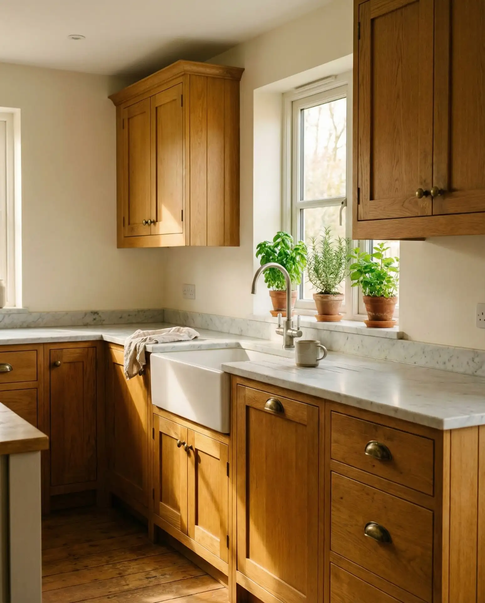
1. Warm White Walls with Oak Cabinets
If you have oak cabinets and want a fresh, updated look without replacing them, warm white walls are your best friend. This combination softens the orange undertones often found in oak while keeping the space bright and welcoming. The key is choosing a white with creamy or beige undertones rather than stark cool whites, which can clash with the natural wood grain.
This works especially well in west-facing kitchens, where the golden afternoon light enhances both the oak and the warm white tones. Many homeowners report that this simple paint change made their 1990s kitchens feel ten years newer without the cost of a full remodel. It’s also forgiving with decor styles—whether you lean farmhouse, transitional, or even slightly modern, warm white provides a neutral backdrop that doesn’t compete with your wood.
2. Sage Green Cabinets with Soft Cream Walls
Painted sage green cabinets have become one of the most pinned kitchen trends, and pairing them with soft cream or off-white walls creates a serene, nature-inspired space. This cottagecore aesthetic feels both vintage and contemporary, making it ideal for homeowners who want a calming kitchen that still feels current. The muted green brings life without overwhelming the room. 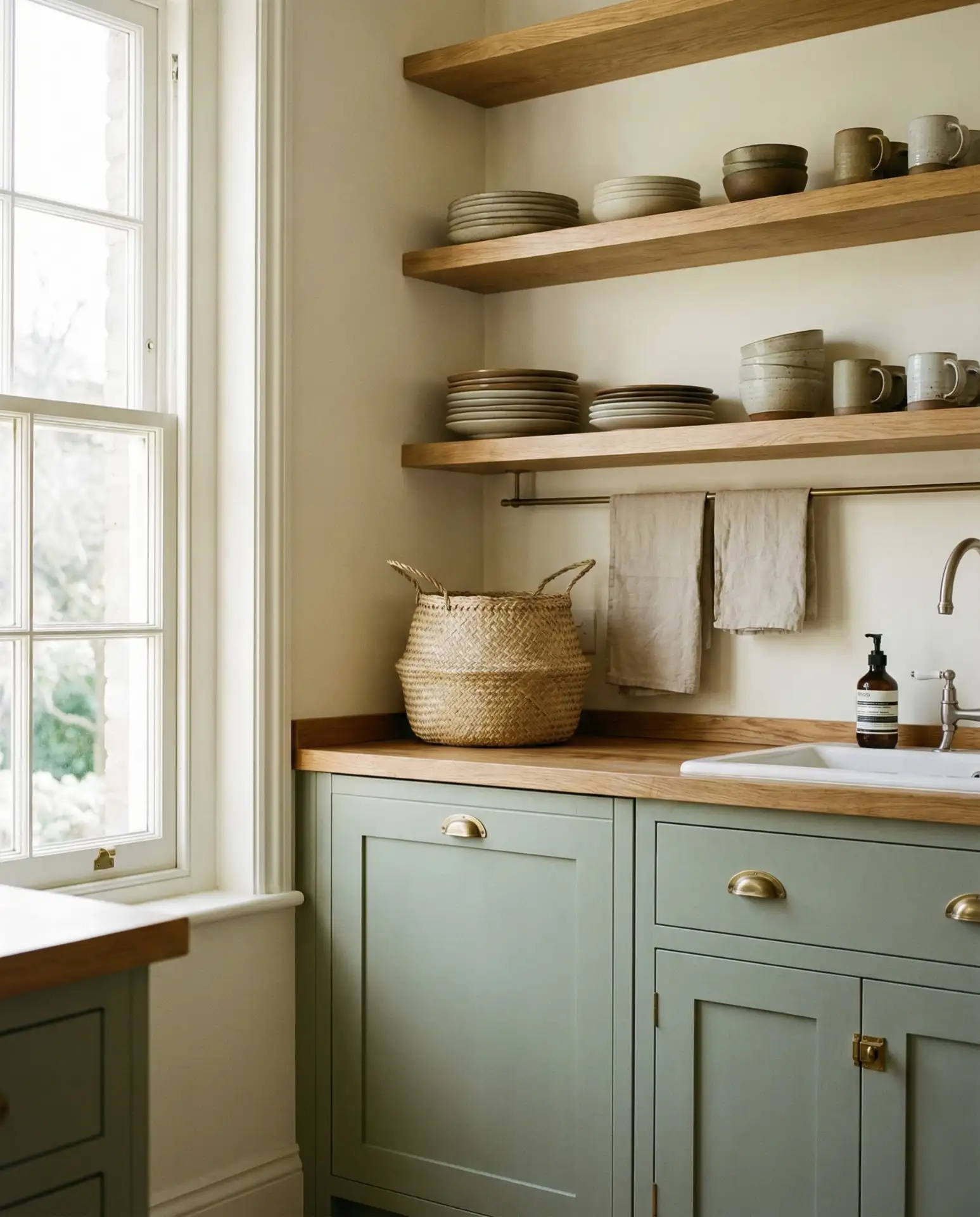
One common mistake is choosing a sage that’s too gray or too yellow—test samples in your actual lighting before committing. The cream walls should have just enough warmth to complement the green without turning peachy. This palette works beautifully in both small galley kitchens and open-concept spaces, and it pairs well with natural wood accents, rattan, and linen textiles for that relaxed, countryside vibe.
3. Moody Charcoal with White Cabinets
For those who love drama, painting your kitchen walls a deep charcoal or near-black while keeping white cabinets creates a striking, sophisticated contrast. This moody approach has exploded in popularity on Pinterest, especially among homeowners who want a kitchen that feels more like a stylish cocktail bar than a traditional cooking space. The dark walls make white cabinetry pop and give the room unexpected depth. 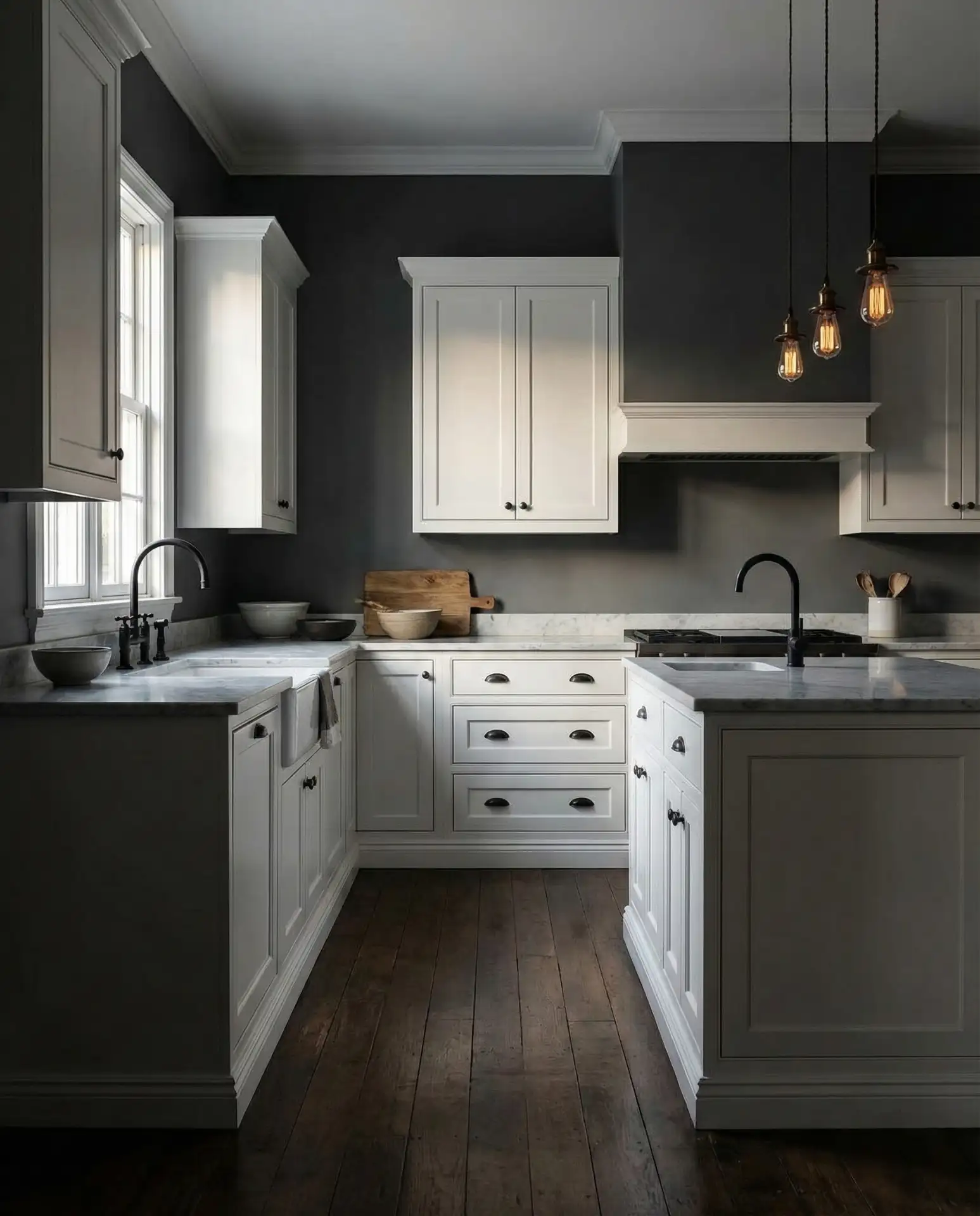
This look is perfect for kitchens with plenty of natural light or good task lighting, as dark walls can make smaller spaces feel closed in without proper illumination. It’s also a favorite in urban lofts and modern farmhouses where homeowners want to balance clean lines with warmth. Adding brass or gold hardware and warm wood tones prevents the space from feeling too cold or industrial, which is a pitfall some DIYers encounter.
4. Coastal Blue Walls with White Cabinets
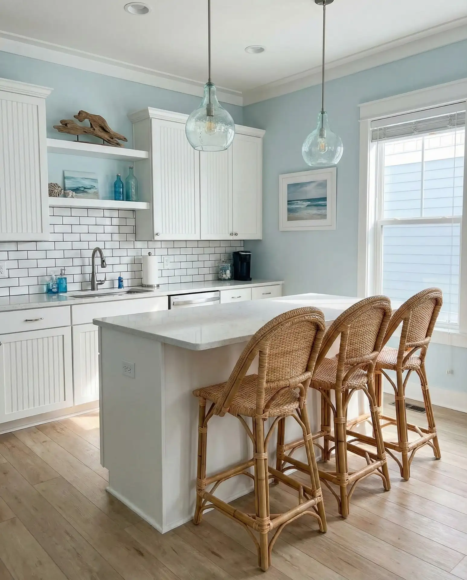
A soft, breezy blue on the walls paired with white cabinets is the ultimate coastal kitchen palette. Think of the color of a calm ocean or a clear sky—this shade brings tranquility and freshness into the heart of your home. It’s especially popular in beach towns and suburban homes where homeowners want that vacation-at-home feeling year-round. 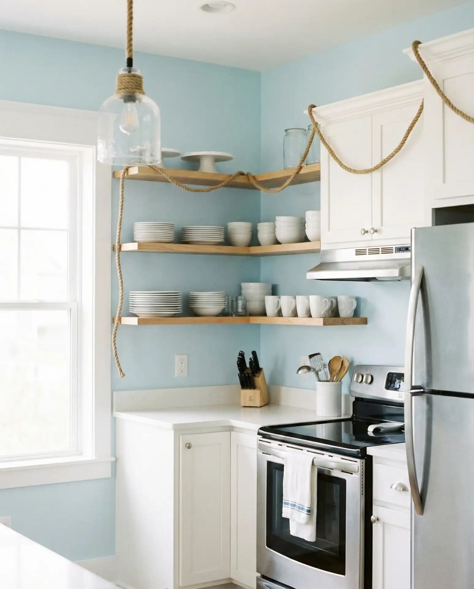
Where it works best: kitchens with abundant natural light, open floor plans that connect to living areas, and homes near water or in warm climates. The blue should be soft enough to feel serene but saturated enough to read as blue rather than gray. Avoid overly bright or electric blues, which can feel juvenile or jarring in a kitchen setting. Pair with natural textures like jute, linen, and light woods to complete the coastal vibe.
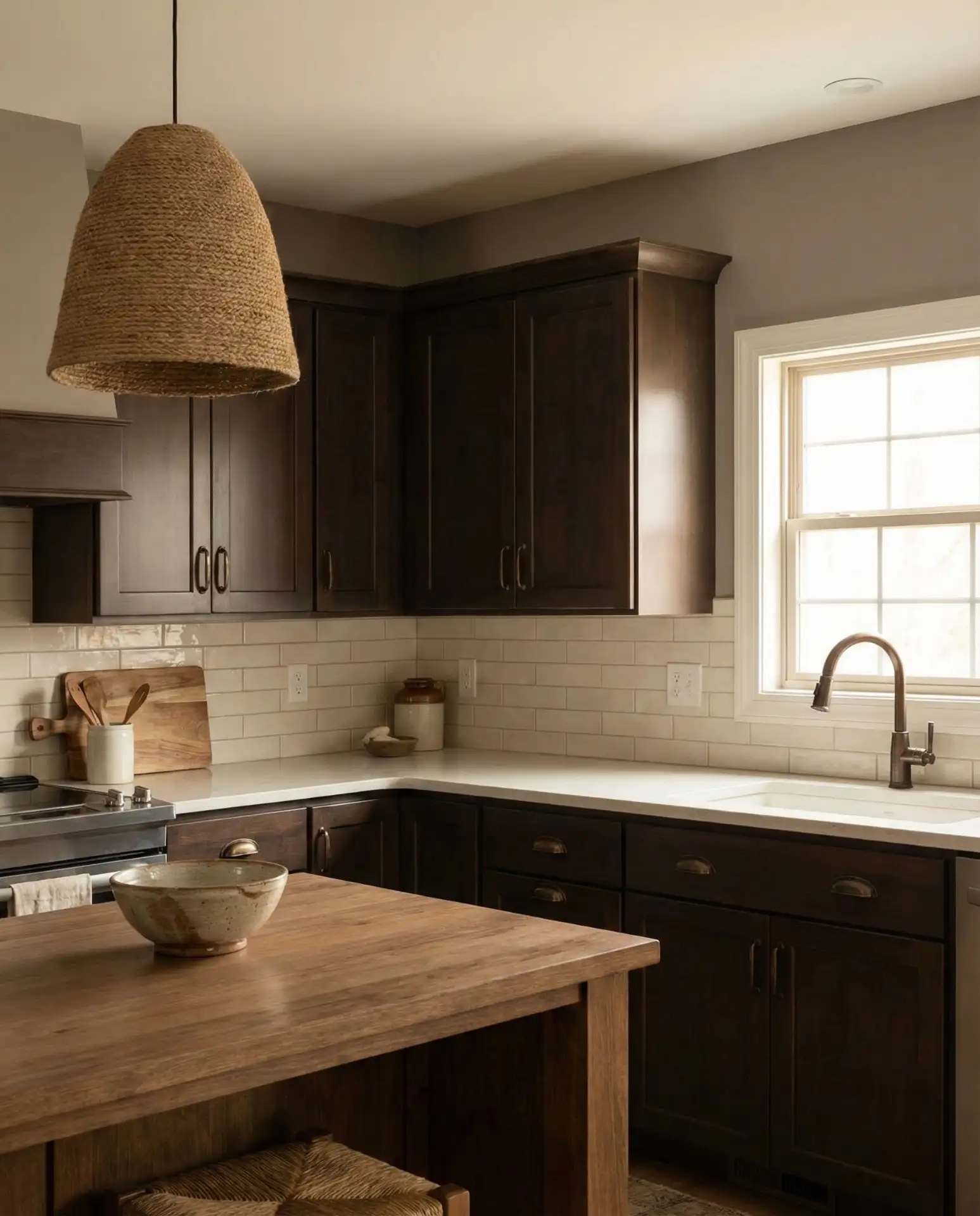
5. Warm Neutral Greige with Dark Wood Cabinets

When you have dark wood cabinets, choosing the right wall color can make or break the space. A warm neutral greige—a blend of gray and beige—provides the perfect backdrop that lets rich wood tones shine without making the kitchen feel too heavy. This combination is timeless and sophisticated and works across traditional, transitional, and modern aesthetics. 
Many real homeowners choose this palette when they inherit dark cabinetry and aren’t ready to paint or replace it. The greige acts as a bridge between warm and cool tones, preventing the space from feeling dated or too formal. It’s also incredibly forgiving with lighting changes throughout the day, maintaining its warmth in morning light and its subtle sophistication in the evening. Accent with cream, ivory, or soft white trim for a polished finish.
6. Cheerful Yellow Accent Wall with White Cabinets

A single yellow accent wall in a kitchen with white cabinets can completely change the mood of the space, bringing energy and warmth without overwhelming the room. This approach is perfect for homeowners who love color but aren’t ready to commit to painting the entire kitchen. Think buttery yellow or soft marigold rather than neon or lemon. 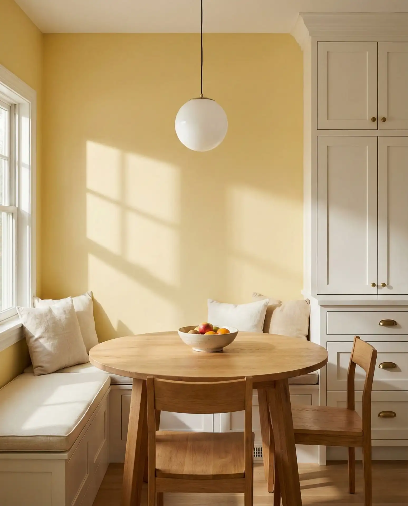
Budget-wise, painting just one wall is a low-cost way to experiment with color. If you decide you don’t love it, you’ve only committed to repainting a single surface. Yellow works especially well in kitchens that face north or east, where it can compensate for cooler natural light. Pair with white, natural wood, and greenery to keep the look fresh and avoid a retro diner vibe unless that’s your intention.
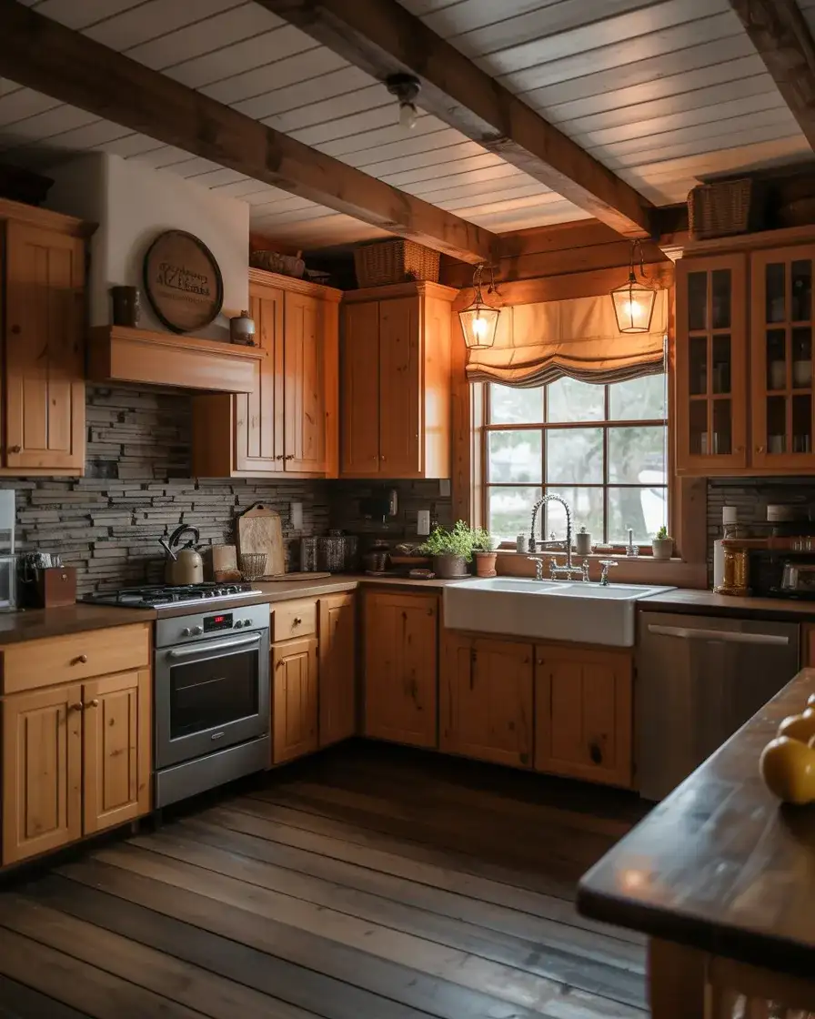
7. Deep Green Walls with Honey Oak Cabinets
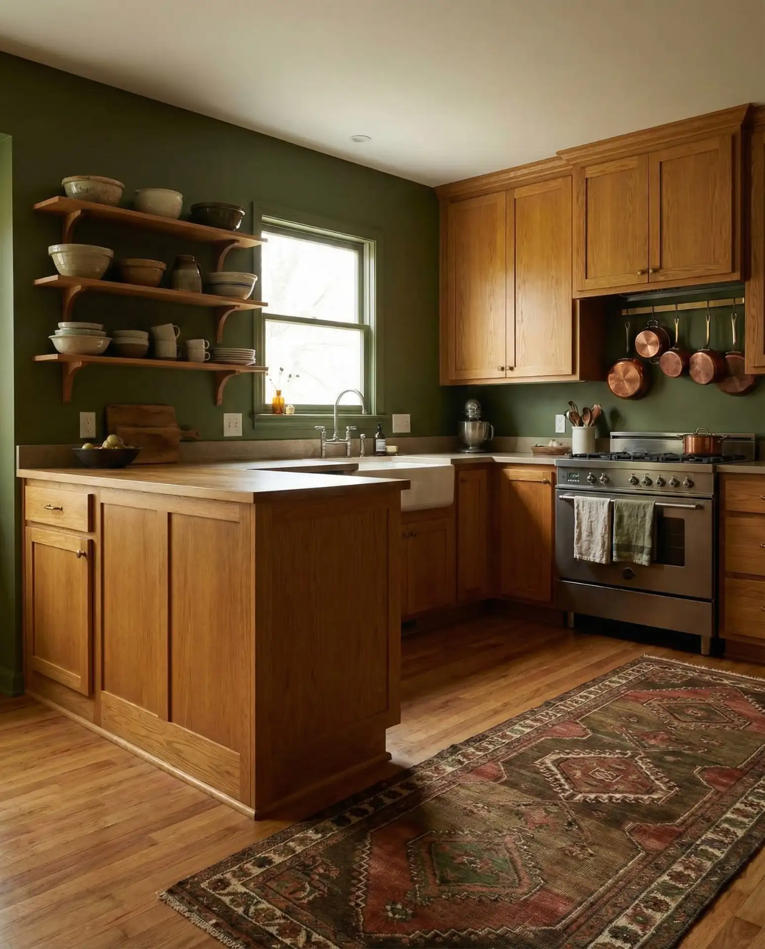
Pairing green walls with honey oak cabinets might sound risky, but when done right, it creates a rich, layered look that feels both vintage and current. The trick is choosing a deep, earthy green rather than a bright or lime tone. This combination celebrates the warmth of oak rather than fighting against it, and it’s a favorite among homeowners who love eclectic, maximalist, or cottagecore styles. 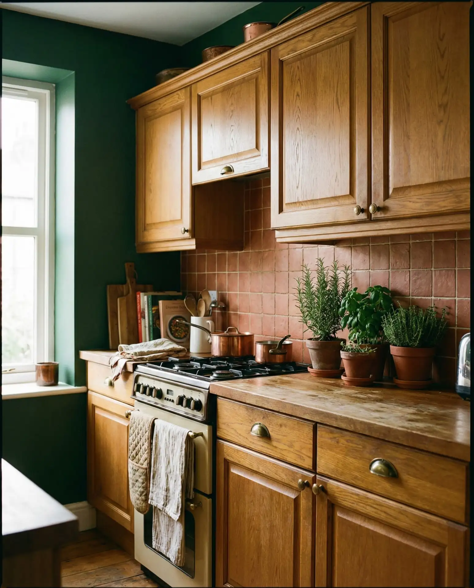
One practical insight: this palette works best when you commit to the richness. Pale or minty greens can make oak look dated, but a saturated, jewel-toned green elevates the wood and makes it feel intentional. Add black or dark bronze fixtures, cream or white countertops, and plenty of plants to tie the look together. It’s a bold choice that’s gaining traction as more homeowners embrace colorful, personality-filled kitchens.
8. Soft Gray Walls with Cherry Cabinets
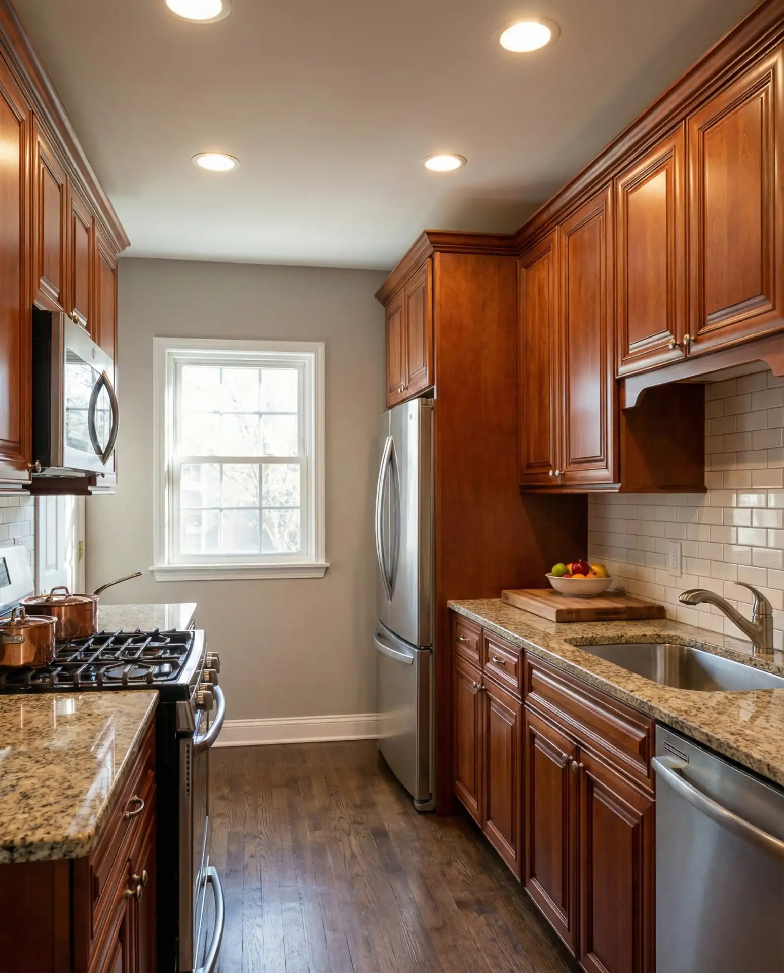
If you have cherry wood cabinets, which can lean quite red or orange, a soft, cool-toned gray on the walls can help balance those warm tones. This creates a sophisticated, tailored look that feels transitional and timeless. The key is avoiding grays that are too blue or too dark, which can make the cherry feel even more dated. 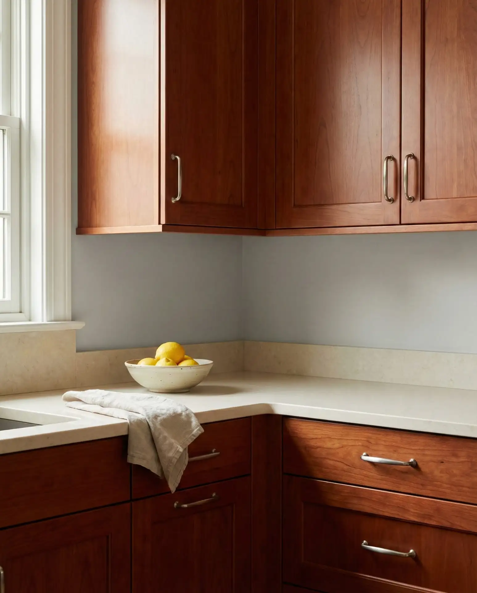
Expert-style commentary: designers often recommend a gray with a slight greige undertone when working with cherry, as this prevents the space from feeling too cool or sterile. The gray acts as a neutral anchor that lets the cherry be the star without competing. White trim and neutral countertops complete the look, and the result is a kitchen that feels classic but not stuck in the early 2000s when cherry was everywhere.
9. Witchy Black Walls with Open Shelving
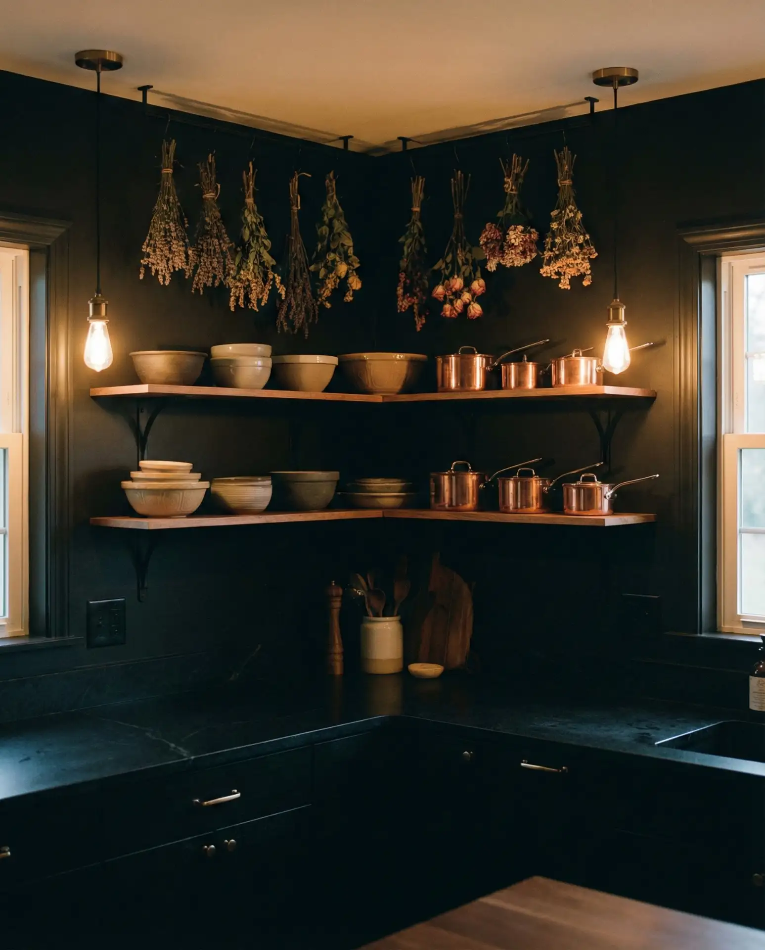
For homeowners drawn to witchy, gothic, or dark academia aesthetics, painting kitchen walls in deep matte black creates a cozy, intimate space that feels like a modern apothecary. This look has been gaining serious traction on Pinterest, especially among younger homeowners who want their kitchen to feel more like a curated personal space than a sterile cooking zone. 
Real homeowner behavior: people who choose this style often pair it with abundant plants, vintage glassware, and natural textures to keep the space from feeling too stark or cold. Open shelving in wood or metal allows you to display colorful dishware and ingredients that pop against the dark backdrop. Lighting is crucial—layered sources like pendant lights, under-cabinet LEDs, and candles create warmth and prevent the space from feeling cave-like.
10. Warm Taupe with Brown Cabinets
Kitchens with brown cabinets—whether medium-toned wood or painted brown—benefit from walls in a warm neutral taupe that has both gray and beige qualities. This creates a monochromatic, layered look that feels cohesive and calming. It’s a safe choice that never feels boring when you vary textures and finishes throughout the space. 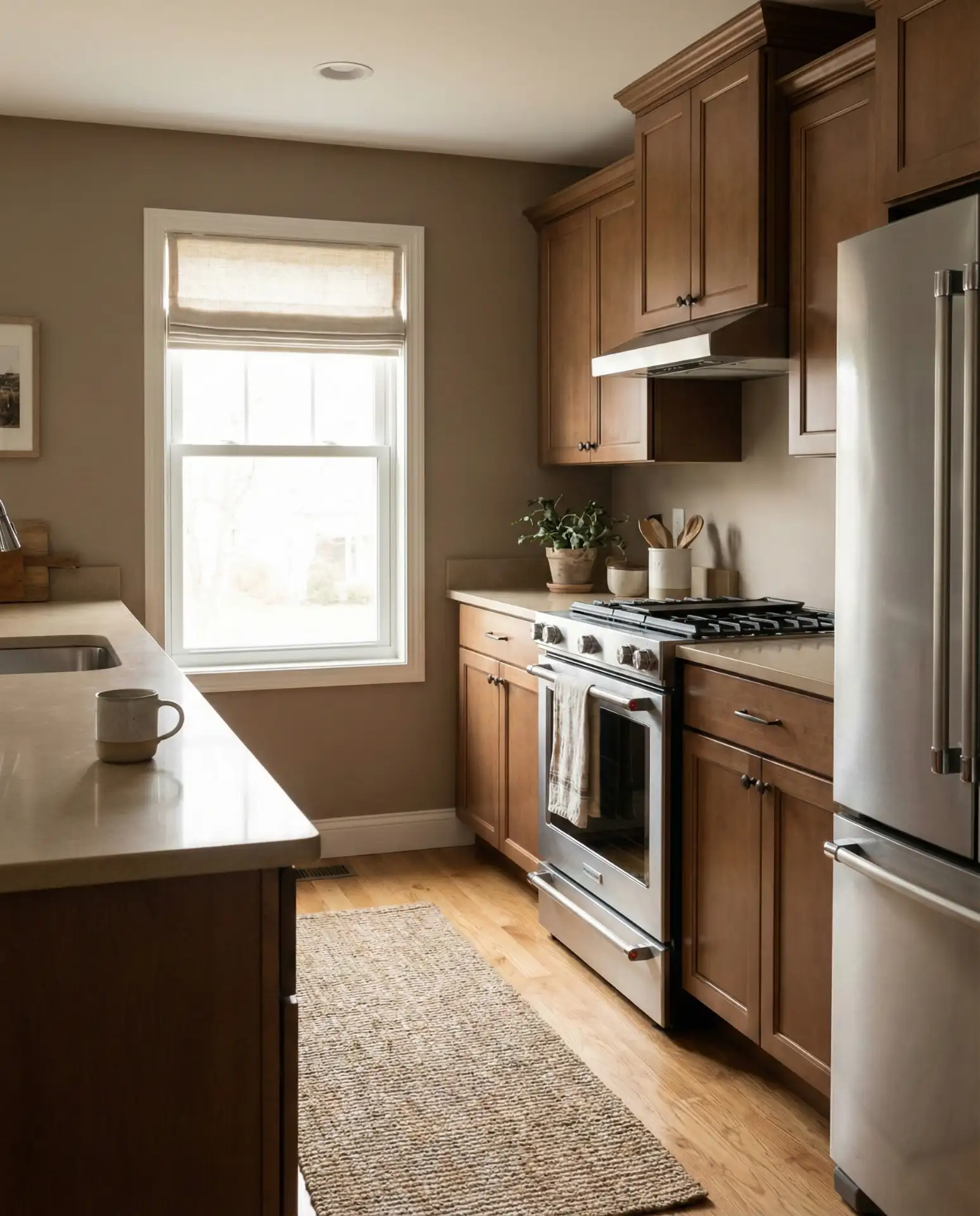
This palette is especially common in Midwestern and Southern homes where a cozy, traditional aesthetic is prized. It’s also budget-friendly because it doesn’t require bold accent colors or high-end finishes to look pulled together. A common mistake is choosing a taupe that’s too pink or mauve, which can read dated. Test your sample in both natural and artificial light, and lean toward taupes with more greige or mushroom qualities for a contemporary feel.
11. Crisp White Walls and White Cabinets with Black Countertops
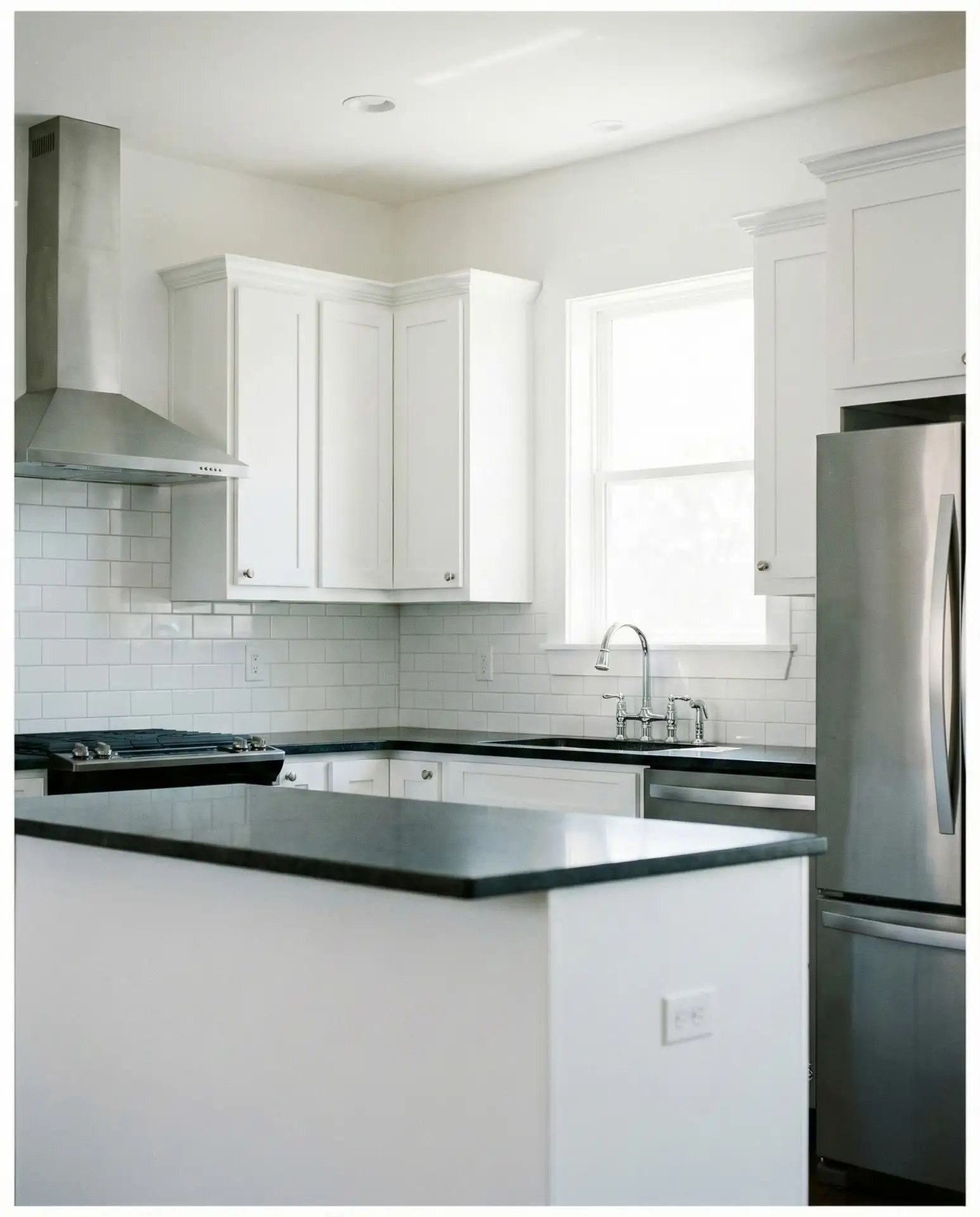
The classic white cabinets and black countertops combination gets even sharper when you paint the walls in a clean, bright white. This high-contrast look is timeless, modern, and incredibly popular in both urban apartments and suburban homes. The all-white backdrop lets the black countertops and any colorful decor or dishware really stand out. 
American lifestyle context: this palette is especially beloved in coastal regions and in homes with open floor plans where the kitchen flows into the living area. The crisp white keeps the space feeling expansive and bright, while the black grounds it and adds drama. To avoid a sterile look, add warmth through natural wood cutting boards, plants, woven baskets, or brass and gold accents. It’s a versatile foundation that adapts to nearly any style.
12. Dusty Rose Walls with White Cabinets
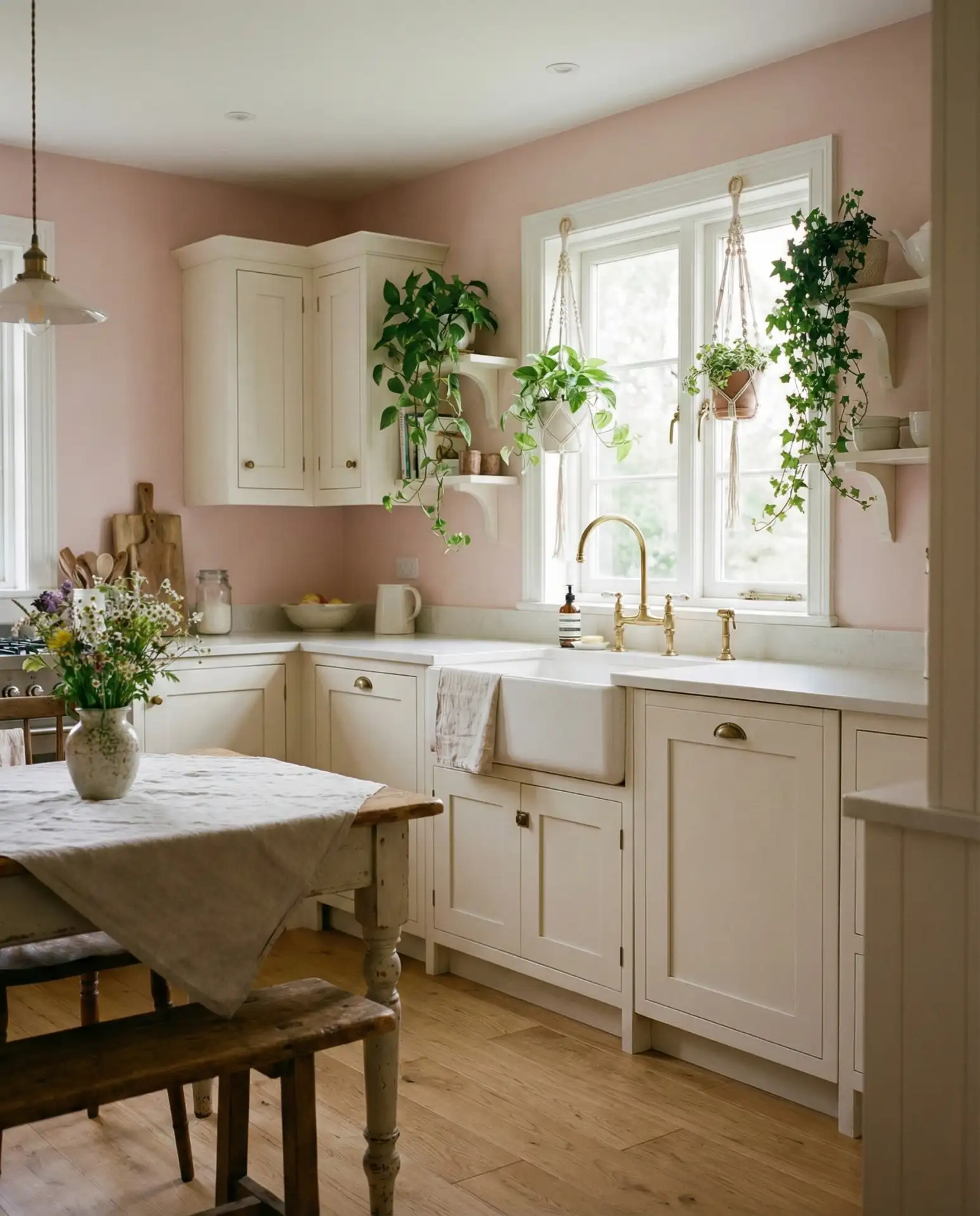
A muted, dusty rose or blush pink on the walls might not be your first thought for a kitchen, but paired with white cabinets, it creates a surprisingly sophisticated and warm space. This color has been trending in cottage and modern farmhouse kitchens, offering a softer alternative to the usual grays and beiges while still feeling grown-up. 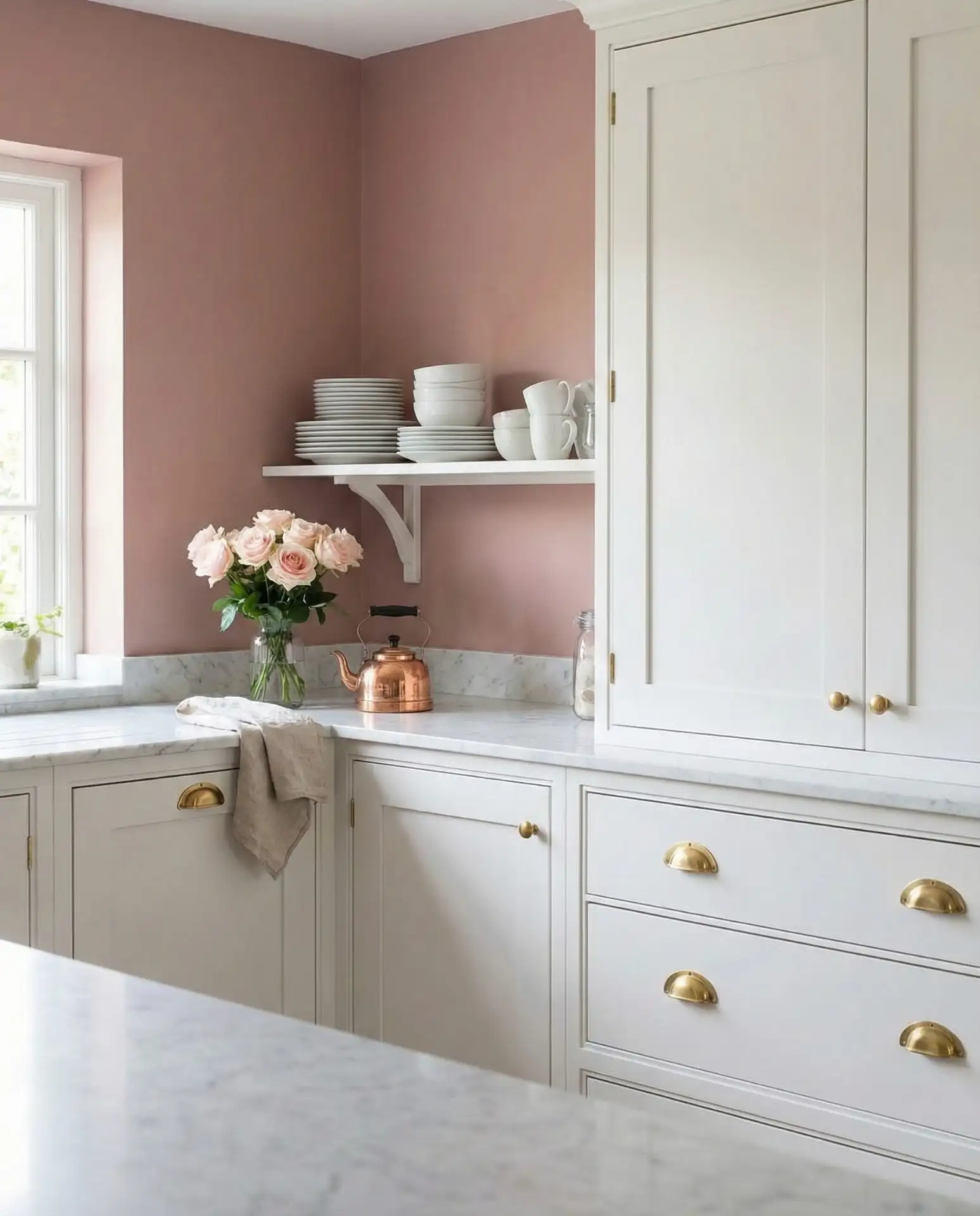
Where it works best: kitchens with good natural light, especially those with white or light wood floors and countertops. The rose should be toned down—almost grayish—to avoid looking too sweet or childlike. Pair with black, brass, or matte gold fixtures to add sophistication, and avoid overly floral or frilly decor. This palette is perfect for homeowners who want a kitchen with personality that still photographs beautifully and feels inviting.
13. Navy Blue Walls with Brass and White Cabinets
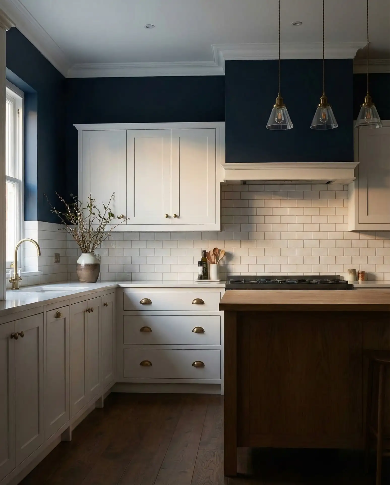
Deep navy blue walls combined with white cabinets and brass hardware create a preppy, upscale look that’s both bold and refined. This color scheme has been a favorite on Pinterest for years and shows no signs of slowing down. The navy adds drama and depth, while the white keeps the space from feeling too enclosed. 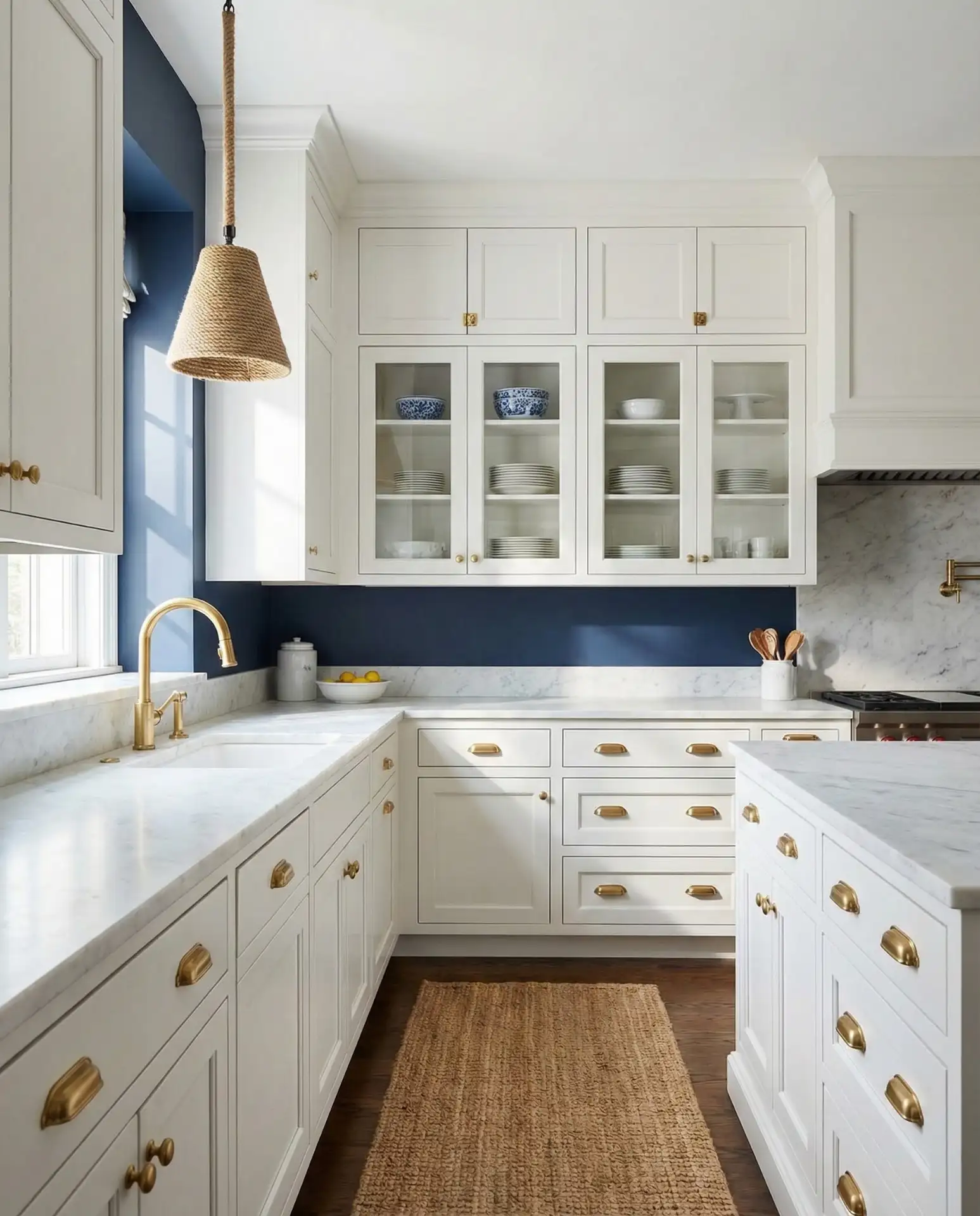
Practical insight: navy works particularly well in kitchens with high ceilings or large windows, as the dark color can make smaller spaces feel cramped. The brass hardware and fixtures add warmth and prevent the navy and white from feeling too stark or nautical in a cliché way. Accent with natural wood, marble, and white or cream textiles. This palette is a favorite among homeowners who want a kitchen that feels both timeless and current.
14. Terracotta Walls with White Cabinets
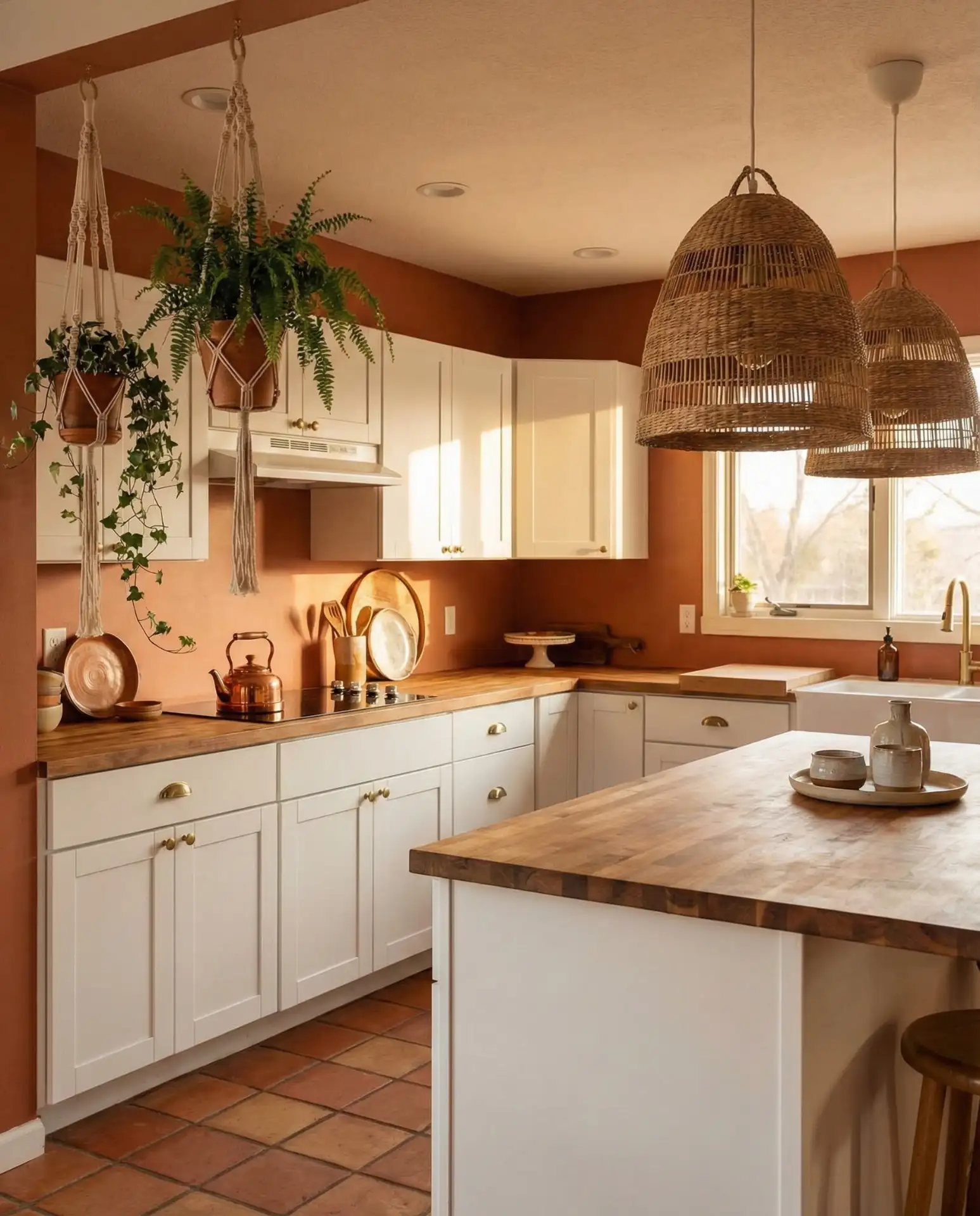
Warm terracotta or clay-colored walls are having a major moment, especially in kitchens with white cabinets and natural materials. This earthy, sun-baked hue brings a Mediterranean or Southwestern vibe to your kitchen and pairs beautifully with wood, rattan, and greenery. It’s a warm neutral that feels rich but not overwhelming. 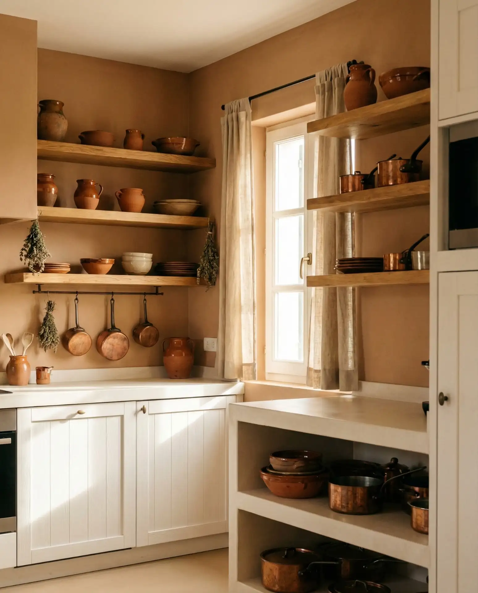
This color is particularly popular in regions with warm climates, like the Southwest and Southern California, where it echoes the natural landscape. It also works beautifully in older homes with Spanish or Mission-style architecture. The key is to balance the richness of the terracotta with plenty of white, cream, and natural wood so the space doesn’t feel too heavy. Add black iron or matte black fixtures for contrast and depth.
15. Pale Mint Walls with Oak Cabinets
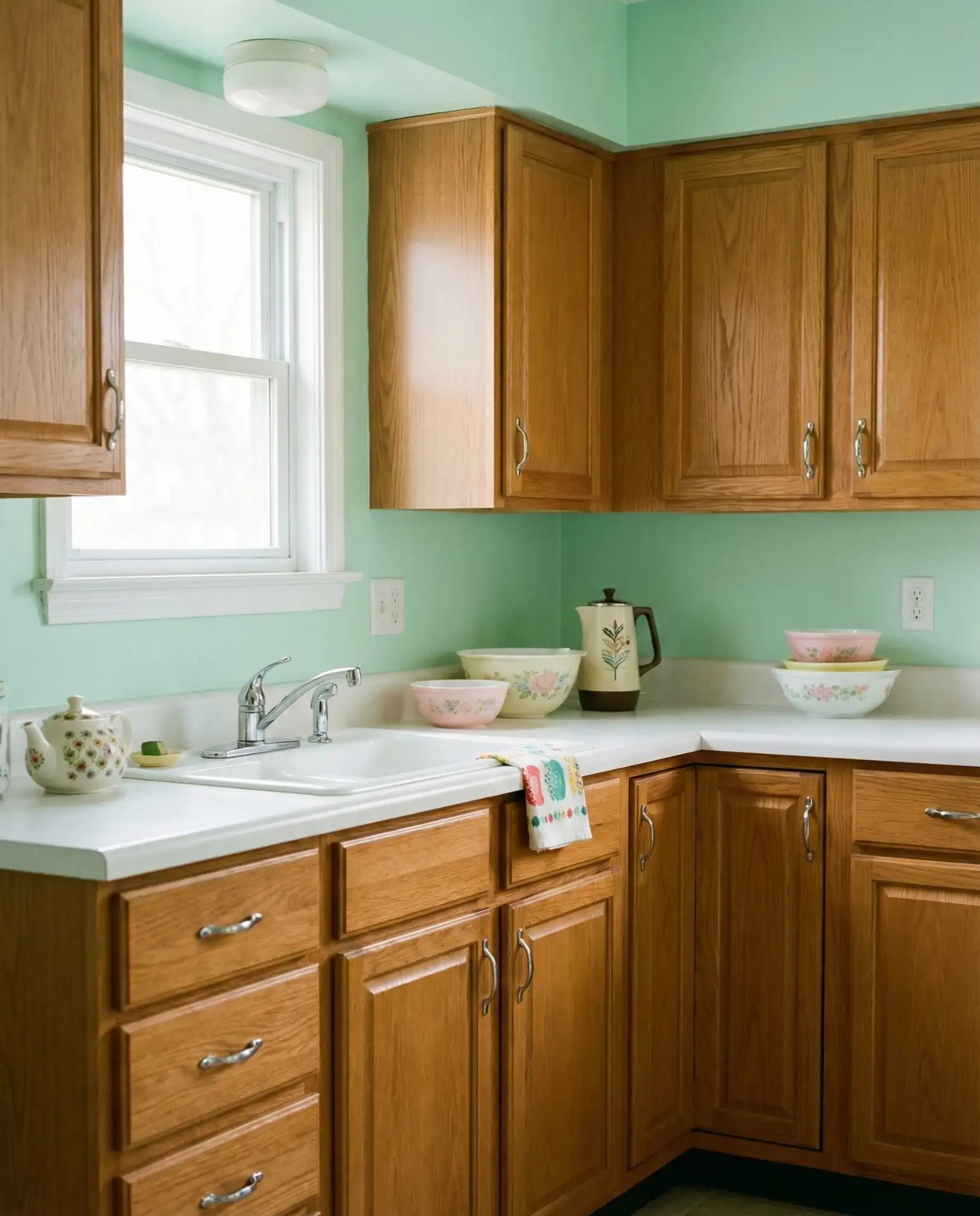
A very soft, barely-there mint green can be a surprising and delightful choice for kitchens with oak cabinets. Unlike bolder greens, pale mint adds a whisper of color that feels fresh and retro in the best way. This combination has a nostalgic, mid-century quality that’s been embraced by homeowners looking for something a little different from the usual neutrals. 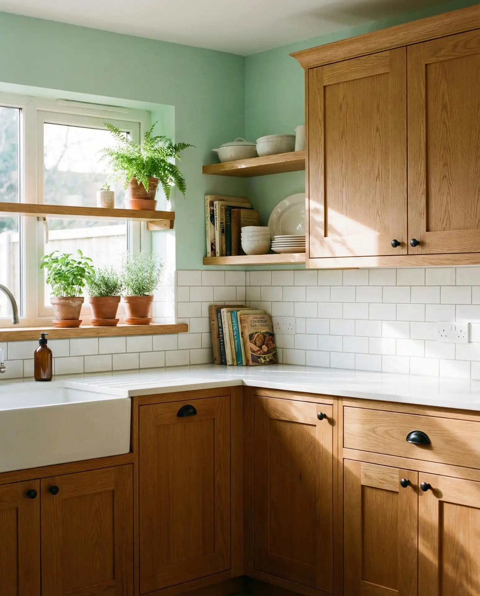
A micro anecdote: one homeowner described this as “the color that made me stop hating my oak cabinets.” The pale mint acts as a cooling agent to the warm, sometimes orange oak, creating balance without fighting the wood. Keep the rest of the palette simple—whites, creams, and natural fibers—so the mint can do its job without competition. This is a great choice for anyone who wants a kitchen with a gentle personality that’s still easy to live with.
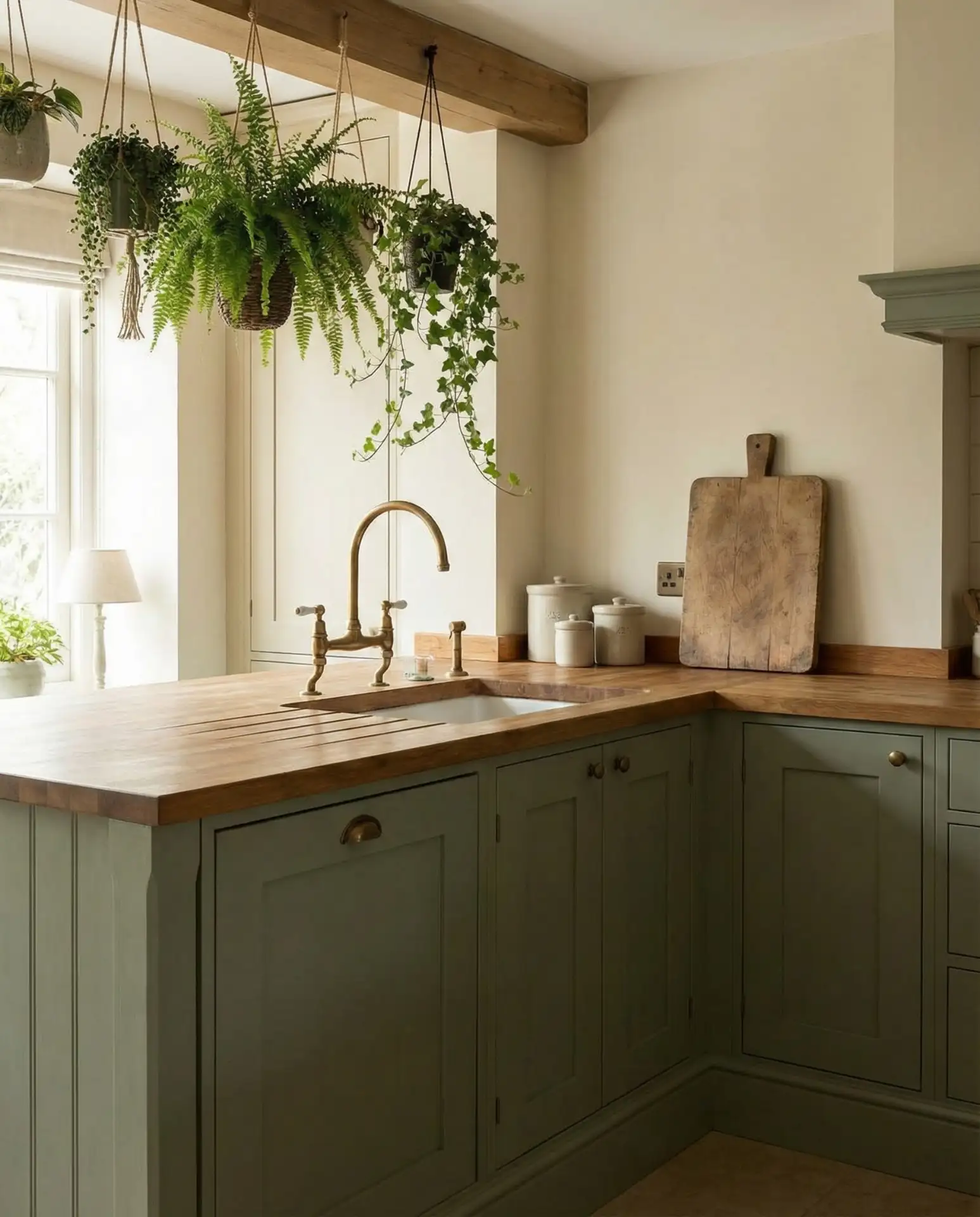
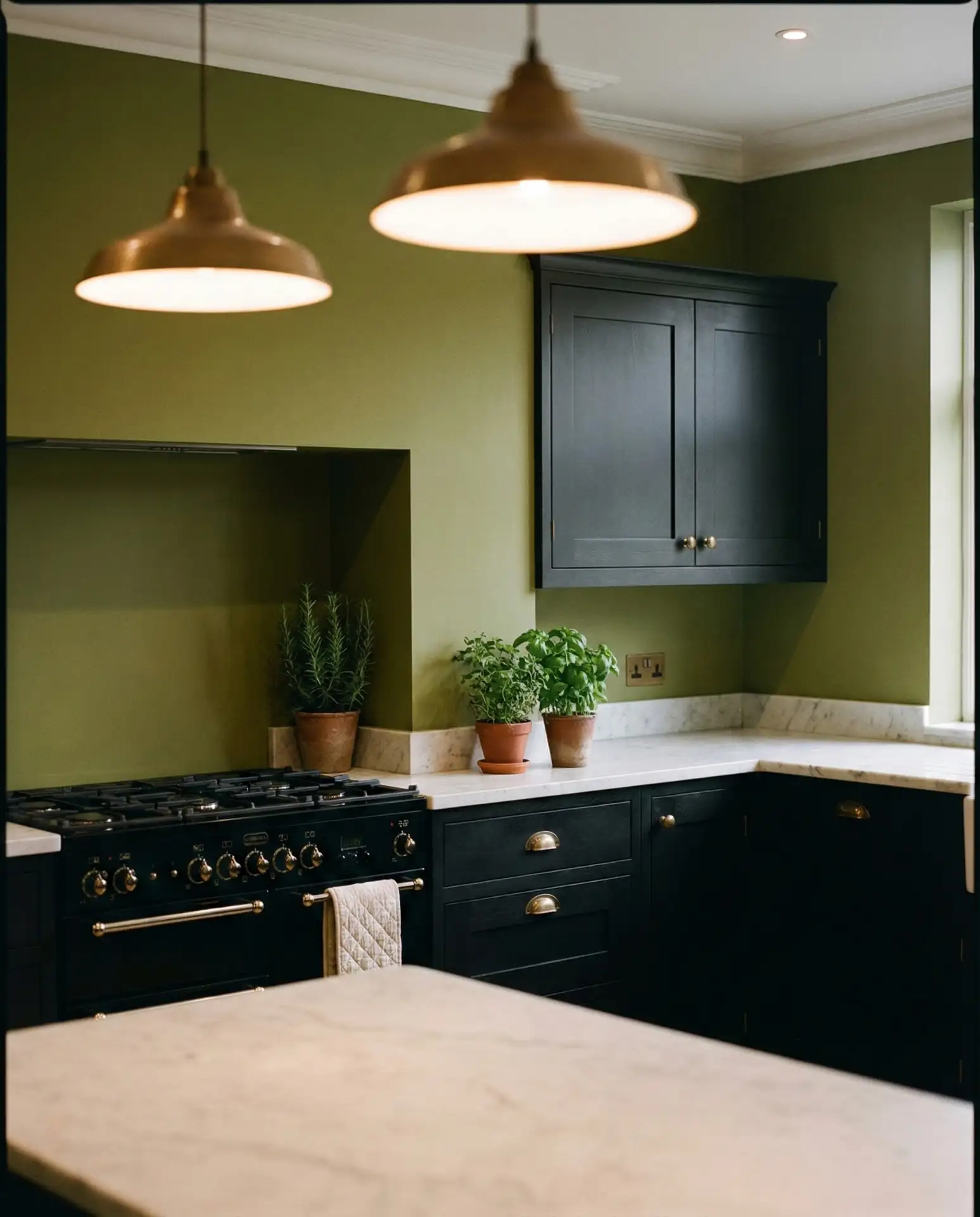
16. Olive Green Walls with Black Cabinets
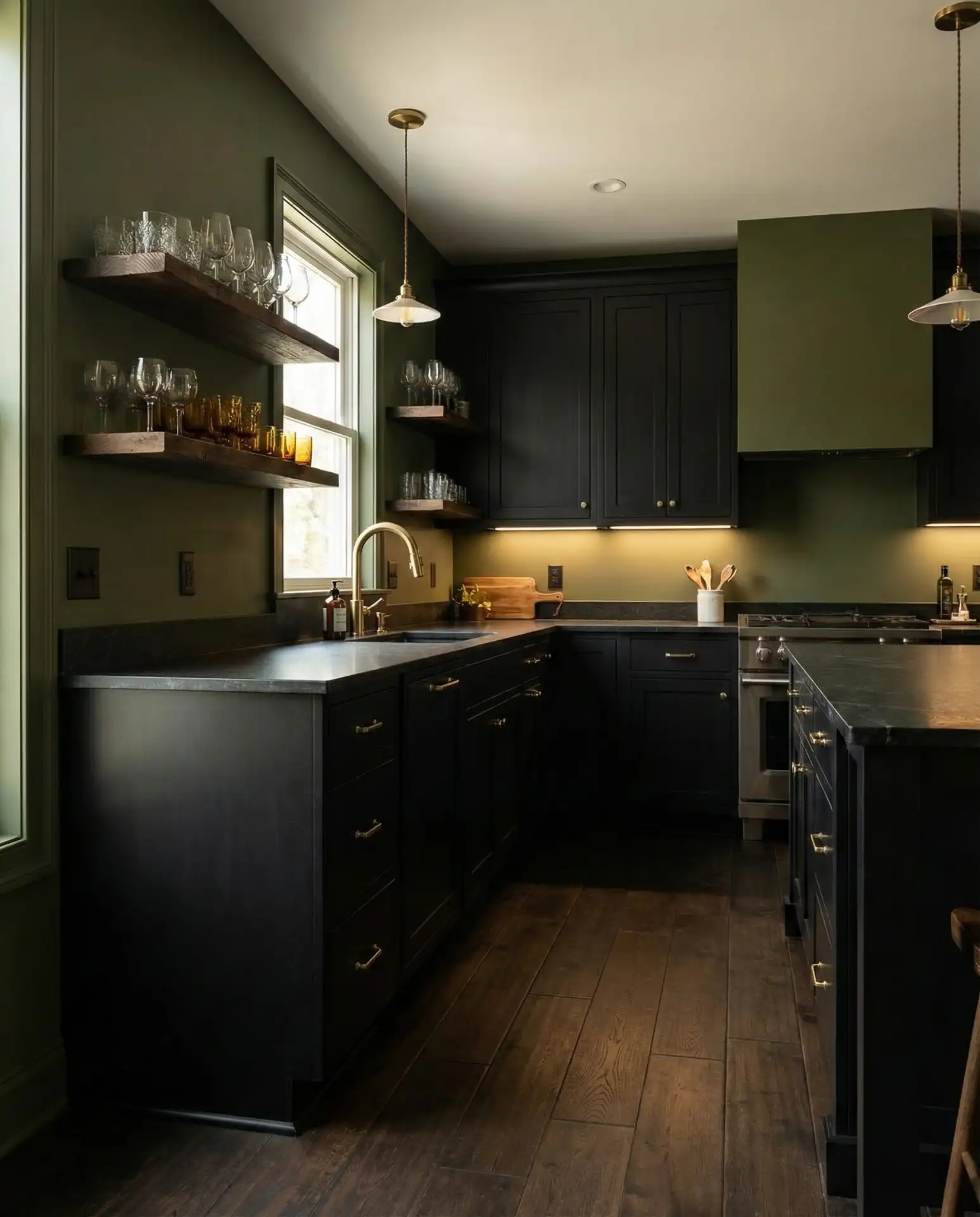
Pairing rich olive green walls with black cabinets creates a dramatic, nature-inspired kitchen that feels both luxurious and grounded. This moody palette is ideal for homeowners who want a kitchen that makes a statement and feels like a cozy retreat rather than a bright, open space. The combination is earthy yet sophisticated. 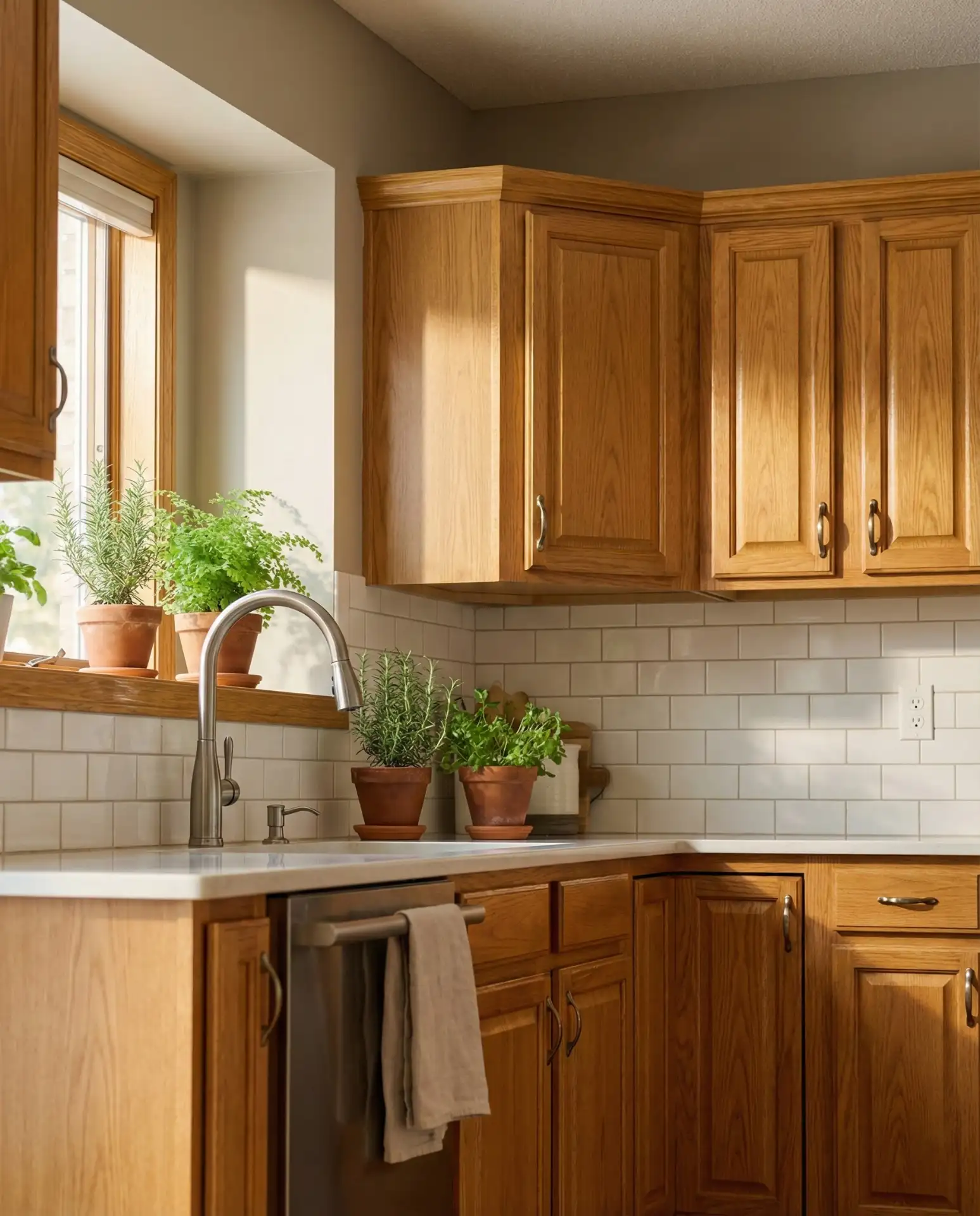
Expert commentary: when working with such saturated colors, lighting becomes even more critical. Layered lighting—recessed, pendant, and under-cabinet—ensures the space doesn’t feel too dark or closed in. The olive green should have a warm, earthy undertone rather than leaning too gray or too yellow. Pair with natural wood, brass or gold accents, and plenty of greenery to enhance the organic, luxe vibe. This palette is not for the faint of heart, but when done right, it’s stunning.
17. Sherwin Williams Agreeable Gray with Honey Oak Cabinets
Sherwin Williams Agreeable Gray is one of the most recommended paint colors for kitchens with honey oak cabinets because it’s a true warm greige that balances the orange tones in the wood. It’s not too gray, not too beige, and it works across a wide range of lighting conditions, making it a safe but effective choice for homeowners looking to update their space. 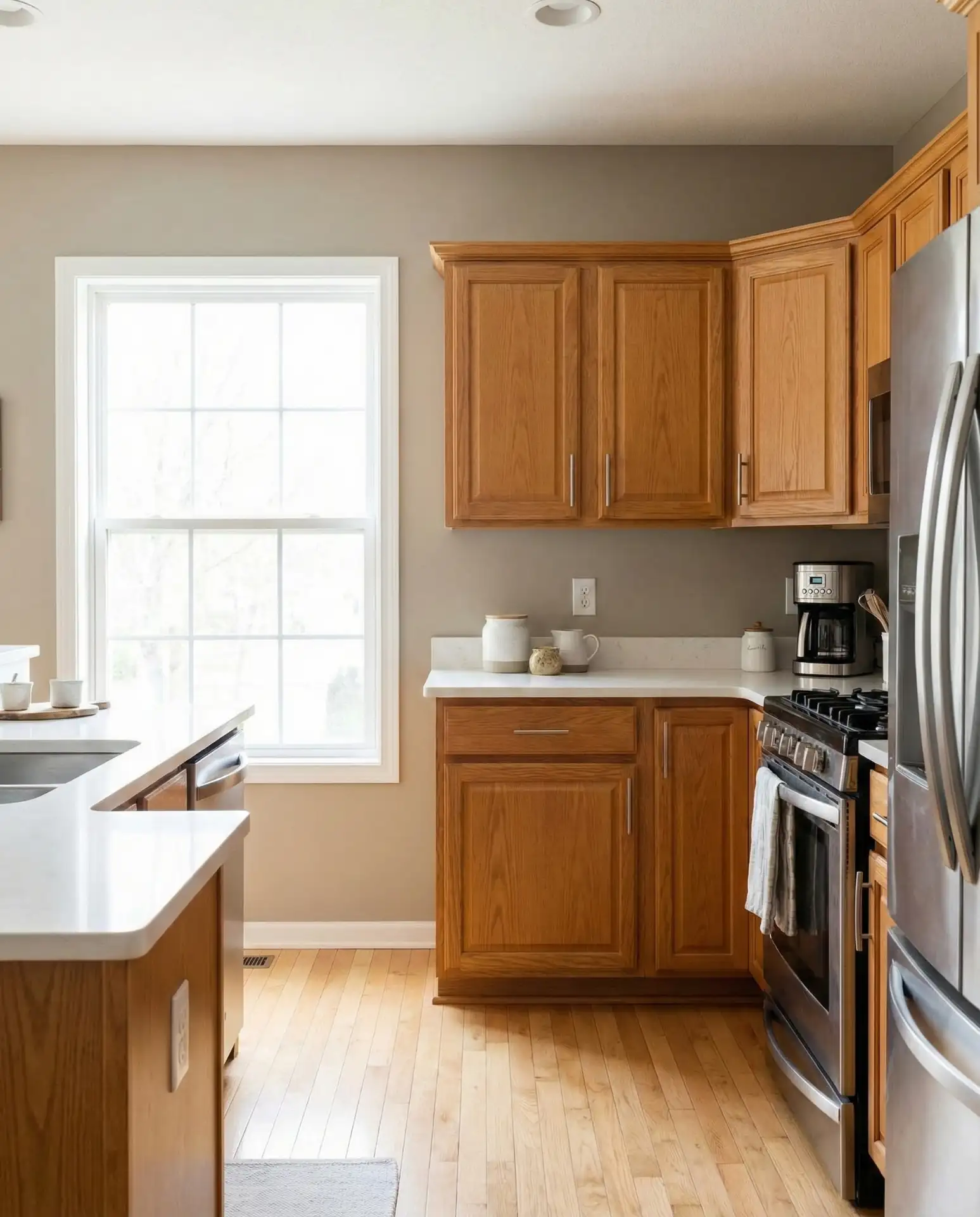
Where it works best: literally everywhere. Agreeable Gray is popular for a reason—it’s incredibly versatile and works in kitchens of all sizes, styles, and orientations. It’s warm enough to complement oak but neutral enough to recede into the background. Pair it with white or cream countertops and backsplash, and add warmth through textiles, wood accents, and greenery. This is a go-to recommendation from designers and DIYers alike for good reason.
18. Benjamin Moore Hale Navy with White Cabinets

Benjamin Moore Hale Navy is a go-to deep blue for kitchen walls, especially when paired with white cabinets. It’s a saturated, classic navy that feels timeless and elegant without being too dark or oppressive. This color has been a Pinterest favorite for years and continues to be a top choice for homeowners wanting a dramatic but livable kitchen. 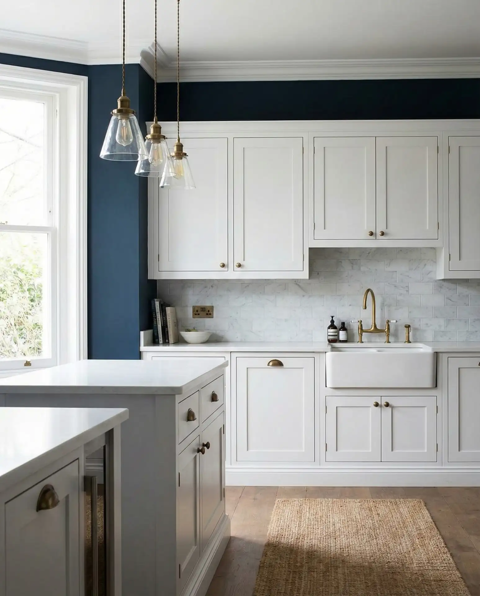
Budget angle: while Hale Navy is a premium paint color from Benjamin Moore, the investment is often worth it because the color is so rich and well-formulated that you may need fewer coats than with cheaper alternatives. It also holds up well over time without fading. The key to success is ensuring you have ample lighting and balancing the navy with plenty of white, cream, and warm metallics to prevent the space from feeling too heavy or cave-like.
19. Sherwin Williams Sea Salt in a Coastal Kitchen
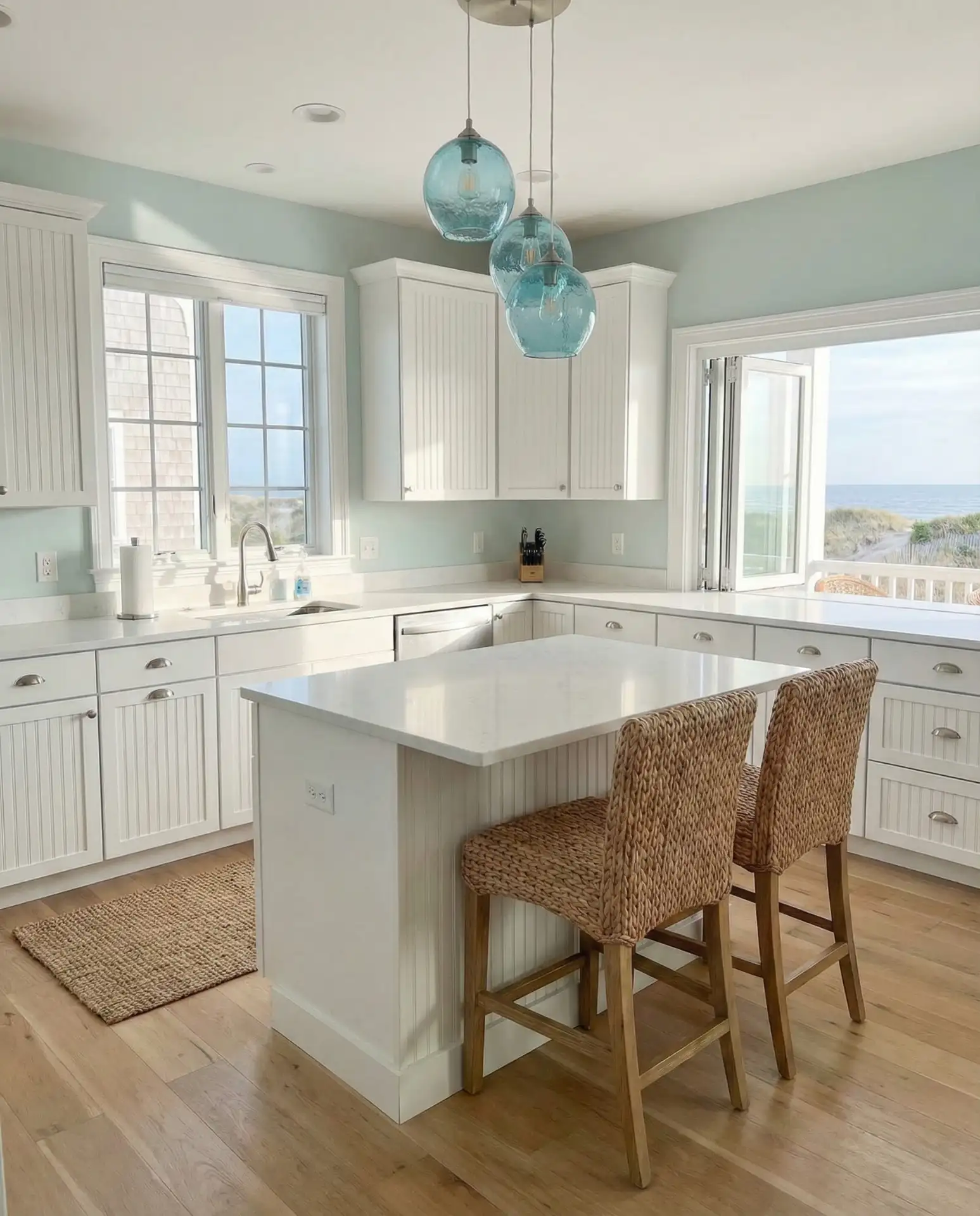
Sherwin Williams Sea Salt is a soft, watery green-blue that’s perfect for coastal kitchens or any space where you want a calm, beachy vibe. It’s not quite blue, not quite green, which gives it a chameleon quality that shifts with the light throughout the day. Pair it with white cabinets and natural textures for the ultimate relaxed kitchen. 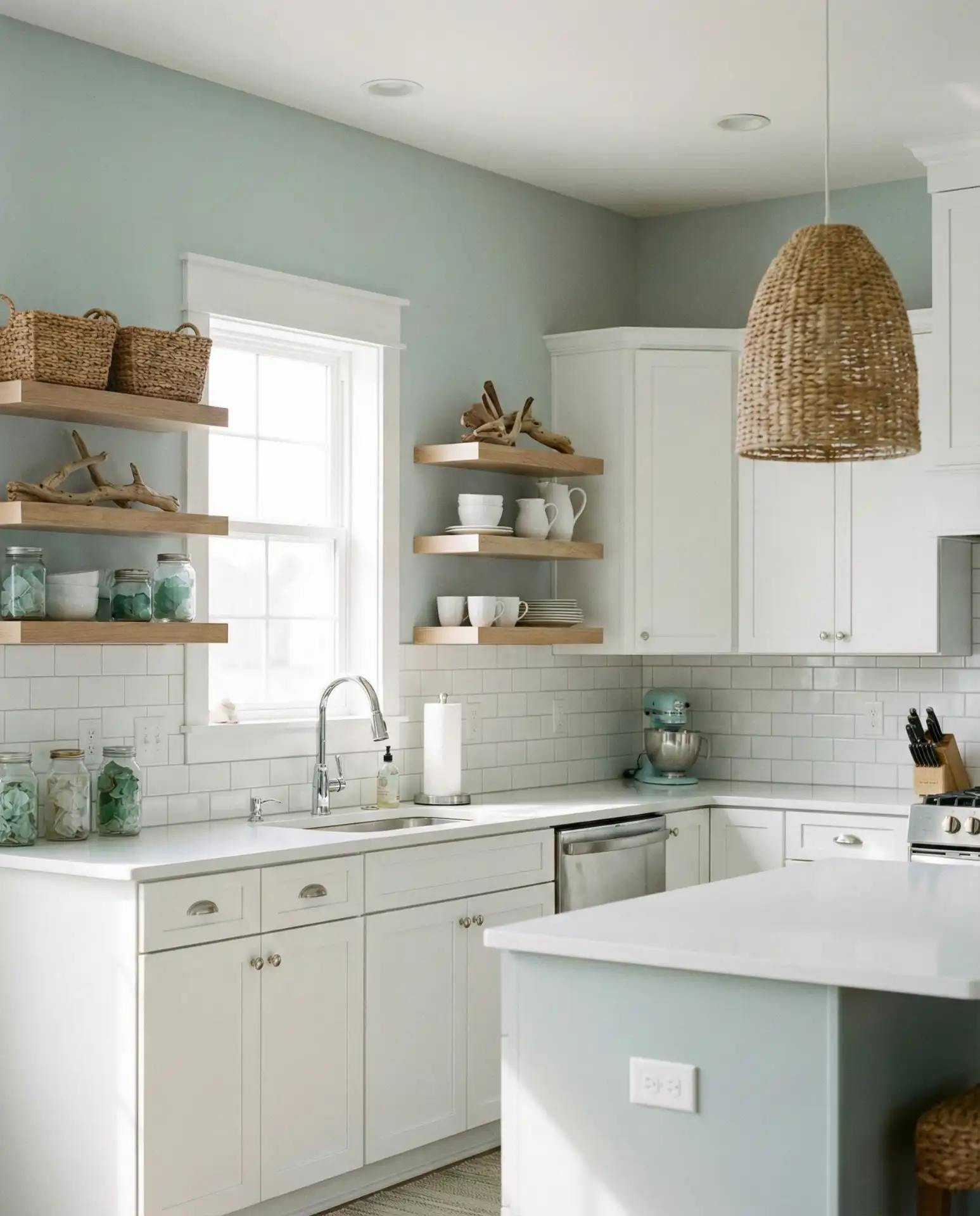
Real homeowner behavior: many people describe Sea Salt as “the color that doesn’t commit,” meaning it reads differently in various lights—sometimes more blue, sometimes more green, and sometimes nearly gray. This versatility is part of its charm, but it’s also why sampling it in your actual space is critical. It works best in kitchens with natural light and pairs beautifully with whites, creams, natural wood, and blue or green accents. Avoid cool grays and stark whites, which can make it feel washed out.
20. Soft Peach Walls with White Cabinets
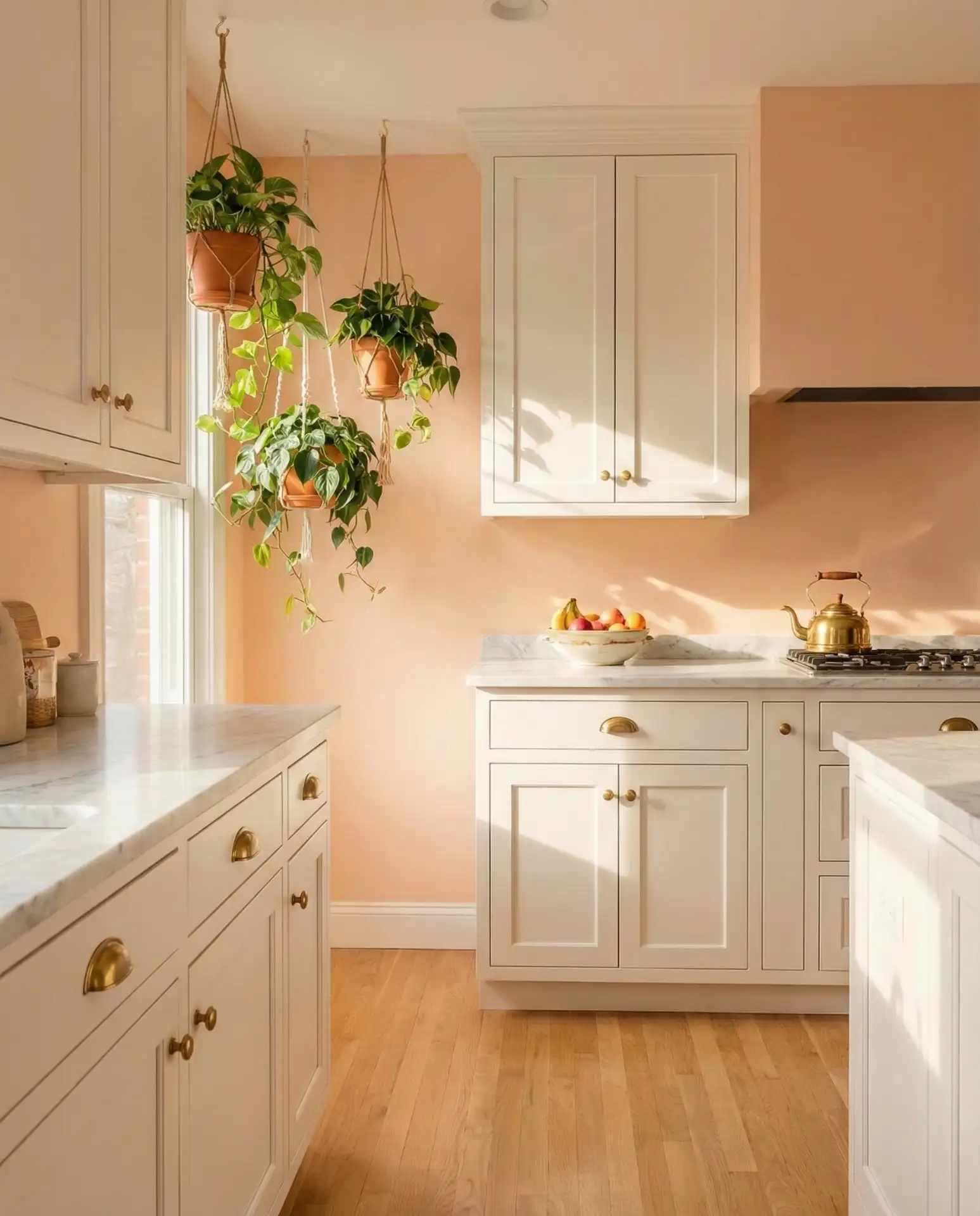
A muted, dusty peach on the walls creates a warm, inviting kitchen that feels fresh and unexpected. Paired with white cabinets, this color adds personality without overwhelming the space. It’s a wonderful alternative to beige or gray and has been gaining traction in cottage and eclectic kitchens where homeowners want warmth and character. 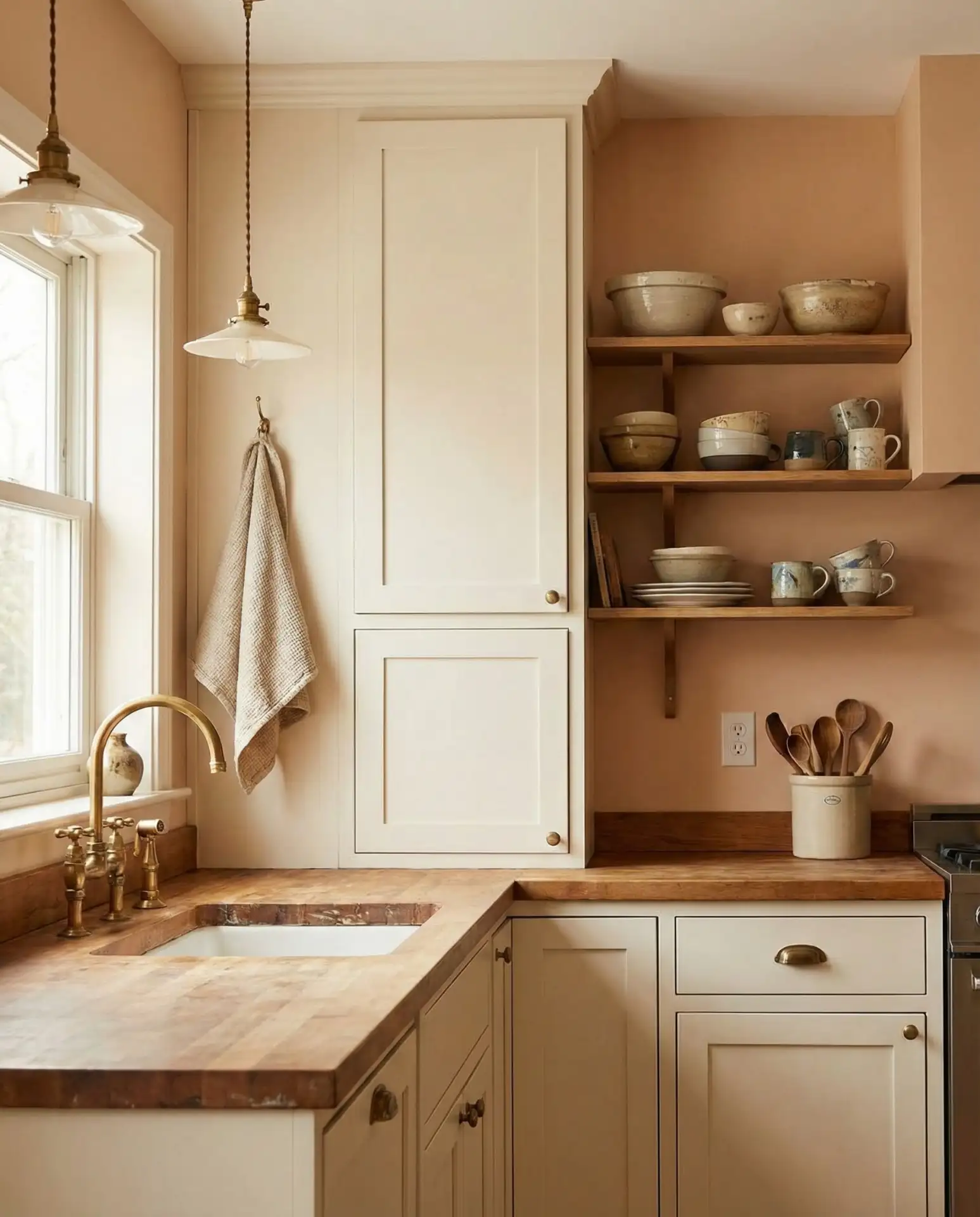
Common mistakes and how to avoid them: choosing a peach that’s too bright or orange will make the kitchen feel dated or too bold. The trick is finding a peach with gray or clay undertones that softens the color and makes it sophisticated. Test your sample in different lights and look at it next to your cabinets, countertops, and floors. Pair with black, brass, or natural wood accents to ground the palette and add contrast.
21. Charcoal Gray Walls with White Cabinets and Black Countertops
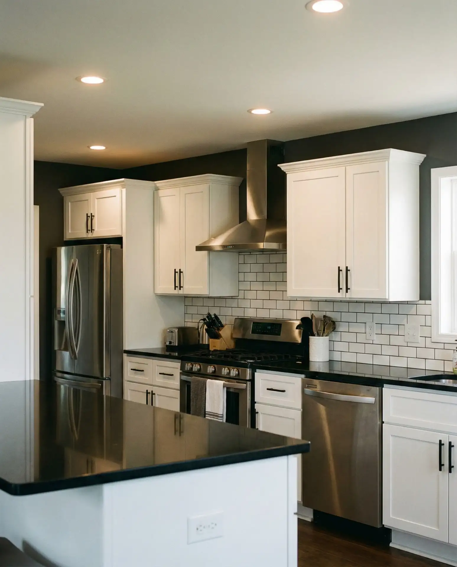
Combining charcoal gray walls with white cabinets and black countertops creates a sophisticated, high-contrast kitchen that feels both modern and timeless. This is a popular combination on Pinterest because it balances drama with livability—the white cabinets keep it from feeling too dark, while the charcoal adds depth and richness. 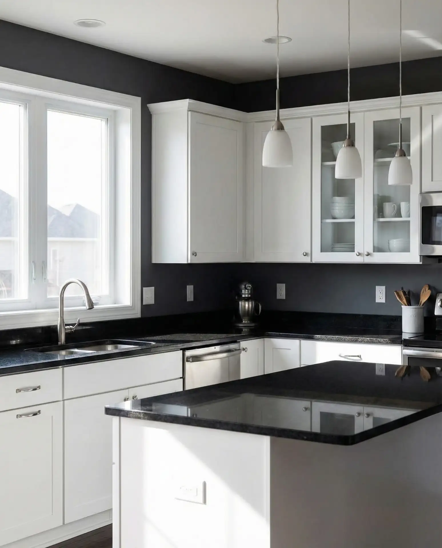
Practical insight: this color scheme requires excellent lighting to prevent the space from feeling too enclosed. Layer your light sources—recessed cans, pendants, under-cabinet strips—and consider adding a statement light fixture to draw the eye up. The charcoal should be a true gray without too much blue or brown, which keeps it modern. Add warmth through wood accents, brass or gold hardware, and textiles to prevent the space from feeling cold or sterile.
22. Soft Lavender Walls with White Cabinets
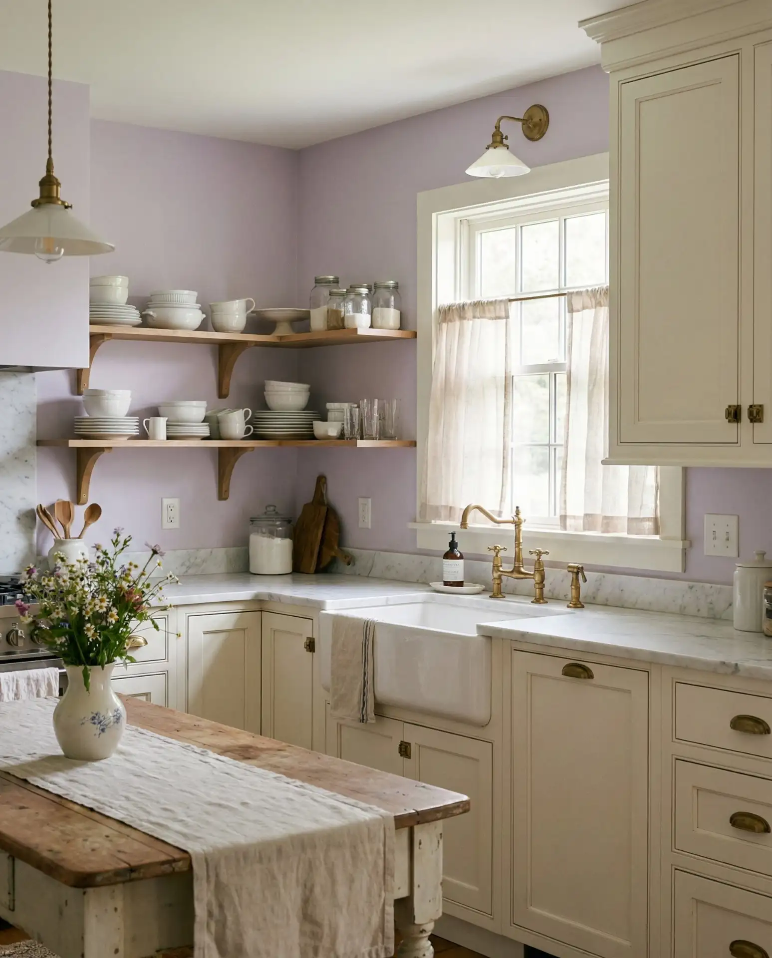
A barely-there lavender or pale purple on the walls is an unexpected choice that can bring a serene, dreamy quality to a kitchen with white cabinets. This color has a subtle, almost ethereal presence that works particularly well in cottage- or romantic-style kitchens. It’s for homeowners who want something different without going too bold. 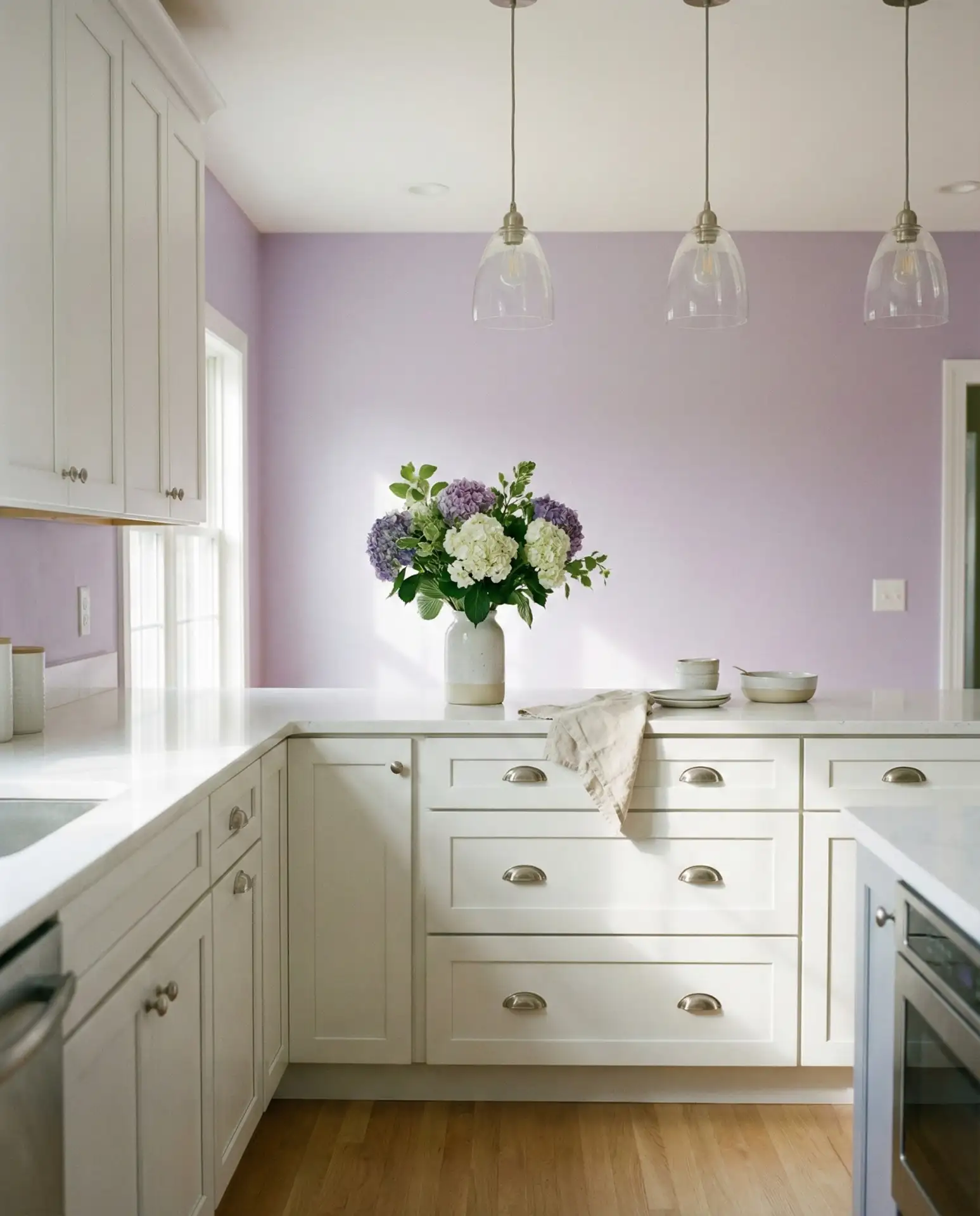
Where it works best: kitchens with abundant natural light and a light, airy aesthetic. The lavender should be so soft it almost reads as white from a distance—think of it as a tinted white rather than a bold purple. Pair with white or cream, natural wood, and silver or chrome fixtures. Avoid heavy, dark accents, which can make the lavender feel jarring. This palette is perfect for anyone who wants a kitchen that feels gentle, calming, and just a little bit magical.
23. Combinations: Two-Tone Walls in the Living Room and Kitchen
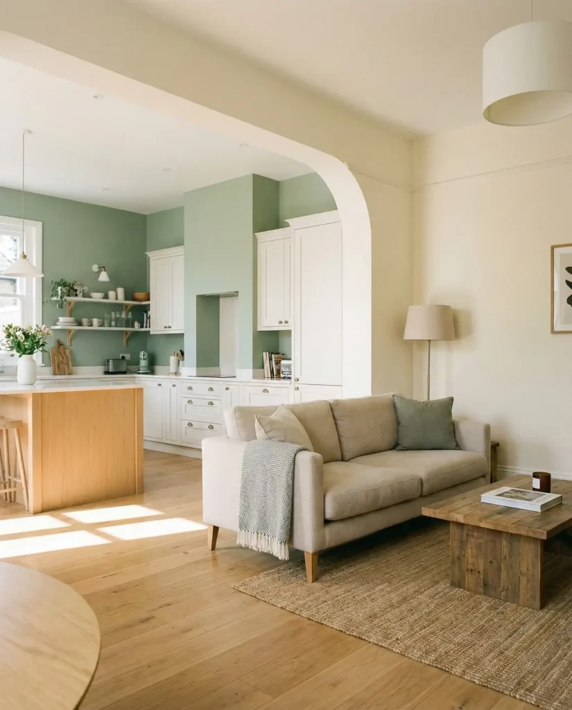
In open-concept homes where the kitchen flows into the living room, using two complementary paint colors creates definition without adding walls. Many homeowners paint the kitchen in a lighter or darker shade than the adjacent space, creating visual interest and helping each area maintain its own identity. This combination approach is practical and stylish. 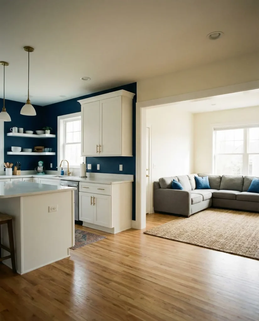
Expert-style commentary: when choosing two colors, make sure they share an undertone—both warm or both cool—so the transition feels intentional rather than jarring. A common approach is to use a darker or more saturated color in the kitchen and a lighter, softer version of a complementary color in the living area. This creates flow while still allowing each space to have its own character. It’s especially effective in homes with large open floor plans where visual boundaries help define function.
24. Warm White with Ideas for Walls with White Cabinets
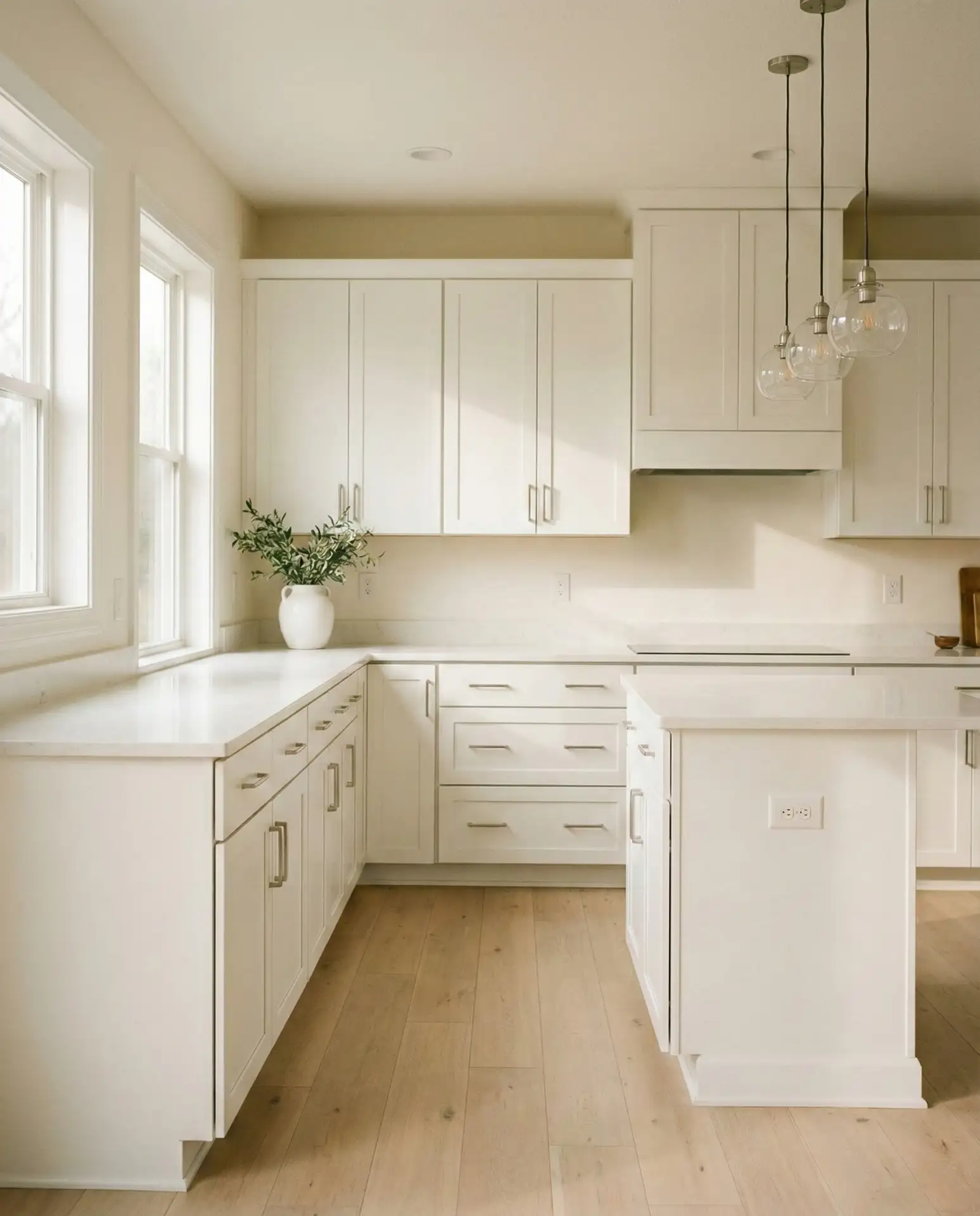
If you have white cabinets and want a monochromatic look, painting the walls in a warm white with a slight cream or beige undertone creates a soft, cohesive space that feels fresh but not stark. This approach is perfect for homeowners who love a clean, minimalist aesthetic but want to avoid the cold, clinical feeling that pure white can sometimes create. 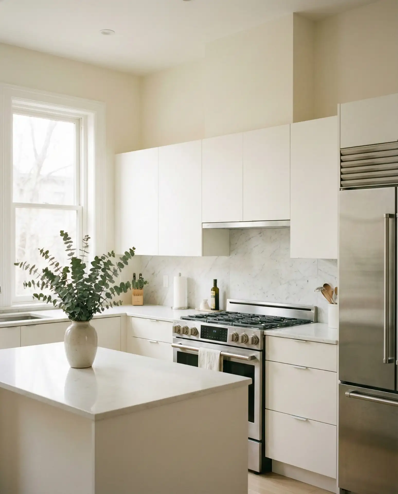
American lifestyle context: the all-white kitchen remains hugely popular, especially in urban areas and among younger homeowners who value a clean, Instagram-ready aesthetic. The trick to keeping it from feeling sterile is layering in texture through wood, woven elements, plants, and varied finishes. The warm white on the walls adds just enough subtle warmth to prevent the space from feeling too cold or hospital-like. This is a timeless choice that provides a blank canvas for changing decor and styling over time.
Conclusion
Choosing the right kitchen paint color in 2026 is about more than just following trends—it’s about creating a space that reflects your personality and works with your existing elements. Whether you’re embracing moody darks, cheerful brights, or timeless neutrals, the key is to consider your cabinet style, lighting, and overall home aesthetic. Now that you’ve explored these ideas, which one speaks to you? Share your thoughts or your own kitchen color success stories in the comments below—we’d love to hear what you’re planning!