As we move into 2026, American homes are embracing a fresh wave of color psychology and intentional design. Whether you’re scrolling Pinterest for palette ideas or planning a full refresh, choosing the right living room color for 2026 can transform how your space feels every single day. This year’s trending hues blend comfort with personality—from cozy earth tones to bright statement walls that energize open layouts. Ahead, you’ll find curated color directions that speak to real homes, real lifestyles, and the way we actually live now.
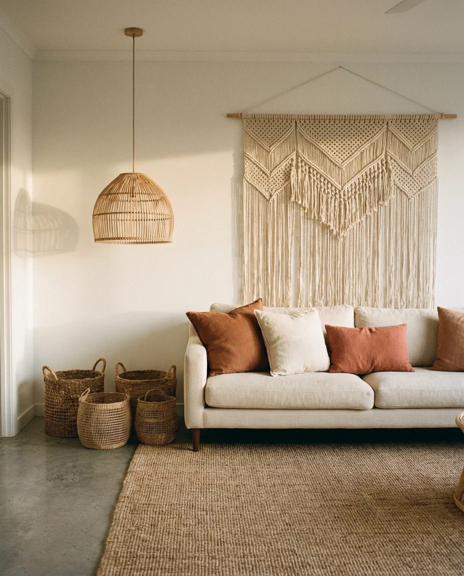
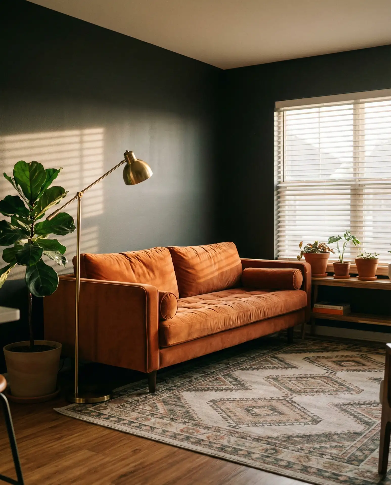
1. Warm Terracotta with Cream Accents
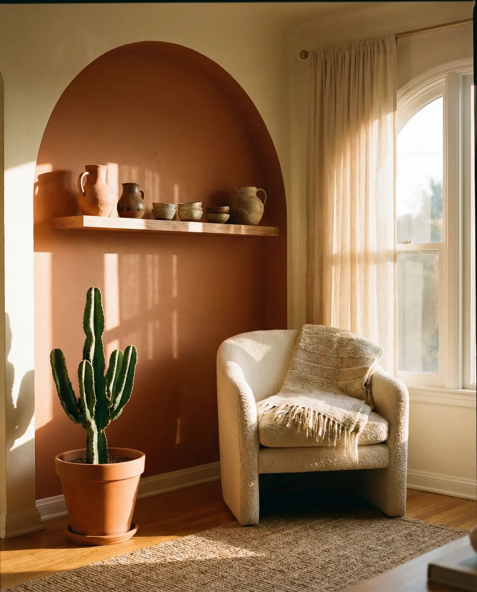
Terracotta brings an earthy, grounded warmth that pairs beautifully with cream-toned furniture and natural wood. This combination works especially well in homes with abundant natural light, where the orange-red undertones glow without overwhelming the room. It’s a palette that nods to Southwest aesthetics but feels modern when balanced with minimal décor and linen textures.
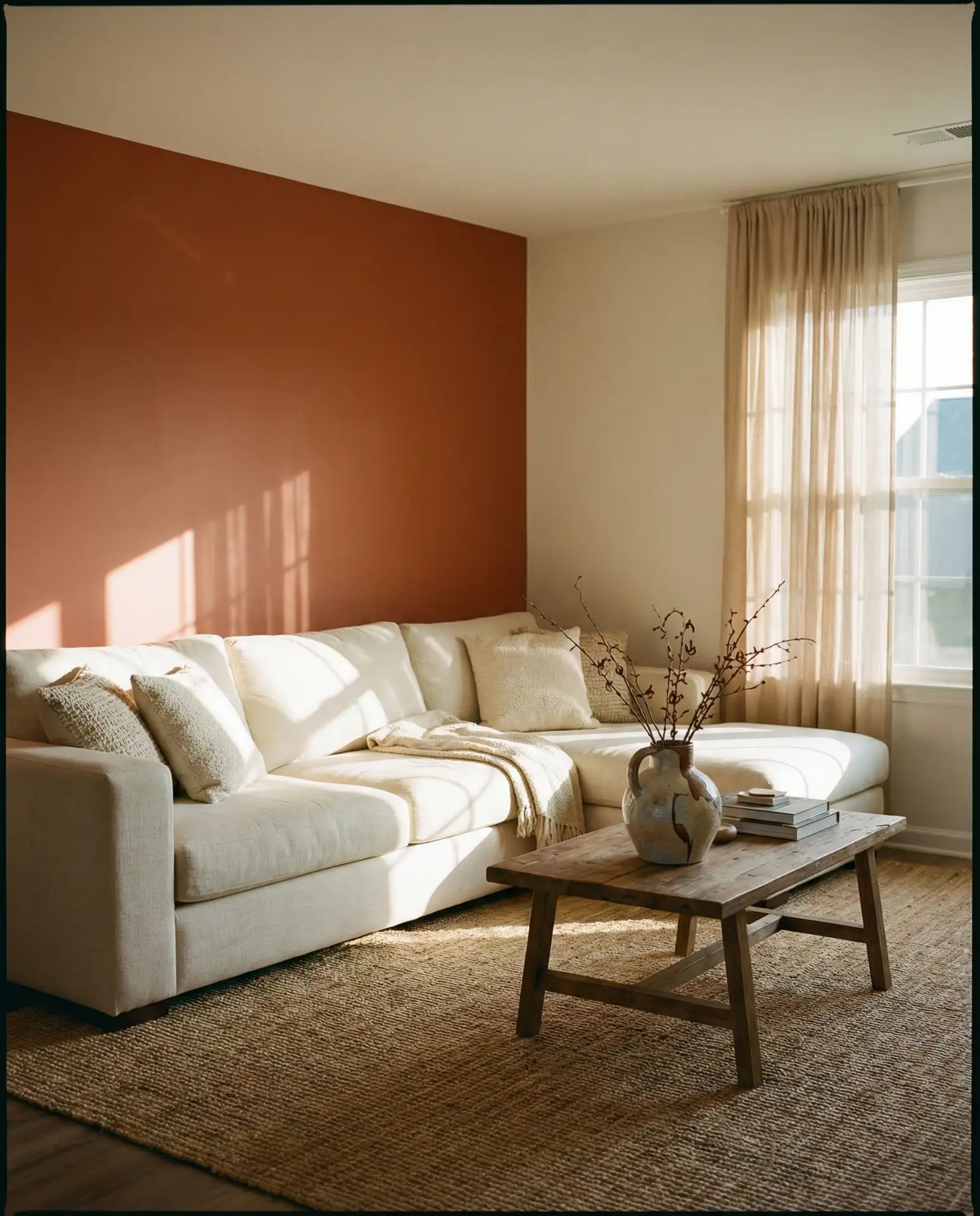
One common mistake is choosing terracotta that’s too bright or too red—test samples in your actual light conditions before committing. In Northern climates where natural light is cooler, terracotta can feel muddy; opt for a version with more clay and less orange. Pair with brass fixtures and textured throws to keep the room from feeling flat or one-note.
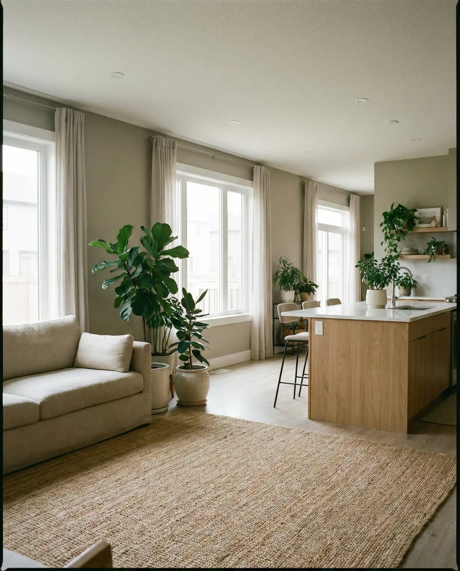
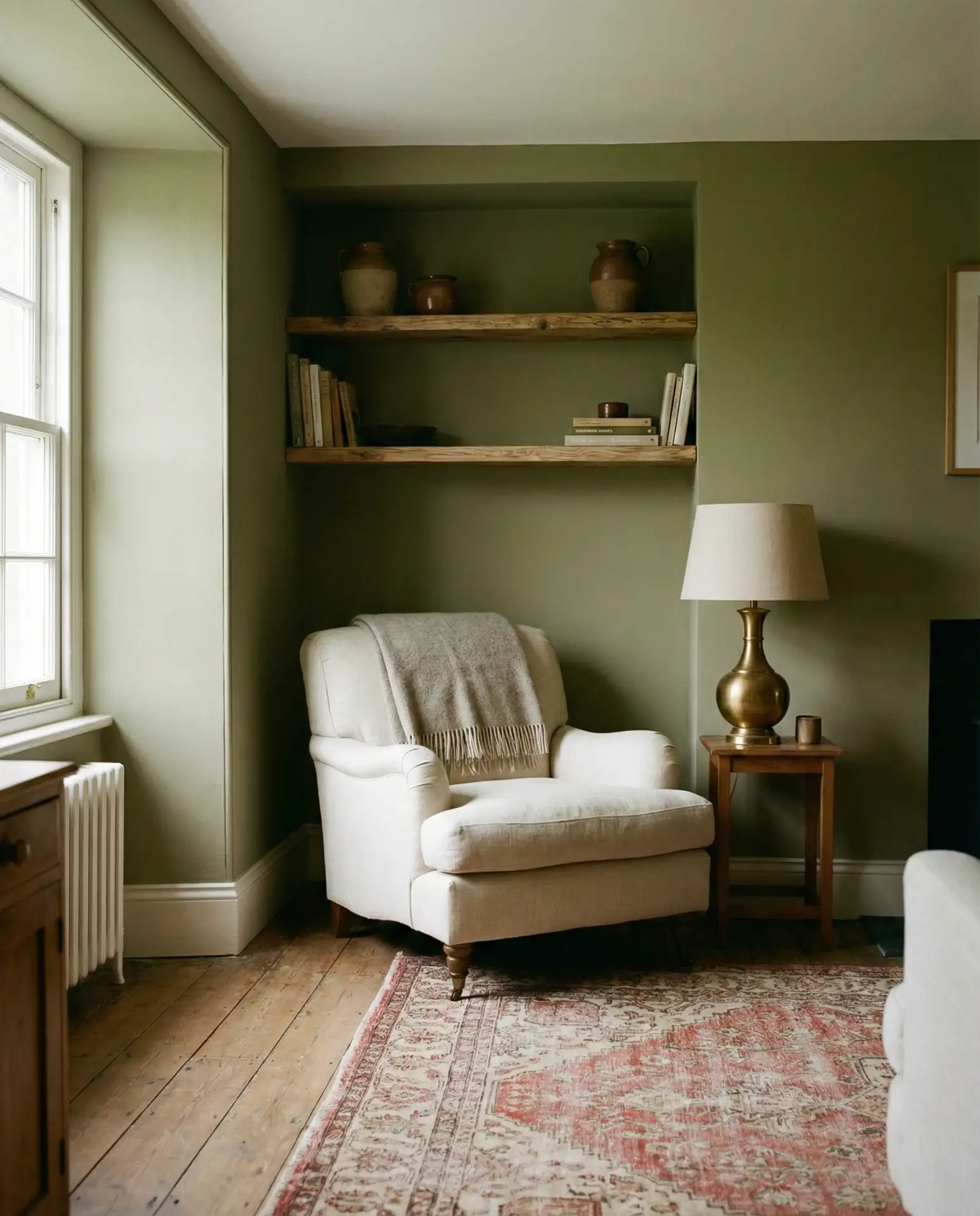
2. Soft Sage Green and Natural Oak
Sage green has become a go-to neutral for Americans seeking calm without going gray. This muted, herbal tone anchors a room while still feeling alive, especially when layered with oak furniture and linen upholstery. It’s a scheme that translates beautifully across climates—from humid Southern porches to dry West Coast bungalows—and it photographs exceptionally well for those curating their Pinterest boards.
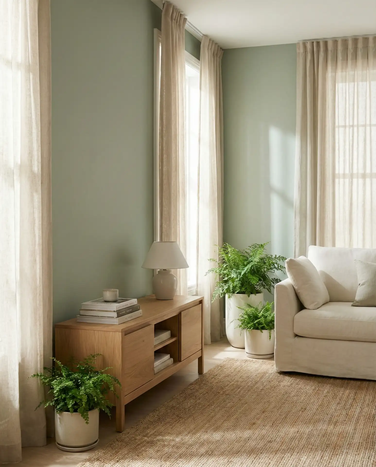
Where it works best: homes with large windows or rooms that face east, where morning light brings out the green’s freshness without turning it murky. Pair with white trim to keep edges crisp, and avoid heavy curtains that can make sage feel drab. This palette also complements vintage rugs and midcentury chairs without competing for attention.
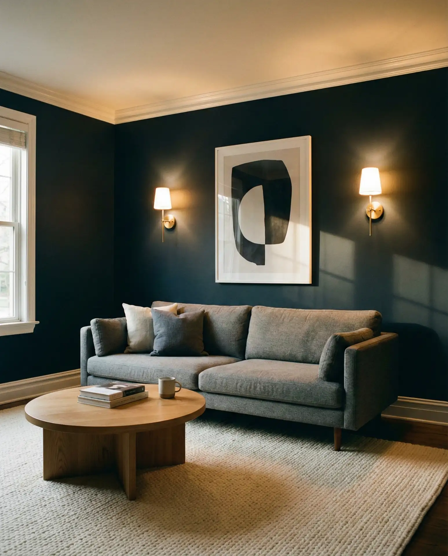
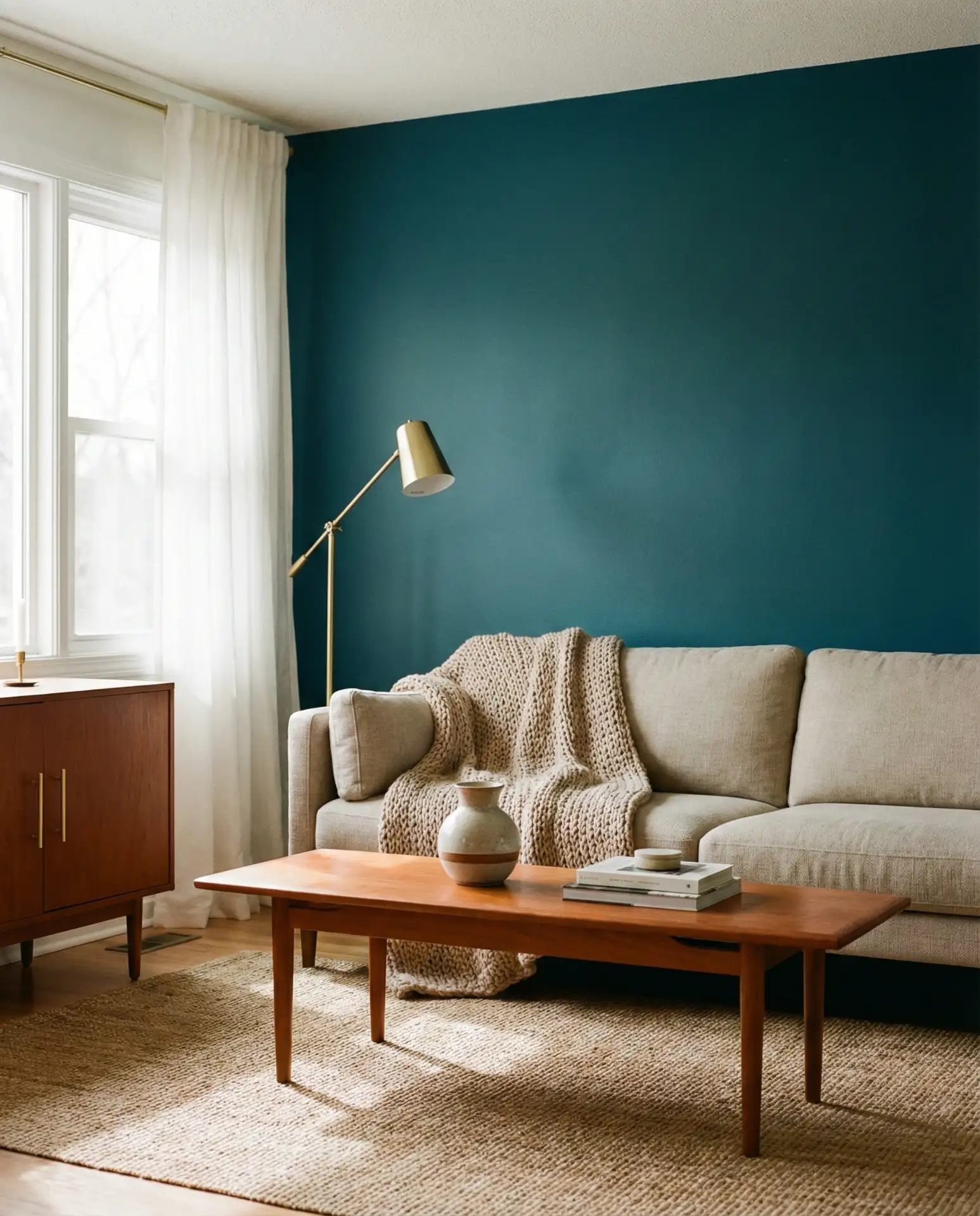
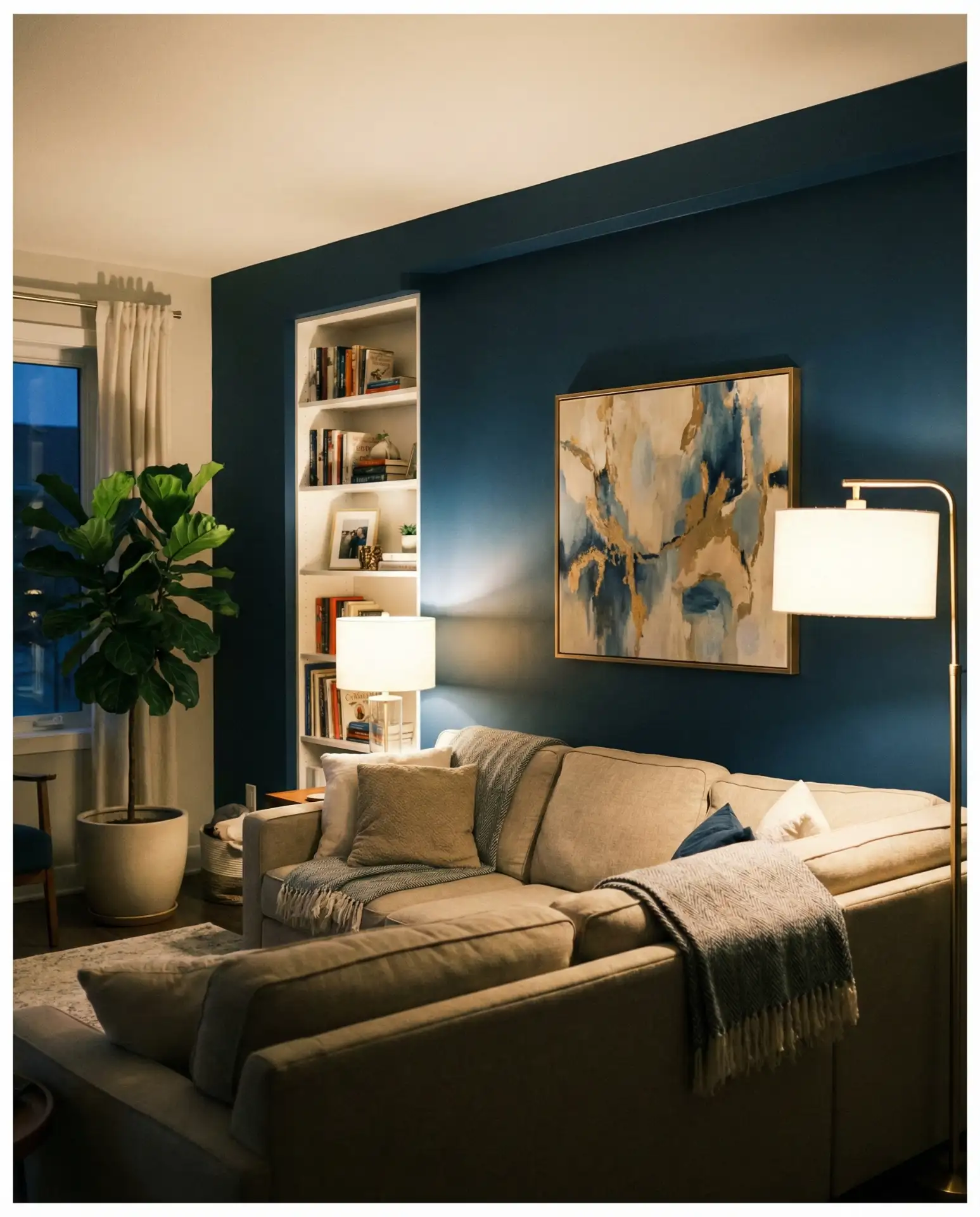
3. Deep Navy with Brass Hardware
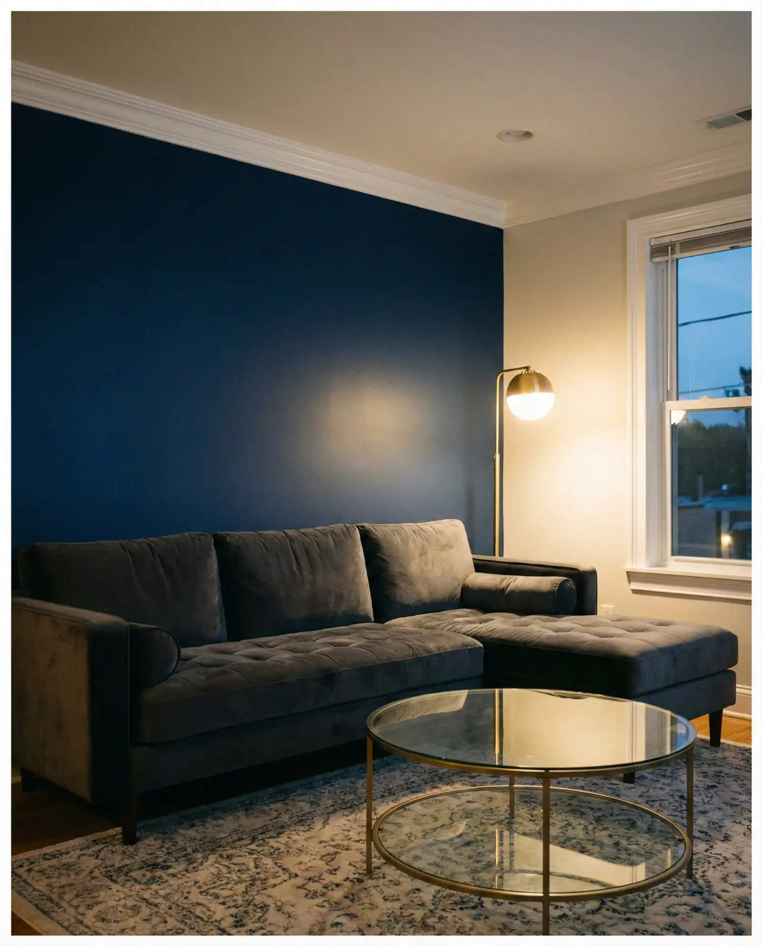
Navy has staying power as a sophisticated alternative to black, offering depth without the starkness. When paired with warm brass lighting and hardware, it creates a cozy yet elevated atmosphere that feels intentional. This combination appeals to urban dwellers and suburban families alike, providing a backdrop that works with both contemporary art and traditional furniture.
Navy works especially well in rooms with high ceilings or ample artificial lighting—without enough light, it can close in on you. A designer I spoke with recommends balancing navy walls with at least one large white element, like a sofa or oversized artwork, to prevent the room from feeling too moody. Brass accents warm up the cool undertones and add a touch of luxury without going full glam.
4. Creamy White with Black Trim
This classic combination white wall approach flips the traditional white-on-white formula by introducing crisp black window frames and door casings. The contrast is sharp but not harsh, giving rooms an editorial quality that feels fresh in 2026. It’s a favorite among renovators who want to modernize older homes without losing architectural character.
Budget-wise, this is one of the most cost-effective updates you can make—paint is inexpensive, and the impact is immediate. Black trim does require precision during painting, so factor in a bit more labor time or DIY patience. The result is a timeless look that won’t date itself quickly, making it ideal for homeowners planning to sell within a few years.
5. Dusty Blue with Walnut Furniture
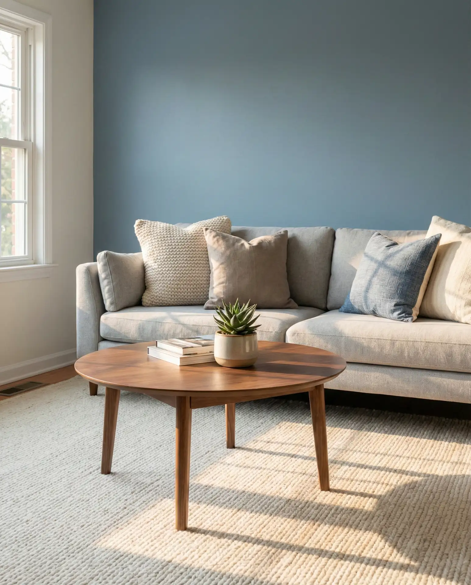
Dusty blue sits between gray and periwinkle, offering a soft, weathered quality that works beautifully with mid-toned walnut wood. This scheme feels calm without being cold, making it a strong choice for families who want a living room that’s both stylish and livable. It’s especially popular in the Pacific Northwest, where the muted palette mirrors the region’s natural landscape.
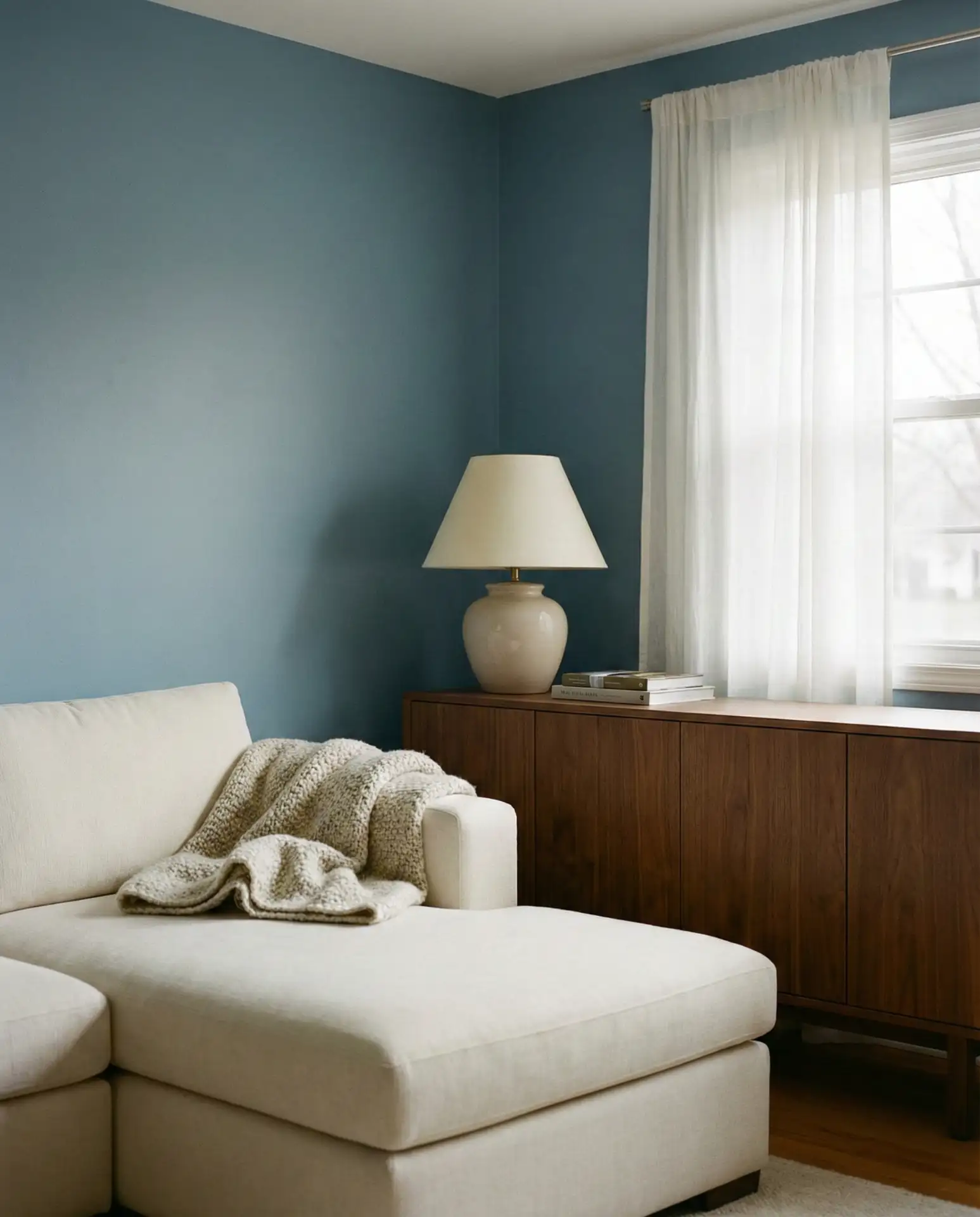
Many homeowners make the mistake of pairing dusty blue with too much gray, which can flatten the palette. Instead, bring in warm woods, natural fibers, and even a touch of rust or coral in pillows or art. This prevents the room from feeling too Scandinavian or sterile, especially in climates where warmth is already in short supply.
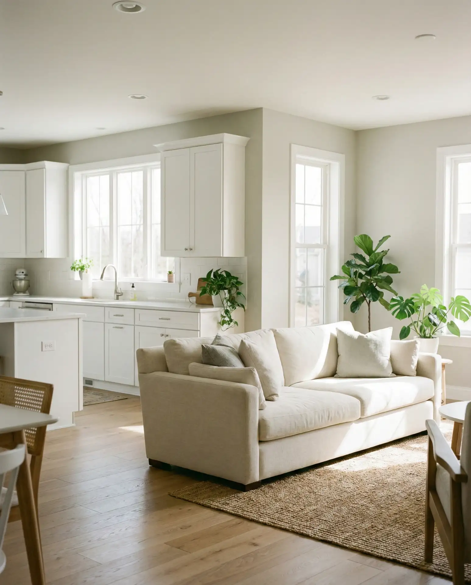
6. Warm Greige for Open Concept Spaces
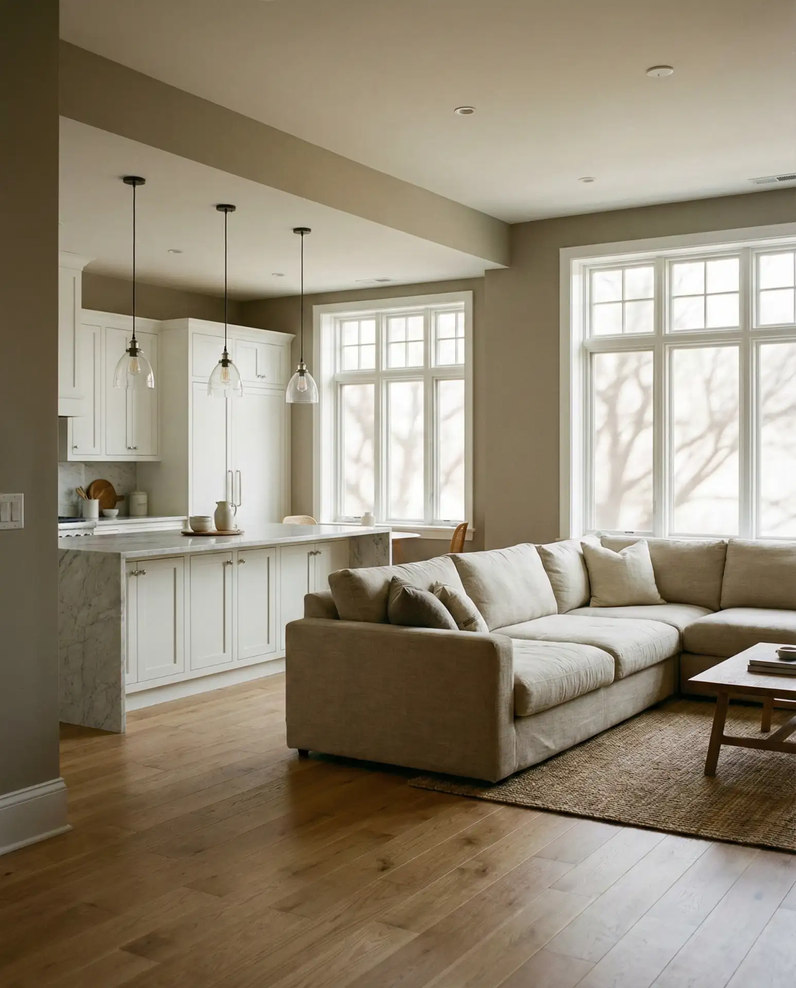
Greige—a blend of gray and beige—remains a top choice for open-concept kitchen and living areas where color consistency matters across multiple zones. It’s a neutral that doesn’t read as cold or institutional, and it transitions seamlessly from morning coffee to evening wine without clashing with natural light shifts. Americans with open floor plans rely on greige to unify spaces without committing to a single bold color.
Real homeowner behavior shows that greige is often the go-to for resale appeal—it’s safe, it’s neutral, and it lets buyers imagine their own style. But it can also feel generic if not layered with texture. Add woven baskets, linen curtains, and varied wood tones to keep the space from looking like a staged listing photo.
7. Charcoal Gray with Mustard Accents
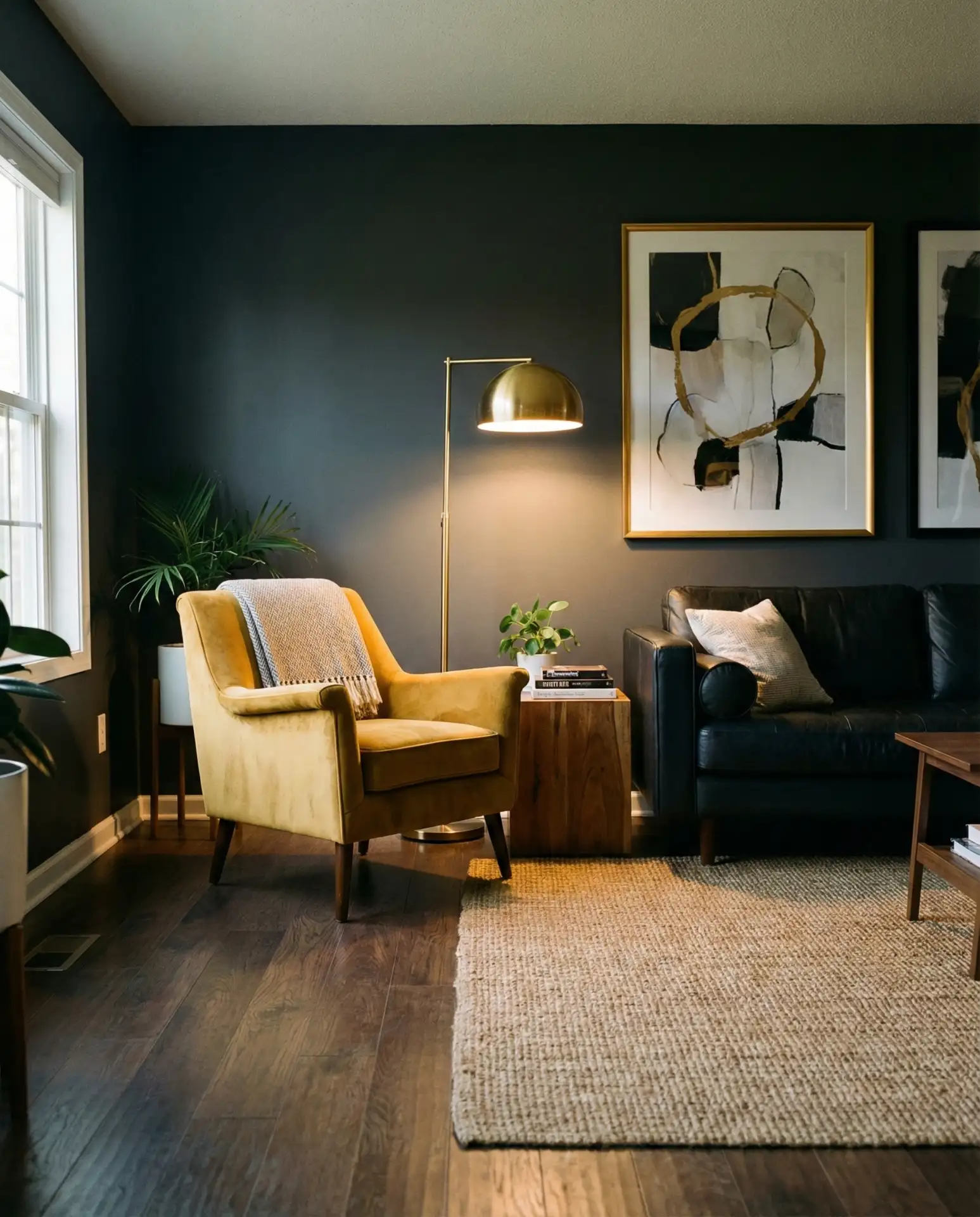
Charcoal walls create a moody, enveloping backdrop that makes accent colors pop—and mustard yellow is having a moment as the warm counterpoint. This combination feels modern and confident, ideal for urban apartments or homes with contemporary furniture. It’s a palette ideas favorite on Pinterest, where high-contrast visuals perform well in search.
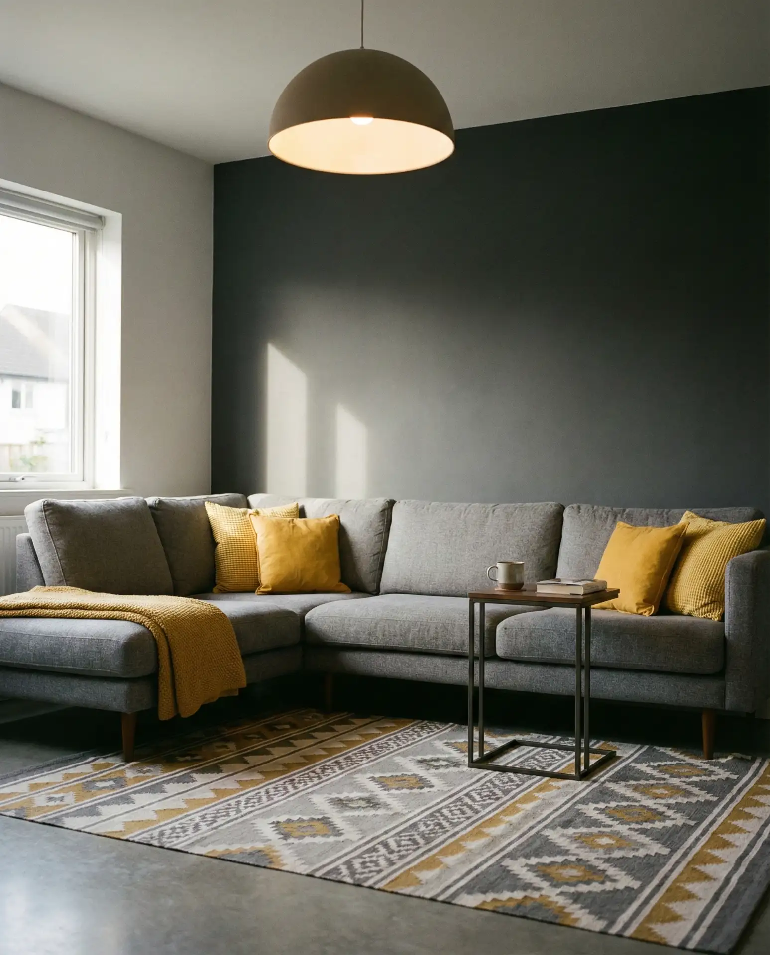
Where it works best: rooms with large windows or in homes where you want to create a den-like, intimate atmosphere. Charcoal can shrink a small room visually, so it’s better suited to spaces over 200 square feet. Mustard keeps the palette from feeling too masculine or heavy, and it pairs surprisingly well with greenery and natural wood.
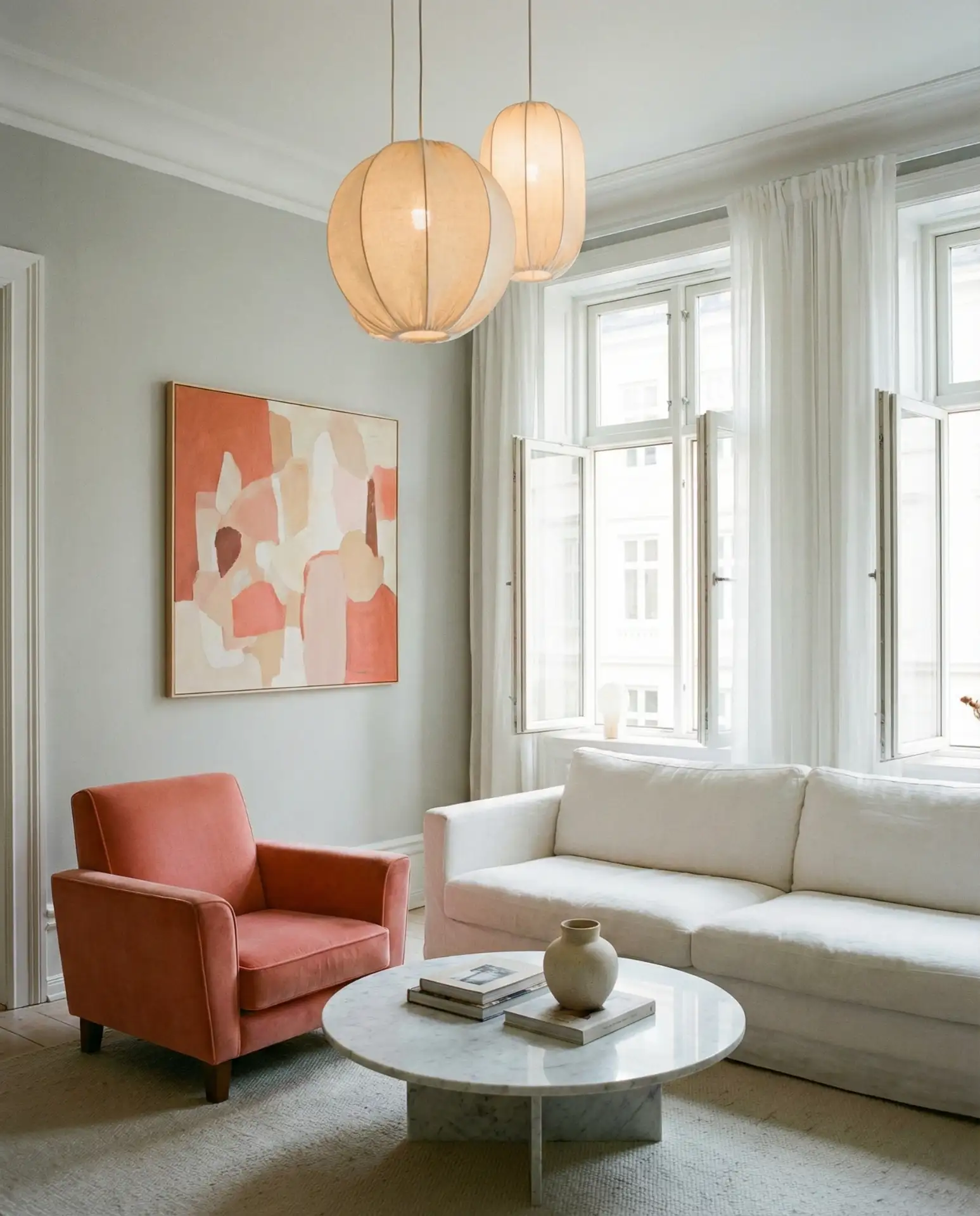
8. Blush Pink and Soft Gray
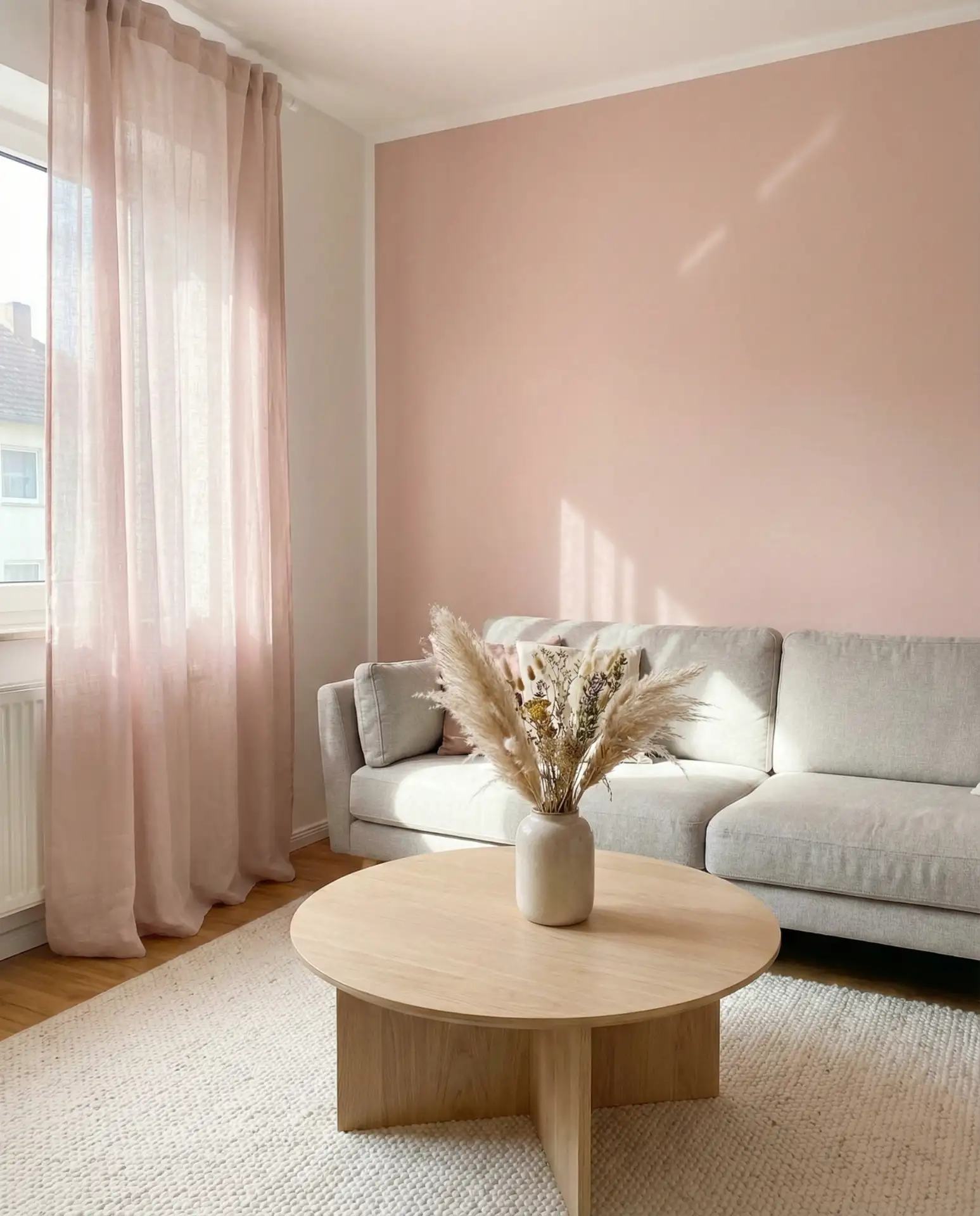
Blush pink has evolved beyond nurseries and now anchors sophisticated designs when paired with soft gray. The combination feels gentle and approachable, perfect for living rooms where you want guests to feel immediately at ease. It’s a cozy palette that works across seasons, shifting from fresh and airy in summer to warm and enveloping in winter.
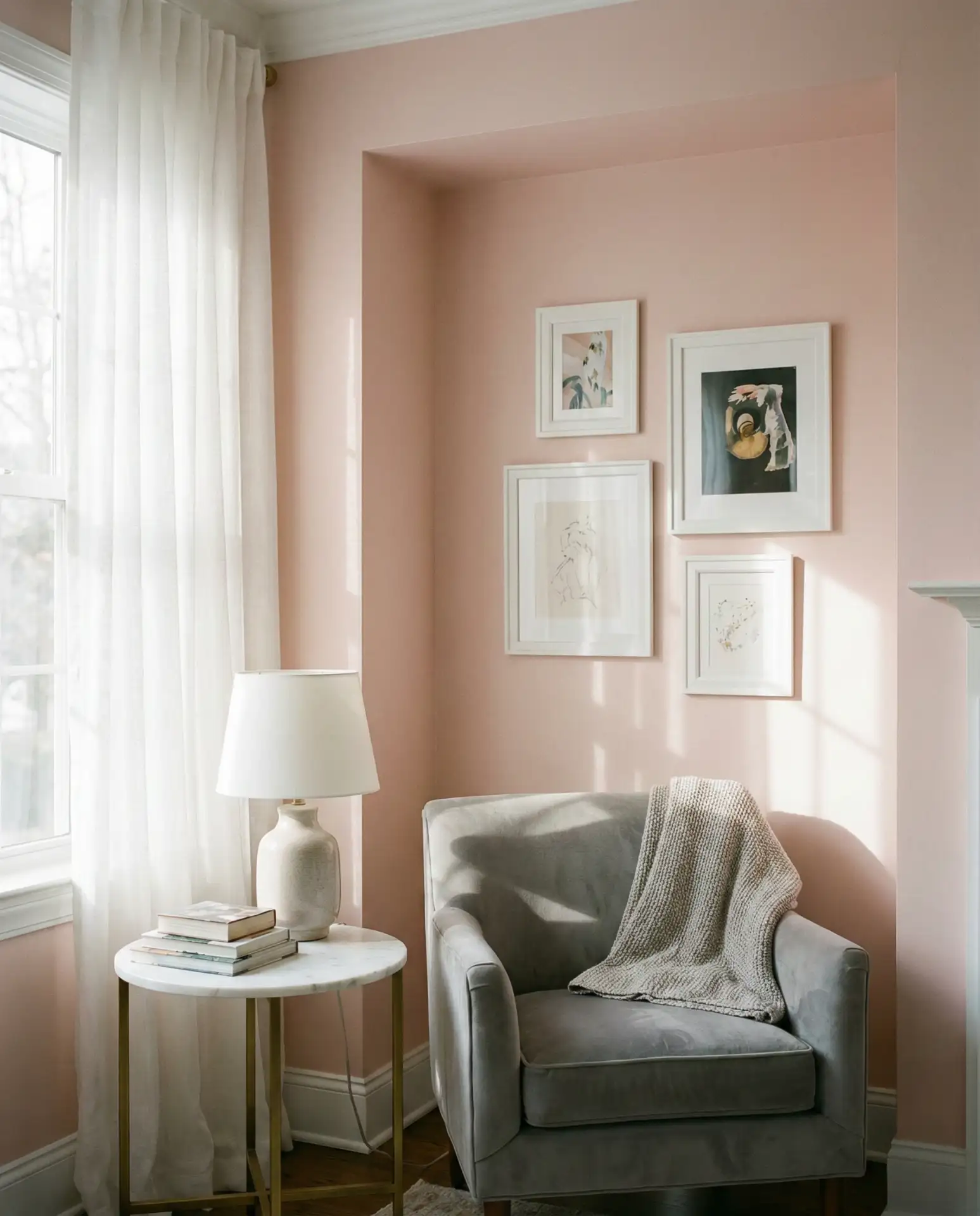
A friend who’s a realtor mentioned that blush and gray is one of the few soft palettes that still feels current in 2026—it’s not stuck in the millennial pink era but has matured into something more refined. The key is keeping the pink muted and the gray warm-toned; cool grays can make the whole room feel like a doctor’s office.
9. Forest Green with Tan Leather
Deep forest green brings richness and a connection to nature, especially when balanced with tan leather seating. This palette has a vintage-meets-modern appeal, working beautifully in homes with wood paneling or exposed beams. It’s a good choice for those who want color without going pastel, and it’s particularly popular in the Mountain West and New England regions.
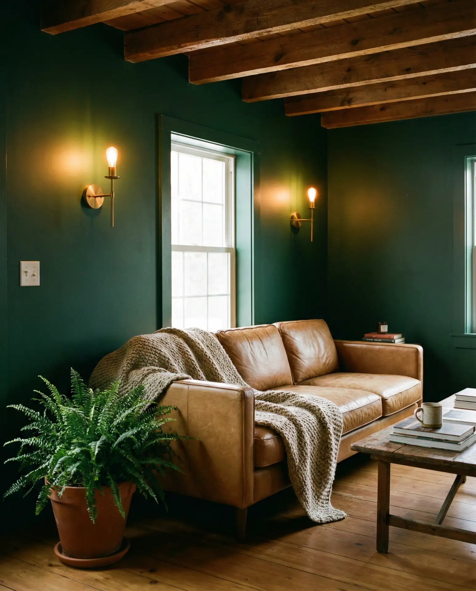
This combination taps into American nostalgia for cabin retreats and national parks, making it feel grounded and authentic. Avoid pairing forest green with too much black or dark wood—it can veer into somber territory. Instead, lighten the space with cream textiles and plenty of greenery to keep it from feeling like a hunting lodge.
10. Pale Lavender and White Oak
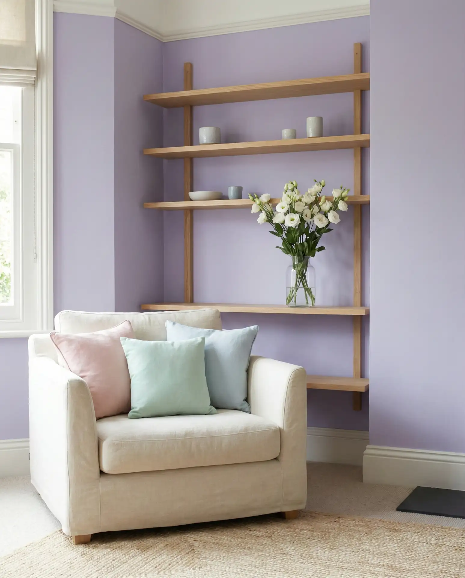
Pale lavender offers a fresh alternative to gray and beige, with a subtle purple undertone that feels both modern and calming. Paired with white oak furniture, it creates a light, airy environment that’s ideal for smaller living rooms or spaces with limited natural light. This scheme idea’s direction is gaining traction on Pinterest as people seek color that’s quiet but not boring.
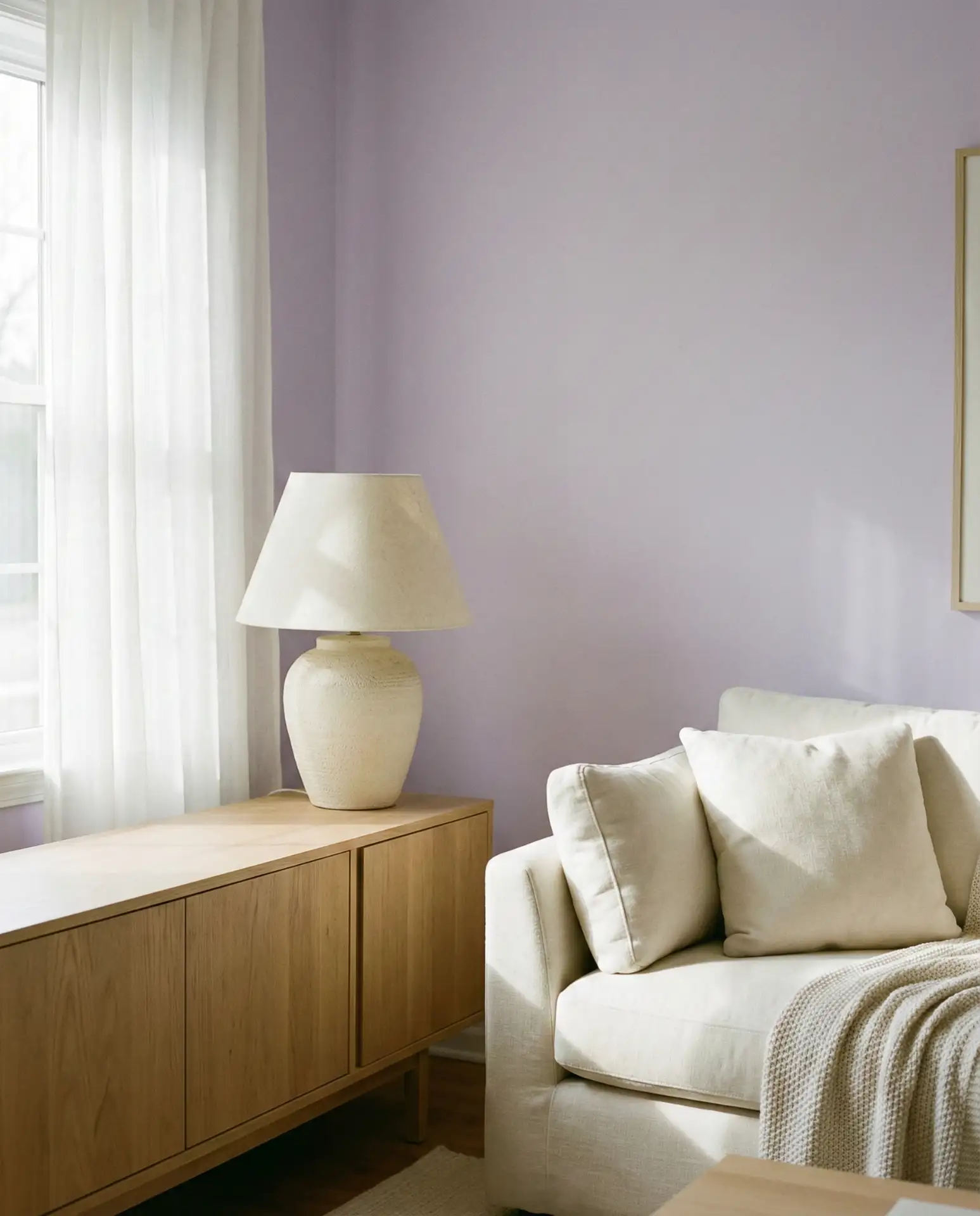
One practical insight: lavender can shift tone dramatically depending on your lighting. Test it in both morning and evening light before committing, as some shades can read too gray or too pink. Pair with warm whites and light woods to keep the palette balanced, and avoid cool-toned grays that can make lavender feel institutional.
11. Burnt Orange and Charcoal
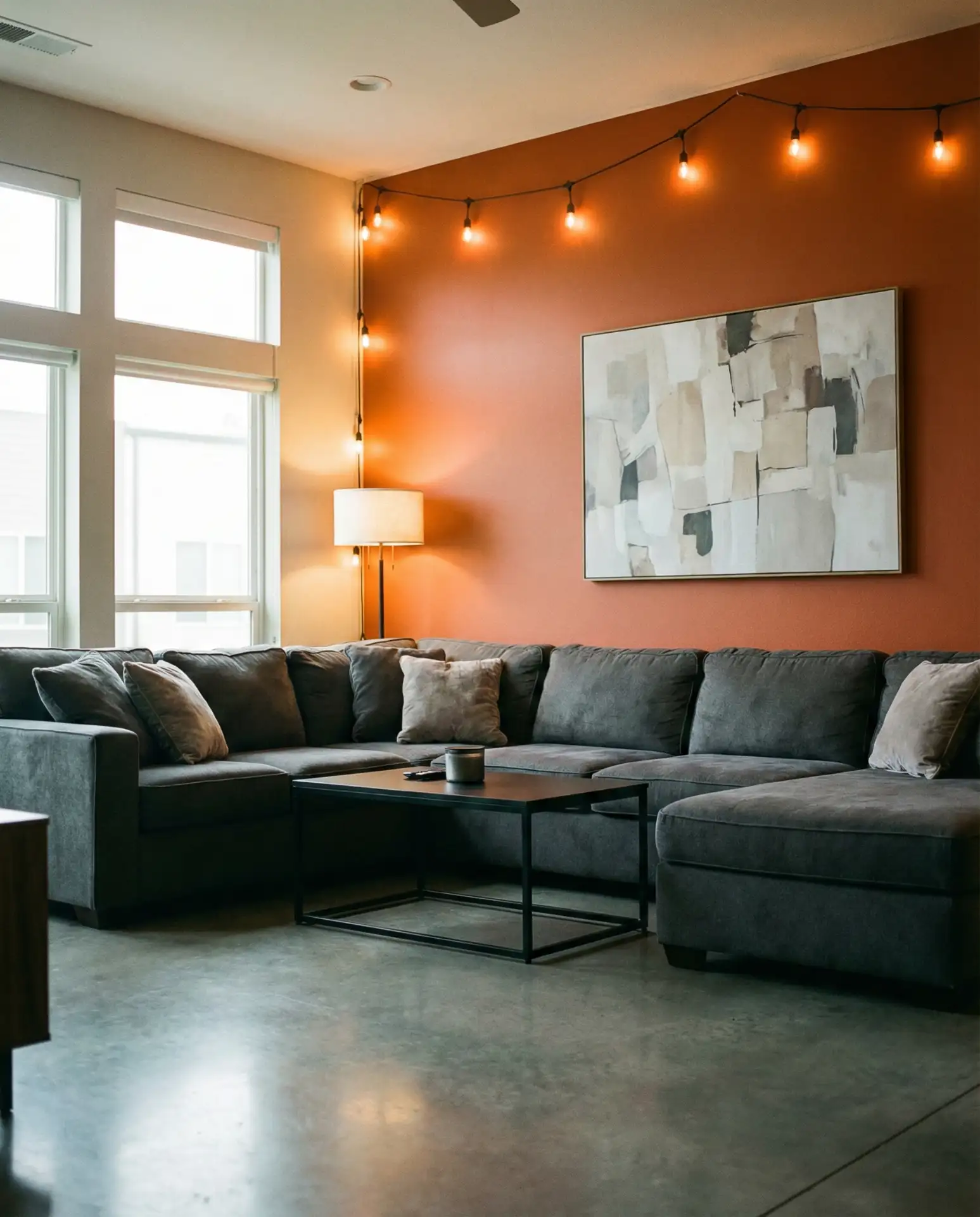
Burnt orange brings energy and warmth, while charcoal grounds it with sophistication. This combination of ideas pairing is bold but not overwhelming, making it a favorite for accent walls or statement furniture. It’s a palette that works in both mid-century modern and industrial-style homes, offering flexibility across interior design aesthetics.
Where it works best: south-facing rooms that can handle deeper tones or in homes where you want to make a design statement. The orange adds a retro vibe that feels fresh again in 2026, especially when paired with vintage furniture or handmade textiles. Avoid using too much orange—keep it to one or two key pieces to prevent visual fatigue.
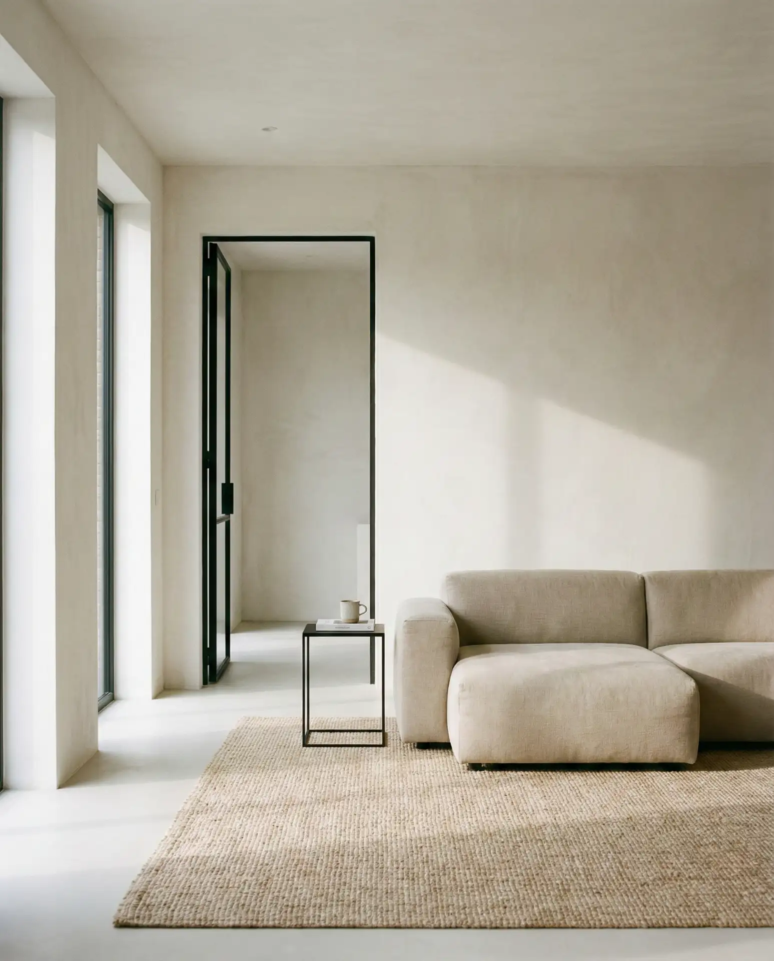
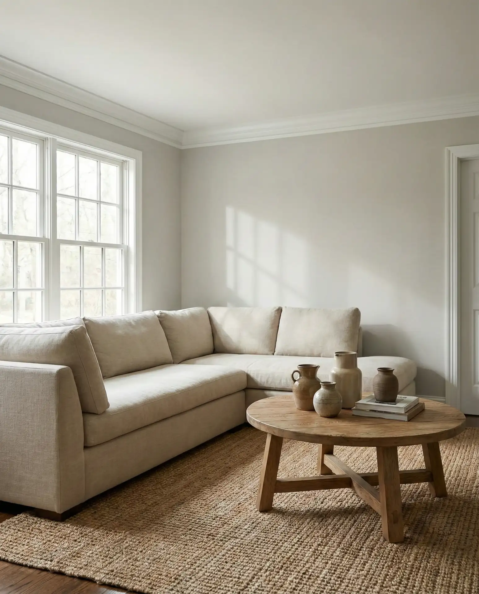
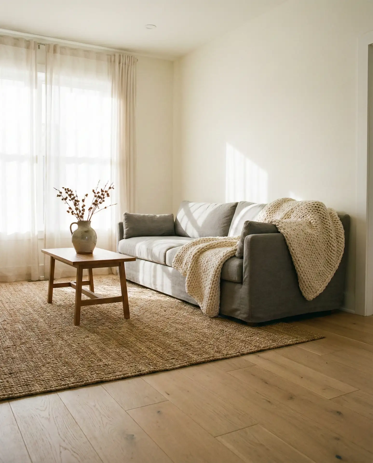
12. Soft Beige Throughout
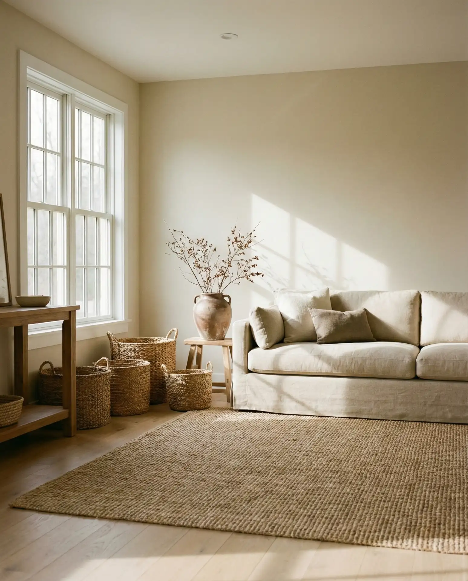
An all-beige palette might sound safe, but when done with intention, it creates a serene, spa-like atmosphere that feels luxurious. This monochromatic neutral approach relies on texture—linen, wool, rattan, and matte ceramics—to keep the room from feeling flat. It’s a cozy choice for those who prefer understated elegance over bold color statements.
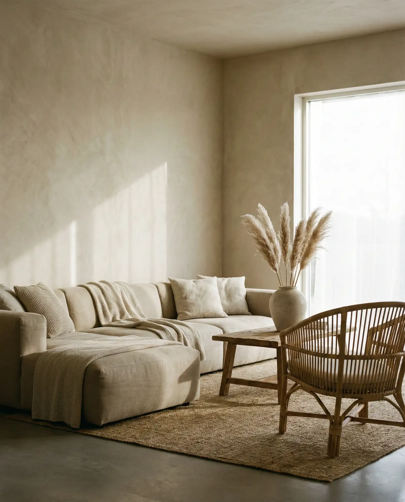
Real homeowner behavior shows that all-beige rooms are often the easiest to maintain visually—there’s no clash, no color fatigue, and everything feels cohesive. The downside is that without enough texture or lighting variation, the room can feel generic. Layer in sculptural furniture, varied heights, and natural elements to add dimension without introducing new colors.
13. Teal and Warm Wood Tones
Teal strikes a balance between blue and green, offering depth without the coolness of navy or the earthiness of sage. Paired with warm wood tones—cherry, mahogany, or teak—it creates a rich, inviting space that feels collected over time. This palette-ideas approach is especially popular in coastal and lakeside homes, where the teal echoes water views.
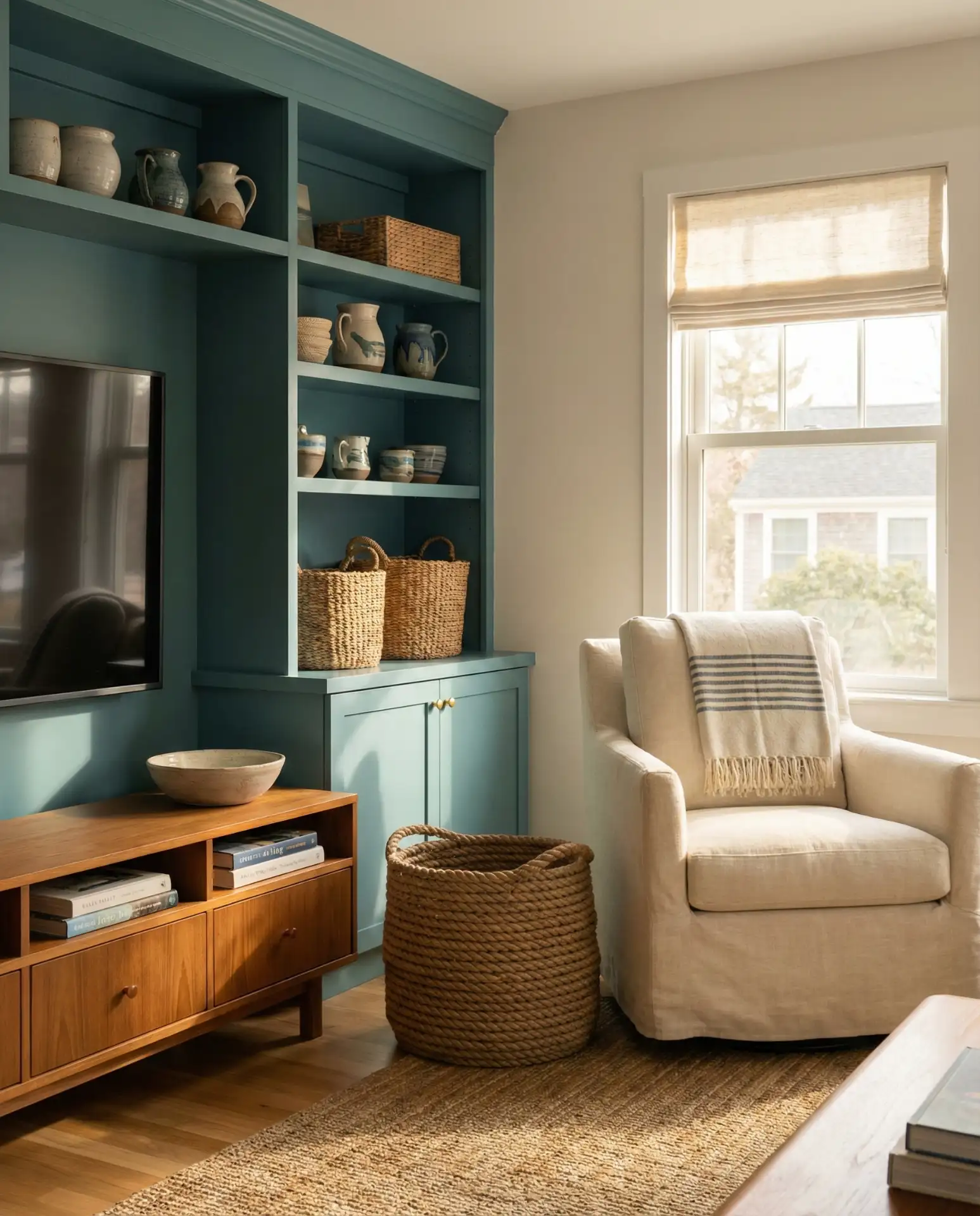
A common mistake is choosing a teal that’s too bright or turquoise, which can feel dated or tropical. Stick with muted, complex teals that have gray or charcoal undertones. These versions work year-round and don’t pigeonhole your space into a single season or style. Pair with cream and natural fibers to soften the intensity.
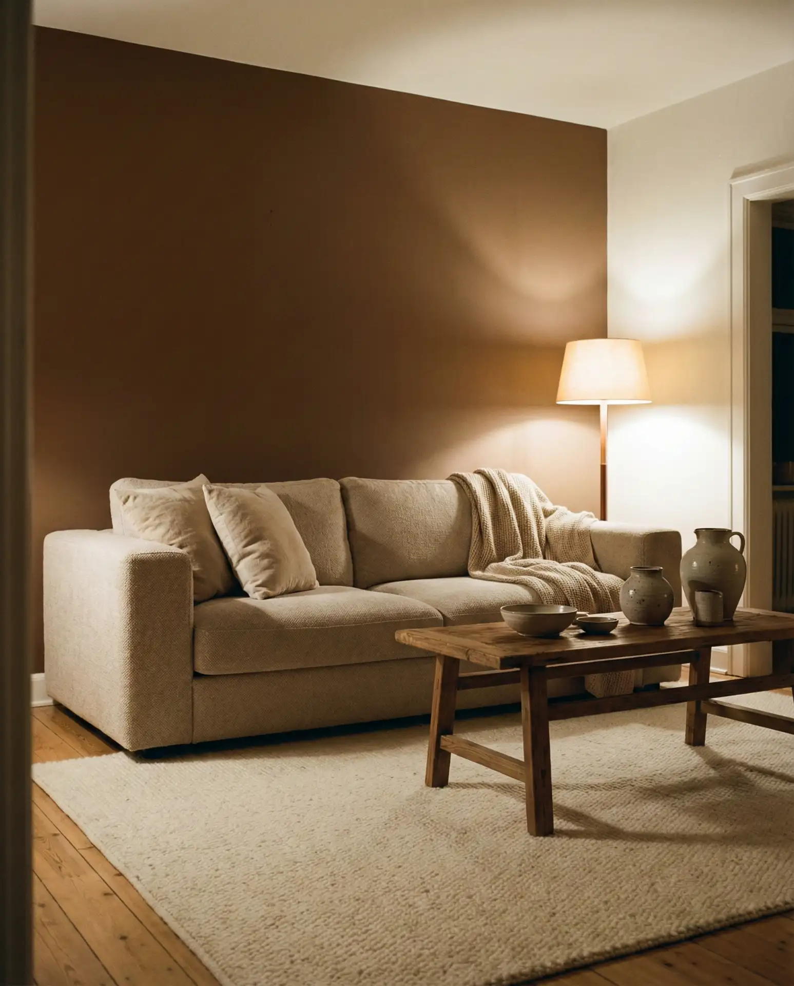
14. Ivory Walls with a Brown Couch
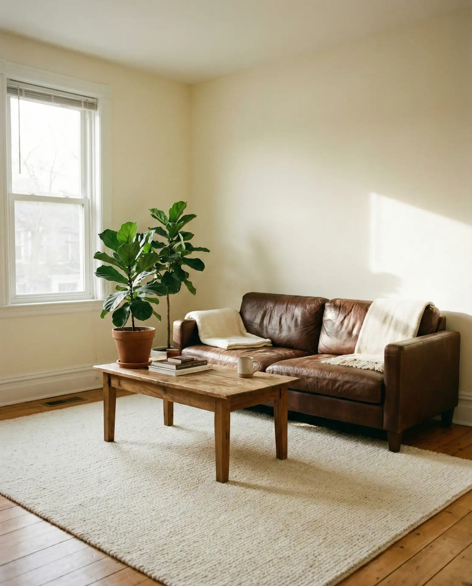
Ivory walls provide a soft, warm backdrop that makes a brown couch feel intentional rather than leftover from a previous decade. This classic combination is grounded and inviting, perfect for families who prioritize comfort and durability. It’s a palette that works across American home styles, from farmhouse to transitional to modern traditional.
Budget-wise, this is a refresh that requires minimal investment—paint is affordable, and the brown sofa you already own becomes the anchor. Add texture through pillows, throws, and rugs to prevent the palette from feeling too monochromatic. Avoid heavy drapes or dark wood that can make the room feel dated; stick with lighter woods and airy textiles.
15. Light Gray with Pops of Coral
Light gray offers a clean, modern foundation, while coral brings unexpected warmth and personality. This scheme’s bright combination feels fresh and energizing without being overwhelming, making it ideal for living rooms that serve as both gathering and relaxation spaces. It’s a palette that appeals to younger homeowners looking for something more dynamic than the all-gray trend of the past decade.
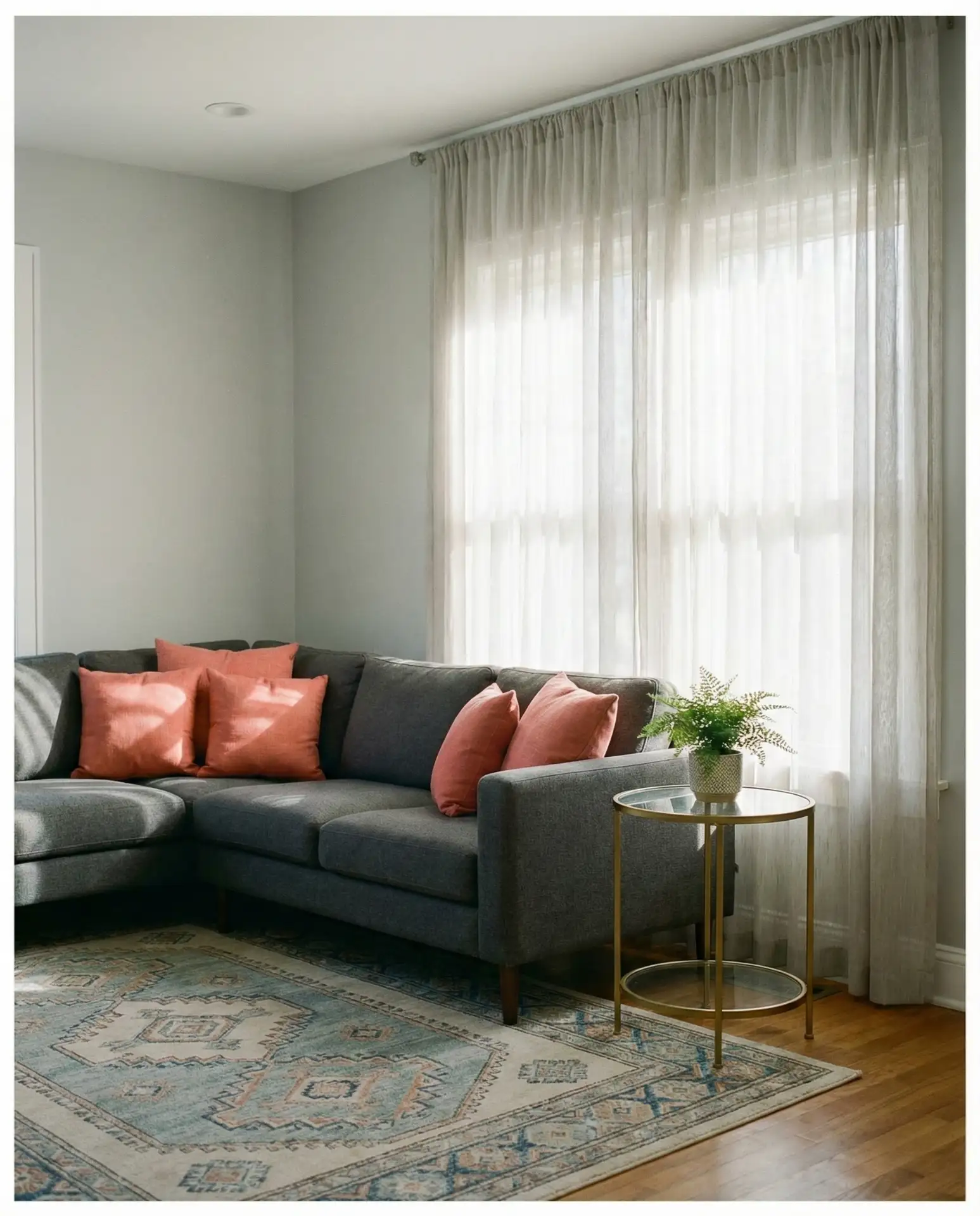
Where it works best: rooms with plenty of natural light or southern exposure, where coral can glow without looking garish. The gray keeps the palette grounded, while coral adds just enough color to make the space feel alive. Avoid pairing with too much white, which can make the room feel sterile—stick with warm grays and natural textures.
16. Sherwin Williams Agreeable Gray Throughout
Sherwin Williams Agreeable Gray remains one of the most popular neutral choices for American homes, thanks to its warm undertones and adaptability. It’s a greige that leans slightly beige, making it less stark than pure gray and more versatile across different lighting conditions. This color works seamlessly in open-concept kitchen and living areas, providing consistency without feeling monotonous.
Real homeowners often choose Agreeable Gray because it’s safe, resale-friendly, and easy to decorate around. The downside is that it’s so common it can feel generic—layer in personality through art, textiles, and furniture. Pair with warm whites and natural wood to prevent the space from feeling too builder-grade.
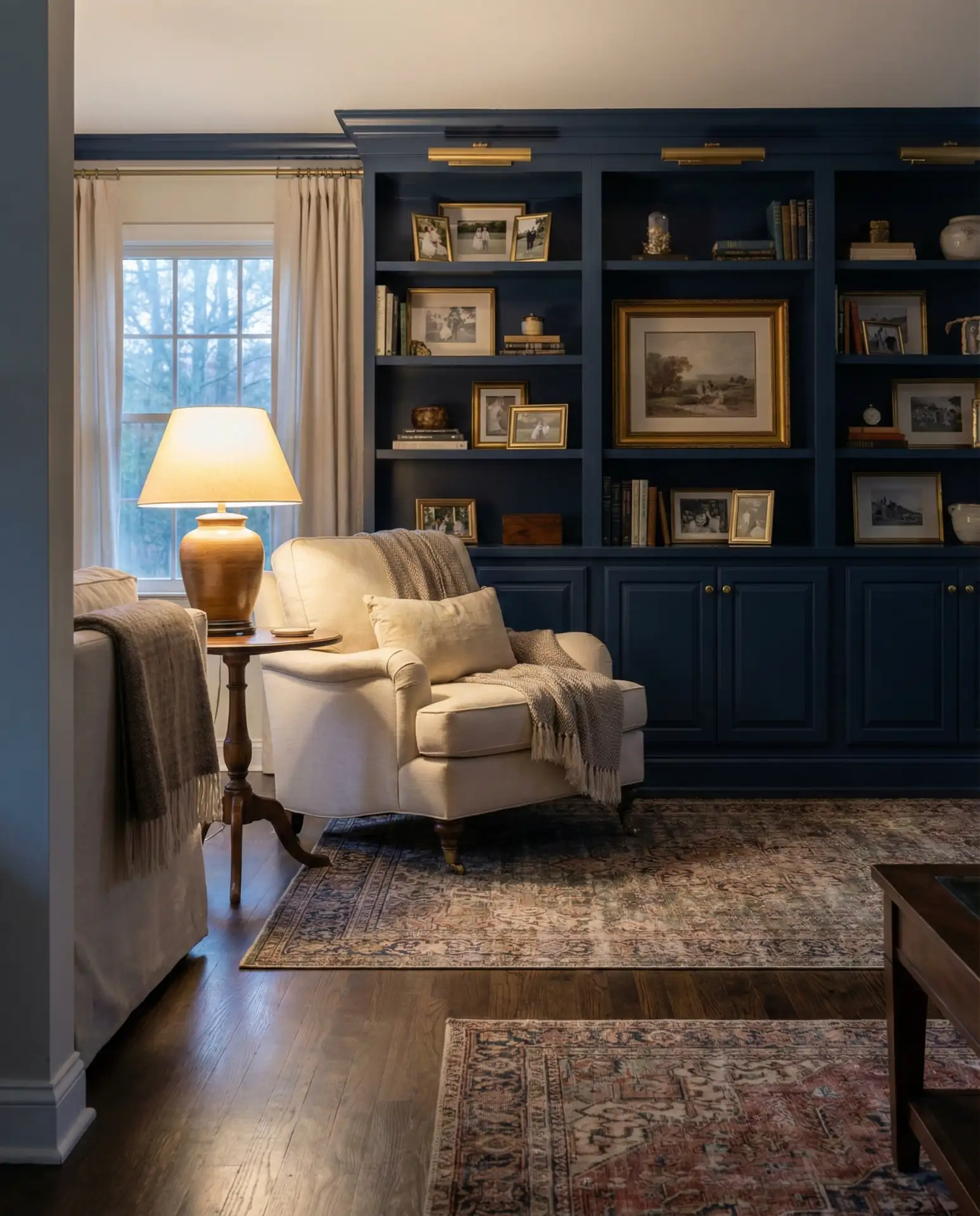
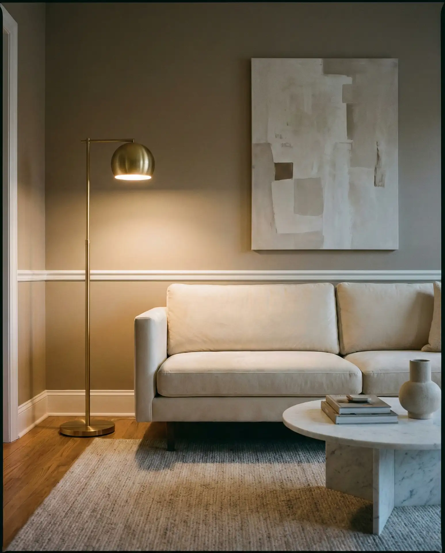
17. Benjamin Moore Hale Navy on One Wall
Benjamin Moore Hale Navy is a rich, timeless navy that works beautifully as an accent wall in living rooms. It provides drama and depth without committing the entire room to a dark color, making it a good choice for those who want impact without risk. This approach is especially effective in rooms with high ceilings or architectural details you want to highlight.
A decorator I know recommends using Hale Navy on the wall opposite your main seating area—it creates a focal point without making the room feel enclosed. Pair with plenty of white or cream and warm metallics to keep the space from feeling too moody. This is also a great backdrop for gallery walls or statement artwork.
18. Warm White with a Grey Couch
Warm white walls make a grey couch feel modern and intentional, avoiding the cold, clinical look that cooler whites can create. This combination is clean and timeless, ideal for minimalist or Scandinavian-inspired spaces. It’s a palette that relies on texture and subtle color variation to keep the room from feeling flat.
One common mistake is pairing a gray sofa with cool white walls, which can make the room feel like a showroom. Warm whites have a slight cream or yellow undertone that adds coziness without sacrificing the clean aesthetic. Add warmth through wood tones, natural textiles, and layered lighting to prevent the space from feeling sterile.
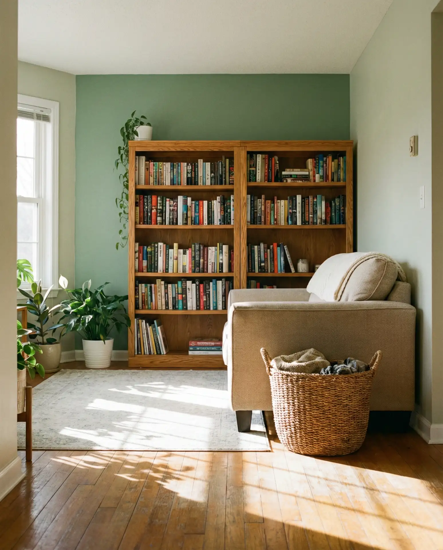
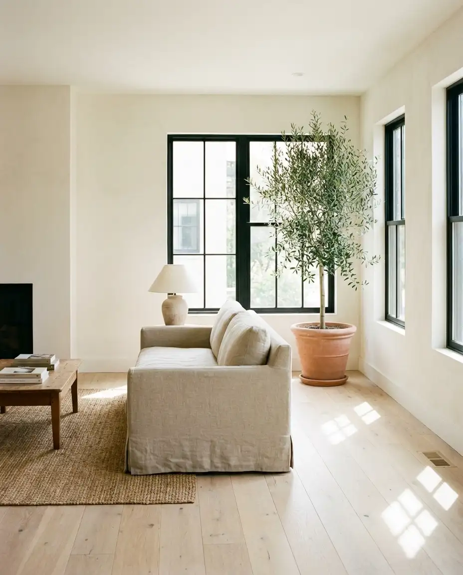
19. Earthy Olive and Cream
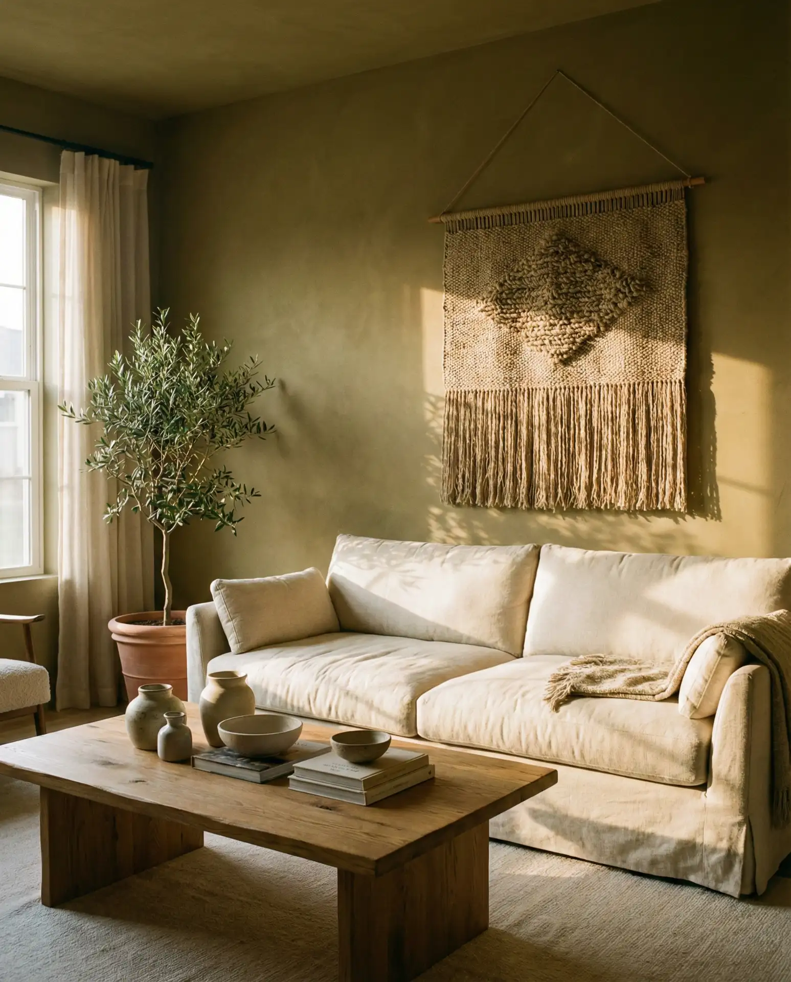
Earthy olive is a grounded, organic green that pairs beautifully with cream tones, creating a cozy and lived-in feel. This palette’s ideas direction nods to European farmhouse aesthetics while feeling current in 2026. It’s a palette that works especially well in homes with vintage furniture or handmade textiles, adding depth without overwhelming the space.
Where it works best: homes with abundant natural materials—wood floors, exposed brick, or stone accents—where olive enhances rather than competes. Avoid pairing olive with too much black or dark wood, which can make the room feel heavy. Instead, keep it light with cream, natural linen, and plenty of greenery.
20. Soft Peach with White Trim
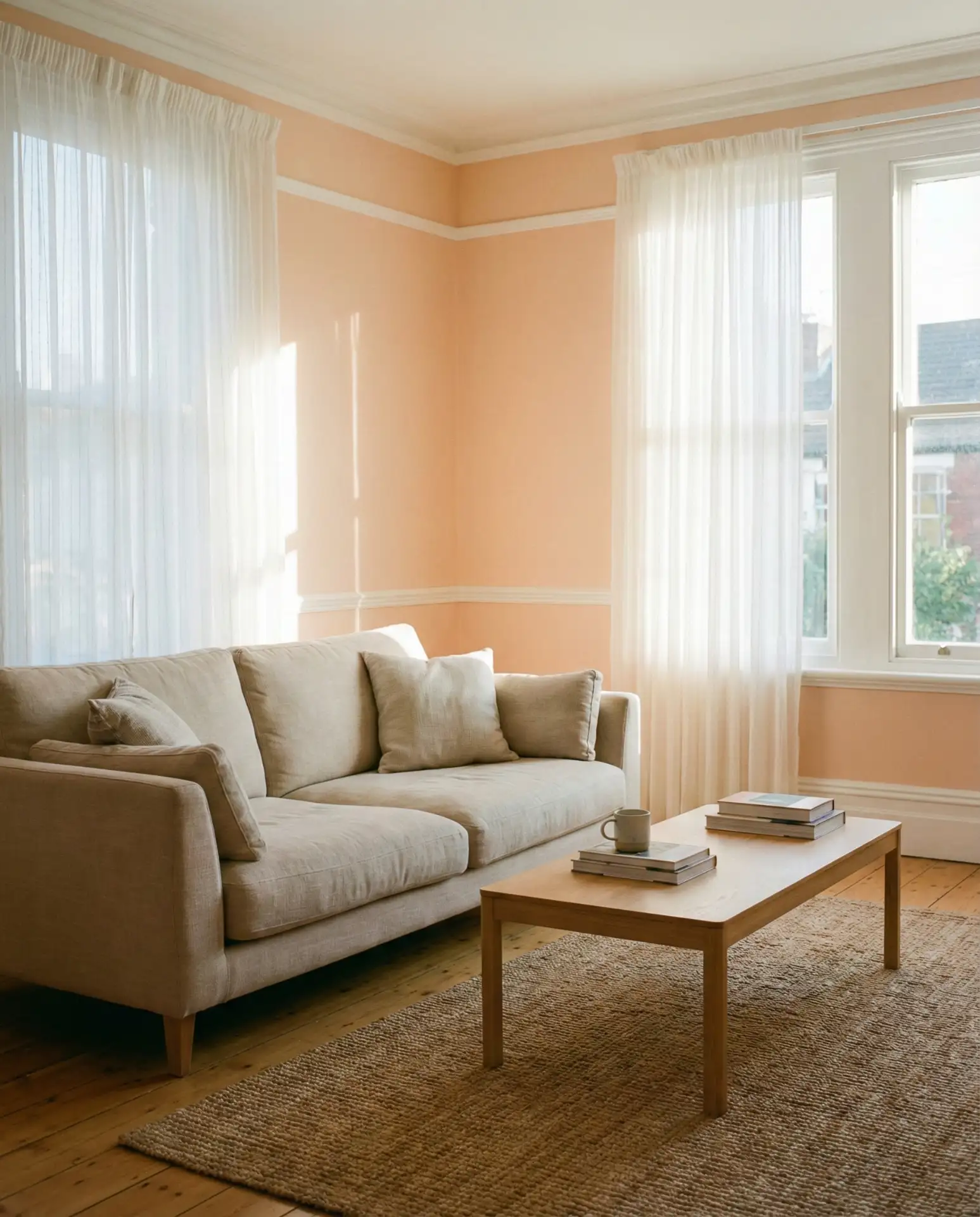
Soft peach is having a resurgence as a light, warm alternative to pink and beige. Paired with crisp white trim, it creates a fresh, airy feel that’s perfect for living rooms with southern or western exposure. This inspiration comes from mid-century color palettes but feels thoroughly modern when styled with contemporary furniture.
Practical insight: peach can shift dramatically depending on your light source. Incandescent bulbs will make it warmer and more orange, while LED daylight bulbs keep it cooler and more neutral. Test your paint sample with the actual lighting you plan to use, and avoid versions that are too saturated or coral-leaning unless you’re going for a retro vibe.
21. Taupe with Brushed Gold Accents
Taupe is an understated neutral that sits between gray and brown, offering warmth without being too earthy. When paired with brushed gold hardware and lighting, it elevates the space into something polished and intentional. This palette works beautifully in formal living rooms or spaces where you entertain frequently, providing elegance without being overly precious.
A designer friend recommends taupe for clients who want a step up from beige but aren’t ready for bold color—it’s sophisticated without being risky. The brushed gold adds a touch of luxury without the flashiness of polished brass. This combination works especially well in homes with traditional architecture, where it bridges classic and contemporary styles.
22. Icy Blue and Warm White
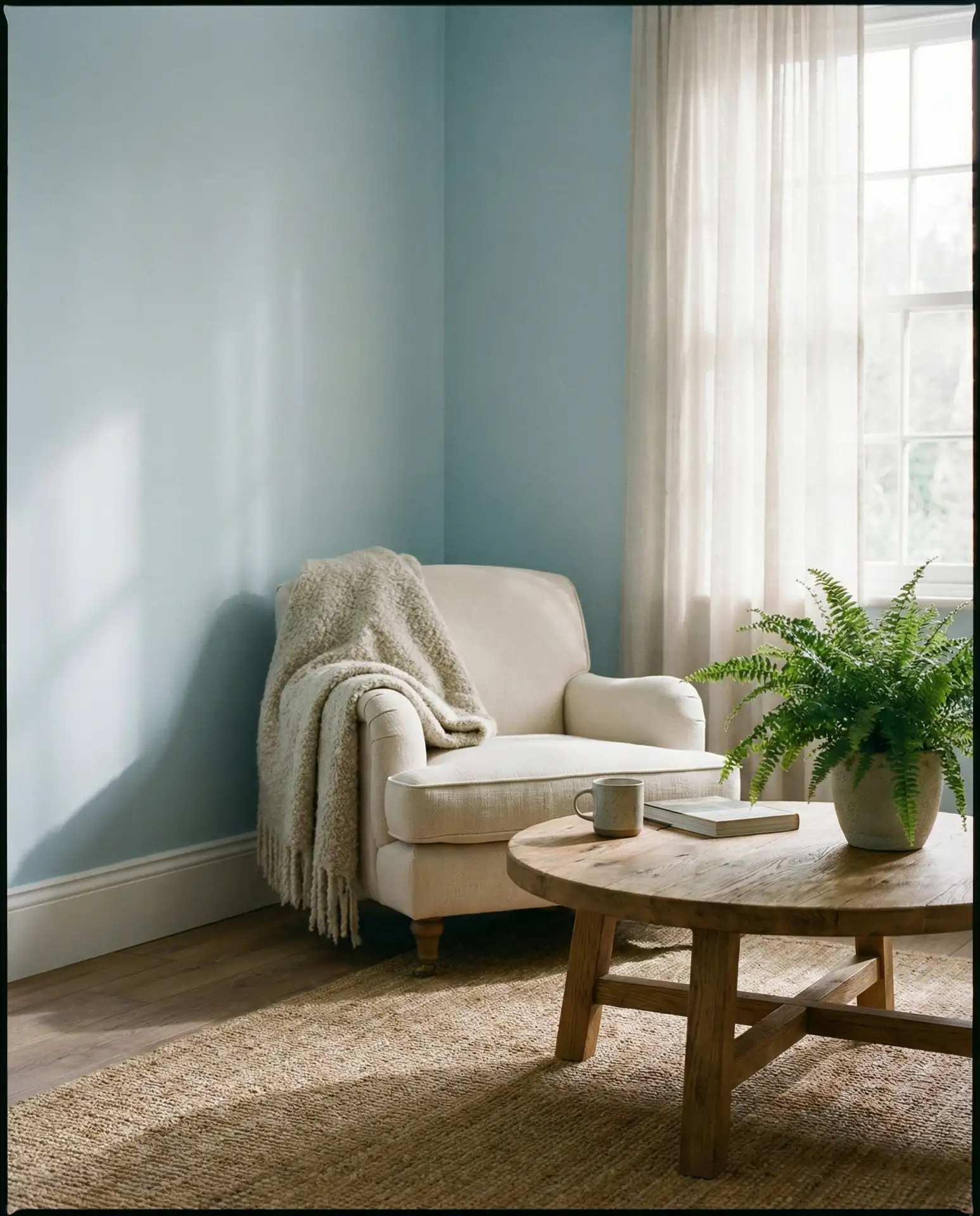
Icy blue is a pale, almost-gray blue that feels serene and spacious, especially when paired with warm white trim. This scheme’s cozy approach creates a calm, meditative environment perfect for living rooms used primarily for relaxation. It’s a palette inspired by Scandinavian design but adapted for American homes with more varied lighting conditions.
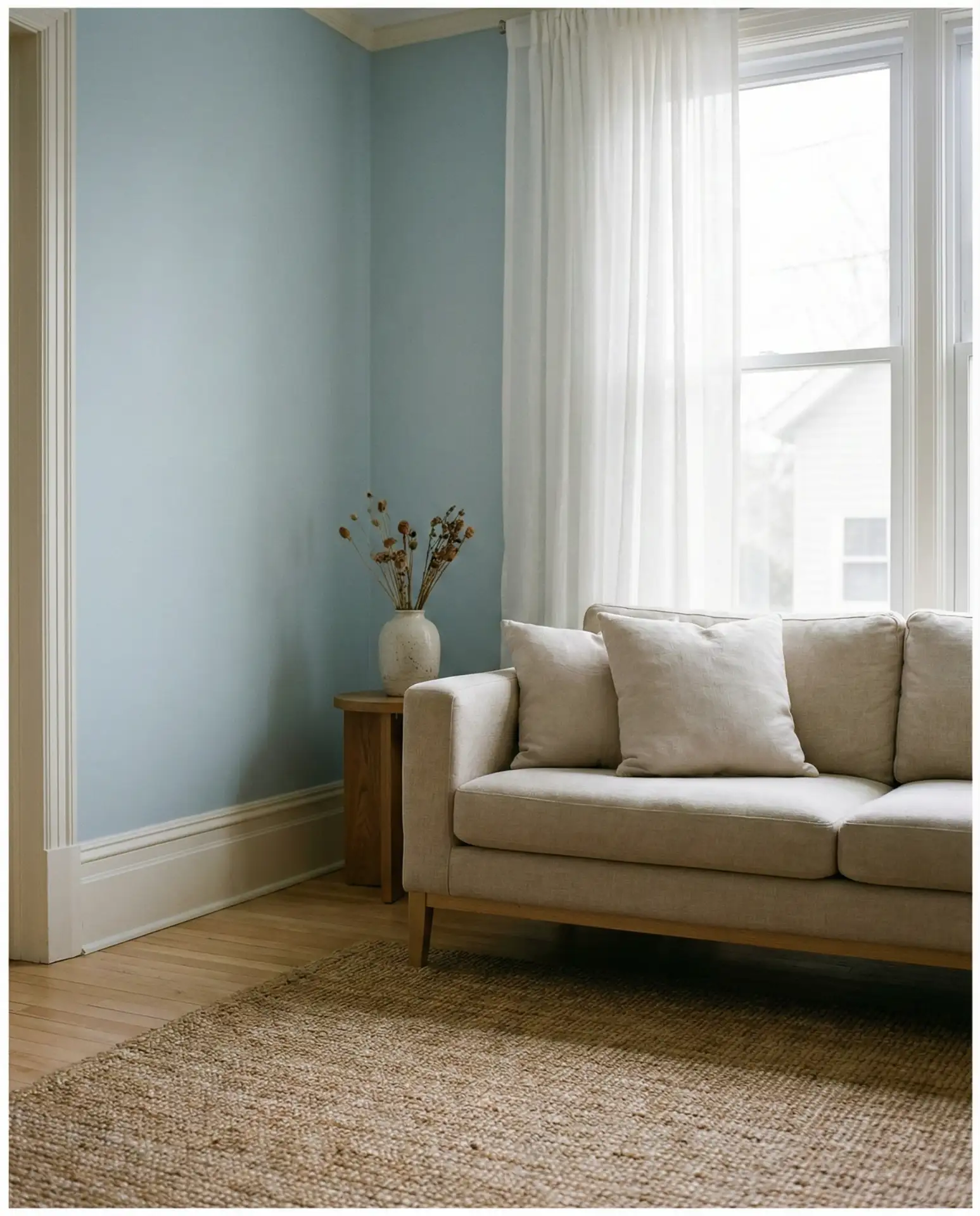
Where it works best: north-facing rooms where the cool undertones won’t make the space feel too cold. Pair with warm woods, textured textiles, and layered lighting to prevent the room from feeling like a spa or hotel lobby. This is a palette that benefits from lived-in touches—books, throws, and personal objects that add warmth.
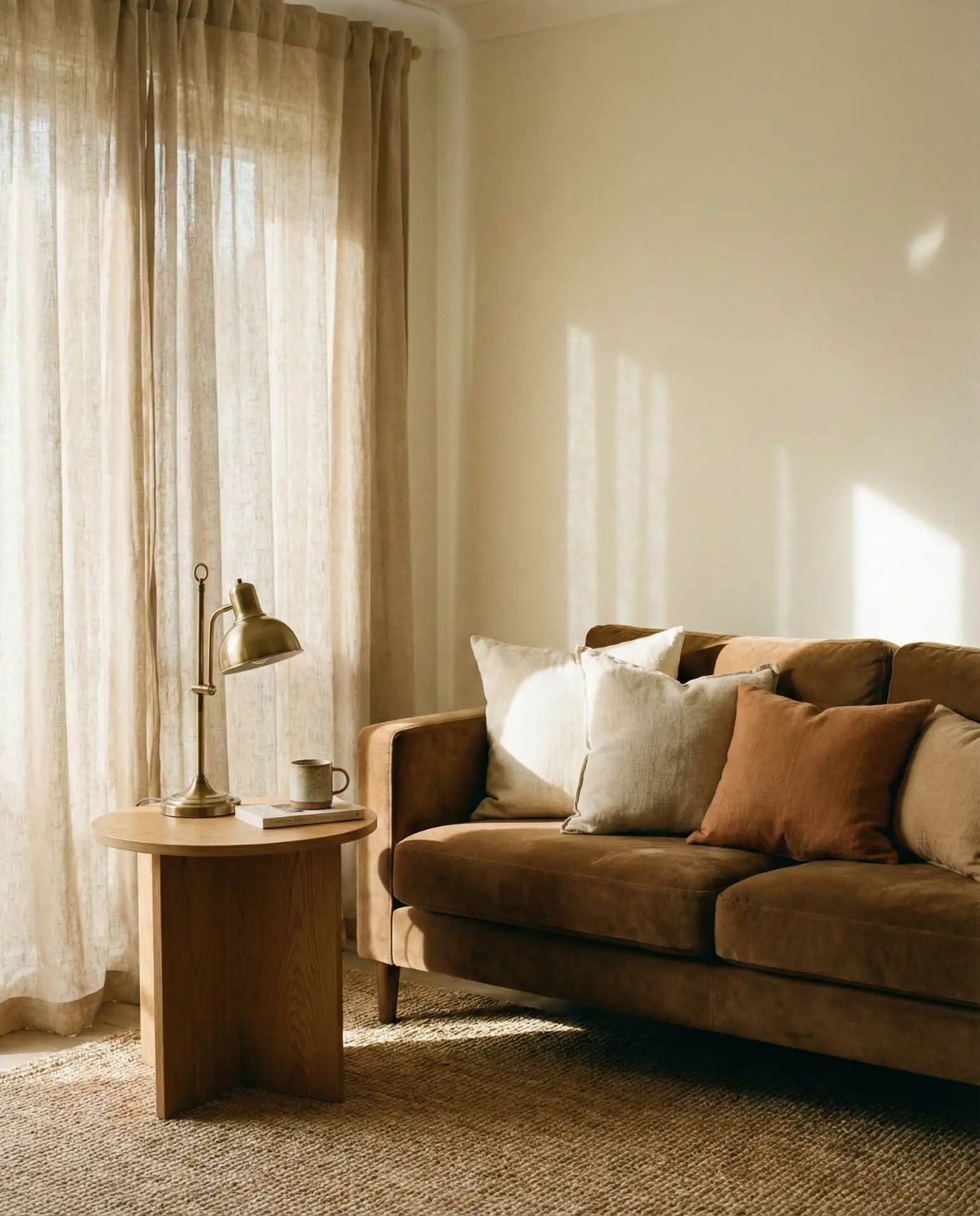
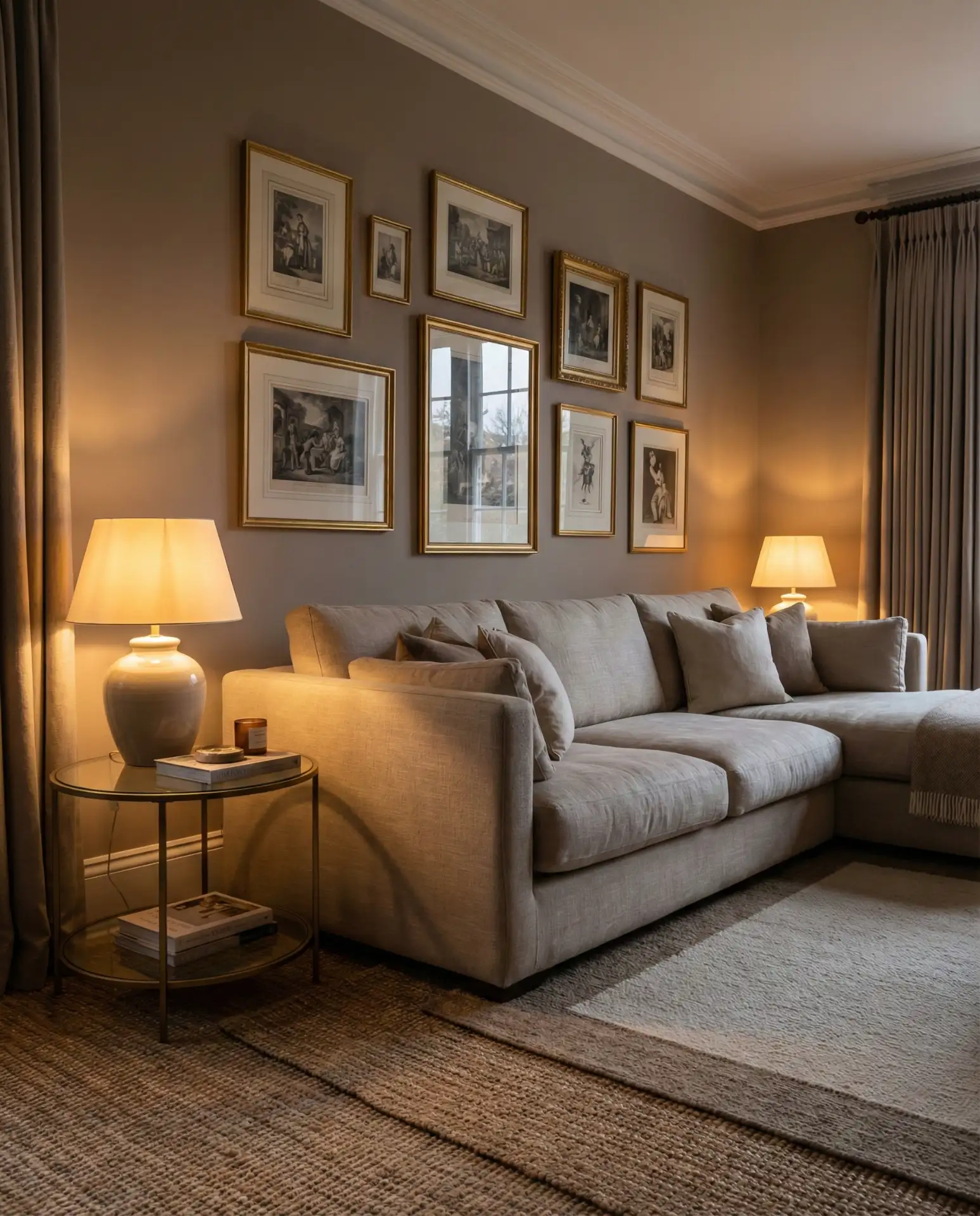
23. Mocha and Soft Beige
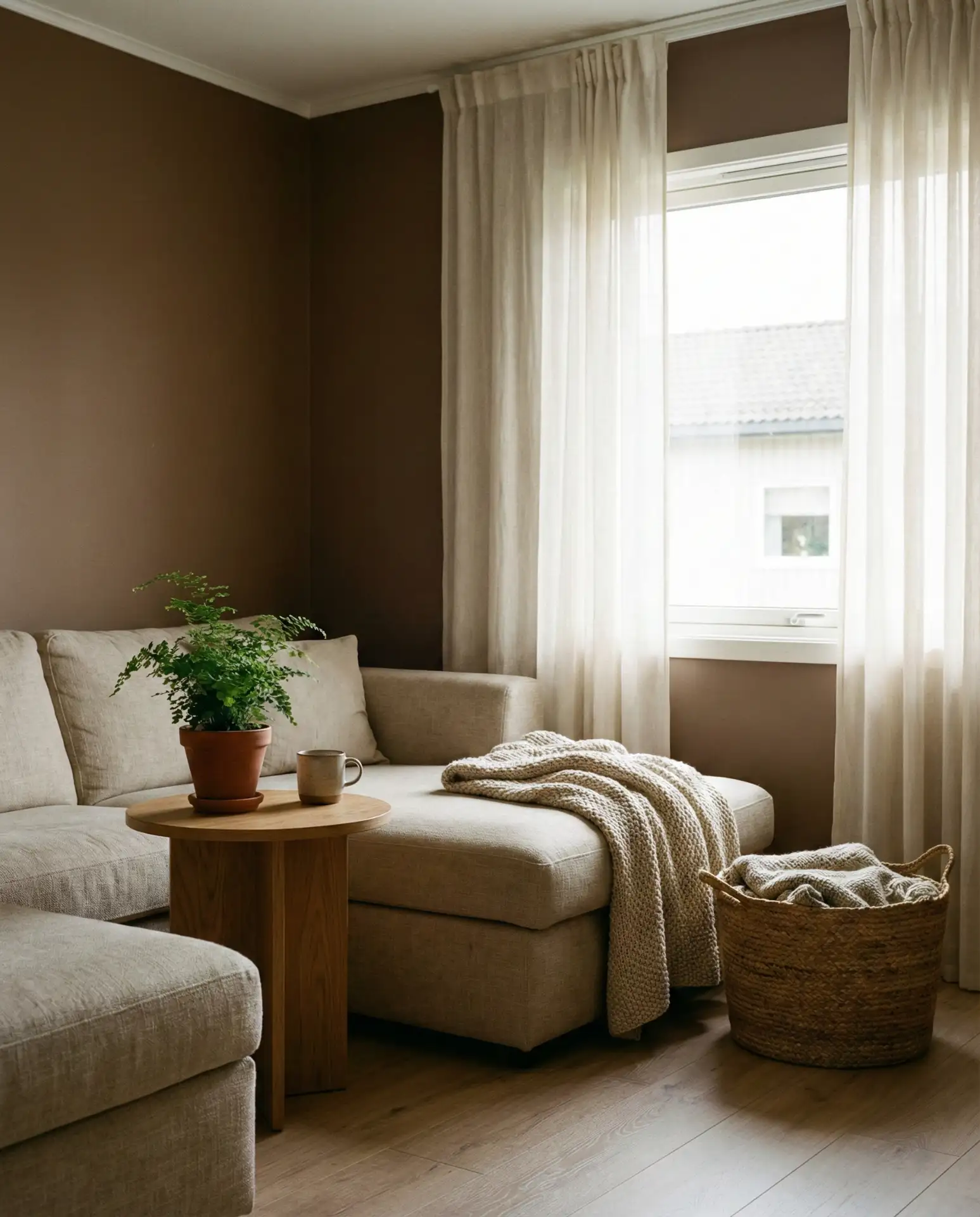
Mocha is a rich, chocolatey brown that brings warmth and grounding when paired with soft beige. This combination feels both cozy and sophisticated, perfect for living rooms where comfort is the priority. It’s a palette that appeals to families and homebodies, offering a cocoon-like atmosphere without feeling dark or closed-in.
Real homeowner behavior shows that mocha and beige are often chosen by people moving away from all-white or all-gray interiors—they want warmth but without the commitment of bold color. The key is balancing the mocha so it doesn’t dominate; use it on one accent wall or in large furniture pieces, then surround it with lighter tones. Add texture through pillows, rugs, and curtains to keep the palette from feeling too monochromatic.
Conclusion
Your living room is the heart of your home, and the colors you choose in 2026 can transform not just how it looks, but how it feels every single day. From the grounded warmth of terracotta to the crisp freshness of icy blue, these color ideas offer endless possibilities for creating a space that’s uniquely yours. Whether you’re drawn to bold combinations or prefer the calm of neutrals, the key is choosing colors that reflect how you want to live. What color direction are you leaning toward? Drop your thoughts in the comments below—we’d love to hear what inspires you.