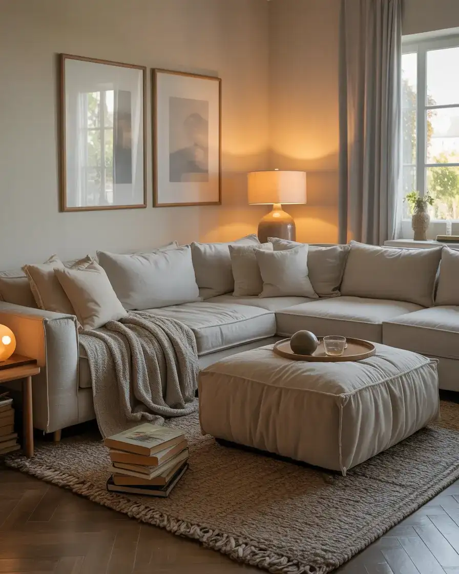
Neutral living rooms have long been a favorite in American homes, but 2026 is ushering in a fresh take on this timeless palette. Pinterest searches for neutral living room ideas are climbing as homeowners seek spaces that feel both calming and current—places where cozy meets contemporary, and where subtle earthy tones create a backdrop for real life. This year, neutrals aren’t about playing it safe; they’re about layering textures, adding unexpected pops of color, and creating rooms that feel collected rather than decorated. Whether you’re drawn to moody charcoal walls or soft linen sofas, these ideas will show you how to build a neutral living room that feels anything but boring.
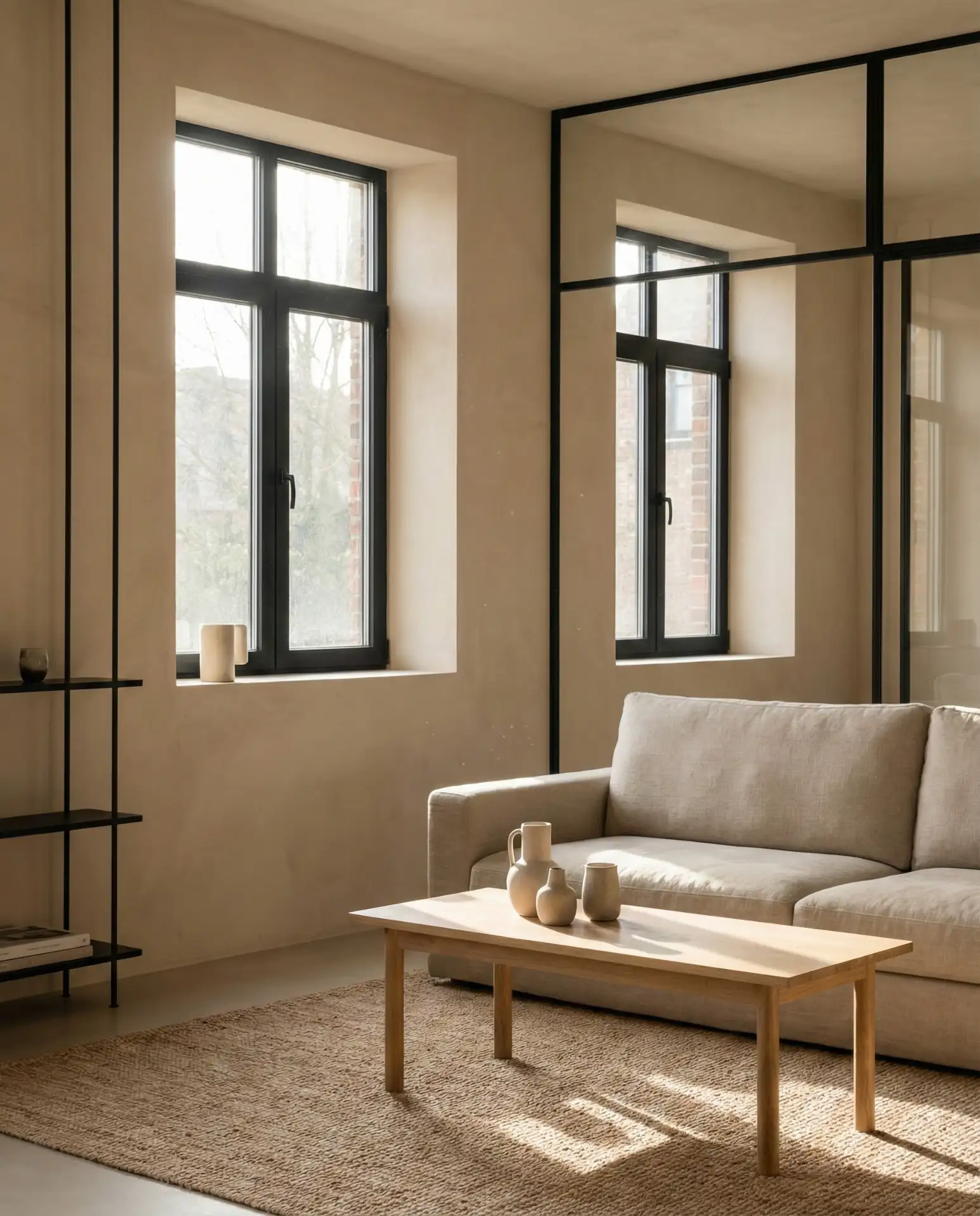
1. Warm Taupe Walls with Black Hardware
Taupe has reclaimed its place as a go-to neutral, especially when paired with black accents that give it definition. Think warm, greige-toned walls that shift with the light throughout the day, grounded by matte black door handles, curtain rods, and picture frames. This combination works beautifully in both apartments and larger homes, offering a sophisticated base that never feels cold. The taupe reads soft and inviting, while the black hardware adds just enough contrast to keep the space from feeling washed out. 
This combination works best in rooms with plenty of natural light, where the taupe can show its full range of undertones. In spaces with less light, consider using black accents more sparingly—too much can make the room feel heavy. A common mistake is choosing a taupe that leans too pink or too yellow; test samples on your wall and observe them at different times of day before committing. The right taupe should feel like a warm hug, not a color you’re constantly second-guessing.
2. Layered Cream and Ivory Textures
A monochromatic cream palette creates a serene living room when you layer different textures and finishes. Mix a smooth ivory leather chair with a chunky cream knit throw, a linen sofa, and a wool rug in a slightly deeper shade. The magic happens when light hits these surfaces differently throughout the day, revealing depth without relying on color. This approach feels particularly cozy in homes where the living room serves as a true gathering space, not just a showpiece. 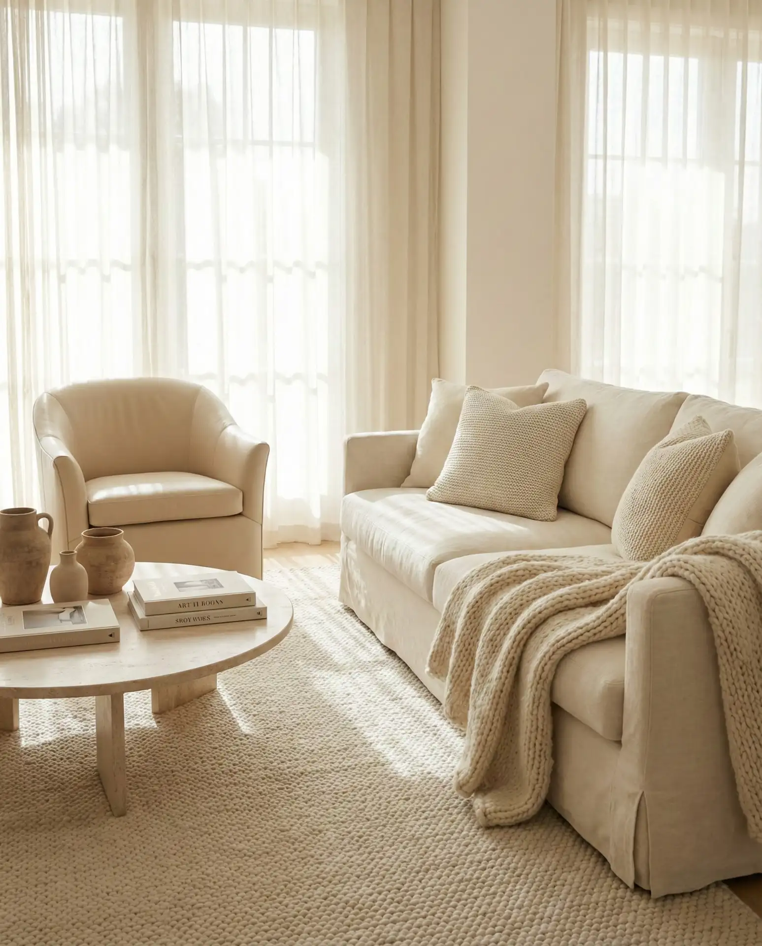
Many homeowners worry that an all-cream room will feel sterile or show every mark, but the opposite is often true. Lived-in cream spaces develop character over time, and the layered textures help disguise minor wear better than flat, uniform surfaces. One designer trick: vary the sheen levels. Pair matte linen with a subtle satin pillow or a glazed ceramic side table to create visual interest without introducing new colors. This technique keeps the eye moving without overwhelming the senses.
3. Soft Grey with Warm Wood Tones

Light grey and warm wood is a pairing that feels current without trying too hard. Choose a soft, dove grey for walls or a sectional, then introduce honey-toned oak or walnut through a coffee table, floating shelves, or a media console. The wood brings necessary warmth to grey’s cool undertones, creating balance that works in both modern and more traditional spaces. This combination is especially popular in open-concept homes where the living room flows into brown-toned hardwood floors. 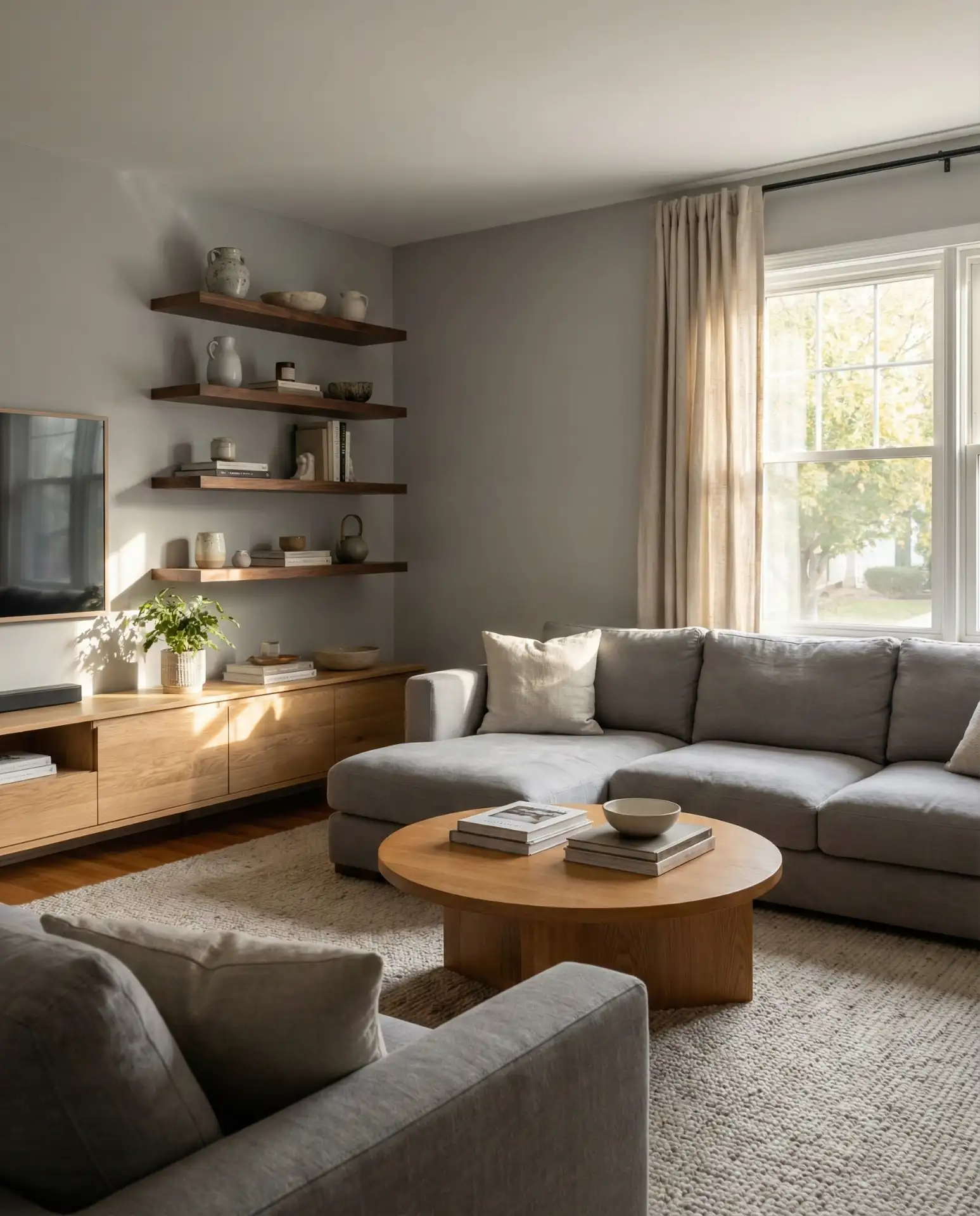
Where it works best: homes in the Pacific Northwest and Northeast, where grey skies are common and homeowners crave interiors that feel grounded and warm despite the weather outside. The wood tones prevent the grey from feeling institutional or cold. If you’re working with builder-grade grey walls that skew too blue or too purple, adding warm wood is one of the fastest fixes—it neutralizes unwanted undertones and adds instant personality without a full repaint.
4. Beige Base with Terracotta Accents
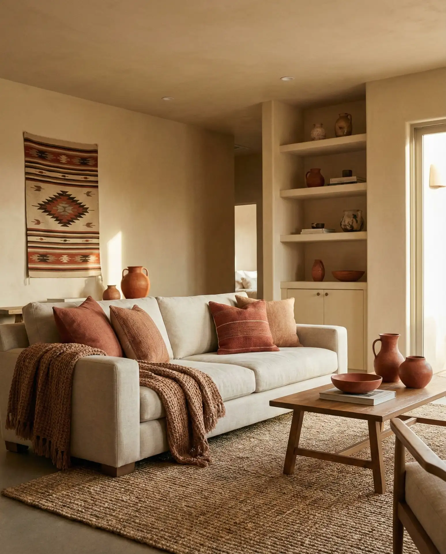
Beige doesn’t have to feel bland when you introduce a pop of color like terracotta. Start with a sandy beige sofa and walls, then layer in rust-toned pillows, a clay vase, or a faded terracotta throw blanket. This combination nods to Southwestern and Mediterranean aesthetics without committing to a full theme. The warmth of terracotta feels organic and grounding, especially when paired with natural materials like jute or raw linen. It’s a palette that works beautifully in dry climates but translates well anywhere. 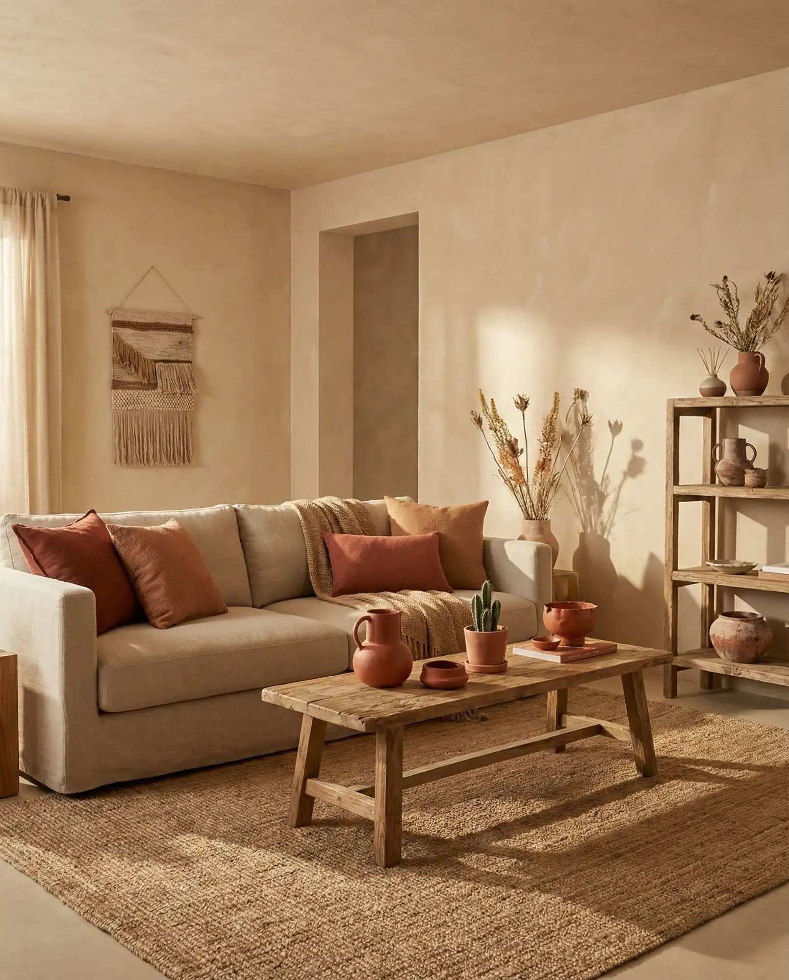
In many American homes, especially across the Southwest and California, homeowners are returning to earth tones that reflect the landscape outside their windows. Terracotta accents feel less trendy and more timeless than some of the cooler accent colors that dominated the last few years. A micro tip: if terracotta feels too bold, start with one large piece—like a rust-colored throw or a ceramic lamp base—and see how it settles into your space before adding more.
5. Pale Green Walls with Natural Fiber Textures
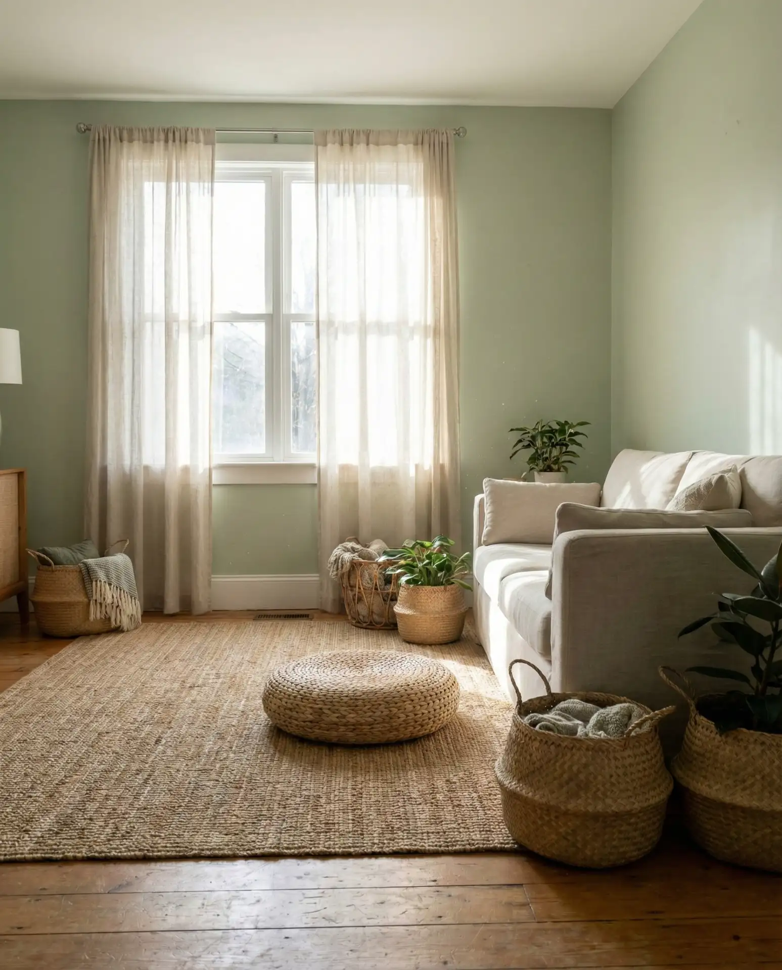
A whisper of green and natural textures brings a biophilic calm to neutral living rooms. Think barely-there sage or celadon walls paired with woven seagrass baskets, a jute rug, and linen curtains. The green registers as a neutral but adds a layer of freshness that pure beige or grey can’t achieve. This approach works especially well in homes with limited outdoor views, creating an indoor connection to nature. The natural fiber textures keep the look grounded and prevent the green from feeling too sweet or cottage-like. 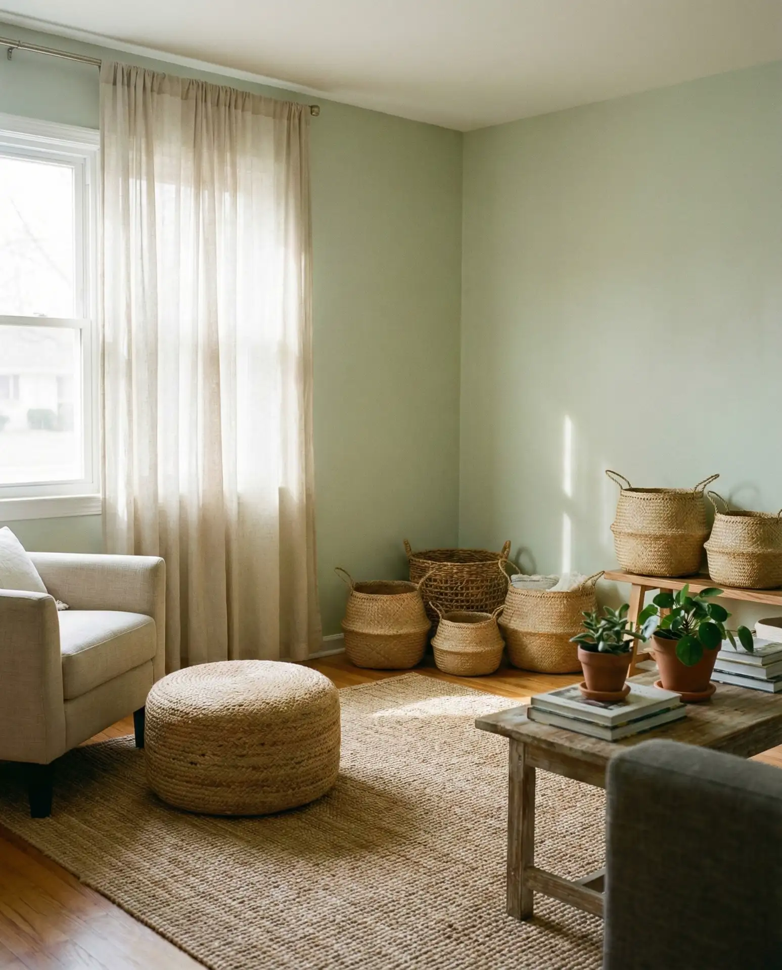
Paint companies have reported a surge in sales of muted greens over the past year, with many homeowners choosing these shades for main living spaces rather than bedrooms or bathrooms. The appeal is clear: green feels calming without being cold. One practical insight—these pale greens pair beautifully with brass or gold hardware, which adds just enough warmth to keep the space from feeling too spa-like. Avoid pairing pale green with chrome or silver finishes, which can make the room feel clinical.
6. Charcoal Grey with White Trim

For those drawn to moody interiors, charcoal grey walls with crisp white trim offer drama without going fully dark. This high-contrast pairing creates architectural interest, making baseboards, window frames, and crown molding stand out. The charcoal reads as sophisticated and intentional, especially when balanced with plenty of warm wood furniture and soft textiles. It’s a bold choice that works best in rooms with strong natural light or good artificial lighting to prevent the space from feeling cave-like. 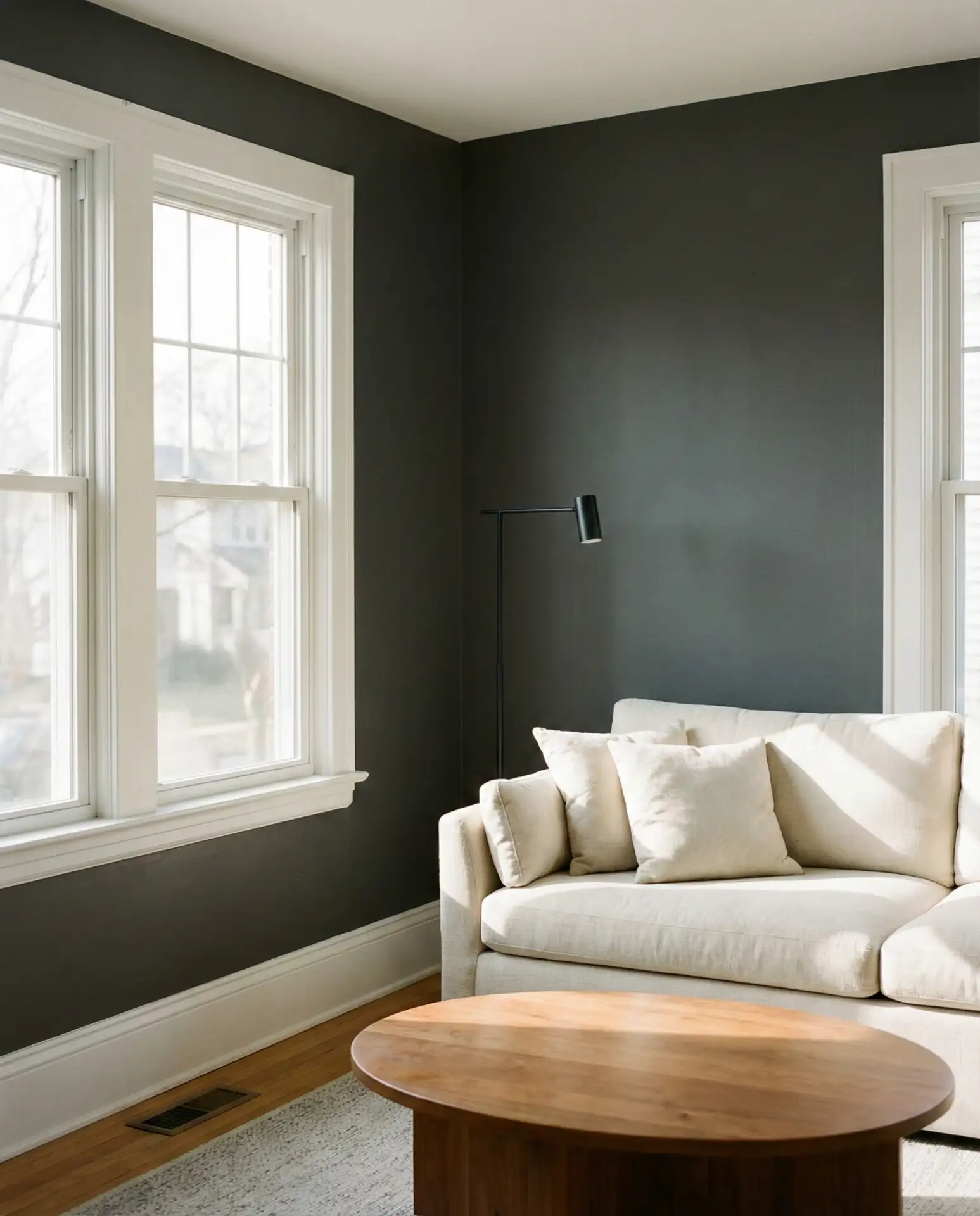
This look is gaining traction in urban apartments and renovated townhomes where homeowners want to make a statement without permanent wallpaper or extensive renovations. The white trim prevents the dark walls from closing in the space, acting as a visual release. Budget-wise, this is one of the more affordable dramatic transformations—quality paint and steady hands (or a good painter) are all you need. Just be sure to use a matte or eggshell finish on the charcoal to avoid showing every fingerprint.
7. Soft White Walls with Textured Plaster Finish
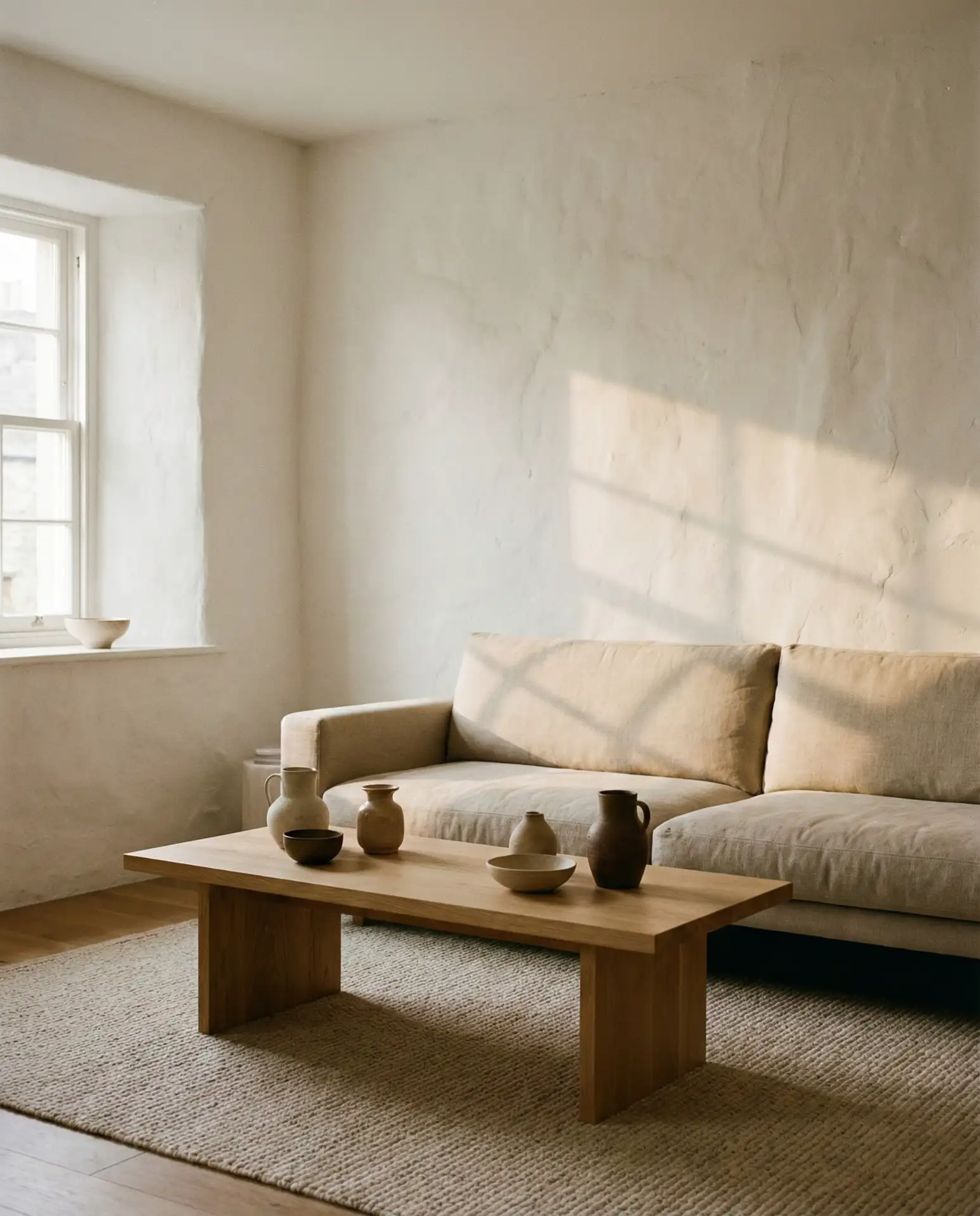
White walls get a sophisticated upgrade with a subtle plaster or limewash texture that catches light and creates depth. This isn’t flat builder white—it’s a soft, warm white with visible texture that adds organic character without pattern or color. The slight irregularity of the plaster finish makes the walls feel handcrafted and intentional, perfect for spaces that lean modern Mediterranean or California casual. Pair with simple furniture in natural materials to let the walls be the subtle star. 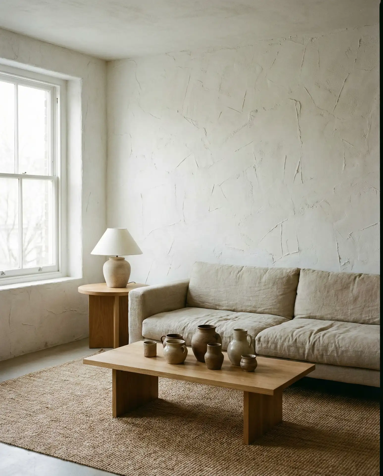
Real homeowner behavior: many people are moving away from perfectly smooth drywall finishes, embracing walls with character. The textured plaster trend started in high-end renovations but is becoming more accessible through specialty paint techniques and textured wallcoverings that mimic the look. It’s particularly popular in regions with Spanish colonial or Mediterranean architectural history—think Southern California, Arizona, and parts of Florida—where these finishes feel culturally rooted rather than imported.
8. Mushroom Brown Sofa with Cream Surroundings
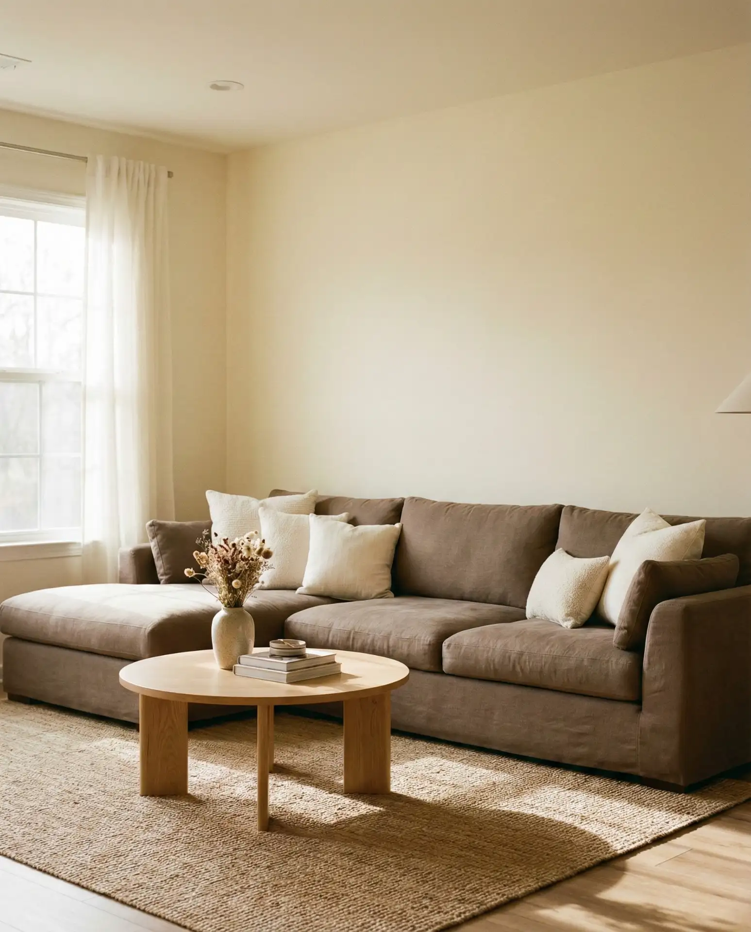
A rich mushroom brown sofa anchors a cream-walled living room with unexpected warmth. This shade of brown—somewhere between taupe and cocoa—feels current and grounding without the heaviness of traditional chocolate brown furniture. Surround it with cream walls, a light wood coffee table, and ivory accents for a tonal palette that’s anything but flat. The mushroom brown adds just enough weight to make the room feel furnished and intentional, not sparse or under-decorated. 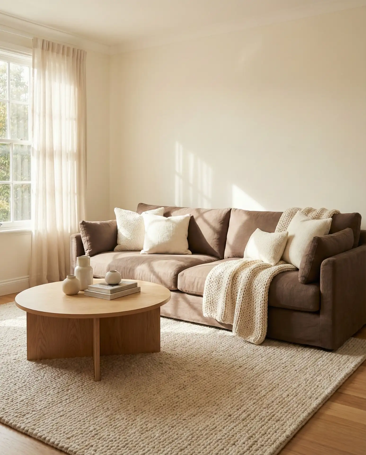
Where it works best: in homes where the living room needs to balance busy family life with visual calm. A mushroom brown sofa is far more forgiving than cream or white upholstery, hiding daily wear while still reading as neutral and sophisticated. It’s a smart choice for families with kids or pets who want a beautiful living room that doesn’t require constant maintenance. Plus, this shade pairs beautifully with both warm and cool accent colors, making it easy to refresh the space seasonally.
9. Greige Walls with Brass Fixtures
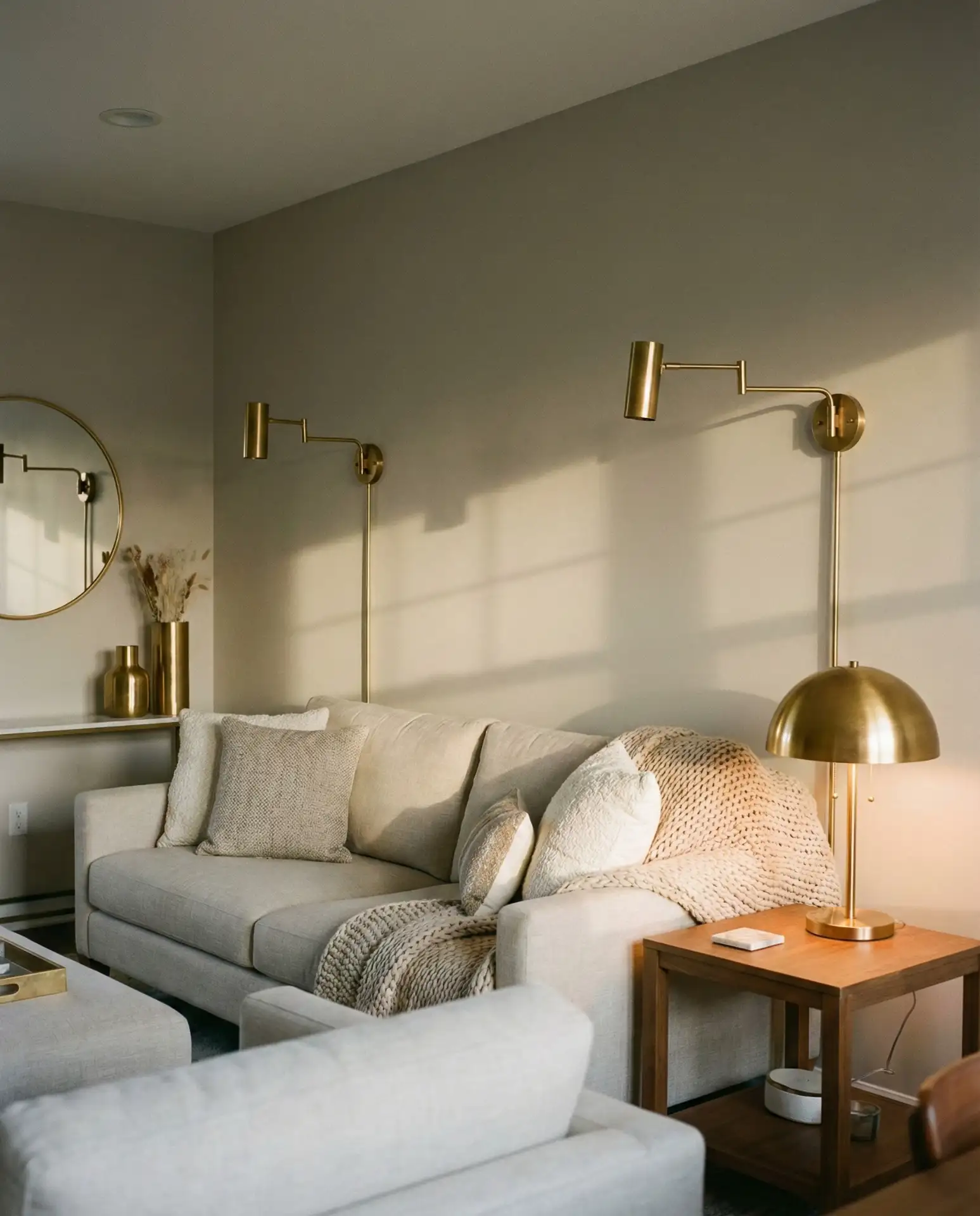
Greige—that perfect grey-beige hybrid—gets an elevated look when paired with warm brass lighting and hardware. The greige provides a balanced neutral backdrop that doesn’t skew too warm or too cool, while brass sconces, lamp bases, or picture frame edges add subtle gleam. This combination works beautifully in transitional spaces that bridge modern and traditional styles. The brass keeps the greige from feeling flat or institutional, adding a layer of warmth that makes the room feel lived-in and considered. 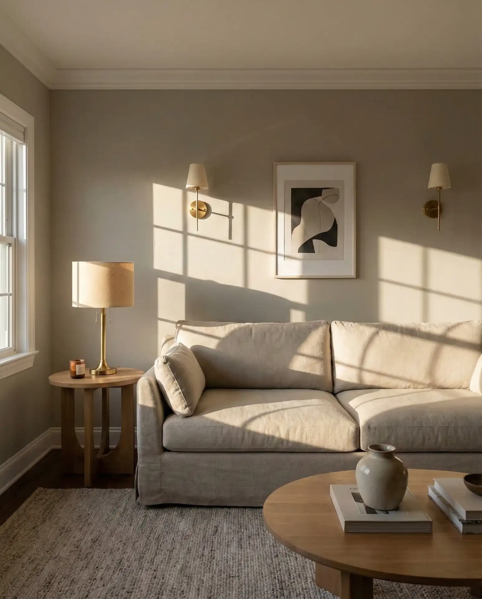
Expert-style commentary: the shift from chrome to brass fixtures reflects a broader move toward warmer metals in American interiors. Brass brings a sense of history and craftsmanship that cooler metals can’t replicate. The finish works particularly well with greige because both sit in that comfortable middle ground—neither too modern nor too traditional. If you’re replacing fixtures gradually, brass is a safe investment that won’t feel dated in a few years the way some trendier finishes might.
10. Neutral Palette with Deep Blue Accent Chair
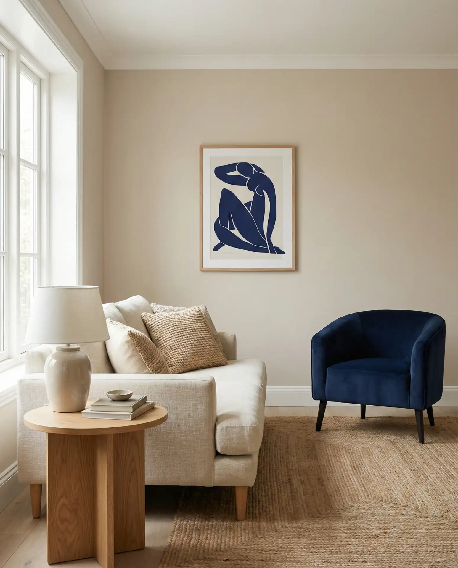
A blue and neutral combination works when you let one deep blue piece carry the color load. Start with beige or cream walls, a neutral sofa, and natural wood furniture, then introduce a single navy or midnight blue accent chair. The blue reads as grounding rather than bright, almost functioning as a dark neutral that adds depth without competing with the softer tones. This approach is perfect for homeowners who want to add color but feel nervous about going bold—one piece is enough to shift the entire mood. 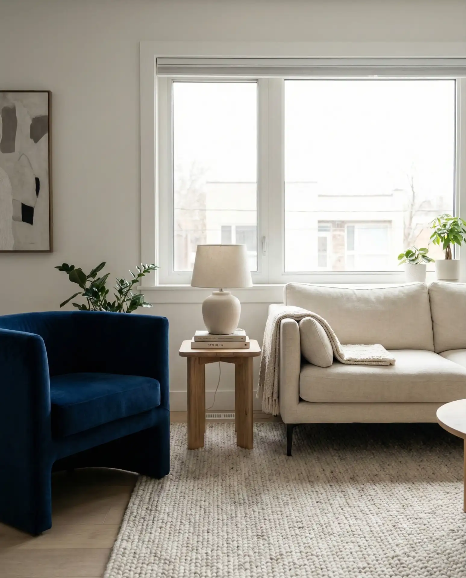
A micro anecdote: a friend recently swapped her beige accent chair for a deep navy one and said it finally made her neutral living room feel complete. That one change gave the room a focal point and made the entire space feel more intentional. The trick is choosing a blue that has some depth—avoid anything too bright or primary. Look for blues with grey or black undertones that read sophisticated rather than juvenile.
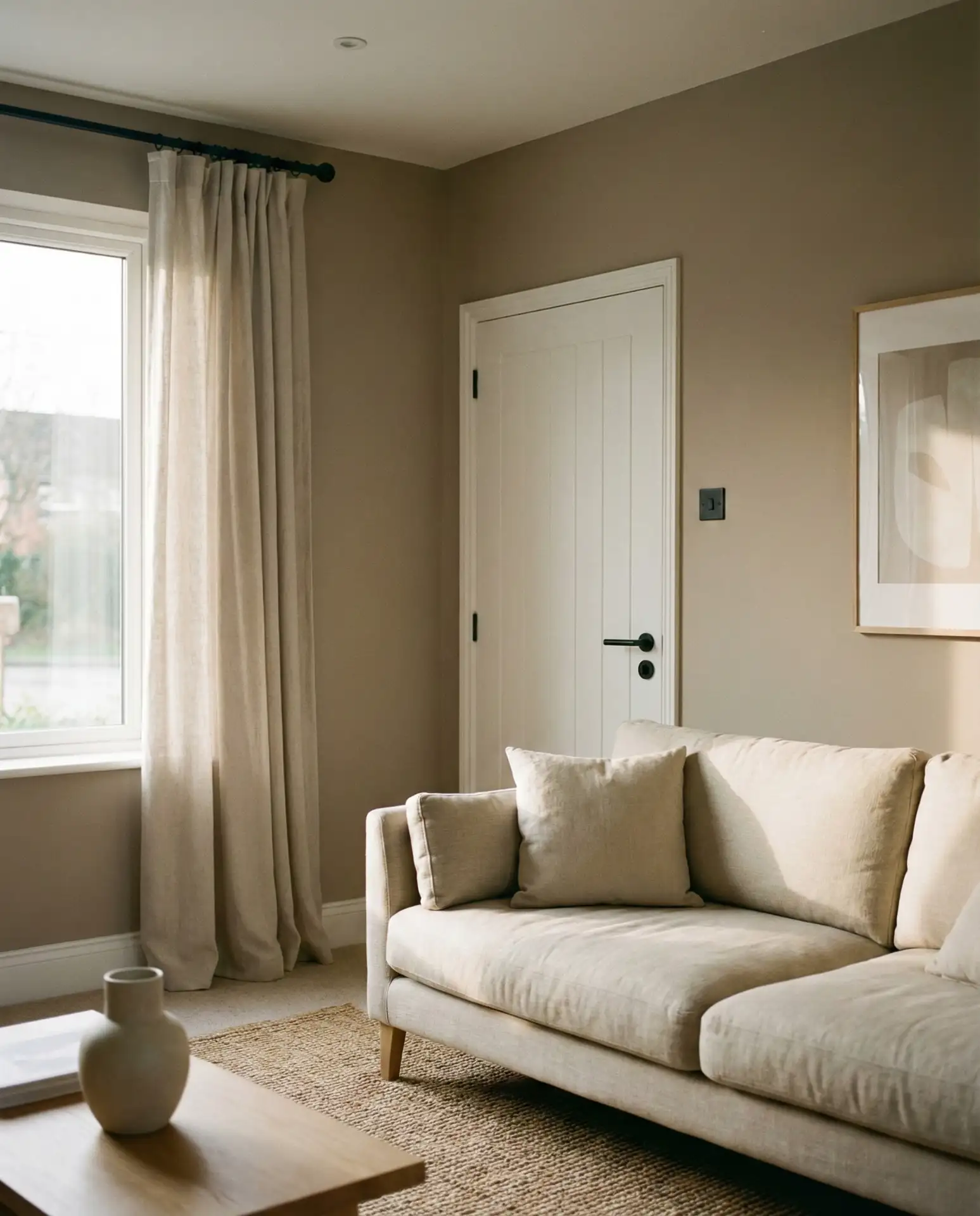
11. Warm Off-White with Natural Linen Everywhere
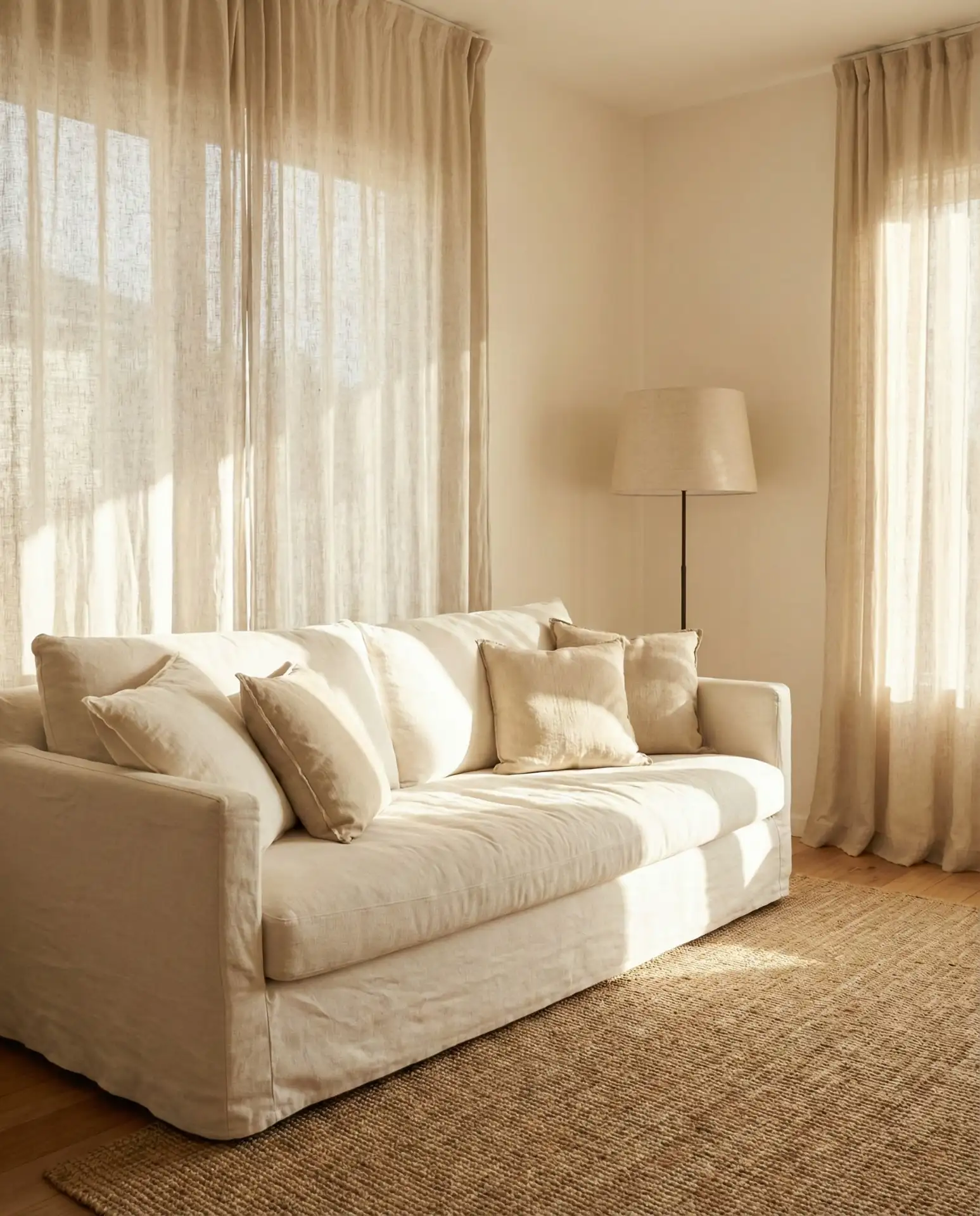
An all-linen approach creates a cosy living room that feels effortlessly elegant. Choose warm off-white walls, then layer in natural linen upholstery, linen curtains, linen pillow covers, and even linen lampshades. The fabric’s inherent texture and slight imperfection keep the monochromatic palette from feeling sterile. Linen also ages beautifully, developing a soft, lived-in quality that suits the relaxed neutral aesthetic perfectly. This look thrives in homes where comfort is prioritized over formality. 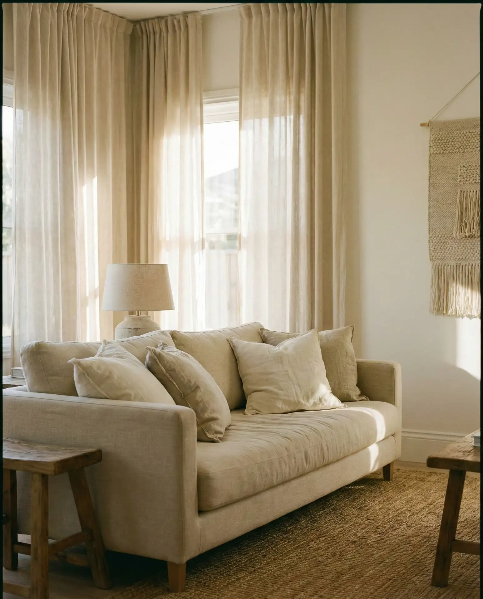
Practical insight: linen wrinkles, and that’s part of its charm. If you’re the type who irons bed sheets, an all-linen living room might drive you crazy. But if you embrace the rumpled, relaxed aesthetic, linen is unbeatable. It’s naturally antimicrobial, breathable, and incredibly durable. Many American homeowners in warmer climates—like the South and Southwest—are gravitating toward linen because it helps rooms feel cooler and more breathable during hot months.
12. Sand Tones with Black Window Frames
Soft sand-colored walls take on architectural drama when paired with black accents like painted window frames. The black creates strong lines that define the space and draw the eye to natural light sources. This combination is particularly striking in rooms with large windows or sliding doors, where the black frames act almost like artwork, framing views of the outdoors. The sandy neutral keeps the look from feeling too stark or industrial, maintaining warmth and approachability. 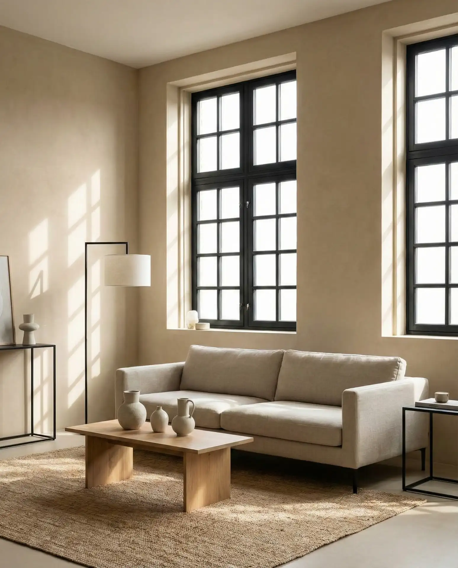
This is one of those upgrades that looks expensive but can be surprisingly affordable. Painting existing window frames black is a DIY-friendly weekend project that completely transforms how a neutral room reads. Where it works best: in newer construction homes where windows are large and numerous, or in renovated spaces where you want to highlight architectural features. The black frames also help transition between indoor and outdoor spaces, especially if you have dark exterior elements like black shutters or dark landscaping stones.
13. Oatmeal Walls with Collected Vintage Woods
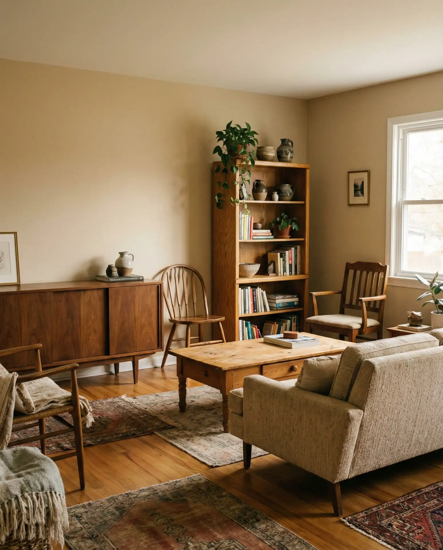
Oatmeal-toned walls provide the perfect backdrop for mixing different wood tones and vintages without the space feeling chaotic. Combine a mid-century walnut credenza, a weathered pine coffee table, and lighter oak shelving—the neutral walls unify everything. This approach feels collected over time rather than bought in one shopping trip, which is exactly the vibe many homeowners are chasing. The varied woods add warmth and organic interest without requiring additional color or pattern. 
Real homeowner behavior: people are moving away from matching furniture sets and embracing pieces with history and character. Thrift stores, estate sales, and family hand-me-downs are being mixed with new pieces to create more personal spaces. The oatmeal walls act as a visual equalizer, allowing each wood piece to shine without competing. One tip: if your vintage woods feel too disparate, add matching hardware or identical styling on each piece to create subtle visual cohesion.
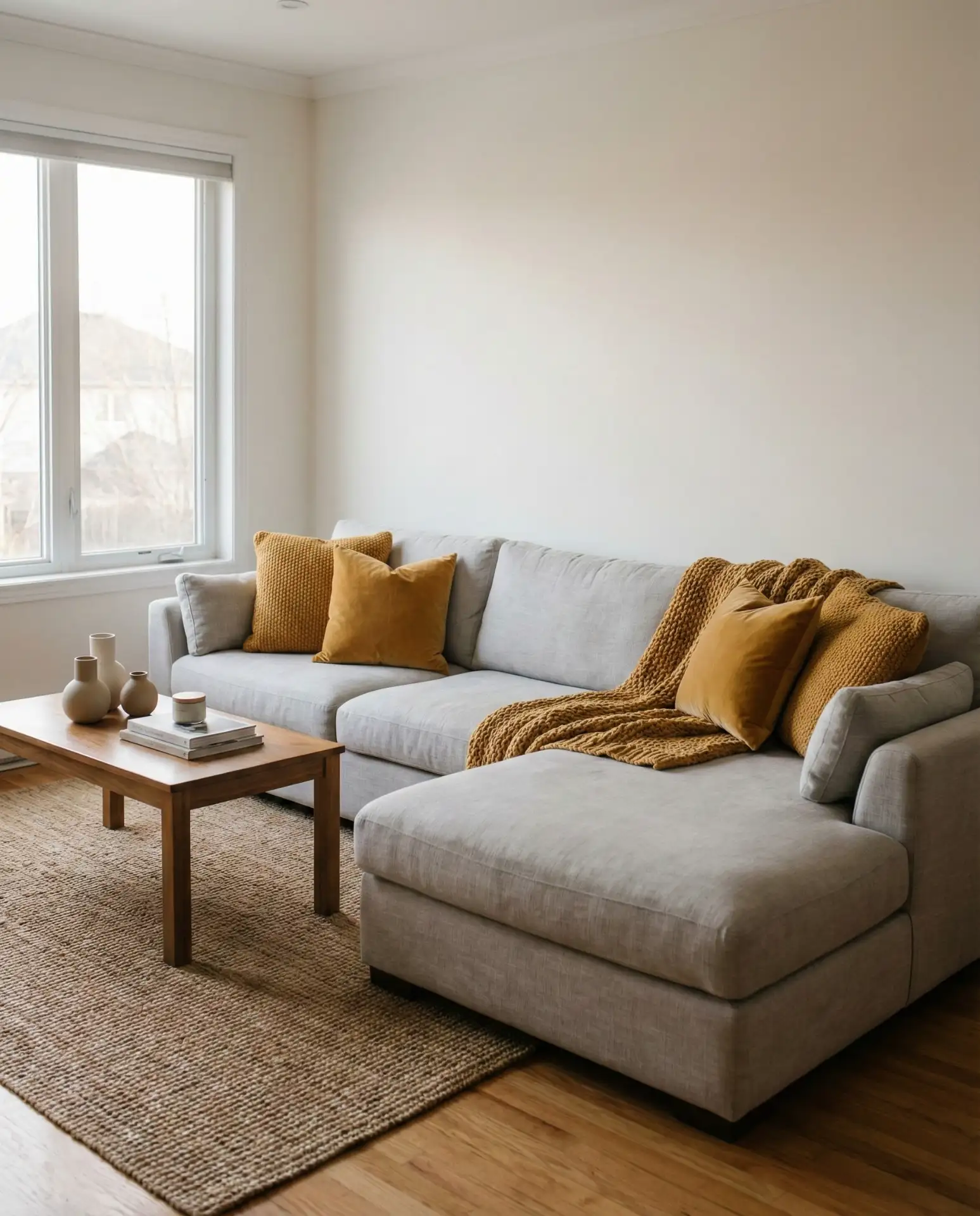
14. Soft Grey Sectional with Mustard Pillows
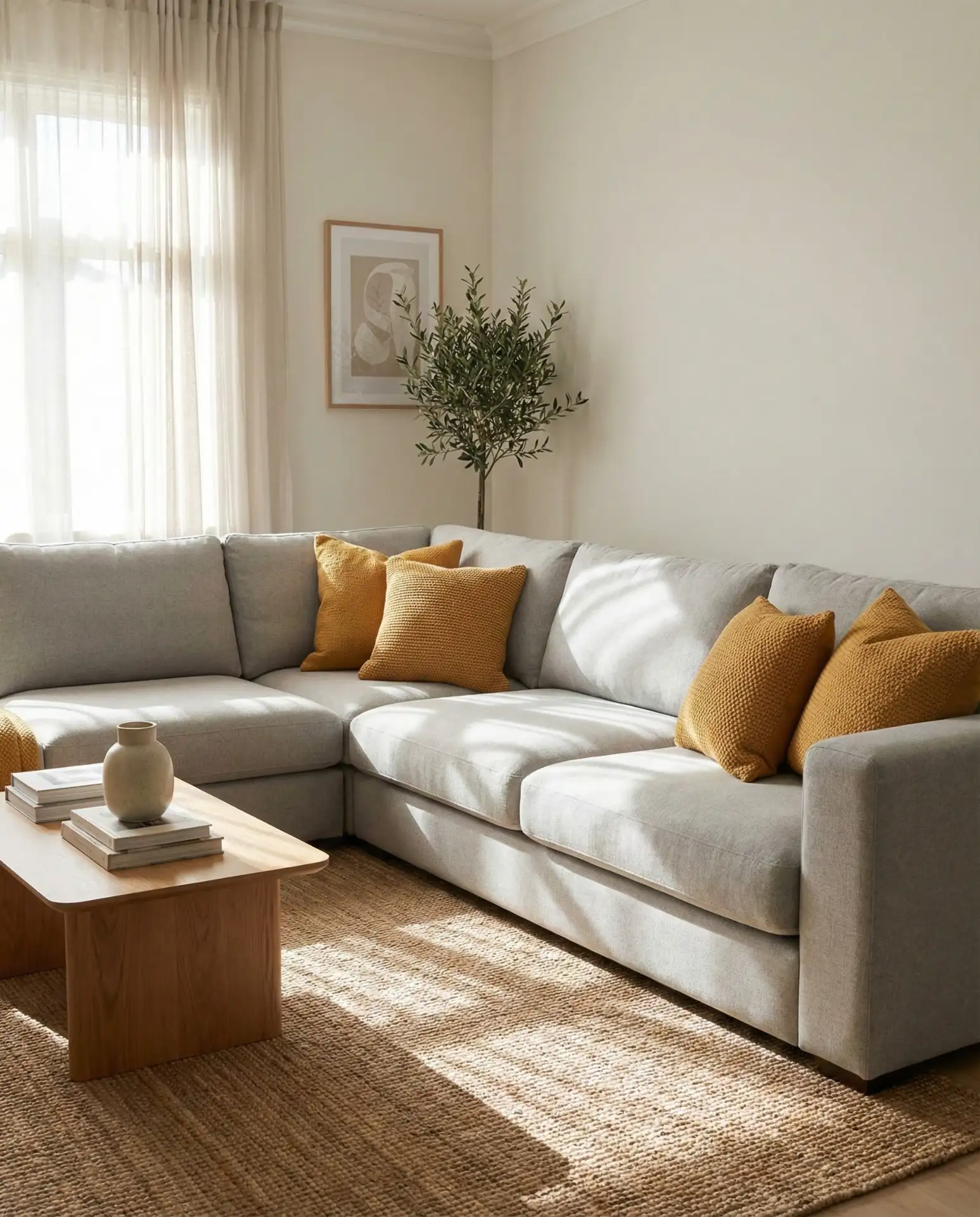
A light grey and neutral sectional becomes instantly more inviting with the addition of warm mustard throw pillows. The yellow-gold tones bring energy and warmth without overwhelming the calm grey base. This is a low-commitment way to add color—pillows can be swapped seasonally or as tastes change. The combination works particularly well in rooms with cool natural light, where the mustard compensates for the lack of warm sunlight. Choose mustard shades with some depth rather than bright lemon yellows for a more sophisticated look.
Budget angle: throw pillows are one of the most affordable ways to test color in a neutral room before making bigger commitments. Quality pillow covers in mustard or ochre tones run $20-40 each, making it easy to try the look without significant financial investment. If you love it, you might paint an accent wall or add a larger yellow piece; if not, you’re out less than $100 and can try something else. This makes mustard pillows a smart entry point for color-hesitant homeowners.
15. Cream Walls with Woven Pendant Lights
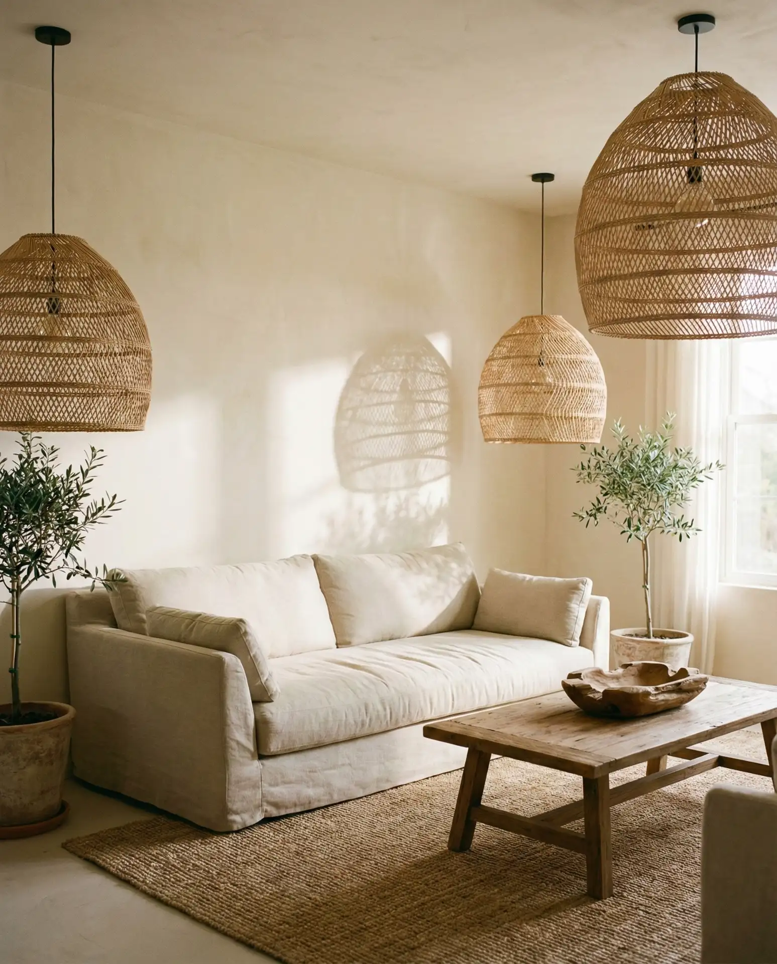
Soft cream walls gain dimension and inspiration when paired with natural woven pendant lights in rattan, seagrass, or bamboo. The pendants add sculptural interest and cast beautiful shadows when lit, creating pattern and texture without wallpaper or paint. This combination has a subtle coastal or California casual vibe without leaning into full beach house territory. The woven lights work equally well over a coffee table, in a corner reading nook, or flanking a sofa, bringing the eye upward and adding vertical interest. 
These pendant lights have become increasingly popular as homeowners seek alternatives to standard overhead lighting. They provide softer, more diffused light than typical fixtures, contributing to the overall cozy atmosphere of a neutral room. Common mistake: hanging them too high. The bottom of a pendant light should generally be 30-36 inches above a coffee table or side table to create proper scale and ensure the light illuminates the space effectively without hanging in sightlines.
16. Pale Taupe with Sage Green Accents
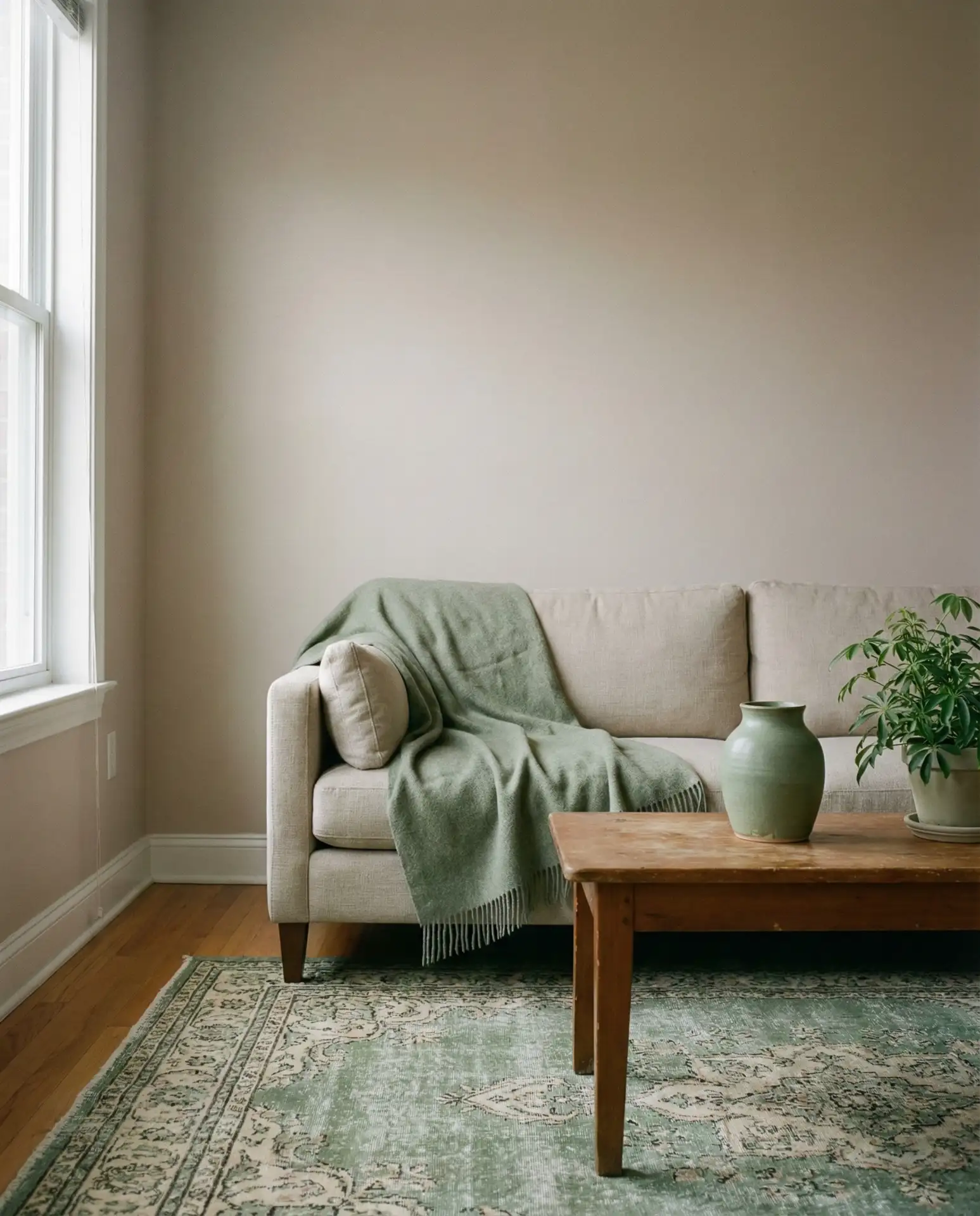
Pale taupe walls create a warm neutral foundation that pairs beautifully with soft green accents. Think sage green throw blankets, a muted green ceramic planter, or a faded green vintage rug. The combination feels earthy and grounded, bringing together warm and cool tones without either dominating. This palette works especially well in homes surrounded by greenery, as it creates a seamless visual transition between indoors and outdoors. The taupe prevents the green from feeling too crisp or artificial, keeping everything soft and approachable. 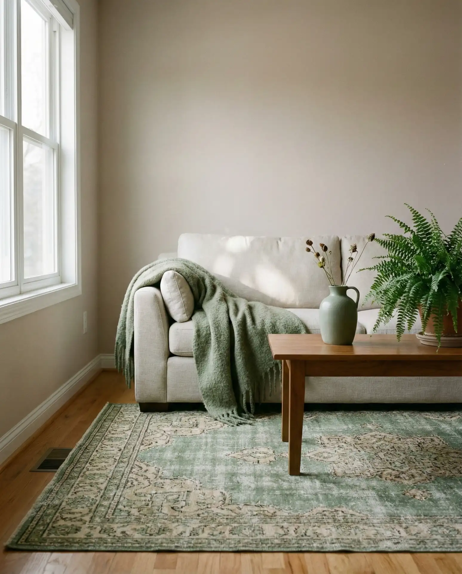
American lifestyle context: in regions like the Pacific Northwest, Northeast, and parts of the Midwest where green landscapes dominate, homeowners often bring these tones indoors to maintain visual continuity with the surrounding environment. The taupe-and-sage combination feels particularly appropriate in these settings, almost like bringing the outdoors in without literal botanical wallpaper or heavy-handed nature themes. It’s a subtle nod to place that feels genuine rather than decorative.
17. Warm White Walls with Chunky Wool Textiles
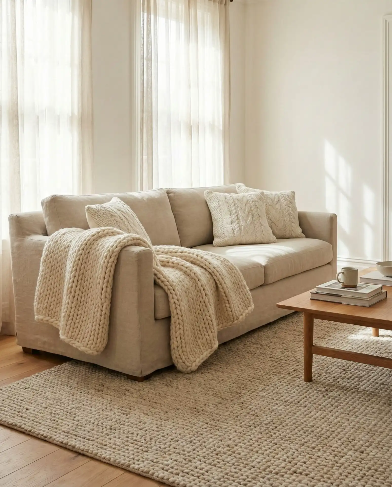
Warm white walls become instantly cozy when layered with chunky wool throws, cable-knit pillows, and thick wool area rugs. The textural contrast between smooth walls and tactile textiles creates a welcoming atmosphere that invites you to settle in. This combination works year-round but feels especially right during colder months when the wool adds both visual and physical warmth. Choose wool in natural, undyed shades to maintain the neutral palette while maximizing texture. 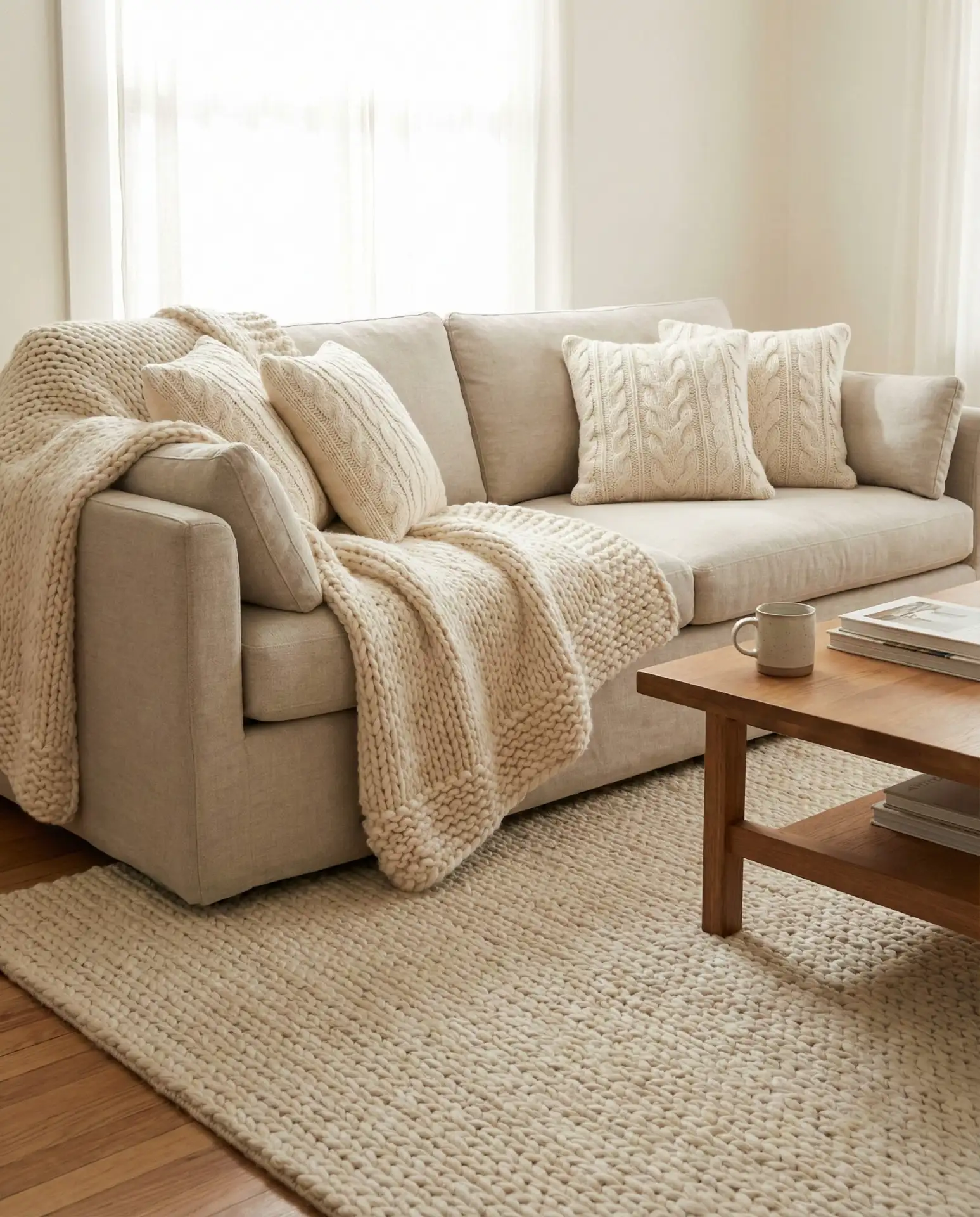
Practical insight: wool textiles are an investment but they last significantly longer than synthetic alternatives and actually improve with age. Natural wool is also naturally stain-resistant and flame-retardant, making it a smart choice for high-traffic living rooms. Many American wool textile companies offer machine-washable options now, eliminating one of the historical barriers to using wool in family spaces. Look for Oeko-Tex certified wool if you want to ensure the dyes and treatments are non-toxic.
18. Greige Sofa with Rust Orange Throw
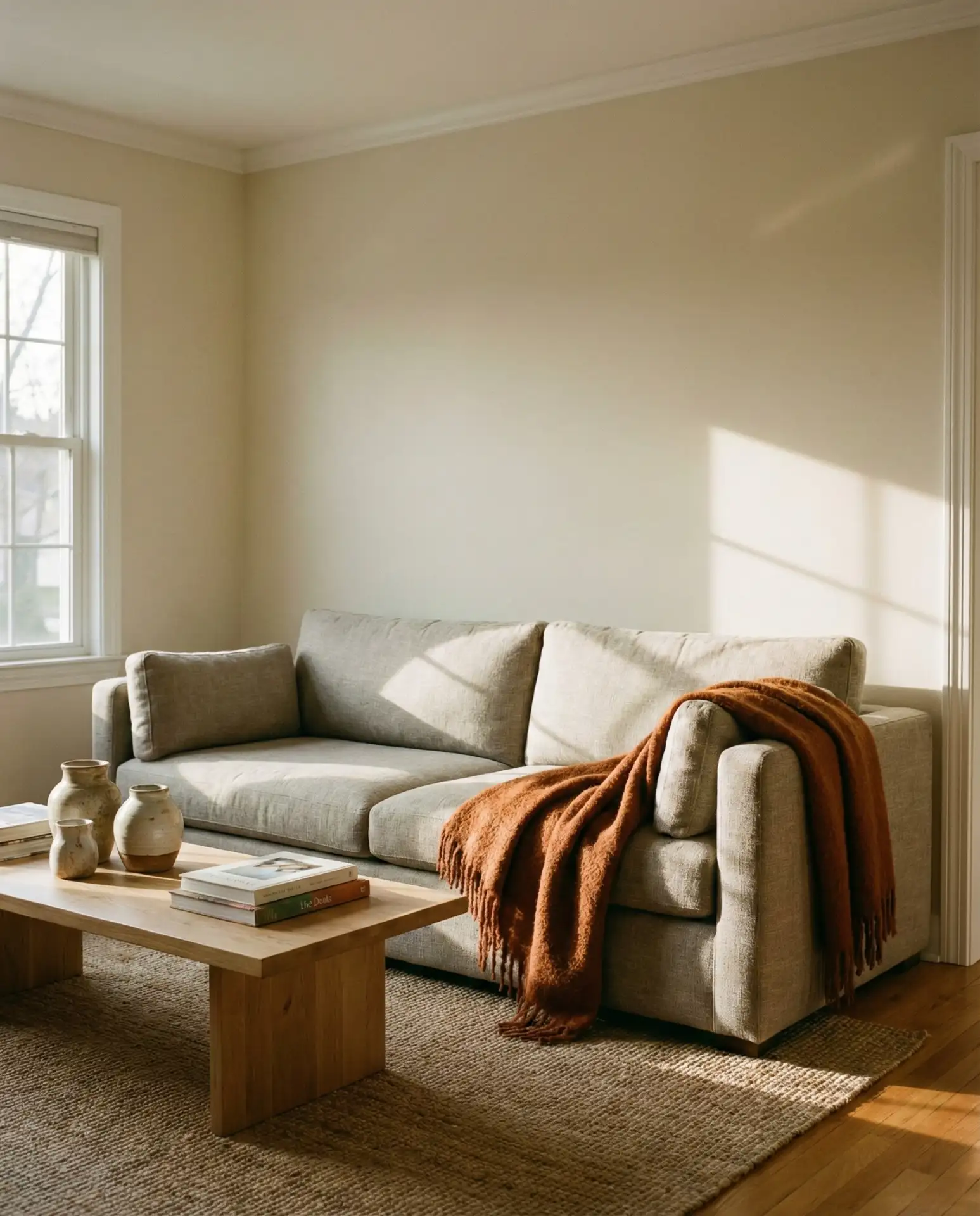
A versatile greige sofa gets a shot of personality with a rust orange throw blanket draped casually over one arm. The warm orange brings earthy energy without overwhelming the neutral base, creating a focal point that’s easy to change if your tastes shift. This combination has a subtle 1970s vibe that feels current rather than retro, especially when paired with natural wood and ceramic accessories. The rust orange works as both a pop of color and a grounding element, bridging warm and cool tones effortlessly. 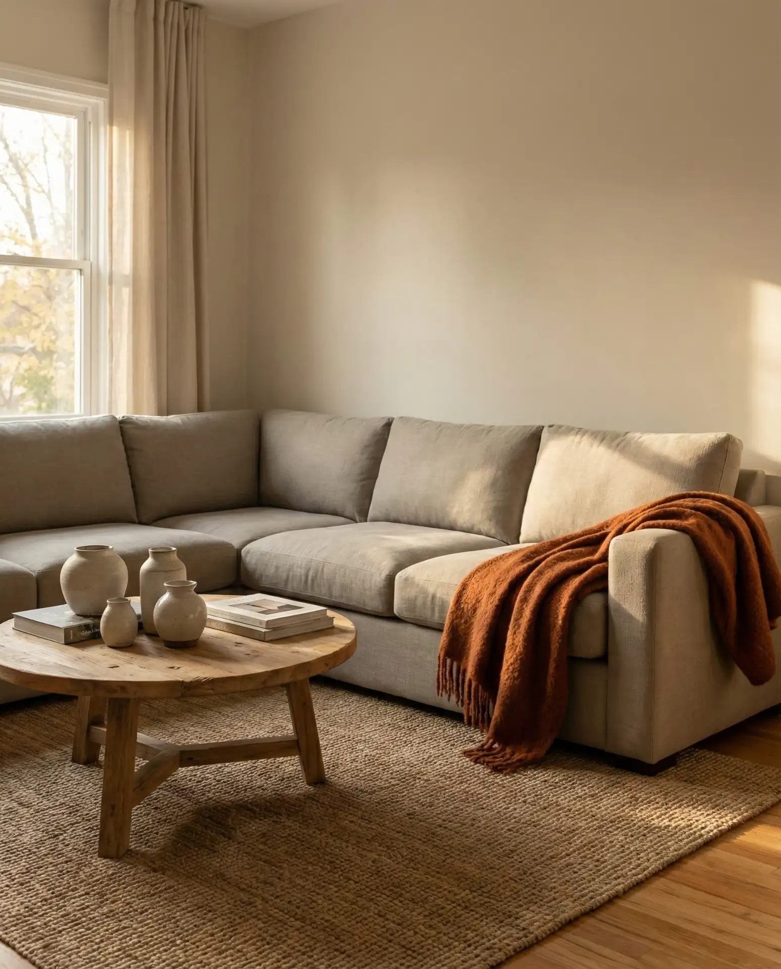
Where it works best: in transitional spaces that bridge different design eras or in homes where residents want to acknowledge trends without fully committing. The rust orange throw is affordable enough to replace when you’re ready for something new, but substantial enough to impact the room’s entire feel. It’s particularly effective in living rooms that get good afternoon light, where the orange seems to glow and amplify the warmth already present in the space.
19. Bone White Walls with Dark Wood Beams
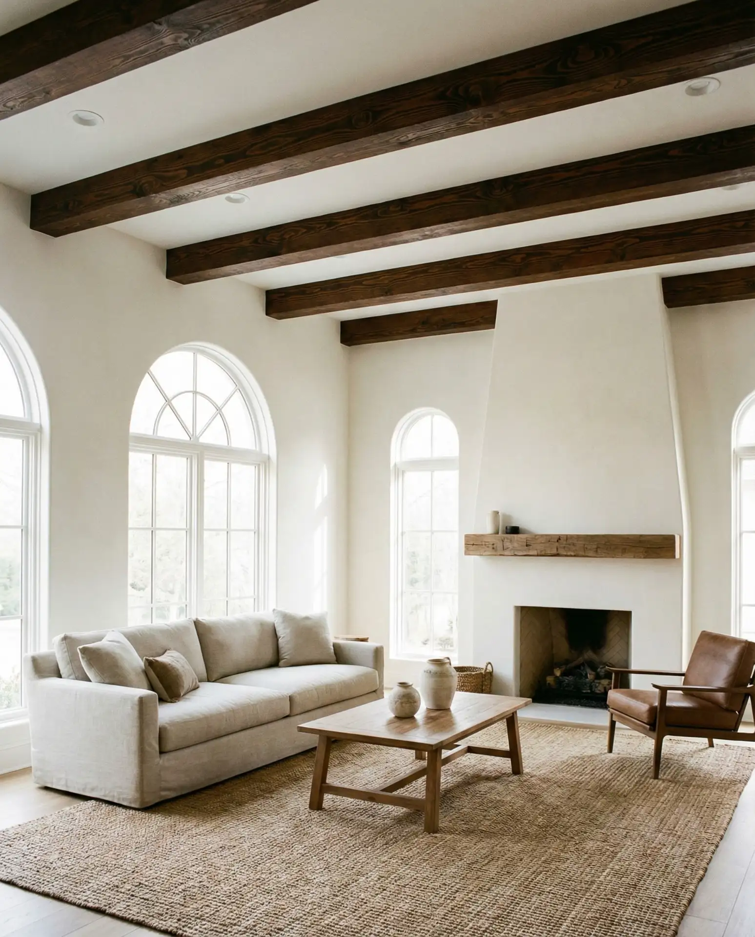
In homes with exposed ceiling beams, painting walls a warm bone white while leaving beams in dark stained wood creates stunning contrast. The white brightens the space and makes ceilings feel higher, while the wood beams add architectural character and prevent the room from feeling too minimal. This combination is particularly effective in older homes, mountain houses, or renovated barns where the beams are existing structural elements. The neutral white allows the wood’s natural grain and patina to become the room’s defining feature. 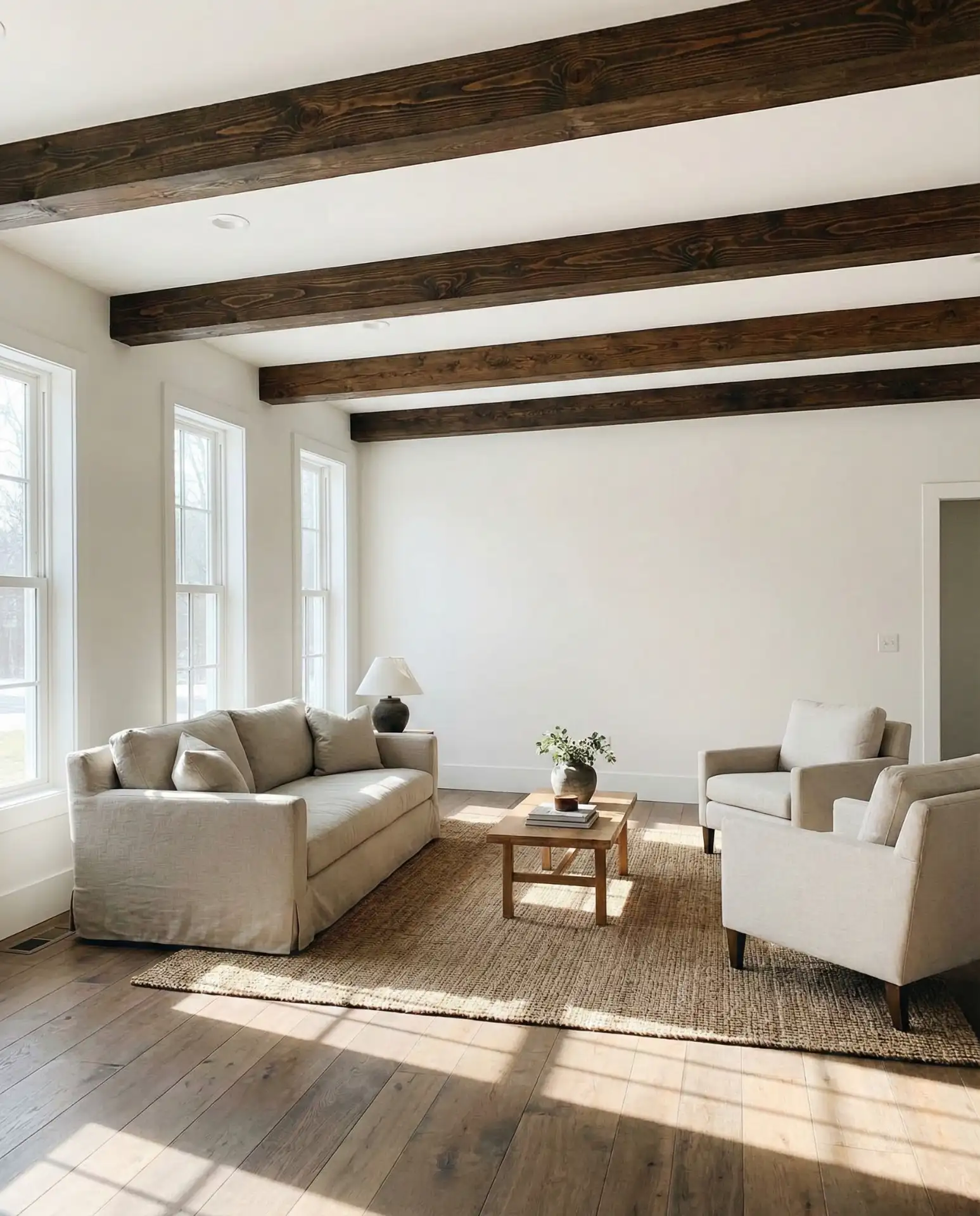
Regional context: this look is particularly common in the Mountain West, New England, and Pacific Northwest where timber-frame construction and exposed beams are part of local building traditions. Homeowners in these regions often struggle with how to modernize rustic architectural elements without losing character. The bone white walls offer a solution—they acknowledge the beams’ presence while creating breathing room around them, preventing the space from feeling too heavy or lodge-like.
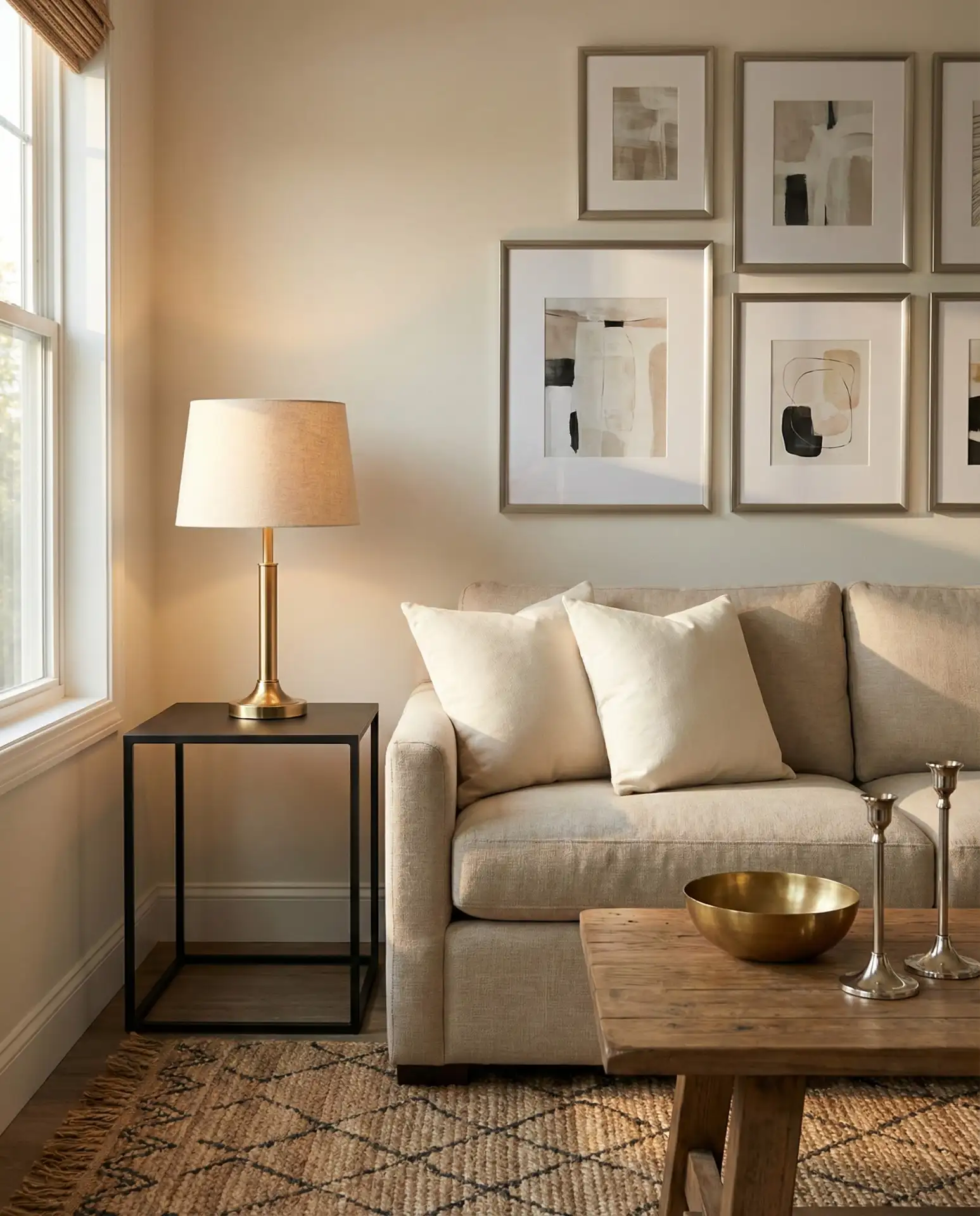
20. Neutral Base with Large-Scale Black and White Art
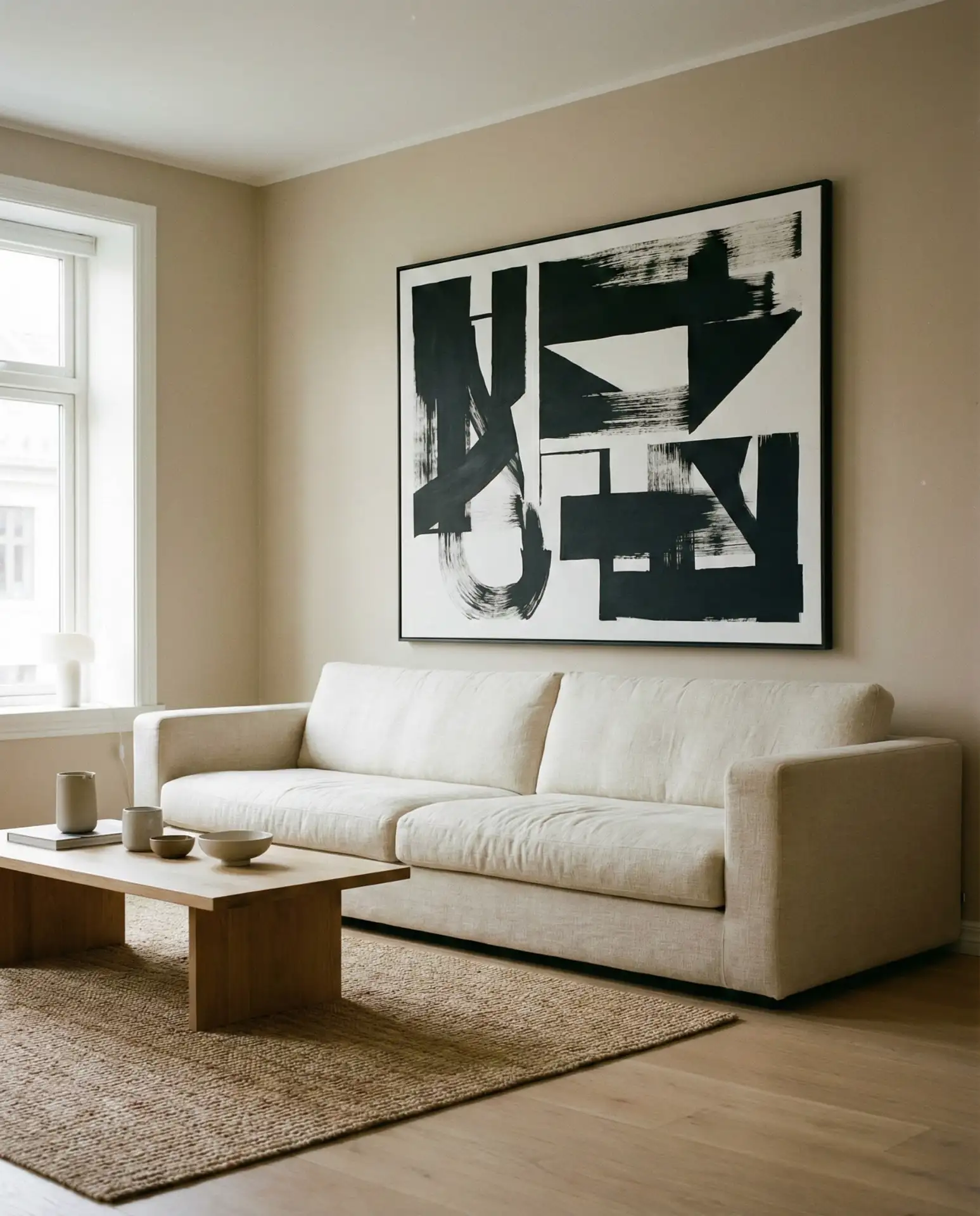
A fully neutral living room comes alive with the addition of a large-scale black and white photograph or abstract artwork. The art provides visual interest and a focal point without introducing color, maintaining the room’s serene palette while preventing it from feeling empty or under-styled. Choose art that’s oversized rather than too small—in neutral rooms, scale matters. The black and white creates graphic impact that works with any combination of beige, cream, grey, or taupe in the rest of the space. 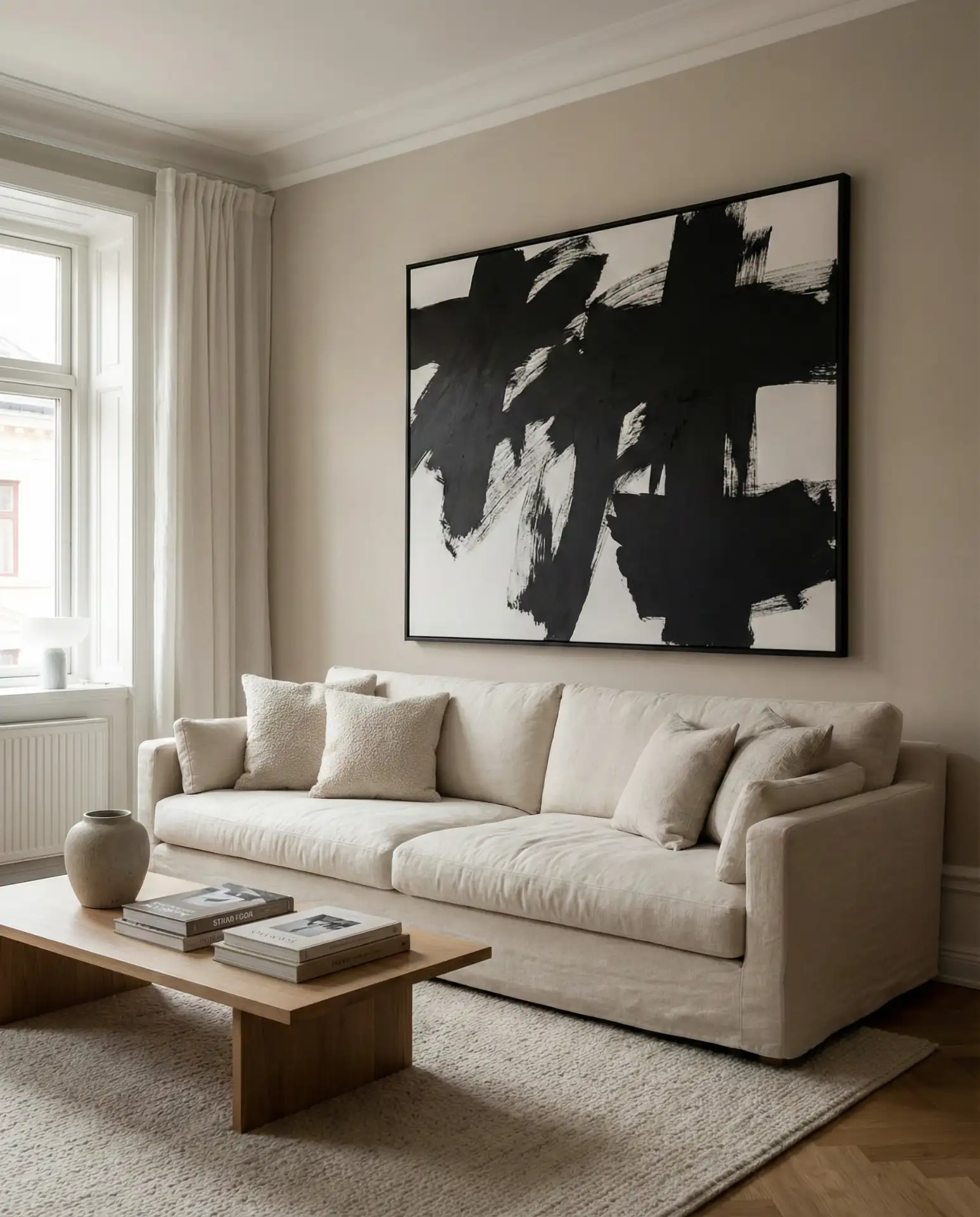
Expert-style commentary: when working with neutral palettes, many designers recommend investing in one significant art piece rather than multiple smaller ones. The single large piece creates more impact and helps anchor the space visually. Look for pieces that are at least two-thirds the width of your sofa for proper proportion. Black and white art also has the advantage of never clashing with future design changes—you can swap pillows, rugs, or even wall colors without needing to replace your artwork.
21. Pale Grey with Indoor Plants and Natural Pots
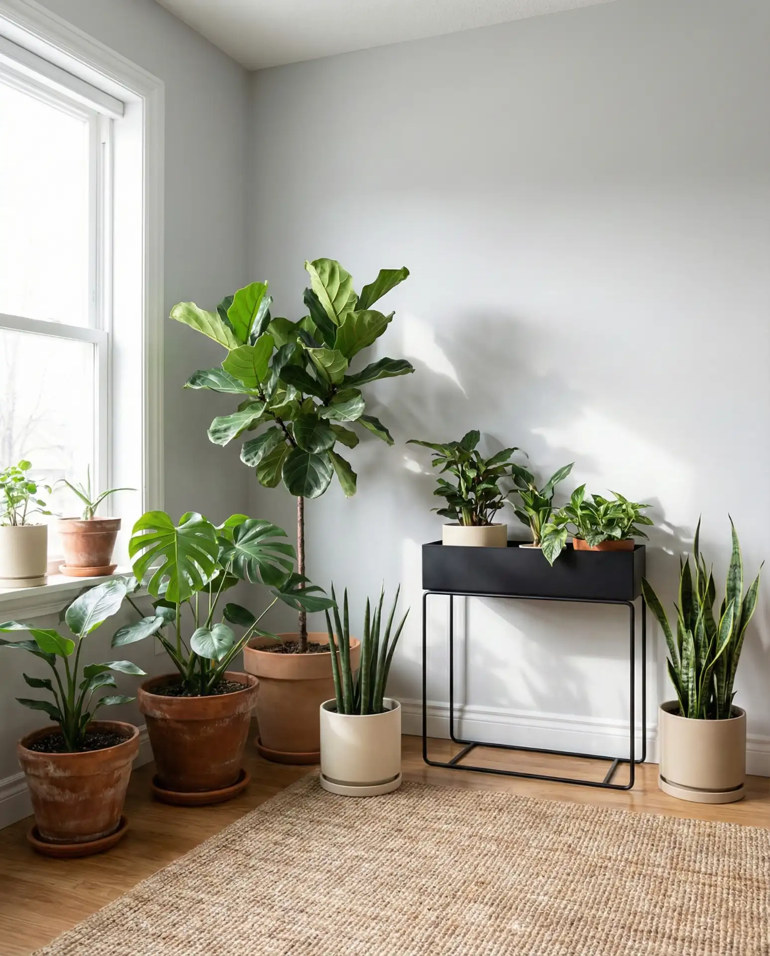
Pale grey walls create a perfect backdrop for an indoor plant collection when combined with natural terracotta, ceramic, or concrete planters. The plants bring the only real color into the space—varying shades of green—while the neutral pots maintain the cohesive palette. This approach works beautifully for plant enthusiasts who want their collection to be the room’s defining feature. The grey prevents the greenery from feeling too busy or overwhelming, acting as a calming visual buffer. 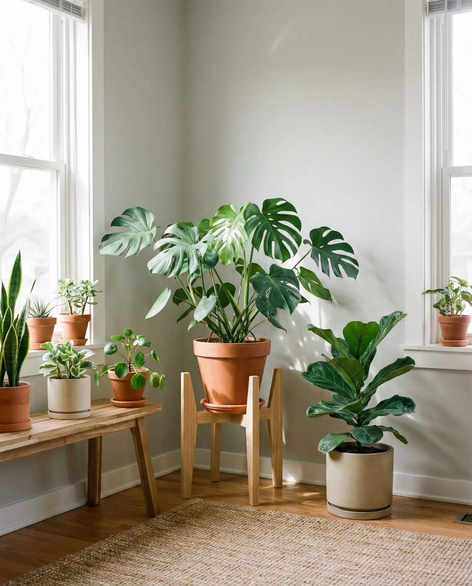
Real homeowner behavior: plant collections have exploded in American homes over the past few years, with many people treating plant care as both hobby and décor strategy. In neutral living rooms, plants do double duty—they add life and color while improving air quality and creating a sense of ongoing care and attention. One micro tip: group plants in odd numbers (three, five, seven) and vary their heights for a more natural, collected appearance rather than a rigid, symmetrical arrangement.
22. Warm Beige with Mixed Metal Accents
Warm beige walls and upholstery gain sophistication when you mix metal finishes—brass table lamps, matte black side tables, and brushed nickel picture frames. The mixed metals add personality and prevent the room from feeling too matchy-matchy or overly coordinated. This approach works particularly well in neutral rooms where you want to suggest a collected-over-time aesthetic. The beige provides enough warmth to unify the various metal tones, preventing them from feeling random or chaotic. 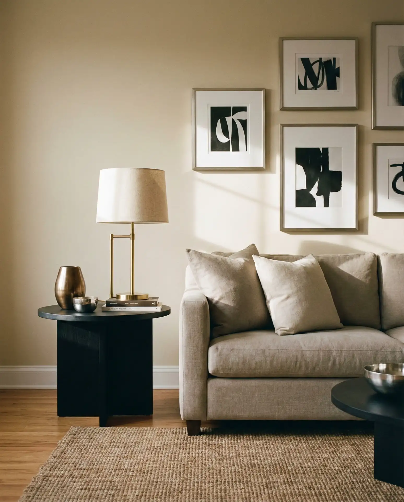
Common mistake: worrying too much about metal finishes matching. The old rule about sticking to one metal finish per room is outdated. Today’s interiors feel more dynamic and personal when metals are thoughtfully mixed. The key is keeping a dominant metal (in this case, warm tones like brass and bronze) with secondary metals (black, nickel) in supporting roles. This creates visual interest without looking scattered. The beige background ties everything together, making the mixed metals feel intentional rather than accidental.
Conclusion
Neutral living rooms in 2026 prove that “neutral” doesn’t mean boring—it means versatile, personal, and quietly sophisticated. Whether you’re drawn to warm taupes with black accents or soft greys layered with natural textures, these ideas offer endless ways to build a calm, cohesive space that still feels distinctly yours. We’d love to hear which combination speaks to you—drop a comment below with your favorite approach or share how you’re planning to refresh your own neutral living room this year.