Pink bathrooms are having a major moment in 2026, and it’s easy to see why. From soft blush tones that create serene spa-like retreats to bold fuchsia statements that pack personality, pink has evolved far beyond outdated stereotypes. American homeowners are turning to Pinterest in droves for inspiration, seeking ways to blend this versatile hue with modern design sensibilities. Whether you’re renovating a powder room or dreaming up a luxurious master bath, pink offers endless possibilities for creating spaces that feel both timeless and on-trend. In this article, we’ll explore fresh ideas that showcase how pink can transform your bathroom into a stunning, functional oasis.
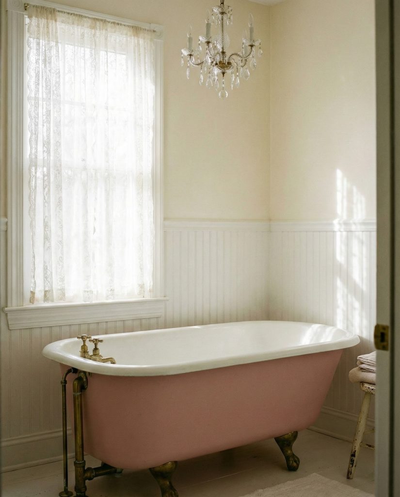
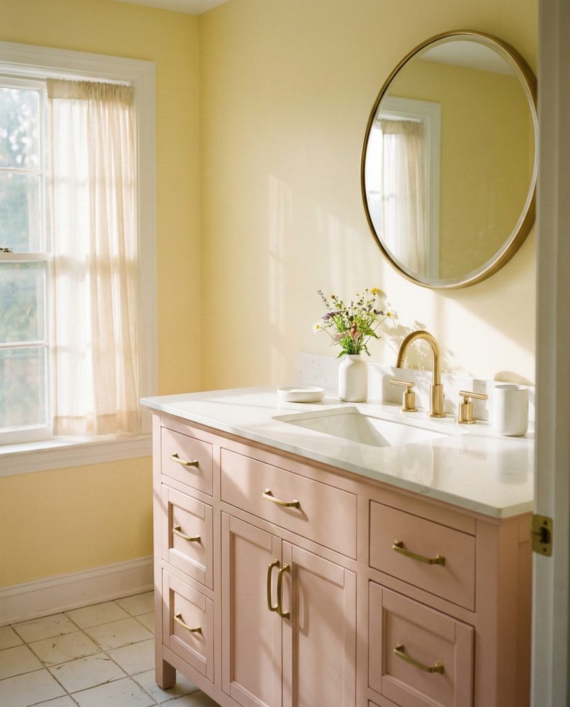
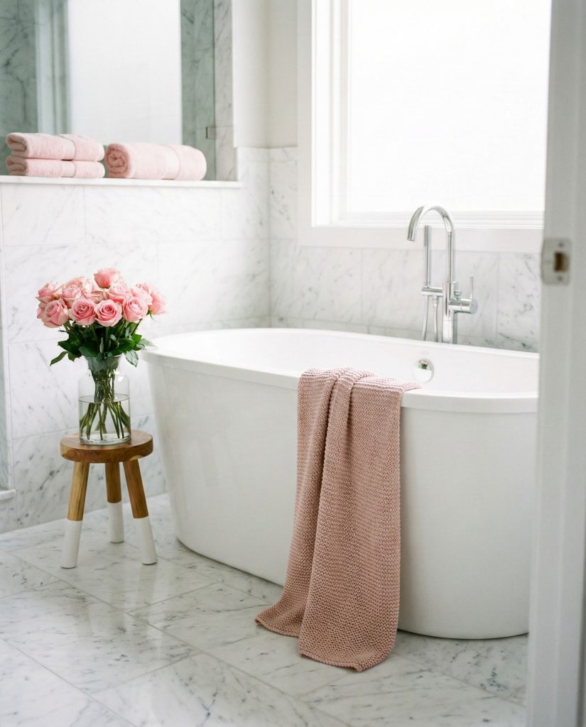
1. Dusty Rose Sanctuary with Natural Textures
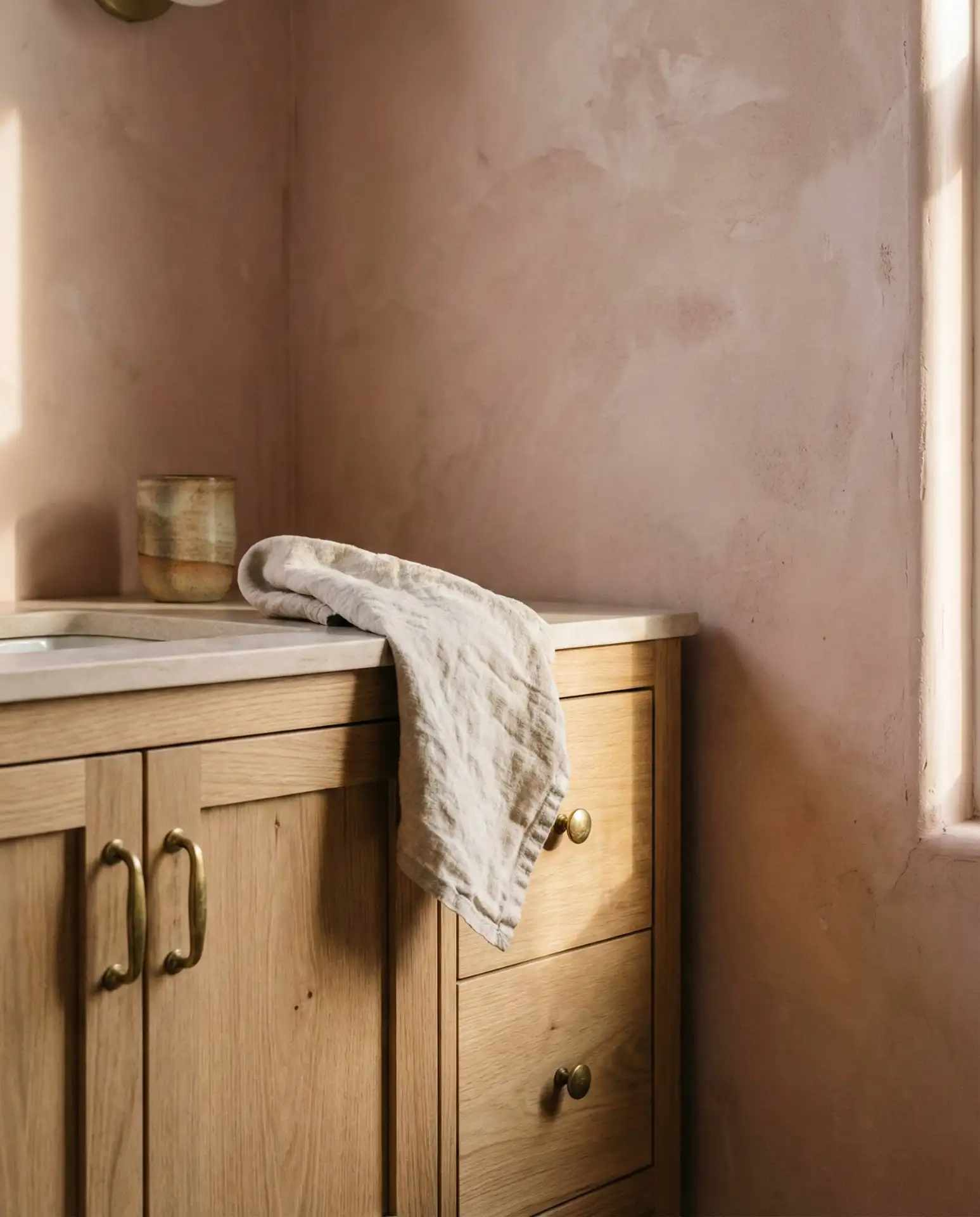
This approach combines dusty pink tones with organic materials like woven baskets, wooden vanity elements, and linen textiles to create a calming retreat. The muted rose shade works beautifully in bathrooms with ample natural light, where it catches morning sun and transforms throughout the day. Pair it with brass or gold fixtures for subtle warmth, and consider open shelving to display rolled towels in complementary cream or taupe shades. This palette feels especially fresh in coastal or farmhouse-style homes where simplicity meets sophistication. 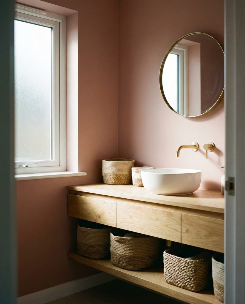
Where this works best: smaller bathrooms in suburban homes where square footage is limited but natural light is abundant. The dusty rose shade doesn’t overwhelm compact spaces the way saturated colors can, and the natural textures add dimension without visual clutter. Many homeowners report that this combination makes their 5×7 powder rooms feel significantly larger and more inviting than stark white alternatives ever did.
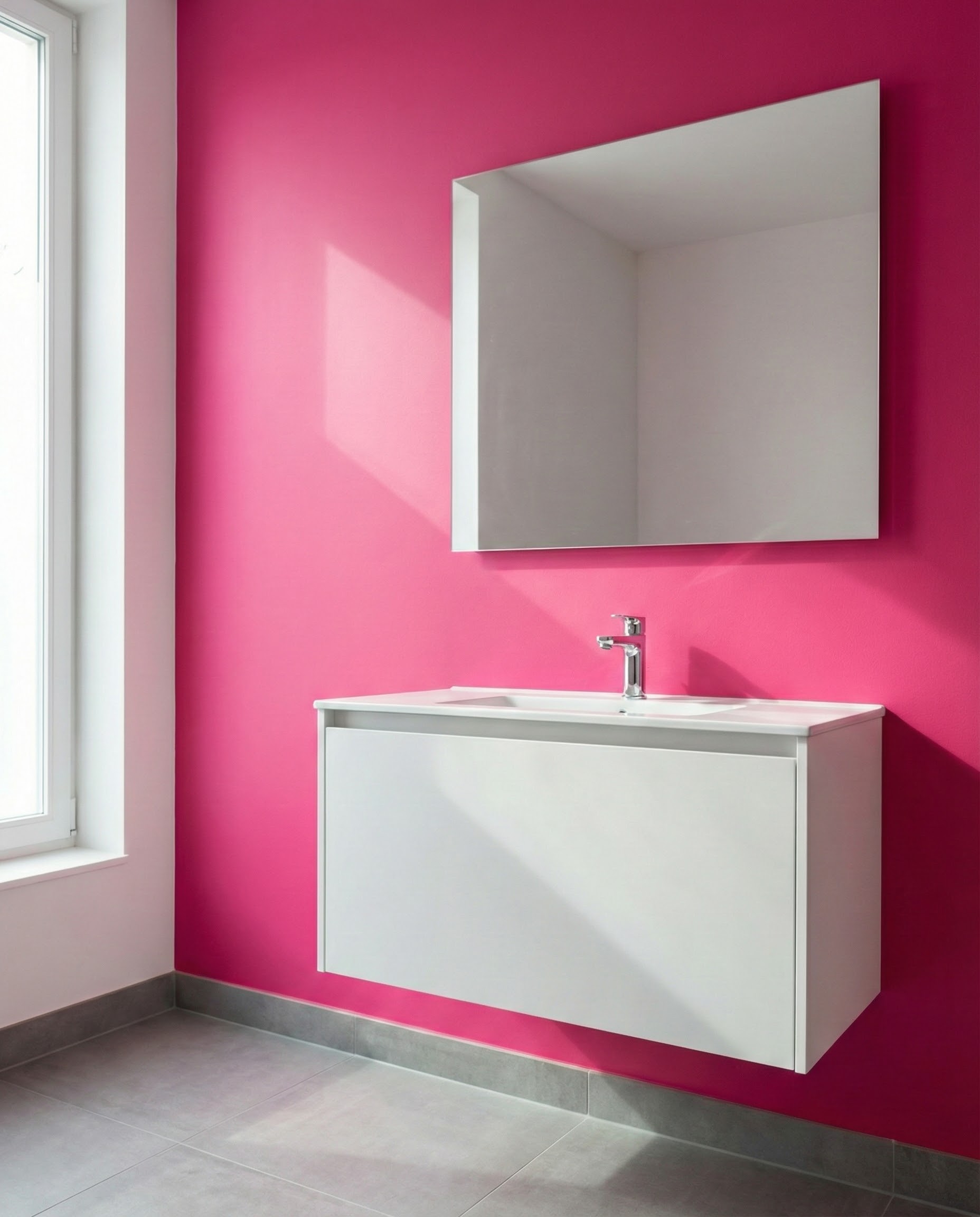
2. Bold Fuchsia Statement Wall Drama

For those who crave visual impact, a single hot pink or fuchsia accent wall transforms an ordinary bathroom into a memorable space. Keep surrounding walls neutral—crisp white or soft grey tones—to let the vibrant hue shine without overwhelming the senses. This technique works particularly well behind a freestanding tub or as a backdrop for a floating vanity, where the color creates an intentional focal point. The key is balance: let the pink wall do the talking while keeping fixtures, hardware, and accessories understated in chrome, matte black, or brushed nickel. 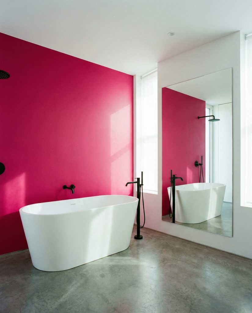
Common mistake: pairing fuchsia with too many competing colors or patterns. The boldness of this pink demands simplicity elsewhere. Avoid busy tile patterns, ornate mirrors, or colorful towels that fight for attention. Instead, treat the fuchsia wall like artwork—it should be the undisputed star, supported by a cast of neutral, textured elements that enhance rather than distract from its intensity.
3. Pale Blush Spa Retreat
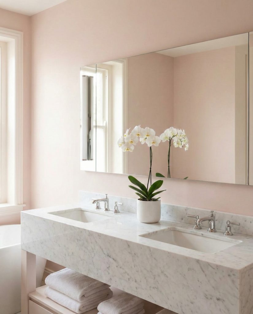
A pale pink bathroom evokes the tranquility of high-end spas, creating a space that encourages genuine relaxation. This nearly neutral shade pairs beautifully with white marble countertops, soft grey accents, and chrome fixtures for a look that feels both current and timeless. Consider extending the blush tone across walls, ceiling, and even cabinetry for an enveloping effect that softens harsh bathroom lighting. Add plush white bath mats, eucalyptus bundles, and minimalist accessories to complete the serene atmosphere that makes every morning feel like a wellness retreat. 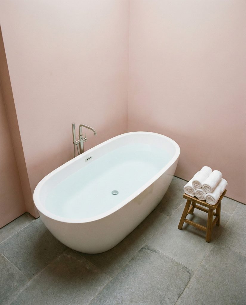
Practical insight: pale pink is surprisingly forgiving when it comes to skin tones in mirror lighting. Unlike cool whites that can cast unflattering shadows, this warm blush creates a soft-focus effect that many homeowners find more flattering for morning routines. It’s why high-end hotels increasingly choose this palette for their luxury suites—it photographs beautifully and makes guests look radiant.
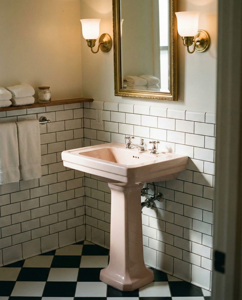
4. Vintage Tile Pattern Revival

Classic pink hex tile design ideas are making a comeback, especially when combined with black and white accents for timeless contrast. This retro-inspired look works beautifully on floors or as wainscoting, paired with white subway tiles above to balance the visual weight. The pattern adds personality without feeling overly feminine, particularly when you choose a muted rose or salmon shade rather than bubblegum pink. Vintage-style fixtures in oil-rubbed bronze or matte black complete the throwback aesthetic while keeping the space grounded in modern function. 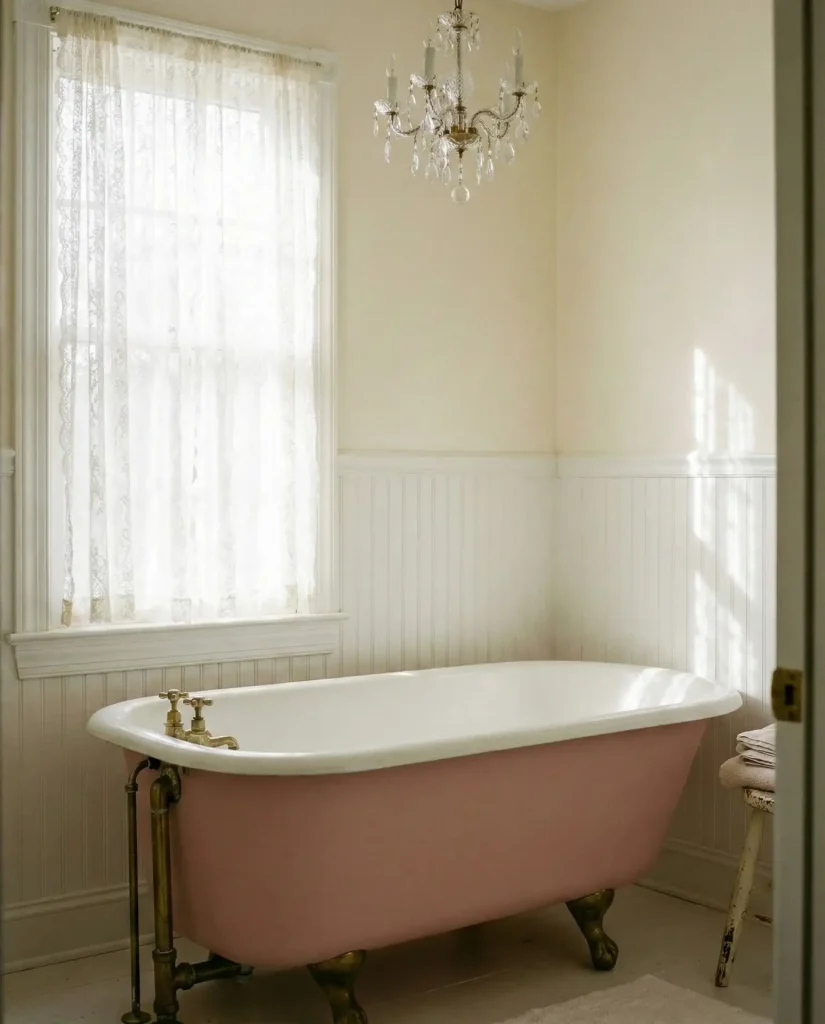
This style thrives in older homes undergoing thoughtful renovations, particularly in neighborhoods with historic character like brownstone districts in Boston or bungalow communities in Portland. Homeowners appreciate that it honors the home’s original era while feeling fresh rather than dated. The investment in quality tile pays dividends—these patterns have proven staying power that transcends fleeting trends, making them a smart choice for those planning to stay in their homes long-term.
5. Teal and Pink Maximalist Paradise
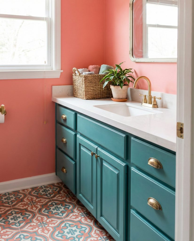
The unexpected pairing of teal and pink creates an energetic bathroom that celebrates color confidence. Think pink walls with teal vanity cabinetry, or vice versa, unified by brass hardware and white fixtures that provide visual breathing room. This combination works because both colors share similar saturation levels, creating harmony despite their contrast. Add patterned tile design ideas that incorporate both hues, perhaps in a geometric or floral motif, and don’t shy away from artwork or textiles that play with this dynamic duo. 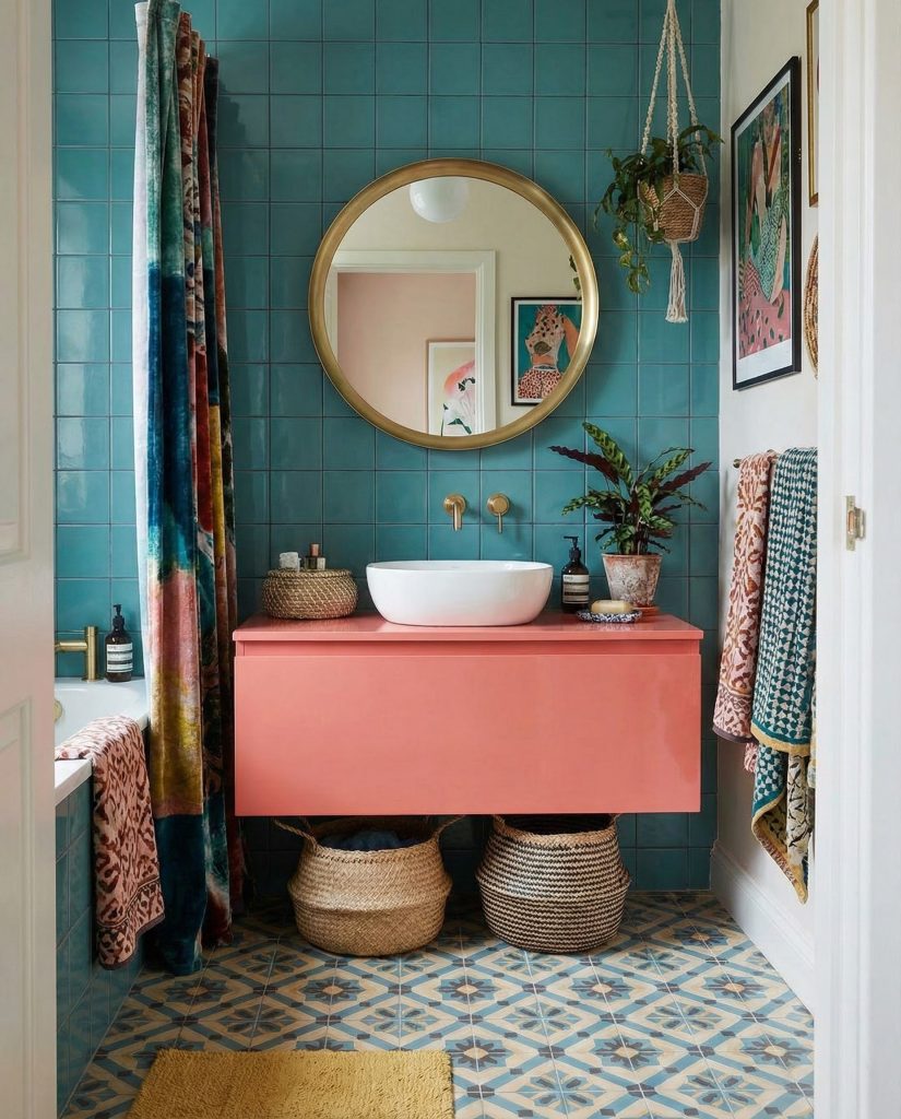
Expert-style commentary: this bold combination requires a confident hand, but when executed well, it creates spaces with genuine personality that feel curated rather than chaotic. The key is establishing a dominant color (usually pink) and using the secondary shade (teal) as a substantial accent rather than scattered touches. This prevents the space from feeling like a preschool and instead channels the sophisticated playfulness of high-end boutique hotels.
6. Minimalist Pink Concrete Chic
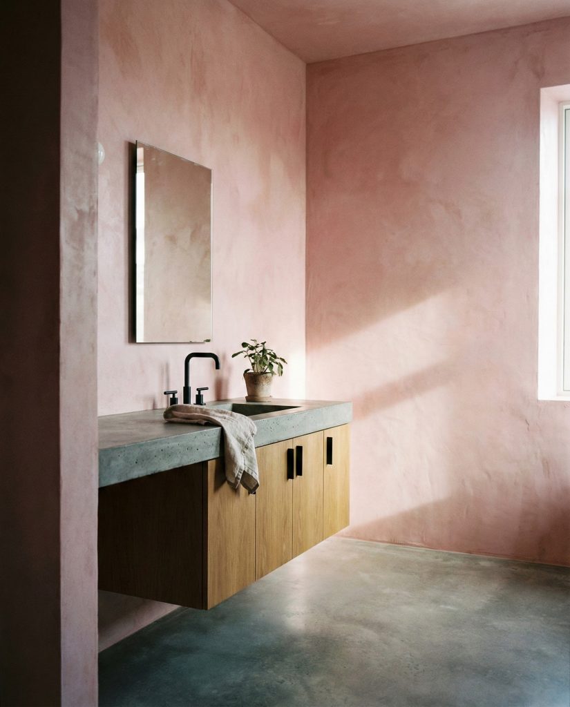
Industrial materials meet soft color in this modern approach that pairs pink-tinted concrete or plaster walls with raw concrete floors and sleek fixtures. The texture of troweled plaster in a blush or rose tone adds depth and visual interest without pattern, creating a backdrop that feels both warm and architectural. Keep the vanity simple—perhaps a floating slab in natural wood or a vessel sink mounted on a concrete counter. This aesthetic appeals to urban dwellers who appreciate the tension between rough and refined, particularly in loft conversions or new construction with contemporary bones. 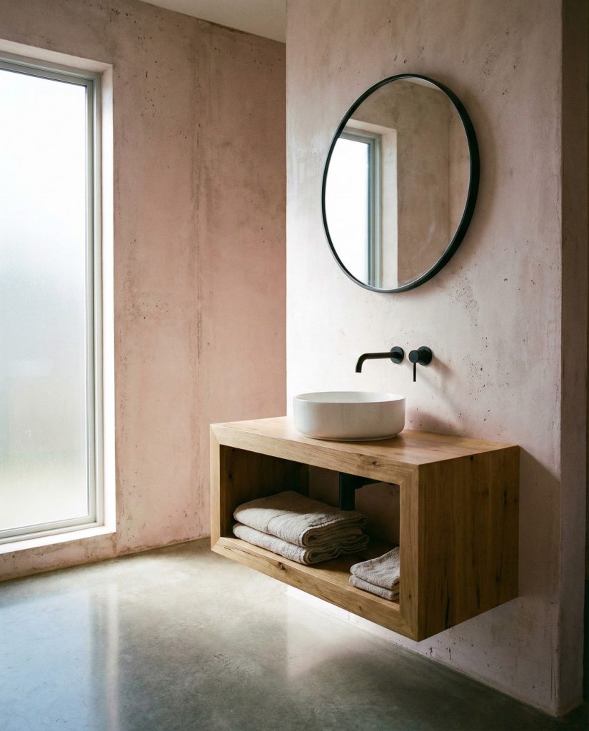
Budget consideration: while poured concrete work requires professional installation, achieving a similar look through microcement or specialized plaster finishes can cost 40-60% less while still delivering that coveted textured appearance. Many contractors now offer these alternative applications that DIY-savvy homeowners can even tackle themselves with proper preparation, making this high-end look more accessible than ever.
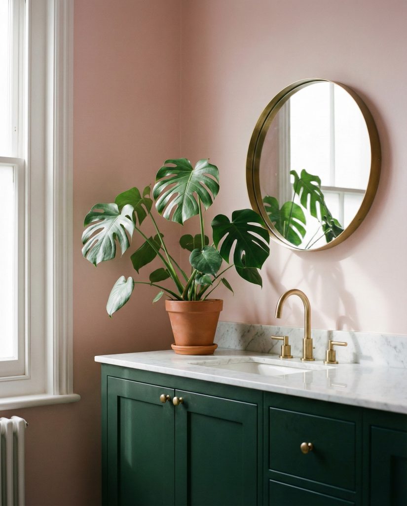
7. Sage Green and Pink Natural Harmony
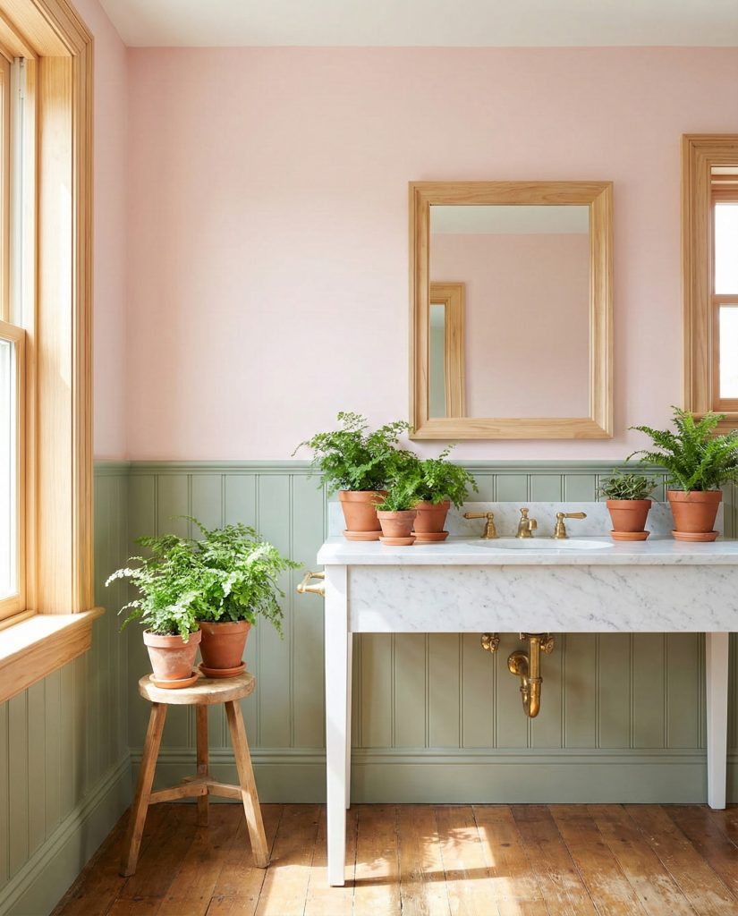
The pairing of sage and pink brings the garden indoors, creating a bathroom that feels organic and calming. Use sage green on lower cabinetry or wainscoting while keeping upper walls in soft pink, or reverse the combination depending on your ceiling height. This color duo works particularly well with natural materials—think marble counters, brass fixtures, and plenty of live plants that thrive in bathroom humidity. The result is a space that feels connected to nature without relying on literal botanical prints, offering sophistication that appeals to adults while remaining approachable and serene. 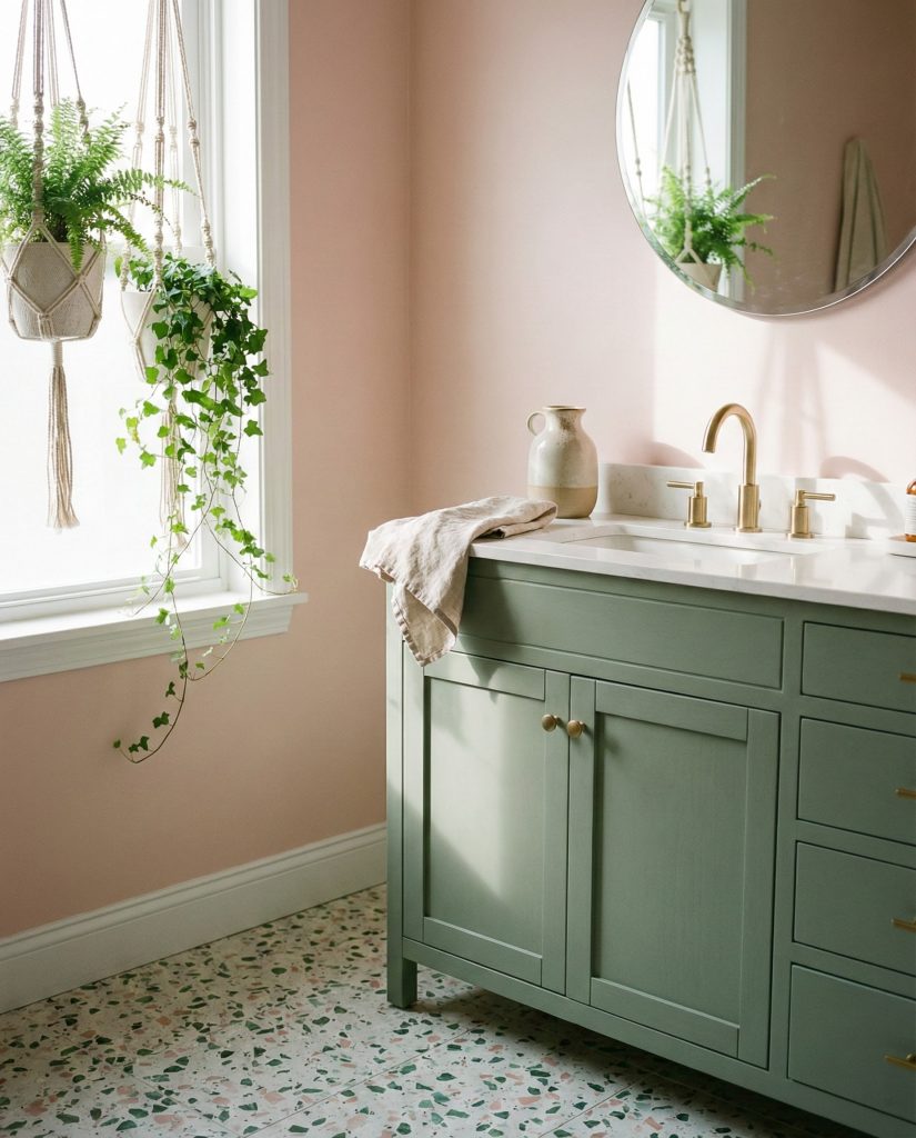
Real homeowner behavior: many people initially worry that pink and green will read as “too Easter” or childish, but selecting muted, sophisticated versions of both colors completely transforms the outcome. The sage-and-blush combination has become increasingly popular in nurseries, which has actually helped normalize it for adult spaces as parents discover how calming and versatile this palette truly is throughout their homes.
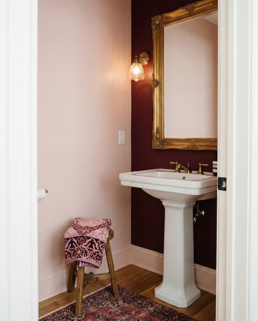
8. Dark Moody Pink Powder Room
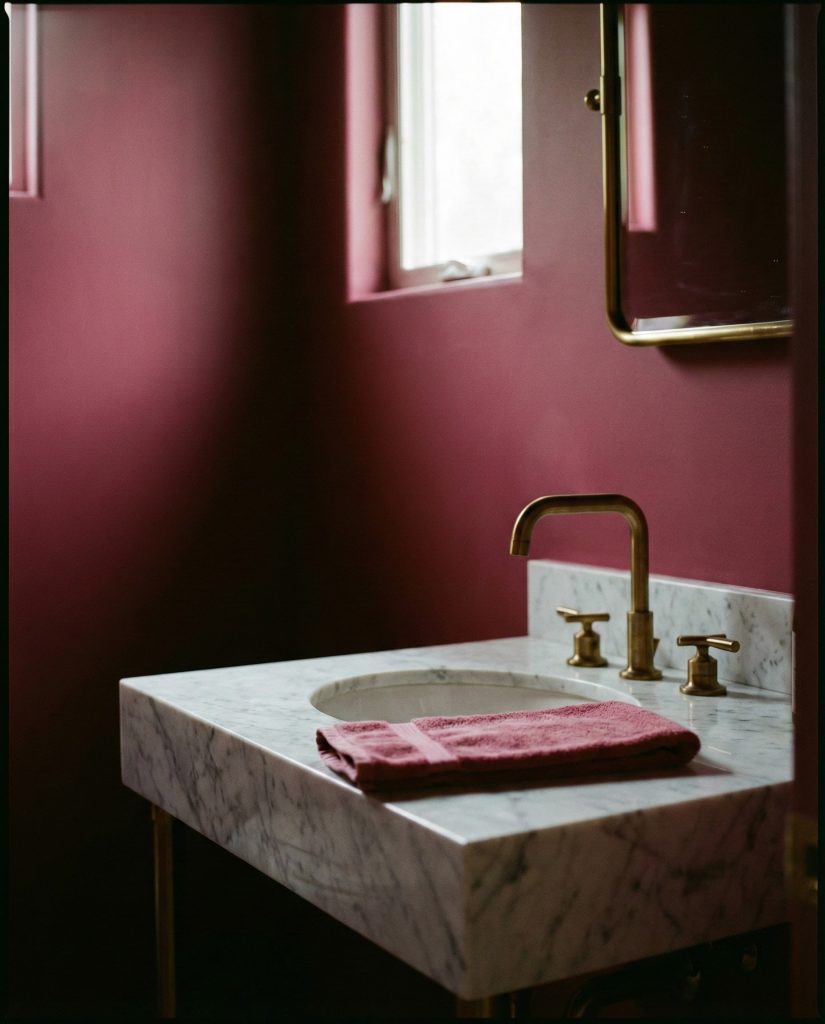
A dark mauve or wine-toned pink creates dramatic impact in small powder rooms where bold choices carry less risk than in primary bathrooms. Paint walls, ceiling, and trim in the same deep shade for an enveloping cocoon effect, then layer in luxe touches like a brass mirror, marble sink, and crystal sconces. This approach transforms a utilitarian space into a jewel-box moment that guests remember. The darkness actually makes small rooms feel more intentional and designed rather than cramped, especially when paired with flattering warm lighting that enhances the pink’s richness. 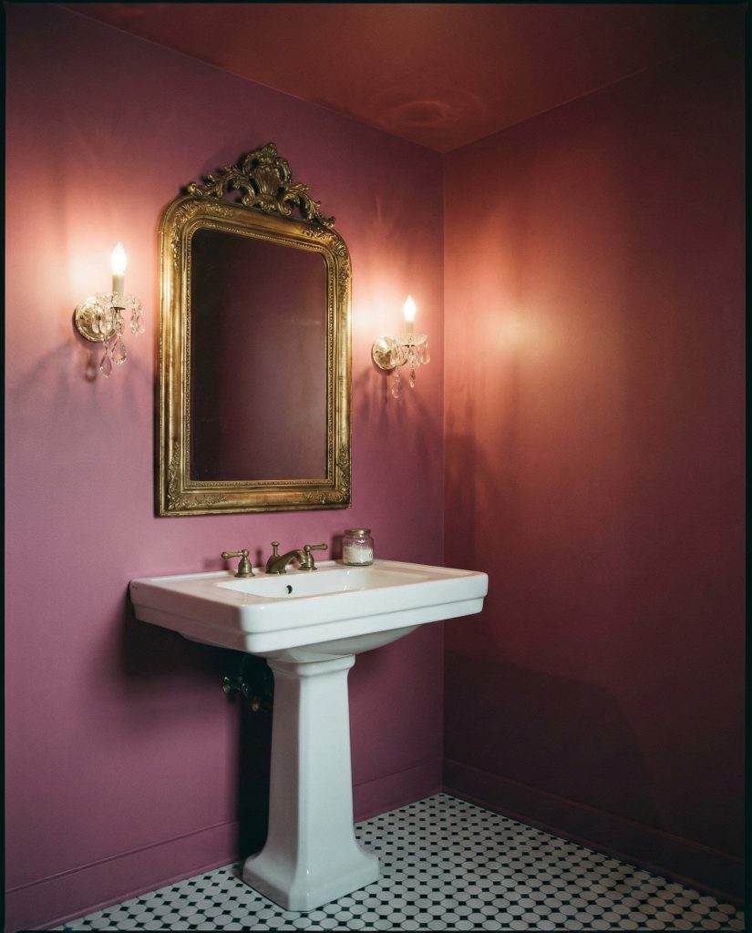
A micro-anecdote: a Denver homeowner shared that her dark pink powder room became the most photographed space in her home during parties. Guests constantly asked about the paint color and lighting choices, proving that bold color decisions in small, low-stakes spaces can deliver outsized impact and serve as conversation starters that reveal a homeowner’s design confidence.
9. Cute Scalloped Tile Feature
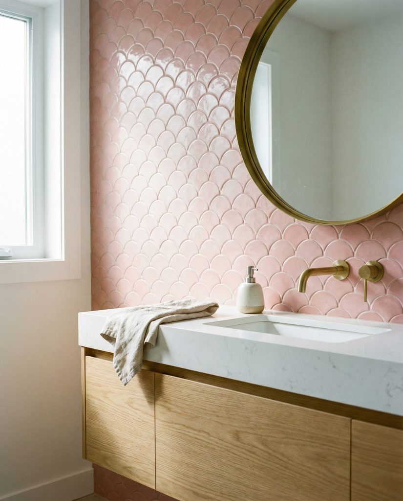
Scalloped or fish-scale tile design ideas in pink create a cute yet sophisticated focal point, especially as a shower accent wall or behind a vanity. The undulating pattern adds movement and dimension, while the pink tone keeps things soft rather than stark. Pair scalloped pink tiles with simple white or cream field tiles elsewhere to let the pattern shine, and choose grout in a matching or slightly darker pink to enhance the scales’ definition. This playful detail works beautifully in bathrooms with vintage, coastal, or even modern farmhouse aesthetics, proving that “cute” doesn’t have to mean juvenile. 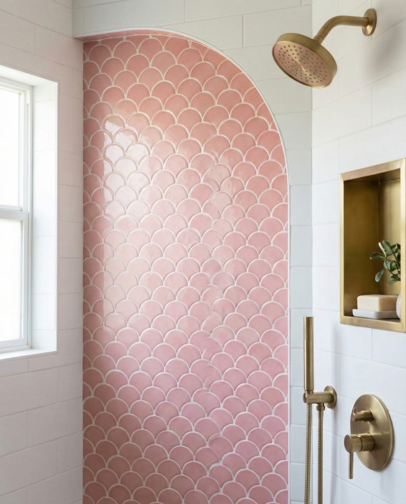
This tile choice thrives in bathrooms where homeowners want personality without permanent commitment to full-room color. Since it’s typically used as an accent, you’re investing in a smaller square footage of specialty tile, making it more budget-friendly than tiling an entire space. The scalloped shape also hides water spots and soap residue better than flat tiles, a practical consideration that makes this pretty pattern surprisingly functional for shower applications.
10. Terracotta and Pink Warm Embrace
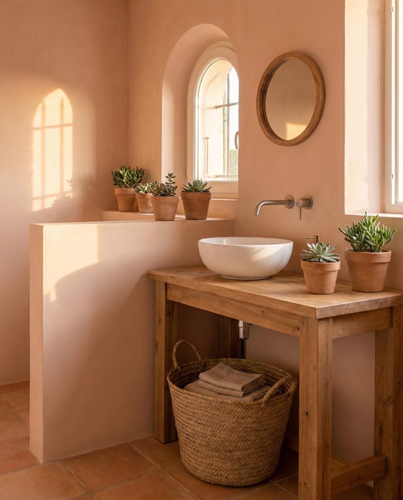
Combining peachy pink with brown and terracotta tones creates a bathroom that feels sun-soaked and inviting, channeling Mediterranean warmth. Use terracotta-colored floor tiles or a clay-toned vanity against soft pink walls, unified by natural wood elements and woven accessories. This palette works especially well in homes with southwestern architecture or in regions where outdoor living is central to lifestyle—think Arizona, Southern California, or Texas. The earthy quality of terracotta grounds the pink, preventing it from feeling too sweet while adding depth that pure pastels can’t achieve alone. 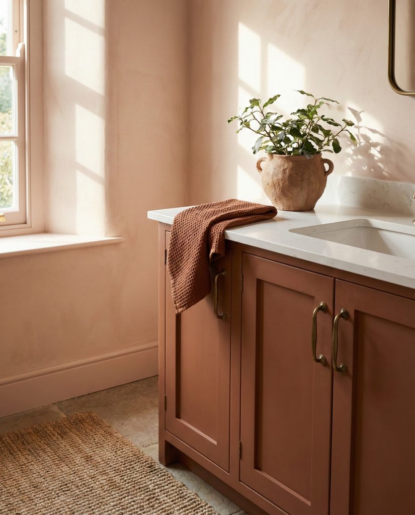
American lifestyle context: this color combination resonates particularly with homeowners who’ve traveled to places like Morocco, Spain, or Mexico and want to recreate that vacation feeling at home. The warm tones work beautifully in climates with abundant sunshine, where the colors appear to glow naturally throughout the day. It’s a palette that encourages slower mornings and lingering evening routines, reflecting a lifestyle shift many Americans embraced during recent years.
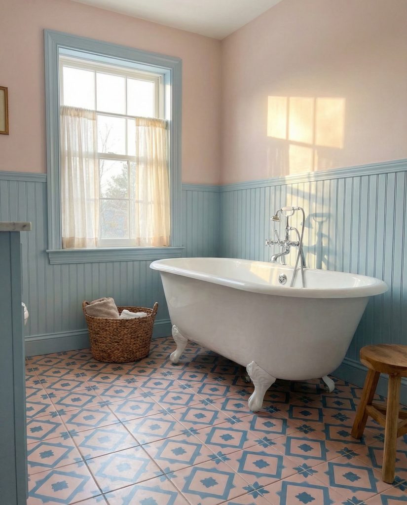
11. Blue and Pink Coastal Fresh
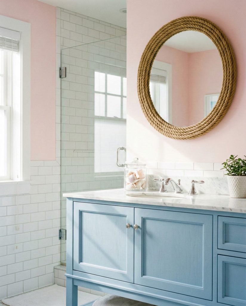
Soft blue and pink create a refreshing combination that evokes seaside sunsets and beach houses without feeling overly thematic. Use powder blue on cabinetry or as an accent wall while keeping the dominant pink tone on walls or through tile design ideas that incorporate both colors in a subtle pattern. White fixtures and natural rope or driftwood accessories complete the coastal feel without resorting to obvious nautical clichés. This pairing works beautifully in homes along both coasts and even in landlocked areas where homeowners crave that breezy, relaxed bathroom atmosphere. 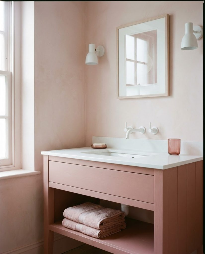
A common mistake homeowners make is choosing blue and pink shades with different undertones—cool pink with warm blue or vice versa—which creates visual discord rather than harmony. The trick is ensuring both colors lean toward either warm or cool undertones. A peachy pink pairs beautifully with a warm turquoise, while a cool rose works with true powder blue. Test samples together before committing to avoid that jarring mismatch.
12. Luxe Gold Hardware Accents
Any shade of pink bathroom gains instant sophistication when paired with gold and brass fixtures, cabinet pulls, and lighting. The warm metallic tones enhance pink’s inherent warmth while adding a layer of elegance that chrome or nickel can’t match. Consider brushed brass faucets, a gold-framed mirror, brass towel bars, and even gold-finished light fixtures to create cohesive glamour. This approach works across pink shades from pale blush to deep rose, though the effect is particularly striking against dusty or muted pink tones where the gold and brass really pop without overwhelming the space. 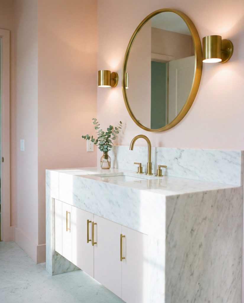
Practical insight about finishes: while polished brass shows water spots easily, brushed or satin brass finishes hide fingerprints and splashes far better, making them more practical for busy family bathrooms. Many manufacturers now offer “living finishes” that develop a natural patina over time, which actually enhances the vintage charm of gold hardware rather than appearing worn—a smart choice for those seeking both beauty and practicality.
13. Statement Wallpaper Drama
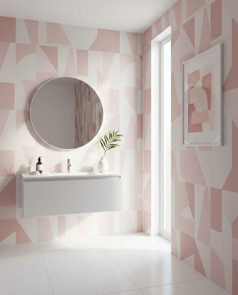
Bold pink prints or wallpaper patterns transform a bathroom into an unforgettable space, especially in powder rooms or small bathrooms where maximum impact meets minimal square footage. Choose large-scale florals, geometric patterns, or abstract designs that feature pink as a dominant color alongside complementary hues. The key is treating wallpaper as the room’s artwork—keep everything else simple and let the pattern speak. Consider moisture-resistant wallpaper specifically designed for bathrooms, and if commitment feels daunting, remember that smaller spaces require less wallpaper, making updates more feasible down the road. 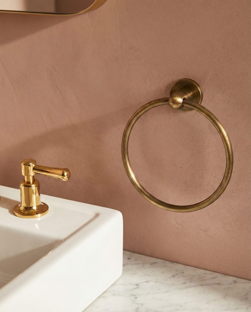
Regional context: wallpaper in bathrooms remains more popular in certain American markets—particularly in older cities like Charleston, Savannah, and parts of New England—where historic homes have always featured decorative wall treatments. Meanwhile, in newer construction hubs like Texas or Phoenix, homeowners are just discovering this design layer, making it feel fresh and unexpected. The regional variation creates interesting opportunities for creating unique spaces that reflect local design sensibilities.
14. Monochromatic Pink Immersion
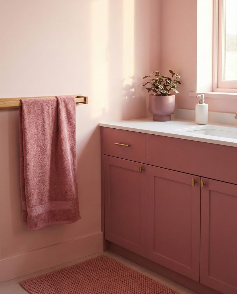
Going all-in with various shades of pink—from pale walls to deeper vanity tones to rose-colored accessories—creates a cohesive, enveloping space that feels intentional and sophisticated. The key is varying the intensity across different surfaces: perhaps pale pink walls, a slightly deeper blush vanity, dusty rose towels, and mauve accents in artwork or containers. This tonal approach requires confidence but delivers a bathroom that feels like a curated experience rather than a generic space. It works especially well in master bathrooms where creating a personal retreat takes priority over broad appeal. 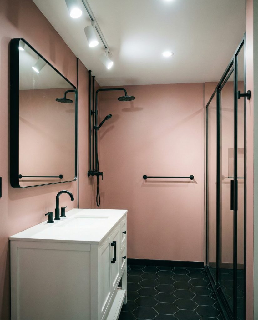
A quick anecdote worth sharing: interior designers often call this approach “color drenching,” and it’s gained serious traction on Pinterest and Instagram as homeowners realize that full color commitment can actually feel less risky than awkward half-measures. When you fully embrace a color story, the eye accepts it as intentional. Partial commitment often reads as uncertainty, while total immersion communicates confidence.
15. Industrial Black and Pink Edge
The unexpected combination of black, white, and pink creates an edgy, modern bathroom that balances toughness with softness. Use matte black fixtures, black-framed shower enclosures, or black hexagon floor tiles against pink walls or cabinetry for striking contrast. This pairing works particularly well in urban lofts or modern homes where industrial elements already exist. The black grounds the pink, preventing any perception of excessive sweetness while creating visual drama that feels current and design-forward. Add crisp white elements—subway tiles, countertops, or towels—to brighten the combination and prevent it from feeling too heavy.
Expert commentary: this combination challenges traditional gender associations with color while creating spaces with genuine edge and sophistication. It appeals particularly to younger homeowners who appreciate design that defies convention. The key is balancing proportions—typically using pink as the dominant color (60-70%) with black as a strong accent (20-30%) and white as the balancing neutral (10-20%) ensures the space feels bold but not overwhelming.
16. Vintage Glamour with Pink Suite Elements
Channel old Hollywood glamour with pink bathroom suite elements—think vintage pink tubs, pedestal sinks, or salvaged fixtures paired with period-appropriate details. If original pink fixtures aren’t available, modern reproductions in retro shapes create a similar impact. Surround these pieces with white or cream subway tiles, add chrome or brass fixtures depending on your preferred era, and layer in vintage lighting for authentic appeal. This approach celebrates bathroom history while avoiding the trap of making the space feel like a dated time capsule—thoughtful editing and modern conveniences keep it livable.
Budget angle: hunting for vintage pink fixtures at architectural salvage yards or online marketplaces can yield incredible finds at a fraction of new costs, though restoration and retrofitting for modern plumbing adds expense. Many homeowners find that mixing one statement vintage piece (like an original pink sink) with new elements strikes the right balance between authenticity and budget. The single vintage focal point provides character while avoiding the cost and complexity of a fully period-correct renovation.
17. Nature-Inspired Dark Green and Pink
Pairing pink with dark green creates a lush, botanical atmosphere that feels both grounded and romantic. Use deep emerald or forest green on cabinetry or as an accent wall while keeping pink as the dominant wall color, unified by natural materials and plenty of plants. This combination works beautifully in bathrooms with good natural light where the darker green doesn’t overwhelm, though strategic lighting can make it work in smaller spaces too. Add brass or gold fixtures to enhance the luxe factor, and consider marble or stone surfaces that bridge both colors through natural veining. 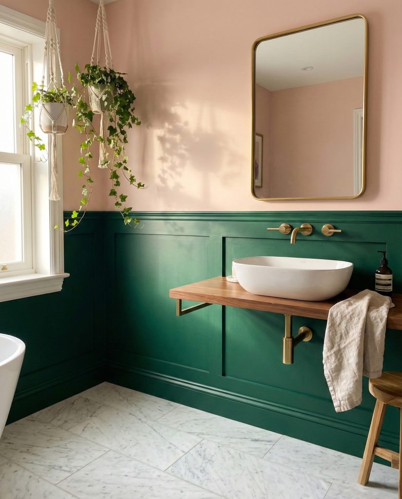
Where this works best: homes with a maximalist or eclectic aesthetic where layered colors and rich materials feel at home. This isn’t a minimalist palette, and that’s its strength—it rewards homeowners who appreciate depth, texture, and the slight drama that comes from unexpected color combinations. The dark green-and-pink pairing has particular resonance in the Pacific Northwest and Northeast, where connection to nature and rich, moody interiors align with regional design preferences.
18. Soft Yellow and Pink Sunshine Blend
Combining soft yellow and pink creates a cheerful bathroom that evokes sunrise and optimism without feeling childish. Use pale butter yellow on walls with pink vanity cabinetry, or reverse the ratio depending on your preference. This unexpected combination works because both colors share similar lightness and warmth, creating harmony rather than competition. Keep accessories minimal in white, natural wood, or brass to let the colors shine, and consider how natural light shifts these hues throughout the day—morning sun intensifies the warmth, while evening light adds depth. 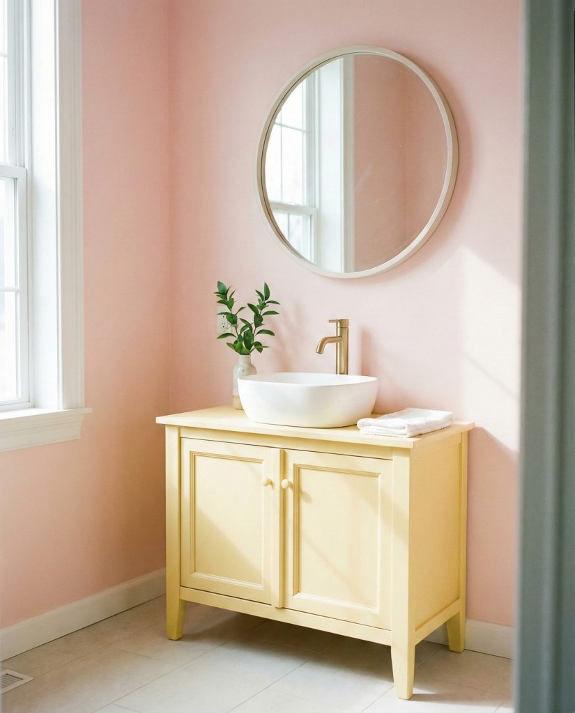
Real homeowner insight: this color combination often surprises people who initially dismiss it as “too much” but change their mind upon seeing it executed well. The softness of both colors prevents the combination from feeling overwhelming, while the warmth makes bathrooms feel inviting even on grey days. Several homeowners in sun-challenged climates like Seattle report that this palette helps compensate for limited natural light, creating artificial brightness through color psychology.
19. Earthy Orange and Pink Sunset Glow
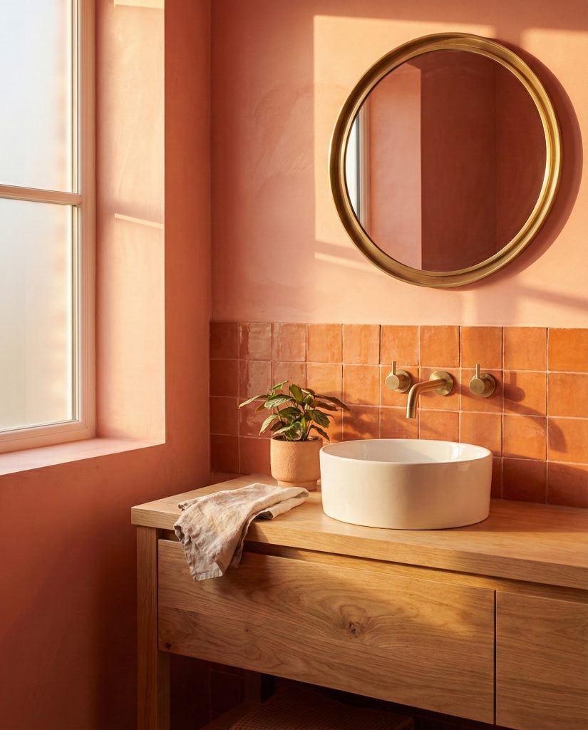
Blending coral or peachy orange and pink creates a warm, energizing bathroom reminiscent of desert sunsets and southwestern landscapes. This combination works best when both colors lean toward the same temperature—either peachy-orange with salmon pink or true orange with rose pink. Use the combination in tile design ideas, painted surfaces, or textiles, unified by natural materials like wood, stone, or woven elements. The result feels both earthy and vibrant, particularly suited to homes in warmer climates or for homeowners who want their bathroom to deliver an instant mood boost. 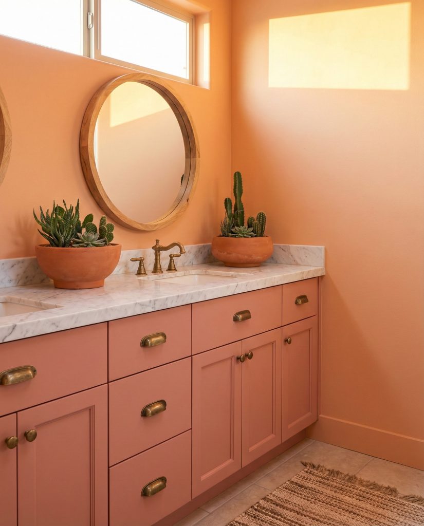
American lifestyle connection: this palette resonates strongly in the Southwest—Arizona, New Mexico, and Southern California—where natural landscape colors inspire interior choices. But it’s increasingly appearing in unexpected markets as remote workers relocate and bring design sensibilities from their travels. The combination also photographs exceptionally well, making it popular among homeowners who share their spaces on social media or Pinterest, seeking those viral-worthy interiors.
20. Clean White Base with Pink Accents
For those hesitant about a full pink commitment, starting with a crisp white bathroom and layering in pink through accessories, towels, art, and small décor pieces offers flexibility and ease. This approach lets you control the pink intensity and change it seasonally or as tastes evolve. A white vanity, white tiles, and white walls create a neutral canvas where even small touches of pink—a bath mat, hand towels, and a vase—make a noticeable impact. This strategy works particularly well in rental properties or for conservative tastes that appreciate pink’s softness without wanting permanent color commitment. 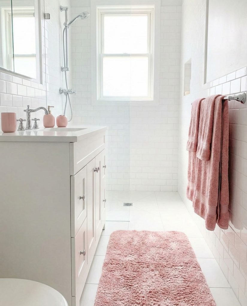
Practical insight for commitment-phobic decorators: this approach offers the perfect testing ground for pink lovers who aren’t sure how much they want. Start with easily changeable elements and live with them for a few months. If you find yourself wanting more pink, gradually add it through permanent fixtures. Many homeowners discover that beginning with accessories gives them confidence to eventually paint walls or choose pink tile, using the trial period to refine their preferred shade.
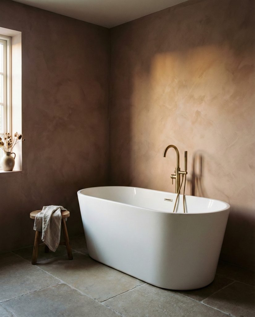
21. Textured Plaster Pink Walls
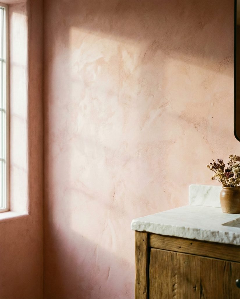
Skip flat paint in favor of textured plaster or limewash in pink tones for walls that offer depth and character without pattern. The subtle variations in texture catch light beautifully throughout the day, creating visual interest that flat paint can’t match. This European-inspired technique works across pink shades but truly shines with dusty or muted tones that highlight the texture’s complexity. Pair textured pink walls with simple fixtures, minimal accessories, and natural materials—the walls become the feature, requiring little additional decoration. This approach suits both modern and traditional bathrooms, adapting to various styles through fixture and furniture choices. 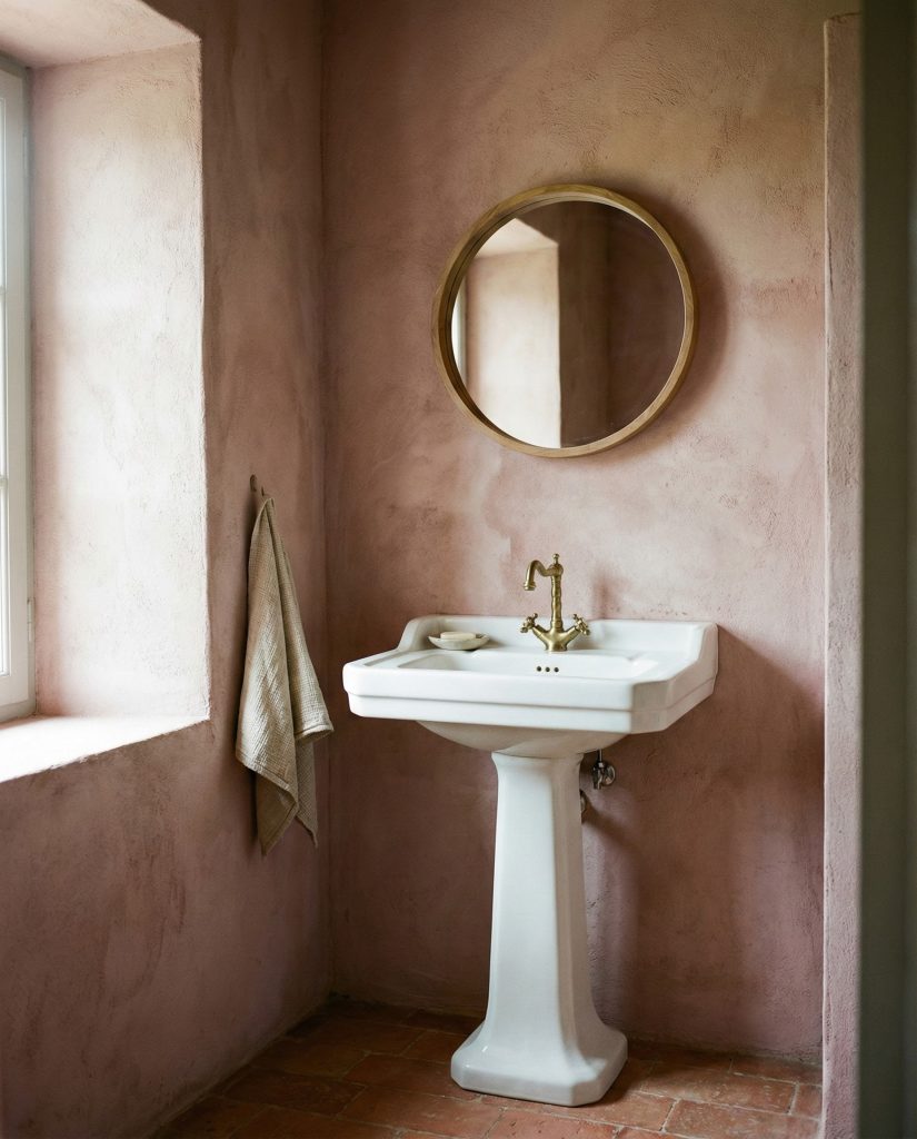
Common mistake: applying textured plaster or limewash over poorly prepared walls, which exaggerates imperfections rather than hiding them. While these finishes are more forgiving than flat paint, they still require proper surface prep—filling holes, sanding rough spots, and priming appropriately. Many DIYers underestimate this step, leading to disappointing results. Professional application costs more upfront but delivers the luminous, sophisticated texture that makes this technique worth pursuing.
22. Red and Pink Bold Statement
For maximum drama, combining red and pink in the same space creates unexpected warmth and intensity. Use deeper wine or burgundy reds with softer pink tones rather than bright cherry red, which can feel jarring. This might manifest as red and pink patterned tile design ideas, red cabinetry against pink walls, or red accessories in a predominantly pink bathroom. The combination requires confidence but delivers spaces with genuine personality that feel mature and sophisticated rather than childish. It works particularly well in powder rooms or eclectic homes where bold color choices align with the overall aesthetic. 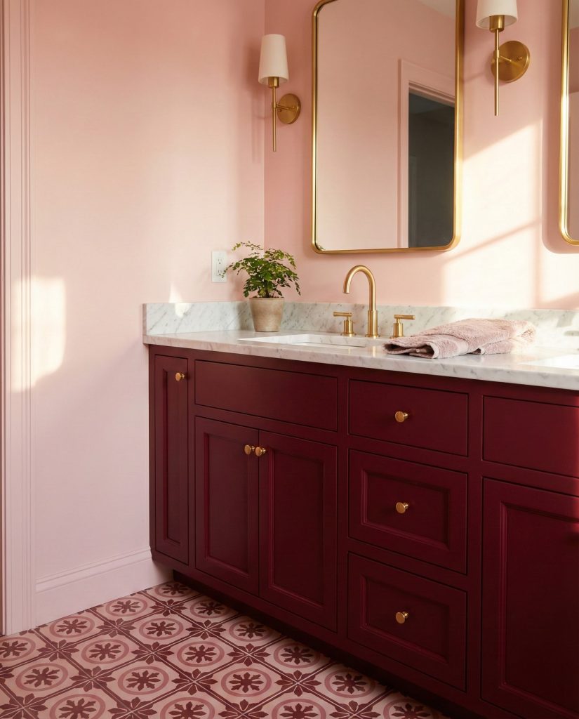
Design commentary worth noting: this combination challenges conventional wisdom about pink needing to be soft or demure. The addition of red deepens pink’s emotional register, creating spaces that feel passionate and confident. It appeals to homeowners who want their design choices to reflect a bold personality, and it pairs beautifully with antique or vintage elements that bring additional character. This isn’t a trendy palette—it’s a timeless statement that requires commitment.
23. Modern Sulking Room Pink Sophistication
The specific shade known as sulking room pink—a sophisticated brownish-rose tone—offers grown-up elegance that works beautifully in contemporary bathrooms. This complex color reads differently depending on lighting, sometimes appearing more brown, sometimes more pink, creating a chameleon quality that keeps spaces interesting. Use it on all walls for enveloping warmth, paired with white marble, brass fixtures, and simple modern furniture. The shade’s complexity means it doesn’t need busy patterns or excessive decoration—let the color’s nuanced beauty stand alone, supported by quality materials and thoughtful lighting that reveals its depth. 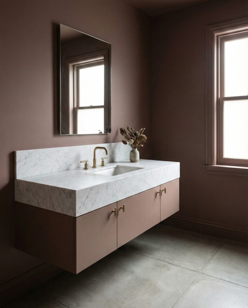
This particular shade has gained a cult following among design enthusiasts who appreciate paint colors with complexity and history—sulking room pink originated in 18th-century England as a private retreat color. Modern homeowners discover it offers the perfect middle ground between overtly pink and disappointingly neutral, creating bathrooms that feel sophisticated and current while maintaining connection to design history. It’s particularly popular in urban markets where homeowners seek distinction within similar architectural footprints.
Conclusion
Pink bathrooms in 2026 prove that this versatile color deserves serious consideration for any renovation or refresh. From soft, spa-like retreats to bold, personality-packed powder rooms, the possibilities are limited only by imagination and courage. We’d love to hear which of these ideas resonates with your style—share your thoughts or your own pink bathroom inspiration in the comments below!