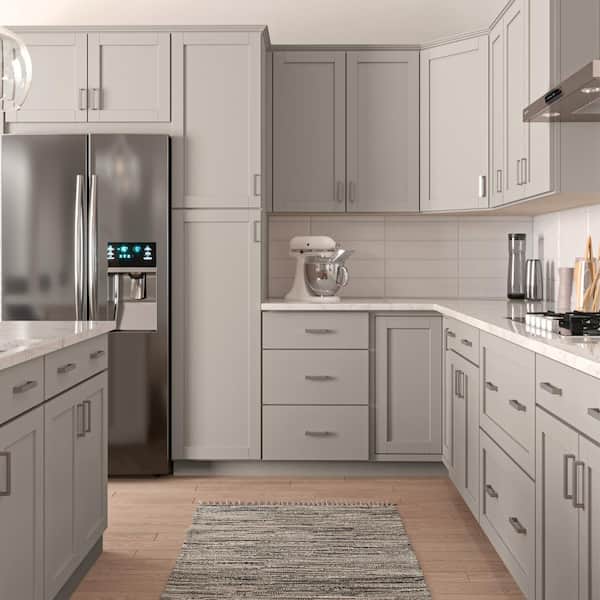
You know that feeling when you finally find the kitchen window idea that looks *exactly* right for your space? It’s a game-changer. That small area over the sink holds so much potential to define the entire room’s personality. We spent serious time browsing real designer projects and stunning home tours to bring you only what’s worth your attention this year. Our team filtered through hundreds of options to find the best kitchen window designs across every price point—from simple DIYs to full-on renovations. We’ve gathered 31 distinct, real-world ideas, covering everything from minimalist modern to cozy farmhouse, to get your inspiration flowing for 2026. And stay until the end — we break down the most common mistakes that can ruin these looks. 📌 Save this to Pinterest for later — you’ll want to revisit these ideas.
This post may contain affiliate links. As an Amazon Associate, we earn from qualifying purchases at no extra cost to you.
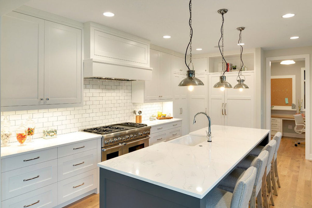
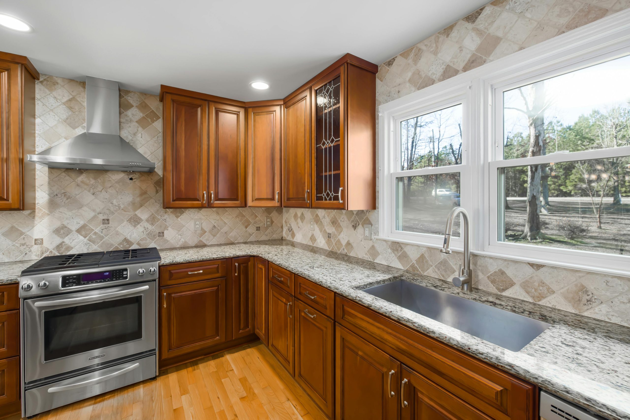
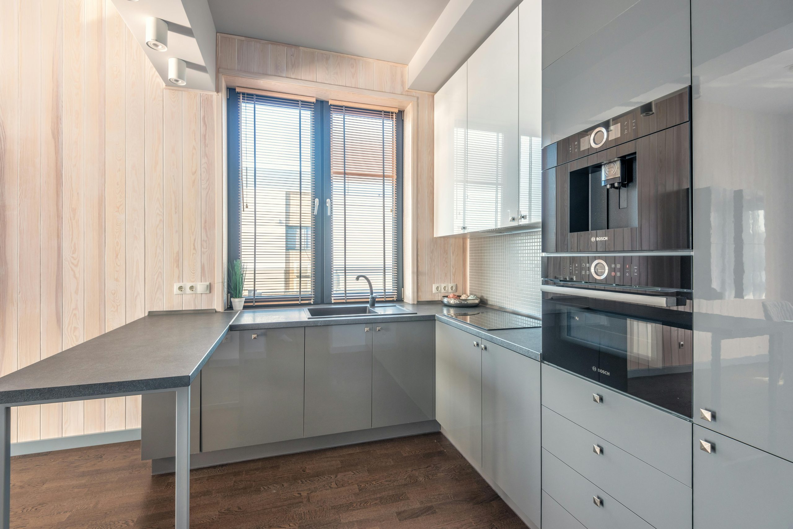
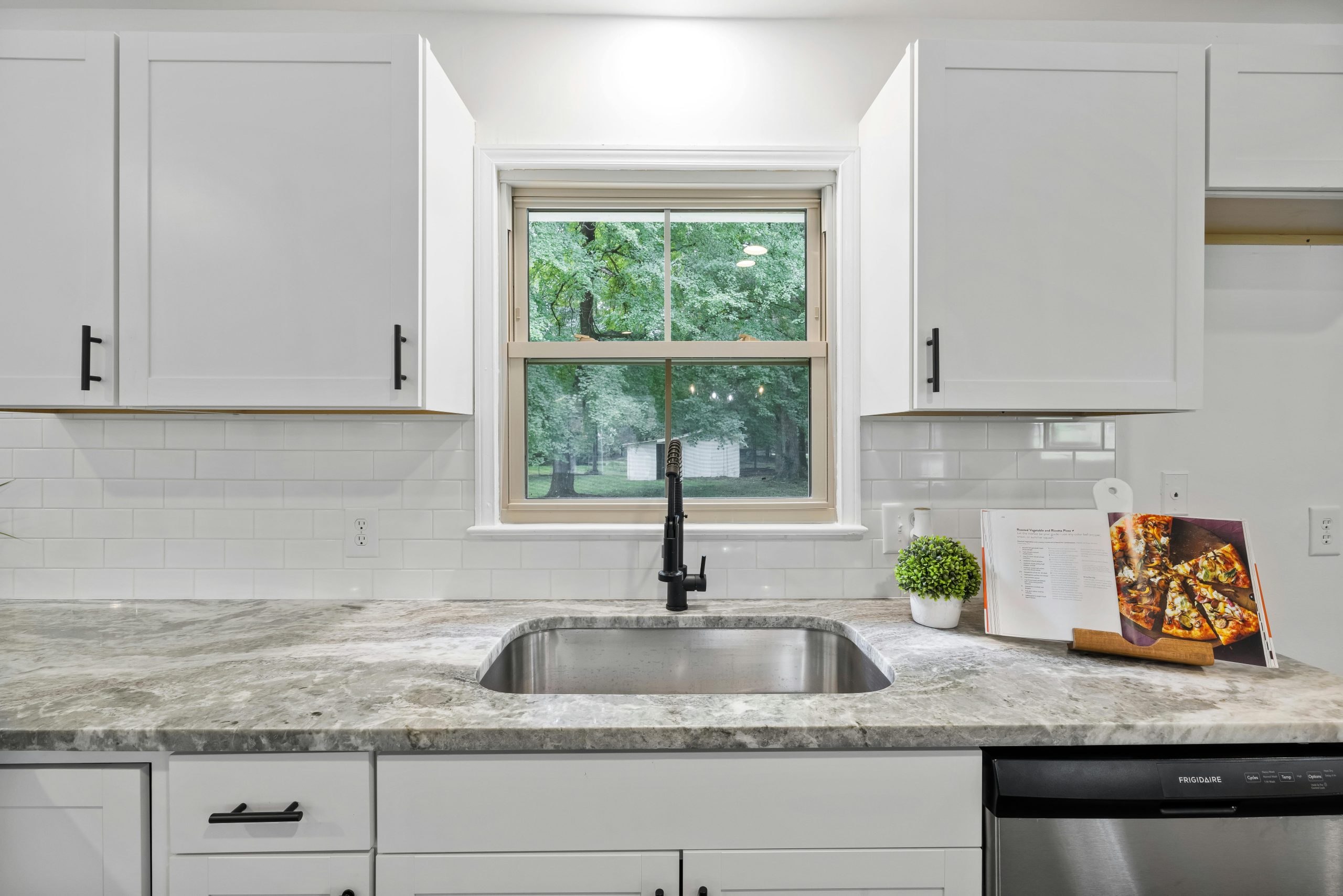
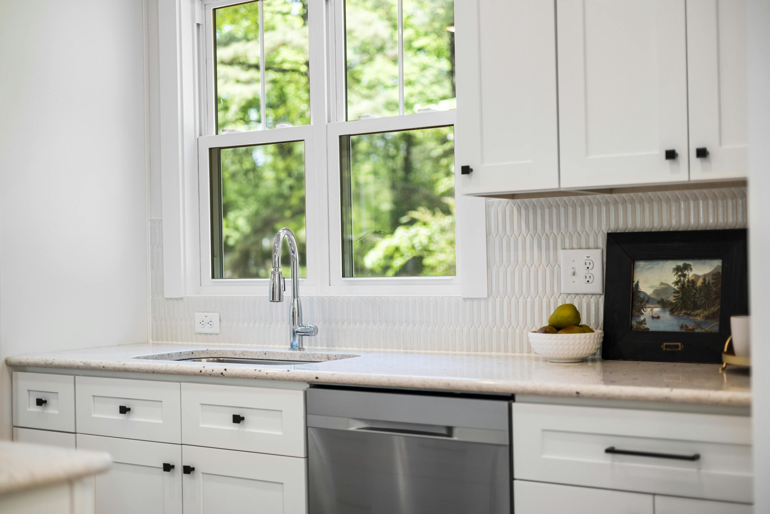
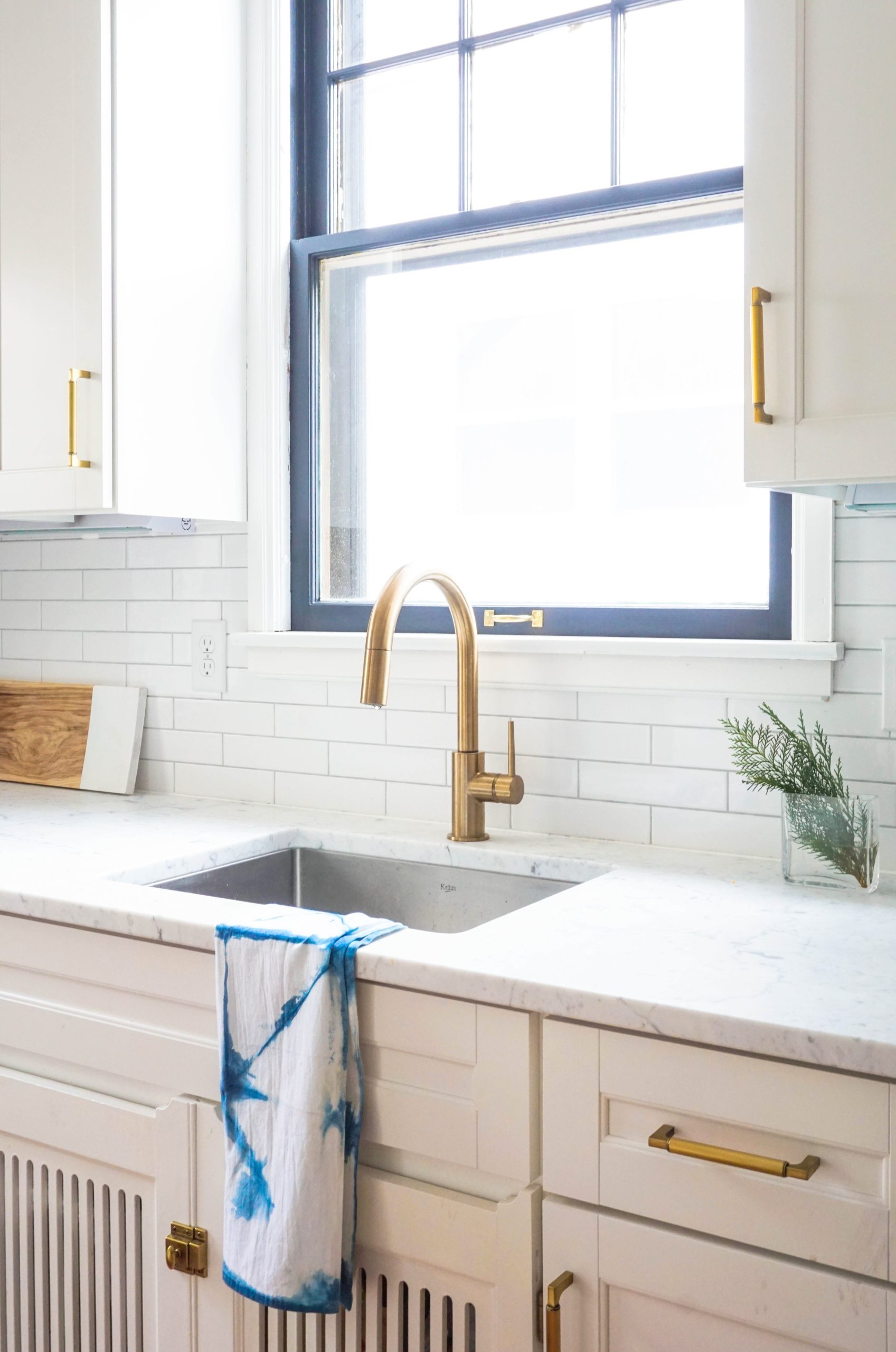
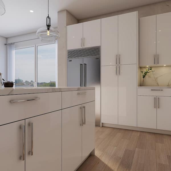
1. Frame a View with Warm Wood and White Subway Tile
What makes this work is the beautiful balance of texture and tone. The light wood grain of the cabinets and countertops introduces natural warmth and visual softness, preventing the space from feeling sterile. This is contrasted perfectly by the glossy white subway tile backsplash, which reflects the under-cabinet lighting and adds a clean, modern feel. The central white-framed window acts as a focal point, drawing the eye outward and making the whole space feel larger and more connected to the outdoors.
|
$2,010.96
|
$22.99
|
$219.00
|
$59.97
|

“To get this bright, modern look, here’s a possible cost breakdown for a standard”
To get this bright, modern look, here’s a possible cost breakdown for a standard 10×10 kitchen area:
- Main furniture (Cabinets, Countertops): $3,500 – $7,000
- Lighting (Under-cabinet LEDs): $200 – $500
- Wall Treatment (Subway Tiles): $400 – $900
- Decor/Accessories (Floating shelf): $50 – $150
- TOTAL: $4,150 – $8,550
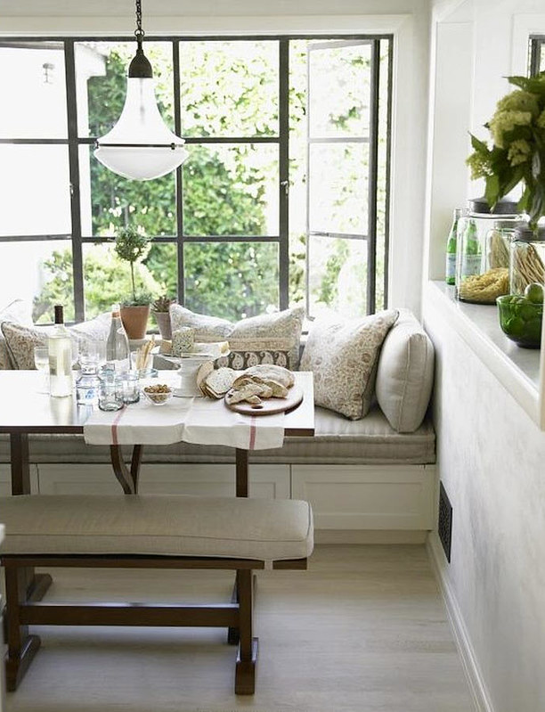
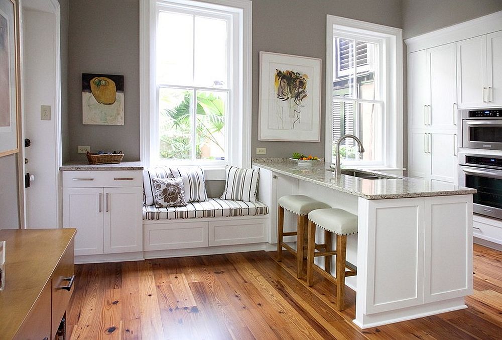
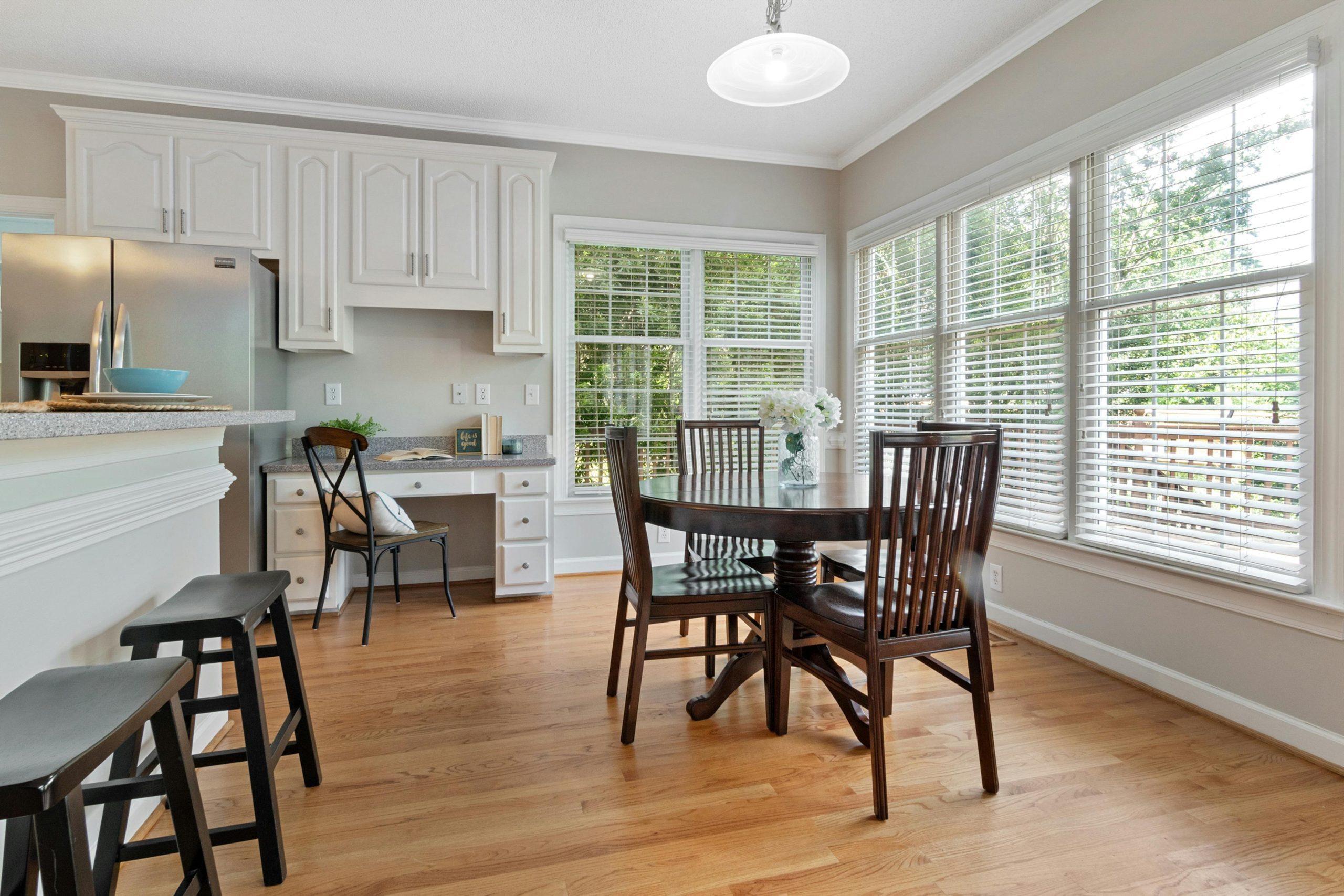
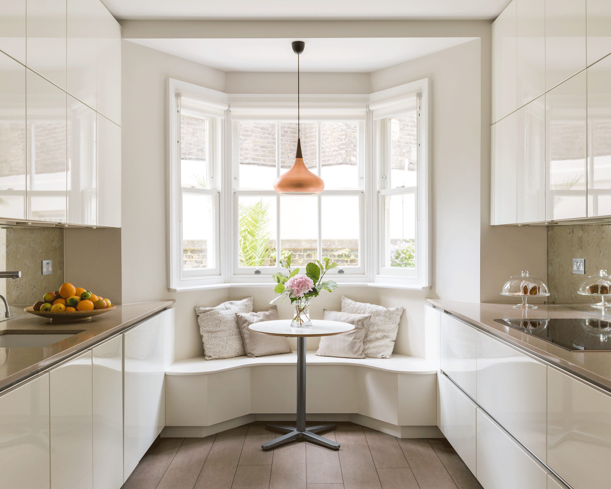
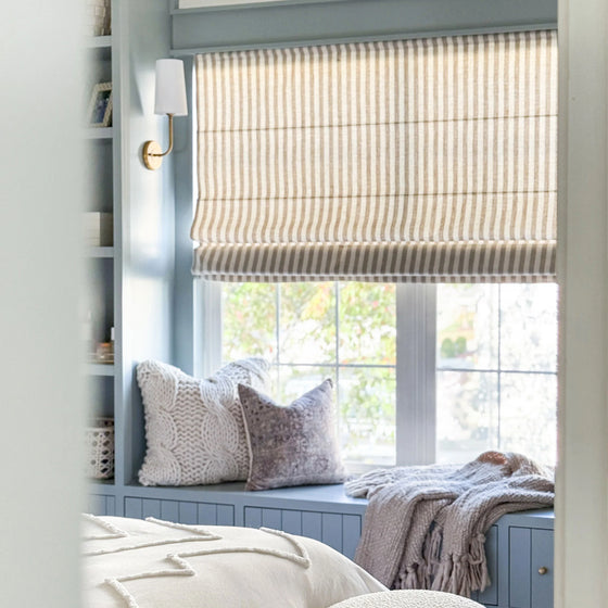
2. Integrate a Window Seat for a Cozy Breakfast Bar
When integrating a window seat, ensure the seat height aligns perfectly with your kitchen island or table to create a cohesive, multi-functional space. A standard seat height is around 18 inches (including the cushion), which pairs well with a 30-inch tall dining table. For a counter-height island (36 inches), you’d need to adjust or create a raised platform, but linking the two zones with coordinating fabrics on the cushions and bar stools makes the design feel intentional and fluid.
|
$47.17
|
$172.99
|
$162.99
|
“This idea is brilliant for kitchens with at least 150-200 square feet to spare, especially in an L-shaped or open-plan layout.”
The window seat requires a depth of at least 18-24 inches for comfortable seating, and the island needs about 36-42 inches of clearance around it for traffic flow. It’s less suited for narrow galley kitchens, where it could obstruct movement. For smaller spaces, consider the more compact bench nook in Idea #6.
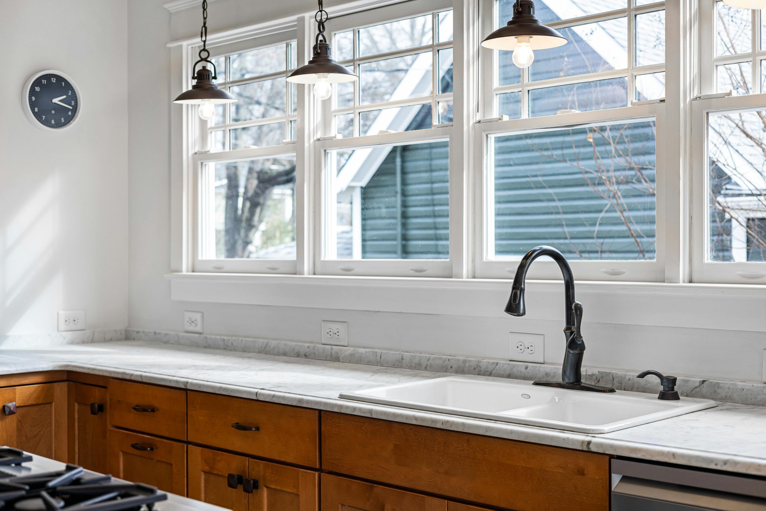
3. Hang Bronze Pendant Lights Over a Farmhouse Sink
The single element that truly defines this space is the trio of bronze pendant lights. If you take them away, you still have a lovely, functional kitchen. But with them, you have a room with soul and a clear focal point. They introduce a darker, warmer metallic tone that beautifully contrasts the crisp white windows and sink. Their placement in front of the windows is a daring choice that pays off, adding depth and a layer of moody elegance that simple recessed lighting could never achieve.
|
$169.00
|
$199.00
|
$256.67
|
“Think of this look as a simple design equation: 50% traditional base (white windows, farmhouse sink) + 30% rustic warmth (wood cabinetry) + 20% industrial elegance (bronze pendants, black faucet).”
You could easily swap the wood for painted cabinets in a deep green or navy and still maintain the formula’s success. The key is the high-contrast mix of classic shapes, natural textures, and a strong metallic accent to tie it all together with a touch of sophistication.
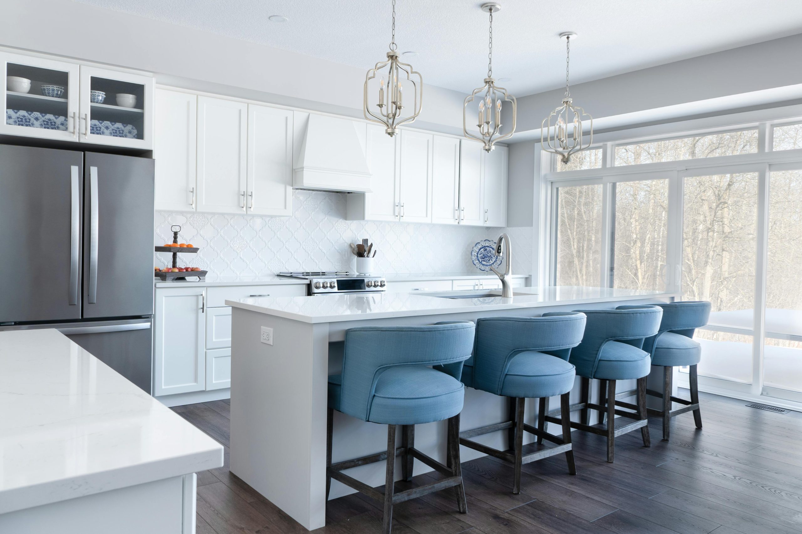
4. Add a Pop of Color with Blue Upholstered Bar Stools
Here, the magic lies in the strategic use of color and repetition. The three blue bar stools provide a single, confident splash of color in an otherwise serene, monochromatic white and gray palette. The color is bold but not overwhelming. This effect is amplified by the repetition of three: three pendant lights, three stools. This rhythmic grouping creates a sense of order and balance, making the entire island composition feel thoughtful and visually satisfying. The dark wood floor grounds the airy space, preventing it from feeling washed out.
|
$59.98
|
$3.12
|
$167.05
|
$169.00
|


“Let’s be honest: while white kitchens are timeless and stunning, they are not friends of high-traffic family life.”
White shaker cabinets, white countertops, and light grout will show every splash of spaghetti sauce and every fingerprint. If you have kids or are a particularly enthusiastic cook, be prepared for a daily wipe-down routine. Using a semi-gloss or satin paint finish on cabinets can help, but for a truly low-maintenance version of this look, consider light gray cabinets instead.
5. Create a Bright Corner Nook with an Integrated Desk
This multi-purpose nook is fantastic, but it requires careful planning before you commit. Here is a little checklist to run through:
|
$140.00
|
$899.00
|
$36.75
|

“Measure the Corner: Do you have at least 5×5 feet of clear floor space?”
This is the minimum to fit a round table and chairs without it feeling cramped.
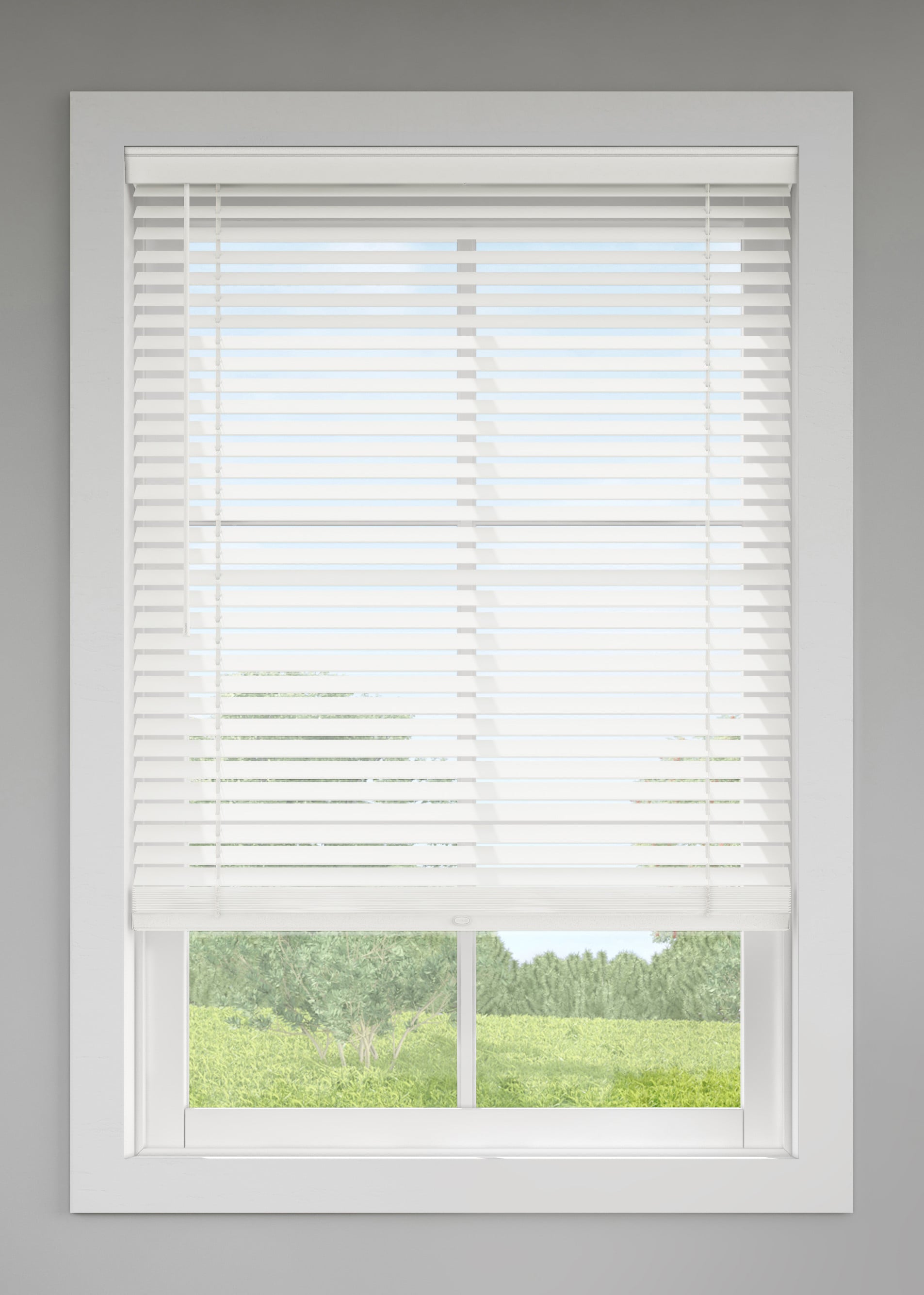
Check the Light: Does this corner get morning or afternoon light? Direct sun might require better blinds (like these white horizontals) to prevent glare on your laptop screen.
Confirm Your Needs: Will this be a true workspace or just a casual spot for coffee? The amount of built-in storage and outlets you plan for depends on the answer.
You don’t need custom built-ins to get this look. Create a DIY version with an IKEA LINNMON / ADILS table ($40) for the desk and a KALLAX shelf unit ($50) for storage, paired with a simple round dining table from Target or Facebook Marketplace (around $100-$250). The key is to paint everything the same shade of white to create that seamless, built-in feel. Use white horizontal blinds from a home improvement store to complete the bright, airy vibe for a fraction of the custom cost.
6. Build a Breakfast Nook Around a Black Steel-Framed Window
The black steel-framed window (often called a Crittall-style window) is a major trend rooted in the revival of industrial and Art Deco design. It’s popular right now because it acts as a graphic focal point, framing the view like a piece of art. Unlike traditional white vinyl or wood, the dark grid creates instant architectural interest and a sense of history, even in a new build. This trend has staying power because of its versatility—it works equally well in modern, farmhouse, and traditional contexts, as seen in Idea #28.

|
$244.99
|
$791.56
|
$799.00
|
$211.65
|


“holding this entire design together?”
It’s the integrated window bench. Without it, you’d just have a window and a separate table, creating two disconnected elements. The bench physically and visually anchors the dining set to the window, making the entire nook feel like a single, intentional architectural feature. It transforms a simple wall into a destination—a cozy, light-filled spot to gather, which is a much more powerful design move.
7. Pair Traditional Wood Cabinets with a Tiled Backsplash
This classic look follows a tried-and-true formula: 60% traditional warmth (medium-toned wood cabinets) + 30% neutral brightness (light granite countertops and a white window) + 10% textural detail (the diagonally-laid tile backsplash). The tile’s pattern is subtle, but by setting it on a 45-degree angle, it adds a touch of custom detail that elevates it beyond a standard subway tile layout. It’s a quiet way to add personality without overwhelming the calm, functional feel of the kitchen.
|
$2,041.31
|
$3.00
|
$75.00
|
$656.00
|


“Medium-toned wood cabinets, like the ones shown here, are excellent at hiding minor splashes and fingerprints, making them a practical choice.”
However, the grout on that light-colored tile backsplash will be the weak spot. To keep it looking fresh, it’ll need a good scrub every few months and should be sealed annually to prevent staining from things like tomato sauce or oil. The granite countertop is durable, but also requires sealing to prevent stains and can be prone to chipping if a heavy pot is dropped on the edge.
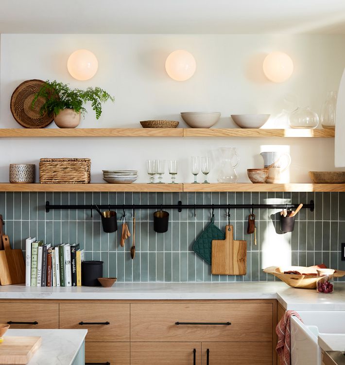
8. Install Glass Shelving Across a Window for Open Storage
When installing glass shelves in front of a window, the details make all the difference. Use high-clarity, low-iron glass (like Starphire) so it doesn’t have that green tint on the edge, ensuring it looks almost invisible. For the supports, choose a finish that matches your faucet or cabinet hardware—here, the brass rods echo a classic, warm aesthetic. Most importantly, leave at least 10-12 inches of vertical space between shelves to allow light to pass through and to fit taller items without it looking cluttered.
|
$644.00
|
$19.96
|
$282.99
|
$579.99
|
“Be brutally honest with yourself: are you a tidy person?”
Glass shelves in front of a window put everything on display, backlit by the sun. There is nowhere to hide. This solution is perfect for people who own beautiful, coordinated sets of glassware and dishes and who enjoy styling and curating their collection. If your mugs are a chaotic jumble of souvenirs and jokes, or if you prefer to quickly stash things away, this open-storage concept will likely become a source of visual stress rather than joy.
9. Mix Glossy Grey Cabinets with a Natural Wood Plank Wall
The success of this design comes from the expert blending of contrasting materials. The sleek, glossy grey and white cabinets scream modern and high-tech. To prevent this from feeling cold or clinical, the design introduces a natural wood plank wall and matching blinds. This infusion of organic texture and warmth provides the perfect counterbalance. The wood’s natural grain stands out against the flat, reflective cabinet surfaces, creating a dynamic and sophisticated material palette that feels both contemporary and inviting.
|
$69.98
|
$49.98
|
$3.99
|
$194.00
|
“A corner window treatment like this is a fantastic way to maximize light and views in a kitchen with an L-shaped layout.”
This idea is best for rooms where you can dedicate a continuous run of at least 6-8 feet along one wall and 4-5 feet on the other. It requires a ceiling height of at least 8 feet to accommodate the upper cabinets without making the space feel top-heavy. The horizontal lines of the wood planks and blinds will also make the space feel wider, which is a great bonus for smaller or narrower kitchens.
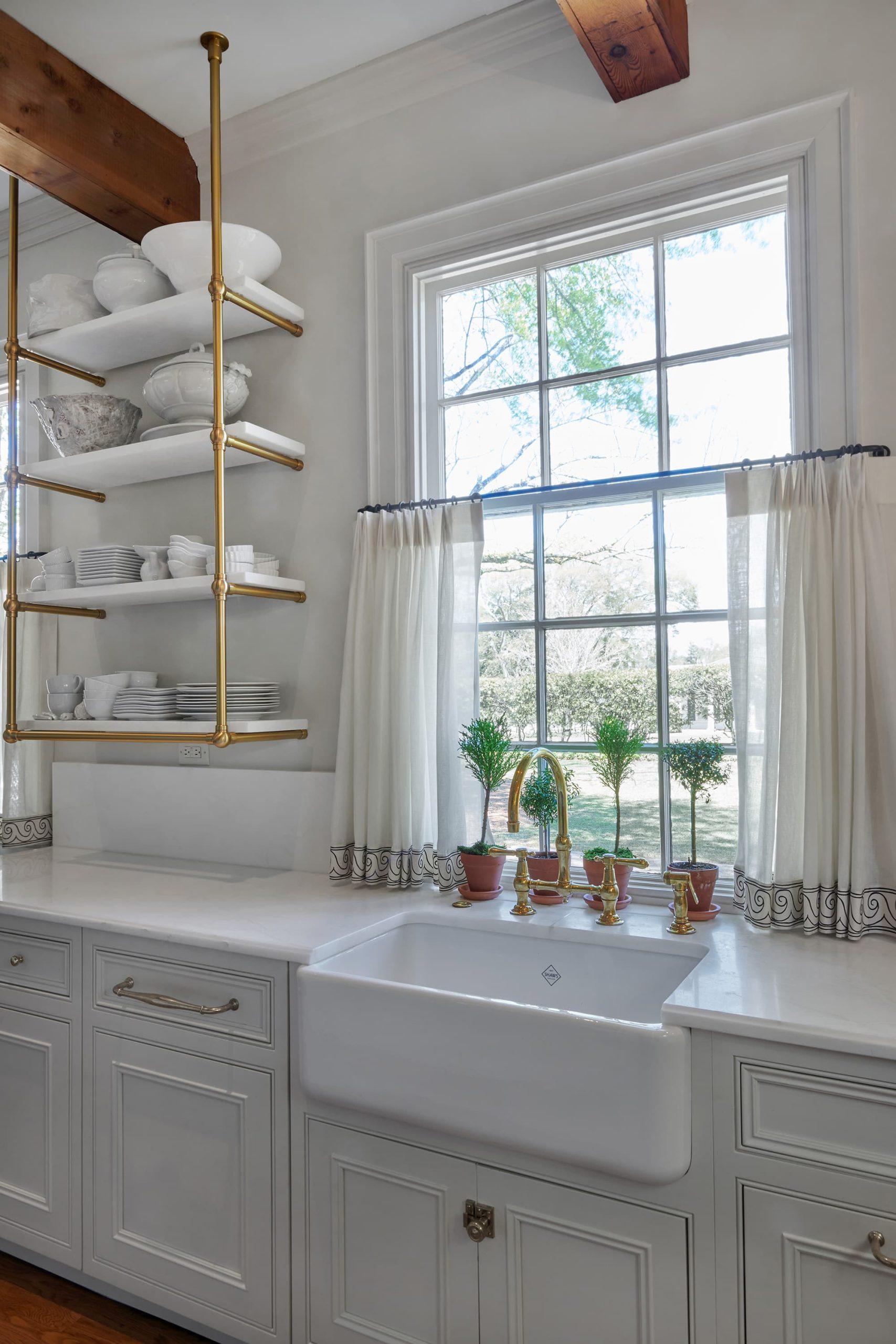
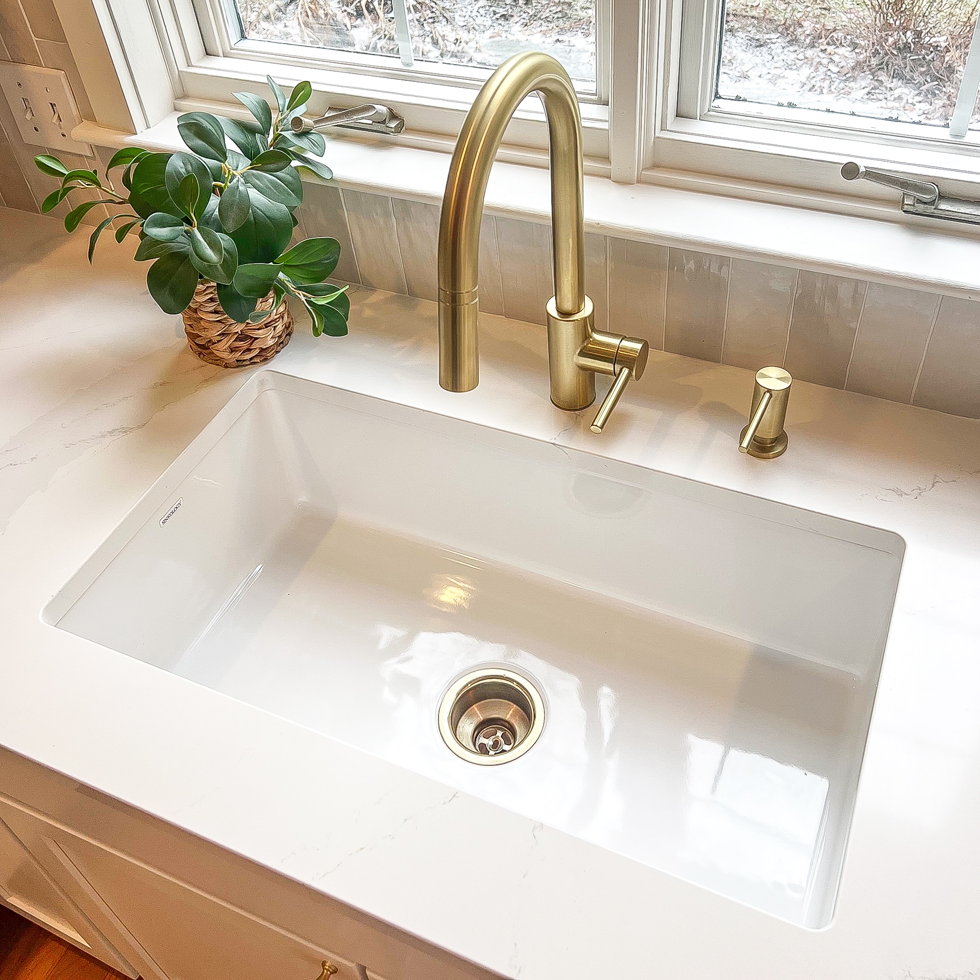
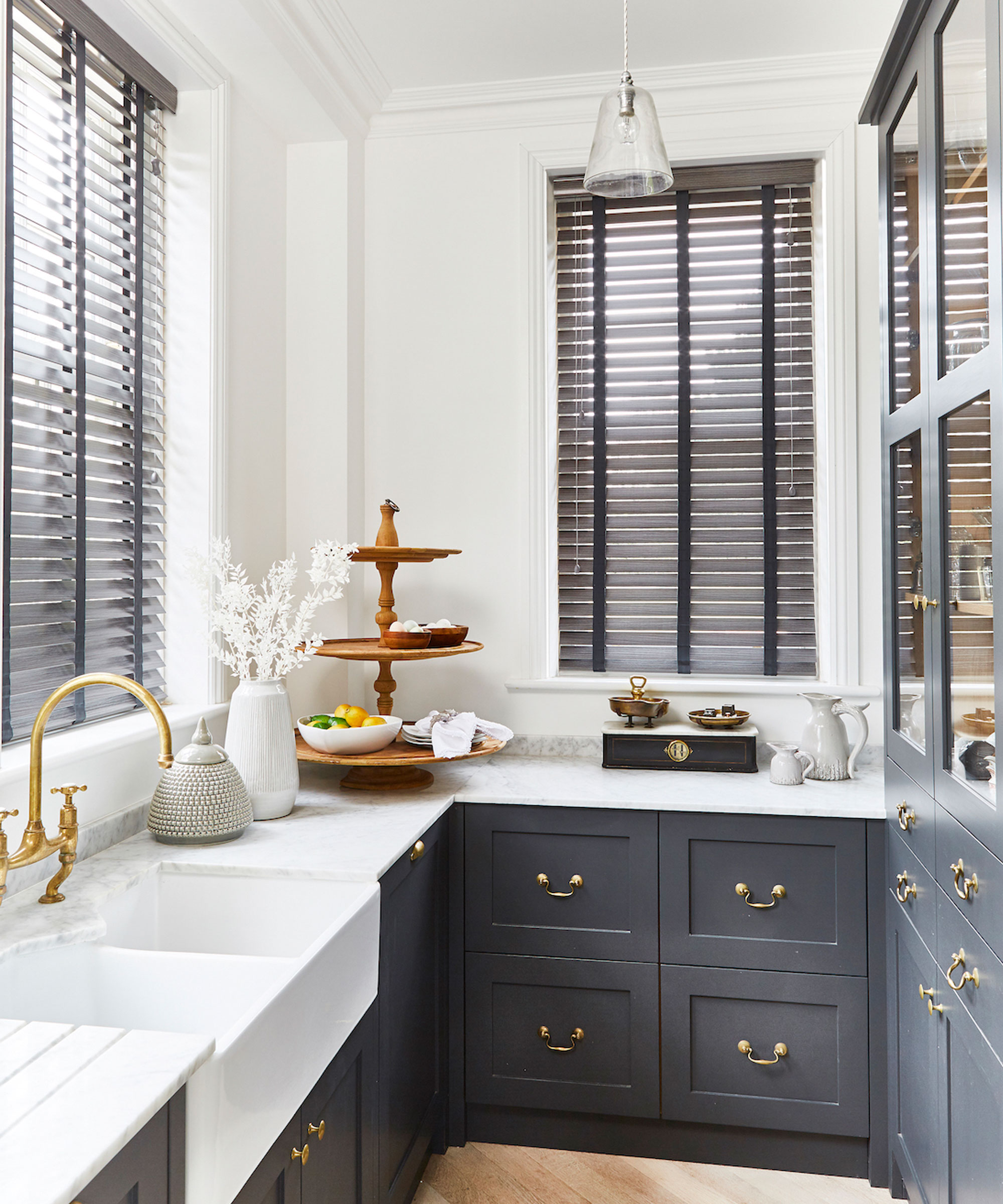
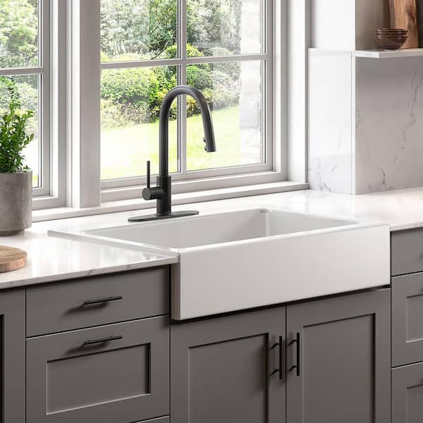
10. Combine a Farmhouse Sink with Brass and Marble Shelving
This entire look taps into the ‘Modern English Country’ trend that’s all over Pinterest. It’s about mixing classic, sturdy elements (the farmhouse sink, the chunky wood beam) with touches of refined elegance (the marble and brass). The open shelving, in particular, is key. Unlike closed cabinets, it feels airy and personal, allowing for curated displays of everyday items. The combination of unlacquered brass, which patinas over time, and classic marble creates a space that feels both timeless and lived-in from day one.
|
$21.50
|
$121.00
|
$393.00
|

“Love this elegant look but not the price tag?”
You can achieve a similar vibe with some savvy shopping. Start with a classic fireclay sink from IKEA ($300). Find a brass-finish faucet from Wayfair or Overstock for $150-$250. For the shelves, use high-quality marble-look contact paper over a simple wooden shelf from Home Depot. Pair it with brass shelf brackets from Amazon for under $40. It’s about capturing the interplay of white, brass, and marble, which you can do for about 30% of the cost of custom materials. Compare this with Idea #8 to see another take on shelves over the sink.
11. Elevate a Minimalist Kitchen with a Textured Backsplash
In this quiet, minimalist space, the white textured backsplash is the hero. Without it, the kitchen would be a flat expanse of white and grey—clean, but forgettable. The geometric pattern of the tiles adds a layer of subtle, sophisticated detail that catches the light in interesting ways. It provides visual interest and a tactile quality without introducing a new color, perfectly adhering to the minimalist aesthetic while giving the room a distinct personality.
|
$284.00
|
$17.40
|
$99.95
|
$16.00
|

“Want to install similar floating shelves?”
Here’s a quick guide for a clean, hardware-free look. Time: 2 hours. Cost: $80-$200.
Purchase a floating shelf kit that includes a hidden metal bracket.
Use a stud finder to locate the wall studs where you want to hang your shelf. This is critical for strength.
Mark your drill holes on the wall, using a level to ensure the bracket will be perfectly straight.
Drill pilot holes, then securely screw the metal bracket to the wall studs.
Slide the hollow outer shelf onto the bracket.
Secure the shelf to the bracket from the underside, usually with a few small, included screws.
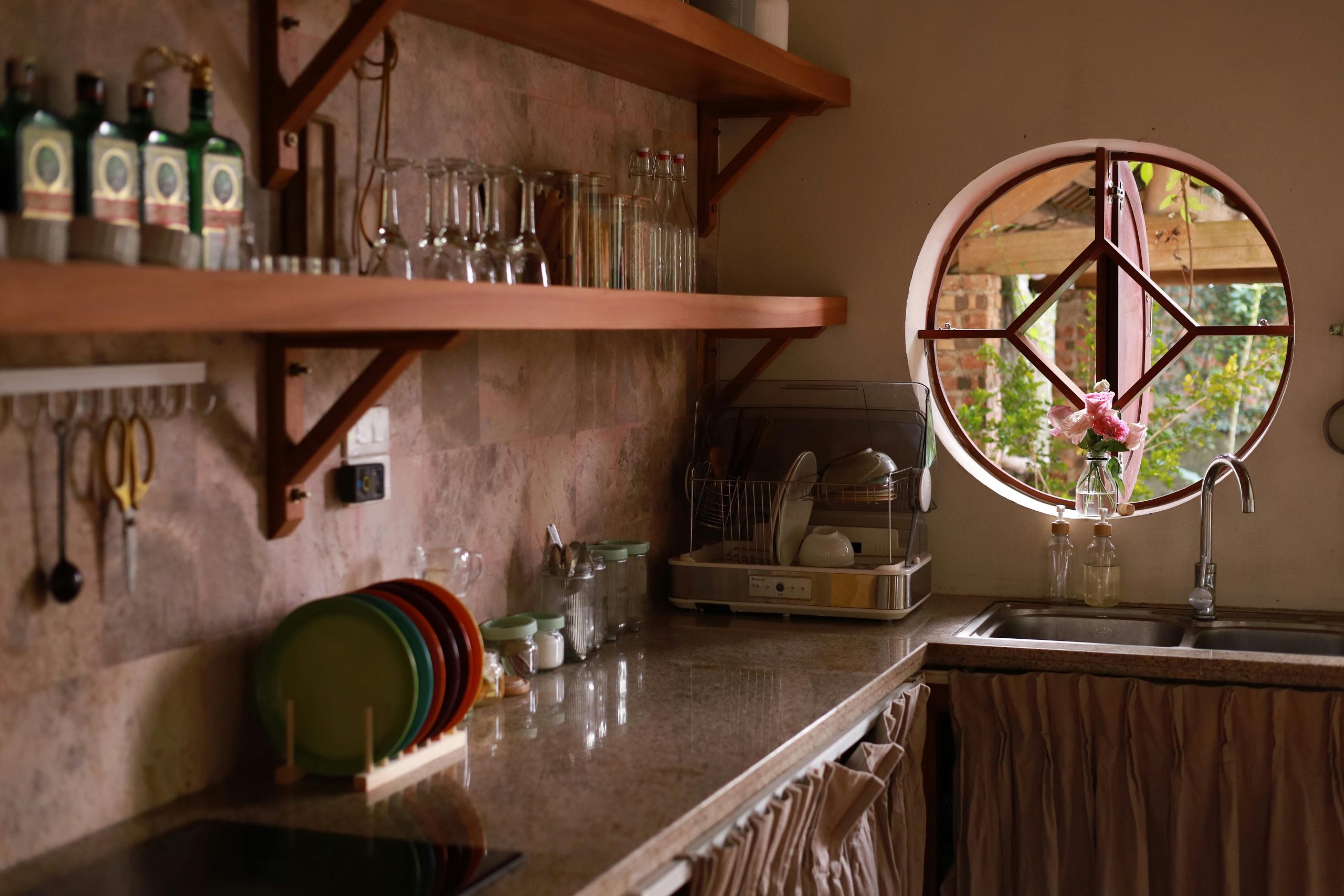
12. Embrace Rustic Style with a Circular Window
A circular window is a huge statement, but it comes with practical considerations. First, they are significantly more expensive than standard rectangular windows due to the custom manufacturing and installation. Second, finding a functional window covering can be tricky and costly—custom circular shutters or cellular shades are often the only options. Finally, cleaning the exterior of a high-up, fixed circular window can be a real challenge. It’s a fantastic feature, but be prepared for the added cost and maintenance.
|
$29.99
|
$34.00
|
$25.85
|
“This design’s charm comes from its unapologetic embrace of raw, natural materials.”
The warm wood of the open shelving isn’t perfectly polished, the speckled granite has earthy tones, and the off-white walls feel soft and organic. The circular window acts as a geometric counterpoint to all this rustic texture. Its perfect curves break up the straight lines of the shelves and tiles, adding a touch of whimsical, handcrafted character that makes the whole space feel unique and personal.
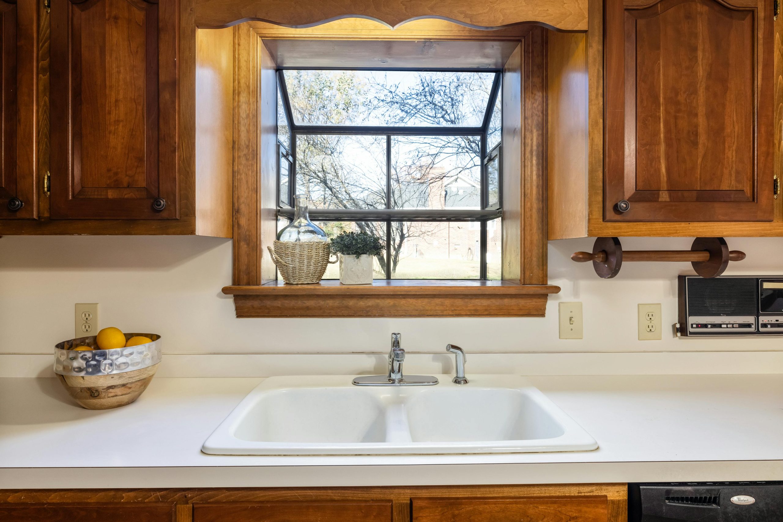
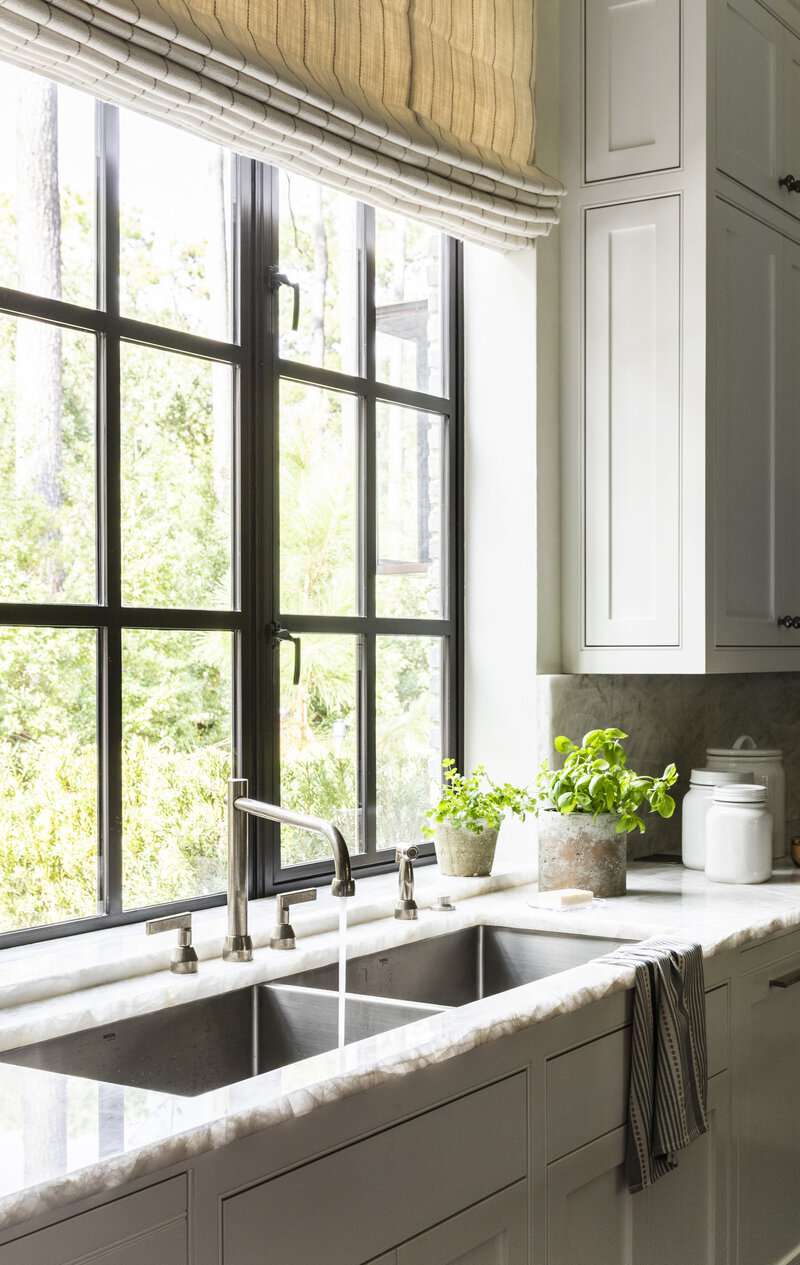
13. Center a Traditional Wood-Framed Window Over the Sink
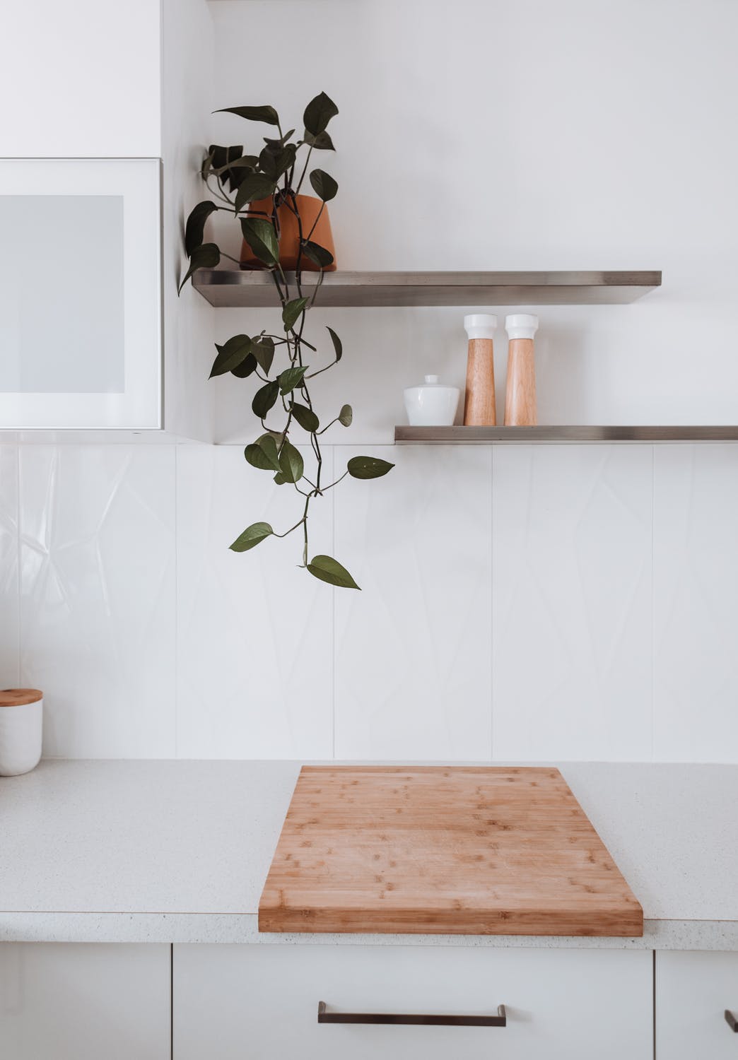
When framing a window with wood that matches your cabinetry, as seen here, the sill becomes a key design element. Don’t be afraid to make it deeper than standard. A 6- to 8-inch deep sill provides the perfect stage for a small potted plant, a decorative bottle, or a collection of small ceramics. This intentional depth transforms the window from a simple opening into a built-in feature with its own functional, decorative surface, making the design feel more custom and thoughtful.
|
$450.12
|
$19.86
|
$131.54
|
$83.98
|


“The formula here is one of classic simplicity: 80% warm wood + 15% crisp white + 5% metallic accent.”
The overwhelming warmth and grain of the wood cabinetry and trim create a cozy, enveloping feeling. The white countertop and sink provide a necessary break, brightening the workspace and adding a clean, functional contrast. The small touch of chrome in the faucet is just enough to add a little sparkle without competing with the dominant wood tones. It’s a balanced and timeless composition.
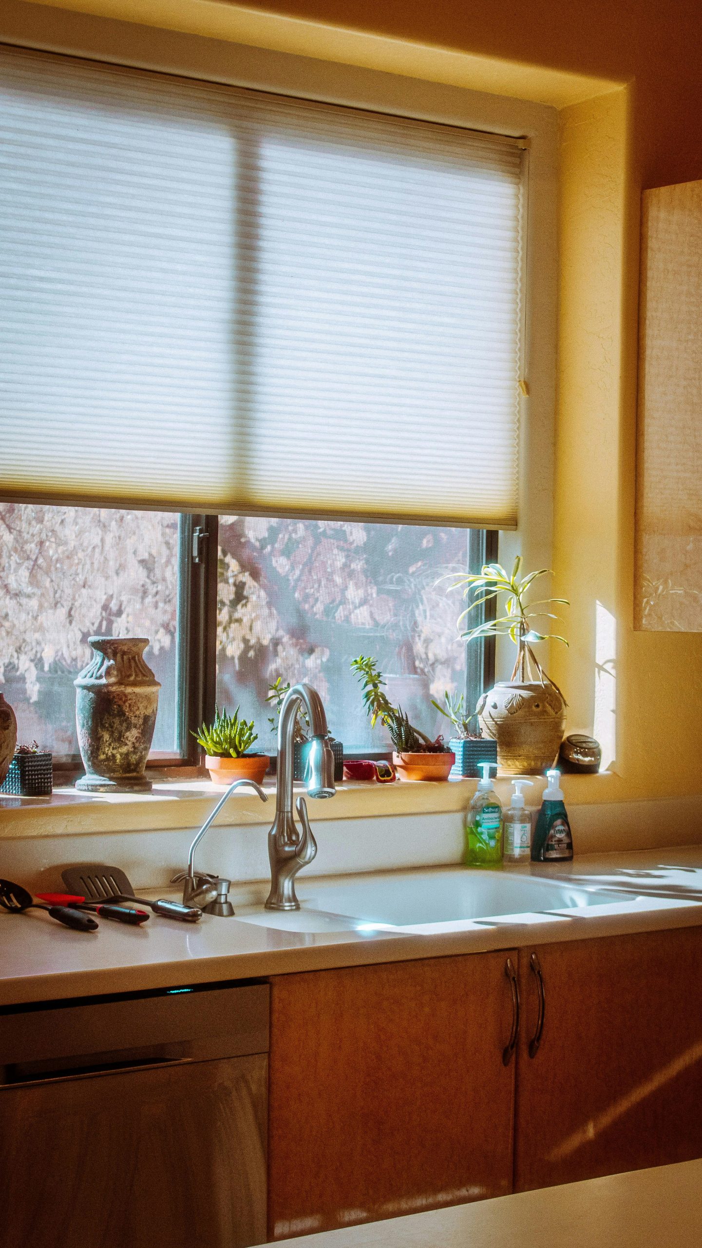
14. Filter Sunlight with a Pleated Shade and Potted Plants
that makes this kitchen window feel so alive and personal is the curated chaos of the plants and decor on the sill. It’s not a sterile, professionally styled space; it’s a space that feels loved and lived-in. The collection of different pots, the variety of green succulents and plants, and the clear glass vases tell a story of someone who enjoys nurturing things. Removing them would leave a perfectly nice window, but it would strip the area of all its warm, sunny personality.
|
$39.98
|
$89.00
|
$299.00
|
$279.00
|

“Cellular or pleated shades are fantastic for providing privacy and filtering light, but they can be magnets for dust and tiny insects.”
To keep them clean, you’ll need to go over them with the brush attachment of your vacuum cleaner every couple of weeks. For a deeper clean, most can be wiped with a damp cloth, but check the manufacturer’s instructions. The real maintenance challenge here is keeping that many potted plants on a sunny sill watered, happy, and pest-free. It’s a commitment!
15. Use Patterned Blinds with Grey Subway Tile
What makes this combination work so well is the contrast in pattern and texture. The glossy grey subway tile is hard, uniform, and geometric. The blinds, on the other hand, are soft fabric with a delicate, translucent pattern. This juxtaposition creates visual interest without clashing. The light wood countertop acts as a warm, neutral bridge between the cool grey tile and the soft white blinds, tying the whole vignette together harmoniously.
|
$219.90
|
$13.85
|
$45.36
|
$55.99
|

“When using a patterned window treatment in a kitchen, opt for a ‘moisture-resistant’ or ‘kitchen and bath’ specific fabric.”
These are typically treated to repel water and resist mildew, which is crucial in a high-humidity area above a sink. Look for patterns with a good amount of negative (empty) space, like the one shown here. This keeps the look feeling airy and light, rather than busy and overwhelming, especially in a smaller kitchen space.
16. Stick to a Classic: White Shaker Cabinets and Subway Tile
The single most impactful choice here is the dark hardware. On an all-white canvas of shaker cabinets and subway tile, the black faucet and cabinet pulls create a strong graphic contrast. It’s what gives this classic kitchen its modern edge. If you swapped them for chrome or nickel, the look would be far more traditional and less dynamic. The hardware acts as the punctuation, defining the lines and adding a crisp, contemporary rhythm to the space.
|
$0.15
|
$179.90
|
$399.00
|


“This is a masterclass in the 60-30-10 rule, but with a monochromatic twist.”
The breakdown is: 60% white (cabinets, tile) serving as the dominant base, 30% grey (marble countertop veining) as the secondary neutral, and 10% black (hardware, faucet) as the sharp accent. This simple, high-contrast palette is the foundation of the modern farmhouse aesthetic. You could introduce a single color, like a green-gray on the walls, and the core formula would still hold true.
17. Choose Picket Tiles for a Modern Backsplash
Picket-shaped tiles are a fresh alternative to the ubiquitous subway tile, and that’s why they are trending. They offer a familiar rectangular quality but with a geometric twist that feels modern and custom. The elongated hexagonal shape draws the eye upwards, which can help make a space with standard-height ceilings feel taller. It’s a choice that says you appreciate classic design but want something with a bit more personality and a contemporary edge. It’s the perfect tile for the ‘I want something different, but not *too* different’ crowd.
|
$2.98
|
$12.84
|
$151.00
|
$70.05
|


“This look works because of its subtle complexity within a simple palette.”
The kitchen is almost entirely white, but it’s not boring. Why? Because it layers multiple shapes and textures. You have the simple rectangular grid of the window, the classic raised-panel shaker cabinets, and the unique geometry of the picket tile backsplash. The black hardware adds a final layer of sharp, graphic contrast. This layering of white-on-white textures is what gives the space depth and a high-end feel.
18. Contrast White Cabinets with a Dark-Framed Window
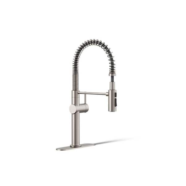
If you’re using a dark-framed window as a focal point, don’t let it fight with your faucet. A common mistake is to match the faucet to the cabinet hardware. Instead, create a cohesive ‘feature’ by matching the faucet to the window. Here, the brass faucet echoes the warmth of the brass cabinet pulls, but a dark bronze or matte black faucet would have also worked beautifully, tying directly back to the dark window frame and creating a stronger, more consolidated focal point over the sink.
|
$29.00
|
$33.46
|
$266.00
|
$133.00
|


“A brand new, dark-framed window can be pricey.”
To get this high-contrast look on a budget, you can paint your existing window frame. If you have vinyl or wood windows, a high-quality enamel paint like Sherwin-Williams Emerald Urethane Trim Enamel in a satin or semi-gloss black (like ‘Tricorn Black’) will do the trick. The key is proper prep: clean thoroughly, lightly sand, and use a good primer. For under $100 in materials, you can create the same dramatic effect as the window shown here.
19. Add a Bay Window Banquette with Matte Gold Accents
Creating this rustic, inviting nook is a significant investment, but the payoff is huge. Here’s a potential cost breakdown to bring this look to life:
|
$2,022.80
|
$13,171.75
|
$339.00
|
$44.99
|
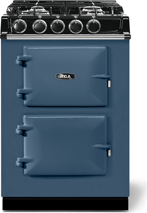

“Main Furniture (Custom Banquette, Wood Countertops): $4,000 – $9,000
Appliances ”
- Main Furniture (Custom Banquette, Wood Countertops): $4,000 – $9,000
- Appliances (Aga Range Cooker): $15,000 – $25,000
- Lighting (Pendant, Sconces): $500 – $1,500
- Flooring (Stone Tiles): $1,500 – $3,000 sq ft
- Fixtures (Faucet, Hardware): $400 – $1,000
- TOTAL: $21,400 – $39,500+
Budget alternative: A freestanding bench from Wayfair, a butcher block countertop from IKEA, and a much more modest range can achieve a similar feel for under $8,000.
This design works best in a medium to large kitchen, ideally one that’s at least 15 feet wide to comfortably accommodate the bay window projection without cramping the main workspace. A typical bay window adds about 2 to 3 feet of depth, which is perfect for a banquette seat (18-24 inches deep) and a small table. You’ll need at least 8-foot ceilings to handle the visual weight of the chunky stone flooring and cabinetry. For a more compact approach, see the corner nook in Idea #5.
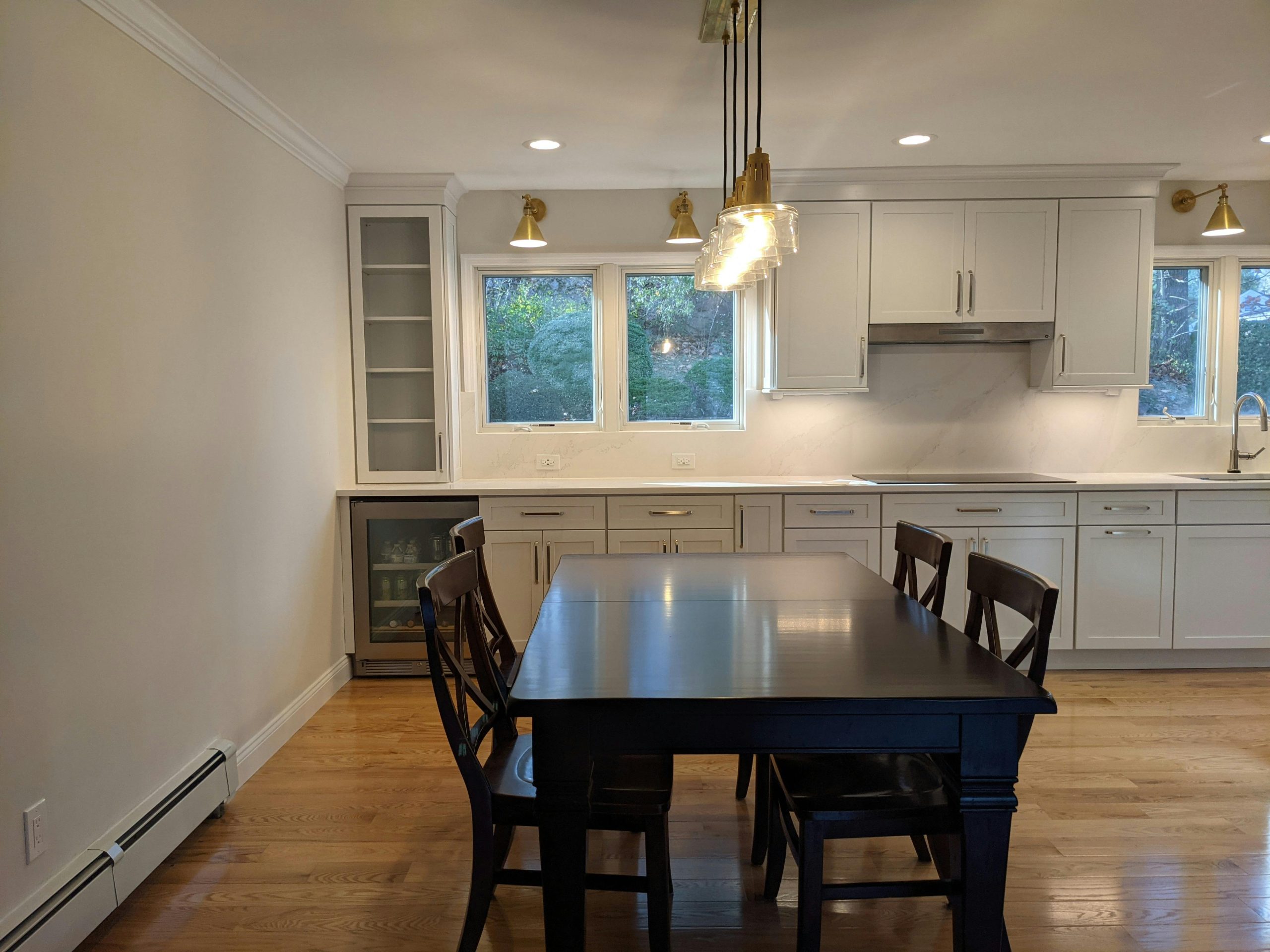
20. Contrast a Light Kitchen with a Dark Wood Dining Table
The design principle at play here is ‘anchoring.’ In this bright, airy kitchen with light gray cabinets and white walls, the dark wooden dining table and chairs act as a visual anchor. They provide weight and substance, preventing the room from feeling like it might float away. The dark wood grounds the space, creates a clear zone for dining, and adds a touch of traditional, sophisticated warmth that contrasts beautifully with the contemporary lightness of the kitchen itself.
|
$73.09
|
$222.27
|
$136.99
|
$420.99
|

“A large, open-concept space like this looks stunning, but sound can be a major issue.”
With hardwood floors, stone countertops, and lots of glass, there are very few soft surfaces to absorb noise. The clatter of dishes, conversations, and footsteps can echo and become overwhelming. To mitigate this, consider adding a large, thick area rug under the dining table and using fabric window treatments like Roman shades or curtains where possible. Even upholstered dining chairs can make a small but noticeable difference.
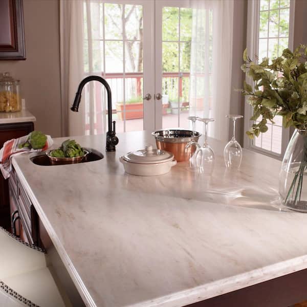
21. Style a Marble Countertop with Crisp White Decor
When styling a window sill or countertop with a distinct pattern like this white-and-grey marble, embrace a monochromatic palette for your decor. Notice how all the key items—the pitcher, the pear, the floral arrangement—are white and green. This allows the beautiful veining of the marble to remain the star of the show. If you were to add too many competing colors, the overall look would become busy and chaotic. Sticking to a tight, clean palette creates a serene, high-end, and intentional feel.
|
$88.00
|
$24.99
|
$162.47
|
$299.00
|

“A marble-patterned countertop, likely quartz or engineered stone in this modern application, is a fantastic choice for durability.”
It’s non-porous and resistant to staining, unlike true marble. However, the one thing to watch out for is heat. Placing a hot pot or pan directly on the surface can cause ‘thermal shock,’ which may lead to cracking or discoloration. Always use a trivet or hot pad. The chrome faucet is also durable but will show water spots and fingerprints readily, requiring frequent wiping to keep it looking shiny.
22. Pair Dark Gray Wood Blinds with a Classic Marble Kitchen
The single element that gives this classic kitchen its modern, moody edge is the dark gray wooden blinds. A more traditional choice would have been white blinds or a fabric Roman shade. But opting for this bold, dark color, complete with contrasting black fabric tapes, is a confident move. It picks up on the color of the cabinets and creates a dramatic silhouette against the incoming light, adding a layer of sophisticated, almost masculine, gravity to the elegant space.
|
$136.58
|
$437.92
|

“Want to create a decorative tray display like the one shown?”
It’s all about layering heights. Time: 15 minutes. Cost: $50-$150 (using what you own).
Start with a multi-tiered tray. A two or three-tiered stand works best.
Place your largest and tallest item on the bottom tier, often towards the back. This could be a small vase, a candle, or a small potted plant.
Add medium-sized items to the bottom and middle tiers. Think mugs, small bowls, or bundled napkins.
Fill in the gaps with smaller decorative objects: a string of beads, a vintage-looking utensil, or a small figurine.
Place your most delicate or eye-catching items on the top tier.
Step back and adjust, ensuring there’s a mix of textures and heights on each level.
23. Fit a Bay Window with Seating and a Copper Pendant
This inviting nook follows a simple formula: 70% sleek modern base (glossy off-white cabinets, simple countertops) + 20% natural texture (wood-look flooring, patterned pillows) + 10% warm metallic accent (the copper pendant light). The copper is the jewelry of the room. Its warm, rosy glow contrasts beautifully with the cool, glossy cabinets and adds a necessary focal point and touch of color to the otherwise neutral space. You could swap the copper for brass or matte black, but the inviting warmth would be lessened.
|
$117.00
|
$579.99
|

“You can get this look for much less.”
Instead of custom built-in seating, find a freestanding storage bench from IKEA or Target ($150-$300). Pair it with a small, inexpensive cafe table. The real key is the pendant light. Look for a copper-finished pendant on Amazon or Wayfair for under $100. Add some affordable throw pillows in a coordinating pattern, and you’ve captured the essence of this cozy, modern breakfast spot for a few hundred dollars, not thousands.
24. Filter Light with Modern Sheer Layered Shades
These sheer layered shades, sometimes called zebra blinds, are brilliant because they offer maximum flexibility. You can align the solid bands for privacy and room darkening, or align the sheer bands to let in soft, diffused light while still maintaining a sense of separation from the outdoors. This duality is what makes them work so well in a kitchen—you get an open, airy feeling like you would with no covering, but also the option for privacy and light control when you need it. The clean, horizontal lines also complement the contemporary aesthetic of the kitchen.
|
$41.15
|
$39.99
|
$113.97
|
$47.00
|

“When measuring for inside-mount shades like these, precision is everything.”
Measure the width of the window inside the frame at the top, middle, and bottom. Then, measure the height at the left, middle, and right. Use the narrowest width and the shortest height for your order. The factory will make a small deduction (usually 1/4 to 1/2 inch) to ensure the shade fits easily inside the frame and operates smoothly without scraping the sides. Don’t be tempted to ‘add a little extra’—trust the process.
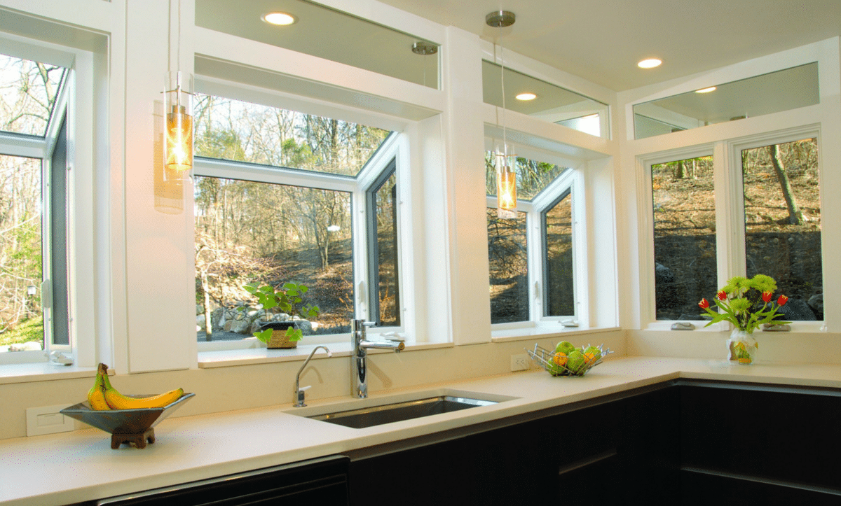
25. Maximize Light with Angled Corner Windows
This design is a showstopper for kitchens that have an exterior corner with a good view. It works beautifully in open-concept floor plans where the kitchen flows into a dining or living area. The wrap-around glass makes the room feel boundless. This treatment is best suited for a longer wall—you need at least 10-12 feet of total wall space to make the angled effect feel grand rather than cramped. Standard 8-foot ceilings work, but 9-foot or higher ceilings will truly make this design sing by enhancing the sense of vertical space.
|
$2,928.49
|
$119.00
|
“While a wall of windows is breathtaking, it comes with a major challenge: a lack of upper cabinet storage.”
Notice how this kitchen only has base cabinets. Before committing to this design, you must have a solid plan for where your dishes, glasses, and pantry items will go. This usually means incorporating a full-height pantry cabinet on another wall or designing an island with exceptionally deep and well-organized drawers. It’s a trade-off: you’re swapping storage for light and views.
26. Combine a Dark Framed Window with a Neutral Roman Blind
The effectiveness of this design lies in its sophisticated layering of neutrals. You have the white glossy cabinets, the light grey countertops, the dark grey window frame, and the medium-grey Roman blind. It’s a four-tone palette of greyscale that feels incredibly deliberate and calming. The potted plants are crucial, providing the only source of organic color and life, which pops beautifully against the monochromatic background. The mix of gloss (cabinets) and matte (blind) finishes adds another layer of subtle texture.
|
$339.97
|
$63.38
|
$80.00
|
$180.10
|

“For a clean, modern look with a Roman blind, choose an ‘inside mount’ where the blind fits snugly within the window frame.”
But if your window frame isn’t very deep, or if you want to make the window appear larger, use an ‘outside mount’. When ordering an outside mount blind, add at least 2-3 inches to the width and height of the window frame’s outer dimensions. This ensures full coverage, blocks more light, and creates a more substantial, drapery-like effect.
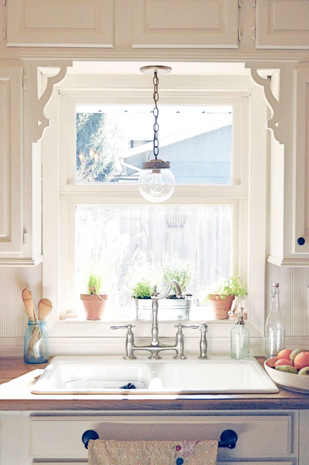
27. Hang a Single Globe Pendant Over the Sink
The single most charming element here is the globe pendant light. It’s a simple, almost humble fixture, but its placement is perfect. Hung directly in the center of the window, it acts like a piece of jewelry, adding a touch of sparkle and a clear focal point to the sink area. It breaks up the square lines of the window panes and cabinets, and the warmth of its brass detail echoes the terracotta pots on the sill, creating a cohesive, thoughtful little vignette. It feels special. This is a much better approach than the mistake shown in Mistake #3.
|
$36.79
|
$299.00
|
$4.76
|
$24.99
|


“Want to recreate the windowsill herb garden?”
It’s simple, affordable, and adds life to any kitchen. Time: 20 minutes. Cost: $20-$40.
Choose a window that gets at least 4-6 hours of direct sunlight per day.
Buy small starter herbs like basil, mint, rosemary, or parsley from a local garden center.
Select small pots (4-6 inches in diameter) that have drainage holes at the bottom. Terracotta pots like the ones shown are great because they allow the soil to breathe.
Place a small dish or saucer under each pot to catch excess water and protect your windowsill.
Gently repot your herbs into their new containers using a quality potting mix.
Water them thoroughly and place them on your sunny sill. Water only when the top inch of soil feels dry.
28. Go Graphic with a Black Grid Window and Marble
This kitchen’s success is all about high-contrast, graphic elements. The bold, black grid of the window creates a powerful geometric pattern that acts as the room’s primary artwork. This is set against the organic, soft swirls of the white marble countertop. The tension between the rigid, man-made grid and the soft, natural stone is what creates the dynamic energy. The potted plants are essential, softening the hard lines and bridging the gap between the indoor and outdoor spaces.
|
$105.91
|
$16.95
|
$499.00
|
$219.00
|


“A true divided-light metal window is a major expense.”
You can get 90% of this look for 10% of the cost. Start with a standard, inexpensive vinyl window. Then, using a roll of high-quality black vinyl tape (about 1-inch wide), create a grid pattern on the interior side of the glass. For a more durable solution, you can paint the grid on using a stencil and black glass paint. It won’t have the same dimensional quality, but from a few feet away, it creates the same bold, graphic effect. Compare this with Idea #6’s similar window style in a cozier setting.
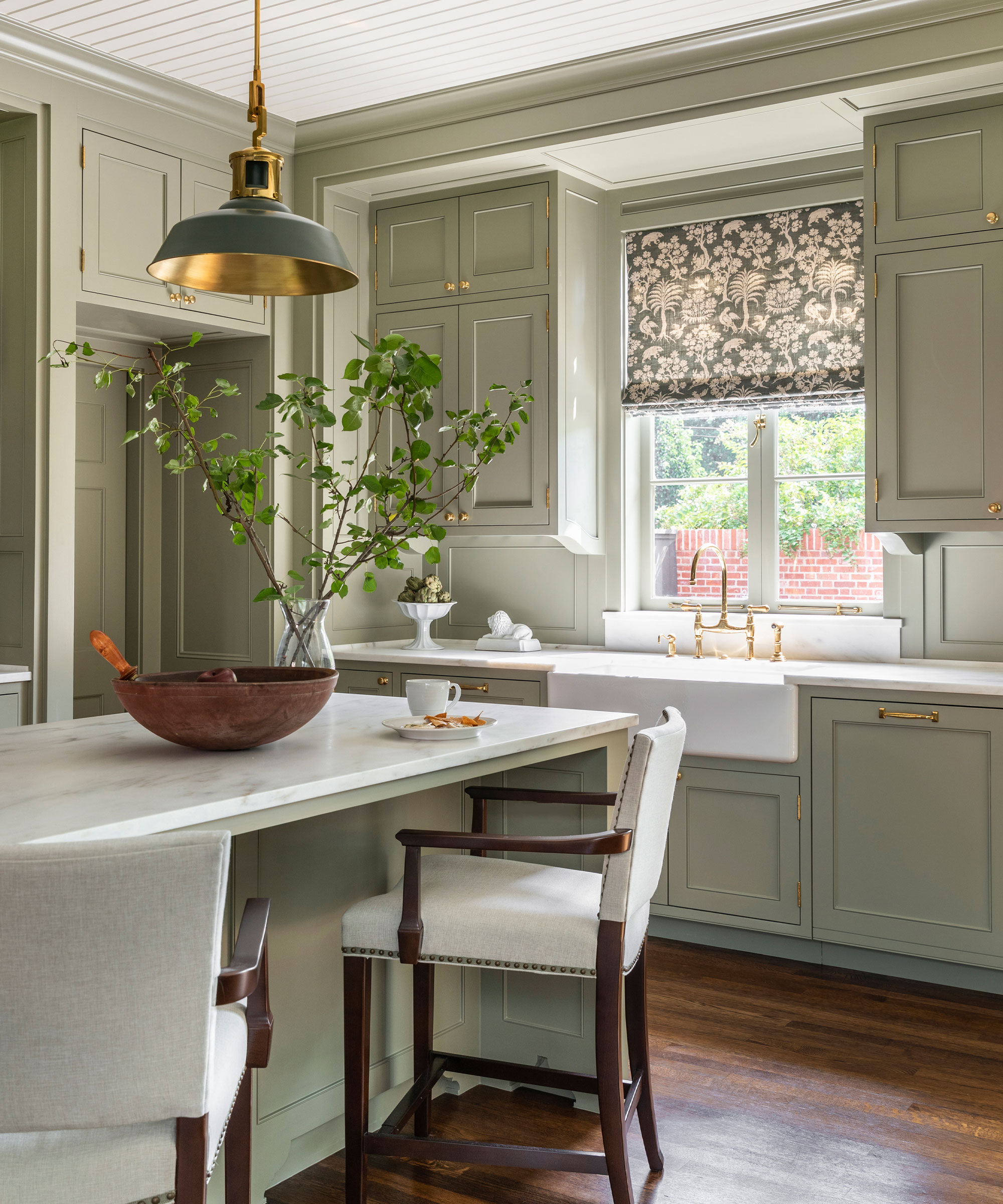
29. Design an Elegant Kitchen with Sage Green Cabinets
Sage green is having a huge moment in kitchen design because it hits the perfect sweet spot. It acts like a neutral—calming, earthy, and easy to pair with other finishes—but it’s more interesting and personal than white or grey. It connects to the broader wellness and biophilic design trends, which are all about bringing natural, soothing elements indoors. Paired with warm brass hardware and dark wood floors, as seen here, it creates a look that feels both classic and completely current for 2026.
|
$105.00
|
$2,197.84
|
$377.99
|
$249.00
|

“When using a patterned fabric for a Roman shade, the scale of the pattern is crucial.”
For a smaller window, like one over a kitchen sink, choose a small to medium-scale pattern. A huge, sprawling pattern will get cut off and look awkward. The floral and animal motif here is perfectly sized; you can appreciate the repeat and see the full illustration, which adds a layer of bespoke, storybook charm to the whole kitchen. Always order a fabric sample to see it in your space and light before committing.
30. Soften a Farmhouse Sink with Sheer Cafe Curtains
The single element that gives this kitchen its cozy, farmhouse-chic charm is the sheer cafe curtain. Without it, you’d have a beautiful but somewhat standard kitchen with a farmhouse sink and marble-look countertops. The curtain, hung on a simple dark rod, adds a layer of softness, texture, and a touch of modesty. It filters the light beautifully and introduces a sense of nostalgia and comfort that hard window treatments can’t replicate. It’s a small detail that does a lot of heavy lifting for the room’s atmosphere.
|
$89.00
|
$419.00
|
$9.73
|
$2,139.90
|

“Let’s be real: fabric curtains directly over a kitchen sink can be a bit high-maintenance.”
They are prone to getting splashed with water, soap, and food. Sheer white curtains, in particular, will show every little spot. To make this work, choose a machine-washable fabric and be prepared to launder them every month or two. Also, ensure the curtains are hung high enough that they aren’t constantly dipping into the sink area or getting snagged by the faucet. It’s a trade-off of practicality for charm.
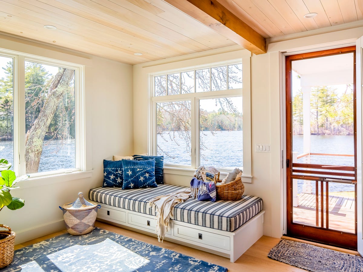
31. Create a Lakeside Window Nook with Built-In Storage
The magic of this nook lies in its celebration of the view. The designer wisely kept the interior palette simple and complementary to the exterior. The light wood of the ceiling and trim echoes the tones of the shoreline, while the various shades of blue in the textiles mirror the water and sky. By framing the view with natural materials and colors, the design erases the boundary between indoors and out, making the entire space feel like a serene, immersive lakeside retreat.
|
$129.99
|
$6.99
|
$60.00
|
“Dreaming of a cozy reading nook like this?”
Check these things off your list first to make sure it’s the right fit:
- View Assessment: Is the view from this window genuinely pleasant to look at year-round? A window seat draws major attention to whatever is outside.
- Sunlight Direction: Will you be blinded by direct sun in the morning or afternoon? Consider investing in discreet roller shades that can be hidden when not in use.
- Storage Needs: The drawers underneath are a huge bonus. Are you building this primarily for seating, or do you desperately need that extra storage space for blankets, games, or seasonal items? Plan the interior of the drawers accordingly.
Your Kitchen’s New View Awaits
That little patch of wall over your sink is more than just a space for a window—it’s an opportunity to add personality, function, and light to the heart of your home. Whether you’re drawn to a minimalist shelf or a cozy built-in seat, the right design can completely change the way your kitchen feels and works. We hope these real-world examples have sparked some amazing ideas. Now, head over to Pinterest and start creating a board for the kitchen you deserve!
Photo credits: The Spruce, Decoist, Livingetc, At Home Blinds & Decor, Peak Custom Remodeling, Momooze, Oknoplast, Apartment Therapy, Homes and Gardens, The Kitchn, Sleek-chic Interiors, Reliable Design-Build-Remodel, Good Housekeeping, www.domino.com / Web, Mateusz Pielech, Max Vakhtbovych, Curtis Adams, Melanie Brumble, Hồng Quang Official, Hugo Ayala, Isaak Jahn / Pexels