As we step into 2026, bedroom paint colors are taking a bold new direction—blending comfort with personality in ways that feel fresh yet timeless. Whether you’re drawn to moody jewel tones that wrap you in drama, calm neutrals that soothe after a long day, or romantic pastels that whisper elegance, this year’s palette celebrates individuality. Americans are searching Pinterest for inspiration that goes beyond trends, seeking colors that transform their master bedroom into a true sanctuary. From Benjamin Moore classics to Sherwin-Williams showstoppers, we’ve gathered stunning ideas to help you find the perfect hue for your space.
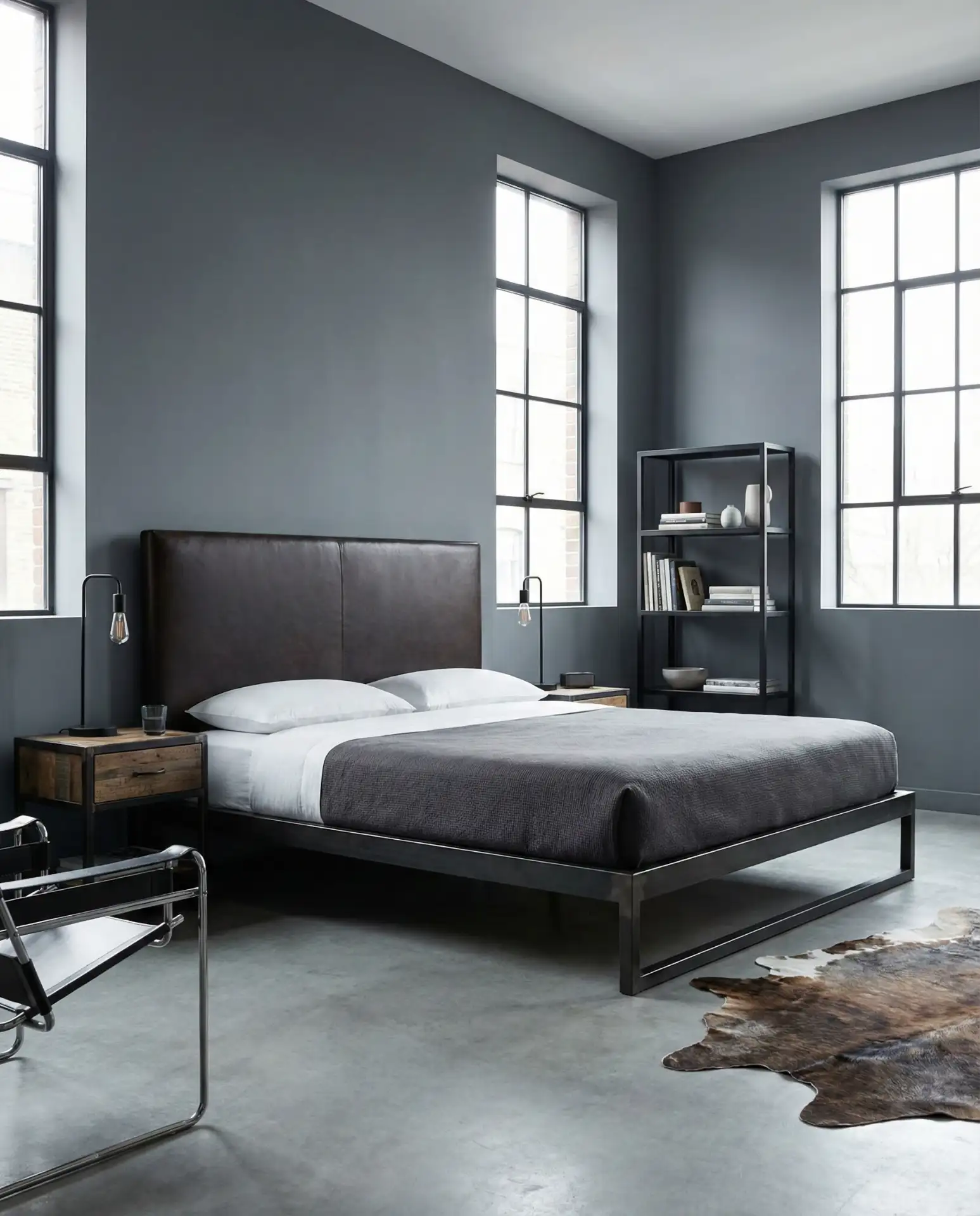
1. Deep Charcoal with Velvet Accents
This moody charcoal shade creates an instant cocoon effect, perfect for bedrooms where you want to escape the world. The color works beautifully in spaces with ample natural light, preventing the darkness from feeling oppressive. Pair it with velvet throw pillows in burnt orange or mustard to add warmth, and consider a plush area rug underfoot. This approach suits both master bedroom retreats and guest rooms that aim to impress with sophistication. 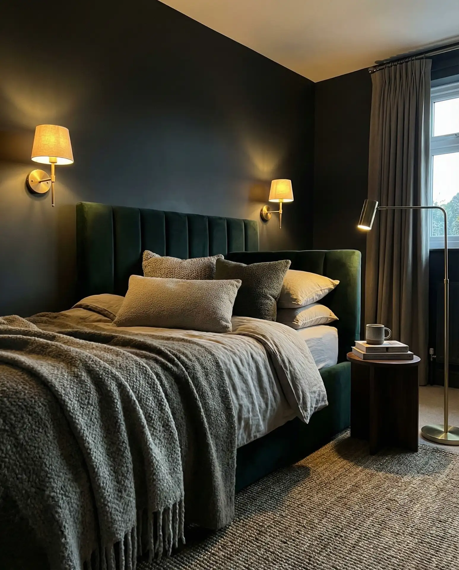
Where it works best: Rooms with south- or west-facing windows that receive strong afternoon sun. The natural light keeps the space from feeling cave-like, while the deep color absorbs harshness during peak daylight hours. In northern climates where winter light is scarce, balance with warm white LED bulbs and reflective surfaces like mirrored nightstands to bounce light around the room.
2. Olive Green Sanctuary
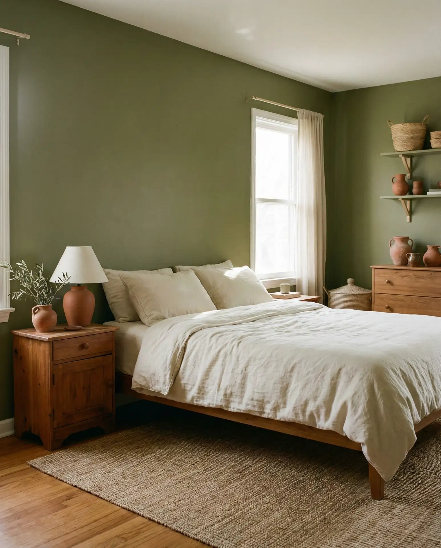
Muted green with earthy undertones creates a naturally cozy retreat that feels both grounded and refreshing. This sophisticated shade works beautifully in master bedroom spaces where you want a connection to nature without the brightness of traditional greens. Olive pairs effortlessly with warm woods, terracotta accents, and cream textiles for a Mediterranean-inspired aesthetic. The color is particularly effective in creating calm environments that promote restful sleep and relaxation. 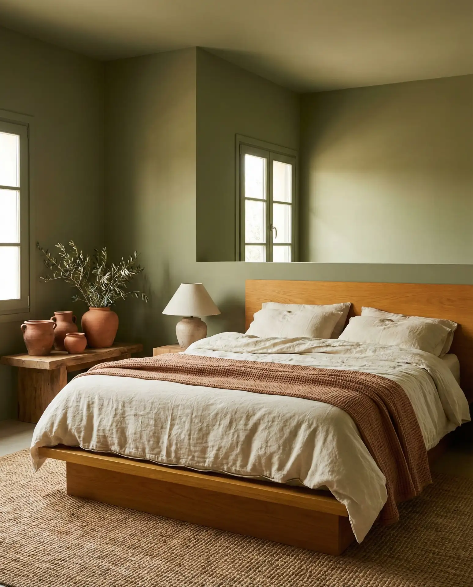
Where it works best: Rooms with abundant natural light, especially those facing east, where morning sun brings out the warmth in olive tones. In Pacific Northwest homes where gray skies dominate, olive green provides a grounding counterpoint that feels organic rather than fighting against the climate. Balance with plenty of warm metallics like aged brass or copper to enhance the earthy, collected quality.
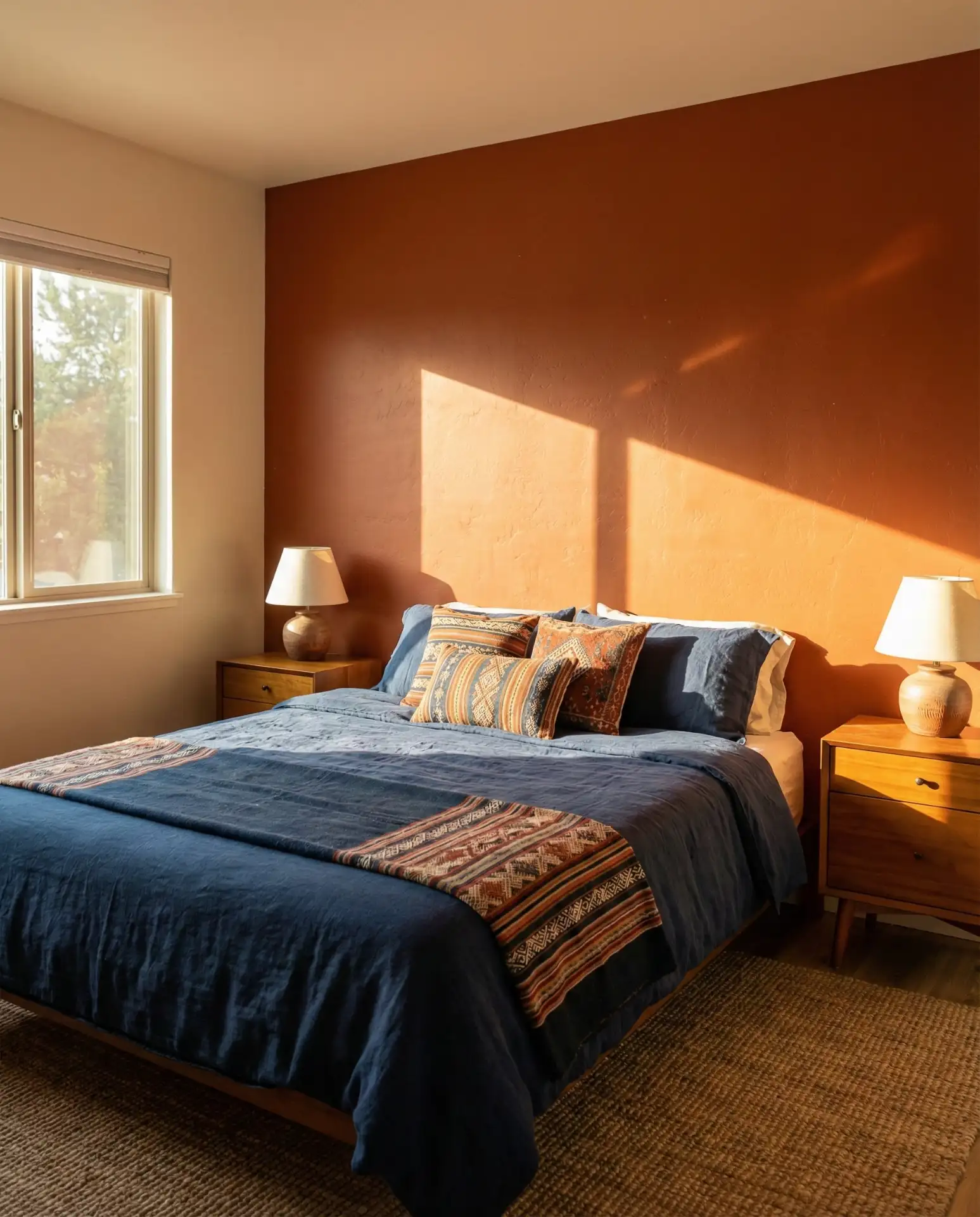
3. Warm Terracotta Glow
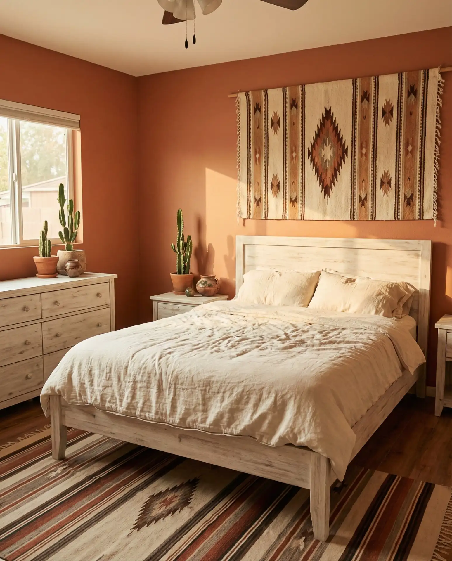
Terracotta brings western warmth and earthy richness that feels both grounded and adventurous. This brown-toned orange creates a sunset-like ambiance, especially when paired with whitewashed wood furniture and woven textiles. The shade flatters a variety of skin tones in photographs, making it popular among Pinterest users who style their homes with social media in mind. Layer in cream accents and black iron fixtures for a balanced, collected-over-time aesthetic. 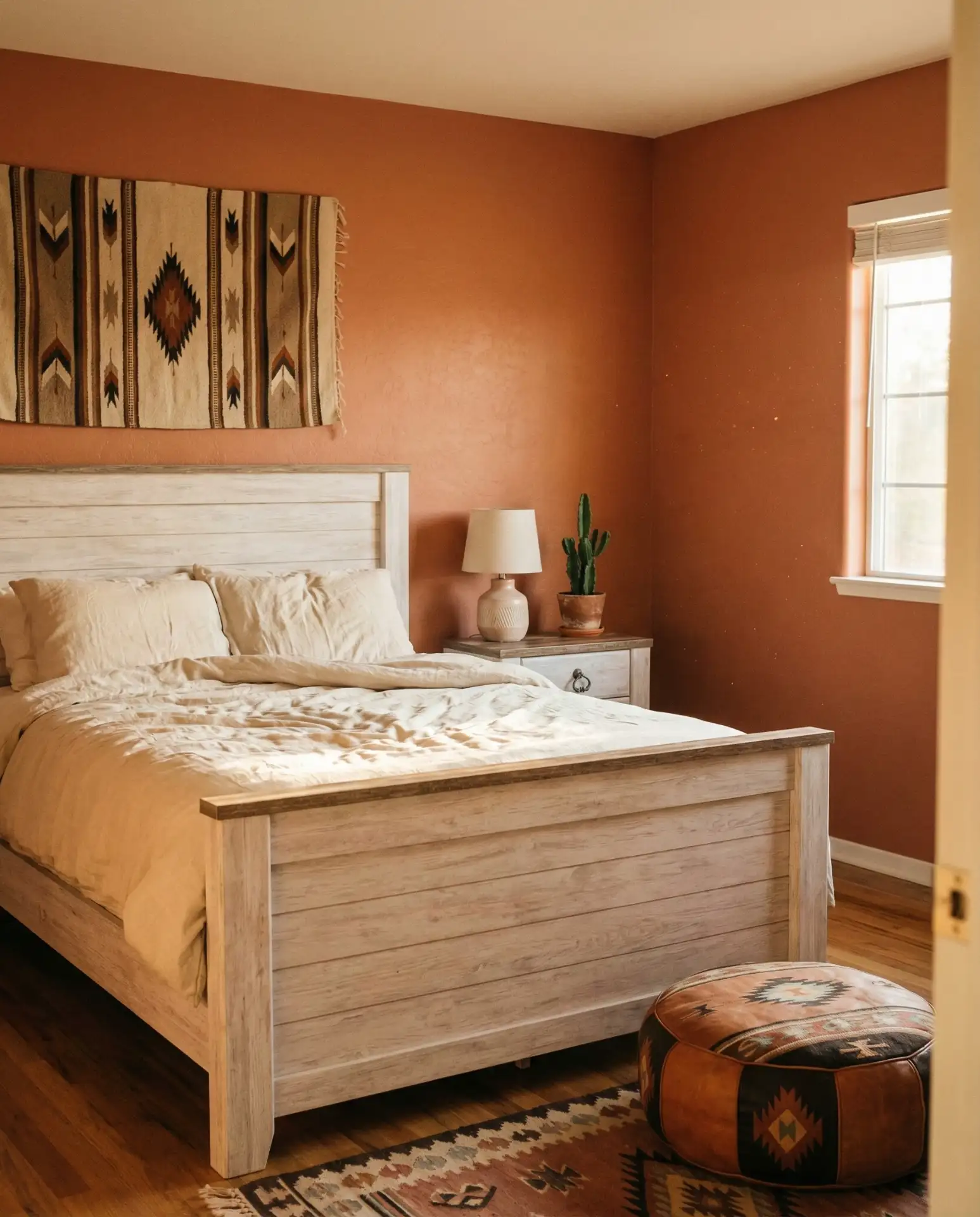
Budget consideration: Mid-tier paint brands like Behr offer excellent terracotta shades at $30–$40 per gallon, often requiring just two coats over a primer. For a standard 12×14 bedroom, expect to spend around $100 on paint, making this transformation surprisingly affordable compared to wallpaper or architectural changes.
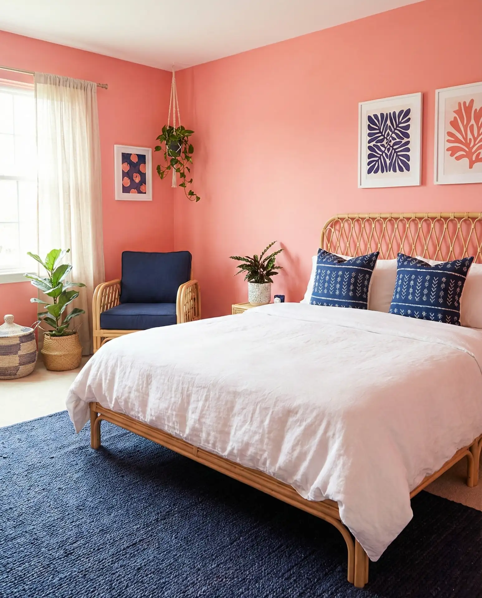
4. Soft Blush Romance

Delicate pink tones create an undeniably romantic atmosphere without veering into overly sweet territory. Modern blush shades have gray or beige undertones that read sophisticated rather than juvenile, making them appropriate for adult bedrooms. This color works beautifully with gold hardware, marble-topped nightstands, and charcoal gray accent furniture. It’s particularly stunning in bedrooms with high ceilings, where the softness prevents the space from feeling cold or cavernous. 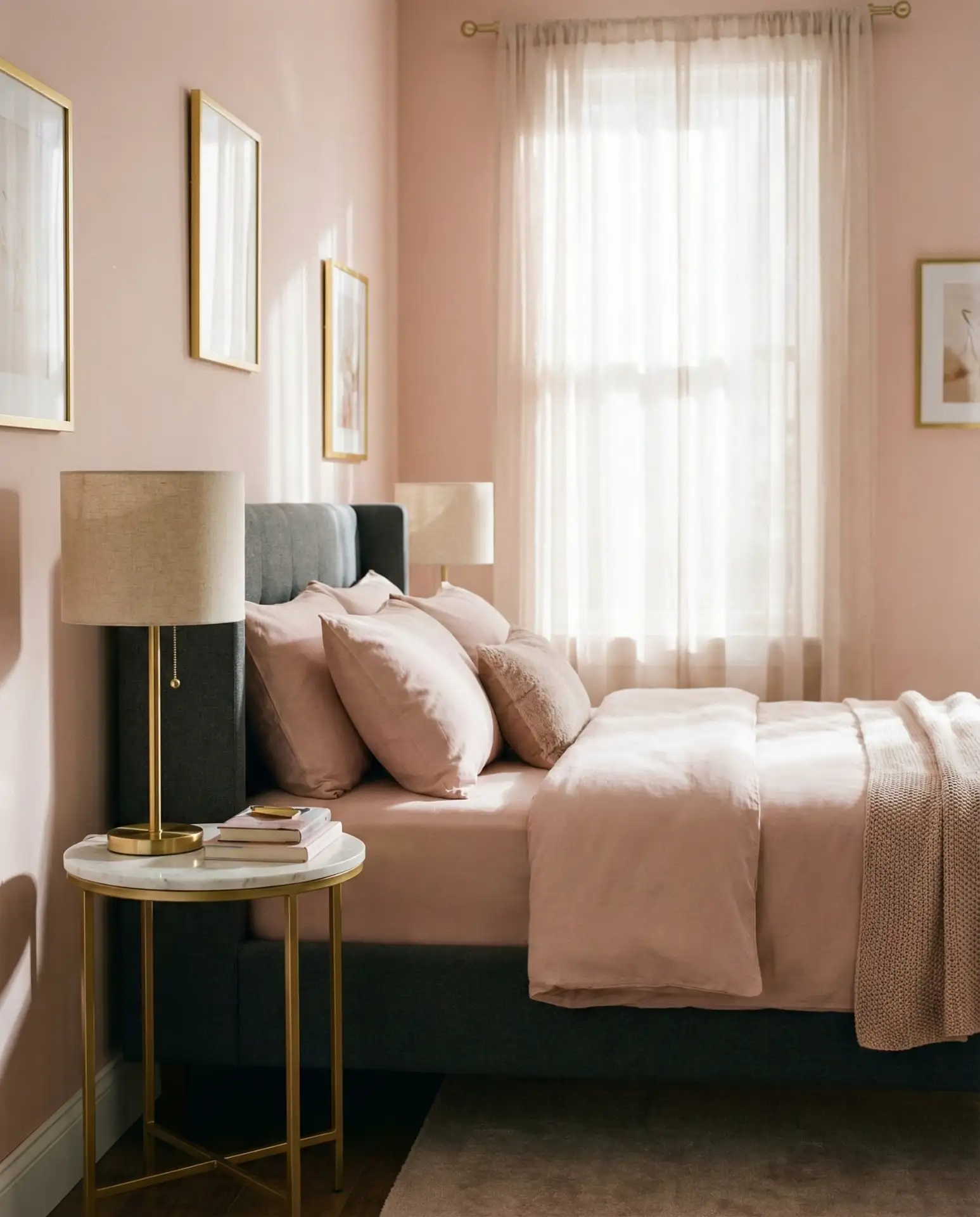
Common mistake: Pairing blush with too many white elements, which can make the room feel washed out. Instead, ground the palette with deeper neutrals like taupe, charcoal, or even navy blue in throw pillows and artwork frames. This creates visual weight and prevents the space from appearing too airy or one-dimensional.
5. Navy Blue Sophistication

Rich blue walls offer timeless elegance with a surprisingly cozy feel once the sun sets. Navy reads as a neutral in modern interiors, pairing effortlessly with brass, leather, and crisp white linens. This shade is ideal for master bedroom spaces where you want to create a hotel-like retreat. Consider a matte finish to absorb light and enhance the enveloping quality, or opt for a subtle sheen in rooms with limited natural light. 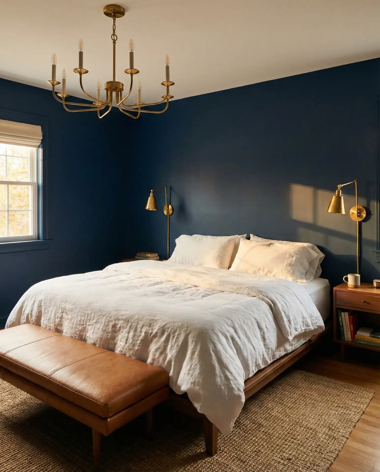
In coastal Massachusetts homes, navy bedrooms are increasingly popular as they echo maritime heritage while feeling completely current. Homeowners pair them with weathered wood furniture and rope-wrapped mirrors for a coastal vibe that doesn’t rely on literal beach décor.
6. Creamy White with Texture
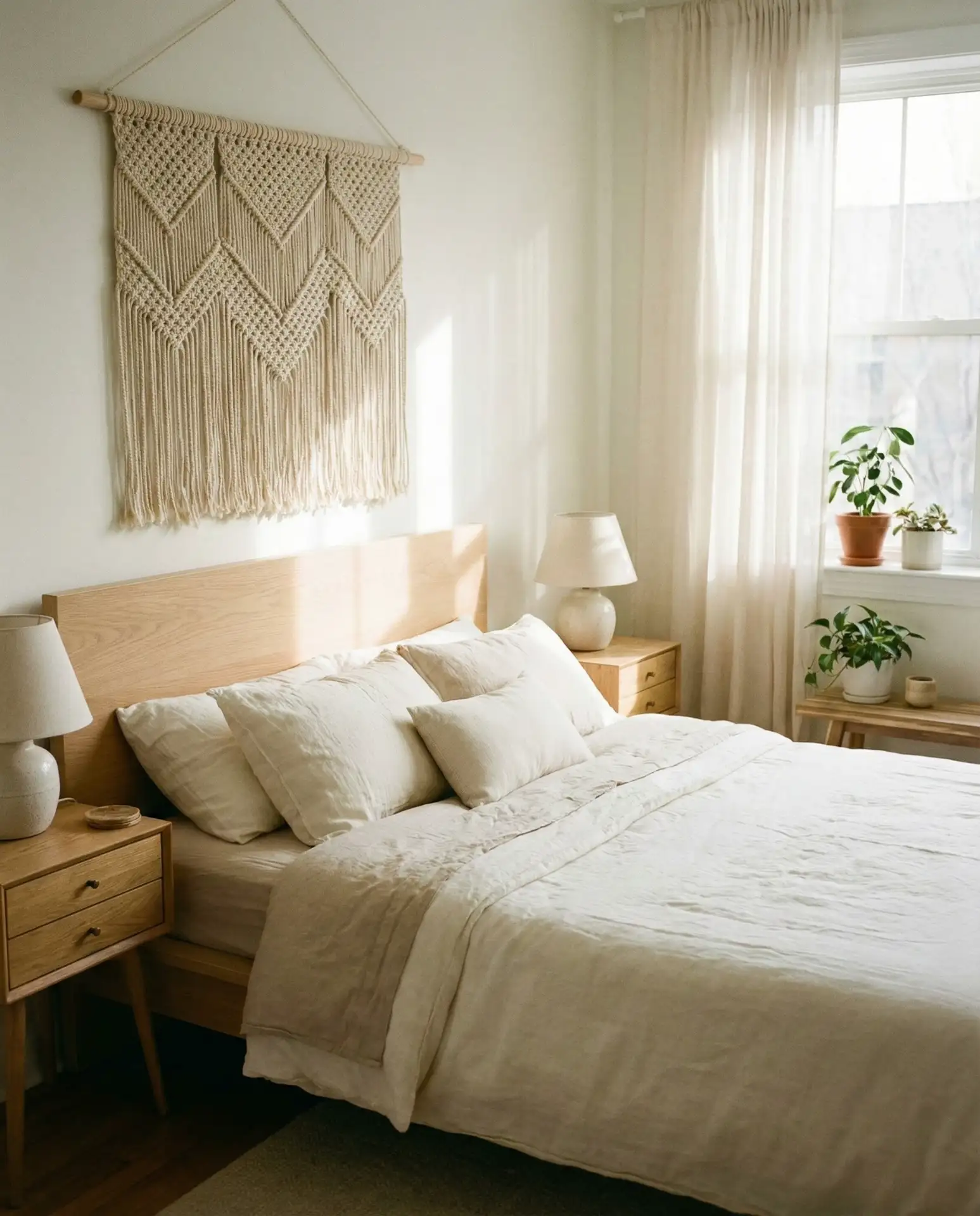
Warm white shades create the perfect backdrop for layered textures and ever-changing décor styles. Unlike stark white, creamy tones have subtle yellow or beige undertones that prevent the space from feeling clinical. This approach is essential in guest bedrooms where you want a canvas that accommodates various tastes. Add dimension through woven wall hangings, linen drapery, and chunky knit throws rather than relying solely on paint for visual interest. 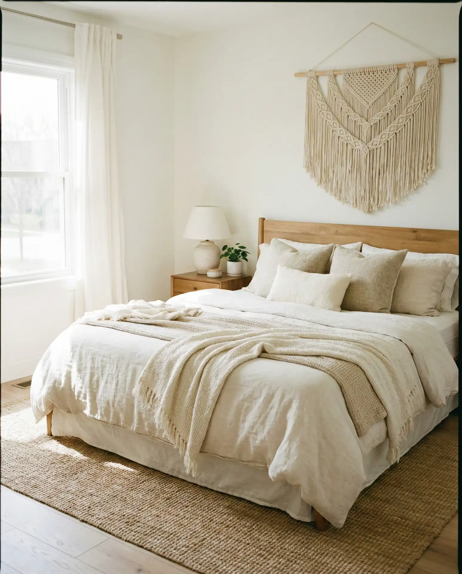
Expert insight: When choosing white paint, test samples on all four walls at different times of day. What looks perfect in morning light might appear too yellow or too blue in afternoon sun. Benjamin Moore’s “Swiss Coffee” and “White Dove” are reliable starting points that adapt well to changing light conditions throughout the day.
7. Forest Green Drama
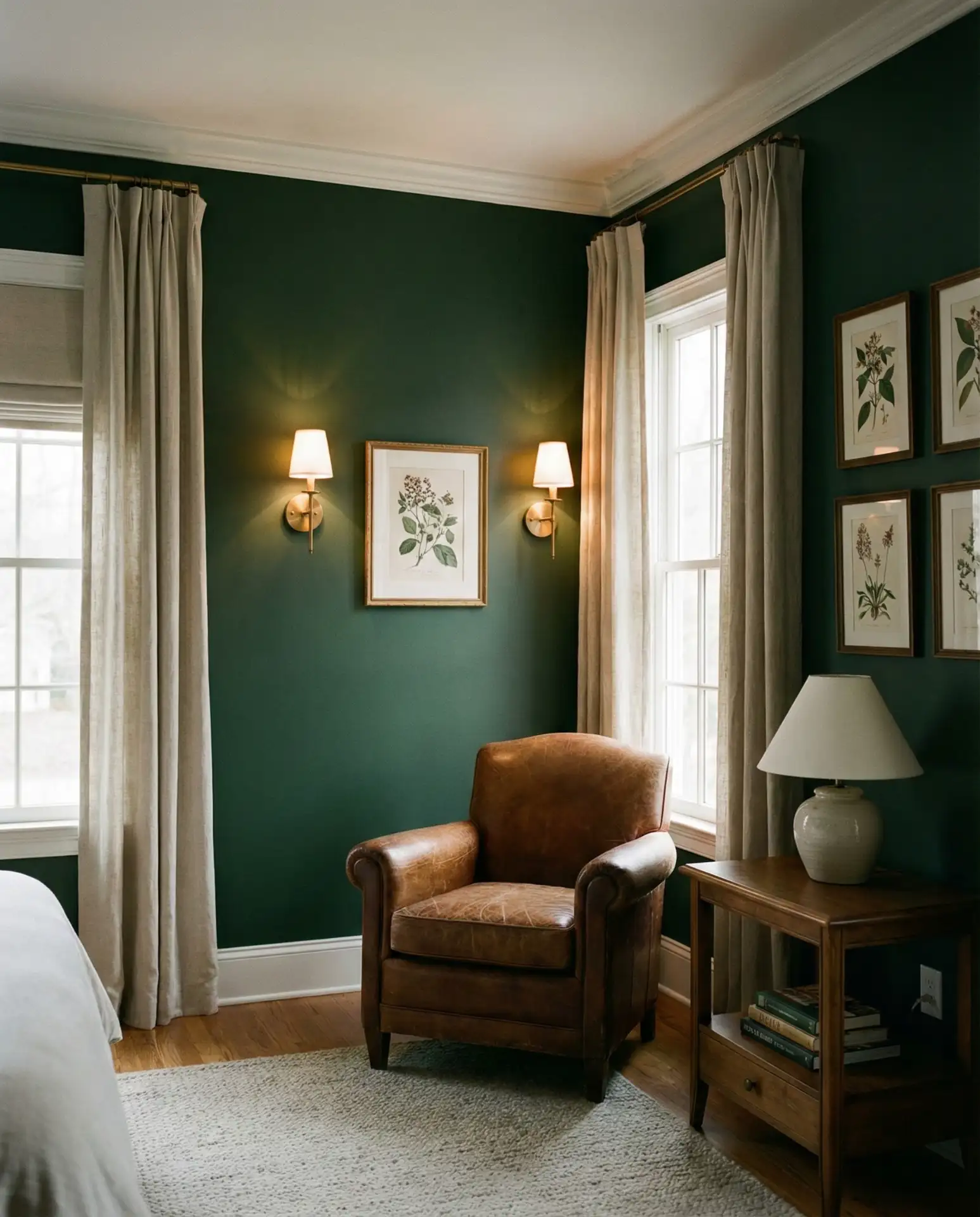
Deep green creates instant drama while maintaining a connection to nature that feels grounding rather than overwhelming. This shade works exceptionally well in bedrooms with architectural details like crown molding or wainscoting, which it highlights beautifully. Pair with aged brass fixtures, cognac leather accents, and plenty of greenery to create a library-like retreat. The color is particularly effective in luxury homes where bold choices are celebrated. 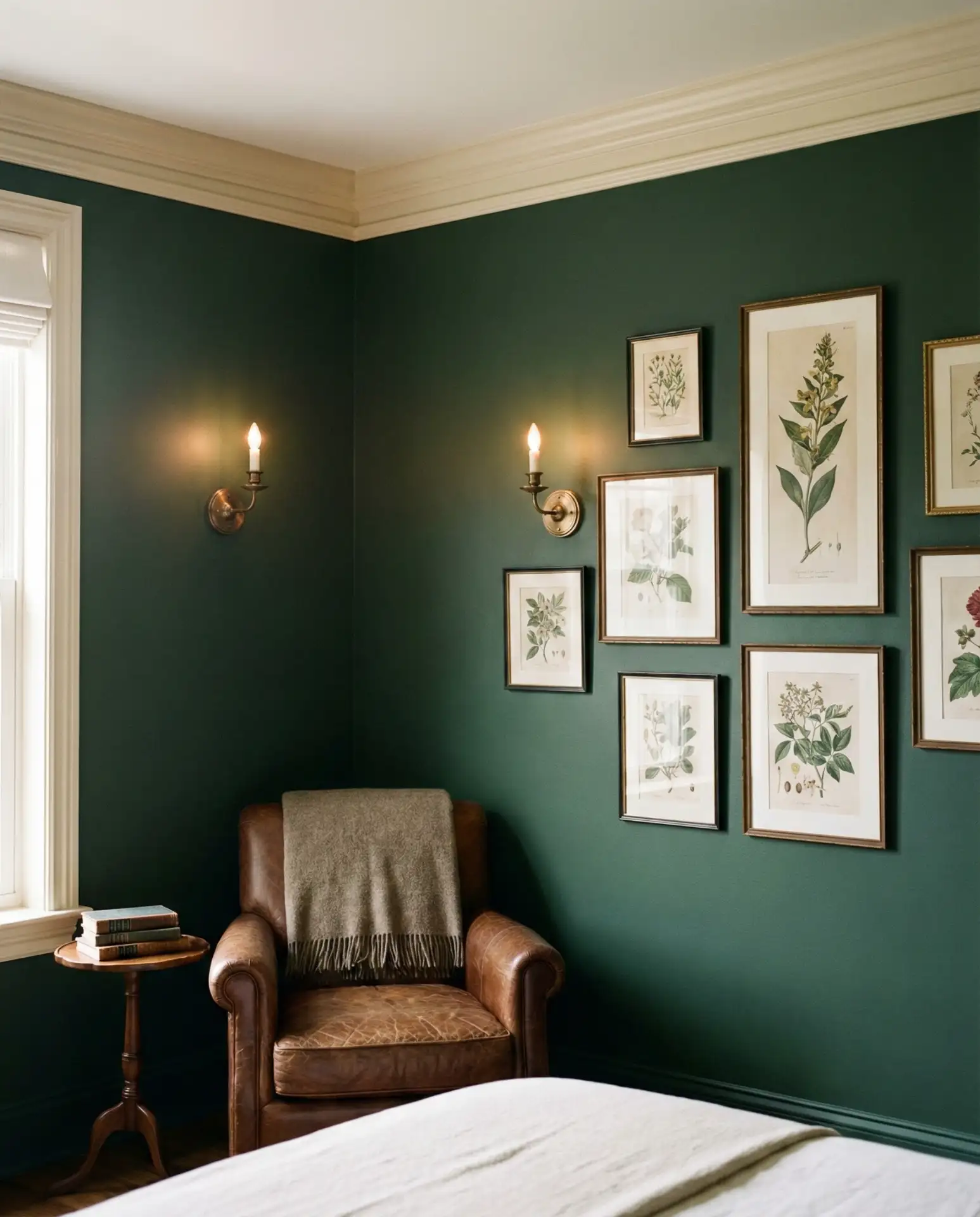
Where it works best: Rooms with at least one large window and high ceilings above 9 feet. The darkness can make standard 8-foot ceilings feel lower, but with proper vertical space, forest green creates an intimate yet spacious feel. Balance with lighter flooring in oak or whitewashed pine to prevent heaviness.
8. Soft Gray Minimalism
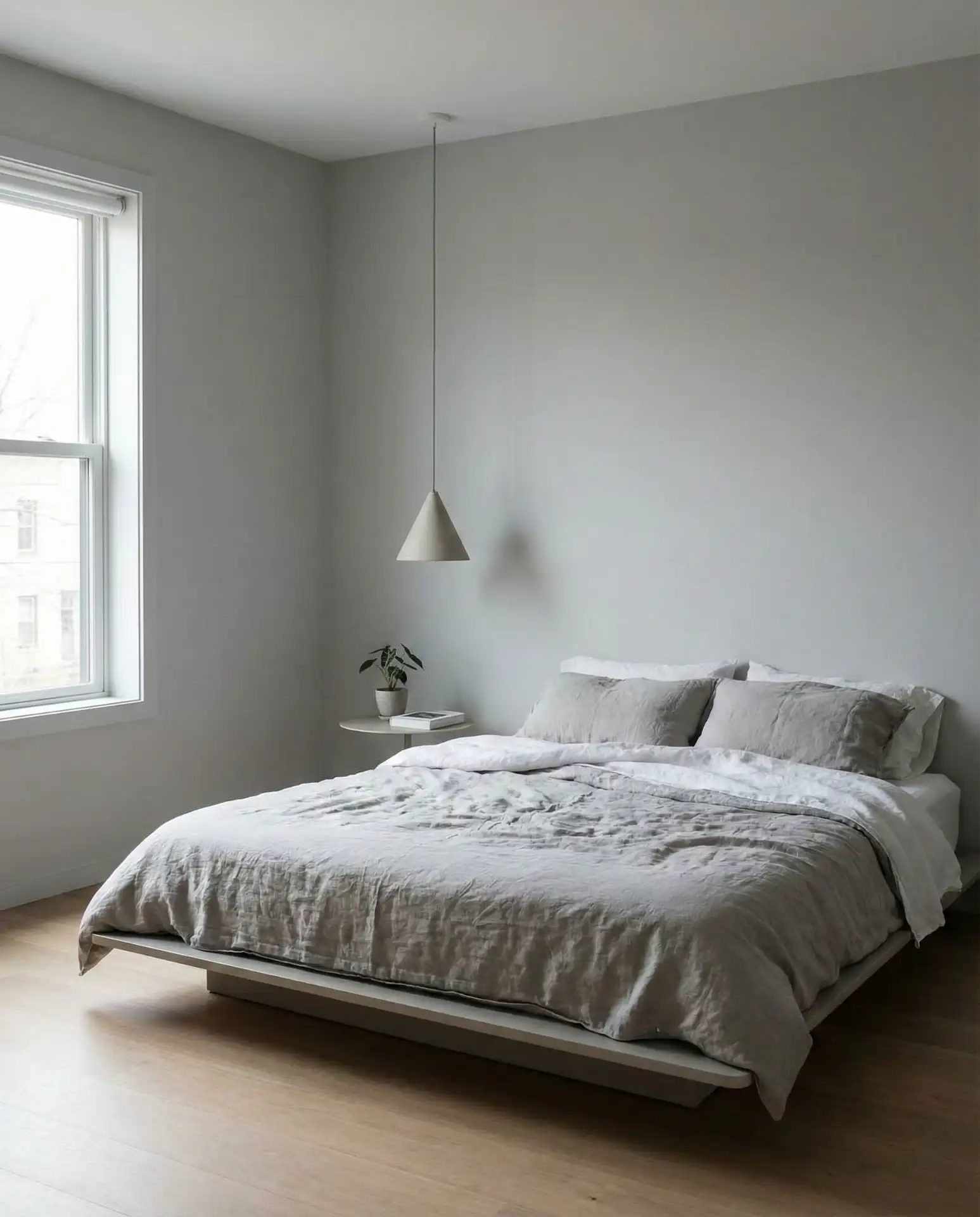
Grey remains a go-to choice for its versatility and calm presence in spaces meant for rest. Modern grays lean warm rather than cool, with greige undertones that prevent the stark institutional feel of older gray palettes. This neutral works beautifully in open-concept homes where the bedroom flows visually into hallways or sitting areas. Keep furniture lines clean and accessories minimal to let the subtle paint color shine without competing elements. 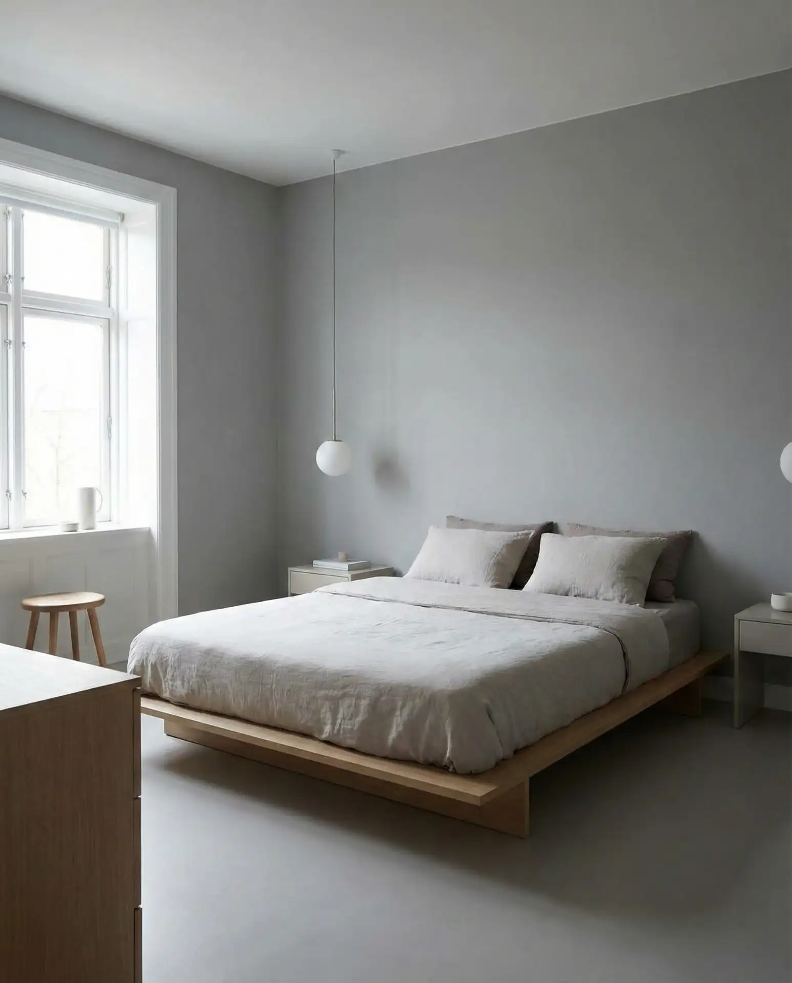
Real homeowner behavior: Many people choose gray, thinking it’s foolproof, then struggle with it feeling cold. The fix is simple—add warm wood tones through furniture and flooring, incorporate textiles in warmer neutrals like oatmeal and camel, and ensure lighting has a warm color temperature (2700K–3000K) rather than cool daylight bulbs.
9. Dusty Mauve Elegance
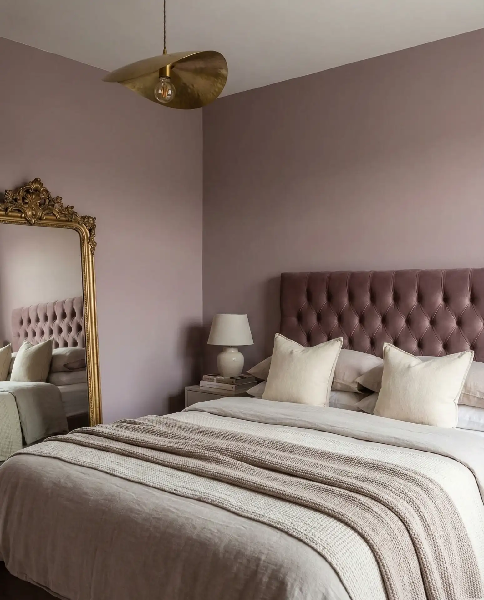
This muted purple-pink hybrid brings unexpected sophistication to bedrooms seeking something beyond beige. Dusty mauve pairs beautifully with both warm and cool accent colors, making it remarkably adaptable as your style evolves. The shade has enough color to feel intentional while remaining subtle enough for long-term livability. It’s an excellent choice for aesthetic bedrooms styled for Pinterest, where uniqueness matters but trendiness should be avoided. 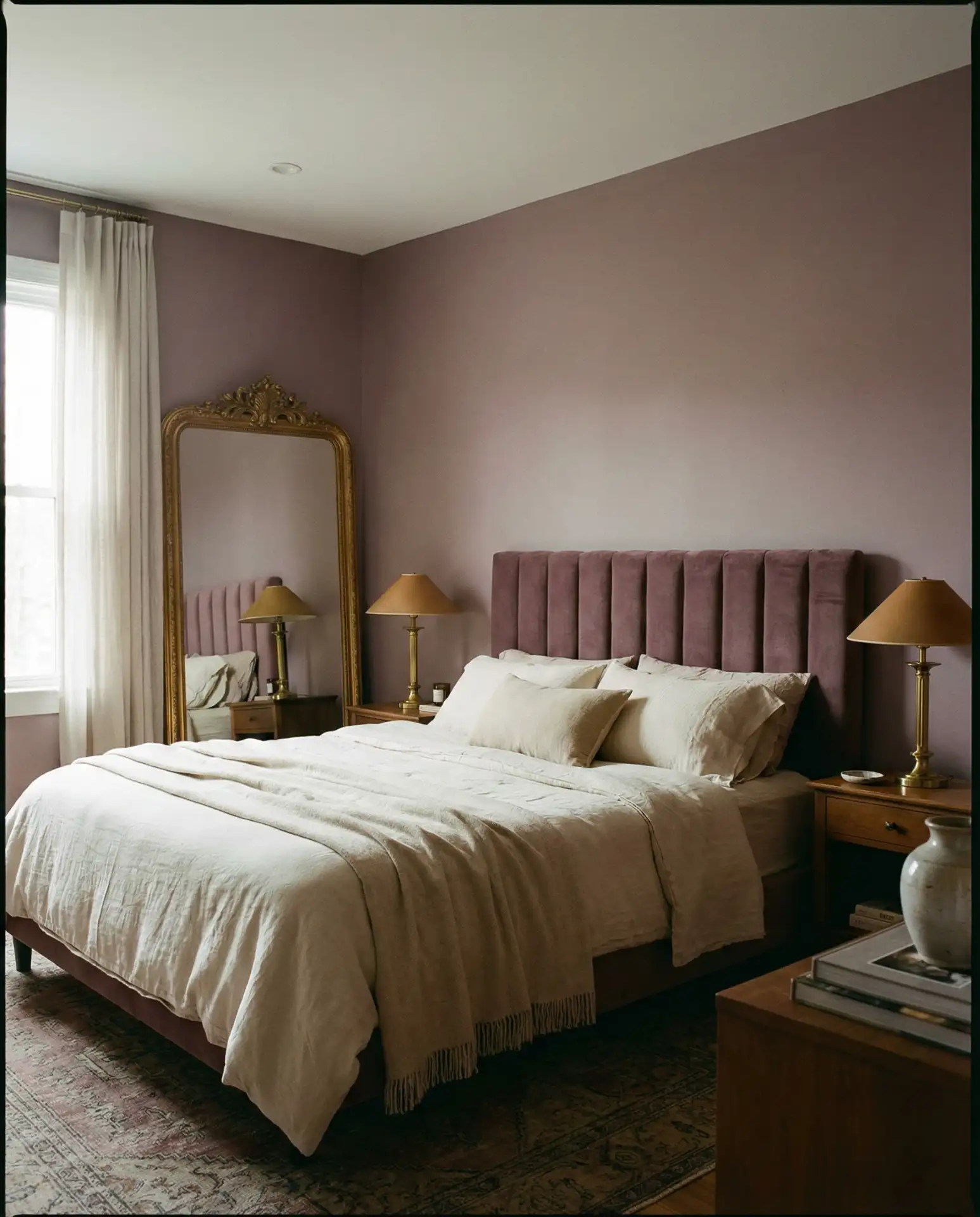
Practical insight: Mauve can shift dramatically based on your room’s light exposure. In north-facing rooms, it may read more gray-purple, while in west-facing spaces with warm afternoon light, the pink undertones emerge. Always test a large swatch (at least 2×2 feet) before committing to the full room.
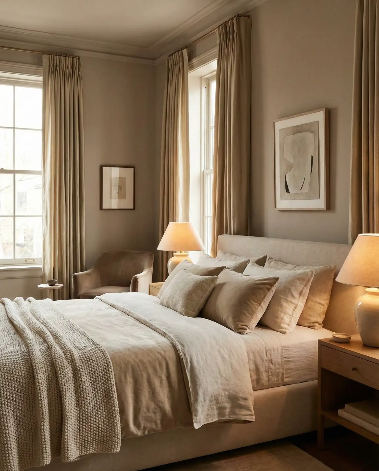
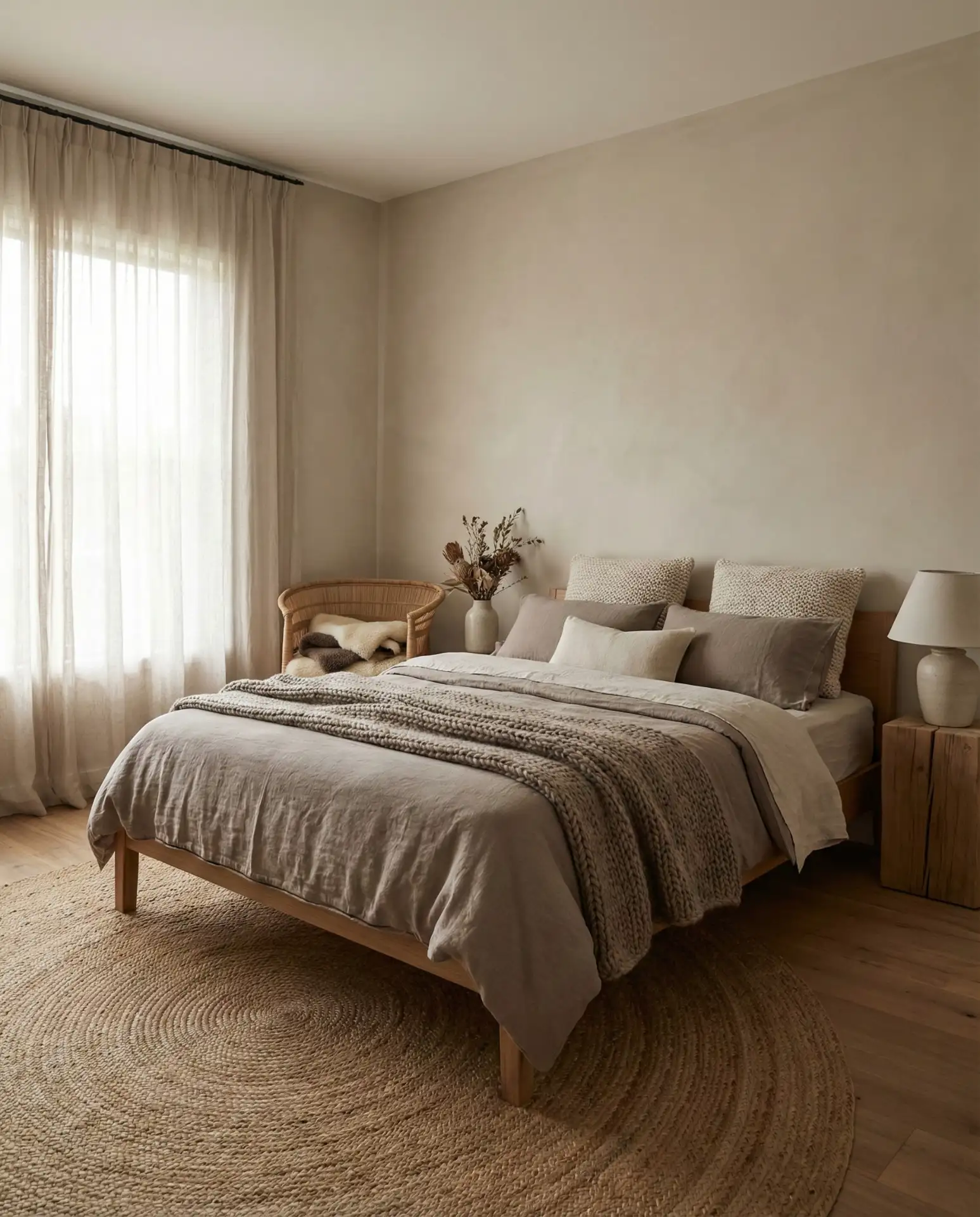
10. Warm Beige Foundation
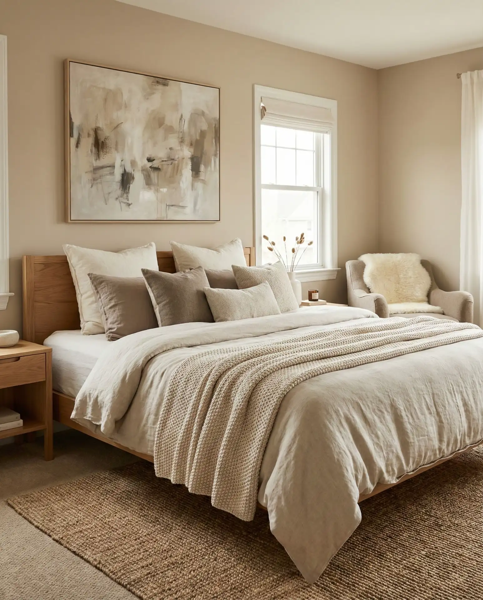
Beige has shed its boring reputation, emerging as a sophisticated neutral palette staple that works in virtually any home style. Modern beiges have complex undertones—hints of pink, gray, or green—that create depth rather than flatness. This color provides the perfect backdrop for bold artwork, colorful textiles, or a rotating seasonal décor scheme. It’s particularly valuable in master bedroom spaces shared by partners with different style preferences. 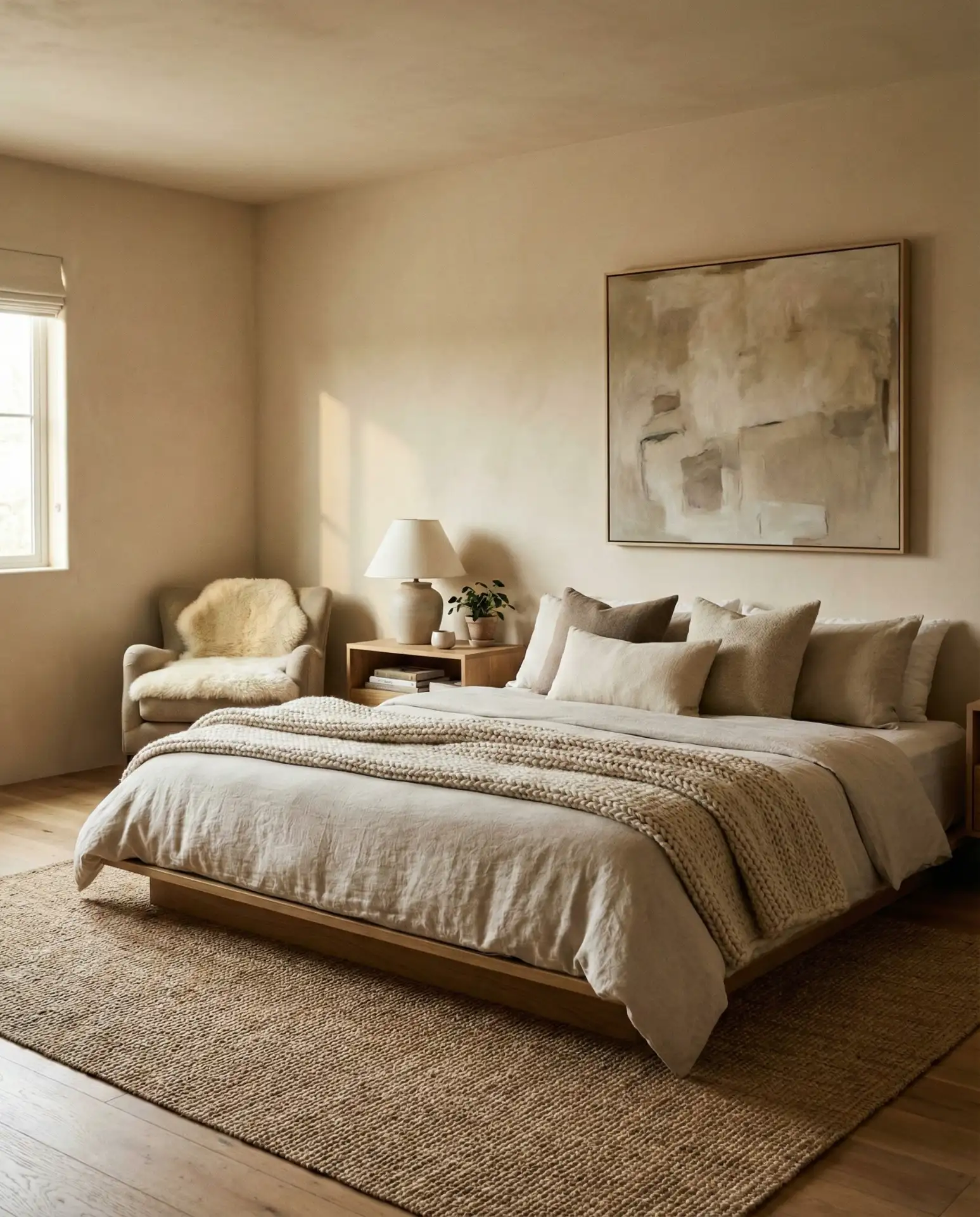
Budget angle: Beige paint is widely available across all price points, from premium Benjamin Moore at $75 per gallon down to budget-friendly options at $25. For renters or budget-conscious homeowners, this ubiquity means easy color matching for touch-ups and the flexibility to start with a cheaper brand, knowing you can upgrade later without a noticeable difference.
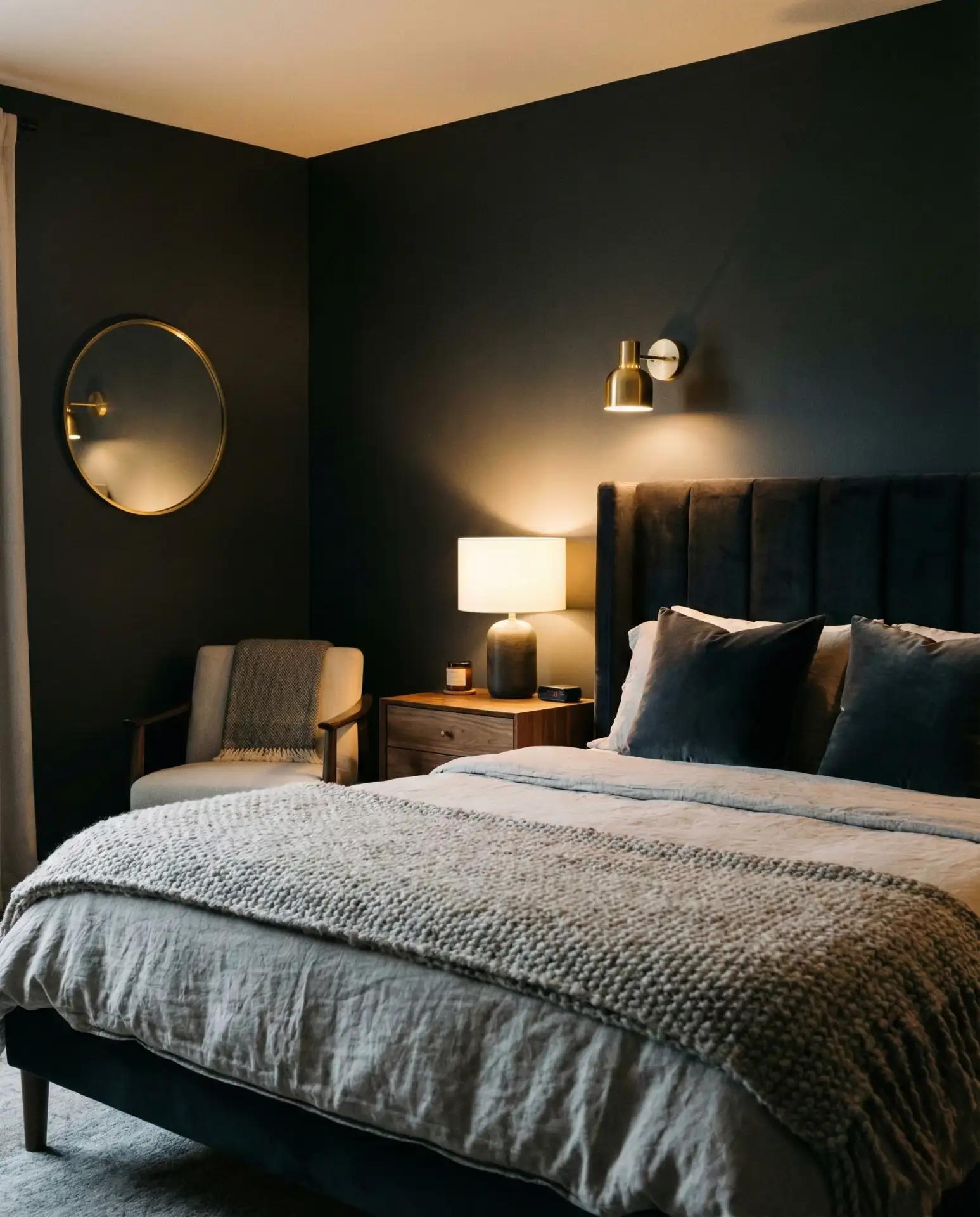
11. Midnight Black Statement
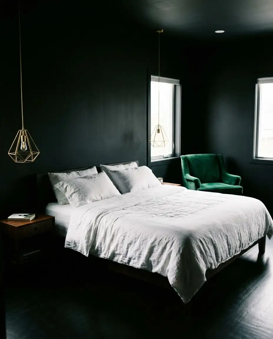
True black walls create the ultimate moody retreat, turning bedrooms into dramatic sanctuaries that feel worlds away from everyday life. This bold choice requires commitment but delivers unmatched impact, especially when combined with warm metallics and rich jewel tones. Black absorbs imperfections in wall surfaces better than lighter colors, making it surprisingly forgiving in older homes. Consider a matte finish to avoid harsh reflections, or go with high-gloss for a luxury lacquered look. 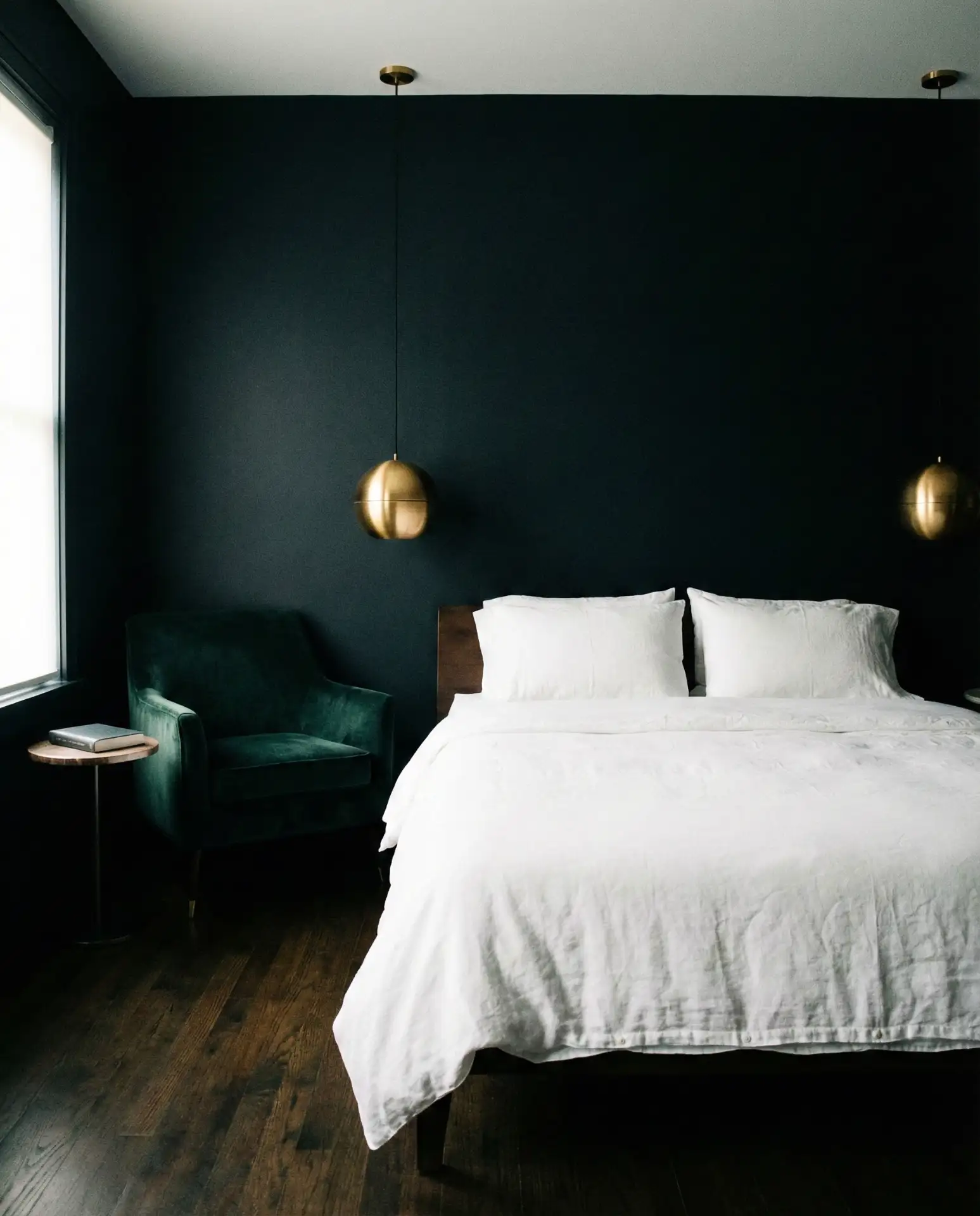
Common mistake: Forgetting that black shows dust, fingerprints, and scuffs more than any other color. Combat this by choosing a paint with a built-in primer for better durability, keeping a small container for touch-ups, and using darker bedding and furniture that won’t show transferred marks. Despite the maintenance, the visual impact remains unmatched.
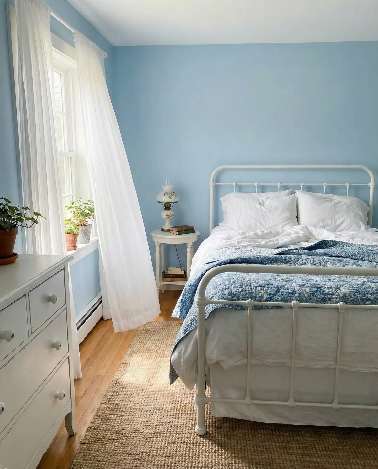
12. Powder Blue Tranquility
Soft blue creates an instantly calm environment reminiscent of clear skies and gentle waters. This shade works beautifully in cottage-style bedrooms where a relaxed, unpretentious vibe is desired. Pair with white or natural wood furniture, vintage textiles, and casual layered bedding for an effortless look. The color also excels in children’s rooms that need to transition gracefully as kids grow, remaining appropriate from toddler to teen years. 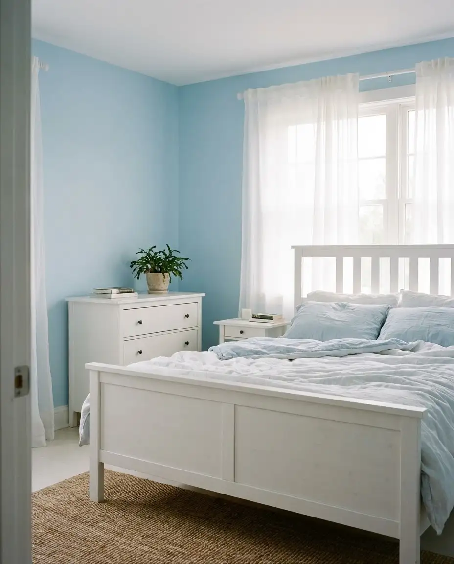
A friend converted her formal guest room to powder blue during the pandemic and noticed visitors immediately relaxed upon entering—the color shift changed the entire energy of the space. She now keeps the room intentionally minimal, letting the soothing wall color do the heavy lifting rather than cluttering it with unnecessary décor.
13. Burnt Orange Warmth
This earthy orange brings immediate warmth and energy without the intensity of true red. Burnt orange works exceptionally well in west-facing bedrooms, where it amplifies the gorgeous golden hour light. The shade pairs surprisingly well with navy, forest green, and deep plum for a collected, globally inspired aesthetic. Consider using it on a single accent wall if full-room color feels too bold, maintaining neutral palette tones elsewhere. 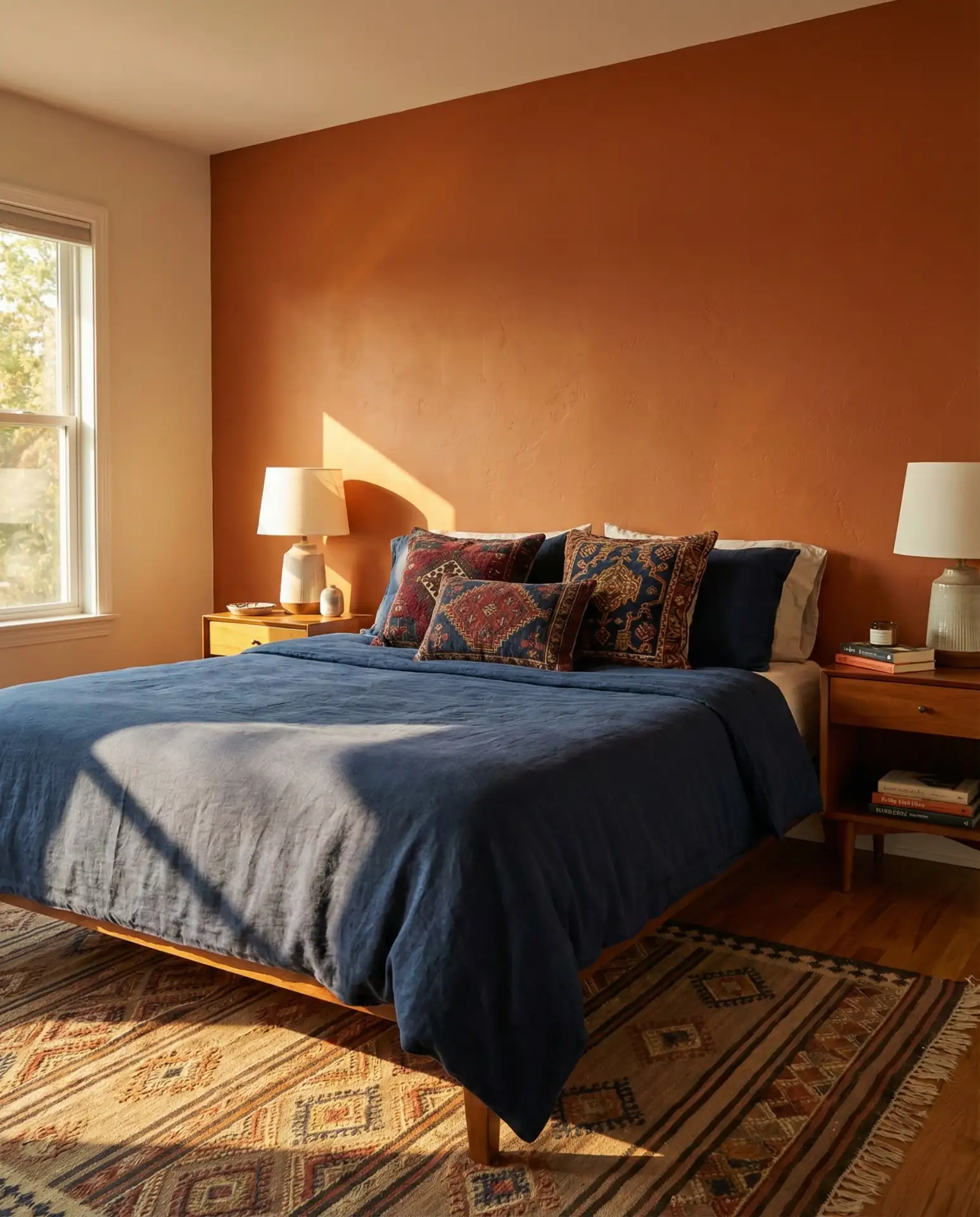
Where it works best: Rooms with strong architectural features like exposed beams or brick walls that can handle a bold color without competing. In newer construction with plain walls, balance the intensity with substantial furniture pieces and layered textures that add visual weight to match the paint’s presence.
14. Lavender Dreamscape

Soft lavender creates a romantic and slightly whimsical atmosphere perfect for bedrooms meant to inspire creativity and rest. This purple-pink hybrid works beautifully with both silver and gold metallics, making it remarkably versatile. The color has natural calming properties associated with the lavender plant itself, making it ideal for spaces dedicated to sleep and relaxation. Pair with white or gray furniture to keep the look grounded and avoid an overly sweet result. 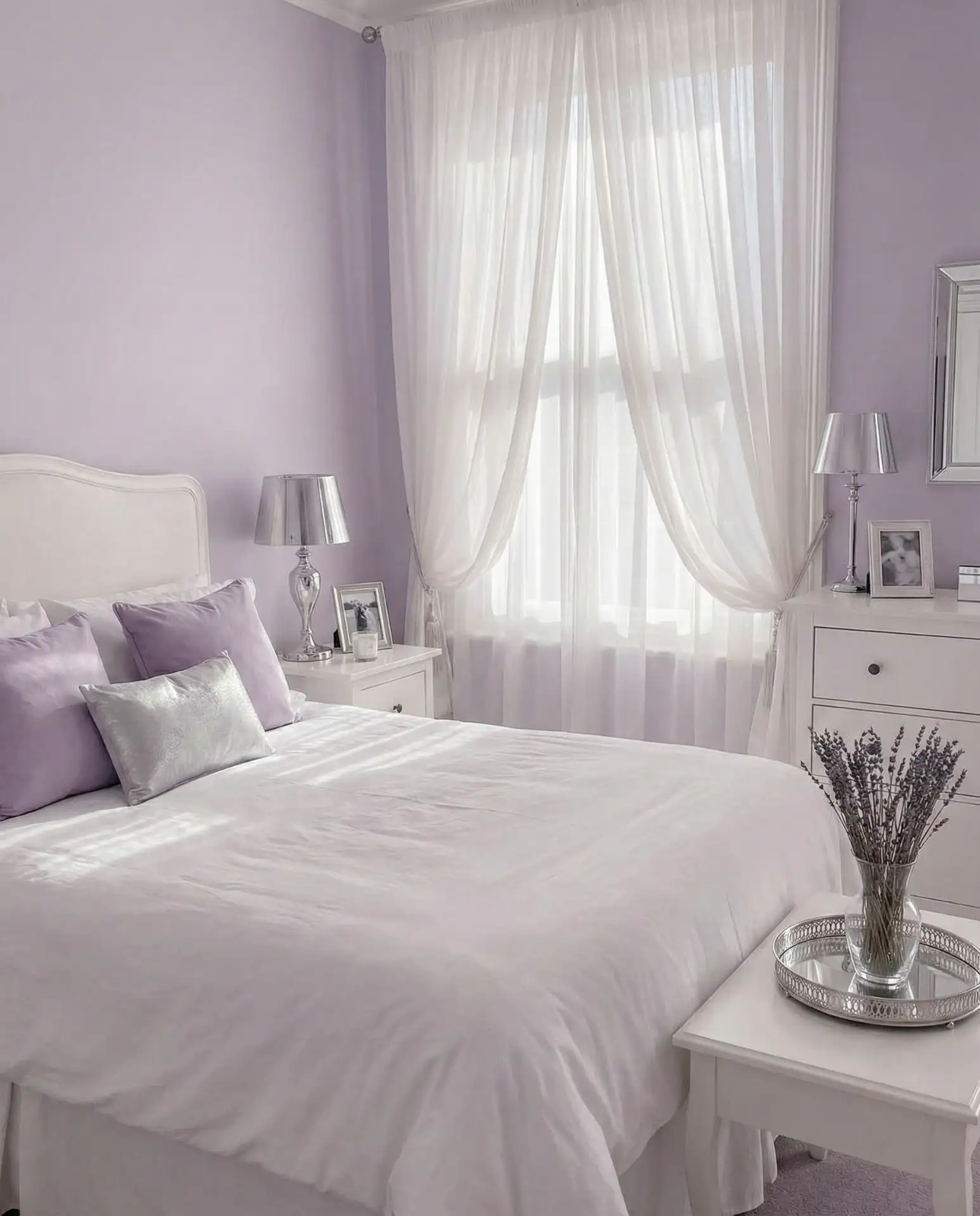
Expert commentary: Lavender can read quite differently depending on the paint brand’s undertones. Sherwin Williams tends toward more purple-leaning lavenders, while some formulations skew pinker. Request tester pots from multiple brands even if the color names sound similar—the actual result can vary significantly, and this small investment prevents costly repainting.
15. Taupe Sophistication
This gray-brown hybrid delivers warmth without reading as definitively brown or gray, making it the ultimate diplomatic neutral palette choice. Taupe works across design styles from traditional to contemporary, providing a sophisticated backdrop that ages well as trends shift. The color is particularly effective in master bedroom suites where elegance matters but the space shouldn’t feel overly designed. Layer in cream, charcoal, and soft metallics for a cohesive, curated look. 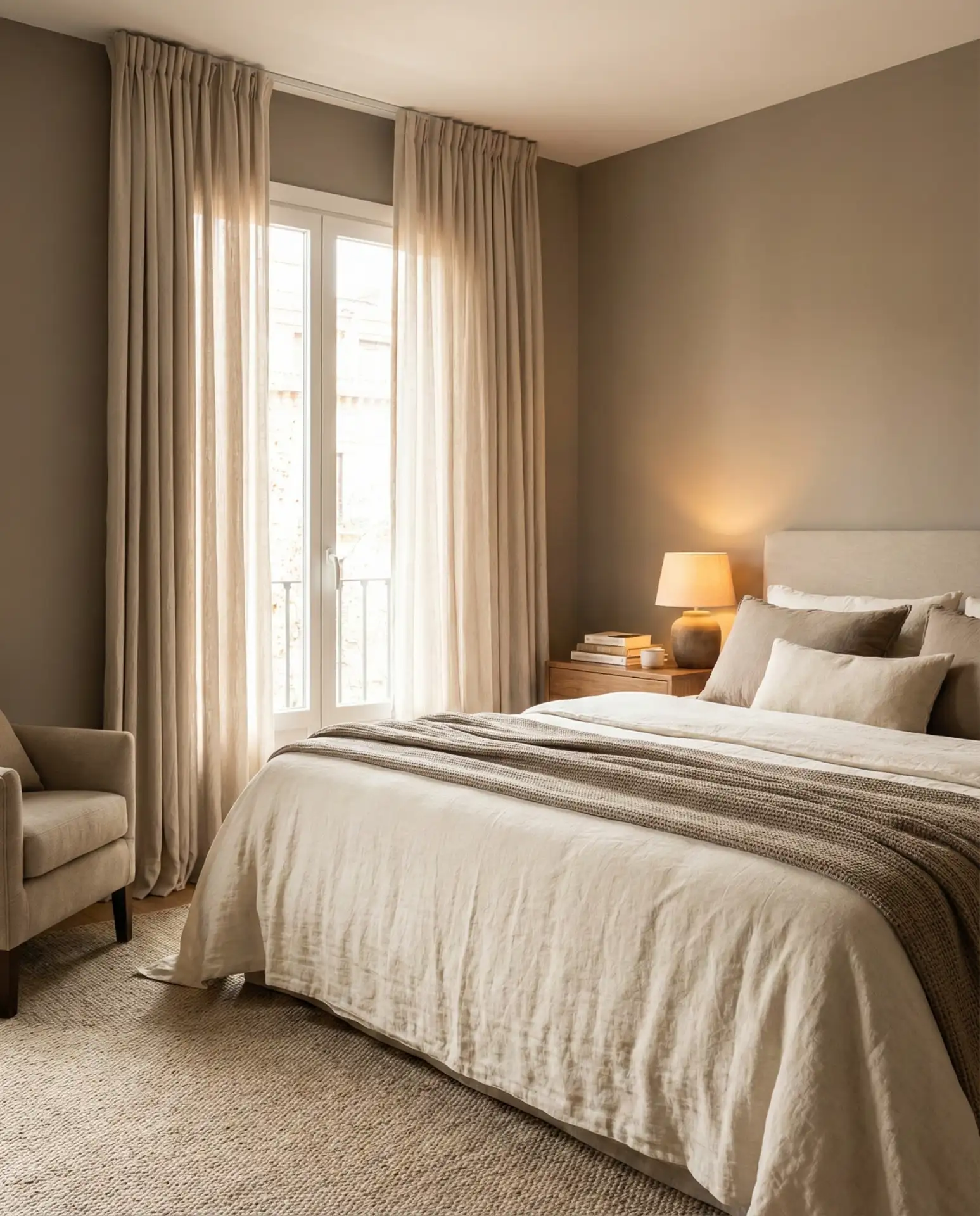
Real homeowner behavior: Taupe is the color people choose when they can’t decide between gray and beige—and that indecision actually creates the perfect middle ground. Homeowners report high satisfaction because it complements existing furniture, whether your pieces lean warm or cool, eliminating the need to replace everything when updating just the walls.
16. Aqua Coastal Breeze
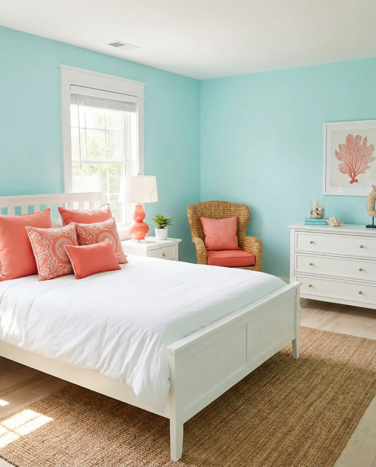
Bright aqua brings coastal energy and playful sophistication to bedrooms seeking a vacation-like vibe. This blue-green hybrid evokes tropical waters and clear skies, creating an uplifting environment that combats seasonal blues. The shade pairs beautifully with white, coral, and natural rattan furniture for a classic beach house aesthetic. Consider balancing the brightness with deeper navy or chocolate brown accents to prevent the space from feeling too juvenile. 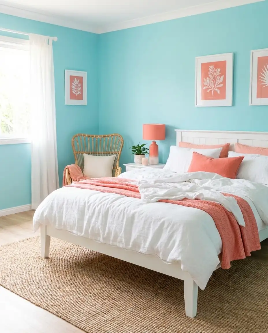
Practical consideration: Aqua can feel cold in rooms with limited natural light. Combat this by ensuring warm-toned lighting (avoid cool LED bulbs) and incorporating plenty of warm wood tones through flooring, furniture, or decorative elements. The contrast between cool walls and warm accents creates dynamic visual interest rather than temperature confusion.
17. Chocolate Brown Richness
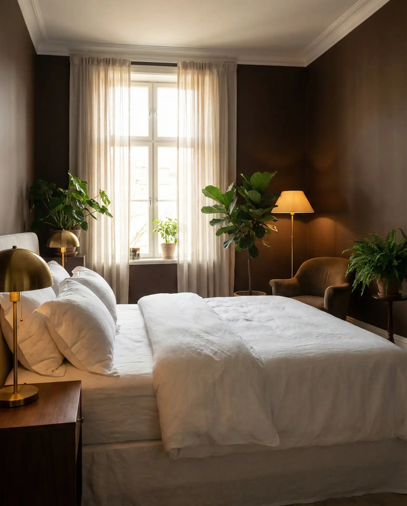
Deep brown walls create an enveloping, cozy atmosphere that feels both grounding and luxurious. This color works exceptionally well in bedrooms with plentiful natural light that prevents it from reading as too dark or oppressive. Pair with crisp white bedding, brass fixtures, and plenty of greenery to keep the space feeling fresh rather than heavy. The shade is particularly effective in creating luxury hotel vibes in master suites. 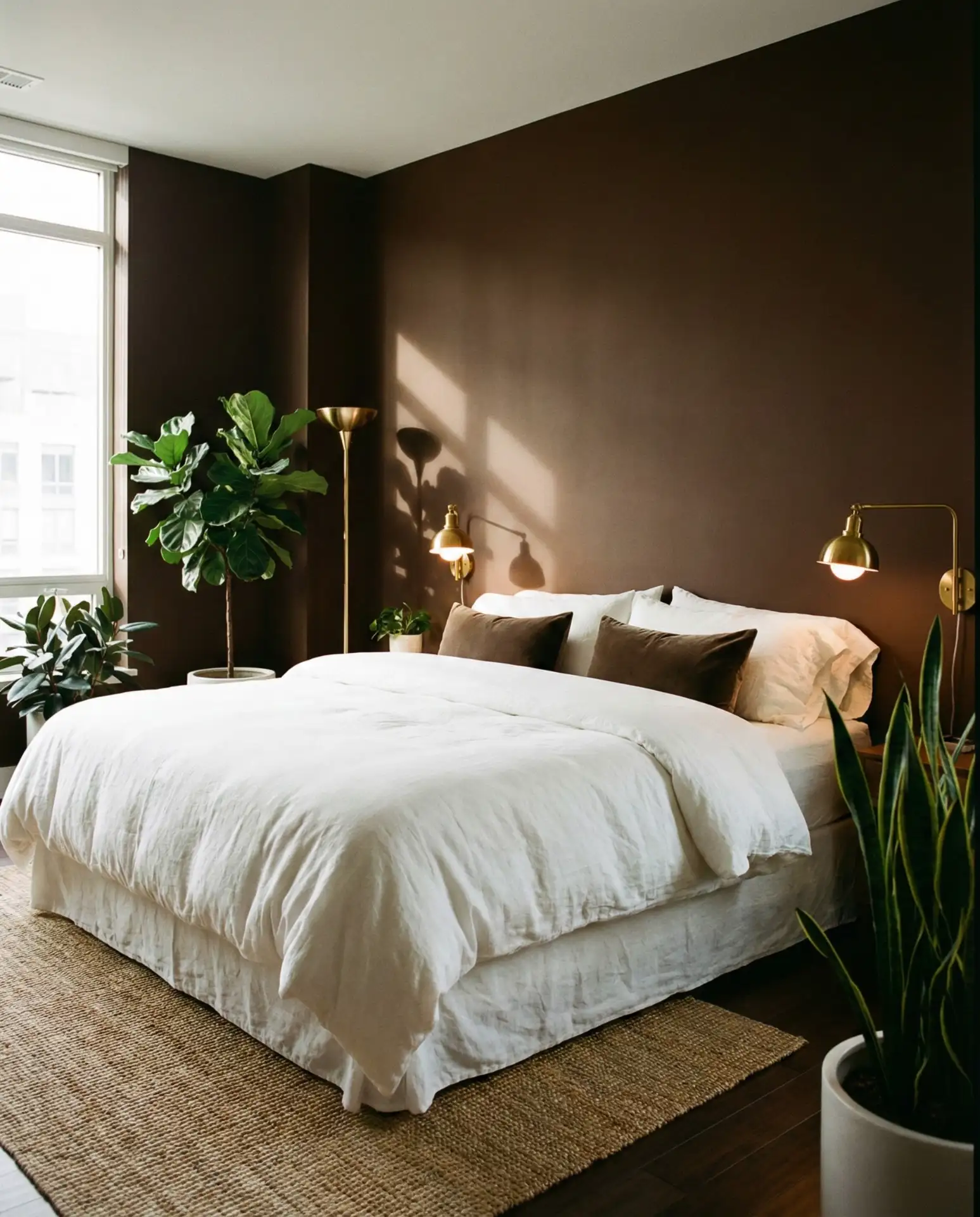
Where it works best: Bedrooms with large windows, especially those facing south or west where strong light needs taming. The dark walls absorb excessive brightness while creating an intimate feel. In apartments with limited light control, chocolate brown provides natural light management without the need for heavy curtains or blackout shades.
18. Pale Yellow Sunshine
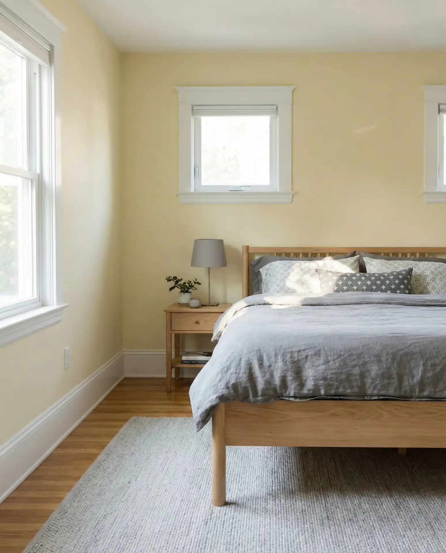
Soft butter yellow brings cheerfulness and warmth to bedrooms, particularly effective in spaces that struggle with natural light. This shade works beautifully in north-facing rooms where you want to compensate for cooler light throughout the day. The color pairs nicely with white trim, gray accents, and natural wood furniture for a fresh, cottage-inspired look. Avoid lemon or primary yellows, which can feel juvenile—stick with muted, creamy tones with slight gray undertones. 
A neighbor painted her basement bedroom pale yellow to combat the dungeon-like feeling of the small windows. The transformation was remarkable—the space immediately felt larger and more inviting, proving that color choice can overcome architectural limitations when thoughtfully applied. She paired it with plenty of mirrors to amplify the light-reflecting quality.
19. Slate Gray Modernity
This deeper grey brings a contemporary edge without the drama of black or the coldness of lighter grays. Slate works beautifully in room color ideas that aim for urban sophistication, pairing effortlessly with leather, metal, and glass elements. The color provides enough depth to hide wear and tear while remaining light enough to avoid feeling oppressive. Consider it for bedrooms in loft apartments or modern homes with industrial touches like exposed ductwork or concrete floors. 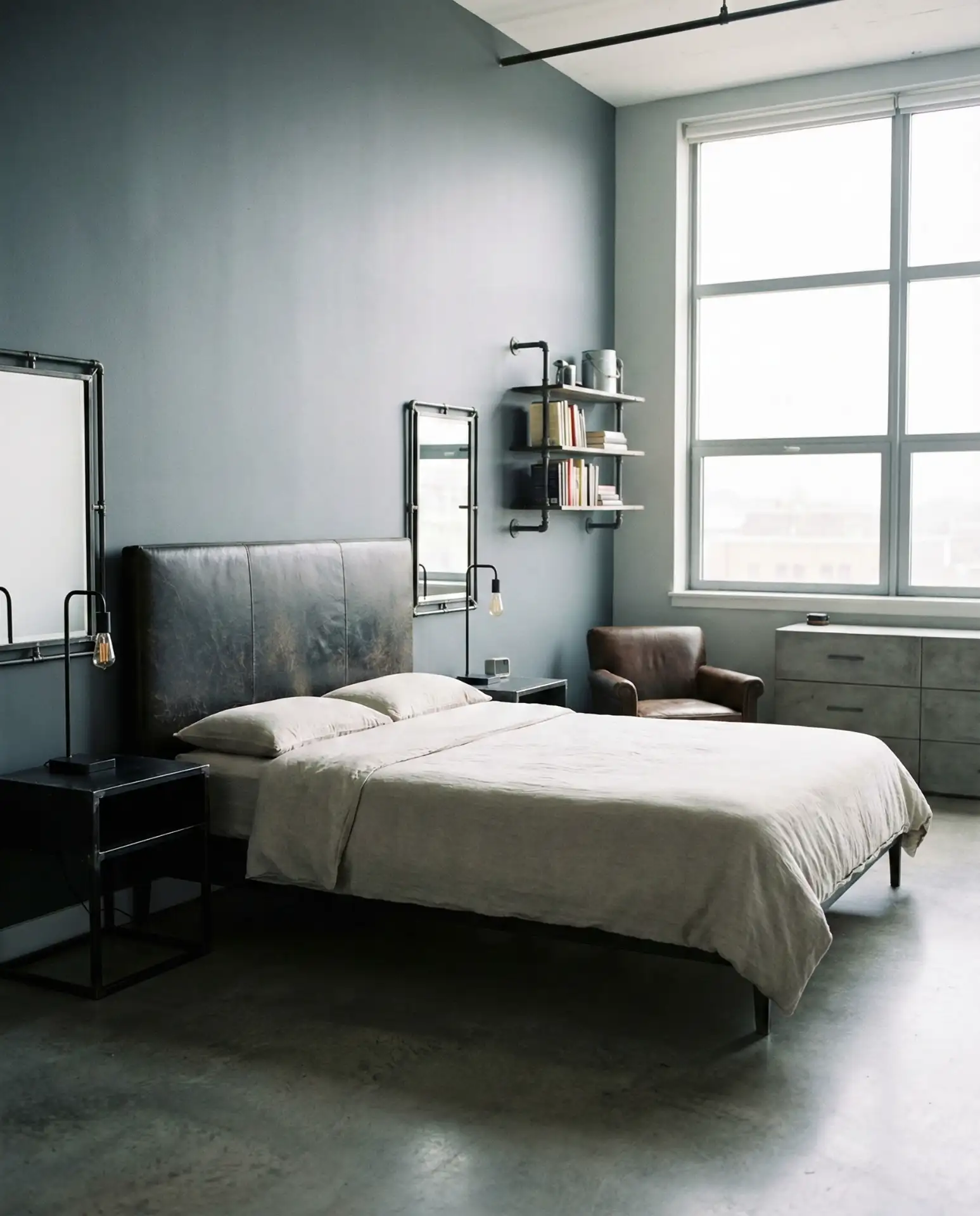
Budget perspective: Behr offers several excellent slate gray options in their mid-tier line at around $35 per gallon. The key is choosing a paint-and-primer-in-one formula, which typically provides better coverage and color depth in a single coat over primer. This reduces both material costs and labor time if you’re DIYing the project.
20. Coral Pink Energy
Vibrant coral brings a burst of energy and optimism, perfect for bedrooms belonging to creative individuals who want their space to inspire rather than sedate. This orange-pink hybrid feels both playful and sophisticated when paired with navy, emerald, or charcoal accents. The shade works surprisingly well in guest bedrooms, creating a memorable space that stands apart from typical neutral choices. Balance the intensity with plenty of white or natural materials to prevent visual overwhelm. 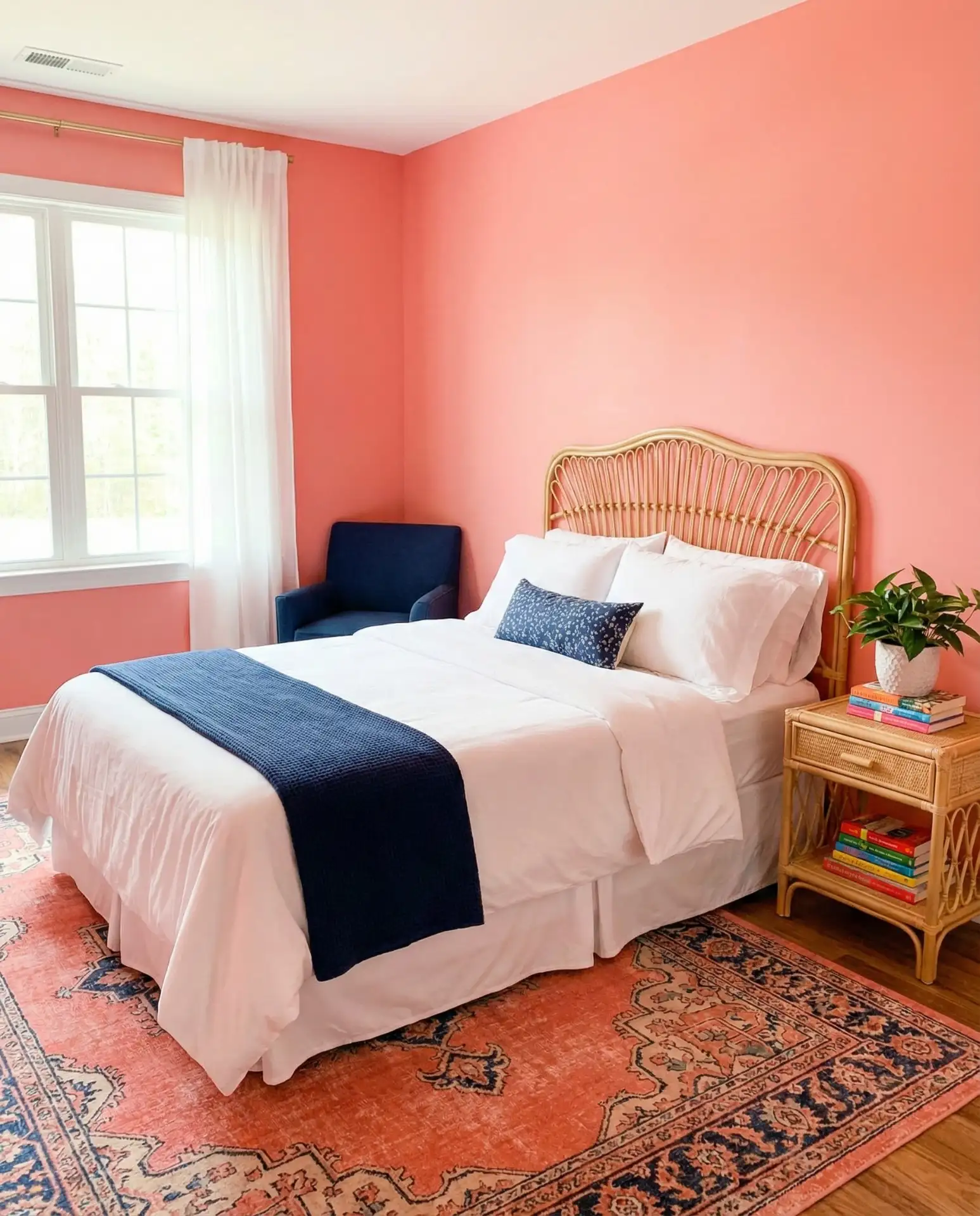
Common mistake: Treating coral as an accent color for just one wall, which can make it feel like an afterthought rather than an intentional choice. If you’re nervous about a full-room coral, consider using it in a small bedroom or dressing room first to build confidence, then expanding to larger spaces once you experience how well the color works in real life.
21. Mushroom Neutral
This earthy gray-beige creates a naturally calm backdrop inspired by nature’s palette. Mushroom tones have become increasingly popular as homeowners move away from stark grays and seek warmer, more organic neutral palette options. The color works beautifully with both modern and traditional furniture styles, making it ideal for bedrooms that evolve over time. Layer in various textures—linen, wool, wood, and stone—to create depth and prevent the neutral palette from reading flat. 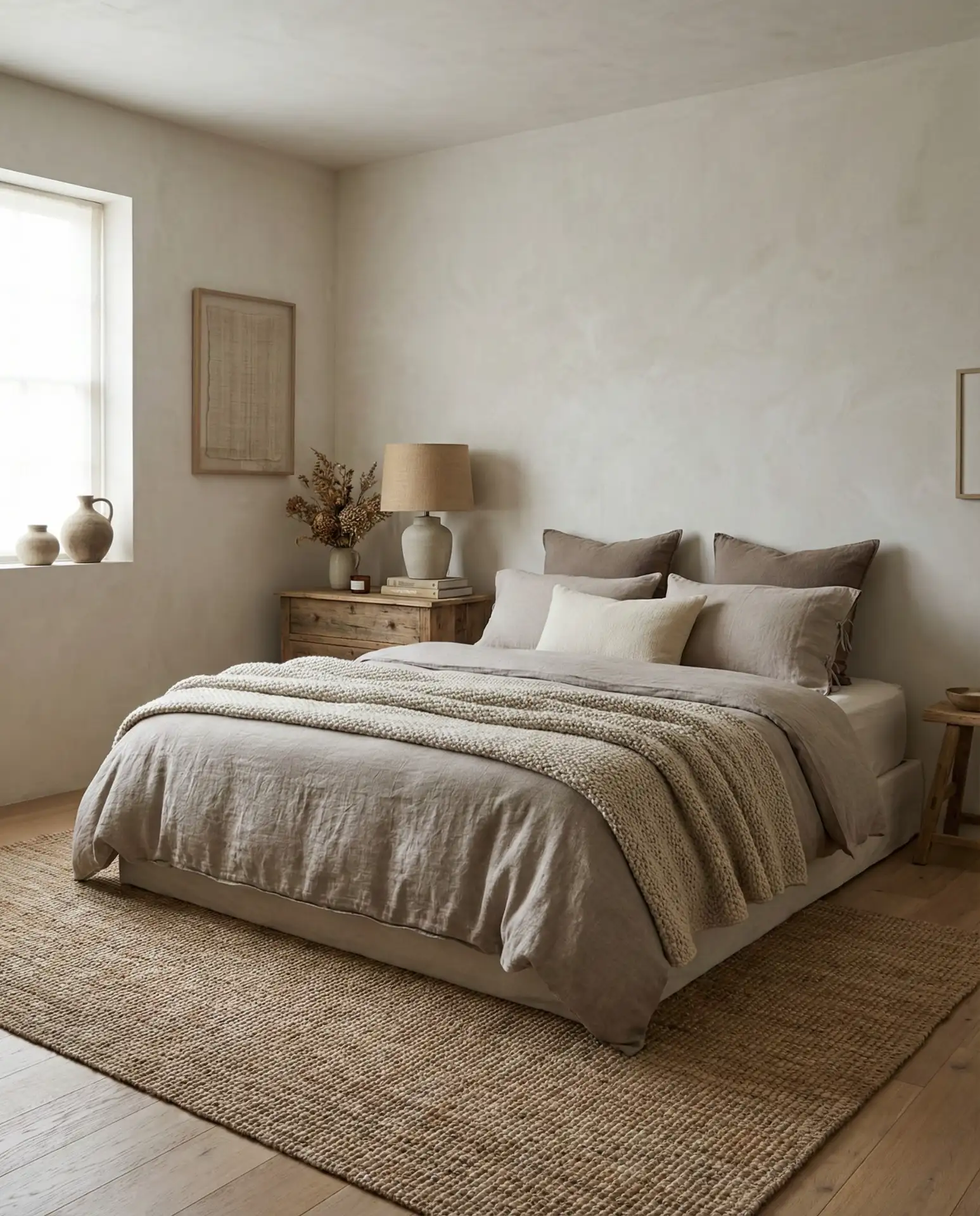
Expert insight: Mushroom neutrals from Sherwin Williams tend to have slightly different undertones than those from Benjamin Moore—the former often leaning grayer, the latter warmer. This subtle difference matters most in rooms with mixed lighting sources (natural plus artificial). Test samples in the specific room with your actual lighting conditions before committing.
22. Teal Jewel Tone
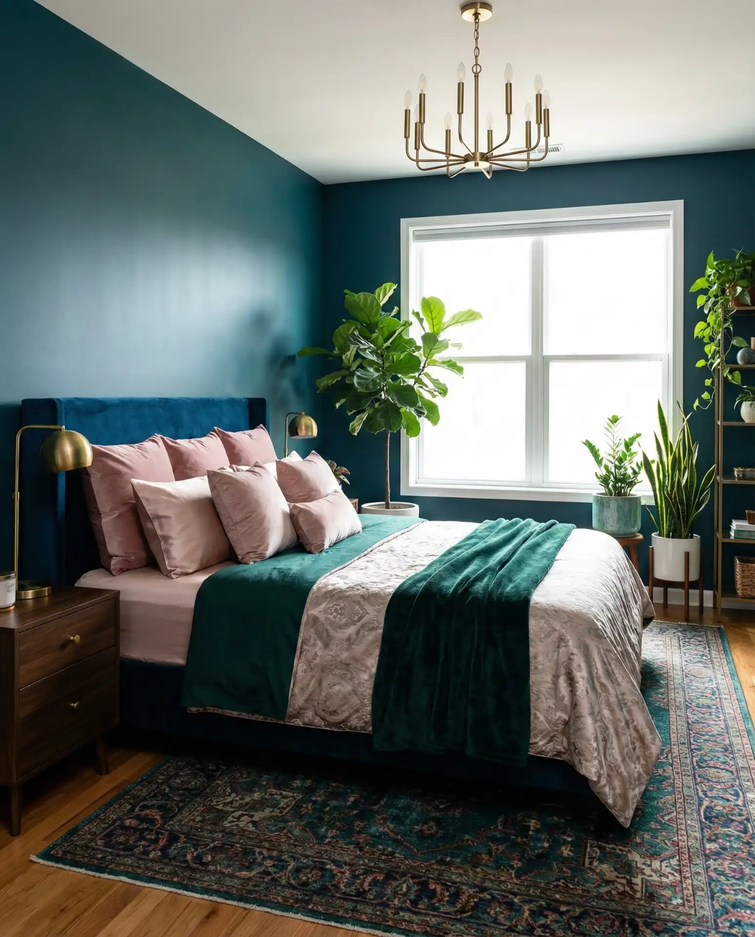
Rich teal combines the calm properties of blue with the refreshing energy of green, creating a complex, layered color perfect for aesthetic bedrooms. This jewel tone works beautifully in both modern and traditional spaces, adapting to your styling choices. Pair with brass fixtures, blush pink accents, and plenty of plants for a curated, Pinterest-worthy look. The color has enough depth to feel intentional while remaining versatile enough for long-term satisfaction. 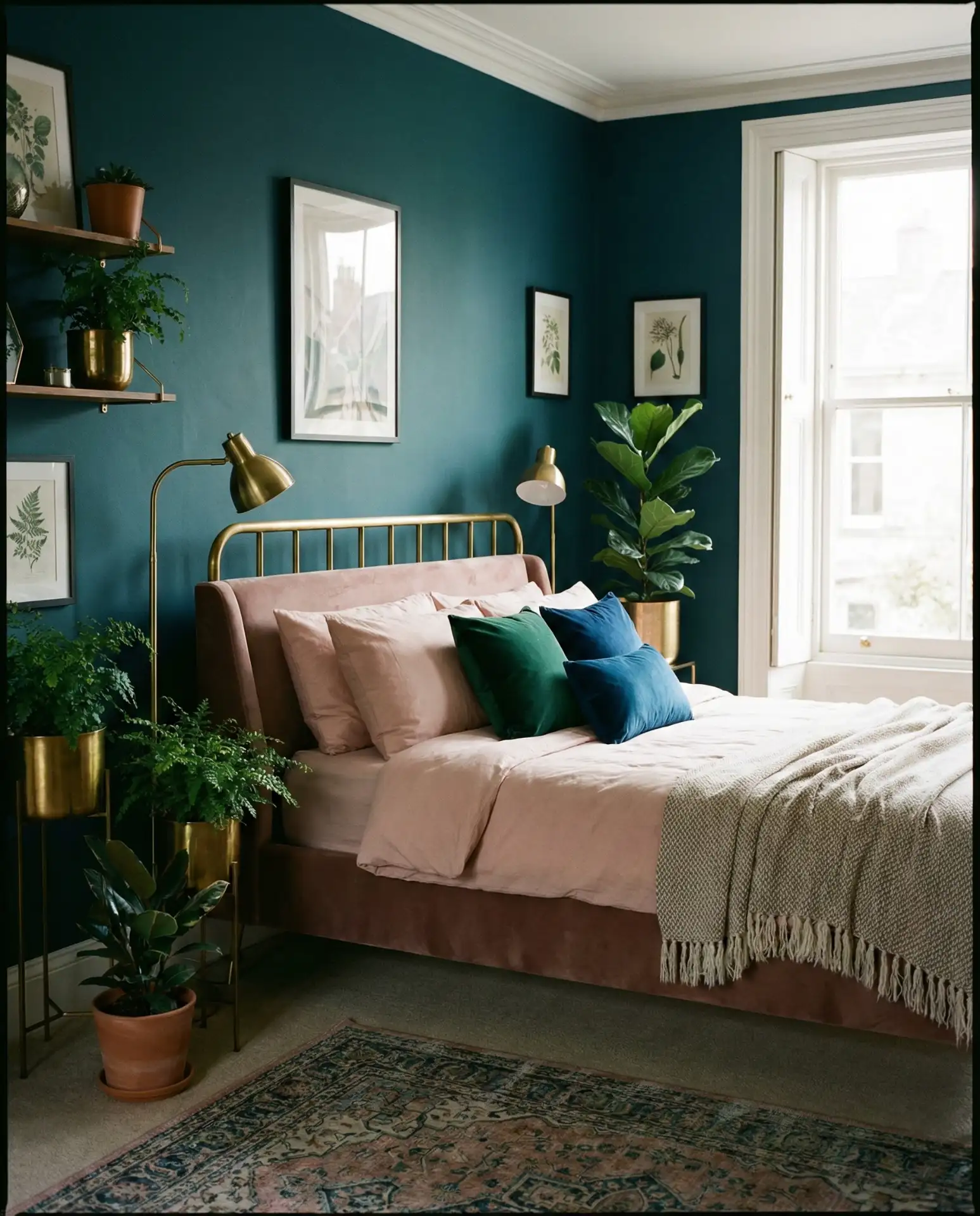
Regional context: In southwestern states like Arizona and New Mexico, teal has become increasingly popular as a cooling color that psychologically combats extreme heat. Homeowners report their bedrooms feeling more refreshing despite no actual temperature change—a testament to color psychology’s powerful influence on our perception of space and comfort.
23. Ivory Elegance
Warm ivory provides a softer alternative to stark white while maintaining that bright, airy quality. This shade works across all bedroom styles, from cottage charm to luxury minimalism, making it one of the most versatile choices available. Ivory reflects light beautifully without the harshness of pure white, creating a gentle glow throughout the day. The color is particularly effective in bedrooms with beautiful architectural details you want to highlight without competing color distractions. 
Practical insight: Ivory requires less maintenance than true white because it doesn’t show scuffs, dust, or yellowing as noticeably. For families with children or pets, this slight color difference can mean the gap between constant touch-ups and a paint job that looks fresh for years. The warmth also makes the space feel more welcoming and less clinical than builder-grade bright white.
Conclusion
Whether you’re drawn to the moody sophistication of deep jewel tones or the serene simplicity of warm neutrals, 2026’s bedroom paint colors offer something for every style and space. The key is choosing a shade that resonates with your lifestyle and makes you excited to retreat to your bedroom each evening. We’d love to hear which color you’re considering—drop a comment below sharing your favorite from this list or tell us about your own bedroom transformation journey.