Wall molding is one of those details that can quietly define a room. Whether you lean toward clean lines or prefer something more ornate, the way you frame your walls changes how the whole space feels.
This collection of 31 wall molding design ideas shows how pattern, proportion, and paint can shift a room from flat to finished, no matter your style.
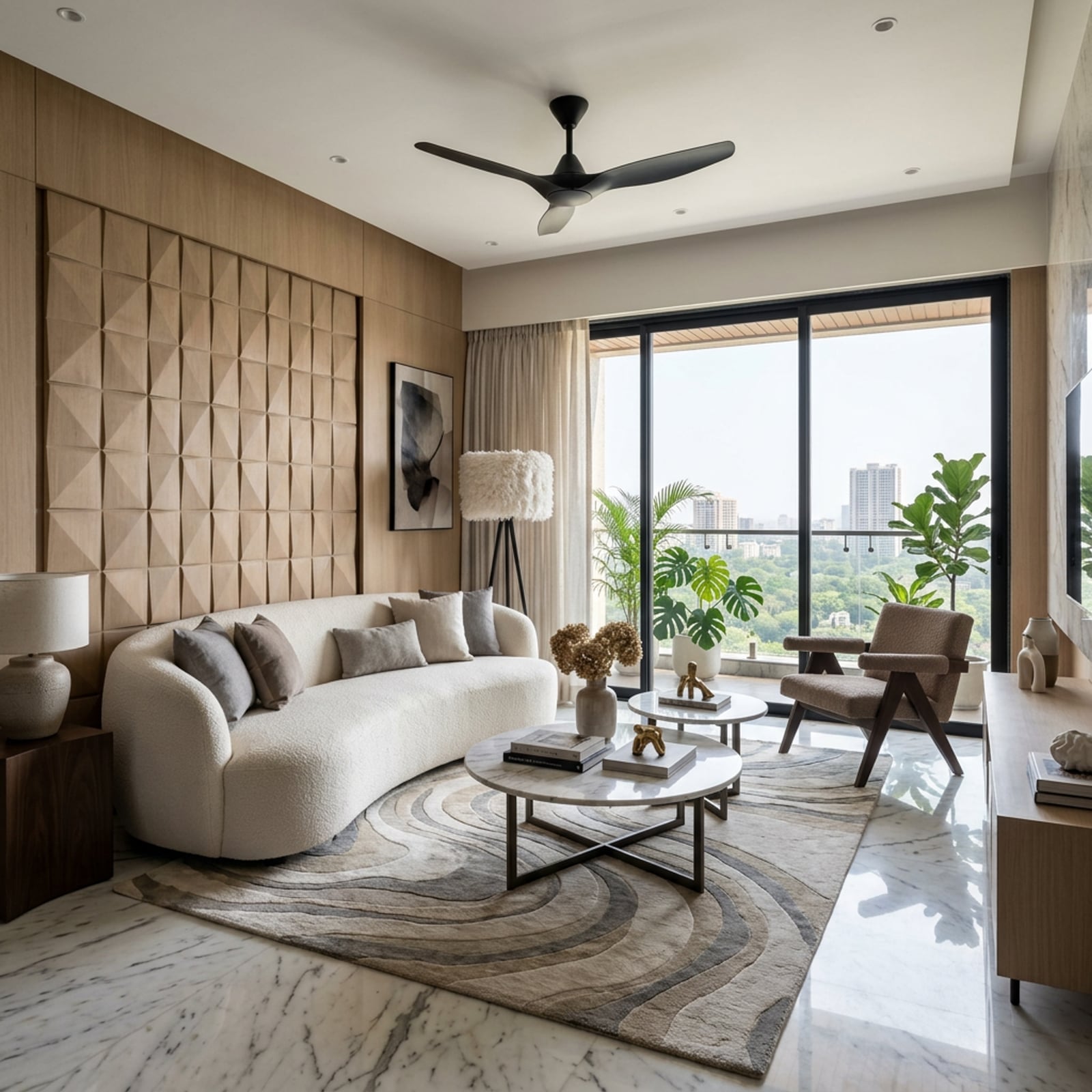
Geometric Wood Panel Accent Wall for a Modern Organic Living Room
A wall of geometric wood panels shifts the whole room toward natural texture without a single new plant or throw. The warm wood tones anchor a palette of cream, gray and green, while the curved sofa and round coffee tables soften the lines. Boucle on the armchair and a glass tabletop keep the look from turning too heavy. This is a layout trick: let one textured surface do the work, then keep every other piece simple so the eye rests on the wood.
Ornate Grid Molding on Teal Walls for a Maximalist Living Room
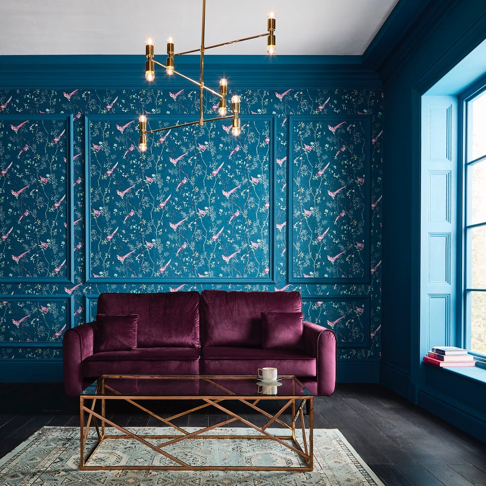
Ornate grid molding on deep teal walls sets the stage for a maximalist room that knows exactly when to stop. The teal acts as a rich backdrop, while the molding frames the wall into neat sections that keep the pink velvet sofa and gold accents from feeling chaotic. A glass coffee table and a chandelier add sparkle without competing for space. The palette is the anchor here: teal and pink are high contrast, so the molding breaks them into manageable blocks that let the eye travel without getting lost.
Gray Paneled Walls with Distinct Molding in a Modern Living Room
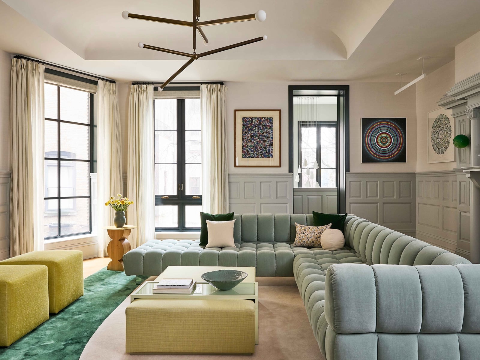
What makes gray wall molding feel current rather than dated? The spacing and the company it keeps. In this modern living room, the gray paneled walls with distinct molding frame a large sectional sofa and a fireplace without crowding them. Yellow and green accents in the fabric and decor add warmth to the gray, while a modern chandelier pulls the eye up. The layout works because the molding defines the walls as background, not decoration. The sectional anchors the seating area, and the fireplace becomes the natural focal point. The molding simply gives the wall a reason to exist.
Elegant White Wall Molding for a Transitional Living Room
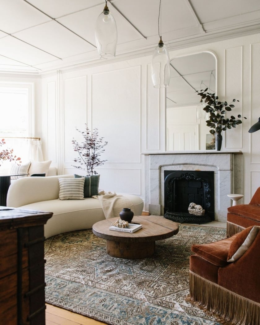
White wall molding in a transitional living room does more than look polished. The white and cream palette lets the curved sofa and fireplace read as sculptural shapes, while terracotta accents add a warm counterpoint. The molding itself is simple, almost flat, so it adds structure without competing with the furniture. This is a materials play: wood molding painted to match the wall color creates shadow lines that change with the natural light. The room feels both formal and relaxed, which is the whole point of transitional style.
Geometric Wall Molding in Pale Pink and Gray Modern Living Room
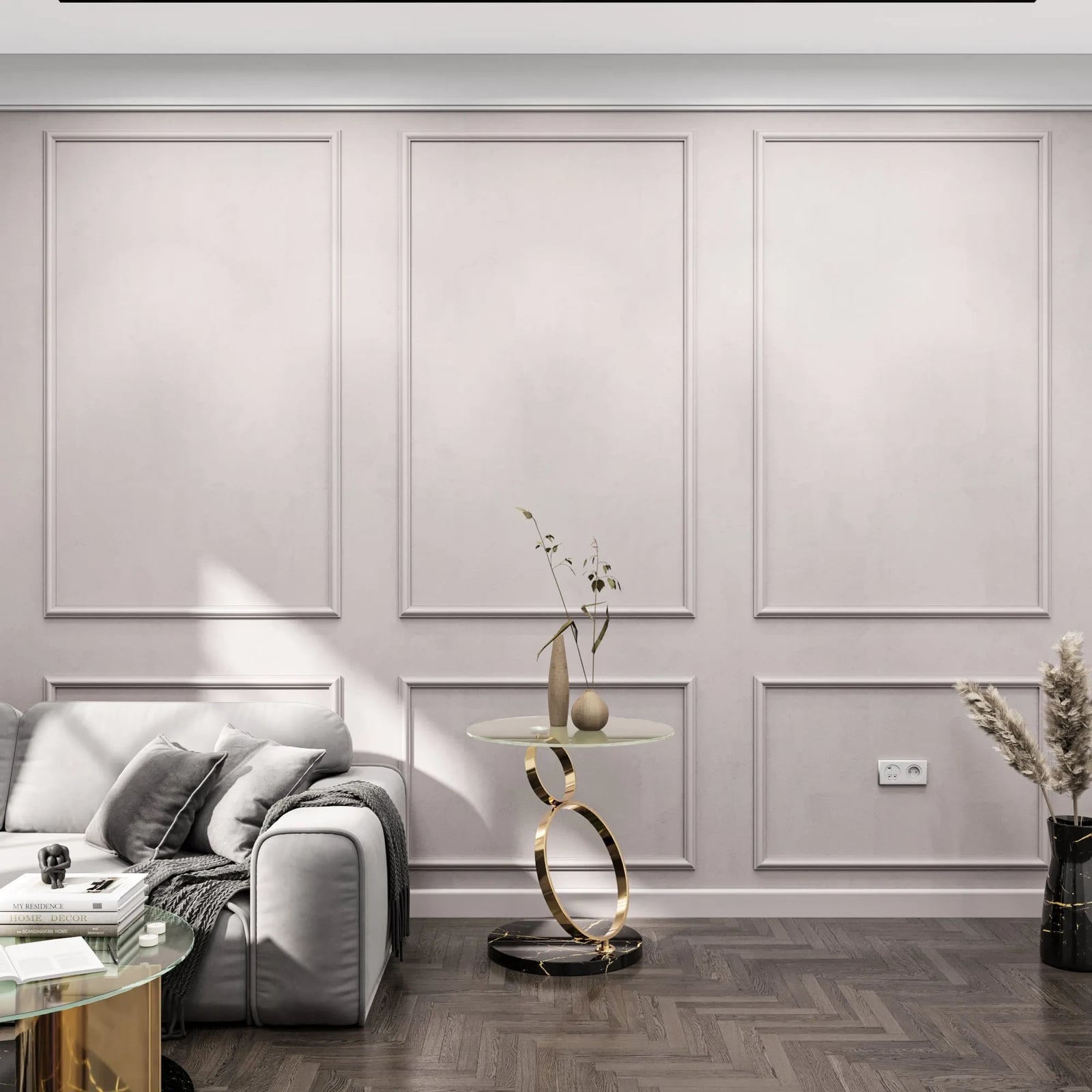
A practical rule for geometric wall molding: let the shape of the panels dictate the furniture arrangement. In this pale pink and gray living room, the molding frames each wall section like a piece of art, so the sofa and accent table sit in clear relationship to those lines. The gold and gray palette keeps the pink from reading as too sweet, while natural daylight casts soft shadows that emphasize the geometry. The molding does the decorating, so the room needs only a few pieces of furniture to feel complete.
Arched Niches with Botanical Art and Brass Lighting
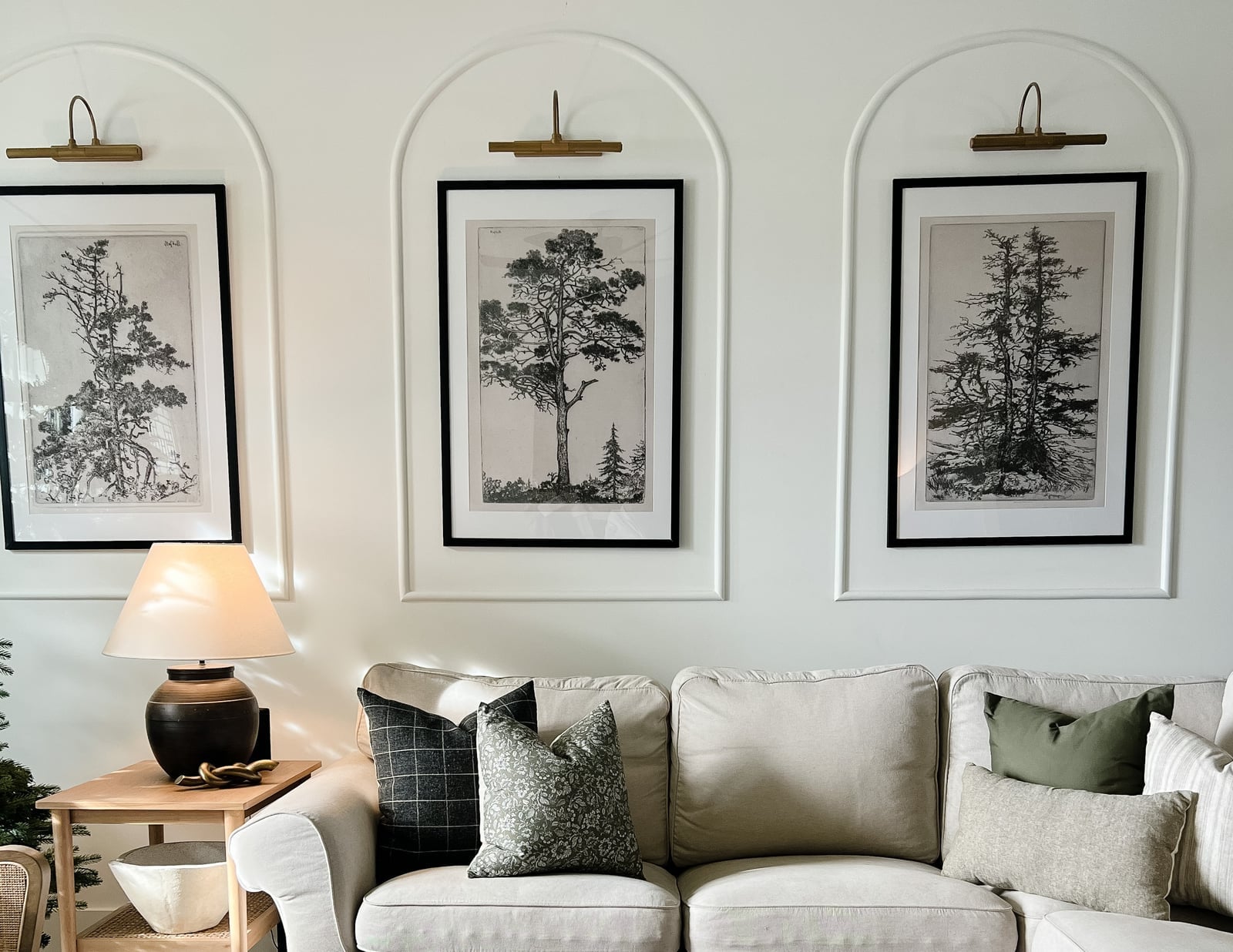
Arched niches offer a built-in look without the full commitment of major construction. Here, a gallery wall arrangement centers on the curves, with botanical art and brass task lighting drawing the eye upward. The white plaster keeps the room feeling open, while black frames and natural wood pieces ground the look. This setup works well for renters: you can achieve a similar effect with peel-and-stick arch decals or a lightweight frame placed over existing flat art. The key is keeping the surrounding layout simple so the niche remains the focal point. Style mode here means the eclectic mix of paper and linen textures defines the space, while the consistent white backdrop keeps it from feeling busy.
Geometric Wall Molding in a Modern Farmhouse Living Room
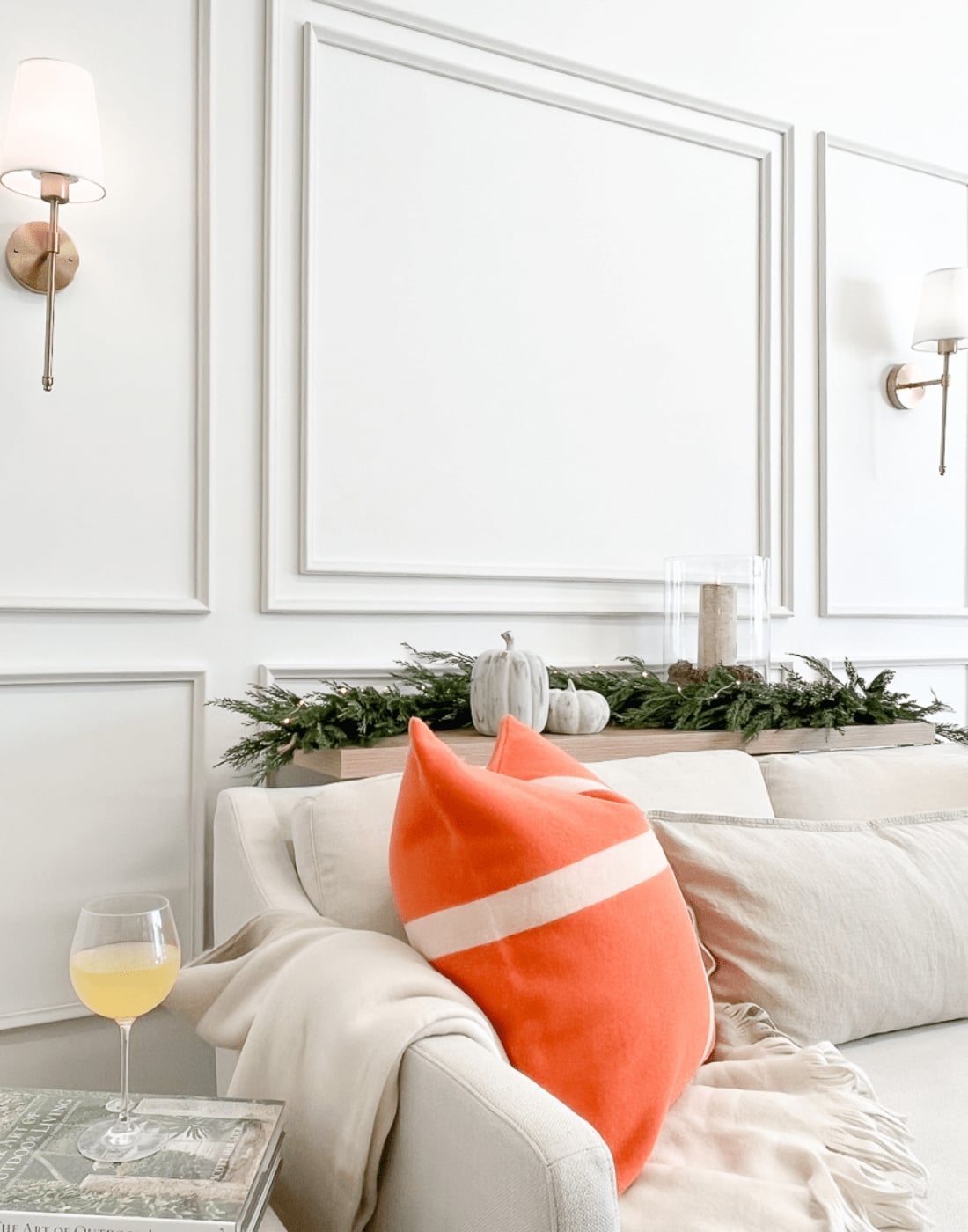
The geometric wall molding here creates distinct panels that break up the wall without adding bulk. White plaster shapes frame the sofa below, while wall sconces add a soft glow that highlights the angles. A garland of greenery and natural wood accents keep the farmhouse feel present, but the molding itself is what defines the style. The ratio of solid wall to molding stays balanced, so the room reads as clean rather than cluttered. What breaks the look would be too many competing patterns on the sofa or pillows; the molding needs room to breathe.
Abstract Artwork on Molded Walls in a Modern Minimalist Living Room
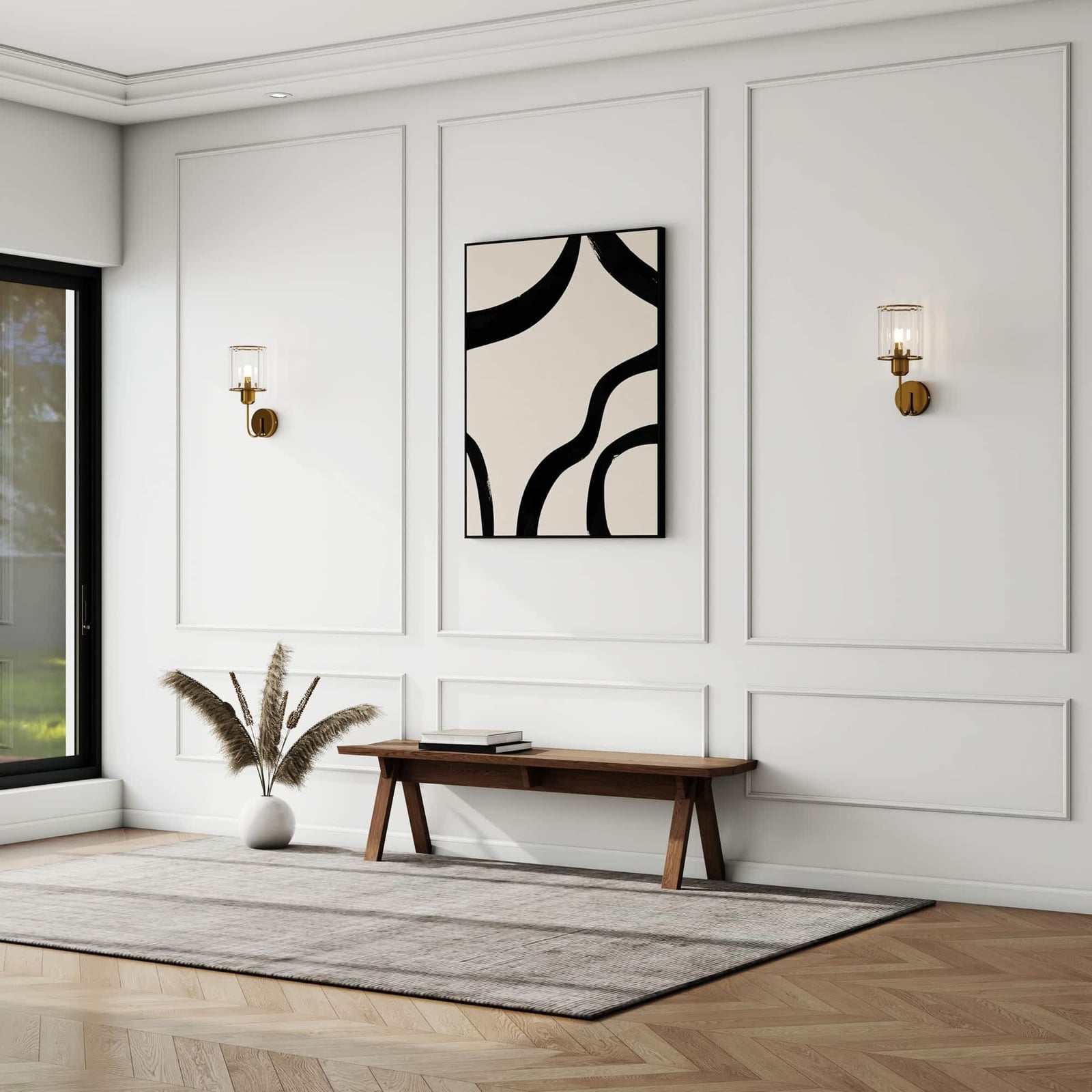
This setup proves that molded walls and modern minimalism can coexist. The wall molding frames the wall panels, and a large abstract artwork is centered within that frame, creating a natural gallery wall without extra hardware. Natural daylight from the window and a pair of wall sconces keep the space bright but soft. The palette stays restrained: white, beige, black, and wood. The style mode here is defined by the contrast between the structured molding and the fluid abstract shapes. What breaks the look is adding too many small decorative items; the room lives best when the art and molding carry the visual weight.
Picture Frame Molding in a Transitional Living Room
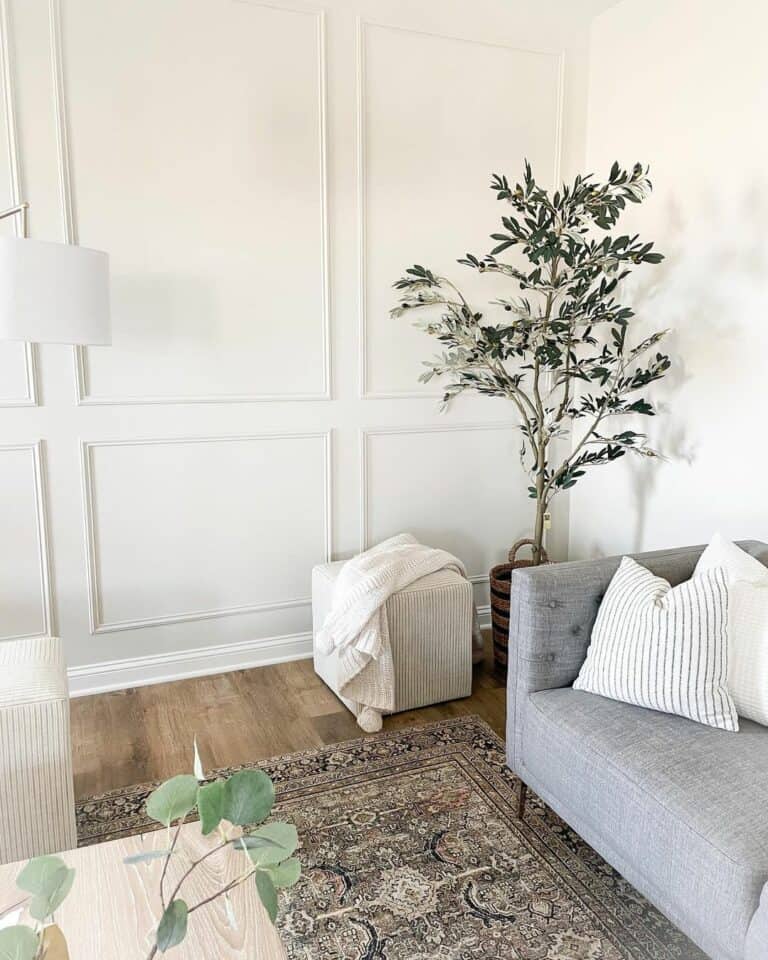
Can you add character to a rental without painting or drilling into walls? Picture frame molding offers a straightforward answer. In this transitional living room, the molding creates a wall feature that frames the sofa and ottoman below. The palette of white, gray, and beige keeps the room flexible for seasonal decor changes. Ambient light from the floor lamp and window soften the lines. From a layout angle, the molding anchors the seating area without needing a large piece of furniture against the wall. The style is transitional, meaning it borrows from both traditional and modern, and the molding’s clean lines are what define that balance.
Geometric Wall Molding in a Modern Organic Bedroom
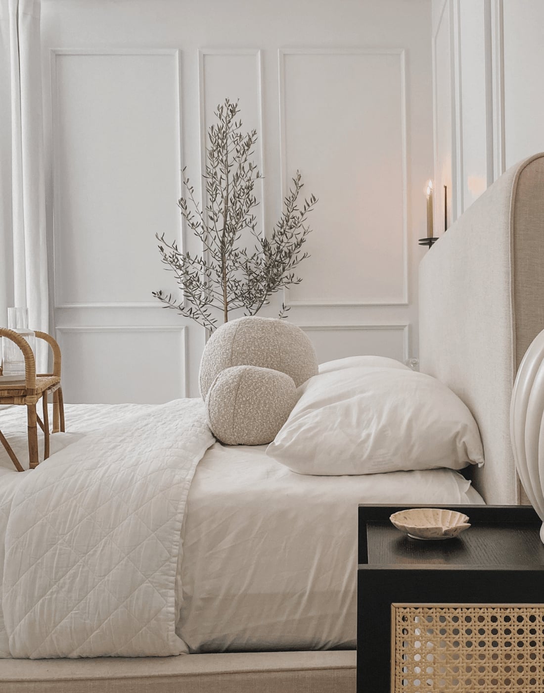
The geometric wall molding here frames the bed panel and creates a structured backdrop for a modern organic bedroom. White plaster shapes contrast with natural wood and rattan accents, while a wall sconce on each side provides soft task lighting. The palette stays neutral with beige and white, letting the molding’s angles define the room’s character. From a layout angle, the bed is centered, and the molding frames the wall panels in a way that guides the eye across the room rather than just to one spot. What defines this style is the balance between the crisp molding and the organic textures of linen and rattan.
Intricate Picture Frame Molding with Built-In Bookshelves
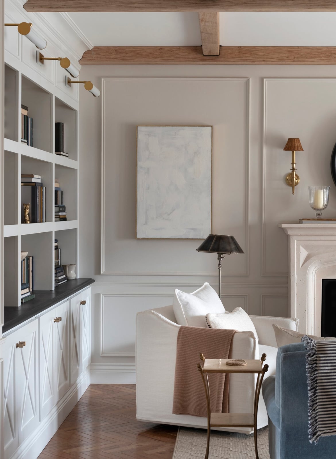
Let the wall molding act as a frame for the whole arrangement, not just the books. In this transitional living room, the detailed picture frame molding wraps the wall above the fireplace and around the built-ins, tying the seating area together. The cream and gold palette keeps the wood and plaster work from feeling heavy, while wall sconces and a table lamp add warm light. The molding gives the room a finished look. It is a style that suits anyone who wants storage to feel like part of the architecture.
Blue Molding Framing Vibrant Tropical Wallpaper in a Maximalist
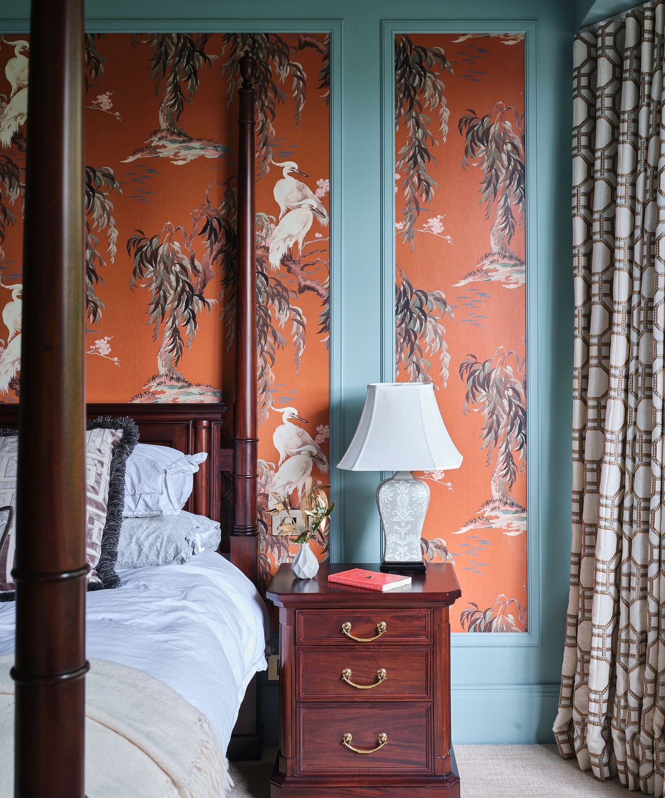
Wallpaper can feel overwhelming without a clear boundary, but blue molding gives it that edge. In this maximalist bedroom, the vibrant tropical wallpaper covers the wall behind a four-poster bed, and the blue molding frames it like a piece of art. The palette is orange, blue, cream, and brown, so the molding anchors the wallpaper. A table lamp on the nightstand adds warm light, and natural light from the window keeps the room from feeling too dark.
The ratio here is important. The wallpaper takes up most of the wall, and the molding is just a thin line around it. That break in pattern prevents the room from feeling chaotic. Choose a molding color that appears in the wallpaper, even if only as a small accent. It creates a connection that feels deliberate.
Sage Green Walls with Detailed Picture Frame Molding in a Bedroom
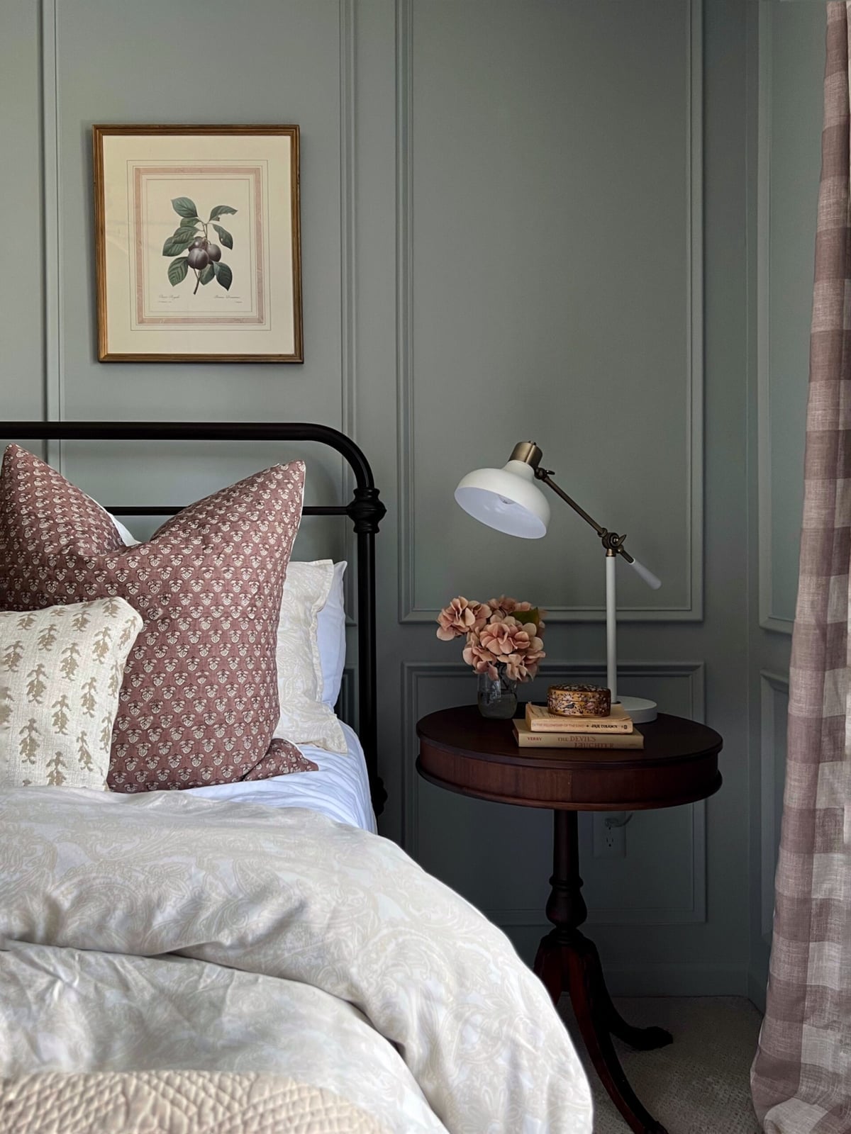
The sage green paint here does not just cover the wall; it defines the molding. In this traditional bedroom, the picture frame molding is painted the same shade as the wall, so the pattern comes from the shadow lines and the raised wood, not from color contrast. A cream bed and a metal and glass lamp keep the corner vignette calm. The compact layout works because the molding adds detail without needing extra furniture. It is a simple way to bring texture to a small space.
Angular Geometric Molding in a Modern Charcoal Hallway
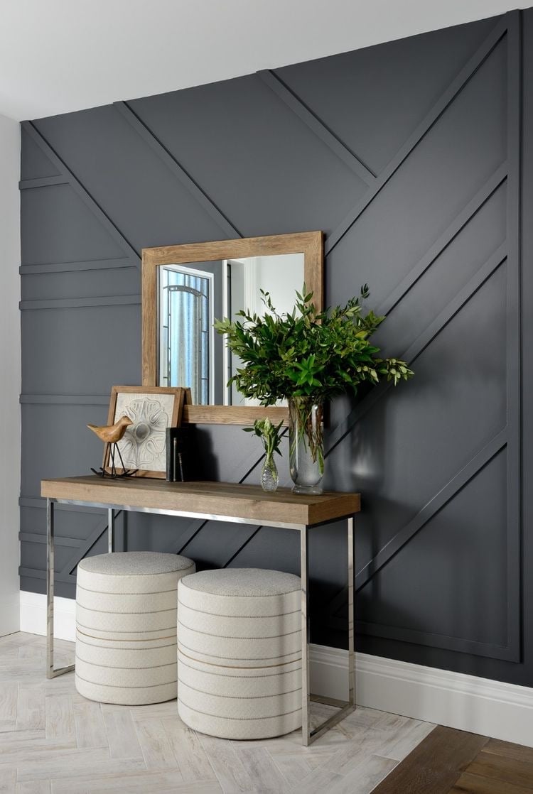
This hallway proves that molding does not have to be traditional to feel right. The angular geometric panels are painted charcoal gray, and the wood tones in the console table and stools add warmth. A large mirror hangs above the console, reflecting the room and making the space feel wider. The ambient light is soft, so the shadows from the molding create depth without harsh lines. The geometric pattern is the focal point, and the furniture stays simple. It is a look that works when the molding is bold and everything else steps back.
Ornate Picture Frame Molding in a Modern Farmhouse Hallway
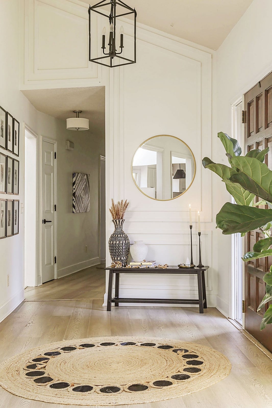
In this modern farmhouse hallway, the ornate picture frame molding covers the walls in white, and the console table and jute rug add natural texture. A black lantern hangs overhead, and natural light from the door keeps the space bright. The mirror above the console reflects the molding, so the pattern repeats without adding clutter.
The molding defines the style here. It is ornate enough to feel traditional, but the white paint and simple furniture keep it from being fussy. The black lantern breaks the all-white palette and gives the eye a place to rest. For a hallway, this approach means you do not need much on the walls or the table. The molding is the decoration.
Detailed Wall Molding Along a Traditional Staircase
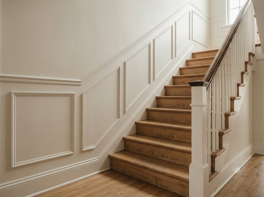
A traditional staircase with cream walls and wooden banisters benefits from molding that follows the angle of the steps. The molding is the hero element here, drawing the eye upward along the wall paneling that mirrors the staircase’s own geometry. The palette stays light with cream and wood tones, so the plaster and wood details read as architectural bones rather than decoration. Natural daylight from a nearby window keeps the shadows soft, which is key for a staircase where you want clear sight lines rather than dramatic contrast. The layout proves that molding can guide movement through a space, not just frame a static wall.
Ornate Picture Frame Molding in a Transitional Living Room, Indoor
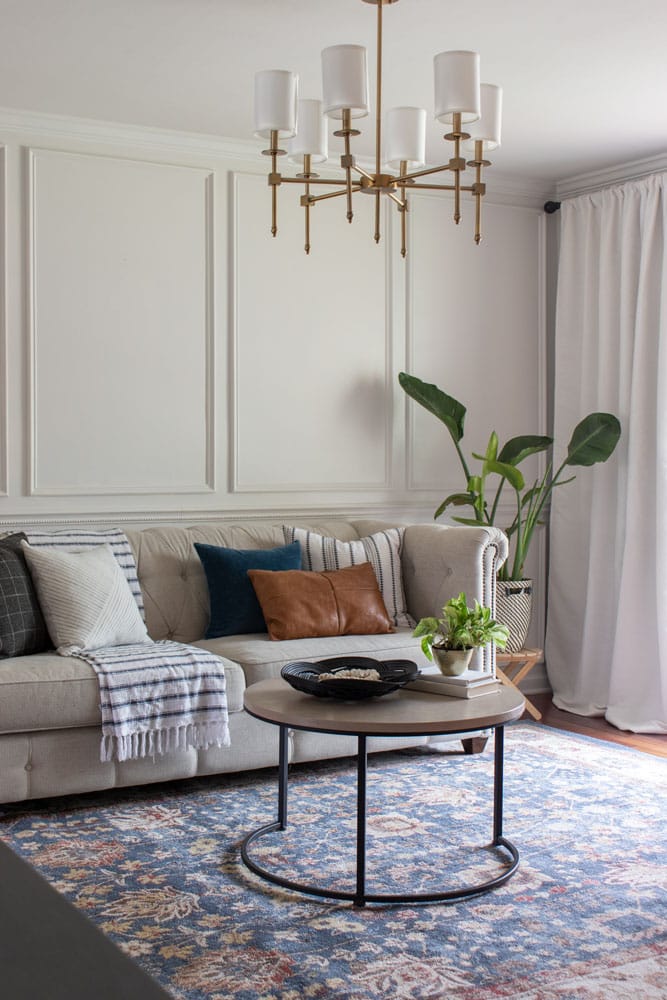
The practical rule for ornate picture frame molding in a transitional living room is to let the furniture sit away from the wall so the pattern stays visible. A tufted sofa faces the wall with the molding, and the off-white, blue, and brown palette keeps the ornate detail from feeling heavy. The chandelier and natural light hit the molding at different angles through the day, which changes how the rectangles read. The style defines itself through the ratio of empty wall to framed panel: the molding covers enough surface to feel intentional but leaves breathing room. What breaks the formality is the fabric upholstery and the glass coffee table, which keep the room grounded rather than precious.
Ornate Wall Molding in a Traditional Gray Bathroom
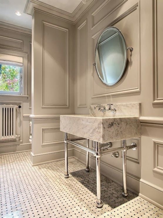
Ornate wall molding in a bathroom reads differently than the same molding in a living room. In a compact space with a pedestal sink and an oval mirror, the molding adds texture without crowding the layout. The neutral gray palette and marble surfaces keep the look cohesive, while the metal fixtures provide a subtle contrast.
The natural light from the window and the overhead fixture both matter here. The molding catches the overhead light directly, which defines its profile, but the natural light softens the edges so the room does not feel like a box of gray. The style is traditional but not stiff, because the molding is the only ornate element. The tile floor and simple sink keep everything else clean, which is how you make ornate work in a small room.
Subtle Molding on White Walls in a Traditional Hallway
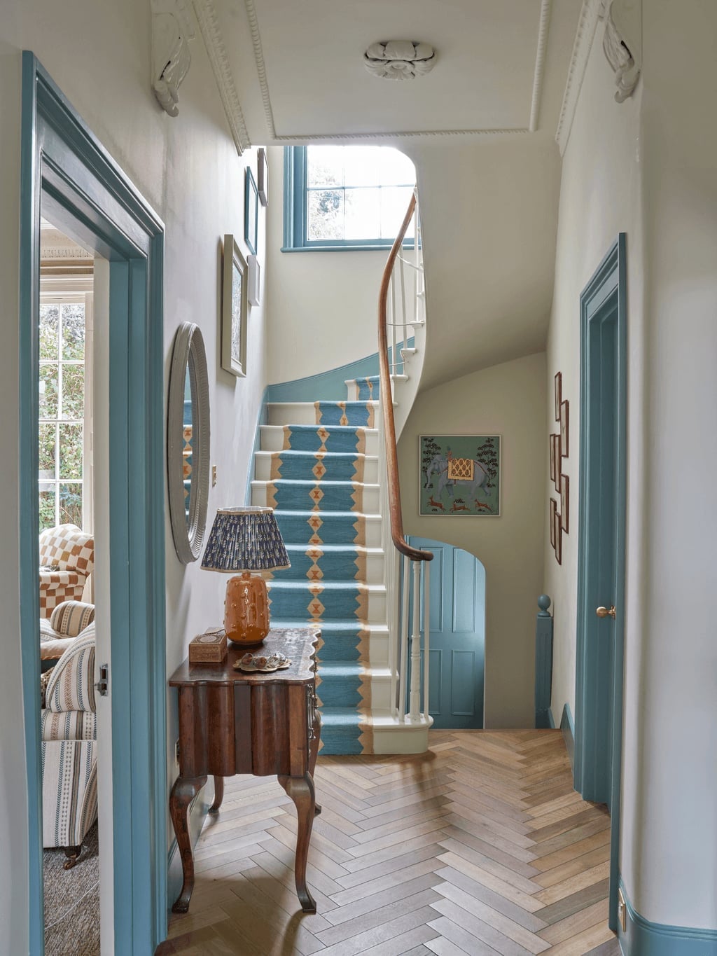
The molding on the white walls here frames the curved staircase and blue runner without competing for attention. The palette of blue, white, and wood lets the molding quietly border the artwork and console table. Natural light from the front hallway and the ceiling light keep the space bright, a key detail in a traditional hallway where molding can look busy. The layout centers the staircase, while the console table and mirror anchor the opposite wall. The molding simply ties the composition together.
Intricate Crown Molding with Peacock Artwork in a Transitional Hallway
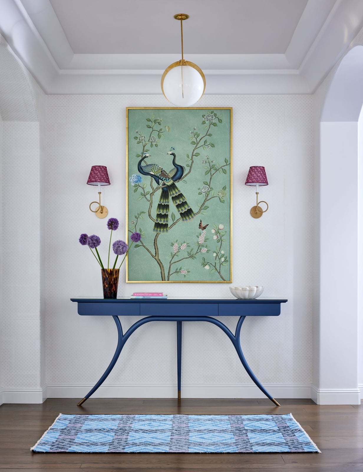
The crown molding here is intricate, but the peacock artwork is the clear focal point. The transitional hallway uses a white, blue, gold, and green palette, with the molding in white and the artwork bringing in the bolder colors. The overhead pendant and wall sconces hit the crown molding from two directions, which keeps the detail visible without casting harsh shadows on the wallpaper. The style is defined by the ratio of molding to wall: the crown is elaborate, but the picture frame molding on the wallpaper is simpler. What breaks the traditional formality is the brass console table and the glass sconces, which add a lighter, more modern touch.
Detailed Staircase Molding in a Traditional Foyer, Indoor
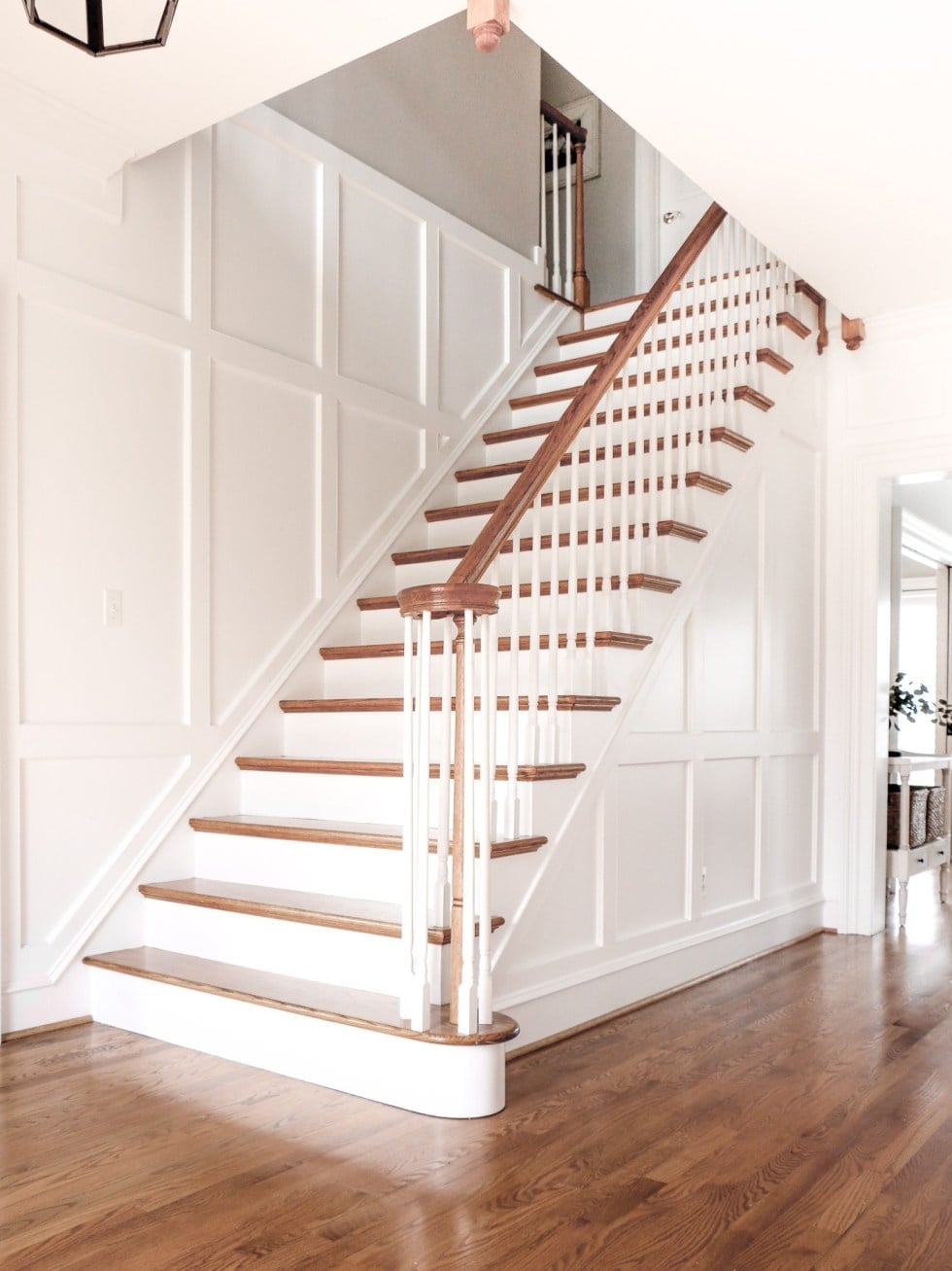
In a foyer with a staircase, the molding should guide the eye upward without competing with the steps. The trick is to match the molding’s detail level to the staircase’s own architecture so neither feels crowded. Here, the wall molding runs alongside the stairs in a traditional foyer, with white paint on wood that keeps the entryway feeling roomy. Natural light lands on the raised profiles, creating shadows that shift as you walk through. The molding acts like a frame for the vertical line of the staircase, giving the tall wall a reason to exist. This is element mode: the molding is the hero, and the foyer stays simple so the joinery reads clearly.
Classic Picture Frame Molding in a Traditional Living Room
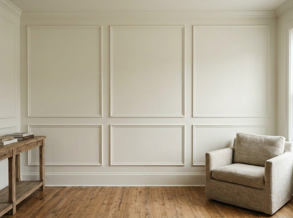
Classic picture frame molding uses rectangles of trim applied directly to the wall, creating the look of panels without the cost of solid wood. In this traditional living room, the off-white painted walls carry the molding in even spacing that gives the room a measured, orderly feel. The wood floor below and the armchair and console table placed against the wall all sit within that grid, so the molding becomes the anchor for the furniture arrangement. Raised edges catch the natural light and soften the transition between wall and trim.
Board and Batten Molding in a Modern Farmhouse Dining Room
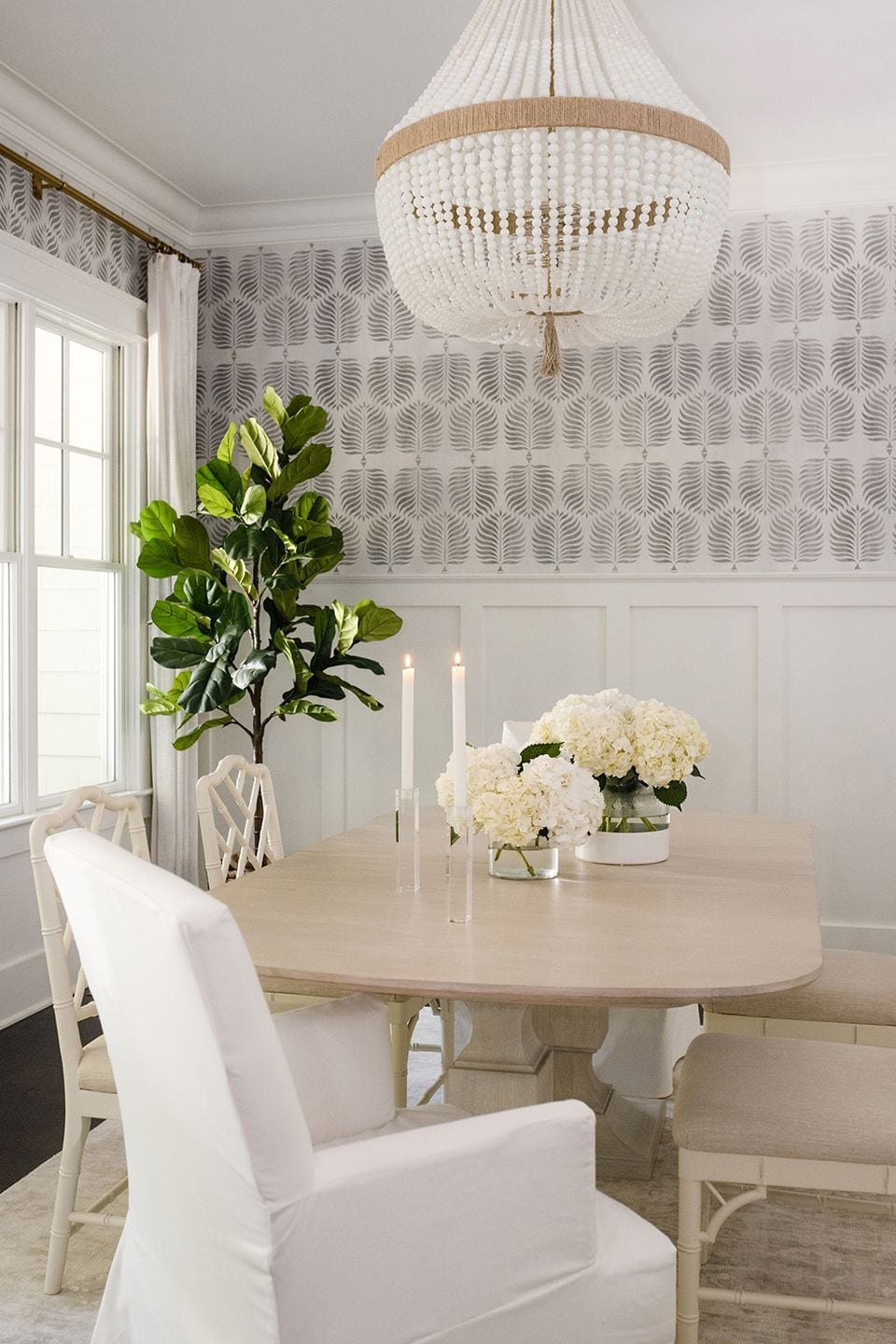
Board and batten molding runs from floor to chair rail height in a modern farmhouse dining room, with white wood strips spaced evenly across a gray wall. The dining table sits centered under a beaded chandelier, and a green upholstered chair and a potted plant add softness against the rigid lines. The wallpaper above the molding introduces a pattern that the battens below keep grounded. The contrast between painted wood and fabric prevents the room from feeling like a box of straight lines.
Ornate Window Trim and Gray Wall Molding in a Traditional Interior
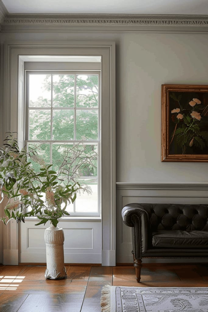
Plain walls make ornate trim feel heavy, but a gray wall with white molding strikes a balance. In this traditional interior, the window trim is the hero element, with carved details that draw attention to the glass and the natural light coming through. The gray wall behind it recedes, so the molding pops. A leather sofa and a framed painting sit nearby, but the eye goes first to the window, then to the wall molding framing it. The lighting is the point: the natural light lands on the white trim first, then spreads across the gray wall, creating a soft gradient that changes through the day.
Gray Wall Paneling in a Traditional Dining Room
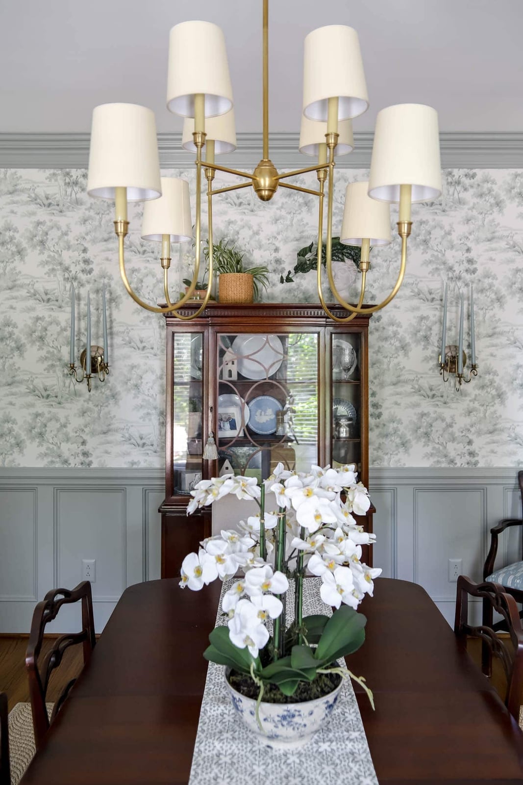
Gray wall paneling in a traditional dining room works because the gray is warm enough to not feel cold. The paneling here is painted a soft gray that picks up the cream tones in the wallpaper above it. A brass chandelier hangs over the dining table, and wall sconces on the paneled wall add light at eye level. The china cabinet against the paneling is ornate, with glass doors and brass handles that repeat the warm metal of the lights. The palette is gray, white, green, and cream, and the paneling anchors the room so the wallpaper and the china cabinet don’t compete.
Detailed Wall Molding in a Moody Dark Academia Bedroom
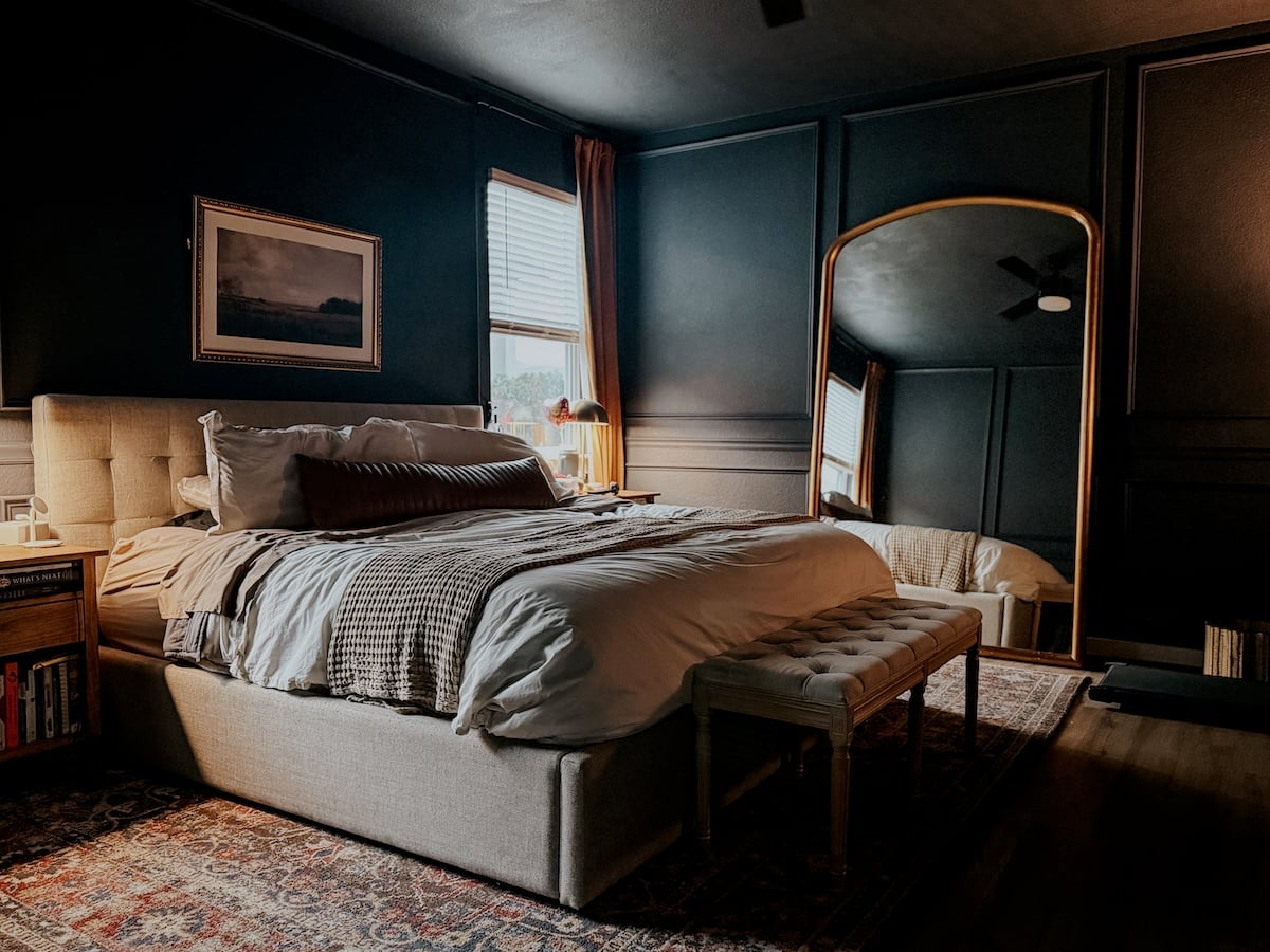
For a bedroom that leans into the dark academia mood, detailed wall molding is the single most effective way to add architectural heft without a full renovation. The palette here is deep teal and brown, with gold accents from a mirror and lamp, and the ornate molding pattern on all walls makes the room feel like a quiet library rather than just a place to sleep. The centered bed and bench keep the layout simple so the wall treatment stays central. What defines the dark academia look is the ratio of dark paint to trim: the molding should be painted the same deep teal as the wall, not white, so the whole surface reads as one rich texture. A large mirror opposite the natural light source helps bounce what little ambient light there is around the room, stopping the moody palette from feeling cave-like.
White Paneled Wall Detail Connecting Bathroom and Bedroom
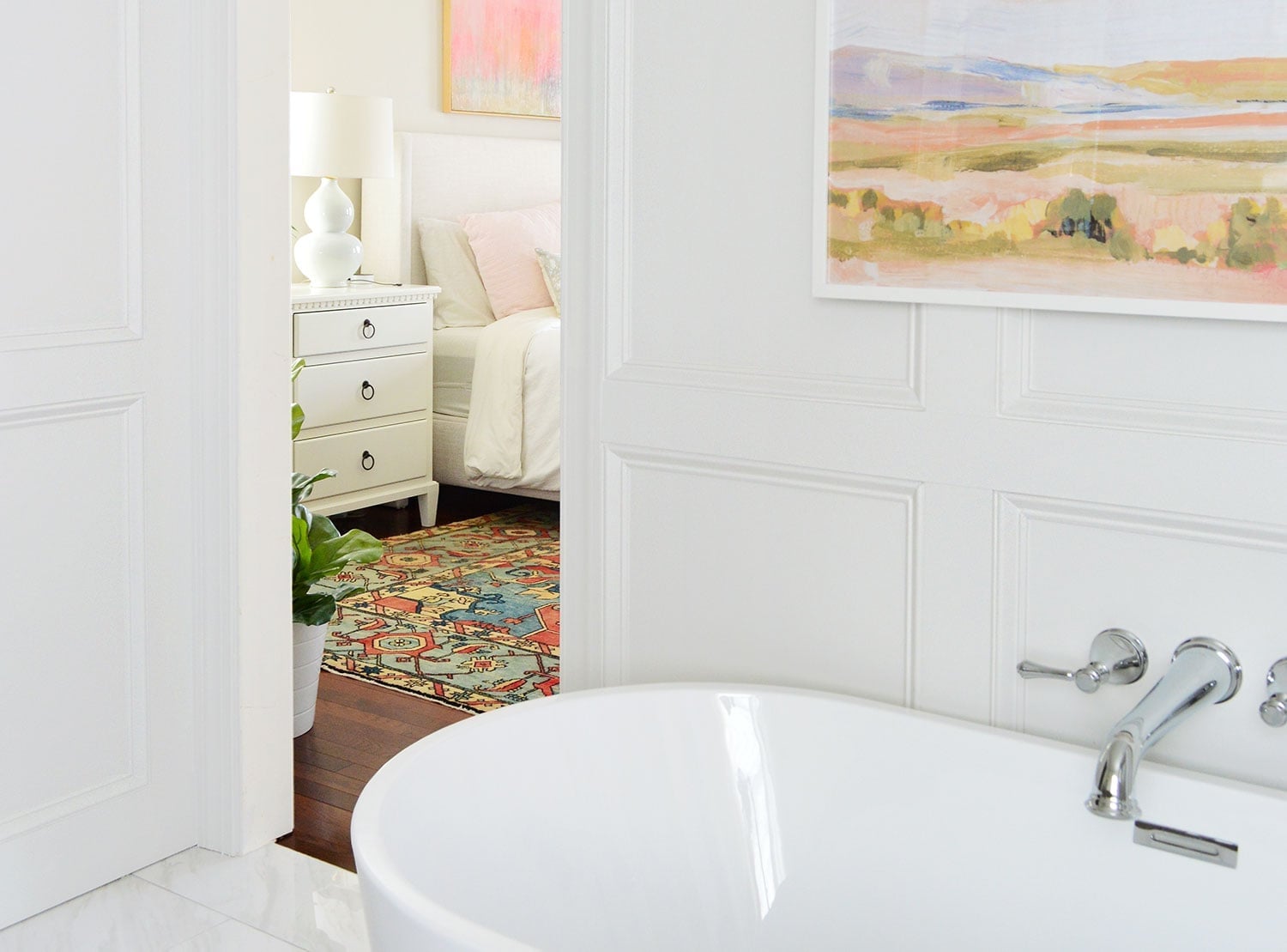
In open plan spaces, a single wall feature can visually connect two rooms that share a floor plan. Here, white paneled molding runs along the wall that separates a bathroom from a bedroom, and because the trim is painted the same white as both rooms, it creates one continuous surface instead of a hard divider. The palette stays clean: white walls and tile floor in the bathroom, white walls and a bed in the bedroom, with only a piece of pastel art breaking the neutral field.
The layout works because the molding is the same height and scale on both sides of the opening. That consistency makes the bathroom feel like an extension of the bedroom, not a separate little box. For renters, this effect can be faked with stick-on molding strips that are removable, as long as the walls are smooth and you use a low-tack adhesive. Bedroom window light and bathroom artificial light keep both sides well lit without shadows falling across the panel detail.
Geometric Wall Paneling in a Modern Scandi Bedroom
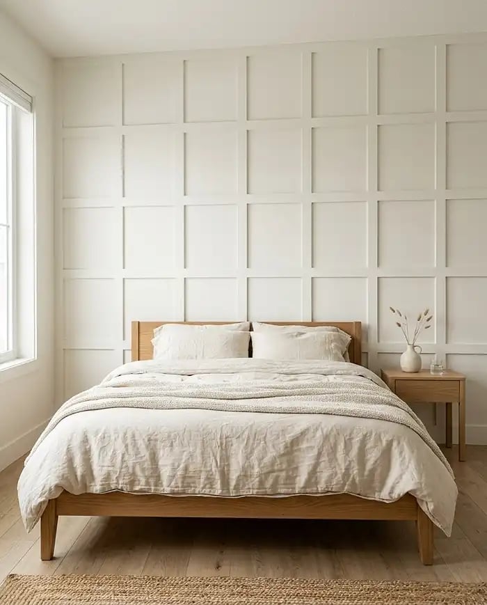
The geometric wall paneling in this bedroom uses straight lines and right angles to create a pattern that feels modern without being cold. The palette is white and natural wood, with a linen bed and a woven rug adding soft texture. What defines the Scandi look is how the paneling is used: it covers only one wall behind the platform bed, leaving the other walls plain, which keeps the room from feeling busy. The ratio of paneled to bare wall is about one to three. A single nightstand on one side of the bed breaks the symmetry, which is the key move here. That small asymmetry keeps the room from looking like a showroom and gives it a lived-in, approachable feel.
Gray Wainscoting in a Farmhouse Hallway Corner
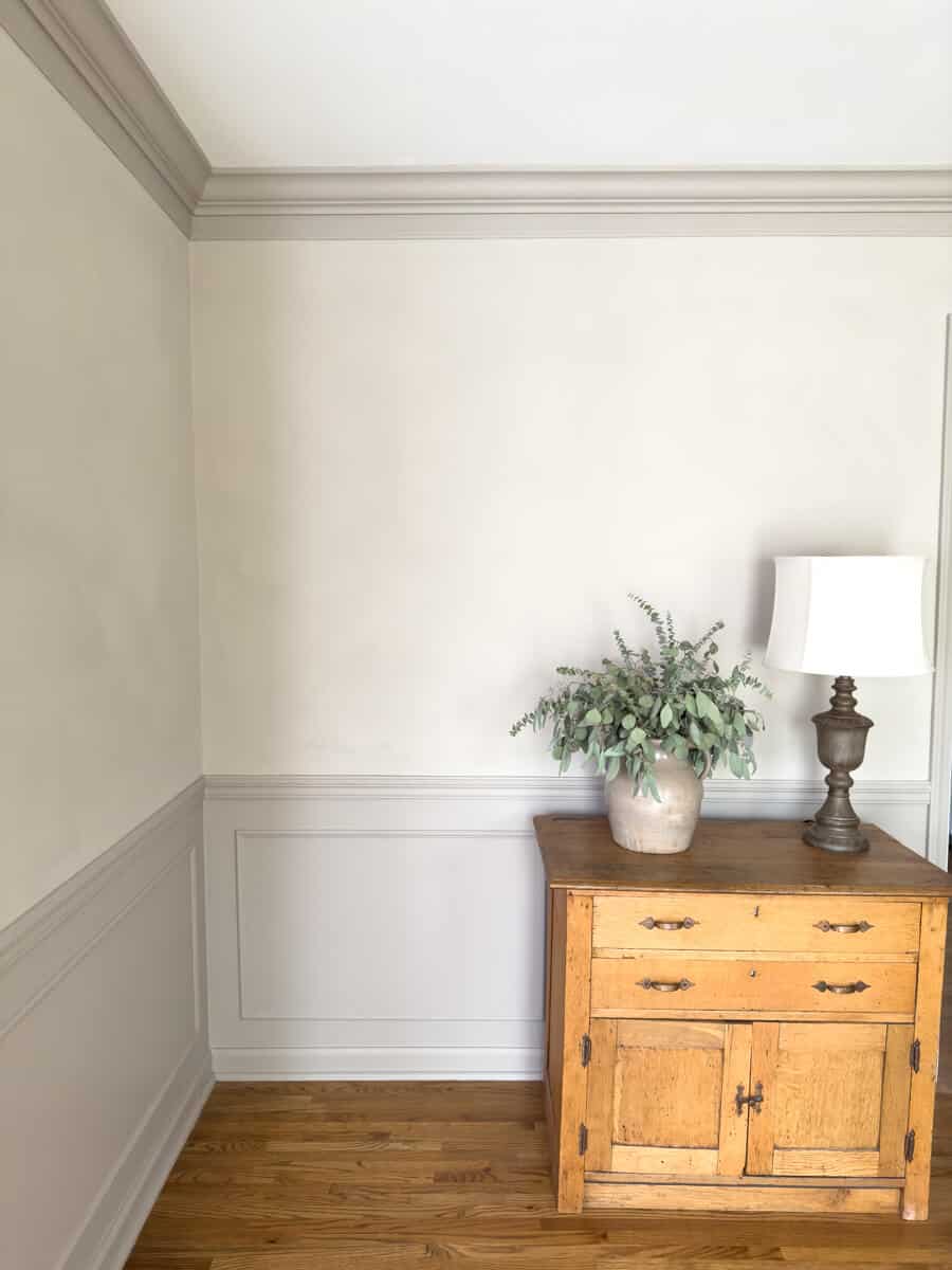
The wainscoting here covers the lower half of the wall in a compact hallway corner, painted a soft gray that is warm against the off-white upper wall and the wood tones of the hardwood floor. An antique wooden dresser with a vase of greenery anchors the vignette, and the light hits the painted wood just enough to show its subtle sheen. What makes the farmhouse style work here is the material choice: the wainscoting is painted wood, which is durable enough for a high-traffic hallway corner where furniture and shoes might bump the wall. The gray paint hides scuffs better than white would, and because the wainscoting stops at chair-rail height, it creates a clear visual line that makes the compact space feel taller.
Traditional Wainscoting with Gray Molding in a Narrow Hallway
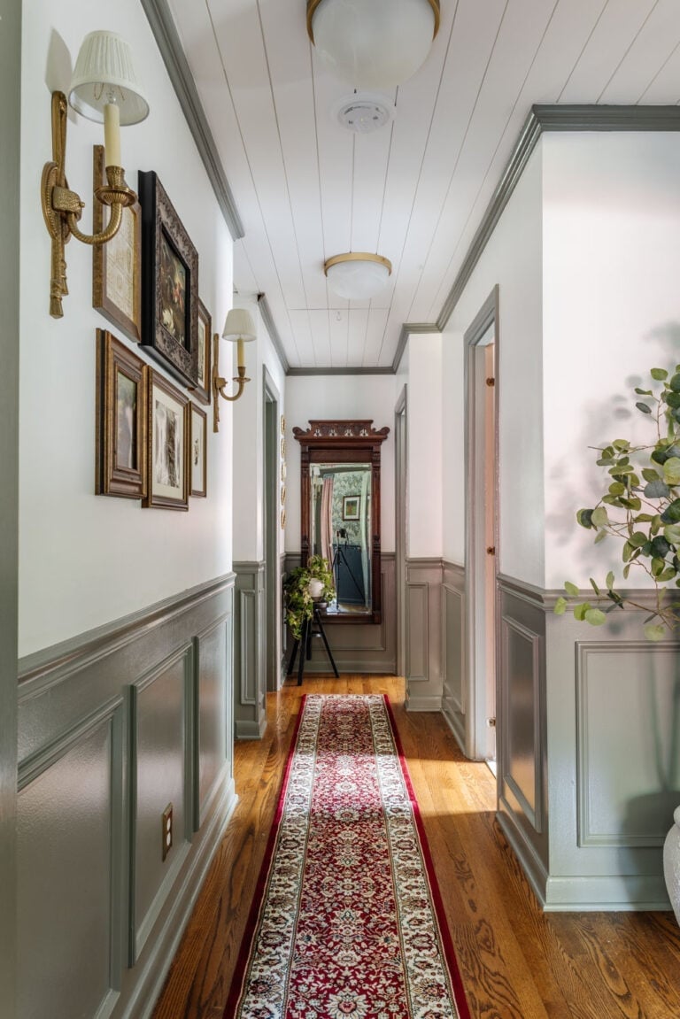
A long, narrow hallway can feel like a tunnel if the walls are all one color, but adding wainscoting with a contrasting molding color changes the proportions entirely. Here, the upper wall is white and the wainscoting is a soft gray, with the molding itself painted in a darker gray that stands out against both. The runner rug in red and wood tones pulls the eye down the length of the hall, and the wall sconces provide even light that prevents the narrow space from feeling dark.
The layout is the key factor: artwork is placed at the far end, which gives the eye a destination and makes the hallway feel like a room instead of a passage. A large mirror above the table reflects light from the opposite end, doubling the sense of width. For a narrow hallway, keep the molding profile simple and the spacing consistent. Overly ornate trim can visually crowd the walls, while a clean, traditional profile keeps the space feeling functional and open.
Green Walls with White Box Trim Molding in a Farmhouse Living Room
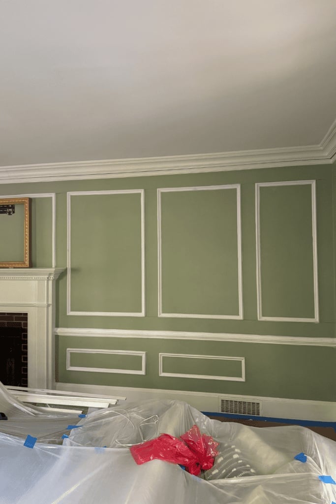
Box trim molding in white against deep green walls is one of those farmhouse moves that feels both classic and fresh. The green gives the room warmth and depth, while the crisp white trim keeps the look clean rather than heavy. A fireplace anchors the layout, and the molding frames the wall without competing with it. For a similar effect, keep the molding simple and let the color contrast do the work. The ratio here is about two parts green to one part white, and that balance is what makes the room feel finished without being fussy.
Final Thoughts
Wall molding design is more about shape and spacing than you might think. A tall rectangle draws the eye up, while a wide panel makes a room feel broader. Dark paint on the molding adds contrast without needing more trim. If you’re renting, stick to removable panels or stick-on molding. For everyone else, the time spent measuring and cutting pays off in a room that looks built, not decorated. Pick one wall, try one pattern, and see what it does to the light.