Choosing an exterior paint color for your house can feel like a high-stakes decision. It’s the first thing people see, and it needs to hold up against sun, rain, and snow.
This article rounds up 29 real-world exterior paint color ideas, from deep teal to soft sage, to help you narrow down the options. Each look focuses on the paint color itself, with the surrounding architecture kept simple and supportive.
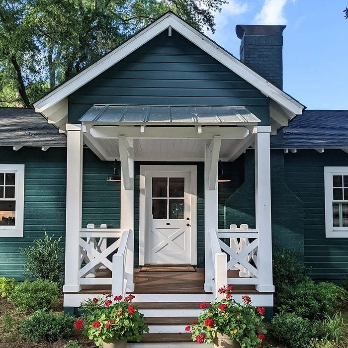
Deep Teal Charm for a Farmhouse Porch
A deep teal farmhouse exterior paint color brings a surprising amount of warmth to a compact front porch. The wood siding in this hue pairs well with a brick chimney and a metal roof, while white railings and a white door keep the space balanced. The palette is simple: deep teal against crisp white, with potted plants adding a natural touch. On your own porch, keep the entrance centered and the trim light to let the deep teal be the main event. The overcast light helps the color look rich.
Olive Green Sophistication in Mid-Century Modern Design
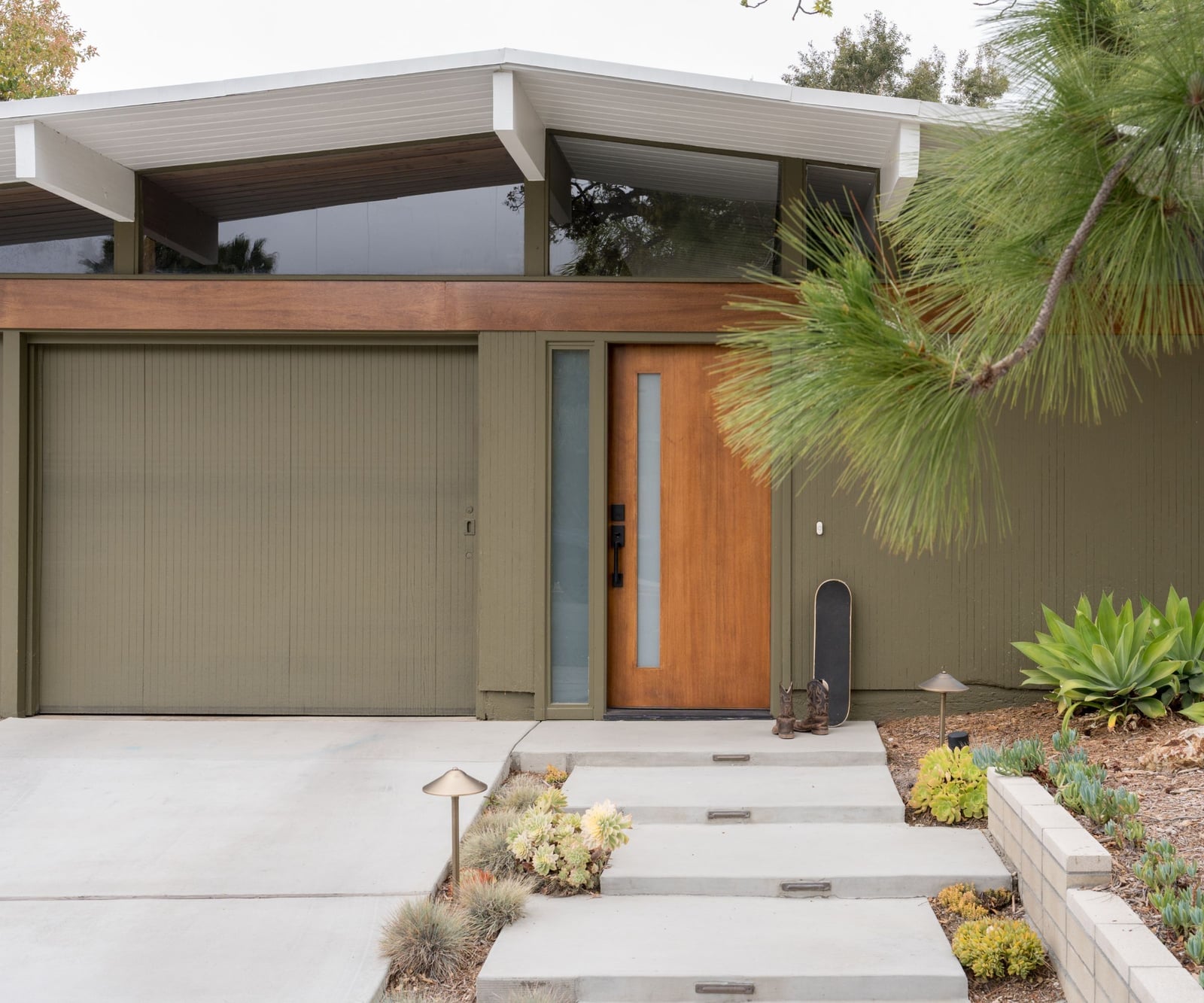
For a mid-century modern house exterior, olive green is a natural fit. The palette here pairs olive green siding with warm wood tones and concrete, creating a look that is grounded and sophisticated. The olive green is the dominant color, making up about two-thirds of the facade, while the wood and concrete provide contrast. A unique, angular roofline breaks the look, not a standard gable. The front door and garage door are in similar tones, so the eye moves across the whole facade without a jarring stop. This scheme pairs well with a green or neutral surrounding landscape.
Rich Dark Brown for a Classic Craftsman Exterior
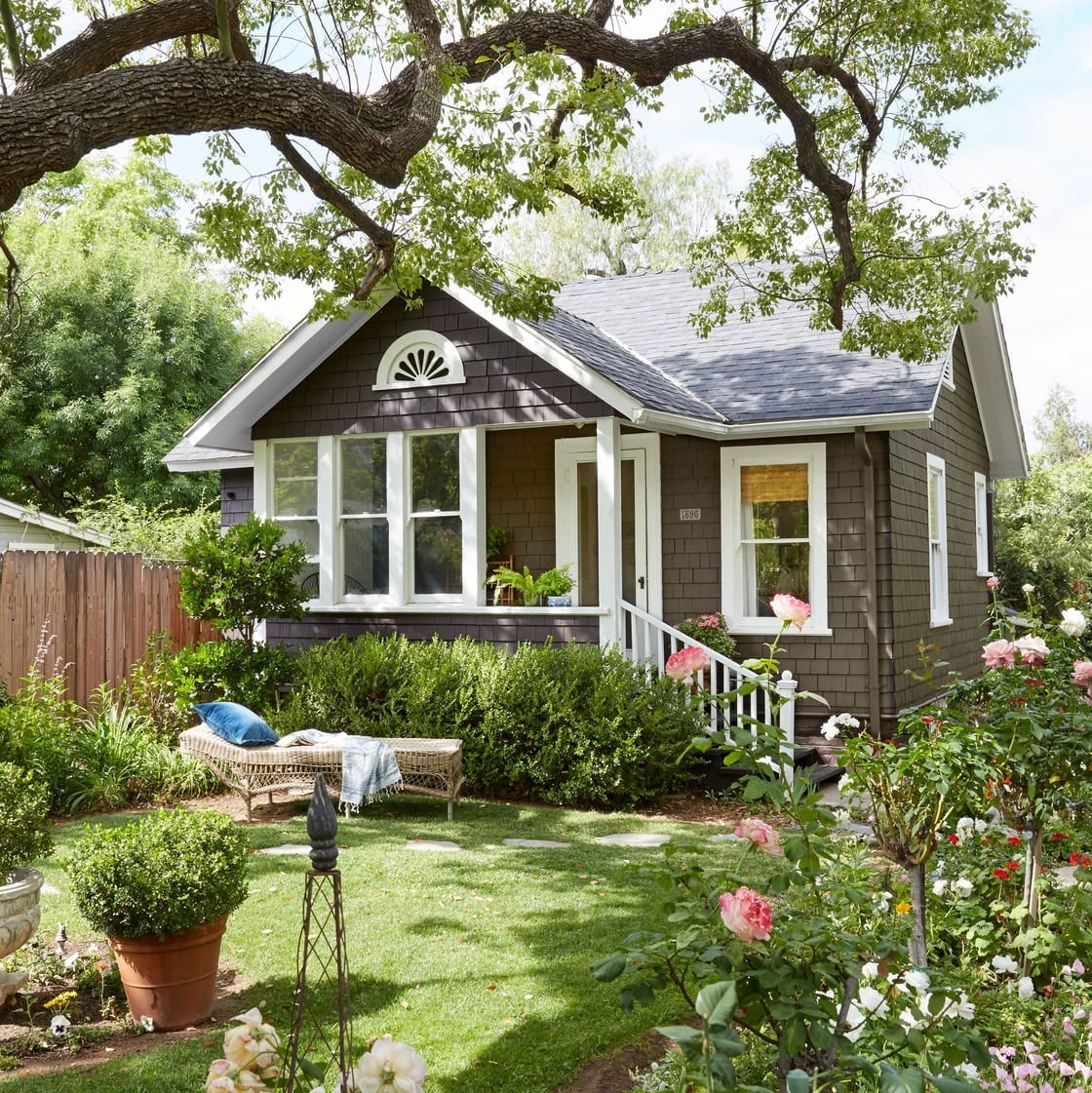
A rich dark brown craftsman house paint color makes a large house feel welcoming. The dark brown wood shingles anchor the house against the yard, while the white trim around windows and doors provides the necessary contrast. The bench in the front yard adds a human scale to the roomy facade.
For the materials, the dark brown color works well on wood shingles because it allows the texture of the material to show through. A flat or matte finish on the shingles helps the color appear soft and not shiny. The white trim should be in a semi-gloss to hold up to weather. This color choice means the house recedes into the landscape, which can be a good thing if you want the garden to stand out.
Earthy Sage Green Accents on a Craftsman Porch
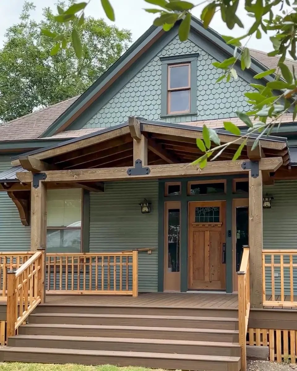
The sage green siding on this craftsman porch shifts in daylight. On an overcast day, it looks earthy and muted, with brown undertones that tie into the wood trim and shingles. The palette is tight: sage green, brown, and natural wood tones. The sage green covers the main body of the house, while the brown wood porch and door provide a warm counterpoint. Keep the railings and door in a similar wood finish to avoid adding a third color. The covered porch and steps leading up create a clear path to the front door, a practical layout for an inviting entrance.
Timeless Red Brick with Contrasting Brown Trim
A practical rule for exterior paint colors is that the trim should contrast with the main facade. For a red brick house with brown trim, the contrast is clear without being stark. The red brick provides a warm, classic base, while the brown wood trim around windows and the front porch adds depth. White accents, likely on the window sashes or porch details, keep the palette from feeling too dark. The palette here is about balance: the red brick is the largest area, the brown trim is the secondary color, and the white accents are the smallest. This arrangement makes the house feel solid and grounded. The traditional layout with a welcoming front porch works well with this color scheme.
Crisp White Brick for a Modern Aesthetic
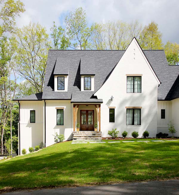
White brick might sound like a safe choice, but it can be a bold one when paired with the right details. This facade uses a clean white brick exterior, offset by a dark roof and large windows that break up the surface. The result is a modern look that feels open rather than stark. The key is in the contrast: dark framing and metal accents keep the white from feeling flat, while the brick texture adds depth that painted siding cannot match. For a renter-friendly version, try a brick veneer in a matte white finish. It gives the same clean backdrop without a permanent commitment.
Deep Blue Siding with Stone Foundation Contrast
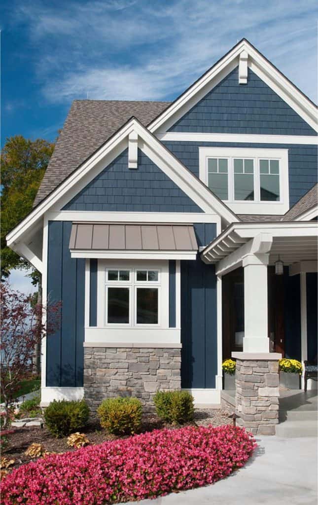
The deep blue siding here does more than add color. It creates a clear visual break against the stone veneer foundation, giving the facade a layered structure that feels intentional. The white trim and columns bridge the two materials, keeping the look cohesive rather than choppy. For a renter-friendly approach, focus on the contrast rather than the paint. Add a dark blue outdoor rug or a set of deep blue cushions on the porch to echo the siding color. It is a low-risk way to test how the palette works with your existing stone or brick.
Monochromatic White Modern Farmhouse Appeal
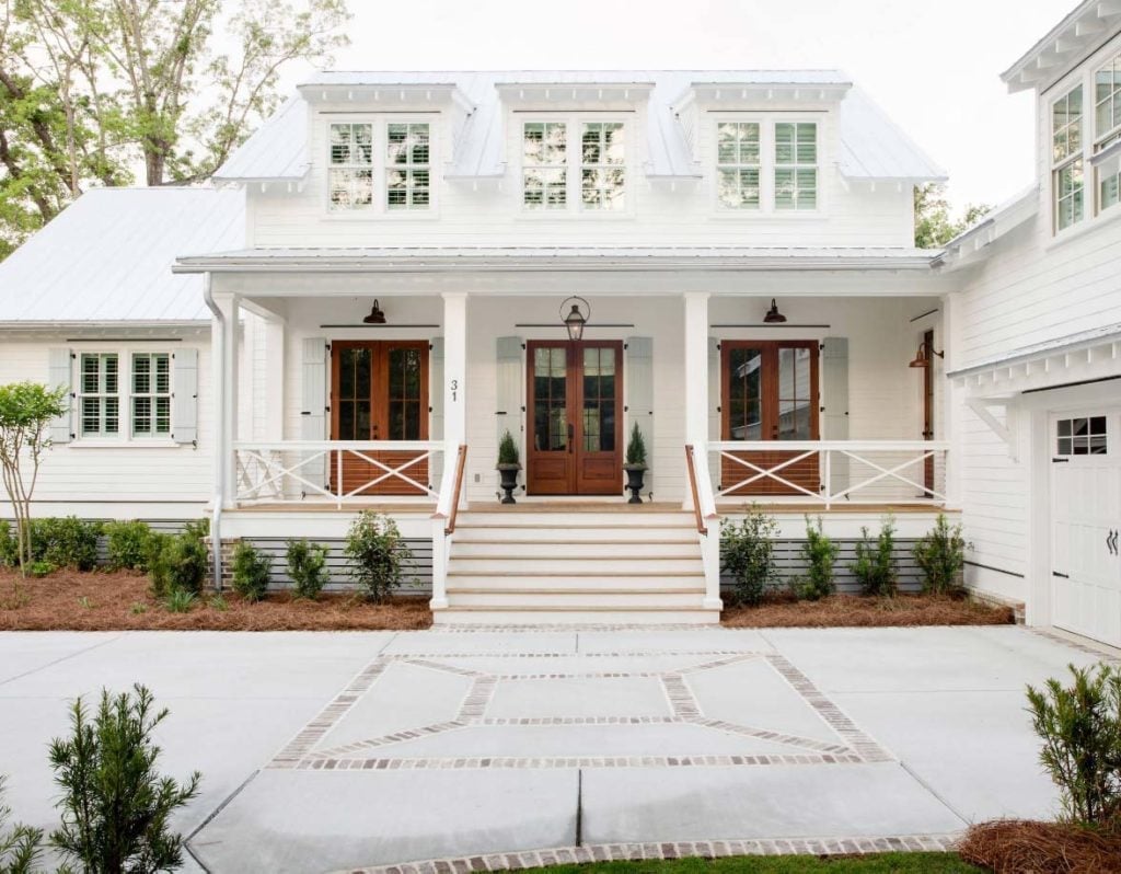
An all-white facade can read as crisp or cold, and the difference is often in the accents. This modern farmhouse keeps the palette monochromatic but adds warmth with wood doors and a metal roof that reads as dark charcoal. The white siding, white trim and white porch railing create a seamless backdrop, while the wood elements prevent the house from feeling sterile. The front doors, with their natural grain, become the focal point. A monochrome scheme like this works best when you have at least one material that brings warmth, whether wood, stone or a deep roof color.
Charming Blue Shingles for a Cottage Feel
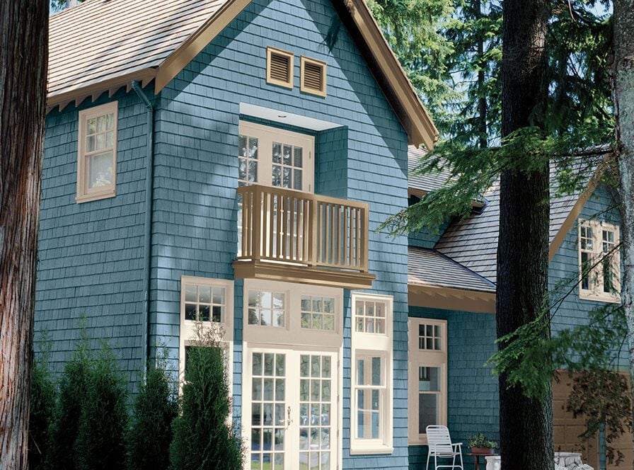
Can a single color make a house feel like a cottage? In this case, the blue shingle siding does most of the work. The shade is a muted blue, not too bright, which keeps the look grounded rather than cutesy. Beige trim and white window frames soften the blue, while the multi-level layout with a balcony adds character. The shingle texture itself is important. Wood shingles take paint differently than smooth siding, holding color in a way that feels more textured and less uniform. For a rental, try a blue stain on the shingles if you have permission to alter the exterior. It lets the wood grain show through.
Classic Dark Gray Siding with Crisp White Trim
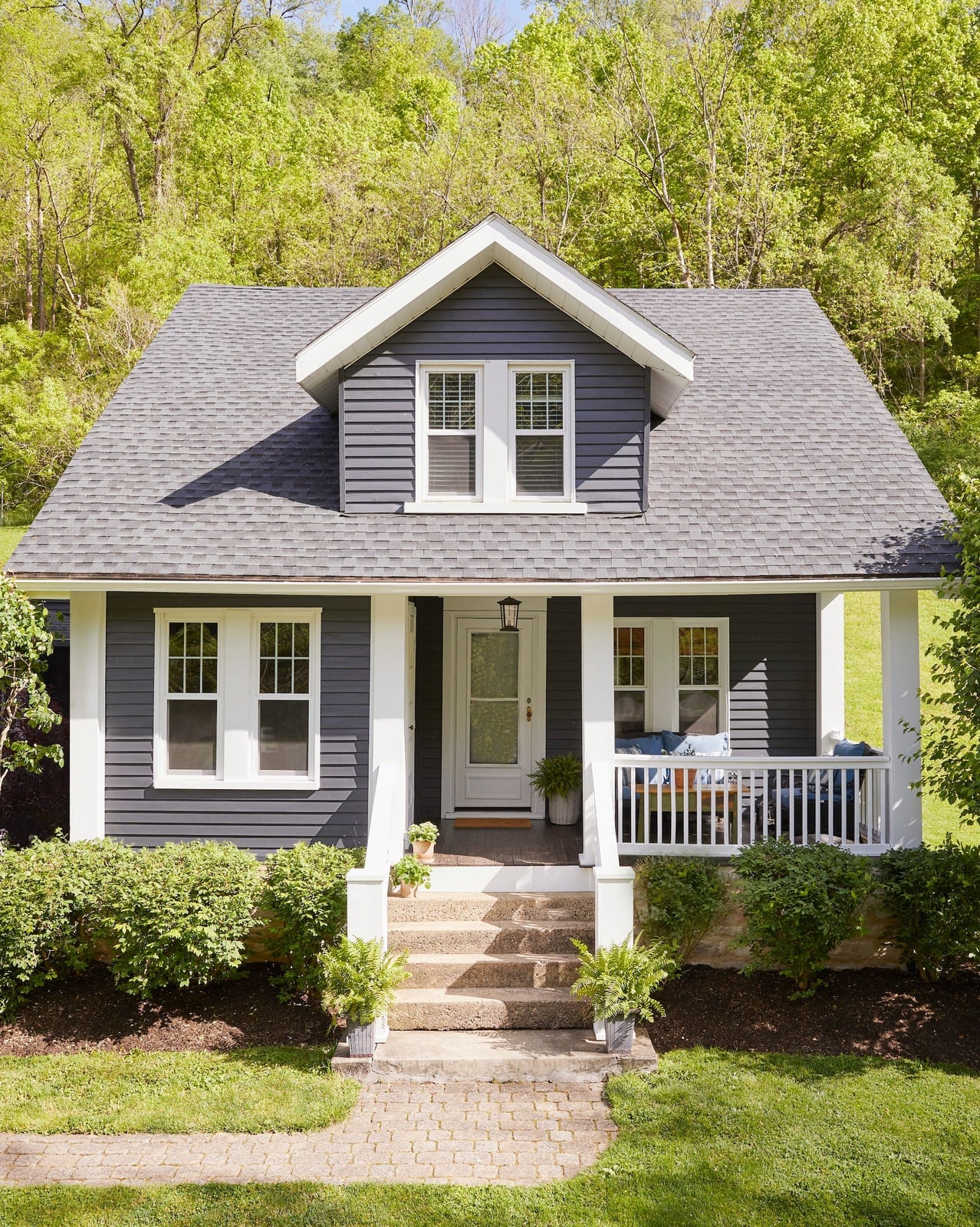
Dark gray siding with white trim is a classic combination for a reason: the high contrast looks clean and deliberate without needing a third color. This traditional house uses dark gray vinyl siding against white porch posts and trim, with green bushes softening the base. The stone steps add a natural element that keeps the dark gray from feeling heavy. One practical note about scale: on a compact house, dark siding can make the facade look smaller. Keep the trim bright and the landscaping full to counterbalance the darker mass.
Bold Dark Navy Siding with Brick Accents
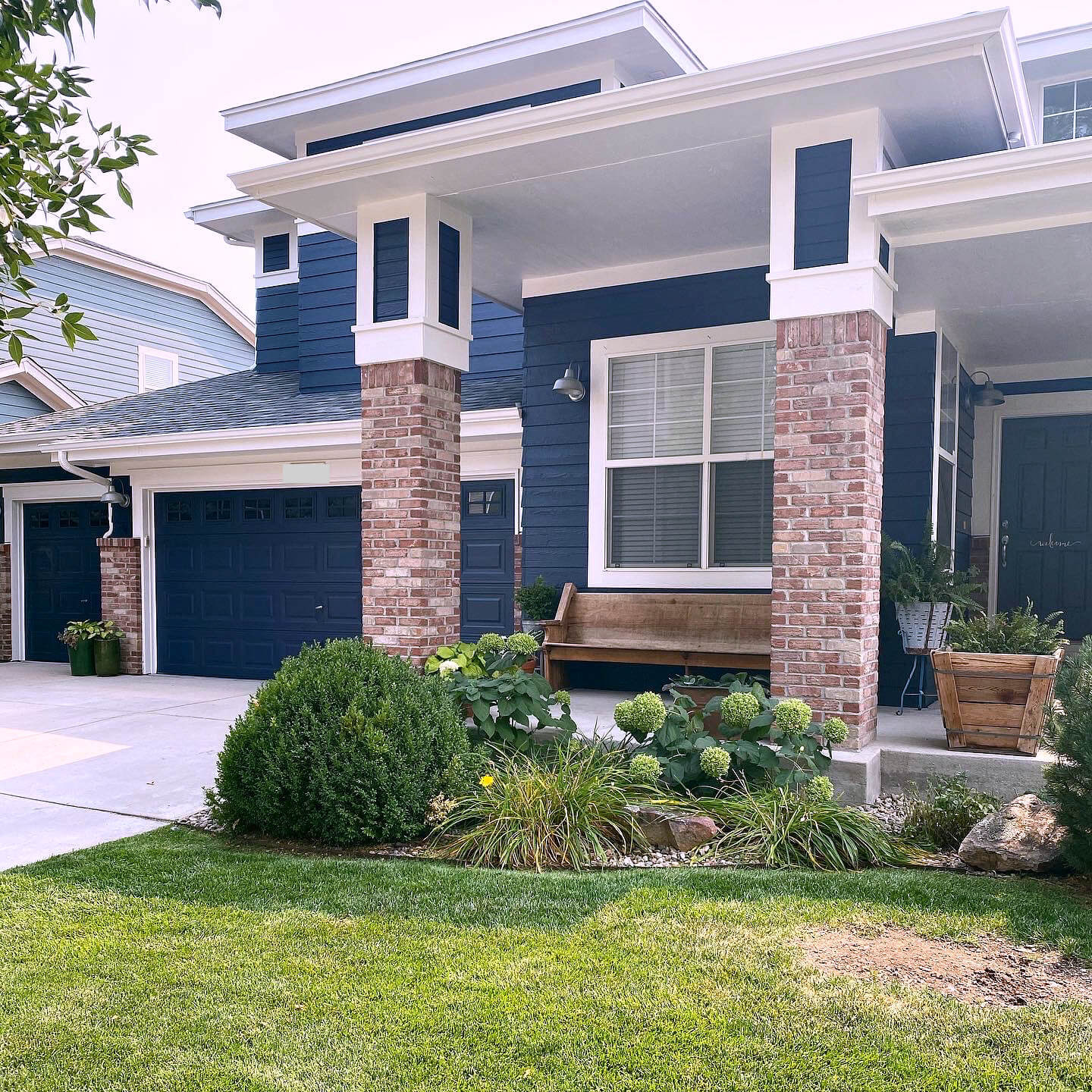
A dark navy exterior forms a single, commanding shape when the trim stays simple. Here the siding wraps the main facade and garage doors, while brick columns and a brick foundation break up the mass without competing. A white bench near the entry lightens the overall look. The trick is to let one material dominate and use the other as punctuation.
Striking White Brick and Charcoal Gray Contrast
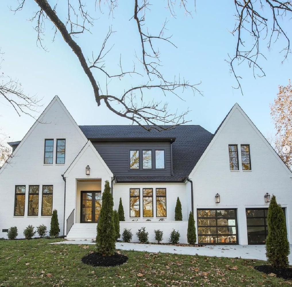
Most modern farmhouses pick one light color and run with it. This one does the opposite: a white brick section on one side, a charcoal gray wood-siding section on the other, split by a central gable. The symmetry keeps the contrast from feeling random.
Large windows and black garage doors reinforce the bold division. The palette works because the white brick reads as the base and the charcoal gray acts as the anchor. Without the clear center line, the two tones would fight.
Subtle Light Gray Siding for Traditional Elegance
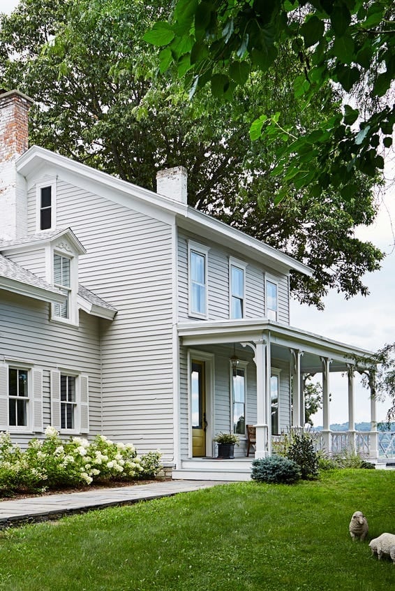
Light gray siding on a traditional house adds depth that white cannot. Here the side view shows the gray against white trim and green bushes, creating a soft transition. The porch and shutters stay white so the gray feels like a backdrop, not a statement.
Sage Green Craftsman with Natural Accents
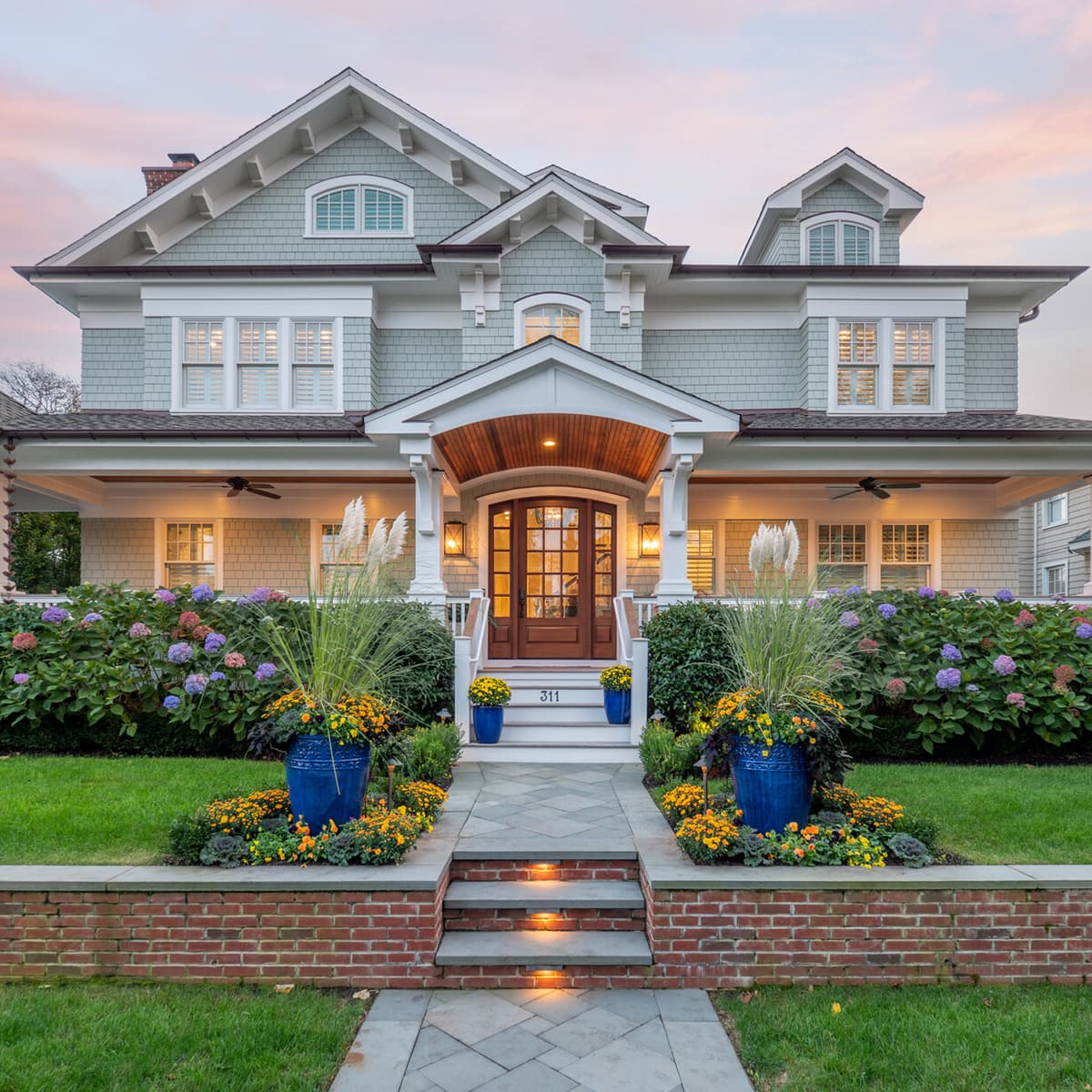
Sage green on a craftsman exterior works because the undertone pulls from the same earthy palette as wood and brick. Here the shingles sit above a brick foundation, with wood columns and stone details on the porch. Large planters with lush greenery reinforce the natural feel. The soft dusk light makes the sage muted, not pastel.
Coastal Light Gray Shingles with Copper Accents
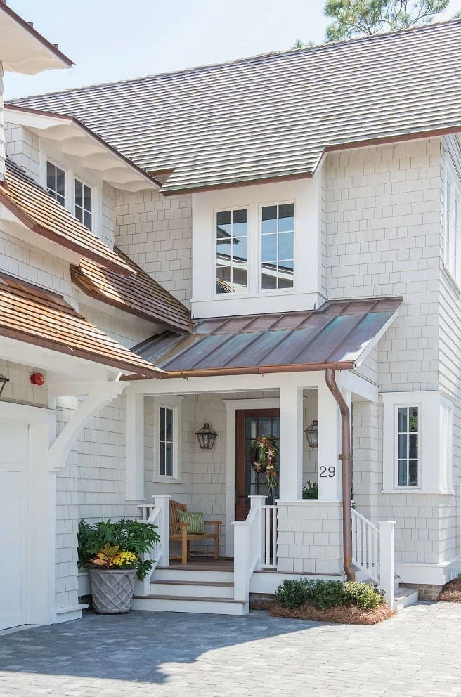
A coastal house needs a color that fades into the sky rather than competing with it. Light gray shingles do exactly that. The real interest here comes from the copper roof accents and a copper light fixture near the front door. Copper warms up as it ages, so the palette gets better over time.
The white porch railing and a simple wooden chair keep the look casual. If you want coastal without the cliche blue, this is the swap.
Classic White Farmhouse with Dark Green Shutters
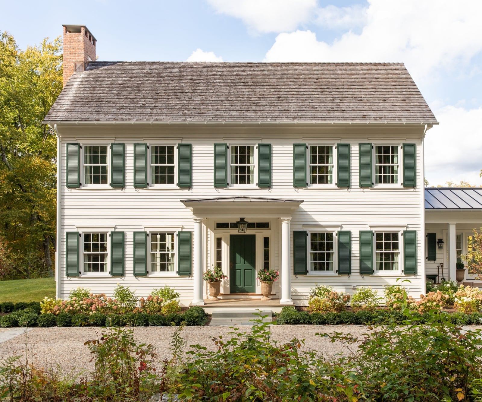
Crisp white wood siding covers the front facade, and the dark green shutters frame each window with a clean, traditional contrast. The farmhouse style stays true to its roots here, with the white walls acting as a backdrop and the shutters doing the heavy work of defining the look. A stone foundation anchors the house to the ground, and the front porch adds a welcoming spot to land. The palette keeps things simple: white, green, natural wood, and stone. If you want a version of this that costs less time to change later, swap painted shutters for ready-made ones in a similar dark green. You get the same color punch without committing to a full paint job.
Dark Navy Siding with Brick Steps and Pathway
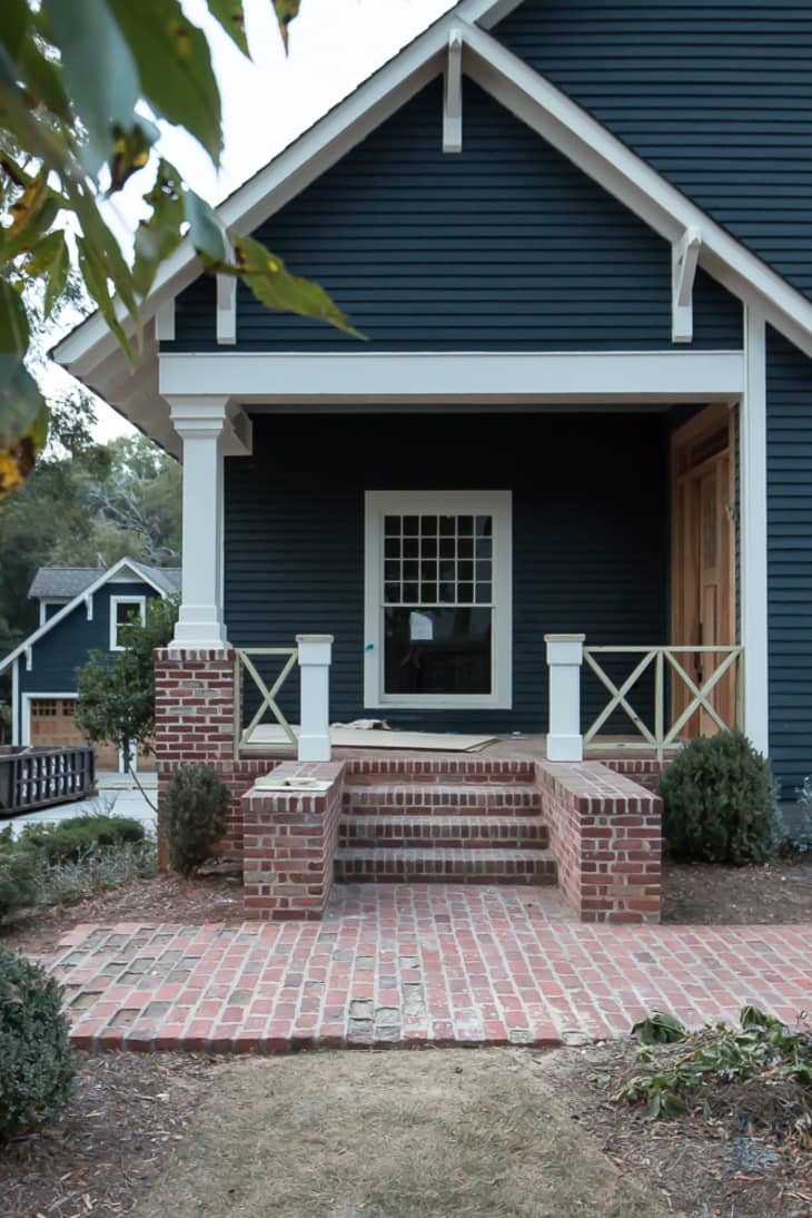
A practical rule for dark exterior paint is to let the ground plane do the balancing. Here, dark navy siding covers the main facade, and the white trim keeps the windows and roofline from disappearing into the color. The brick steps and pathway lead the eye from the street up to the front porch, adding a warm red-brown tone that breaks up all that deep blue. The wood trim on the porch posts keeps the traditional feel intact. For renters, this look is not about painting the siding. You can mimic the effect by adding dark navy outdoor furniture cushions or a navy front door mat on a lighter house. The idea is the same: a dark anchor against a pale background, just easier to undo.
Deep Blue Modern Home with Gray Stone Base
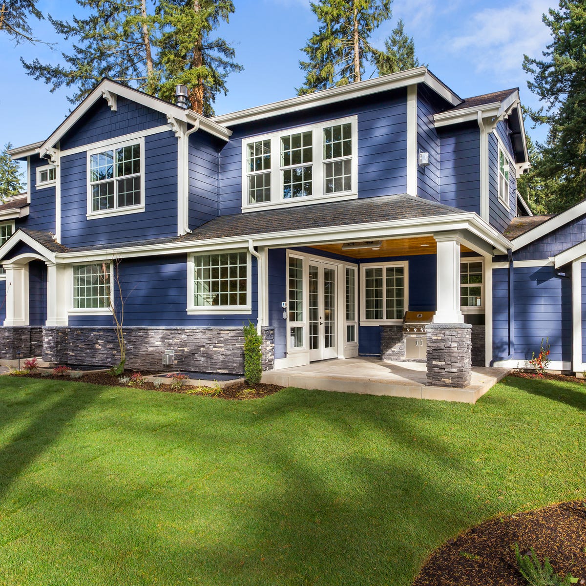
Where a deep teal farmhouse leans on charm and contrast, this deep blue modern home goes for a cleaner, more restrained palette. The deep blue siding covers the bulk of the rear facade, and a gray stone veneer wraps the lower portion, grounding the house without needing a porch or heavy trim. White soffits under the roofline keep the edges sharp and defined.
The covered patio extends the living space into the backyard, and the grill setup suggests this is where the cooking happens in warmer months. The wood soffit adds a natural note that stops the blue and gray from feeling too cold. If you want a similar look but prefer a warmer stone, try a tan or buff color instead. The blue stays the same, but the base shifts the whole mood.
Creamy White Farmhouse with Natural Wood Accents
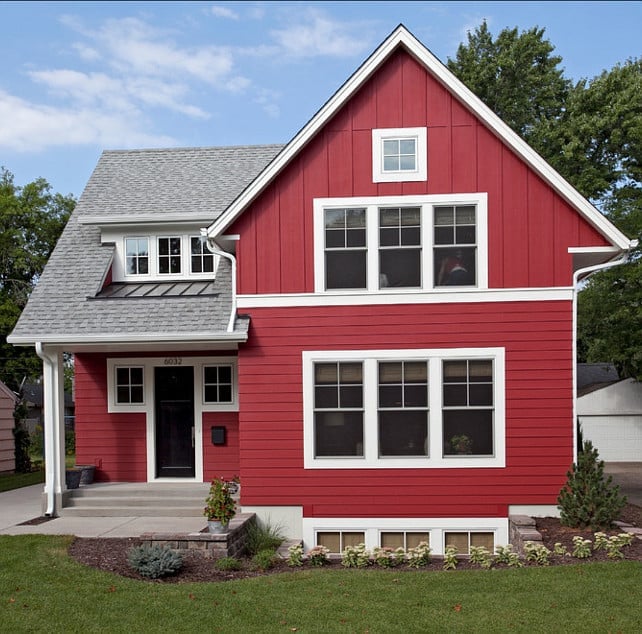
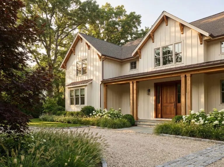
The warm cream siding on this farmhouse avoids the starkness of a pure white, giving the exterior a softer, more lived-in feel. Natural wood accents show up on the beams and trim, and the wood doors repeat the same tone, tying the whole facade together. A large porch runs across the front, supported by wooden posts that match the accent color. The gravel driveway and stone elements add texture without competing with the main palette. This combination holds up well in areas with strong sun, because the cream does not glare the way bright white can, and the wood tones age naturally. Just check your local climate before choosing a light cream over a true white.
Two-Tone Gray Siding for Craftsman Appeal
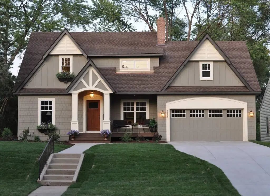
Two-tone gray siding is a straightforward way to add depth to a craftsman facade without introducing a third color. The upper story and dormers wear a lighter gray, while the lower level and porch use a darker shade. White trim outlines the windows and roofline, and the brown front door and garage door keep the palette grounded. Exterior sconces flank the entrance, providing warm light that softens the gray tones after dark. The stone foundation ties into the brown accents, making the whole composition feel intentional. The ratio here matters: the darker gray stays on the bottom third, so the house does not look top-heavy. If you want to try this on a rental, use the two-tone idea on planters or porch furniture instead.
White Siding with Light Blue Shutters and Door
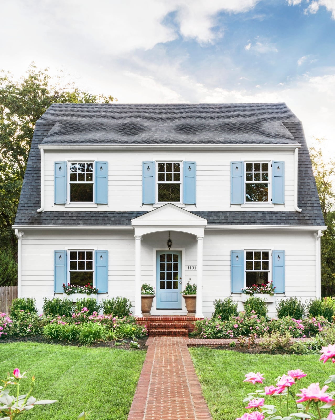
A white house with light blue shutters and a matching front door creates a balanced palette that feels both crisp and inviting. The brick red walkway adds warmth to the cool blue and white combination, grounding the facade. With daylight filtering through an overcast sky, the siding reads as a clean neutral, while the shutters provide a soft color focus. For a traditional home, this palette works because the blue stays muted rather than bright, so it complements the white without competing. The brick pathway anchors the color scheme by introducing a natural terracotta note. A centered house facade with roomy proportions allows the paint colors to speak for themselves.
Off-White Modern Home with Taupe Shutters
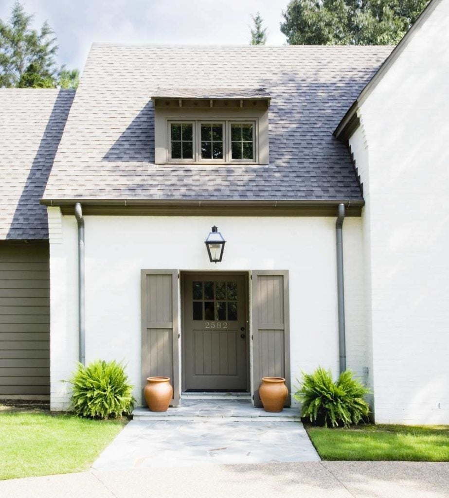
An off-white stucco exterior with taupe wood shutters reads as a deliberate study in neutrals. The taupe is warm enough to avoid looking flat against the stone base, yet subdued enough to keep the modern facade clean. Soft daylight helps the off-white appear luminous, not chalky. This pairing suits a modern home where you want contrast without the sharpness of black or navy. The shutters become the defining detail without overwhelming the stucco expanse.
Rich Deep Purple Victorian Exterior
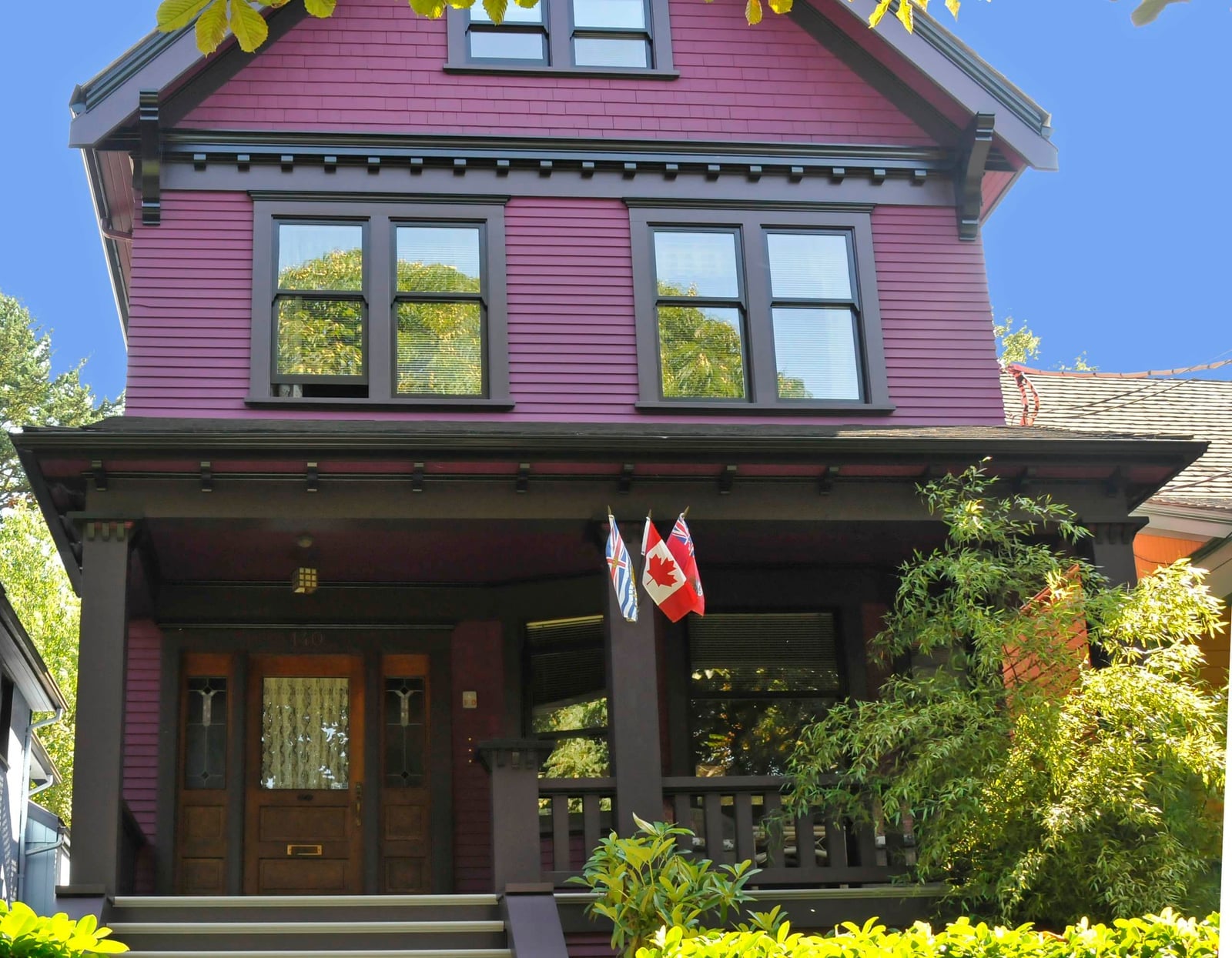
A deep purple exterior for a Victorian house draws the eye to the architectural details of the porch and windows. The dark brown trim frames the rich hue without competing, letting the purple carry the character. In sunny daylight, the color is bold but not garish because the purple is deep. The trim stays neutral and the purple is the single statement. The painted siding and wood trim keep the look cohesive, with the dark brown grounding the facade.
Expansive White Colonial with Black Shutters
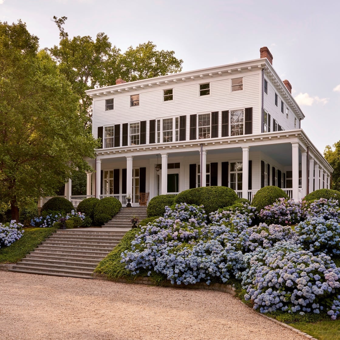
A white colonial with black shutters reads as the standard for traditional American architecture, but the scale changes how the combination lives. On a grand facade with columns and a sweeping lawn, the white expands the visual footprint during golden hour light. The black shutters anchor the windows, preventing the white from feeling too vast. Blue hydrangeas near the entrance add a soft color note that breaks the strict black-and-white scheme. This pairing suits a large home because the contrast is strong enough to define the architecture without making the house feel heavy. The stone foundation adds a natural base that keeps the look grounded.
Vibrant Bright Blue Colonial Facade
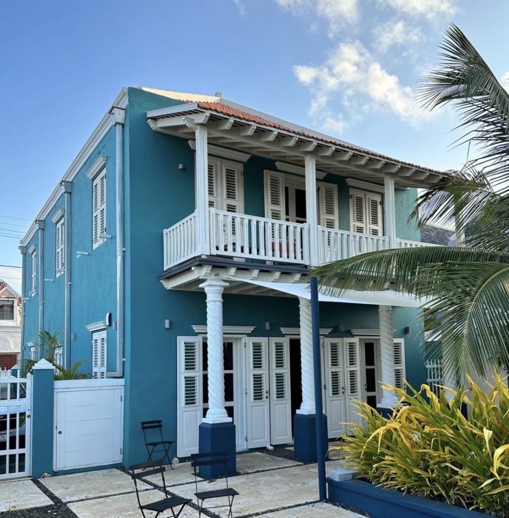
A bright blue stucco facade with white wood shutters gives a colonial home a lively, personal character. The white trim keeps the blue from overwhelming the architecture by providing clear boundaries around the windows and doors. In sunny daylight, the blue reads as saturated but not harsh, because the white balances the intensity. This palette suits a home where you want the color to be the first thing people notice. The balcony and shutters maintain the colonial style while the blue makes it feel current.
Earthy Sage Green Shingles with Stone Foundation
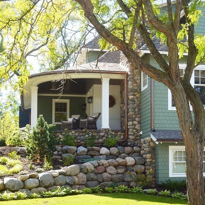
Sage green shingles paired with a natural stone foundation create a look that feels grounded and quietly traditional. The earthy green stands out against the white columns and wood trim, while the stone base adds texture without competing for attention. The palette works because the shades share a muted, organic quality. Choose a sage with a hint of gray so it shifts with daylight. The stone foundation also helps define the boundary between house and landscape, making the whole facade feel settled into its site.
Yellow Stucco Craftsman with Brick Red Accents
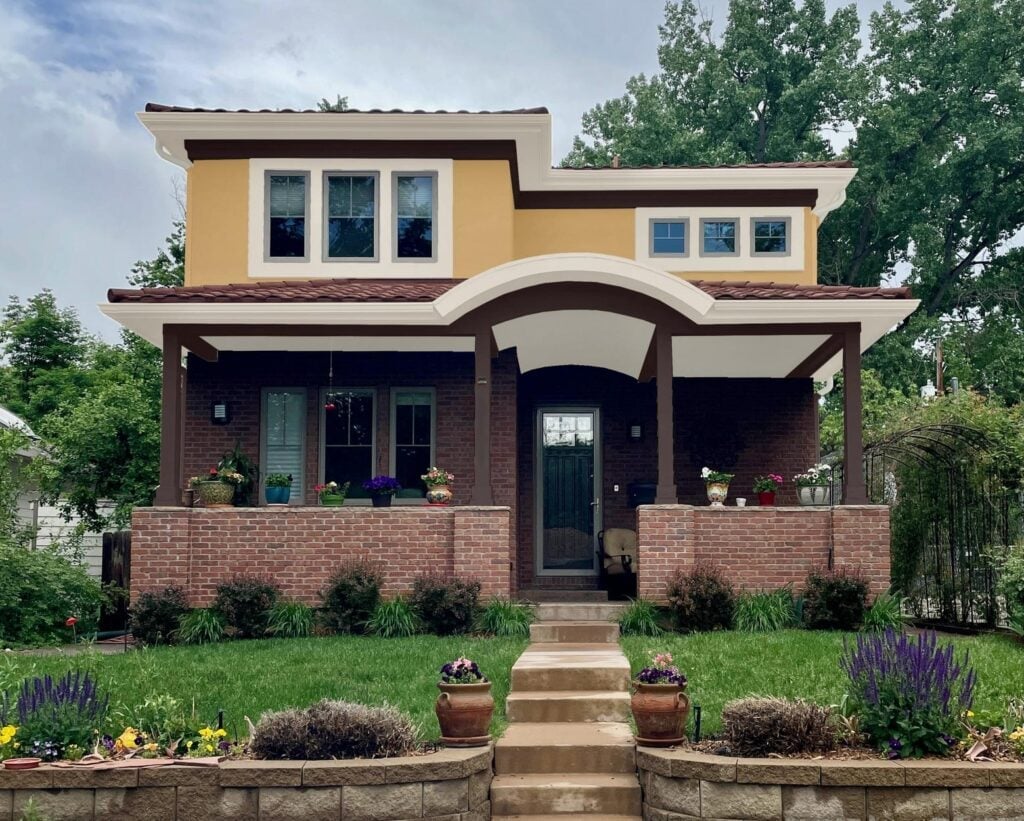
A yellow stucco facade might feel risky until you see it anchored by a brick red base and brown wood trim. The warmth of the yellow is balanced by the earthy brick, keeping the exterior from reading as too sweet or pastel. The tile roof and arched porch reinforce the craftsman character without adding more color to compete.
For renters, this palette is a good reference for temporary upgrades. A warm neutral throw on a porch chair or a terracotta planter near the entry can echo the brick and stucco contrast. You are not repainting the house, but you can borrow the color logic. Stick to one warm accent at a time so the facade does not look busy.
Teal Blue Front Door as a Focal Point
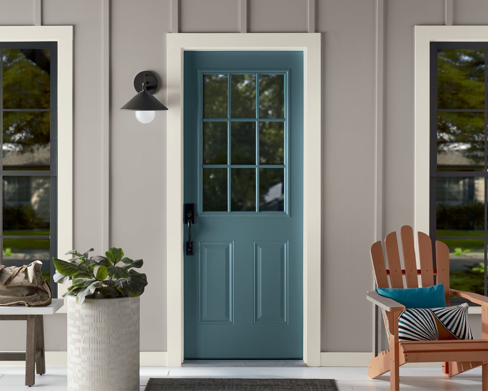
A teal blue front door stands out against a gray house facade without feeling jarring. The door is painted wood, and the color is saturated enough to hold its own next to the neutral siding and natural wood accents. A small chair and a potted plant near the entry keep the vignette from feeling sparse. The teal works because it shares a cool tone with the gray, so the contrast looks deliberate. For a rental, a removable door wrap or a temporary film in a similar blue can give the same focal point without permanent paint.
Vibrant Pink Mediterranean Facade with Blue Accents
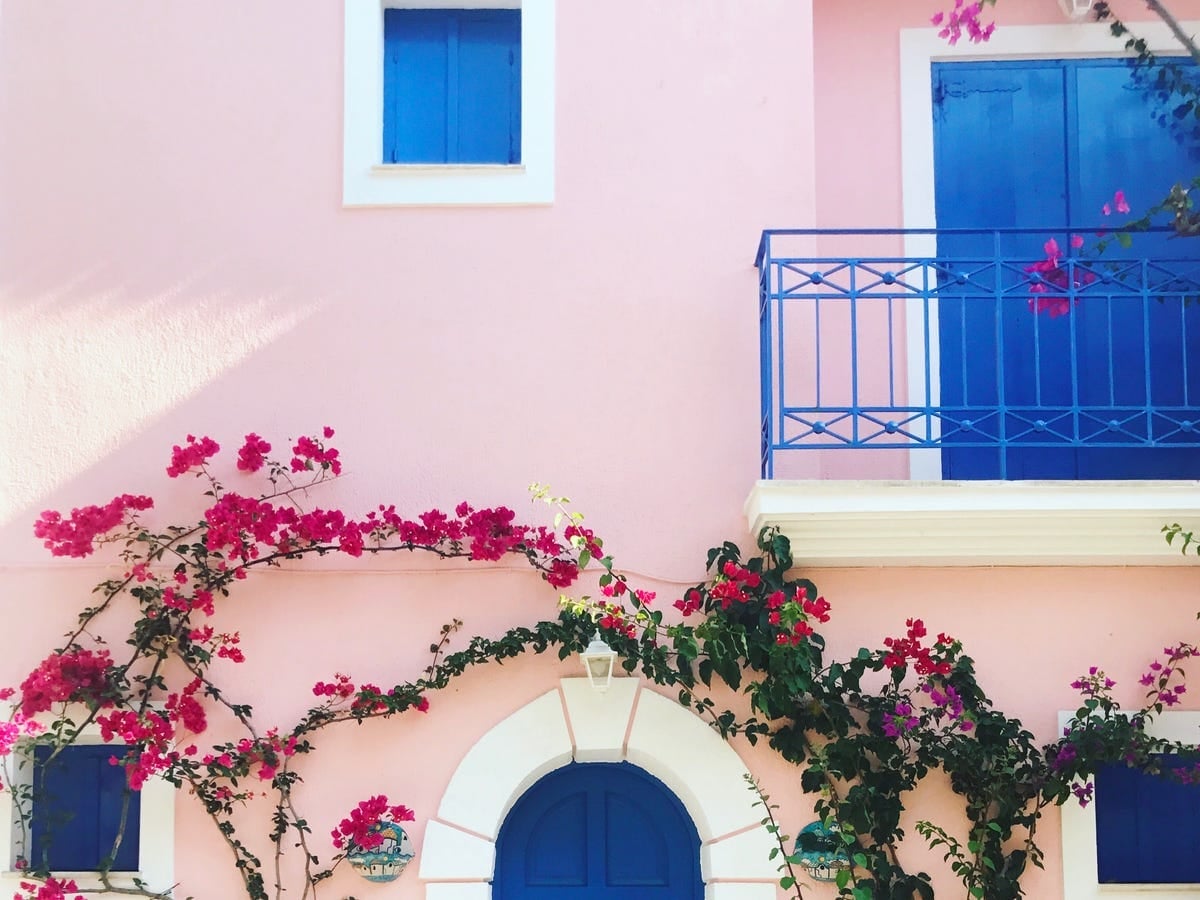
A pink stucco facade with bright blue doors and window frames is a bold choice that relies on the sunny climate to feel natural rather than garish. The pink is warm and dusty, not bubblegum, so it pairs well with the vivid blue accents. The balcony, doors, and windows are all painted wood, and the repetition of blue keeps the palette cohesive. This kind of color scheme works best in full sun, where the stucco can reflect light without looking washed out. Check your USDA zone for heat and UV exposure before committing to a saturated exterior shade.
Final Thoughts
From deep teal farmhouse charm to vibrant pink Mediterranean facades, these 29 exterior paint colors show how much a single shade can transform a home’s personality. The best color is one that feels right for your house’s architecture and your own taste. Remember to test samples in different lights, consider your trim and landscape, and think about how the color will look year-round. A thoughtful choice now can bring you joy for years to come. Take your time, enjoy the process, and trust your instincts.