First impressions start at the front door. Your entry color sets the tone for your whole home, signaling warmth, personality, or a wink of whimsy before anyone steps inside. Whether you lean traditional or crave something bolder, the right shade turns a functional door into a design statement.
From classic reds to unexpected corals and calming greens, this collection of 30 front door color ideas offers fresh inspiration for every architectural style. You will find practical guidance on how each hue interacts with brick, stone, stucco, and wood, helping you choose a color that feels intentional and welcoming.
Classic Red Front Door for Timeless Traditional Charm
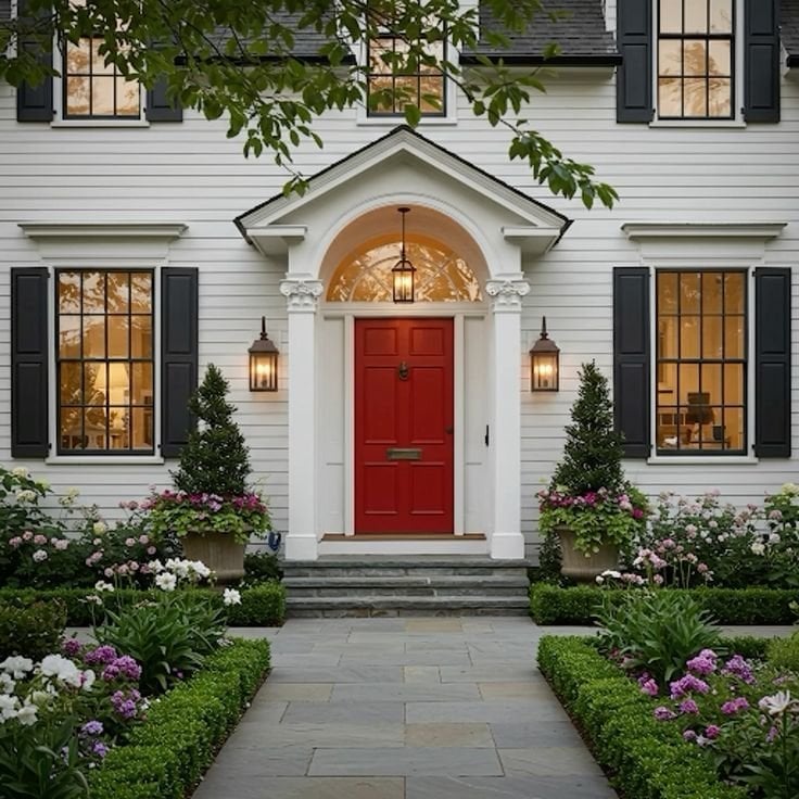
A bold red door is a direct way to signal a traditional home, especially when the palette around it stays neutral. Here the red sits against white siding, dark green topiaries, and a stone path, so the color reads as the deliberate focal point rather than a random bright spot. The ratio of red to white to green is what defines the look: one strong hue, a light backdrop, and deep green for stability. What breaks the scheme would be adding another saturated color near the door, which would split attention and weaken the front door’s role as the anchor.
Soft Lavender Door for a Charming Cottage Entrance
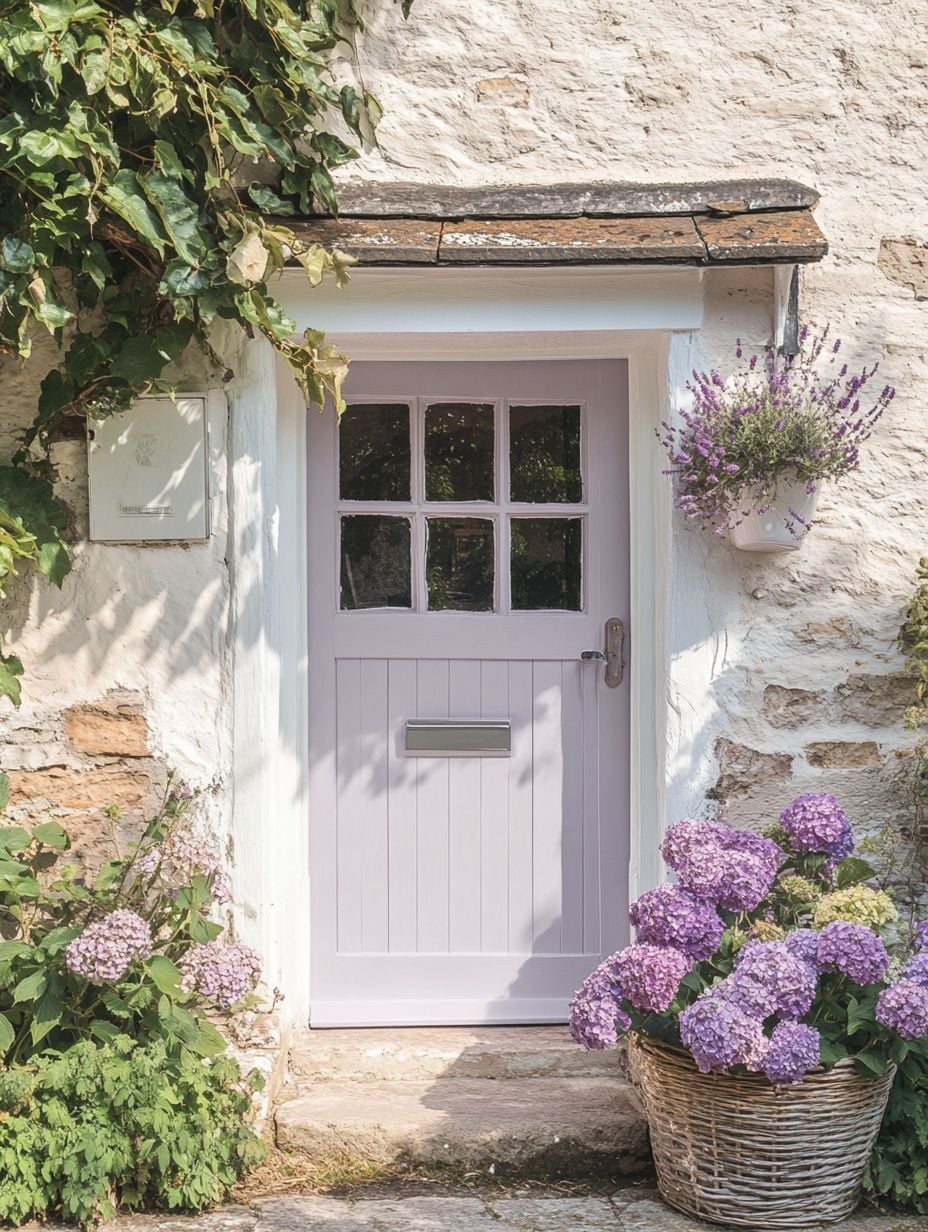
A lavender door works because it is a quiet color that still carries personality. On a compact cottage entry with a stone surround and a single multi-pane window, the soft purple does not fight the rough texture of the stone or the dark roof. The palette here is narrow: lavender, stone gray, and the green of a basket planter. That restraint is what lets the door feel intentional rather than random. Adding a second pastel like mint or butter yellow to the same facade would break the calm, because the door would then compete for attention rather than lead it.
Salmon Pink Door for a Welcoming Farmhouse Porch
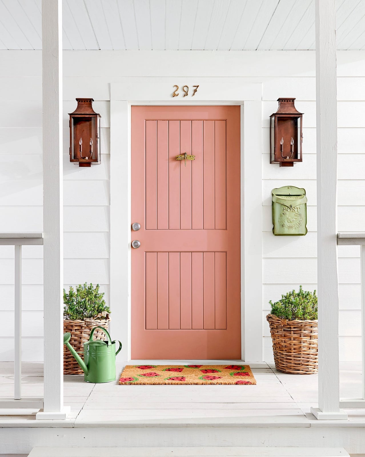
Can a pink door still read as farmhouse? Yes, when the pink is a muted salmon and the porch around it keeps to classic farmhouse materials. The paneled door is set between white railings and paired with black metal lanterns, wicker baskets, and a galvanized watering can. Those practical, un-fussy objects ground the pink so it feels like a chosen accent rather than a departure from the style. What defines this look is the ratio: salmon pink covers the door, white covers the trim and railings, and brown and green appear in smaller doses through the pots and plants. Breaking the balance would mean adding another pastel or a patterned door mat in a competing color, which would pull the eye away from the door and make the porch feel busy.
Pale Green Door Amidst Stone and Roses
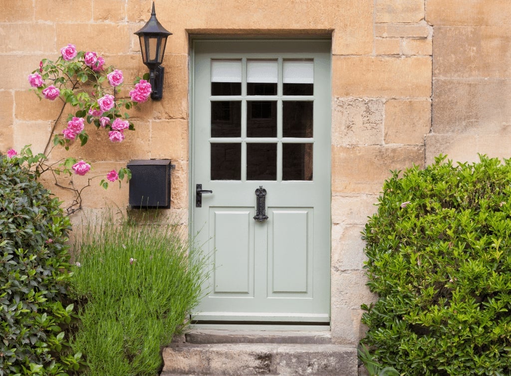
A pale green door blends into the surrounding landscape when the same green appears in leaves and vines. Here the door is set into a stone wall with climbing roses nearby, so the color looks like an extension of the garden. The palette is narrow: light green, warm stone, and the pink of the roses. That small range makes the door feel settled. Adding bright white trim around the door would break the quiet, because the contrast would pull the door forward instead of letting it sit comfortably within the stone and greenery.
Muted Green Door with Stucco and Topiaries
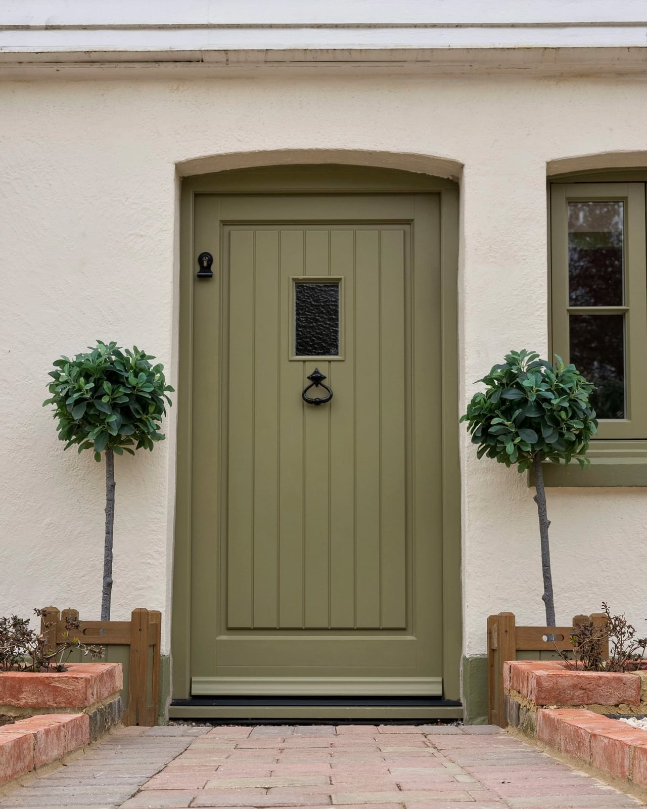
A muted green door on a stucco facade is a practical choice because the low contrast hides dust and weather marks better than a lighter color would. Here the door is centered between two topiary trees in pots, with a cream stucco wall and a brick step below. The green is soft enough that it recedes slightly, letting the shape of the doorway and the symmetry of the topiaries carry the entrance. The ratio is about equal parts green and cream, with brown from the pots and brick as a minor third. Adding a brightly colored welcome mat or a brass kick plate would break the restraint, because the eye would go to that detail instead of the calm balance between door and wall.
Natural Wood Door with Glass Panels for Modern Appeal
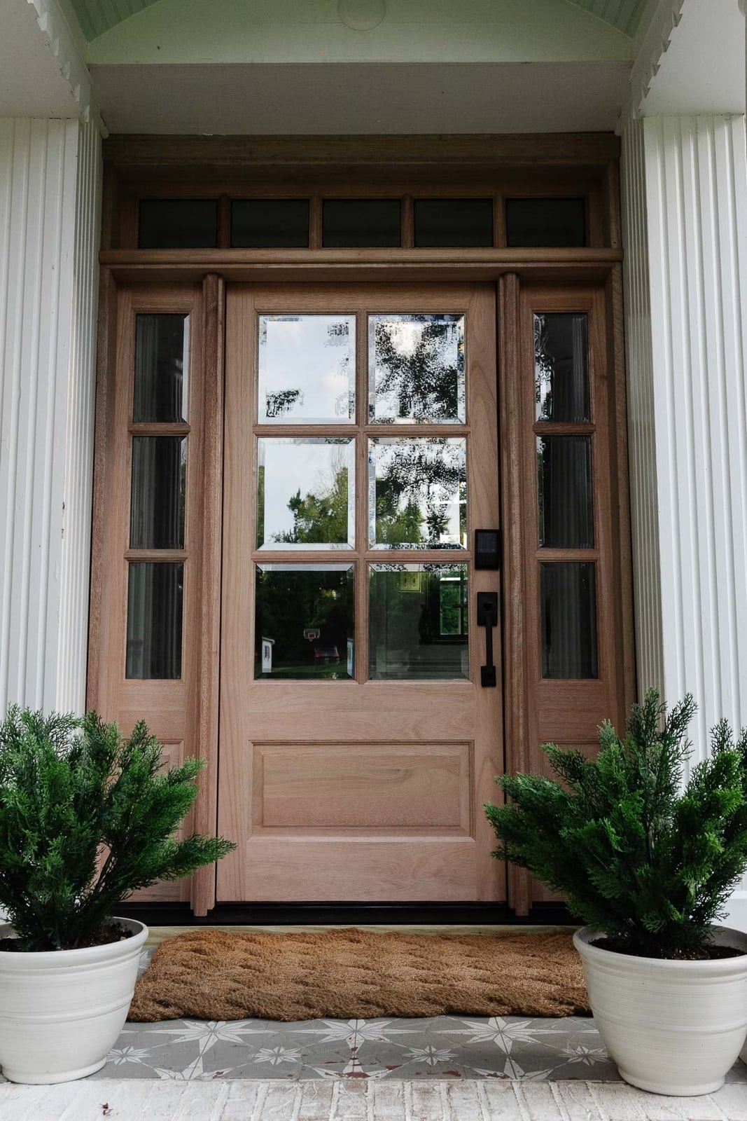
A natural wood door with glass panels offers a different pace than a painted one. The wood grain becomes the main event, so the surrounding palette should stay quiet. Here, a centered wood door with sidelights sits against stone, with white and green accents in the potted plants nearby. The daylight pulls warmth from the grain, making the entrance feel roomy without needing extra color. This is a materials-first choice: the door itself sets the tone, and the glass panels let light pass through while keeping the look polished. What defines this style is the balance between the wood’s organic texture and the clean lines of the sidelights. The ratio leans heavily on natural tones, and the only thing that breaks it is clutter, so keep the porch simple.
Classic Black Door with Brass Hardware in Historic Setting
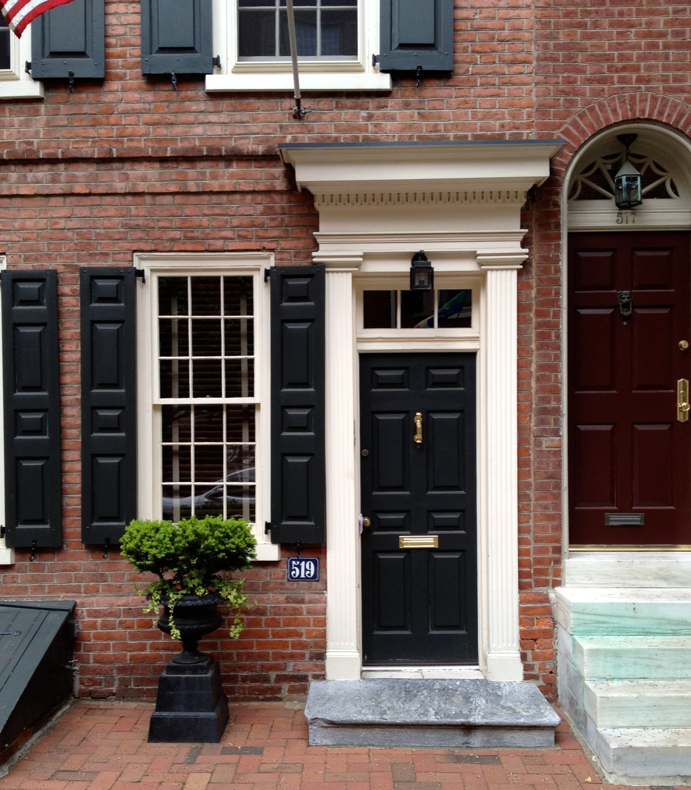
A black paneled door set into a recessed brick archway, flanked by a window and topped with cream trim, reads as a classic choice that suits a historic home. The brass knocker and hardware add a warm metallic note against the dark paint. For renters, this look is surprisingly achievable: a temporary door wrap or high-quality peel-and-stick film in a matte black finish can mimic the effect without altering the original door. Swap the existing hardware for a brass knocker or handle that screws on, and store the originals for move-out. The key is keeping the trim around the door clean and light, so the black stays grounded.
Vibrant Coral Double Doors for a Grand Entrance
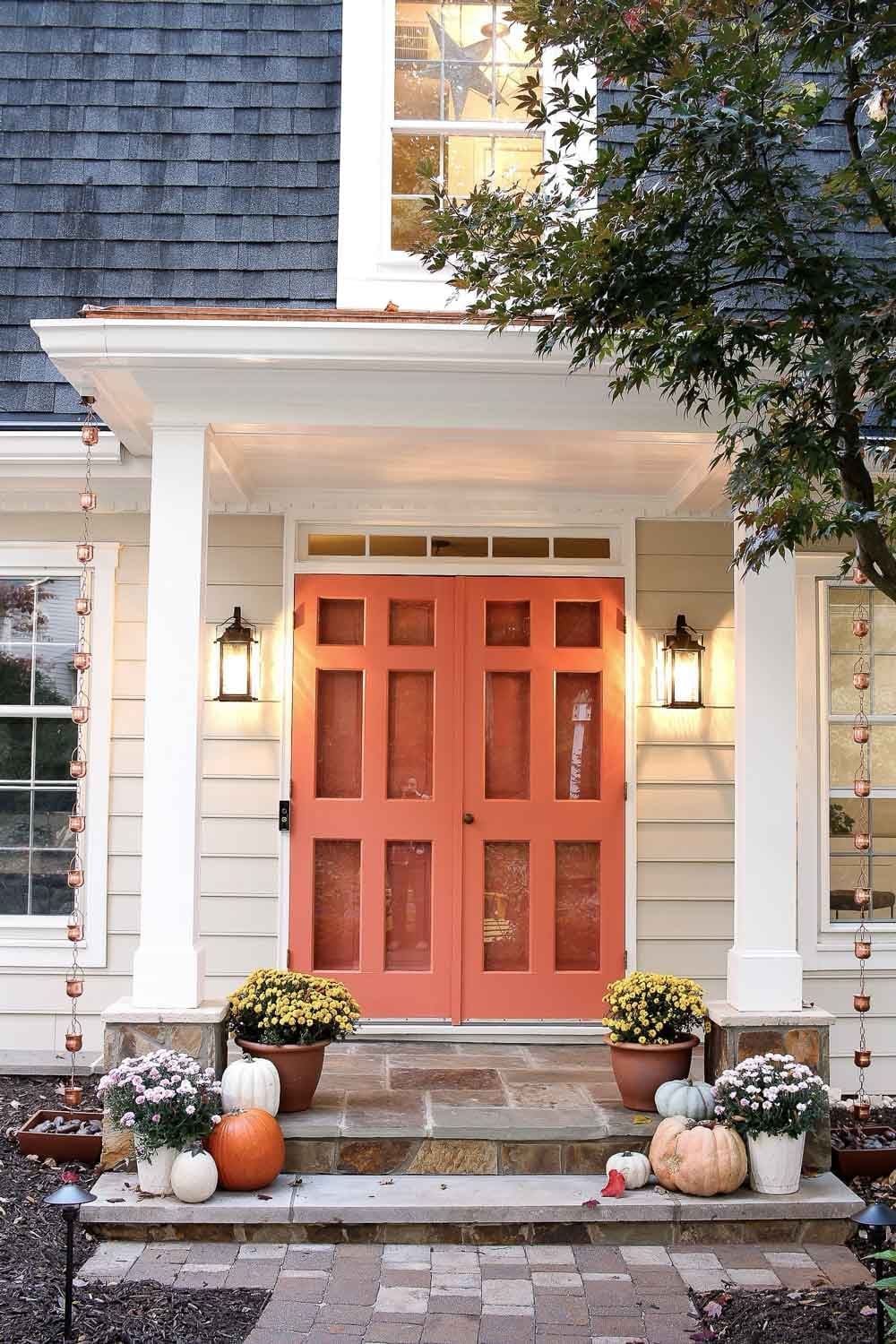
Coral double doors on a traditional porch make a clear statement: this entrance is meant to be noticed. The color sits between pink and orange, and against beige siding and white trim, it finds its balance. Stone steps and a pair of lanterns add structure, while potted plants and a few pumpkins soften the look for fall. In the evening, the artificial light from the lanterns warms the coral further, so the doors don’t fade into the dark. The palette here is about contrast, but the ratio matters: the coral covers only the doors, not the walls or trim, which keeps it from feeling overwhelming. What would break the look is adding another bright color nearby, so let the coral lead.
Pale Pink Door with Black and White Steps
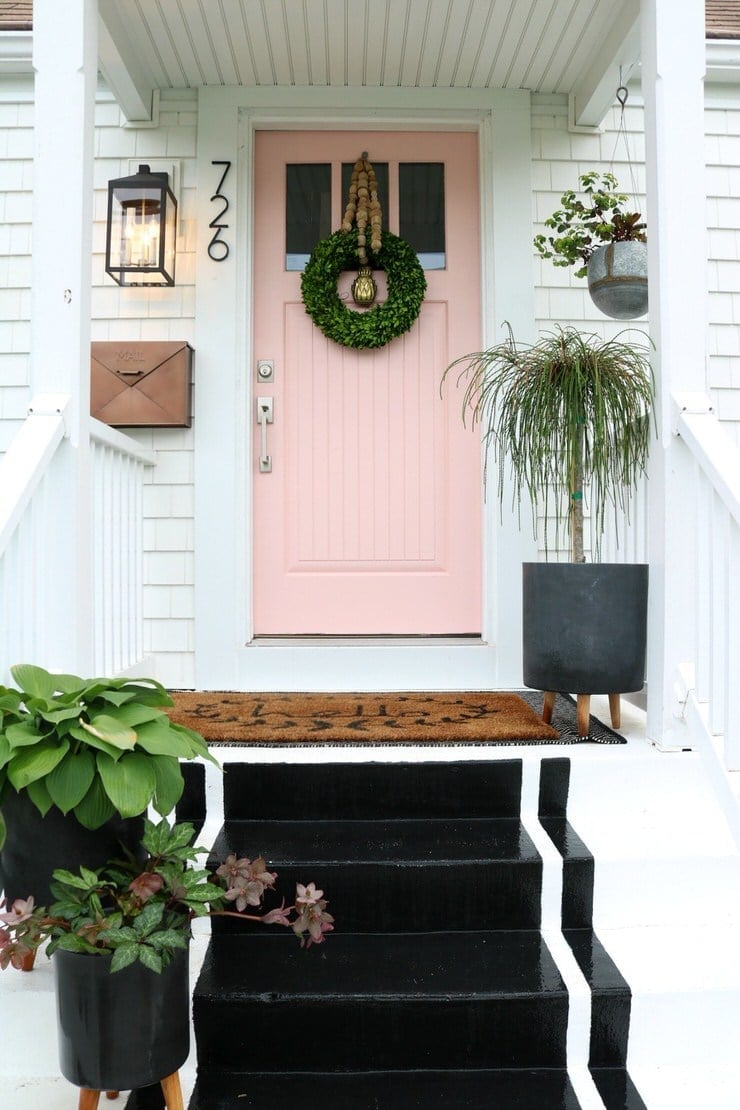
Can a pale pink door feel sturdy enough for a front entrance? It can, especially when the rest of the entryway offers strong contrast. Here, a pale pink door sits at the top of a compact porch, with black steps and a white railing framing the view. A hanging lantern adds a warm glow during the day. The cottage-style palette works because the pink is soft, not sweet, and the black steps ground it. The ratio of pale to dark is about two to one, so the door doesn’t float. What defines the look is the simple color blocking, and the one thing that would break it is adding a third pastel. Stick with the black and white accents, and the pink holds its own.
Vibrant Teal Door in an Arched Entryway
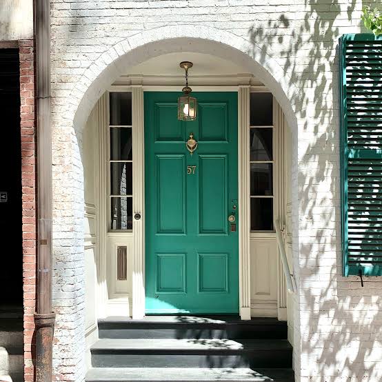
A vibrant teal door set within a white arched brick entryway draws the eye upward, making the entrance feel taller. The arch itself is a strong architectural feature, and the teal paint emphasizes its curve without competing with it. A single lantern overhead adds a practical light source while echoing the arched shape. The color combination is simple: teal, white, and brick red, and the white trim separates the door from the brick. The teal sits inside the arch as a focal point, with a ratio of roughly one part color to two parts neutral. The only thing that would break it is busy decor around the door, so let the arch and the paint do the work.
Dark Green Double Doors Against Beige Brick
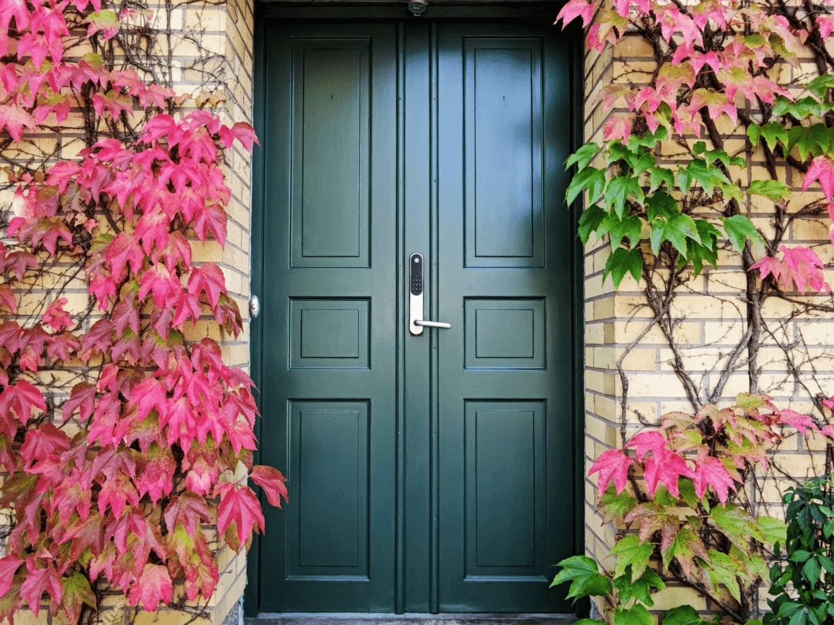
A dark green door needs a surrounding palette that lets it breathe. Here, beige brick and a touch of pink in the stone soften the contrast, while climbing ivy adds texture without competing. The double doors themselves are the focal point, so keeping the entry simple with minimal hardware and a single lantern makes the color stand out. The ratio of green to beige is roughly one to three, which gives the eye a clear resting place. What breaks the scheme is clutter: too many planters or a busy welcome mat would fragment the clean line between door and wall.
Emerald Green Door with Stone Facade and Brass Hardware
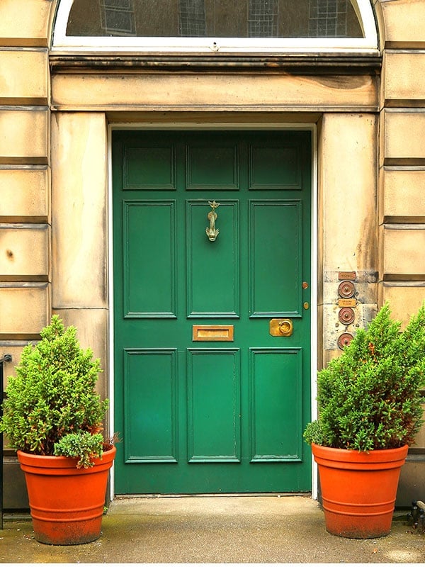
Emerald green reads differently than a forest or olive tone. It has more blue in it, which makes it feel cooler and more formal against warm beige stone. The brass knocker and mail slot pick up the orange undertones in the terracotta pots, tying the whole entry together without matching anything exactly. This is a palette that works because it uses three distinct color families: green, warm neutral stone, and fired earth.
For a traditional facade, the rule is to keep the door the darkest element. The stone wall and pots should stay lighter so the door steps forward. If the stone were dark gray or charcoal, the emerald would recede and the entry would feel flat. That is the line between intentional and muddled.
Deep Teal Door on a Traditional Front Porch
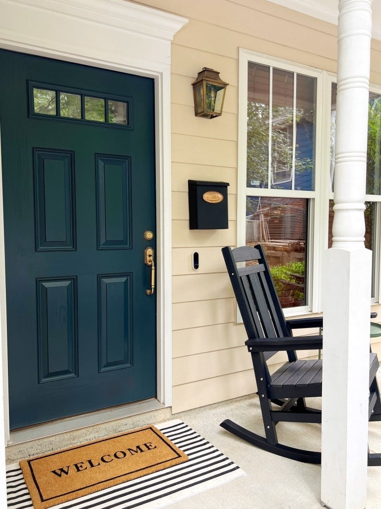
Deep teal sits at the intersection of blue and green, which gives it flexibility with both warm and cool porch elements. The black rocking chair and metal lantern anchor the darker end of the palette, while the cream trim and natural wood ceiling keep the space balanced. The welcome mat in a neutral tone provides a visual pause before the step up. Teal acts as a neutral here, letting the porch feel layered and cohesive.
Victorian Pink Door with Stained Glass Detail
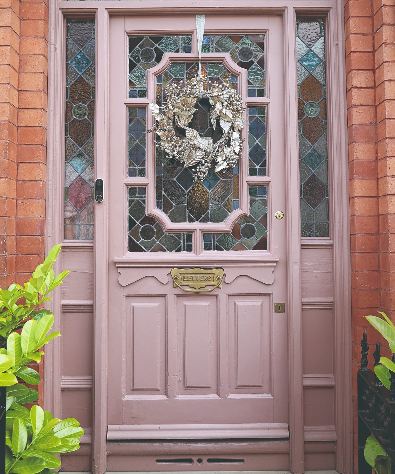
This door does not rely on its pink color alone. The stained glass panels in jewel tones add a secondary layer of interest that keeps the pink from feeling overly sweet or one-note. The brick facade in deep red grounds the pastel, so the entry feels historic. A metal letterbox and simple wreath in muted green complete the composition without adding another competing color. The lesson is that a pale door needs a strong material counterpoint to hold its own against a busy facade.
Bright Yellow Door for a Modern, Cheerful Entrance
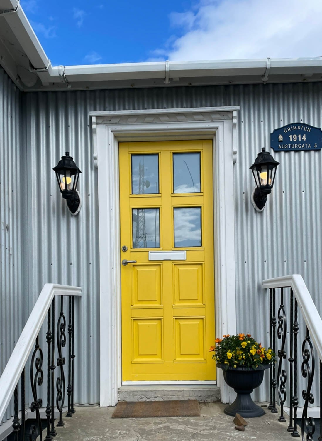
A bold front door color works best when the surrounding surfaces stay quiet. Here, the gray metal siding and white trim frame the yellow without competing, so the door becomes the natural focal point. The two lanterns flanking the door create symmetry that balances the intensity of the color. Glass panes in the door itself break up the yellow surface, preventing it from feeling like a solid block of paint.
For a modern exterior, the ratio of bright to neutral should be roughly one to four. That keeps the door cheerful without overwhelming the facade. If the siding were also bright, the entry would feel chaotic. The simplicity of the layout is what makes the yellow work.
Deep Teal Door in a Regal Stone Archway
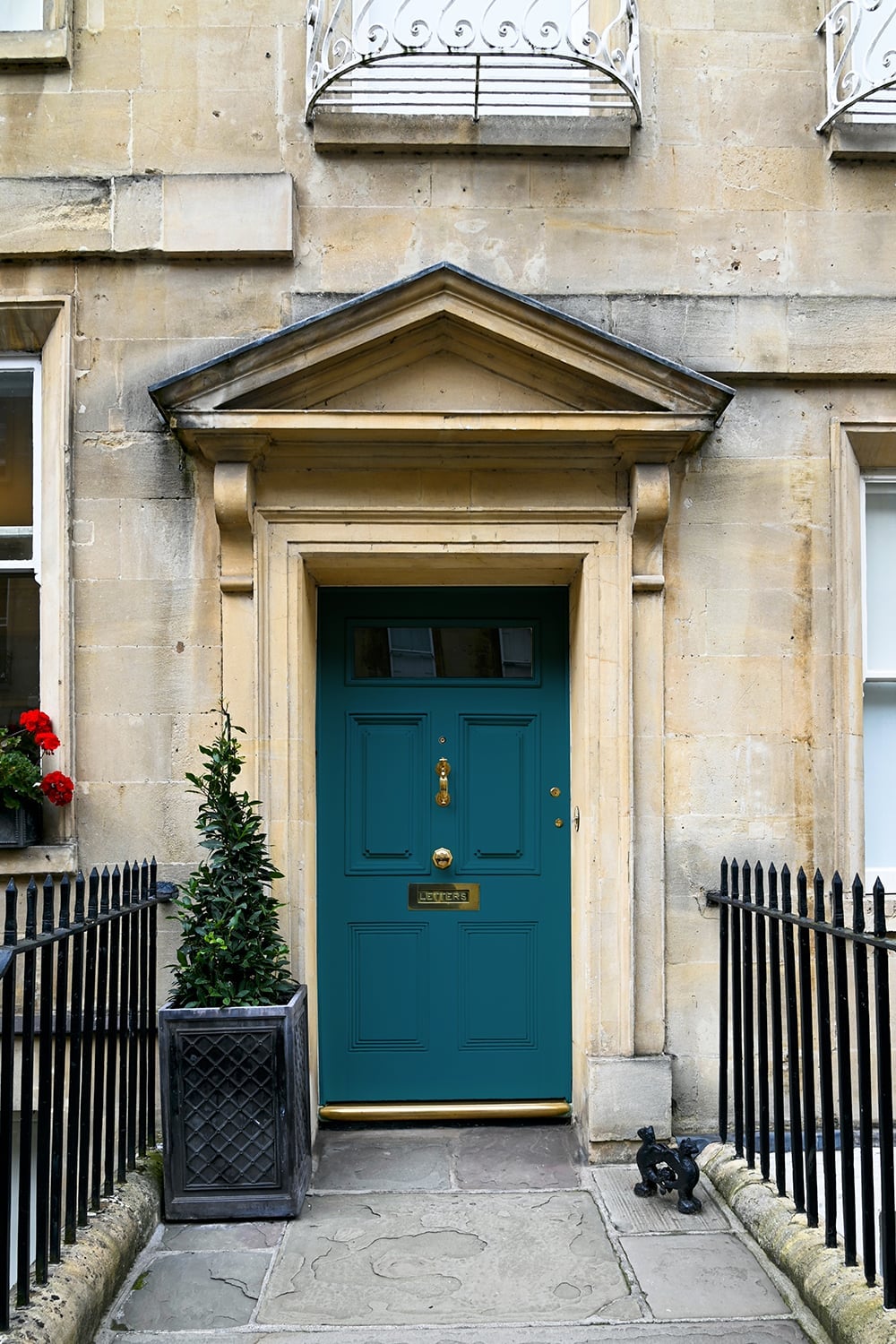
A deep teal front door set within a stone facade looks instantly regal, especially when the archway frames it like a portrait. The teal hue carries enough blue to feel cool and grounded against warm gray stone, while brass hardware adds a subtle metallic gleam. The ratio of color to neutral defines this look: the door acts as the single saturated element, with everything else, stone, black planter, metal accents, staying quiet. A single potted plant near the threshold keeps the composition from feeling too formal.
Vibrant Blue Door Against Pink Stucco in Mediterranean Style
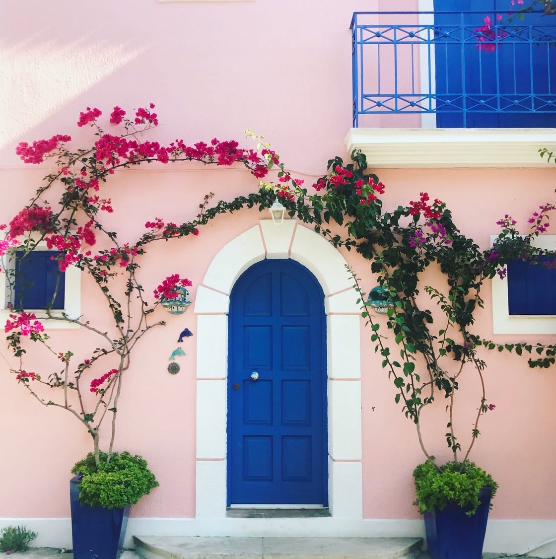
When you cannot change the wall color, pick a door shade that plays off it. Here, a vibrant blue door sits against pink stucco in a Mediterranean-style entry. The blue is saturated enough to hold its own, while the pink wall softens the overall palette. Potted greenery in the arched doorway bridges the two warm tones. For renters, a high-quality temporary film or a removable paint product can achieve a similar effect without altering the door permanently. Check your lease first, but let the existing architecture guide your color choice.
Deep Red Door with Gold Knocker in a Classic Setting
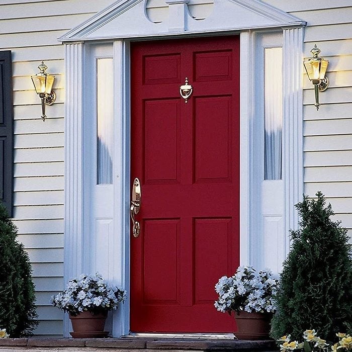
A deep red door fits a traditional style, but the difference between stately and stuffy comes down to the details. Here, a red door with a gold knocker sits centered between white siding and stone, flanked by sidelights and potted plants. The red is rich without being bright, which keeps it from competing with the white trim. What breaks this look from a standard colonial palette is the gold hardware: a single knocker instead of a full set of polished fixtures. Wall sconces on either side add symmetry without clutter. The lesson is that one metallic accent can shift a door from expected to distinctive.
Dark Green Door Within a Red Brick Archway
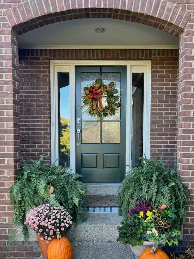
Dark green and red brick are a classic pairing, and the effect is deliberate: the green door sits centered within a brick archway, with glass panes letting light pass through. The red brick feels warm and earthy, while the green door adds a cooler, more grounded note. Ferns in pots near the threshold soften the hard lines of the arch, and a few pumpkins on the step hint at the season without overwhelming the palette. The ratio is roughly one part green to three parts brick, which keeps the door prominent without letting it dominate the facade.
Bright Yellow Door with Symmetrical Topiaries
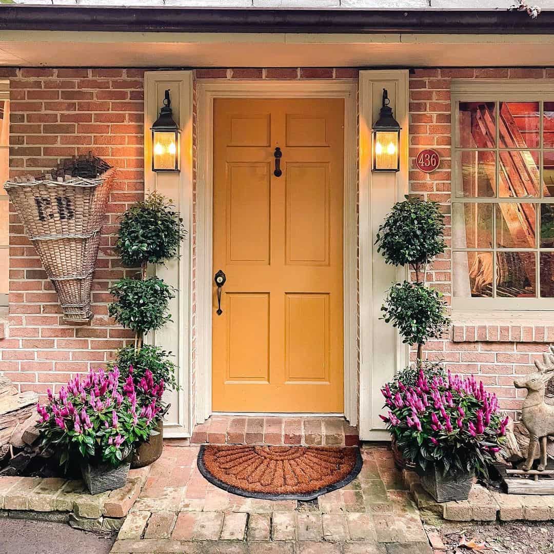
A bright yellow door on a traditional brick porch is a clear one-line assessment: this entrance does not blend in. The yellow is saturated enough to pop against the warm red brick, while symmetrical topiaries in pots on either side anchor the composition. A basket planter on the step adds softness at ground level. Lanterns flanking the door echo the symmetry and provide warm light at dusk. What keeps this look from feeling chaotic is the strict balance: everything comes in pairs, so the bright color stays cheerful without being overwhelming. The topiaries also provide year-round structure, which matters when the door color is seasonal in feel.
Mint Green Door with Festive String Lights and Tile Path
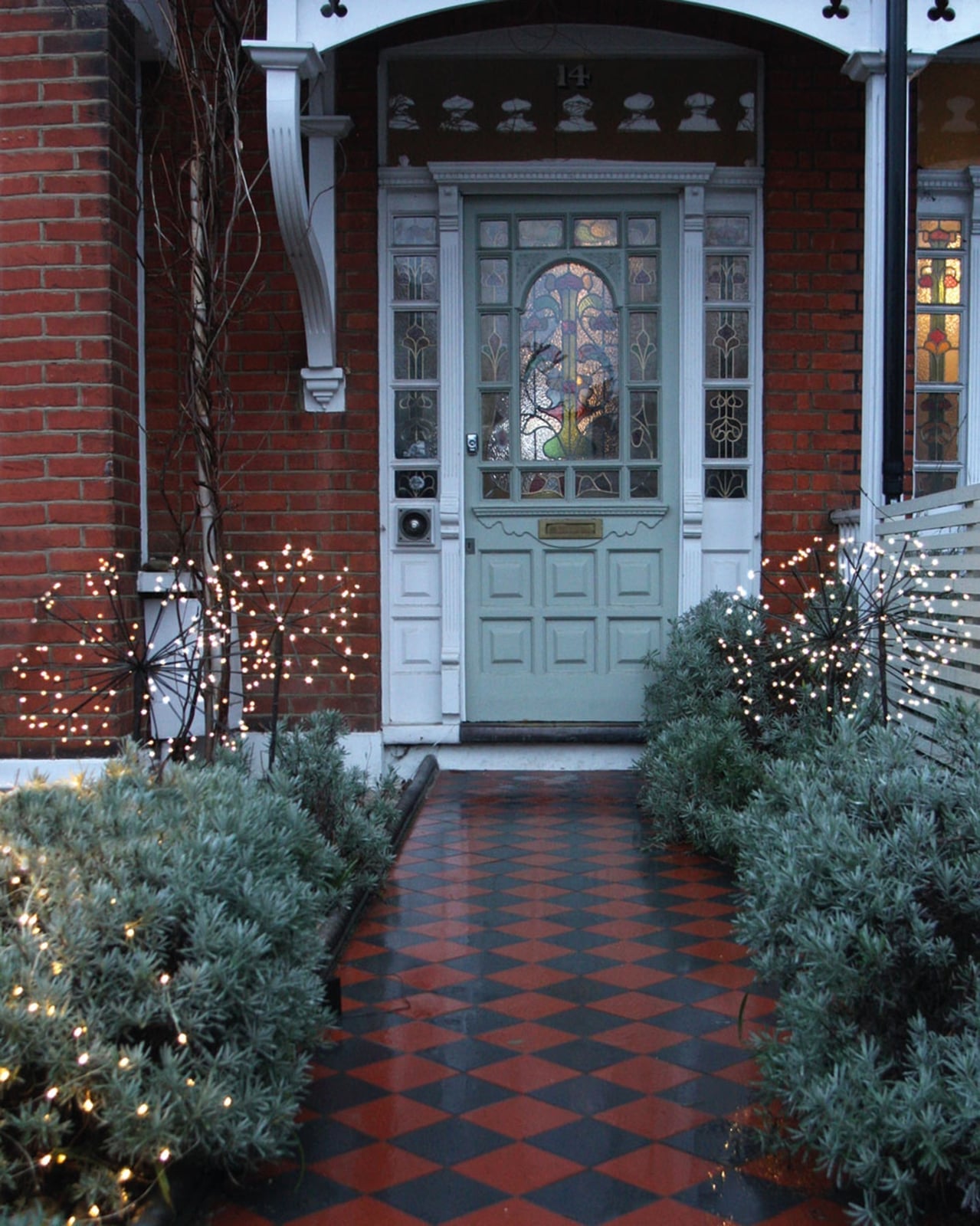
String lights do two jobs at once: they mark the path and make the door color read differently after dark. This mint green front door sits at the far end of a diamond tile walkway, with a row of warm bulbs suspended above the brick. By evening the green shifts cooler against the yellow glow, so the house feels lit from within rather than just lit. The tile path anchors the layout, pulling the eye straight to the door. It is a setup that works for any narrow or long walkway where you want the door to feel like a destination, not just an entrance.
Cheerful Yellow Door on a Farmhouse Porch
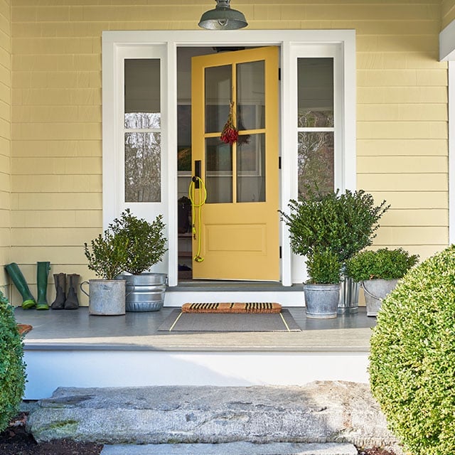
A glass-paneled yellow door opens onto a compact farmhouse porch, with a concrete floor and a pair of metal planters holding greenery. The yellow is the high point of the palette, and everything around it stays neutral: gray siding, a dark doormat, muted green leaves. The color ratio is roughly one part yellow to three parts gray and green, which keeps the door from overpowering the small porch. It is the kind of palette that works when you want a bright spot without repainting the whole house.
Bright Green Screen Door for a Farmhouse Vibe
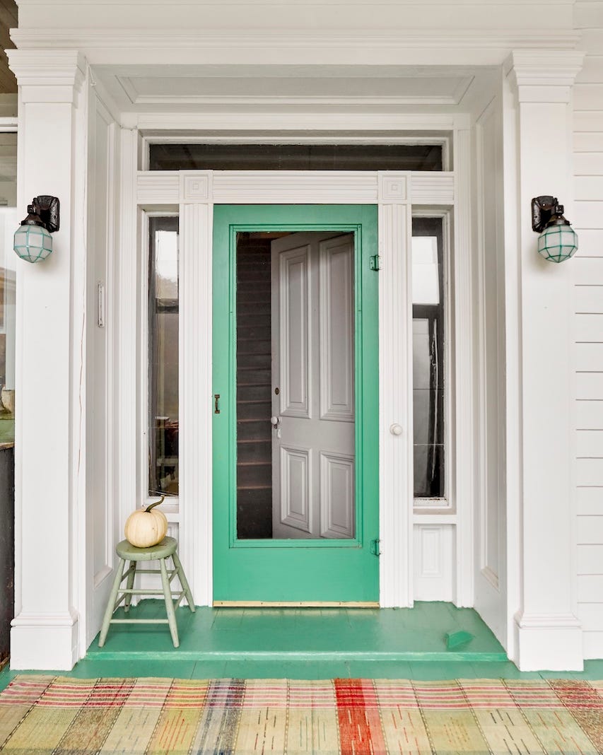
A screen door can carry the color instead of the main door, which gives you the option to change it without touching the entry behind it. This bright green screen door sits centered between two porch columns, with a woven rug, a wooden stool, and a single pumpkin at the step. The green pops against the white trim and the multi-color rug, and the metal frame keeps the look from going too sweet. It is a smart swap if you rent or just want a seasonal shift without a full paint project.
Dark Gray Door with Halloween Decor
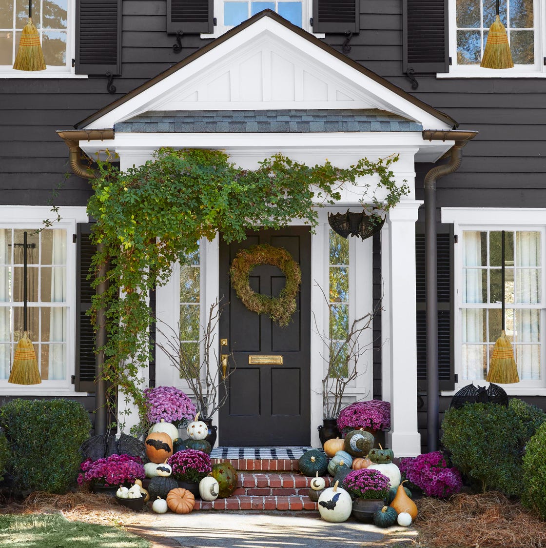
A dark gray door is often chosen for its neutrality, but the same quiet backdrop makes seasonal decor stand out more than a bright door would. Here the gray wood door sits centered on a traditional porch, flanked by stone and brick, with a wreath, pumpkins, mums, and a trio of brooms leaning against the frame. The purple and orange accents read clearly because the door does not compete. Come November the decor comes down and the gray slips back into its role as a calm, reliable entry, no repainting needed.
Gray Arched Door Against a Warm Yellow Exterior
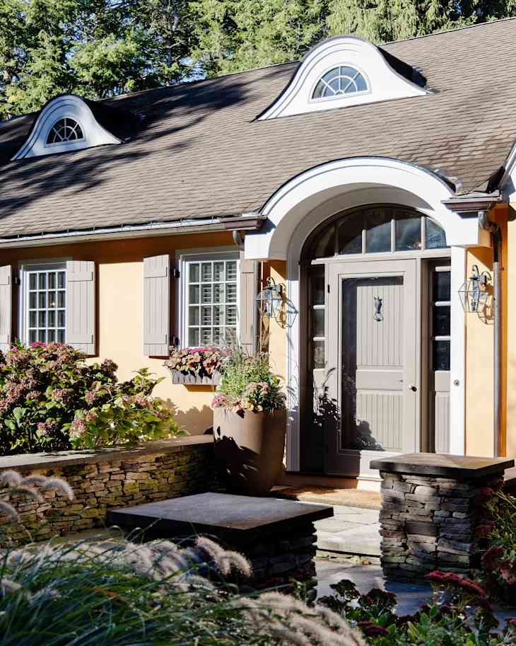
An arched door changes the way color reads on a house because the curve breaks up the usual rectangle. This gray arched door sits inside a stone archway on a warm yellow exterior, with a large planter and a pair of lanterns at the base. The gray is cool and quiet against the yellow, so the arch gets the attention instead of the paint. It is a palette that works when you want contrast without a sharp edge, letting the architecture do the talking.
Teal Paneled Door for a Coastal Charm
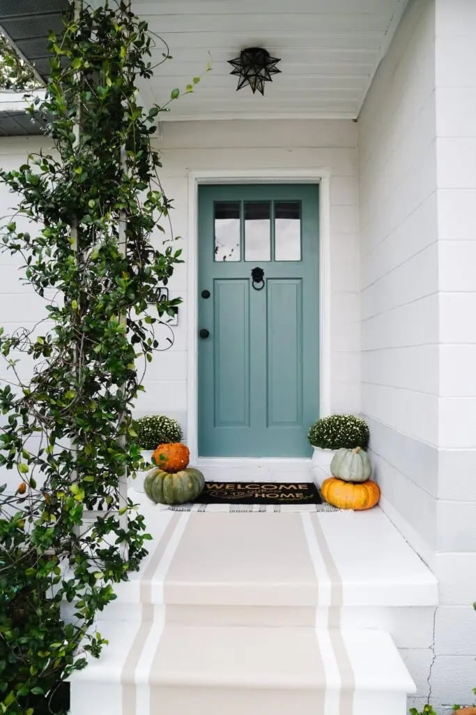
Teal is the color that says beach house without needing a shell collection. This paneled door sits centered on a compact front porch with steps leading up, and the palette around it stays restrained: white trim, green potted plants, orange pumpkins as a seasonal pop, and a simple welcome mat. The glass panel in the door lets daylight pass through, which keeps the entry from feeling closed off. What defines the coastal style here is the ratio of teal to white roughly two thirds door, one third trim. The pumpkins break the expected seaside palette with a warm autumn note, proving that coastal does not mean stuck in summer.
Vibrant Red Door at the End of a Stone Pathway
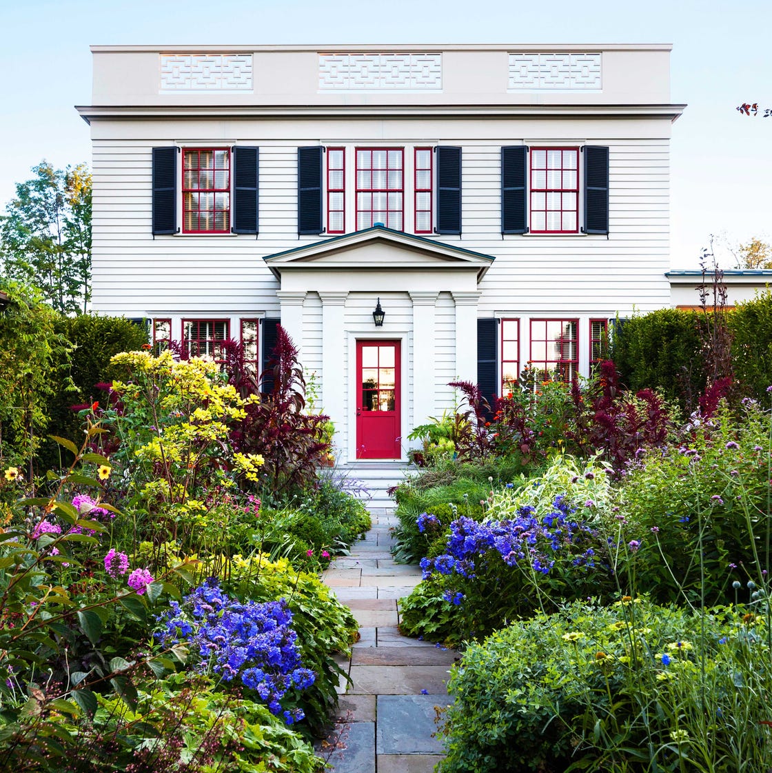
A white house with a red door is a classic combination, but this version earns a second look because of the path. The stone walkway leads straight to the door, making the red feel like a destination. The white wood siding and the lush garden in green and yellow keep the red from feeling aggressive. For a renter, the layout is the real trick. You cannot repaint the siding, but you can influence how the eye travels to the door. A clear path, whether stone, gravel, or pavers, frames the approach and gives the red door a purpose. The garden softens the geometry and keeps the whole scene feeling settled.
Vibrant Coral Door on a Bright Yellow House
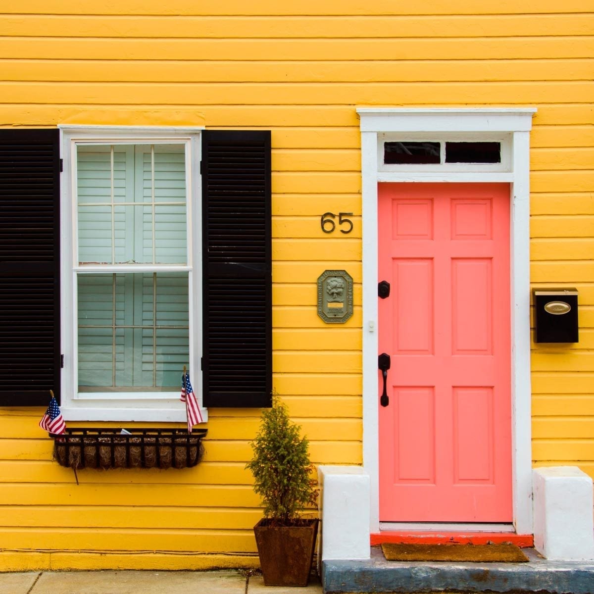
Coral and yellow sit close on the color wheel, so this combination relies on contrast from the black shutters and the white window box. The door is centered between flanking windows on a compact front exterior with wood siding. The coral reads as a warm variation on orange, and the yellow house acts as a backdrop that amplifies its saturation. What breaks the expected monochrome warmth is the black hardware and shutters they introduce a cool, graphic line that keeps the facade from feeling washed out. The window box adds a vertical interruption that balances the horizontal siding.
Teal Front Door on a Serene Coastal Porch at Dusk
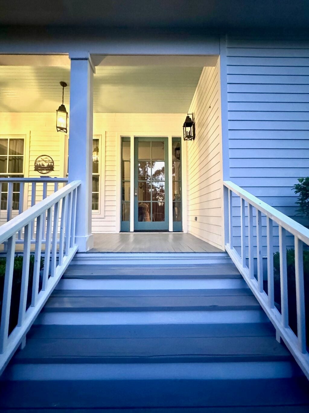
At dusk, a teal door shifts from a daytime blue green to a deeper, more saturated tone that holds its own against the fading light. This porch is roomy, with the door set at the end, flanked by railing and lit by lanterns that cast warm artificial light across the painted wood. The siding and porch floor stay in white and gray, so the teal has no competition. The lighting here does the work: the lanterns create a pool of warmth that makes the cool teal feel intentional rather than cold. For a coastal porch that lives in the evening hours, teal holds its character better than a pale blue would.
Vibrant Green Door in a Pink Brick Cottage Garden Setting
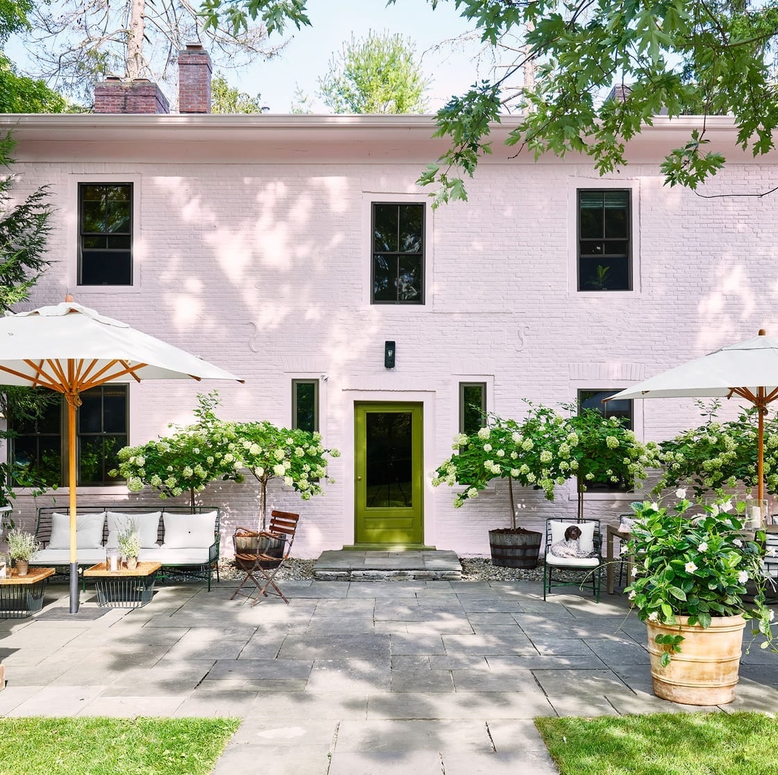
A pink brick house sounds like a risk until you see it with a vibrant green door. This cottage garden setting uses the door as the anchor for a palette that runs from the pink brick to the white patio furniture, gray stone, and the deep green of large planters and umbrellas. The door is centered on the pink brick facade, and the patio area opens out from it, making the entry feel like part of the outdoor room rather than a transition point.
The alternative to this pairing would be a neutral door, white or black, which would sit quietly against the pink brick. The green door does the opposite it declares the palette. The dappled sunlight from the garden breaks up the solid color, letting the door shift in brightness throughout the day. The metal hardware and fabric cushions in white and gray keep the green from dominating the whole scene.
Final Thoughts
Choosing a front door color is a small project with a big payoff. The best shades work with your home’s existing materials rather than against them. Before you buy paint, test samples on a section of the door and live with them for a few days. Note how the color shifts in morning light versus dusk. A good exterior paint job lasts three to five years with proper prep and a quality primer. If you live in a historic district or have an HOA, check the rules first. The right color makes your entrance feel like an invitation, and that is always worth the effort.