You know that feeling when you finally find the rustic kitchen idea that looks exactly right for your space, only to realize you have ten more just like it saved to your Pinterest board? It’s easy to get lost in a sea of wood beams and farmhouse sinks. We’ve been there. That’s why we filtered through hundreds of designs from high-end showrooms to IKEA and Target to find what actually works. This isn’t just another photo dump; it’s a curated guide to the 31 most inspiring rustic kitchens for 2026, covering everything from dark and moody cabins to modern farmhouse styles. Rustic design is leaning into authentic materials and personal touches more than ever, moving away from cookie-cutter looks. And stay until the end — we break down the most common mistakes that can ruin these looks. 📌 Save this to Pinterest for later — you’ll want to revisit these ideas.
This post may contain affiliate links. As an Amazon Associate, we earn from qualifying purchases at no extra cost to you.
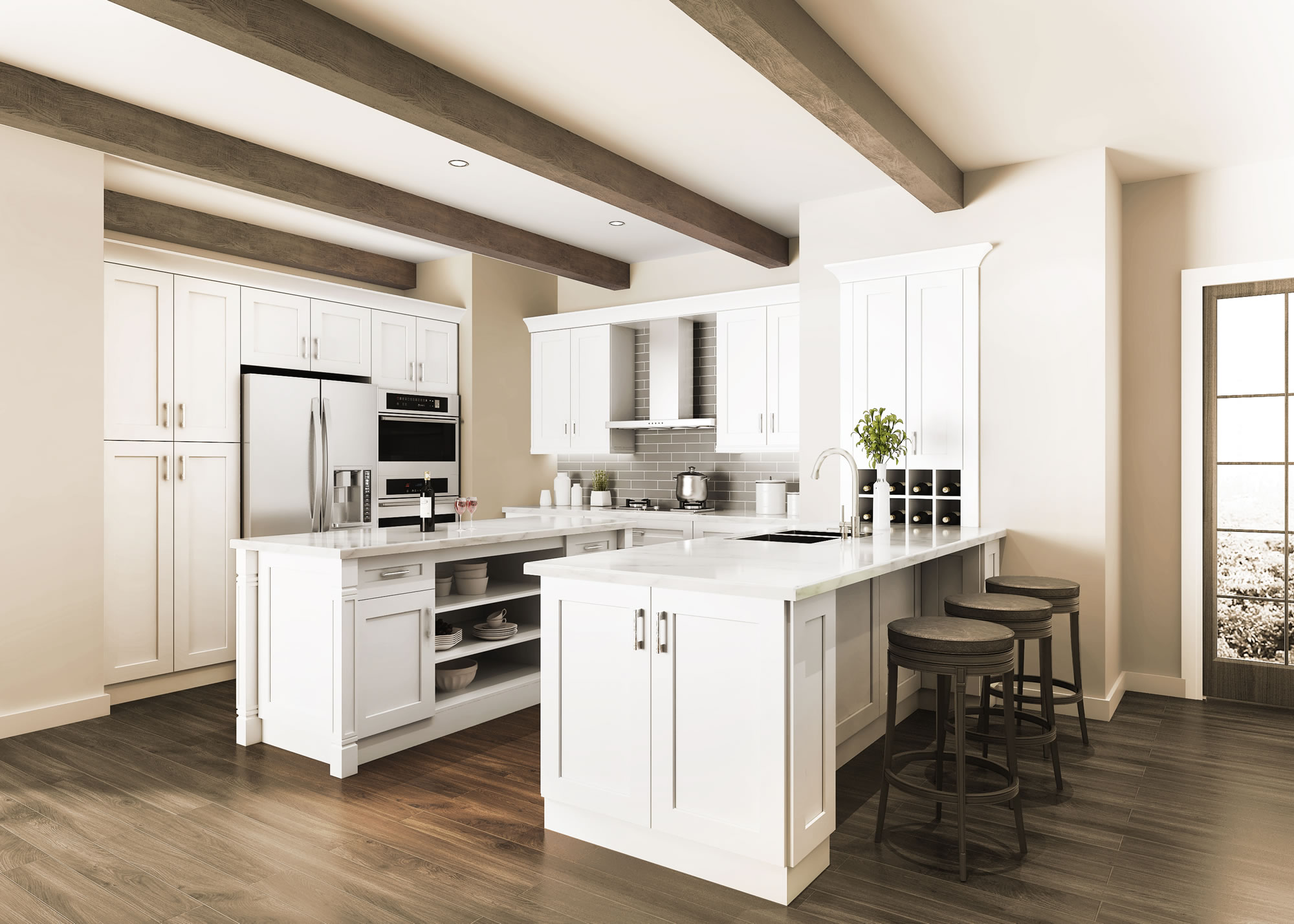
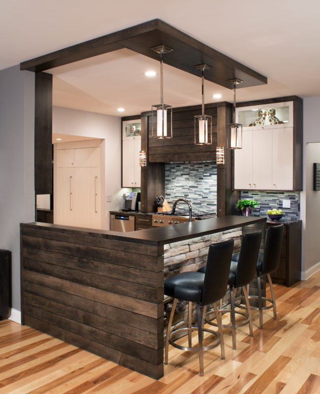
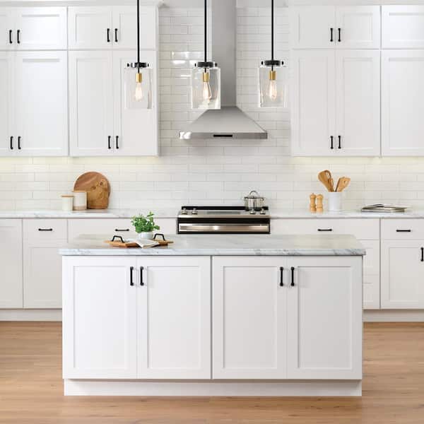
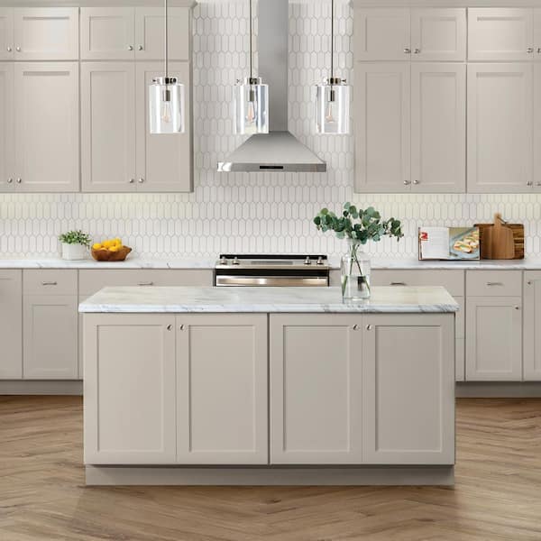
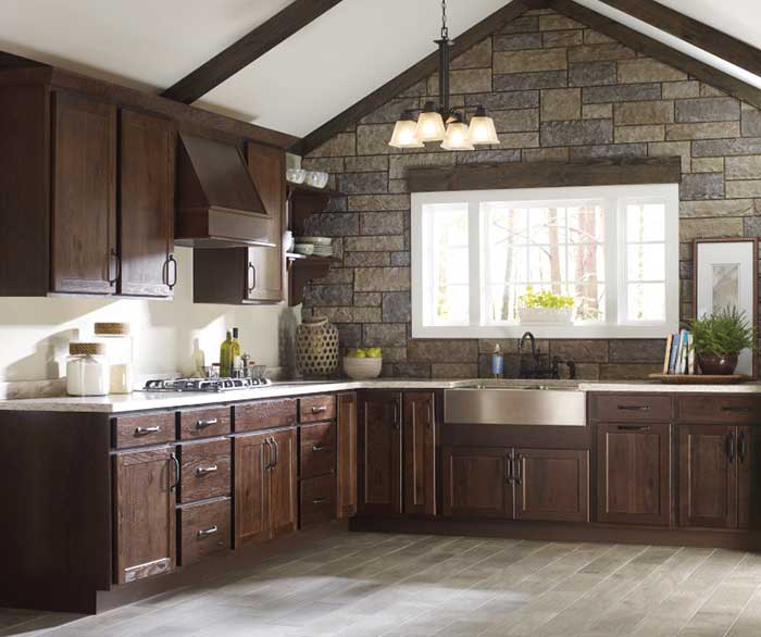
1. Frame a Vaulted Ceiling with Dark Exposed Beams
The magic here is all about contrast and lines. The dark, heavy texture of the wood beams draws your eye upward, making the already high, angled ceiling feel even more expansive. By painting the ceiling and walls bright white, the beams pop, creating a graphic frame for the whole room. The clean lines of the subway tile and black window grids echo this linear theme, keeping the space feeling fresh and structured, not just old-fashioned.
|
$163.93
|
$2,022.80
|
$95.84
|
$389.00
|
“This look is a showstopper, but it really needs room to breathe.”
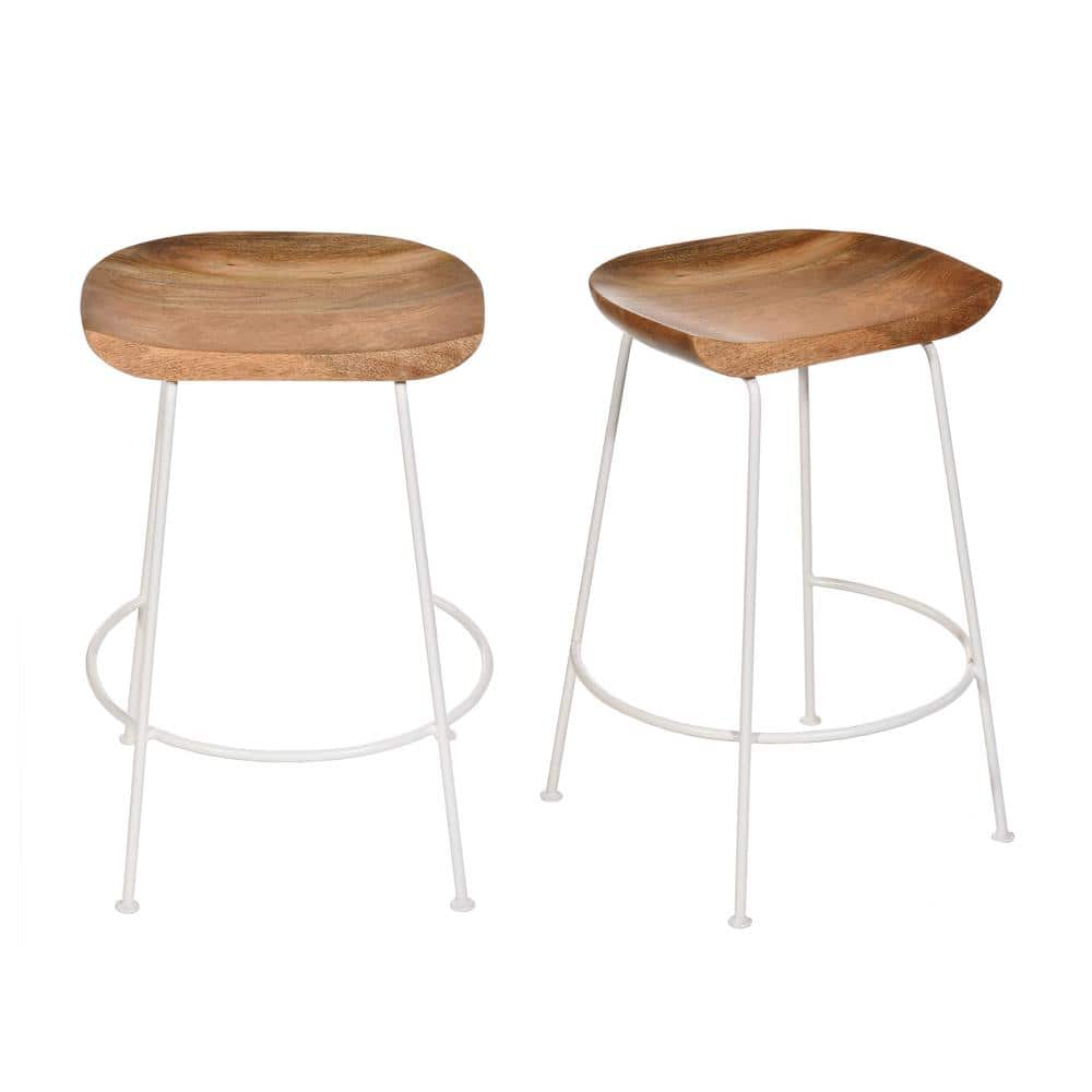
An angled, vaulted ceiling is a must, ideally with a peak height of at least 12-15 feet. Anything less, and the dark beams can feel heavy and lower the ceiling visually. The overall kitchen footprint should be generous enough to support a large island without feeling crowded, so think a minimum of 200 square feet for the main kitchen area.
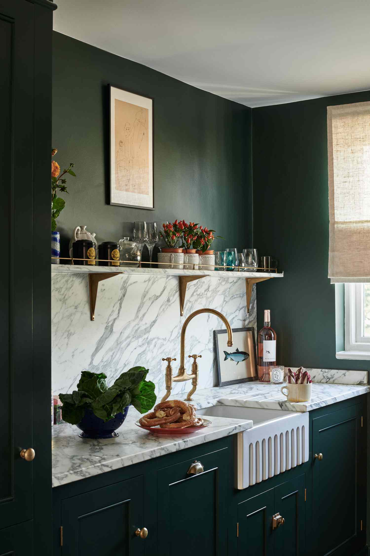
2. Pair Forest Green Cabinets with a Light Brick Wall
When pairing a bold cabinet color like deep forest green with a textured element like brick, ensure your lighting is on point. Install under-cabinet LED strips with a warm temperature (around 2700K-3000K) to highlight the texture of the brick and prevent the dark cabinets from feeling gloomy. The light bouncing off the stone countertops will create a lovely ambient glow and make the whole space feel more inviting.
|
$75.00
|
$70.80
|
$1,483.41
|
$190.99
|


“Think of this design as a simple formula: 60% dominant color (the dark green cabinetry), 30% texture (the light brick walls and wood), and 10% neutral accent (the white pendants and stool tops).”
You could swap the green for a deep navy or charcoal and the brick for stacked stone, and the room’s balanced, earthy feel would remain. It’s the ratio that makes it work.
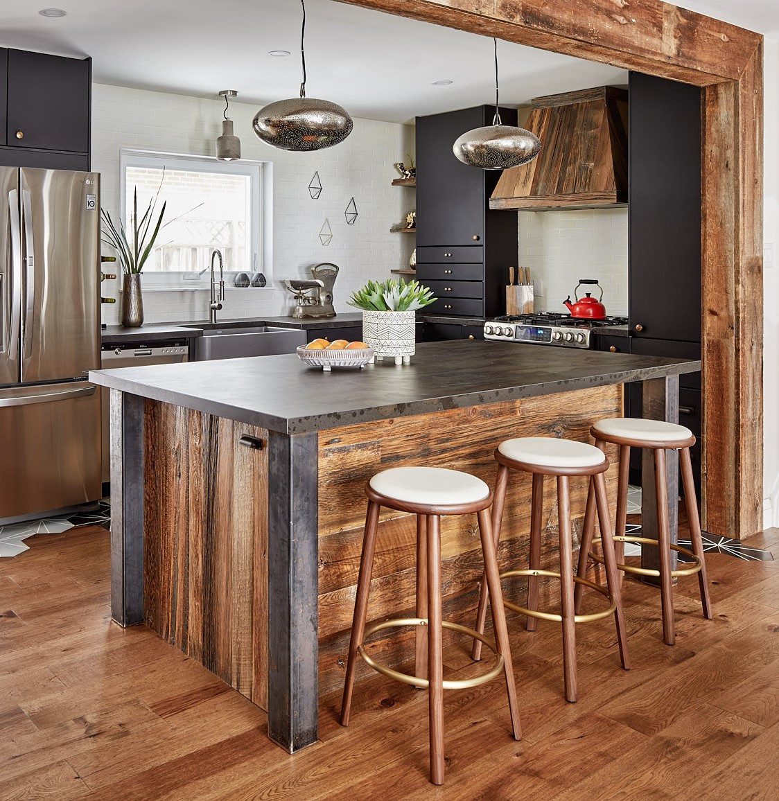
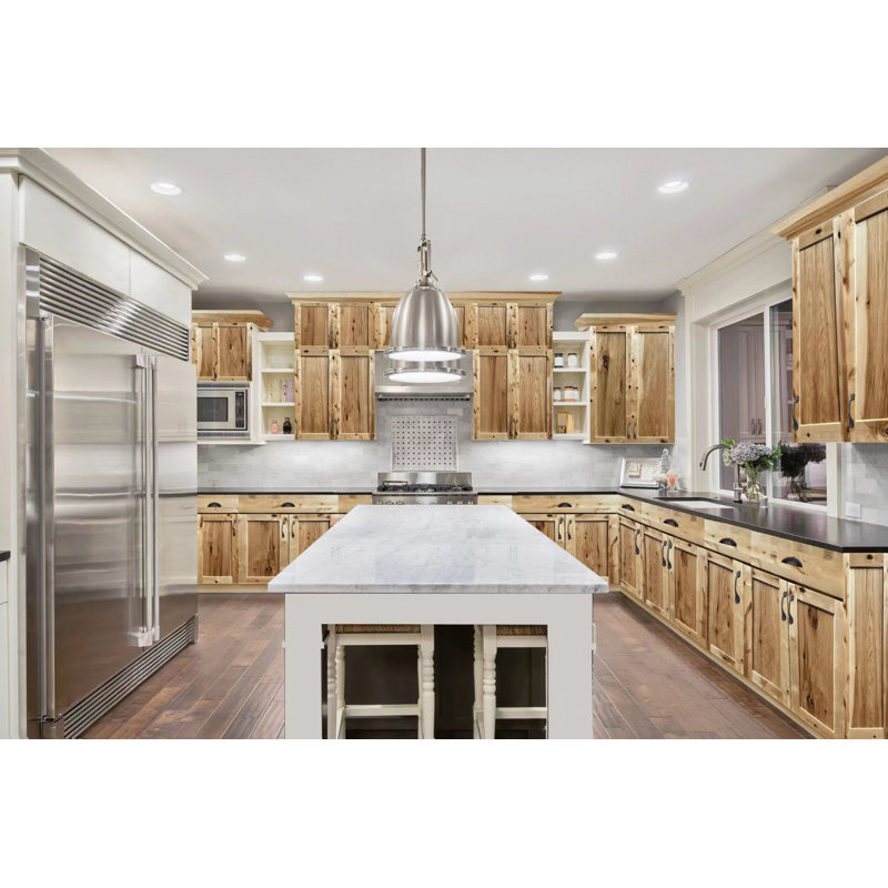
3. Mix Wood, Stone, and Mosaic Tile on a Kitchen Island
that makes this kitchen unforgettable is the masterfully layered island. It’s not just a block in the middle of the room; it’s a piece of furniture that tells a story. The combination of sleek horizontal wood planks, rugged stacked stone, and a polished dark top creates incredible visual and textural interest. Remove this island, and you’re left with a nice but fairly standard kitchen. It’s the element that gives the space its unique, contemporary-yet-earthy identity.
|
$0.10
|
$139.99
|
$184.98
|
$7.98
|


“An island with this many materials requires some specific care.”
The stacked stone portion can be a dust and crumb magnet; a vacuum with a soft brush attachment is your best friend for weekly cleanings. The mosaic tile backsplash behind the sink will need its grout sealed annually to prevent staining, especially from things like tomato sauce or coffee. The wood and stone surfaces themselves are durable, but it’s the upkeep of the in-betweens that you need to be ready for.
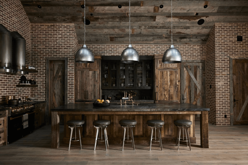
4. Combine Exposed Brick Walls with Hammered Metal Pendants
What makes this work is the masterful blend of rough and refined textures. The rugged, uneven surface of the exposed brick provides a warm, historic backdrop. Against this, the smooth, cool sheen of the hammered silver pendants and stainless steel hoods creates a striking contrast. It’s a textbook example of texture balancing: the matte, warm brick makes the metallics feel more deliberate and sleek, while the metals keep the rustic wood and brick from feeling too heavy or dated.
|
$199.99
|
$115.07
|
$166.68
|
“You don’t need an original 19th-century warehouse to get this vibe.”
Create a similar look for a fraction of the cost using brick veneer panels from a home improvement store (around $8-$12 per sq. ft.). For the island, a butcher block top from IKEA ($200-$400) on a simple painted base can stand in for a custom piece. Hunt for industrial-style pendants on Facebook Marketplace or at flea markets—you can often find a set of three for under $150.
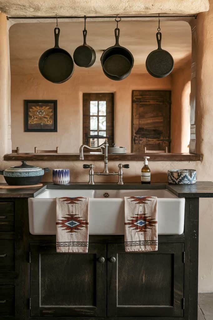
5. Evoke Santa Fe Style with Plaster Walls and a Farmhouse Sink
The single element holding this entire look together is the textured plaster walls. Their earthy, slightly uneven finish is the canvas for everything else. It’s what transforms the scene from a simple rustic kitchen into a specific, Santa Fe-inspired space. Without that hand-troweled texture, the dark wood cabinets and farmhouse sink would still be lovely, but they wouldn’t have the same warm, sun-baked character. It’s the indispensable ingredient.

|
$99.99
|
$386.55
|
$18.08
|
$516.27
|


“While those cast iron pans look amazing hanging over the sink, be honest with yourself about how you cook.”
If you’re not using them daily, they can quickly become dust collectors that are a pain to take down and clean. Also, hanging heavy items from a simple metal rod requires very secure anchoring into wall studs or a proper wood backing. Don’t just stick it into the plaster or drywall!
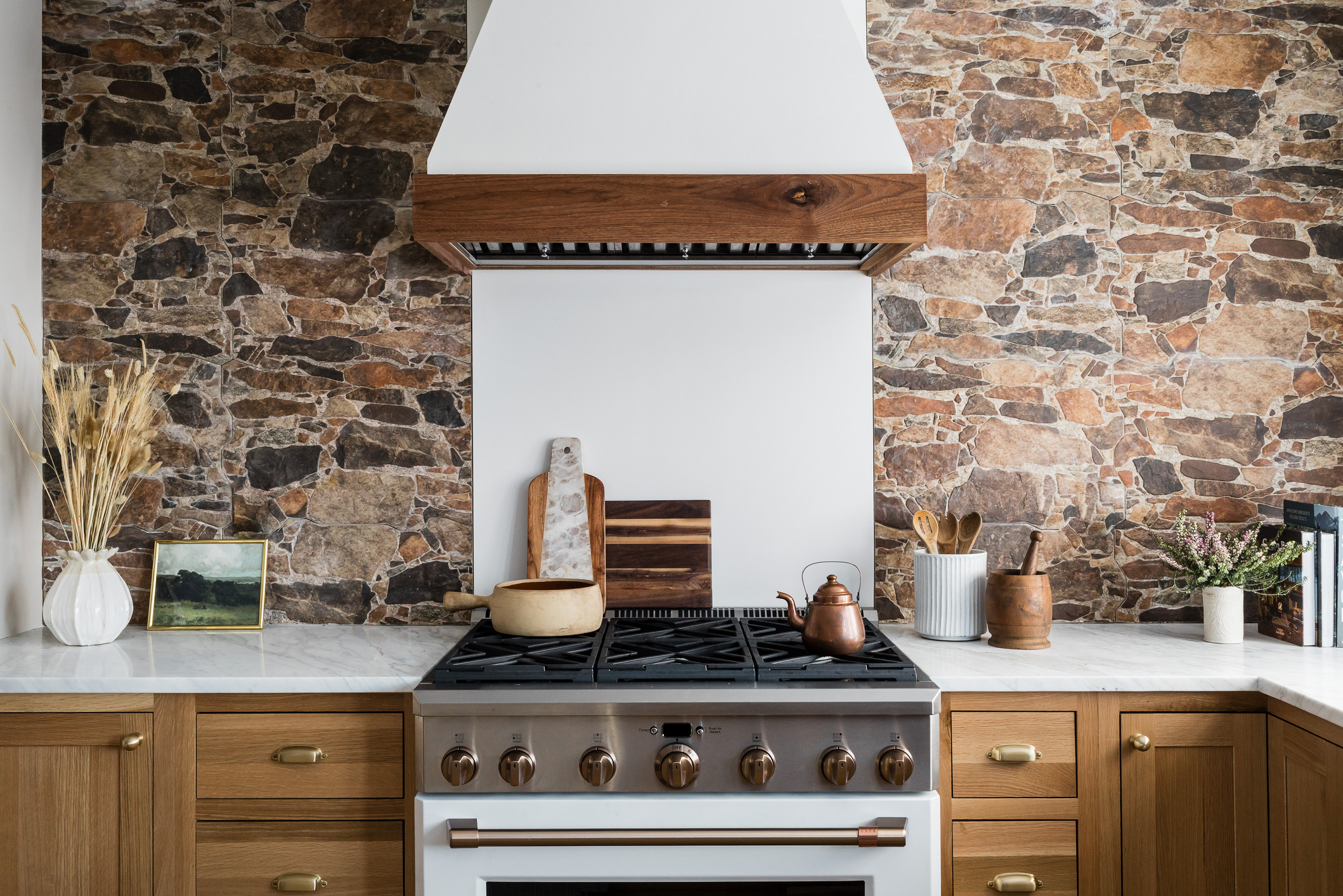
6. Set a Modern White Hood Against a Rustic Stone Wall
This high-contrast look is stunning, but check these things first:
|
$1,216.00
|
$3.99
|
$1,499.99
|
$159.00
|

“Ventilation Path: Can you actually vent your range hood to the outside through this wall?”
A decorative hood is one thing, but a functional one needs a clear duct path. Check your home’s framing before you fall in love.
Stone Weight: A full wall of natural stone is incredibly heavy. Confirm that your wall structure and foundation can support the load, especially if you’re not on a ground floor.
Lighting Plan: Stone absorbs light. Do you have a plan for under-cabinet lighting to illuminate your countertops effectively? Relying on overhead light alone will leave your prep space in shadow.
When selecting a wood trim for a white appliance or hood like this, don’t try to match your cabinets exactly. It will likely be a near-miss and look unintentional. Instead, choose a wood tone that is either significantly lighter or darker than your main cabinetry. This creates a deliberate, thoughtful accent. Here, the lighter wood trim on the hood complements the tones in the stone without competing with the main cabinets.
7. Mix Reclaimed Wood, Dark Cabinets, and Gold Hardware
The formula for this modern-rustic look is a study in balance: 50% sleek and modern (the dark, clean-lined Shaker cabinets and stainless steel), 40% warm and rustic (the reclaimed wood on the hood and beam), and 10% glam (the pop of gold hardware). This careful equation ensures the kitchen feels current and sophisticated, not like a theme park log cabin. You can change the wood tone or metal finish, but keeping that approximate ratio is key to its success.
|
$123.00
|
$1,504.00
|
$197.40
|
“This look is a perfect example of the “warm minimalism” trend that’s dominating interior design.”
People are moving away from stark, all-white kitchens, but they aren’t ready to embrace full-blown rustic clutter either. By pairing clean, dark cabinetry with organic, textured wood elements, you get the best of both worlds: the simplicity and function of a modern kitchen with the soul and warmth of rustic materials.
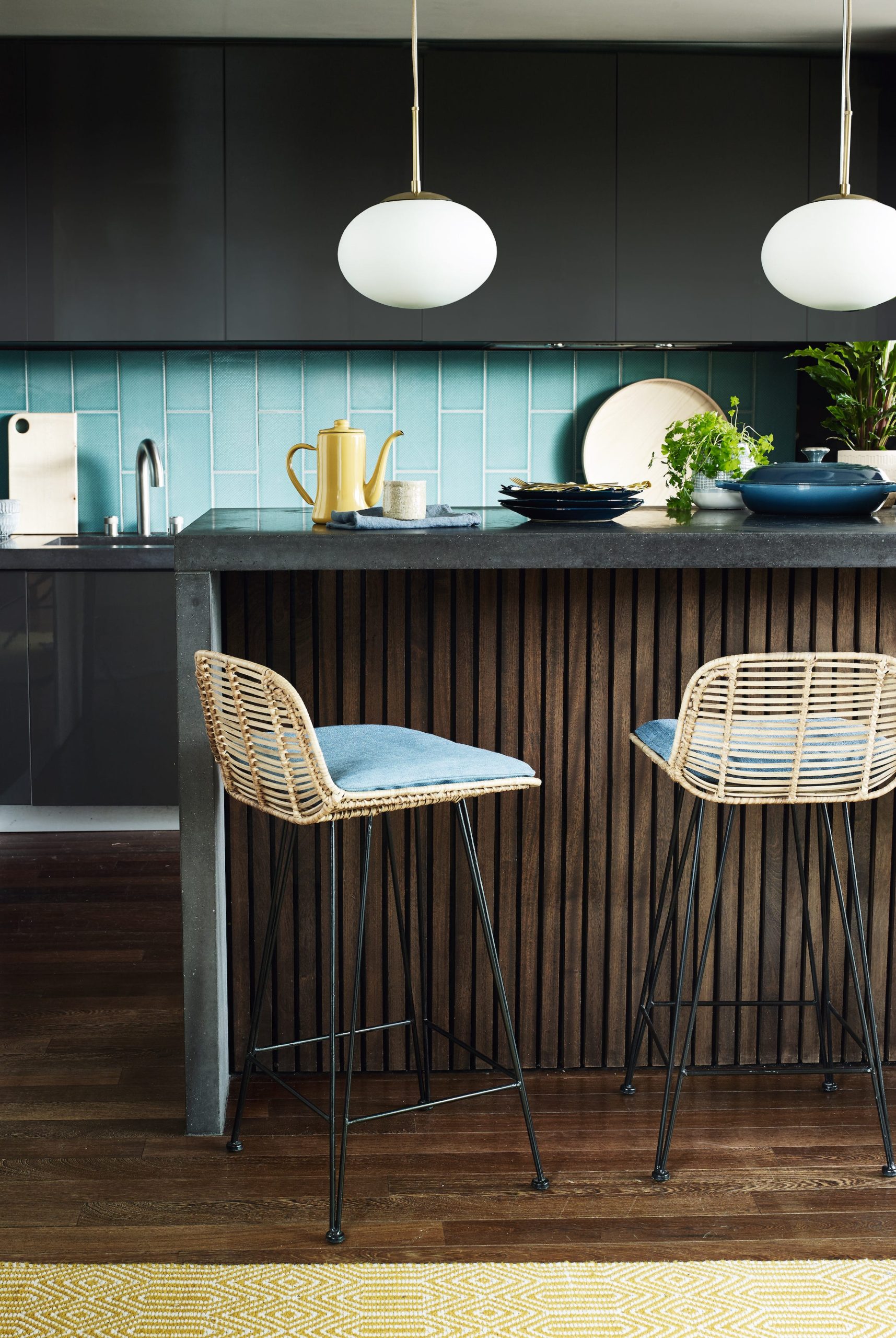
8. Combine Teal Tile with Woven Rattan Stools
This design succeeds by breaking the rustic mold. The combination of sleek, dark gray cabinets and a vibrant teal backsplash is unapologetically modern. However, the introduction of the woven rattan bar stools and the dark wood-slatted island face brings in the natural, textural element that grounds the space and gives it a rustic, earthy touch. It’s the tension between the slick, colorful elements and the organic, natural ones that creates such a dynamic and memorable kitchen. Compare it with the more traditional green in Idea #2.
|
$262.49
|
$15.00
|
$48.15
|
$31.99
|


“A vibrant, glossy tile backsplash looks incredible, but it will show every single splash of water and oil.”
If you’re a meticulous cook who wipes down surfaces as you go, you’ll be fine. If you tend to leave cleanup for later, you might find yourself constantly battling spots and splatters. Be honest about your habits before committing to a high-gloss finish behind a primary prep or cooking zone.
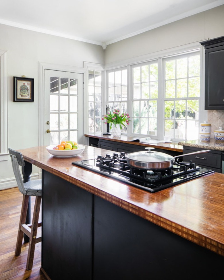
9. Top a Matte Black Island with a Glossy Wood Surface
The single element that makes this island a knockout is the contrast in finishes. The matte black base absorbs light, making it feel solid, grounded, and modern. Perched on top, the thick, high-gloss wood countertop does the exact opposite—it reflects light, highlights the natural grain, and adds a layer of warmth and rustic charm. It’s this specific pairing of matte and gloss that gives the piece its sophisticated, custom-designed feel. A matte top or a glossy base just wouldn’t have the same impact.
|
$53.86
|
$169.00
|
$37.49
|
$2,699.00
|

“A glossy wood countertop is stunning, but it’s not for the faint of heart.”
It will show scratches and dings more readily than a matte or oiled finish. You’ll need to be diligent about using cutting boards and trivets. Minor scratches can often be buffed out, but a deep gouge could require a professional to refinish the entire surface. This is a high-beauty, high-care choice best suited for households that are gentle on their surfaces.
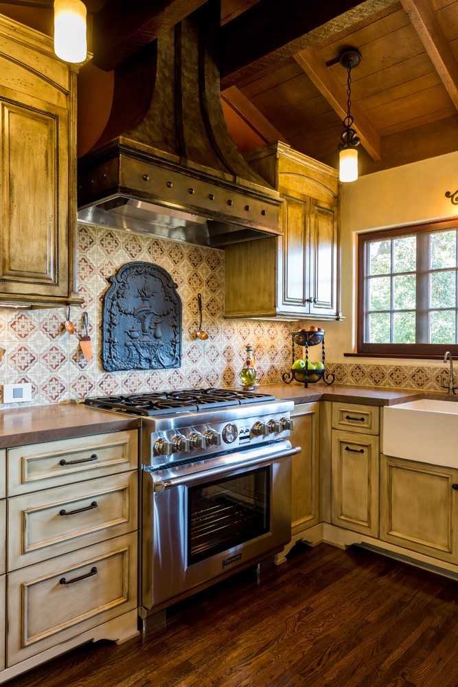
10. Accent a Range with a Patterned Tile Backsplash
When creating a decorative backsplash feature behind the range, the key is to define its boundaries. Don’t just let the pattern float. Here, the ornate metal insert and the slightly raised tile border give the feature a clear beginning and end. This makes it look like a deliberate piece of art. For a 36-inch range, a feature area that is 36 inches wide by 24-30 inches high is typically a well-proportioned size.
|
$80.21
|
$3,600.00
|
$2,972.69
|
$17.90
|

“Want to recreate that beautiful distressed finish on the cabinetry?”
Here’s a quick guide:
- Time: 1 weekend | Cost: $100-$150
- Step 1: Start with a base coat. Paint your cabinets in a darker color (like the warm brown seen here) and let it dry completely.
- Step 2: Apply a wax resist. Rub a wax puck or candle randomly along the edges and corners where natural wear would occur.
- Step 3: Paint the top coat. Apply your main color (the distressed off-white) over the entire surface.
- Step 4: Once dry, use a putty knife or sandpaper to gently scrape the areas where you applied the wax. The top coat will come off easily, revealing the darker color underneath for a naturally aged look.
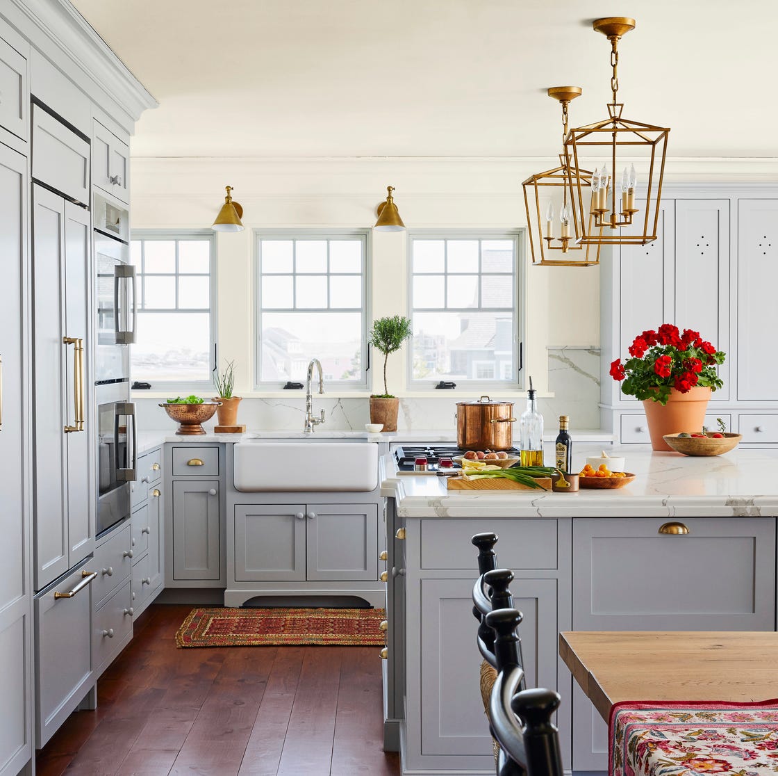
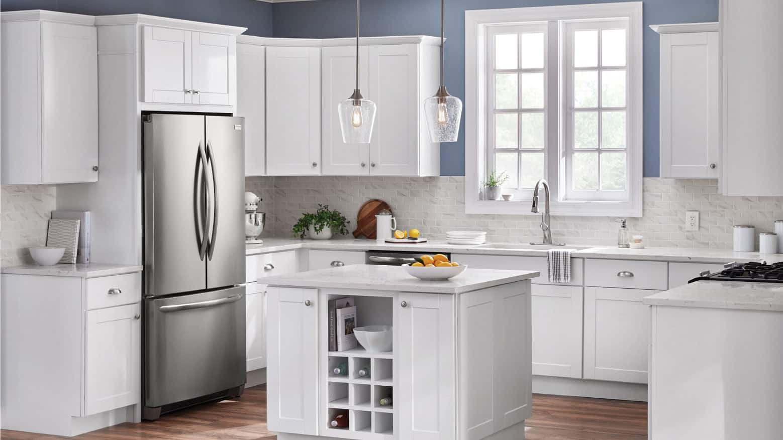
11. Soften a Kitchen with Light Gray Cabinets and Brass Details
Here’s a look at the estimated cost to bring this elegant design to life:
|
$712.45
|
$258.26
|
$49.00
|
$168.86
|

“Main Cabinetry: $7,000 – $15,000
Lighting (2 Pendants): $400 – $1,200
Textiles (”
- Main Cabinetry: $7,000 – $15,000
- Lighting (2 Pendants): $400 – $1,200
- Textiles (Rug): $150 – $400
- Decor & Hardware: $500 – $1,500
- Countertops (Marble): $4,000 – $9,000
- TOTAL: $12,050 – $27,100
- Budget alternative: Use high-quality laminate that mimics marble, source lighting from a big-box store, and opt for brass-plated hardware to get this look for 40-50% less.
This kitchen feels so calm and welcoming because it masterfully mixes color temperatures. The light gray cabinets and white marble have cool undertones, which keep the space feeling bright and clean. However, the brass hardware and lighting, along with the dark wood floors, introduce a deep warmth. This balance prevents the kitchen from feeling sterile or cold, creating a sophisticated yet comfortable atmosphere. The pops of red in the rug and decor add a final, playful touch of warmth.
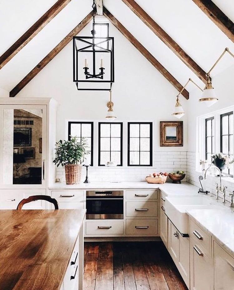
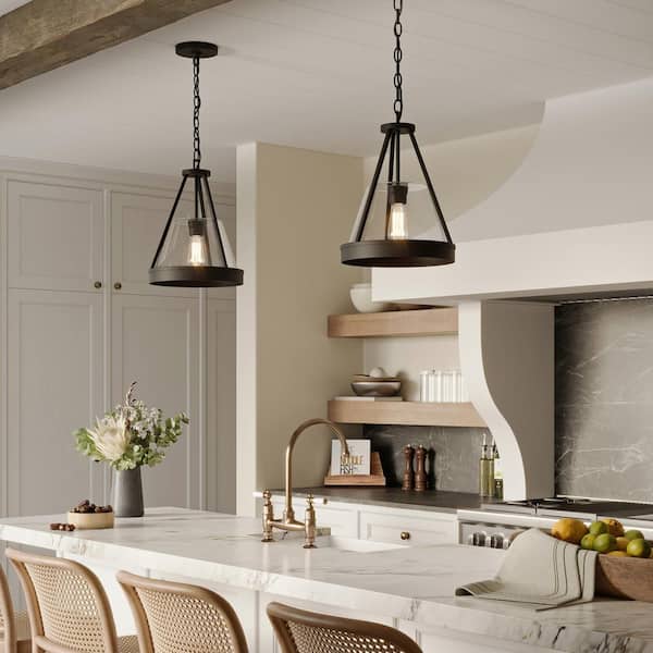
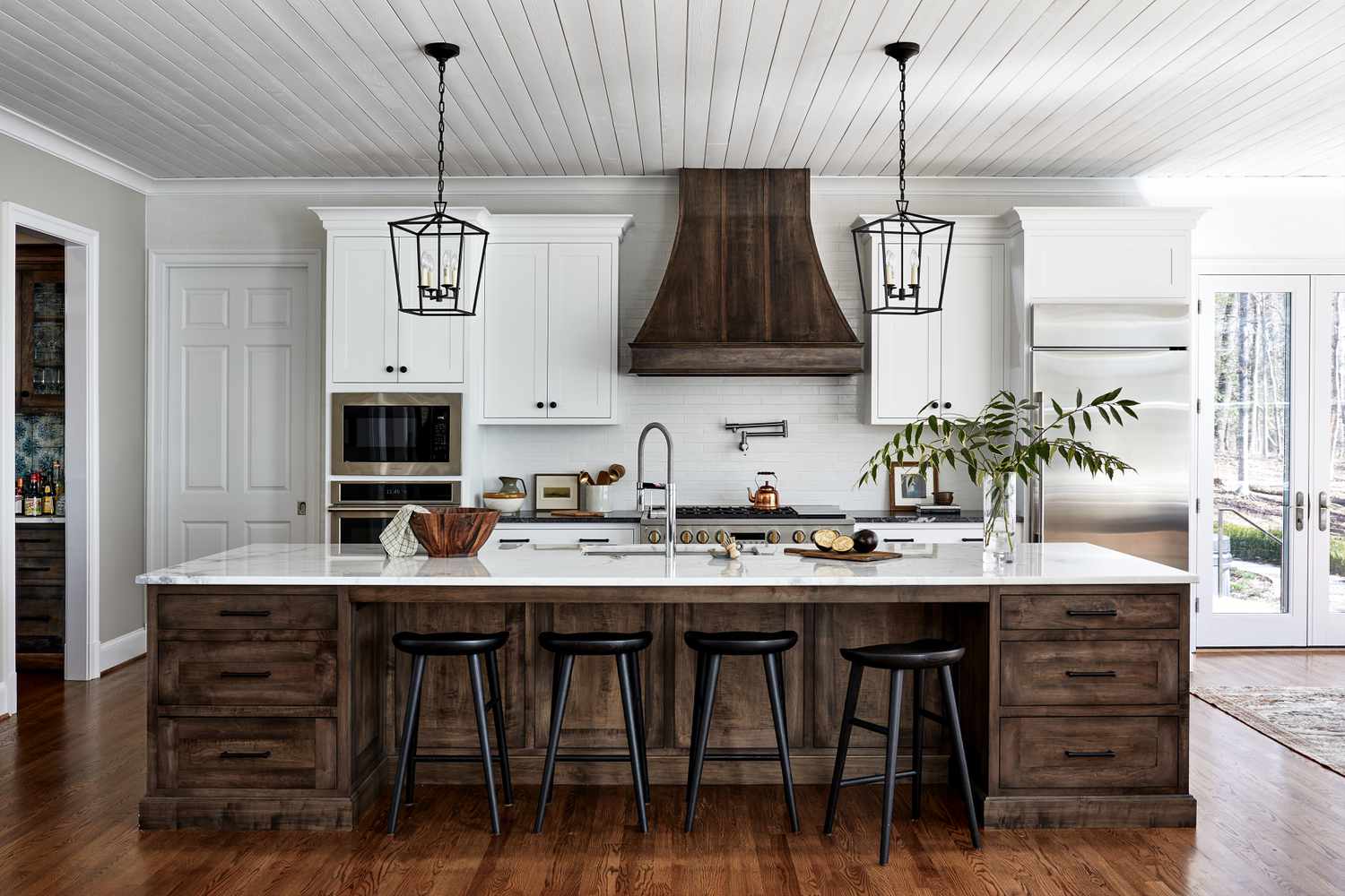
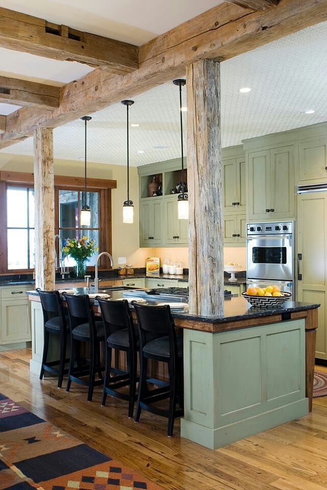
12. Anchor a Farmhouse Kitchen with a Slatted Wood Island
The single element that gives this kitchen its authentic farmhouse heart is the slatted wood island. Its slightly rough, imperfect texture and dark stain provide a necessary rustic counterpoint to the clean white subway tiles and cabinetry. If you replaced it with a sleek, painted island, the room would instantly feel more generic and less special. The unique chain-hung lantern is a close second, but it’s the island that truly grounds the entire design and defines its character.
|
$360.00
|
$1,720.00
|
$199.98
|
$214.27
|

“A large, dark island like this works best in a space with high or vaulted ceilings and plenty of natural light, just like the one shown.”
In a standard 8-foot ceiling room, it could feel a bit overwhelming. Ensure you have at least 42-48 inches of clearance on all sides for comfortable traffic flow, especially around appliances. For a more compact space, consider a similar style but with a lighter wood finish to reduce its visual weight.
13. Create Contrast with a Dark Walnut Island
When you have two different wood tones in a kitchen, like the light oak perimeter cabinets and the dark walnut island, the key to making it cohesive is a shared element. Here, the brass hardware is used on both the light and dark cabinets, creating a visual link between them. This small detail tells your brain that even though the colors are different, they are part of the same design family. The black range hood also calls back to the dark island top, further unifying the space.
|
$78.92
|
$869.67
|
$359.99
|

“Pairing a dark wood island with light wood perimeter cabinets is a beautiful choice, but be mindful of your flooring.”
If you have wood floors as well, you’re now juggling three different wood tones. This can get busy fast. A safe bet is to ensure your floor is either significantly lighter or significantly darker than both cabinet woods, or to break it up with a large area rug. Trying to match one of the cabinet woods can often lead to a near-miss that looks off.
14. A Classic Combo: Espresso Cabinets and Light Counters
This is a fantastic example of a handsome kitchen on a realistic budget. Espresso shaker cabinets have been a bestseller at home improvement stores for years because they offer a rich, high-end look at a great price point. Paired with affordable and durable speckled laminate countertops (around $20-$40 per sq. ft. installed), you get a high-contrast, functional kitchen that looks far more expensive than it is. This proves you don’t need a custom cabinet budget to achieve a clean, contemporary design.
|
$2,816.80
|
$199.99
|
$917.99
|
“The reason this combination is so enduringly popular is its powerful use of contrast.”
The deep, dark espresso cabinets create a sense of depth and luxury, while the light countertops and white walls bounce light around, preventing the dark wood from overwhelming the space. The stainless steel appliances act as a neutral bridge between the light and dark elements, adding a touch of modern sleekness. It’s a simple, foolproof formula for a balanced kitchen.
15. Go Bold with Deep Green Cabinets and a Marble Backsplash
Ready to commit to this rich, elegant look? Here’s a potential cost breakdown:
|
$235.00
|
$359.00
|
$9.07
|
$89.59
|

“Custom Cabinetry & Paint: $9,000 – $18,000
Marble Countertops & Backsplash Slab:”
- Custom Cabinetry & Paint: $9,000 – $18,000
- Marble Countertops & Backsplash Slab: $7,000 – $15,000
- Brass Faucet & Hardware: $800 – $2,500
- Farmhouse Sink: $600 – $1,500
- Floating Marble Shelf: $500 – $1,200
- TOTAL: $17,900 – $38,200
- Budget alternative: Get a similar vibe with stock cabinets painted a deep green (like Farrow & Ball’s ‘Studio Green’), a marble-look quartz, and more affordable brass-finish hardware.
Kitchens are becoming more personal and less clinical, and this design is a perfect reflection of that shift. Homeowners are craving color and personality, moving away from the all-white kitchens that dominated the 2010s. Deep, moody greens like this feel sophisticated, natural, and timeless. Paired with classic materials like marble and brass, as seen in Idea #27 as well, it feels like a new classic that has serious staying power.
16. Hang Industrial Pendants Over a Concrete-Texture Wall
For pendants over a counter or island, a good rule of thumb is to hang them so the bottom of the shade is 30-36 inches above the countertop. This provides ample task lighting without obstructing the view across the kitchen. For spacing, with multiple pendants, you generally want to leave about 30 inches between the center point of each light fixture to ensure they feel balanced and not crowded.
|
$174.99
|
$105.59
|
$199.00
|
$183.84
|


“This look, with its raw concrete texture and industrial lights, is perfect for spaces with an urban or loft-like feel.”
It thrives in rooms with high ceilings (9 feet or more) and large windows that provide plenty of natural light to balance the cool gray of the concrete. In a smaller, more traditional home, a full concrete wall might feel out of place. However, you could achieve a similar effect on a smaller scale with a concrete-look tile backsplash.
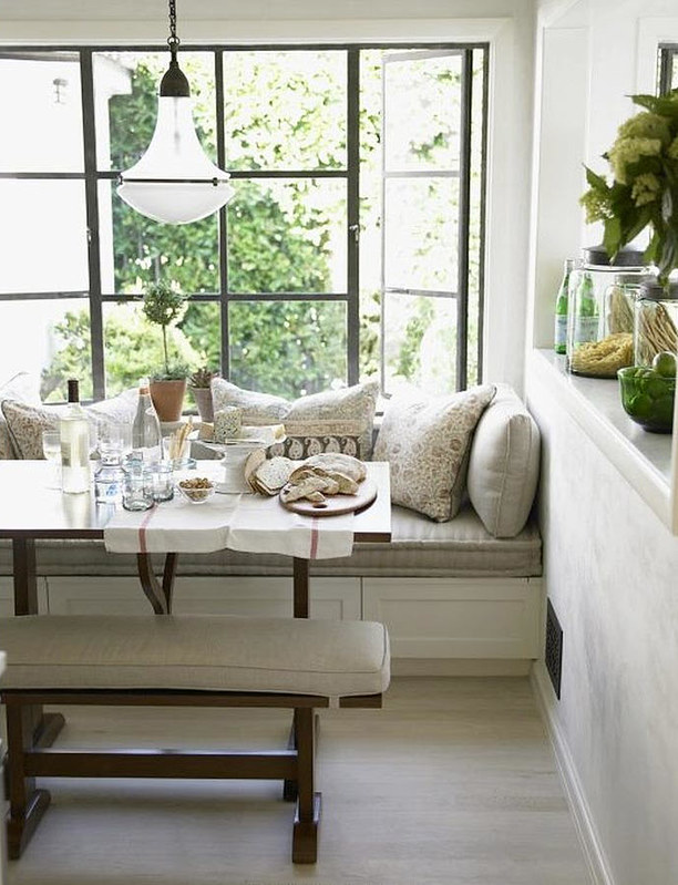
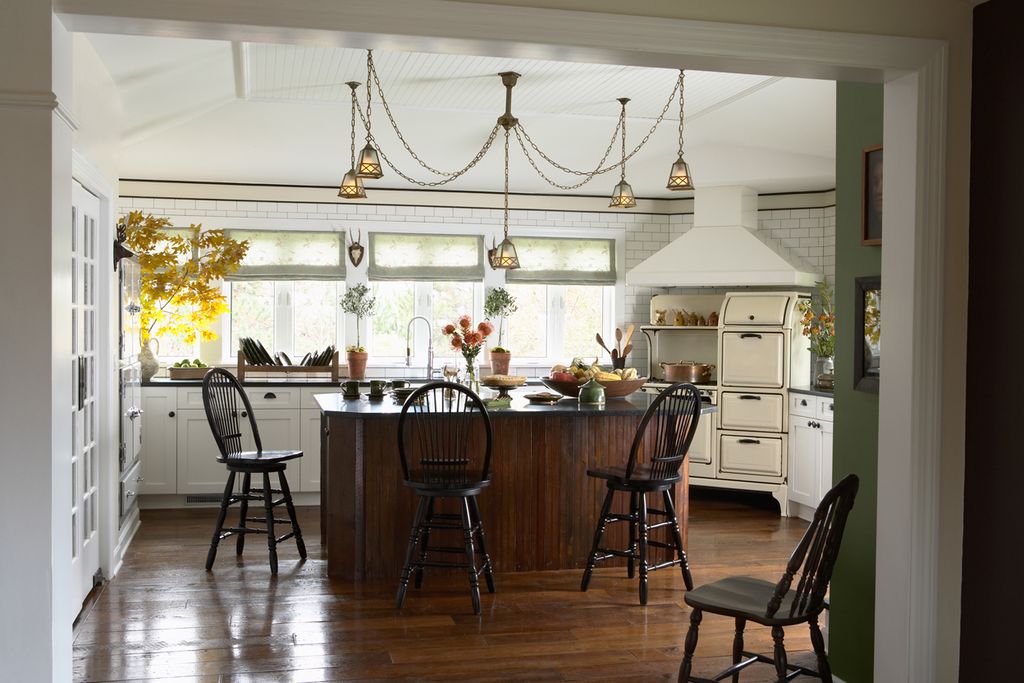
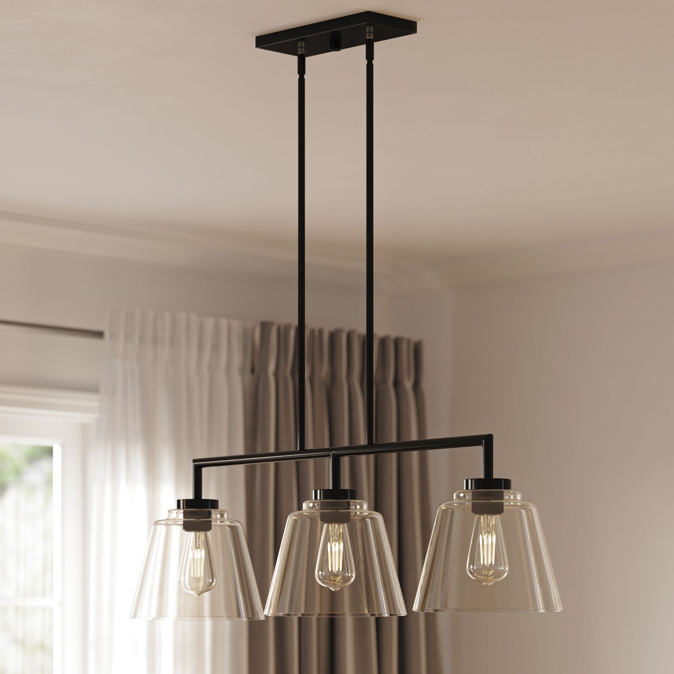
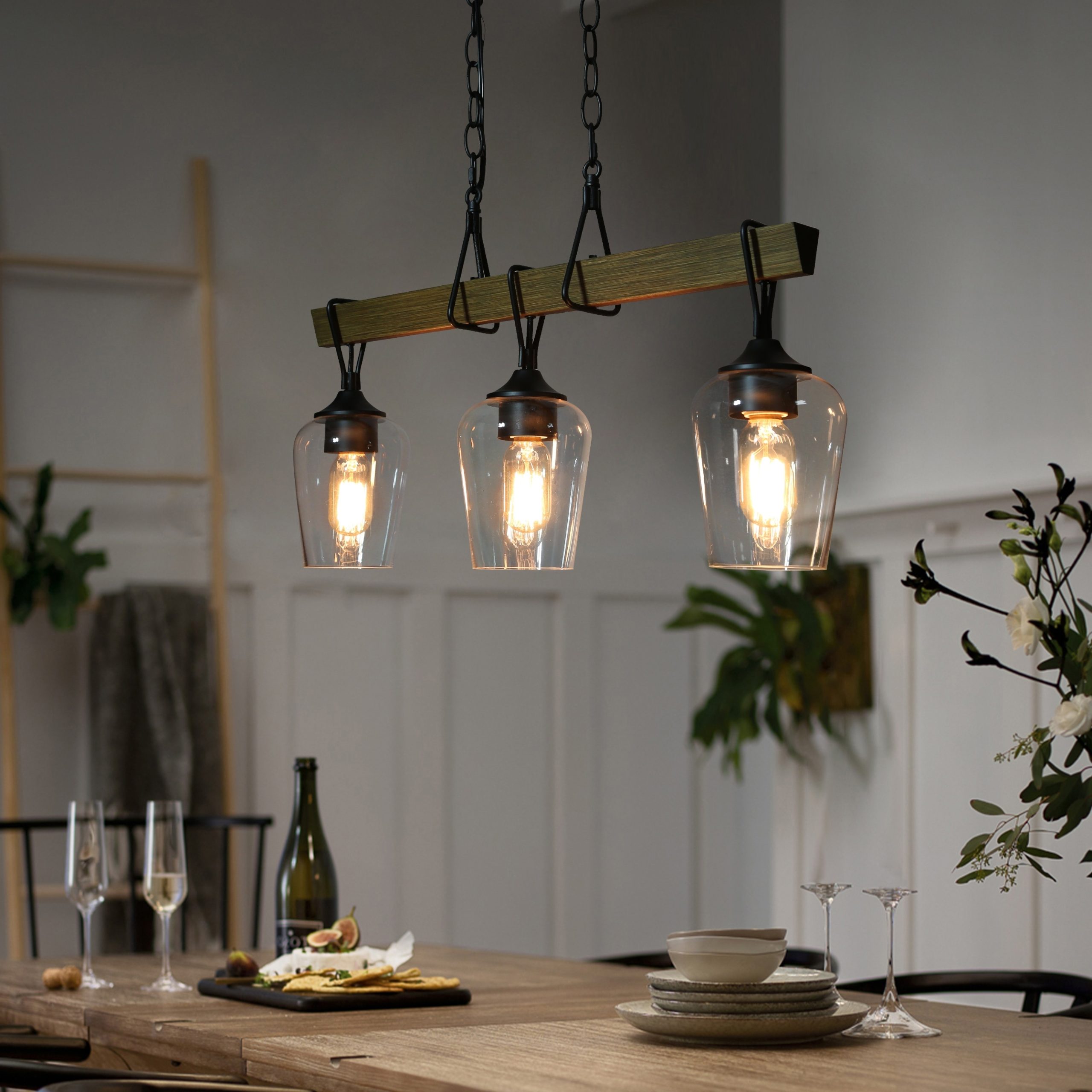
17. Light a Dining Table with a Rustic Beam Chandelier
The beauty of this setup lies in its harmonious repetition of form and material. The long, linear shape of the wooden chandelier directly mirrors the long, linear shape of the dining table below it. This creates a strong sense of cohesion and intentionality. The dark wood of the light fixture also echoes the dark stain of the table and chairs, tying the entire dining zone together into one unified, welcoming vignette.
|
$999.99
|
$59.99
|
$128.99
|
$42.68
|


“A large, statement chandelier like this is fantastic, but make sure it’s on a dimmer switch!”
At full power, three exposed bulbs can cast harsh, unflattering light—not ideal for a relaxed dinner party. A dimmer allows you to adjust the mood from bright and functional for cleanup to a soft, warm glow for dining, giving you much more versatility and comfort in the space.
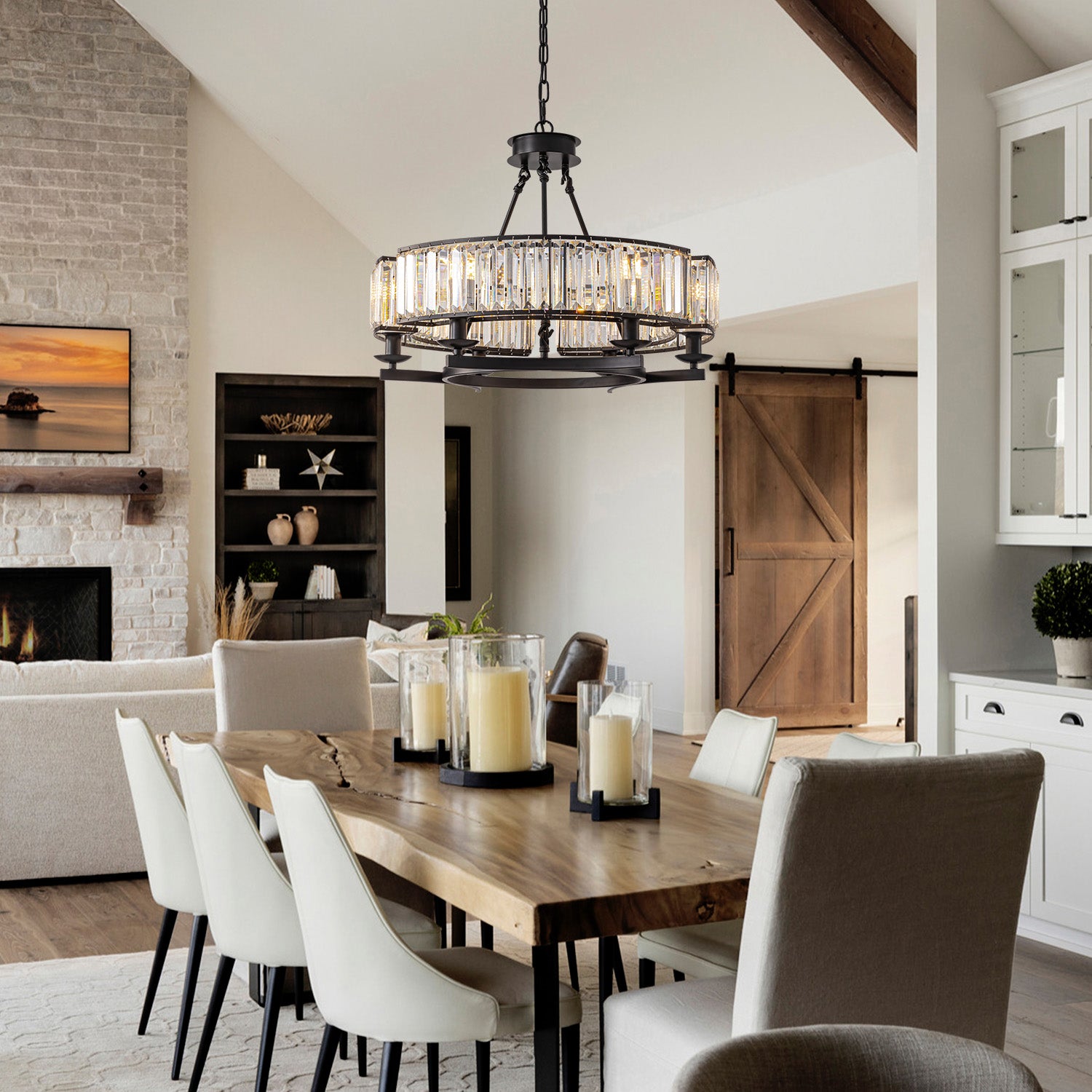
18. Mix Rustic and Glam with a Crystal Chandelier
The single element that elevates this entire space from simply ‘rustic’ to ‘rustic chic’ is the crystal chandelier. It’s a deliberate and slightly audacious touch of glamour amidst the natural wood, stone, and cozy textiles. Without it, the room would be beautiful but expected. The chandelier introduces an element of surprise and sophistication, proving that rustic design doesn’t have to be devoid of sparkle and elegance. It’s the perfect high/low mix.
|
$2,025.00
|
$104.99
|
$85.00
|
“This is the new rustic.”
It’s not about recreating a pioneer cabin; it’s about blending the authenticity and warmth of natural materials with modern comforts and a touch of unexpected luxury. People want homes that feel both grounded and a little bit glamorous. This combination of a rough-hewn live-edge table with a sparkling crystal light fixture perfectly captures that 2026 desire for a home that is both relaxed and refined.
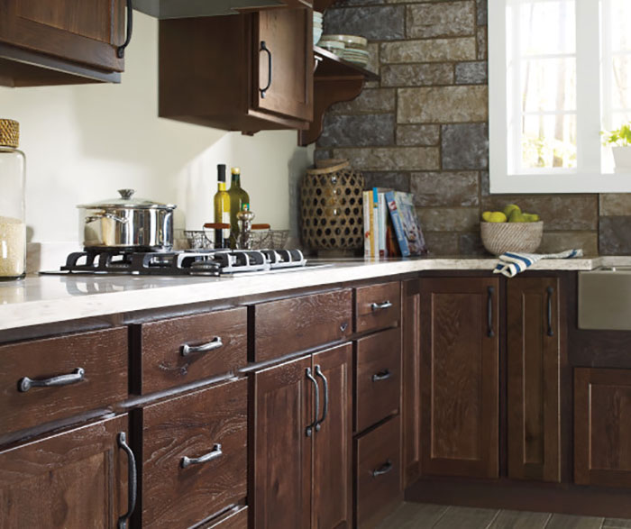
19. Feature a Stacked Stone Wall with Black Cabinets
This cozy, earthy kitchen follows a simple but effective formula: 40% dominant texture (the stacked stone wall), 40% grounding color (the matte black cabinets), and 20% natural wood accents (the live-edge countertops and open shelving). The greenery and copper add small, jewel-like pops of color and shine. By keeping the major elements in balance, the result is a space that feels rich and layered, but not chaotic.
|
$470.00
|
$80.48
|
$395.00
|
“A full wall of natural stone can be a major investment.”
To get this look for less, consider stone veneer panels, which are lighter and more DIY-friendly. For the countertops, you can find acacia or other solid wood options at stores like Floor & Decor for a fraction of the price of a custom live-edge slab. Pair them with simple black cabinets from IKEA (like the KUNGSBACKA line) to complete the look on a budget. This is a more approachable version of the dramatic look in Idea #29.
20. Add a Pop of Color with a Muted Orange Island
This kitchen feels so warm and inviting because of its expert use of analogous colors—hues that sit next to each other on the color wheel. The orange of the island, the brown of the beams, and the cream of the cabinets all belong to the same warm family. This creates a cohesive, harmonious palette that’s visually gentle and comforting. The single black pendant light provides a perfect point of contrast, keeping the warm tones from becoming monotonous.
|
$146.87
|
$99.00
|
$159.00
|
$5,999.00
|

“If you want to paint your kitchen island a statement color, but are nervous about it overpowering the room, choose a muted, earthy version of the hue.”
This dusty, terracotta-like orange is much easier to live with than a bright, saturated traffic-cone orange. Muted tones act as a ‘colored neutral,’ providing personality without shouting for attention. They blend beautifully with wood and stone, as seen here.
21. Create Character with a Distressed Wood Ceiling
that absolutely makes this kitchen is the distressed white wood-paneled ceiling. It adds an incredible layer of texture and history to the room that drywall could never achieve. It draws the eye upward and provides the perfect rustic canopy for the unique island and brick textures below. This single design choice defines the room’s entire character, making it feel like a space that has evolved over time.
|
$1,102.45
|
$95.93
|
$67.19
|

“A brick accent wall or alcove, like the one around the window here, looks incredible but can be a real sponge for cooking grease, especially if it’s near the stovetop.”
Sealing the brick with a matte-finish sealant can make it easier to wipe down. Even then, it will never be as simple to clean as a tile or slab backsplash. This is a feature you choose for love of the look, not for low-maintenance living.
22. Balance White Uppers with Dark Wood Lowers
This two-tone approach is so effective because it cleverly manipulates our perception of the space. Placing the dark wood cabinets on the bottom grounds the kitchen, giving it a solid, reassuring base. The white upper cabinets and glossy backsplash, in contrast, seem to float above, making the room feel taller and more open. This prevents the dark wood from feeling too heavy while still adding warmth and richness. The black hardware acts as a unifying accent, tying the top and bottom halves together.
|
$318.00
|
$134.95
|
$266.00
|
$65.00
|

“Installing floating shelves so they look professional and can hold weight is key.”
Here’s how:
- Time: 2-3 hours | Cost: $50-$200 (for hardware and shelves)
- Step 1: Locate your wall studs using a stud finder. This is non-negotiable for strength.
- Step 2: Purchase a heavy-duty floating shelf bracket. These are metal brackets with rods that project from the wall.
- Step 3: Level and mount the bracket securely into the studs with long screws.
- Step 4: Slide your hollow-core floating shelf (or a solid shelf that has been drilled out) onto the rods. Secure it with small screws from the underside, if provided by the bracket manufacturer.
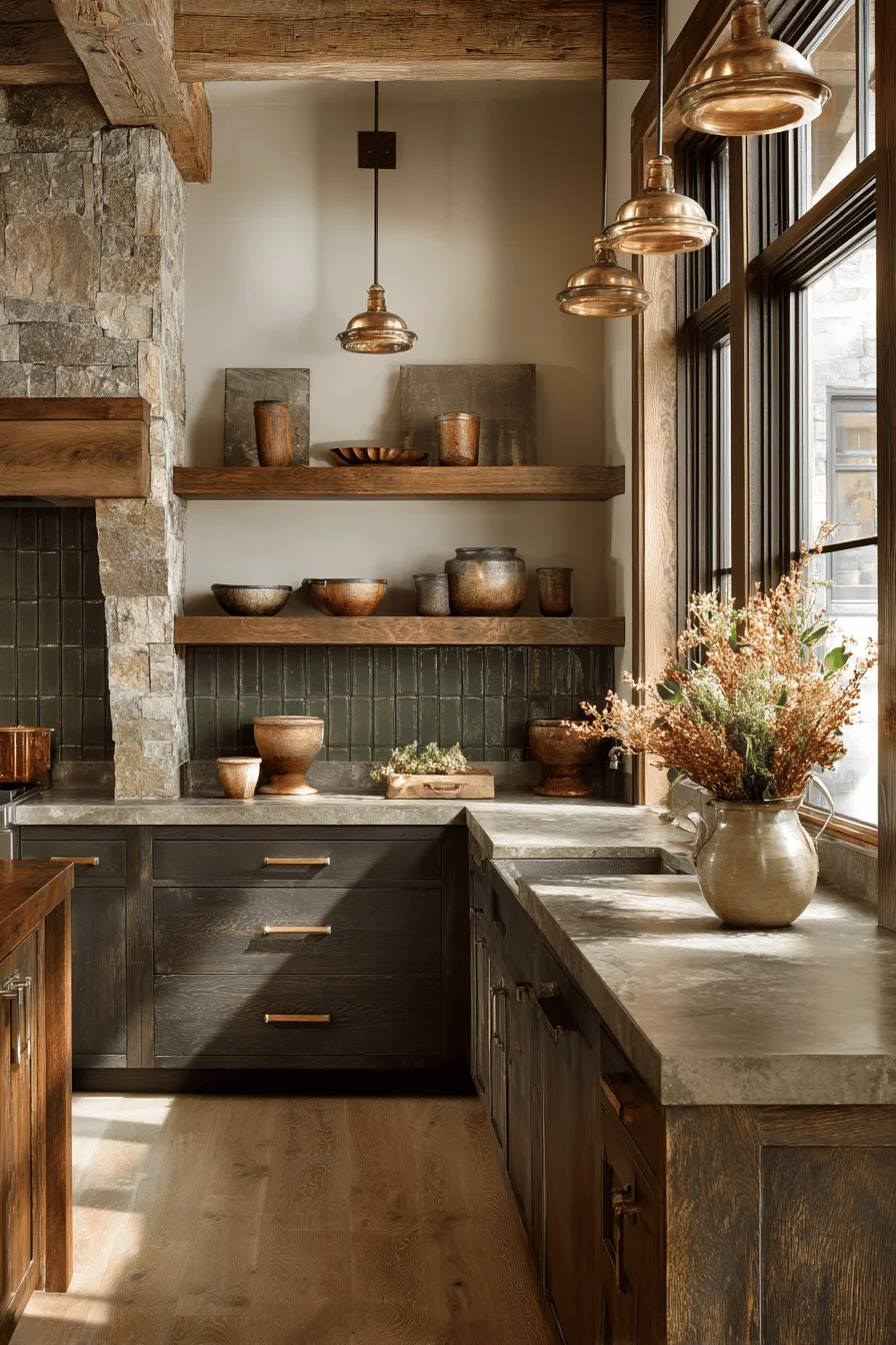
23. Layer Dark Wood, Green Tile, and Stone
When working with multiple strong rustic elements like wood beams, stone walls, and dark cabinets, the key to avoiding a
|
$1.49
|
$149.00
|
$34.98
|
$312.00
|


24. Contrast a Dark Wood Island with White Perimeter Cabinets
A large, dark island is a fantastic anchor, but it demands a generously sized room. For an island of this magnitude (likely 8-10 feet long), you’ll want a kitchen space that’s at least 15 feet wide to maintain comfortable 42- to 48-inch walkways on either side. The white perimeter cabinets and light-colored walls are crucial here—they recede visually, making the room feel larger and preventing the substantial island and dark floors from dominating the space.
|
$114.27
|
$3,650.00
|
$29.86
|
$775.99
|

“Love this high-end look but not the price tag?”
You can achieve a similar feeling on a budget. Use IKEA’s white GRIMSLÖV cabinets for the perimeter and create an island using their black-brown LERHYTTAN doors on a standard base. Top it with a marble-look laminate countertop from a big box store. This strategy gives you the same balanced color palette and grand feeling for a small fraction of the cost of custom cabinetry. It’s a similar principle to the design in Idea #14 but on a grander scale.
25. Embrace Nature with Forest Green Cabinets and a View
This design is a masterclass in bringing the outdoors in. The choice of forest green for the cabinetry is no accident; it directly echoes the color of the pine trees visible through the large windows. This creates a seamless visual connection between the interior and the exterior landscape. The natural wood ceiling and stone backsplash further reinforce this nature-inspired palette, making the kitchen feel like a cozy, sophisticated extension of the forest itself.
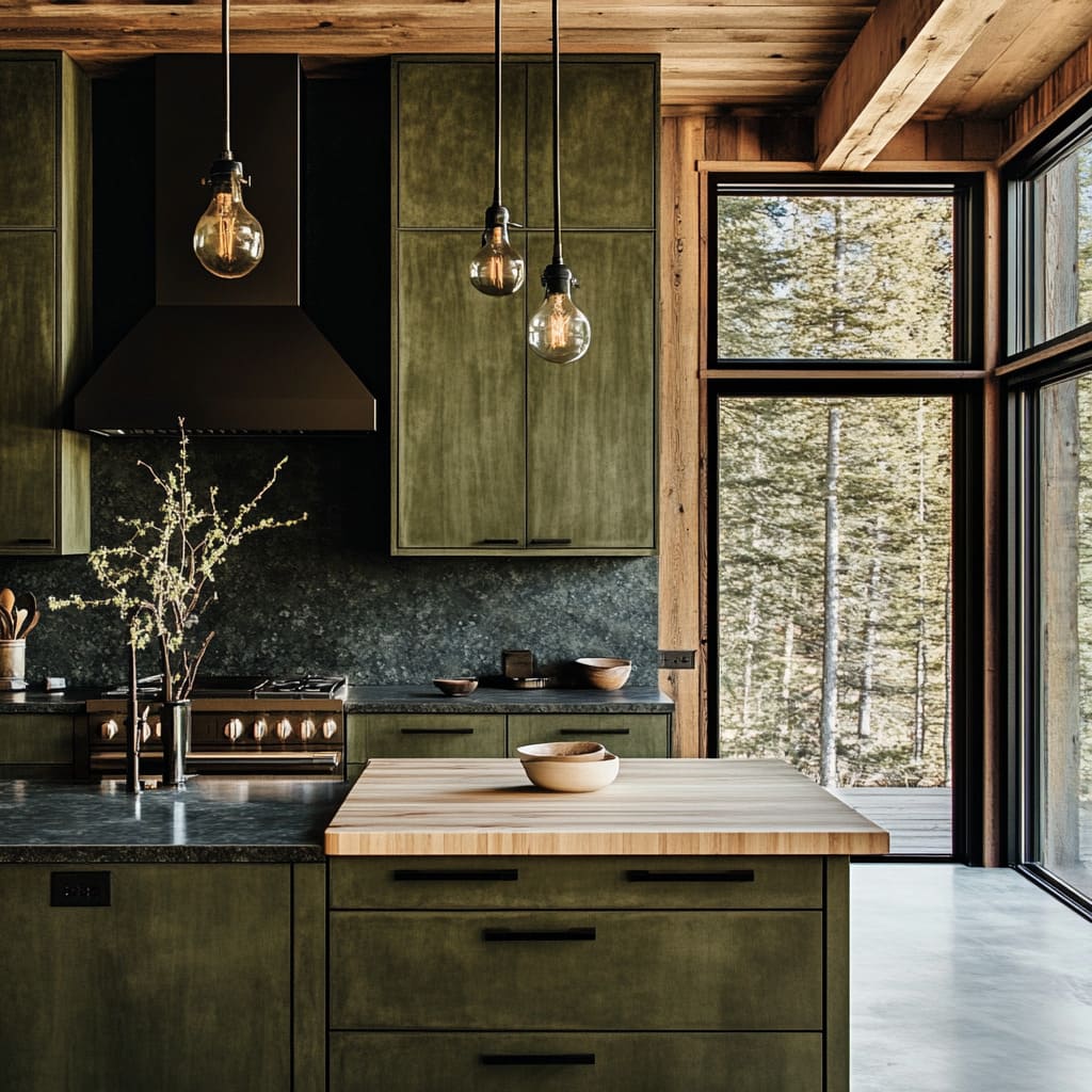
|
$2,280.00
|
$6.17
|
$199.20
|
$124.00
|


“that makes this kitchen truly special is the confident, floor-to-ceiling use of dark, textured stone for the countertops *and* backsplash.”
It’s a bold move that creates a dramatic, cavern-like sense of enclosure and earthiness. A simple tile backsplash wouldn’t have nearly the same impact. This continuous slab of stone is what gives the room its substantial, grounded, and deeply rustic character, perfectly complementing the forest green and wood tones. For a lighter take on green, see Idea #27.
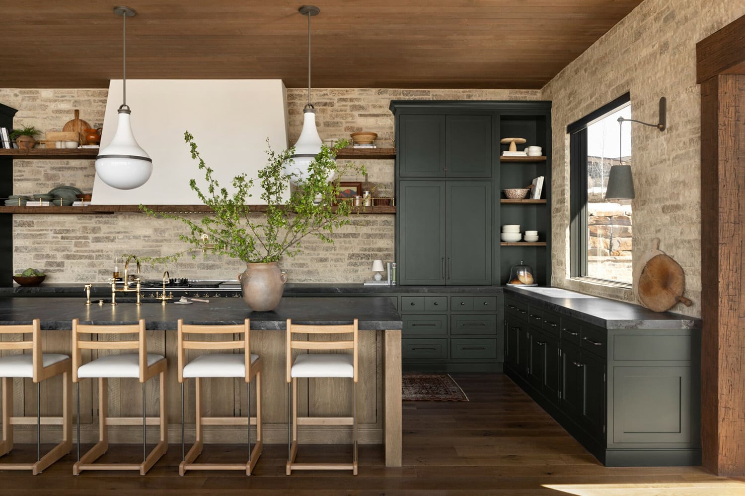
26. Ground a Space with Sage Green Cabinets and Rough-Hewn Beams
Thinking about adding rustic beams? They add incredible character, but plan ahead:
|
$2,197.84
|
$116.91
|
$879.99
|
$53.00
|


“Ceiling Height: Ensure you have at least 9-foot ceilings.”
In a room with standard 8-foot ceilings, heavy beams can make the space feel cramped and visually heavy.
Structural vs. Faux: Are these supporting the house or just for looks? Faux beams are lighter and much easier to install, but make sure they are made from a convincing material. Real structural beams require engineering approval.
Lighting Plan: Beams can create shadows. Plan your lighting around them. You may need more recessed lights or pendants than you think to keep the space evenly lit.
When you have a kitchen with strong architectural elements like these rough wooden posts and beams, keep the other finishes simple and classic. The choice of a timeless sage green shaker cabinet and a simple black granite countertop is perfect. They are beautiful in their own right but don’t compete for attention with the powerful wooden structure. This allows the beams to be the star of the show.
27. Achieve Elegance with Sage Green, Marble, and Brass
This kitchen’s sophisticated formula is all about refined restraint: 70% soft, calming color (the sage green cabinetry and beadboard), 20% classic luxury (the veined white marble), and 10% warm metallic shine (the brass hardware and faucet). This high percentage of soft color creates a tranquil, enveloping feel, while the marble and brass elevate it from simply ‘nice’ to truly elegant. It’s a calmer, more classic approach than the earthy sage green in Idea #26.
|
$61.26
|
$13.83
|
$139.00
|
$339.00
|

“A marble countertop is the dream for many, but it is a soft, porous stone.”
It can etch (dull) when it comes into contact with acidic things like lemon juice, vinegar, or wine, and it can stain if spills aren’t wiped up quickly. While many people come to love the patina that develops over time as a sign of a well-loved kitchen, you must be okay with imperfection. If you want a pristine, perfect surface forever, marble is not for you.
28. Balance Dark Wood Cabinets with a Natural Stone Wall
This kitchen expertly balances dark and light, and smooth and rough. The dark brown shaker cabinets provide a smooth, clean-lined foundation, while the multi-toned natural stone wall offers a rugged, organic texture. The light countertops and large white window cut through the richness, preventing the dark wood and stone from feeling overwhelming. This constant interplay between opposing elements is what makes the space feel so dynamic and visually interesting.
|
$330.93
|
$49.98
|
$1.99
|
$258.00
|
“A natural stone accent wall like this is fairly low-maintenance, but the one area of concern can be the stone behind the sink.”
Hard water can leave mineral deposits over time, and soap scum can build up in the crevices. A weekly wipe-down with a pH-neutral stone cleaner and a soft brush can help prevent buildup. It’s also wise to seal the stone in this splash zone every 1-2 years to make it more resistant to moisture.
29. Embrace a Moody Vibe with Dark Wood and Stone
The single element that defines this kitchen’s powerful, cozy mood is the commitment to a dark palette. The dark cabinets, dark island, and dark range hood, all set against the medium-toned stone and olive walls, create a deeply enveloping and handsome space. If the island or cabinets were painted white, it would completely shatter the immersive, rustic-lodge feeling. The boldness to stay dark is what makes it so successful and memorable.
|
$199.99
|
$74.10
|
$191.96
|

“A dark and moody kitchen like this thrives in an open-concept space where it can borrow light from adjoining areas, like the dining space seen here.”
In a small, enclosed room, this much dark wood and stone could feel oppressive. An ideal footprint would be at least 250 square feet with 9-foot or higher ceilings and large windows in the vicinity to keep it from feeling like a cave. Compare this to the brighter, more open feeling of Idea #24, which uses a similar color palette differently.
30. Pair Textured Dark Wood Cabinets with a Stone Backsplash
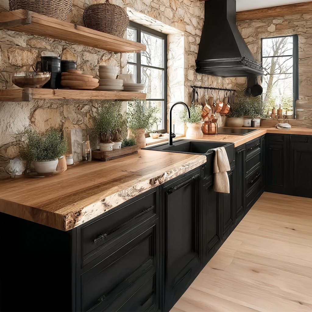
When pairing two strong textures like the wood grain cabinets and the stacked stone backsplash, the countertop choice is critical. Notice how the countertop here is a very quiet, solid, light cream color with almost no pattern. This provides a necessary visual break between the two busy surfaces. A heavily speckled or veined countertop would have created a chaotic, cluttered look. When in doubt, let one element be the star.
|
$44.00
|
$3,417.98
|
$41.29
|
$10.00
|

“This kitchen feels so cohesive because it limits its material palette and repeats it.”
You have wood, stone, metal, and a solid neutral. The dark brown of the wood, the black of the hardware, the grays and browns of the stone, and the cream of the countertops—that’s it. There are no surprise colors or finishes. This disciplined approach is what gives the design its grounded, earthy, and harmonious feel. It feels calm because the elements are all speaking the same visual language.
31. Maximize a Compact Kitchen with Warm Wood and Black Frames
This small but mighty kitchen nails its design with a simple formula: 60% warm texture (the vertical grain wood cabinets), 30% sharp, modern lines (the black frames, countertops, and appliances), and 10% brightness (the light walls and stainless steel sink). This ratio ensures the space feels warm and inviting, thanks to the wood, but also clean, organized, and modern, thanks to the crisp black details. It’s a perfect recipe for a small, rustic-modern space.
|
$243.00
|
$56.15
|
$247.86
|

“In a compact kitchen, every material choice has to work extra hard.”
The use of dark grout-like lines or frames around the cabinets and dark countertops can visually shrink the space if you’re not careful. This look is successful because it’s balanced by a light wall color, light flooring, and a window. If the entire room were dark, it would quickly feel tight and cramped. Be sure you have enough light to support this much contrast in a small footprint.
Your Rustic Kitchen Story Starts Here
Whew, that was a lot of inspiration! But hopefully, you’ve found a few ideas that feel like ‘you.’ The beauty of rustic design is that it’s all about texture, warmth, and personality, not rigid rules. So take these ideas, mix and match them, and create a space that feels like home. Don’t forget to save your favorites to your Pinterest board to come back to when you’re ready to start your project!
Photo credits: HOUSE of HARPER, Hunker, Architectural Digest, Houzz, Lowe’s, Country Living Magazine, The Ponds Farmhouse, The Creek Line House -, Edward George, George Cabinetry, Dura Supreme, Hello Hayley, Crystal Cabinets, The Spruce, Stone Impressions, Sofary Lighting, Fancy House Design, Homecrest Cabinetry, Spryinterior · In stock, Canadian Log Homes Blog, Fineline Kitchens Inc., House Beautiful, Bed Bath & Beyond, Real Homes, The Cottage Market, Log Furniture Place · In stock / Web, Curtis Adams / Pexels
Photo credits: HOUSE of HARPER, Hunker, Architectural Digest, Houzz, Lowe’s, Country Living Magazine, The Ponds Farmhouse, The Creek Line House -, Edward George, George Cabinetry, Dura Supreme, Hello Hayley, Crystal Cabinets, The Spruce, Stone Impressions, Sofary Lighting, Fancy House Design, Homecrest Cabinetry, Spryinterior · In stock, Canadian Log Homes Blog, Fineline Kitchens Inc., House Beautiful, Bed Bath & Beyond, Real Homes, The Cottage Market, Log Furniture Place · In stock / Web, Curtis Adams / Pexels