You know that feeling when you find the perfect DIY garden sign that looks just right for your little slice of heaven? It’s more than just a marker; it’s the finishing touch that adds personality and charm. After sifting through hundreds of options, from rustic wood planks to custom metalwork, we’ve narrowed it down to the very best. Inside, you’ll find 31 curated ideas that actually deliver, covering everything from whimsical fairy signs to classic welcome markers. For 2026, it’s all about hyper-personalization, moving beyond generic quotes to signs that tell a story about your specific garden. And stay until the end — we break down the most common mistakes that can ruin these looks. 📌 Save this to Pinterest for later — you’ll want to revisit these ideas.
1. Hang a Rustic Welcome Sign from a Thick Tree Branch
The single element that elevates this from just a sign to a moment is the thick, natural rope used to hang it directly from a sturdy tree branch. Without it, you’d just have a sign on a post. The rope integrates the sign into the existing landscape, making it feel like it grew there. It suggests a certain effortless, settled-in charm that a more rigid installation couldn’t achieve. This choice turns a simple greeting into an organic part of the garden itself, an invitation that feels as natural as the leaves around it.
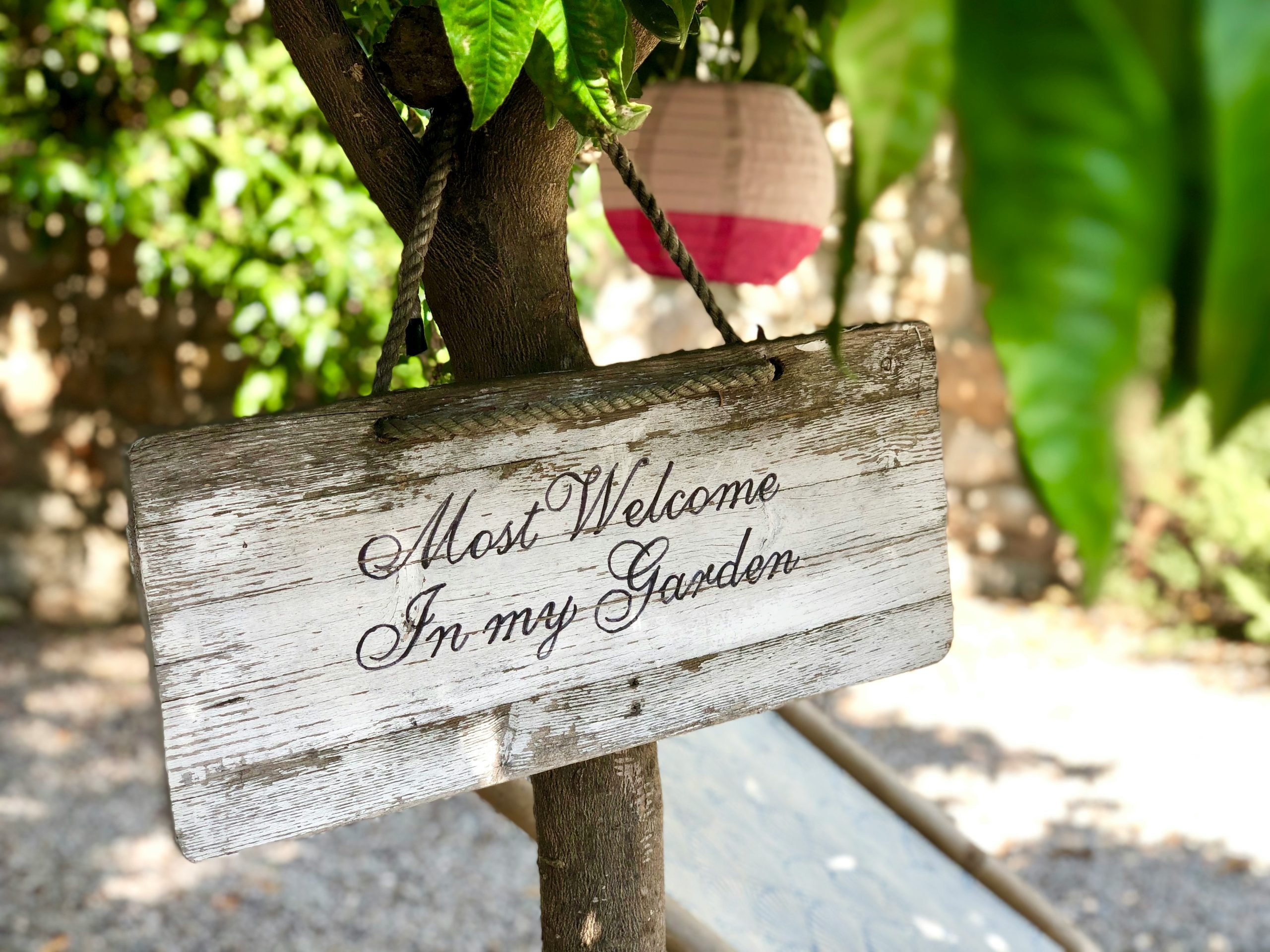
“What makes this work so well is the beautiful play of textures.”
You have the roughness of the tree bark and the thick rope contrasting with the weathered smoothness of the painted white sign. This tactile variety is interesting to the eye. Furthermore, the designer uses layering to create depth. The sign is the foreground, the dense green leaves are the mid-ground, and the pop of color from the distant paper lantern creates a background focal point, making the whole scene feel a little more magical and thoughtfully composed.
2. Point the Way with a Simple, Understated ‘To Garden’ Sign
When creating a directional sign, font choice is everything. For maximum readability from a distance, choose a simple, bold, sans-serif font in a high-contrast color. Here, the clean white text on the dark brown wood is classic and effective. Avoid overly ornate or script fonts for directional purposes, as they can become illegible from more than a few feet away. The goal is clarity, not clutter. A good rule of thumb is that the letter height should be at least one inch for every 25 feet of viewing distance.
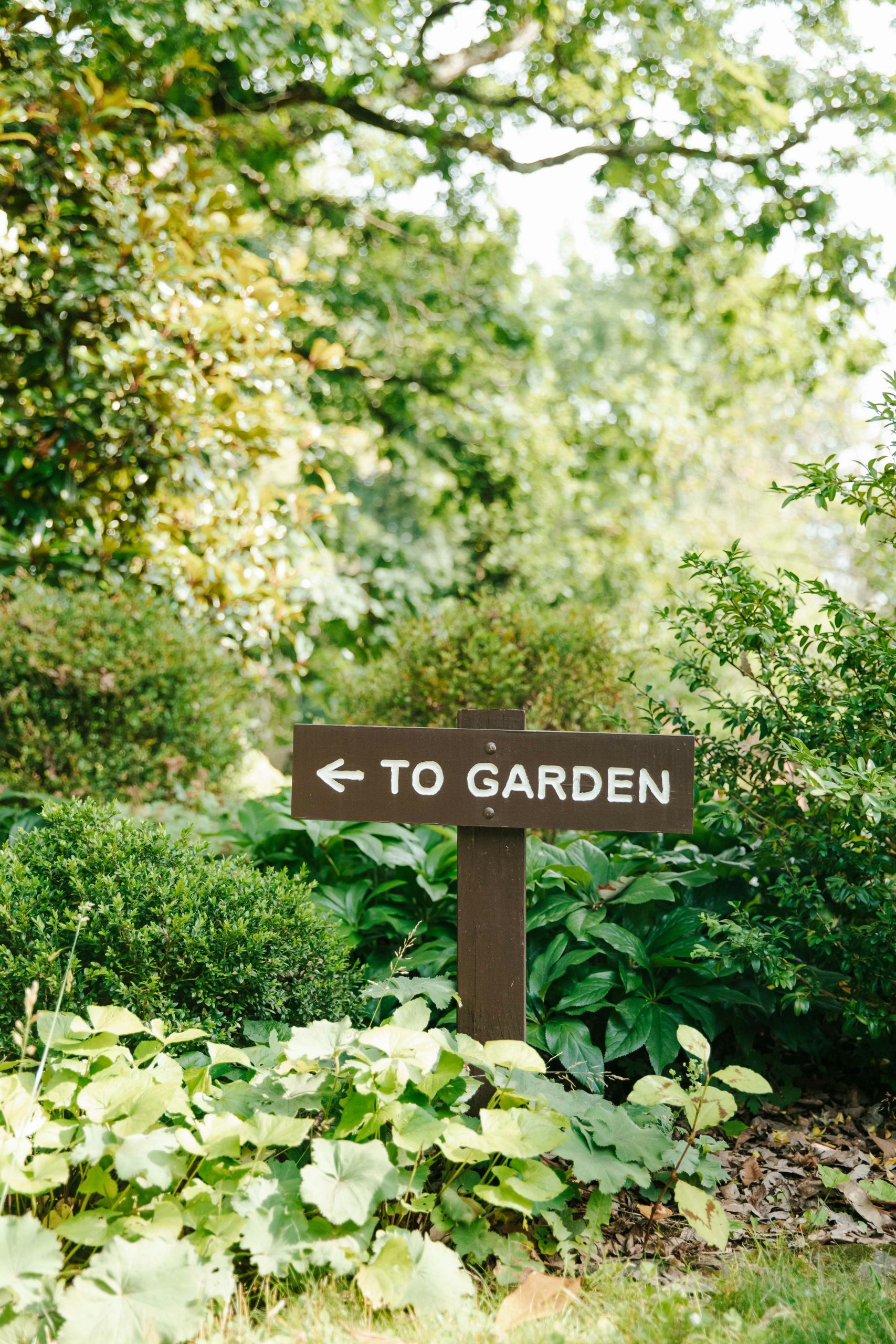
“This style of sign is perfect for medium to large gardens where paths might diverge or the main garden area isn’t immediately visible from the house or entrance.”
It requires enough surrounding space and foliage to feel nestled in, rather than starkly exposed. For this to be effective, you need a minimum of 10-15 feet of pathway or lawn leading up to it. In a very small or patio garden, a directional sign might feel a bit silly, as the destination is already in plain sight. It’s all about creating a sense of journey and discovery.
3. Frame an Entrance with a Post-and-Beam Welcome Sign
A sign like this, built with heavy wood posts and thick rope, is a statement piece, but it requires upkeep. The natural wood posts will need to be sealed every 1-2 years with a UV-protectant and water-repellent finish to prevent rot and fading, especially in wet or sunny climates. The rope bindings can collect moisture and debris, so check them seasonally for mold or fraying. The metal chains and sign are fairly low-maintenance, but you may want to apply a clear coat if you wish to halt the rusting process and prevent rust stains on the wood below.
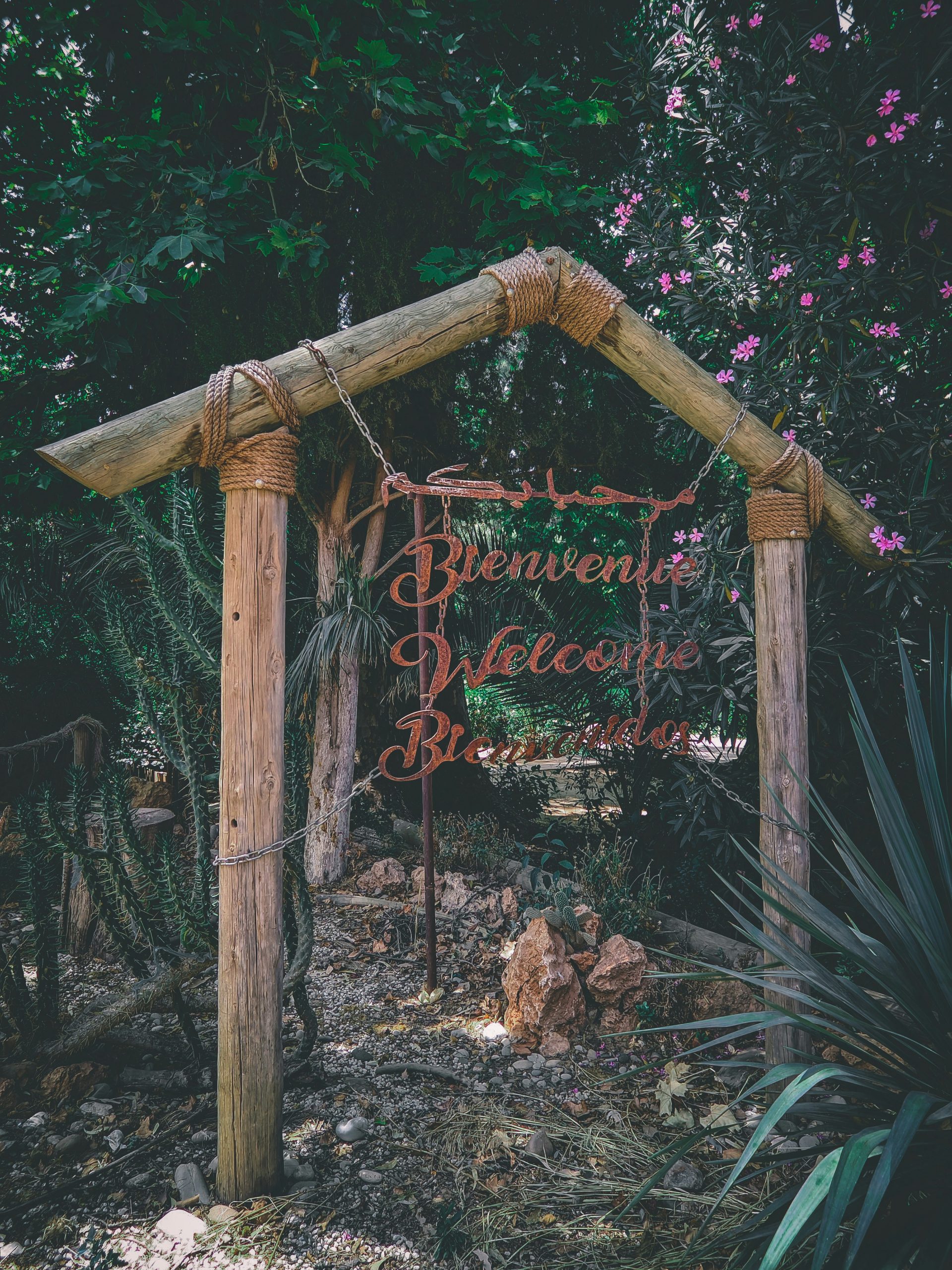
“The visual formula here is a masterclass in rustic texture.”
Think of it as 50% raw wood structure, 20% natural fiber rope, 20% aged metal, and 10% delicate floral accents. The key is the balance between the heavy, masculine elements (posts, chains) and the soft, organic surroundings (foliage, flowers). You could swap the materials while keeping the ratio: imagine a sleek black metal frame (50%) with brass accents (20%) and a polished stone sign (20%), surrounded by architectural grasses (10%) for a modern take.
4. Build a Farm-Style Sign with an Integrated Flower Planter
This is a substantial build, but it delivers a huge impact. Here’s a rough estimate to create this look yourself, assuming you have basic woodworking tools.
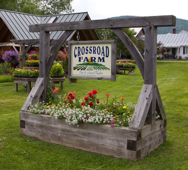
“Wood & Hardware: Pressure-treated lumber for the posts and planter box, plus screws and bolts.”
($150 – $300)Custom Sign: A professionally cut and painted hanging sign. ($100 – $250)Paint & Sealer: Exterior-grade paint or stain and a weatherproof sealer. ($50 – $80)Flowers & Soil: Enough potting soil and assorted annuals to create a lush, overflowing look. ($60 – $120)TOTAL: $360 – $750Budget alternative: Use reclaimed pallet wood for the structure and hand-paint your own sign to bring the total cost down to around $150-$250.
Be honest with yourself about your DIY skills before tackling this. A structure of this size needs to be built safely and securely. The posts must be sunk deep enough into the ground (at least 2-3 feet, possibly in concrete) to prevent them from leaning or being toppled by high winds, especially with the added weight of the planter box filled with wet soil. If you’re not comfortable with this level of construction, it’s safer to hire a handyman. An improperly installed sign of this scale can be a serious hazard.
5. Hang an Uplifting ‘Cultivate Kindness’ Garden Flag
A custom-printed garden flag is a lovely touch, but it can cost anywhere from $25 to $50 plus the hanger. To get this look for less, you can create a beautiful no-sew version for under $15. Start with a piece of plain, light-colored canvas or burlap from a craft store. Use fabric paint and stencils to create your own design and lettering—you can find endless font stencils online. For the hanger, a simple wooden dowel with twine or a creatively bent metal hanger from a hardware store will do the trick perfectly. It’s a 1-hour project that delivers the same uplifting message.
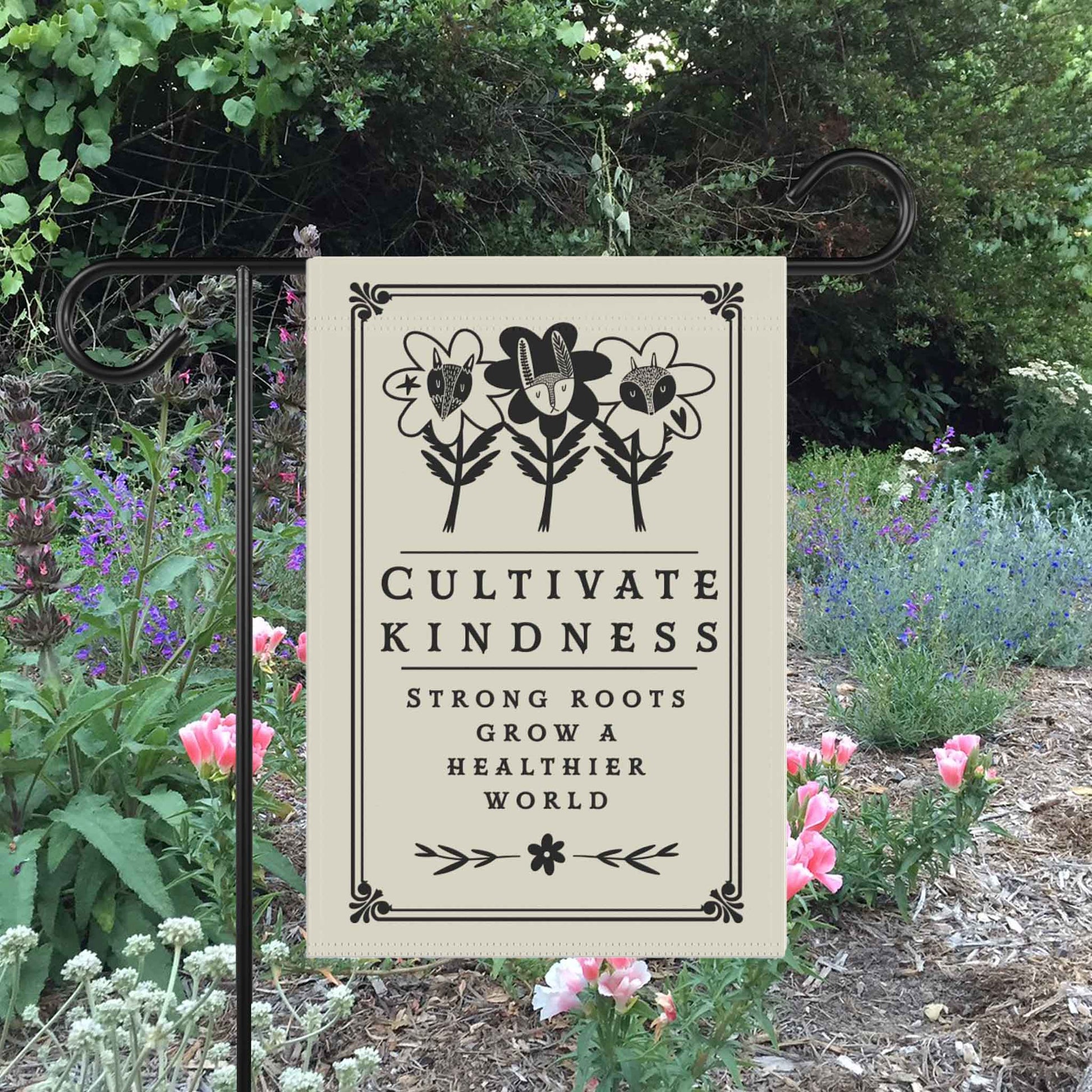
“Garden flags with positive, mindful messages are a huge trend right now, flowing directly from the broader wellness and self-care movement.”
People are increasingly viewing their gardens as sanctuaries for mental health, not just for growing plants. A sign that says ‘Cultivate Kindness’ isn’t just about being nice; it’s a gentle command to oneself, a reminder of intention. This trend has staying power because it connects an activity (gardening) with a deeper personal value, making the garden a space for personal growth as well as botanical growth.
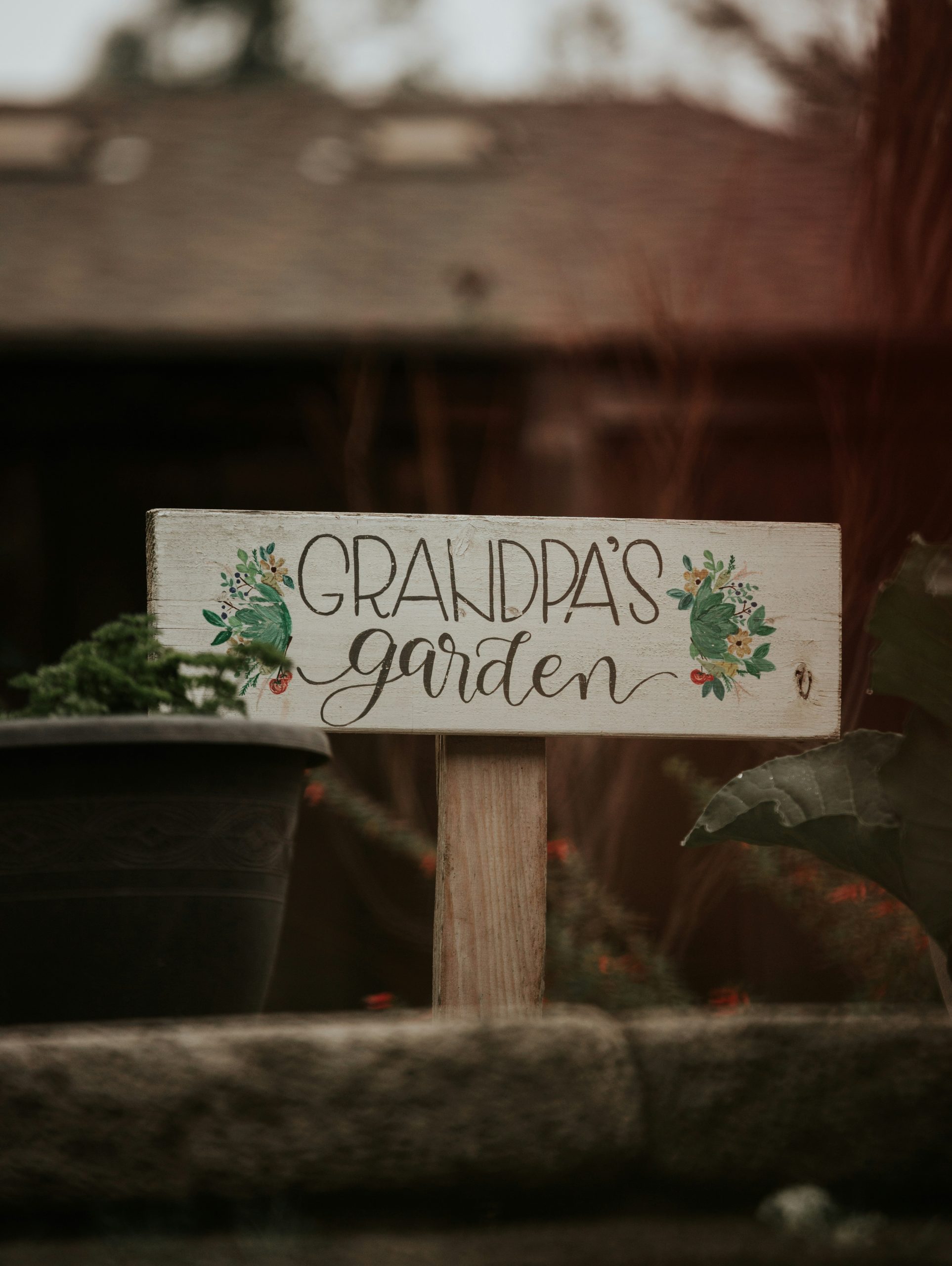
6. Create a Heartfelt ‘Grandpa’s Garden’ Sign
It’s the hand-painted lettering, hands down. The slight imperfections and personal touch in the way ‘GRANDPA’S garden’ is written are what give this sign its soul. If this were done with a perfect, vinyl-cut stencil, it would feel generic and lose all its heartfelt charm. The authenticity of the brush strokes tells a story of care and affection, making it clear that this isn’t just any garden—it’s a specific, beloved place. It’s a tribute, and that feeling can only be conveyed through the human hand. For a different type of personal touch, check out the fairy theme in Idea #9.
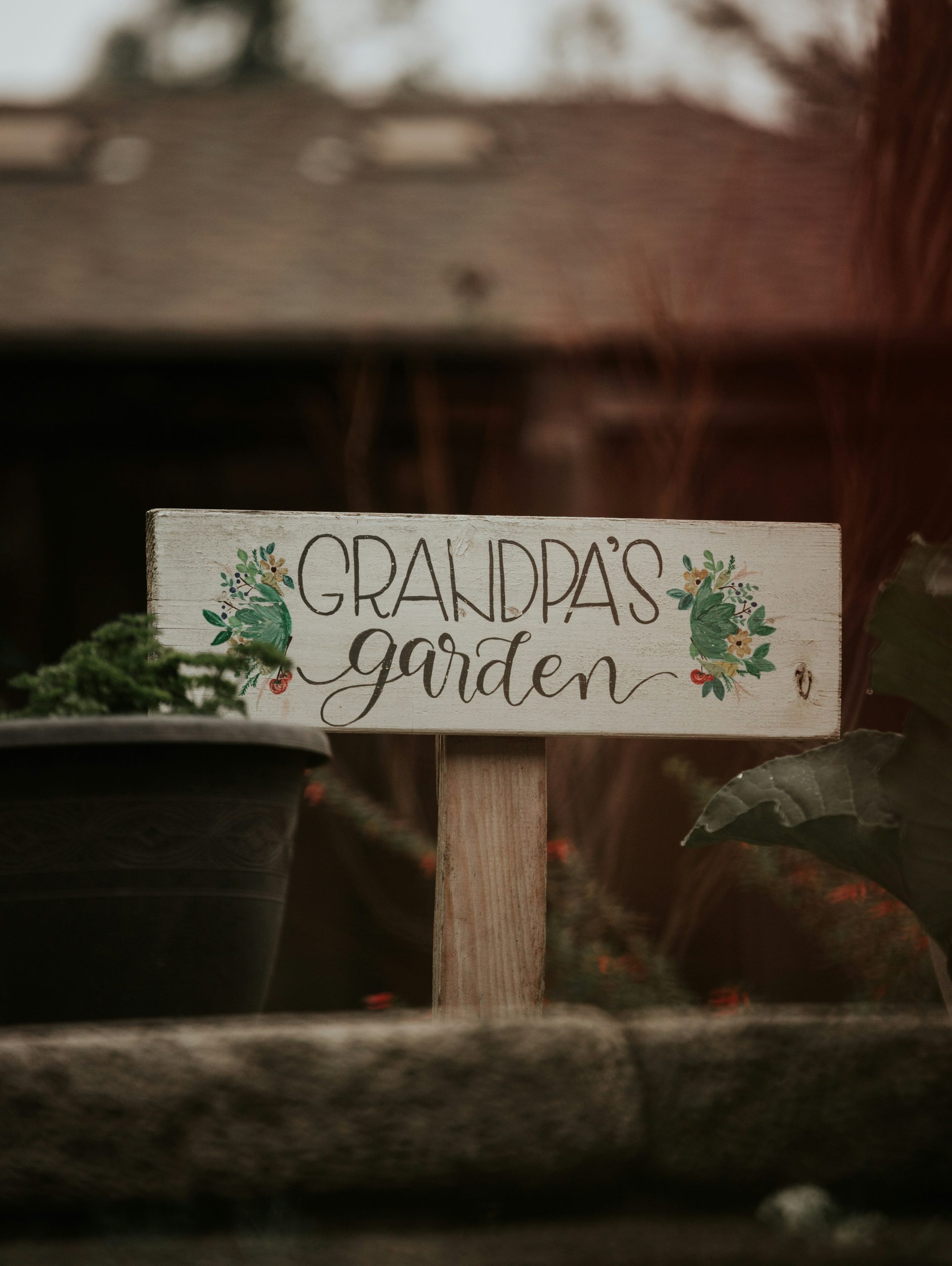
“This sign works because of its charming simplicity and effective use of contrast.”
The clean white, albeit distressed, background makes the black lettering pop, ensuring the message is the hero. The design follows the principle of unity; the muted colors of the floral illustrations (green, yellow, red) are cohesive and complement the natural wood tone of the post and the surrounding greenery. Nothing is jarring or out of place. It creates a harmonious little moment that feels both intentional and completely at home in the garden.
7. Point to Whimsy with a Hand-Painted Arrow Sign
This look is all about playful imperfection. Let’s call the formula: 70% rustic wood + 20% whimsical hand-lettering + 10% simple illustration. The key is that the ‘rustic’ base does the heavy lifting. The wood should have some character—knots, an uneven shape, or a slightly weathered surface. The lettering shouldn’t be perfect; its charm is in its authenticity. The little flower doodle is just enough to add a spot of color and personality without overwhelming the sign. You could change the illustration to a bee, a strawberry, or a sun to personalize it. Compare this style with the simple, rustic arrow in Idea #25.
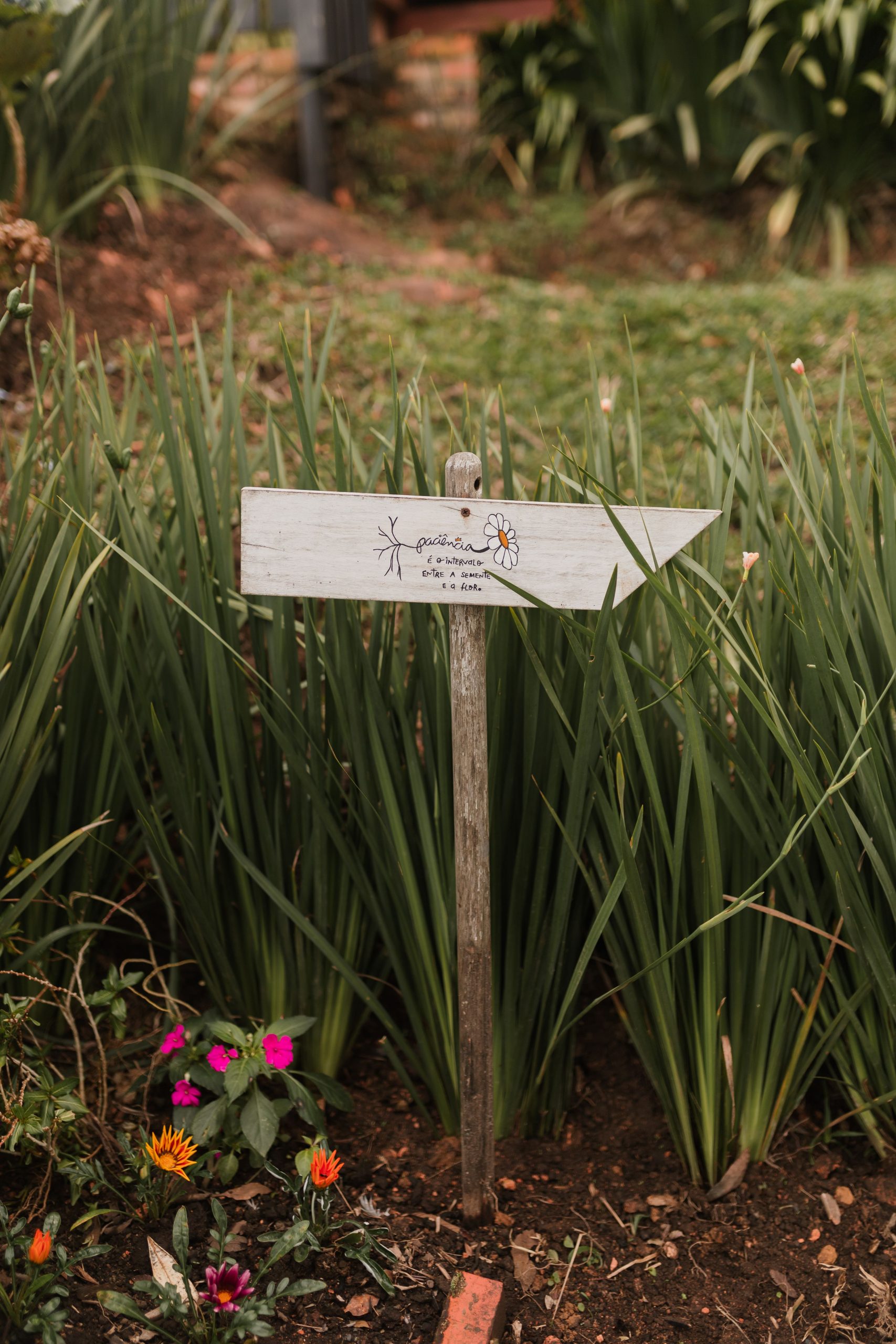
“You can create this sign for next to nothing.”
Hunt for a scrap piece of wood at a construction site (with permission!), a local sawmill, or even on Facebook Marketplace in the ‘free’ section. A small sample pot of exterior paint for the sign’s background is often less than $5 at a hardware store. For the lettering and illustration, a simple black permanent marker or a small tube of black acrylic craft paint will work just fine. Mount it on a sturdy branch found in your own yard. The entire project could easily come in under $10.
8. Add a Quirky Cactus Graphic to a Rustic Wooden Arrow
When adding a graphic element to your sign, place it strategically to enhance flow and readability. Here, the little potted cactus serves as a visual pause between ‘Carry on’ and ‘GARDEN’. This intentional spacing prevents the text from feeling like one long, jumbled phrase. When designing your own, place your graphic either in the center, like this, or at the start or end of the text. Avoid placing it in a way that interrupts a single word. The goal is for the graphic to be a charming punctuation mark, not a confusing interruption.
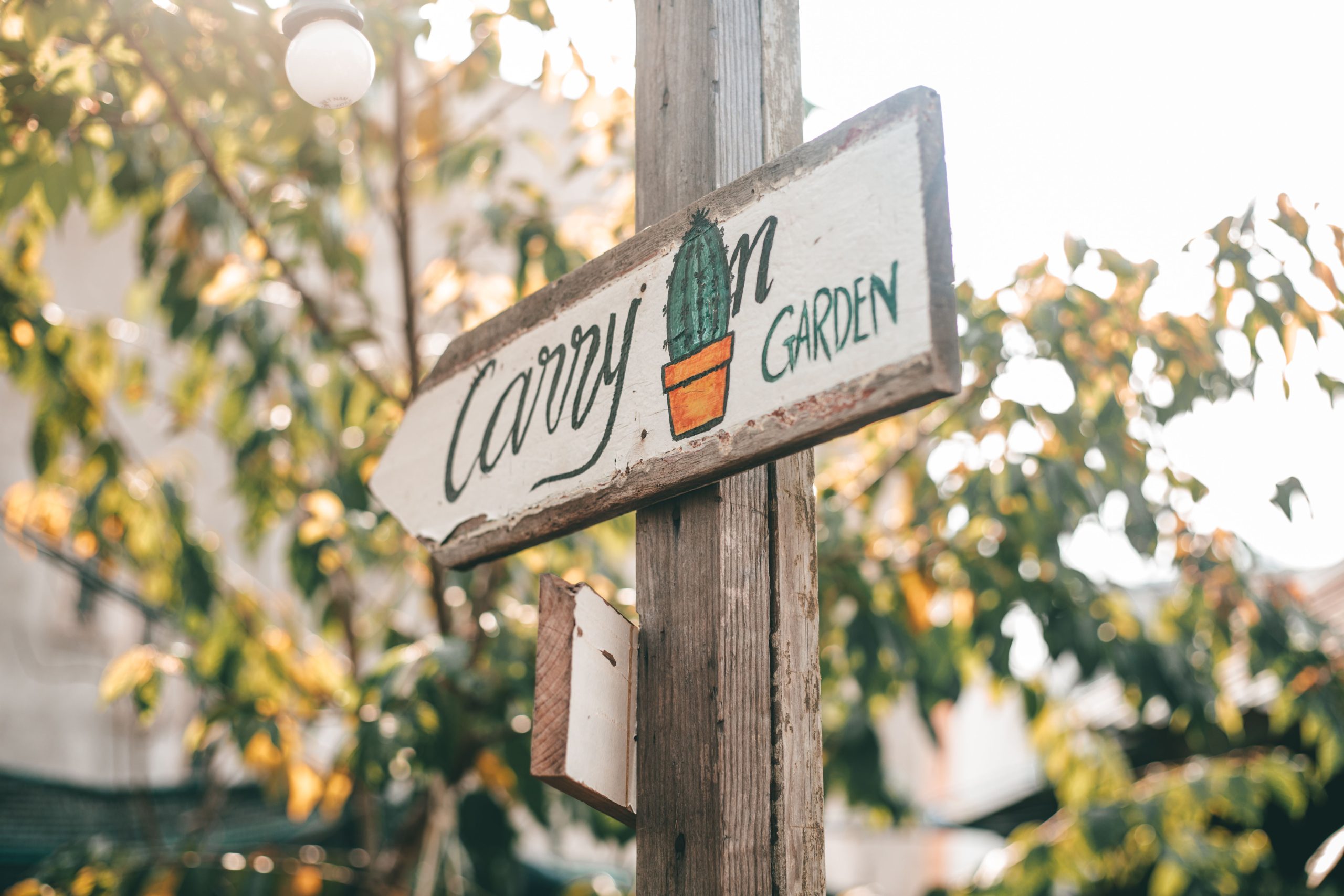
“A sign with this much raw, weathered wood charm can be tricky to maintain.”
The unpainted post, with its deep cracks and rough texture, is a prime spot for moisture to seep in, which can lead to rot or attract insects. While the weathered look is fantastic, the sign’s longevity is a real concern. To get this look but with better durability, choose a naturally rot-resistant wood like cedar and apply a clear, matte-finish penetrating sealer. It will protect the wood without adding a glossy, unnatural sheen, preserving that rustic vibe.
9. Designate an Enchanted ‘Fairy Forest’ Zone
Create your own ‘Fairy Forest’ sign with this quick project. Time: 1 hour + drying time. Cost: Approx. $20.
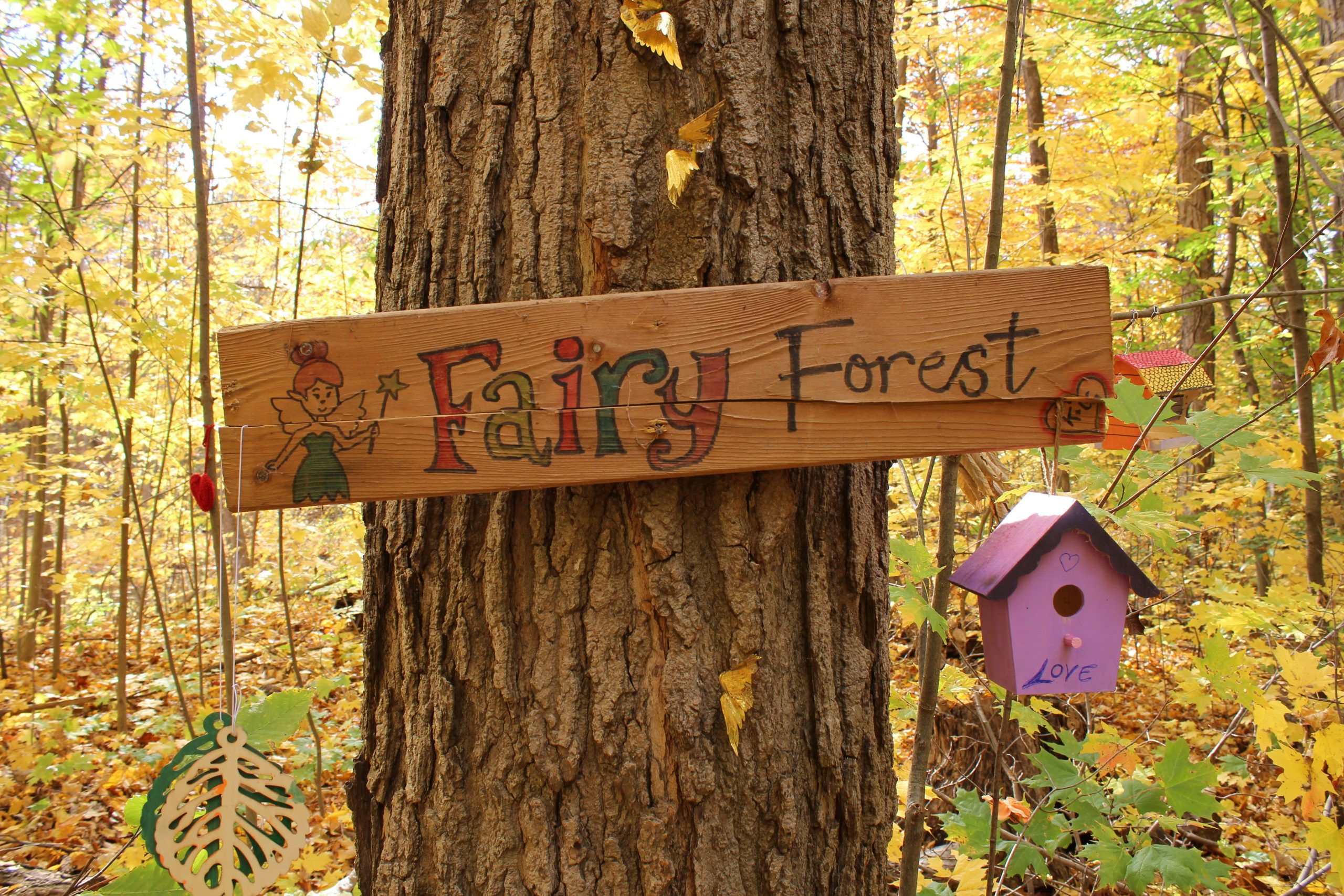
“Find a small plank of wood (about 6×12 inches).”
Sand the front surface lightly, but leave the edges rough for a rustic look.Paint a simple background if you wish, or leave the natural wood grain.Use stencils or freehand the words ‘Fairy Forest’ with craft paint. A vibrant color like red will stand out.Paint a simple fairy silhouette. Don’t worry about details; a basic shape with wings is all you need to convey the idea.Once dry, seal the entire front and back of the sign with a clear matte exterior sealant to protect it from the weather.Nail it to a tree or a post in a special corner of your garden.
This little vignette is successful because it commits to a theme and creates a world in miniature. It’s not just a sign; it’s a storytelling kit. The sign provides the ‘title’, the birdhouses act as ‘fairy houses’, and the leaf cutouts are the ‘decor’. The placement on a large, textured tree trunk grounds the fantasy in a real, natural element. It works by sparking imagination, inviting kids (and adults!) to see the garden not just as a collection of plants, but as a place where magic could happen. If you love this personal touch, check out the charming tribute in Idea #6.
10. Upcycle a Galvanized Tub with a Dancer Sculpture Sign
A custom metal sculpture can be pricey. To get a similar whimsical vibe for less, search for ‘metal garden art’ or ‘yard silhouette’ on sites like Etsy or Wayfair, where you can find pieces for $30-$80. For the planter, skip the new galvanized tubs and head to a flea market or farm supply store. You can often find beautifully weathered old tubs for under $25. The key is to look for something with character. The combination of a unique metal art piece and a vintage planter will give you this eclectic, artistic look for a fraction of the cost.
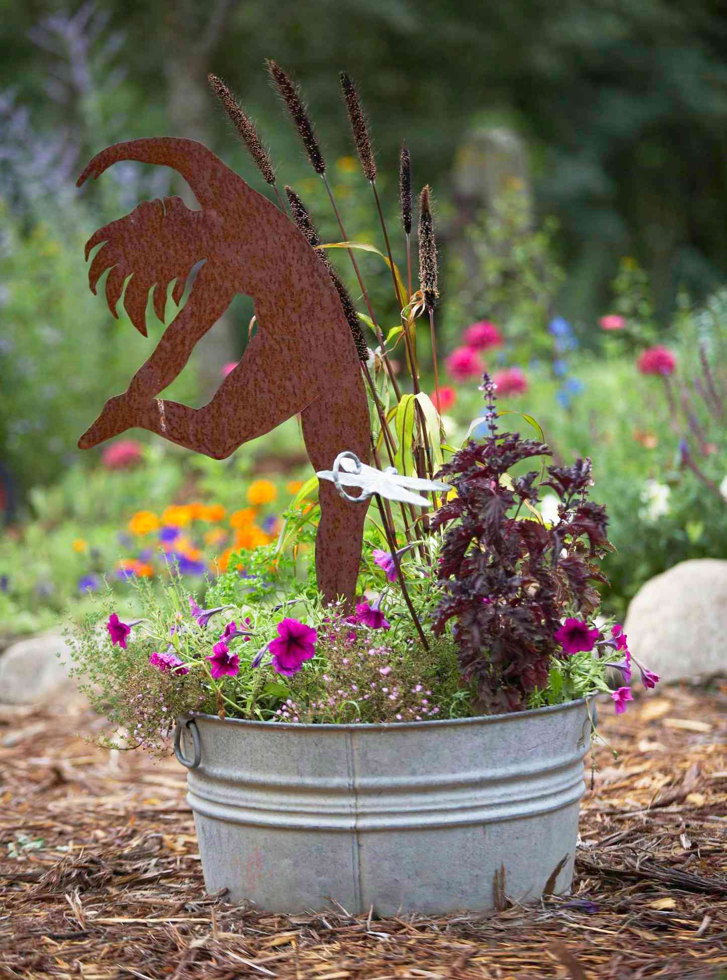
“A galvanized tub looks fantastic, but it requires one crucial step: drilling drainage holes.”
Without adequate drainage, the tub will fill with water every time it rains, creating a bog that will quickly lead to root rot and kill your beautiful flowers. Drill at least 5-6 half-inch holes in the bottom before you add any soil. Also, be aware that the metal will get very hot in direct sun, which can heat the soil and stress the plant roots. In hot climates, this type of planter might be best in a location that gets some afternoon shade.
11. Opt for a Classic, Personalized Metal Lawn Plaque
A high-quality, powder-coated aluminum plaque like this is one of the most durable options for a garden sign. These signs are specifically designed to be rust-proof and fade-resistant. Maintenance is incredibly simple: just wipe it down with a damp cloth and some mild soap once or twice a year to remove dirt and pollen. Avoid using harsh chemicals or abrasive scrubbers, as they can damage the powder-coated finish. With minimal care, a sign like this will genuinely last for decades, making it a great long-term investment.
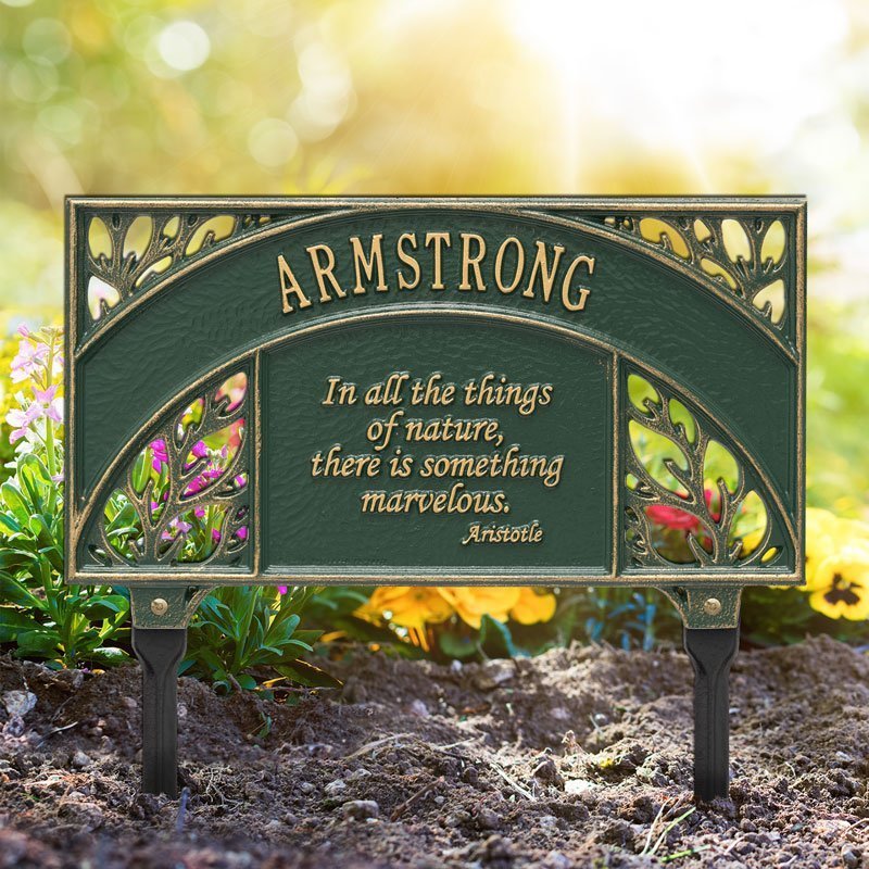
“When choosing a personalized lawn plaque, placement is key to ensuring it looks intentional and professional.”
Install the plaque at the entrance to a specific garden bed or pathway, not floating randomly in the middle of a large lawn. The stakes should be pushed deep enough into the soil so that the base of the sign is just a few inches above the ground or mulch. This low-profile placement makes it look like an integrated part of the landscape design, rather than an afterthought stuck in the grass.
12. Combine a Sign with a Rustic Planter Box
The formula for this charming piece is about balance: 60% floral abundance + 30% rustic container + 10% simple message. The flowers are the star of the show; the vibrant purple and white blooms are overflowing, creating a sense of generosity and life. The light-colored wooden planter and the simple brown sign are intentionally understated, providing a neutral, earthy backdrop that lets the flowers shine. The scripted white text is just enough to add a touch of personality without competing for attention. This is a more compact version of the integrated planter concept seen in Idea #4.
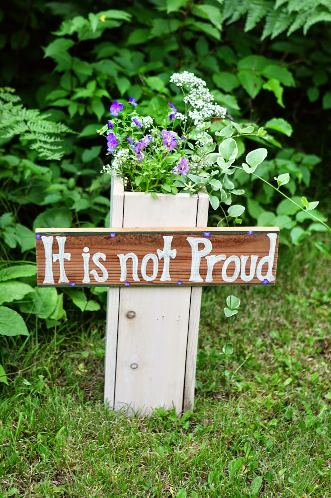
“What makes this design so effective is its cohesive color palette.”
The dark green trim on the sign is a clever detail that directly ties into the leaves of the plants and the surrounding foliage, creating a unified look. The small purple dots embellishing the text are another smart touch, echoing the color of the main flowers. This repetition of color, even in small doses, is a professional design trick that makes the entire arrangement feel polished and thoughtfully put together, even with its rustic materials.
13. Go Vertical with a ‘Welcome Home’ Sign and Planter
A tall, vertical sign like this is a fantastic solution for small spaces or narrow entryways. It works best leaned against a house column, a substantial tree trunk, or a fence post. It draws the eye upward, creating an illusion of height and grandeur. The ideal space for this would be a front porch or a garden entrance with a clear vertical element to support it. It needs about 2 feet of horizontal floor or ground space for the sign and its planter base, but it makes a big statement without demanding a wide footprint.
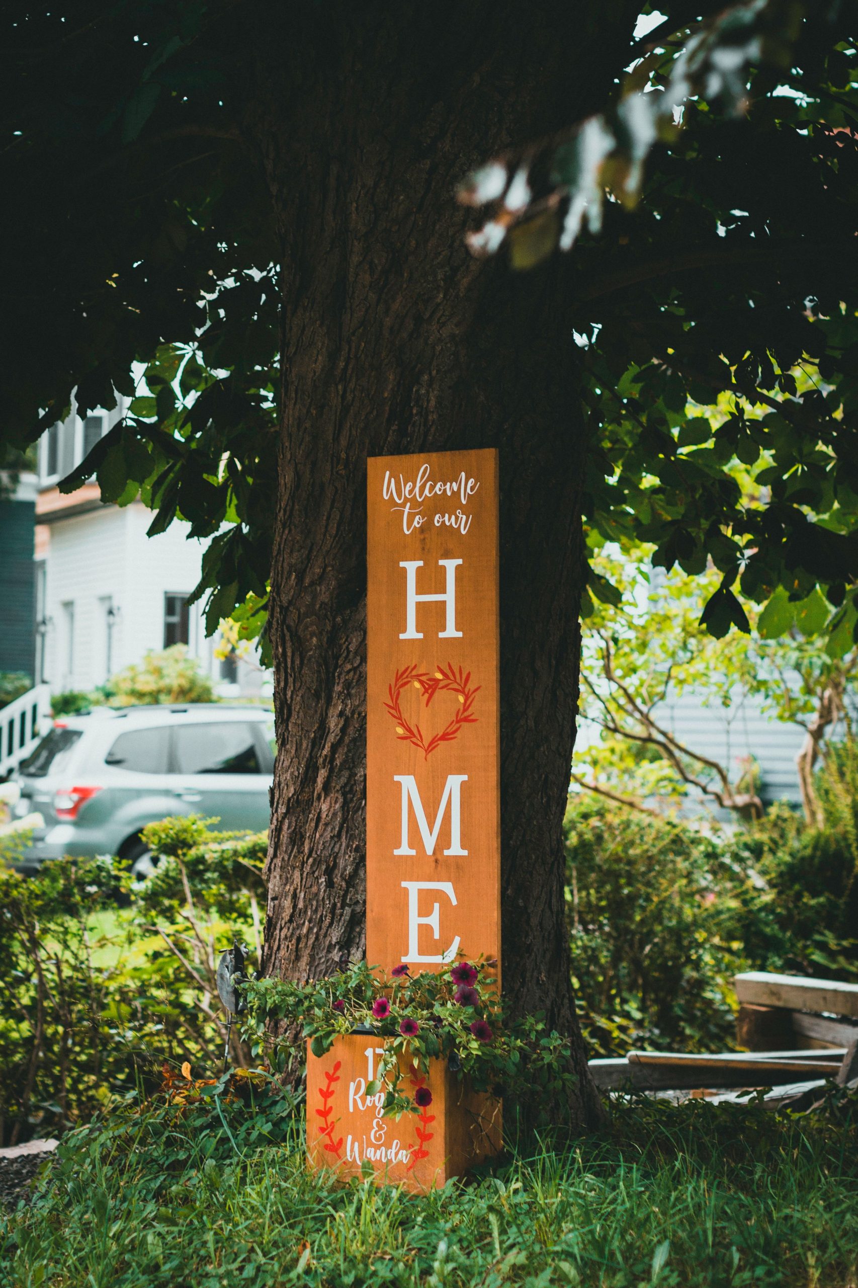
“The single element that makes this sign feel truly special is the personalization.”
Adding the names ‘Roy & Wanda’ on the planter cube transforms it from a generic ‘welcome’ sign you could buy anywhere into a unique, custom piece that tells you who lives here. It’s a small detail, but it’s everything. It changes the message from a general sentiment to a personal greeting, making the entire display feel more authentic, warm, and deeply connected to the home and its owners.
14. Stack Colorful, Hand-Painted Planks for a Joyful Message
This sign is pure joy, and it works because it breaks from convention. Instead of a single sign, it uses a collection of planks to create a single message, turning it into a piece of art. The staggered alignment and varied, vibrant colors (yellow, red, teal, blue) create a dynamic rhythm and movement that is incredibly eye-catching. The hand-painted, slightly naive style of the letters and symbols adds a layer of whimsical charm that feels playful and approachable. It’s a celebration of color and creativity that is impossible to ignore.

“Gather 4-5 small planks of scrap wood, each a different length.”
Don’t worry if they’re not perfect.Paint each plank a different, bright color using exterior or craft paint.Once dry, use a contrasting color (like white) to paint letters or symbols on each plank. Plan your message ahead of time.Find a sturdy wooden post or stake (at least 4-5 feet tall).Arrange your painted planks on the post in a staggered, playful order. Attach them from the back using wood screws.Install your finished sign in the garden by driving the post at least 1-2 feet into the ground.
15. Plant a Cheerful Directional Pole in a Flowering Bush
To make a colorful signpost like this truly pop, plant it directly within a contrasting bush. The bright yellow pole against the vibrant green foliage and light blue flowers is a classic example of using complementary colors to create visual excitement. Don’t just stake your sign in the mulch; make it look like it’s bursting forth from the plant life. The key is to choose a pole color that is the opposite of your flower or foliage color on the color wheel for the most dramatic and designerly effect.
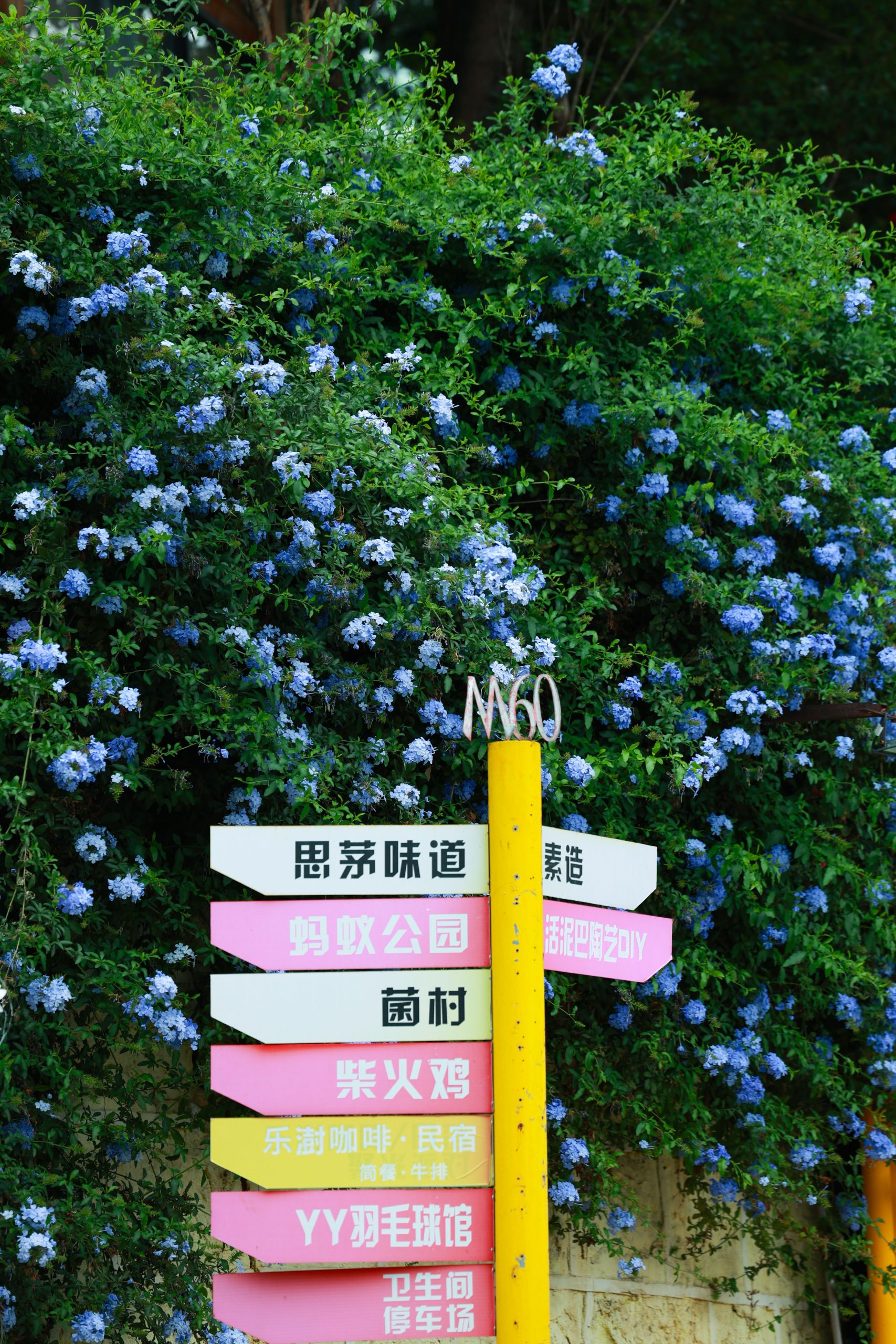
“The ‘destination’ signpost, pointing to whimsical or imaginary places, is a trend that’s all about injecting a sense of humor and escapism into our own backyards.”
In a world that can feel heavy, these signs are a lighthearted nod to fantasy worlds, inside jokes, or favorite vacation spots. It’s a way of saying, ‘This garden is my happy place, my escape.’ This trend has legs because it’s infinitely personalizable and taps into our collective desire for a little more playfulness and magic in our daily lives.
16. Set a Welcoming Tone with Teal Planters and a Metal Sign
This welcoming entryway follows a powerful design formula: 50% bold color + 30% natural texture + 20% metallic accent. The deep teal of the glazed planters provides the main color punch, commanding attention. The natural textures come from the brown wooden posts, the green grass, and the bright yellow flowers. Finally, the silver metal ‘welcome’ sign acts as a reflective, eye-catching focal point. You could swap the palette: imagine cobalt blue planters (bold color), bamboo posts (natural texture), and a brass sign (metallic accent) for a slightly different vibe.
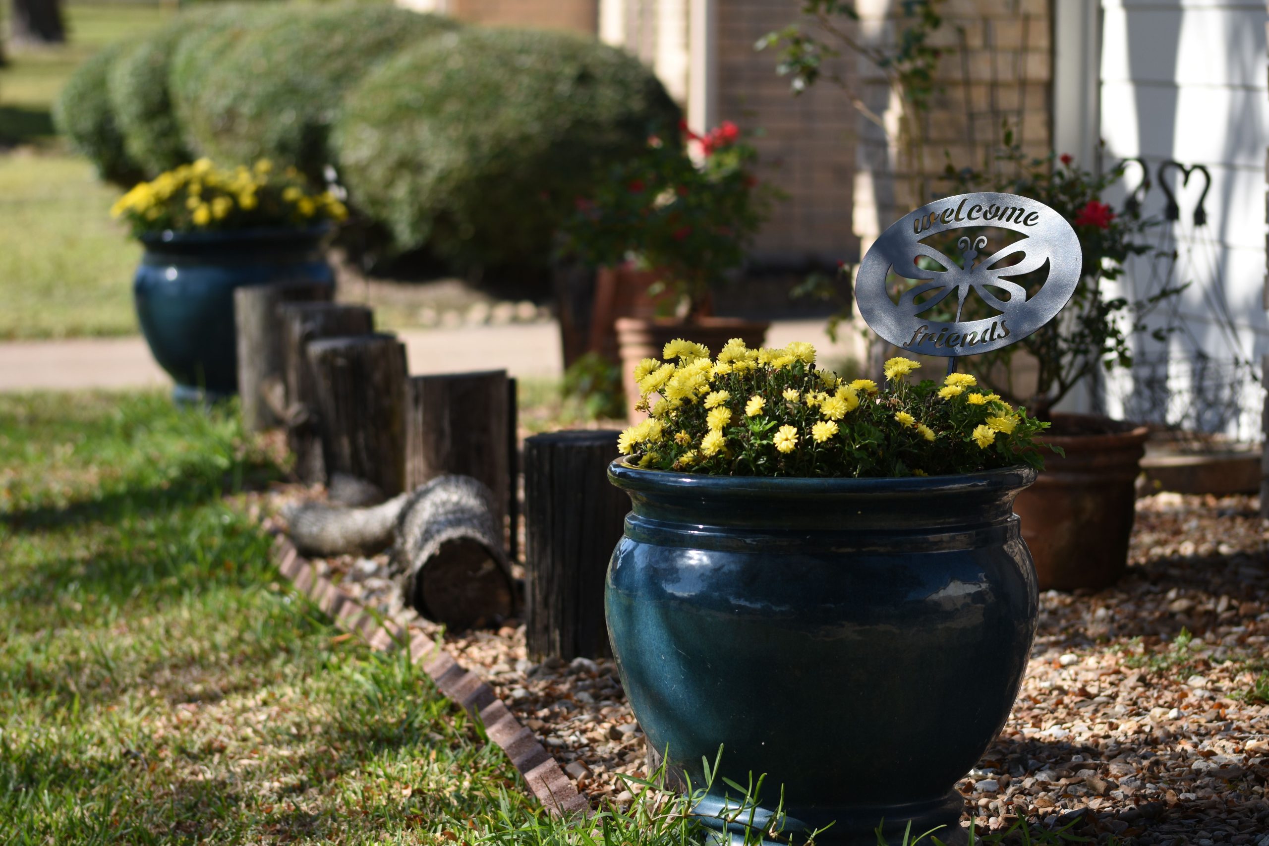
“Before you commit to lining a path with glazed ceramic planters, check these ite”
Before you commit to lining a path with glazed ceramic planters, check these items off your list:
- Path Width: Do you have at least 3-4 feet of path width to accommodate planters without making the walkway feel cramped?
- Sunlight: Does this spot get the right amount of sun (at least 6 hours for most annuals like these mums) for the flowers you want to plant?
- Drainage: Is the area level? Do the planters themselves have drainage holes? Pooled water is a plant killer.
- Budget: High-quality glazed ceramic pots can be an investment. Price them out first—you might need three or five to make a real impact.
17. Organize Your Veggie Patch with Rustic Hand-Lettered Markers
Before making a whole set of these vegetable markers, take a moment for this quick checklist. Proper prep will make them last much longer than one season.
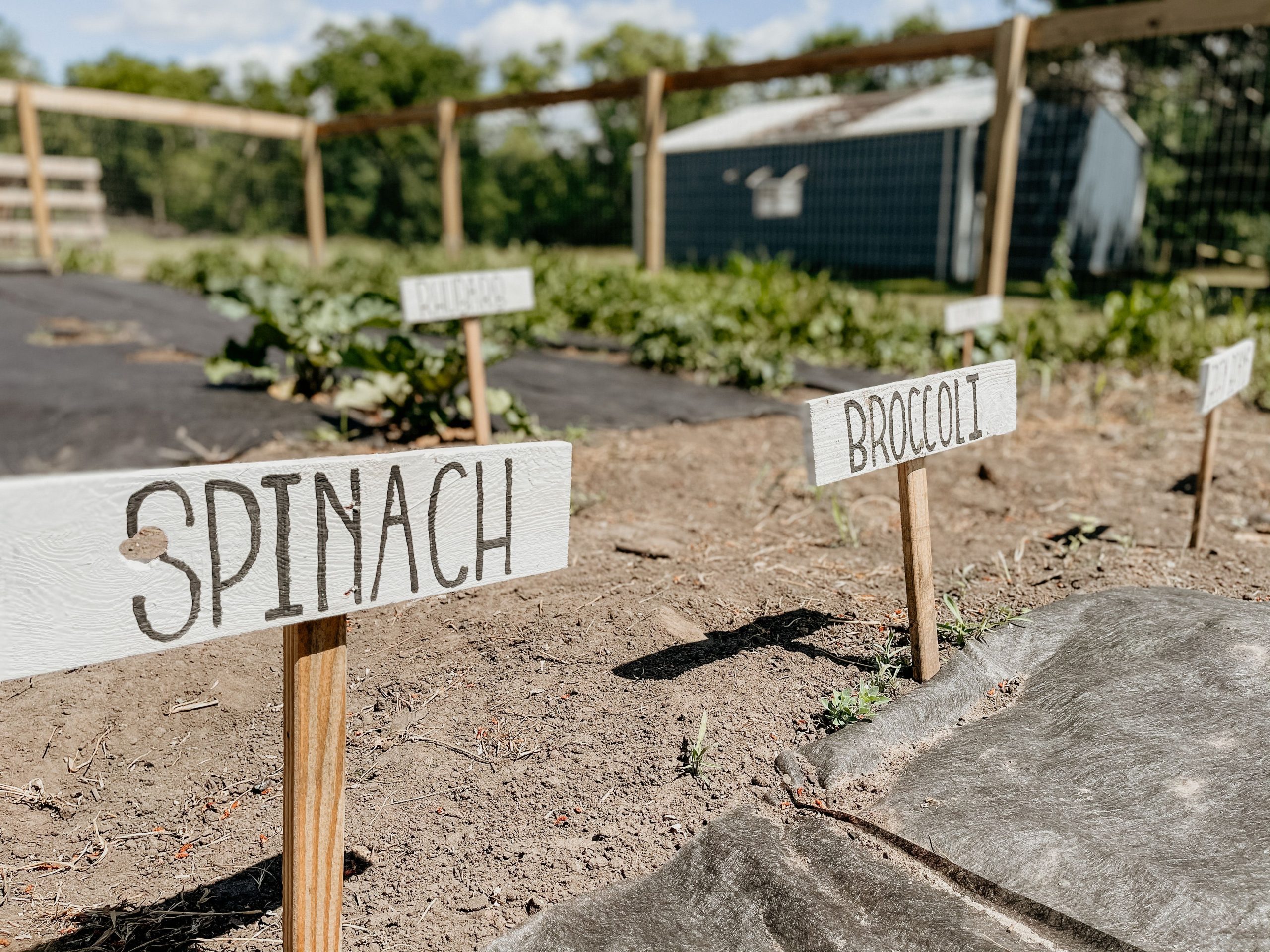
“Choose the Right Wood: Are you using naturally rot-resistant wood like cedar, or plain pine?”
Pine will need a much more thorough sealing.Use the Right Paint: A standard craft marker will fade in the sun and run in the rain. Did you buy an oil-based paint pen or exterior-grade paint for the lettering?Seal Everything: Did you remember to apply a clear, waterproof sealer to the front, back, and all edges of the signs *after* the lettering is completely dry? This is the most crucial step for longevity.Stake Height: Have you considered how tall your vegetables will get? Make your stakes long enough so the signs will still be visible when the plants are mature.
There’s no need to buy new wood for this project. In fact, they look better with a bit of character. Ask for free scrap wood at a local lumber yard or a construction site. Pallet wood, which you can often find for free, is perfect for this. Just be sure to check that the pallet is stamped ‘HT’, which means it was heat-treated, not chemically treated, making it safe for use in a garden. For the stakes, you can often find bags of cheap survey stakes at a home improvement store for less than a dollar each. For a quirkier look, see the illustrated markers in Idea #18.
18. Identify Plants with Illustrated Fruit and Herb Markers
The illustrations are what make these markers truly delightful. While simple text labels are functional, the charming, colorful drawings of the fruits, vegetables, and herbs add a layer of visual joy to the garden. They are especially great for kids, helping them identify plants long before they can read the names. This visual-first approach transforms a practical tool into a decorative element, sprinkling a bit of artistry and playfulness among the seedlings. These would be a fun alternative to the wooden markers in Idea #17.
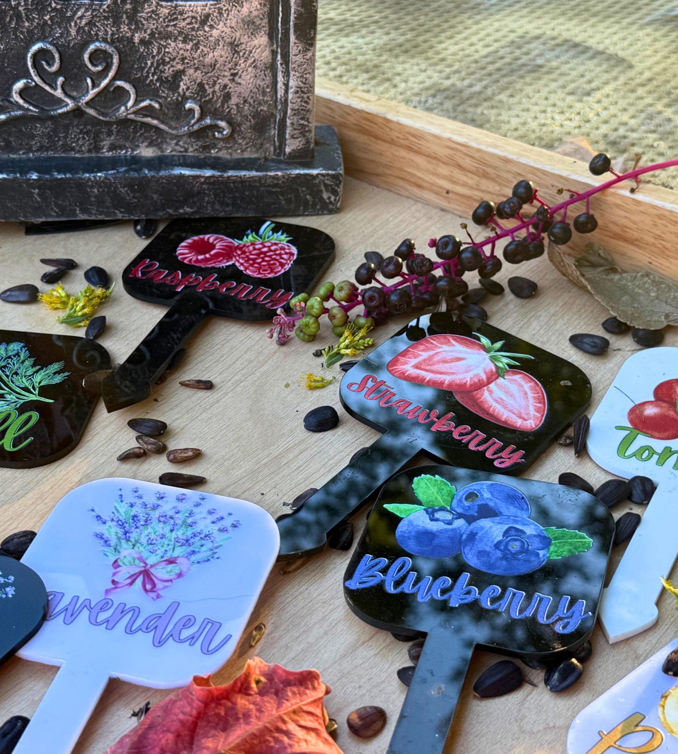
“While these plastic markers are cute and informative, let’s be honest about their lifespan.”
Most commercially available plastic plant markers of this style are susceptible to sun damage. The plastic can become brittle and snap after a season or two in the direct sun, and the printed colors, unless they are UV-treated, will likely fade significantly. They are a great, affordable option for annual vegetable gardens, but don’t expect them to be a permanent, multi-year solution for marking perennial herbs or shrubs.
19. Personalize Your Space with a Black Metal Hummingbird Sign
This sign is a great example of the power of silhouette. By using a simple, solid black form, the shapes of the hummingbird, leaves, and flowers are instantly recognizable and graphic. This high contrast against a lighter background (like the off-white wall shown here) creates a strong focal point. The design is contained within a clean, curved frame, which gives it a finished, emblem-like quality. It feels less like a sign and more like a custom piece of art for the garden.
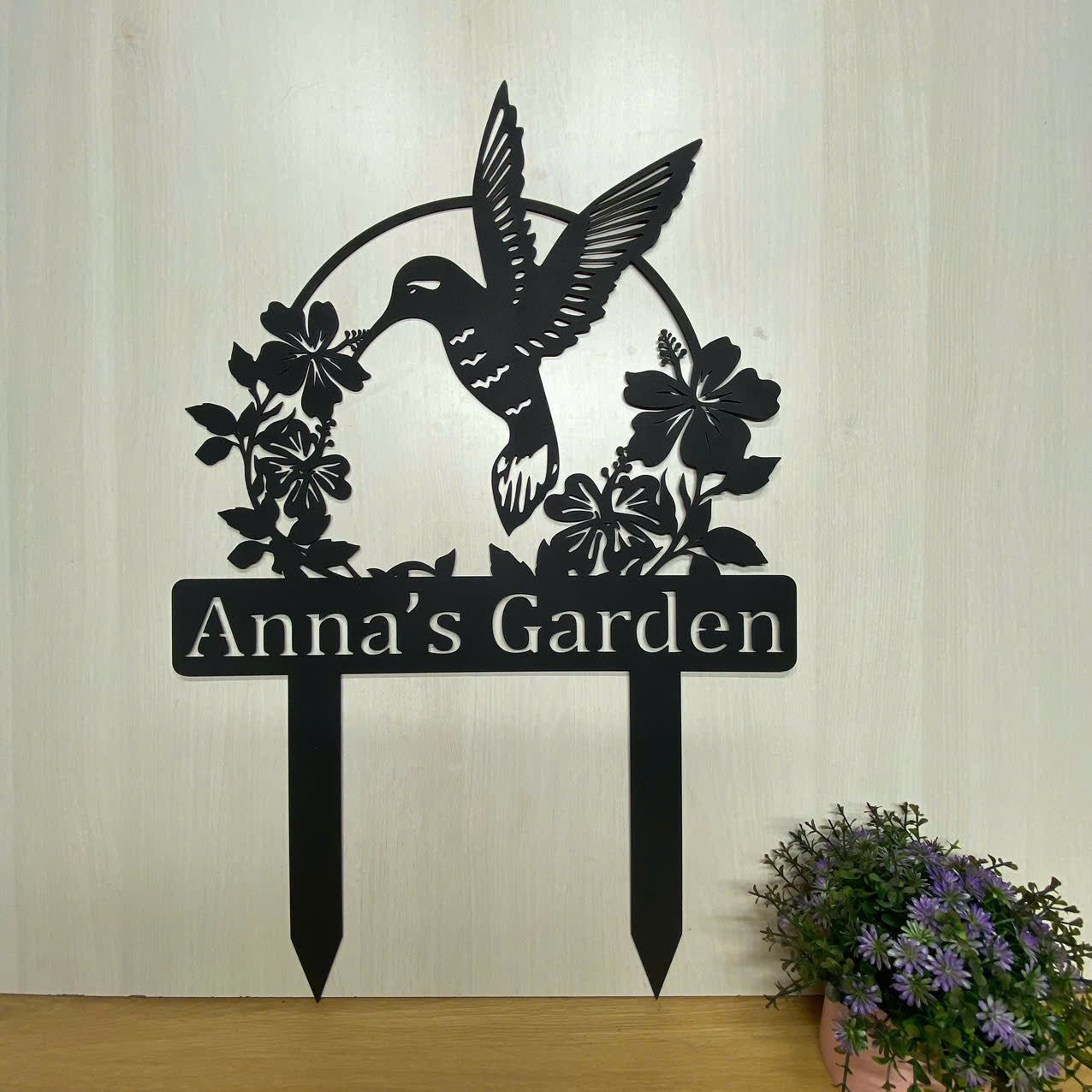
“A personalized sign of this size—likely around 18-24 inches wide—is incredibly versatile.”
It’s substantial enough to be a focal point in a small patio garden or on a balcony wall. In a larger garden, it’s perfect for designating a specific ‘room,’ like ‘Anna’s Flower Garden’ near a prized rose bed, or mounted to a gate or shed door. Its sweet spot is at eye level, where the personalized text can be easily read. Avoid placing it too low to the ground, where it might get lost behind plants.
20. Add a Pop of Color with a Bright Orange Dog Silhouette Stake
When using a bright, non-natural color like this vibrant orange, the key is to let it be the star. Don’t surround it with other brightly colored objects or flowers that will compete for attention. Place it in a sea of green, as shown here against the lawn and trees. The solid green background makes the orange appear even more intense and saturated, creating a striking, high-impact moment from a very simple object. It’s a designer’s trick: use nature’s neutral (green) to make your accent color sing.
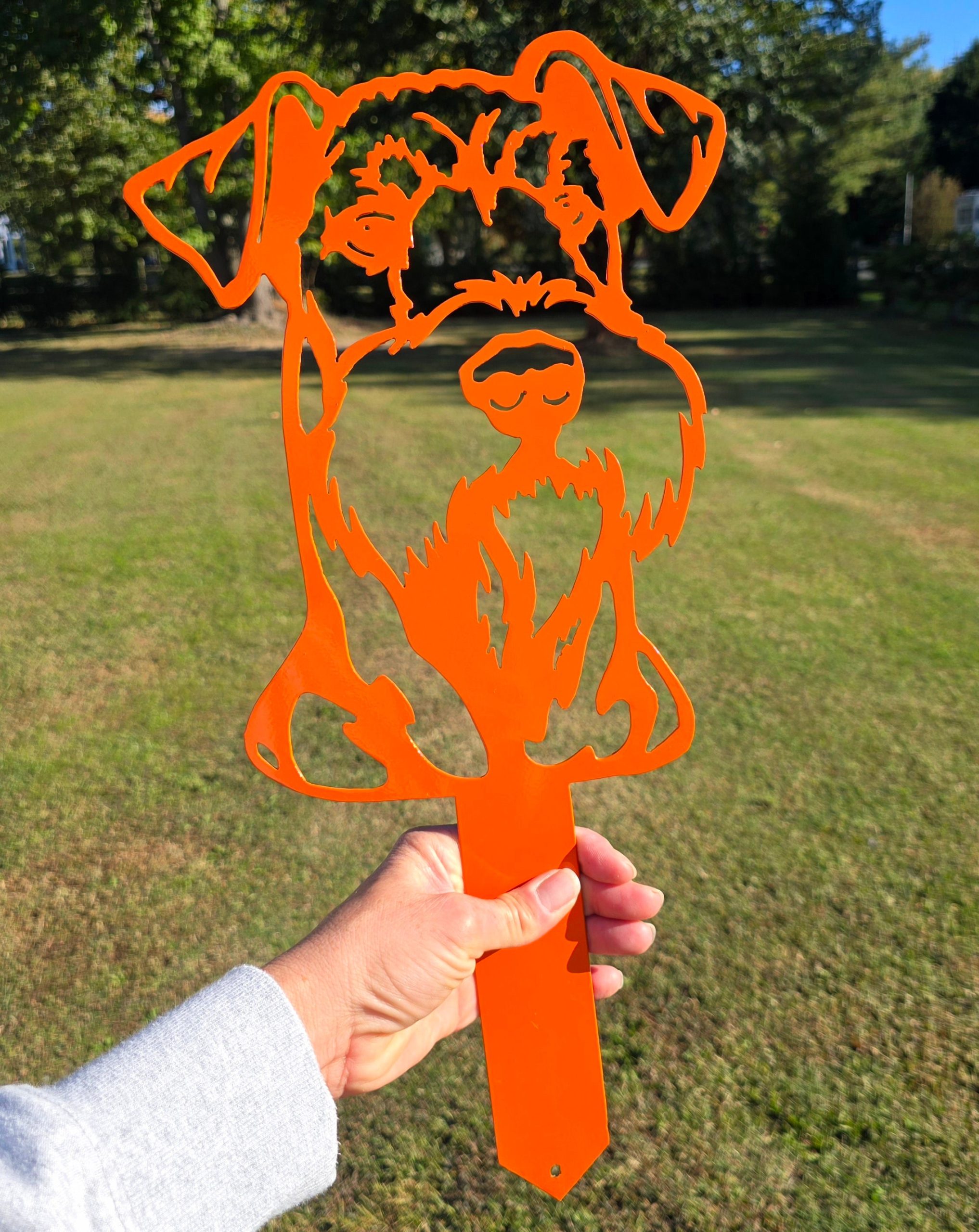
“It’s the color.”
Absolutely, 100%, the color. If this dog silhouette were black or brown, it would be a charming garden stake. But in this brilliant, saturated orange, it’s an exclamation point. It’s a piece of pure, unexpected joy. The color choice transforms it from a simple representation of a pet into a bold, modern piece of pop art for the yard. It’s confident, playful, and guaranteed to make you smile, which is what great garden decor is all about.
21. Mix Languages and Fun Characters on a Birch Post Sign
The eclectic charm of this sign works because it fully embraces a ‘more is more’ philosophy with a cohesive anchor. The white birch log acts as a clean, rustic spine that holds all the disparate elements together. Without it, a collection of random colorful signs would just look messy. The natural, neutral texture of the birch bark allows the bright colors, different fonts, and quirky characters (hello, Minion!) to coexist playfully. It’s a carefully orchestrated chaos that feels personal and full of life.
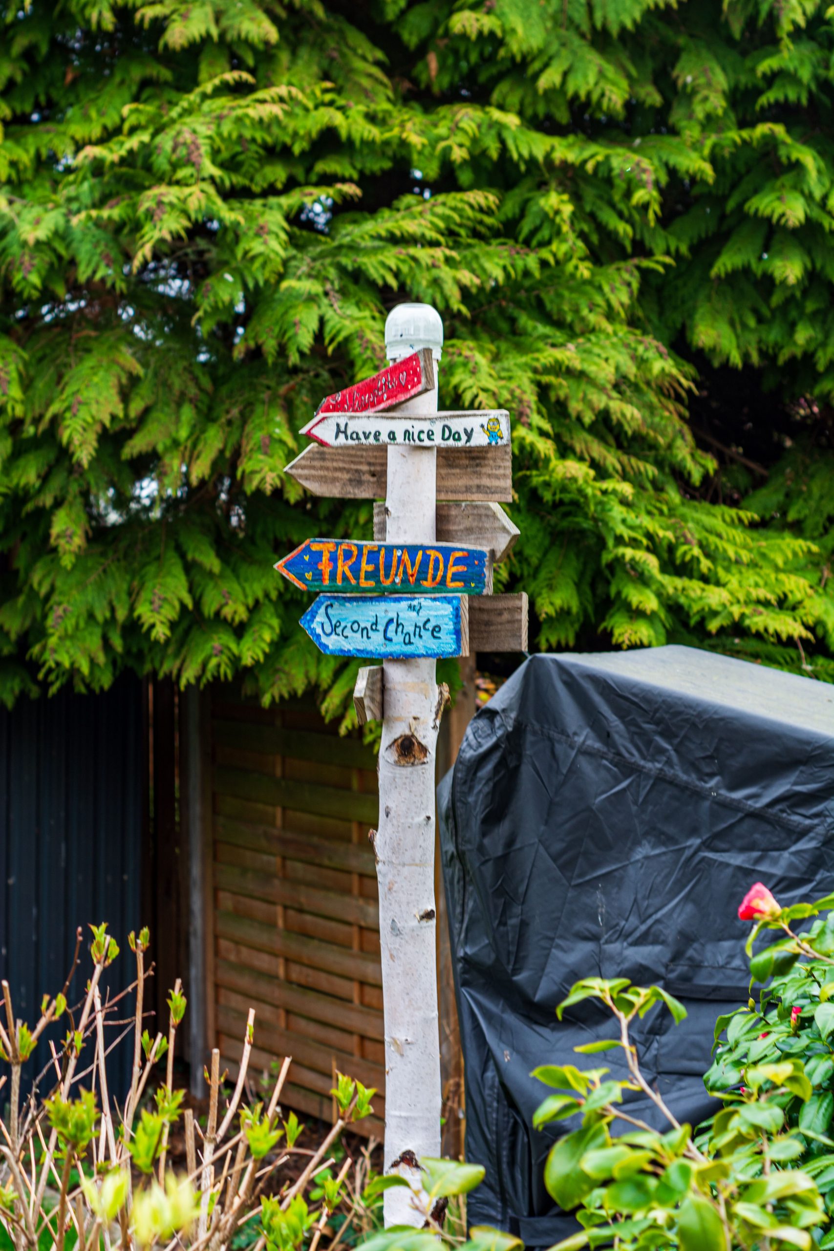
“A sign made with untreated natural wood like a birch log is incredibly charming but has a limited lifespan outdoors.”
Birch bark is naturally water-resistant, but the exposed wood at the top and bottom is vulnerable to rot. To extend its life, the log should be sealed with a marine-grade varnish, especially on the ends. Even then, expect it to last maybe 3-5 years in a damp climate before decay sets in. Think of it as a temporary art piece to be enjoyed for a few seasons, rather than a permanent fixture.
22. Spell It Out with Colorful ‘CREATE’ Word Art Blocks
This is a super affordable and impactful DIY project, perfect for using up leftover materials. You can create this for less than $20. Use square offcuts of plywood or MDF for the signs (you can often get these for free from the scrap bin at a home improvement store). The stakes can be simple, inexpensive wooden garden stakes. The real fun is using up all those little sample pots or nearly-empty cans of colorful paint you have lying around in the garage. A set of letter stencils can help with the lettering, or just freehand it for a more artistic look. This deconstructed word sign is a fun twist on the stacked message pole in Idea #14.

“The visual recipe for this playful installation is simple: 60% color variation + 30% repetition of form + 10% unified message.”
The success comes from using a different, vibrant background color for each block while keeping the shape (square) and the font style consistent. This creates a rhythmic, candy-like effect. The single word ‘CREATE’ provides a clear theme, tying all the individual pieces together into one cohesive statement. It’s a formula that encourages creativity while maintaining visual order.
23. Welcome Guests with a Layered, Illustrated Garden Sign
This sign is a masterclass in layering, both physically and informationally. The top ‘WELCOME’ is bold and primary, grabbing attention with its colorful, 3D letters. The plaque below offers a secondary, more personal message: ‘The garden IS MY HAPPY place’. The illustrations of plants and tools add a third layer of visual storytelling. This hierarchy guides the viewer’s eye from the general greeting to the personal sentiment, and finally to the charming details. It’s this depth that makes the sign so engaging and special.
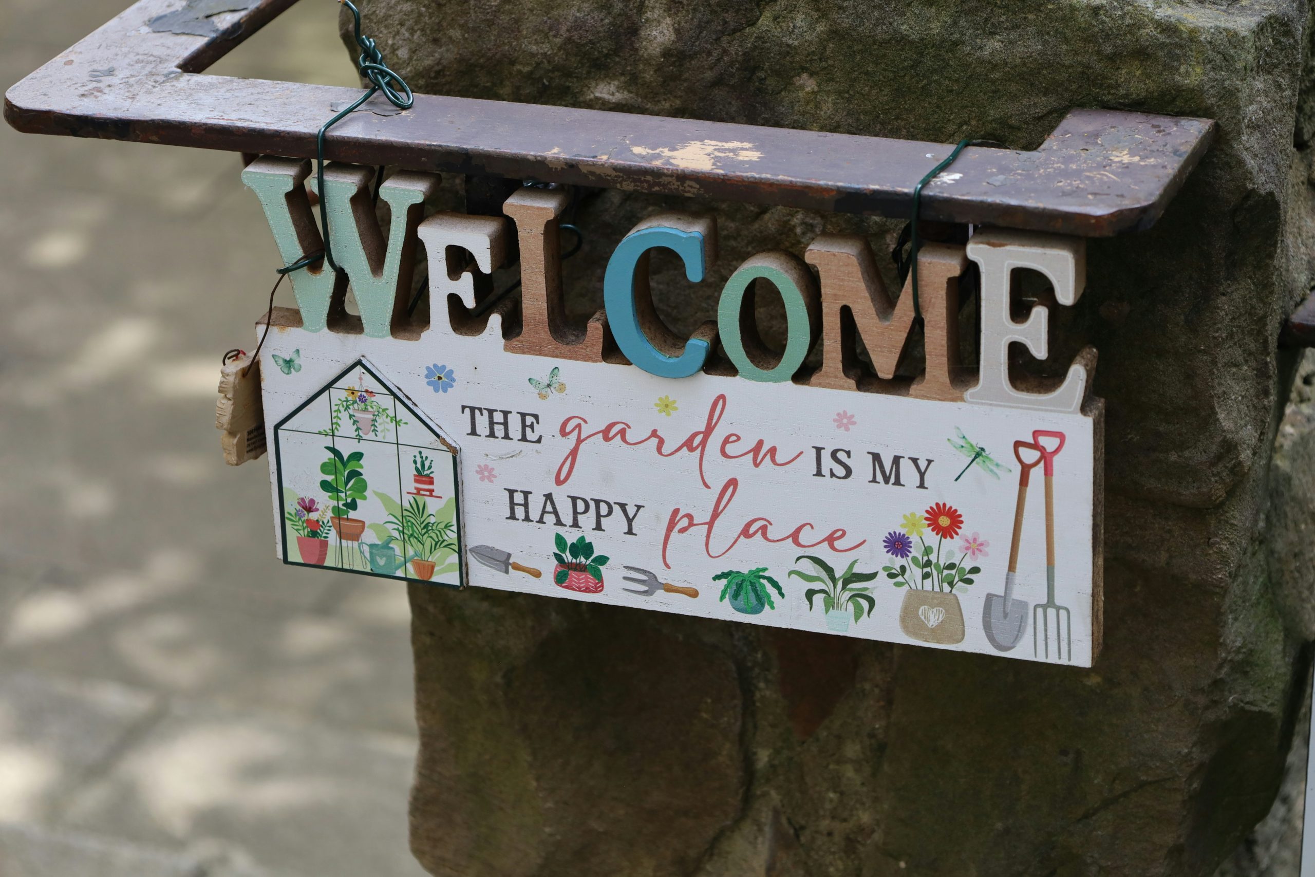
“Don’t be afraid to mix fonts on a sign like this, as long as you have a clear strategy.”
The key is to create contrast and hierarchy. Here, the ‘WELCOME’ is in a bold, fun, slab-serif font, while ‘The garden IS MY HAPPY place’ is in a simpler, hand-written style. This pairing works because they are distinctly different and serve different purposes. A good rule is to pair a bold, decorative font with a simple, clean font. Avoid using two complex or two very similar fonts together, which can look messy and amateurish.
24. Add a Touch of Serenity with a Crackled Stone Quote Sign
The texture is the one thing that truly makes this piece. The crackled, aged finish on the stone gives it a sense of history and permanence, as if it has been in the garden for generations. It feels more like a discovered artifact than a purchased decoration. This texture adds a layer of sophistication and depth that a smooth sign couldn’t achieve. It complements the natural, imperfect textures of the surrounding foliage and makes the entire scene feel more organic and peaceful.
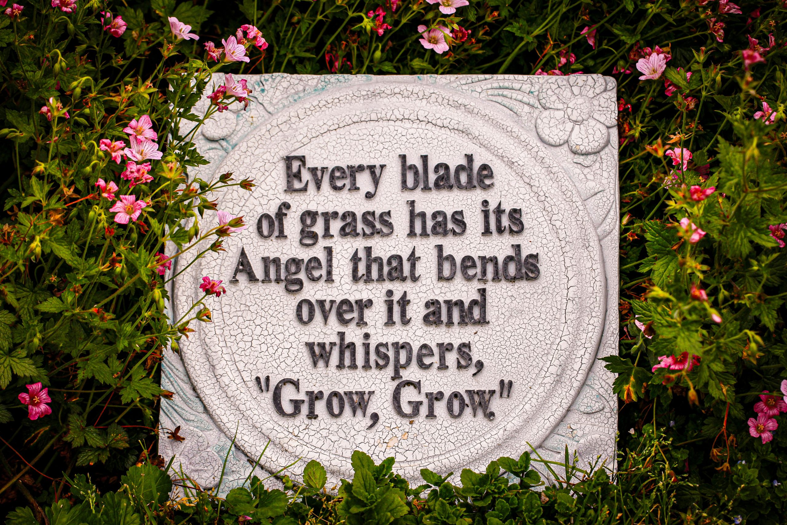
“A stone or cast concrete sign is extremely durable, but the beautiful crackled finish (often called ‘craquelure’) can be a magnet for dirt and algae in shady, damp areas.”
To keep it looking its best, you’ll want to give it a gentle scrub with a soft brush and a mild soap solution once a year. Avoid pressure washing, as this can be too aggressive and might chip the delicate raised floral details or damage the crackled surface. In a sunny spot, maintenance will be minimal.
25. A Simple Hand-Painted Arrow Sign with a Pop of Hibiscus
The beauty of this sign lies in its simplicity. It’s a perfect example of the ‘less is more’ principle. The sign itself is just a rustic piece of wood with simple black text. There are no extra frills or decorations on the sign itself. Instead, the designer has cleverly used a single, vibrant pink hibiscus flower at its base to provide a pop of color and visual interest. This makes the flower the star and allows the sign to serve its function without cluttering the scene. The result is natural, effortless, and elegant.
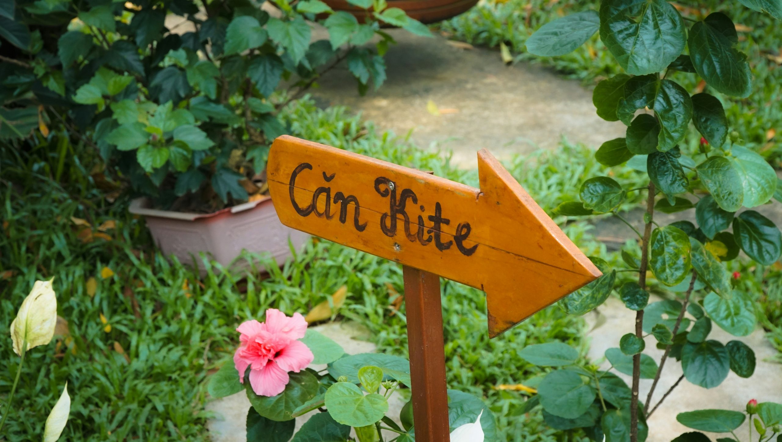
“When placing a sign, think like a photographer and frame your shot.”
Notice how this sign is positioned right next to a bright pink hibiscus. This isn’t an accident. By placing the neutral, rustic sign next to a beautiful natural element, you create a composed vignette. Before you stake your sign, hold it up in a few different spots. Does it look better next to a colorful flower, against a backdrop of interesting foliage, or at the start of a winding path? A few feet can make all the difference between a sign that looks stuck in the ground and one that looks perfectly placed.
26. Display Your Address with a Black Metal Ram Silhouette
An address sign of this style and scale is designed for maximum curbside impact. It’s not a subtle garden marker; it’s a statement piece for your front yard. It works best with a bit of breathing room, placed in a lawn or a low-profile garden bed near the driveway entrance. For a sign this large (likely 3-4 feet tall), you need a viewing distance of at least 30-50 feet for it to be properly appreciated and for the address to be legible from the street. It would overwhelm a small townhouse garden but is perfectly scaled for a larger suburban or rural property.
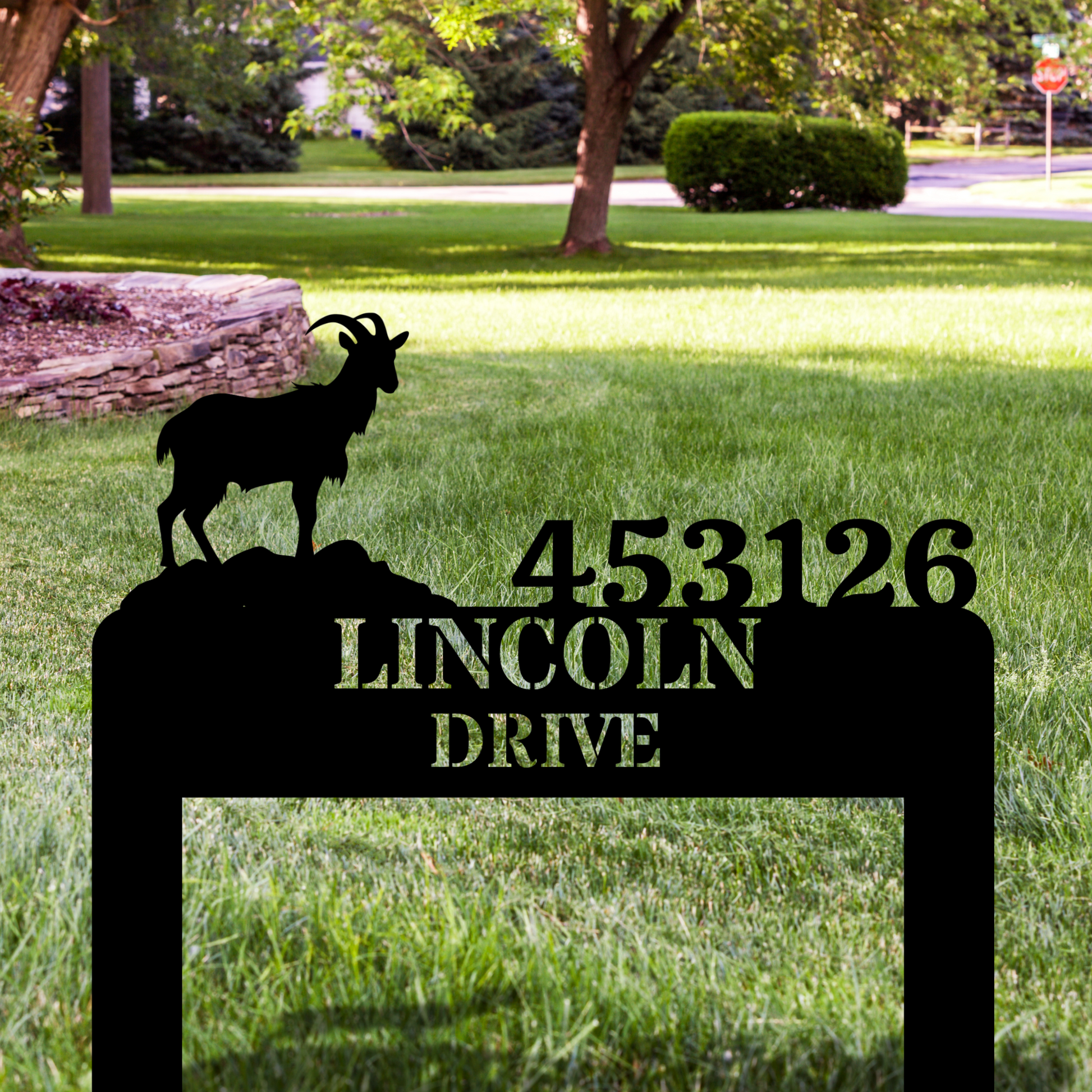
“The bold ram silhouette is what gives this address sign its unique identity.”
It transforms a purely functional object into a piece of custom art that reflects the homeowner’s personality or perhaps the home’s location (e.g., in a mountainous region or on a street named ‘Ram’s Head’). Without the silhouette, it would just be a number on a plaque. With it, the sign tells a story and establishes a strong, memorable character for the property before you even reach the front door.
27. Welcome Guests with a Pair of Whimsical Garden Gnomes
Gnomes are back in a big way, but these aren’t your grandpa’s kitschy fishing gnomes. The 2026 version is all about pastel colors, sweet expressions, and charming details like the butterflies and bees seen here. This trend is driven by a desire for ‘cottagecore’ and whimsical, gentle aesthetics in the garden. It’s less about irony and more about a genuine affection for joyful, playful decor. These gnomes, holding a tiny ‘Welcome’ sign, turn a simple greeting into an enchanting little scene straight out of a storybook.
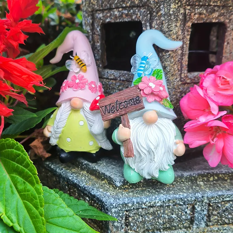
“Let’s be real: decorative figurines like these can look charming when new, but they are vulnerable to the elements.”
Ceramic or resin can chip if knocked over, and the paint—especially on mass-produced items—will inevitably fade after a few seasons of harsh sun and rain. To prolong their life, give them a spray with a clear UV-protectant sealant at the start of each season. If you live in a climate with freezing winters, it’s best to bring them inside to prevent cracking from the freeze-thaw cycle.
28. Display an Uplifting Quote on a Ceramic Garden Plaque
This sign works because it perfectly matches the medium to the message. The quote, ‘May all your weeds be wild flowers,’ is a gentle, optimistic sentiment. The off-white ceramic material, with its slightly irregular shape and delicate floral scrollwork, echoes that gentleness. It doesn’t shout; it suggests. The classic black capital letters are clear and easy to read, but the overall feel is soft and inspiring. It’s a thoughtful pairing that makes the piece feel like a blessing for your garden.
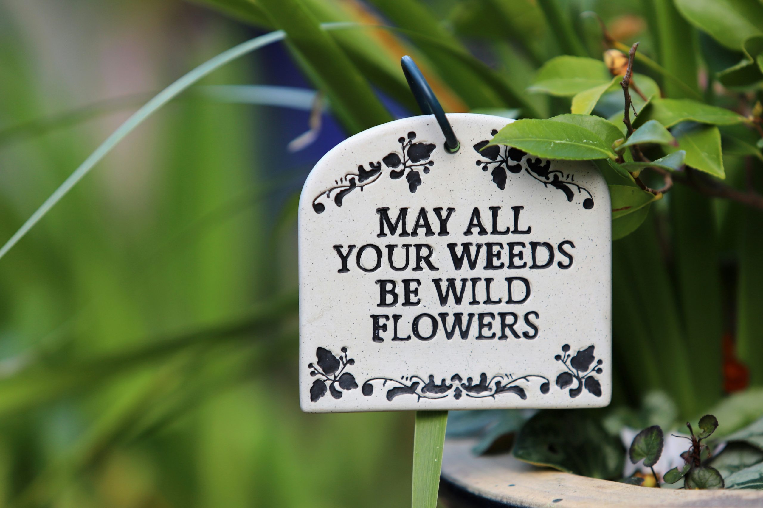
“A custom ceramic sign can be a bit of an investment.”
For a budget-friendly alternative with a similar vibe, pick up a plain, unglazed terracotta saucer (the dish that goes under a pot) from any garden center for a few dollars. Using an oil-based paint pen (for weather resistance), carefully write your favorite quote. You can use stencils for a cleaner look or go freehand. Let it dry completely, and then prop it up in your flowerbed. It will have a more rustic, earthy feel, but will deliver the same personal touch for under $10.
29. Create a Cheerful Welcome with a Colorful Arrow Signpost
This vibrant signpost nails a playful aesthetic with a clear formula: 70% bright, varied color + 20% consistent shape + 10% whimsical detail. The collection of bright hues—teal, pink, lavender, yellow, navy—is the main draw, creating immediate energy. The repetition of the arrow shape for each sign provides structure and keeps the collection from looking chaotic. The final 10% comes from the hand-painted text and tiny floral motifs, which add a layer of personal, handmade charm. The joyful vibe of this post is similar to the one in Idea #21, but with a more coordinated palette.
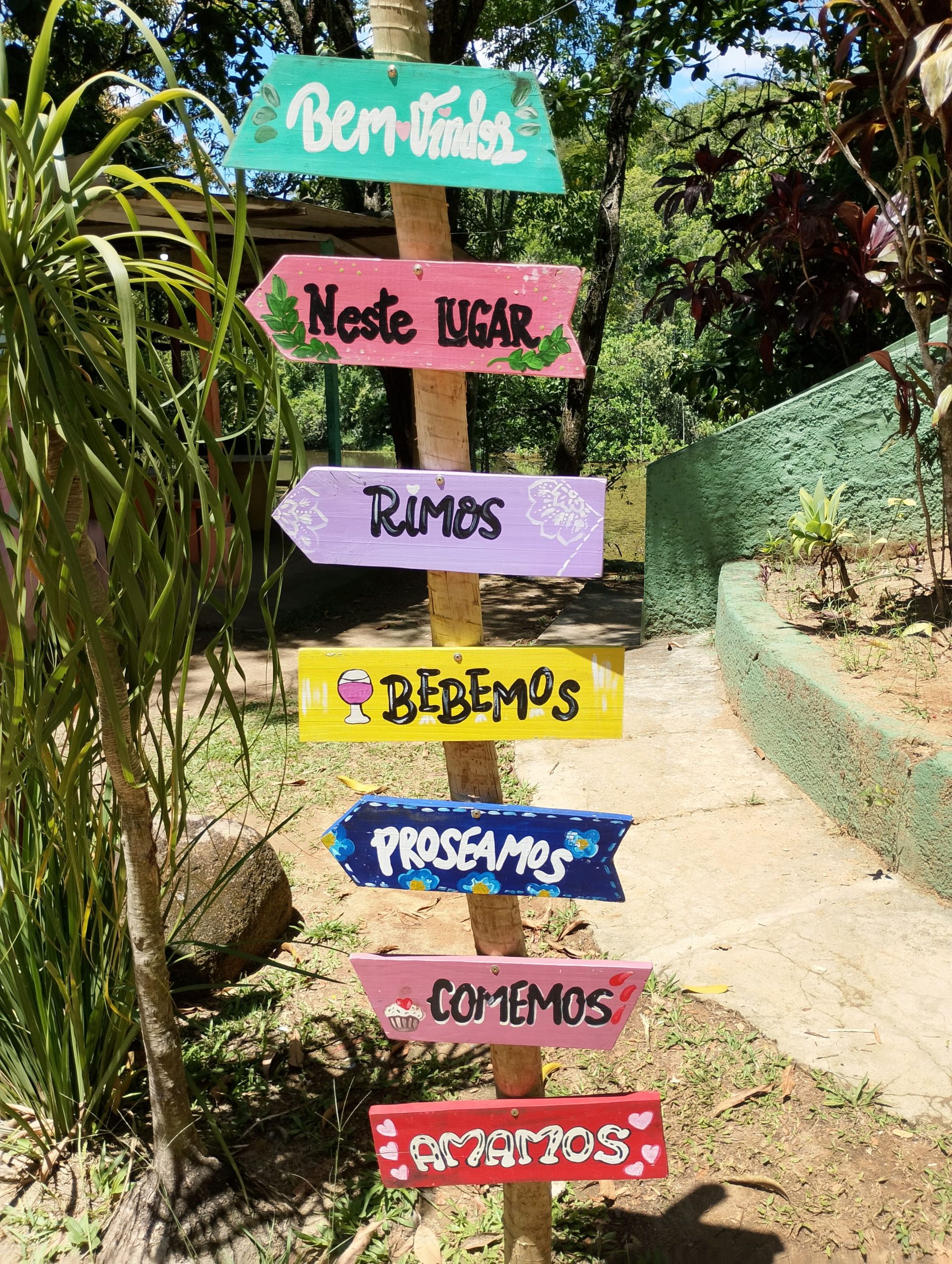
“When creating a multi-sign post like this, the order of your arrows matters.”
To create a dynamic, balanced look, don’t have them all pointing in the same direction or evenly spaced. Instead, stagger them, pointing in various directions (even if they’re purely decorative) and cluster some closer together while leaving larger gaps between others. This creates a more interesting rhythm and a sense of playful movement that is far more eye-catching than a perfectly symmetrical arrangement.
30. Direct Visitors with a Rustic Red ‘Jardin’ Sign
This sign’s effectiveness comes from its high-contrast, elemental design. The combination of three simple elements—natural wood, a single bold color, and a lush green background—is timeless. The warm, weathered wood provides a rustic base, the vibrant red script immediately draws the eye, and the out-of-focus green foliage creates a soft backdrop that makes the sign pop. It’s a classic, can’t-miss formula that feels both elegant and effortlessly natural.
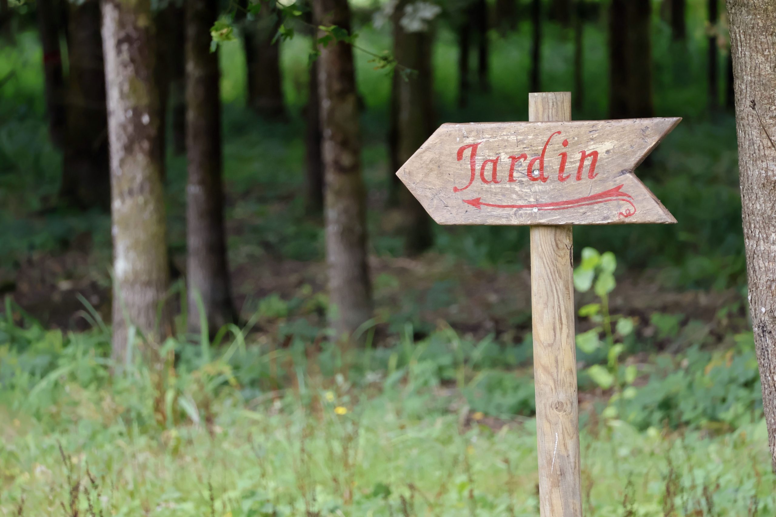
“You don’t need to be a master carver to achieve this look.”
Find a piece of scrap wood and draw a simple arrow shape. You can cut it out with a basic handsaw or jigsaw. Don’t worry about perfect edges; a little roughness adds to the charm. Lightly sand the surface and use a simple stencil and some red acrylic or exterior paint to apply the word ‘Jardin’ or any other message. Attach it to a sturdy branch or wooden stake. This entire DIY project can easily be done for less than $15 and in under an hour.
31. Combine a Welcome Sign with a Playful Shovel Weather Vane
The single element that makes this arrangement so special is the red shovel weather vane. Without it, you’d have a perfectly nice, if somewhat standard, welcome sign. The shovel adds a layer of unexpected whimsy and clever, garden-themed storytelling. It’s a playful twist on a traditional form. This creative detail shows a sense of humor and a love for the garden that goes beyond a simple ‘welcome,’ making the whole piece memorable and unique.
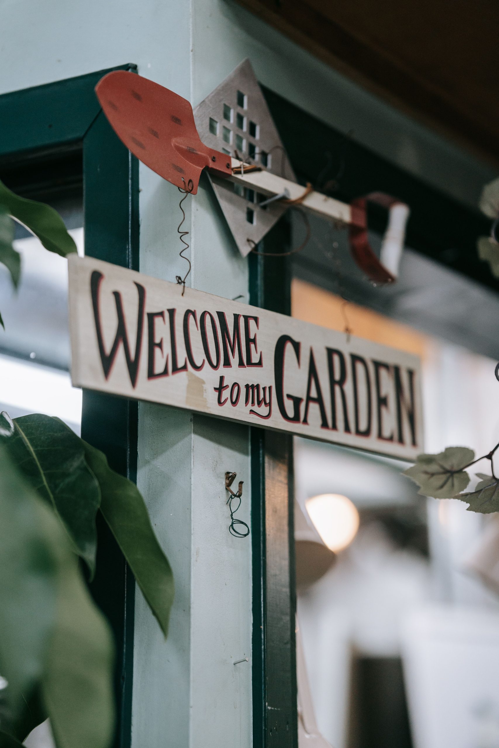
“While a weather vane is a delightful touch, a decorative one like this might not function as a true, meteorologically accurate instrument.”
The shovel shape is not aerodynamically designed to catch the wind as effectively as a traditional arrow or banner. Think of it as a kinetic sculpture that will move in a strong breeze, rather than a reliable tool for telling wind direction. Enjoy it for its charm and movement, but don’t rely on it to tell you which way the wind is blowing before you start your spring planting!
Your Garden’s Story Starts with a Sign
Now that you’re brimming with ideas, it’s time to pick the one that speaks to your garden’s unique personality. Whether it’s a rustic welcome, a practical marker, or a playful piece of art, let your sign be a reflection of you. What are you waiting for? Get creating, and don’t forget to share your masterpiece on Pinterest!